Embed Size (px)
Citation preview
Automatically Adapting Web Sites for Mobile Access through Logical Descriptions and Dynamic Analysis of
Interaction Resources Fabio Paternò, Carmen Santoro, Antonio Scorcia
ISTI-CNR Via Moruzzi 1, 56124 Pisa, Italy
{fabio.paterno, carmen.santoro, antonio.scorcia}@isti.cnr.it
ABSTRACT While several solutions for desktop user interface adaptation for mobile access have been proposed, there is still a lack of solutions able to automatically generate mobile versions taking semantic aspects into account. In this paper, we propose a general solution able to dynamically build logical descriptions of existing desktop Web site implementations, adapt the design to the target mobile device, and generate an implementation that preserves the original communications goals while taking into account the actual resources available in the target device. We describe the novel transformations supported by our new solution, show example applications and report on first user tests.
Author Keywords Multi-device Web interfaces, Mobile interfaces, Model-based design, User interface adaptation.
ACM Classification Keywords H5.m. Information interfaces and presentation (e.g., HCI).
INTRODUCTION The increasing availability of mobile devices has stimulated interest in tools for adapting the great number of existing Web applications originally developed for desktop systems into versions that are accessible and usable for mobile devices. In carrying out this adaptation it is important to consider the main characteristics of the target device, in this case the mobile devices. For example, one aspect to consider is that often mobile devices have no pointing device, thus users have to navigate through 5-way keys, which allow them to go left, right, up, down and select the
current element. There are also softkeys, which are used to activate commands, but their number and purpose vary depending on the device. In addition, text input is slow and users often have to pay to access the information, and thus prefer short sessions.
In general there are various approaches to authoring multi-device interfaces:
• Device-specific authoring, which means that a specific version is developed separately for each target platform. One example is the Amazon Web site, which has a separate version (http://www.amazon.com/anywhere) for mobile devices. This approach is clearly expensive in terms of time and effort.
• Multiple-device authoring, which is similar to the previous one but utilises a single application that has separate parts for different platforms. An example is the use of CSS depending on the platform.
• Single authoring, in which only one version of the application is built and then adapted to various target platforms. There are two main possibilities for this purpose: either to include the authors’ hints or to specify an abstract description, which is then refined according to the target platform (see for example SUPPLE [8]).
• Automatic re-authoring, which means an automatic transformation of a version for a given platform, usually the desktop, into a version for the target platform.
Our work falls into the last category, with the aim of obtaining a solution that does not require particular effort in terms of time but is still able to produce meaningful results. Various automatic re-authoring solutions have been proposed. A first distinction can be made depending on where the re-authoring process occurs: the client device, the application server or an intermediate proxy server. We prefer the last solution because performing the transformation on the client device can lead to performance issues with limited capabilities devices, while a solution on the application server would require duplicate installations in all the applications of interest. The feasibility of proxy-
Permission to make digital or hard copies of all or part of this work forpersonal or classroom use is granted without fee provided that copies arenot made or distributed for profit or commercial advantage and that copiesbear this notice and the full citation on the first page. To copy otherwise, to republish, to post on servers or to redistribute to lists, requires prior specific permission and/or a fee. AVI'08, 28-30 May , 2008, Napoli, Italy Copyright 2008 ACM 1-978-60558-141-5...$5.00.
260
based solutions is also shown by its widespread use in tools, such as Google for mobile devices (www.google.com/xhtml) [9], which converts the Web pages identified by the search engine into versions adapted for mobile devices.
In addition, we think that effective solutions for transforming desktop Web sites for mobile access should be based on semantic aspects. Unfortunately, so far the semantic Web has mainly focused on the data semantics through the use of ontologies and languages that allow for more intelligent processing. We would also like to consider the semantics of interaction, which is related to the tasks to support in order to reach the users’ goals.
In particular, after discussion of the related work we provide some background information regarding the XML-based language that we use for representing logical user interfaces. Next, we introduce our approach and the general architecture of our tool, and explain how we automatically obtain logical descriptions of existing implementations through a reverse engineering process. We describe in detail how our semantic redesign algorithm works for transforming desktop versions for mobile devices, show example applications, and report on first user tests, which have provided useful suggestions to further improve the tool. Lastly, we draw some conclusions along with indications for future work.
RELATED WORK Several solutions for automatic re-authoring from desktop-to-mobile have been proposed in recent years. The simplest one just proposes resizing the elements according to the size of the target screen. However, it often generates unusable results with unreadable elements and presentation structures unsuitable for the mobile device. Thus, research work has focused on transformations able to go further, to modify both the content and structure originally designed for desktop systems to make them suitable for small screen displays. Also in this case various possibilities have been explored. The most common transformation supported by current mobile devices is conversion into a single column (the narrow solution): the order of the content follows that of the mark-up file starting from the top, the images are scaled to the size of the screen, and the text is always visible and the content compacted without blank spaces. It eliminates horizontal scrolling, though it greatly increases the amount of vertical scrolling. For example, Opera SSR (Small Screen Rendering, www.opera.com/products /smartphone/smallscreen/) uses a remote server to pre-process Web pages before sending them to a mobile device, Web content is compressed to reduce the size of data transfers. In general, in this solution content requiring a good deal of space such as maps and tables can become unreadable; and often it is difficult to understand that the corresponding desktop page has changed because the initial parts of several desktop pages are indistinguishable from each other. Digestor [4] and Power Browser [5] have been
solutions that use proxy-based transformations (as in our case) in order to modify the content and structure of Web pages for mobile use. However, they do not use logical descriptions of user interfaces in order to reason about the page re-design or apply analysis of the sustainable costs of the target device, as happens in our case.
Various approaches have considered the application of information visualization techniques to address these issues. Fish-eye representations have been considered, for example Fishnet [3], which is a fisheye Web browser that shows a focus region at a readable scale, while spatially compressing page content outside the focus region. However, generating fish-eye representations of desktop Web pages in mobile devices can require excessive processing. Overview + detail splits a Web page into multiple sections and provides an overview page with links to these sections. The overview page can be either a thumbnail image, or a text summary of the Web page. Within this approach various solutions have been proposed. Smartview [12] provides a zoomed-out thumbnail view of the original Web page fitting it on the screen horizontally. The approach partitions the page into logical regions; when one is selected, content is presented inside the screen space in detailed view. Summary Thumbnails [10] uses the same thumbnail approach but the texts are summarized enabling good legibility (fonts are enlarged to a legible size and characters are cropped from right to left until the sentence fits in the available area). The main issue with this type of approach is that it works well in some cases, less in others, because it mainly focuses on the transformation of specific elements (for example, Summary Thumbnail mainly works on text snippets). Another contribution in this area is MiniMap [13] a browser for Nokia 6600 mobile phones developed at Nokia Research. The user interface is organised in such a way that text size should not exceed the screen space and provides an overview+detail representation. The overview is given by an area dedicated to showing where the current mobile page is located in the original desktop page. However, this solution is effective only with mobile devices with relatively large screens. We believe that model-based approaches can provide a more general solution. They are based on the use of logical descriptions that capture the main semantic aspects of the user interface and hide low-level details. Some first studies of how to apply them in this context have already been proposed (see for example [6][7]). These works were useful to provide solutions to specific issues raised by supporting mobile user interactions, but they did not address the issue of providing a general solution for taking Web sites originally developed for desktop systems and dynamically transforming them into accessible and usable versions for mobile devices while users are accessing them.
TERESA XML Several approaches for representing logical descriptions of user interfaces have been proposed. (e.g. UIML [1], UsiXML[11]). We use TERESA XML because it provides
261
not only abstractions of the single interface elements but also various ways to compose and structure them, which is an important aspect in user interface design. In this section we summarise the main features of this language in order to make the reader in a position to understand how we exploited it in our new tool. TERESA XML supports the various possible abstraction levels (task, abstract and concrete user interface). The task level describes the activities that should be supported. An abstract user interface is composed of a number of presentations and connections among them. While each presentation defines a set of interaction techniques perceivable by the user at a given time, the connections define the dynamic behaviour of the user interface, by indicating what interactions trigger a change of presentation and what the next presentation is. There are abstract interactors indicating the possible interactions in a platform-independent manner: for instance we just indicate the type of interaction to be performed (e.g.: selection, editing, etc.) without any reference to concrete ways to support such an interaction (e.g.: selecting an object through a radio button or a pull-down menu, etc.). At this level we also describe how to compose such basic elements through some composition operators. Such operators can involve one or two expressions, each of them can be composed of one or several interactors or, in turn, compositions of interactors. In particular, the composition operators have been defined taking into account the type of communication effects that designers aim to achieve when they create a presentation. They are: Grouping: indicates a set of interface elements logically connected to each other; Relation: highlights that one element has some effects on a set of elements; Ordering: some kind of ordering among a set of elements can be indicated; Hierarchy: different levels of importance can be defined among a set of elements.
The concrete level is a refinement of the abstract interface: depending on the type of platform considered there are different ways to render the various interactors and composition operators of the abstract user interface. The concrete elements are obtained as a refinement of the abstract ones. For example, a navigator (an abstract interactor) can be implemented, either through a textlink, or an imagelink or a simple button, and in the same way, a single choice object can be implemented using either a radio button or a list box or a drop-down list. The same holds for the composition operators: for example an abstract grouping operator can be refined at the concrete level in a desktop platform by a number of techniques including both unordered lists by row and unordered lists by column (apart from classical grouping techniques such as fieldsets, bullets, and colours). The small capability of a mobile phone does not allow for implementing the grouping operator by using an unordered list of elements by row, thus this technique is not available on this platform.
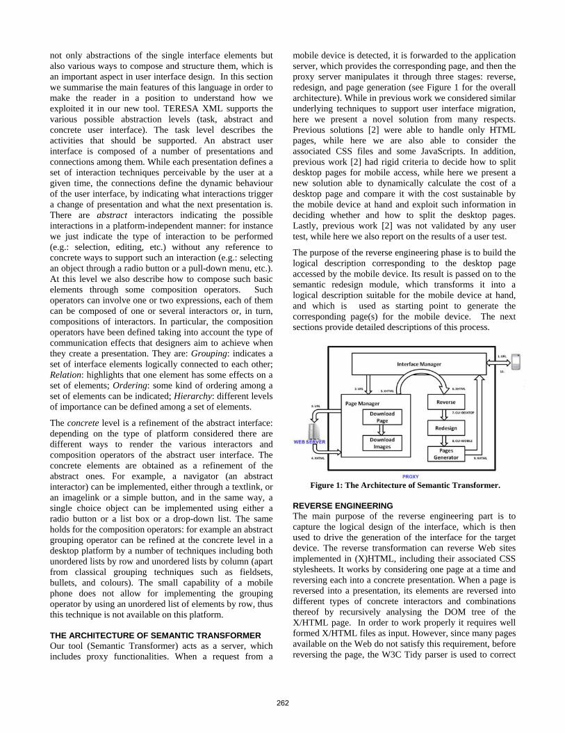
THE ARCHITECTURE OF SEMANTIC TRANSFORMER Our tool (Semantic Transformer) acts as a server, which includes proxy functionalities. When a request from a
mobile device is detected, it is forwarded to the application server, which provides the corresponding page, and then the proxy server manipulates it through three stages: reverse, redesign, and page generation (see Figure 1 for the overall architecture). While in previous work we considered similar underlying techniques to support user interface migration, here we present a novel solution from many respects. Previous solutions [2] were able to handle only HTML pages, while here we are also able to consider the associated CSS files and some JavaScripts. In addition, previous work [2] had rigid criteria to decide how to split desktop pages for mobile access, while here we present a new solution able to dynamically calculate the cost of a desktop page and compare it with the cost sustainable by the mobile device at hand and exploit such information in deciding whether and how to split the desktop pages. Lastly, previous work [2] was not validated by any user test, while here we also report on the results of a user test.
The purpose of the reverse engineering phase is to build the logical description corresponding to the desktop page accessed by the mobile device. Its result is passed on to the semantic redesign module, which transforms it into a logical description suitable for the mobile device at hand, and which is used as starting point to generate the corresponding page(s) for the mobile device. The next sections provide detailed descriptions of this process.
Figure 1: The Architecture of Semantic Transformer.
REVERSE ENGINEERING The main purpose of the reverse engineering part is to capture the logical design of the interface, which is then used to drive the generation of the interface for the target device. The reverse transformation can reverse Web sites implemented in (X)HTML, including their associated CSS stylesheets. It works by considering one page at a time and reversing each into a concrete presentation. When a page is reversed into a presentation, its elements are reversed into different types of concrete interactors and combinations thereof by recursively analysing the DOM tree of the X/HTML page. In order to work properly it requires well formed X/HTML files as input. However, since many pages available on the Web do not satisfy this requirement, before reversing the page, the W3C Tidy parser is used to correct
262
features such as missing and mismatching tags and returns the DOM tree of the corrected page. The algorithm of the reverse phase analyses each XHTML element and if such element can be mapped onto a concrete interactor then we have a recursion endpoint. The appropriate interactor element is built and inserted into the XML-based logical description. For example, DOM nodes corresponding to the tags <img>, <a> and <select> cause the generation of concrete objects respectively of type image, navigator and selection. The properties of the objects in the source page considered are also used to fill in the attributes of the corresponding concrete user interface elements, independent of the peculiarities used to implement the page of the source device. For instance, the italic attribute of a text concrete element is set to true, though in the HTML implementation it might appear as either <i> or <em>.
If the XHTML node corresponds to a composition operator then, after creating the proper composition element, the function is called recursively on the XHTML node subtrees. The subtree analysis can return both elementary interactors and compositions of them. In both cases the resulting nodes are appended to the composition element from which the analysis started. For example, the node corresponding to the tag <form> is reversed into a Relation composition operator, <ol> into an Ordering, <ul> into a Grouping. Depending on the considered node to be reversed, appropriate attributes are also stored in the resulting element at the concrete level (e.g. typical HTML desktop <ul> lists will be mapped at the concrete level into a grouping expression using vertical bullets).
If the node does not require the creation of an instance of an interactor in the concrete specification (for example, if the Web page contains the definition of a new font, no new element is added in the concrete description) then if the node has no children, no action is taken and we have a recursion endpoint (this can happen for example with line separators such as <br> tags). Otherwise, if the node has children, each child subtree is recursively reversed and the resulting nodes are collected into a grouping composition which is in turn added to the result. In the reversing process, the environment first builds the concrete description and then derives the abstract logical objects corresponding to the different concrete interaction elements. This is a simple matter in TERESA XML because the concrete languages are a refinement of the abstract one, which means that they add a number of attributes to the higher level elements defined in the abstract description. Thus, the process for reversing a concrete description into the corresponding abstract one consists of removing the lower level details from the interactor and composition operators specification, while leaving the structure of the presentations and the connections among presentations unchanged. In practice, there is a many-to-one relation between the elements of the concrete languages and the abstract one (for both the interaction objects and the composition operators).
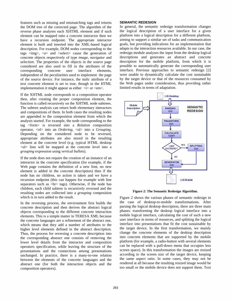
SEMANTIC REDESIGN In general, the semantic redesign transformation changes the logical description of a user interface for a given platform into a logical description for a different platform, aiming to support a similar set of tasks and communication goals, but providing indications for an implementation that adapts to the interaction resources available. In our case, the redesign module analyses the input from the desktop logical descriptions and generates an abstract and concrete description for the mobile platform, from which it is possible to automatically generate the corresponding user interface. Previous approaches to semantic redesign [2] were unable to dynamically calculate the cost sustainable by the target device or that of the resources consumed by the Web pages under consideration, thus providing rather limited results in terms of adaptation.
Figure 2: The Semantic Redesign Algorithm.
Figure 2 shows the various phases of semantic redesign in the case of desktop-to-mobile transformations. After parsing the logical desktop description, there are three main phases: transforming the desktop logical interface into a mobile logical interface, calculating the cost of such a new user interface in terms of resources, and splitting the logical interface into presentations that fit the cost sustainable by the target device. In the first transformation, we mainly change the concrete elements of the desktop description into concrete elements that are supported by the mobile platform (for example, a radio-button with several elements can be replaced with a pull-down menu that occupies less screen space). In this transformation the images are resized according to the screen size of the target device, keeping the same aspect ratio. In some cases, they may not be rendered at all because the resulting resized image would be too small or the mobile device does not support them. Text
263
and labels can be transformed as well, since they may be too long for the mobile device. In converting labels we use tables able to identify shorter synonyms. In order to automatically redesign a desktop presentation for a mobile device, we need to consider semantic information and the limits of the available resources. If we consider only the physical limitations, we may end up dividing large pages into smaller ones that are not meaningful. To avoid this, we also consider the composition operators indicated in the logical descriptions.
To this end, our algorithm tries to maintain interactors that are composed together through some composition operator in the same final presentation, thus preserving the communication goals of the designer and obtaining consistent interfaces. In addition, the page splitting requires a change in the navigation structure with the need for additional navigator interactors that allow access to the newly created pages. More specifically, the algorithm for calculating the costs and splitting the presentations accordingly is based on the number and cost of interactors and their compositions. The cost is related to the interaction resources consumed, e.g.: number of pixels of images, font sizes. After the initial transformation, which replaces the desktop concrete elements with mobile concrete elements (for example, a text area for the desktop could be transformed into a simpler text edit on the mobile), the cost of each presentation is calculated. If it fits the cost sustainable by the target device, then no other processing is applied. Otherwise, the presentation is split into two or more pages following this approach. The cost of each composition of elements is calculated. The one with the highest cost is associated to a newly generated presentation and is replaced in the original presentation with a link to the resulting new presentation. Thus, if the cost of the original presentation after this modification is less or equal the maximum cost that can be supported by a single mobile presentation, then the process terminates, otherwise the algorithm is recursively applied to the remaining composition of elements. In case of a complex composition of interface elements that might not be entirely included in a single presentation because of its high cost for the target device, the algorithm aims to distribute the interactors equally amongst presentations of the mobile device.
In the transformation process we take into account semantic aspects and the cost in terms of interaction resources of the elements considered. The cost that can be supported by the target mobile device is calculated by identifying the characteristics of the device through the user agent information in the HTTP protocol, which can be used to access more detailed information in its description, which is stored in the adaptation server through the WURFL (wurfl.sourceforge.net/), a Device Description Repository containing a catalogue of mobile device information. Initially, we considered UAProfiles but sometimes such descriptions are not available and they require an additional access to another server where they are stored.
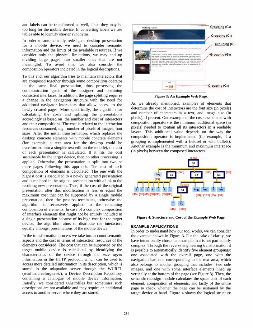
Figure 3: An Example Web Page.
As we already mentioned, examples of elements that determine the cost of interactors are the font size (in pixels) and number of characters in a text, and image size (in pixels), if present. One example of the costs associated with composition operators is the minimum additional space (in pixels) needed to contain all its interactors in a readable layout. This additional value depends on the way the composition operator is implemented (for example, if a grouping is implemented with a fieldset or with bullets). Another example is the minimum and maximum interspace (in pixels) between the composed interactors.
(675)
G0
Figure 4: Structure and Cost of the Example Web Page.
EXAMPLE APPLICATIONS In order to understand how our tool works, we can consider the example shown in Figure 3. For the sake of clarity, we have intentionally chosen an example that is not particularly complex. Through the reverse engineering transformation it is possible to automatically identify five element groupings: one associated with the overall page, one with the navigation bar, one corresponding to the text area, which also belongs to another grouping that includes two side images, and one with some interface elements lined up vertically at the bottom of the page (see Figure 3). Then, the semantic redesign module calculates the space cost of each element, composition of elements, and lastly of the entire page to check whether the page can be sustained by the target device at hand. Figure 4 shows the logical structure
L
G2 G3
TG4 Img ImgImg
TLT
(335)
(135)
(99) (101) (35) (31)(35)
(35) (100)
L
Img
LL
G1
LLL
(245)
(29)
(66)
(35) (35) (35) (35) (35) (35)
264
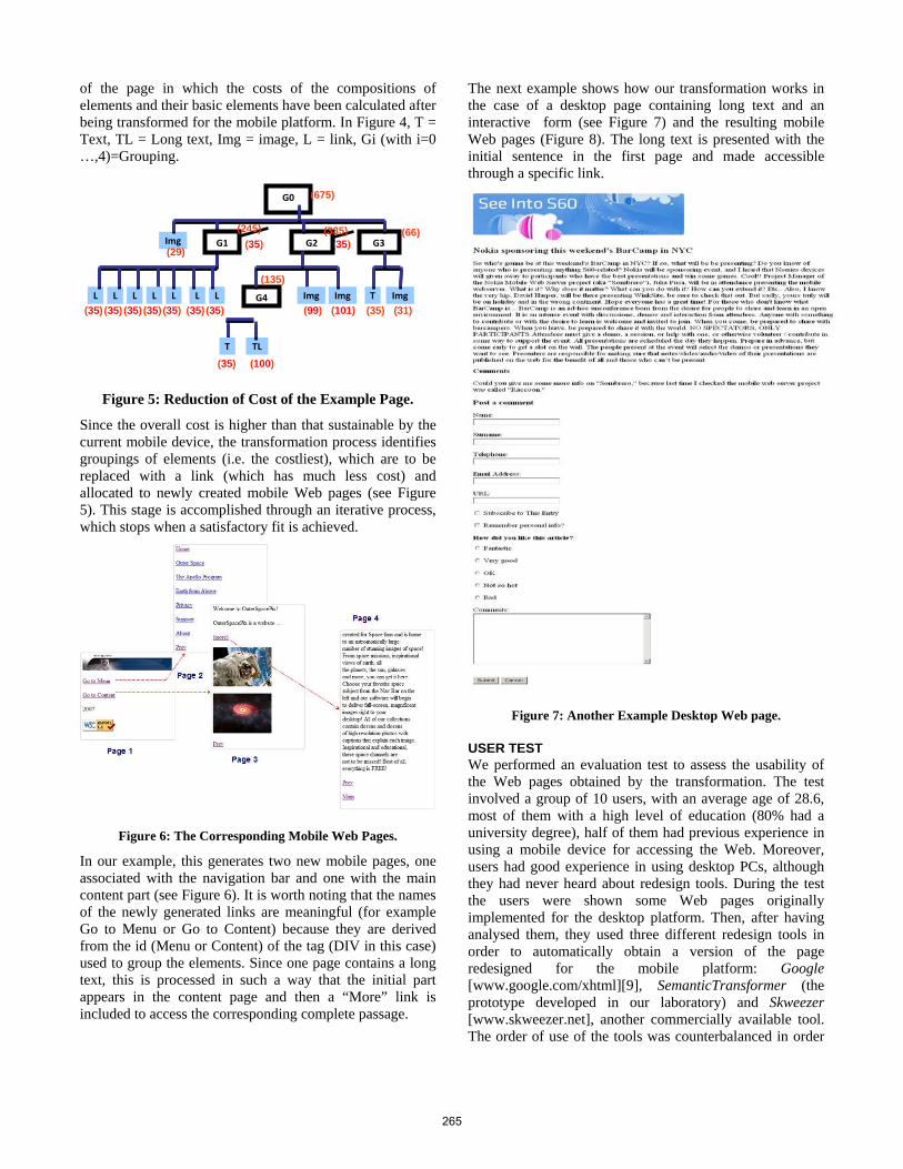
of the page in which the costs of the compositions of elements and their basic elements have been calculated after being transformed for the mobile platform. In Figure 4, T = Text, TL = Long text, Img = image, L = link, Gi (with i=0 …,4)=Grouping.
Figure 5: Reduction of Cost of the Example Page.
Since the overall cost is higher than that sustainable by the current mobile device, the transformation process identifies groupings of elements (i.e. the costliest), which are to be replaced with a link (which has much less cost) and allocated to newly created mobile Web pages (see Figure 5). This stage is accomplished through an iterative process, which stops when a satisfactory fit is achieved.
Figure 6: The Corresponding Mobile Web Pages.
In our example, this generates two new mobile pages, one associated with the navigation bar and one with the main content part (see Figure 6). It is worth noting that the names of the newly generated links are meaningful (for example Go to Menu or Go to Content) because they are derived from the id (Menu or Content) of the tag (DIV in this case) used to group the elements. Since one page contains a long text, this is processed in such a way that the initial part appears in the content page and then a “More” link is included to access the corresponding complete passage.
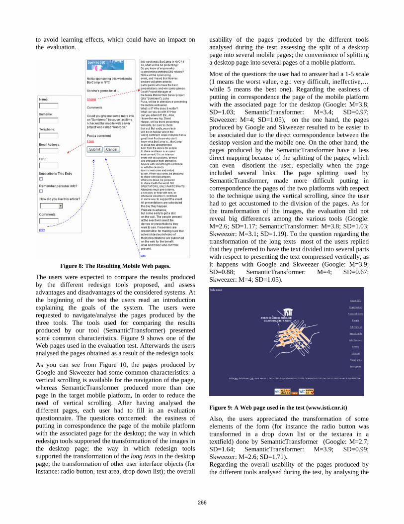
The next example shows how our transformation works in the case of a desktop page containing long text and an interactive form (see Figure 7) and the resulting mobile Web pages (Figure 8). The long text is presented with the initial sentence in the first page and made accessible through a specific link.
Figure 7: Another Example Desktop Web page.
USER TEST We performed an evaluation test to assess the usability of the Web pages obtained by the transformation. The test involved a group of 10 users, with an average age of 28.6, most of them with a high level of education (80% had a university degree), half of them had previous experience in using a mobile device for accessing the Web. Moreover, users had good experience in using desktop PCs, although they had never heard about redesign tools. During the test the users were shown some Web pages originally implemented for the desktop platform. Then, after having analysed them, they used three different redesign tools in order to automatically obtain a version of the page redesigned for the mobile platform: Google [www.google.com/xhtml][9], SemanticTransformer (the prototype developed in our laboratory) and Skweezer [www.skweezer.net], another commercially available tool. The order of use of the tools was counterbalanced in order
(35) (35)
G0
L
G2 G3
TG4 Img Img
(675)
Img
TL T
(335) (66)
(135)
(99) (101) (35) (31) (35)
(35) (100)
L
Img
L L
(245) G1
(29)
L L L
(35) (35) (35) (35) (35) (35)
265
to avoid learning effects, which could have an impact on the evaluation.
Figure 8: The Resulting Mobile Web pages.
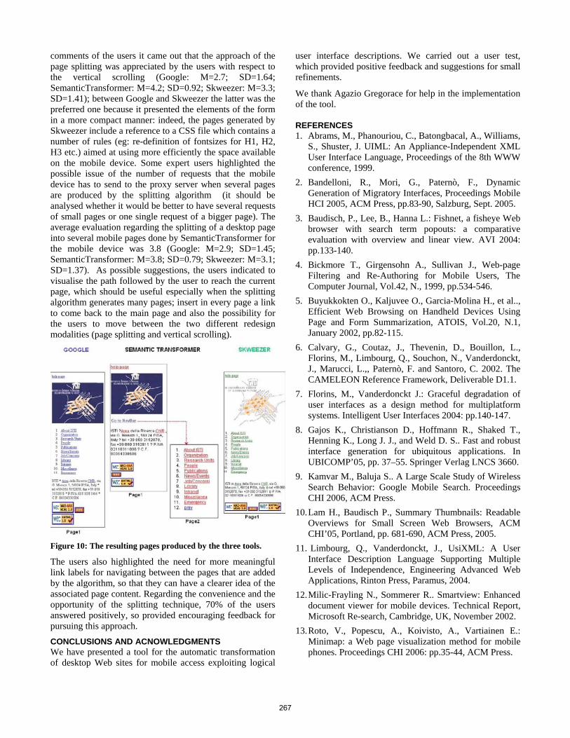
The users were expected to compare the results produced by the different redesign tools proposed, and assess advantages and disadvantages of the considered systems. At the beginning of the test the users read an introduction explaining the goals of the system. The users were requested to navigate/analyse the pages produced by the three tools. The tools used for comparing the results produced by our tool (SemanticTransformer) presented some common characteristics. Figure 9 shows one of the Web pages used in the evaluation test. Afterwards the users analysed the pages obtained as a result of the redesign tools.
As you can see from Figure 10, the pages produced by Google and Skweezer had some common characteristics: a vertical scrolling is available for the navigation of the page, whereas SemanticTransformer produced more than one page in the target mobile platform, in order to reduce the need of vertical scrolling. After having analysed the different pages, each user had to fill in an evaluation questionnaire. The questions concerned: the easiness of putting in correspondence the page of the mobile platform with the associated page for the desktop; the way in which redesign tools supported the transformation of the images in the desktop page; the way in which redesign tools supported the transformation of the long texts in the desktop page; the transformation of other user interface objects (for instance: radio button, text area, drop down list); the overall
usability of the pages produced by the different tools analysed during the test; assessing the split of a desktop page into several mobile pages; the convenience of splitting a desktop page into several pages of a mobile platform.
Most of the questions the user had to answer had a 1-5 scale (1 means the worst value, e.g.: very difficult, ineffective,… while 5 means the best one). Regarding the easiness of putting in correspondence the page of the mobile platform with the associated page for the desktop (Google: M=3.8; SD=1.03; SemanticTransformer: M=3.4; SD=0.97; Skweezer: M=4; SD=1.05), on the one hand, the pages produced by Google and Skweezer resulted to be easier to be associated due to the direct correspondence between the desktop version and the mobile one. On the other hand, the pages produced by the SemanticTransformer have a less direct mapping because of the splitting of the pages, which can even disorient the user, especially when the page included several links. The page splitting used by SemanticTransformer, made more difficult putting in correspondence the pages of the two platforms with respect to the technique using the vertical scrolling, since the user had to get accustomed to the division of the pages. As for the transformation of the images, the evaluation did not reveal big differences among the various tools (Google: M=2.6; SD=1.17; SemanticTransformer: M=3.8; SD=1.03; Skweezer: M=3.1; SD=1.19). To the question regarding the transformation of the long texts most of the users replied that they preferred to have the text divided into several parts with respect to presenting the text compressed vertically, as it happens with Google and Skweezer (Google: M=3.9; SD=0.88; SemanticTransformer: M=4; SD=0.67; Skweezer: M=4; SD=1.05).
Figure 9: A Web page used in the test (www.isti.cnr.it)
Also, the users appreciated the transformation of some elements of the form (for instance the radio button was transformed in a drop down list or the textarea in a textfield) done by SemanticTransformer (Google: M=2.7; SD=1.64; SemanticTransformer: M=3.9; SD=0.99; Skweezer: M=2.6; SD=1.71). Regarding the overall usability of the pages produced by the different tools analysed during the test, by analysing the
266
comments of the users it came out that the approach of the page splitting was appreciated by the users with respect to the vertical scrolling (Google: M=2.7; SD=1.64; SemanticTransformer: M=4.2; SD=0.92; Skweezer: M=3.3; SD=1.41); between Google and Skweezer the latter was the preferred one because it presented the elements of the form in a more compact manner: indeed, the pages generated by Skweezer include a reference to a CSS file which contains a number of rules (eg: re-definition of fontsizes for H1, H2, H3 etc.) aimed at using more efficiently the space available on the mobile device. Some expert users highlighted the possible issue of the number of requests that the mobile device has to send to the proxy server when several pages are produced by the splitting algorithm (it should be analysed whether it would be better to have several requests of small pages or one single request of a bigger page). The average evaluation regarding the splitting of a desktop page into several mobile pages done by SemanticTransformer for the mobile device was 3.8 (Google: M=2.9; SD=1.45; SemanticTransformer: M=3.8; SD=0.79; Skweezer: M=3.1; SD=1.37). As possible suggestions, the users indicated to visualise the path followed by the user to reach the current page, which should be useful especially when the splitting algorithm generates many pages; insert in every page a link to come back to the main page and also the possibility for the users to move between the two different redesign modalities (page splitting and vertical scrolling).
Figure 10: The resulting pages produced by the three tools. The users also highlighted the need for more meaningful link labels for navigating between the pages that are added by the algorithm, so that they can have a clearer idea of the associated page content. Regarding the convenience and the opportunity of the splitting technique, 70% of the users answered positively, so provided encouraging feedback for pursuing this approach.
CONCLUSIONS AND ACNOWLEDGMENTS We have presented a tool for the automatic transformation of desktop Web sites for mobile access exploiting logical
user interface descriptions. We carried out a user test, which provided positive feedback and suggestions for small refinements.
We thank Agazio Gregorace for help in the implementation of the tool.
REFERENCES 1. Abrams, M., Phanouriou, C., Batongbacal, A., Williams,
S., Shuster, J. UIML: An Appliance-Independent XML User Interface Language, Proceedings of the 8th WWW conference, 1999.
2. Bandelloni, R., Mori, G., Paternò, F., Dynamic Generation of Migratory Interfaces, Proceedings Mobile HCI 2005, ACM Press, pp.83-90, Salzburg, Sept. 2005.
3. Baudisch, P., Lee, B., Hanna L.: Fishnet, a fisheye Web browser with search term popouts: a comparative evaluation with overview and linear view. AVI 2004: pp.133-140.
4. Bickmore T., Girgensohn A., Sullivan J., Web-page Filtering and Re-Authoring for Mobile Users, The Computer Journal, Vol.42, N., 1999, pp.534-546.
5. Buyukkokten O., Kaljuvee O., Garcia-Molina H., et al.., Efficient Web Browsing on Handheld Devices Using Page and Form Summarization, ATOIS, Vol.20, N.1, January 2002, pp.82-115.
6. Calvary, G., Coutaz, J., Thevenin, D., Bouillon, L., Florins, M., Limbourg, Q., Souchon, N., Vanderdonckt, J., Marucci, L.,, Paternò, F. and Santoro, C. 2002. The CAMELEON Reference Framework, Deliverable D1.1.
7. Florins, M., Vanderdonckt J.: Graceful degradation of user interfaces as a design method for multiplatform systems. Intelligent User Interfaces 2004: pp.140-147.
8. Gajos K., Christianson D., Hoffmann R., Shaked T., Henning K., Long J. J., and Weld D. S.. Fast and robust interface generation for ubiquitous applications. In UBICOMP’05, pp. 37–55. Springer Verlag LNCS 3660.
9. Kamvar M., Baluja S.. A Large Scale Study of Wireless Search Behavior: Google Mobile Search. Proceedings CHI 2006, ACM Press.
10. Lam H., Baudisch P., Summary Thumbnails: Readable Overviews for Small Screen Web Browsers, ACM CHI’05, Portland, pp. 681-690, ACM Press, 2005.
11. Limbourg, Q., Vanderdonckt, J., UsiXML: A User Interface Description Language Supporting Multiple Levels of Independence, Engineering Advanced Web Applications, Rinton Press, Paramus, 2004.
12. Milic-Frayling N., Sommerer R.. Smartview: Enhanced document viewer for mobile devices. Technical Report, Microsoft Re-search, Cambridge, UK, November 2002.
13. Roto, V., Popescu, A., Koivisto, A., Vartiainen E.: Minimap: a Web page visualization method for mobile phones. Proceedings CHI 2006: pp.35-44, ACM Press.
267