Embed Size (px)
Citation preview
Published by the IEEE Computer Society 0272-1716/07/$25.00 © 2007 IEEE IEEE Computer Graphics and Applications 57
Feature Article
V isualization of multiple attributes acrossa region is a complex problem for which
several experimental tools have been developed. Insome cases, the attributes correspond to events occur-ring at discrete locations; in others, the data are phe-nomena that vary continuously across a region. In thediscrete case, the focus is often on using maps forgeospatial referencing. For example, events might bebunched together in some spaces and sparse in others.Much of the research effort therefore seeks methodsthat adjust the physical presentation of the space to
make it more amenable to visualiz-ing all the events and their relativegeographical locations. This mightinclude, for example, distortingspace to enlarge areas with denseconcentrations of events whileshrinking others with relatively fewevents. In the continuously varyingcase, space distortion isn’t appro-priate. Instead, the emphasis is on visualizing multiple attributevalues at all points throughout the space.
This article describes a new technique based onattribute blocks, a dynamically configurable array oflenses through which users can visualize specificattribute values at given locations throughout a region.Users can exploit this ability to dynamically adjust thearray’s configuration as well as the attribute blocks’ sizeand origin in this new exploratory tool for discoveringpatterns of interest in multivariate data sets.
Attribute blocksI use the technique described in this article to visual-
ize n attributes defined continuously across a region ona single map. Coloring each pixel using some multivari-ate function of the attribute values at that location isineffective; as I note in the sidebar, approaches such asmultivariate choropleth maps haven’t proved effectivefor more than two or three variables.
I instead arrange all or an interactively selected sub-set of the n attributes into a dynamically configurable kr
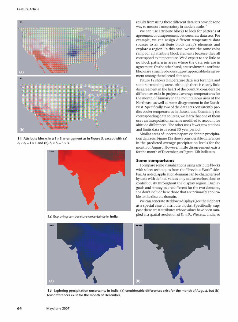
� kc array of visual representations called an attributeblock. Each element of the attribute block array encodesa single attribute value. All attributes are defined every-where; the attribute block array simply acts as a “screendoor” of lenses, each allowing a single attribute valueto be seen at the specific location. The dimensions ofeach lens—denoted br � bc—are also dynamicallyadjustable. I then tile the current kr � kc array of br � bc
lenses across the entire map. Figure 1 illustrates a basic
Attribute blocks are a techniquefor visualizing continuouslyvarying attributes across aregion, letting you quicklylocate patterns in large datasets. Attribute blocks can bedisplayed in a flat 2D projectionwithout needing constant 3Ddynamic rotations.
James R. MillerUniversity of Kansas
Attribute Blocks:Visualizing MultipleContinuouslyDefined Attributes
Previous WorkPhenomena of interest from a visualization
viewpoint are either discrete objects or eventswhose locations are one of the attributes thatmust be visualized or continuous functions thatare defined everywhere. Examples of the formerinclude sightings of endangered species, votingresults, and windmill locations. These might berendered using glyphs or icons whose attributes(color, shape, topology, and so on) aredetermined by associated attributes. Examplesof continuous attributes include averagetemperature or height above sea level.Continuous phenomena like these have valueseverywhere, even when they’re only capturedat discrete locations.
Keim et al.’s PixelMaps is a technique fordisplaying values for a single attribute whosegeolocation must be visualized.1 They addressproblems such as ensuring that distinct pointsare mapped to distinct pixels, and thatabsolute and relative positions of points in theinput set are preserved as much as possible.Addressing these goals can cause map scales to
Continued on page 58
Feature Article
58 May/June 2007
become distorted. I focus on application domains inwhich many attributes are defined continuouslythroughout the model space and in which nonlineardistortions of model space aren’t allowed.
When focusing on the visualization of multipleattributes defined continuously throughout a geographicregion, one obvious approach is to simply display one 3Dsurface z � fi(x, y) for each attribute i. The vertical scalesare generally unrelated, however�for example, wemight wish to visualize how temperature, precipitation,and air pressure vary throughout a region�hence, therewould be no significance whatsoever to the fact that onesurface was above another or that two surfacesintersected. Yet, for example, a surface intersectionregion might draw an observer’s attention, and theobserver might unconsciously try to assign somesignificance to this visual manifestation. In earlier work,my colleagues and I used multiple surfaces for attributedisplay, but only when the attributes were closely relatedand used the same units.2 However, the display requiredconstant dynamic rotations to enable interpretation, andeven then it was effective for only fairly small geographicregions.
Another obvious issue with this approach is thatfunctions such as fi(x, y) are rarely, if ever, explicitlyknown. Instead, the user often employs some sort of(regular or irregular) discrete data sampling followed byan interpolation process to create an approximation tofunctions such as fi(x, y). A common approach is based oninterpolating the data onto a regular grid indexed bydiscrete geospatial (x, y) coordinates at some appropriateresolution. Such data gathering and interpolationschemes are beyond this article’s scope. (Slocum et al.and references cited therein discuss a few methods.)3
Once this interpolation process is complete, youessentially have a 2D array for each attribute, whichrepresents a discrete approximation to fi(x, y) across somefinite domain. Each element of the array corresponds toone grid cell within the domain, and you can usesubsequent interpolation to further approximate how theattribute value might vary across the regioncorresponding to a given grid cell.
A complete survey of multidimensional visualizationtechniques is beyond this article’s scope; however, Ihighlight a few relevant techniques and relate them to theattribute blocks approach.
Beddow used a technique somewhat similar to ours tovisualize atmospheric data sets generated by the NASAGoddard Space Flight Center.4 He recorded hourlyaverages for various attributes (such as magnetic strength,plasma temperature, and ion density) over many days. Inhis visualization, the horizontal axis represented the hourand the vertical axis encoded the day. Each resulting gridcell (indexed by [day, hour]) contained an array of patchesin which an attribute’s value determined thecorresponding patch’s color. The display captured the dataset’s resolution completely, and the position of the colored
patches within the grid cell were irrelevant because therewas no need to visualize how that value might changeacross the area represented by the display cell.
Although similar in appearance, my application differs inseveral respects. Most notably, I wanted to decoupleattribute-value display resolution from the resolution atwhich the attribute data is stored, and to do so withminimal computational overhead. For example, I wantedto avoid having to regenerate and resample polygonaldescriptions and attribute values at each interaction duringan exploratory process. So, I defined the geometry and allattributes once at the resolution of the original data set,and then arranged for a low-level scan-conversion processto determine which attribute value to display on a pixel-by-pixel basis.
Slocum classifies techniques for displaying multivariateattributes in geospatial applications based on whether theuser compares multiple maps visually or combines allattributes on a single map.3 In the former case, the usertypically encodes one attribute per map. This multiplemap approach requires visually integrating the distinctmaps to visualize all of the attributes at a given location.By contrast, when you use a single map for the attributes,you need a scheme to encode all the attributes atlocations throughout that map. Researchers have exploredseveral such techniques, most of which rely on colorand/or texture mixtures. Alternatively, characteristics (forexample, color, shape, size, and topology) of specialsymbols can encode a collection of attributes at thesymbols’ location.
MacEachren et al. used GeoVista Studio to developtechniques for visualizing geospatially referenced objectswith multiple attributes.5 Their multiform bivariate matrixcorrelates a statistic of interest (cancer mortality rates, intheir example) to pairs of possible risk factors(environmental factors, health care access, and so on).Their matrix uses side-by-side displays. They use the map inposition (i, j), for example, to visualize the extent to whichrisk factors i and j lead to increased mortality ratesthroughout the region of study (the US, in their case).Their displays present data that’s both continuouslydefined (for example, presence of atmospheric emissions)and discretely defined (such as mortality statistics). Eachmap in the matrix displays only a single pair of attributes,however. The data is binned for each bivariate map, andthey use one of four colors to visualize the resulting data.
Choropleth maps use attributes to determine theshading of a region on a map. Frequently the regions havegeopolitical significance independent of the data�forexample, they might represent counties, states, orcountries.3 Univariate choropleth maps are probably themost common; however, researchers have used bivariateand even trivariate choropleth maps. The bivariatetechnique maps two independent attributes into twodistinct color scales, combines the resulting colors, anduses them in the corresponding map region.
Rather than mixing three distinct color scales,
Continued from page 57
IEEE Computer Graphics and Applications 59
approaches that use trivariate choropleth maps frequentlyemploy texture in lieu of one or two of the colors.3 You cantheoretically extend this technique to n attributes, but eventhe trivariate case can be difficult to grasp, and yougenerally need relatively large geographic regions whenusing textures to encode attribute values.
Multivariate dot mapping is an alternative to color andtexture mixing for single map visualization of multipleattributes. Attribute values are rarely constant throughout aregion, hence drawing the entire region in a single colorcan be deceiving. Dot mapping originated as a techniqueto better visualize discrete phenomena when additionalinformation could be exploited to illustrate how thephenomena varied throughout a region on a map.3 Forexample, instead of visualizing a state’s population bydrawing the entire state using a color selected from a rangeaccording to the state’s total population, you can displaydots throughout the state, concentrating the dots locally toreflect the population’s actual nonuniform distributionthroughout the state.
For multiple discrete attributes, multivariate dot mappinguses differently colored dots for each attribute in ananalogous fashion. User testing indicates that this approachis slightly more effective than an approach using multipleindividual attribute maps when three attributes are beingvisualized.6 However, it might not be at all effective forlarger numbers of attributes. Our interest is in visualizing anarbitrary number of continuously varying attributes, so thisapproach isn’t directly applicable. Nevertheless, ourattribute block technique might be viewed as an analog ofmultivariate dot mapping in the continuous domain,particularly when our attribute block size is 1 pixel.
A completely different approach to displayingmultivariate attribute data involves generating symbolslocated at points of interest, with their color, size, shape,and topology encoding quantities of interest. Thistechnique was first developed for visualizing multipleattribute values at specific locations.7 This schemeinvolved families of stick figure icons in which onereference leg was fixed, with other legs branching awayfrom the fixed leg. A specific topology characterized eachfamily. For a given visualization application, the userselected a specific family and placed instances of thefamily throughout the field of view. The geometriccharacteristics of each n-legged instance encoded n � 1attribute values at the instance’s position. An nth attributevalue could be represented if the stick figure’s overallorientation was allowed to vary. With a sufficiently denseplacement of stick figures, the resulting texture in thedisplay could reveal interesting aspects of the data.7
Researchers have also successfully used stick figure iconsto compare different but related data sets. For example,Keller uses these icons to locate hot spots in pairs ofmagnetic resonance imaging images. Neither MRI image isitself displayed; instead, the display consists of an array ofstick figure icons. The values at location (i, j) in each of thetwo MRI images determine the shape and size of the icon at
location (i, j) in the display.8 In Keller’s example, a hot spotappears as a bright region in the display.
Chernoff faces is another variation on this general idea.The icons placed in the field of view are faces, and the size,shape, and color of various facial features (eyes, nose,mouth, and so on) are generated from correspondingattribute values.3
More recently, Healey and Enns extended the basic ideaof icon-based representation of multiple attributes usingperceptual texture elements.9 A pexel is a polygon of fixedwidth whose height and color can be used to encodeattribute values at a given location. Healey and Enns usepexel density and regularity to encode additional attributes.They identified three levels of regularity: regular, irregular,and random. Given sufficient numbers of pexels, you canperceive changes in pexel placement density, independentof regularity.9
Healey and Enns report on extensive user studies usingpexels in two visualization applications: an oceanographicstudy involving plankton densities and a severe weatherapplication studying typhoon activity in the Pacific. Theirstudies confirm that pexels effectively visualize fourattributes at given locations, each mapped to one of height,color, density, and regularity of pexels in a region. Theyhypothesize that you can use motion and orientation toincrease the number of attributes that can be presented indynamic displays.9
References1. D.A. Keim et al., “Pixel-Based Visual Data Mining of Geo-spatial
Data,” Computers and Graphics, vol. 28, no. 3, June 2004, pp.327-344.
2. D.C. Cliburn et al., “Design and Evaluation of a Decision SupportSystem in a Water Balance Application,” Computers and Graphics,vol. 26, no. 6, Dec. 2002, pp. 931-949.
3. T.A. Slocum et al., Thematic Cartography and Geographic Visual-ization, 2nd ed., Pearson Prentice Hall, 2005.
4. J. Beddow, “Shape Coding of Multidimensional Data on a Micro-computer Display,” Proc. IEEE Conf. Visualization, IEEE CS Press,1990, pp. 238-246.
5. A.M. MacEachren et al., “Geovisualization for Knowledge Con-struction and Decision Support,” IEEE Computer Graphics andApplications, vol. 24, no. 1, Jan./Feb. 2004, pp. 13-17.
6. J.E. Rogers and R.E. Groop, “Regional Portrayal with Multi-Pat-tern Color Dot Maps,” Cartographica, vol. 18, no. 4, winter 1981,pp. 51-64.
7. R.M. Pickett and G.G. Grinstein, “Iconographic Displays for Visu-alizing Multidimensional Data,” Proc. 1988 IEEE Int’l Conf. Sys-tems, Man, and Cybernetics, 1988, pp. 514-519.
8. P.R. Keller and M.M. Keller, Visual Cues: Practical Data Visualization,IEEE CS Press, 1993.
9. C.G. Healey and J.T. Enns, “Large Datasets at a Glance: Combin-ing Textures and Colors in Scientific Visualization,” IEEE Trans.Visualization and Computer Graphics, vol. 5, no. 2, Apr.-June 1999,pp. 145-167.
Feature Article
60 May/June 2007
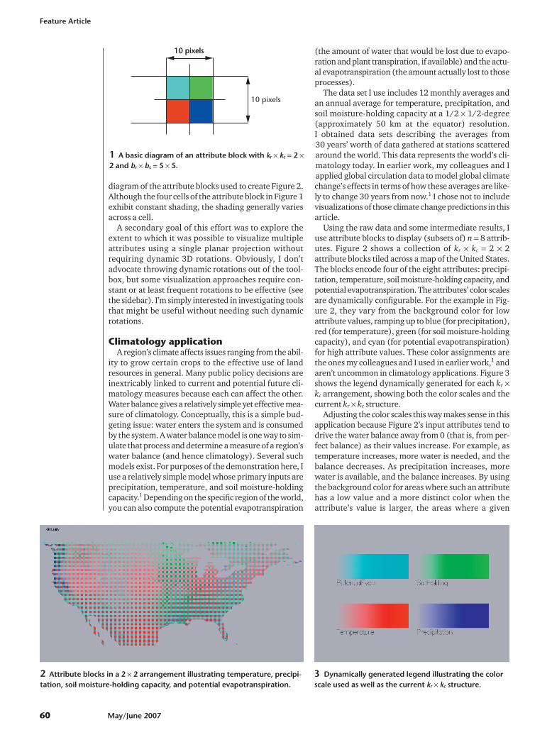
diagram of the attribute blocks used to create Figure 2.Although the four cells of the attribute block in Figure 1exhibit constant shading, the shading generally variesacross a cell.
A secondary goal of this effort was to explore theextent to which it was possible to visualize multipleattributes using a single planar projection withoutrequiring dynamic 3D rotations. Obviously, I don’tadvocate throwing dynamic rotations out of the tool-box, but some visualization approaches require con-stant or at least frequent rotations to be effective (seethe sidebar). I’m simply interested in investigating toolsthat might be useful without needing such dynamicrotations.
Climatology applicationA region’s climate affects issues ranging from the abil-
ity to grow certain crops to the effective use of landresources in general. Many public policy decisions areinextricably linked to current and potential future cli-matology measures because each can affect the other.Water balance gives a relatively simple yet effective mea-sure of climatology. Conceptually, this is a simple bud-geting issue: water enters the system and is consumedby the system. A water balance model is one way to sim-ulate that process and determine a measure of a region’swater balance (and hence climatology). Several suchmodels exist. For purposes of the demonstration here, Iuse a relatively simple model whose primary inputs areprecipitation, temperature, and soil moisture-holdingcapacity.1 Depending on the specific region of the world,you can also compute the potential evapotranspiration
(the amount of water that would be lost due to evapo-ration and plant transpiration, if available) and the actu-al evapotranspiration (the amount actually lost to thoseprocesses).
The data set I use includes 12 monthly averages andan annual average for temperature, precipitation, andsoil moisture-holding capacity at a 1/2 � 1/2-degree(approximately 50 km at the equator) resolution. I obtained data sets describing the averages from 30 years’ worth of data gathered at stations scatteredaround the world. This data represents the world’s cli-matology today. In earlier work, my colleagues and Iapplied global circulation data to model global climatechange’s effects in terms of how these averages are like-ly to change 30 years from now.1 I chose not to includevisualizations of those climate change predictions in thisarticle.
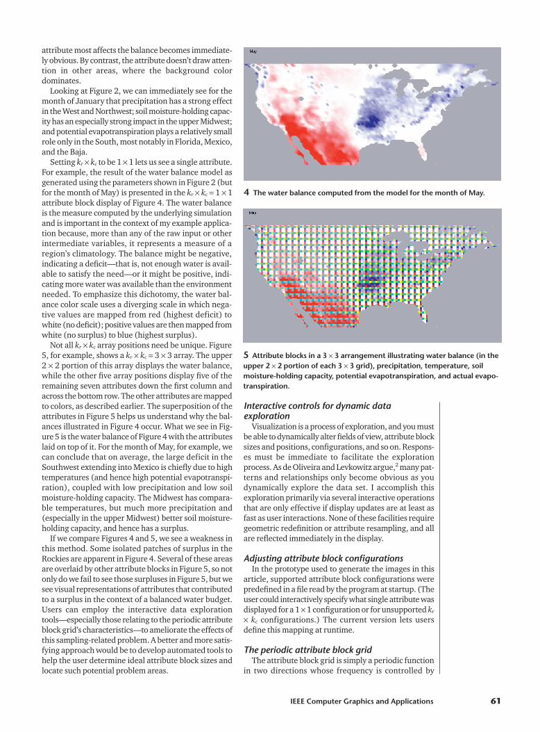
Using the raw data and some intermediate results, Iuse attribute blocks to display (subsets of) n � 8 attrib-utes. Figure 2 shows a collection of kr � kc � 2 � 2attribute blocks tiled across a map of the United States.The blocks encode four of the eight attributes: precipi-tation, temperature, soil moisture-holding capacity, andpotential evapotranspiration. The attributes’ color scalesare dynamically configurable. For the example in Fig-ure 2, they vary from the background color for lowattribute values, ramping up to blue (for precipitation),red (for temperature), green (for soil moisture-holdingcapacity), and cyan (for potential evapotranspiration)for high attribute values. These color assignments arethe ones my colleagues and I used in earlier work,1 andaren’t uncommon in climatology applications. Figure 3shows the legend dynamically generated for each kr �kc arrangement, showing both the color scales and thecurrent kr � kc structure.
Adjusting the color scales this way makes sense in thisapplication because Figure 2’s input attributes tend todrive the water balance away from 0 (that is, from per-fect balance) as their values increase. For example, astemperature increases, more water is needed, and thebalance decreases. As precipitation increases, morewater is available, and the balance increases. By usingthe background color for areas where such an attributehas a low value and a more distinct color when theattribute’s value is larger, the areas where a given
10 pixels10 pixels
10 pixels
1 A basic diagram of an attribute block with kr � kc = 2 �2 and br � bc = 5 � 5.
2 Attribute blocks in a 2 � 2 arrangement illustrating temperature, precipi-tation, soil moisture-holding capacity, and potential evapotranspiration.
3 Dynamically generated legend illustrating the colorscale used as well as the current kr � kc structure.
IEEE Computer Graphics and Applications 61
attribute most affects the balance becomes immediate-ly obvious. By contrast, the attribute doesn’t draw atten-tion in other areas, where the background colordominates.
Looking at Figure 2, we can immediately see for themonth of January that precipitation has a strong effectin the West and Northwest; soil moisture-holding capac-ity has an especially strong impact in the upper Midwest;and potential evapotranspiration plays a relatively smallrole only in the South, most notably in Florida, Mexico,and the Baja.
Setting kr � kc to be 1 � 1 lets us see a single attribute.For example, the result of the water balance model asgenerated using the parameters shown in Figure 2 (butfor the month of May) is presented in the kr � kc � 1 � 1attribute block display of Figure 4. The water balanceis the measure computed by the underlying simulationand is important in the context of my example applica-tion because, more than any of the raw input or otherintermediate variables, it represents a measure of aregion’s climatology. The balance might be negative,indicating a deficit—that is, not enough water is avail-able to satisfy the need—or it might be positive, indi-cating more water was available than the environmentneeded. To emphasize this dichotomy, the water bal-ance color scale uses a diverging scale in which nega-tive values are mapped from red (highest deficit) towhite (no deficit); positive values are then mapped fromwhite (no surplus) to blue (highest surplus).
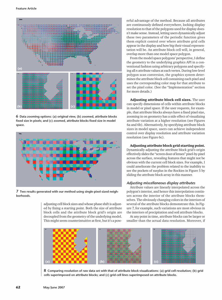
Not all kr � kc array positions need be unique. Figure5, for example, shows a kr � kc � 3 � 3 array. The upper2 � 2 portion of this array displays the water balance,while the other five array positions display five of theremaining seven attributes down the first column andacross the bottom row. The other attributes are mappedto colors, as described earlier. The superposition of theattributes in Figure 5 helps us understand why the bal-ances illustrated in Figure 4 occur. What we see in Fig-ure 5 is the water balance of Figure 4 with the attributeslaid on top of it. For the month of May, for example, wecan conclude that on average, the large deficit in theSouthwest extending into Mexico is chiefly due to hightemperatures (and hence high potential evapotranspi-ration), coupled with low precipitation and low soilmoisture-holding capacity. The Midwest has compara-ble temperatures, but much more precipitation and(especially in the upper Midwest) better soil moisture-holding capacity, and hence has a surplus.
If we compare Figures 4 and 5, we see a weakness inthis method. Some isolated patches of surplus in theRockies are apparent in Figure 4. Several of these areasare overlaid by other attribute blocks in Figure 5, so notonly do we fail to see those surpluses in Figure 5, but wesee visual representations of attributes that contributedto a surplus in the context of a balanced water budget.Users can employ the interactive data explorationtools—especially those relating to the periodic attributeblock grid’s characteristics—to ameliorate the effects ofthis sampling-related problem. A better and more satis-fying approach would be to develop automated tools tohelp the user determine ideal attribute block sizes andlocate such potential problem areas.
Interactive controls for dynamic dataexploration
Visualization is a process of exploration, and you mustbe able to dynamically alter fields of view, attribute blocksizes and positions, configurations, and so on. Respons-es must be immediate to facilitate the explorationprocess. As de Oliveira and Levkowitz argue,2 many pat-terns and relationships only become obvious as youdynamically explore the data set. I accomplish thisexploration primarily via several interactive operationsthat are only effective if display updates are at least asfast as user interactions. None of these facilities requiregeometric redefinition or attribute resampling, and allare reflected immediately in the display.
Adjusting attribute block configurationsIn the prototype used to generate the images in this
article, supported attribute block configurations werepredefined in a file read by the program at startup. (Theuser could interactively specify what single attribute wasdisplayed for a 1 � 1 configuration or for unsupported kr
� kc configurations.) The current version lets usersdefine this mapping at runtime.
The periodic attribute block gridThe attribute block grid is simply a periodic function
in two directions whose frequency is controlled by
5 Attribute blocks in a 3 � 3 arrangement illustrating water balance (in theupper 2 � 2 portion of each 3 � 3 grid), precipitation, temperature, soilmoisture-holding capacity, potential evapotranspiration, and actual evapo-transpiration.
4 The water balance computed from the model for the month of May.
Feature Article
62 May/June 2007
adjusting cell block sizes and whose phase shift is adjust-ed by fixing a starting point. Both the size of attributeblock cells and the attribute block grid’s origin aredecoupled from the geometry of the underlying model.This might seem counterintuitive at first, but it’s a pow-
erful advantage of the method. Because all attributesare continuously defined everywhere, locking displayresolution to that of the polygons used for display does-n’t make sense. Instead, letting users dynamically adjustthese two parameters of the periodic function givesthem explicit control over where attribute grid cellsappear in the display and how big their visual represen-tation will be. An attribute block cell will, in general,overlap more than one model space polygon.
From the model space polygons’ perspective, I definethe geometry to the underlying graphics API in a con-ventional fashion using arbitrary polygons and specify-ing all n attribute values at each vertex. During low-levelpolygon scan conversion, the graphics system deter-mines the attribute block cell containing each pixel anduses the corresponding color map for that attribute toset the pixel color. (See the “Implementation” sectionfor more details.)
Adjusting attribute block cell sizes. The usercan specify dimensions of cells within attribute blocksin model or pixel space. If the user requests, for exam-ple, that attribute blocks always have a fixed pixel size,zooming in on geometry has a side effect of visualizingattribute variation at a higher resolution (see Figures6a and 6b). Alternatively, by specifying attribute blocksizes in model space, users can achieve independentcontrol over display resolution and attribute variationresolution (see Figure 6c).
Adjusting attribute block grid starting point.Dynamically adjusting the attribute block grid’s origineffectively slides the “screen door of lenses” pixel-by-pixelacross the surface, revealing features that might not beobvious with the current cell block sizes. For example, Icould ameliorate the problem related to the inability tosee the pockets of surplus in the Rockies in Figure 5 bysliding the attribute block array in this manner.
Adjusting miscellaneous display attributesAttribute values are linearly interpolated across the
polygon’s interior, and hence this interpolation contin-ues across the interior of the attribute blocks them-selves. The obviously changing colors in the interiors ofseveral of the attribute blocks demonstrate this. In Fig-ure 7, for example, such variations are most obvious inthe interiors of precipitation and soil attribute blocks.
At any point in time, attribute blocks can be larger orsmaller than the actual data resolution. Moreover, if
6 Data zooming options: (a) original view, (b) zoomed, attribute blocksfixed size in pixels; and (c) zoomed, attribute blocks fixed size in modelspace.
7 Two results generated with our method using single-pixel-sized neigh-borhoods.
(a)
(b)
8 Comparing resolution of raw data set with that of attribute block visualizations: (a) grid cell resolution; (b) gridcells superimposed on attribute blocks; and (c) grid cell lines superimposed on attribute blocks.
(c)
(a) (b) (c)
IEEE Computer Graphics and Applications 63
attribute block sizes are specified in pixel space, this rela-tionship will change dynamically as the user zooms in orout. Users therefore need to be able to visualize how theresolution of the point-sampled data sets compares tothat of the attribute blocks themselves. Figure 8a showsthe data resolution for the display in Figure 6b; Figure8b shows the two images superimposed; and Figure 8cshows just the polygon grid lines superimposed on theattribute block display. (The polygons in the runningexample are bounded by latitude and longitude lines,hence the orientations of the polygons and the attributeblocks are the same. This is coincidental and is neitherassumed nor exploited anywhere in the application.)
Attribute rows and columnsA special case of note is when exactly one of kr or kc is
1. In that case, the attribute blocks become attributerows or attribute columns, respectively (see Figure 9).The relative advantages and disadvantages of attributerows and columns as compared to ordinary attributeblocks needs more study. For example, in some situa-tions it might be easier to visualize how an importantattribute varies across an entire field of view using rowsor columns of attributes. Although attribute blocks pro-vide good local information in terms of how relevantattributes affect important quantities in a given region,the block structure can make it difficult to comparetrends for two or more attributes simultaneously interms of their impact on composite quantities.
PointillismAdjusting the attribute blocks’ pixel sizes can be use-
ful when exploring a data set for unknown patterns ininput data. The display in Figure 10 is the kr � kc � 2 � 2case of Figure 2, but for the month of May with attributeblock sizes set in pixel space with br � bc � 1 � 1. Theresulting display has the feel of pointillism (a type ofgraphical display that uses small colored dots to simu-late an image composed of a much wider range of col-ors). It’s immediately clear where various inputparameters have the strongest effect: soil in the upperMidwest, temperature in the Southwest, and precipita-tion in the Northwest and much of the East.
The example in Figure 11a (next page) is an attemptto replicate this feel for the kr � kc � 3 � 3 case of Figure5 (and again with br � bc � 1 � 1 in pixel space). Theattribute blocks for the principal input parameters tendto be too small to permit an adequate visualization oftheir impact on the computed water balance.
The 10 � 10-pixel attribute blocks in Figure 5 seemedreasonable. But how small can the blocks be whileremaining effective? The optimal (or minimal) sizeseems to depend on the application and the data. Empir-ically, I’ve found br � bc � 3 � 3 to be a reasonable lowerboundary in many instances. Figure 11b shows the br �bc � 3 � 3 case with kr � kc � 3 � 3 for our sample data setin the month of May.
Using attribute blocks for uncertaintyvisualization
Scientific models and the physical data that drivethem are subject to errors and uncertainty. Error in this
context is generally understood to describe raw dataincorrectly captured or recorded. By contrast, uncer-tainty refers to how confident you are in the results ofsome physical simulation, either a self-contained appli-cation or one driven by one or more raw data sets.1
Many techniques exist for modeling, measuring, anddisplaying uncertainty arising from scientific computa-tions.1,3 For the water balance model example, manyinterpolated global temperature, precipitation, and soildata sets are available. These interpolated data sets dif-fer in what raw physical data the scientists used, howthey interpolated the data, and whether they used var-ious corrections to known problems (or relevant physi-cal characteristics such as altitude). Comparing the
9 Two special cases occurring when either kr or kc is 1: (a) attributecolumns and (b) attribute rows.
10 Setting attribute block size to 1 � 1 in pixel space achieves a pointillismeffect.
(a)
(b)
results from using these different data sets provides oneway to measure uncertainty in model results.1
We can use attribute blocks to look for patterns ofagreement or disagreement between raw data sets. Forexample, we can assign different temperature datasources to an attribute block array’s elements andexplore a region. In this case, we use the same colorramp for all attribute block elements because they allcorrespond to temperature. We’d expect to see little orno block pattern in areas where the data sets are inagreement. On the other hand, areas where the attributeblocks are visually obvious suggest appreciable disagree-ment among the selected data sets.
Figure 12 shows temperature data sets for India andsome surrounding areas. Although there is clearly littledisagreement in the heart of the country, considerabledifferences exist in projected average temperatures forthe month of January in the mountainous area of theNortheast, as well as some disagreement in the North-west. Specifically, two of the data sets consistently pre-dict cooler temperatures in these areas. Examining thecorresponding data sources, we learn that one of themuses an interpolation scheme modified to account foraltitude differences. The other uses fewer raw stationsand limits data to a recent 30-year period.
Similar areas of uncertainty are evident in precipita-tion data sets. Figure 13a shows considerable differencesin the predicted average precipitation levels for themonth of August. However, little disagreement existsfor the month of December, as Figure 13b indicates.
Some comparisonsI compare some visualizations using attribute blocks
with select techniques from the “Previous Work” side-bar. As noted, application domains can be characterizedby data with defined values only at discrete locations orcontinuously throughout the display region. Displaygoals and strategies are different for the two domains,so I don’t include here those that are primarily applica-ble to the discrete domain.
We can generate Beddow’s displays(see the sidebar)as a special case of attribute blocks. Specifically, sup-pose there are n attributes whose values have been sam-pled at a spatial resolution of Dx � Dy. We set kr and kc so
Feature Article
64 May/June 2007
(a)
(b)
11 Attribute blocks in a 3 � 3 arrangement as in Figure 5, except with (a)br � bc � 1 � 1 and (b) br � bc � 3 � 3.
12 Exploring temperature uncertainty in India.
13 Exploring precipitation uncertainty in India: (a) considerable differences exist for the month of August, but (b)few differences exist for the month of December.
(b)(a)
IEEE Computer Graphics and Applications 65
there is a slot for each of the n attributes (that is, n � kr
� kc). We specify that attribute block sizes are fixed inmodel space and set to br � Dy/kr and bc � Dx/kc. Linearinterpolation across the attribute blocks can be enabledor disabled as desired.
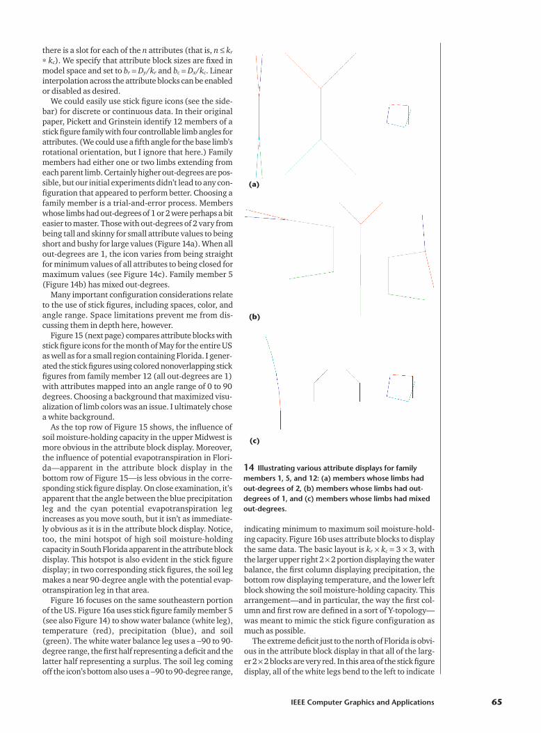
We could easily use stick figure icons (see the side-bar) for discrete or continuous data. In their originalpaper, Pickett and Grinstein identify 12 members of astick figure family with four controllable limb angles forattributes. (We could use a fifth angle for the base limb’srotational orientation, but I ignore that here.) Familymembers had either one or two limbs extending fromeach parent limb. Certainly higher out-degrees are pos-sible, but our initial experiments didn’t lead to any con-figuration that appeared to perform better. Choosing afamily member is a trial-and-error process. Memberswhose limbs had out-degrees of 1 or 2 were perhaps a biteasier to master. Those with out-degrees of 2 vary frombeing tall and skinny for small attribute values to beingshort and bushy for large values (Figure 14a). When allout-degrees are 1, the icon varies from being straightfor minimum values of all attributes to being closed formaximum values (see Figure 14c). Family member 5(Figure 14b) has mixed out-degrees.
Many important configuration considerations relateto the use of stick figures, including spaces, color, andangle range. Space limitations prevent me from dis-cussing them in depth here, however.
Figure 15 (next page) compares attribute blocks withstick figure icons for the month of May for the entire USas well as for a small region containing Florida. I gener-ated the stick figures using colored nonoverlapping stickfigures from family member 12 (all out-degrees are 1)with attributes mapped into an angle range of 0 to 90degrees. Choosing a background that maximized visu-alization of limb colors was an issue. I ultimately chosea white background.
As the top row of Figure 15 shows, the influence ofsoil moisture-holding capacity in the upper Midwest ismore obvious in the attribute block display. Moreover,the influence of potential evapotranspiration in Flori-da—apparent in the attribute block display in the bottom row of Figure 15—is less obvious in the corre-sponding stick figure display. On close examination, it’sapparent that the angle between the blue precipitationleg and the cyan potential evapotranspiration legincreases as you move south, but it isn’t as immediate-ly obvious as it is in the attribute block display. Notice,too, the mini hotspot of high soil moisture-holdingcapacity in South Florida apparent in the attribute blockdisplay. This hotspot is also evident in the stick figuredisplay; in two corresponding stick figures, the soil legmakes a near 90-degree angle with the potential evap-otranspiration leg in that area.
Figure 16 focuses on the same southeastern portionof the US. Figure 16a uses stick figure family member 5(see also Figure 14) to show water balance (white leg),temperature (red), precipitation (blue), and soil(green). The white water balance leg uses a �90 to 90-degree range, the first half representing a deficit and thelatter half representing a surplus. The soil leg comingoff the icon’s bottom also uses a �90 to 90-degree range,
indicating minimum to maximum soil moisture-hold-ing capacity. Figure 16b uses attribute blocks to displaythe same data. The basic layout is kr � kc � 3 � 3, withthe larger upper right 2 � 2 portion displaying the waterbalance, the first column displaying precipitation, thebottom row displaying temperature, and the lower leftblock showing the soil moisture-holding capacity. Thisarrangement—and in particular, the way the first col-umn and first row are defined in a sort of Y-topology—was meant to mimic the stick figure configuration asmuch as possible.
The extreme deficit just to the north of Florida is obvi-ous in the attribute block display in that all of the larg-er 2 � 2 blocks are very red. In this area of the stick figuredisplay, all of the white legs bend to the left to indicate
(a)
14 Illustrating various attribute displays for familymembers 1, 5, and 12: (a) members whose limbs hadout-degrees of 2, (b) members whose limbs had out-degrees of 1, and (c) members whose limbs had mixedout-degrees.
(b)
(c)
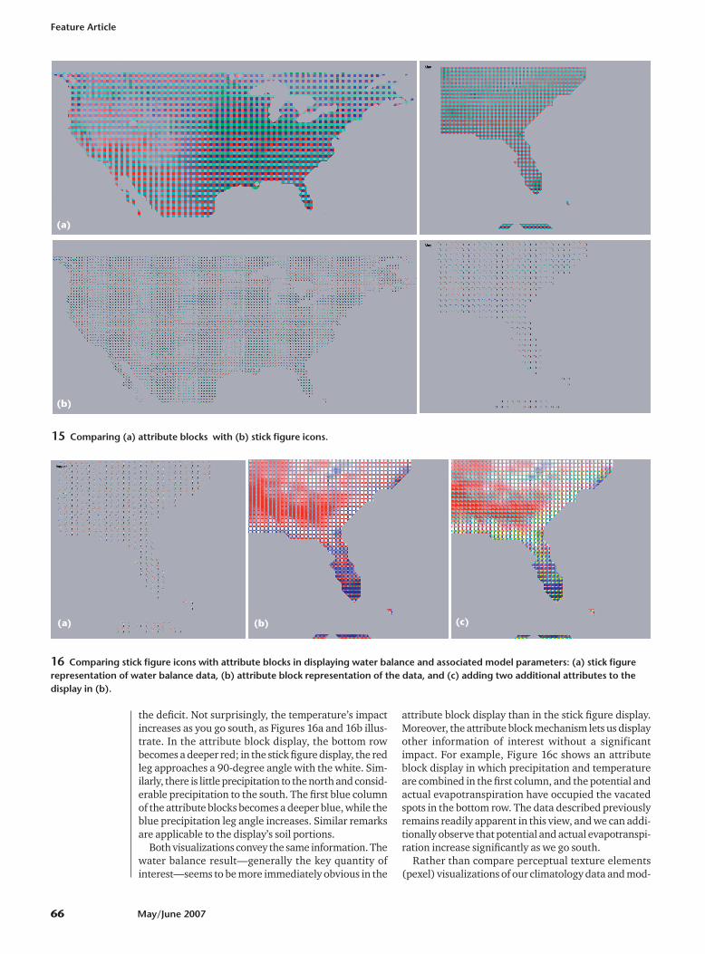
the deficit. Not surprisingly, the temperature’s impactincreases as you go south, as Figures 16a and 16b illus-trate. In the attribute block display, the bottom rowbecomes a deeper red; in the stick figure display, the redleg approaches a 90-degree angle with the white. Sim-ilarly, there is little precipitation to the north and consid-erable precipitation to the south. The first blue columnof the attribute blocks becomes a deeper blue, while theblue precipitation leg angle increases. Similar remarksare applicable to the display’s soil portions.
Both visualizations convey the same information. Thewater balance result—generally the key quantity ofinterest—seems to be more immediately obvious in the
attribute block display than in the stick figure display.Moreover, the attribute block mechanism lets us displayother information of interest without a significantimpact. For example, Figure 16c shows an attributeblock display in which precipitation and temperatureare combined in the first column, and the potential andactual evapotranspiration have occupied the vacatedspots in the bottom row. The data described previouslyremains readily apparent in this view, and we can addi-tionally observe that potential and actual evapotranspi-ration increase significantly as we go south.
Rather than compare perceptual texture elements(pexel) visualizations of our climatology data and mod-
Feature Article
66 May/June 2007
(a)
15 Comparing (a) attribute blocks with (b) stick figure icons.
(b)
(a) (b) (c)
16 Comparing stick figure icons with attribute blocks in displaying water balance and associated model parameters: (a) stick figurerepresentation of water balance data, (b) attribute block representation of the data, and (c) adding two additional attributes to thedisplay in (b).
IEEE Computer Graphics and Applications 67
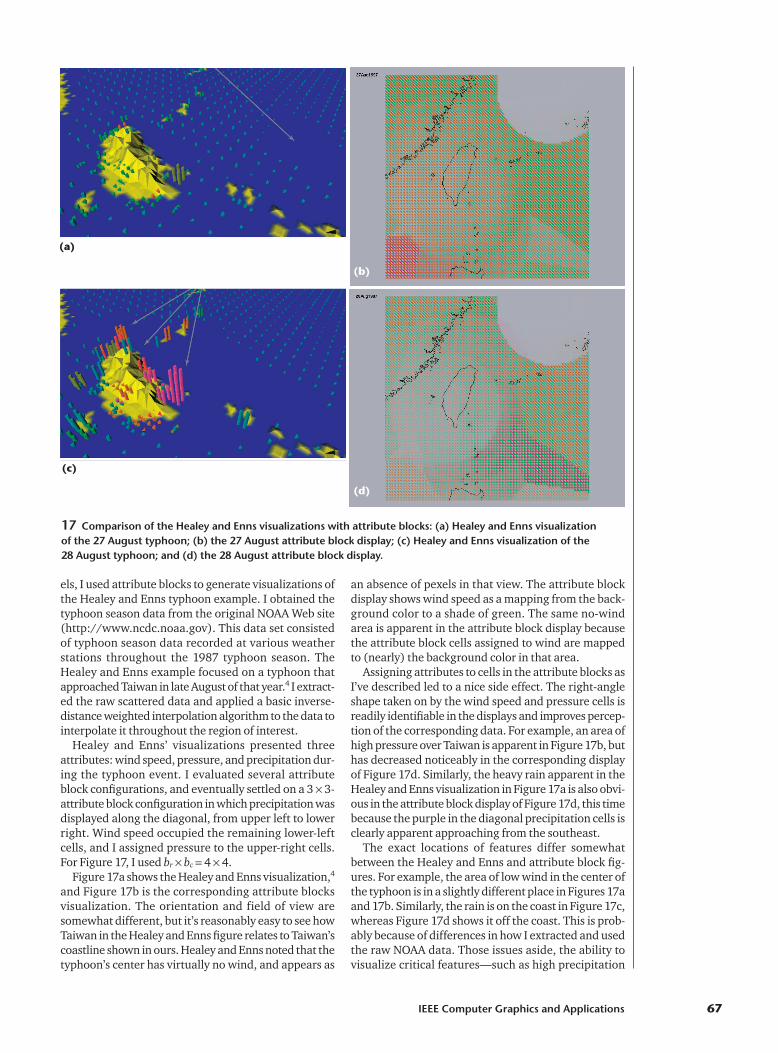
els, I used attribute blocks to generate visualizations ofthe Healey and Enns typhoon example. I obtained thetyphoon season data from the original NOAA Web site(http://www.ncdc.noaa.gov). This data set consistedof typhoon season data recorded at various weather stations throughout the 1987 typhoon season. TheHealey and Enns example focused on a typhoon thatapproached Taiwan in late August of that year.4 I extract-ed the raw scattered data and applied a basic inverse-distance weighted interpolation algorithm to the data tointerpolate it throughout the region of interest.
Healey and Enns’ visualizations presented threeattributes: wind speed, pressure, and precipitation dur-ing the typhoon event. I evaluated several attributeblock configurations, and eventually settled on a 3 � 3-attribute block configuration in which precipitation wasdisplayed along the diagonal, from upper left to lowerright. Wind speed occupied the remaining lower-leftcells, and I assigned pressure to the upper-right cells.For Figure 17, I used br � bc � 4 � 4.
Figure 17a shows the Healey and Enns visualization,4
and Figure 17b is the corresponding attribute blocksvisualization. The orientation and field of view aresomewhat different, but it’s reasonably easy to see howTaiwan in the Healey and Enns figure relates to Taiwan’scoastline shown in ours. Healey and Enns noted that thetyphoon’s center has virtually no wind, and appears as
an absence of pexels in that view. The attribute blockdisplay shows wind speed as a mapping from the back-ground color to a shade of green. The same no-windarea is apparent in the attribute block display becausethe attribute block cells assigned to wind are mappedto (nearly) the background color in that area.
Assigning attributes to cells in the attribute blocks asI’ve described led to a nice side effect. The right-angleshape taken on by the wind speed and pressure cells isreadily identifiable in the displays and improves percep-tion of the corresponding data. For example, an area ofhigh pressure over Taiwan is apparent in Figure 17b, buthas decreased noticeably in the corresponding displayof Figure 17d. Similarly, the heavy rain apparent in theHealey and Enns visualization in Figure 17a is also obvi-ous in the attribute block display of Figure 17d, this timebecause the purple in the diagonal precipitation cells isclearly apparent approaching from the southeast.
The exact locations of features differ somewhatbetween the Healey and Enns and attribute block fig-ures. For example, the area of low wind in the center ofthe typhoon is in a slightly different place in Figures 17aand 17b. Similarly, the rain is on the coast in Figure 17c,whereas Figure 17d shows it off the coast. This is prob-ably because of differences in how I extracted and usedthe raw NOAA data. Those issues aside, the ability tovisualize critical features—such as high precipitation
17 Comparison of the Healey and Enns visualizations with attribute blocks: (a) Healey and Enns visualization of the 27 August typhoon; (b) the 27 August attribute block display; (c) Healey and Enns visualization of the 28 August typhoon; and (d) the 28 August attribute block display.
(a)
(b)
(d)
(c)
and absence of wind—is clear. I don’t claim that eitherapproach is uniformly better, but that they represent dif-ferent ways to see the data.
ImplementationOur implementation uses the OpenGL programmable
vertex and fragment shader capability.5 Typically, anapplication defines a scene’s geometry to the OpenGLengine during a display callback using geometric formsand attributes predefined in OpenGL. For example,OpenGL knows about such rendering-related attributesas RGB colors and normal vectors. Current values ofthese attributes are associated with vertices of primitivesand are sent down the graphics pipeline with them.
In a conventional OpenGL program, the pipeline is ablack box. It contains a vertexshader, which performs per-ver-tex operations such as calculat-ing a lighting model. OpenGLlinearly interpolates the resultsof these per-vertex operationsacross the interior of the owningprimitive during the primitivereassembly and scan-conversionprocess. It then invokes a frag-ment shader for each pixel iden-tified during scan conversion.This shader is responsible for cal-culating and setting the pixelcolor. Using the OpenGL Shad-ing Language, I can replace thestandard vertex and fragment shader computations witharbitrary processing, provided that I follow certain basicconventions.5
I used this mechanism for my attribute block render-ings. I associated the eight water-balance attributes withvertices of the polygon and communicated them to aspecialized vertex shader. That shader mapped theattribute values into a 0-to-1 range and arranged forthese mapped values to be linearly interpolated acrossthe primitive.
Our fragment shader is somewhat more complex. Ituses the current kr � kc and br � bc settings to determinethe attribute block cell in which the current pixel lies.This is actually a two-step process because it first deter-mines the (i, j) cell index (0 � i � kr; 0 � j � kc) from thekr, kc, br, and bc values, and then determines the actualattribute to which that (i, j) position corresponds basedon the current assignment of attributes to cell locationsin the attribute-block array. Once the fragment shaderidentifies the appropriate attribute, it accesses the cor-responding interpolated attribute value and color rampand generates the resulting pixel color.
The ability to relegate these operations to the vertexand especially the fragment shader lets us decoupleattribute block cells from the geometry definition andwas critical to our implementation’s success. Moreover,the entire C program is independent of the actualdata. Our data file begins with a short header describ-ing the data. The vertex and fragment shaders are thenin separate files and use the variable names identifiedin the data file. To use attribute blocks in a different
context, you need only design the data file headerappropriately.
From the fragment shader’s perspective, attributeblock cell sizes are always specified in pixel units. If theuser wants to fix these cell sizes in model space, theapplication computes the pixel dimensions based on thecurrent field of view and viewport dimensions at thebeginning of each display callback. In either event, thefragment shader simply gets (via uniform variables5)the current br � bc dimensions in pixel units.
Ongoing and future workAlthough my preliminary experiences with attribute
block visualizations are positive, several limitationsand areas of further study are apparent. Most notably,
several questions related tosampling and its relationship todetermining ideal attributeblock cell sizes merit additionalwork. As I discussed in the con-text of Figures 4 and 5, in thecurrent system, the user mustdetect and deal with undersam-pling problems by adjusting cellsizes and origins. Although thissometimes works, a much bet-ter approach would be to devel-op tools that could analyze theunderlying data, suggest cellsizes, and perhaps even developsimple animations by automat-
ically cycling through cell size and/or phase shiftadjustments.
Attribute data is linearly interpolated across the inte-rior of model space polygons, hence also across the inte-rior of attribute block cells. A better understanding ofthis linear interpolation’s limitations is needed. Doesswitching between linear interpolation functions in anattribute block cell’s interior cause visible discontinu-ities? Should discontinuities be preserved so as toemphasize the resolution of the underlying data? Arethere advantages to using higher-order interpolationfunctions?
My approach currently uses only color to displayattribute values. I could also use texture variations (seethe sidebar). As for the colors themselves, I need a moresystematic study of color ensembles and how users per-ceive them. Earlier work used color mappings,1 butbecause we never displayed mixed data types in thateffort, we avoided potential problems related to coloroverloading. For example, a red ramp in Figure 5 indi-cates temperature; in that same figure, it’s also part ofthe diverging color ramp used for the water balance.
The interplay between shapes taken on by attributecell assignments in an attribute block and perceptionneeds more study. As I mentioned when comparingattribute blocks with pexel displays, the specific shapestaken on by the wind speed, pressure, and precipitationcells in the attribute block display played an importantrole in bringing out the values of the correspondingattributes. We need to better understand how to exploitsuch shape-related cues. ■
Feature Article
68 May/June 2007
The ability to decouple
attribute block cells
from the geometry
definition was critical
to our implementation’s
success.
AcknowledgmentsI thank the reviewers for pointing me to several use-
ful related references and for providing many extreme-ly helpful suggestions to make the description muchmore complete and clear. I also thank Johan Feddemaand Terry Slocum for the data sets used in the runningexample here as well as for providing helpful sugges-tions to improve interactions with the visualizations.
References1. D.C. Cliburn et al., “Design and Evaluation of a Decision
Support System in a Water Balance Application,” Comput-ers and Graphics, vol. 26, no. 6, Dec. 2002, pp. 931-949.
2. M.C.F. de Oliveira and H. Levkowitz, “From Visual DataExploration to Visual Data Mining: A Survey,” IEEE Trans.Visualization and Computer Graphics, vol. 9, no. 3, July-Sept. 2003, pp. 378-394.
3. A. MacEachren, “Visualizing Uncertain Information,” Car-tographic Perspective, vol. 13, 1992, pp. 10-19.
4. C.G. Healey and J.T. Enns, “Large Datasets at a Glance:Combining Textures and Colors in Scientific Visualization,”IEEE Trans. Visualization and Computer Graphics, vol. 5,no. 2, Apr.-June 1999, pp. 145-167.
5. R.J. Rost, OpenGL Shading Language, Addison-Wesley,2006.
James R. Miller is an associate pro-fessor of computer science in theDepartment of Electrical Engineeringand Computer Science and codirectorof the eLearning DesignLab at the Uni-versity of Kansas. His research inter-ests include computer graphics,scientific visualization, geometric
modeling, and e-learning. He has a PhD in computer science from Purdue University. Contact him at [email protected].
Article submitted: 9 Feb. 2006; revised: 14 Oct. 2006;
accepted: 18 Nov. 2006.
IEEE Computer Graphics and Applications 69
Get accessto individual IEEE Computer Society
documents online.
More than 100,000 articles and conference papers available!
$9US per article for members
$19US for nonmembers
www.computer.org/publications/dlib