Embed Size (px)
Citation preview

Assignment: ggplot2
Purpose: The purpose of this assignment is “trial by fire” in ggplot. You will be required to
apply the skills covered in lab, and also to take the concepts that you learned about ggplot and
extend them to new packages and new types of graphs that were not covered in lab. You will
most likely have to use the help features in RStudio and you will no doubt find yourself googling
many ggplot graphing features. The basics were covered in our lab. But finding the right way
to tell a story about data will often require you to follow an iterative exploration process. I
demonstrate my process below, and I challenge you to follow it and to augment it with your
own.
What you need to do:
Follow along my exploration process detailed below. Recreate my steps,
and answer any questions that are listed. I start off giving you a small
snippet of code. Sometimes I describe what I did, without giving you the
actual code. Sometimes I simply state my objective, without describing my
steps in R. Your job is to recreate my steps, and also answer any questions
that I pose. Clearly number your graphs and your text answers as
“comments” in your source code.
In addition, prepare a report (in Word or similar), which addresses each
point below, if the point requires some type of answer or action. Copy and
paste snippets of your code and the resulting graphs, with your own
comments and explanations, so that I can follow your thought processes in
recreating these visualizations. This should be written as a report to the
user who is interested in your understanding and interpretation of the data.
I specify 5 R source code files for you include in your R project.
FYI: For one of the graphs, I was inspired by something I saw online. But
nearly everything in this assignment is original, which means that barring a
very unlikely coincidence, you will not find it online. Just sayin’. So no
shortcuts….
Be creative and meaningful for Step #9.
And enjoy! This is really fun!
I Scatter Plot
1. Create a new project in RStudio. Name it ggplot-HW-yourname.
2. Name the default R source file Scatter.R.
3. Set your working directory to wherever you have saved your project. This means that
you will either store your dataset in that directory, or you will read in your dataset using
the full path for it. (For these homeworks, I would opt to store it in the same directory,
just to make things easy. But you certainly may prefer to store all of your data files in
one directory.)
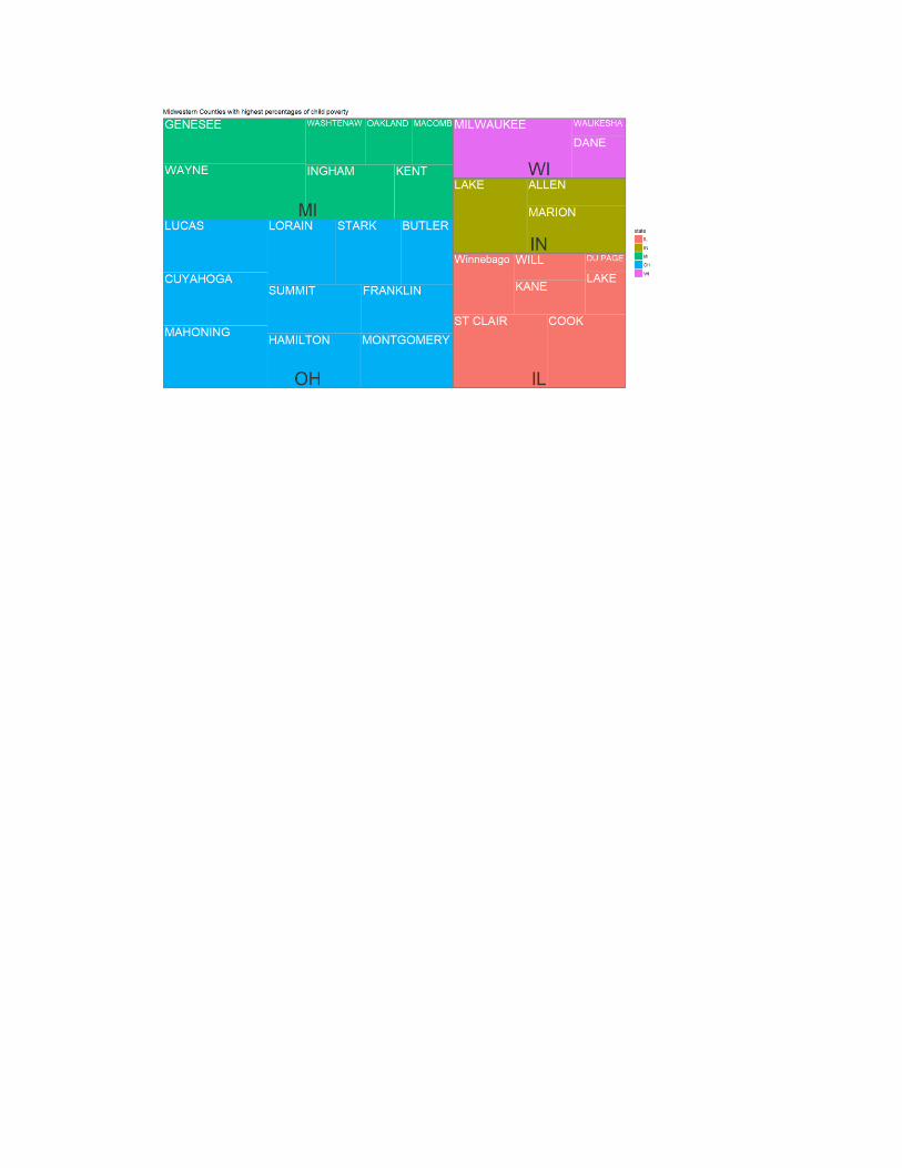
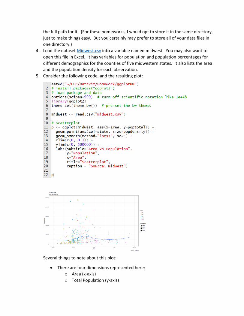
4. Load the dataset Midwest.csv into a variable named midwest. You may also want to
open this file in Excel. It has variables for population and population percentages for
different demographics for the counties of five midwestern states. It also lists the area
and the population density for each observation.
5. Consider the following code, and the resulting plot:
Several things to note about this plot:
• There are four dimensions represented here:
o Area (x-axis)
o Total Population (y-axis)
o State (color)
o Population Density (bubble size)
• The y-axis is set to go as high as 500,000. Look at the data in your spreadsheet.
How many counties are not displayed on this plot? Would you consider these
counties to be outliers? Does their omission lessen the usefulness of the
information communicated in the plot, or is it “okay” for them to be omitted? In
other words, what purpose does this visualization serve, and in what ways is it
effective or ineffective?
• If you want to include the omitted counties, what would you have to change?
Change it. What new issues does this present to this graph? Is there a good
solution to this problem? Include your graph, and comment on why it is an
improvement or not.
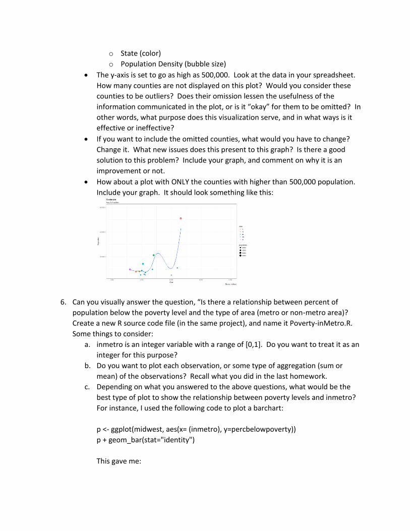
• How about a plot with ONLY the counties with higher than 500,000 population.
Include your graph. It should look something like this:
6. Can you visually answer the question, “Is there a relationship between percent of
population below the poverty level and the type of area (metro or non-metro area)?
Create a new R source code file (in the same project), and name it Poverty-inMetro.R.
Some things to consider:
a. inmetro is an integer variable with a range of [0,1]. Do you want to treat it as an
integer for this purpose?
b. Do you want to plot each observation, or some type of aggregation (sum or
mean) of the observations? Recall what you did in the last homework.
c. Depending on what you answered to the above questions, what would be the
best type of plot to show the relationship between poverty levels and inmetro?
For instance, I used the following code to plot a barchart:
p <- ggplot(midwest, aes(x= (inmetro), y=percbelowpoverty))
p + geom_bar(stat="identity")
This gave me:
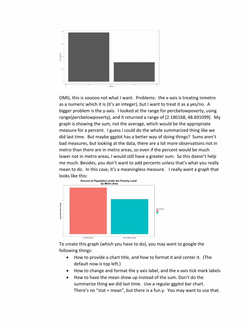
OMG, this is sooooo not what I want. Problems: the x-axis is treating inmetro
as a numeric which it is (it’s an integer), but I want to treat it as a yes/no. A
bigger problem is the y-axis. I looked at the range for percbelowpoverty, using
range(percbelowpoverty), and it returned a range of [2.180168, 48.691099]. My
graph is showing the sum, not the average, which would be the appropriate
measure for a percent. I guess I could do the whole summarized thing like we
did last time. But maybe ggplot has a better way of doing things? Sums aren’t
bad measures, but looking at the data, there are a lot more observations not in
metro than there are in metro areas, so even if the percent would be much
lower not in metro areas, I would still have a greater sum. So this doesn’t help
me much. Besides, you don’t want to add percents unless that’s what you really
mean to do. In this case, it’s a meaningless measure. I really want a graph that
looks like this:
To create this graph (which you have to do), you may want to google the
following things:
• How to provide a chart title, and how to format it and center it. (The
default now is top left.)
• How to change and format the y axis label, and the x-axis tick mark labels
• How to have the mean show up instead of the sum. Don’t do the
summarize thing we did last time. Use a regular ggplot bar chart.
There’s no “stat = mean”, but there is a fun.y. You may want to use that.
• I used factor(inmetro) in the aes of my ggplot. So I had to explicitly
change the x axis tick marks. I supposed you could also change inmetro
itself to a factor and change the names of the levels.
• Feel free to change the colors and the formatting. In fact, do change
them.
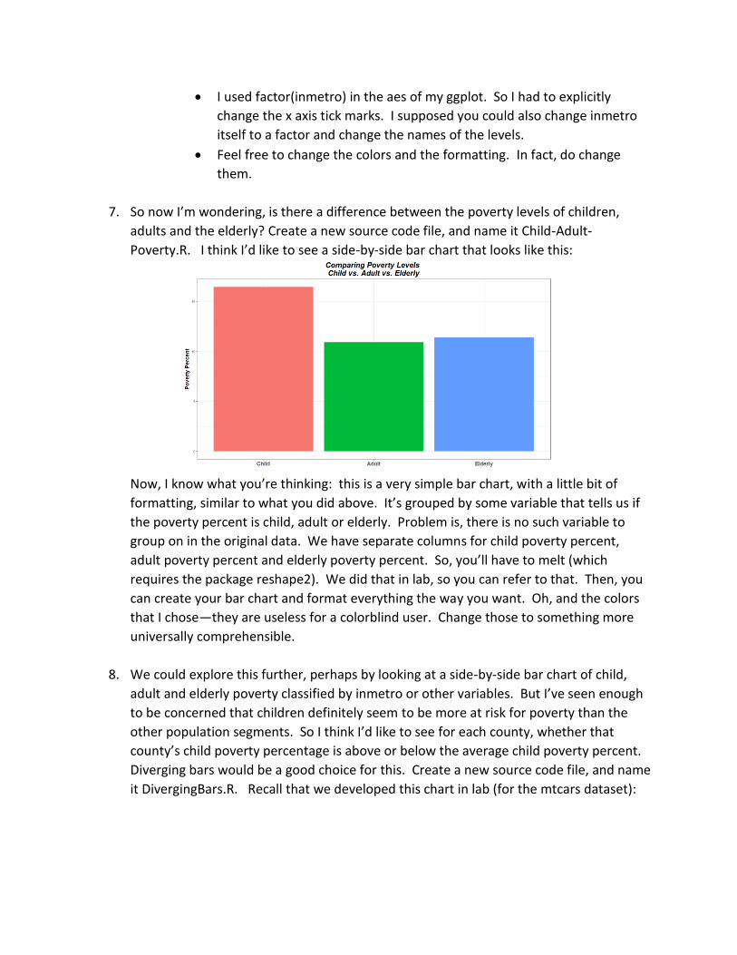
7. So now I’m wondering, is there a difference between the poverty levels of children,
adults and the elderly? Create a new source code file, and name it Child-Adult-
Poverty.R. I think I’d like to see a side-by-side bar chart that looks like this:
Now, I know what you’re thinking: this is a very simple bar chart, with a little bit of
formatting, similar to what you did above. It’s grouped by some variable that tells us if
the poverty percent is child, adult or elderly. Problem is, there is no such variable to
group on in the original data. We have separate columns for child poverty percent,
adult poverty percent and elderly poverty percent. So, you’ll have to melt (which
requires the package reshape2). We did that in lab, so you can refer to that. Then, you
can create your bar chart and format everything the way you want. Oh, and the colors
that I chose—they are useless for a colorblind user. Change those to something more
universally comprehensible.
8. We could explore this further, perhaps by looking at a side-by-side bar chart of child,
adult and elderly poverty classified by inmetro or other variables. But I’ve seen enough
to be concerned that children definitely seem to be more at risk for poverty than the
other population segments. So I think I’d like to see for each county, whether that
county’s child poverty percentage is above or below the average child poverty percent.
Diverging bars would be a good choice for this. Create a new source code file, and name
it DivergingBars.R. Recall that we developed this chart in lab (for the mtcars dataset):
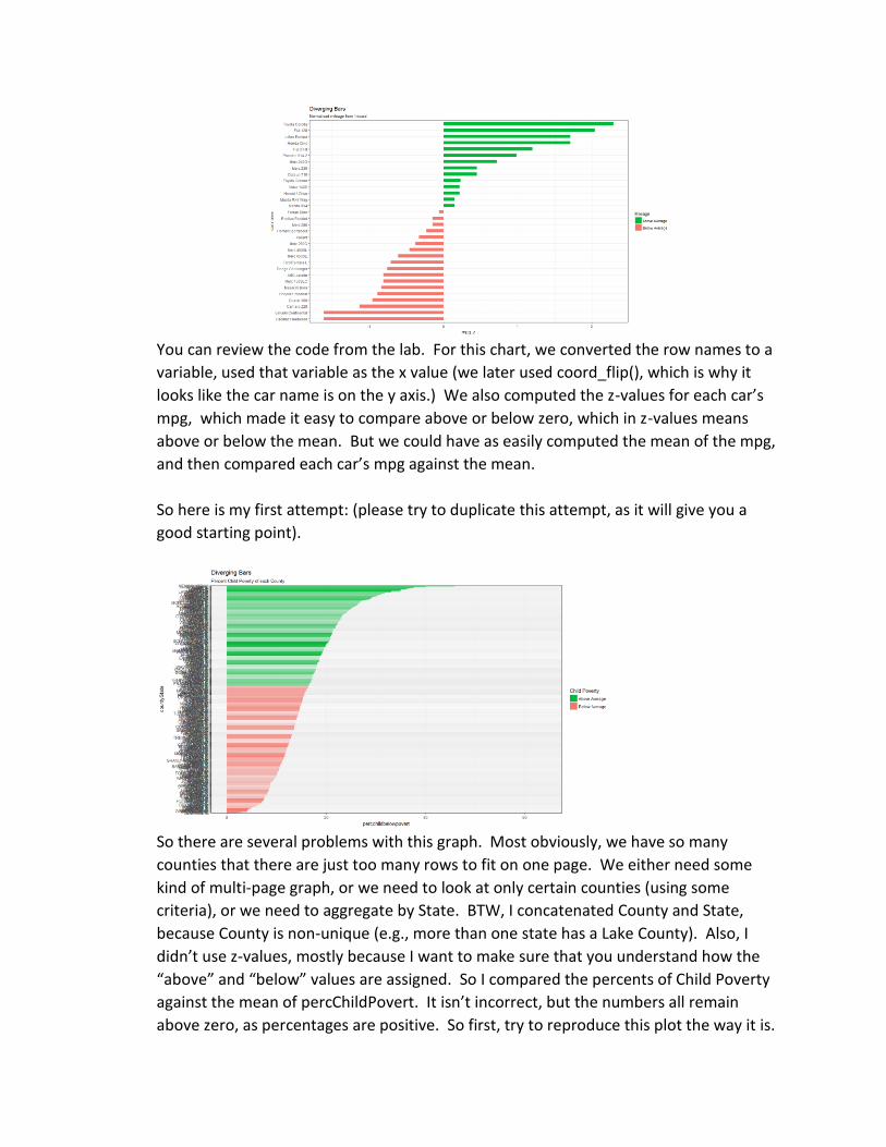
You can review the code from the lab. For this chart, we converted the row names to a
variable, used that variable as the x value (we later used coord_flip(), which is why it
looks like the car name is on the y axis.) We also computed the z-values for each car’s
mpg, which made it easy to compare above or below zero, which in z-values means
above or below the mean. But we could have as easily computed the mean of the mpg,
and then compared each car’s mpg against the mean.
So here is my first attempt: (please try to duplicate this attempt, as it will give you a
good starting point).
So there are several problems with this graph. Most obviously, we have so many
counties that there are just too many rows to fit on one page. We either need some
kind of multi-page graph, or we need to look at only certain counties (using some
criteria), or we need to aggregate by State. BTW, I concatenated County and State,
because County is non-unique (e.g., more than one state has a Lake County). Also, I
didn’t use z-values, mostly because I want to make sure that you understand how the
“above” and “below” values are assigned. So I compared the percents of Child Poverty
against the mean of percChildPovert. It isn’t incorrect, but the numbers all remain
above zero, as percentages are positive. So first, try to reproduce this plot the way it is.
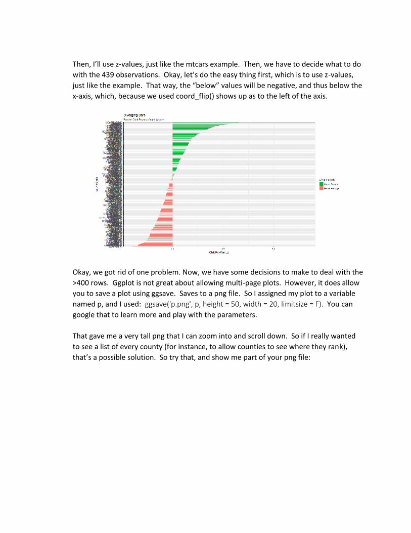
Then, I’ll use z-values, just like the mtcars example. Then, we have to decide what to do
with the 439 observations. Okay, let’s do the easy thing first, which is to use z-values,
just like the example. That way, the “below” values will be negative, and thus below the
x-axis, which, because we used coord_flip() shows up as to the left of the axis.
Okay, we got rid of one problem. Now, we have some decisions to make to deal with the
>400 rows. Ggplot is not great about allowing multi-page plots. However, it does allow
you to save a plot using ggsave. Saves to a png file. So I assigned my plot to a variable
named p, and I used: ggsave('p.png', p, height = 50, width = 20, limitsize = F). You can
google that to learn more and play with the parameters.
That gave me a very tall png that I can zoom into and scroll down. So if I really wanted
to see a list of every county (for instance, to allow counties to see where they rank),
that’s a possible solution. So try that, and show me part of your png file:
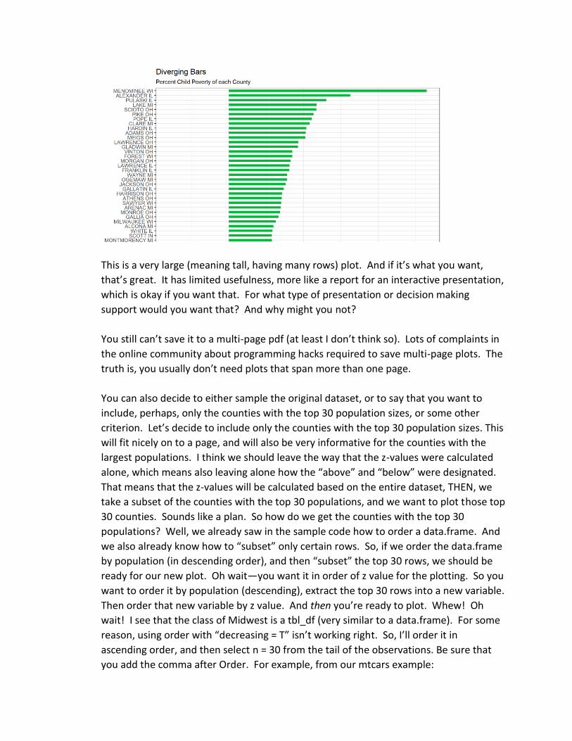
This is a very large (meaning tall, having many rows) plot. And if it’s what you want,
that’s great. It has limited usefulness, more like a report for an interactive presentation,
which is okay if you want that. For what type of presentation or decision making
support would you want that? And why might you not?
You still can’t save it to a multi-page pdf (at least I don’t think so). Lots of complaints in
the online community about programming hacks required to save multi-page plots. The
truth is, you usually don’t need plots that span more than one page.
You can also decide to either sample the original dataset, or to say that you want to
include, perhaps, only the counties with the top 30 population sizes, or some other
criterion. Let’s decide to include only the counties with the top 30 population sizes. This
will fit nicely on to a page, and will also be very informative for the counties with the
largest populations. I think we should leave the way that the z-values were calculated
alone, which means also leaving alone how the “above” and “below” were designated.
That means that the z-values will be calculated based on the entire dataset, THEN, we
take a subset of the counties with the top 30 populations, and we want to plot those top
30 counties. Sounds like a plan. So how do we get the counties with the top 30
populations? Well, we already saw in the sample code how to order a data.frame. And
we also already know how to “subset” only certain rows. So, if we order the data.frame
by population (in descending order), and then “subset” the top 30 rows, we should be
ready for our new plot. Oh wait—you want it in order of z value for the plotting. So you
want to order it by population (descending), extract the top 30 rows into a new variable.
Then order that new variable by z value. And then you’re ready to plot. Whew! Oh
wait! I see that the class of Midwest is a tbl_df (very similar to a data.frame). For some
reason, using order with “decreasing = T” isn’t working right. So, I’ll order it in
ascending order, and then select n = 30 from the tail of the observations. Be sure that
you add the comma after Order. For example, from our mtcars example:
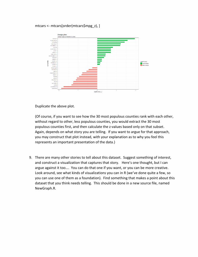
mtcars <- mtcars[order(mtcars$mpg_z), ]
Duplicate the above plot.
(Of course, if you want to see how the 30 most populous counties rank with each other,
without regard to other, less populous counties, you would extract the 30 most
populous counties first, and then calculate the z-values based only on that subset.
Again, depends on what story you are telling. If you want to argue for that approach,
you may construct that plot instead, with your explanation as to why you feel this
represents an important presentation of the data.)
9. There are many other stories to tell about this dataset. Suggest something of interest,
and construct a visualization that captures that story. Here’s one thought, but I can
argue against it too…. You can do that one if you want, or you can be more creative.
Look around, see what kinds of visualizations you can in R (we’ve done quite a few, so
you can use one of them as a foundation). Find something that makes a point about this
dataset that you think needs telling. This should be done in a new source file, named
NewGraph.R.