Embed Size (px)
Citation preview

Assignment 3
Due Thursday September 28 at 11:59pm on Blackboard
As before, the questions without solutions (here, the last two) are an assignment: you need to do thesequestions yourself and hand them in (instructions below).
The assignment is due on the date shown above. An assignment handed in after the deadline is late, andmay or may not be accepted (see course outline). My solutions to the assignment questions will be availablewhen everyone has handed in their assignment.
You are reminded that work handed in with your name on it must be entirely your own work.
Assignments are to be handed in on Blackboard. Instructions are at http://www.utsc.utoronto.ca/
~butler/c32/blackboard-assgt-howto.html, in case you forgot since last week. Markers’ comments andgrades will be available on Blackboard as well.
As ever, you’ll want to begin with:
library(tidyverse)
1. The data in file http://www.utsc.utoronto.ca/~butler/c32/ncbirths.csv are about 500 randomlychosen births of babies in North Carolina. There is a lot of information: not just the weight at birth ofthe baby, but whether the baby was born prematurely, the ages of the parents, whether the parents aremarried, how long (in weeks) the pregnancy lasted (this is called the “gestation”) and so on. We haveseen these data before.
(a) Read in the data from the file into R, bearing in mind what type of file it is.
Solution:
This is a .csv file (it came from a spreadsheet), so it needs reading in accordingly. Work directly fromthe URL (rather than downloading the file, unless you are working offline):
1
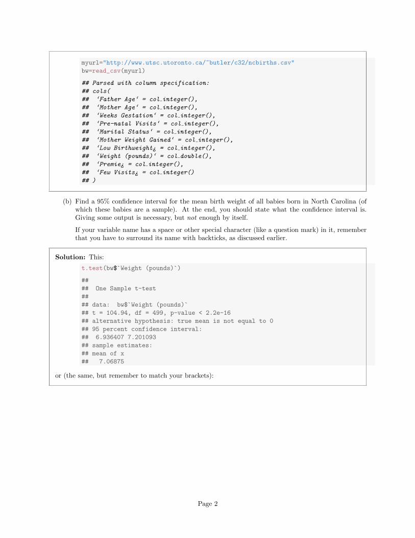
myurl="http://www.utsc.utoronto.ca/~butler/c32/ncbirths.csv"
bw=read_csv(myurl)
## Parsed with column specification:
## cols(
## ‘Father Age‘ = col integer(),
## ‘Mother Age‘ = col integer(),
## ‘Weeks Gestation‘ = col integer(),
## ‘Pre-natal Visits‘ = col integer(),
## ‘Marital Status‘ = col integer(),
## ‘Mother Weight Gained‘ = col integer(),
## ‘Low Birthweight¿ = col integer(),
## ‘Weight (pounds)‘ = col double(),
## ‘Premie¿ = col integer(),
## ‘Few Visits¿ = col integer()
## )
(b) Find a 95% confidence interval for the mean birth weight of all babies born in North Carolina (ofwhich these babies are a sample). At the end, you should state what the confidence interval is.Giving some output is necessary, but not enough by itself.
If your variable name has a space or other special character (like a question mark) in it, rememberthat you have to surround its name with backticks, as discussed earlier.
Solution: This:
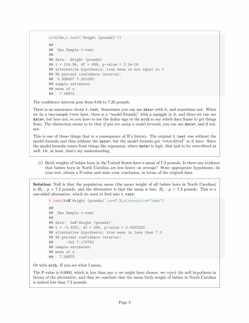
t.test(bw$`Weight (pounds)`)
##
## One Sample t-test
##
## data: bw$`Weight (pounds)`
## t = 104.94, df = 499, p-value < 2.2e-16
## alternative hypothesis: true mean is not equal to 0
## 95 percent confidence interval:
## 6.936407 7.201093
## sample estimates:
## mean of x
## 7.06875
or (the same, but remember to match your brackets):
Page 2
with(bw,t.test(`Weight (pounds)`))
##
## One Sample t-test
##
## data: Weight (pounds)
## t = 104.94, df = 499, p-value < 2.2e-16
## alternative hypothesis: true mean is not equal to 0
## 95 percent confidence interval:
## 6.936407 7.201093
## sample estimates:
## mean of x
## 7.06875
The confidence interval goes from 6.94 to 7.20 pounds.
There is an annoyance about t.test. Sometimes you can use data= with it, and sometimes not. Whenwe do a two-sample t-test later, there is a “model formula” with a squiggle in it, and there we can usedata=, but here not, so you have to use the dollar sign or the with to say which data frame to get thingsfrom. The distinction seems to be that if you are using a model formula, you can use data=, and if not,not.
This is one of those things that is a consequence of R’s history. The original t.test was without themodel formula and thus without the data=, but the model formula got “retro-fitted” to it later. Sincethe model formula comes from things like regression, where data= is legit, that had to be retro-fitted aswell. Or, at least, that’s my understanding.
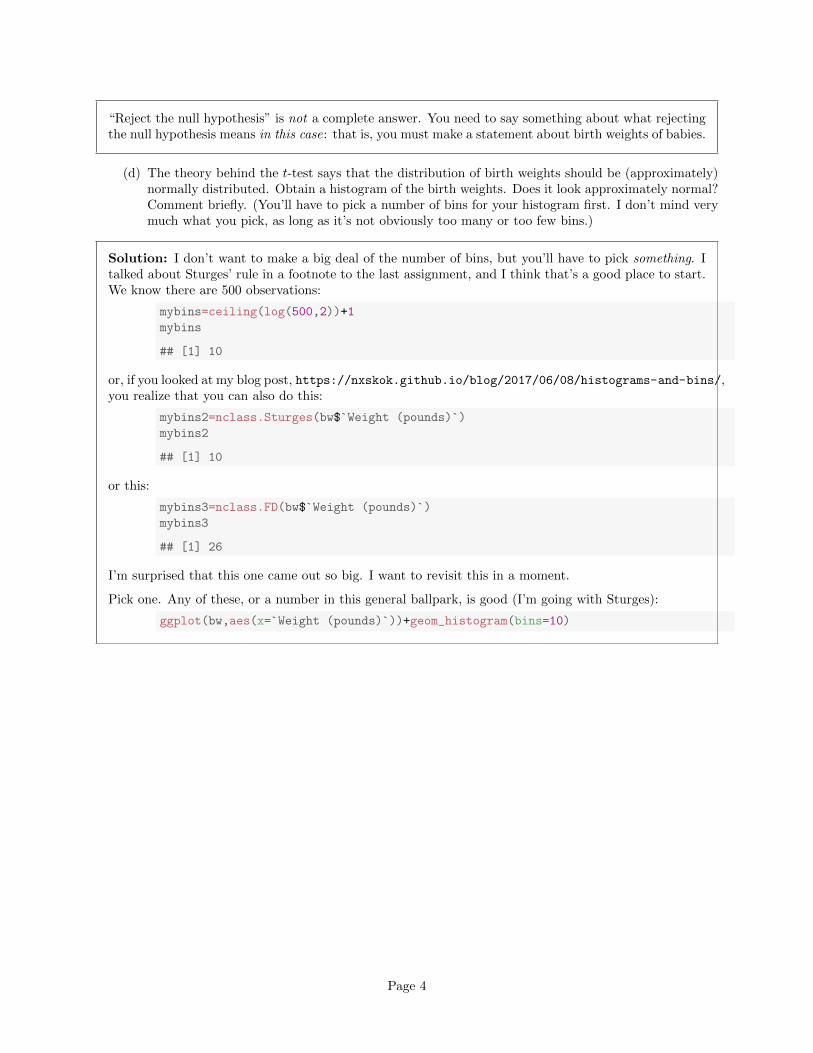
(c) Birth weights of babies born in the United States have a mean of 7.3 pounds. Is there any evidencethat babies born in North Carolina are less heavy on average? State appropriate hypotheses, doyour test, obtain a P-value and state your conclusion, in terms of the original data.
Solution: Null is that the population mean (the mean weight of all babies born in North Carolina)is H0 : µ = 7.3 pounds, and the alternative is that the mean is less: Ha : µ < 7.3 pounds. This is aone-sided alternative, which we need to feed into t.test:
t.test(bw$`Weight (pounds)`,mu=7.3,alternative="less")
##
## One Sample t-test
##
## data: bw$`Weight (pounds)`
## t = -3.4331, df = 499, p-value = 0.0003232
## alternative hypothesis: true mean is less than 7.3
## 95 percent confidence interval:
## -Inf 7.179752
## sample estimates:
## mean of x
## 7.06875
Or with with. If you see what I mean.
The P-value is 0.0003, which is less than any α we might have chosen: we reject the null hypothesis infavour of the alternative, and thus we conclude that the mean birth weight of babies in North Carolinais indeed less than 7.3 pounds.
Page 3
“Reject the null hypothesis” is not a complete answer. You need to say something about what rejectingthe null hypothesis means in this case: that is, you must make a statement about birth weights of babies.
(d) The theory behind the t-test says that the distribution of birth weights should be (approximately)normally distributed. Obtain a histogram of the birth weights. Does it look approximately normal?Comment briefly. (You’ll have to pick a number of bins for your histogram first. I don’t mind verymuch what you pick, as long as it’s not obviously too many or too few bins.)
Solution: I don’t want to make a big deal of the number of bins, but you’ll have to pick something. Italked about Sturges’ rule in a footnote to the last assignment, and I think that’s a good place to start.We know there are 500 observations:
mybins=ceiling(log(500,2))+1
mybins
## [1] 10
or, if you looked at my blog post, https://nxskok.github.io/blog/2017/06/08/histograms-and-bins/,you realize that you can also do this:
mybins2=nclass.Sturges(bw$`Weight (pounds)`)
mybins2
## [1] 10
or this:
mybins3=nclass.FD(bw$`Weight (pounds)`)
mybins3
## [1] 26
I’m surprised that this one came out so big. I want to revisit this in a moment.
Pick one. Any of these, or a number in this general ballpark, is good (I’m going with Sturges):
ggplot(bw,aes(x=`Weight (pounds)`))+geom_histogram(bins=10)
Page 4
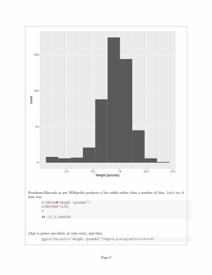
0
50
100
150
2.5 5.0 7.5 10.0 12.5
Weight (pounds)
coun
t
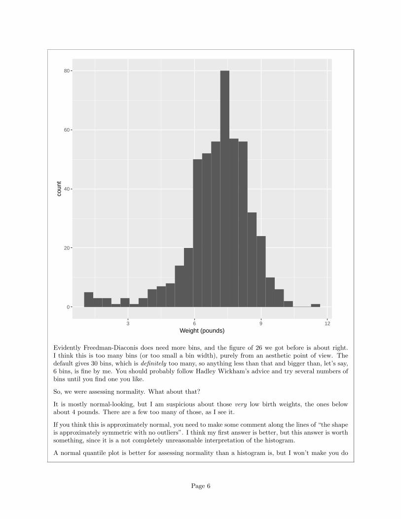
Freedman-Diaconis as per Wikipedia produces a bin width rather than a number of bins. Let’s try itthat way:
r=IQR(bw$`Weight (pounds)`)
w=2*r/500^(1/3)
w
## [1] 0.4094743
(that is power one-third, or cube root), and then
ggplot(bw,aes(x=`Weight (pounds)`))+geom_histogram(binwidth=w)
Page 5
0
20
40
60
80
3 6 9 12
Weight (pounds)
coun
t
Evidently Freedman-Diaconis does need more bins, and the figure of 26 we got before is about right.I think this is too many bins (or too small a bin width), purely from an aesthetic point of view. Thedefault gives 30 bins, which is definitely too many, so anything less than that and bigger than, let’s say,6 bins, is fine by me. You should probably follow Hadley Wickham’s advice and try several numbers ofbins until you find one you like.
So, we were assessing normality. What about that?
It is mostly normal-looking, but I am suspicious about those very low birth weights, the ones belowabout 4 pounds. There are a few too many of those, as I see it.
If you think this is approximately normal, you need to make some comment along the lines of “the shapeis approximately symmetric with no outliers”. I think my first answer is better, but this answer is worthsomething, since it is a not completely unreasonable interpretation of the histogram.
A normal quantile plot is better for assessing normality than a histogram is, but I won’t make you do
Page 6
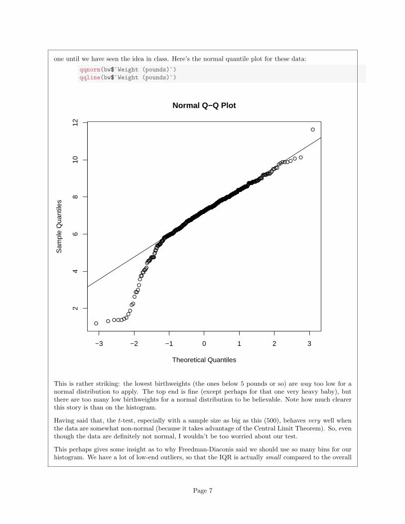
one until we have seen the idea in class. Here’s the normal quantile plot for these data:
qqnorm(bw$`Weight (pounds)`)
qqline(bw$`Weight (pounds)`)
●●
●
●●
●
●
●
●
●
●
●
●
●
●
●
●
●
●
●
●
●
●
●
●
●
●
●
●
●●
●
●
●
●
●
●
●
●●
●
●
●
●
●
●
●●
●
●
●
●
●
●
●
●
●
●
●
●●
●
●
●
●
●
●●
●
●
●
●
●
●
●
●
●
●
●
●●
●
●
●
●
●
●
●
●
●
●●
●
●
●
●
●
●
●
●
●
●●●
●
●
●
●
●
●
●
●
●
●
●
●
●
●
●
●
●
●
●
●
●
●
●
●
●
●
●
●
●
●
●
●●
●
●
●
●
●
●
●
●
●
●
●
●
●
●
●
●
●
●
●
●
●
●
●
●
●
●
●
●
●●
●
●
●
●
●
●
●
●
●
●
●
●
●●
●
●
●
●
●
●
●
●
●
●
●
●●
●
●●
●
●
●
●
●
●
●
●
●●
●
●
●
●
●●
●
●
●
●
●
●
●
●
●
●
●
●
●
●
●
●
●
●
●
●●
●
●●●
●
●●
●
●●
●
●
●
●
●
●
●
●
●●
●
●
●
●
●
●
●
●
●
●
●
●
●
●
●
●
●
●
●
●
●
●
●
●
●
●
●●
●
●
●
●
●
●
●●
●
●
●●
●
●
●
●
●●
●
●
●
●
●
●
●
●
●
●●
●
●●
●
●
●
●
●
●
●
●●
●
●
●●
●●
●
●
●
●
●
●
●
●
●
●
●
●
●
●
●
●
●
●
●
●●
●
●
●
●
●
●
●
●
●
●
●
●
●
●
●
●
●
●
●
●
●
●
●
●
●
●
●●
●
●
●
●
●
●
●
●
●
●
●
●
●
●
●
●
●
●
●
●●
●
●
●
●
●
●
●
●
●
●
●●
●
●
●
●
●
●
●
●
●
●●
●
●
●
●
●●
●●
●
●
●
●
●
●
●●
●
●●
●
●
●
●
●
●
●
●
●
●
●
●
●
●
●
●
●
●●
●
●
●
●
●
●
●●
●
●
●
●
●
●
●
●
●
●
●
●
●
●●
●
●
●
●
●
●
●
●
●
●●●
●
●
●
●
●
−3 −2 −1 0 1 2 3
24
68
1012
Normal Q−Q Plot
Theoretical Quantiles
Sam
ple
Qua
ntile
s
This is rather striking: the lowest birthweights (the ones below 5 pounds or so) are way too low for anormal distribution to apply. The top end is fine (except perhaps for that one very heavy baby), butthere are too many low birthweights for a normal distribution to be believable. Note how much clearerthis story is than on the histogram.
Having said that, the t-test, especially with a sample size as big as this (500), behaves very well whenthe data are somewhat non-normal (because it takes advantage of the Central Limit Theorem). So, eventhough the data are definitely not normal, I wouldn’t be too worried about our test.
This perhaps gives some insight as to why Freedman-Diaconis said we should use so many bins for ourhistogram. We have a lot of low-end outliers, so that the IQR is actually small compared to the overall
Page 7
spread of the data (as measured, say, by the SD or the range) and so FD thinks we need a lot of bins todescribe the shape. Sturges is based on data being approximately normal, so it will tend to produce asmall number of bins for data that have outliers.
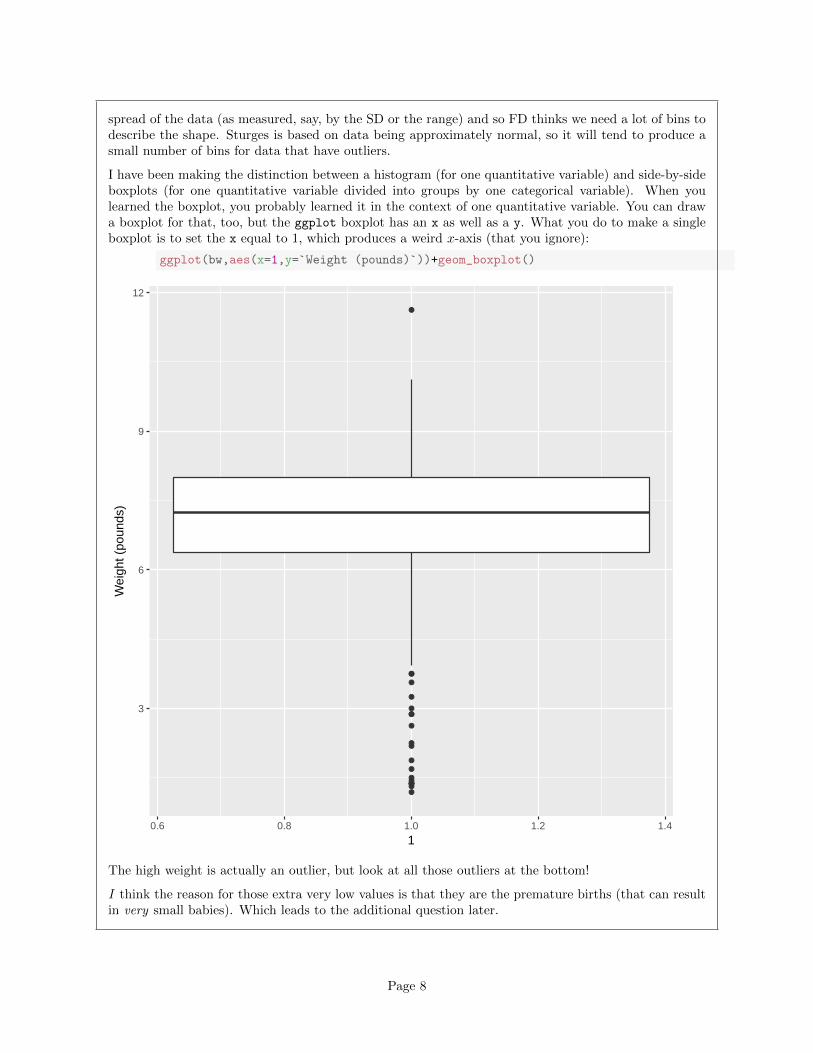
I have been making the distinction between a histogram (for one quantitative variable) and side-by-sideboxplots (for one quantitative variable divided into groups by one categorical variable). When youlearned the boxplot, you probably learned it in the context of one quantitative variable. You can drawa boxplot for that, too, but the ggplot boxplot has an x as well as a y. What you do to make a singleboxplot is to set the x equal to 1, which produces a weird x-axis (that you ignore):
ggplot(bw,aes(x=1,y=`Weight (pounds)`))+geom_boxplot()
●
●
●●
●
●
●
●●
●
●
●
●
●
●
●
●
●
●
●
3
6
9
12
0.6 0.8 1.0 1.2 1.4
1
Wei
ght (
poun
ds)
The high weight is actually an outlier, but look at all those outliers at the bottom!
I think the reason for those extra very low values is that they are the premature births (that can resultin very small babies). Which leads to the additional question later.
Page 8
2. Recall that we previously investigated the North Carolina births in SAS. Here we revisit that data set,which was at http://www.utsc.utoronto.ca/~butler/c32/ncbirths.csv.
(a) Read the data set into SAS again.
Solution: Since you’ve done it before, you can do it again. If you’re on SAS Studio online, you’ll needthe first line (or you’ll have to grapple with variable names containing spaces again):
options validvarname=v7;
filename myurl url "http://www.utsc.utoronto.ca/~butler/c32/ncbirths.csv";
proc import
datafile=myurl
dbms=csv
out=ncbirths
replace;
getnames=yes;
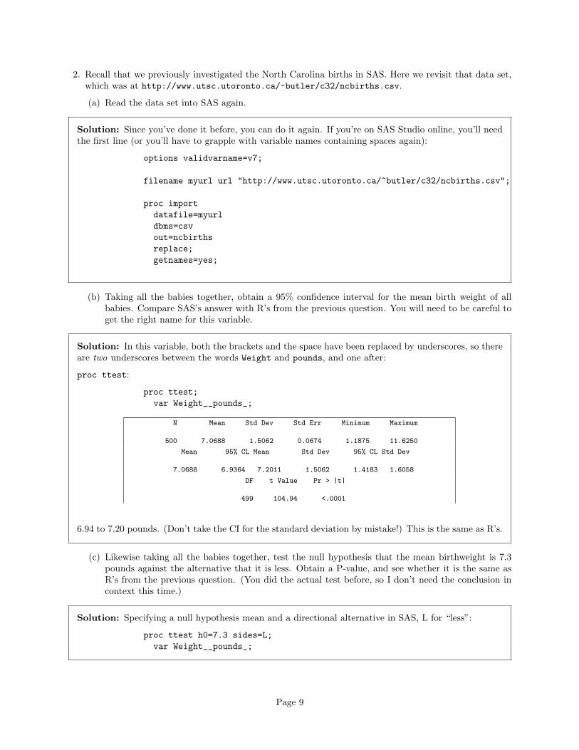
(b) Taking all the babies together, obtain a 95% confidence interval for the mean birth weight of allbabies. Compare SAS’s answer with R’s from the previous question. You will need to be careful toget the right name for this variable.
Solution: In this variable, both the brackets and the space have been replaced by underscores, so thereare two underscores between the words Weight and pounds, and one after:
proc ttest:
proc ttest;
var Weight__pounds_;
N Mean Std Dev Std Err Minimum Maximum
500 7.0688 1.5062 0.0674 1.1875 11.6250
Mean 95% CL Mean Std Dev 95% CL Std Dev
7.0688 6.9364 7.2011 1.5062 1.4183 1.6058
DF t Value Pr > |t|
499 104.94 <.0001
6.94 to 7.20 pounds. (Don’t take the CI for the standard deviation by mistake!) This is the same as R’s.
(c) Likewise taking all the babies together, test the null hypothesis that the mean birthweight is 7.3pounds against the alternative that it is less. Obtain a P-value, and see whether it is the same asR’s from the previous question. (You did the actual test before, so I don’t need the conclusion incontext this time.)
Solution: Specifying a null hypothesis mean and a directional alternative in SAS, L for “less”:
proc ttest h0=7.3 sides=L;
var Weight__pounds_;
Page 9
N Mean Std Dev Std Err Minimum Maximum
500 7.0688 1.5062 0.0674 1.1875 11.6250
Mean 95% CL Mean Std Dev 95% CL Std Dev
7.0688 -Infty 7.1798 1.5062 1.4183 1.6058
DF t Value Pr < t
499 -3.43 0.0003
The alternative is that the mean is lower than 7.3. The P-value is 0.0003, which is the same (to theaccuracy shown) as R’s.
If you couldn’t remember the sides thing, you can do three steps: get a two-sided test (the P-valuecomes out as 0.0006), check to see that you are on the correct side of the null (the sample mean is 7.07,which is less than 7.3), then halve the two-sided P-value (getting 0.0003). But you need all of this. Ifyou have it, you’re good.
3. Nenana, Alaska, is about 50 miles west of Fairbanks. Every spring, there is a contest in Nenana. Awooden tripod is placed on the frozen river, and people try to guess the exact minute when the ice meltsenough for the tripod to fall through the ice. The contest started in 1917 as an amusement for railwayworkers, and has taken place every year since. Now, hundreds of thousands of people enter their guesseson the Internet and the prize for the winner can be as much as $300,000.
Because so much money is at stake, and because the exact same tripod is placed at the exact samespot on the ice every year, the data are consistent and accurate. The data are in http://www.utsc.
utoronto.ca/~butler/c32/nenana.txt.
Yes, we saw these data before.
(a) Read the data into R, as before, or use the data frame that you read in before. Note that the valuesare separated by tabs rather than spaces, so you’ll need an appropriate read to read it in.
Solution: These are “tab-separated values”, so read tsv is the thing, as for the Australian athletes:
myurl="http://www.utsc.utoronto.ca/~butler/c32/nenana.txt"
nenana=read_tsv(myurl)
## Parsed with column specification:
## cols(
## Year = col integer(),
## JulianDate = col double(),
## ‘Date&Time‘ = col character()
## )
Use whatever name you like for the data frame. One that is different from any of the column headersis smart; then it is clear whether you mean the whole data frame or one of its columns. ice or melt oranything like that would also be good.
(b) Obtain a 90% confidence interval for the mean JulianDate. What interval do you get? Lookingback at your histogram, do you have any doubts about the validity of what you have just done?
Page 10
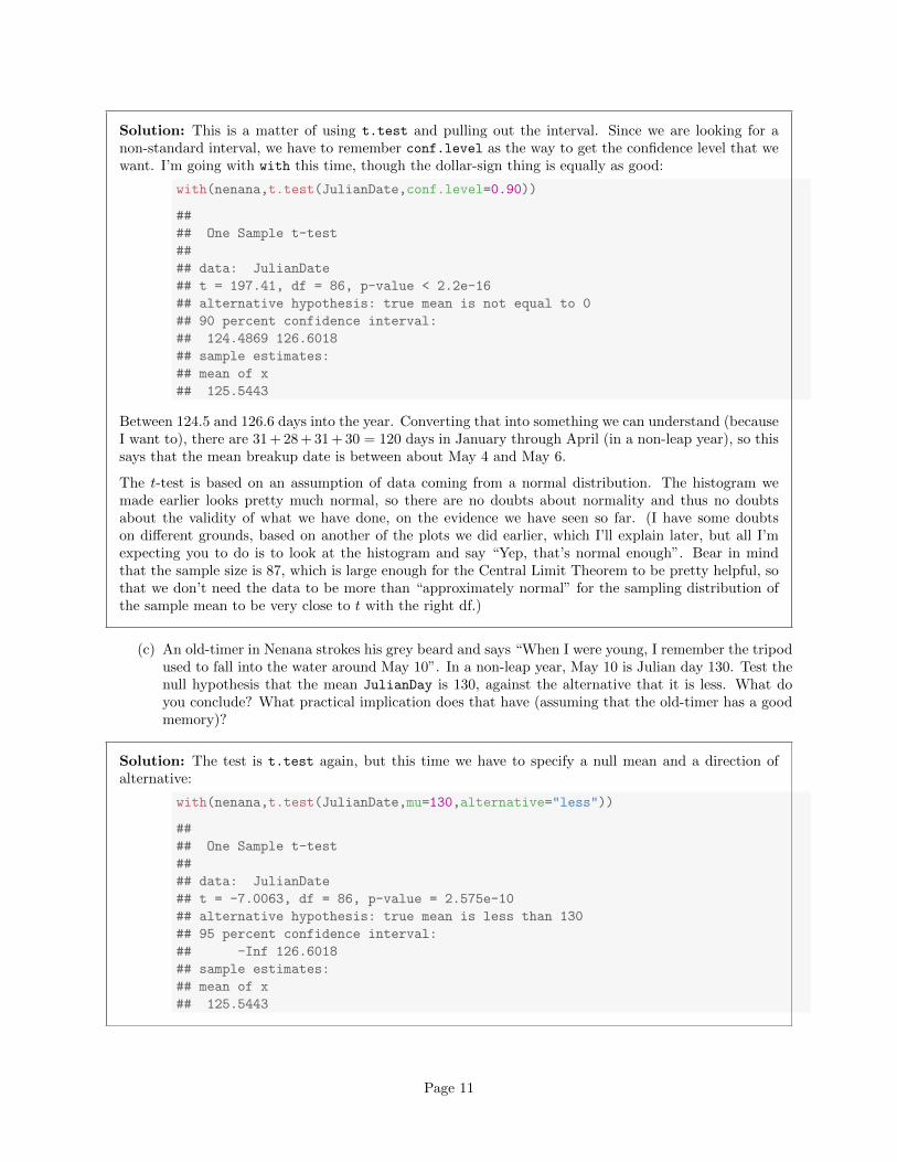
Solution: This is a matter of using t.test and pulling out the interval. Since we are looking for anon-standard interval, we have to remember conf.level as the way to get the confidence level that wewant. I’m going with with this time, though the dollar-sign thing is equally as good:
with(nenana,t.test(JulianDate,conf.level=0.90))
##
## One Sample t-test
##
## data: JulianDate
## t = 197.41, df = 86, p-value < 2.2e-16
## alternative hypothesis: true mean is not equal to 0
## 90 percent confidence interval:
## 124.4869 126.6018
## sample estimates:
## mean of x
## 125.5443
Between 124.5 and 126.6 days into the year. Converting that into something we can understand (becauseI want to), there are 31 + 28 + 31 + 30 = 120 days in January through April (in a non-leap year), so thissays that the mean breakup date is between about May 4 and May 6.
The t-test is based on an assumption of data coming from a normal distribution. The histogram wemade earlier looks pretty much normal, so there are no doubts about normality and thus no doubtsabout the validity of what we have done, on the evidence we have seen so far. (I have some doubtson different grounds, based on another of the plots we did earlier, which I’ll explain later, but all I’mexpecting you to do is to look at the histogram and say “Yep, that’s normal enough”. Bear in mindthat the sample size is 87, which is large enough for the Central Limit Theorem to be pretty helpful, sothat we don’t need the data to be more than “approximately normal” for the sampling distribution ofthe sample mean to be very close to t with the right df.)
(c) An old-timer in Nenana strokes his grey beard and says “When I were young, I remember the tripodused to fall into the water around May 10”. In a non-leap year, May 10 is Julian day 130. Test thenull hypothesis that the mean JulianDay is 130, against the alternative that it is less. What doyou conclude? What practical implication does that have (assuming that the old-timer has a goodmemory)?
Solution: The test is t.test again, but this time we have to specify a null mean and a direction ofalternative:
with(nenana,t.test(JulianDate,mu=130,alternative="less"))
##
## One Sample t-test
##
## data: JulianDate
## t = -7.0063, df = 86, p-value = 2.575e-10
## alternative hypothesis: true mean is less than 130
## 95 percent confidence interval:
## -Inf 126.6018
## sample estimates:
## mean of x
## 125.5443
Page 11
For a test, look first at the P-value, which is 0.0000000002575: that is to say, the P-value is very small,definitely smaller than 0.05 (or any other α you might have chosen). So we reject the null hypothesis,and conclude that the mean JulianDate is actually less than 130.
Now, this is the date on which the ice breaks up on average, and we have concluded that it is earlierthan it used to be, since we are assuming the old-timer’s memory is correct.
This is evidence in favour of global warming; a small piece of evidence, to be sure, but the ice is meltingearlier than it used to all over the Arctic, so it’s not just in Nenana that it is happening. You don’t needto get to the “global warming” part, but I do want you to observe that the ice is breaking up earlierthan it used to.
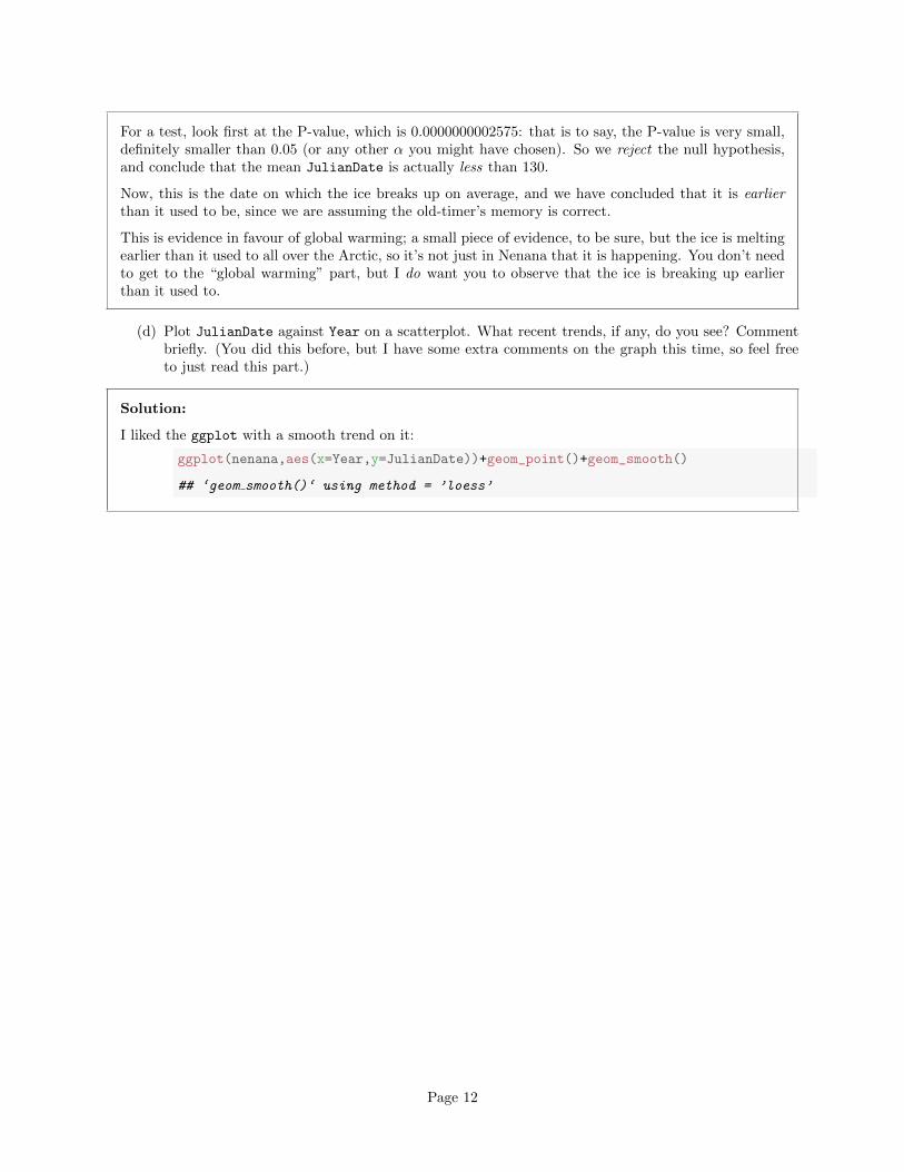
(d) Plot JulianDate against Year on a scatterplot. What recent trends, if any, do you see? Commentbriefly. (You did this before, but I have some extra comments on the graph this time, so feel freeto just read this part.)
Solution:
I liked the ggplot with a smooth trend on it:
ggplot(nenana,aes(x=Year,y=JulianDate))+geom_point()+geom_smooth()
## ‘geom smooth()‘ using method = ’loess’
Page 12
●
●
●
●
●
●
●
●
●
●
●
●
●
●
●
●
●
●
●
●
●
●
●
●
●
●
●
●
●
●
●
●●
●
●
●
●
●
●
●
●
●
●
●
●
●
●
●
●
●
●
●
●
●
●
●
●
●
●
●
●
●●●
●
●
●
●
●
●
●
●
●
●
●
●
●
●
●
●
●
●
●
●
●
●
●
110
120
130
140
1920 1940 1960 1980 2000
Year
Julia
nDat
e
There was something obvious to see: after about 1960, there is a clear downward trend: the ice isbreaking up earlier on average every year. Even though there is a lot of variability, the overall trend,viewed this way, is clear (and consistent with the test we did earlier). Note that the old-timer’s value of130 is the kind of JulianDate we would typically observe around 1920, which would make the old-timerover 90 years old.
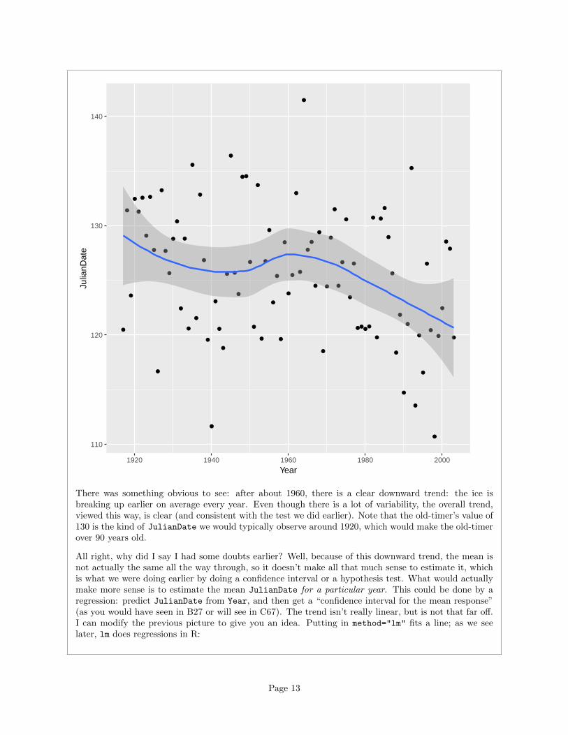
All right, why did I say I had some doubts earlier? Well, because of this downward trend, the mean isnot actually the same all the way through, so it doesn’t make all that much sense to estimate it, whichis what we were doing earlier by doing a confidence interval or a hypothesis test. What would actuallymake more sense is to estimate the mean JulianDate for a particular year. This could be done by aregression: predict JulianDate from Year, and then get a “confidence interval for the mean response”(as you would have seen in B27 or will see in C67). The trend isn’t really linear, but is not that far off.I can modify the previous picture to give you an idea. Putting in method="lm" fits a line; as we seelater, lm does regressions in R:
Page 13
ggplot(nenana,aes(x=Year,y=JulianDate))+geom_point()+
geom_smooth(method="lm")
●
●
●
●
●
●
●
●
●
●
●
●
●
●
●
●
●
●
●
●
●
●
●
●
●
●
●
●
●
●
●
●●
●
●
●
●
●
●
●
●
●
●
●
●
●
●
●
●
●
●
●
●
●
●
●
●
●
●
●
●
●●●
●
●
●
●
●
●
●
●
●
●
●
●
●
●
●
●
●
●
●
●
●
●
●
110
120
130
140
1920 1940 1960 1980 2000
Year
Julia
nDat
e
Compare the confidence interval for the mean JulianDate in 1920: 126 to 131 (the shaded area on thegraph), with 2000: 121 to 125. A change of about 5 days over 80 years. And with the recent trend thatwe saw above, it’s probably changing faster than that now. Sobering indeed.
(e) See if you can repeat the inference part (the test and CI) in SAS: that is, read in the data, get a90% CI for their mean, test whether their mean is 130 or less than 130.
Solution: Reading in the data involves that thing to get “separated by tab”:
filename myurl url "http://www.utsc.utoronto.ca/~butler/c32/nenana.txt";
Page 14
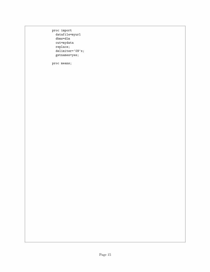
proc import
datafile=myurl
dbms=dlm
out=mydata
replace;
delimiter='09'x;
getnames=yes;
proc means;
Page 15
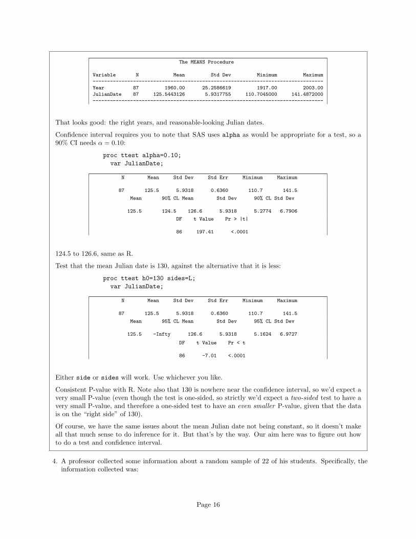
The MEANS Procedure
Variable N Mean Std Dev Minimum Maximum
--------------------------------------------------------------------------------
Year 87 1960.00 25.2586619 1917.00 2003.00
JulianDate 87 125.5443126 5.9317755 110.7045000 141.4872000
--------------------------------------------------------------------------------
That looks good: the right years, and reasonable-looking Julian dates.
Confidence interval requires you to note that SAS uses alpha as would be appropriate for a test, so a90% CI needs α = 0.10:
proc ttest alpha=0.10;
var JulianDate;
N Mean Std Dev Std Err Minimum Maximum
87 125.5 5.9318 0.6360 110.7 141.5
Mean 90% CL Mean Std Dev 90% CL Std Dev
125.5 124.5 126.6 5.9318 5.2774 6.7906
DF t Value Pr > |t|
86 197.41 <.0001
124.5 to 126.6, same as R.
Test that the mean Julian date is 130, against the alternative that it is less:
proc ttest h0=130 sides=L;
var JulianDate;
N Mean Std Dev Std Err Minimum Maximum
87 125.5 5.9318 0.6360 110.7 141.5
Mean 95% CL Mean Std Dev 95% CL Std Dev
125.5 -Infty 126.6 5.9318 5.1624 6.9727
DF t Value Pr < t
86 -7.01 <.0001
Either side or sides will work. Use whichever you like.
Consistent P-value with R. Note also that 130 is nowhere near the confidence interval, so we’d expect avery small P-value (even though the test is one-sided, so strictly we’d expect a two-sided test to have avery small P-value, and therefore a one-sided test to have an even smaller P-value, given that the datais on the “right side” of 130).
Of course, we have the same issues about the mean Julian date not being constant, so it doesn’t makeall that much sense to do inference for it. But that’s by the way. Our aim here was to figure out howto do a test and confidence interval.
4. A professor collected some information about a random sample of 22 of his students. Specifically, theinformation collected was:
Page 16
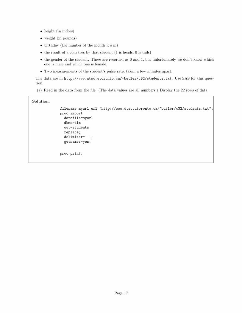
• height (in inches)
• weight (in pounds)
• birthday (the number of the month it’s in)
• the result of a coin toss by that student (1 is heads, 0 is tails)
• the gender of the student. These are recorded as 0 and 1, but unfortunately we don’t know whichone is male and which one is female.
• Two measurements of the student’s pulse rate, taken a few minutes apart.
The data are in http://www.utsc.utoronto.ca/~butler/c32/students.txt. Use SAS for this ques-tion.
(a) Read in the data from the file. (The data values are all numbers.) Display the 22 rows of data.
Solution:
filename myurl url "http://www.utsc.utoronto.ca/~butler/c32/students.txt";
proc import
datafile=myurl
dbms=dlm
out=students
replace;
delimiter=' ';
getnames=yes;
proc print;
Page 17
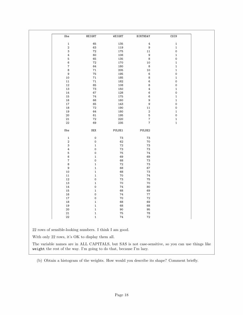
Obs HEIGHT WEIGHT BIRTHDAY COIN
1 65 135 4 1
2 63 119 9 1
3 72 175 11 0
4 60 106 9 1
5 65 135 8 0
6 72 170 10 1
7 64 180 8 1
8 71 205 10 1
9 75 195 6 0
10 71 185 8 1
11 71 182 6 0
12 65 108 8 0
13 73 150 4 1
14 67 128 6 0
15 74 175 6 1
16 66 160 9 1
17 65 143 9 0
18 72 190 11 0
19 64 180 2 1
20 61 195 5 0
21 72 220 7 1
22 69 235 7 1
Obs SEX PULSE1 PULSE2
1 0 73 73
2 0 62 70
3 1 72 73
4 0 73 73
5 0 75 74
6 1 69 69
7 0 68 73
8 1 72 73
9 1 68 67
10 1 68 73
11 1 70 74
12 0 73 75
13 1 70 70
14 0 74 80
15 1 68 69
16 0 74 77
17 0 70 72
18 1 68 69
19 1 68 68
20 1 90 95
21 1 75 78
22 1 74 72
22 rows of sensible-looking numbers. I think I am good.
With only 22 rows, it’s OK to display them all.
The variable names are in ALL CAPITALS, but SAS is not case-sensitive, so you can use things likeweight the rest of the way. I’m going to do that, because I’m lazy.
(b) Obtain a histogram of the weights. How would you describe its shape? Comment briefly.
Page 18
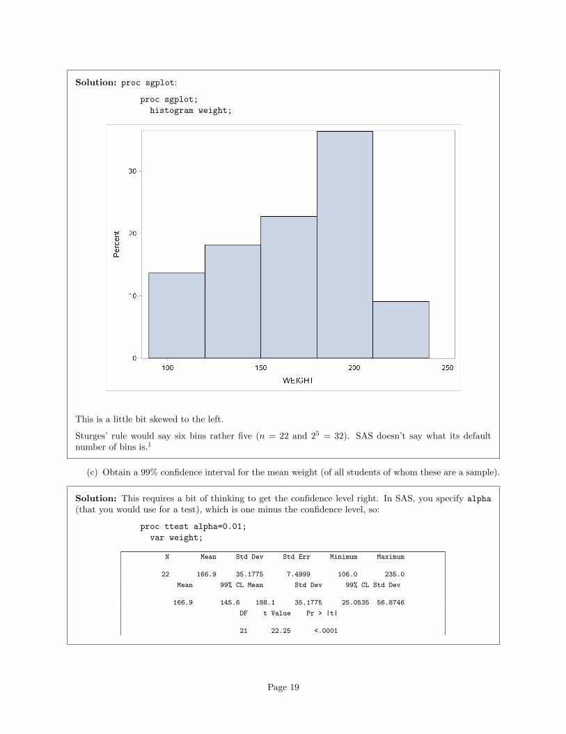
Solution: proc sgplot:
proc sgplot;
histogram weight;
This is a little bit skewed to the left.
Sturges’ rule would say six bins rather five (n = 22 and 25 = 32). SAS doesn’t say what its defaultnumber of bins is.1
(c) Obtain a 99% confidence interval for the mean weight (of all students of whom these are a sample).
Solution: This requires a bit of thinking to get the confidence level right. In SAS, you specify alpha
(that you would use for a test), which is one minus the confidence level, so:
proc ttest alpha=0.01;
var weight;
N Mean Std Dev Std Err Minimum Maximum
22 166.9 35.1775 7.4999 106.0 235.0
Mean 99% CL Mean Std Dev 99% CL Std Dev
166.9 145.6 188.1 35.1775 25.0535 56.8746
DF t Value Pr > |t|
21 22.25 <.0001
Page 19
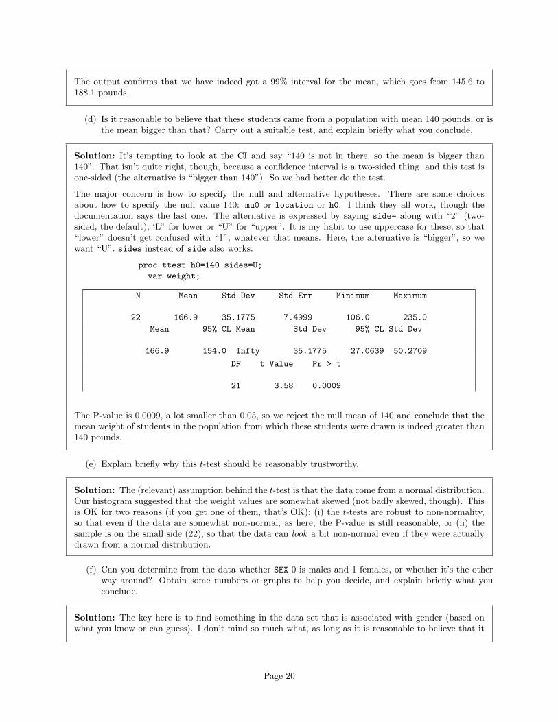
The output confirms that we have indeed got a 99% interval for the mean, which goes from 145.6 to188.1 pounds.
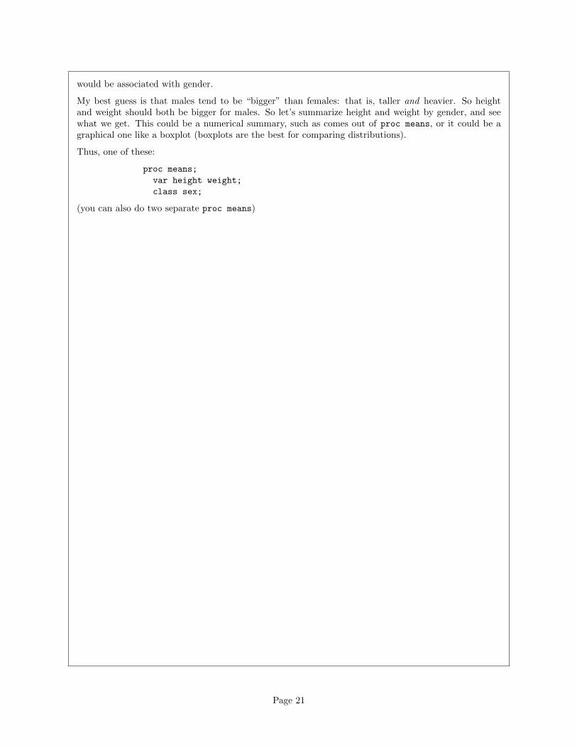
(d) Is it reasonable to believe that these students came from a population with mean 140 pounds, or isthe mean bigger than that? Carry out a suitable test, and explain briefly what you conclude.
Solution: It’s tempting to look at the CI and say “140 is not in there, so the mean is bigger than140”. That isn’t quite right, though, because a confidence interval is a two-sided thing, and this test isone-sided (the alternative is “bigger than 140”). So we had better do the test.
The major concern is how to specify the null and alternative hypotheses. There are some choicesabout how to specify the null value 140: mu0 or location or h0. I think they all work, though thedocumentation says the last one. The alternative is expressed by saying side= along with “2” (two-sided, the default), ‘L” for lower or “U” for “upper”. It is my habit to use uppercase for these, so that“lower” doesn’t get confused with “1”, whatever that means. Here, the alternative is “bigger”, so wewant “U”. sides instead of side also works:
proc ttest h0=140 sides=U;
var weight;
N Mean Std Dev Std Err Minimum Maximum
22 166.9 35.1775 7.4999 106.0 235.0
Mean 95% CL Mean Std Dev 95% CL Std Dev
166.9 154.0 Infty 35.1775 27.0639 50.2709
DF t Value Pr > t
21 3.58 0.0009
The P-value is 0.0009, a lot smaller than 0.05, so we reject the null mean of 140 and conclude that themean weight of students in the population from which these students were drawn is indeed greater than140 pounds.
(e) Explain briefly why this t-test should be reasonably trustworthy.
Solution: The (relevant) assumption behind the t-test is that the data come from a normal distribution.Our histogram suggested that the weight values are somewhat skewed (not badly skewed, though). Thisis OK for two reasons (if you get one of them, that’s OK): (i) the t-tests are robust to non-normality,so that even if the data are somewhat non-normal, as here, the P-value is still reasonable, or (ii) thesample is on the small side (22), so that the data can look a bit non-normal even if they were actuallydrawn from a normal distribution.
(f) Can you determine from the data whether SEX 0 is males and 1 females, or whether it’s the otherway around? Obtain some numbers or graphs to help you decide, and explain briefly what youconclude.
Solution: The key here is to find something in the data set that is associated with gender (based onwhat you know or can guess). I don’t mind so much what, as long as it is reasonable to believe that it
Page 20
would be associated with gender.
My best guess is that males tend to be “bigger” than females: that is, taller and heavier. So heightand weight should both be bigger for males. So let’s summarize height and weight by gender, and seewhat we get. This could be a numerical summary, such as comes out of proc means, or it could be agraphical one like a boxplot (boxplots are the best for comparing distributions).
Thus, one of these:
proc means;
var height weight;
class sex;
(you can also do two separate proc means)
Page 21
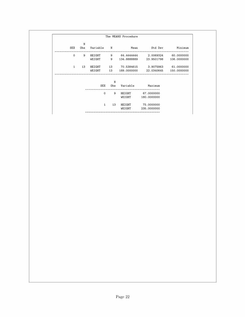
The MEANS Procedure
N
SEX Obs Variable N Mean Std Dev Minimum
-------------------------------------------------------------------------------
0 9 HEIGHT 9 64.4444444 2.0069324 60.0000000
WEIGHT 9 134.8888889 23.9501798 106.0000000
1 13 HEIGHT 13 70.5384615 3.9075863 61.0000000
WEIGHT 13 189.0000000 22.0340645 150.0000000
-------------------------------------------------------------------------------
N
SEX Obs Variable Maximum
--------------------------------------------
0 9 HEIGHT 67.0000000
WEIGHT 180.0000000
1 13 HEIGHT 75.0000000
WEIGHT 235.0000000
--------------------------------------------
Page 22

or (this one needs a plot each for height and weight if you do both):
proc sgplot;
vbox height / category=sex;
Page 23
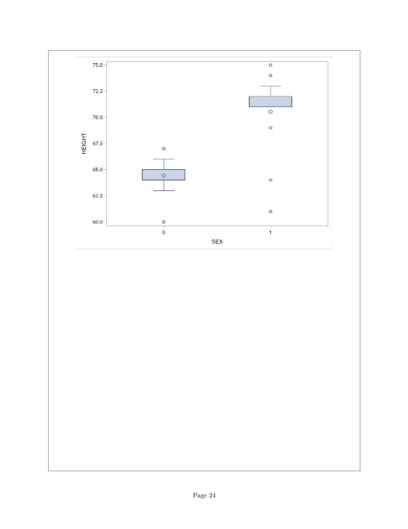
Page 24

proc sgplot;
vbox weight / category=sex;
Page 25
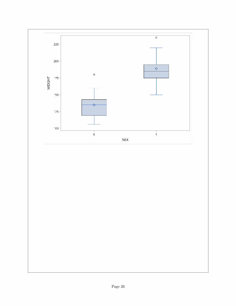
Page 26
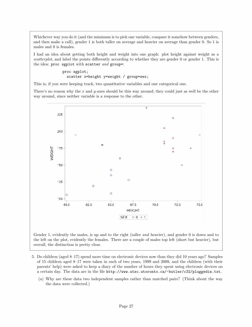
Whichever way you do it (and the minimum is to pick one variable, compare it somehow between genders,and then make a call), gender 1 is both taller on average and heavier on average than gender 0. So 1 ismales and 0 is females.
I had an idea about getting both height and weight into one graph: plot height against weight as ascatterplot, and label the points differently according to whether they are gender 0 or gender 1. This isthe idea: proc sgplot with scatter and group=:
proc sgplot;
scatter x=height y=weight / group=sex;
This is, if you were keeping track, two quantitative variables and one categorical one.
There’s no reason why the x and y-axes should be this way around; they could just as well be the otherway around, since neither variable is a response to the other.
Gender 1, evidently the males, is up and to the right (taller and heavier), and gender 0 is down and tothe left on the plot, evidently the females. There are a couple of males top left (short but heavier), butoverall, the distinction is pretty clear.
5. Do children (aged 8–17) spend more time on electronic devices now than they did 10 years ago? Samplesof 15 children aged 8–17 were taken in each of two years, 1999 and 2009, and the children (with theirparents’ help) were asked to keep a diary of the number of hours they spent using electronic devices ona certain day. The data are in the file http://www.utsc.utoronto.ca/~butler/c32/pluggedin.txt.
(a) Why are these data two independent samples rather than matched pairs? (Think about the waythe data were collected.)
Page 27
Solution: Children that appeared in the 1999 sample would have been too old to be in the 2009sample. So it must have been a different group of children in 2009 than it was in 1999. Thus, this is twoindependent samples (and a two-sample t-test is coming up).
For this to have been matched pairs, we would have had to have the same 15 children assessed bothtimes, or at least we would have had to have some natural pairing-up. (Even having siblings of the 1999children be the sample for 2009 would have been difficult to arrange.)
The fact that there were 15 children in each group was meant to confuse you a little: if they were matchedpairs, there would have to be the same number of children both times, but with two independent samples,there might be the same number of children or there might not be.2
(b) Read the data into SAS, and list out the values. Make sure you have 30 values altogether, and twodifferent years.
Solution: Look at the file to see that the data values are separated by spaces (the clue is in the fileextension .txt), and then use the version of proc import that reads space-delimited files. Copy an oldone. That’s what I do:
filename myurl url "http://www.utsc.utoronto.ca/~butler/c32/pluggedin.txt";
proc import
datafile=myurl
dbms=dlm
out=pluggedin
replace;
delimiter=' ';
getnames=yes;
proc print;
Obs year hours
1 1999 4
2 1999 5
3 1999 7
4 1999 7
5 1999 5
6 1999 7
7 1999 5
8 1999 6
9 1999 5
10 1999 6
11 1999 7
12 1999 8
13 1999 5
14 1999 6
15 1999 6
16 2009 5
17 2009 9
18 2009 5
19 2009 8
20 2009 7
21 2009 6
22 2009 7
23 2009 9
24 2009 7
25 2009 9
26 2009 6
27 2009 9
28 2009 10
29 2009 9
30 2009 8Page 28
2× 15 = 30 lines, years 1999 and 2009. Good.
(c) Draw side-by-side boxplots of hours spent watching electronic devices for each year.
Solution: This is easy, unless you stop to think about it!
proc sgplot;
vbox hours / category=year;
(d) What do your boxplots tell you? You’re looking for a couple of things: how the means/medianscompare, and whether you have any issues with skewness or outliers. Have a think about this beforeyou look at my answer.
Solution: The mean and median for 2009 are quite a bit higher for 2009 compared to 1999, whichsuggests that the “average” number of hours really has increased.
As for skewness and outliers, I really don’t see any issues at all: the top and bottom whiskers are aboutthe same length in both cases, and there are no outliers.
The reason for the second thing is that we are assessing whether a t-test is the right thing to do, and forthat we need data that are approximately normal within each group. By “approximately normal”, it isgenerally enough to be able to say, as we have here, that the distributions are more or less symmetricand that we have no serious problems with outliers; in other words, the kind of things that boxplots willtell you.3
(e) Carry out a test to determine if there is evidence that the mean number of hours spent per daywatching electronic devices has increased since 1999. State your null and alternative hypotheses,and from your output, obtain a P-value and interpret it.
Page 29
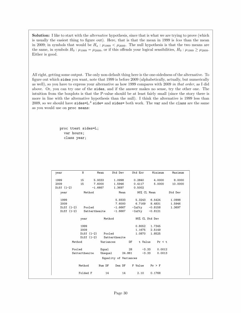
Solution: I like to start with the alternative hypothesis, since that is what we are trying to prove (whichis usually the easiest thing to figure out). Here, that is that the mean in 1999 is less than the meanin 2009; in symbols that would be Ha : µ1999 < µ2009. The null hypothesis is that the two means arethe same, in symbols H0 : µ1999 = µ2009, or if this offends your logical sensibilities, H0 : µ1999 ≥ µ2009.Either is good.
All right, getting some output. The only non-default thing here is the one-sidedness of the alternative. Tofigure out which sides you want, note that 1999 is before 2009 (alphabetically, actually, but numericallyas well), so you have to express your alternative as how 1999 compares with 2009 in that order, as I didabove. Or, you can try one of the sides, and if the answer makes no sense, try the other one. Theintuition from the boxplots is that the P-value should be at least fairly small (since the story there ismore in line with the alternative hypothesis than the null). I think the alternative is 1999 less than2009, so we should have sides=L.4 side= and sides= both work. The var and the class are the sameas you would use on proc means:
proc ttest sides=L;
var hours;
class year;
year N Mean Std Dev Std Err Minimum Maximum
1999 15 5.9333 1.0998 0.2840 4.0000 8.0000
2009 15 7.6000 1.5946 0.4117 5.0000 10.0000
Diff (1-2) -1.6667 1.3697 0.5002
year Method Mean 95% CL Mean Std Dev
1999 5.9333 5.3243 6.5424 1.0998
2009 7.6000 6.7169 8.4831 1.5946
Diff (1-2) Pooled -1.6667 -Infty -0.8158 1.3697
Diff (1-2) Satterthwaite -1.6667 -Infty -0.8121
year Method 95% CL Std Dev
1999 0.8052 1.7345
2009 1.1675 2.5149
Diff (1-2) Pooled 1.0870 1.8525
Diff (1-2) Satterthwaite
Method Variances DF t Value Pr < t
Pooled Equal 28 -3.33 0.0012
Satterthwaite Unequal 24.861 -3.33 0.0013
Equality of Variances
Method Num DF Den DF F Value Pr > F
Folded F 14 14 2.10 0.1768
Page 30
With SAS, you have to choose whether to use the pooled or the Satterthwaite test. The choice is whetheryou believe the two samples come from populations with the same SD (pooled) or not (Satterthwaite).It often doesn’t make much difference, as here. I think the interquartile range for the 2009 figures is abit bigger, so (in the absence of outliers) I would expect its SD to be a bit bigger also. Thus I wouldchoose the Satterthwaite test, though (as I said) it won’t make much difference to your conclusion if youdisagree with me (and say that the two IQRs are not different enough to be worth worrying about). Inany case, the P-value is 0.0013 or 0.0012, smaller than 0.05, and so you reject the null hypothesis5 andconclude that the 2009 mean is indeed larger, for all children, not just the ones that happened to besampled.
The bottom test, the one labelled Folded F, is a test for whether the SDs (variances) in the two groupsare equal (vs. the alternative that they are not). This null is not rejected, suggesting that we would beentitled to use the pooled test because the two group SDs are not significantly different.
Extra bit for those of you that took STAB57: you probably derived the pooled t-test, because the theoryis the same as for the one-sample t-test: you have one population variance σ2 to estimate (common tothe two groups), which you estimate by one sample variance
s2p =(n1 − 1)s21 + (n2 − 1)s22
n1 + n2 − 2
Thus you have a normal thing with one σ2 estimated by an s2, which is therefore t with the right df.
When the two groups have different population SDs, the theory is a whole lot more complicated; in fact,there isn’t even any exact answer.6 What Satterthwaite and Welch did7 was to say that if you calculate
t =x̄1 − x̄2√s21n1
+s22n2
(this is what you learn in the second-last lecture of STAB22 as the “two-sample t-test”), this will haveapproximately a t-distribution, and the best8 approximation to the df is that ugly ugly formula in afootnote in the B22 text, the one that they tell you to ignore.
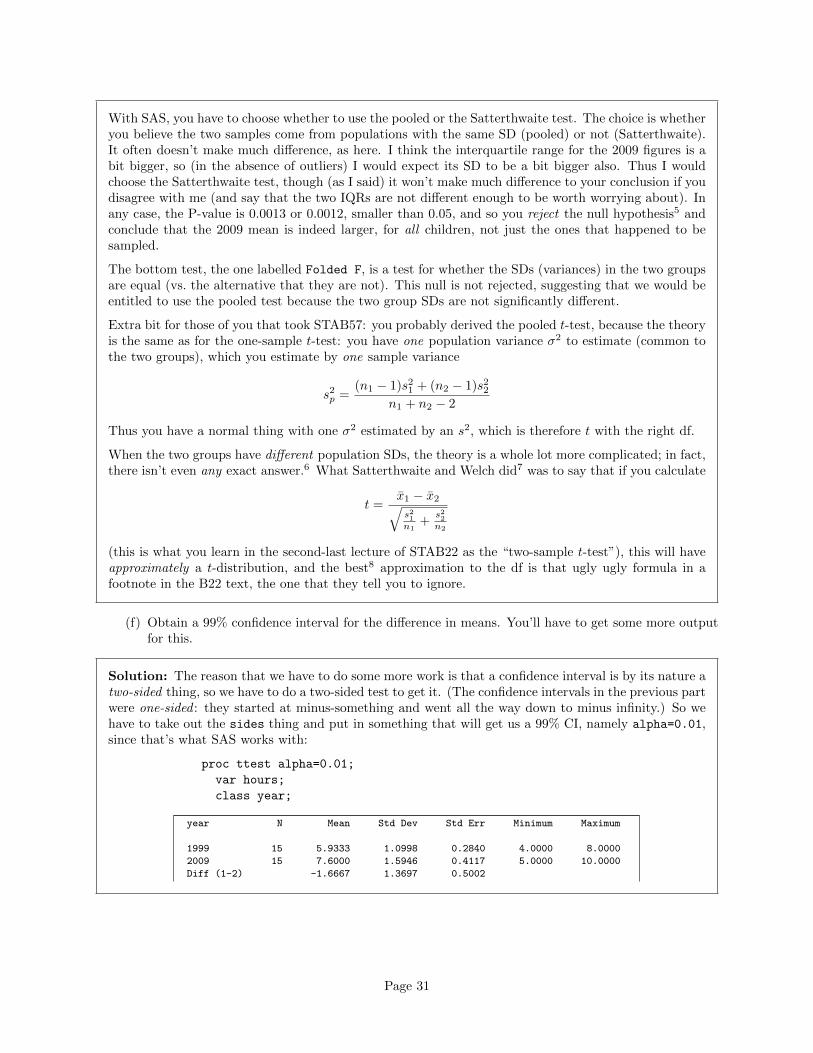
(f) Obtain a 99% confidence interval for the difference in means. You’ll have to get some more outputfor this.
Solution: The reason that we have to do some more work is that a confidence interval is by its nature atwo-sided thing, so we have to do a two-sided test to get it. (The confidence intervals in the previous partwere one-sided : they started at minus-something and went all the way down to minus infinity.) So wehave to take out the sides thing and put in something that will get us a 99% CI, namely alpha=0.01,since that’s what SAS works with:
proc ttest alpha=0.01;
var hours;
class year;
year N Mean Std Dev Std Err Minimum Maximum
1999 15 5.9333 1.0998 0.2840 4.0000 8.0000
2009 15 7.6000 1.5946 0.4117 5.0000 10.0000
Diff (1-2) -1.6667 1.3697 0.5002
Page 31
year Method Mean 99% CL Mean Std Dev
1999 5.9333 5.0880 6.7786 1.0998
2009 7.6000 6.3743 8.8257 1.5946
Diff (1-2) Pooled -1.6667 -3.0487 -0.2846 1.3697
Diff (1-2) Satterthwaite -1.6667 -3.0615 -0.2719
year Method 99% CL Std Dev
1999 0.7353 2.0386
2009 1.0662 2.9558
Diff (1-2) Pooled 1.0150 2.0532
Diff (1-2) Satterthwaite
Method Variances DF t Value Pr > |t|
Pooled Equal 28 -3.33 0.0024
Satterthwaite Unequal 24.861 -3.33 0.0027
Equality of Variances
Method Num DF Den DF F Value Pr > F
Folded F 14 14 2.10 0.1768
The confidence interval goes from −3.06 to −0.27 (hours). Note that SAS did indeed label it as a 99%interval, so that we have the right thing. I pulled out the Satterthwaite interval, since that’s what Ithought was best; if you think the pooled test was OK, then use the pooled interval here. (As for thetests, they are not very different).
(g) What does your confidence interval tell you, in the context of the data?
Solution: It says that the time spent by a child per day in front of an electronic device has increasedby between 0.3 and 3.1 hours between 1999 and 2009. (The negative numbers mean that the 1999 valueswere less on average than the 2009 ones.)
(h) Does your confidence interval contain zero? Does that surprise you? Why, or why not?
Solution: No, it doesn’t: all the values in the interval are negative. This does not surprise me, becausewe said from the test that the mean number of hours had significantly increased, and we would thereforeexpect a CI all on one side of zero (negative, because of the way the numbers were).
This is strictly speaking not quite right (though I didn’t need you to observe this), because the cor-respondence is between a two-sided test and a confidence interval (or between the one-sided test andthe one-sided confidence interval, which didn’t contain zero either). We got away with it here, though,because the P-value was so small that even the two-sided P-value was still safely less than 0.01 (to gowith the 99% CI).
The confidence interval was quite wide. This is partly because it was a 99% one; a 90% CI wouldbe narrower. This says that we know that there was an increase in the mean number of hours spentwatching electronic devices, but that we don’t have a very precise idea of how big that increase was.This is unfortunately all too common.
6. Hand this one in. A hunter-gatherer society is one where people get their food by hunting, fishing orforaging rather than by agriculture or by raising animals. Such societies tend to move from place toplace. Anthropologists have studied hunter-gatherer societies in forest ecosystems across the world. The
Page 32
average population density of these societies is 7.38 people per 100 km2. Hunter-gatherer societies ondifferent continents might have different population densities, possibly because of large-scale ecologicalconstraints (such as resource availability), or because of other factors, possibly social and/or historic,determining population density.
Thirteen hunter-gatherer societies in Australia were studied, and the population density per 100 km2
recorded for each. The data are in http://www.utsc.utoronto.ca/~butler/c32/hg.txt.
(a) (3 marks) Read the data into R. Do you have the correct variables? How many hunter-gatherersocieties in Australia were studied? Explain briefly.
Solution: The data values are separated by spaces, so read delim is the thing:
url="http://www.utsc.utoronto.ca/~butler/c32/hg.txt"
societies=read_delim(url," ")
## Parsed with column specification:
## cols(
## name = col character(),
## density = col double()
## )
I like to put the URL in a variable first, because if I don’t, the read delim line can be rather long. Butif you want to do it in one step, that’s fine, as long as it’s clear that you are doing the right thing.
Let’s look at the data frame:
societies
## # A tibble: 13 x 2
## name density
## <chr> <dbl>
## 1 jeidji 17.00
## 2 kuku 50.00
## 3 mamu 45.00
## 4 ngatjan 59.80
## 5 undanbi 21.74
## 6 jinibarra 16.00
## 7 ualaria 9.00
## 8 barkindji 15.43
## 9 wongaibon 5.12
## 10 jaralde 40.00
## 11 tjapwurong 35.00
## 12 tasmanians 13.35
## 13 badjalang 13.40
I have the name of each society and its population density, as promised (so that is correct). There were13 societies that were studied. For me, they were all displayed.
(b) (2 marks) The question of interest is whether these Australian hunter-gatherer societies are like therest of the world in terms of mean population density. State suitable null and alternative hypotheses.Define any symbols you use: that is, if you use a symbol, you also have to say what it means.
Solution: The mean for the world as a whole (“average”, as stated earlier) is 7.38. Let µ denote thepopulation mean for Australia (of which these societies are a sample). Then our hypotheses are:
Page 33
H0 : µ = 7.38
and
Ha : µ 6= 7.38.
There is no reason for a one-sided alternative here, since all we are interested in is whether Australia isdifferent from the rest of the world.
Expect to lose a point if you use the symbol µ without saying what it means.
(c) (3 marks) Test your hypotheses using a suitable test (in R). What do you conclude, in the contextof the data?
Solution: A t-test, since we are testing a mean:
t.test(societies$density,mu=7.38)
##
## One Sample t-test
##
## data: societies$density
## t = 3.8627, df = 12, p-value = 0.002257
## alternative hypothesis: true mean is not equal to 7.38
## 95 percent confidence interval:
## 15.59244 36.84449
## sample estimates:
## mean of x
## 26.21846
The P-value is 0.0023, less than the usual α of 0.05, so we reject the null hypothesis and conclude thatthe mean population density is not equal to 7.38. That is to say, Australia is different from the rest ofthe world in this sense.
As you know, “reject the null hypothesis” is only part of the answer, so gets only part of the marks.
(d) (2 marks) Do you have any doubts about the validity of your test? Explain briefly, using a suitablegraph to support your explanation.
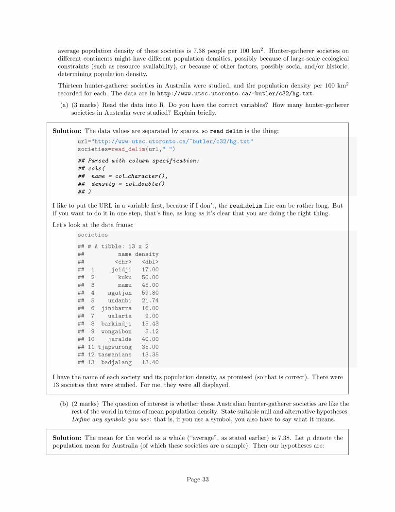
Solution: The assumption behind the t-test is that the data are approximately normal. We can assessthat in several ways, but the simplest (which is perfectly acceptable at this point) is a histogram. You’llneed to pick a suitable number of bins. This one comes from Sturges’ rule:
ggplot(societies,aes(x=density))+geom_histogram(bins=5)
Page 34
0
2
4
6
0 20 40 60
density
coun
t
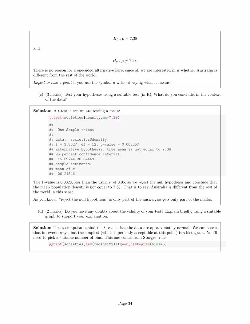
Your conclusion might depend on how many bins you chose for your histogram. Here’s 8 bins (which isreally too many with only 13 observations, but it actually shows the shape well):
ggplot(societies,aes(x=density))+geom_histogram(bins=8)
Page 35
0
1
2
3
4
5
20 40 60
density
coun
t
or you can get a number of bins from one of the built-in functions, such as:
mybins=nclass.FD(societies$density)
mybins
## [1] 3
This one is small. The interquartile range is large and n is small, so the binwidth will be large andtherefore the number of bins will be small.
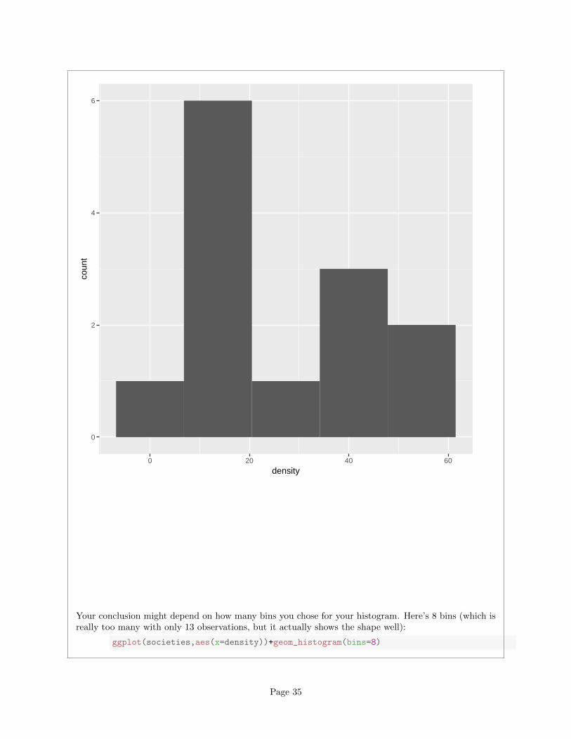
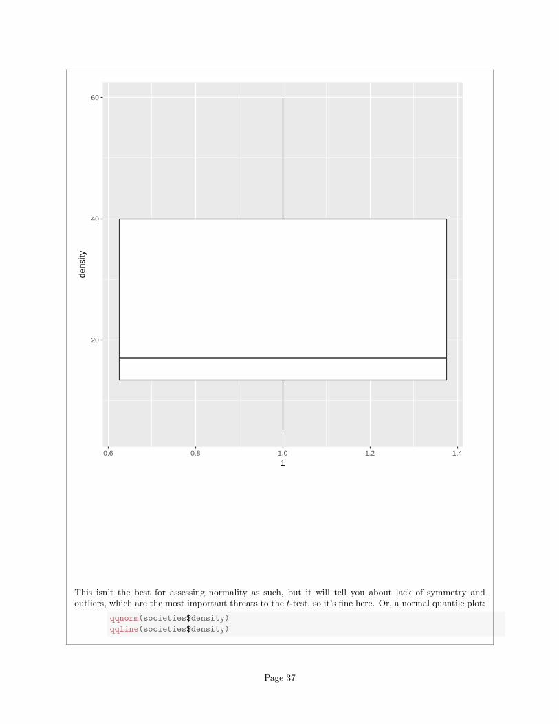
Other choices: a one-group boxplot:
ggplot(societies,aes(x=1,y=density))+geom_boxplot()
Page 36
20
40
60
0.6 0.8 1.0 1.2 1.4
1
dens
ity
This isn’t the best for assessing normality as such, but it will tell you about lack of symmetry andoutliers, which are the most important threats to the t-test, so it’s fine here. Or, a normal quantile plot:
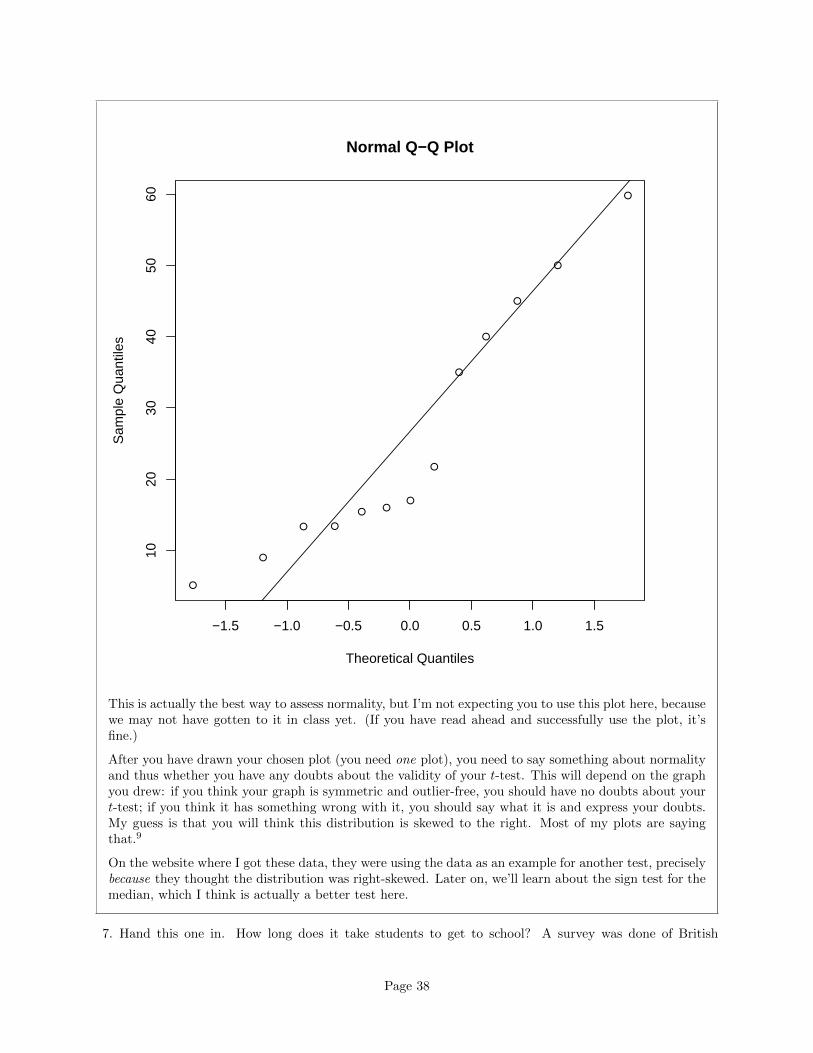
qqnorm(societies$density)
qqline(societies$density)
Page 37
●
●
●
●
●
●
●
●
●
●
●
● ●
−1.5 −1.0 −0.5 0.0 0.5 1.0 1.5
1020
3040
5060
Normal Q−Q Plot
Theoretical Quantiles
Sam
ple
Qua
ntile
s
This is actually the best way to assess normality, but I’m not expecting you to use this plot here, becausewe may not have gotten to it in class yet. (If you have read ahead and successfully use the plot, it’sfine.)
After you have drawn your chosen plot (you need one plot), you need to say something about normalityand thus whether you have any doubts about the validity of your t-test. This will depend on the graphyou drew: if you think your graph is symmetric and outlier-free, you should have no doubts about yourt-test; if you think it has something wrong with it, you should say what it is and express your doubts.My guess is that you will think this distribution is skewed to the right. Most of my plots are sayingthat.9
On the website where I got these data, they were using the data as an example for another test, preciselybecause they thought the distribution was right-skewed. Later on, we’ll learn about the sign test for themedian, which I think is actually a better test here.
7. Hand this one in. How long does it take students to get to school? A survey was done of British
Page 38
secondary school students, and a similar survey of Ontario high-school students, with 40 students ineach (which, you may assume, are a random sample of their respective populations). In both surveys,the “typical” time taken to get to school was recorded. The question of interest is whether thereis a difference in the time students take to get to school in Ontario and the UK. The data are inhttp://www.utsc.utoronto.ca/~butler/c32/to-school.csv.
(a) (2 marks) Read the data into SAS. There should be two columns, traveltime and location.Obtain the mean travel time for each location. How many travel times do you have at each location?
Solution: The usual business for reading in a .csv:
filename myurl url 'http://www.utsc.utoronto.ca/~butler/c32/to-school.csv';
proc import
datafile=myurl
dbms=csv
out=mydata
replace;
getnames=yes;
Normally you’d follow this with proc print, which you probably should for yourself, but there are 80lines of data, a lot to hand in, so I asked you to summarize things, thus:
proc means;
var traveltime;
class location;
The MEANS Procedure
Analysis Variable : traveltime
N
location Obs N Mean Std Dev Minimum Maximum
-------------------------------------------------------------------------------
Ontario 40 40 17.0000000 9.6609178 2.0000000 47.0000000
UK 40 40 20.6500000 13.1276768 3.0000000 60.0000000
-------------------------------------------------------------------------------
There are 40 travel times in each location; the mean for the Ontario students is 17 minutes, and themean for the British students is 20.65 minutes. You need to say this.
If something went astray with the reading in, it will probably show up here, and that would alert youto check what you did.
The first time I did this, I had the British times first in the data file, and the locations were labelled UK
and On (it seems to take the maximum length from the first one it finds). But I didn’t want you to bedealing with that, so I switched things around in the data file.
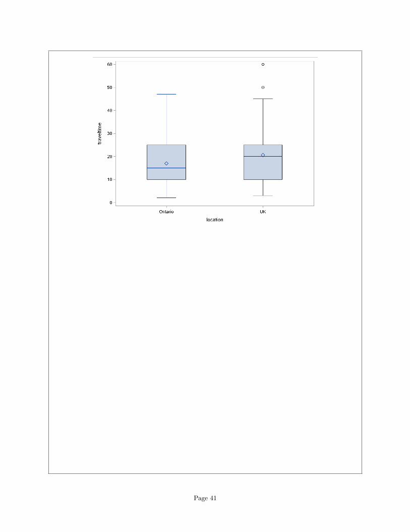
(b) (4 marks) Make a suitable plot of travel times for each location. Describe the shapes of the distri-butions. Do they have similar spreads?
Solution: There is one quantitative variable here, travel time, and one categorical one, location, so theobvious thing is a side-by-side boxplot:
Page 39

proc sgplot;
vbox traveltime / category=location;
Page 40
Page 41
I think both of those distributions are skewed to the right: look at the longer upper whiskers, and theoutliers on the UK distribution. However, the spreads, as measured by the heights of the boxes, lookvery similar to me.
Two points for a suitable graph, and one each for appropriate comment about shape and and aboutspreads.
Another possibility for a graph would be a paneled histogram, but this requires extra cajoling to comeout above and below, like this:
proc sgpanel;
panelby location / columns=1;
histogram traveltime;
The columns=1 arranges all the plots in one long vertical column, which is what we want:
Page 42
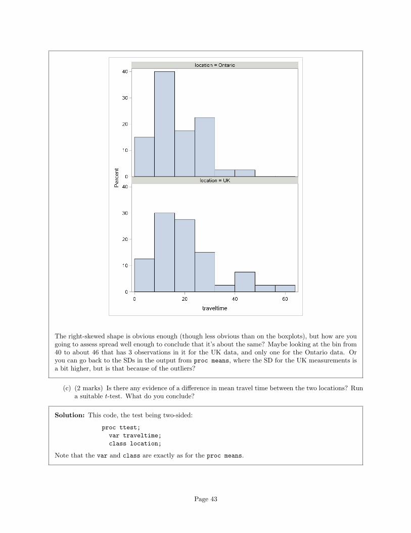
The right-skewed shape is obvious enough (though less obvious than on the boxplots), but how are yougoing to assess spread well enough to conclude that it’s about the same? Maybe looking at the bin from40 to about 46 that has 3 observations in it for the UK data, and only one for the Ontario data. Oryou can go back to the SDs in the output from proc means, where the SD for the UK measurements isa bit higher, but is that because of the outliers?
(c) (2 marks) Is there any evidence of a difference in mean travel time between the two locations? Runa suitable t-test. What do you conclude?
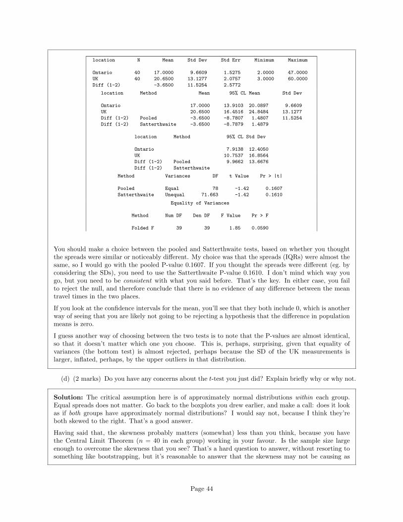
Solution: This code, the test being two-sided:
proc ttest;
var traveltime;
class location;
Note that the var and class are exactly as for the proc means.
Page 43
location N Mean Std Dev Std Err Minimum Maximum
Ontario 40 17.0000 9.6609 1.5275 2.0000 47.0000
UK 40 20.6500 13.1277 2.0757 3.0000 60.0000
Diff (1-2) -3.6500 11.5254 2.5772
location Method Mean 95% CL Mean Std Dev
Ontario 17.0000 13.9103 20.0897 9.6609
UK 20.6500 16.4516 24.8484 13.1277
Diff (1-2) Pooled -3.6500 -8.7807 1.4807 11.5254
Diff (1-2) Satterthwaite -3.6500 -8.7879 1.4879
location Method 95% CL Std Dev
Ontario 7.9138 12.4050
UK 10.7537 16.8564
Diff (1-2) Pooled 9.9662 13.6676
Diff (1-2) Satterthwaite
Method Variances DF t Value Pr > |t|
Pooled Equal 78 -1.42 0.1607
Satterthwaite Unequal 71.663 -1.42 0.1610
Equality of Variances
Method Num DF Den DF F Value Pr > F
Folded F 39 39 1.85 0.0590
You should make a choice between the pooled and Satterthwaite tests, based on whether you thoughtthe spreads were similar or noticeably different. My choice was that the spreads (IQRs) were almost thesame, so I would go with the pooled P-value 0.1607. If you thought the spreads were different (eg. byconsidering the SDs), you need to use the Satterthwaite P-value 0.1610. I don’t mind which way yougo, but you need to be consistent with what you said before. That’s the key. In either case, you failto reject the null, and therefore conclude that there is no evidence of any difference between the meantravel times in the two places.
If you look at the confidence intervals for the mean, you’ll see that they both include 0, which is anotherway of seeing that you are likely not going to be rejecting a hypothesis that the difference in populationmeans is zero.
I guess another way of choosing between the two tests is to note that the P-values are almost identical,so that it doesn’t matter which one you choose. This is, perhaps, surprising, given that equality ofvariances (the bottom test) is almost rejected, perhaps because the SD of the UK measurements islarger, inflated, perhaps, by the upper outliers in that distribution.
(d) (2 marks) Do you have any concerns about the t-test you just did? Explain briefly why or why not.
Solution: The critical assumption here is of approximately normal distributions within each group.Equal spreads does not matter. Go back to the boxplots you drew earlier, and make a call: does it lookas if both groups have approximately normal distributions? I would say not, because I think they’reboth skewed to the right. That’s a good answer.
Having said that, the skewness probably matters (somewhat) less than you think, because you havethe Central Limit Theorem (n = 40 in each group) working in your favour. Is the sample size largeenough to overcome the skewness that you see? That’s a hard question to answer, without resorting tosomething like bootstrapping, but it’s reasonable to answer that the skewness may not be causing as
Page 44
much of a problem as it appears because of the largish sample sizes.
There’s a lot of hand-waving involved in all of this, and it may be difficult to get a definitive answerabout whether we should do the two-sample t-test or something else (eg. Mood’s median test, comingup later), but I want you to get at the issues in your answer: at least, that both distributions are skewedright, so that approximate normality fails, but possibly also that we have n = 40 in both groups so theCentral Limit Theorem is in our favour (and the normality doesn’t matter as much).
One other thing in among the infinity of issues here is that it helps if both groups are skewed in the samedirection, as here, because whichever t-statistic you calculate, you subtract the sample means, and thisallows the skewness to “cancel out”, or at least get reduced. The idea is that you might get an unusuallylarge travel time in either group, and those will both inflate the mean in that group upwards, so thatwhen you subtract the means this effect is dampened down. (Compare if one group were skewed rightand the other skewed left ; then you’d have the sample means being pulled potentially opposite ways byunusual values and the difference could, if you were unlucky, be pulled a long way away from zero.)
One way to do less hand-waving, as I hinted above, is via the “bootstrap”. The idea behind this is thatyou treat the observed data as populations, and then you sample from them with replacement. Youcalculate the test statistic each time, and then this gives an idea of what the sampling distribution lookslike. Since we’re doing a test which is based on a null hypothesis, we arrange things beforehand so thatthe means actually are equal, and then see how often we mistakenly reject.
As you might expect, R is the tool for this. Let’s start with a small one where the distributions areskewed opposite ways, so we expect it to go wrong:
x=c(0,1,2,10)
y=c(0,7,8,9)
Two populations of size 4, x skewed right and y skewed left. But they have different means. Let’ssubtract off the mean of each to get two tiny populations with mean zero:
xx=x-mean(x)
xx
## [1] -3.25 -2.25 -1.25 6.75
mean(xx)
## [1] 0
yy=y-mean(y)
yy
## [1] -6 1 2 3
mean(yy)
## [1] 0
Now we sample from each of those with replacement, taking samples of the same size as we originallyhad (4, here). I’m using set.seed to start the random number generator in the same place every time,so that each time I run this whole procedure, I get the same answers to talk about:
Page 45
set.seed(457299)
x_star=sample(xx,4,replace=T)
x_star
## [1] 6.75 -3.25 -3.25 -1.25
y_star=sample(yy,4,replace=T)
y_star
## [1] 1 3 -6 -6
The re-sampled samples can have repeats, and that’s fine.
Then we throw the re-sampled samples into t.test:
tt=t.test(x_star,y_star)
tt
##
## Welch Two Sample t-test
##
## data: x_star and y_star
## t = 0.52369, df = 5.9987, p-value = 0.6193
## alternative hypothesis: true difference in means is not equal to 0
## 95 percent confidence interval:
## -6.42718 9.92718
## sample estimates:
## mean of x mean of y
## -0.25 -2.00
tt$statistic
## t
## 0.5236924
tt$p.value
## [1] 0.6192682
This time we got a test statistic of 0.52 and a P-value of 0.62.
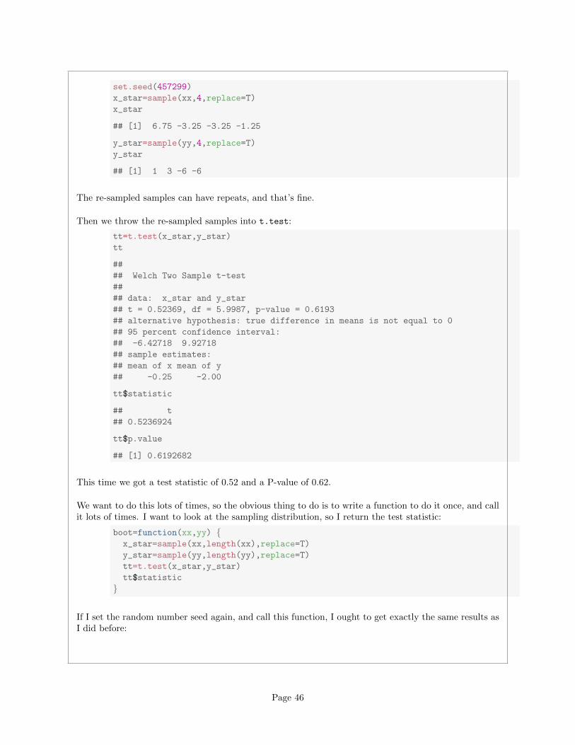
We want to do this lots of times, so the obvious thing to do is to write a function to do it once, and callit lots of times. I want to look at the sampling distribution, so I return the test statistic:
boot=function(xx,yy) {x_star=sample(xx,length(xx),replace=T)
y_star=sample(yy,length(yy),replace=T)
tt=t.test(x_star,y_star)
tt$statistic
}
If I set the random number seed again, and call this function, I ought to get exactly the same results asI did before:
Page 46
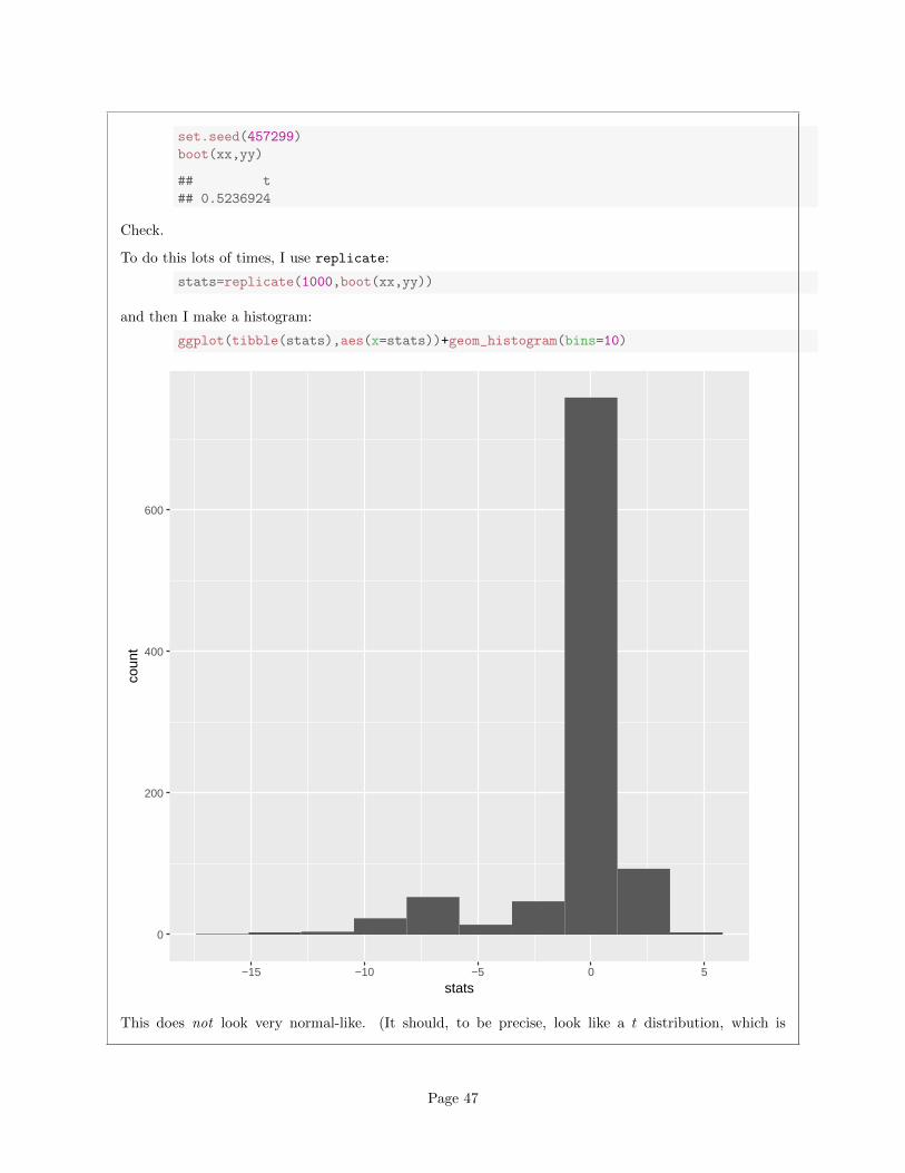
set.seed(457299)
boot(xx,yy)
## t
## 0.5236924
Check.
To do this lots of times, I use replicate:
stats=replicate(1000,boot(xx,yy))
and then I make a histogram:
ggplot(tibble(stats),aes(x=stats))+geom_histogram(bins=10)
0
200
400
600
−15 −10 −5 0 5
stats
coun
t
This does not look very normal-like. (It should, to be precise, look like a t distribution, which is
Page 47
symmetric, and this is definitely not.)
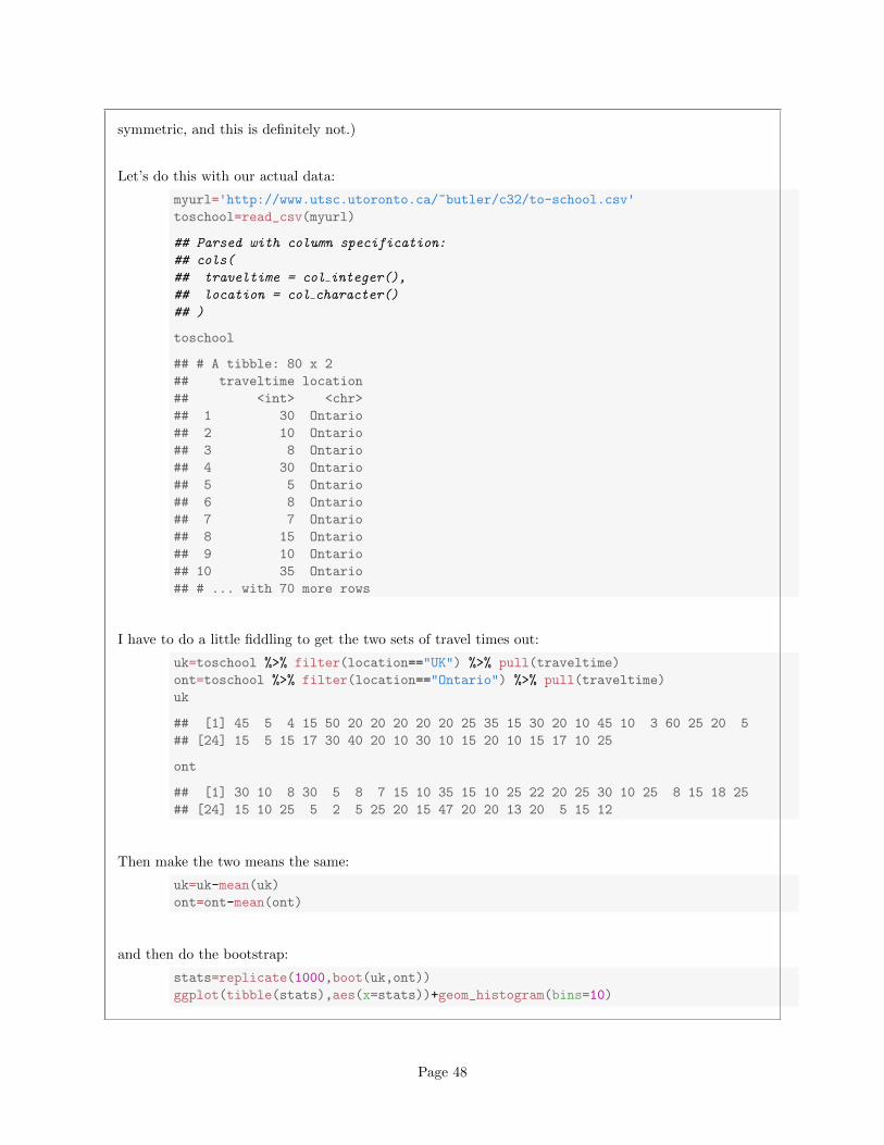
Let’s do this with our actual data:
myurl='http://www.utsc.utoronto.ca/~butler/c32/to-school.csv'
toschool=read_csv(myurl)
## Parsed with column specification:
## cols(
## traveltime = col integer(),
## location = col character()
## )
toschool
## # A tibble: 80 x 2
## traveltime location
## <int> <chr>
## 1 30 Ontario
## 2 10 Ontario
## 3 8 Ontario
## 4 30 Ontario
## 5 5 Ontario
## 6 8 Ontario
## 7 7 Ontario
## 8 15 Ontario
## 9 10 Ontario
## 10 35 Ontario
## # ... with 70 more rows
I have to do a little fiddling to get the two sets of travel times out:
uk=toschool %>% filter(location=="UK") %>% pull(traveltime)
ont=toschool %>% filter(location=="Ontario") %>% pull(traveltime)
uk
## [1] 45 5 4 15 50 20 20 20 20 20 25 35 15 30 20 10 45 10 3 60 25 20 5
## [24] 15 5 15 17 30 40 20 10 30 10 15 20 10 15 17 10 25
ont
## [1] 30 10 8 30 5 8 7 15 10 35 15 10 25 22 20 25 30 10 25 8 15 18 25
## [24] 15 10 25 5 2 5 25 20 15 47 20 20 13 20 5 15 12
Then make the two means the same:
uk=uk-mean(uk)
ont=ont-mean(ont)
and then do the bootstrap:
stats=replicate(1000,boot(uk,ont))
ggplot(tibble(stats),aes(x=stats))+geom_histogram(bins=10)
Page 48
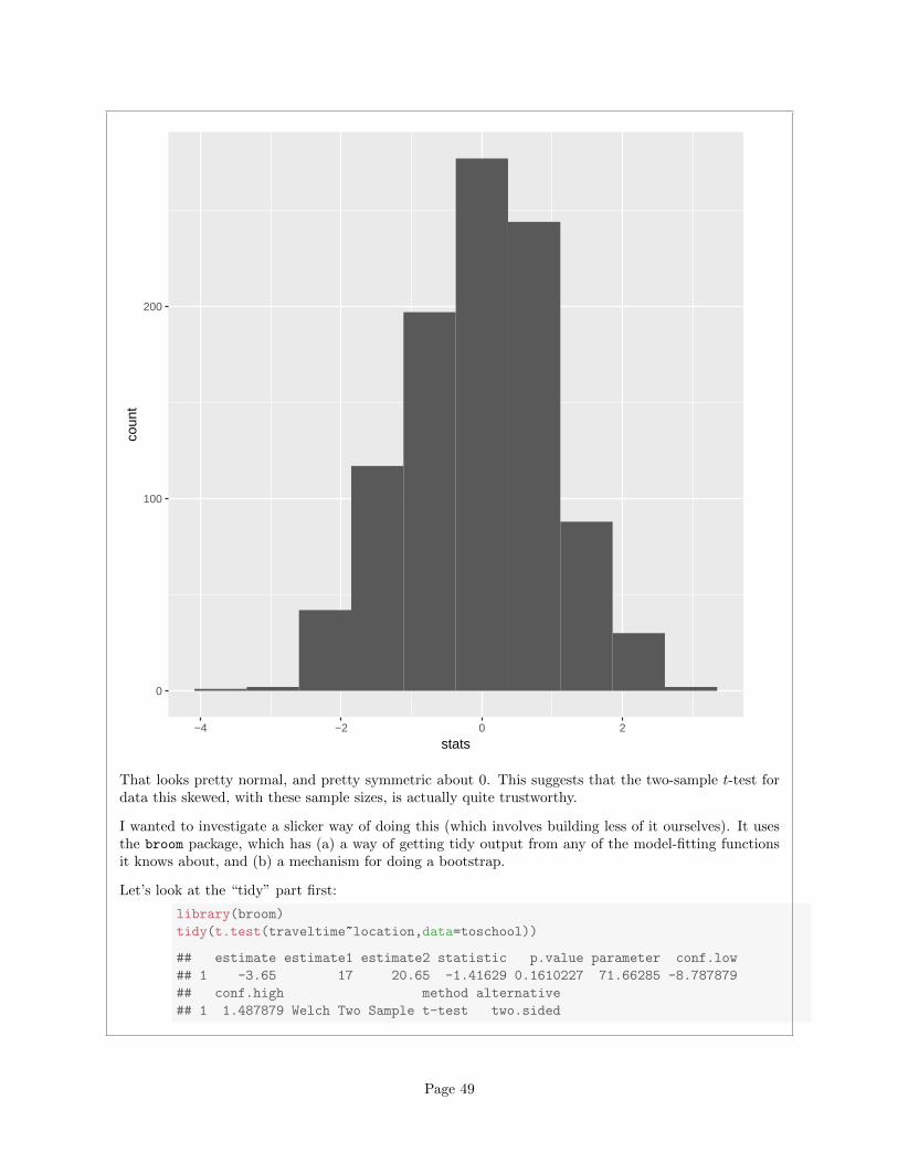
0
100
200
−4 −2 0 2
stats
coun
t
That looks pretty normal, and pretty symmetric about 0. This suggests that the two-sample t-test fordata this skewed, with these sample sizes, is actually quite trustworthy.
I wanted to investigate a slicker way of doing this (which involves building less of it ourselves). It usesthe broom package, which has (a) a way of getting tidy output from any of the model-fitting functionsit knows about, and (b) a mechanism for doing a bootstrap.
Let’s look at the “tidy” part first:
library(broom)
tidy(t.test(traveltime~location,data=toschool))
## estimate estimate1 estimate2 statistic p.value parameter conf.low
## 1 -3.65 17 20.65 -1.41629 0.1610227 71.66285 -8.787879
## conf.high method alternative
## 1 1.487879 Welch Two Sample t-test two.sided
Page 49
This summarizes the whole test in one row of a data frame.
With this in place, we can do the bootstrap:
boots=toschool %>% bootstrap(1000) %>%
do(tidy(t.test(traveltime~location,data=.)))
boots
## # A tibble: 1,000 x 11
## # Groups: replicate [1,000]
## replicate estimate estimate1 estimate2 statistic p.value
## <int> <dbl> <dbl> <dbl> <dbl> <dbl>
## 1 1 -2.732244 19.34884 22.08108 -0.9875869 0.327493090
## 2 2 -5.997494 16.02632 22.02381 -2.1692336 0.033186041
## 3 3 -9.343750 15.43750 24.78125 -3.1433310 0.002941195
## 4 4 -4.268170 17.54762 21.81579 -1.5063593 0.138041883
## 5 5 -5.422222 15.57778 21.00000 -1.8419914 0.071106588
## 6 6 -2.812030 17.21429 20.02632 -1.1902022 0.238316774
## 7 7 -3.189394 16.47727 19.66667 -1.2245495 0.225479129
## 8 8 -5.749361 15.45652 21.20588 -2.1144210 0.039096687
## 9 9 -9.620301 15.64286 25.26316 -3.3772869 0.001232392
## 10 10 -1.187621 18.72727 19.91489 -0.4577070 0.648445794
## # ... with 990 more rows, and 5 more variables: parameter <dbl>,
## # conf.low <dbl>, conf.high <dbl>, method <fctr>, alternative <fctr>
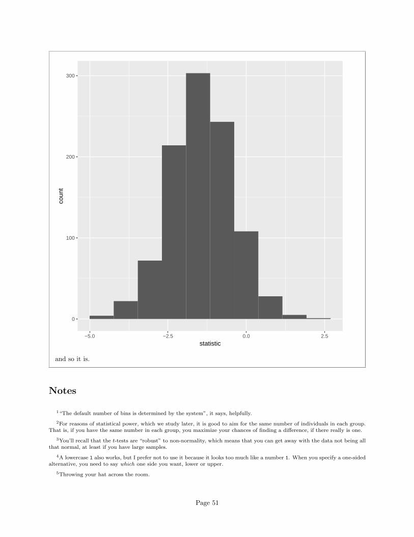
I didn’t subtract off the means, so the sampling distribution won’t be centred at zero, but its shapeshould be about normal:
ggplot(boots,aes(x=statistic))+geom_histogram(bins=10)
Page 50
0
100
200
300
−5.0 −2.5 0.0 2.5
statistic
coun
t
and so it is.
Notes
1“The default number of bins is determined by the system”, it says, helpfully.
2For reasons of statistical power, which we study later, it is good to aim for the same number of individuals in each group.That is, if you have the same number in each group, you maximize your chances of finding a difference, if there really is one.
3You’ll recall that the t-tests are “robust” to non-normality, which means that you can get away with the data not being allthat normal, at least if you have large samples.
4A lowercase l also works, but I prefer not to use it because it looks too much like a number 1. When you specify a one-sidedalternative, you need to say which one side you want, lower or upper.
5Throwing your hat across the room.
Page 51
6Some people call this the “Behrens-Fisher problem”. See that name Fisher again?
7R calls it the “Welch t-test”.
8What W and S did was to work out the variance of t above under the null hypothesis, the mean being zero, and matchthat variance up to the variance of t-distribution, which depends on its degrees of freedom. Choose the degrees of freedom tomake the variances of the t statistic and the t distribution match. Method of moments, in fact. You might have learned thatin STAB52. There is actually no assertion of “best” here: the idea is that W and S proposed this as a “sensible” test statisticand said that it has approximately a t-distribution with the right df. It happens to be almost as good as the pooled t-test whenthe two groups have the same variance, which is a lucky break: we had no right to expect that.
9The normal quantile plot is rather interesting: it says that the uppermost values are approximately normal, but the smallesteight or so values are too bunched up to be normal. That is, normality fails not because of the long tail on the right, but thebunching on the left. Still right-skewed, though.
Page 52