Embed Size (px)
DESCRIPTION
Asset Meltdown Wealth Middle Class - Edward N Wolff
Citation preview

7/18/2019 Asset Meltdown Wealth Middle Class
http://slidepdf.com/reader/full/asset-meltdown-wealth-middle-class 1/75
NBER WORKING PAPER SERIES
THE ASSET PRICE MELTDOWN AND THE WEALTH OF THE MIDDLE CLASS
Edward N. Wolff
Working Paper 18559
http://www.nber.org/papers/w18559
NATIONAL BUREAU OF ECONOMIC RESEARCH
1050 Massachusetts AvenueCambridge, MA 02138
November 2012
I would like to thank the Russell Sage Foundation for financial support for this work. The views expressed
herein are those of the author and do not necessarily reflect the views of the National Bureau of Economic
Research.
NBER working papers are circulated for discussion and comment purposes. They have not been peer-
reviewed or been subject to the review by the NBER Board of Directors that accompanies officialNBER publications.
© 2012 by Edward N. Wolff. All rights reserved. Short sections of text, not to exceed two paragraphs,
may be quoted without explicit permission provided that full credit, including © notice, is given tothe source.
7/18/2019 Asset Meltdown Wealth Middle Class
http://slidepdf.com/reader/full/asset-meltdown-wealth-middle-class 2/75
The Asset Price Meltdown and the Wealth of the Middle Class
Edward N. Wolff
NBER Working Paper No. 18559
November 2012
JEL No. D31,J15
ABSTRACT
I find that median wealth plummeted over the years 2007 to 2010, and by 2010 was at its lowest level
since 1969. The inequality of net worth, after almost two decades of little movement, was up sharply
from 2007 to 2010. Relative indebtedness continued to expand from 2007 to 2010, particularly for
the middle class, though the proximate causes were declining net worth and income rather than an
increase in absolute indebtedness. In fact, the average debt of the middle class actually fell in real terms
by 25 percent. The sharp fall in median wealth and the rise in inequality in the late 2000s are traceable
to the high leverage of middle class families in 2007 and the high share of homes in their portfolio.
The racial and ethnic disparity in wealth holdings, after remaining more or less stable from 1983 to
2007, widened considerably between 2007 and 2010. Hispanics, in particular, got hammered by the
Great Recession in terms of net worth and net equity in their homes. Households under age 45 also
got pummeled by the Great Recession, as their relative and absolute wealth declined sharply from
2007 to 2010.
Edward N. Wolff
Department of Economics
New York University
19 W. 4th Street, 6th Floor
New York, NY 10012and NBER

7/18/2019 Asset Meltdown Wealth Middle Class
http://slidepdf.com/reader/full/asset-meltdown-wealth-middle-class 3/75
2
1. Introduction
The last two decades have witnessed some remarkable events. Perhaps, most notable is the housing
value cycle which first led to an explosion in home prices and then a collapse, affecting net worth and
helping to precipitate the Great Recession. The housing bubble, in turn, was based on questionable mortgage
practices and then speculative over-building.The median house price remained virtually the same in 2001 as in 1989 in real terms.1 However, the
home ownership rate shot up from 62.8% in 1989 to 67.7% in 2001 according to data from the Survey of
Consumer Finances (SCF). Then, 2001 saw a recession (albeit a short one). Despite this, house prices
suddenly took off. The median sales price of existing one-family homes rose by 17.9% in real terms
nationwide.2 However, from 2004 to 2007 housing prices slowed, with the median sales price of existing
one-family nationwide advancing only 1.7% in real terms. Over the years 2001 to 2007 real housing prices
gained 18.8%. The home ownership rate continued to expand, though at a somewhat slower rate, from
67.7% to 68.6%.
Then, the Great Recession and the associated financial crisis hit at the end of 2007 and asset prices
plummeted. From 2007 to 2010, in particular, the median price of existing homes nose-dived by 21% in
nominal terms and 24% in real terms.3 Moreover, for the first time in 30 years, the share of households
owning their own home fell off, from 68.6 to 67.2 percent.
The housing price bubble was fueled in large part by a generous expansion of credit available for
home purchases and re-financing. This took a number of forms. First, many home owners re-financed their
primary mortgage. However, because of the rise in housing prices, these home owners increased the
outstanding mortgage principal and thereby extracted equity from their homes. Second, many home owners
took out second mortgages and home equity loans or increased the outstanding balances on these
instruments. Third, among new home owners, credit requirements were softened, and so-called “no-doc”
loans were issued requiring none or little in the way of income documentation. Many of these loans, in turn,
were so-called “sub- prime” mortgages, characterized by excessively high interest rates and “balloon
payments” at the expiration of the loan (that is, a non-zero amount due when the term of the loan was up).
All told, average mortgage debt per household expanded by 59% in real terms between 2001 and 2007
according to the SCF data, and outstanding mortgage loans as a share of house value rose from 0.334 to
1 The source is Table 935 of the 2009 Statistical Abstract , US Bureau of the Census, available at
[http://www.census.gov/compendia/statab/].
2 The source is Table 935 of the 2009 Statistical Abstract , op. cit.
3 The source is National Association of Realtors, “Median Sales Price of Existing Single-Family Homes for
Metropolitan Areas,” available at: http://www.realtor.org/sites/default/files/reports/2012/embargoes/2012-q1-metro-
home-prices-49bc10b1efdc1b8cc3eb66dbcdad55f7/metro-home-prices-q1-single-family-2012-05-09.pdf.

7/18/2019 Asset Meltdown Wealth Middle Class
http://slidepdf.com/reader/full/asset-meltdown-wealth-middle-class 4/75
3
0.349, despite the 19% gain in real housing prices (see Table 5 below for more details).
In contrast to the housing market, the stock market boomed during the 1990s. On the basis of the
Standard & Poor (S&P) 500 index, stock prices surged 171% between 1989 and 2001. Stock ownership
spread and by 2001 (as we shall see below) over half of U.S. households owned stock either directly or
indirectly. However, the stock market peaked in 2000 and dropped steeply from 2000 to 2003 but recoveredsomewhat in 2004, so that between 2001 and 2004 the S&P 500 was down by “only” 5.3% in nominal terms
but by 12.0% in real terms.4 From 2004 to 2007, the stock market rebounded. The S&P 500 rose 19% in
real terms. Over the period from 2001 to 2007, the S&P 500 was up 6% in real terms. However, the share of
households who owned stock either directly or indirectly fell somewhat to 49% from 52% in 2001. Then
came the Great Recession. Stock prices, based on the S&P 500 index, crashed from 2007 to 2009 and then
partially recovered in 2010 for a net decline of 26% in real terms. The stock ownership rate also once again
declined, to 47%.
Real wages, after stagnating for many years, finally grew in the late 1990s. According to BLS
figures, real mean hourly earnings gained 8.3% between 1995 and 2001.5 From 1989 to 2001, real wages
rose by 4.9% (in total), and median household income in constant dollars inched up by 2.3%. Employment
also surged over these years, growing by 16.7%.6 The (civilian) unemployment rate remained relatively low
over these years, at 5.3% in 1989, 4.7% in 2001, with a low point of 4.0% in 2000, and averaging 5.5% over
these years.7
Real wages then rose very slowly from 2001 to 2004, with the BLS real mean hourly earnings up by
only 1.5%, and median household income dropped in real terms by 1.5%.8 From 2004 to 2007, real wages
remained stagnant, with the BLS real mean hourly earnings rising by only 1.0%. Median household income
in real terms showed some growth over this period, rising by 3.2%. From 2001 to 2007 it gained 1.6%.
Employment also grew more slowly over these years, gaining 6.7%. The unemployment rate remained low
4 The source for stock prices is Table B-96 of the Economic Report of the President, 2012, available at
http://www.gpoaccess.gov/eop/tables12.html
5 These figures are based on the Bureau of Labor Statistics (BLS) hourly wage series. The source is Table B-47 of the
Economic Report, available at http://www.gpoaccess.gov/eop/tables09.html.
The BLS wage figures are converted to constant dollars on the basis of the Consumer Price Index (CPI-U).
6 The figure is for civilian employment. The source is Table B-36 of the Economic Report of the President, 2012,
available at http://www.gpoaccess.gov/eop/tables36.html.
7 The source is Table B-42 of the Economic Report of the President, 2012, available at
http://www.gpoaccess.gov/eop/tables42.html.
8 The source is Table B-33 of the Economic Report of the President, 2009, available at
http://www.gpoaccess.gov/eop/tables09.html.

7/18/2019 Asset Meltdown Wealth Middle Class
http://slidepdf.com/reader/full/asset-meltdown-wealth-middle-class 5/75
4
again, at 4.7% in 2001, 4.6% in 2007, and an average value of 5.2%.
Real wages, on the other hand, picked up from 2007 to 2010, with the BLS real mean hourly
earnings increasing by 3.6%.9 In contrast, median household income in real terms declined sharply over this
period, by 6.4% (see Table 1 below). Moreover, employment contracted over these years, by 4.8%, and the
unemployment rate surged from 4.6% in 2007 to 10.5% in 2010, though it did come down a bit to 8.9% in2011.
There was also an explosion of consumer debt leading up to the Great Recession. Between 1989 and
2001, total consumer credit outstanding in 2007 dollars surged by 70% and then from 2001 to 2007 it rose
by another 17%.10 There were a number of factors responsible for this. First credit cards became more
generally available for consumers. Second, credit standards were relaxed considerably, making more
households eligible for credit cards. Third, credit limits were generously increased by banks hoping to make
profits out of increased fees from late payments and from higher interest rates.
Another source of new household indebtedness was from a huge increase in student loans. This
issue has recently received wide attention in the press. According to the SCF data, the share of households
reporting an educational loan rose from 13.4% in 2004 to 15.2% in 2007 and then surged to 19.1% in
2010.11 The mean value of educational loans in 2010 dollars among loan holders only increased by 17%
from $19,410 in 2004 to $22,367 in 2007 and then by another 14% to $25,865 in 2010. The median value of
such loans first went up by 19% from $10,620 in 2007 to $12,620 in 2007 and then by another 3% to
$13,000 in 2010. These loans were heavily concentrated among younger households and, as we shall see
below, was one of the factors which led to a precipitous decline in their net worth between 2007 to 2010.
Another major change over the last two decades affecting household wealth was a major overhaul of
the private pension system in the United States. As documented in Wolff (2011b), in 1989, 46% of all
households reported holding a defined benefit (DB) pension plan. DB plans are traditional pensions, such as
provided by many large corporations and governments, which guarantee a steady flow of income upon
retirement. By 2007, that figure was down to 34%. The decline was more pronounced among younger
households, under the age of 46, from 38% to 23%, as well as among middle-aged households, ages 47 to
64, from 57 to 39%.
Many of these plans were replaced by so-called defined contribution (DC) pension accounts, most
9 The source is Table B-47 of the Economic Report of the President, 2012, available at
http://www.gpoaccess.gov/eop/tables12.html.
10 These figures are based on the Federal Reserve Board’s Flow of Funds data, Table B.100, available at:
http://www.federalreserve.gov/releases/Z1/.
11 Unfortunately, no data on educational loans are available in the 2001 SCF.
7/18/2019 Asset Meltdown Wealth Middle Class
http://slidepdf.com/reader/full/asset-meltdown-wealth-middle-class 6/75
5
notably 401(k) plans and Individual Retirement accounts (IRAs). These plans allow household to
accumulate savings for retirement purposes directly. The share of all household with a DC plan skyrocketed
from 24% in 1989 to 53% in 2007. Among younger households, the share rose from 31% to 50%, and
among middle-aged households it went from 28 to 64 percent.
This transformation is even more notable in terms of actual dollar values. While the average value ofDB pension wealth among all households crept up by 8% from $56,500 in 1989 to $61,200 in 2007, the
average value of DC plans shot up more than 7-fold from $10,600 to $76,800 (all figures are in 2007
dollars).12 Among younger households, average DB wealth actually fell in absolute terms, while DC wealth
rose by a factor of 3.3. Among middle-aged households, the value of DB pensions also fell in absolute terms
while the value of DC plans mushroomed by a factor of 6.5.
These changes are important for understanding trends in household wealth because DB pension
wealth is not included in the measure of marketable household wealth whereas DC wealth is included (see
Section 4 below). Thus, the substitution of DC wealth for DB wealth is likely to lead to an overstatement in
the “true” gains in household wealth, since the displacement in DB wealth is not captured (see Wolff,
2011b, for more discussion).
The other big story was household debt, particularly that of the middle class, which skyrocketed
during these years, as we shall see below. Despite the recession, the relative indebtedness of American
families continued to rise from 2007 to 2010.
What have all these major transformations wrought in terms of the distribution of household wealth,
particularly over the Great Recession? How have these changes impacted different demographic groups,
particularly as defined by race, ethnicity, and age? This is the subject of the remainder of the paper.
2. Plan of the Paper
The paper focuses mainly on how the middle class fared in terms of wealth over the years 2007 to
2010 during one of the sharpest declines in stock and real estate prices. As discussed below, the debt of the
middle class exploded from 1983 to 2007, already creating a very fragile middle class in the United States.
The main interest here is whether their position deteriorated even more over the “Great Recession.” The
paper also investigates trends in wealth inequality from 2007 to 2010, changes in the racial wealth gap and
wealth differences by age, and trends in homeownership rates, stock ownership, retirement accounts, and
mortgage debt.
The period covered in the project will span the years from 1962 to 2010. In particular, results will be
provided for years 1962, 1969, 1983, 1989, 1992, 1995, 1998, 2001, 2004, 2007, 2009, and 2010. The
choice of years is dictated by the availability of survey data on household wealth. By 2010, we are able to
12 The computation of DB pension wealth is based on the present value of expected pension benefits upon retirement.
See Wolff (2011b) for details.

7/18/2019 Asset Meltdown Wealth Middle Class
http://slidepdf.com/reader/full/asset-meltdown-wealth-middle-class 7/75
6
see what the fall-out was from the financial crisis and associated recession and, in particular, which groups
were impacted the most.
There are seven specific issues addressed in the paper. (1) Did the inequality of household wealth
rise over time, particularly during the years from 2007 to 2010? (2) Did median household wealth continue
to advance over time or did it fall, particularly from 2007 to 2010? (3) Did the debt of the middle classincrease over time, especially during the last three years of the previous decade? (4) What are the time
trends in home ownership and home equity and what happened, in particular, from 2007 to 2010? (5) Did
the rate of stock ownership and the value of retirement accounts rise over time, especially at the end of the
last decade? (6) How did time trends in average wealth, household debt, the home ownership rate, home
equity, stock ownership, and the value of retirement accounts vary by age group? (7) What are the time
trends in average wealth, household debt, the home ownership rate, home equity, stock ownership, and the
value of retirement accounts for different racial and ethnic groups? As discussed in the next section, trends
in household wealth have a direct bearing on household well-being and should therefore be of general public
interest.
The paper is organized as follows. The next section, Section 3, provides a rationale for looking at
household wealth. Section 4 discusses the measurement of household wealth and describes the data sources
used for this study. Section 5 presents results on time trends in median and average wealth holdings, Section
6 on changes in the concentration of household wealth, and Section 7 on the composition of household
wealth. Section 8 provides added details on the housing market. In Section 9, I provide an analysis of the
effects of leverage on wealth movements over time, particularly in regard to how it impacted households
during the Great Recession. Section 10 investigates changes in wealth holdings by race and ethnicity; and
Section 11 reports on changes in the age-wealth profile. Section 12 provides details on stock ownership for
different demographic groups. Section 13 focuses on changes in pension wealth. A summary of results and
concluding remarks are provided in Section 14.
Previous work of mine (see Wolff, 1994, 1996, 1998, 2001, 2002a, and 2011a), using SCF data from
1983 through 2007, presented evidence of sharply increasing wealth inequality from 1983 to 1989 followed
by little change between 1989 and 2007. Both mean and median wealth holdings climbed briskly during the
1983-1989 period, and from 1989 to 2007 both mean and median net worth continued to grow substantially.
However, most of the wealth gains from 1983 to 2007 were concentrated among the richest 20% of
households. Moreover, despite the buoyant economy over the 1990s and 2000s, overall indebtedness
continued to rise among American families. Stocks and pensions accounts also rose as a share of total
household wealth, with offsetting declines in bank deposits, investment real estate, and financial securities.
The ratio of mean wealth between African-American and white families was very low in 1983, at
0.19, and barely budged during the 1990s and the early and mid 2000s. The ratio of median wealth was also

7/18/2019 Asset Meltdown Wealth Middle Class
http://slidepdf.com/reader/full/asset-meltdown-wealth-middle-class 8/75
7
about the same in 2007 as in 1983 (about 0.07). In 1983, the richest households were those headed by
persons between 45 and 74 years of age, though between 1983 and 1989, wealth shifted away from this age
group toward both younger and older age groups. However, the relative wealth holdings of both younger and
older families fell between 1989 and 2007, particularly the former.
In this study, I look at wealth trends from 1962 to 2010. The most telling finding is that medianwealth plummeted over the years 2007 to 2010, and by 2010 was at its lowest level since 1969. The
inequality of net worth, after almost two decades of little movement, was up sharply during the late 2000s.
Relative indebtedness continued to expand during the late 2000s, particularly for the middle class, though
the proximate causes were declining net worth and income rather than an increase in absolute indebtedness.
In fact, the average debt of the middle class in real terms was down by 25%. The sharp fall in median net
worth and the rise in its inequality in the late 2000s are traceable to the high leverage of middle class
families in 2007 and the high share of homes in their portfolio. The racial and ethnic disparity in wealth
holdings, after remaining more or less stable from 1983 to 2007, widened considerably in the years between
2007 and 2010. Hispanics, in particular, got hammered by the Great Recession in terms of net worth and net
equity in their homes. Finally, young households (under age 45) also got pummeled by the Great Recession,
as their relative and absolute wealth declined sharply from 2007 to 2010.
3. Why look at household wealth?
Most studies have looked at the distribution of well-being or its change over time in terms of
income. However, family wealth is also an indicator of well-being, independent of the direct financial
income it provides. There are six reasons. First, owner-occupied housing provides services directly to their
owner. Second, wealth is a source of consumption, independent of the direct money income it provides,
because assets can be converted directly into cash and thus provide for immediate consumption needs.
Third, the availability of financial assets can provide liquidity to a family in times of economic stress, such
as occasioned by unemployment, sickness, or family break-up. Fourth, as the work of Conley (1999) has
shown, wealth is found to affect household behavior over and above income. Fifth, as Spilerman (2000) has
argued, wealth generated income does not require the same trade offs with leisure as earned income. Sixth,
in a representative democracy, the distribution of power is often related to the distribution of wealth.
As a result it is important to consider developments in personal wealth along with both income and
poverty when evaluating changes in well-being over time. On the basis of previous research, the three
indicators do not always track together so that wealth may give a different picture of developments in well-
being. Comparisons will be drawn here between wealth and income trends.
4. Data sources and methods
The primary data sources used for this study are the 1983, 1989, 1992, 1995, 1998, 2001, 2004,
2007, and 2010 SCF conducted by the Federal Reserve Board. Each survey consists of a core representative

7/18/2019 Asset Meltdown Wealth Middle Class
http://slidepdf.com/reader/full/asset-meltdown-wealth-middle-class 9/75
8
sample combined with a high-income supplement. In 1983, for example, the supplement was drawn from the
Internal Revenue Service's Statistics of Income data file. For the 1983 SCF, an income cut-off of $100,000
of adjusted gross income was used as the criterion for inclusion in the supplemental sample. Individuals
were randomly selected for the sample within pre-designated income strata. In later years, the high income
supplement was selected as a list sample from statistical records (the Individual Tax File) derived from taxdata by the Statistics of Income Division of the Internal Revenue Service (SOI). This second sample was
designed to disproportionately select families that were likely to be relatively wealthy (see, for example,
Kennickell, 2001, for a more extended discussion of the design of the list sample in the 2001 SCF). The
advantage of the high-income supplement is that it provides a much "richer" sample of high income and
therefore potentially very wealthy families. However, the presence of a high-income supplement creates
some complications, because weights must be constructed to meld the high-income supplement with the core
sample.13 Typically, about two thirds of the cases come from the representative sample and one third from
the high-income supplement. In the 2007 SCF the standard multi-stage area-probability sample contributed
2,915 cases while the high-income supplement contributed another 1,507 cases.14
The principal wealth concept used here is marketable wealth (or net worth), which is defined as the
current value of all marketable or fungible assets less the current value of debts. Net worth is thus the
difference in value between total assets and total liabilities or debt. Total assets are defined as the sum of:
(1) owner-occupied housing; (2) other real estate; (3) demand and savings deposits, certificates of deposit,
and money market accounts; (5) government bonds, corporate bonds, and other financial securities; (6) the
cash surrender value of life insurance plans; (7) the cash surrender value of pension plans, including IRAs,
Keogh, and 401(k) plans; (8) corporate stock and mutual funds; (9) equity in unincorporated businesses; and
(10) equity in trust funds. Total liabilities are the sum of: (1) mortgage debt, (2) consumer debt, including
auto loans, and (3) other debt such as educational loans.
This measure reflects wealth as a store of value and therefore a source of potential consumption. I
believe that this is the concept that best reflects the level of well-being associated with a family's holdings.
Thus, only assets that can be readily converted to cash (that is, "fungible" ones) are included. As a result,
consumer durables such as automobiles, televisions, furniture, household appliances, and the like, are
excluded here, since these items are not easily marketed, with the possible exception of vehicles, or their
resale value typically far understates the value of their consumption services to the household. Another
justification for their exclusion is that this treatment is consistent with the national accounts, where purchase
13 For a discussion of some of the issues involved in developing these weights, see Kennickell, McManus, and
Woodburn (1996) for the 1992 SCF; Kennickell and Woodburn (1999) for the 1995 SCF, and Kennickell
(2001) for the 2001 SCF.
14 See Appendix Table 2 for sample sizes by year and household characteristic.

7/18/2019 Asset Meltdown Wealth Middle Class
http://slidepdf.com/reader/full/asset-meltdown-wealth-middle-class 10/75
9
of vehicles is counted as expenditures, not savings.15 As a result, my estimates of household wealth will
differ from those provided by the Federal Reserve Board, which includes the value of vehicles in their
standard definition of household wealth (see, for example, Kennickell and Woodburn, 1999).
Also excluded is the value of future Social Security benefits the family may receive upon retirement
(usually referred to as "Social Security wealth"), as well as the value of retirement benefits from private pension plans ("pension wealth"). Even though these funds are a source of future income to families, they
are not in their direct control and cannot be marketed.16
I also use a more restricted concept of wealth, which I call "non-home wealth." This is defined as net
worth minus net equity in owner-occupied housing (the primary residence only). Non-home wealth is a more
liquid concept than marketable wealth, since one's home is difficult to convert into cash in the short term.
Moreover, primary homes also serve a consumption purpose besides acting as a store of value. Non-home
wealth thus reflects the resources that may be immediately available for consumption expenditure or various
forms of investments.
Three other data sources are used in the study. The first of these is the 1962 Survey of Financial
Characteristics of Consumers conducted by the Federal Reserve Board (see Projector and Weiss, 1966, for
details on the survey). This is also a stratified sample which over-samples high income households. Though
the sample design and questionnaire are different from the SCF, the methodology is sufficiently similar to
allow comparisons with the SCF data (see Wolff, 1987, for details on the adjustments). The second is the so-
called 1969 MESP database, a synthetic dataset constructed from income tax returns and information
provided in the 1970 Census of Population. A statistical matching technique was employed to assign income
tax returns for 1969 to households in the 1970 Census of Population. Property income flows (such as
dividends) in the tax data were then capitalized into corresponding asset values (such as stocks) to obtain
estimates of household wealth (see Wolff, 1980, for details). The third dataset is the 2009 Panel Study of
Income Dynamics (PSID), which has a special supplement on house foreclosures and “distressed”
mortgages, which will be a valuable complement to the SCF data on home ownership and home equity
amounts.
5. Median wealth plummets over the late 2000s
Table 1 documents a robust growth in wealth from 1983 to 2007, even back to 1962 (also see Figure
1). From 1962 to 1983, median wealth in real terms increased at an annual rate of 1.63%. Median wealth
15 Another rationale is that if cars are included in the household portfolio, their “rate of return” would be substantially
negative since cars depreciate very rapidly over time (see Section 9 for calculations of the overall rate of return on the
household portfolio).
16 See Wolff (2002b and 2011b) for estimates of Social Security and pension wealth.
7/18/2019 Asset Meltdown Wealth Middle Class
http://slidepdf.com/reader/full/asset-meltdown-wealth-middle-class 11/75
10
was 16% greater in 2001 than in 1989. After rising by 7% between 1983 and 1989, median wealth fell by
17% from 1989 to 1995 and then rose by 39% from 1995 to 2001. As a result, median wealth grew slightly
faster between 1989 and 2001, 1.32% per year, than between 1983 and 1989, at 1.13% per year. However,
between 2001 and 2004, median wealth fell by 0.7%, a result of the 2001 recession. Then, from 2004 to
2007 there was a sharp recovery in median wealth, which grew by a sizeable 20%. Thus, over the 2001-2007 period it increased by 19% or an annual rate of 2.91%, even faster than during the 1970s, 1980s, and 1990s,
though comparable to the 1960s.
Then between 2007 and 2010, median wealth plunged by a staggering 47%! Indeed, median wealth
was actually lower in 2010 than in 1969 (in real terms). The primary reasons, as we shall see below, were
the collapse in the housing market and the high leverage of middle class families.17
As shown in the third row of Panel A, the percentage of households with zero or negative net worth,
after falling form 18.2% in 1962 to 15.5% in 1983, increased to 17.9% in 1989 but fell off a bit to 17.6% in
2001 and then to 17.0% in 2004 (also see Figure 2). However, this was followed by a moderate increase in
2007, to 18.6%, and then a sharp rise to 22.5% in 2010, its highest point over the half century. Similar time
trends are in evidence for the share of household with net worth less than $5,000 and less than $10,000 (both
in 1995 dollars).
Mean net worth also grew vigorously from 1962 to 1983, at an annual rate of 1.82%. It then showed
a sharp increase from 1983 to 1989 followed by a rather precipitous decline from 1989 to 1995 and then,
buoyed largely by rising stock prices, another surge in 2001 and then an additional rise in both 2004 and
2007. Overall, its 2007 value was almost double its value in 1983 and about three quarters larger than in
1989. Mean wealth grew quite a bit faster between 1989 and 2001, at 3.02% per year, than from 1983 to
1989, at 2.27% per year. There was then a slight increase in wealth growth from 2001 to 2007 to 3.10% per
year. This modest acceleration was due largely to the rapid increase in housing prices of 19% in real terms
over the six years counterbalanced by the reduced growth in stock prices between 2001 and 2007 in
comparison to 1989 to 2001, and to the fact that housing comprised 28% and (total) stocks made up 25% of
total assets in 2001. Another point of note is that mean wealth grew more about twice as fast as the median
between 1983 and 2007, indicating widening inequality of wealth over these years.
The great Recession also saw an absolute decline in mean household wealth. However, whereas
median wealth plunged by 47%, mean wealth fell by (only) 18%.18 In this case, both falling housing and
stock prices were the main causes (see below). However, here, too, the relatively faster growth in mean
17 The percentage decline in net worth from 2007 to 2010 is lower when vehicles are included in the measure of wealth –
“only” 39 percent. The reason is that automobiles comprise a substantial share of the assets of the middle class.
18 The decline in mean net worth is 15 percent when vehicles are included in net worth.

7/18/2019 Asset Meltdown Wealth Middle Class
http://slidepdf.com/reader/full/asset-meltdown-wealth-middle-class 12/75
11
wealth than median wealth (that is, the latter’s more moderate decline) was coincident with rising wealth
inequality.
Non-home wealth, after expanding at a relatively slow pace of 0.55% per year from 1962 to 1983,
grew even faster than net worth during the 1990s (also see Figure 3). Median non-home wealth rose by 18%
between 1983 and 1989, then plummeted by 24% from 1989 to 1995, and then surged over the next sixyears, for a net increase of 53% between 1989 and 2001. However, from 2001 to 2004, median non-home
wealth once again collapsed – in this case, by 27%. Here, again, the reasons are falling stock prices and
rising non-mortgage debt as a share of total assets. From 2004 to 2007 median non-home wealth recovered
again and grew by 18%, reflecting the recovery of stock prices and the slight reduction in household debt.
All in all, median non-home wealth fell by 14% from 2001 to 2007 but increased by 57% from 1983 to
2007, about 10 percentage points more than the gain in median net worth.
Then during the financial crisis of the late 2000s, median non-home wealth nose-dived by a colossal
60% to only $10,000 – is lowest level over the fifty-year period! The main reason was across-the-board
reductions in asset prices, as well as rising relative indebtedness.
After holding relatively steady between 1962 and 1983, the fraction of households with zero or
negative non-home wealth expanded from 25.7% to 28.7% between 1983 and 1995, fell back to 25.5% in
2001 and then climbed again to 27.4% in 2007. Thus, the sharp decline in median non-home wealth from
2001 to 2007 reflected, in part, the growing non-mortgage debt of the bottom half of the distribution.
However, by 2010 the share rose to 30.9%, as asset prices declined.
Mean non-home wealth, after expanding at annual pace of 1.38% from 1962 to 1983, increased by
18% from 1983 to 1989, declined by 8% between 1989 and 1995, and then jumped after that, for a net gain
of 51% between 1989 and 2001. From 2001 to 2004 there was virtually no change in mean non-home wealth
but from 2004 to 2007 there was robust growth, with mean non-home wealth advancing by 14%, so that over
the entire 1983-2007 period mean non-home wealth increased by 104%, slightly more than mean net worth.
Increases were almost identical for median and mean non-home wealth from 1983 to 2001 but because of the
sharp fall-off in median non-home wealth from 2001 to 2007 mean non-home wealth grew at about double
the pace of median non-home wealth from 1983 to 2007. The bull market in stocks was largely responsible
for the sharp growth in non-home wealth between 1995 and 2001, while the slow rise in stock prices coupled
with rising indebtedness caused the slow growth in average non-home wealth from 2001 to 2007.
Once again there was a sharp fall-off of 14% in mean non-home wealth from 2007 to 2010, but this
percentage decline was substantially smaller than that of median non-home wealth. The difference is due to
the fact that average net home equity fell by an enormous 28%.
Median household income (from the CPS) advanced at a fairly solid pace from 1962 to 1983, at
0.85% per year (also see Figure 4). Then, after gaining 11% between 1983 and 1989, it grew by only 2.3%

7/18/2019 Asset Meltdown Wealth Middle Class
http://slidepdf.com/reader/full/asset-meltdown-wealth-middle-class 13/75
12
from 1989 to 2001, then dipped by 1.6% between 2001 and 2004, but gained 3.2% from 2004 to 2007, for a
net change of 16% from 1983 to 2007. However, from 2007 to 2010, it fell off in absolute terms by 6.4%.
Though this is not an insignificant amount, the reduction was not nearly as great as that in median wealth (or
non-home wealth).
In contrast, mean income, after advancing at an annual rate of 1.17% from 1962 to 1983, rose by16% from 1983 to 1989, by another 12% from 1989 to 2001, then fell by 2.6% from 2001 to 2004 but gained
1.9% from 2004 to 2007, for a net change of -0.8% from 2001 to 2007 and a total change of 28% from 1983
to 2007. Between 1983 and 2007, mean income grew less than mean net worth (and non-home wealth), and
median income grew at a much slower pace than median wealth. However, mean income also dropped in
real terms from 2007 to 2010, by 5.0%, slightly less than that of median income.
In sum, while household income virtually stagnated for the average American household over the
1990s and 2000s, median net worth and especially median non-home wealth grew strongly over this period.
In the early and mid 2000s, in particular, mean and median income changed very little while mean and
median net worth grew strongly, as did mean non-home wealth, though median non-home wealth tumbled by
14%. The Great Recession, on the other hand, saw a massive reduction in median net worth (and median
non-home wealth) but much more modest declines in mean wealth (and mean non-home wealth) and both
median and mean income.
6. Wealth inequality jumps in the late 2000s
The figures in Table 2 also show that wealth inequality in 1983 was quite close to its level in 1962
(also see Figure 5).
19
Then, after rising steeply between 1983 and 1989, it remained virtually unchangedfrom 1989 to 2007. The share of wealth held by the top 1 percent rose by 3.6 percentage points from 1983 to
1989 and the Gini coefficient increased from 0.80 to 0.83. What was behind the sharp rise in wealth
inequality? As I shall discuss in Section 9, there are two principal factors accounting for changes in wealth
concentration. The first is the change in income inequality and the second is the change in the ratio of stock
prices to housing prices. As we shall see below, there was a huge increase in income inequality between
1983 and 1989, with the Gini coefficient rising by 0.041 points. Second, stock prices increased much faster
than housing prices. The stock market boomed and the S&P 50 Index in real terms was up by 62%, whereas
median home prices increased by a mere two percent in real terms. As a result, the ratio between the twoclimbed by 58%.20
19 This is not to say that there was no change in wealth inequality over these years. Indeed, on the basis of estate tax data,
Wolff (2002a) documents a sharp reduction in wealth inequality from about 1969 to 1976 and then an equally sharp rise
from 1976 to 1983.
20 These years coincided with the last part of the Reagan administration and the first year of the George Bush
administration. However, it is hard to think of specific policies of theirs that might have been responsible for the sharp

7/18/2019 Asset Meltdown Wealth Middle Class
http://slidepdf.com/reader/full/asset-meltdown-wealth-middle-class 14/75
13
Between 1989 and 2007, the share of the top percentile actually declined sharply, from 37.4 to 34.6
percent, though this was more than compensated for by an increase in the share of the next four percentiles.
As a result, the share of the top five percent increased from 58.9% in 1989 to 61.8% in 2007, and the share
of the top quintile rose from 83.5 to 85.0 percent.21 The share of the fourth and middle quintiles each
declined by about a percentage point from 1989 to 2007, while that of the bottom 40 percent increased byalmost one percentage point. Overall, the Gini coefficient was virtually unchanged -- 0.832 in 1989 and
0.834 in 2007. 22
In contrast, the years of the Great Recession saw a very sharp elevation in wealth inequality, with
the Gini coefficient rising from 0.83 to 0.87. Interestingly, the share of the top percentile showed less than a
one percentage point gain.23 Most of the rise in wealth share took place in the remainder of the top quintile,
and overall the share of wealth held by the top quintile climbed by almost four percentage points. The shares
of the other quintiles, correspondingly, dropped, with the share of the bottom quintile falling from 0.2% to -
0.9%.
Non-home wealth is even more concentrated than net worth, with the richest 1 percent (as ranked by
non-home wealth) owning 42% of total household non-home wealth in 2010 (compared to 35% for net
worth) and the top 20 percent owning 95% (compared to 89% for net worth). The inequality of non-home
wealth shows a different time trend than net worth – mainly because of differences in timing between the
housing market and the stock market cycles (also see Figure 6). The share of the top percentile climbed from
39.5% in 1962 to 42.9% in 1983 and the Gini coefficient showed a marked increase from 0.84 to 0.89, while
the inequality of net worth remained largely unchanged. The share of the top one percent then gained 4.0
percentage points and the Gini coefficient increased from 0.89 to 0.93 between 1983 and 1989 – trends, in
this case, mirroring those of net worth.
However, in the ensuing twelve years, from 1989 to 2001, the share of the richest one percent
spike in both income and wealth inequality, except, perhaps, the passage of the Tax Reform Act of 1986, which
substantially lowered marginal tax rates on high income.
21 Actually, the big slippage in the share of the top one percent occurred between 1998 and 2001. The main reason
appears to be a sizeable drop in the share of households in the top one percent owning their own business, from 72 to 66
percent. Whereas the mean net worth of the top one percent increased by 13.5 percent in real terms, the mean value of
unincorporated business equity and other real estate grew by only 6.2 percent.
22 It might seem somewhat surprising that wealth inequality remained relatively unchanged during the latter part of the
George Bush administration, the Clinton administration, and the George W. Bush administration. However, as we shall
see in Section 9 below, the reason for the stability in wealth inequality over these years was the sharp increase in the
relative indebtedness of the middle class.
23 Once again, the main culprit explaining the rather meager increase in the share of the top one percent is
unincorporated business equity, whose mean value fell by 26 percent in real terms from 2007 to 2010, compared to a 16
percent overall decline in their mean net worth.
7/18/2019 Asset Meltdown Wealth Middle Class
http://slidepdf.com/reader/full/asset-meltdown-wealth-middle-class 15/75
14
plummeted by seven percentage points, the share of the top five percent fell by three percentage points, and
that of the top quintile by two percentage points. The share of the fourth quintile increased by 0.4 percentage
points, the share of the middle quintile held its own, and that of the bottom two quintiles rose.24 As a result,
the Gini coefficient fell from 0.93 in 1989 to 0.89 in 2001 and was actually slightly lower in 2001 than in
1983.However, the trend reversed between 2001 and 2007, with the share of the top percent rising by 3.0
percentage points, that of the top quintile up by 1.7 percentage points, and the shares of the third and four
quintiles, and the bottom 40 percent all falling. As a result, the Gini coefficient rose from 0.89 in 2001 to
0.91 in 2007, still higher than in 1983 but lower than its peak value of 1989. The run-up in inequality in the
early and mid 2000s is a reflection of the increase in the share of households with zero or negative non-home
wealth.
From 2007 to 2010, the share of total non-home wealth held by the top one percent actually declined
a bit but the shares of the remaining groups in the top quintile expanded, so that the share of the top quintile
rose strongly from 93.0 to 95.4 percent. The shares of the lower four quintiles declined, so that the overall
Gini coefficient rose substantially, from 0.908 in 2007 to 0.927 in 2010, about the same as its previous high
point in 1989.
The top 1 percent of families (as ranked by income on the basis of the SCF data) earned
17% of total household income in 2009 and the top 20 percent accounted for 59% -- large figures but lower
than the corresponding wealth shares.25 The time trend for income inequality also contrasts with those for
net worth and non-home wealth inequality. Income inequality showed a sharp rise from 1961 to 1982, with
the Gini coefficient expanding from 0.428 to 0.480 and the share of the top one percent from 8.4 to 12.8
percent.26 Income inequality increased sharply again between 1982 and 1988, with the Gini coefficient rising
from 0.48 to 0.52 and the share of the top one percent from 12.8 to 16.6 percent. There was then very little
change between 1988 and 1997. While the share of the top one percent remained at 16.6% of total income,
the share of the next 19 percent increased by 0.6 percentage points and the share of the other quintiles lost,
so that the Gini coefficient grew slightly, from 0.52 to 0.53.
However, between 1997 and 2000, income inequality again surged, with the share of the top
24 Once again, the large plunge in the shares of the top groups occurred between 1998 and 2001 and once again the proximate cause was the decline in business equity among the top one percent. As noted above, the share of households
in the top percentile owning their own business fell from 72 to 66 percent, and the mean value of business equity and
other real estate grew by only 6.2 percent.
25 It should be noted that the income in each survey year (say 2007) is for the preceding year (2006 in this case).
26 The 1969 MESP data suggest a huge expansion in income inequality from 1962 to 1969 but it is likely that the income
data in the MESP file are flawed.

7/18/2019 Asset Meltdown Wealth Middle Class
http://slidepdf.com/reader/full/asset-meltdown-wealth-middle-class 16/75
15
percentile rising by 3.4 percentage points, the shares of the other quintiles falling again, and the Gini index
advancing from 0.53 to 0.56. As a result, the years from 1989 to 2001 saw almost the same degree of
increase in income inequality as the 1983-1989 period.27 The trend reversed between 2000 and 2003, with
the Gini coefficient falling from 0.56 to 0.54 (though still above its 1997 level). The main change was a
sharp decline in the share of the top one percent by 3 percentage points, reflecting a substantial downturn inrealized capital gains. The trend reversed once again from 2003 to 2007. The share of the top one percent
swelled from 17.0 to 21.3 percent of total income, the share of the top quintile from 57.9 to 61.4 percent, the
shares of the other quintiles fell, and the Gini coefficient rose sharply from 0.54 to 0.57. All in all, the period
from 2001 to 2007 witnessed a moderate increase in income inequality, a small rise in wealth inequality, and
a significant jump in non-home wealth inequality.
Perhaps, somewhat surprisingly, the Great Recession witnessed a rather sharp contraction in income
inequality. The Gini coefficient fell from 0.574 to 0.549 and the share of the top one percent dropped
sharply from 21.3 to 17.2 percent. Property income and realized capital gains (which is included in the SCF
definition of income), as well as corporate bonuses and the value of stock options, plummeted over these
years, a process which explains the steep decline in the share of the top percentile. Real wages, as noted
above, actually rose over these years, though the unemployment rate also increased. As a result, the income
of the middle class was down but not nearly as much in percentage terms as that of the high income groups.
In contrast, transfer income such as unemployment insurance rose, so that the bottom also did better in
relative terms than the top. As a result, overall income inequality fell over the years 2006 to 2009.28
As a result, one of the puzzles we have to contend with is the fact that both net worth and non-home
wealth inequality rose sharply over the Great Recession while income inequality fell sharply, at least
according to the SCF data. I will return to this question in Section 9 below.
6.1 The millionaire count
27 It should be noted that the SCF data show a much higher level of income inequality than the CPS data. In the year
2000, for example, the CPS data show a share of the top five percent of 22.1 percent and a Gini coefficient of 0.462. The
difference is primarily due to three factors. First, the SCF oversamples the rich (as noted above), while the CPS is a
representative sample. Second, the CPS data are top-coded (that is, there is an open-ended interval at the top, typically at
$75,000 or $100,000), whereas the SCF data are not. Third, the income concepts differ between the two samples. In
particular, the SCF income definition includes realized capital gains whereas the CPS definition does not. However, the
CPS data also show a large increase of inequality between 1989 and 2000, with the share of the top five percent rising
from 18.9 to 22.1 percent and the Gini coefficient from 0.431 to 0.462. Further analysis of the difference in incomefigures between the two surveys is beyond the scope of this paper.
28 The CPS data, in contrast, shows little change in household income inequality, with the Gini coefficient falling
slightly from 0.470 in 2006 to 0.468 in 2009.The source is:
http://www.census.gov/hhes/www/income/data/historical/household/2010/H04_2010.xls. However, the work of
Emmanuel Saez and Thomas Piketty, based on IRS tax data, reveals a sizeable decline in income inequality from 2007
to 2010. In particular, incomes at the 99.99th, 99.9th, and 99 th percentile drop sharply over these years (the source is:
New York Times, October 24, 2012, page A14).
7/18/2019 Asset Meltdown Wealth Middle Class
http://slidepdf.com/reader/full/asset-meltdown-wealth-middle-class 17/75
16
Despite the relative stability in overall wealth inequality during the 1990s, there was a near
explosion in the number of very rich households (see Table 3). The number of millionaires almost doubled
between 1989 and 2001, the number of "penta-millionaires" ($5,000,000 or more) increased three and a half
times, and the number of "deca-millionaires" ($10,000,000 or more) grew more than five-fold. Much of the
growth occurred between 1995 and 2001 and was directly related to the surge in stock prices. The number ofthe very rich continued to increase between 2001 and 2007 at about the same pace, with the number of
millionaires growing by 23%, the number of penta-millionaires by 37%, and the number of deca-millionaires
by 37% as well.
However, despite the increase in the share of the top one percent of wealth holders, the millionaire
count slowed markedly from 2007 to 2010, rising by only 5%. Moreover, there was an absolute decline in
the number of penta-millionaires and deca-millionaires, falling by 28 and 25 percent, respectively. These
numbers reflect the steep decline in asset prices over these years, particularly for stocks and business equity
(see Section 9 below).
6.2 The share of overall wealth gains, 1983 to 2010
Table 4 shows the absolute changes in wealth and income between 1983 and 2010. The results are
even more striking. Over this period, the largest gains in relative terms were made by the wealthiest
households. The top one percent saw their average wealth (in 2010 dollars) rise by almost seven million
dollars or by 71%. The remaining part of the top quintile experienced increases from 52 to 101 percent and
the fourth quintile by 21%, while the middle quintile lost 18% and the poorest 40 percent lost 270%! By
2010, the average wealth of the bottom 40 percent had fallen to -$10,600.
Another way of viewing this phenomenon is afforded by calculating the proportion of the total
increase in real household wealth between 1983 and 2010 accruing to different wealth groups. This is
computed by dividing the increase in total wealth of each percentile group by the total increase in household
wealth, while holding constant the number of households in that group. If a group's wealth share remains
constant over time, then the percentage of the total wealth growth received by that group will equal its share
of total wealth. If a group's share of total wealth increases (decreases) over time, then it will receive a
percentage of the total wealth gain greater (less) than its share in either year. However, it should be noted
that in these calculations, the households found in each group (say the top quintile) may be different in the
two years.
The results indicate that the richest one percent received over 38% of the total gain in marketable
wealth over the period from 1983 to 2010. This proportion was greater than the share of wealth held by the
top one percent in any of the 9 years. The next 4 percent received 36% of the total gain and the next 15
percent 27%, so that the top quintile collectively accounted for a little over 100% of the total growth in

7/18/2019 Asset Meltdown Wealth Middle Class
http://slidepdf.com/reader/full/asset-meltdown-wealth-middle-class 18/75
17
wealth, while the bottom 80 percent accounted for virtually none.29
The pattern of results is similar for non-home wealth. The average non-home wealth of the richest
one percent climbed by 83%, that of the next richest four percent rose by 120%, and that of the next richest
15 percent increased by about 90%. Altogether, the non-home wealth of the top quintile gained 95 percent.
As in the case of net worth, the fourth quintile showed a positive gain while the third quintile and bottom 40 percent had absolute declines. Of the total growth in non-home wealth between 1983 and 2007, 41% accrued
to the top one percent and fully 100% to the top quintile, while the bottom 80 percent collectively again
accounted for none.
A similar calculation using the SCF income data reveals that the greatest gains in real income over
the period from 1982 to 2009 were made by households in the top one percent of the income distribution,
who saw their incomes grow by 59%. Mean incomes increased by almost half for the next 4 percent, over a
quarter for the next highest 5 percent and by 13% for the next highest ten percent. The fourth quintile of the
income distribution experienced only a 3% growth in income, while the middle quintile and the bottom 40
percent had absolute declines in mean income. Of the total growth in real income between 1982 and 2009,
39 percent accrued to the top one percent and over 100% to the top quintile. These figures are very close to
those for net worth and non-home wealth. These results indicate rather dramatically that the growth in the
economy during the period from 1983 to 2010 was concentrated in a surprisingly small part of the
population -- the top 20 percent and particularly the top one percent.
7. Household debt continues to remain high
In 2010, owner-occupied housing was the most important household asset in the average portfolio
breakdown for all households shown in Table 5, accounting for 31 percent of total assets (also see Figure 7).
However, net home equity -- the value of the house minus any outstanding mortgage -- amounted to only 18
percent of total assets. Real estate, other than owner-occupied housing, comprised 12 percent, and business
equity another 18 percent.
Demand deposits, time deposits, money market funds, CDs, and the cash surrender value of life
insurance (collectively, “liquid assets”) made up 6 percent and pension accounts 15 percent. Bonds and
other financial securities amounted to 2 percent; corporate stock, including mutual funds, to 11 percent; and
trust equity to 2 percent. Debt as a proportion of gross assets was 17 percent, and the debt-equity ratio (the
ratio of total household debt to net worth) was 0.21.
There were some significant changes in the composition of household wealth over the period
between 1983 and 2010. The first regards the share of gross housing wealth in total assets. After fluctuating
29 Almost all of the increase in the share of the total wealth gains accruing to the top one percent and top quintiles can be
traced to just two periods: 1983-1989 and 2007-2010. During the other years, the proportion of the total wealth gains
going to the top groups was more or less equal to their wealth share.

7/18/2019 Asset Meltdown Wealth Middle Class
http://slidepdf.com/reader/full/asset-meltdown-wealth-middle-class 19/75
18
between 28.2 and 30.4 percent from 1983 to 2001, the ratio jumped to 33.5 percent in 2004, declined
slightly to 32.8 percent in 2007 and then fell more steeply to 31.3 percent in 2010. There are two factors
behind this. The first is the trend in the homeownership rate. According to the SCF data, the homeownership
rate, after falling from 63.4 percent in 1983 to 62.8 percent in 1989, picked up to 67.7 percent in 2001 and
then to 69.1 percent in 2004 before falling to 68.6 percent in 2007 and then to 67.2 percent in 2010. Thesecond is the up and down movement in housing prices. As noted above, the median house price for existing
one-family homes rose by 18 percent in real terms between 2001 and 2004 but only 2 percent from 2004 to
2007. It then dropped sharply by 26 percent from 2007 to 2010. A substantial share of the movement of the
share of housing in gross assets can be traced to these two time trends.30
A second and related trend is that net equity in owner-occupied housing (the difference between the
market value and outstanding mortgages on the property), after falling almost continuously from 23.8
percent in 1983 to 18.2 percent in 1998, picked up to 18.8 percent in 2001 and 21.8 percent in 2004, fell
slightly to 21.4 percent in 2007 and then very sharply to 18.4 percent in 2010. The difference between the
two series (gross versus net housing values as a share of total assets) is attributable to the changing
magnitude of mortgage debt on homeowner's property, which increased from 21 percent in 1983 to 37
percent in 1998, fell back to 33 percent in 2001, and then rose again to 35 percent in 2004 and 2007 and 41
percent in 2010. Moreover, mortgage debt on principal residence climbed from 9.4 to 11.4 percent of total
assets between 2001 and 2007 and then to 12.9 percent in 2010. The increase in net home equity as a
proportion of assets between 2001 and 2004 reflected the strong gains in real estate values over these years,
while its sharp decline from 2007 to 2010 reflected the sharp decline in housing prices at the end of the last
decade.
Third, overall indebtedness first increased, with the debt-equity ratio leaping from 15.1 percent in
1983 to 19.4 percent in 1995, before falling off to 17.6 percent in 1998 and 14.3 percent in 2001. However,
it jumped to 18.4 percent in 2004, close to its previous 1992 high, fell off slightly to 18.1 percent in 2007,
and then climbed to 21.0 percent in 2010. Likewise, the ratio of debt to total income first surged from 68
percent in 1983 to 91 percent in 1995, leveled off in 1998, declined to 81 percent in 2001, skyrocketed to
115 percent in 2004, 119 percent in 2007, and then to 127 percent in 2010, its high for this period. If
mortgage debt on principal residence is excluded, then the ratio of other debt to total assets fell off from 6.8
percent in 1983 to 3.1 percent in 2001, rose to 3.9 percent in both 2004 and 2007 and then to 4.5 percent in
2010.
The large rise in relative indebtedness between 2007 and 2010 could be due to a rise in the absolute
30 It may seem surprising that the share of housing in gross assets declined very little between 2007 and 2010, given the
steep drop in housing prices, but the price of other assets also fell over this period, particularly those of stocks and
business equity.
7/18/2019 Asset Meltdown Wealth Middle Class
http://slidepdf.com/reader/full/asset-meltdown-wealth-middle-class 20/75
19
level of debt and/or a fall off in net worth and income. As shown in Table 1, both mean net worth and mean
income fell over the three years. There was also a slight contraction of debt in constant dollars, with
mortgage debt declining by 5.0 percent, other debt by 2.6 percent, and total debt by 4.4 percent. Thus, the
steep rise in the debt to equity and the debt to income ratio over the three years was entirely due to the
reduction in wealth and income.A fourth change is that pension accounts rose from 1.5 to 12.1 percent of total assets from 1983 to
2007 and then up sharply to 15.3 percent in 2010. This increase largely offset the decline in the share of
liquid assets in total assets, from 17.4 percent in 1983 to 6.2 percent in 2010, so that it is reasonable to
conclude that households to a large extent substituted tax-deferred pension accounts for taxable savings
deposits.
Fifth, the proportion of total assets in the form of other (non-home) real estate fell off sharply, from
15 percent in 1983 to 10 percent in 2001, but then increased to 11.8 percent in 2010. The change from 2001
to 2007 (particularly 2001 to 2004) to a large extent reflected rising real estate prices. Financial securities
fell from 4.2 to 1.8 percent of total assets between 1983 and 2010. Unincorporated business equity rose from
18.8 to 20.1 percent as a share of gross wealth over the years 1983 to 2007 but then declined to 18.0 percent
in 2010. The share of corporate stock and mutual funds in total assets rose rather briskly from 9.0 in 1983 to
14.8 percent in 1998, stayed at 14.8 percent in 2001, and then plummeted to 11.8 percent in 2007 and even
further to 11.4 percent in 2010. If we include the value of stocks indirectly owned through mutual funds,
trusts, IRAs, 401(k) plans, and other retirement accounts, then the value of total stocks owned as a share of
total assets more than doubled from 11.3 percent in 1983 to 24.5 percent in 2001 and then tumbled to 16.8
percent in 2007 before rising slightly to 17.8 percent in 2010. The rise during the 1990s reflected the bull
market in corporate equities as well as increased stock ownership, while the decline in the 2000s was a result
of the sluggish stock market as well as a drop in stock ownership (see Table 17b below).
7.1. Portfolio composition by wealth class
The tabulation in Table 5 provides a picture of the average holdings of all families in the economy,
but there are marked class differences in how middle-class families and the rich invest their wealth. As
shown in Table 6, the richest one percent of households (as ranked by wealth) invested over three quarters of
their savings in investment real estate, businesses, corporate stock, and financial securities in 2010 (also see
Figure 8). Corporate stocks, either directly owned by the households or indirectly owned through mutual
funds, trust accounts, or various pension accounts, comprised 21 percent by themselves. Housing accounted
for only 9 percent of their wealth (and net equity in housing 8 percent), liquid assets another 5 percent, and
pension accounts another 8 percent. Their ratio of debt to net worth was only 3 percent, their ratio of debt to
income was 61 percent, and the ratio of mortgage debt to house value was 19 percent.
Among the next richest 19 percent of U.S. households, housing comprised 30 percent of their total

7/18/2019 Asset Meltdown Wealth Middle Class
http://slidepdf.com/reader/full/asset-meltdown-wealth-middle-class 21/75
20
assets (and net home equity 21 percent), liquid assets another 7 percent, and pension assets 21 percent.
Investment assets -- real estate, business equity, stocks, and bonds – made up 41 percent and 20 percent was
in the form of stocks directly or indirectly owned. Debt amounted to 14 percent of their net worth and 118
percent of their income, and the ratio of mortgage debt to house value was 30 percent.
In contrast, almost exactly two thirds of the wealth of the middle three quintiles of households wasinvested in their own home in 2010. However, home equity amounted to only 32 percent of total assets, a
reflection of their large mortgage debt. Another 20 percent went into monetary savings of one form or
another and pension accounts. Together housing, liquid assets, and pension assets accounted for 87 percent
of the total assets of the middle class. The remainder was about evenly split among non-home real estate,
business equity, and various financial securities and corporate stock. Stocks directly or indirectly owned
amounted to only 8 percent of their total assets. The ratio of debt to net worth was 72 percent, substantially
higher than for the richest 20 percent, and their ratio of debt to income was 135 percent, also much higher
than that of the top quintile. Finally, their mortgage debt amounted to a little more than half the value of
their principal residences.
Almost all households among the top 20 percent of wealth holders owned their own home, in
comparison to 68 percent of households in the middle three quintiles. Three-quarters of very rich households
(in the top percentile) owned some other form of real estate, compared to 49 percent of rich households
(those in the next 19 percent of the distribution) and only 12 percent of households in the middle 60 percent.
Eighty-nine percent of the very rich owned some form of pension asset, compared to 83 percent of the rich
and 46 percent of the middle. A somewhat startling 74 percent of the very rich reported owning their own
business. The comparable figures are 30 percent among the rich and only 8 percent of the middle class.
Among the very rich, 89 percent held corporate stock, mutual funds, financial securities or a trust
fund, in comparison to 61 percent of the rich and only 15 percent of the middle. Ninety-five percent of the
very rich reported owning stock either directly or indirectly, compared to 84 percent of the rich and 41
percent of the middle. If we exclude small holdings of stock, then the ownership rates drop off sharply
among the middle three quintiles, from 41 percent to 29 percent for stocks worth $5,000 or more and to 24
percent for stocks worth $10,000 or more.
The rather staggering debt level of the middle class in 2010 raises the question of whether this is a
recent phenomenon or whether it has been going on for some time. The overall debt-equity ratio in 2010 was
its peak value over the years 1983 to 2010, while the overall debt-income ratio was generally trending
upward since 1983 and actually took a big jump from 2001 to 2010.
Table 7 compares the wealth composition of the three wealth classes in 1983 and 2010. There is
remarkable stability in the composition of wealth by wealth class between 1983 and 2010. The most notable
exception is a substitution of pension assets for liquid assets -- a transition that occurred for all three wealth

7/18/2019 Asset Meltdown Wealth Middle Class
http://slidepdf.com/reader/full/asset-meltdown-wealth-middle-class 22/75
21
classes but that was particularly marked for percentiles 80-99 and for the middle three quintiles. The debt-
equity ratio actually fell for the top one percent from 1983 and 2010, as did the debt-income ratio. The debt-
equity ratio increased slightly for the next 19 percent, while the debt-income ratio rose sharply, from 73 to
118 percent.
Table 8 shows the wealth composition for the middle three wealth quintiles from 1983 to 2010.Perhaps, the noteworthy finding here is that changes in the asset portfolio composition of the middle class
basically paralleled those of all households. Houses as a share of total assets remained virtually unchanged
from 1983 to 2001 but then increased in 2004, largely a reflection of rising house prices, and then remained
relatively unchanged through 2010. It might seem surprising that despite the steep drop in home prices from
2007 to 2010, housing as a share of total assets actually increased slightly. The reason is that the other
components of wealth fell even more than housing. While housing fell by 30 percent in real terms, other real
estate was down by 39 percent, liquid assets by 48 percent, and stocks and mutual funds by 47 percent.
Pension accounts rose as a share of total assets by almost 13 percentage points from 1983 to 2010
while liquid assets declined as a share by 16 percentage points. This set of changes paralleled that of all
households. The share of investment assets in total assets rose by 3 percentage points from 1983 to 2001 and
then fell by 2.5 percentage points in 2010, mainly reflecting the stagnation of stock prices. The share of all
stocks in total assets mushroomed from 2.4 percent in 1983 to 12.6 percent in 2001 and then fell off to 8.2
percent in 2010 as stock prices stagnated and then collapsed and middle class households divested
themselves of stock holdings.31 The proportion of middle class households with a pension account surged by
41 percentage points between 1983 and 2007 but then fell off sharply by almost 8 percentage points in 2010.
Changes in debt, however, represent the most dramatic movements. There was a sharp rise in the
debt-equity ratio of the middle class from 37 percent in 1983 to 61 percent in 2007, with all of the increase
occurring between 2001 and 2004, a reflections mainly of a steep rise in mortgage debt. The debt to income
ratio skyrocketed from 1983 to 2007, more than doubling. Once, again, much of the increase happened
between 2001 and 2004. The rise in the debt-equity ratio and the debt to income ratio was much steeper than
for all households. In 1983, for example, the debt to income ratio was about the same for middle class as for
all households but by 2007 the ratio was much larger for the middle class.
Then, the Great Recession hit. The debt-equity ratio continued to rise, reaching 72 percent in 2010
but there was actually a retrenchment in the debt to income ratio, falling to 135 percent in 2010. The reason
is that from 2007 to 2010, the mean debt of the middle class in constant dollars actually contracted by 25
percent. The average mortgage debt in constant dollars declined by 23 percent, while the mean value of
other debt plummeted by 32 percent. The steep rise in the debt-equity ratio of the middle class between 2007
31 The share of stocks in total assets did not fall back to the 1983 level of 2.4 percent because, as noted above, other
assets also fell in real terms from 2007 to 2010.

7/18/2019 Asset Meltdown Wealth Middle Class
http://slidepdf.com/reader/full/asset-meltdown-wealth-middle-class 23/75
22
and 2010 was due to both the drop off of debt and the sharp drop in net worth, while the decline in the debt
to income ratio was almost exclusively due to the sharp contraction of overall debt. There was, in fact, a 23
percent reduction in mortgage debt as families paid down their outstanding balances, and an even larger drop
in other debt of 32 percent as families paid off credit card balances and other forms of consumer debt.
As for all households, net home equity as a percentage of total assets fell for the middle class from1983 to 2010 and mortgage debt as a proportion of house value rose. The decline in the ratio of net home
equity to total assets between 2007 and 2010 was relatively small despite the steep decrease in home prices,
a reflection of the sharp reduction in mortgage debt. On the other hand, the rise in the ratio of mortgage debt
to house values was relatively large over these years because of the fall off in home prices.
7.2 Concentration of assets by asset type
Another way to portray differences between middle class households and the rich is to compute the
share of total assets of different types held by each group (see Table 9). In 2010 the richest one percent of
households held about half of all outstanding stock, financial securities, trust equity, and business equity,
and 36 percent of non-home real estate. The top 10 percent of families as a group accounted for about 85 to
90 percent of stock shares, bonds, trusts, business equity, and non-home real estate. Moreover, despite the
fact that 47 percent of households owned stock shares either directly or indirectly through mutual funds,
trusts, or various pension accounts, the richest 10 percent of households accounted for 81 percent of the total
value of these stocks, though less than its 91 percent share of directly owned stocks and mutual funds.
In contrast, owner-occupied housing, deposits, life insurance, and pension accounts were more
evenly distributed among households. The bottom 90 percent of households accounted for 60 percent of the
value of owner-occupied housing, 30 percent of deposits, 45 percent of life insurance cash value, and 35
percent of the value of pension accounts. Debt was the most evenly distributed component of household
wealth, with the bottom 90 percent of households responsible for 73 percent of total indebtedness.
The concentration of asset ownership by asset type remained remarkably stable over the three
decades despite the dramatic changes in the economy over this time period discussed in Section 1. However,
there were three exceptions. First, the share of total stocks and mutual funds held by the richest 10 percent
of households declined from 90 to 85 percent from 1983 to 2004 but then rose back to 91 percent in 2010,
while their share of stocks directly or indirectly owned fell from 90 percent in 1983 to 77 percent in 2001
but then rose to 81 percent in 2010. Second, the proportion of total pension accounts held by the top 10
percent fell from 68 percent in 1983 to 51 percent in 1989, reflecting the growing use of IRAs by middle
income families, and then rebounded to 66 percent in 2010 from the expansion of 401(k) plans and their
adoption by high income earners. Third, the share of total debt held by the top 10 percent declined from 32
to 28 percent between 1983 and 2010.

7/18/2019 Asset Meltdown Wealth Middle Class
http://slidepdf.com/reader/full/asset-meltdown-wealth-middle-class 24/75
23
7.3. The “middle class squeeze”
Nowhere is the middle class squeeze more vividly demonstrated than in their rising debt. As noted
above, the ratio of debt to net worth of the middle three wealth quintiles rose from 37 percent in 1983 to 46
percent in 2001 and then jumped to 61 percent in 2007. Correspondingly, their debt to income rose from 67
percent in 1983 to 100 percent in 2001 and then zoomed up to 157 percent in 2007! This new debt took twomajor forms. First, because housing prices went up over these years, families were able to borrow against the
now enhanced value of their homes by refinancing their mortgages and by taking out home equity loans (lines
of credit secured by their home). In fact, mortgage debt on owner-occupied housing (principal residence only)
as a proportion of total assets climbed from 29 percent in 1983 to 47 percent in 2007, and home equity as a
share of total assets actually fell from 44 to 35 percent over these years. Second, because of their increased
availability, families ran up huge debt on their credit cards.
Where did the borrowing go? Some have asserted that it went to invest in stocks. However, if this were
the case, then stocks as a share of total assets would have increased over this period, which it did not (it fell
from 13 to 7 percent between 2001 and 2007). Moreover, they did not go into other assets. In fact, the rise in
housing prices almost fully explains the increase in the net worth of the middle class from 2001 to 2007. Of the
$16,400 rise in median wealth, gains in housing prices alone accounted for $14,000 or 86 percent of the growth
in wealth. Instead, it appears that middle class households, experiencing stagnating incomes, expanded their
debt in order to finance normal consumption expenditures.
The large build-up of debt set the stage for the financial crisis of 2007 and the ensuing Great
Recession. When the housing market collapsed in 2007, many households found themselves “underwater ,”
with larger mortgage debt than the value of their home. This factor, coupled with the loss of income emanating
from the recession, led many home owners to stop paying off their mortgage debt. The resulting foreclosures
led, in turn, to steep reductions in the value of mortgage-backed securities. Banks and other financial
institutions holding such assets experienced a large decline in their equity, which touched off the financial
crisis.
8. The housing market
It is perhaps no surprise that the housing sector took an especially large hit — the prime culprits in
this crisis were the mortgage industry and the creation of faulty financial instruments by the financial sector
that were tied to the fate of the housing market. The housing bubble in the early part of the last decade,
which artificially inflated home prices to unprecedented levels, certainly set the stage for a major market
‘correction’. Indeed, as noted in Section 3 above, from 2007 to 2010, the median price of existing homes
plummeted by 24 percent in real terms. Because housing makes up over 30 percent of total assets for all
households and two thirds of the assets for the middle class, any economic downturn that affects the housing
market will naturally hurt the wealth of the middle class.

7/18/2019 Asset Meltdown Wealth Middle Class
http://slidepdf.com/reader/full/asset-meltdown-wealth-middle-class 25/75
24
As discussed above, the overall home ownership rate declined from 68.6 percent in 2007 to 67.2
percent in 2010 according to the SCF data, for a drop of 1.4 percentage points (see Table 10). This seems
pretty modest, given all the media hype about home foreclosures. Percentage point reductions were sharper
for African-American and Hispanic households (1.9 percentage points) than for white households (almost no
change); for single males (2.6 percentage points) than for married couples or single females (actually a netincrease); for high school graduates (4.3 percentage points) than other educational groups; younger age
groups in comparison to age group 75 and over (a large net increase); and for households with annual
incomes below $25,000 and, surprisingly, above $75,000 than for middle income households.
The collapse in home values has led to a surprisingly modest uptick in the number of families
“underwater,” or with negative home equity. In 2007, only 1.8 percent of homeowners reported that their net
home equity was negative on the basis of the 2007 SCF. By 2010, according to the SCF data, 8.2 percent of
homeowners were “underwater.” As discussed above, though housing prices dropped by 24 percent in real
terms from 2007 to 2010, there was also a substantial retrenchment of mortgage debt, which accounts for the
relatively small share of home owners underwater in 2010.32
Normally, we might think that the poorest households had the greatest incidence of being
underwater but this was not always the case. Minorities did have a somewhat higher incidence of negative
home equity than (non-Hispanic) whites but the differences were quite small. Somewhat surprisingly, single
females, the poorest of the three family types, and single males had a somewhat lower incidence of negative
home equity among homeowners than married couples. The reason for this is likely the lower mortgage debt
of single females and single males (that is, they had less expensive houses to begin with). Also, again
somewhat surprisingly, the lowest educational group, those with less than 12 years of schooling, had the
smallest incidence of negative home equity among their homeowners, only 5 percent.33 In contrast, the
incidence ranged from 8 percent to 11 percent among high school graduates, those with some college, and
college graduates.
The age pattern is more consistent with expectations. Homeowners in the youngest age group, under
age 35, had by far the highest incidence of negative home equity, 16 percent. The incidence of negative
home equity declined almost directly with age, reaching only 3 percent for the oldest age group, 75 years
and older. This reflects the fact that mortgages are generally paid off as people age. Moreover, the overall
32 Perhaps, this may not be surprising after all. The home owners who fell under water were those who bought homes
recently when prices were at an all-time high. The collapse in home prices put these home owners underwater. However,
most homeowners bought their homes well before the price collapse. As a result, they saw their home values first soar
and then fall back. Most of these home owners had homes that in 2010 were worth less than in 2005-2006 but much
more than when they originally bought their homes.
33 One possible explanation for this finding is that the least educated group is also the oldest group, who probably bought
homes in the more distant past. This fact could explain their low incidence of negative home equity.

7/18/2019 Asset Meltdown Wealth Middle Class
http://slidepdf.com/reader/full/asset-meltdown-wealth-middle-class 26/75
25
ratio of debt to net worth also declined directly with age.34
However, the pattern by income class is again unexpected. The overall pattern is U-shaped, with the
lowest incidence of negative home equity being for the lowest income class (under $15,000 of annual
income) and the highest income class ($250,000 or more). The incidence of negative home equity among
homeowners peaked at the $50,000 to $75,000 income class. Thus, the middle class was hit hardest by thecollapse in housing prices. The reason is that they took out much higher mortgage debt, through re-
financing, secondary mortgages, and home equity lines of credit, relative to their home values than the poor
or the rich (see Table 6 above).
I also show the percentage decline in the average value of home equity among home owners from
2007 to 2010. For all home owners, the average decline was 26 percent (in 2010 dollars). This, again, is a
surprisingly low figure given the 24 percent decline in real housing prices. The reason is that if average
mortgage debt had remained constant over the three years, average home equity would have dropped by 43
percent.35
It was only the contraction of average mortgage debt over these years that kept the percentage
decline in home equity at 26 percent instead of 43 percent.
The pattern by demographic group in the change in net home equity tends to be different than that of
the third column, the share of households who were underwater in 2010. Hispanic home owners suffered by
far the largest percentage decline in home equity – 48 percent – of the three racial/ethnic groups. African-
American households experienced a somewhat larger percentage decline than white home owners. Single
female households experienced a somewhat larger decline than single males or married couples. The less
schooled households suffered a larger decline than college graduates (only 24 percent for the latter). There is
tremendous age variation, with older households more immune to the housing price collapse. The youngest
age group experienced a 59 percent fall in home equity while the oldest age group had “only” a 9 percent
decline.
There is a U-shaped pattern with regard to household income, with the lowest income class
experiencing only a 7 percent depreciation in home equity, income class $75,000-$99,999 suffering the
greatest percentage decline – 35 percent – and the highest income class undergoing a 15 percent loss in
home equity. It is likely that this pattern is due to the fact that Hispanic, black, and younger households
came later into the home buying market and therefore were more likely to buy when prices were peaking.
Indeed, during the early 2000s mortgage companies and banks were using all kinds of devices to permit
34 On the basis of the 2007 SCF, the overall debt to net worth ratio fell from 93 percent for the under 35 age group to 2
percent for the age 75 and over group (see Table 16 below).
35 In 2007, the average house value was $207,600 and the average mortgage debt was $72,400, resulting in an average
home equity of $135,200. If house prices decline by 24 percent and mortgage debt remains fixed, then average home
equity falls to $77,000, for a decline of 43 percent.

7/18/2019 Asset Meltdown Wealth Middle Class
http://slidepdf.com/reader/full/asset-meltdown-wealth-middle-class 27/75
26
households with low income and low credit ratings to get into very risky mortgages. This particularly
affected minorities and low income whites.
Generally speaking (though not always) the groups with the highest ownership rates -- non-Hispanic
whites, married people, people with higher education, older people (over age 64), and people with higher
income -- also had the lowest share of homeowners with negative home equity and the lowest percentageloss in home equity. Here, too, the difference likely reflects when the families in these groups bought their
home. Of those who were home owners, minorities, married individuals, those with some college education,
younger people and people with incomes between $50,000 and $100,000 had the highest percentages with
negative home equity. Likewise, among home owners, Hispanics, single females, those with some college,
younger households, and those with incomes between $75,000 and $100,000 suffered the largest percentage
declines in home equity. Young homeowners under the age of 35 (16.2 percent with negative home equity
and a 59 percent decline in net home equity) were the hardest hit by the recession.
The PSID added a special supplement to its 2009 wealth survey on distressed mortgages. In
particular, families were asked new questions about mortgage distress in the form of foreclosure activity,
falling behind in payments, mortgage modification, and expectations about mortgage payment difficulties in
the coming 12 months. Results of this survey on the share of home owners who were delinquent on their
mortgages in 2009 are shown in the last column of Table 10.
The interesting feature of these results is that they do not automatically line up with the share of
households underwater. That is to say, the mere fact that a family has negative home equity in its home does
not necessarily mean that the family will “walk away” from its home by stopping mortgage payments.
Indeed, as will be seen, it tends to be the low income groups that have the highest delinquency rate, which
seems to imply that affordability is the main determinant of mortgage delinquency. This is consistent with
reports from the Federal Housing Finance Agency which suggest that the top five reasons for default are
‘trigger events’ such as income loss (36 percent), excessive obligations such as supporting dependents or
high amounts of debt (19 percent), unemployment (8 percent), illness and associated medical costs or loss of
income (6 percent) and marital dissolution (3 percent).36 Those individuals who are least able to handle
unexpected financial hardships are the most likely to default, regardless of their home equity levels.
However, a lack of home equity may make these individuals even more vulnerable to foreclosure if they are
unable to refinance or sell their homes.
The overall delinquency rate among homeowners in 2009 was 5.1 percent and the percent of
American homeowners that will likely continue to be behind or fall behind soon was a startling 14.1 percent.
36 Federal Housing Finance Agency, Foreclosure Prevention Report , First Quarter 2009. This report analyzes data from
Fannie Mae and Freddie Mac.

7/18/2019 Asset Meltdown Wealth Middle Class
http://slidepdf.com/reader/full/asset-meltdown-wealth-middle-class 28/75
27
Indeed, among all of the demographic features of the heads of households, the percentage of individuals who
will likely fall behind or remain behind on their mortgage is approximately three times the percent of
individuals who are currently behind, suggesting that rates of default and foreclosure continued to rise at
least through 2011. Among white households, the percentage was only 3.4 percent but it was 11.0 percent
among blacks and a somewhat startling 15.4 percent among Hispanics (in contrast, the share underwater wasslightly higher for blacks than Hispanics). Single females were further behind on mortgage payments (a 7.8
percent delinquency rate) than single males or couples, even though single females had a smaller share of
underwater mortgages than married couples.
There is a negative linear relationship between delinquency rate and educational attainment. The
lowest education group had a 11.8 percent delinquency rate, compared to 6.0 percent for high school
graduates, 5.0 percent for those with some college, and a mere 1.6 percent for college graduates. Mortgage
delinquency rates do seem to line up fairly well with the percent of homeowners with negative home equity.
These relationships probably reflect not much more than the high correlation between income and education.
The highest incidence occurred among the non-elderly, with delinquency rates ranging from 4.7 to 6.5
percent. In contrast, among age group 65 to 74, the delinquency rate was only 1.0 percent. Delinquency rates
also tend to line up well with income class, with the lowest income groups having the highest delinquency
rates. The bottom income group had a delinquency rate of 7.7 percent, income class $25,000 to $50,000 a
rate of 8.4 percent, and income class $50,000 to $75,000 a rate of 6.4 percent, compared to 2.7 percent for
the second highest and only 0.4 percent for the highest income class.
9. The role of leverage in explaining the steep fall in median wealth and the sharp rise in wealth
inequality over the Great Recession
Two major puzzles emerge from the preceding analysis. The first is the steep plunge in median net
worth between 2007 and 2010 of 47 percent. This happened despite a moderate drop in median income of
6.4 percent in real terms and steep but less steep declines in housing and stock prices of 24 and 26 percent in
real terms, respectively.
The second is the steep increase of wealth inequality of 0.035 Gini points. It is surprising that wealth
inequality rose so sharply, given that income inequality dropped by 0.025 Gini points (at least according to
the SCF data) and the ratio of stock prices to housing prices was essentially unchanged. In fact, as shown in
Wolff (2002), wealth inequality is very sensitive and positively related to the ratio of stock prices to housing
prices, since the former is heavily concentrated among the rich and the latter is the chief asset of the middle
class. A regression was run of a wealth inequality index, measured by the share of marketable wealth held
by the top one percent of households (WLTH) on income inequality, measured by the share of income
received by the top five percent of families (INC), and the ratio of stock prices (the Standard and Poor
index) to housing prices (RATIO), with 21 data points between 1922 and 1998. It yields:
7/18/2019 Asset Meltdown Wealth Middle Class
http://slidepdf.com/reader/full/asset-meltdown-wealth-middle-class 29/75
28
(1) WLTH = 5.10 + 1.27 INC + 0.26 RATIO, R2 = 0.64, N = 21
(0.9) (4.2) (2.5)
with t-ratios shown in parentheses. Both variables are statistically significant (INC at the 1 percent level and
RATIO at the 5 percent level) and with the expected (positive) sign. Also, the fit is quite good, even for this
simple model.
Changes in median wealth and wealth inequality from 2007 to 2010 can be explained to a large
extent by leverage. The steep fall in median wealth was due in larger measure to the high leverage (that is,
debt to net worth) ratio of middle class households. The spike in wealth inequality was largely due to
differential leverage between the rich and the middle class.37
9.1 Two arithmetic examples
A simple arithmetical example might illustrate the effects of leverage. Suppose average assets are 50
and average debt is zero. Also, suppose that asset prices rise by 20 percent. Then average net worth also
rises by 20 percent. However, now suppose that average debt is 40 and asset prices once again rise by 20
percent. Then average net worth increases from a base of 10 (50 minus 40) to 20 (60 minus 40) or by 100
percent , Thus, leverage amplifies the effects of asset price changes.
However, the converse is also true. Suppose that asset prices decline by 20 percent. In the first case,
net worth falls from 50 to 40 or by 20 percent. In the second case, net worth falls from 10 to 0 (40 minus 40)
or by 100 percent. Thus, leverage can also magnify the effects of an asset price bust.
Another arithmetical example might illustrate the effects of differential leverage. Suppose the total
assets of the very rich in a given year is 100, consisting of 50 in stocks and 50 in other assets, and its debt is
zero, for a net worth of 100. In contrast, among the “middle class”, suppose their total assets are 70,
consisting of 60 in housing and 10 in other assets, and their mortgage debt is 30, for a net worth of 40. The
ratio of net worth between the very rich and the middle is then 2.5 (100/40).
Suppose the value of both stocks and housing falls by 20 percent from year one to year two. Then,
the total assets of the rich fall to 90 (40 in stocks and 50 in other), for a net worth of 90.38 The total assets of
the middle falls to 58 (48 in housing and 10 in other) but its debt remains exactly the same at 30, for a net
37 On the surface, there appears to be a strong positive relationship between median net worth and house prices. Forexample, between 1983 and 1989, median net worth grew by 2.3 percent and median home prices rose by 7.0 percent
(both in constant dollars); between 1995 and 1998, both were essentially unchanged; and between 2007 and 2010, the
former plunged by 47 percent and the latter by 25 percent. However, between 2001 and 2004, for example, median
wealth fell by 0.7 percent while home prices boomed by 17 percent. It does turn out that there is a positive correlation
between median net worth and home prices bu the correlation is relatively weak – 0.37 over the nine survey years
between 1983 and 2010.
38 This assumes that the prices of “other assets” remain unchanged.

7/18/2019 Asset Meltdown Wealth Middle Class
http://slidepdf.com/reader/full/asset-meltdown-wealth-middle-class 30/75
29
worth of 28. As a result, the ratio of net worth between the rich and the middle rises to 3.21 (90/28). Here it
is apparent that even though housing and stock prices fall at the same rate, the inequality of wealth goes up.
The key is the differential leverage between the rich and the middle. If asset prices fall, then the rate of
return to net worth will be lower than that to assets alone if households are leveraged. In other words, if
asset prices decline at the same rate, net worth decreases at an even greater rate for the middle class than therich, since the ratio of debt to net worth is much higher for the middle class than the rich and debt is
unchanged in nominal terms.
The converse is also true. If the debt-equity ratio is higher for the middle class than the rich, then a
proportionate increase in house and stock prices will result in a decrease in wealth inequality.
9.2 Rates of return
Table 11 shows my estimates of average annual rates of return for both gross assets and net worth
over the period from 1983 to 2010. Results are based on the average portfolio composition over the period.
It is first of interest to look at the results for all households (see Appendix Table 1 for the source data). The
overall average annual rate of return on gross assets rose from 2.20 percent in the 1983-1989 period to 3.25
percent in the 1989-2001 period and then to 3.34 percent in the 2001-2007 period before plummeting to -
6.95 percent over the Great Recession. As shown in Appendix Table 1, the largest declines in asset prices
over the years 2007 to 2010 occurred for residential real estate and the category businesses and non-home
real estate. The value of financial assets, including stocks, bonds, and other financial securities, registered an
annual rate of return of “only” -2.23 percent because interest rates on corporate and foreign bonds continued
to remain strong over these years. The value of pension accounts had a -2.46 percent annual rate of return,
reflecting the mixture of bonds and stocks held in pension accounts (see Table 17c below).
The average annual rate of return on net worth among all households also increased from 3.17
percent in the first period to 4.25 percent in the second and then to 4.31 percent in the third and then fell off
sharply to -7.39 percent in the last period. It is first of note that the annual rates of return on net worth are
uniformly higher – by about one percentage point – than those of gross assets over the first three periods,
when asset prices were generally rising. However, in the 2007-2010 period, the opposite was the case, with
the annual rate of return on net worth 0.44 percent lower than that on gross assets. These results illustrate the
effect of leverage, raising the return when asset prices rise and lowering the return when asset prices fall.
Over the full 1983-2010 period, the annual return on net worth was 0.83 percentage points higher than that
on gross assets.39
When we next consider rates of return by wealth class, we see some striking differences. The
highest rates of return on gross assets were registered by the top one percent of wealth holders, followed by
39 An earlier analysis was conducted by the author for the 1969-1975 period in the U.S. See Wolff (1979) for details.

7/18/2019 Asset Meltdown Wealth Middle Class
http://slidepdf.com/reader/full/asset-meltdown-wealth-middle-class 31/75
30
the next 19 percent and then by the middle three wealth quintiles. The one exception was the 2007-2010
period when the next 19 percent was first, followed by the top one percent and then the middle three
quintiles. The differences are quite substantial. Over the full 1983-2010 period, the average annual rate of
return on gross assets for the top one percent was 0.55 percentage points greater than that of the next 19
percent and 1.39 percentage points greater than that of the middle here quintiles. The differences reflect thegreater share of high yield investment assets like stocks in the portfolios of the rich and the greater share of
housing in the portfolio of the middle class (see Tables 6 and 7).
This pattern is almost exactly reversed when we look at rates of return for net worth. In this case, in
the first three periods when asset prices were generally rising, the highest return was recorded by the middle
three wealth quintiles but in the 2007-2010 period, when asset prices were declining, the middle three
quintiles registered the lowest (that is, most negative) rate of return. The exception was the first period when
the top one percent had the highest return. The reason was the substantial spread in returns on gross assets
between the top one percent and the middle three quintiles – 1.79 percentage points. Interestingly, rates of
return for the top one percent were greater than that of the next 19 percent and for the same reason.
Differences in returns between the top one percent and the middle three quintiles were quite
substantial in some years. In the 2001-2007 period, the average annual rate of return on net worth was 5.95
percent for the latter and 4.03 percent for the former – a difference of 1.92 percentage points. Over the Great
Recession the rate of return on net worth was -7.10 percent for the top one percent and -8.89 percent for the
middle three quintiles – a differential of 1.78 percentage points.
The spread in rates of return between the top one percent and the middle three quintiles reflects the
much higher leverage of the middle class. In 2010, for example, the debt-equity ratio of the middle three
quintiles was 0.72 while that of the top one percent was 0.04. The debt-equity ratio of the next 19 percent
was also relatively low, at 0.14.
The huge negative rate of return on net worth of the middle three wealth quintiles was largely
responsible for the precipitous drop in median net worth between 2007 and 2010. This factor, in turn, was
due to the steep drop in asset prices, particularly housing, and the very high leverage of the middle wealth
quintiles. Likewise, the very high rate of return on net worth of the middle three quintiles over the 2001-
2007 period (5.95 percent per year) played a big role in explaining the robust advance of median net worth,
despite the sluggish growth in median income. This in turn, was a result of their high leverage coupled with
the boom in housing prices.
The substantial differential in rates of return on net worth between the middle three wealth quintiles
and the top quintile (over a point and a half lower) helped explain why wealth inequality rose sharply
between 2007 and 2010 despite the decline in income inequality. Likewise this differential over the 2001-

7/18/2019 Asset Meltdown Wealth Middle Class
http://slidepdf.com/reader/full/asset-meltdown-wealth-middle-class 32/75
31
2007 period (a spread of about two percentage points in favor of the middle quintiles) helped account for the
stasis in wealth inequality over these years despite the increase in income inequality.
10. The racial divide widens over the Great Recession
Striking differences are found in the wealth holdings of different racial and ethnic groups. In Tables
12 and 13, households are divided into three groups: (i) non-Hispanic whites, (ii) non-Hispanic African-Americans, and (iii) Hispanics.40 In 2007, while the ratio of mean incomes between non-Hispanic white and
non-Hispanic black households was an already low 0.48 and the ratio of median incomes was 0.60, the ratios
of mean and median wealth holdings were even lower, at 0.19 and 0.06, respectively, and those of non-home
wealth still lower, at 0.14 and 0.01, respectively.41 The homeownership rate for black households was 49
percent in 2007, a little less than two thirds the rate among whites, and the percentage of black households
with zero or negative net worth stood at 33.4, more than double the corresponding percentage among whites.
Between 1982 and 2006, while the average real income of non-Hispanic white households increased
by 42 percent and the median by 10 percent, the former rose by only 28 percent for non-Hispanic black
households but the latter by 18 percent. As a result, the ratio of mean income slipped from 0.54 in 1982 to
0.48 in 2006, while the ratio of median income rose from 0.56 to 0.60.42 The contrast in the time trends for
the ratio of means and that of medians reflects the fact that a relatively small number of white households
increased their incomes by a huge amount over these years – a results of rising income inequality among
white households.
Between 1983 and 2001, average net worth (in 2001 dollars) climbed by 73 percent for whites but
rose by only 31 percent for black households, so that the net worth ratio fell from 0.19 to 0.14. Most of the
slippage occurred between 1998 and 2001, when white net worth surged by a spectacular 34 percent and
black net worth advanced by only a respectable 5 percent. Indeed, mean net worth growth among black
households was slightly higher in the 1998-2001 years, at 1.55 percent per year, than in the preceding 15
years, at 1.47 percent per year. The difference in the 1998-2001 period was the huge increase in household
wealth among white households. However, between 2001 and 2007, mean net worth among black
households gained an astounding 58 percent while white wealth advanced only 29 percent, so that by 2007
the net worth ratio was back to 0.19, the same level as in 1983.
40 The residual group, American Indians and Asians, is excluded here.
41 It should be stressed that the unit of observation is the household, which includes both families (two or
more related individuals living together), as well as single adults. As is widely known, the share of female-
headed households among African-Americans is much higher than that among whites. This difference partly
accounts for the relatively lower income and wealth among African-American households.
42 The 1988 income figure for black households appears to be an outlier. The low income for blacks in that year
probably reflects the small sample size for blacks (and Hispanics as well) and the survey-to-survey sample variability
(see Appendix Table 2).

7/18/2019 Asset Meltdown Wealth Middle Class
http://slidepdf.com/reader/full/asset-meltdown-wealth-middle-class 33/75
32
It is not clear how much of the sharp drop in the racial wealth gap between 1998 and 2001 and the
turnaround between 2001 and 2007 is due to actual wealth changes in the African-American community and
how much is due to sampling variability (since the sample sizes of non-Hispanic African Americans are
relatively small in all years, as shown in Appendix Table 2). However, one salient difference between the
two groups is the much higher share of stocks in the white portfolio and the much higher share of principalresidences in the portfolio of black households. In 2001, the gross value of principal residences formed 46.3
percent of the total assets of black households and only 26.9 percent that of white households, while (total)
stocks were 25.4 percent of the total assets of whites and only 14.9 percent that of black households.43
Moreover, while the debt ratio was much higher for black than white households in 2001 (debt to asset ratios
of 0.324 and 0.115, respectively), the ratio declined for black households from 0.324 in 2001 to 0.297 in
2004 but then bounced back to 0.356 in 2007. For whites the debt to asset ratio first rose to 0.140 in 2004
but then fell slightly to 0.134 in 2007.
In the case of median wealth, the black-white ratio first increased from 7 to 12 percent between 1983
and 1998 and then diminished to 10 percent in 2001, where it remained in 2004. In this case, median wealth
for white households grew by 25 percent between 1998 and 2004 but by only 2.1 percent among black
households. Median wealth among black households actually dipped by 29 percent between 2004 and 2007,
reflecting in part the rising share of black households with zero or negative net worth, while it rose by 11
percent among white households, and the ratio of median wealth between blacks and whites fell to 0.06 in
2007, a little less than the ratio in 1983.
Average non-home wealth also increased somewhat more for black than white households between
1983 and 1998, so that the ratio rose from 13 to 15 percent. However, between 1998 and 2001, mean non-
home wealth among white households surged by 34 percent but inched up only 6 percent among black
households, so that the ratio dwindled back to 0.12 – even lower than in 1983. Once again there was a
notable recovery from 2001 to 2004, where mean non-home wealth climbed by 33 percent among blacks but
was virtually unchanged among white households, so that by 2004 the ratio was up to 0.15, the same level as
in 2001. The ratio then dipped a bit, to 0.14, in 2007. The reasons are here also the lower share of non-home
assets held in the form of stocks by black households and the decrease in their debt ratio over the 2001-2004
period followed by a rise in their debt ratio from 2004 to 2007.
The median non-home wealth of non-Hispanic black households also increased, from virtually zero
in 1983 to a positive $1,100 in 2001, and the corresponding ratio also grew, from zero to 3 percent.
However, from 2001 to 2004, median non-home wealth among blacks toppled to only $300 and the
corresponding ratio fell to only 1 percent. The reason for the decline is the faster growth of debt among
43 Also, see Gittleman and Wolff (2004) for additional evidence from the PSID.
7/18/2019 Asset Meltdown Wealth Middle Class
http://slidepdf.com/reader/full/asset-meltdown-wealth-middle-class 34/75
33
black middle class households than among whites, and this, in turn, was predominantly due to a run-up of
mortgage debt. There followed a slight recover in median non-home wealth among blacks to $500 in 2007
but the racial ratio remained at 0.01.
The homeownership rate of black households grew from 44.3 to 47.4 percent between 1983 and
2001 but relative to white households, the homeownership rate first increased from a ratio of 0.65 in 1983 to0.67 in 1998 and then slipped to 0.64 in 2001. The change over the 1998-2001 period primarily reflected a
big jump in the white homeownership rate, of 2.3 percentage points. However, from 2001 to 2004, the black
homeownership rate surged to a little over half, while the white homeownership rate moved up to only 75.8
percent. The large increase in the black home ownership rate is most likely due to the lending practices of
mortgage companies and banks – particularly, selling to black families in order to make a profit on mortgage
origination and other fees. As a result, the homeownership rate ratio recovered a bit to 0.66 by 2004. The
homeownership rates dropped a bit for both black and white households between 2004 and 2007, and the
ratio of homeownership rates fell slightly, to 0.65.
In contrast, the percentage of black households reporting zero or negative net worth fell from 34.1
percent in 1983 to 27.4 percent in 1998 (and likewise declined relative to white households) but then
retreated to 30.9 percent in 2001 (and also rose relative to the corresponding rate for white households).44 In
2004, the share of black households with non-positive wealth dipped a bit again, to 29.4 percent, and also
fell a bit relative to the corresponding share of white households. However, in the ensuing three years the
share of black households with zero or negative wealth surged again, reaching 33.4 percent in 2007. The
share of white households reporting non-positive wealth was also up in 2007 and the black-white ratio also
rose somewhat from 2004 to 2007. The share of households with zero or negative wealth very likely reflects
the boom/bust cycle in the housing market. For example, if a family bought a home in 2001, its home value
increased substantially as home prices surged but then tanked as home prices collapsed, leading to a sharp
decline in net worth.
The picture is somewhat different for Hispanics (see Table 13). The ratio of mean income between
Hispanics and non-Hispanic whites in 2007 was 0.50, almost the same as that between African-American
and white households. However, the ratio of median income was 0.70, much higher than the 0.60 ratio
between black and white households. The ratio of mean net worth was 0.26 compared to a ratio of 0.19
between blacks and whites and the ratio of mean non-home wealth 0.19, compared to a ratio of 0.14 between
blacks and whites. However, the ratios of medians were 0.06 and 0.01, respectively, almost identical to those
44 There is a large amount of variation in the income and wealth figures for both blacks and Hispanics on a
year by year basis. This is probably a reflection of the small sample sizes for these two groups and the
associated sampling variability, as well as some changes in the wording of questions on race and ethnicity over
the eight surveys (see Appendix Table 2).
7/18/2019 Asset Meltdown Wealth Middle Class
http://slidepdf.com/reader/full/asset-meltdown-wealth-middle-class 35/75
34
between blacks and whites. The Hispanic homeownership rate was 49 percent, almost identical to that of
non-Hispanic black households, and 34 percent of Hispanic households reported zero or negative wealth,
almost the same as African-Americans.
Progress among Hispanic households over the period from 1983 to 2007 was generally a positive
story. Mean household income for Hispanics grew by 18 percent and median household income by 16 percent, so that the ratio of mean income slid from 60 to 50 percent while that of median income advanced
from 66% to 70%. In fact, from 2004 to 2007 median income for Hispanics apparently grew by an
astonishing 23% while that for non-Hispanic whites declined by 5 percent.45
Between 1983 and 1998, mean wealth almost doubled for Hispanic households and mean non-home
wealth grew more than four-fold but between 1989 and 2001 both declined in absolute terms. As a result, the
ratio of mean net worth climbed from 16 percent in 1983 to 25 percent in 1998 and then tumbled to 17
percent in 2001, and the ratio of mean non-home wealth jumped from 7 to 20 percent between 1983 and
1998 then fell off to 14 percent in 2001. However, both recovered in 2004. Mean net worth among Hispanics
climbed by 32 percent between 2001 and 2004 and mean non-home wealth by 22 percent, and the
corresponding ratios advanced to 21 percent and 17 percent, respectively. Another wealth surge occurred
from 2004 to 2007 for Hispanics. Mean net worth among Hispanics gained 36 percent and mean non-home
wealth advanced by 31 percent and the corresponding ratios climbed to 26 and 19 percent, respectively,
quite a bit higher than those between black and white households. The surge in Hispanic wealth from 2001
to 2007 can be traced to a five percentage point jump in the Hispanic home ownership rate (see below).
From 1983 to 2007, median wealth among Hispanics remained largely unchanged, as did median
non-home wealth (at virtually zero!), so that the ratio of both median wealth and median non-home wealth
between Hispanics and non-Hispanic whites stayed virtually the same. In contrast, the homeownership rate
among Hispanic households surged from 33 to 44 percent between 1983 and 1998 and the ratio of
homeownership rates between the two groups grew from 0.65 in 1983 to 0.67 in 1998. No progress was
made among Hispanics in the homeownership rate between 1998 and 2001, so that the homeownership ratio
fell back to 0.60. However, between 2001 and 2007, the Hispanic homeownership rose once again, to 49
percent, about the same as black households, and the homeownership ratio recovered to 0.66.
The percentage of Hispanic households with zero or negative net worth fell rather steadily over
time, from 40 percent in 1983 to 31 percent in 2004, and the share relative to white household tumbled from
a ratio of 3.01 to 2.41. Here, too, the ratio first spiked upward from 2.1 in 1998 to 2.7 in 2001 before
recovering partway to 2.4 in 2004. However, from 2004 to 2007, the share of Hispanics with non-positive
45 In contrast, according the CPS data, median household income among Hispanics grew by only 4.4 percent from 2003
to 2006 and that among non-Hispanic whites by 0.1 percent. It is not clear why there is such a large discrepancy between
the SCF and CPS data.

7/18/2019 Asset Meltdown Wealth Middle Class
http://slidepdf.com/reader/full/asset-meltdown-wealth-middle-class 36/75
35
wealth rose to 34 percent, almost the same as among black households, though the ratio with white
households fell to 2.3.
Despite some progress from 2001 to 2007, the respective wealth gaps between African-Americans
and Hispanics on the one hand and non-Hispanic whites on the other were still much greater than the
corresponding income gaps in 2007. While mean income ratios were of the order of 50 percent, mean wealthratios were of the order of 20-25 percent. Median non-home wealth among non-Hispanic black and Hispanic
households was still virtually zero in 2007 and the percent with zero or negative net worth was around a
third, in contrast to 15 percent among non-Hispanic white households (a difference that appears to mirror the
gap in poverty rates). While blacks and Hispanics were left out of the wealth surge of the years 1998 to 2001
because of relatively low stock ownership, they actually benefited from this (and the relatively high share of
houses in their portfolio) in the 2001-2007 period. However, all three racial/ethnic groups saw an increase in
their debt to asset ratio from 2001 to 2007.46
The racial picture really changed radically by 2010. While the ratio of both mean and median
income between black and white households changed very little between 2007 and 2010 (mean income, in
particular, declined for both groups), the ratio of mean net worth dropped from 0.19 to 0.14 and that of mean
non-home wealth from 0.14 to 0.10. The proximate causes were the higher leverage of black households and
their higher share of housing wealth in gross assets (see Table 14). In 2007, the ratio of debt to net worth
among African-American households was an astounding 0.553, compared to 0.154 among whites, while
housing as a share of gross assets was 0.540 percent for the former as against 0.308 percent for the latter.
The ratio of mortgage debt to home value was also much higher for blacks, 0.494, than for whites, 0.324.
The sharp drop in home prices from 2007 to 2010 thus led to a relatively steeper loss in home equity for the
former, 24.6 percent, than the latter, 20.6 percent (see Table 10), and this factor, in turn, led to a much
steeper fall in mean net worth for black households than white households.47 Moreover, the higher leverage
of African-American households relative to white households and the broad decline in asset prices (shown in
Table 11) led to greater relative losses in mean non-home wealth for the former than the latter.48
46 One important reason for the wealth gap is differences in inheritances. According to my calculations from the SCF
data, 24.1 percent of white households in 1998 reported receiving an inheritance over their life time, compared to 11.0
percent of black households, and the average bequest among white inheritors was 115 thousand dollars (present value in
1998) and only 32 thousand dollars among black inheritors. Thus, inheritances appear to play a vital role in explainingthe large wealth gap, particularly in light of the fact that black families appear to save more than white families at similar
income levels (see, for example, Blau and Graham, 1990; Oliver and Shapiro, 1997; and Gittleman and Wolff, 2004).
47 Unfortunately, there are no data available to separate out actual declines in house prices for white, black, and Hispanic
homeowners.
48 There was almost no change in the relative home ownership rates of the two groups – both experienced moderate
losses – while the share of households with non-positive net worth actually increased more in relative terms for white
households than black ones.
7/18/2019 Asset Meltdown Wealth Middle Class
http://slidepdf.com/reader/full/asset-meltdown-wealth-middle-class 37/75
36
The Great Recession actually hit Hispanic households much harder than black households in terms
of household wealth. Mean income among Hispanic households rose a bit from 2007 to 2010 and the ratio
with respect to white households increased from 0.50 to 0.57. On the other hand, the median income of
Hispanics fell, as did the ratio of median income between Hispanic and white households. However, the
mean net worth in 2010 dollars of Hispanics fell almost in half, and the ratio of this to the mean net worth ofwhite households plummeted from 0.26 to 0.15. The same factors were responsible as in the case of black
households. In 2007, the debt-equity ratio for Hispanics was 0.511, compared to 0.154 among whites, while
housing as a share of gross assets was 0.525 percent for the former as against 0.308 percent for the latter
(see Table 14). The ratio of mortgage debt to home value was also higher for Hispanics, 0.452, than for
whites, 0.324. As a result, net home equity dropped by 48 percent among Hispanic home owners, compared
to 21 percent among white home owners (see Table 10), and this factor, in turn, was largely responsible for
the huge decline in Hispanic net worth both in absolute and relative terms. The high overall leverage among
Hispanic households was also mainly responsible for the 50 percent decline in their mean non-home wealth
in real terms and the fall in the ratio of this to that of white households from 0.19 to 0.11.
There are two reasons that might explain the extreme drop in Hispanic net worth. First, a large
proportion of Hispanic home owners bought their home in the interval from 2001 to 2007, when home prices
were peaking. This is reflected in the sharp increase in their home ownership rate over this period. As a
result, they suffered a disproportionately large percentage drop in their home equity. Second, it is likely that
Hispanic home owners were more heavily concentrated than whites in parts of the country like Arizona,
California, Florida, Arizona, and Nevada where home prices plummeted the most.
There was also a steep drop in the home ownership rate among Hispanic households of 1.9
percentage points from 2007 to 2010. Indeed, after catching up on white households in this dimension from
1983 to 2007, Hispanic households fell back in 2010 to the same level as in 2004. These results accord with
the results of Table 10 showing that Hispanics had by far the highest percent of home owners who were
delinquent in their mortgage payments in 2009 of any group.
11. Wealth shifts from the young to the old
As shown in Table 15, the cross-sectional age-wealth profiles of 1983, 1989, 1992, 1995, 1998,
2001, 2004, 2007, and 2010 generally follow the predicted hump-shaped pattern of the life-cycle model.
Mean wealth increases with age up through age 65 or so and then falls off. Non-home wealth has an almost
identical profile, though the peak is generally somewhat higher than for net worth. Home ownership rates
also have a similar profile, though the fall-off after the peak age is much more attenuated than for the wealth
numbers (and in 2004 they actually show a steady rise with age). In 2010, the wealth of elderly households
(age 65 and over) was 2.1 times as high as that of the non-elderly and their homeownership rate was 19
percentage points higher.

7/18/2019 Asset Meltdown Wealth Middle Class
http://slidepdf.com/reader/full/asset-meltdown-wealth-middle-class 38/75
37
Despite the apparent similarity in the profiles, there were notable shifts in the relative wealth
holdings of age groups between 1983 and 2007. The relative wealth of the youngest age group, under 35
years of age, expanded from 21 percent of the overall mean in 1983 to 29 percent in 1989 but then collapsed
to only 17 percent in 2007. In 2007, the mean wealth of the youngest age group was $95,900 (in 2010
dollars), which was only slightly more than the mean wealth of this age group in 1989 ($93,100). Though asnoted in the Introduction (Section 1), educational loans expanded markedly over the 2000s, still 74 percent
of the total debt of this age group in 2007 was mortgage debt and only 9.5 percent took the form of student
loans.49
The mean net worth of the next youngest age group, 35-44, relative to the overall mean remained
fairly steady at around 0.71 from 1983 to 1992 and then dipped to 0.65 in 1995 where it generally remained
until 2004 and then tumbled to 0.58 in 2007. The relative wealth of the next youngest age group, 45-54, also
declined rather steadily over time, from 1.53 in 1983 to 1.19 in 2007. The relative wealth of age group 55-64
gained rather steadily over time from 1.67 in 1983 to 1.91 in 2004 but then fell to 1.69 in 2007. The relative
net worth of age group 65-74 plummeted from 1.93 in 1983 to 1.61 in 1989, regained some of the lost
ground, reaching 1.72 in 2001, and then underwent another steep drop, to 1.57 in 2004, but again recovered
to 1.86 in 2007. The wealth of the oldest age group, age 75 and over, gained substantially, from only 5
percent above the mean in 1983 to 32 percent in 1995 but then fell back to 16 percent in 2007, though still
above its 1983 level.
Results for non-home wealth are very similar. The average non-home wealth of the youngest age
group climbed from 17 to 28 percent of the overall mean from 1983 to 1989 and then plummeted to only 15
percent in 2007. The mean non-home wealth of age group 45-54 and 65-74 also fell over the 1983-2004
period, whereas that of age group 55-64 rose. Two patterns were somewhat different. The relative mean non-
home wealth of age group 35-44 rose from 0.59 in 1983 to 0.68 in 1989 and then declined to 0.54 in 2007,
below its 1983 level, while that of the oldest age group rose from 10 percent above the mean in 1983 to 27
percent above the mean in 1983 and then fell back to 10 percent above the mean in 2007 (the same as its
1983 position).
Changes in homeownership rates tend to mirror these trends. While the overall ownership rate
increased by 5.2 percentage points from 63.4 to 68.6 percent between 1983 and 2007, the share of
households in the youngest age group owning their own home increased by only 2.1 percentage points. The
homeownership rate of households between 35 and 44 of age actually fell by 2.3 percentage points, and that
of age group 45 to 54 years of age declined by 0.9 percentage points. Big gains in homeownership were
recorded by the older age groups: 3.9 percentage points for age group 55-64, 7.1 percentage points for age
49 However, fully one third of the households in this age group reported having a student loan outstanding.
7/18/2019 Asset Meltdown Wealth Middle Class
http://slidepdf.com/reader/full/asset-meltdown-wealth-middle-class 39/75
38
group 65-74, and 7.6 percentage points for the oldest age group.50 By 2007, homeownership rates rose
monotonically with age up to age group 65-74 and then dropped for the oldest age group. The statistics point
to a relative shifting of home ownership away from younger towards older households between 1983 and
2007.
Changes in relative wealth were even more dramatic from 2007 to 2010. The relative wealth of theunder 35 age group plummeted from 0.17 to 0.10 and that of age group 35-44 from 0.58 to 0.41, while that
of age group 45-54 fell somewhat from 1.19 to 1.14. In actual (2010) dollar terms, the average wealth of the
youngest age group collapsed from $95,500 in 2007 to $48,400 in 2010, is second lowest point over the 27
year period (the lowest occurred in 1995),51 while the relative wealth of age group 35-44 shrank from
$325,00 to $190,000 its lowest point over the whole 1983 to 2010 period. One possible reason for these
steep declines in wealth is that younger households were more likely to have purchased their homes near the
peak of the housing cycle.
In contrast, the relative net worth of age group 55-64 increased sharply from 1.69 to 1.81 (though it
shrank in actual 2010 dollar terms from $950,400 to $841,000) and that of the oldest age group from 1.16 to
1.36 (though once again it was down in absolute terms from $653,700 to $629,100), though the relative
wealth of age group 65 to 74 declined from 1.86 to 1.74 (and fell in absolute dollars as well, from
$1,048,600 to $808,500). The pattern of change is very similar for non-home wealth. Home ownership rates
fell for all age group from 2007 to 2010 (except the very oldest) but the percentage point decline (3.3
percentage points) was greatest for the youngest age group.
Changes in the relative wealth position of different age groups depend in large measure on relative
asset price movements and differences in asset composition. The latter are highlighted in Table 16 for the
year 2007. The gross value of the principal residence comprised over half the value of total assets for age
group 35 and under, and its share of total assets fell off with age to about a quarter for age group 55-64 and
then rose to 30 percent for age group 75 and over. Liquid assets as a share of total assets remained relatively
flat with age group at around 6 percent except for the oldest group for whom it was 11 percent, perhaps
reflecting the relative financial conservativeness of older people. Pension accounts as a share of total assets
rose from 4 percent for the youngest group to 16 percent for age group 55 to 64 and then fell off to 5 percent
for the oldest age group. This pattern likely reflects the build-up of retirement assets until retirement age and
50 As with racial minorities, the sample size is relatively small for age group 75 and over, so that the huge increase in the
homeownership rate between 2001 and 2004 (almost 9 percentage points) may be ascribable to sampling variation (see
Appendix Table 2).
51 As in 2007, the principal source of debt was mortgage debt, which comprised 70 percent of the total debt for the
youngest age group in 2010. However, educational loans now amounted to 15 percent of their total liabilities, up from
9.5 percent in 2007, and 40 percent of households in this age group reported an outstanding student loan in 2010.

7/18/2019 Asset Meltdown Wealth Middle Class
http://slidepdf.com/reader/full/asset-meltdown-wealth-middle-class 40/75
39
then a decline as these retirement assets are liquidated.52 Corporate stock and financial securities showed a
steady rise with age, from a 4 percent share for the youngest group to a 26 percent share for the oldest. A
similar pattern was evident for total stocks as a percentage of all assets. Unincorporated business equity and
non-home real estate were relatively flat as a share of total assets with age, about 30 percent.
There was a pronounced fall off of debt with age. The debt to equity ratio declined from 93 percentfor the youngest group to 2 percent for the oldest, the debt to income ratio from 168 percent to 30 percent,
and principal residence debt as a share of house value from 65 to 5 percent. As a result of the latter, net
home equity as a proportion of total assets rose from 19 to 29 percent from the youngest to oldest age group.
Younger households were thus more heavily invested in homes and more heavily in debt whereas
the portfolio of older households was more heavily skewed to financial assets, particularly corporate stock.
As a result, younger households benefit relatively when housing prices rise and inflation is strong while
older households benefit relatively from rising stock prices. Changes in the relative net worth position of age
groups over the 1983 to 2007 period were thus largely due to these relative asset price movements.
Conversely, as with black and Hispanic households, the higher leverage of younger age groups made
them vulnerable when asset prices, particularly housing prices, declined. In 2007, the debt to net worth ratio
of households under age 35 was a huge 0.93 compared to 0.18 overall, while housing as a share of gross
assets was 54.3 percent for the former in comparison to 32.8 percent overall. Likewise, the ratio of mortgage
debt to home value was 0.65, compared to 0.35 overall. The steep decline in house prices from 2007 to 2010
thus led to a relatively steeper loss in home equity for the youngest age group, 59 percent, than overall, 26
percent (see Table 10), and this factor, in turn, led to a much steeper fall in net worth . Moreover, the very
high leverage of the youngest age group and the general decline in asset prices led to much steeper losses in
non-home wealth as well.
The story is very similar for age group 35 to 44. Their debt-equity ratio was 0.41 in 2007, their ratio
of mortgage debt to house value was 51.4 percent, and their share of housing in gross assets was 43.7
percent, all much higher than overall. As with the youngest age group, the drop in home prices from 2007 to
2010 caused a large fall in home equity of 49 percent, which in turn caused a steep fall off in their relative
net worth, and their higher than average overall leverage led to their relative deterioration of non-home
wealth.
12. Stock ownership first rises and then falls
Tables 16a and 16b report on overall stock ownership trends from 1983 to 2010. The proportion of
households who owned corporate stock shares directly declined a bit between 1983 and 1989, from 13.7 to
52 This pattern may also be partly a cohort effect since 401(k) plans and other defined contribution plans were not widely
introduced into the workplace until after 1989.

7/18/2019 Asset Meltdown Wealth Middle Class
http://slidepdf.com/reader/full/asset-meltdown-wealth-middle-class 41/75
40
13.1 percent, while the share that owned any stocks or mutual funds plunged over these years, from 24.4 to
19.9 percent.53 In contrast, the share of households owning stocks and mutual funds worth $5,000 or more
(in 1995 dollars) was stable over this period; and, indeed, the proportion with holdings of $10,000 or more
and with $25,000 or more actually rose over this period. These changes over the 1983-1989 period might
reflect the steep drop in the stock market in 1987 and the consequent exit of small fund holders after 1987.Yet, despite a 62 percent real increase in stock prices (as measured by the Standard and Poor 500 index),
stocks plus mutual funds as a share of total household asset actually dipped form 9.0 percent in 1983 to 6.9
percent in 1989 – probably because a lot of investors were scared off from the stock market by the mini
stock market crash of 1987.
In contrast, the years 1989 to 2001 saw a substantial increase in stock ownership (see Table 17b).
The share of households with direct ownership of stock climbed from 13.1 percent in 1989 to 21.3 percent in
2001, while the share with some stock owned either outright or indirectly through mutual funds, trusts, or
various pension accounts surged from 31.7 to 51.9 percent. Much of the increase was fueled by the growth
in pension accounts like IRAs, Keogh plans, and 401(k) plans. Between 1989 and 2001, the share of
households owning stock through a pension account more than doubled, accounting for the bulk of the
overall increase in stock ownership. Indirect ownership of stocks through mutual funds also greatly
expanded over the 1989-2001 period, from 5.9 to 16.7 percent, as did indirect ownership through trust funds,
from 1.6 to 5.1 percent. All told, the share of households with indirect ownership of stocks more than
doubled, from 23.5 percent in 1989 to 47.7 percent in 2001.
The next nine years, 2001-2010, generally saw a retrenchment in stock ownership. This trend
probably reflected the sharp drop in the stock market from 2000 to 2001, its rather anemic recovery through
2004, its subsequent rebound from 2004 to 2007, and its even sharper fall off from 2007 to 2010. Direct
stock ownership declined only slightly from 21.3 percent in 2001 to 20.7 percent in 2004 but then
plummeted in 2007 to 17.9 percent and then to 15.1 percent in 2010. Indirect stock ownership fell by 4.3
percentage points from 2001 to 2010. This trend was largely due to a sharp decline in stock ownership
through mutual funds (down by 8.4 percentage points). Stock ownership through pension accounts was
down by 3.4 percentage points from 2001 to 2004 but then rose by 2.2 percentage points from 2004 to 2007
as the stock market recovered. Interestingly, despite the collapse of stock prices from 2007 to 2010, the
share of households holding stocks through pension accounts remained essentially unchanged.
By 2004 the share of households who owned stock directly or indirectly dipped below half, down to
48.6 percent, about the same level as in 1998 and down from its peak of 51.9 percent in 2001. However, the
share did increase slightly to 49.1 percent in 2007 before dropping to 46.9 percent in 2010. Moreover, many
53 The 1983 data do no permit an estimation of indirect stock ownership, so that we present the results for 1983 and
1989 separately from the other years.

7/18/2019 Asset Meltdown Wealth Middle Class
http://slidepdf.com/reader/full/asset-meltdown-wealth-middle-class 42/75
41
of these families had only a minor stake in the stock market in 2010, with only 34 percent with total stock
holdings worth $5,000 (in 1995 dollars) or more, down from 40 percent in 2001; only 29 percent owned
$10,000 or more of stock, down from 35 percent in 2001; and only 22 percent owned $25,000 or more of
stocks, down from 27 percent nine years earlier.
Direct plus indirect ownership of stocks as a percent of total household assets did more than doublefrom 10.2 in 1989 to 24.5 in 2001. This increase may reflect in large measure the 171 percent surge in stock
prices in constant dollars over these years. However, between 2001 and 2007, the share plummeted to 16.8
percent, though it did recover slightly to 17.8 percent in 2010. This change is a result not only of the relative
stagnation of the stock market over these years but also of the withdrawal of many families from the stock
market.
Table 17c shows the distribution of total stocks owned by vehicle of ownership. Here there are very
marked time trends. Direct stock holdings as a share of total stock holdings fell almost continuously over
time, from 54 percent in 1989 to 31 percent in 2010. The only deviation occurred in 1998, when direct stock
ownership took an upward spike. This may reflect the stock market frenzy of the late 1990s. In contrast,
stock held in mutual funds as a share of total stock rose almost continuously over time, from 8.5 percent in
1983 to 23 percent in 2010, while that held in trust funds declined by 6.7 percentage points.
The most interesting pattern is with regard to stock held in pension accounts (including IRAs). Its
share of total stocks first increased from 24 percent in 1989 to 38 percent in 1995, fell off to 31 percent in
2007, but then shot up to 40 percent in 2010. The trend from 1995 to 2007 seems to reflect a substitution of
stock holdings in mutual funds for those in pension plans as investors looked for safer retirement accounts
(see below). The reversal from 2007 to 2010 is likely due to two factors. First, interest rates were very low
over these years, so that pension holders substituted stocks for bonds in their retirement portfolio, despite the
sharp drop in stock prices. Second, as shown in Table 5, there was an overall shift in portfolios away from
other assets toward pension accounts (the share of total assets in pensions increased from 12.1 to 15.3
percent). Likewise the share of the total value of pension plans held as stock more than doubled between
1989 and 1995, from 33 to 68 percent, remained at this level through 2001, and then plummeted to 44
percent in 2007. The sharp tail-off in stock ownership in pension plans between 2001 and 2004 likely
reflects the lethargic performance of the stock market over this period (and its precipitous fall from 2000 to
2002) and the search for more secure investments among plan holders. However, from 2007 to 2010, the
share of pensions invested in stocks rose from 44 to 47 percent, as interest rates dropped precipitously.
Stock ownership is also highly skewed by wealth and income class. As shown in Table 18a, 95
percent of the very rich (the top one percent) reported owning stock either directly or indirectly in 2010,
compared to 45 percent of the middle quintile and 22 percent of the poorest 20 percent. While 94 percent of
the very rich also reported stocks worth $10,000 or more (in current dollars), only 25 percent of the middle

7/18/2019 Asset Meltdown Wealth Middle Class
http://slidepdf.com/reader/full/asset-meltdown-wealth-middle-class 43/75
42
quintile and 5 percent of the bottom quintile did so. The top one percent of households owned 35 percent of
all stocks, the top five percent 67 percent, the top 10 percent 81 percent, and the top quintile 92 percent.
Stock ownership also tails off by income class (see Table 18b). Whereas 94 percent of households in
the top 3.6 percent of income recipients (those who earned $250,000 or more) owned stock in 2010, 40
percent of the middle class (incomes between $25,000 and $50,000), 18 percent of the lower middle class(incomes between $15,000 and $25,000), and only 10 percent of poor households (income under $15,000)
reported stock ownership. The comparable ownership figures for stock holdings of $10,000 or more are 93
percent for the top income class, 19 percent for the middle class, 9 percent for the lower middle class, and 5
percent for the poor. Moreover, 83 percent of all stocks were owned by households earning $75,000 or more
(the top 28 percent) and 91 percent by those earning $50,000 or more in terms of income.
Another notable development in the 2000s was an increase in the concentration of stock ownership.
The share of total stock owned by the richest one percent in terms of wealth increased from 33.5 percent in
2001 to 35.0 percent in 2010 and that of the richest 5 percent from 62.3 to 67.1 percent. In terms of income,
the share of total stock owned by the top income class jumped from 40.6 to 50.3 percent (though, it should
be noted their share of total households also rose, from 2.7 to 3.6 percent) and that of the top two income
classes from 68.6 to 76.4 percent. One result of the stock market bust of the early and late 2000s was a
withdrawal of middle class families from the stock market.
Thus, in terms of wealth or income, substantial stock holdings have still not penetrated much beyond
the reach of the rich and the upper middle class. The big winners from the stock market boom of the late
1990s (as well as the big losers in the early and late 2000s) were these groups, while the middle class and
the poor did not see sizable benefits from the bull market (or losses when the stock market tanked in 2000-
2002 and 2007-2010). It is also apparent which groups benefit the most from the preferential tax treatment
of capital gains.
13. Defined contribution pension wealth continues to rise
Despite the extreme downturn in the stock market from 2007 to 2010, defined contribution (DC)
pension accounts continued to advance over these years. DC accounts include not only 401(k) and other
employer-provided retirement plans but also Individual Retirement Accounts (IRAs), Keogh plans, and
similar government-sponsored plans. Table 19 charts the development of these accounts over selected years
from 1983 to 2010. There was a huge increase in the share of households holding these accounts from 1983
to 2001 both overall and by individual age group. Overall, the proportion skyrocketed from 11 to 52 percent.
The mean value of these plans climbed dramatically. Overall, it almost tripled among account holders and
skyrocketed by a factor of 13.6 among all households. These time trends partially reflect the history of DC
plans. Individual Retirement Accounts (IRAs) were first established in 1974. This was followed by 401(k)
plans in 1978 for profit-making companies (403(b) plans for non-profits are much older). However, 401(k)
7/18/2019 Asset Meltdown Wealth Middle Class
http://slidepdf.com/reader/full/asset-meltdown-wealth-middle-class 44/75
43
plans the like did not become widely available in the workplace until about 1989.
From 2001 to 2007 the share of households with a DC plan leveled off and then from 2007 to 2010
the share fell modestly. Overall, the proportion declined from 52.6 to 50.4 percent, or by 2.2 percentage
points, from 2007 to 2010. The average value of DC plans in constant dollars continued to grow after 2001.
Overall, it advanced by 21 percent from 2001 to 2007 and then by 11 percent from 2007 to 2010 amongaccount holders and by 22 percent and 7 percent, respectively, among all households. Thus, despite the stock
market collapse of 2007-2010 and the 18 percent decline of overall mean net worth, the average value of DC
accounts continued to grow after 2007. The reason is that households shifted their portfolio out of other
assets and into DC accounts. As noted above, the proportion of total assets in pension accounts rose from
12% to 15% over these years (see Table 5).
The pattern of change was similar for middle-aged households (ages 47 to 64) and older households
(ages 65 and over). However, the story was quite different for younger households (ages 46 and under).
Their average DC wealth among account holders was almost unchanged from 2001 to 2007 and then fell by
2.5 percent from 2007 to 2010, whereas among all households in the age group, average DC wealth declined
by 7 percent from 2001 to 2007 and by another 7 percent from 2007 to 2010 (the difference reflects the
reduction in the share of young households holding pension accounts). Thus, in terms of DC accounts, there
was no deterioration in retirement preparedness from 2007 to 2010 among middle-aged and older
households, though there was among younger households.54 The fall-off among younger workers is likely
due to their high unemployment rate and relatively low wages among those who did have a job.
14. Summary and concluding remarks
After a period of robust growth, median wealth declined by 0.7 percent from 2001 to 2004.
Moreover, median non-home wealth (total wealth less home equity) fell by a staggering 27 percent from
2001 to 2004. Median income also fell, by 1.6 percent from 2001 to 2004. In contrast, the mid-2000s, from
2004 to 2007, was a period of recovery. Median household income rose by 3.2 percent and median wealth
grew sharply, by 20 percent. Over the 2001-2007 period it increased by 19 percent, even faster than during
the 1990s (and 1980s). Median non-home wealth also showed a sizeable increase from 2004 to 2007, by 18
percent, though it was down by 14 percent over the whole 2001 to 2007 period.
Then the Great Recession hit. From 2007 to 2010, house prices fell by 24 percent in real terms,
stock prices by 26 percent, and median wealth by a staggering 47 percent. Median income also dropped but
by a relatively modest 6.4 percent and median non-home wealth plummeted by 60 percent. The share of
households with zero or negative net worth rose sharply from 18.6 to 22.5 percent and the share with zero or
negative non-home wealth from 27.4 to 30.9 percent.
54 However, a full appraisal of retirement preparedness would also require a consideration of defined benefit pensions
and Social Security.

7/18/2019 Asset Meltdown Wealth Middle Class
http://slidepdf.com/reader/full/asset-meltdown-wealth-middle-class 45/75
44
Wealth inequality after remaining relatively stable from 1989 to 2007 showed a steep increase over
the Great Recession. The Gini coefficient climbed from 0.834 to 0.870 and the share of the top 20 percent
from 85 to 89 percent. The share of the bottom 40 percent experienced a precipitous drop from 0.2 to -0.9
percent. A similar trend is evident for non-home wealth. In contrast, income inequality, after rising
moderately from 2000 to 2007 (an increase of 0.12 Gini points), dropped substantially from 2006 to 2009 (adecrease of 0.25 Gini points).
The mean wealth of the top one percent jumped to 16.4 million dollars in 2010. The percentage
increase in net worth (also that of non-home wealth and income) from 1983 to 2010 was much greater for
the top wealth (and income) groups than for those lower in the distribution. Moreover, the average wealth of
the poorest 40 percent declined from $6,2000 (in 2010 dollars) in 1983 to -$10,600 in 2010. All in all, the
greatest gains in wealth and income were enjoyed by the upper 20 percent, particularly the top one percent,
of the respective distributions. Between 1983 and 2010, the top one percent received 38 percent of the total
growth in net worth, 41 percent of the total growth in non-home wealth, and 39 percent of the total increase
in income. The figures for the top 20 percent are 101 percent, 100 percent, and 104 percent, respectively –
that is to say, the upper quintile got it all!.
The biggest story for the early and mid 2000s is the sharply rising debt to income ratio, reaching its
highest level in almost 25 years, at 119% among all households in 2007. Also the debt-equity ratio (ratio of
debt to net worth) was way up, from 14.3 percent in 2001 to 18.1 percent in 2007. Most of the rising debt
was from increased mortgages on homes. From 2007 to 2010 both ratios rose, the former moderately from
119 to 127 percent and the latter more steeply from 18.1 to 21.0 percent. This was true despite a moderate
retrenchment of overall average debt of 4.4 percent and reflected the drop in both mean wealth and income.
Home values as a share of total assets among all households remained relatively unchanged from
1983 to 2010 (around 30 percent). However, net equity in owner-occupied housing as a share of total assets
fell from 24 percent in 1983 to 18 percent in 2010, reflecting rising mortgage debt on homeowner's property,
which grew from 21 percent in 1983 to 35 percent in 2007 and then jumped to 41 percent in 2010. The large
increase in the ratio from 2007 to 2010 was a result of falling home values (average mortgage debt actually
declined by 5.0 percent in absolute terms).
Among the middle class (defined here by the middle three wealth quintiles) there was a huge
increase in the debt-income ratio from 100 to 157 percent from 2001 to 2007 and an almost doubling of the
debt-equity ratio from 32 to 61 percent. The debt-equity ratio was also much higher among the middle 60
percent of households in 2007, at 0.61, than among the top one percent (0.028) or the next 19 percent
(0.121). However, from 2007 to 2010, while the debt-equity ratio continued to advance to 71.5 percent, the
debt to income ratio actually fell off to 135 percent. The reason is the substantial retrenchment of average
debt among the middle class over these years. Overall debt fell by 25 percent in real terms, mortgage debt by
7/18/2019 Asset Meltdown Wealth Middle Class
http://slidepdf.com/reader/full/asset-meltdown-wealth-middle-class 46/75
45
23 percent, and other debt by 32 percent. The fact that the debt-equity ratio rose over these years was a
reflection of the steep drop in net worth of 47 percent.
The overall stock ownership rate (either directly or indirectly through mutual funds, trust funds, or
pension plans), after rising briskly from 32 percent in 1989 to 52 percent in 2001, fell off moderately to 49
percent in 2007 and then to 47 percent in 2010. Similar time trends are evident for the share of householdswith $5,000 or more of stocks and with $10,000 or more of stocks. The fall off from 2007 to 2010 was
surprisingly modest in light of the very steep decline in stock prices over those years.
However, the concentration of investment type assets generally remained as high in 2010 as during
the previous two and a half decades. About 90 percent of the total value of stock shares, bonds, trusts, and
business equity, and about 80 percent of non-home real estate were held by the top 10 percent of households.
Stock ownership is also highly skewed by wealth and income class. The top one percent of households
classified by wealth owned 35 percent of all stocks in 2010, the top 10 percent 81 percent, and the top
quintile 92 percent. Moreover, 83 percent of all stocks were owned by households earning $75,000 or more
and 91 percent by households with incomes of $50,000 or more.
Despite the 24 percent plunge in house prices (in real terms) from 2007 to 2010, the share of home
owners who were “underwater” was “only” 8.2 percent in 2010. However, average home equity among
home owners did decline by 26 percent. This reduction would have been higher except for the contraction of
mortgage debt noted above. Hispanics, younger households, and middle income households were hit
particularly hard in terms of the loss of home equity.
The one piece of mainly positive news is that among all households there was no deterioration in
pension accumulations in DC-type pension plans over the Great Recession. The share of households with a
DC account, after rising from 11 percent in 1983 to 53 percent in 2007, did fall off a bit to 50 percent in
2010. However, average DC pension wealth among all households continued to grow from 2007 to 2010.
The main reason was a shifting of household portfolios. Pension accounts as a share of total assets, after
rising from 1.5 percent in 1983 to 12.1 percent in 2007, jumped to 15.3 percent in 2010. However, while DC
pensions were up (in real terms) for middle-aged households and elderly households from 2007 to 2010,
they fell for younger households (ages 46 and under). Moreover, the percent of middle class households (of
all ages) with a defined contribution pension plan, after growing robustly from 12 percent in 1983 to 53
percent in 2007, fell off sharply to 46 percent in 2010, and the change in dollar terms from 2007 to 2010 was
-24 percent. Thus, in terms of retirement preparedness from DC accounts, there was generally an
improvement from 2007 to 2010 except for younger households and middle call households (of all ages).
The key to understanding the plight of the middle class over the Great Recession was their high
degree of leverage and the high concentration of assets in their home. The steep decline in median net worth
between 2007 and 2010 was primarily due to the very high negative rate of return on net worth of the middle

7/18/2019 Asset Meltdown Wealth Middle Class
http://slidepdf.com/reader/full/asset-meltdown-wealth-middle-class 47/75
46
three wealth quintiles (-8.9 percent per year). This, in turn, was attributable to the precipitous fall in home
prices and the very high degree of leverage of the middle wealth quintiles. High leverage, moreover, helps
explain why median wealth fell more than house (and stock) prices over these years and declined much more
than median household income.
The large spread in rates of return on net worth between the middle three wealth quintiles and thetop quintile (over a point and a half lower) also largely explained why wealth inequality increased steeply
from 2007 to 2010 despite the decline in income inequality. It was thus the case that the middle class took a
bigger relative hit on their net worth from the decline in home prices than the top 20 percent did from the
stock market plunge. This factor is also reflected in the fact that median wealth dropped much more in
percentage terms than mean wealth over the Great Recession.
The evidence, moreover, suggests that middle class households, experiencing stagnating incomes,
expanded their debt mainly in order to finance normal consumption expenditures rather than to increase their
investment portfolio. However, a second reason now appears to be that the middle class also went into debt to
increase their leverage and to raise their rate of return, at least when asset prices were rising. Of course, the
increased leverage also made them very vulnerable when asset prices collapsed.
The racial disparity in wealth holdings, after fluctuating over the years from 1983 to 2007, was
almost exactly the same in 2007 as in 1983. However, the Great Recession hit African-American households
much harder than whites and the ratio of mean wealth between the two groups plunged from 0.19 in 2007 to
0.14 in 2010, mainly due to a 34 percent decline (in real terms) in black wealth. Similar time trends are
evident for non-home wealth. The relative (and absolute) losses suffered by black households from 2007 to
2010 are ascribable to the fact that blacks had a higher share of homes in their portfolio than did whites and
much higher leverage than whites (debt-equity ratios of 0.55 and 0.15, respectively).
Hispanic households made sizeable gains on (non-Hispanic) white households from 1983 to 2007.
The ratio of mean net worth grew from 0.16 to 0.26, that of non-home wealth from 0.07 to 0.19, the
homeownership rate among Hispanic households climbed from 33 to 49 percent, and the ratio of
homeownership rates with white households advanced from 48 percent in 1983 to 66 percent in 2007.
However, in a reversal of fortunes, Hispanic households got hammered by the Great Recession. Their mean
net worth plunged in half, the ratio of mean net worth with white households fell from 0.26 to 0.15, the ratio
of mean non-home wealth from 0.19 to 0.11, their home ownership rate fell by 1.9 percentage points, and
their net home equity plummeted by 48 percent. The relative (and absolute) losses suffered by Hispanic
households over these three years are also mainly due to the much larger share of homes in their wealth
portfolio and their much higher leverage rate (a debt-equity ratio of 0.51 versus 0.15). Another likely factor
is that a high percentage of Hispanics bought their homes close to the housing cycle peak.
Young households also got pummeled by the Great Recession. The ratio of net worth between

7/18/2019 Asset Meltdown Wealth Middle Class
http://slidepdf.com/reader/full/asset-meltdown-wealth-middle-class 48/75
47
households under age 35 and all households, after rising from 0.21 in 1983 to 0.29 in 1989, fell almost
continuously to 0.17 in 2007 and then plunged to 0.10 in 2010. In (real) dollar terms, their mean net worth
declined by 49 percent from 2007 to 2010. Among age group 35-44, the ratio of their net worth to the overall
figure fell from 0.71 in 1983 to 0.58 in 2007 and then declined precipitously to 0.41 in 2010. In dollar terms,
their wealth fell by 42 percent over the latter three years. Similar trends are evident for non-home wealth.The same two factors explain the losses suffered by young households – the higher share of homes in their
wealth portfolio and their much higher leverage ratios.
References
Blau, Francine D., and John W. Graham. 1990. "Black-White Differences in Wealth and Asset
Composition." Quarterly Journal of Economics, Vol. 105 (1): 321-339.
Board of Governors of the Federal Reserve System. 1998. "Flow of Funds Accounts of the United
States: Flows and Outstanding Second Quarter 1998." (September 11).
Conley, Dalton. 1999. Being Black, Living in the Red: Race, Wealth and Social Policy in America.
Berkeley and Los Angeles: University of California Press.
Gittleman, Maury, and Edward N. Wolff. 2004. "Racial Differences in Patterns of Wealth
Accumulation,” Journal of Human Resources, Vol. 39 (1): 193-227.
Kennickell, Arthur B. 2001. "Modeling Wealth with Multiple Observations of Income: Redesign of
the Sample for the 2001 Survey of Consumer Finances," October,
http://www.federalreserve.gov/pubs/oss/oss2/method.html.
Kennickell, Arthur B., Douglas A. McManus, and R. Louise Woodburn. 1996. "Weighting Design
for the 1992 Survey of Consumer Finances." Federal Reserve Board of Washington (March).
Kennickell, Arthur B., and R. Louise Woodburn. 1999. "Consistent Weight Design for the 1989,
1992, and 1995 SCFs, and the Distribution of Wealth." Review of Income and Wealth series 45 (2): 193-216.
Oliver, Melvin L., and Thomas M. Shapiro. 1997. Black Wealth, White Wealth. New York:
Routledge.
Spilerman, Seymour. 2000. “Wealth and Stratification Processes,” American Review of Sociology,
Vol. 26 (1): 497-524.
Wolff, Edward N., “Estimates of the 1969 Size Distribution of Household Wealth in the U.S from a
Synthetic Data Base,” in Modeling the Distribution and Intergenerational Transmission of Wealth, J. Smith,
ed., Chicago, 1980, pp. 223-271.
Wolff, Edward N. 1979. "The Distributional Effects of the 1969-75 Inflation on Holdings of
Household Wealth in the United States." Review of Income and Wealth series 25 (2): 195-207.
-----. 1987. "Estimates of Household Wealth Inequality in the United States, 1962-83." Review of

7/18/2019 Asset Meltdown Wealth Middle Class
http://slidepdf.com/reader/full/asset-meltdown-wealth-middle-class 49/75
48
Income and Wealth series 33 (3): 231-256.
-----. 1994. "Trends in Household Wealth in the United States, 1962-1983 and 1983-1989." Review
of Income and Wealth series 40 (2): 143-174.
-----. 1996. TOP HEAVY: A Study of Increasing Inequality of Wealth in America. New York: New
Press.-----. 1998. "Recent Trends in the Size Distribution of Household Wealth." Journal of Economic
Perspectives, Vol. 12 (3): 131-150.
-----. 2001. "Recent Trends in Wealth Ownership, from 1983 to 1998", in Thomas M. Shapiro and
Edward N. Wolff eds., Assets for the Poor: The Benefits of Spreading Asset Ownership, New York: Russell
Sage Press, pp. 34-73.
-------. 2002a. TOP HEAVY: A Study of Increasing Inequality of Wealth in America. Newly updated
and expanded edition, New York: the New Press.
-------. 2002b. Retirement Insecurity: The Income Shortfalls Awaiting the Soon-to-Retire,
Washington, DC: Economic Policy Institute.
------. 2011a. “Recent Trends in Household Wealth in the U.S.: Rising Debt and the Middle Class
Squeeze,” in Jason M. Gonzales editor, Economics of Wealth in the 21 st Century. Nova Science Publishers,
Inc., pp. 1-41.
-----. 2011b. The Transformation of the American Pension System: Was It Beneficial for Workers? ,
Kalamazoo, Michigan : W.E. Upjohn Institute for Employment Research.
Wolff, Edward N., Ajit Zacharias, and Thomas Masterson. 2009. “Long-Term Trends in the Levy
Institute Measure of Economic Well-Being (LIMEW), United States, 1959-2004,” Working Paper No. 556,
Levy Economics Institute of Bard College, Annandale-on-Hudson, NY, January.

7/18/2019 Asset Meltdown Wealth Middle Class
http://slidepdf.com/reader/full/asset-meltdown-wealth-middle-class 50/75
49
Table 1: Mean and Median Wealth and Income, 1962-2010(In thousands, 2010 dollars)
Variable 1962 1969 1983 1989 1992 1995 1998 2001 2004 2007 2010
A. Net Worth
1. Median 51.9 63.6 73.0 78.2 66.7 65.3 81.2 90.5 89.9 107.8 57.0
2. Mean 194.1 232.5 284.4 325.8 316.8 292.6 361.5 468.1 496.9 563.8 463.8
3. Percent with net worth
a. Zero or negative 18.2 15.6 15.5 17.9 18.0 18.5 18.0 17.6 17.0 18.6 22.5
b. Less Than $5,000 (1995$) 30.0 20.9 25.4 27.6 27.2 27.8 27.2 26.6 26.8 26.6 33.5
c. Less Than 10,000 (1995$) 34.1 26.0 29.7 31.8 31.2 31.9 30.3 30.1 29.9 30.0 37.1
B. Non-home Wealth
1. Median 14.1 17.7 15.8 18.6 15.6 14.2 23.8 28.6 21.0 24.7 10.0
2. Mean 154.4 197.3 206.4 243.2 241.5 224.5 284.0 367.5 368.6 421.6 360.7
3. Percent with zero 25.9 23.5 25.7 26.8 28.2 28.7 25.7 25.5 28.0 27.4 30.9
or negative non-home wealth
C. Income (CPS)a
1. Median 38.2 49.8 45.7 50.8 47.6 48.8 52.0 52.0 51.2 52.8 49.4
2. Mean 43.5 56.7 55.6 64.2 60.4 64.3 69.4 71.7 69.8 71.1 67.5
1962- 1969- 1983- 1989- 2001- 2007- 1962-
1969 1983 1989 2001 2007 2010 2010
II Annual Growth Rates (percent)
A. Net Worth
1. Median 2.91 0.98 1.13 1.22 2.91 -15.19 0.19
2. Mean 2.58 1.44 2.27 3.02 3.10 -2.29 1.81
B. Non-home Wealth
1. Median 3.33 -0.84 2.76 3.57 -2.41 -24.75 -0.71
2. Mean 3.50 0.32 2.74 3.44 2.29 -0.73 1.77
C. Income (CPS)a
1. Median 3.78 -0.62 1.76 0.19 0.27 -1.15 0.54
2. Mean 3.80 -0.14 2.40 0.91 -0.13 -1.10 0.92
Source: own computations from the 1983, 1989, 1992, 1995, 1998, 2001, 2004, 2007, and 2010 SCF
Additional sources are the 1962 Survey of Financial Characteristics of Consumers (SFCC) and the 1969 MESP file.
a. Source for household income data: http://www.census.gov/hhes/www/income/data/historical/household/
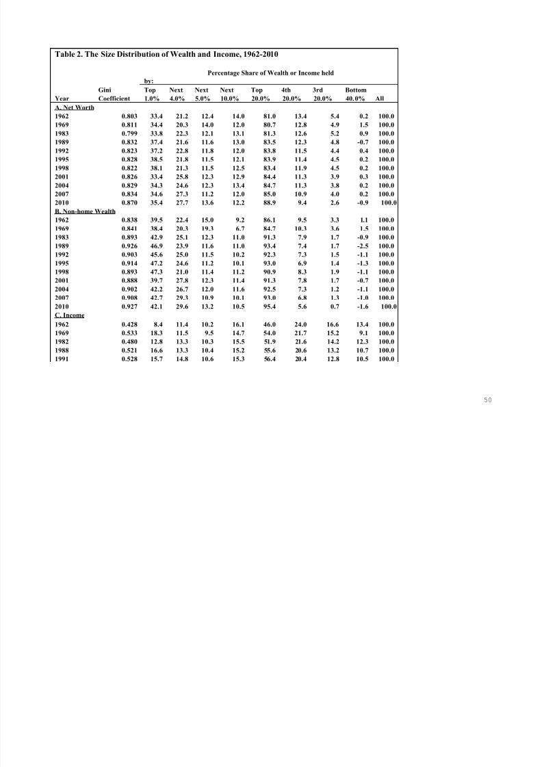
7/18/2019 Asset Meltdown Wealth Middle Class
http://slidepdf.com/reader/full/asset-meltdown-wealth-middle-class 51/75
50
Table 2. The Size Distribution of Wealth and Income, 1962-2010
Percentage Share of Wealth or Income held
by:
Gini Top Next Next Next Top 4th 3rd Bottom
Year Coefficient 1.0% 4.0% 5.0% 10.0% 20.0% 20.0% 20.0% 40.0% All
A. Net Worth
1962 0.803 33.4 21.2 12.4 14.0 81.0 13.4 5.4 0.2 100.0
1969 0.811 34.4 20.3 14.0 12.0 80.7 12.8 4.9 1.5 100.0
1983 0.799 33.8 22.3 12.1 13.1 81.3 12.6 5.2 0.9 100.01989 0.832 37.4 21.6 11.6 13.0 83.5 12.3 4.8 -0.7 100.0
1992 0.823 37.2 22.8 11.8 12.0 83.8 11.5 4.4 0.4 100.0
1995 0.828 38.5 21.8 11.5 12.1 83.9 11.4 4.5 0.2 100.0
1998 0.822 38.1 21.3 11.5 12.5 83.4 11.9 4.5 0.2 100.0
2001 0.826 33.4 25.8 12.3 12.9 84.4 11.3 3.9 0.3 100.0
2004 0.829 34.3 24.6 12.3 13.4 84.7 11.3 3.8 0.2 100.0
2007 0.834 34.6 27.3 11.2 12.0 85.0 10.9 4.0 0.2 100.0
2010 0.870 35.4 27.7 13.6 12.2 88.9 9.4 2.6 -0.9 100.0
B. Non-home Wealth
1962 0.838 39.5 22.4 15.0 9.2 86.1 9.5 3.3 1.1 100.0
1969 0.841 38.4 20.3 19.3 6.7 84.7 10.3 3.6 1.5 100.0
1983 0.893 42.9 25.1 12.3 11.0 91.3 7.9 1.7 -0.9 100.0
1989 0.926 46.9 23.9 11.6 11.0 93.4 7.4 1.7 -2.5 100.0
1992 0.903 45.6 25.0 11.5 10.2 92.3 7.3 1.5 -1.1 100.0
1995 0.914 47.2 24.6 11.2 10.1 93.0 6.9 1.4 -1.3 100.0
1998 0.893 47.3 21.0 11.4 11.2 90.9 8.3 1.9 -1.1 100.0
2001 0.888 39.7 27.8 12.3 11.4 91.3 7.8 1.7 -0.7 100.0
2004 0.902 42.2 26.7 12.0 11.6 92.5 7.3 1.2 -1.1 100.0
2007 0.908 42.7 29.3 10.9 10.1 93.0 6.8 1.3 -1.0 100.0
2010 0.927 42.1 29.6 13.2 10.5 95.4 5.6 0.7 -1.6 100.0
C. Income
1962 0.428 8.4 11.4 10.2 16.1 46.0 24.0 16.6 13.4 100.0
1969 0.533 18.3 11.5 9.5 14.7 54.0 21.7 15.2 9.1 100.0
1982 0.480 12.8 13.3 10.3 15.5 51.9 21.6 14.2 12.3 100.0
1988 0.521 16.6 13.3 10.4 15.2 55.6 20.6 13.2 10.7 100.0
1991 0.528 15.7 14.8 10.6 15.3 56.4 20.4 12.8 10.5 100.0
7/18/2019 Asset Meltdown Wealth Middle Class
http://slidepdf.com/reader/full/asset-meltdown-wealth-middle-class 52/75
51
1994 0.518 14.4 14.5 10.4 15.9 55.1 20.6 13.6 10.7 100.0
1997 0.531 16.6 14.4 10.2 15.0 56.2 20.5 12.8 10.5 100.0
2000 0.562 20.0 15.2 10.0 13.5 58.6 19.0 12.3 10.1 100.0
2003 0.540 17.0 15.0 10.9 14.9 57.9 19.9 12.1 10.2 100.0
2006 0.574 21.3 15.9 9.9 14.3 61.4 17.8 11.1 9.6 100.0
2009 0.549 17.2 16.5 10.7 14.7 59.1 18.7 14.9 7.3 100.0
Source: own computations from the 1983, 1989, 1992, 1995, 1998, 2001, 2004, 2007, and 2010 SCF.
Additional sources are the 1962 SFCC and the 1969 MESP file. Income data are from these files.
For the computation of percentile shares of net worth, households are ranked according to their net worth;
for percentile shares of non-home wealth, households are ranked according to their non-home wealth; andfor percentile shares of income, households are ranked according to their income.
Table 3. The Count of Millionaires and Multi-Millionaires, 1983-2010
Total
Number of The Number of Households (in 1,000s) with
Households Net Worth Equal to or Exceeding (in 1995$):
Year (1,000s) 1 Million 5 Million 10 Million
1983 83,893 2,411 247.0 66.5
1989 93,009 3,024 296.6 64.9
1992 95,462 3,104 277.4 41.6
1995 99,101 3,015 474.1 190.4
1998 102,547 4,783 755.5 239.42001 106,494 5,892 1,067.8 338.4
2004 112,107 6,466 1,120.0 344.8
2007 116,120 7,274 1,466.8 464.2
2010 117,606 7,655 1,061.9 349.8
% Change 40.2 217.5 329.9 426.2
Source: own computations from the 1983, 1989, 1992, 1995, 1998, 2001, 2004, 2007, and 2010 SCF.

7/18/2019 Asset Meltdown Wealth Middle Class
http://slidepdf.com/reader/full/asset-meltdown-wealth-middle-class 53/75
52
Table 4. Mean Wealth Holdings and Income by Wealth or Income Class, 1983-2010
(In thousands, 2010 dollars)
Top Next Next Next Top 4th 3rd Bottom
Variable 1.0% 4.0% 5.0% 10.0% 20.0% 20.0% 20.0% 40.0% All
A. Net Worth
1983 9,599 1,588 690.5 372.9 1,156.5 178.7 74.2 6.3 284.4
2010 16,439.4 3,192.5 1,263.4 567.0 2,061.6 216.9 61.0 (10.6) 463.8
% change 71.3 101.1 83.0 52.1 78.3 21.4 -17.9 -269.7 63.1
% of gaina 38.1 35.8 16.0 10.8 100.7 4.3 -1.5 -3.8 100.0
B. Non-home Wealth
1983 8,276 1,212 473.5 212.3 880.7 76.2 16.4 (4.2) 193.0
2010 15,171.6 2,661.6 949.8 378.5 1,719.8 100.7 12.2 (14.8) 360.7
% change 83.3 119.6 100.6 78.3 95.3 32.1 -25.7 -- 86.9
% of gaina 41.1 34.6 14.2 9.9 99.8 2.9 -0.5 -2.5 100.0
C. Income
1982 827.1 213.7 132.7 99.6 167.1 69.7 45.6 19.9 64.4
2009 1,318.2 317.2 164.0 112.0 226.2 72.0 41.7 17.3 76.9
% change 59.4 48.4 23.6 12.5 35.4 3.3 -8.4 -12.9 19.3
% of gaina 39.4 41.6 12.7 10.1 103.7 3.6 -3.1 -4.1 100.0
Source: own computations from the 1983 and 2010 Survey of Consumer Finances.
For the computation of percentile shares of net worth, households are ranked according to their net worth;
for percentile shares of non-home wealth, households are ranked according to their non-home wealth; and
for percentile shares of income, households are ranked according to their income.
a. The computation is performed by dividing the total increase in wealth of a given group by the total increase of
wealth for all households over the period, under the assumption that the number of households in each group
remains unchanged over the period. It should be noted that the households found in a given group (such as
the top quintile) may be different in each year.

7/18/2019 Asset Meltdown Wealth Middle Class
http://slidepdf.com/reader/full/asset-meltdown-wealth-middle-class 54/75
53
Table 5. Composition of Total Household Wealth, 1983 – 2010(Percent of gross assets)
Wealth component 1983 1989 1992 1995 1998 2001 2004 2007 2010
Principal residence 30.1 30.2 29.8 30.4 29.0 28.2 33.5 32.8 31.3
Other real estatea 14.9 14.0 14.7 11.0 10.0 9.8 11.5 11.3 11.8
Unincorporated business equityb 18.8 17.2 17.7 17.9 17.7 17.2 17.1 20.1 18.0
Liquid assetsc 17.4 17.5 12.2 10.0 9.6 8.8 7.3 6.6 6.2
Pension accountsd 1.5 2.9 7.2 9.0 11.6 12.3 11.8 12.1 15.3
Financial securitiese 4.2 3.4 5.1 3.8 1.8 2.3 2.1 1.5 1.8
Corporate stock & mutual funds 9.0 6.9 8.1 11.9 14.8 14.8 11.9 11.8 11.4
Net equity in personal trusts 2.6 3.1 2.7 3.2 3.8 4.8 2.9 2.3 2.4
Miscellaneous assetsf 1.3 4.9 2.5 2.8 1.8 1.8 1.8 1.7 1.7
Total 100.0 100.0 100.0 100.0 100.0 100.0 100.0 100.0 100.0
Debt on principal residence 6.3 8.6 9.8 11.0 10.7 9.4 11.6 11.4 12.9
All other debtg 6.8 6.4 6.0 5.3 4.2 3.1 3.9 3.9 4.5
Total debt 13.1 15.0 15.7 16.3 15.0 12.5 15.5 15.3 17.4
Selected ratios in percent:
Debt / equity ratio 15.1 17.6 18.7 19.4 17.6 14.3 18.4 18.1 21.0
Debt / income ratio 68.4 87.6 88.8 91.3 90.9 81.1 115.0 118.7 127.0
Net home equity / total assetsh 23.8 21.6 20.1 19.5 18.2 18.8 21.8 21.4 18.4
Principal residence debt as 20.9 28.6 32.7 36.0 37.0 33.4 34.8 34.9 41.2
ratio to house value
Stocks, directly or indirectly 11.3 10.2 13.7 16.8 22.6 24.5 17.5 16.8 17.8
owned as a ratio to total assetsi
Source: own computations from the 1983, 1989, 1992, 1995, 1998, 2001, 2004, 2007, and 2010 SCF.
a. In 2001, 2004, and 2007, this equals the gross value of other residential real estate plus the net equi ty in
non-residential real estate.
b. Net equity in unincorporated farm and non-farm businesses and closely-held corporations.
c. Checking accounts, savings accounts, time deposits, money market funds, certificates of deposits, and the
cash surrender value of life insurance.

7/18/2019 Asset Meltdown Wealth Middle Class
http://slidepdf.com/reader/full/asset-meltdown-wealth-middle-class 55/75
54
d. IRAs, Keogh plans, 401(k) plans, the accumulated value of defined contribution pension plans, and other
retirement accounts.
e. Corporate bonds, government bonds (including savings bonds), open-market paper, and notes.
f. Gold and other precious metals, royalties, jewelry, antiques, furs, loans to friends and
relatives, future contracts, and miscellaneous assets.
g. Mortgage debt on all real property except principal residence; credit card, installment, and other consumer debt.
h. Ratio of gross value of principal residence less mortgage debt on principal residence to total assets.
i. Includes direct ownership of stock shares and indirect ownership through mutual funds, trusts, and IRAs,Keogh plans, 401(k) plans, and other retirement accounts
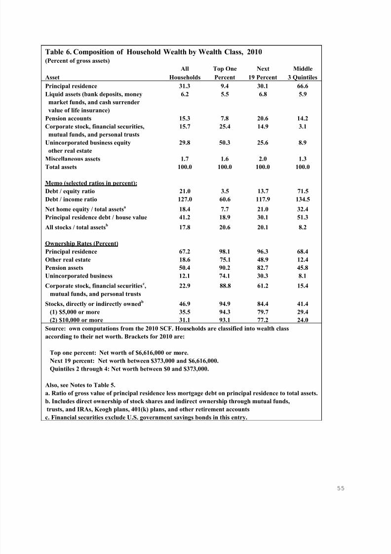
7/18/2019 Asset Meltdown Wealth Middle Class
http://slidepdf.com/reader/full/asset-meltdown-wealth-middle-class 56/75
55
Table 6. Composition of Household Wealth by Wealth Class, 2010(Percent of gross assets)
All Top One Next Middle
Asset Households Percent 19 Percent 3 Quintiles
Principal residence 31.3 9.4 30.1 66.6
Liquid assets (bank deposits, money 6.2 5.5 6.8 5.9market funds, and cash surrender
value of life insurance)
Pension accounts 15.3 7.8 20.6 14.2
Corporate stock, financial securities, 15.7 25.4 14.9 3.1
mutual funds, and personal trusts
Unincorporated business equity 29.8 50.3 25.6 8.9
other real estate
Miscellaneous assets 1.7 1.6 2.0 1.3
Total assets 100.0 100.0 100.0 100.0
Memo (selected ratios in percent):
Debt / equity ratio 21.0 3.5 13.7 71.5Debt / income ratio 127.0 60.6 117.9 134.5
Net home equity / total assetsa 18.4 7.7 21.0 32.4
Principal residence debt / house value 41.2 18.9 30.1 51.3
All stocks / total assetsb 17.8 20.6 20.1 8.2
Ownership Rates (Percent)
Principal residence 67.2 98.1 96.3 68.4
Other real estate 18.6 75.1 48.9 12.4
Pension assets 50.4 90.2 82.7 45.8
Unincorporated business 12.1 74.1 30.3 8.1
Corporate stock, financial securitiesc, 22.9 88.8 61.2 15.4
mutual funds, and personal trusts
Stocks, directly or indirectly ownedb 46.9 94.9 84.4 41.4
(1) $5,000 or more 35.5 94.3 79.7 29.4
(2) $10,000 or more 31.1 93.1 77.2 24.0
Source: own computations from the 2010 SCF. Households are classified into wealth class
according to their net worth. Brackets for 2010 are:
Top one percent: Net worth of $6,616,000 or more.
Next 19 percent: Net worth between $373,000 and $6,616,000.
Quintiles 2 through 4: Net worth between $0 and $373,000.
Also, see Notes to Table 5.a. Ratio of gross value of principal residence less mortgage debt on principal residence to total assets.
b. Includes direct ownership of stock shares and indirect ownership through mutual funds,
trusts, and IRAs, Keogh plans, 401(k) plans, and other retirement accounts
c. Financial securities exclude U.S. government savings bonds in this entry.

7/18/2019 Asset Meltdown Wealth Middle Class
http://slidepdf.com/reader/full/asset-meltdown-wealth-middle-class 57/75
56
Table 7. Composition of Household Wealth by Wealth Class, 1983 and 2010
(Percent of gross assets)
Top One Percent Next 19 Percent Middle 3 Quintiles
Component 1983 2010 1983 2010 1983 2010
Principal residence 8.1 9.4 29.1 30.1 61.6 66.6
Liquid assets (bank deposits, money 8.5 5.5 21.4 6.8 21.4 5.9market funds, and cash surrender
value of life insurance)
Pension accounts 0.9 7.8 2.0 20.6 1.2 14.2
Corporate stock, financial securities, 29.5 25.4 13.0 14.9 3.1 3.1
mutual funds, and personal trusts
Unincorporated business equity 52.0 50.3 32.8 25.6 11.4 8.9
other real estate
Miscellaneous assets 1.0 1.6 1.6 2.0 1.3 1.3
Total assets 100.0 100.0 100.0 100.0 100.0 100.0
Memo:
Debt / equity ratio 5.9 3.5 10.9 13.7 37.4 71.5
Debt / income ratio 86.8 60.6 72.8 117.9 66.9 134.5Note: own computations from the 1983 and 2010 Survey of Consumer Finances. Also, see Notes to Tables 5 and 6.
Table 8. Composition of Household Wealth of the Middle Three Wealth Quintiles, 1983-2010(Percent of gross assets)
Asset 1983 1989 1998 2001 2004 2007 20
Principal residence 61.6 61.7 59.8 59.2 66.1 65.1 66
Liquid assets (bank deposits, money 21.4 18.6 11.8 12.1 8.5 7.8 5
market funds, and cash surrender
value of life insurance)
Pension accounts 1.2 3.8 12.3 12.7 12.0 12.9 14
Corporate stock, financial securities, 3.1 3.5 5.5 6.2 4.2 3.6 3mutual funds, and personal trusts
Unincorporated business equity 11.4 9.4 8.8 8.5 7.9 9.3 8
other real estate
Miscellaneous assets 1.3 2.9 1.8 1.2 1.4 1.3 1
Total assets 100.0 100.0 100.0 100.0 100.0 100.0 10
Memo (selected ratios in percent):
Debt / equity ratio 37.4 41.7 51.3 46.4 61.6 61.1 71
Debt / income ratio 66.9 83.0 101.6 100.3 141.2 156.7 13
Net home equity / total assets 43.8 39.2 33.3 33.8 34.7 34.8 32
Principal residence debt / house value 28.8 36.5 44.4 42.9 47.6 46.6 51
All stocks / total assets 2.4 3.3 11.2 12.6 7.5 7.0 8
Ownership Rates (Percent)
Principal residence 71.6 71.5 73.3 75.9 78.2 76.9 68
Other real estate 15.4 15.5 13.7 13.2 13.6 14.7 12
Pension assets 12.2 27.3 48.5 52.9 51.4 53.4 45
Unincorporated business 8.5 8.4 8.5 7.9 8.1 8.8 8
Corporate stock, financial securities, 21.6 24.2 26.7 27.5 27.1 23.1 15
mutual funds, and personal trusts

7/18/2019 Asset Meltdown Wealth Middle Class
http://slidepdf.com/reader/full/asset-meltdown-wealth-middle-class 58/75
57
Table 9. The Percent of Total Assets Held by Wealth Class, 2010
Top Next Bottom Share of Top 10 %
Asset Type 1.0% 9.0% 90.0% All 1983 1989 1992 1995 1998 2001 2004 2007 2010
A. Investment assets
Stocks & mutual funds 48.8 42.5 8.6 100.0 90.4 86.0 86.3 88.4 85.1 84.5 85.4 89.4 91.4
Financial securities 64.4 29.5 6.1 100.0 82.9 87.1 91.3 89.8 84.1 88.7 87.9 98.5 93.9
Trusts 38.0 43.0 19.0 100.0 95.4 87.9 87.9 88.5 90.8 86.7 81.5 79.4 81.0
Business equity 61.4 30.5 8.1 100.0 89.9 89.8 91.0 91.7 91.7 89.6 90.3 93.3 91.9
Non-home real estate 35.5 43.6 20.9 100.0 76.3 79.6 83.0 78.7 74.9 78.5 79.4 76.9 79.1Total for group 50.4 37.5 12.0 100.0 85.6 85.7 87.6 87.5 86.2 85.5 85.6 87.8 88.0
Stocks, directly or 35.0 45.8 19.2 100.0 89.7 80.8 78.7 81.9 78.7 76.9 78.8 81.2 80.8
indirectly owneda
B. Housing, liquid assets, pension assets, and debt
Principal residence 9.2 31.0 59.8 100.0 34.2 34.0 36.0 31.7 35.2 37.0 38.0 38.5 40.2
Depositsb 28.1 42.5 29.5 100.0 52.9 61.5 59.7 62.3 51.0 57.2 60.9 57.7 70.5
Life insurance 20.6 34.1 45.3 100.0 33.6 44.6 45.0 44.9 52.8 46.0 57.3 54.9 54.7
Pension accountsc 15.4 50.2 34.5 100.0 67.5 50.5 62.3 62.3 59.8 60.4 58.3 59.2 65.5
Total for group 13.0 37.8 49.2 100.0 41.0 43.9 45.2 42.5 44.0 45.9 45.7 45.8 50.8
Total debt 5.9 21.6 72.5 100.0 31.8 29.4 37.5 28.3 27.0 25.9 27.0 26.6 27.5
Source: own computations from the SCF. Brackets are:
Top one percent: Net worth of $6,616,000 or more.
Next 9 percent: Net worth between $890,000 and $6,616,000.
Bottom 90 Percent: Net worth less than $890,000.
a. Includes direct ownership of stock shares and indirect ownership through mutual funds,
trusts, and IRAs, Keogh plans, 401(k) plans, and other retirement accounts
b. Includes demand deposits, savings deposits, time deposits, money market funds, and CDs.
c. IRAs, Keogh plans, 401(k) plans, and other retirement accounts.

7/18/2019 Asset Meltdown Wealth Middle Class
http://slidepdf.com/reader/full/asset-meltdown-wealth-middle-class 59/75
58
Table 10. Share of Homeowners with Negative Home Equity and Delinquent on their Mortgage, 2007 and 2010
Percent Percentage Percent of
of Home owners Decline in Average Home-Owners
Home Ownership with Negative Home Equity for Delinquent on
Rate [%] Home Equity Home Owners Their Mortgage
2007 2010 2007 2010 2007-2010 2009
A. All Households 68.6 67.2 1.8 8.2 25.7 5.1
1. Non-Hispanic white 74.8 74.6 1.7 8.0 20.6 3.4
2. African-American 48.6 47.7 1.3 9.2 24.6 11.0
3. Hispanic 49.2 47.3 2.1 9.1 48.3 15.4
4. Married couples 79.0 77.5 1.9 8.4 22.8 4.6
5. Single males 51.4 48.9 3.0 7.5 24.7 3.7
6. Single females 55.1 55.5 0.9 7.8 26.9 7.8
B. Years of Schoolingb
1. Less than 12 years 52.8 54.3 0.4 5.0 29.7 11.8
2. 12 Years 68.9 64.6 2.4 8.4 27.2 6.0
3. 13-15 years 62.3 61.5 2.1 10.5 31.8 5.0
4. 16 or more years 77.8 76.5 1.4 7.8 23.9 1.6
C. Age Classc
1. Under 35 40.7 37.5 5.5 16.2 58.7 4.6
2. 35-44 66.1 63.8 2.6 13.8 48.7 6.5
3. 45-54 77.3 75.2 1.4 8.5 27.4 5.6
4. 55-64 81.0 78.1 0.9 5.3 13.6 4.7
5. 65-74 85.5 82.5 0.4 3.5 29.6 1.0
6. 75 and over 77.0 81.3 0.0 2.7 9.3 3.9
D. Income Class [2007$]
1. Under $15,000 36.3 32.5 0.8 2.6 6.9 7.7
2. $15-000-$24,999 53.5 49.5 1.7 6.4 27.4 5.5
3. $25,000-$49,999 60.9 65.8 1.9 8.1 10.9 8.4
4. $50-000-$74,999 76.8 79.4 1.9 11.7 23.3 6.4
5. $75,000-$99,999 89.2 84.3 3.2 10.9 34.5 4.2
6. $100,000-$249,999 92.9 91.3 1.3 7.4 18.1 2.7
7. $250,000 or over 97.2 96.1 0.3 1.4 14.6 0.4
Source: the first 5 columns are from computations from the 2007 and 2010 SCF. Last column from the 2009 PSID.

7/18/2019 Asset Meltdown Wealth Middle Class
http://slidepdf.com/reader/full/asset-meltdown-wealth-middle-class 60/75
59
Table 11. Average Annual Rates of Return by Period and Wealth Class, 1983 - 2010(percent)
1983- 1989- 2001- 2007- 1983-
1989 2001 2007 2010 2010
A. Gross Assets1. All Households 2.20 3.25 3.34 -6.95 1.90
2. Top 1 Percent 3.00 3.88 3.86 -6.94 2.48
3. Next 19 Percent 2.17 3.33 3.19 -6.70 1.93
4. Middle 3 Quintiles 1.21 2.23 2.95 -7.52 1.08
B. Net Worth
1. All Households 3.17 4.25 4.31 -7.39 2.73
2. Top 1 Percent 3.38 4.15 4.03 -7.10 2.70
3. Next 19 Percent 2.82 3.97 3.80 -7.35 2.42
4. Middle 3 Quintiles 3.15 4.55 5.95 -8.89 3.06
Source: own computations from the 1983, 1989, 2991, 2007, and 2010 SCF.Rates of return by asset type are provided in Appendix 1.
Households are classified into wealth class according to their net worth.
Calculations are based on household portfolios averaged over the period.
Miscellaneous assets are excluded from the calculation.
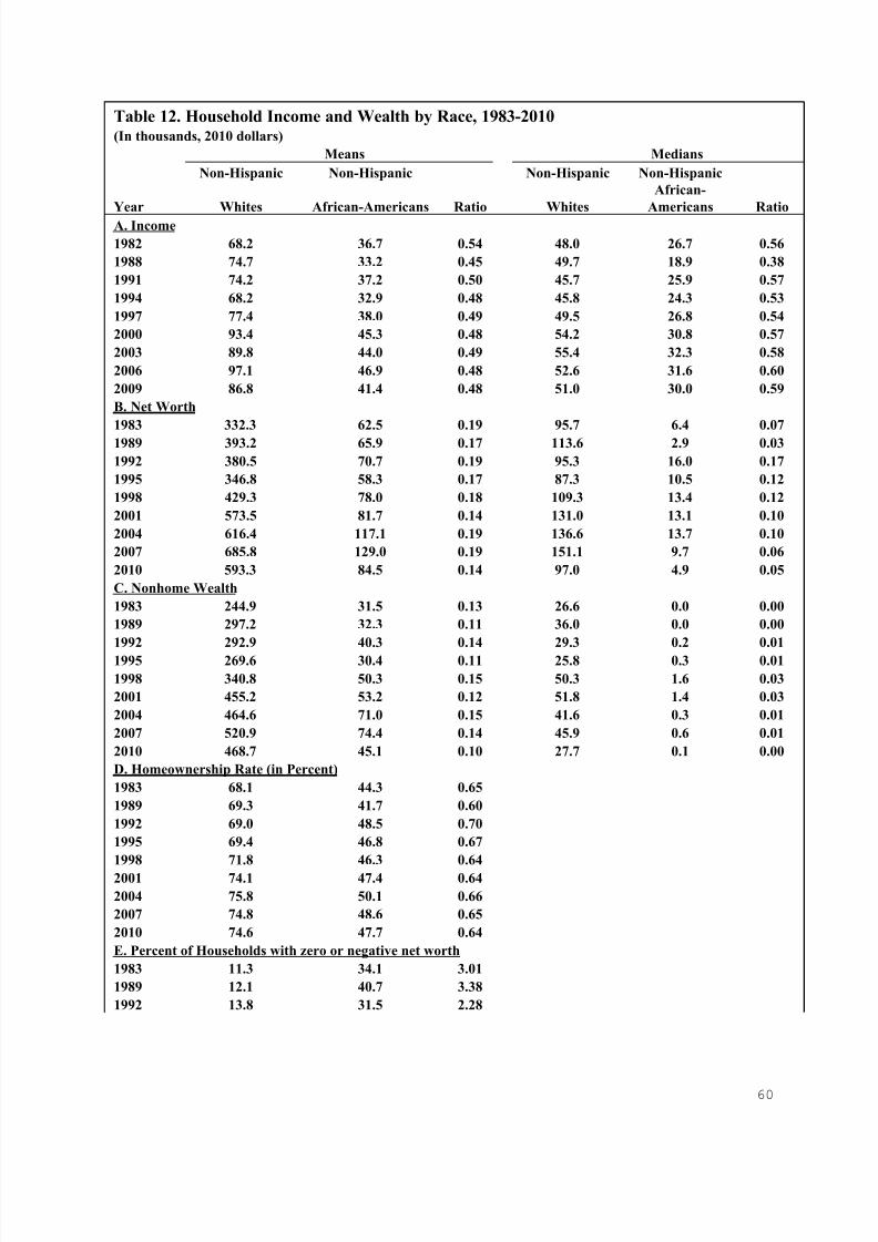
7/18/2019 Asset Meltdown Wealth Middle Class
http://slidepdf.com/reader/full/asset-meltdown-wealth-middle-class 61/75
60
Table 12. Household Income and Wealth by Race, 1983-2010(In thousands, 2010 dollars)
Means Medians
Non-Hispanic Non-Hispanic Non-Hispanic Non-Hispanic
Year Whites African-Americans Ratio Whites
African-
Americans Ratio
A. Income
1982 68.2 36.7 0.54 48.0 26.7 0.56
1988 74.7 33.2 0.45 49.7 18.9 0.38
1991 74.2 37.2 0.50 45.7 25.9 0.57
1994 68.2 32.9 0.48 45.8 24.3 0.53
1997 77.4 38.0 0.49 49.5 26.8 0.54
2000 93.4 45.3 0.48 54.2 30.8 0.57
2003 89.8 44.0 0.49 55.4 32.3 0.58
2006 97.1 46.9 0.48 52.6 31.6 0.60
2009 86.8 41.4 0.48 51.0 30.0 0.59
B. Net Worth
1983 332.3 62.5 0.19 95.7 6.4 0.07
1989 393.2 65.9 0.17 113.6 2.9 0.03
1992 380.5 70.7 0.19 95.3 16.0 0.17
1995 346.8 58.3 0.17 87.3 10.5 0.12
1998 429.3 78.0 0.18 109.3 13.4 0.12
2001 573.5 81.7 0.14 131.0 13.1 0.10
2004 616.4 117.1 0.19 136.6 13.7 0.10
2007 685.8 129.0 0.19 151.1 9.7 0.06
2010 593.3 84.5 0.14 97.0 4.9 0.05
C. Nonhome Wealth
1983 244.9 31.5 0.13 26.6 0.0 0.00
1989 297.2 32.3 0.11 36.0 0.0 0.00
1992 292.9 40.3 0.14 29.3 0.2 0.01
1995 269.6 30.4 0.11 25.8 0.3 0.01
1998 340.8 50.3 0.15 50.3 1.6 0.03
2001 455.2 53.2 0.12 51.8 1.4 0.03
2004 464.6 71.0 0.15 41.6 0.3 0.01
2007 520.9 74.4 0.14 45.9 0.6 0.01
2010 468.7 45.1 0.10 27.7 0.1 0.00
D. Homeownership Rate (in Percent)
1983 68.1 44.3 0.65
1989 69.3 41.7 0.60
1992 69.0 48.5 0.70
1995 69.4 46.8 0.67
1998 71.8 46.3 0.64
2001 74.1 47.4 0.64
2004 75.8 50.1 0.66
2007 74.8 48.6 0.65
2010 74.6 47.7 0.64
E. Percent of Households with zero or negative net worth
1983 11.3 34.1 3.01
1989 12.1 40.7 3.38
1992 13.8 31.5 2.28

7/18/2019 Asset Meltdown Wealth Middle Class
http://slidepdf.com/reader/full/asset-meltdown-wealth-middle-class 62/75
61
1995 15.0 31.3 2.09
1998 14.8 27.4 1.85
2001 13.1 30.9 2.35
2004 13.0 29.4 2.27
2007 14.5 33.4 2.30
2010 18.6 33.9 1.83
Source: own computations from the 1983, 1989 1992, 1995, 1998, 2001, 2004, 2007, and 2010 SCF.
Households are divided into four racial/ethnic groups: (I) non-Hispanic whites; (ii) non-Hispanic blacks;
(iii) Hispanics; and (iv) American Indians, Asians, and others. For 1995, 1998, and 2001, the classification
scheme does not explicitly indicate non-Hispanic whites and non-Hispanic blacks for the first two categories
so that some Hispanics may have classified themselves as either whites or blacks.

7/18/2019 Asset Meltdown Wealth Middle Class
http://slidepdf.com/reader/full/asset-meltdown-wealth-middle-class 63/75
62
Table 13. Family Income and Wealth for Non-Hispanic Whites and Hispanics, 1983-2010(In thousands, 2010 dollars)
Means Medians
Non-Hispanic Non-Hispanic
Year Whites Hispanics Ratio Whites Hispanics Ratio
A. Income
1982 68.2 41.2 0.60 48.0 31.8 0.66
1988 74.7 34.0 0.46 49.7 23.8 0.48
1991 74.2 35.0 0.47 45.7 24.4 0.53
1994 68.2 44.2 0.65 45.8 31.5 0.69
1997 77.4 41.6 0.54 49.5 30.8 0.62
2000 93.4 46.3 0.50 54.2 29.6 0.55
2003 89.8 44.4 0.49 55.4 30.0 0.54
2006 97.1 48.8 0.50 52.6 36.8 0.70
2009 86.8 49.1 0.57 51.0 34.0 0.67
B. Net Worth
1983 332.3 54.0 0.16 95.7 3.7 0.04
1989 393.2 64.7 0.16 113.6 2.4 0.02
1992 380.5 84.6 0.22 95.3 5.7 0.06
1995 346.8 73.4 0.21 87.3 7.2 0.08
1998 429.3 106.0 0.25 109.3 4.0 0.04
2001 573.5 98.6 0.17 131.0 3.6 0.03
2004 616.4 132.1 0.21 136.6 6.4 0.05
2007 685.8 179.2 0.26 151.1 9.6 0.06
2010 593.3 90.3 0.15 97.0 1.3 0.01
C. Nonhome Wealth
1983 244.9 16.0 0.07 26.6 0.0 0.00
1989 297.2 31.6 0.11 36.0 0.0 0.00
1992 292.9 54.3 0.19 29.3 0.0 0.00
1995 269.6 41.9 0.16 25.8 0.0 0.00
1998 340.8 67.4 0.20 50.3 0.0 0.00
2001 455.2 63.4 0.14 51.8 0.3 0.01
2004 464.6 77.3 0.17 41.6 0.1 0.00
2007 520.9 101.3 0.19 45.9 0.4 0.01
2010 468.7 50.7 0.11 27.7 0.0 0.00
D. Homeownership Rate (in Percent)
1983 68.1 32.6 0.48
1989 69.3 39.8 0.57
1992 69.0 43.1 0.62
1995 69.4 44.4 0.64
1998 71.8 44.2 0.61
2001 74.1 44.3 0.60
2004 75.8 47.7 0.63
2007 74.8 49.2 0.66
2010 74.6 47.3 0.63
E. Percent of Households with zero or negative net worth
1983 11.3 40.3 3.01
1989 12.1 39.9 3.38
1992 13.8 41.2 2.28
1995 15.0 38.3 2.09

7/18/2019 Asset Meltdown Wealth Middle Class
http://slidepdf.com/reader/full/asset-meltdown-wealth-middle-class 64/75
63
1998 14.8 36.2 2.09
2001 13.1 35.3 2.69
2004 13.0 31.3 2.41
2007 14.5 33.5 2.30
2010 18.6 35.8 1.93
Source: own computations from the 1983, 1989 1992, 1995, 1998, 2001, 2004, 2007, and 2010 SCF.
See footnote to Table 12 for details on racial/ethnic categories.
Table 14. Composition of Household Wealth by Race and Ethnicity, 2007(Percent of gross assets)
Non-Hispanic African-
Asset Whites Americans Hispanics
Principal residence 30.8 54.0 52.5
Liquid assets (bank deposits, money 6.6 7.6 3.9
market funds, and cash surrender
value of life insurance)
Pension accounts 12.5 12.3 7.7
Corporate stock, financial securities, 17.1 3.4 2.5
mutual funds, and personal trusts
Unincorporated business equity 31.3 20.9 32.9
other real estate
Miscellaneous assets 1.7 1.8 0.4
Total assets 100.0 100.0 100.0
Memo (selected ratios in percent):
Debt / equity ratio 15.4 55.3 51.1
Debt / income ratio 109.0 152.2 187.9
Net home equity / total assetsa 20.8 27.3 28.8
Principal residence debt / house value 32.4 49.4 45.2
All stocks / total assetsb 18.3 5.0 5.1
Source: own computations from the 2007 SCF.
a. Ratio of gross value of principal residence less mortgage debt on principal residence
to total assetsb. Includes direct ownership of stock shares and indirect ownership through mutual funds,
trusts, and IRAs, Keogh plans, 401(k) plans, and other retirement accounts
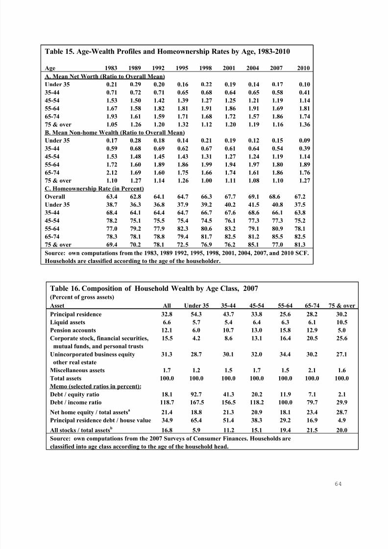
7/18/2019 Asset Meltdown Wealth Middle Class
http://slidepdf.com/reader/full/asset-meltdown-wealth-middle-class 65/75
64
Table 15. Age-Wealth Profiles and Homeownership Rates by Age, 1983-2010
Age 1983 1989 1992 1995 1998 2001 2004 2007 2010
A. Mean Net Worth (Ratio to Overall Mean)
Under 35 0.21 0.29 0.20 0.16 0.22 0.19 0.14 0.17 0.10
35-44 0.71 0.72 0.71 0.65 0.68 0.64 0.65 0.58 0.41
45-54 1.53 1.50 1.42 1.39 1.27 1.25 1.21 1.19 1.14
55-64 1.67 1.58 1.82 1.81 1.91 1.86 1.91 1.69 1.81
65-74 1.93 1.61 1.59 1.71 1.68 1.72 1.57 1.86 1.74
75 & over 1.05 1.26 1.20 1.32 1.12 1.20 1.19 1.16 1.36
B. Mean Non-home Wealth (Ratio to Overall Mean)
Under 35 0.17 0.28 0.18 0.14 0.21 0.19 0.12 0.15 0.09
35-44 0.59 0.68 0.69 0.62 0.67 0.61 0.64 0.54 0.39
45-54 1.53 1.48 1.45 1.43 1.31 1.27 1.24 1.19 1.14
55-64 1.72 1.60 1.89 1.86 1.99 1.94 1.97 1.80 1.89
65-74 2.12 1.69 1.60 1.75 1.66 1.74 1.61 1.86 1.76
75 & over 1.10 1.27 1.14 1.26 1.00 1.11 1.08 1.10 1.27
C. Homeownership Rate (in Percent)
Overall 63.4 62.8 64.1 64.7 66.3 67.7 69.1 68.6 67.2
Under 35 38.7 36.3 36.8 37.9 39.2 40.2 41.5 40.8 37.5
35-44 68.4 64.1 64.4 64.7 66.7 67.6 68.6 66.1 63.8
45-54 78.2 75.1 75.5 75.4 74.5 76.1 77.3 77.3 75.2
55-64 77.0 79.2 77.9 82.3 80.6 83.2 79.1 80.9 78.1
65-74 78.3 78.1 78.8 79.4 81.7 82.5 81.2 85.5 82.5
75 & over 69.4 70.2 78.1 72.5 76.9 76.2 85.1 77.0 81.3
Source: own computations from the 1983, 1989 1992, 1995, 1998, 2001, 2004, 2007, and 2010 SCF.
Households are classified according to the age of the householder.
Table 16. Composition of Household Wealth by Age Class, 2007(Percent of gross assets)
Asset All Under 35 35-44 45-54 55-64 65-74 75 & over
Principal residence 32.8 54.3 43.7 33.8 25.6 28.2 30.2
Liquid assets 6.6 5.7 5.4 6.4 6.3 6.1 10.5
Pension accounts 12.1 6.0 10.7 13.0 15.8 12.9 5.0
Corporate stock, financial securities, 15.5 4.2 8.6 13.1 16.4 20.5 25.6
mutual funds, and personal trusts
Unincorporated business equity 31.3 28.7 30.1 32.0 34.4 30.2 27.1
other real estate
Miscellaneous assets 1.7 1.2 1.5 1.7 1.5 2.1 1.6
Total assets 100.0 100.0 100.0 100.0 100.0 100.0 100.0
Memo (selected ratios in percent):
Debt / equity ratio 18.1 92.7 41.3 20.2 11.9 7.1 2.1
Debt / income ratio 118.7 167.5 156.5 118.2 100.0 79.7 29.9
Net home equity / total assetsa 21.4 18.8 21.3 20.9 18.1 23.4 28.7
Principal residence debt / house value 34.9 65.4 51.4 38.3 29.2 16.9 4.9
All stocks / total assetsb 16.8 5.9 11.2 15.1 19.4 21.5 20.0
Source: own computations from the 2007 Surveys of Consumer Finances. Households are
classified into age class according to the age of the household head.

7/18/2019 Asset Meltdown Wealth Middle Class
http://slidepdf.com/reader/full/asset-meltdown-wealth-middle-class 66/75
65
Table 17a. Stock Ownership, 1983 and 1989(Percent of households holding stocks)
1983-
Stock Type 1983 1989 1989
Direct stock holdings only 13.7 13.1
Stocks and mutual funds
1. Any holdings 24.4 19.9
2. Holdings worth $5,000 or morea 14.5 14.6
3. Holdings worth $10,000 or morea 10.8 12.3
4. Holdings worth $25,000 or morea 6.2 8.4
Memo:
Stocks plus mutual funds as a percent 9.0 6.9
of total assets
Percentage change in S&P 500 Index, 61.7
in constant dollars over period
Source: own computations from the 1983 and 1989 SCF.
a. 1995 dollars
Table 17b. Stock Ownership, 1989-2010(Percent of households holding stocks)
1989-
Stock Type 1989 1992 1995 1998 2001 2004 2007 2010 2010
Direct stock holdings only 13.1 14.8 15.2 19.2 21.3 20.7 17.9 15.1
Indirect stock holdings only 23.5 29.3 34.8 43.4 47.7 44.0 44.4 43.4
1. Through mutual funds 5.9 8.4 11.3 15.2 16.7 14.1 10.6 8.3
2. Through pension accounts 19.5 24.8 29.2 37.4 41.4 38.0 40.2 40.0
3. Through trust funds 1.6 1.2 1.9 2.4 5.1 4.7 4.1 4.2
All stock holdingsa
1. Any holdings 31.7 37.2 40.4 48.2 51.9 48.6 49.1 46.9
2. Stock worth $5,000 or moreb 22.6 27.3 29.5 36.3 40.1 34.9 34.6 33.6
3. Stock worth $10,000 or moreb 18.5 21.8 23.9 31.8 35.1 29.8 29.6 28.8
4. Stock worth $25,000 or moreb 10.5 13.1 16.6 24.3 27.1 22.5 22.1 21.6
Memo:
a percent of total assets
Percentage change in S&P 500 13.8 20.0 87.3 1.3 -11.2 19.0 -26.6 116.7
index in constant dollars over period
Source: own computations from the 1989, 1992, 1995, 1998, 2001, 2004, 2007, and 2010 SCF. Also,
Economic Report of the President, 2012 , Table B-96.
a. Includes direct ownership of stock shares and indirect ownership through mutual funds,
trusts, and IRAs, Keogh plans, 401(k) plans, and other retirement accounts.
b. 1995 dollars

7/18/2019 Asset Meltdown Wealth Middle Class
http://slidepdf.com/reader/full/asset-meltdown-wealth-middle-class 67/75
66
Table 17c. Distribution of Stock Ownership by Asset Type, 1989-2007(Percent of total stock held in each asset type) Chan
1989
Stock Type 1989 1992 1995 1998 2001 2004 2007 2010 2010
Direct stock holdings 54.0 49.4 36.7 42.6 38.5 37.1 37.1 30.6 -23.3
Indirect stock holdings only 46.0 50.6 63.3 57.4 61.5 62.9 62.9 69.4 23.3
1. Through mutual funds 8.5 10.9 17.9 16.3 16.0 21.9 21.3 22.7 14.2
2. Through pension accounts 24.4 34.1 37.9 32.9 33.5 30.9 31.4 40.2 15.8
3. Through trust funds 13.2 5.6 7.6 8.2 12.0 8.1 7.2 6.5 -6.7
Memo:
Stocks held in pension accounts / 32.6 44.8 67.5 64.1 66.3 45.6 43.6 46.8 14.2
total value of pension accounts
Source: own computations from the 1989, 1992, 1995, 1998, 2001, 2004, 2007, and 2010 SCF.
a. Includes direct ownership of stock shares and indirect ownership through mutual funds,
trusts, and IRAs, Keogh plans, 401(k) plans, and other retirement accounts.

7/18/2019 Asset Meltdown Wealth Middle Class
http://slidepdf.com/reader/full/asset-meltdown-wealth-middle-class 68/75
67
Table 18a. Concentration of Stock Ownership by Wealth Class, 2010
Percent of Households
Owning
Stock Worth More Than Percent of Stock Owned
Wealth Class Zero $4,999 $9,999 Shares Cumulative Cumulative-2001
Top one percent 94.9 94.3 94.3 35.0 35.0 33.5
Next four percent 93.1 89.5 89.1 32.1 67.1 62.3
Next five percent 88.2 85.3 83.4 13.7 80.8 76.9
Next ten percent 79.0 73.7 70.5 10.9 91.6 89.3
Second quintile 59.7 50.3 44.1 5.9 97.5 97.1
Third quintile 44.6 30.6 24.7 1.8 99.3 99.3
Fourth quintile 23.9 11.1 6.5 0.3 99.6 99.8
Bottom quintile 21.8 7.9 4.5 0.4 100.0 100.0
All 46.9 36.1 31.6 100.0
Note: Includes direct ownership of stock shares and indirect ownership through mutual funds, trusts, and IRAS,
Keogh plans, 401(k) plans, and other retirement accounts. All figures are in 2010 dollars.
Table 18b. Concentration of Stock Ownership by Income Class, 2010
Percent of Households
Owning
Share of Stock Worth More Than Percent of Stock Owned
Income Level Households Zero $4,999 $9,999 Shares Cumulative
Cumulative-
2001
$250,000 or more 3.6 94.3 93.3 92.8 50.3 50.3 40.6
$100,000-$249,999 14.4 82.2 75.5 70.8 26.1 76.4 68.6
$75,000-$99,999 10.1 66.8 53.3 46.9 6.5 82.9 77.4$50,000-$74,999 18.1 56.0 41.4 34.6 8.4 91.3 89.3
$25,000-$49,999 27.7 39.9 24.6 19.1 5.5 96.8 97.6
$15,000-$24,999 14.0 17.9 10.3 8.5 1.2 98.0 98.9
Under $15,000 12.1 10.0 5.4 4.8 2.0 100.0 100.0
All 100.0 46.9 36.1 31.6 100.0
Note: Includes direct ownership of stock shares and indirect ownership through mutual funds, trusts,
and IRAs, Keogh plans, 401(k) plans, and other retirement accounts. All figures are in 2010 dollars.

7/18/2019 Asset Meltdown Wealth Middle Class
http://slidepdf.com/reader/full/asset-meltdown-wealth-middle-class 69/75
68
Table 19 Defined Contribution Pensions by Age Group, 1983-2010(In thousands, 2010 dollars)
% Change
1983 1989 2001 2007 2010 1983-2010
A. All Households
1. Percent with a DC Account 11.1 24.0 52.2 52.6 50.4
2. Mean DC Pension Wealth 43.9 46.4 126.5 153.5 170.9 288.8
(Pension holders only)
3. Mean DC Pension Wealth 4.9 11.1 66.1 80.8 86.1 1669.6
(All households in group)
B. Ages 46 and under
1. Percent with a DC Account 13.7 31.2 53.8 49.9 47.8
2. Mean DC Pension Wealth 22.7 31.1 64.6 64.7 63.1 178.2
(Pension holders only)
3. Mean DC Pension Wealth 3.1 9.7 34.8 32.3 30.2 867.6
(All households in group)
C. Ages 47-64
1. Percent with a DC Account 12.3 28.3 62.0 63.8 59.6
2. Mean DC Pension Wealth 82.9 76.0 191.9 220.7 241.5 191.2
(Pension holders only)
3. Mean DC Pension Wealth 10.2 21.5 118.9 140.8 144.0 1314.1
(All households in group)
D. Ages 65 and over
1. Percent with a DC Account 2.0 1.3 35.0 40.8 41.1
2. Mean DC Pension Wealth 105.5 183.0 188.5 218.0 256.7 143.4
(Pension holders only)
3. Mean DC Pension Wealth 2.2 2.4 65.9 88.9 105.5 4793.9
(All households in group)
Note: own computations from the 1983, 1989, 2001, 2007, and 2010 SCF.
Defined contribution (DC) pensions include Individual Retirement Accounts (IRAs), Keogh Plans,
401(k) plans, and other employer-provided DC plans.
Households are classified into age groups by the age of the head of household.
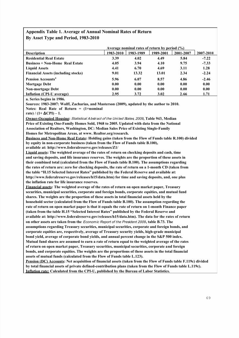
7/18/2019 Asset Meltdown Wealth Middle Class
http://slidepdf.com/reader/full/asset-meltdown-wealth-middle-class 70/75
69
Appendix Table 1. Average of Annual Nominal Rates of Return
By Asset Type and Period, 1983-2010
Average nominal rates of return by period (%)
Description 1983-2010 1983-1989 1989-2001 2001-2007 2007-2010
Residential Real Estate 3.39 4.02 4.49 5.84 -7.22Business + Non-Home Real Estate 4.05 3.94 4.10 9.75 -7.33
Liquid Assets 4.41 6.70 4.69 3.11 1.28
Financial Assets (including stocks) 9.01 13.32 13.01 2.34 -2.24
Pension Accountsa 5.96 6.07 8.57 4.86 -2.46
Mortgage Debt 0.00 0.00 0.00 0.00 0.00
Non-mortgage Debt 0.00 0.00 0.00 0.00 0.00
Inflation (CPI-U average) 2.95 3.72 3.02 2.66 1.71
a. Series begins in 1986.
Sources: 1983-2007: Wolff, Zacharias, and Masterson (2009), updated by the author to 2010.
Notes: Real Rate of Return = (1+nominal
rate) / (1+ ΔCPI) – 1.
Owner-Occupied Housing: Statistical Abstract of the Uni ted States, 2009 , Table 943, MedianPrice of Existing One-Family Homes Sold, 1968 to 2005. Updated with data from the National
Association of Realtors, Washington, DC: Median Sales Price of Existing Single-Family
Homes for Metropolitan Areas, at www. Realtor.org/research.
Business and Non-Home Real Estate: Holding gains (taken from the Flow of Funds table R.100) divided
by equity in non-corporate business (taken from the Flow of Funds table B.100),
available at: http://www.federalreserve.gov/releases/Z1/
Liquid assets: The weighted average of the rates of return on checking deposits and cash, time
and saving deposits, and life insurance reserves. The weights are the proportion of these assets in
their combined total (calculated from the Flow of Funds table B.100). The assumptions regarding
the rates of return are: zero for checking deposits, the rate of return on a 1-month CD (taken from
the table “H.15 Selected Interest Rates” published by the Federal Reserve and available at:
http://www.federalreserve.gov/releases/h15/data.htm) for time and saving deposits, and, one plusthe inflation rate for life insurance reserves.
Financial assets: The weighted average of the rates of return on open market paper, Treasury
securities, municipal securities, corporate and foreign bonds, corporate equities, and mutual fund
shares. The weights are the proportion of these assets in total financial assets held by the
household sector (calculated from the Flow of Funds table B.100). The assumption regarding the
rate of return on open market paper is that it equals the rate of return on 1-month Finance paper
(taken from the table H.15 “Selected Interest Rates” published by the Federal Reserve and
available at: http://www.federalreserve.gov/releases/h15/data.htm). The data for the rates of return
on other assets are taken from the Economic Report of the President 2009 , table B.73. The
assumptions regarding Treasury securities, municipal securities, corporate and foreign bonds, and
corporate equities are, respectively, average of Treasury security yields, high-grade municipal
bond yield, average of corporate bond yields, and annual percent change in the S&P 500 index.Mutual fund shares are assumed to earn a rate of return equal to the weighted average of the rates
of return on open market paper, Treasury securities, municipal securities, corporate and foreign
bonds, and corporate equities. The weights are the proportions of these assets in the total financial
assets of mutual funds (calculated from the Flow of Funds table L.123).
Pension (DC) Accounts: Net acquisition of financial assets (taken from the Flow of Funds table F.119c) divided
by total financial assets of private defined-contribution plans (taken from the Flow of Funds table L.119c).
Inflation rate: Calculated from the CPI-U, published by the Bureau of Labor Statistics.

7/18/2019 Asset Meltdown Wealth Middle Class
http://slidepdf.com/reader/full/asset-meltdown-wealth-middle-class 71/75
70
Appendix Table 2. Sample Sizes by Household Characteristic and Year, 1983-2010
Category 1983 1989 1992 1995 1998 2001 2004 2007 2010
All Households 4262 3143 3906 4299 4305 4442 4519 4418 6482
A. Income Level (1998$)
Under $15,000 999 546 705 717 702 675 644 624 1196
$15,000-$24,999 650 362 461 533 513 516 515 490 970
$25,000-$49,999 1173 726 883 1058 952 979 1013 939 1586
$50,000-$74,999 587 436 499 558 598 612 579 559 861
$75,000-$99,999 208 234 251 295 310 294 326 347 410
$100,000-$249,999 310 363 484 523 519 527 562 537 659
$250,000 or more 335 477 622 615 712 839 880 923 800
B. Wealth Level (1998$)
Under $25,000 1570 804 1159 1259 1295 1294 1418 1171 2537
$25-000-$49,999 406 217 298 306 246 271 273 232 413
$50,000-$99,999 584 338 366 454 401 389 348 321 522
$100-000-$249,999 725 486 548 590 583 563 534 580 776
$250,000-$499,999 308 344 318 369 427 392 392 422 576
$500,000-$999,999 203 224 259 300 286 317 346 370 417
$1,000,000 or over 466 730 958 1021 1068 1215 1208 1322 1242
C. Race
Non-Hispanic whites 3406 2558 3148 3562 3498 3580 3519 3518 4759
Non-Hispanic African- 472 308 358 380 414 462 484 410 790
Americans
Hispanicsa 108 161 218 177 251 279 348 313 639
Asian and other races 117 116 183 180 143 121 168 177 293
D. Age Classb
Under 35 1157 542 805 886 837 810 757 702 1178
35-44 777 688 830 908 926 929 886 812 1182
45-54 680 612 775 907 956 1064 1081 1014 1492
55-64 673 569 595 657 687 733 919 930 1362
65-74 527 452 574 560 522 499 512 549 748
75 & over 289 280 327 381 377 407 364 411 520
E. Educationc
Less than 12 years 1281 667 613 608 613 615 547 503 658
12 years 1151 787 921 1086 1037 1059 1057 1075 1821
13-15 years 742 548 737 920 913 874 880 861 1101
16 years of more 1088 1141 1635 1685 1742 1894 2035 1979 2902
Note: own computations from the1983, 1989, 1992, 1995, 1998, 2001, 2004, 2007, and 2010 SCF.
a. Hispanics can be of any race.
b. Households are classified according to the age of the head of household.
c. Households are classified according to the education of the head of household.

7/18/2019 Asset Meltdown Wealth Middle Class
http://slidepdf.com/reader/full/asset-meltdown-wealth-middle-class 72/75
71
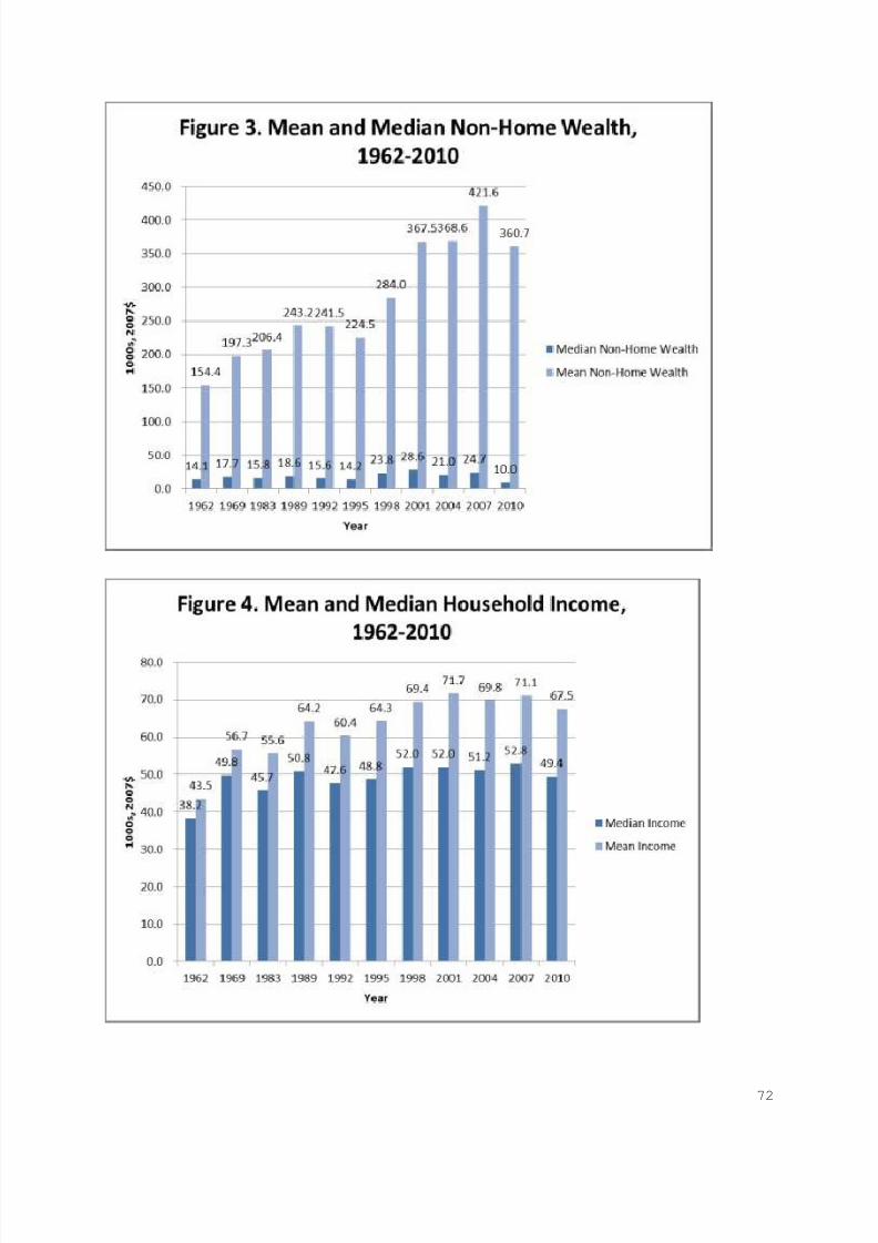
7/18/2019 Asset Meltdown Wealth Middle Class
http://slidepdf.com/reader/full/asset-meltdown-wealth-middle-class 73/75
72
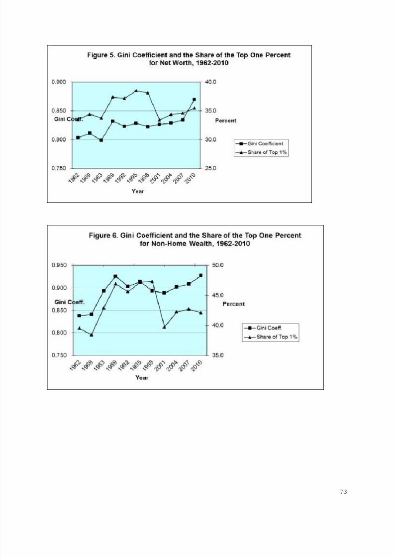
7/18/2019 Asset Meltdown Wealth Middle Class
http://slidepdf.com/reader/full/asset-meltdown-wealth-middle-class 74/75
73
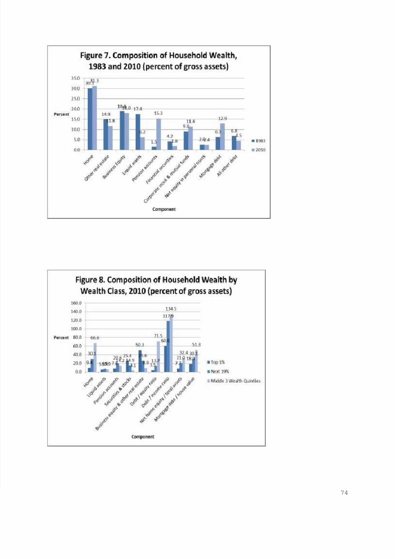
7/18/2019 Asset Meltdown Wealth Middle Class
http://slidepdf.com/reader/full/asset-meltdown-wealth-middle-class 75/75