Embed Size (px)
Citation preview
Assessing the Integration of Electricity Markets
using Principal Component Analysis:
Network and Market Structure Effects∗
Lewis Evans†
Victoria University of Wellington
Graeme Guthrie
Victoria University of Wellington
Steen Videbeck
Cornell University
May 31, 2006
∗We thank Neil Walbran and M-co New Zealand for providing us with electricity spot price data. Chris Ewers
provided very helpful comments, as did participants at a New Zealand Institute for the Study of Competition and
Regulation seminar.†Corresponding author: School of Economics and Finance, PO Box 600, Victoria University of Wellington,
Wellington, New Zealand. Ph: 64-4-4635560. Fax: 64-4-4635014. Email: [email protected]
1

Assessing the Integration of Electricity Markets
using Principal Component Analysis:
Network and Market Structure Effects
Abstract
The major difficulties in assessing market power in electricity wholesale spot markets mean
that great weight should be placed upon assessing market outcomes against the fundamental
determinants of supply, demand and competition. In this spirit we study whether the New
Zealand market has been a national market or a set of local markets since its inception in
1996. Electricity markets generally have loop flows that require simultaneous assessment
of prices at all nodes, thereby limiting the informativeness of pair-wise nodal comparisons.
We introduce principal component analysis to this application and show that it is a natural
tool for the qualitative and quantitative assessment of the presence of local markets. We
find that increased competition induced some separation into local markets that was elim-
inated by transmission enhancement and the introduction of generation downstream from
the constrained circuits. For most of the period New Zealand has had one national market.
JEL Classification code: D4, L1, L4
Keywords: Electricity; Market power; Principal component analysis.

Assessing the Integration of Electricity Markets
using Principal Component Analysis:
Network and Market Structure Effects
1 Introduction
Detecting the exercise of market power in electricity markets is even more difficult than detecting
it in markets for more conventional goods because of such features as the volatility of electricity
prices and fuel supplies.1 This makes it especially important to develop techniques that can
detect situations in which exercising market power is possible, so that the occurrence of such
situations can be minimized. In this paper we describe one such technique and demonstrate it in
the context of the New Zealand Electricity Market (NZEM). Our approach assesses the number
and nature of the factors driving prices across the market and provides valuable information on
where market power problems are likely to arise.
The NZEM is a pool market with locational marginal-loss pricing determined by a uniform
price auction.2 In pool-based systems, generators’ output is pooled and then used to meet
demand with a centrally-coordinated dispatch process controlled by the market operator. Under
locational marginal-loss pricing regimes, each node has its own price, which equals the marginal
cost of supplying electricity to that node. Ideally, there will be no outages or transmission
constraints, so that the system operator is able to call on all generators when implementing
the dispatch schedule; that is, the market is ‘integrated’. In this case, prices at all nodes will
be driven largely by market-wide factors, such as total demand and the market-wide supply
schedule. In contrast, if the market is segmented into two or more parts, the dispatcher must
select generators from within each segment to meet demand in each segment. This creates inter-
segment variation in prices, although intra-segment variation will continue to be determined
only by transmission losses. Prices within each segment should still be driven by a single factor.
Market segmentation makes it easier for firms to exercise market power because it reduces
competition and thus renders it easier for them to influence market prices through their choice of
supply schedules. When prices are set using a uniform price auction, offering generation at prices
in excess of marginal cost leads to one of three possible outcomes in a situation of imperfect
competition. First, if the market-clearing price exceeds the firm’s offer price, the market clearing
price is the same as it would have been had the firm offered in at its marginal cost. Second, if the1An indication of just some of the difficulties involved can be found from recent papers investigating the causes
of the crisis in the Southern Californian electricity market in 2000–2001 (Borenstein et al., 2002; Bushnell, 2005;
Bushnell et al., 2004; Joskow and Kahn, 2002). However, these papers do not adequately address issues arising
from price and fuel supply volatility (Counsell et al., 2006).2Many other electricity markets (notably, the PJM market in the US) use locational marginal-loss pricing.
However, alternative pricing regimes have been adopted by, for example, Nordpool and the UK market.
1

offer price is set so high that the plant in question is not dispatched, the market-clearing price
will be higher than it would have been had the firm offered in at its marginal cost (unless the
marginal cost itself was greater than the market-clearing price), so all of the firm’s inframarginal
plants will benefit from the higher market-clearing price. Third, if the dispatch process leads to
the firm having the marginal generator (that is, the uniform price auction yields a price equal
to the firm’s offer price), the firm raises the market-clearing price, so that all of its generating
plants that are dispatched benefit. Thus, knowing ex ante that it owns the marginal generator
confers market power on a firm — its offer price can influence the distribution of market prices
— which can be exploited by offering some generation at prices higher than marginal cost.3 This
will be relatively unlikely in an integrated market, since then any single firm competes with all
other firms. However, when the market is segmented, there will be fewer competitors in each
segment, and accordingly a greater probability of influencing the marginal generator.
Attempts to detect the exercise of market power in electricity markets usually involve so-
called strategic offering and direct analysis, which compare actual price and supply outcomes
with the theoretical ideal of a perfectly competitive electricity market. Strategic offering analysis
examines the offer strategies of individual generators against the counterfactual of a (perfectly)
competitive market, looking for evidence that the generators have attempted to influence the
market (Joskow and Kahn, 2002; Wolfram, 1998). Direct analysis is similar, but it uses the
entire market rather than individual generating firms (Borenstein et al., 2002; Joskow and
Kahn, 2002). Some authors supplement direct analysis by also comparing actual prices to
those resulting from an oligopoly counterfactual — typically a Cournot equilibrium (Bushnell,
2005; Bushnell et al., 2004; Wolfram, 1999). It is apparent from all these studies that the
construction of the supply curve is critical to conclusions reached. They adopt an ‘engineering’
approach in order to construct the ‘perfectly competitive market’ supply curve and thereby
ignore important characteristics of electricity markets such as uncertain future input and output
prices and resource availability. These features can mean that the marginal cost of generating
electricity includes a sizeable opportunity cost, which derives from the value of the option to delay
generation that is destroyed when generation occurs. As Counsell et al. (2006) demonstrate, this
option value can be many times larger than the direct marginal cost of generation. Since there
is no established model for quantifying the option value, estimation of the price-cost margin in
electricity markets where option values are likely to be large is currently infeasible.4 It remains
possible, however, to assess the performance of the market against the fundamental determinants
of supply and demand. This paper contributes to this purpose.5
Our approach is to assess the extent to which the electricity market breaks into segments.3Market power in the spot market applies only to power transacted in that market. The extent of market
power is typically substantially reduced by hedge contracts, which may be long-term or as short as a day ahead.4Such markets include those dominated by hydroelectric generation, but generation from stored gas also
involves option values.5Cicchetti et al. (2004) study the role of market fundamentals in the 2000–2001 electricity crisis in California.
2
If this is rare, market power will be relatively difficult to attain; in contrast, if segmentation
is frequent and predictable, some firms may have substantial ability to raise prices by offering
generation at prices greater than marginal cost at frequent predictable times. We use principal
component analysis to determine the number of factors driving prices across the market and,
when we detect segmentation, we use the composition of these principal components to identify
the ways in which the market breaks up. This approach provides more informative analysis of
the correlation structure of prices than a simple pairwise calculation of correlation coefficients.6
Other authors have attempted to identify the geographical extent of deregulated electricity
markets, but these studies typically involve pairwise assessments of market integration.7 For
example, Bailey (1998a, 1998b), de Vany and Walls (1999), and Woo et al. (1997) investigate
the integration of electricity markets in the western US.8 Using daily peak and off-peak price
data from five regions of the Western System Coordinating Council (WSCC) during the period
June 1995–December 1996, Bailey finds that pairwise correlations of prices at different nodes are
generally high and that they are highest when known congestion conditions are absent. De Vany
and Walls also use daily peak and off-peak prices. They find them to be integrated of order 1
and that, during the period 1994–1996, prices at the overwhelming majority of regional market-
pairs are cointegrated. Woo et al. restrict their attention to one of the five regions, the Pacific
Northwest, of the WSCC. Using daily data on the peak period (6 a.m.–10 p.m.) for 1996, they
find that four submarkets in this region are integrated, inter-submarket price differences quickly
disappear and are generally smaller than posted transmission tariffs, and prices in different
submarkets are highly positively correlated.9 An alternative approach, which has been adopted
by several authors, is to estimate the cost of transporting electricity between pairs of markets
— market power will be relatively unimportant when these costs are low, since then individual
firms are exposed to a greater number of potential competitors. For example, Bailey (1998a,
1998b) estimates that inter-region price differences across five regions of the WSCC exceed a
(stochastic) measure of transmission costs just 19% and 8% of the time during the peak and6Our approach is essentially looking at the geographical and intertemporal extent of economic markets. The
most popular test for economic market composition involves examining the correlation between prices at different
locations, with a high correlation indicating the two locations are in the same economic market (Stigler and
Sherwin, 1985).7The principal limitation of focussing on pairwise relationships is the ensuing difficulty in capturing network
effects, which are very important in a pool market. For example in a pairwise analysis of a three node network,
nodes A and B are treated independently of node C, whereas the network interactions that occur in an electricity
pool market can be both strong and complex. Indeed, a single constraint can create congestion that can change
the price in a different way at every location in a network (Cardell et al., 1997).8Park et al. (2006) analyze price dynamics among 11 markets that cover three regions of the US. However,
there is limited transmission between these regions and the markets are quite distinct, with different operators
and market structures. Their study is quite different from ours, both in the technique used and in our focus on
a single market which, as there is a single operator setting all prices, should be integrated except when there is
substantial congestion.9Woo et al. find that electricity prices are stationary, but nevertheless proceed with cointegration tests.
3
off-peak periods, respectively. Kleit (2001) applies a similar approach using daily peak prices at
four trading hubs in the Western US.
Compared with this literature, our approach offers insights in two dimensions. First, by
using principal component analysis we extend the pairwise analysis of traditional studies and
investigate situations with more than two regional markets. Second, by analyzing prices in each
half-hour trading period separately we are able to draw a finer picture of market integration
across time. Our approach thus reveals more information about both the geographical and
temporal extent of any market segmentation.
We demonstrate our approach in the context of the NZEM, which has been operating since
1996 and is therefore one of the oldest functioning pool markets in the world. Evans and
Meade (2005, Chapter 5) provide a detailed account of the evolution of the NZEM throughout
this period. Significant events for our study include the split of the Electricity Corporation of
New Zealand (ECNZ) into three competing state-owned firms at the beginning of 1999, which
increased the number of large generating firms operating in the NZEM from two to four; the
opening of the Otahuhu B generation facility in January 2000, which relieved congestion in the
north of the North Island; and droughts in 2001 and 2003, which had a significant impact on
supply, as the majority of generation capacity in New Zealand is hydroelectric. We find that
the New Zealand electricity market was one market in 1997–1998 and 2001–2004 inclusive, but
that in 1999 and 2000 there was some market separation (although the quantitative effect of
this was small). We consider that the competition produced by the change from a duopoly to
four generators at the beginning of 1999 so altered network electrical energy flows that some
segmentation occurred. Since the end of 2000, when a generation plant was placed downstream
of the constrained region and the transmission constraint was relaxed by network enhancement,
the market has been integrated.10 This result indicates the importance of adequate transmission
network capacity for competitive electricity spot markets.
We describe our data in the next section and report the results of a preliminary assessment
of market integration in Section 3. We describe how we use principal component analysis to
give a more detailed view of market integration in Section 4. The results of this analysis are
presented and discussed in Section 5, while Section 6 contains some concluding remarks.
2 Data
This paper examines the spot prices at seven nodes (Otahuhu, Whakamaru, Taumarunui, Strat-
ford, Tokaanu, Haywards, and Benmore) in the NZEM for the period from November 1, 1996
to April 30, 2005. These nodes, which are shown in Figure 1, were chosen to make our sample
representative of the market as a whole. The large hydroelectric generators in the south of the10The network enhancement entailed splitting the bus at the Tokaanu node with the effect that electrical flows
made more use of an alternative to the Tokaanu-Whakamaru circuits.
4

Figure 1: New Zealand Electricity Market
Notes. The map shows the location of the seven nodes analyzed in this study. They are Otahuhu
(OTA), Whakamaru (WKM), Taumarunui (TMN), Tokaanu (TKU), Stratford (SFD), Haywards
(HAY), and Benmore (BEN).
South Island and the high-demand metropolitan regions in the North Island11 are separated
by several potential congestion points, including the ‘Cook Strait Cable’, a bipole HVDC line
that connects the Benmore substation in the South Island to the Haywards substation in the
North Island. This cable is the only way to transfer electricity between the islands. Another
constraint, which has been congested at times, arises at the Tokaanu-Whakamaru circuits in the
middle of the North Island.
The long time series of half-hourly electricity spot prices for each node is separated into
48 series, each one comprising daily observations for a different half-hourly trading period.12
By treating electricity delivered in different trading periods as separate commodities we are
able to identify which periods are more vulnerable to market segmentation, giving a better
understanding of the dynamics of market integration and performance. The prices at the seven
nodes we analyze are stationary.
The existence of day-of-the-week and seasonal trends means that, even if the NZEM is
segmented, prices at different nodes will be highly correlated. To prevent these predictable
patterns contaminating our study, we filter such influences out of our price series using regressions
of the form
pni,t =
6∑
j=1
γni,jdj,t +
102∑
k=1
δni,kmk,t + un
i,t, uni,t ∼ N(0, ψ2
n,i), (1)
where pni,t is the price at node n in trading period i on day t, dj,t is a dummy variable that takes
1139% of total generation capacity is located in the South Island and 65% of demand is located in the North
Island. (Source: www.nzelectricity.co.nz)12Guthrie and Videbeck (2004) model the dynamics of spot prices in the NZEM by treating electricity sold in
different trading periods as distinct commodities. They find that prices in different trading periods can behave
quite differently from one another.
5
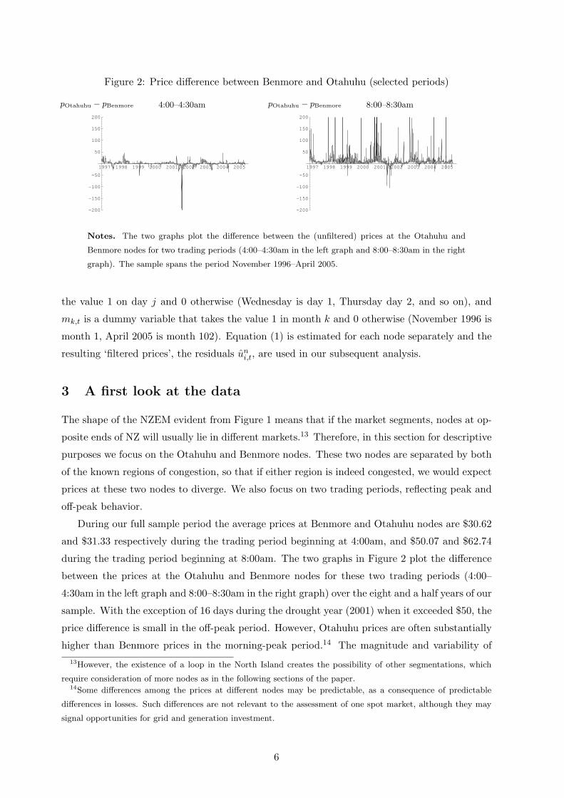
Figure 2: Price difference between Benmore and Otahuhu (selected periods)
1997 1998 1999 2000 2001 2002 2003 2004 2005
-200
-150
-100
-50
50
100
150
200
4:00–4:30ampOtahuhu − pBenmore
1997 1998 1999 2000 2001 2002 2003 2004 2005
-200
-150
-100
-50
50
100
150
200
8:00–8:30ampOtahuhu − pBenmore
Notes. The two graphs plot the difference between the (unfiltered) prices at the Otahuhu and
Benmore nodes for two trading periods (4:00–4:30am in the left graph and 8:00–8:30am in the right
graph). The sample spans the period November 1996–April 2005.
the value 1 on day j and 0 otherwise (Wednesday is day 1, Thursday day 2, and so on), and
mk,t is a dummy variable that takes the value 1 in month k and 0 otherwise (November 1996 is
month 1, April 2005 is month 102). Equation (1) is estimated for each node separately and the
resulting ‘filtered prices’, the residuals uni,t, are used in our subsequent analysis.
3 A first look at the data
The shape of the NZEM evident from Figure 1 means that if the market segments, nodes at op-
posite ends of NZ will usually lie in different markets.13 Therefore, in this section for descriptive
purposes we focus on the Otahuhu and Benmore nodes. These two nodes are separated by both
of the known regions of congestion, so that if either region is indeed congested, we would expect
prices at these two nodes to diverge. We also focus on two trading periods, reflecting peak and
off-peak behavior.
During our full sample period the average prices at Benmore and Otahuhu nodes are $30.62
and $31.33 respectively during the trading period beginning at 4:00am, and $50.07 and $62.74
during the trading period beginning at 8:00am. The two graphs in Figure 2 plot the difference
between the prices at the Otahuhu and Benmore nodes for these two trading periods (4:00–
4:30am in the left graph and 8:00–8:30am in the right graph) over the eight and a half years of our
sample. With the exception of 16 days during the drought year (2001) when it exceeded $50, the
price difference is small in the off-peak period. However, Otahuhu prices are often substantially
higher than Benmore prices in the morning-peak period.14 The magnitude and variability of13However, the existence of a loop in the North Island creates the possibility of other segmentations, which
require consideration of more nodes as in the following sections of the paper.14Some differences among the prices at different nodes may be predictable, as a consequence of predictable
differences in losses. Such differences are not relevant to the assessment of one spot market, although they may
signal opportunities for grid and generation investment.
6
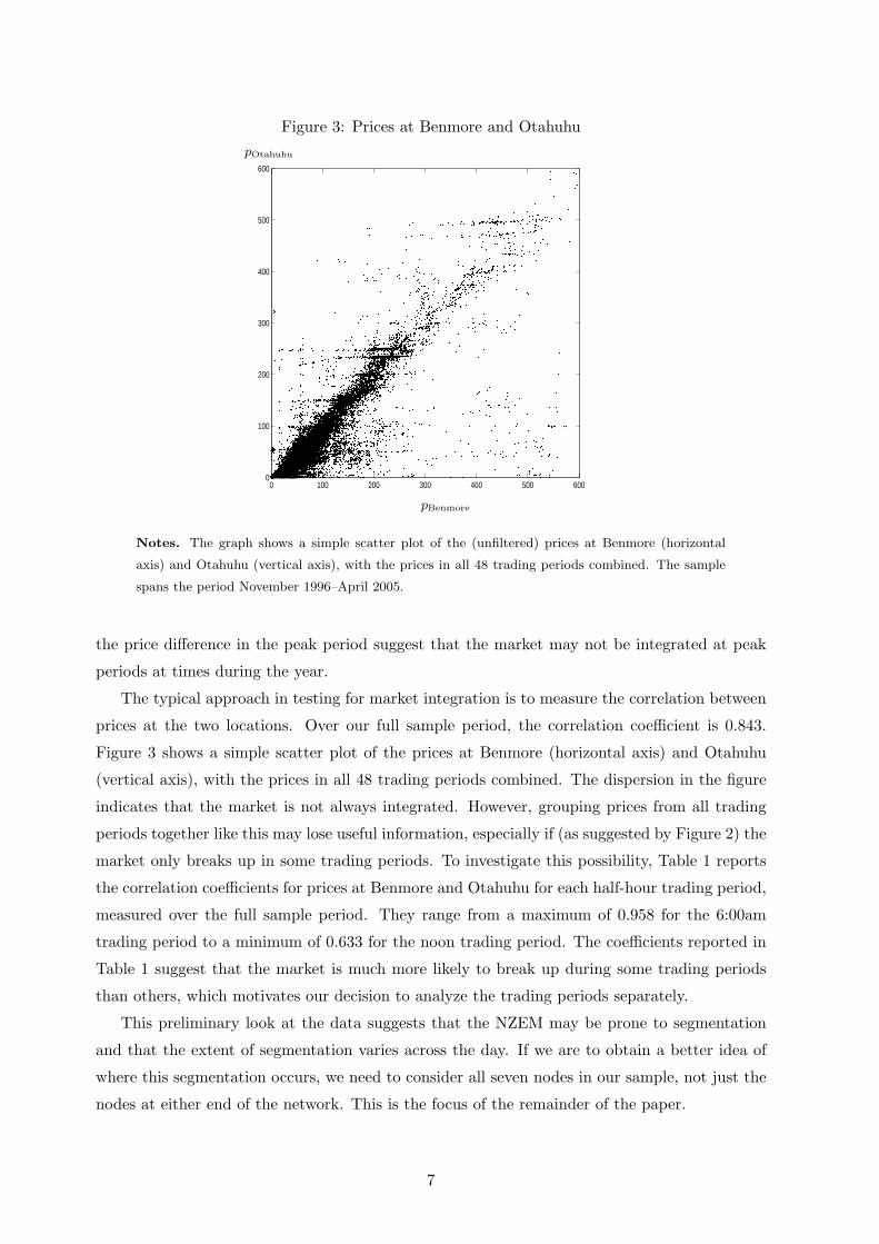
Figure 3: Prices at Benmore and Otahuhu
0 100 200 300 400 500 6000
100
200
300
400
500
600
pOtahuhu
pBenmore
Notes. The graph shows a simple scatter plot of the (unfiltered) prices at Benmore (horizontal
axis) and Otahuhu (vertical axis), with the prices in all 48 trading periods combined. The sample
spans the period November 1996–April 2005.
the price difference in the peak period suggest that the market may not be integrated at peak
periods at times during the year.
The typical approach in testing for market integration is to measure the correlation between
prices at the two locations. Over our full sample period, the correlation coefficient is 0.843.
Figure 3 shows a simple scatter plot of the prices at Benmore (horizontal axis) and Otahuhu
(vertical axis), with the prices in all 48 trading periods combined. The dispersion in the figure
indicates that the market is not always integrated. However, grouping prices from all trading
periods together like this may lose useful information, especially if (as suggested by Figure 2) the
market only breaks up in some trading periods. To investigate this possibility, Table 1 reports
the correlation coefficients for prices at Benmore and Otahuhu for each half-hour trading period,
measured over the full sample period. They range from a maximum of 0.958 for the 6:00am
trading period to a minimum of 0.633 for the noon trading period. The coefficients reported in
Table 1 suggest that the market is much more likely to break up during some trading periods
than others, which motivates our decision to analyze the trading periods separately.
This preliminary look at the data suggests that the NZEM may be prone to segmentation
and that the extent of segmentation varies across the day. If we are to obtain a better idea of
where this segmentation occurs, we need to consider all seven nodes in our sample, not just the
nodes at either end of the network. This is the focus of the remainder of the paper.
7
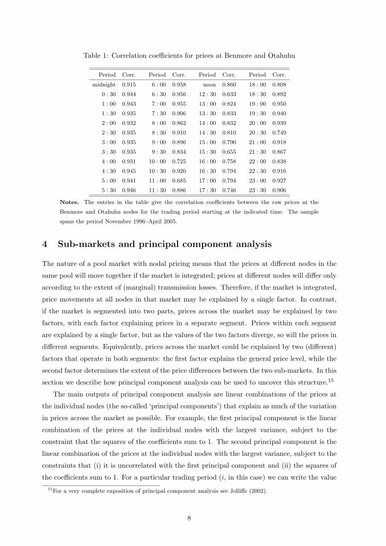
Table 1: Correlation coefficients for prices at Benmore and Otahuhu
Period Corr. Period Corr. Period Corr. Period Corr.
midnight 0.915 6 : 00 0.958 noon 0.860 18 : 00 0.808
0 : 30 0.944 6 : 30 0.956 12 : 30 0.633 18 : 30 0.892
1 : 00 0.943 7 : 00 0.955 13 : 00 0.824 19 : 00 0.950
1 : 30 0.935 7 : 30 0.906 13 : 30 0.833 19 : 30 0.940
2 : 00 0.932 8 : 00 0.862 14 : 00 0.832 20 : 00 0.939
2 : 30 0.935 8 : 30 0.910 14 : 30 0.810 20 : 30 0.749
3 : 00 0.935 9 : 00 0.896 15 : 00 0.790 21 : 00 0.918
3 : 30 0.935 9 : 30 0.834 15 : 30 0.655 21 : 30 0.867
4 : 00 0.931 10 : 00 0.725 16 : 00 0.758 22 : 00 0.838
4 : 30 0.945 10 : 30 0.920 16 : 30 0.794 22 : 30 0.916
5 : 00 0.941 11 : 00 0.685 17 : 00 0.794 23 : 00 0.927
5 : 30 0.946 11 : 30 0.886 17 : 30 0.746 23 : 30 0.906
Notes. The entries in the table give the correlation coefficients between the raw prices at the
Benmore and Otahuhu nodes for the trading period starting at the indicated time. The sample
spans the period November 1996–April 2005.
4 Sub-markets and principal component analysis
The nature of a pool market with nodal pricing means that the prices at different nodes in the
same pool will move together if the market is integrated; prices at different nodes will differ only
according to the extent of (marginal) transmission losses. Therefore, if the market is integrated,
price movements at all nodes in that market may be explained by a single factor. In contrast,
if the market is segmented into two parts, prices across the market may be explained by two
factors, with each factor explaining prices in a separate segment. Prices within each segment
are explained by a single factor, but as the values of the two factors diverge, so will the prices in
different segments. Equivalently, prices across the market could be explained by two (different)
factors that operate in both segments: the first factor explains the general price level, while the
second factor determines the extent of the price differences between the two sub-markets. In this
section we describe how principal component analysis can be used to uncover this structure.15
The main outputs of principal component analysis are linear combinations of the prices at
the individual nodes (the so-called ‘principal components’) that explain as much of the variation
in prices across the market as possible. For example, the first principal component is the linear
combination of the prices at the individual nodes with the largest variance, subject to the
constraint that the squares of the coefficients sum to 1. The second principal component is the
linear combination of the prices at the individual nodes with the largest variance, subject to the
constraints that (i) it is uncorrelated with the first principal component and (ii) the squares of
the coefficients sum to 1. For a particular trading period (i, in this case) we can write the value15For a very complete exposition of principal component analysis see Jolliffe (2002).
8

of the mth principal component (or factor) on day t as
fmi,t = xm1u
1i,t + . . . + xmN uN
i,t, m = 1, . . . , N,
where N is the number of nodes in the market and uni,t denotes the price at node n. The
coefficients xmn are known as the ‘loadings’ on the principal component. It turns out that each
vector (xm1, . . . , xm7) is an eigenvector of the price covariance matrix and that the matrix of
eigenvectors is orthonormal. Thus, we can equivalently write the price at node n on day t as
uni,t = x1nf1
i,t + . . . + xNnfNi,t , n = 1, . . . , N.
The price at each node is thus a linear combination of the N principal components (or factors).
The eigenvalues corresponding to the principal components are ordered from largest to smallest.
For our purposes, we will therefore write the price as a linear combination of the first two
principal components and a residual term; that is,
uni,t = x1nf1
i,t + x2nf2i,t + εn
i,t. (2)
For our data, the elements of the vector (x11, . . . , x1N ) corresponding to the first principal
component are all positive and of similar magnitude. The first principal component (f1i,t) there-
fore offers a measure of the market-wide price — from equation (2), an increase in the value of
the first principal component will lead to a higher price at each node. In contrast, the vector
(x21, . . . , x2N ) corresponding to the second principal component is a mix of positive and negative
elements, so that the second principal component (f2i,t) represents the spread in prices across
the market — from equation (2), an increase in the value of the second principal component
will lead to higher prices at some nodes and lower prices at others. The loadings on the second
principal component therefore give useful information about where segmentation tends to oc-
cur. For example, suppose the NZEM breaks into two due to the HVDC link between the North
and South Islands becoming constrained. Then, compared to what would have happened if the
market had remained integrated, prices in one part of the NZEM (typically the North Island)
will be high and prices in the other part will be low. The overall level of prices will continue
to be determined primarily by the first factor, but a second factor will determine the extent
of separation. We should find that nodes in one segment will have positive loadings on the
second principal component (so that positive values of the principal component are associated
with relatively high prices in that segment), while nodes in the other segment will have negative
loadings (so that positive values of the principal component are associated with relatively low
prices in that segment).
The mix of negative and positive signs of the coefficients of the second principal component
are only of interest in this respect if the contribution of the second principal component is
important. If variation in f2i,t is significant, the second principal component will be important in
explaining the (co)variance of prices; otherwise the second principal component will not explain
9

(much) price variation and there will be a one-factor market. In this case, the first principal
component can be viewed as determining the base level of prices collectively across all nodes of
one market. Where the second principal component has relatively significant variation, there
will be market separation given by the wedge between markets arising from the negative and
positive coefficients on the second principal component. In this case nodes will fall into two
markets. This argument can be extended to allow the approach to describe a situation where
there are more than two markets among the nodes.
The eigenvalues of the covariance matrix reveal a great deal of useful information about
market integration. We denote the eigenvalues by λi for i = 1, . . . , N , and order them so that
λi ≥ λi+1. The sum of the eigenvalues of the covariance matrix equals the sum of the variances
of the prices at each node. The largest eigenvalue divided by the sum of all eigenvalues equals the
weighted average of the R2s obtained by regressing the prices at each node on the first principal
component, where each individual R2 is weighted by the variance of prices at that node relative
to the total variance across all nodes. If this measure, which we denote by
Λ1 ≡ λ1
λ1 + . . . + λN,
is high, a single factor explains much of the variation in prices across the market, so that market
segmentation is relatively unimportant. If it is low, more than one factor is needed to explain
the variations in prices across the market, so that segmentation is a more important issue.16
Similarly, the sum of the two largest eigenvalues divided by the sum of all eigenvalues equals
the weighted average of the R2s obtained by regressing the prices at each node on the first two
principal components, with the same weights as before. We denote this measure by
Λ2 ≡ λ1 + λ2
λ1 + . . . + λN.
Thus, we proceed by extracting the first two principal components from prices in each trading
period. If the market is integrated, a single factor will explain most of the variation across prices
in the network and the second factor will explain little; if the market is prone to segmentation,
the second factor will play a bigger role. In either case, we expect the loadings on the first factor
to all have the same sign and be of similar magnitude. If the market breaks up, the loadings on
the second factor tell us where this occurs. We discuss the results of this procedure in the next
section.
5 Results
We start by considering the case of a single trading period during November 1996–April 2005
in detail. We choose period 17 (8:00–8:30am) as it is representative of a peak period, and
summarize our results in Table 2. The second and third columns of Table 2 show the variance16There may be no significant factor explanation, in which case prices across nodes are independent.
10
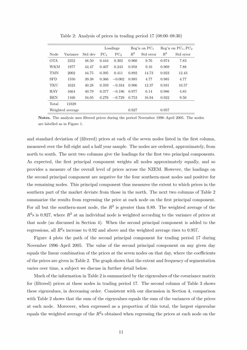
Table 2: Analysis of prices in trading period 17 (08:00–08:30)
Loadings Reg’n on PC1 Reg’n on PC1, PC2
Node Variance Std dev PC1 PC2 R2 Std error R2 Std error
OTA 2352 48.50 0.444 0.302 0.960 9.76 0.974 7.83
WKM 1977 44.47 0.407 0.243 0.958 9.16 0.969 7.88
TMN 2002 44.75 0.395 0.411 0.892 14.73 0.923 12.43
SFD 1550 39.38 0.366 −0.002 0.985 4.77 0.985 4.77
TKU 1623 40.28 0.359 −0.334 0.906 12.37 0.931 10.57
HAY 1664 40.79 0.377 −0.196 0.977 6.14 0.986 4.85
BEN 1160 34.05 0.276 −0.729 0.753 16.94 0.922 9.50
Total 12328
Weighted average 0.927 0.957
Notes. The analysis uses filtered prices during the period November 1996–April 2005. The nodes
are labelled as in Figure 1.
and standard deviation of (filtered) prices at each of the seven nodes listed in the first column,
measured over the full eight and a half year sample. The nodes are ordered, approximately, from
north to south. The next two columns give the loadings for the first two principal components.
As expected, the first principal component weights all nodes approximately equally, and so
provides a measure of the overall level of prices across the NZEM. However, the loadings on
the second principal component are negative for the four southern-most nodes and positive for
the remaining nodes. This principal component thus measures the extent to which prices in the
southern part of the market deviate from those in the north. The next two columns of Table 2
summarize the results from regressing the price at each node on the first principal component.
For all but the southern-most node, the R2 is greater than 0.89. The weighted average of the
R2s is 0.927, where R2 at an individual node is weighted according to the variance of prices at
that node (as discussed in Section 4). When the second principal component is added to the
regressions, all R2s increase to 0.92 and above and the weighted average rises to 0.957.
Figure 4 plots the path of the second principal component for trading period 17 during
November 1996–April 2005. The value of the second principal component on any given day
equals the linear combination of the prices at the seven nodes on that day, where the coefficients
of the prices are given in Table 2. The graph shows that the extent and frequency of segmentation
varies over time, a subject we discuss in further detail below.
Much of the information in Table 2 is summarized by the eigenvalues of the covariance matrix
for (filtered) prices at these nodes in trading period 17. The second column of Table 3 shows
these eigenvalues, in decreasing order. Consistent with our discussion in Section 4, comparison
with Table 2 shows that the sum of the eigenvalues equals the sum of the variances of the prices
at each node. Moreover, when expressed as a proportion of this total, the largest eigenvalue
equals the weighted average of the R2s obtained when regressing the prices at each node on the
11
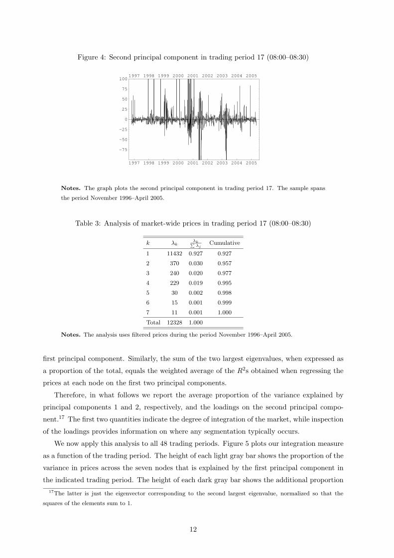
Figure 4: Second principal component in trading period 17 (08:00–08:30)
1997 1998 1999 2000 2001 2002 2003 2004 2005
-75
-50
-25
0
25
50
75
1001997 1998 1999 2000 2001 2002 2003 2004 2005
Notes. The graph plots the second principal component in trading period 17. The sample spans
the period November 1996–April 2005.
Table 3: Analysis of market-wide prices in trading period 17 (08:00–08:30)
k λkλk∑
λjCumulative
1 11432 0.927 0.927
2 370 0.030 0.957
3 240 0.020 0.977
4 229 0.019 0.995
5 30 0.002 0.998
6 15 0.001 0.999
7 11 0.001 1.000
Total 12328 1.000
Notes. The analysis uses filtered prices during the period November 1996–April 2005.
first principal component. Similarly, the sum of the two largest eigenvalues, when expressed as
a proportion of the total, equals the weighted average of the R2s obtained when regressing the
prices at each node on the first two principal components.
Therefore, in what follows we report the average proportion of the variance explained by
principal components 1 and 2, respectively, and the loadings on the second principal compo-
nent.17 The first two quantities indicate the degree of integration of the market, while inspection
of the loadings provides information on where any segmentation typically occurs.
We now apply this analysis to all 48 trading periods. Figure 5 plots our integration measure
as a function of the trading period. The height of each light gray bar shows the proportion of the
variance in prices across the seven nodes that is explained by the first principal component in
the indicated trading period. The height of each dark gray bar shows the additional proportion17The latter is just the eigenvector corresponding to the second largest eigenvalue, normalized so that the
squares of the elements sum to 1.
12
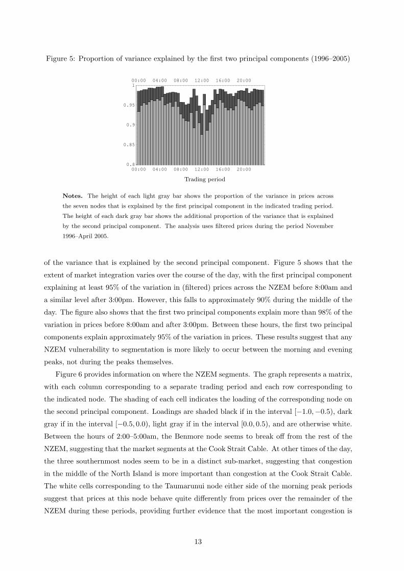
Figure 5: Proportion of variance explained by the first two principal components (1996–2005)
00:00 04:00 08:00 12:00 16:00 20:000.8
0.85
0.9
0.95
100:00 04:00 08:00 12:00 16:00 20:00
Trading period
Notes. The height of each light gray bar shows the proportion of the variance in prices across
the seven nodes that is explained by the first principal component in the indicated trading period.
The height of each dark gray bar shows the additional proportion of the variance that is explained
by the second principal component. The analysis uses filtered prices during the period November
1996–April 2005.
of the variance that is explained by the second principal component. Figure 5 shows that the
extent of market integration varies over the course of the day, with the first principal component
explaining at least 95% of the variation in (filtered) prices across the NZEM before 8:00am and
a similar level after 3:00pm. However, this falls to approximately 90% during the middle of the
day. The figure also shows that the first two principal components explain more than 98% of the
variation in prices before 8:00am and after 3:00pm. Between these hours, the first two principal
components explain approximately 95% of the variation in prices. These results suggest that any
NZEM vulnerability to segmentation is more likely to occur between the morning and evening
peaks, not during the peaks themselves.
Figure 6 provides information on where the NZEM segments. The graph represents a matrix,
with each column corresponding to a separate trading period and each row corresponding to
the indicated node. The shading of each cell indicates the loading of the corresponding node on
the second principal component. Loadings are shaded black if in the interval [−1.0,−0.5), dark
gray if in the interval [−0.5, 0.0), light gray if in the interval [0.0, 0.5), and are otherwise white.
Between the hours of 2:00–5:00am, the Benmore node seems to break off from the rest of the
NZEM, suggesting that the market segments at the Cook Strait Cable. At other times of the day,
the three southernmost nodes seem to be in a distinct sub-market, suggesting that congestion
in the middle of the North Island is more important than congestion at the Cook Strait Cable.
The white cells corresponding to the Taumarunui node either side of the morning peak periods
suggest that prices at this node behave quite differently from prices over the remainder of the
NZEM during these periods, providing further evidence that the most important congestion is
13
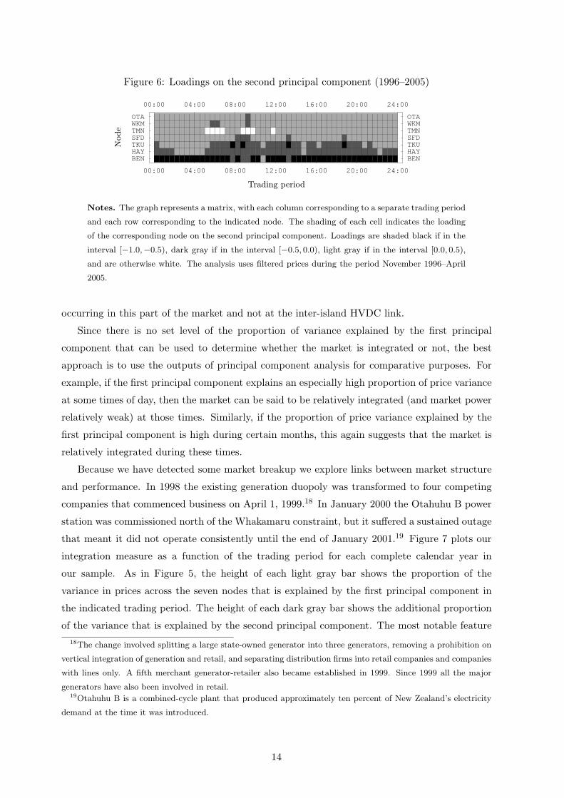
Figure 6: Loadings on the second principal component (1996–2005)
00:00 04:00 08:00 12:00 16:00 20:00 24:00
BENHAYTKUSFDTMNWKMOTA
00:00 04:00 08:00 12:00 16:00 20:00 24:00
BENHAYTKUSFDTMNWKMOTA
Node
Trading period
Notes. The graph represents a matrix, with each column corresponding to a separate trading period
and each row corresponding to the indicated node. The shading of each cell indicates the loading
of the corresponding node on the second principal component. Loadings are shaded black if in the
interval [−1.0,−0.5), dark gray if in the interval [−0.5, 0.0), light gray if in the interval [0.0, 0.5),
and are otherwise white. The analysis uses filtered prices during the period November 1996–April
2005.
occurring in this part of the market and not at the inter-island HVDC link.
Since there is no set level of the proportion of variance explained by the first principal
component that can be used to determine whether the market is integrated or not, the best
approach is to use the outputs of principal component analysis for comparative purposes. For
example, if the first principal component explains an especially high proportion of price variance
at some times of day, then the market can be said to be relatively integrated (and market power
relatively weak) at those times. Similarly, if the proportion of price variance explained by the
first principal component is high during certain months, this again suggests that the market is
relatively integrated during these times.
Because we have detected some market breakup we explore links between market structure
and performance. In 1998 the existing generation duopoly was transformed to four competing
companies that commenced business on April 1, 1999.18 In January 2000 the Otahuhu B power
station was commissioned north of the Whakamaru constraint, but it suffered a sustained outage
that meant it did not operate consistently until the end of January 2001.19 Figure 7 plots our
integration measure as a function of the trading period for each complete calendar year in
our sample. As in Figure 5, the height of each light gray bar shows the proportion of the
variance in prices across the seven nodes that is explained by the first principal component in
the indicated trading period. The height of each dark gray bar shows the additional proportion
of the variance that is explained by the second principal component. The most notable feature18The change involved splitting a large state-owned generator into three generators, removing a prohibition on
vertical integration of generation and retail, and separating distribution firms into retail companies and companies
with lines only. A fifth merchant generator-retailer also became established in 1999. Since 1999 all the major
generators have also been involved in retail.19Otahuhu B is a combined-cycle plant that produced approximately ten percent of New Zealand’s electricity
demand at the time it was introduced.
14
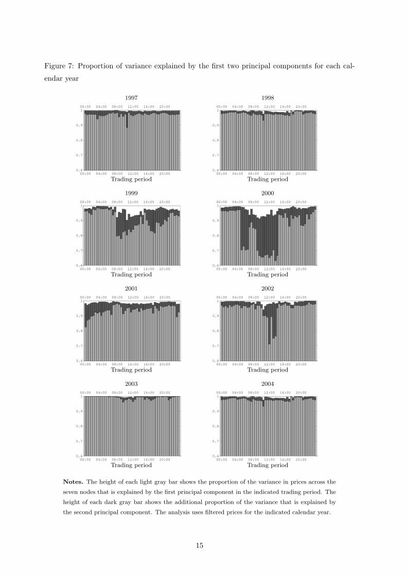
Figure 7: Proportion of variance explained by the first two principal components for each cal-
endar year
1997
00:00 04:00 08:00 12:00 16:00 20:000.6
0.7
0.8
0.9
100:00 04:00 08:00 12:00 16:00 20:00
Trading period
1998
00:00 04:00 08:00 12:00 16:00 20:000.6
0.7
0.8
0.9
100:00 04:00 08:00 12:00 16:00 20:00
Trading period
1999
00:00 04:00 08:00 12:00 16:00 20:000.6
0.7
0.8
0.9
100:00 04:00 08:00 12:00 16:00 20:00
Trading period
2000
00:00 04:00 08:00 12:00 16:00 20:000.6
0.7
0.8
0.9
100:00 04:00 08:00 12:00 16:00 20:00
Trading period
2001
00:00 04:00 08:00 12:00 16:00 20:000.6
0.7
0.8
0.9
100:00 04:00 08:00 12:00 16:00 20:00
Trading period
2002
00:00 04:00 08:00 12:00 16:00 20:000.6
0.7
0.8
0.9
100:00 04:00 08:00 12:00 16:00 20:00
Trading period
2003
00:00 04:00 08:00 12:00 16:00 20:000.6
0.7
0.8
0.9
100:00 04:00 08:00 12:00 16:00 20:00
Trading period
2004
00:00 04:00 08:00 12:00 16:00 20:000.6
0.7
0.8
0.9
100:00 04:00 08:00 12:00 16:00 20:00
Trading period
Notes. The height of each light gray bar shows the proportion of the variance in prices across the
seven nodes that is explained by the first principal component in the indicated trading period. The
height of each dark gray bar shows the additional proportion of the variance that is explained by
the second principal component. The analysis uses filtered prices for the indicated calendar year.
15

of the eight graphs is that the NZEM was much more prone to segmentation in 1999 and 2000,
with the market breaking up during the periods 5:00–7:00am and 9:00am–2:30pm, than in other
years. There is evidence that the market was breaking up into at least three segments during
the latter period. Inspection of the other graphs suggests that the NZEM is more integrated
after Otahuhu B entered service and the network was strengthened: during this period the first
principal component alone explains a great deal of the variation in prices throughout the day.
Of course, factors other than the appearance of the new power plant and expansion of network
capacity may be explaining the greater integration. However, the 2001–2004 periods include two
high-price episodes — the dry years of 2001 and 2003 — which we would expect to have imposed
greater pressure on the transmission constraints as the generally northward flow of electricity
was reversed for considerable periods of time. Nevertheless, the 2001–2004 period exhibits the
characteristics of one market. The significance of the 1999–2000 market separation is a matter
of judgement. Both factors explain almost all of the variation in prices during this period, but
in certain non-peak periods, particularly in 2000, the second factor contributes more than 30
percent to the explanation of price variation.20 We have no information about the effect of this
separation on market participant behavior. However, it may well have affected decisions such
as the location of hedge agreements, especially had the 2000 segmentation persisted.
Figure 8 provides more detail on segmentation in the NZEM. The top graph corresponds to
the period (1997–1998) before competition in the NZEM was materially enhanced, the middle
graphs relate to 1999 and 2000, and the bottom graph to the period 2001–2004. Interpretation
of the cells represented by the graphs is as for Figure 6. Here, as in Figure 7, the behavior before
competition and after the introduction of Otahuhu B and transmission expansion is similar. In
contrast to the duopoly period of 1997–1998, in 1999 and 2000 the three northernmost nodes
(Otahuhu, Whakamaru, and Taumarunui) were prone to separate from the rest of the NZEM
during the daytime and early evening; overnight segmentation typically occurred nearer the
inter-island HVDC link. However, the introduction of Otahuhu B and transmission expansion
appear to have relieved congestion in the middle of the North Island because, as the bottom graph
shows, segmentation in the period beginning in 2001 tends to involve only the two southernmost
nodes separating from the rest of the market.
The period 1999–2000 is quite distinctive. Recall from Figure 7 that the NZEM was especially
prone to break up into two or three parts during this period. The middle graphs in Figure 8
suggest that this involved the Stratford (overnight) or Taumarunui (daytime) node separating
from the rest of the market. The results in Figure 7 strongly indicate that in only 1999 and
2000 has there been other than one market. This conclusion is supported by Figure 8, which
demonstrates the location of the market segmentation. Together they suggest that the advent20As Figure 7 reveals, the constraint seems to bind in the morning and middle of the day: outside peak hours.
This is concordant with generators with storage — hydro, gas or coal — reducing their generation in off peak
times to an extent that northbound electricity induced the Tokaanu-Whakamaru constraint to bind. Absent the
constraint, this management of storage may have been efficient (see Counsell et al., 2006).
16

Figure 8: Loadings on second principal component
1997–1998
00:00 04:00 08:00 12:00 16:00 20:00 24:00
BENHAYTKUSFDTMNWKMOTA
00:00 04:00 08:00 12:00 16:00 20:00 24:00
BENHAYTKUSFDTMNWKMOTA
Node
Trading period
1999
00:00 04:00 08:00 12:00 16:00 20:00 24:00
BENHAYTKUSFDTMNWKMOTA
00:00 04:00 08:00 12:00 16:00 20:00 24:00
BENHAYTKUSFDTMNWKMOTA
Node
Trading period
2000
00:00 04:00 08:00 12:00 16:00 20:00 24:00
BENHAYTKUSFDTMNWKMOTA
00:00 04:00 08:00 12:00 16:00 20:00 24:00
BENHAYTKUSFDTMNWKMOTA
Node
Trading period
2001–2004
00:00 04:00 08:00 12:00 16:00 20:00 24:00
BENHAYTKUSFDTMNWKMOTA
00:00 04:00 08:00 12:00 16:00 20:00 24:00
BENHAYTKUSFDTMNWKMOTA
Node
Trading period
Notes. The graph represents a matrix, with each column corresponding to a separate trading period
and each row corresponding to the indicated node. The shading of each cell indicates the loading
of the corresponding node on the second principal component. Loadings are shaded black if in the
interval [−1.0,−0.5), dark gray if in the interval [−0.5, 0.0), light gray if in the interval [0.0, 0.5),
and are otherwise white. The analysis uses filtered prices during 1997–1998 in the top graph, 1999
in the next graph, 2000 in the next graph, and 2001–2004 in the bottom graph.
17

of a sharp increase in competition induced market separation hitherto not present, and that this
was removed by the appearance of additional generation downstream of the constraint and some
expansion of network capacity in the critical area of the transmission grid.21
6 Conclusion
This paper has used principal component analysis to examine the degree of market integration
in the New Zealand spot wholesale market for the years 1997–2004 inclusive. Our approach is
different from previous analyses in that we use principal component analysis, which provides
a natural way to model the base level of prices and relative prices that may vary across the
nodes of the market. The base factor and, by definition, different other factors provide a way of
exploring and describing market segmentation in an interconnected pool.
We find that there was some regular separation in the market in 1999 and 2000 around a
constraint in the center of the North Island and that, particularly in 2000, it had some significant
effect. At 1 April 1999 a generator duopoly was replaced by four generator-retailer firms, and
for two years competition among them seemed to result in a constraint that had not previously
been present. The constraint was relaxed somewhat by a transmission enhancement at the
end of 2000 and at the same time a new combined cycle gas generation plant downstream
of the constraint commenced reliable operation. From this date the separation was virtually
eliminated and the spot market returned to its ‘one-market’ status. It maintained this status
even in two dry-year high-price episodes when electricity often flowed opposite to its normal
direction. These findings suggest that increased generator-retailer competition may well require
grid and generator-locational investments to enable the maintenance of a competitive wholesale
spot market.
References
Bailey, Elizabeth M. 1998a. “Electricity Markets in the Western United States,” Electricity
Journal, 11:6, pp. 51–60.
Bailey, Elizabeth M. 1998b. “The Geographical Expanse of the Market for Wholesale Electric-
ity,” Massachusetts Institute of Technology Working Paper.
Borenstein, Severin, James B. Bushnell, and Frank A. Wolak. 2002. “Measuring Market In-
efficiencies in California’s Restructured Wholesale Electricity Market,” American Economic21The segmentation in 1999 and 2000 depicted in Figure 8 is in accord with transmission network experiences
of the period. The relatively high prices during this period at Tokaanu and Stratford occurred at the same time
as relatively low prices to the south of these nodes. Indeed, on 57 occasions during this period the constraint
pressure was sufficient to produce a spring-washer effect (Read and Ring, 1995) in which prices to the south of
the constraint were so low — to back off generation — that they became negative. At the same time, prices to
the north of the constraint were very high to encourage demand reductions.
18

Review, 92:5, pp. 1376–1405.
Bushnell, James. 2005. “Looking for Trouble: Competition Policy in the US Electricity In-
dustry.” In Steven L. Puller and J. Griffin (eds), Electricity Restructuring: Choices and
Challenges, University of Chicago Press.
Bushnell, James, Erin T. Mansur, and Celeste Saravia. 2004. “Market Structure and Compe-
tition: A Cross-Market Analysis of US Electricity Deregulation,” Center for the Study of
Energy Markets Working Paper 126.
Cardell, Judith B., Carrie Cullen-Hitt, and William W. Hogan. 1997. “Market Power and Strate-
gic Interaction in Electricity Networks,” Resource and Energy Economics, 19:1, pp. 109–137.
Cicchetti, Charles J., Jeffrey A. Dubin, and Colin M. Long. 2004. The California Electricity
Crisis: What, Why, and What’s Next, Kluwer Academic Publishers. Boston, MA.
Counsell, Kevin, Lewis Evans, Graeme Guthrie, and Steen Videbeck. 2006. “Electricity Gen-
eration with Uncertain Fuel Supplies and the Implications for Measuring Market Power,”
Working paper, Victoria University of Wellington.
De Vany, Arthur. S.; and W. David Walls. 1999. “Cointegration Analysis of Spot Electricity
Prices: Insights on Transmission Efficiency in the Western US,” Energy Economics, 21,
pp. 435–448.
Evans, Lewis T., and Richard B. Meade. 2005. Alternating Currents or Counter-Revolution?
Contemporary Economic Reform in New Zealand. Wellington, New Zealand: Victoria Uni-
versity Press
Guthrie, Graeme, and Steen Videbeck. 2004. “Electricity Spot Price Dynamics: Beyond Finan-
cial Models,” ISCR Working Paper. http://ssrn.com/abstract=648361
Jolliffe, Ian T. 2002. Principal Component Analysis (2nd ed.), Springer-Verlag, New York.
Joskow, Paul L., and Edward Kahn. 2002. “A Quantitative Analysis of Pricing Behavior
in California’s Wholesale Electricity Market During Summer 2000,” Energy Journal, 23:4,
pp. 1–35.
Kleit, Andrew N. 2001. “Defining Electricity Markets: An Arbitrage Cost Approach,” Resource
and Energy Economics, 23, pp. 259–270.
Park, Haesun; James W. Mjelde; and David A. Bessler. 2006. “Price Dynamics Among US
Electricity Spot Markets,” Energy Economics, 28, pp. 81–101.
Read, E. Grant, and Brendan J. Ring. 1995. “A Dispatch Based Pricing Model for the New
Zealand Electricity Market.” In Riaz Siddiqi and Michael A. Einhorn (eds.), Transmission
Pricing and Technology, Kluwer Academic Press, Boston, pp. 183–206.
19

Stigler, George J., and Robert A. Sherwin. 1985. “The Extent of the Market,” Journal of Law
and Economics, 28:3, pp. 555–586.
Transpower. 2001. “Supplementary Submission to the Post-winter Review of the New Zealand
Electricity System,” Transpower New Zealand Limited, October 2001.
Wolfram, Catherine D. 1998. “Strategic Bidding in a Multiunit Auction: An Empirical Analysis
of Bids to Supply Electricity in England and Wales,” RAND Journal of Economics, 29:4,
pp. 703–725.
Wolfram, Catherine D. 1999. “Measuring Duopoly Power in the British Electricity Spot Mar-
ket,” American Economic Review, 89:4, pp. 805–826.
Woo, Chi-Keung, Debra Lloyd-Zannetti, and Ira Horowitz. 1997. “Electricity Market Integra-
tion in the Pacific Northwest,” Energy Journal, 18:3, pp. 75–101.
20