Embed Size (px)
DESCRIPTION
AS Media double page spreads. By Connor West. - PowerPoint PPT Presentation
Citation preview

AS Media double page spreads
By Connor West

It is a magazine double page spread from the magazine four four two with Real Madrid and Barcelona being talked about. The colours used are mainly white and black so that the writing can stand out because the background is black and the writing is white. The font is quite small but the headline is big and bold so it can stand out from the text. The writing is on the right hand third with the headline on the left hand third. The target audience would be football fans or fans of either one of these two teams. It is typical of the brand name because it is two sporting giants being talked about so that means football fans will want to buy it. The images are the most effective because they are two well recognised teams and once someone see’s a picture of them then the person will want to buy the magazine to see what is happening with the two teams.

It is a magazine double page spread from the magazine look with Robert Paterson and Kristen Stewart being talked about. The colours used are mainly white blue and black so that the writing can stand out because the background is white and the writing is black and blue. The font is quite small but the headline is big and bold which is a quote said by Robert. The writing is on the left hand third with the headline above it. The target audience would be female teenagers or fans of either one of these two celebrities. It is typical of the brand name because it is two popular actors/actress being talked about so that means the fans of the two will want to buy it. The images are the most effective because Robert Paterson is a well recognised person and once someone see’s a picture of he then they will want to buy the magazine to see what is happening with him.

It is a magazine double page spread from the magazine bail out with Jacques Kollis being talked about. The colours used are mainly white, pink, green and black so that the writing can stand out because the background is black and the writing is white, green and pink. The font is quite small but the headline is big and bold so it can stand out from the text. The writing is on the left hand third with the headline above it. The target audience would be cricket fans. It is typical of the brand name because it is a cricketer being talked about so that means cricket fans will want to buy it. The images are the most effective because it covers the whole of the right hand page so it shows how important he is to his team and so people who are fans of the team he plays for and of cricket will buy the magazine so they can see what the article is about.

It is a magazine double page spread from the magazine heat with Katie Price and her boyfriend Leandro being talked about. The colours used are mainly white, yellow, red and black so that the writing can stand out because the background is black and the writing is white. Also, the headline is yellow and the background behind that it red. The font is quite small but the headline is big and bold so it can stand out from the text. The writing is mainly on the left hand third but also goes onto the right side and the headline going across both pages. The target audience would be women. It is typical of the brand name because it is a person who is in the news quite frequently because of her relationships so that means women will want to buy it to find out what is happening with her latest boyfriend. The images are the most effective because it tells you a little about what happened and so it will attract the reader because the images show both of them having “their first public row!”

It is a magazine double page spread from the magazine empire with a new film Black Swan being talked about. The colours used are mainly white and black which links with the name of the film because it has black in the title so they make a black background and also you see a swan as white so they use that for the text. The font is quite small but the headline is big and bold so it can stand out from the text. The writing is on the right hand third with the headline in the middle of the page and the picture of the main character on the left page. The target audience would be movie lovers or fans that would like to see the film. It is typical of the brand name because it is a new film being talked about so that means movie fans will want to find out about it so they will buy the magazine. The image is the most effective because it shows what the Black Swan looks like and shows a long shot of the actress.

It is a magazine double page spread from the magazine empire with the new Pirates of the Caribbean movie being talked about. The colours used are mainly red, white and black so that the writing can stand out because the background is white and the writing is black. The font is quite small but the headline is big and bold so it can stand out from the text and also the sub headline is big and bold. The writing is on the left hand third with the headline on the left hand third as well. The target audience would be movie lovers or fans of the Pirates of the Caribbean moves. It is typical of the brand name because it is a well known film being talked about so that means people will want to buy it. The images are the most effective because they are all on the right hand page so it shows what the film is going to feature and pictures of some of the scenes.

It is a magazine double page spread from the magazine men’s health with protein pills being talked about. The colours used are mainly white and blue with the background grey so the writing can stand out which is white. The font is quite small but the headline is big and bold so it can stand out from the text. The writing is on the right hand third with the headline above it. The target audience would be men who would want to get fit. It is typical of the brand name because it is protein pills being advertised and it shows a man next to the pills which shows men that you will get a good body if you take the pills. The images are the most effective because it has a picture of the pills and the bloke next to them so it shows what the pill can do to those who take them.
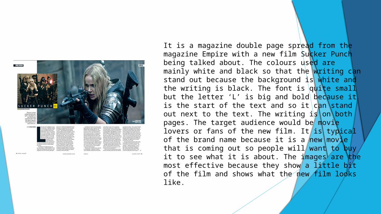
It is a magazine double page spread from the magazine Empire with a new film Sucker Punch being talked about. The colours used are mainly white and black so that the writing can stand out because the background is white and the writing is black. The font is quite small but the letter ‘L’ is big and bold because it is the start of the text and so it can stand out next to the text. The writing is on both pages. The target audience would be movie lovers or fans of the new film. It is typical of the brand name because it is a new movie that is coming out so people will want to buy it to see what it is about. The images are the most effective because they show a little bit of the film and shows what the new film looks like.