Embed Size (px)
Citation preview

TM
Repackaging Program 04 26 10
TM
Repackaging Program 04 26 10


Process
01 Discovery
02 Define
03 Design
04 Develop
05 Deploy

01Why repackage?
Why redesign Artistry packaging?
01
Compete more closely against our competitive set –
are established, well-known, brands with physical presence
02
Develop more consistent brand elements between
ARTISTRY’s sublines
03
Draw attention to our new positioning.
04
Boost the prestige perception of the packaging

03Market Learnings | Workshop

In March 2010, a group of us went on
an immersion trip, where we met with
marketing teams in Seoul and Tokyo to
better understand the needs, concerns
and competitive sets of the affiliates in our
leading markets. This comprehensive visit
included competitive shopping, affiliate
presentations and in-home visits.
Here is a synopsis of our learnings.

Seoul

What we learned in Seoul
01 Quality interior elements are as important as exterior
02 Weight signifies a luxury product
03 Innovation is a key driver for growth
04 Design Intent reflecting brans concept is important
05 Sampling samples are portable representations of the brand

Tokyo
What we learned in Tokyo
01 Quality interior elements are as important as exterior
02 Functionality everything must have purpose and fulfill that purpose
03 Design Intent the reason for everything should be explained
04 Details how something closes is as important as its opening
05 Simplicity reduction is key to the Japanese aesthetic
06 Sustainability must be addressed in this market
07 Sampling is the number one driver for sales

Our Competition

Sulwhasoo
Brand: Based on the science of traditional Asian medicine and stress-balanced skin maintenance.
Packaging: The brand identity is reinforced via the authentic, traditional product design and colour cues:- Amber, inspired by Korean traditional jewelry (amber & jade)- Calligraphy-style logo gives an emotional & authentic Korean image- Consistency among the sub-brands
SU:M 37
Brand: The brand name “su:m 37” captures the science behind naturally fermented cosmetics: the concept of the skin’s respiration (sum in Korean) and the temperature at which fermentation takes place, 37°C.
Packaging: Shapes that echo nature through Oriental simplicity and the beauty of flowing curved lines. Use of colour to differentiate sublines, and special finishes for special products.
SK-II
Brand: Women are at their most beautiful when they are true to their own unique beauty, thus everyone’s skincare ritual is different.
Packaging: Innovative designs for special products. Use of colour to differentiate sublines. Silhouettes not all exactly the same, but similar enough to feel like a family.
Shiseido
Brand: Fusion between Western pharmacology and Eastern philosophy, creating an image of mystery and sophistication.
Packaging: Futuristic and sleek but with feminine shapes. Interesting juxtaposition of different finishes used on lipsticks.
Clé de Peau
Brand: Fusion of the most sophisticated technology and equisitely refined aesthetics.
Packaging: Elegant, sophisticated, significant of icon. Most skin care products use glass and have signature freshness seal.
Suqqu
Brand: For women with experience and confidence, to help nurture and enhance the sophistication that comes with maturity.
Packaging: Design is simple, yet the shapes are unique, easy to hold and use. Finishes are elegant, sophisticated, ranging from slightly textured matte to smooth gloss.
The History of Whoo
Brand: A modern reinterpretation of ancient secret Korean royal court beauty secrets, using the special ingredient Gongjinbidan.
Packaging:- Lotus flower and feminine refined curves remind one of a Queen- Calligraphy style is reminiscent of a Korean fiddle- Gold and amber colouring symbolize the luxury of the royal court- Collaboration with famous artists and designers on some sublines lends excitement
O Hui
Brand: Creating scientific cosmetic solutions to keep women’s skin healthy and beautiful.Brings together nature’s power to heal and the best of skin science.
Packaging: Futuristic, technologically inspired.
AmorePacific
Brand: Draws on traditional concepts of Asian beauty culture and uses indigenous botanical ingredients with cutting-edge technology.
Packaging: Elegant and sensual, designed in multiple layers to protect product from light and extreme temperatures.
Hera
Brand: The joy of renewal through innovative skin care and the artistry of makeup.
Packaging: Sophisticated, scientific package design. Signature use of colour gradations across sublines. For a special subline, gold accents were used to create an element of surprise, and colour was used to indicate functional elements. Refills available.
Three
Brand: Skincare should be ultimately natural, comfortable and powerful. Makeup should be edgy but show your personality. “Natural” skincare and “edgy” makeup. The new standard created by the two contrasting elements.
Packaging: Soft touch, matte natural finish. Earth-toned neutral colour
for cosmetics.
Lancôme
Brand: French heritage, embracing elegance, femininity, inspiration and allure; Continual product innovation and scientific development.
Packaging: Strong use of the rose icon. Very consistent shapes/silhouettes across sublines, differentiated through colour. Innovative packaging is introduced for special products like Génifique and Secret de Vie.
Estée Lauder
Brand: Symbolizes an iconic, accessible luxury, built on product innovation and technological advances.
Packaging: Similar to Lancôme, there are common shapes/silhouettes across sublines with differentiation in colour. Often prominent use of EL icon.
Clinique
Brand: Dermatologist-developed, with products that are heavily tested, the brand meets individual skin care needs in a simple, thorough and effective way.
Packaging: Supports clinical positioning. Minimal, with focus on functionality. Simple silhouettes throughout with slight differentiations in colour.
Our Competition

Tokyo
What we learned in Tokyo
01 Quality interior elements are as important as exterior
02 Functionality everything must have purpose and fulfill that purpose
03 Design Intent design elements for function or story support
04 Details how something closes is as important as how it opens
05 Simplicity reduction is key to the Japanese aesthetic
06 Sustainability must be addressed in this market
07 Sampling is the number one driver for sales
Men’s competitive
Shiseido Men
Brand: Power your skin. Powerful science. Practical skincare.
Packaging: Strong, clean forms. On transparent bottles, the product explanation is often put on a seal which is placed at bottom of package, to keep simplicity and cleanliness of front facade.
Hera Homme
Brand: Innovative skin care line extension of Hera for women.
Packaging: More rectangular bottles but with rounded edges, in blues, greys and silver, both differentiates Hera Homme from the women’s line and connects it.
Comfort Zone Man Space
Brand: Synergy of emotional experiences and sensory sublimity; Advanced formulation research, refinement of Italian taste in its choice of an appropriate image and Oriental knowledge in its gentle and natural approach. Man Space is a unique grooming system within Comfort Zone, conceived to match the highest expectations of contemporary men.
Packaging: Reflects the brand’s commitment to and respect for the environment and a strategy of sustainable development
Seoul
What we learned in Seoul
01 Finish and Detail interior elements are as important as exterior
02 Weight signifies a luxury product
03 Innovation is a key driver for growth
04 Design Intent reflecting a brand’s concept is important
05 Sampling samples are portable representations of the brand

03Market Learnings | Workshop
In March 2010, a group of us went on
an immersion trip, where we met with the
marketing teams in Seoul and Tokyo to
better understand the needs, concerns
and competitive sets of the affiliates in our
leading markets. This comprehensive visit
included competitive shopping, affiliate
presentations and in-home visits.
Here is a synopsis of our learnings.
04Criteria for repackaging
Our Criteria
01 Design Intent
02 Quality
03 Innovation
04 Functionality
05 Sustainability
06 Sampling

01 Design Intent
Telling a story that supports the packaging is considered a
key sales driver. It gives the IBOs an entryway in discussing
these products and creates a point of engagement with
potential customers.
We will create packaging rich in storytelling, in both concept
and execution and make that story available to our affiliates.
02 Quality
Quality perception must be raised if we are to continue
to ask consumers to pay premium prices for our products.
Currently, competitive products’ use of weight, materials,
finish and detail make our products look “cheap” in
comparison.
We will increase our quality cues to address
things such as weight, feel, openings, closures
and fit to make our packaging as superior
as our product.
02Our Process
Our Process
01 Discovery 03.10 - 04.10
02 Design 05.10 - 07.10
03 Validate/Finalize 07.10 - 09.10
- Design Freeze 10.08.10

01Why repackage?
Why redesign Artistry packaging?
01
Be competitive with other prestige beauty brands which are
established, well-known and have physical presence
02
Incorporate more consistent branding elements across the
ARTISTRY sublines
03
Establish a design that is timeless and enduring
04
Boost the prestige perception of the packaging
03 Innovation
Innovative products and methods of delivery will be
key sales drivers, as they allow our IBOs to increase sales
by opening doors with new product stories. Our current lack
of interesting delivery mechanisms leaves us in the shadow
of our competitors, as they invest heavily in this area.
We will integrate innovative delivery mechanisms, materials
and finishes into our product line, all of which will also reflect
our devotion to innovation in our product formulas.
04 Functionality
Taking a very close look at how our products are used and
the context in which they are used needs to be addressed.
Making certain that caps stay on when they are meant to
and that powders do not fall out when turned upside down
is key to customer loyalty.
We will make certain that the packaging which delivers
our products is true to its function as the formulations are
to theirs.

05 Sustainability
Across all industry sectors, sustainability is becoming a
benchmark of quality. In addition, it is integral to Amway as
a brand. Waste is no longer a side effect of luxury, it is seen
as vulgar and has negative implications on brands which
engage in it.
We will strive to find ways to reduce the
impact of our packaging, and these
changes will add to the narrative
and credibility of our repackaging story.
06 Sampling
Sampling is the number one driver in new sales.
It is also the first representation of the brand that potential
custmers see, and lingers with them while they are making
up their minds about purchasing the product. It is often the
most visible representations of our brand outside the home
as samples are often carried in a handbag.
We will create samples of our products much more closely
related to our primary packaging thus increasing our
prestige and quality perception.
Meeting Objectives
01
Understand necessity of repackaging
02
Understand our process
03
Share learnings from our markets
04
Align on criteria to judge success of packaging redesign
Our objectives
for this meeting

our objectivesSub-brand Concepts

There is a common element across all Artistry Brand Spark
territories – Nature. There is perhaps no richer source of
influence we can draw from to inspire out packaging line
and to create a coherent story. Although the messages will
be delivered in slightly different ways depending on final
positioning, the inspiration remains a valid and appealing
guide to the development process.
Sub-Brand Concepts
01 Essentials Pleasura
Inspiration River Stone
The basis and foundation of everything
which is stable. Stone is not only a provider
of shelter but a medium of sculpture.
When combined with the
force of water, a smooth
perfection is created.
Form
Simple with smooth details
Finish
A matte and modeled texture will
accompany this concept.

01 Essentials Pleasua
Matte opaque finish. Lightly textured. Soft touch or other option.
Satin Metallic “Linking Element”

02 Pure White Whiticia
Inspiration Droplet
Water takes its purest form from which we
take our inspiration.
Form
A pure and rounded geometry
Finish
The finish should be perfectly smooth and
brilliantly white.

02 Pure White Whiticia
High gloss opaque finish. A white/metallic look. Matte white “Linking Element”

03 Intensives
Inspiration Vortex
Nature’s most powerful method of creating
an intense focus.
Form
Graduating between the broad
and narrow.
Finish
Levels of opacity combining the
clear and opaque.

03 Intensive
Satin opaque to clear graduation. Metallic blue, to silver to clear.
Blue Metallic “Linking Element”

04 Time Defiance Treatage
Inspiration Shell
Nature’s ultimate solution which through
the act of protecting something delicate,
produces one of its most beautiful objects.
Form
Over casing of a form beneath.
Finish
Color variations through a play of light.

04 Time Defiance Treatage
Gloss mauve/gold with overlay of semi-transparent iridescence.
Bodies are very slightly transparent.
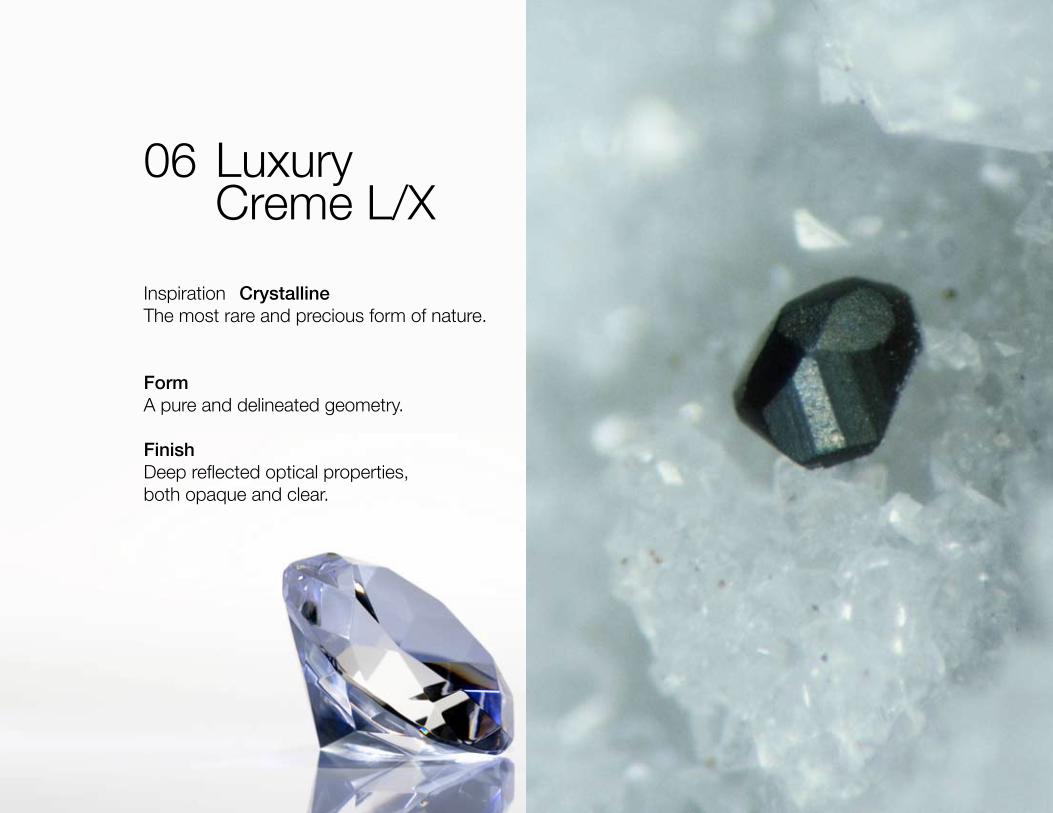
06 Luxury Creme L/X
Inspiration Crystalline
The most rare and precious form of nature.
Form
A pure and delineated geometry.
Finish
Deep reflected optical properties,
both opaque and clear.

05 Luxury Creme L/X
Very heavy walled transparent with opaque insert (refillable).
Exaggerated form from main line. Integrated applicator.
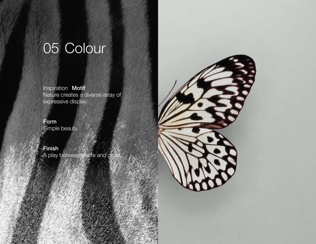
05 Colour
Inspiration Motif
Nature creates a diverse array of
expressive display.
Form
Simple beauty
Finish
A play between matte and gloss.

06 Colour
High gloss warm black outer casing with
matte white linking element.

07 Men
Inspiration Structure
Nature’s cunning is revealed in its ability to
create intensively strong structures through
repetition of interlocking forms.
Form
Forms which fit together.
Finish
Matte and lightly textured.
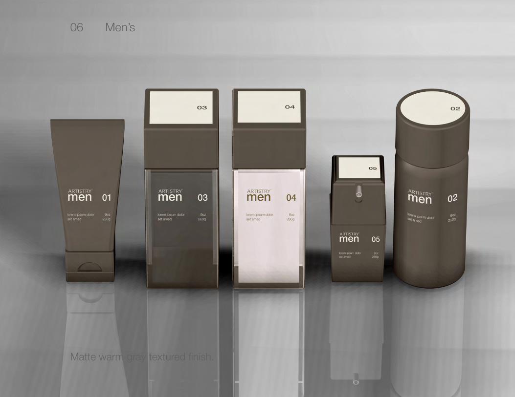
06 Men’s
Matte warm gray textured finish.

01 02 03 04 0605
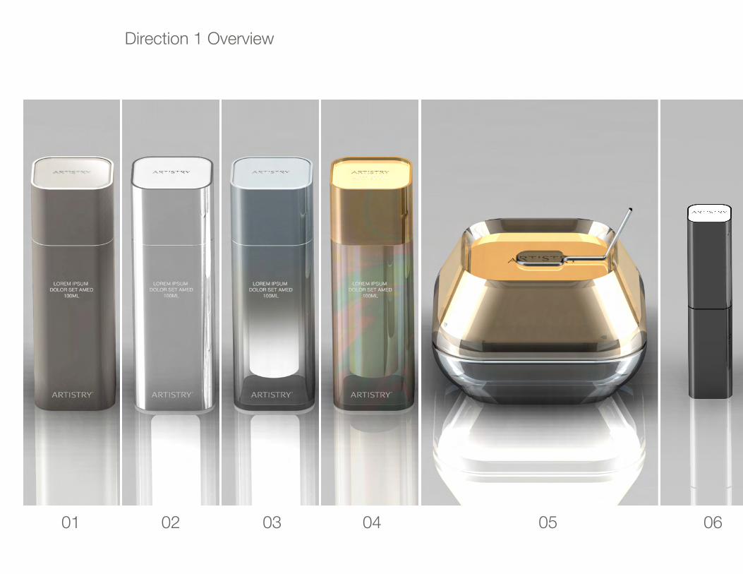
Direction 2 Overview
01 02 03 04 0605
Direction 1 Overview

Next Steps

NEXT STEPS
Complete Design Iteration
Initial Cost implication development based on design recommendation
Present to Stakeholders
ARTISTRY Repositioning Alignment & Stakeholder input refinements
Quantitative Research
Final Design Modifications
Leadership Approval
Design Freeze October 1, 2010
Develop
Deploy Q1 2012

Current Packaging

SPEC
IAL
CAR
EIN
TEN
SIVE
SK
IN C
ARE
CREM
E
L/X
Anti-
Agin
gIn
tens
ives
Luxu
ry
CLEANSER
TIM
E D
EFIA
NCE
TREA
TAG
E
Cleansing Foam Cleansing Creme
Cleansing Treatment
WH
ITIC
IAPU
RE
W
HIT
E
Whi
teni
ng
Cleanser
ESSE
NTI
ALS
ESSE
NTI
ALS
KOR
EA/P
LEAS
UA
SPEC
IAL
CAR
E
Bas
ic
Balancing Cleanser
Cream Cleanser
Hydrating Cleanser
Foaming Cleanser
Polishing Scrub
Cleansing Oil
2011 ARTISTRY GLOBAL SKINCARE MAP
Creme L/X
MOISTURIZERTONER
CreamMilky Lotion Light Milky Lotion Rich
Day Protect Lotion
Day Protect Creme
Night Recovery Lotion
Night Recovery Creme
Lifting Eye Creme
Skin Lotion
Conditioning Toner
Whitening Cream
Moisturiser I Moisturiser II Creme
Eye Attract
Replenishing Eye Creme
Replenishing Eye Creme
Balancing Lotion
Balancing Milky Lotion
Hydrating Lotion
Moisture Milky Lotion
Multi-Protect SPF 30
Calming Cream
Soothing Creme
Whitening Conditioner
Toner I Toner II
Balancing Toner
Moisture Skin Lotion
Hydrating Toner
Balancing Skin Lotion
Eye Creme
TREATMENT
Line Solution
Retinol Treatment
Swiss Serum EX
Renewing Treatment
Dramage 14
Repair Serum
Essence
Skin Refinishing Lotion
3D Lifting Serum
Derma Erase
Illuminating Essence
Intensive Repair Daily
Intensive Repair Serum
Vitamin C & Wild Yam
Whitening Day Essence Whitening Night Essence Spot Corrector
Spot CorrectorEssence
Creamy Massage Gentle Moisture EssenceAdvanced Self Acting
Anti-Blemish Alpha Hydroxy Serum Plus
Creamy Massage
Moisture Plus
Alpha Hydroxy Serum Plus
MASK
Pure White Masque China Sheet Masque
Moisture Mask EX Clay Mask EX
Pore Cleansing Masque
Treatment Mask
Moisture Intense Masque
Pore Cleansing Mask
Polishing Scrub
Moisture Intense Mask
MAKEUP REMOVER
Makeup Remover Gel
Makeup Remover
Point Off
Eye & Lip Makeup Remover
Eye & Lip Makeup Remover
BODY & LIMITED LIFE
Gentle Body Smoother
Limited Life
Limited Life
Limited Life
Essential Hand Treatment
By: Consumer Type and Category

Alternative Direction

Direction 1 Form Diagram

01 Essentials Pleasua
Matte opaque finish. Lightly textured. Soft touch or other option.
Satin Metallic “Linking Element”

02 Pure White Whiticia
High gloss opaque finish. A white/metallic look. Matte white “Linking Element”

03 Intensive
Satin opaque to clear graduation. Metallic blue, to silver to clear.
Blue Metallic “Linking Element”

04 Time Defiance Treatage
Gloss mauve/gold with overlay of semi-transparent iridescence.
Bodies are very slightly transparent.

05 Luxury Creme L/X
Very heavy walled transparent with opaque insert (refillable).
Exaggerated form from main line. Integrated applicator.

06 Colour
High gloss warm black outer casing with
matte white linking element.

Project Background

Process
01 Discovery
02 Define
03 Design
04 Develop
05 Deploy

01 Discovery (March)
1. Establish a core cross-functional team (packaging engineering, brand management, packaging design, procurement)
2. Immersion: In March, the core team went to Japan and Korea and met with the marketing teams to better
understand the needs, concerns and competitive landscape in two of our top markets (China opted out of
participating in the Immersion — acquiescing to Japan and Korea’s lead)
3. Key Learnings: Our Immersion with the Affiliates and subsequent team discussions led us to arrive at 6 driving
factors in prestige packaging, which we’ve set as the criteria against which we will judge the success of our
new packaging:
Design Intent: Packaging that reflects an inspirational concept, a story to share with distributors and consumers
Quality: Increase quality cues by addressing weight and details like finish, openings, closures
Innovation: Integrate innovative delivery mechanisms, materials and finishes into our product line
Functionality: Ensure functionality throughout usage — caps stay on, powder does not leek out
Sustainability: A benchmark of quality and integral to the Amway brand. Reduce the impact of our packaging
Sampling: Key driver in new sales. Increase quality of samples and alight more closely with full size primary
packaging

1. Gain Alignment on Prestige Criteria: Presented our findings and criteria to the Affiliates at the April 2010
Global Marketing Summit for alignment
2. Introduced Colour Cosmetics and Prestige Men’s Skin Care to the project scope.
3. Accelerated both Colour and Men’s categories to current status of the original skin care sublines
4. Operational Readiness:
a. Identification of current and future consumer usage and habits and unmet needs for Prestige /
Luxury packaging
b. Identify new and existing vendors currently supplying luxury brands
c. Prepare strategic sourcing partners for change and quotation process
d. Identify potential new vendors for accelerated / rapid qualification & approval procedures
e. Developing financial modeling tools to offer Stakeholders insight on how the recommended designs will
impact selling price & margins
5. Established guide posts for navigational cues that will visually assist users to identify sublines
6. Identify distinctive inspirational concepts for the skin care sublines and colour cosmetics
02 Define (April/May)

Packaging Structure

Packaging Structure
There are many approaches available to us in creating
a cohesive brand while allowing for stratification and
differentiation between our sub-brands, from Essentials
to Creme L/X.
The following is a diagramatic demonstration of the options
available to us, with a strong recommendation of the third.
Note: The forms are not “designs” but are meant to
represent forms different and common to each other.

01 Story
Loren ipsum dolor set amed histrum pax id tarum for se
parmuis dixon cannis factotoum in toto Loren ipsum dolor
set amed histrum pax id tarum for se parmuis dixon cannis
factotoum in toto Loren ipsum dolor set amed histrum pax
id tarum for se parmuis dixon cannis factotoum in toto Loren
ipsum dolor set amed histrum pax id tarum for se parmuis
dixon cannis factotoum in toto
A Same form with different finishes
Sub-Brand A Sub-Brand B Sub-Brand C Sub-Brand D Sub-Brand E

Discovery (March)
1. Gain Alignment on Prestige Criteria: Presented our findings and criteria to the Affiliates at the April 2010
Global Marketing Summit for alignment
2. Introduced Colour Cosmetics and Prestige Men’s Skin Care to the project scope.
3. Accelerated both Colour and Men’s categories to current status of the original skin care sublines
4. Operational Readiness:
a. Identification of current and future consumer usage and habits and unmet needs for Prestige /
Luxury packaging
b. Identify new and existing vendors currently supplying luxury brands
c. Prepare strategic sourcing partners for change and quotation process
d. Identify potential new vendors for accelerated / rapid qualification & approval procedures
e. Developing financial modeling tools to offer Stakeholders insight on how the recommended designs will
impact selling price & margins
5. Established guide posts for navigational cues that will visually assist users to identify sublines
6. Identify distinctive inspirational concepts for the skin care sublines and colour cosmetics
B different forms with same finishes
Sub-Brand A Sub-Brand B Sub-Brand C Sub-Brand D Sub-Brand E

recommended direction

Discovery (March)
1. Gain Alignment on Prestige Criteria: Presented our findings and criteria to the Affiliates at the April 2010
Global Marketing Summit for alignment
2. Introduced Colour Cosmetics and Prestige Men’s Skin Care to the project scope.
3. Accelerated both Colour and Men’s categories to current status of the original skin care sublines
4. Operational Readiness:
a. Identification of current and future consumer usage and habits and unmet needs for Prestige /
Luxury packaging
b. Identify new and existing vendors currently supplying luxury brands
c. Prepare strategic sourcing partners for change and quotation process
d. Identify potential new vendors for accelerated / rapid qualification & approval procedures
e. Developing financial modeling tools to offer Stakeholders insight on how the recommended designs will
impact selling price & margins
5. Established guide posts for navigational cues that will visually assist users to identify sublines
6. Identify distinctive inspirational concepts for the skin care sublines and colour cosmetics
C different forms with different finishes, but with consistent element
Sub-Brand A Sub-Brand B Sub-Brand C Sub-Brand D Sub-Brand E

1. Start design development. Once grounded with agreed on subline structure system and subline inspirations,
proceed with development of shapes, colours, unique brand identification feature(s), graphic and finish direction.
2. Design iteration process with all disciplines to refine and develop actionable designs
3. Present to corporate and affiliate stakeholders for input and direction on final design refinements
CURRENT PRODUCT NEW DESIGN
Current Distributor Cost Proposed new Distributor Cost
Suggested Retail [if applicable] Proposed new Suggested Retail
CMAM % Proposed new CMAM %
CMAM $ Proposed new CMAM $
03 Design (June/September)

Target Launch Q1 2012
Whitening in Asia
Anti-Aging in Western Markets
05 Deploy
Process
01 Discovery
02 Define
03 Design
04 Develop
05 Deploy
Process
01 Discovery
02 Define
03 Design
04 Develop
05 Deploy
Target Launch Q1 2012
Whitening in Asia
Anti-Aging in Western Markets
05 Deploy