Embed Size (px)
Citation preview
Artistic Data Visualization:
Beyond Visual Analytics
Fernanda B. Viégas and Martin Wattenberg
Visual Communication Lab, IBM Research, 1 Rogers St,
Cambridge, MA 02142, USA {viegasf, mwatten}@us.ibm.com
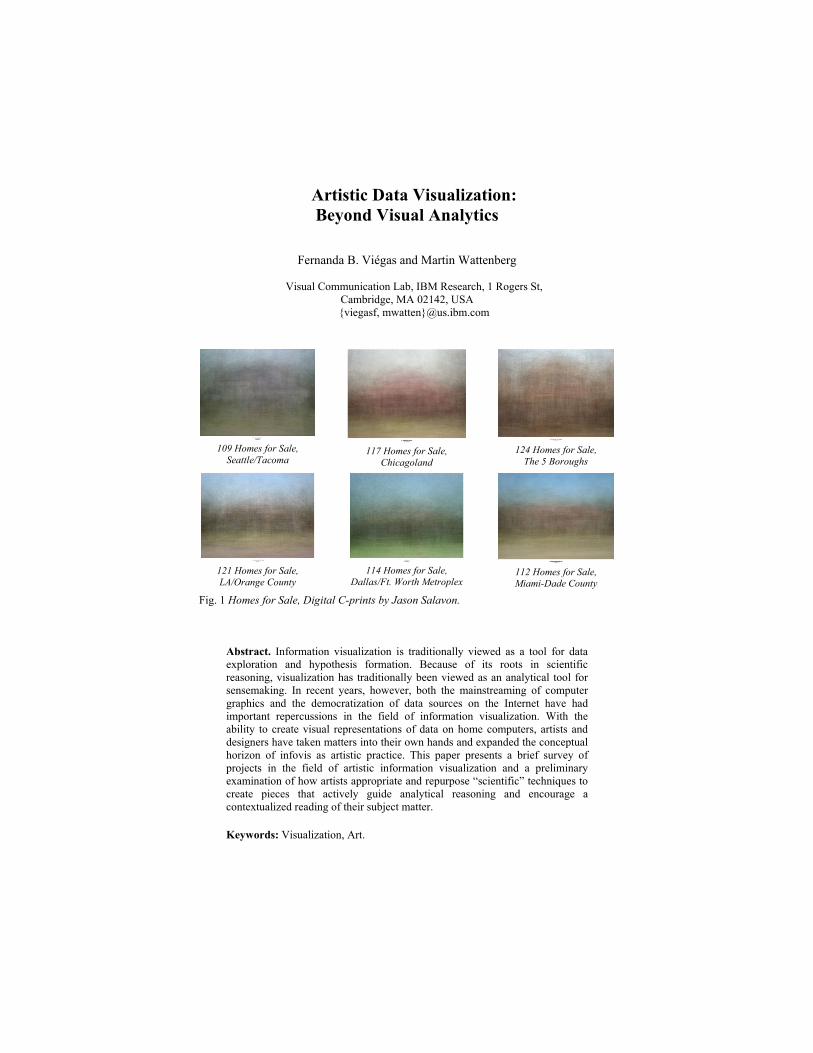
109 Homes for Sale, Seattle/Tacoma
117 Homes for Sale,
Chicagoland
124 Homes for Sale, The 5 Boroughs
121 Homes for Sale, LA/Orange County
114 Homes for Sale,
Dallas/Ft. Worth Metroplex
112 Homes for Sale, Miami-Dade County
Fig. 1 Homes for Sale, Digital C-prints by Jason Salavon.
Abstract. Information visualization is traditionally viewed as a tool for data exploration and hypothesis formation. Because of its roots in scientific reasoning, visualization has traditionally been viewed as an analytical tool for sensemaking. In recent years, however, both the mainstreaming of computer graphics and the democratization of data sources on the Internet have had important repercussions in the field of information visualization. With the ability to create visual representations of data on home computers, artists and designers have taken matters into their own hands and expanded the conceptual horizon of infovis as artistic practice. This paper presents a brief survey of projects in the field of artistic information visualization and a preliminary examination of how artists appropriate and repurpose “scientific” techniques to create pieces that actively guide analytical reasoning and encourage a contextualized reading of their subject matter.
Keywords: Visualization, Art.
1 Introduction
Data visualization is usually viewed as a tool to support analytic reasoning. This reflects its roots in science—ranging the economic charts of William Playfair to Richard Feynman’s diagrams for performing calculations in quantum field theory. Researchers in the scientific visualization community have naturally focused on supporting scientific analytic tasks. In recent years there has been a renewed interest in infovis’ role as an intelligence
tool for military and national security applications. (This too has historical roots: several visualizations of war have become touchstones for information designers: e.g., the 1869 chart by Minard of Napoleon's march to Moscow and Florence Nightingale’s diagram of patient mortality in military field hospitals.) Visual analytics, the combination of infovis and mathematical deduction to extract patterns in massive, dynamically changing information spaces has, of late, become one of the main themes of the visualization academic community. As with research that supports scientific visualization, the emphasis has been on visualization as a tool for dispassionate analysis. This relentless focus on visualization as a neutral tool may appear to be a forced
move. At first, bias in a visualization might seem like a technical problem, much like chromatic aberration in a telescope. Yet a recent, separate stream of thought in visualization calls this assumption into question. In the past decade a second very different type of information visualization has
flourished. Art based on data has been featured at institutions such as the Whitney Museum of American Art [6] and the San Francisco Museum of Modern Art. [3]. Often such artwork is directly based on techniques first explored by the academic community. At the Austrian Ars Electronica art festival in 2004, a visitor could see interactive treemaps in one exhibit [20], play with an installation by Brad Paley based on social network analysis [12], and hear Josh On talk about his use of graph drawing a discussion panel. While the basic techniques used by these artists would be familiar to those in the
scientific visualization community, their motivations and creations are new and different. In this paper we explore the implications of the surge of artistic interest in visualization. In section 2, we define our terms and describe some useful context. Section 3, the core of the paper, consists of a set of analyses of several prominent examples of artistic visualizations. Finally, in section 4 we make some suggestions about what the academic visualization community might learn from artists on visualization.
2. Definitions and Background
Defining what constitutes “artistic” visualization is hard, if only because defining art itself is hard. To sidestep that philosophical question, our working definition in this paper is that artistic visualizations are visualizations of data done by artists with the intent of making art. This definition may seem like a tautology, but in fact it specifies a coherent and interesting class of work.
First, the artworks must be based on actual data, rather than the metaphors or surface appearance of visualization. Many artists have used diagrammatic imagery as a base for their projects. One example is Simon Patterson, whose “Great Bear” relabels the famous map of the London Underground [12], and whose “J.P.233 in C.S.O. Blue” [14] appropriates imagery from a map of airline routes. While Patterson’s work has many merits, it cannot be said to be data visualization since there is no underlying mapping between data and image. A second point is that our definition avoids the issue of beauty: we do not contend
that beautiful scientific visualizations are automatically artistic, or that visualization art must be pretty. Thus a microscope photograph taken as part of a scientific experiment would not qualify under our definition: no matter how beautiful the colors, the photograph would lack artistic intent. As the examples below show, focusing on intent rather than surface aesthetics provides a coherent category of work with important distinguishing characteristics from scientific visualizations. A natural question is why this new type of visualization (or this new style of art)
has emerged. Any answer to this question is speculative, but two particular factors are relevant. First is the emergence of software tools that are appropriate for artistic production of data visualizations. Today one does not require a supercomputer or fluency in C++ to create visualizations. Instead, it is possible to create sophisticated visualization software using cheap hardware and friendly development environments such as Flash (www.adobe.com/) or Processing (www.processing.org). A second factor is that data has become part of the cultural discourse on several
levels. Thanks to the internet, complex data sets such as SEC filings are available with a few clicks. Indeed, the internet itself can be viewed as a massive database. Moreover, government and corporate collections of data now play a critical role in the lives of citizens of many nations. As a result, it is natural that artists want to grapple with the issues raised by the controlling power of data.
3. Artistic Visualization Projects
To understand the issues raised by artistic visualization, it is helpful to have a set of concrete examples in mind. In this section we provide descriptions of projects that have been successful in the artistic community and that use sophisticated visualizations of data. This is, by no means, supposed to be an exhaustive survey of the area—such an undertaking is well beyond the scope of this paper. Instead, we have chosen to focus on a purposeful sample of projects that highlight some of the central qualities of artistic visualizations.
3.1 Jason Salavon and the Power of Colored Pixels
If information visualization enables the viewer to see unexpected patterns in a body of data, Jason Salavon’s art pieces confront the viewer with inescapable, pervasive patterns in everyday life [15]. From innocuous mementos such as high-school year books (Fig. 2) to racy centerfolds of adult magazines (Fig. 3), Salavon blurs individual pieces to focus our attention on the collective aggregation of human experience.
Take, for instance, Homes for Sale (Fig. 1), which shows a series of realtor photos of single-family homes for sale in different cities around the U.S. Each piece encompasses a collection of homes on the market in a given metro region in the median price range for that area. The images are constructed by taking the mean averaging color of every photo, pixel by pixel. The result is a blurred view of an area’s weather pattern and ghostly images of the houses for sale. Miami boasts the bluest sky whereas Dallas has the greenest grass. Seattle, on the other hand, seems awash in an assortment of gloomy grays. Salavon utilizes the same averaging technique to explore a wide variety of themes
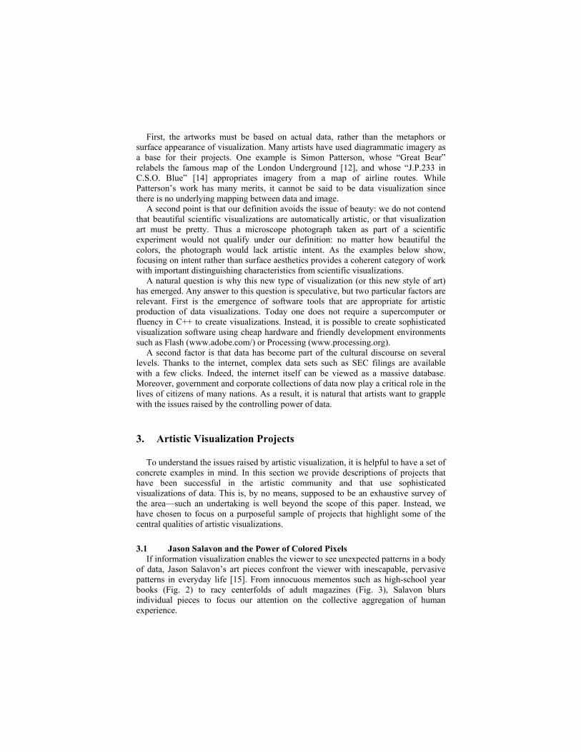
that permeate visual culture. The Class of 1988 and The Class of 1967 (Fig. 2), for instance, are part of a series of pieces investigating rites of passage—in this case, high school graduation—and the conventional visual mementos that get produced to celebrate such events.
The Class of 1988
The Class of 1967
Fig 2. The Class of 1988 and The Class of 1967, by Jason Salavon
The 1960s
The 1970s
The 1980s
The 1990s
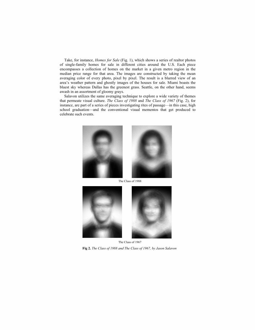
Fig. 3. Every Playboy Centerfold, The Decades (normalized), by Jason Salavon In Every Playboy Centerfold, The Decades (Fig. 3), the colored images confirm the
formulaic compositions of the adult industry and the change in taste over the years. Skin tones and hair color get lighter as time goes by. To be certain, the technique of averaging the color of pixels in a collection of
images is not new. In fact, computer scientists have utilized the same mechanism in a variety of applications in the field of image processing [18]. Whereas the intent in most of these applications is to use pixel manipulations as input to face recognition algorithms, Salavon’s subverts this original goal. The artist exposes the technique as the output of his piece by letting the collection of individual images dissolve into a field of color that carries meaning in itself. Expanding on the theme of pure color, Salavon has also explored the concept of
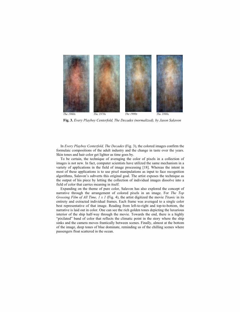
narrative through the arrangement of colored pixels in an image. For The Top Grossing Film of All Time, 1 x 1 (Fig. 4), the artist digitized the movie Titanic in its entirety and extracted individual frames. Each frame was averaged to a single color best representative of that image. Reading from left-to-right and top-to-bottom, the narrative is laid out in color. One can see the rich golden tones depicting the luxurious interior of the ship half-way through the movie. Towards the end, there is a highly “pixilated” band of color that reflects the climatic point in the story where the ship sinks and the camera moves frantically between scenes. Finally, almost at the bottom of the image, deep tones of blue dominate, reminding us of the chilling scenes where passengers float scattered in the ocean.
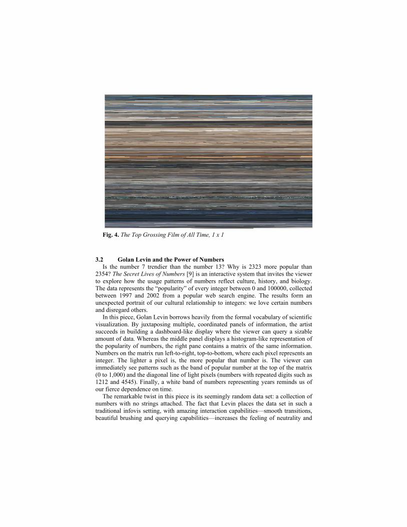
Fig. 4. The Top Grossing Film of All Time, 1 x 1
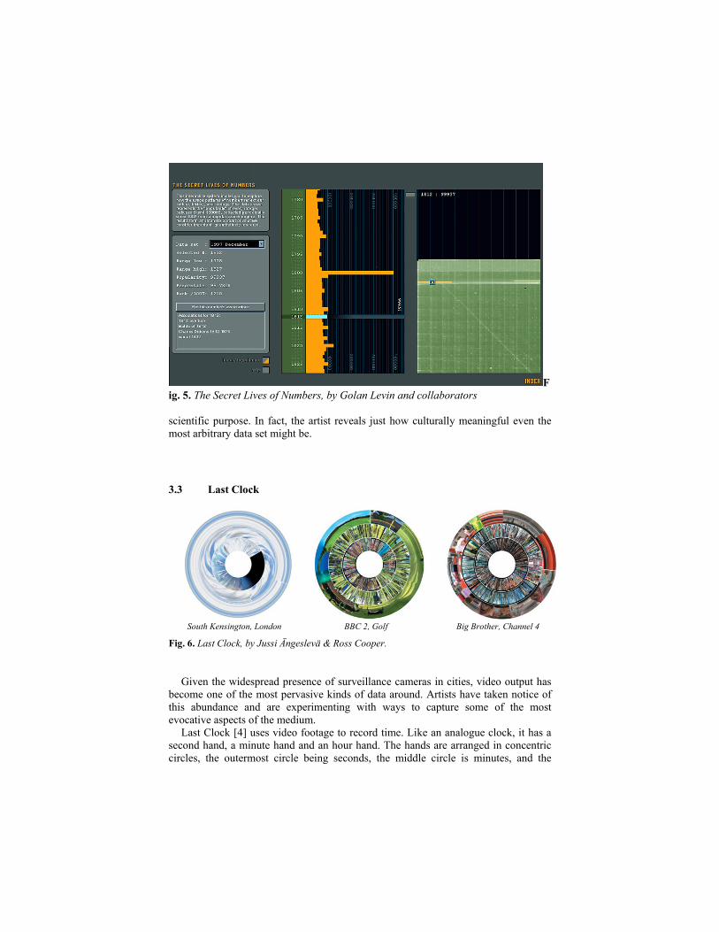
3.2 Golan Levin and the Power of Numbers
Is the number 7 trendier than the number 13? Why is 2323 more popular than 2354? The Secret Lives of Numbers [9] is an interactive system that invites the viewer to explore how the usage patterns of numbers reflect culture, history, and biology. The data represents the “popularity” of every integer between 0 and 100000, collected between 1997 and 2002 from a popular web search engine. The results form an unexpected portrait of our cultural relationship to integers: we love certain numbers and disregard others. In this piece, Golan Levin borrows heavily from the formal vocabulary of scientific
visualization. By juxtaposing multiple, coordinated panels of information, the artist succeeds in building a dashboard-like display where the viewer can query a sizable amount of data. Whereas the middle panel displays a histogram-like representation of the popularity of numbers, the right pane contains a matrix of the same information. Numbers on the matrix run left-to-right, top-to-bottom, where each pixel represents an integer. The lighter a pixel is, the more popular that number is. The viewer can immediately see patterns such as the band of popular number at the top of the matrix (0 to 1,000) and the diagonal line of light pixels (numbers with repeated digits such as 1212 and 4545). Finally, a white band of numbers representing years reminds us of our fierce dependence on time. The remarkable twist in this piece is its seemingly random data set: a collection of
numbers with no strings attached. The fact that Levin places the data set in such a traditional infovis setting, with amazing interaction capabilities—smooth transitions, beautiful brushing and querying capabilities—increases the feeling of neutrality and
F
ig. 5. The Secret Lives of Numbers, by Golan Levin and collaborators scientific purpose. In fact, the artist reveals just how culturally meaningful even the most arbitrary data set might be.
3.3 Last Clock
South Kensington, London BBC 2, Golf Big Brother, Channel 4
Fig. 6. Last Clock, by Jussi Ängeslevä & Ross Cooper.
Given the widespread presence of surveillance cameras in cities, video output has
become one of the most pervasive kinds of data around. Artists have taken notice of this abundance and are experimenting with ways to capture some of the most evocative aspects of the medium. Last Clock [4] uses video footage to record time. Like an analogue clock, it has a
second hand, a minute hand and an hour hand. The hands are arranged in concentric circles, the outermost circle being seconds, the middle circle is minutes, and the
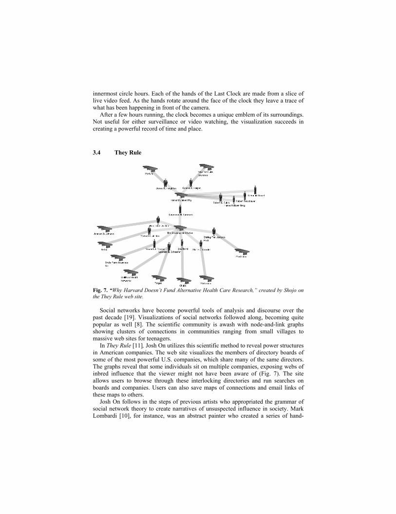
innermost circle hours. Each of the hands of the Last Clock are made from a slice of live video feed. As the hands rotate around the face of the clock they leave a trace of what has been happening in front of the camera. After a few hours running, the clock becomes a unique emblem of its surroundings.
Not useful for either surveillance or video watching, the visualization succeeds in creating a powerful record of time and place.
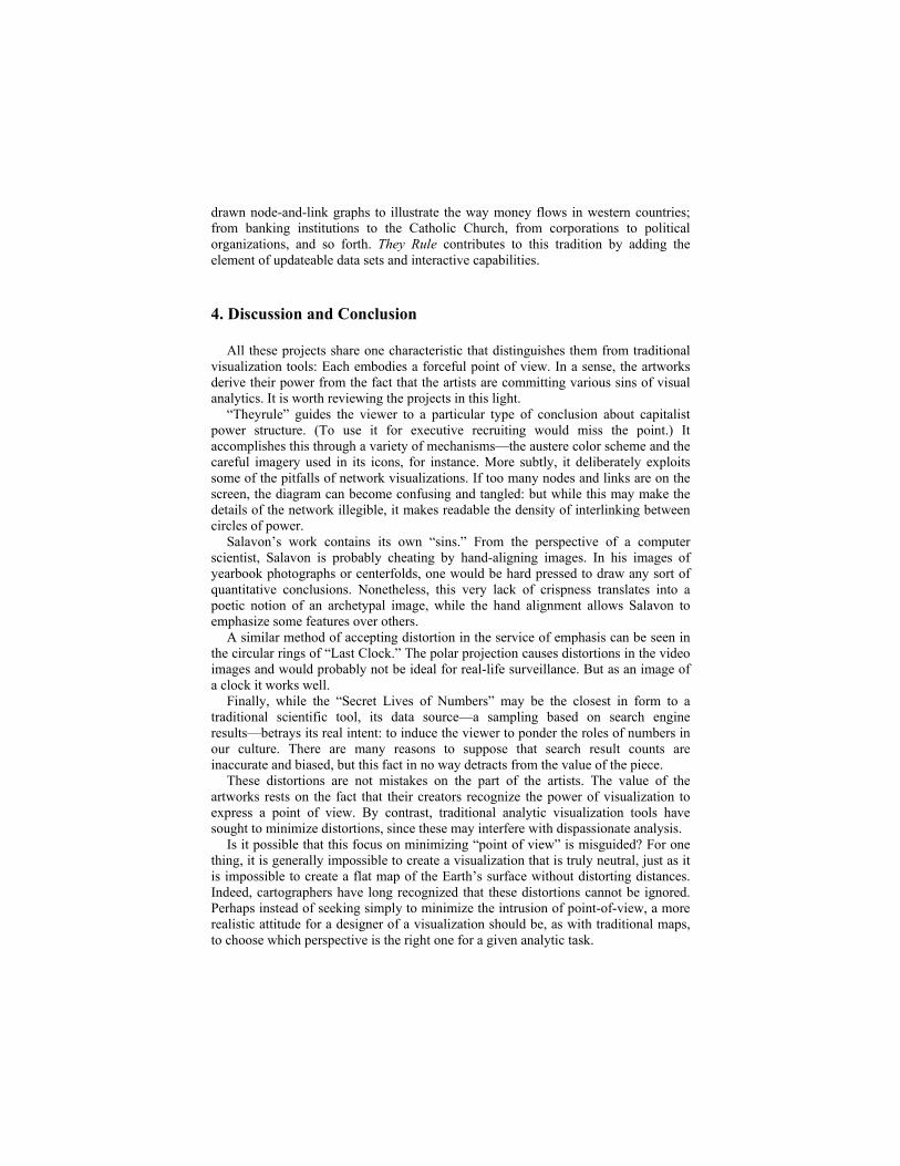
3.4 They Rule
Fig. 7. “Why Harvard Doesn’t Fund Alternative Health Care Research,” created by Shojo on the They Rule web site. Social networks have become powerful tools of analysis and discourse over the
past decade [19]. Visualizations of social networks followed along, becoming quite popular as well [8]. The scientific community is awash with node-and-link graphs showing clusters of connections in communities ranging from small villages to massive web sites for teenagers. In They Rule [11], Josh On utilizes this scientific method to reveal power structures
in American companies. The web site visualizes the members of directory boards of some of the most powerful U.S. companies, which share many of the same directors. The graphs reveal that some individuals sit on multiple companies, exposing webs of inbred influence that the viewer might not have been aware of (Fig. 7). The site allows users to browse through these interlocking directories and run searches on boards and companies. Users can also save maps of connections and email links of these maps to others. Josh On follows in the steps of previous artists who appropriated the grammar of
social network theory to create narratives of unsuspected influence in society. Mark Lombardi [10], for instance, was an abstract painter who created a series of hand-
drawn node-and-link graphs to illustrate the way money flows in western countries; from banking institutions to the Catholic Church, from corporations to political organizations, and so forth. They Rule contributes to this tradition by adding the element of updateable data sets and interactive capabilities.
4. Discussion and Conclusion
All these projects share one characteristic that distinguishes them from traditional visualization tools: Each embodies a forceful point of view. In a sense, the artworks derive their power from the fact that the artists are committing various sins of visual analytics. It is worth reviewing the projects in this light. “Theyrule” guides the viewer to a particular type of conclusion about capitalist
power structure. (To use it for executive recruiting would miss the point.) It accomplishes this through a variety of mechanisms—the austere color scheme and the careful imagery used in its icons, for instance. More subtly, it deliberately exploits some of the pitfalls of network visualizations. If too many nodes and links are on the screen, the diagram can become confusing and tangled: but while this may make the details of the network illegible, it makes readable the density of interlinking between circles of power. Salavon’s work contains its own “sins.” From the perspective of a computer
scientist, Salavon is probably cheating by hand-aligning images. In his images of yearbook photographs or centerfolds, one would be hard pressed to draw any sort of quantitative conclusions. Nonetheless, this very lack of crispness translates into a poetic notion of an archetypal image, while the hand alignment allows Salavon to emphasize some features over others. A similar method of accepting distortion in the service of emphasis can be seen in
the circular rings of “Last Clock.” The polar projection causes distortions in the video images and would probably not be ideal for real-life surveillance. But as an image of a clock it works well. Finally, while the “Secret Lives of Numbers” may be the closest in form to a
traditional scientific tool, its data source—a sampling based on search engine results—betrays its real intent: to induce the viewer to ponder the roles of numbers in our culture. There are many reasons to suppose that search result counts are inaccurate and biased, but this fact in no way detracts from the value of the piece. These distortions are not mistakes on the part of the artists. The value of the
artworks rests on the fact that their creators recognize the power of visualization to express a point of view. By contrast, traditional analytic visualization tools have sought to minimize distortions, since these may interfere with dispassionate analysis. Is it possible that this focus on minimizing “point of view” is misguided? For one
thing, it is generally impossible to create a visualization that is truly neutral, just as it is impossible to create a flat map of the Earth’s surface without distorting distances. Indeed, cartographers have long recognized that these distortions cannot be ignored. Perhaps instead of seeking simply to minimize the intrusion of point-of-view, a more realistic attitude for a designer of a visualization should be, as with traditional maps, to choose which perspective is the right one for a given analytic task.
A more radical change in attitude would be to embrace the fact that visualizations can be used to persuade as well as analyze. Neutral analysis is not the only important task in life. It’s easy to associate persuasion with the sales-oriented “pitch culture” decried by Edward Tufte [17], but there are often valid reasons to want to change the way people think and it may be that much of the value of visualization comes from its ability to change attitudes. A useful context for this line of thinking is the study of “captology” or technology used in the service of persuasion [7] as well as the classical study of rhetoric and oratory. To summarize, we have seen a surge of interest in data visualization in the artistic
community. Many data-oriented artworks use sophisticated visualization techniques that have been developed in academia, but at the same time the techniques are used in a very different style. The information visualization community has a long interdisciplinary tradition, and it is worth asking what might be learned from the current artistic explorations. We suggest that one answer to this question might lie in the artistic use of a particular point of view or persuasive goal. Should data visualization researchers investigate ways to support making a point, as well as disinterested analysis?
References
3. 010101, Exhibit at the San Francisco Museum of Modern Art, 2001. 4. Ängeslevä, J, and Cooper, R. Last Clock. http://www.lastclock.co.uk/ 5. Chung, Pak & Thomas, Jim. Visual Analytics. Retrieved on Feb 6 2007 from:
http://infoviz.pnl.gov/pdf/visualAnalytics.pdf 6. Data Dynamics Exhibit, Whitney Museum of American Art, 2001. 7. Fogg, B. J. Persuasive Technology: Using Computers to Change What We Think and Do.
Morgan Kaufman, 2002. 8. Freeman, L. Visualizing Social Networks. Journal of Social Structure, 1, 2000. 9. Levin, G., Wattenberg, M., Feinberg, J., Becker, D., Elashoff, D., and Wynecoop, S. The
Secret Lives of Numbers. http://www.turbulence.org/Works/nums/ 10. Lombardi, M., Hobbs, R. C., Richards, J. Mark Lombardi: Global Networks. Independent
Curators, 2003. 11. On, J. They Rule. 2001. http://www.theyrule.net/ 12. Paley, W. and Han, J. Trace Encounters. Ars Electronica, Linz, Austria, 2004. 13. Patterson, S. The Great Bear. Tate Museum Collection, lithograph on paper, 1992. 14. Patterson, S. J.P.233 in C.S.O. Tate Musuem Collection, household emulsion paint
installation, 1992 15. Salavon, J. The Salavon Studio. http://salavon.com/ 16. Thomas, J. J. & Cook, K. A. Illuminating the Path: The Research and Development
Agenda for Visual Analytics. IEEE CS Press. 2005. 17. Tufte, E. Beautiful Evidence. Graphics Press, Cheshire, 2006. 18. Turk M., and Pentland, A. Face recognition using eigenfaces. Proc. IEEE Conference on
Computer Vision and Pattern Recognition, 586–591, 1991. 19. Wellman, B., and Berkowitz, S.D. (eds). Networks as Personal Communities. Pp. 130-
184 in Social Structures: A Network Analysis, Cambridge, UK:Cambridge University Press, 1988.
20. Weskamp, M. Newsmap. 2004. http://www.marumushi.com/apps/newsmap/