Embed Size (px)
DESCRIPTION
Student project: Artist release campaign for a fictional record label.
Citation preview
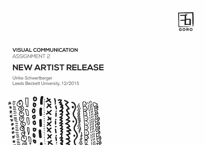
VISUAL COMMUNICATIONASSIGNMENT 2
NEW ARTIST RELEASEUlrike SchwertbergerLeeds Beckett University, 12/2015
GORO
ゴロ
NEW RELEASE CAMPAIGN 2
GORO Records is a Japanese indie-pop label expanding to the Western market. As this is their first artist record release in the UK, GORO aims to make an impact and highlight their unique position as well as appeal to their target audience - young, urban people aged between 15-30 years, fashionable and cosmopolitan, informed about newest trends and eager to go beyond cultural boundaries.
However, a significant percentage of the target audience will already have an interest in Asian or Japanese culture and may already be familiar with the musical styles and tropes present in Japanese pop culture. GORO identify themselves as an alternative label and it will therefore be important to address these themes in a more ironic kind of way and avoid falling victim to stereotypes and clichés.
RECORD LABEL
GORO
ゴロ
NEW RELEASE CAMPAIGN 3
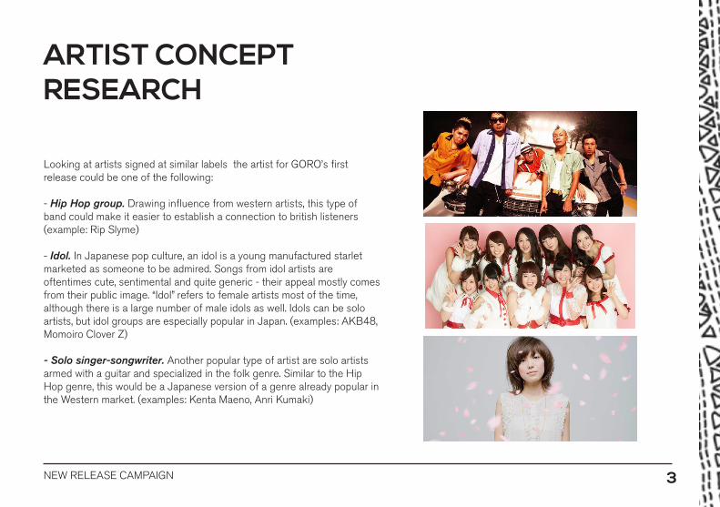
Looking at artists signed at similar labels the artist for GORO’s first release could be one of the following:
- Hip Hop group. Drawing influence from western artists, this type of band could make it easier to establish a connection to british listeners (example: Rip Slyme)
- Idol. In Japanese pop culture, an idol is a young manufactured starlet marketed as someone to be admired. Songs from idol artists are oftentimes cute, sentimental and quite generic - their appeal mostly comes from their public image. “Idol” refers to female artists most of the time, although there is a large number of male idols as well. Idols can be solo artists, but idol groups are especially popular in Japan. (examples: AKB48, Momoiro Clover Z)
- Solo singer-songwriter. Another popular type of artist are solo artists armed with a guitar and specialized in the folk genre. Similar to the Hip Hop genre, this would be a Japanese version of a genre already popular in the Western market. (examples: Kenta Maeno, Anri Kumaki)
ARTIST CONCEPT RESEARCH
NEW RELEASE CAMPAIGN 4
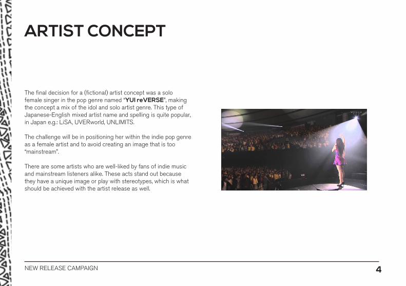
The final decision for a (fictional) artist concept was a solo female singer in the pop genre named “YUI reVERSE”, making the concept a mix of the idol and solo artist genre. This type of Japanese-English mixed artist name and spelling is quite popular, in Japan e.g.: LiSA, UVERworld, UNLIMITS.
The challenge will be in positioning her within the indie pop genre as a female artist and to avoid creating an image that is too “mainstream”.
There are some artists who are well-liked by fans of indie music and mainstream listeners alike. These acts stand out because they have a unique image or play with stereotypes, which is what should be achieved with the artist release as well.
ARTIST CONCEPT
NEW RELEASE CAMPAIGN 5
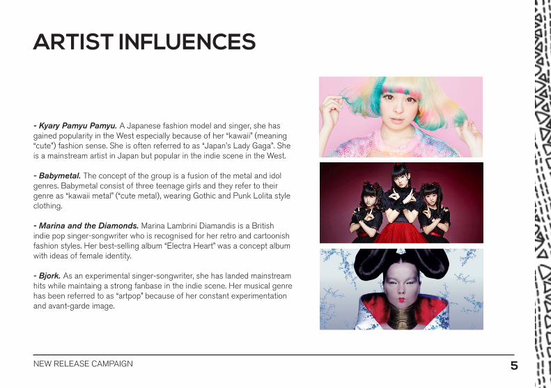
- Kyary Pamyu Pamyu. A Japanese fashion model and singer, she has gained popularity in the West especially because of her “kawaii” (meaning “cute”) fashion sense. She is often referred to as “Japan’s Lady Gaga”. She is a mainstream artist in Japan but popular in the indie scene in the West.
- Babymetal. The concept of the group is a fusion of the metal and idol genres. Babymetal consist of three teenage girls and they refer to their genre as “kawaii metal” (“cute metal), wearing Gothic and Punk Lolita style clothing.
- Marina and the Diamonds. Marina Lambrini Diamandis is a British indie pop singer-songwriter who is recognised for her retro and cartoonish fashion styles. Her best-selling album “Electra Heart” was a concept album with ideas of female identity.
- Bjork. As an experimental singer-songwriter, she has landed mainstream hits while maintaing a strong fanbase in the indie scene. Her musical genre has been referred to as “artpop” because of her constant experimentation and avant-garde image.
ARTIST INFLUENCES

NEW RELEASE CAMPAIGN 6
The idea for the album concept is to take influences from mainstream ideas and add quirky elements to create an interesting mix that will set the release apart from other female solo artists’ works. This will be achieved by contrasting a more “mature” theme with the playful look of hand-drawn elements.
- Royalty. Similar to Gwen Stefani’s album “Love Angel Music Baby” (which itself incorporated elements of Japanese pop culture), the artist is presented as an elegant, wealthy woman, giving off a sense of luxury.
- Gambling. Inspired by “James Bond - Casino Royale”, this theme is also associated with wealth and luxury as well as danger and excitement.
- Prison. A more masculine theme which would also contrast with playful elements in a fun and interesting way.
-Military. Again, this adult and masculine theme could be suitable for a parody-style concept album.
ALBUM CONCEPT BRAINSTORMING

NEW RELEASE CAMPAIGN 7
There are many different examples for the visual style of hand-drawn text and illustrations mixed mith photography.
- Doodles which are painted over photographs to alter their appearance
- Sketchy elements, patterns and geometric shapes as background elements
- Brush stroke thickness as well as the level of detail often varies between different styles.
- Many examples give the impression of sketches but were probably created using digital media (because of uniform line thickness etc).
I wanted to use this kind of visual style for the album as it will add playfulness and invoke associations with the Japanese “cute” comic style.
VISUAL STYLE RESARCH
NEW RELEASE CAMPAIGN 8
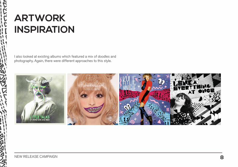
ARTWORK INSPIRATION
I also looked at existing albums which featured a mix of doodles and photography. Again, there were different approaches to this style.
NEW RELEASE CAMPAIGN 9
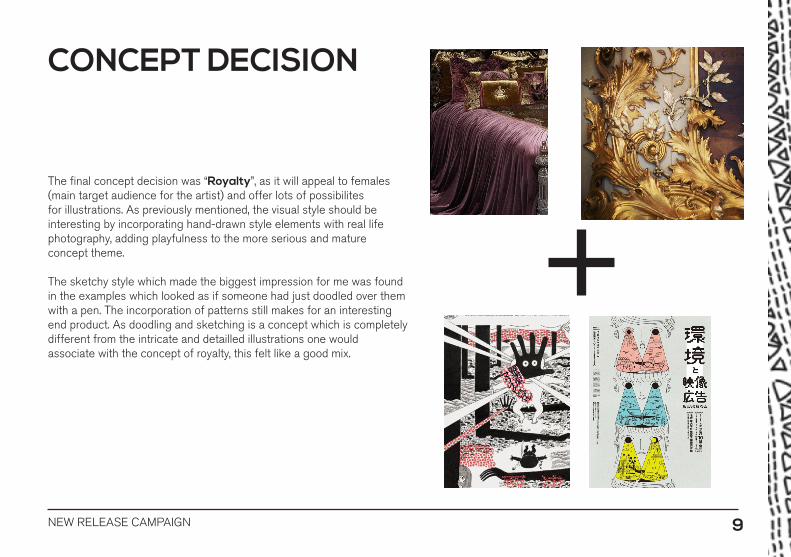
The final concept decision was “Royalty”, as it will appeal to females (main target audience for the artist) and offer lots of possibilites for illustrations. As previously mentioned, the visual style should be interesting by incorporating hand-drawn style elements with real life photography, adding playfulness to the more serious and mature concept theme.
The sketchy style which made the biggest impression for me was found in the examples which looked as if someone had just doodled over them with a pen. The incorporation of patterns still makes for an interesting end product. As doodling and sketching is a concept which is completely different from the intricate and detailled illustrations one would associate with the concept of royalty, this felt like a good mix.
CONCEPT DECISION
NEW RELEASE CAMPAIGN 10
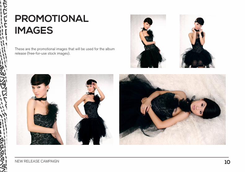
These are the promotional images that will be used for the album release (free-for-use stock images).
PROMOTIONALIMAGES
NEW RELEASE CAMPAIGN 11
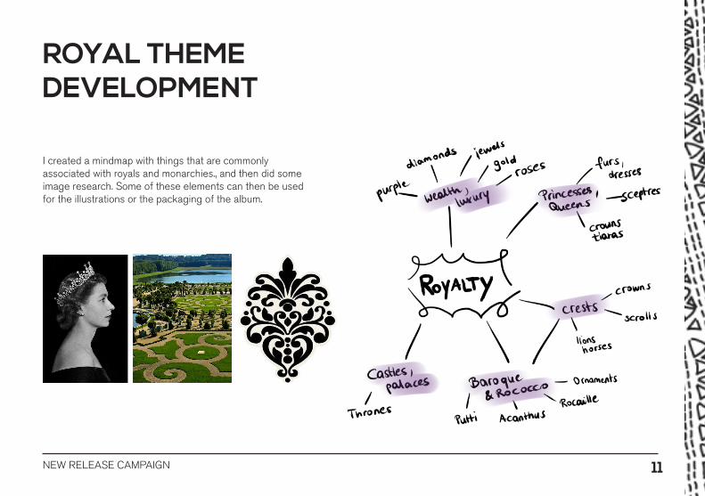
I created a mindmap with things that are commonly associated with royals and monarchies., and then did some image research. Some of these elements can then be used for the illustrations or the packaging of the album.
ROYAL THEMEDEVELOPMENT

NEW RELEASE CAMPAIGN 12
MOODBOARD
NEW RELEASE CAMPAIGN 13
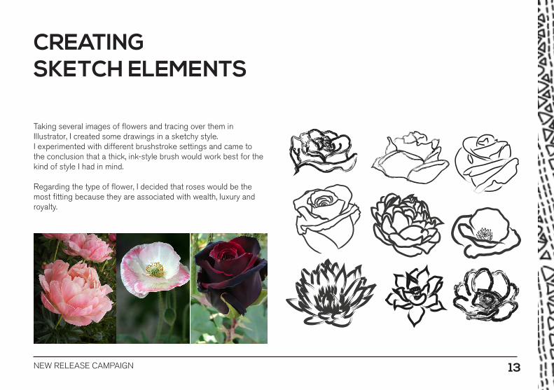
Taking several images of flowers and tracing over them in Illustrator, I created some drawings in a sketchy style. I experimented with different brushstroke settings and came to the conclusion that a thick, ink-style brush would work best for the kind of style I had in mind.
Regarding the type of flower, I decided that roses would be the most fitting because they are associated with wealth, luxury and royalty.
CREATING SKETCH ELEMENTS
NEW RELEASE CAMPAIGN 14
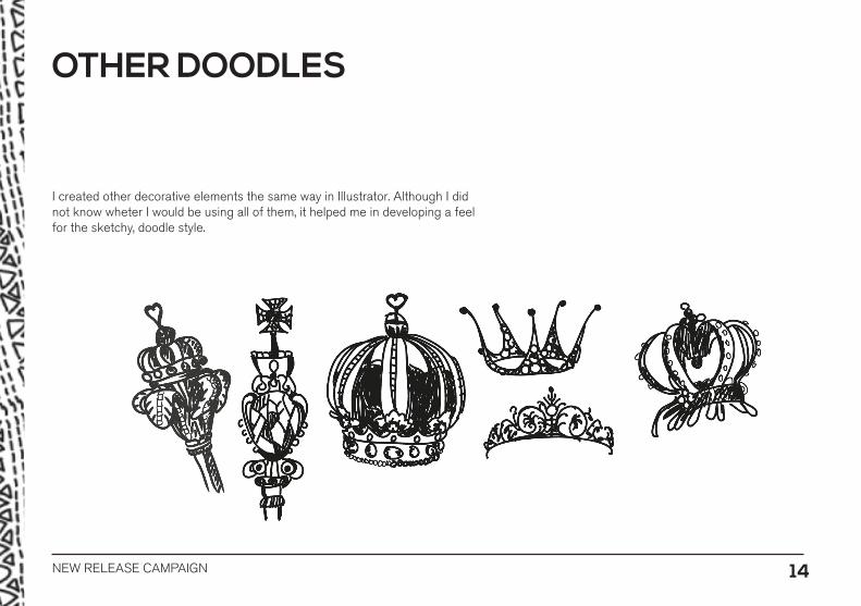
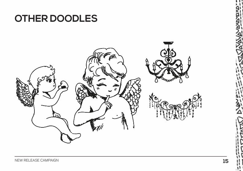
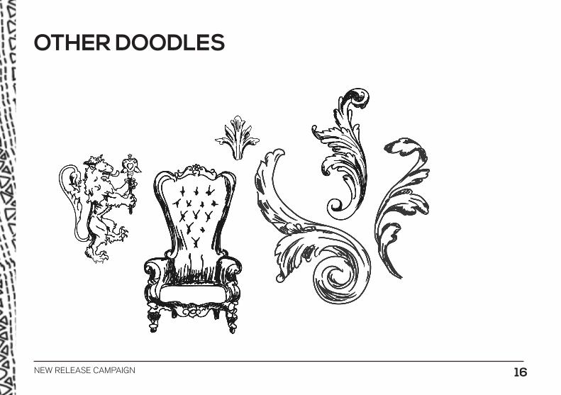
I created other decorative elements the same way in Illustrator. Although I did not know wheter I would be using all of them, it helped me in developing a feel for the sketchy, doodle style.
OTHER DOODLES
NEW RELEASE CAMPAIGN 15
OTHER DOODLES
NEW RELEASE CAMPAIGN 16
OTHER DOODLES
NEW RELEASE CAMPAIGN 17
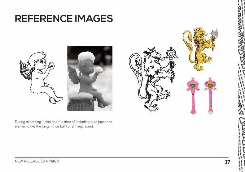
REFERENCE IMAGES
During sketching, I also had the idea of including cute japanese elements like the onigiri (rice ball) or a magic wand.
NEW RELEASE CAMPAIGN 18
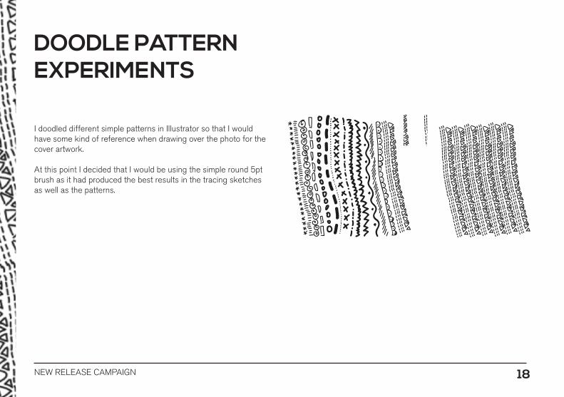
I doodled different simple patterns in Illustrator so that I would have some kind of reference when drawing over the photo for the cover artwork.
At this point I decided that I would be using the simple round 5pt brush as it had produced the best results in the tracing sketches as well as the patterns.
DOODLE PATTERN EXPERIMENTS
NEW RELEASE CAMPAIGN 19
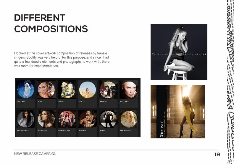
I looked at the cover artwork composition of releases by female singers. Spotify was very helpful for this purpose, and since I had quite a few doodle elements and photographs to work with, there was room for experimentation.
DIFFERENT COMPOSITIONS

NEW RELEASE CAMPAIGN 20
NEW RELEASE CAMPAIGN 21
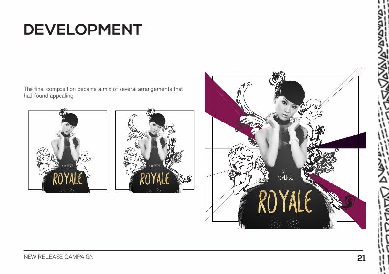
The final composition became a mix of several arrangements that I had found appealing.
DEVELOPMENT
NEW RELEASE CAMPAIGN 22
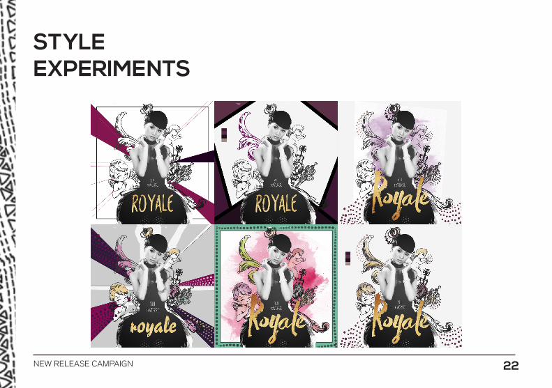
STYLE EXPERIMENTS

NEW RELEASE CAMPAIGN 23
I decided that the design should not be too chaotic with too many different things going on at once. I also decided to use the patterns more sparingly on the cover, as they could distract too much from the doodle illustrations. At this point I had the idea of adding Geisha style lipstick for the artist.
FINAL COMPOSITION

NEW RELEASE CAMPAIGN 24
Some experiments with different typefaces. I quite liked the look of a handwritten font as it fits the doodle style and is a nice contrast to the gold plating texture.
TYPEFACE
NEW RELEASE CAMPAIGN 25
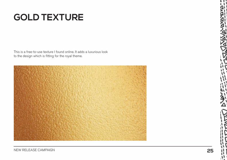
This is a free-to-use texture I found online. It adds a luxurious look to the design which is fitting for the royal theme.
GOLD TEXTURE
NEW RELEASE CAMPAIGN 26
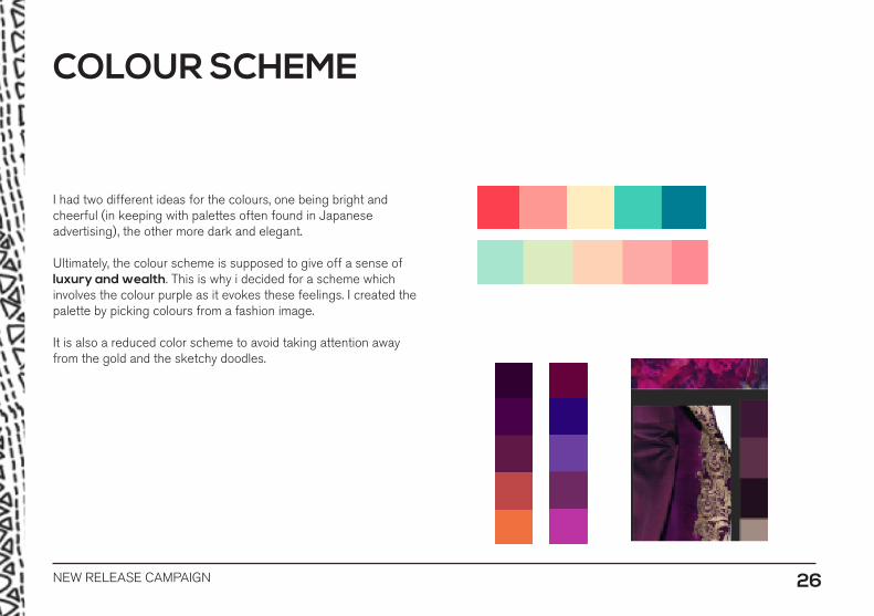
I had two different ideas for the colours, one being bright and cheerful (in keeping with palettes often found in Japanese advertising), the other more dark and elegant.
Ultimately, the colour scheme is supposed to give off a sense of luxury and wealth. This is why i decided for a scheme which involves the colour purple as it evokes these feelings. I created the palette by picking colours from a fashion image.
It is also a reduced color scheme to avoid taking attention away from the gold and the sketchy doodles.
COLOUR SCHEME

NEW RELEASE CAMPAIGN 27
NEW RELEASE CAMPAIGN 28
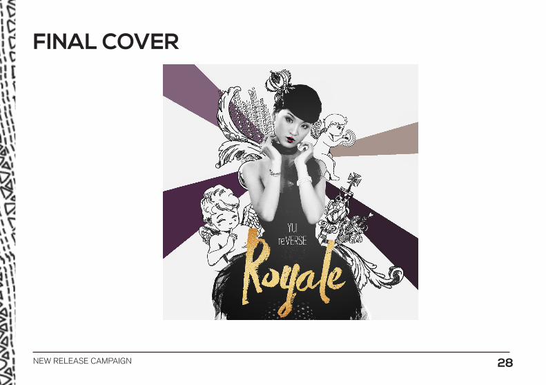
FINAL COVER
NEW RELEASE CAMPAIGN 29
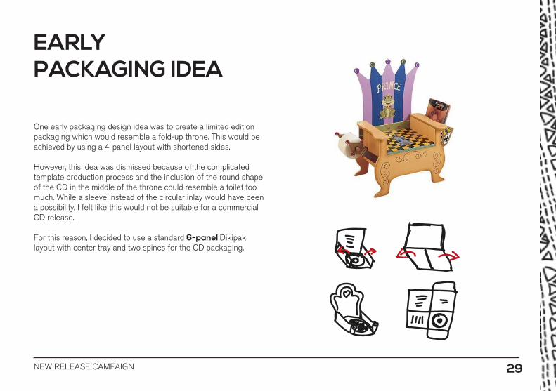
One early packaging design idea was to create a limited edition packaging which would resemble a fold-up throne. This would be achieved by using a 4-panel layout with shortened sides.
However, this idea was dismissed because of the complicated template production process and the inclusion of the round shape of the CD in the middle of the throne could resemble a toilet too much. While a sleeve instead of the circular inlay would have been a possibility, I felt like this would not be suitable for a commercial CD release.
For this reason, I decided to use a standard 6-panel Dikipak layout with center tray and two spines for the CD packaging.
EARLYPACKAGING IDEA
NEW RELEASE CAMPAIGN 30
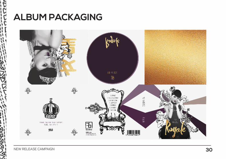
ALBUM PACKAGING
NEW RELEASE CAMPAIGN 31
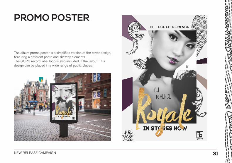
The album promo poster is a simplified version of the cover design, featuring a different photo and sketchy elements.The GORO record label logo is also included in the layout. This design can be placed in a wide range of public places.
PROMO POSTER
NEW RELEASE CAMPAIGN 32
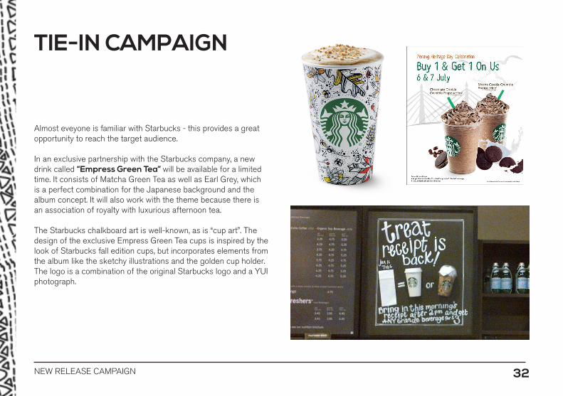
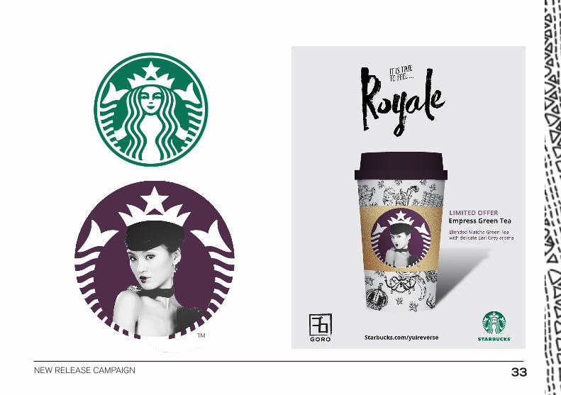
Almost eveyone is familiar with Starbucks - this provides a great opportunity to reach the target audience.
In an exclusive partnership with the Starbucks company, a new drink called “Empress Green Tea” will be available for a limited time. It consists of Matcha Green Tea as well as Earl Grey, which is a perfect combination for the Japanese background and the album concept. It will also work with the theme because there is an association of royalty with luxurious afternoon tea.
The Starbucks chalkboard art is well-known, as is “cup art”. The design of the exclusive Empress Green Tea cups is inspired by the look of Starbucks fall edition cups, but incorporates elements from the album like the sketchy illustrations and the golden cup holder. The logo is a combination of the original Starbucks logo and a YUI photograph.
TIE-IN CAMPAIGN
NEW RELEASE CAMPAIGN 33

NEW RELEASE CAMPAIGN 34
The collaboration will also include a blueberry muffin which fits the concept colours and is popular with the target audience of young females.
LIMITED EDITIONCUPCAKE

NEW RELEASE CAMPAIGN 35
NEW RELEASE CAMPAIGN 36
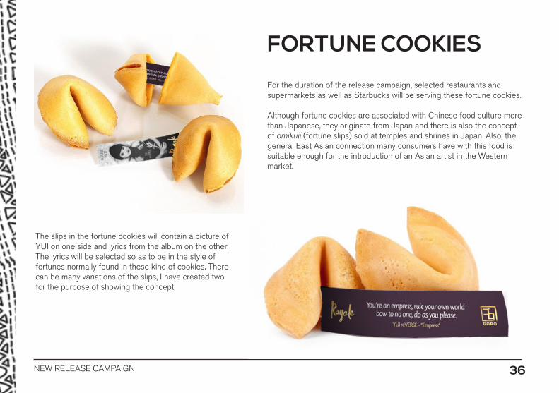
For the duration of the release campaign, selected restaurants and supermarkets as well as Starbucks will be serving these fortune cookies.
Although fortune cookies are associated with Chinese food culture more than Japanese, they originate from Japan and there is also the concept of omikuji (fortune slips) sold at temples and shrines in Japan. Also, the general East Asian connection many consumers have with this food is suitable enough for the introduction of an Asian artist in the Western market.
The slips in the fortune cookies will contain a picture of YUI on one side and lyrics from the album on the other. The lyrics will be selected so as to be in the style of fortunes normally found in these kind of cookies. There can be many variations of the slips, I have created two for the purpose of showing the concept.
FORTUNE COOKIES
NEW RELEASE CAMPAIGN 37
NEW RELEASE CAMPAIGN 38
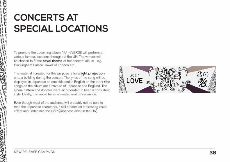
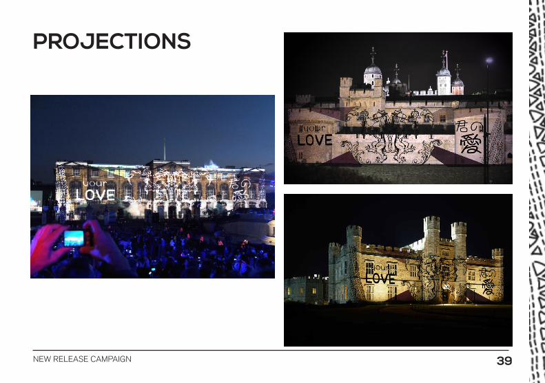
To promote the upcoming album, YUI reVERSE will perform at various famous locations throughout the UK. The venues will be chosen to fit the royal theme of her concept album - e.g. Buckingham Palace, Tower of London etc.
The material I created for this purpose is for a light projection onto a building during the concert. The lyrics of the song will be displayed in Japanese on one side and in English on the other (the songs on the album are a mixture of Japanese and English). The album pattern and doodles were incorporated to keep a consistent style. Ideally, this would be an animated motion sequence.
Even though most of the audience will probably not be able to read the Japanese characters, it still creates an interesting visual effect and underlines the USP (Japanese artist in the UK).
CONCERTS AT SPECIAL LOCATIONS
NEW RELEASE CAMPAIGN 39
PROJECTIONS
NEW RELEASE CAMPAIGN 40
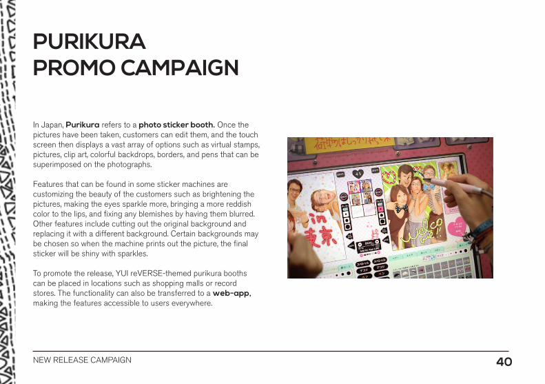
In Japan, Purikura refers to a photo sticker booth. Once the pictures have been taken, customers can edit them, and the touch screen then displays a vast array of options such as virtual stamps, pictures, clip art, colorful backdrops, borders, and pens that can be superimposed on the photographs.
Features that can be found in some sticker machines are customizing the beauty of the customers such as brightening the pictures, making the eyes sparkle more, bringing a more reddish color to the lips, and fixing any blemishes by having them blurred. Other features include cutting out the original background and replacing it with a different background. Certain backgrounds may be chosen so when the machine prints out the picture, the final sticker will be shiny with sparkles.
To promote the release, YUI reVERSE-themed purikura booths can be placed in locations such as shopping malls or record stores. The functionality can also be transferred to a web-app, making the features accessible to users everywhere.
PURIKURA PROMO CAMPAIGN
NEW RELEASE CAMPAIGN 41

NEW RELEASE CAMPAIGN 42
PURIKURA MOCK-UP
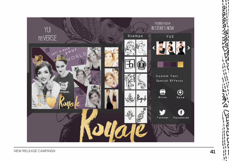
People will be able to print their photos at the booth or share them online.Customizable options include the sketchy doodles, pictures of the artist, adding lipstick, lyrics from the album, the record label logo etc.
This promo concept brings a distinct Japanese pop culture phenomenon to the UK and is therefore fitting for this artist release.
NEW RELEASE CAMPAIGN 43
MockupsStreet Billboard - GraphicBurgerChalkboard - GraphicBurgerCupcake - GraphicRiverStarbucks Coffee Cup - vecteezyStarbucks Logo - Starbucks
ImagesFortune cookies - fancyfortunecookies.comArtist images - angelcurioso.deviantart.comGold metal texture - myfreetextures.com
Research images not included.
REFERENCES