Embed Size (px)
Citation preview
1
Art Notes / Test review Exploring Visual Design
1. What are the fine arts?
1. Visual Arts
2. Music
3. Drama
4. Dance
5. Literature
2. What is needed to make art? (What is art?)
1. Good Composition
2. Media Skill
3. Expression
3. What is the sentence for the elements?
The Cat Looks Very Funny Singing Songs
4. What is the sentence for the principles?
Uncle Frank Raises Violet Plants By Mary’s Café.
5. Lists the elements.
Texture
Color
Line
Value
Form
Shape
Space
6. Lists the principles.
Unity
Focal Point (also known as Emphasis or Dominance)
Repetition (Pattern or rhythm)
Variety
Proportion (Optional – used in drawing)
Balance
Movement
Contrast
2
7. What are the four steps in art criticism? Explain each.
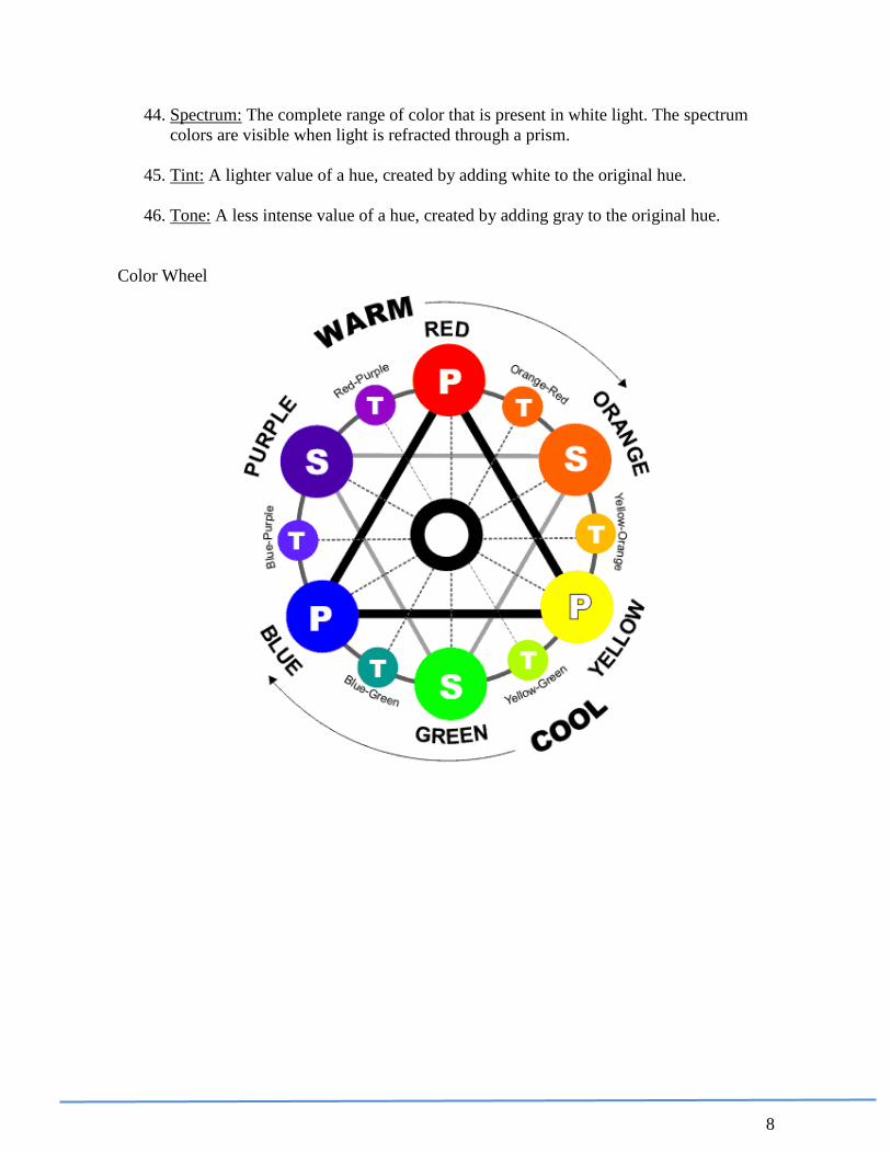
1. Description – Describe what you see (state the facts).
2. Analysis – Talk about the elements and principles (formal qualities).
3. Interpretation – What do you think it means?
4. Evaluation – Was the artists successful?
8. What are the three aesthetic theories? Explain each.
1. Formalism – art with the main emphasis on composition / design qualities.
2. Imationalism – artwork with the main emphasis on representing the real
world.
3. Expressionism – artwork with the main emphasis on content or emotion.
Bonus Question: How does art and time relate to one another?
A: Art is always produced in the content of its time…or…Art is a reflection
of time.
Bonus Question: What are the two things you need to be successful?
A: The ability to constantly focus on your desires and the ability to stay
positive and I your “joy”
3
ELEMENTS
LINE (Chapter 1)
9. Line Types
1. Structural Lines – are the lines that hold a design together.
2. Outlines – the outer edge of a silhouette, or the line made by the edges of an
object.
3. Contour Lines – describe the shape of an object, and include interior detail.
4. Gesture Lines – sometimes called movement lines, emphasize direction and
fluidity.
5. Sketch Line – provide more detail than oulines, contour lines, and gesture
lines. Artists uses sketches for information-gathering.
6. Calligraphy – means “beautiful writing”, is precise, elegant handwriting or
lettering done by hand.
10. What are the two basic line characteristics and qualities that can add personality,
mood or feeling in artworks?
1. Weight
2. Direction
a. Horizontal lines usually suggest calmness, repose, and balance.
b. Vertical lines convey height, stability, and dignity.
c. Diagonal lines express action, movement, and tensions.
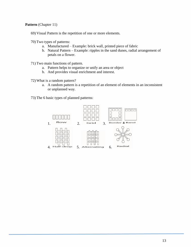
11. Implied lines are lines that are suggested without actually having been drawn or have
been incorporated. Examples of implied lines:
1. Large objects or group of objects that appear as a line (rows of trees, winding
road or river etc)
2. Objects or areas of color meet within a painting, collage, or sculpture.
3. When shapes touch or overlap they share and edge.
4. Lines of Sight – an imaginary line from a figure’s eyes to a viewed object.
12. Line can be used to create simulated texture
13. Lines can create patterns.
14. What are lost and found lines?
They are lines in a drawing that, in a subtle way, are broken due to the light or
dark values that surround that particular area.
4
SHAPE and FORM (Chapter 2)
15. Define Shape and Form
Shape is two-dimensional, with only height and width but form is three-
dimensional, with height, width, and depth.
16. What are the categories and subcategories of shape?
1. Geometric - shapes that can be defined mathematically
2. Organic – shapes that can be found in nature - they often rounded, freeform
and irregular.
a. Amorphic – freeform shapes that you cannot name.
b. Biomorphic – shapes that you can name (heart, clover, figure etc…)
17. What are the two basic shape characteristics and qualities that can add personality,
mood or feeling in artworks?
1. Curved (Geometric Shapes) – shapes that are curved are graceful, and because
the eye rapidly sweeps along them without interruption, they tend to imply
movement.
2. Angular (Organic Shapes) – shapes that are straight-edged. They suggest
strength and regularity.
a. When these types of shapes meet or overlap, they often add a sense of
tension.
b. If an angular shape leans to one side, for instance, this could suggest
movement.
18. What are Positive and Negative Shapes?
1. Positive Shapes – are the actual shapes of the design.
2. Negative Shapes – are the areas around and/or in between the positive shapes.
19. Positive and Negative shapes are equally important. A successful design is one that
carefully balances both. Together, the positive and negative shapes create a unified
whole.
20. Sometimes, an artist prefers to blur the boundaries between them. (Op art)
21. What are the 6 qualities of shape?
Light and Heavy shapes – this effects the perceived weight of objects.
Smooth and Textured shapes -
Smooth shapes reflects the light easily and the reflections can be very
bright.
Heavy textured surfaces tends to absorb light, thereby reflecting far
less light.
Static and Dynamic shapes –
Static - shapes that are either vertical or horizontal will appear to be
standing or resting.
Dynamic – shapes that are leaning suggest falling, running or climbing
appear to be active and are associated with change or movement.
5
22. How does light influence how we see form? Light creates highlights and shadows,
which define the form.
FORM
23. What are the five basic forms.
Shading: Derived from:
1. Cube flat shape square
2. Pyramid flat shape triangle
3. Sphere rounded shape gradation circle
4. Cone rounded shape gradation
5. Cylinder rounded shape gradation
6
VALUE (Chapter 3)
24. Value: An element of design that refers to the lightness or darkness of grays and
colors.
1. Without light, we would not be able to see values. Areas of color or tones in
direct light are lighter than those on surfaces facing away from the light,
which are shadows or darker values.
2. In landscapes, the darker values are usually in the foreground.
25. High-keyed: Describing colors or values that are light tones, created by the use of
white, such as in pastel colors.
26. Low-keyed: Describing colors or values that are dark tints, usually created by the use
of black or gray.
27. Value contrast: Dark and light values placed close together. Black against white
creates the greatest value contrast.
28. Center of Interest: The area of an artwork that the eye is directed; the visual focal
point of the work. High value contrast will help establish this focal point. Example,
black next to white.
29. Values in our environment are depends on illumination by light sources. Areas of
color or tones in direct light are lighter than those on surfaces facing away from the
light, which are shadows or darker values
30. Values may be used to show depth. Values are usually lighter in the distance and
darker in the foreground in photographs and realistic two-dimensional art. When
drawing folds or rounded forms, the lighter values are forward and the darker values
are farther from the viewer.
31. Artists use values to establish moods and feelings in artworks.
1. To depict happiness, warmth, quiet, peacefulness, or sunshine, an artist
emphasizes lighter values (high key).
2. To suggest dark and gloomy days, nighttime, or dim lighting, an artist uses
darker values (low-key). A painting or drawing that emphasizes dark values
can convey feelings of cold or sadness.
7
COLOR (Chapter 4)
32. How do we perceive color? Color is created by light. Light strikes an object, and the
lightwaves that are the color of the object are reflected to our eyes.
33. Primary colors In subtractive color theory, such as when mixing pigments, the hues –
red, yellow, and blue – from which all other colors are made.
34. Secondary colors: These are the colors that are produced when equal amounts of 2
primary colors are mixed together. They are orange, green and violet
35. Intermediate colors: These are the colors that are produced when equal amounts of 1
primary and it’s adjacent secondary colors are mixed together.
36. Neutral Having no easily seen hue. White, gray, and black are neutrals. They are not
found in the light spectrum
37. Color harmony (or color scheme) Combinations of color – such as complementary or
analogous colors – that can be defined by their positions on the color wheel.
Particular color harmonies may be used to achieve specific effects.
a. Complementary colors Any two colors that are opposite each other on the
color wheel.
b. Split Complementary – Using the adjacent colors of one of the colors in a
complementary set. (Y formation)
c. Double Complementary – Using the adjacent colors of both of the colors in a
set of complementary colors. (X formation)
d. Triad – Three colors on the color wheel that are equal distance from each
other. There is 3 colors between each color on the color wheel.
e. Monochromatic - One color with tints and shade.
f. Analogous – Neighboring colors on the color wheel.
38. Value: To what does the term value refer in color mixing? Value refers to the
lightness or darkness of a color.
39. Hue: The name of a color, determined by its position in the spectrum.
40. Intensity: The strength, brightness, or purity of a color.
g. Changing a color’s value will also change its intensity.
h. You can also lessen the intensity of a color by adding its complement.
41. Pigment: The coloring material used in making painting and drawing media, dyes,
inks, and toners. Pigments may be natural (made from earth or plants) or made from
laboratory-prepared chemicals.
42. Shade: A darker value of a hue, created by adding black or a darker complementary
color to the original hue.
43. Tint: A lighter value of a hue, created by adding white to the original hue.
8
44. Spectrum: The complete range of color that is present in white light. The spectrum
colors are visible when light is refracted through a prism.
45. Tint: A lighter value of a hue, created by adding white to the original hue.
46. Tone: A less intense value of a hue, created by adding gray to the original hue.
Color Wheel
9
SPACE (Chapter 5)
47. The art element of space refers to the three-dimensionality of sculpture and
architecture and to an illusion of depth in two-dimensional pieces.
48. The 5 basic means to create an illusion of depth on a flat surface:
1) Overlapping objects
2) Positioning distant objects higher on the picture plane than closer objects
3) Size variation of objects (smaller objects seem farther away).
4) Linear Perspective – using converging lines.
Converging lines meet at the vanishing point(s) on the horizon line.
5) Aerial Perspective – Atmospheric effects on color, value and detail.
b. Using bright colors on a neutral background to make objects seem
closer.
c. Using darker values to make objects seem closer than those with
lighter values.
49. Vanishing Point – In a linear perspective drawing, the vanishing point is where
parallel lines seem to meet.
50. In a linear perspective drawing the horizon line represents the viewer’s eye level.
Texture (Chapter 6)
51. Texture is the physical surface quality of a material, or how it feels or appears to feel
to the touch
.
52. Two types of textures:
1. Real texture – may actually be touched
2. Implied texture – are invented or simulated textures on a smooth surface.
53. Light affects the readability of a surface. Depending on the angle of the light source,
shadows might define the surface texture. If the light is dim, texture may be difficult
to see; if the light is very bright, the texture may seem to wash out in a glare.
54. There are varying methods that artists might use to create real textures: adding grog
to clay, incising, sanding, gouging, and polishing clay, stone, and wood.
10
PRINCIPLES
Balance (Chapter 7)
55. Visual balance is the way that the different parts of a composition relate to one
another.
56. The four types of visual balance are:
1. Symmetrical (bilateral) – both halves on either side of a visual center relate to
each other because they are exactly the same; mirror image. Example -
butterfly
2. Approximate symmetry – both halves on either side of a visual center are
approximately the same. Example – a human face.
3. Asymmetrical balance – both halves on either side of a visual center are not
the same but balance in maintained.
4. Radial balance – the design or image radiates from the visual center like the
spokes of a wheel.
57. Both approximate symmetry and asymmetry can break the possible monotony of a
symmetrically balanced composition. Also, asymmetry can produce a sense of
excitement and interest often not found in symmetrical designs.
Unity (Chapter 8)
58. Why do artists often try to create unity in their artworks?
Artists often want their art to have a feeling of wholeness or harmony.
59. Name the 6 ways to establish unity.
1. Create one element that is dominant.
a) The dominant element is the major element in a design.
b) Subordinate elements are the less emphasized elements in a design.
2. Developing and using a consistent style: Repetition of an element style –
color, shape, line, texture, form….brushstrokes
3. Proximity – cluster objects closer together
4. Overlapping
5. Line up with an edge or contour
6. Feeling of space receding
11
Contrast (Chapter 9)
60. Contrast is a principle of design that describes large differences in the elements of an
artwork to achieve emphasis and interest.
61. Artists create contrast to add interest, to develop a mood, to attract attention, or to
delight the viewer.
62. Below is an example of what visual artists often contrast in their art:
1. Materials (example metal + glass)
2. Lines (curve + straight)
3. Shapes
4. Forms
5. Sizes
6. Values
7. Colors
8. Textures
9. Styles
10. ideas
63. Name the 8 ways to establish contrast.
1. Large vs. small
2. Warm vs. cool
3. Textured vs. non textured
4. Geometric vs. organic
5. Hard edges vs. soft edges
6. Pattern vs. non pattern
7. Complementary vs. complementary
8. Dark vs. light value
63) Colors may be contrasted by placing warm next to cool, or bold near soft or muted,
and by putting complementary colors together.
12
Emphasis / Focal Point (Chapter 10)
64) Something that is singled out or made more prominent has emphasis.
65) An element of a design that dominates or becomes the center of interest has emphasis.
a. Emphasis can be created using all of the various elements and principles of
design.
66) Ways emphasis or focal point may be created (this list is infinite):
a. Rely on one art element.
b. Exaggeration – Exaggerate an art element in a specific area in the
composition.
c. Simplification – Simplify an art element in a specific area in the composition.
d. Placement – Use special placement of elements or objects
e. Grouping / placement -
f. Ioslation
g. Direction – objects that create direction or point (eye movement) to the focal
point
h. Scale – changing size / contrast in size
i. Scale refers to the relative size of a figure or object, compared to
others of its kind, its environment, or humans.
i. Repetition
j. Contrast – High contrast of art elements in an area will create a focal point
67) Emphasis and the Elements of Design Create a focal point by making one element of the design more prominent or eye-
catching than the others. For Example:
a. Line. In a design composed of horizontal lines, the vertical line becomes the
focal point.
b. Shape. A square stands out from a group of circles or organic shapes.
c. Mass. The physically or visually heavier element or piece commands more
attention.
d. Texture. Embossing adds tactile interest and emphasis.
e. Color. A splash of color or a strong change in value in an otherwise gray
piece will draw the eye.
68) Emphasis and the Principles of Design Use the arrangement of the page components to create a focal point or visual
hierarchy of dominant and subordinant elements.
a. Balance. A perfectly symetrical piece may have no focal point because each
element is equally emphasized. Radial balance generally draws the eye first to
the central point in the design.
b. Proximity. A part of the design that is isolated from other parts can become a
focal point.
c. Alignment. The eye is naturally drawn to a point in or near the center of a
page, giving elements in that area perceived importance.
d. Repetition. Repeating an image or a word can establish its importance.
e. Contrast. Like elements that have high contrast to one other will produce a
focal point.
13
Pattern (Chapter 11)
69) Visual Pattern is the repetition of one or more elements.
70) Two types of patterns:
a. Manufactured – Example: brick wall, printed piece of fabric
b. Natural Pattern – Example: ripples in the sand dunes, radial arrangement of
petals on a flower.
71) Two main functions of pattern.
a. Pattern helps to organize or unify an area or object
b. And provides visual enrichment and interest.
72) What is a random pattern?
a. A random pattern is a repetition of an element of elements in an inconsistent
or unplanned way.
73) The 6 basic types of planned patterns:
1. 2. 3.
4. 5. 6.
14
Movement and Rhythm (Chapter 12)
74) Three types of Movement:
a. Actual movement – Artwork that actually moves is called Kinetic Art
b. Recorded movement – An image that records actual movement or4 freezes a
moment of action. Example: Photo of a horse jumping over a fence.
c. Compositional movement (Visual movement) - Visual movement creates a
path for the viewer’s eyes to follow across a composition or to the center of
interest and can also set a mood or convey a feeling.
i. Visual movement may be generated by contrast, emphasis, direction
lines, shapes and colors, and other devices – and it can occur in both 3-
dimenssional and 2-dimensional art.
.
75) Visual rhythm, similar to rhythm in music and dance, is closely related to movement.
a. It may be produced by repeating one or several units of design, such as a
triangular shape or the color green.
b. These motifs are depicted in certain order of pattern which creates a rhythm.
c. Rhythm helps organize a composition and also creates interest, emphasis or
unity.
76) Types of Rhythm:
a. Regular – regular rhythm creates a repeated pattern that is both predictable
and continuous.
b. Flowing – smooth, flowing rhythm seem to unify whole compositions in a
peaceful but powerful way.
i. Usually, large movements that sweep across an entire work tie each of
the parts together.
ii. Some flowing rhythms move along curved, circular, or wavy paths,
and may be similar to radial patterns.
c. Alternating – Rhythms that contain variety to aid to the suspense or
excitement of the composition.
i. Variety is what helps overcome boredom and can create needed
interest in a composition.
d. Progressive – This rhythm brings on a change gradually in a predictable or
regular way. This type of rhythm also brings variety to a composition.
e. Unexpected – These unexpected rhythms might be jerky, irregular, or
spontaneous, like those often found in jazz music.
i. They can convey feelings of excitement, confusion, or unfocused
power and energy.
ii. They can also add suspense, tension, and variety to a composition.
iii. They can be created by irregular spacing and random changes in the
size, color, or shape of repeated motifs.