Embed Size (px)
Citation preview
ART 131 | FALL 2003Design Foundations
Associate Professor Karen ChengAssistant Professor Annabelle GouldAssistant Professor John Rousseau
131

1
ART 131 | Course Introduction
Welcome to ART 131: Design FoundationsThis course offers students a chance to study design theory and values in a lecture hall setting while applying that knowledge to a series of studio projects. The coursework consists of a series of five assignments that explore the basis of successful two-dimensional organization and communication.
The first three assignments involve rigorous analysis of the formal principles of composition and design. The fourth assignment builds on this analysis, but uses a different medium — photography. The fifth and final assignment combines photo-graphy and graphic composition with thematic and conceptual content.
For the prospective Visual Communication Design major, this class is the first of two courses that determine admission to the program. However, the content covered in this course is also meaningful and relevant to any other students who would like to develop an awareness of aesthetics, formal principles and the problem-solving aspects of two-dimensional design.
How the Course WorksLectures: Faculty will introduce each assignment and discuss design theory, practice and history as it pertains to the current assignment.
Critiques: Faculty will assess work in progress and help students with issues faced by the class as a whole.
Labs: Teaching assistants and senior mentors will be available to provide technical assistance, answer questions and work with students individually or in small groups.
Faculty Office Hours and E-mailStudents will be able to meet individually or in small groups with faculty during office hours. E-mail is appropriate for some communication, such as scheduling an appointment or asking a short technical question. However, instructors will not be able to critique work or help a student analyze a problem by e-mail. Wednesday critiques and Friday labs are the proper forums for those issues. Please note that class announcements are occasionally sent to the course e-mail list. Please check your UW account daily.
Course Website and Slide ReviewAll course materials (including this document) are available online. Please visit http://courses.washington.edu/art131. Additionally, lecture slides may be reviewed in the School of Art Media Center (ART 116) for one week following the lecture.
Final PortfolioAt the end of the quarter, students will create a submission package which docu-ments all of their finished work and process. The format and specifications for the submission package is described in detail on pages 20-21 of this packet. Faculty will cover all questions related to the final portfolio during Week 10 of the quarter.
Applying to the VCD MajorFor students who are applying for the VCD major, the submission package must also include a statement of intent, a resumé, and a transcript detailing any previous college work. These elements are described in detail on pages 22-23 of this packet.
For additional information on VCD program, please visit the vcd website at www.vcd.washington.edu. We have specific information on the selection process at: http://depts.washington.edu/vcd/designs/02/curriculum/bfaSel.shtml.
2
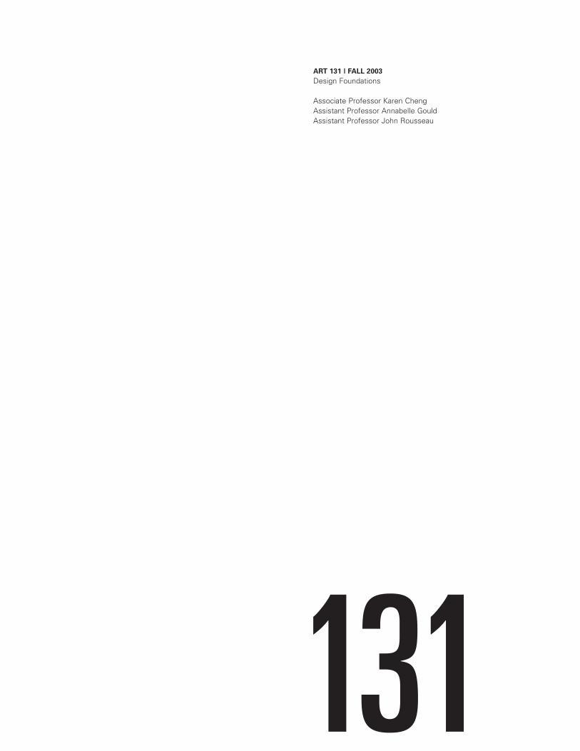
ART 131 | Course Schedule
131 AA,AB,AC AD,AE,AF
131 AA
131 AB
131 AC
131 AD
131 AE
131 AF
131 AA,AB
131 AC,AD
131 AE,AF
Karen Cheng
John Rousseau
Annabelle Gould
Christina Gonzalez
Jason Tselentis
Jim Nesbitt
Dan Johnston
Mon
Wed
Wed
Wed
Wed
Wed
Wed
Fri
Fri
Fri
Lecture
Critique
Lab
Faculty
Teaching Assistants
Senior Mentors
Cheng|RousseauGould
Cheng
Cheng
Rousseau
Rousseau
Gould
Gould
TAs+Mentors
TAs+Mentors
TAs+Mentors
Mon: 11-12
Mon: 11-12
Mon: 11-12
Tues: 3-5
Tue: 10-12
N/A
N/A
If you would like to request academic accommodations due to a disability, please contact Disabled Student Services, 448 Schmitz, 543.8924 (V/TTY). If you have a letter from Disabled Student Services indicating you have a disability that requires academic accommodation, please present the letter to a faculty member so we can discuss the accommodations you might need for the class.
8:30-9:50
8:30-9:50
10-11:20
8:30-9:50
10-11:20
8:30-9:50
10-11:20
8:30-9:50
9:50-11:10
11:10-12:30
MGH 389
ART 212
ART 212
ART 230
ART 230
ART 228
ART 228
MGH 044
MGH 044
MGH 044
ART 257 | [email protected]
ART 249 | [email protected]
ART 251 | 685-0547 [email protected]
ART 247A | [email protected]
ART 247A | [email protected]
ART 131 | Grading
3
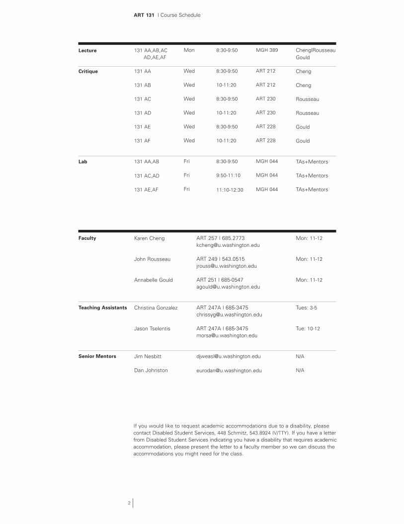
GradingGrading is based on the quality of the work, as evidenced by the projects in the final submission portfolio; the extent of exploration done to achieve the final projects; the skill with which the final projects are crafted; class participation; and quiz scores.
Project 1 - Line Interval Studies 10%Project 2 - Shape Studies 10%Project 3 - Interval Combinations 10%Project 4 - Photographic Oppositions 10%Project 5 - Thematic Composition 20%Final Submission Packet 10%Design Process and Class Participation (in Critique/Lab) 20%Average of Best 4 Lecture Quiz Scores 10%
There will be 5 multiple choice quizzes randomly administered throughout the quarter during the lecture portion of the course. Quizzes will cover material presented in lecture, critique and/or the required reading. There will be no quiz make-ups adminis-tered under any circumstances; however, the lowest quiz score will be dropped. Quiz scores are posted online at http://courses.washington.edu/art131/quizzes; please use the last 4 digits of your student number to find your score.
All projects are due on the dates listed in the syllabus; no late work will be accepted. Each project is graded on a 10-point scale according to the following general criteria: 10=excellent, 8=good, 6=fair, 4 (or less)=poor. Students have the option of revising any project prior to the submission of the portfolio. Final grades will be determined based on a curved scale at the end of the course.
ART 131 | Art Materials, Software, Computer Usage and Textbook
Art MaterialsWe recommend that you purchase the Art 131 Supply Kit, which contains all art materials listed below. This supply kit is only available at Utrecht Art Supplies and Artist & Craftsman Supply. Supplies may also be purchased separately at the University of Washington Bookstore or other art supply stores.
Strathmore text 80# Charcoal gray paper (5 sheets)Ampad quadrille graph paper (10 squares per inch) pad, 8.5”x 11”Strathmore series 300 (single ply) bristol board, 11”x 14”, 15 sheet padX–acto knife with #11 blades18” metal ruler with cork backing14” plastic triangle (30/60 or 45)Bainbridge/Letramax Studio–Tac Dry Adhesive High-Tac 11.5” x 17”, 20 sheet padRubber cement pickupClear acrylic roller brayerStaedtler Mars plastic eraser or kneaded eraserBlack Sandform Sharpie Markers - Ultra Fine Point and Super SharpieDrawing pencils (H, HB, B)
SoftwareIn this course, we will be using Adobe Illustrator 10, which is available for Macintosh or PC for $99.95 (academic price) at the UW Bookstore Computer Store. While it is possible to complete course projects with other vector drawing programs (i.e., Macromedia Freehand or Corel Draw) alternate programs will not be taught or supported by faculty or teaching assistants.
Computer UsageGeneral access computing labs at the University of Washington are located in Odegaard Undergraduate Library Commons and Mary Gates Hall Computing Resource Center. All computers in these labs have Adobe Illustrator 10 installed. For specific lab hours, visit the Student Access and Computing Group website at http://depts.washington.edu/sacg/facilities/labs/
OUGL Computing Commons Odegaard Undergraduate Library, second floor; 616-7173170 PCs + 43 Macs
Mary Gates Hall Computing Resource CenterMary Gates Hall, room 131; 543-0681126 PCs + 39 Macs
Required TextbookIllustrator 10 for Windows and Macintosh (Visual Quickstart Guide) by Elaine Weinmann and Peter Lourekaspublished by Peachpit Press — ISBN 020177321XAvailable at the University of Washington BookstoreList price $24.99
Required MediaYou are required to purchase 2 Zip disks (PC or Mac). Back up your solutions on both disks every time you work. Projects are due on the listed dates regardless of techni-cal failures/emergencies.
4
Local Art Supply Stores
Utrecht Art Supplies1124 Pike Street206.382.9696www.utrechtart.com
Artist & Craftsman Supply4350 8th Avenue NE206.545.0091http://acsupply.hypermart.net
University Bookstore4326 University Way NE206.634.3400www.bookstore.washington.edu
ART 131 | Additional Reading
Additional/Optional ReadingThe following books provide excellent supplementary reading for ART 131. Titles marked with an asterisk are highly recommended. All books have been placed on 1-day or 3-day reserve (unless otherwise noted) at the School of Art library. Visit the VCD website for additional faculty recommendations: http://depts.washington.edu/vcd/designs/02/sources_reading.shtml
CompositionA Primer of Visual Literacy by Donis Dondis* (on 2-hr reserve at UW Art Library)Art and Visual Perception by Rudolf ArnheimBasic Principles of Design by Manfred MaierBasic Visual Concepts and Principles by Wallschlager/Busic–Snyder*Design and Composition by Nathan GoldsteinDesign Principles and Problems by Paul Zelanski and Mary Pat FisherGraphic Design Manual by Armin Hofmann* (on 2-hr reserve at UW Art Library)Living with Art by Rita Gilbert (esp. Chap. 5)* (on 2-hr reserve at UW Art Library)
PhotographersEugene AtgetMargaret Bourke-WhiteHarry CallahanImogen CunninghamWalker EvansJan GrooverAndre KerteszLissete ModelLaszlo Moholy-NagyAlexander RodchenkoAaron SiskindPaul StrandEdward Weston
Visual RelationshipsArt Fundamentals: Theory and Practice by Otto OcvirkCognition and the Visual Arts by Robert SolsoThe Curves of Life by Theodore CookeDynamic Symmetry by Christine HerterThe Elements of Dynamic Symmetry by Jay HambridgeThe Geometry of Art and Life by Matila ChykeThe Geometry of Design by Kimberly ElamGestalt Psychology by Wolfgang KohlerOn Growth and Form by D’Arcy ThompsonThe Power of Limits by Gyorgy DocziThe Visual Mind by Michele Emmer
5
6
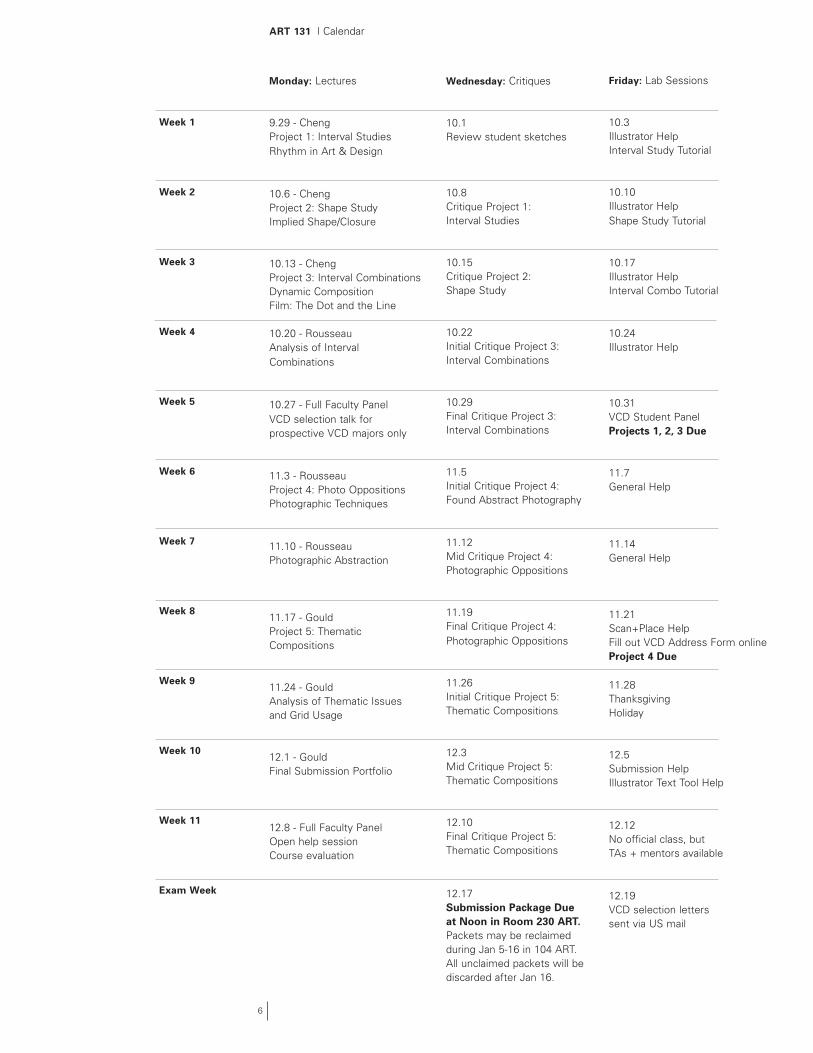
ART 131 | Calendar
Monday: Lectures
9.29 - ChengProject 1: Interval StudiesRhythm in Art & Design
10.6 - ChengProject 2: Shape Study Implied Shape/Closure
10.13 - ChengProject 3: Interval CombinationsDynamic Composition Film: The Dot and the Line
10.20 - RousseauAnalysis of IntervalCombinations
10.27 - Full Faculty PanelVCD selection talk forprospective VCD majors only
11.3 - RousseauProject 4: Photo OppositionsPhotographic Techniques
11.10 - RousseauPhotographic Abstraction
11.17 - GouldProject 5: Thematic Compositions
11.24 - GouldAnalysis of Thematic Issuesand Grid Usage
12.1 - GouldFinal Submission Portfolio
12.8 - Full Faculty PanelOpen help sessionCourse evaluation
Wednesday: Critiques
10.1Review student sketches
10.8Critique Project 1:Interval Studies
10.15Critique Project 2: Shape Study
10.22 Initial Critique Project 3:Interval Combinations
10.29Final Critique Project 3:Interval Combinations
11.5Initial Critique Project 4:Found Abstract Photography
11.12Mid Critique Project 4: Photographic Oppositions
11.19Final Critique Project 4: Photographic Oppositions
11.26Initial Critique Project 5:Thematic Compositions
12.3Mid Critique Project 5:Thematic Compositions
12.10Final Critique Project 5:Thematic Compositions
12.17Submission Package Due at Noon in Room 230 ART.Packets may be reclaimed during Jan 5-16 in 104 ART. All unclaimed packets will be discarded after Jan 16.
Friday: Lab Sessions
10.3Illustrator HelpInterval Study Tutorial
10.10Illustrator HelpShape Study Tutorial
10.17Illustrator HelpInterval Combo Tutorial
10.24 Illustrator Help
10.31VCD Student PanelProjects 1, 2, 3 Due
11.7General Help
11.14General Help
11.21Scan+Place HelpFill out VCD Address Form onlineProject 4 Due
11.28Thanksgiving Holiday
12.5Submission HelpIllustrator Text Tool Help
12.12No official class, butTAs + mentors available
12.19VCD selection letters sent via US mail
Week 1
Week 2
Week 3
Week 4
Week 5
Week 6
Week 7
Week 8
Week 9
Week 10
Week 11
Exam Week
7
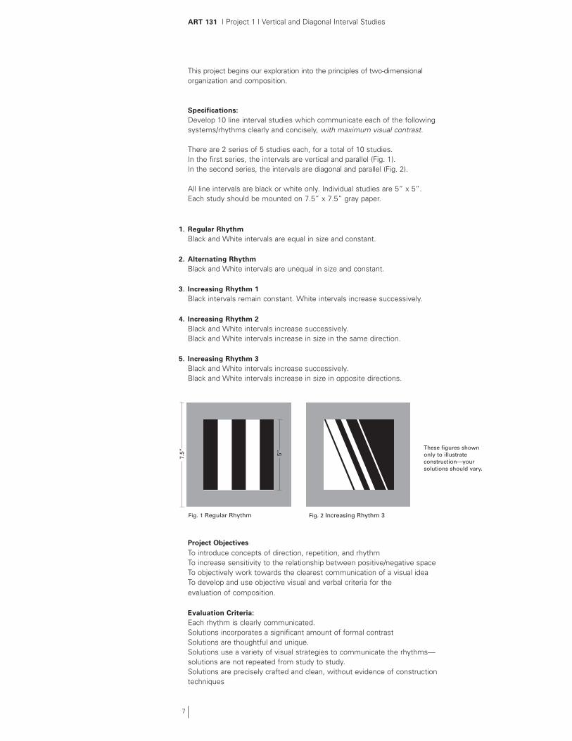
ART 131 | Project 1 | Vertical and Diagonal Interval Studies
This project begins our exploration into the principles of two-dimensional organization and composition.
Specifications:Develop 10 line interval studies which communicate each of the following systems/rhythms clearly and concisely, with maximum visual contrast.
There are 2 series of 5 studies each, for a total of 10 studies.In the first series, the intervals are vertical and parallel (Fig. 1). In the second series, the intervals are diagonal and parallel (Fig. 2).
All line intervals are black or white only. Individual studies are 5” x 5”. Each study should be mounted on 7.5” x 7.5” gray paper.
1. Regular Rhythm Black and White intervals are equal in size and constant.
2. Alternating RhythmBlack and White intervals are unequal in size and constant.
3. Increasing Rhythm 1Black intervals remain constant. White intervals increase successively.
4. Increasing Rhythm 2Black and White intervals increase successively.Black and White intervals increase in size in the same direction.
5. Increasing Rhythm 3Black and White intervals increase successively.Black and White intervals increase in size in opposite directions.
Project ObjectivesTo introduce concepts of direction, repetition, and rhythmTo increase sensitivity to the relationship between positive/negative spaceTo objectively work towards the clearest communication of a visual ideaTo develop and use objective visual and verbal criteria for the evaluation of composition.
Evaluation Criteria:Each rhythm is clearly communicated.Solutions incorporates a significant amount of formal contrastSolutions are thoughtful and unique.Solutions use a variety of visual strategies to communicate the rhythms—solutions are not repeated from study to study.Solutions are precisely crafted and clean, without evidence of construction techniques
These figures shown only to illustrate construction—your solutions should vary.
7.5”
Fig. 1 Regular Rhythm Fig. 2 Increasing Rhythm 3
5”

8
ART 131 | Tutorial 1 | Vertical and Diagonal Interval Studies
Setting up the File1. Following the directions on page 39 of your Visual Quickstart Guide (VQG), create
a new document that is 11”x 8.5” (this will hold two interval studies.)
2. Save your document as an Illustrator (.ai) file (see p. 44).
3. Draw a 5” square by choosing the rectangle tool (see p. 64), clicking on the page, and entering your dimensions. Create a second square by copying the first one, by holding down option/alt and dragging (p. 92). Note: Chapter 1 of the VQG provides a useful overview of the tools palette and other parts of the Illustrator interface.
4. To change the color of your squares, select them using the selection tool (p. 79) and choose either white or black (page 137).
5. Align the top edges of your squares by using the Align palette (p. 418). Lock them in position (p. 91).
6. If you would like to work more precisely, you can turn on Smart Guides (p. 88–89) or use rulers and ruler guides (p. 409).
Creating the Vertical Interval Study1. Create an interval by drawing a new 5” square.
2. Select the interval using the selection tool (p. 79) and change its color to either white or black, the opposite of the background color.
3. Adjust the width of the interval by first selecting its side with the direct selection tool, then dragging while holding the shift key to constrain movement.
4. Move the interval on top of the background. If it is unlocked, you can align the background square and the interval by using the Align palette.
5. Continue to make additional intervals and adjust their size/placement until you are satisfied with your interval study.
Creating Diagonal Interval Studies1. To create diagonal intervals, draw a rectangle and select it with the selection tool.
2. Rotate the interval to the desired angle by using the rotate tool (p. 98). As before, shift-option/alt drag to create new intervals at the same axis as the first one.
Printing the Study1. Make sure your intervals extend beyond the edge of your studies to allow room for
slight mistakes in cutting. This “bleed area” should be at least 1/8”.
2. Select “create trim marks” (see p. 446) to create fine crop marks around your individual studies. These marks make trimming the final 5” square versions easier.
3. Choose letter-sized paper and the appropriate printer for your lab in the page setup dialogue box (p. 444).
2. Drag the page tool over the area you want to print (see p. 42) and then select Print from the File menu.

ART 131 | General Mounting/Cutting Guide
The Friday Lab sessions are an excellent opportunity to receive assistance on issues of construction. Please take advantage of the advice and experience of the ART 131 TA and mentors to improve your craft skills.
Tips on Cutting1. Measure carefully. Most construction errors occur in measuring.
2. Mark short guidelines as lightly as possible with a pencil.
3. Hold the knife the same way you would a pencil. Grasp it firmly but not tightly.
4. Make sure the blade is vertical — straight up–and–down, not at an angle.
5. Always cut against a metal ruler. The ruler should be positioned so that you cannot cut into the final artwork.
6. Use a cover sheet between the artwork and the metal ruler to protect the work.
7. Check the ruler’s position by placing the tip of the blade at the top and bottom of your guideline before cutting.
8. Take your time. Push down lightly when cutting. It’s best to make several shallow cuts with low pressure than to make one deep cut with heavy pressure.
9. Exercise caution — the blade is sharp. Also, please note that the tip of the blade is fragile and can snap under heavy pressure. We recommend safety goggles.
10. Change blades often — dull blades tear paper and increase the likelihood of accidents.
11. Consider purchasing a rubber cutting mat, which helps blades last longer.
Mounting the Study1. Make a high quality laser output of your studies. Mount this study to bristol board
using StudioTac. Trim the mounted study carefully with a sharp xacto knife along the trim marks.
2. Using your ruler, triangle and a pencil, measure and cut a precise 7.5” square piece of gray paper.
3. Using a sharp pencil, lightly mark the location of a centered 5” square on this 7.5” gray square.
4. Using StudioTac, mount the interval study to the center of the gray square. Remove any stray adhesive or pencil marks with an eraser and rubber cement pick-up.
Tips on Gluing with StudioTac1. Carefully peel back the overlay on a sheet of StudioTac — white dots tend to migrate.
2. Place your interval study face-up onto the adhesive.
3. Cover your work with a protective sheet of paper and burnish.
4. Carefully peel the adhesive sheet away from the study (do not bend/peel the study) and mount to bristol board, burnishing carefully — use a cover sheet.
5. Note that rubber cement is not recommended (tends to lift toner from laser outputs).
9
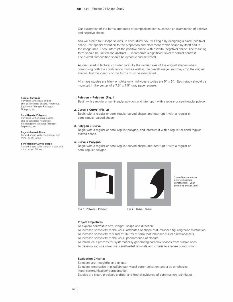
ART 131 | Project 2 | Shape Study
Our exploration of the formal attributes of composition continues with an examination of positive and negative shape.
You will create four shape studies. In each study, you will begin by designing a black (positive) shape. Pay special attention to the proportion and placement of this shape by itself and in the image area. Then, interrupt the positive shape with a white (negative) shape. The resulting form should be unified and abstract — incorporate a significant level of formal contrast. The overall composition should be dynamic and activated.
As discussed in lecture, consider carefully the implied axis of the original shapes when composing both the combination form as well as the overall image. You may crop the original shapes, but the identity of the forms must be maintained.
All shape studies are black or white only. Individual studies are 5” x 5”. Each study should be mounted in the center of a 7.5” x 7.5” gray paper square.
1. Polygon + Polygon (Fig. 1)Begin with a regular or semi-regular polygon, and interrupt it with a regular or semi-regular polygon.
2. Curve + Curve (Fig. 2)Begin with a regular or semi-regular curved shape, and interrupt it with a regular or semi-regular curved shape.
3. Polygon + CurveBegin with a regular or semi-regular polygon, and interrupt it with a regular or semi-regular curved shape.
4. Curve + PolygonBegin with a regular or semi-regular curved shape, and interrupt it with a regular or semi-regular polygon.
Project ObjectivesTo explore contrast in size, weight, shape and direction.To increase sensitivity to the visual attributes of shape that influence figure/ground fluctuation.To increase sensitivity to visual attributes of form that influence visual directional axis.To increase sensitivity to the visual phenomenon of closure.To introduce a process for systematically generating complex shapes from simple ones.To develop and use objective visual/verbal rationale and criteria to analyze composition.
Evaluation Criteria:Solutions are thoughtful and unique.Solutions emphasize implied/abstract visual communication, and a de-emphasizeliteral communication/representation.Studies are clean, precisely crafted, and free of evidence of construction techniques.
10
Fig. 1 - Polygon + Polygon Fig. 2 - Curve + Curve
These figures shown only to illustrate construction—your solutions should vary.
Regular PolygonsPolygons with equal angles and equal sides: Square, Rhombus, Equilateral Triangle, Pentagon, Octagon, etc.
Semi-Regular PolygonsPolygons with 2 equal angles and equal sides: Rectangle, Parallelogram, Isoceles Triangle, Trapezoid, etc.
Regular-Curved ShapeCurved shape with equal major and minor axes: Circle
Semi-Regular Curved ShapeCurved shape with unequal major and minor axes: Ellipse
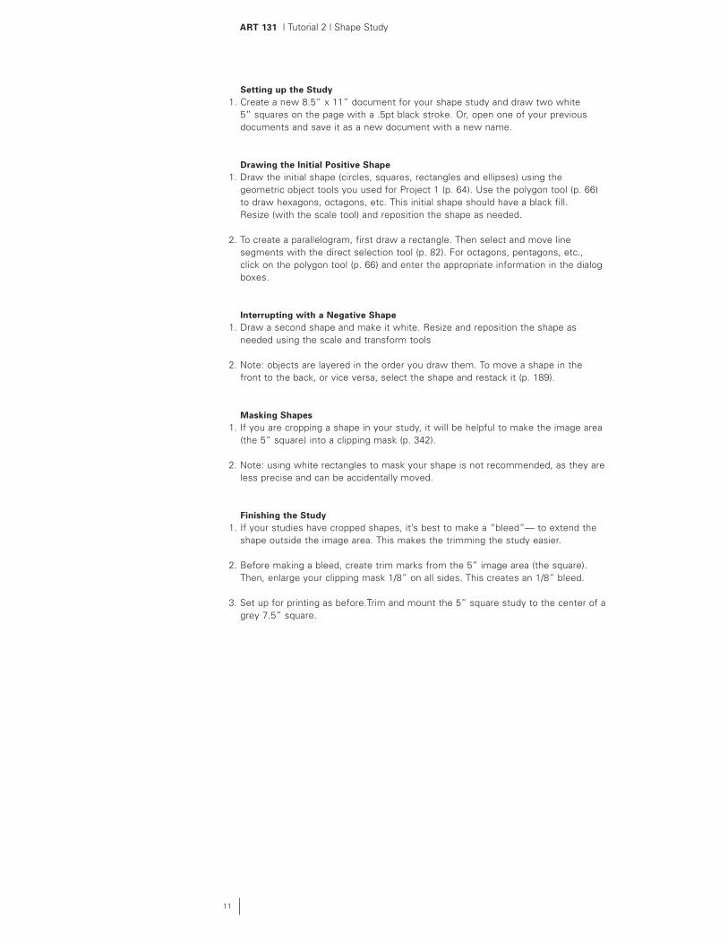
ART 131 | Tutorial 2 | Shape Study
11
Setting up the Study1. Create a new 8.5” x 11” document for your shape study and draw two white
5” squares on the page with a .5pt black stroke. Or, open one of your previous documents and save it as a new document with a new name.
Drawing the Initial Positive Shape1. Draw the initial shape (circles, squares, rectangles and ellipses) using the
geometric object tools you used for Project 1 (p. 64). Use the polygon tool (p. 66) to draw hexagons, octagons, etc. This initial shape should have a black fill. Resize (with the scale tool) and reposition the shape as needed.
2. To create a parallelogram, first draw a rectangle. Then select and move line segments with the direct selection tool (p. 82). For octagons, pentagons, etc., click on the polygon tool (p. 66) and enter the appropriate information in the dialog boxes.
Interrupting with a Negative Shape1. Draw a second shape and make it white. Resize and reposition the shape as
needed using the scale and transform tools
2. Note: objects are layered in the order you draw them. To move a shape in the front to the back, or vice versa, select the shape and restack it (p. 189).
Masking Shapes1. If you are cropping a shape in your study, it will be helpful to make the image area
(the 5” square) into a clipping mask (p. 342).
2. Note: using white rectangles to mask your shape is not recommended, as they are less precise and can be accidentally moved.
Finishing the Study1. If your studies have cropped shapes, it’s best to make a “bleed”— to extend the
shape outside the image area. This makes the trimming the study easier.
2. Before making a bleed, create trim marks from the 5” image area (the square). Then, enlarge your clipping mask 1/8” on all sides. This creates an 1/8” bleed.
3. Set up for printing as before.Trim and mount the 5” square study to the center of a grey 7.5” square.
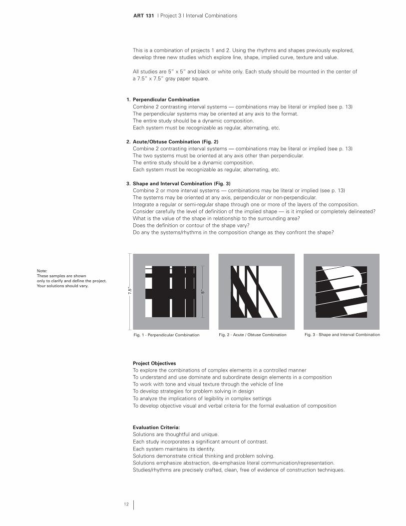
ART 131 | Project 3 | Interval Combinations
This is a combination of projects 1 and 2. Using the rhythms and shapes previously explored, develop three new studies which explore line, shape, implied curve, texture and value.
All studies are 5” x 5” and black or white only. Each study should be mounted in the center of a 7.5” x 7.5” gray paper square.
1. Perpendicular Combination Combine 2 contrasting interval systems — combinations may be literal or implied (see p. 13)The perpendicular systems may be oriented at any axis to the format.The entire study should be a dynamic composition.Each system must be recognizable as regular, alternating, etc.
2. Acute/Obtuse Combination (Fig. 2)Combine 2 contrasting interval systems — combinations may be literal or implied (see p. 13)The two systems must be oriented at any axis other than perpendicular.The entire study should be a dynamic composition.Each system must be recognizable as regular, alternating, etc.
3. Shape and Interval Combination (Fig. 3) Combine 2 or more interval systems — combinations may be literal or implied (see p. 13)The systems may be oriented at any axis, perpendicular or non-perpendicular.Integrate a regular or semi-regular shape through one or more of the layers of the composition.Consider carefully the level of definition of the implied shape — is it implied or completely delineated?What is the value of the shape in relationship to the surrounding area?Does the definition or contour of the shape vary?Do any the systems/rhythms in the composition change as they confront the shape?
Project ObjectivesTo explore the combinations of complex elements in a controlled mannerTo understand and use dominate and subordinate design elements in a compositionTo work with tone and visual texture through the vehicle of lineTo develop strategies for problem solving in designTo analyze the implications of legibility in complex settingsTo develop objective visual and verbal criteria for the formal evaluation of composition
Evaluation Criteria:Solutions are thoughtful and unique.Each study incorporates a significant amount of contrast.Each system maintains its identity.Solutions demonstrate critical thinking and problem solving.Solutions emphasize abstraction, de-emphasize literal communication/representation.Studies/rhythms are precisely crafted, clean, free of evidence of construction techniques.
Fig. 1 - Perpendicular Combination Fig. 3 - Shape and Interval Combination
Note:These samples are shown only to clarify and define the project.Your solutions should vary.
Fig. 2 - Acute / Obtuse Combination
7.5”
5”
12

ART 131 | Project 3 | Interval Studies | Literal and Implied Overlay
Literal Overlay - Entire contour of both systems is completely defined.
Implied Overlay - One system is defined by the manipulation of the other system.
+
+
=
=
13
Samples for project definition only.Your solution should vary.
+ =
Implied Overlay - Contour Manipulation

ART 131 | Project 3 | Interval Studies | Literal and Implied Overlay
14
+ =+
Implied Overlay - One system is defined by the manipulation of the other system.
Incorporating a Shape
+
=
+
Samples for project definition only.Your solution should vary.
+
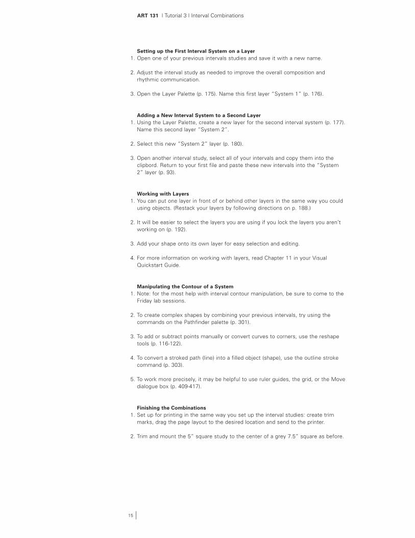
ART 131 | Tutorial 3 | Interval Combinations
15
Setting up the First Interval System on a Layer1. Open one of your previous intervals studies and save it with a new name.
2. Adjust the interval study as needed to improve the overall composition and rhythmic communication.
3. Open the Layer Palette (p. 175). Name this first layer “System 1” (p. 176).
Adding a New Interval System to a Second Layer1. Using the Layer Palette, create a new layer for the second interval system (p. 177). Name this second layer “System 2”.
2. Select this new “System 2” layer (p. 180).
3. Open another interval study, select all of your intervals and copy them into the clipbord. Return to your first file and paste these new intervals into the “System 2” layer (p. 93).
Working with Layers1. You can put one layer in front of or behind other layers in the same way you could
using objects. (Restack your layers by following directions on p. 188.)
2. It will be easier to select the layers you are using if you lock the layers you aren’t working on (p. 192).
3. Add your shape onto its own layer for easy selection and editing.
4. For more information on working with layers, read Chapter 11 in your Visual Quickstart Guide.
Manipulating the Contour of a System1. Note: for the most help with interval contour manipulation, be sure to come to the
Friday lab sessions.
2. To create complex shapes by combining your previous intervals, try using the commands on the Pathfinder palette (p. 301).
3. To add or subtract points manually or convert curves to corners, use the reshape tools (p. 116-122).
4. To convert a stroked path (line) into a filled object (shape), use the outline stroke command (p. 303).
5. To work more precisely, it may be helpful to use ruler guides, the grid, or the Move dialogue box (p. 409-417).
Finishing the Combinations1. Set up for printing in the same way you set up the interval studies: create trim
marks, drag the page layout to the desired location and send to the printer.
2. Trim and mount the 5” square study to the center of a grey 7.5” square as before.
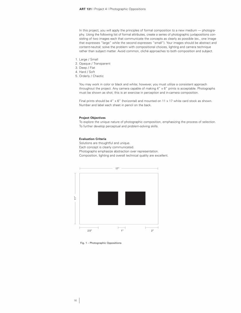
In this project, you will apply the principles of formal composition to a new medium — photogra-phy. Using the following list of formal attributes, create a series of photographic juxtapositions con-sisting of two images each that communicate the concepts as clearly as possible (ex., one image that expresses “large” while the second expresses “small”). Your images should be abstract and content-neutral; solve the problem with compositional choices, lighting and camera technique rather than subject matter. Avoid common, cliché approaches to both composition and subject.
1. Large / Small2. Opaque / Transparent3. Deep / Flat4. Hard / Soft5. Orderly / Chaotic
You may work in color or black and white; however, you must utilize a consistent approach throughout the project. Any camera capable of making 4” x 6” prints is acceptable. Photographs must be shown as shot; this is an exercise in perception and in-camera composition.
Final prints should be 4” x 6” (horizontal) and mounted on 11 x 17 white card stock as shown. Number and label each sheet in pencil on the back.
Project ObjectivesTo explore the unique nature of photographic composition, emphasizing the process of selection.To further develop perceptual and problem-solving skills.
Evaluation CriteriaSolutions are thoughtful and unique.Each concept is clearly communicated.Photographs emphasize abstraction over representation.Composition, lighting and overall technical quality are excellent.
ART 131 | Project 4 | Photographic Oppositions
16
11”
Fig. 1 – Photographic Oppositions
17”
2.5” 2”1”

ART 131 | Project 5 | Thematic Composition
17
In this final assignment, you will combine photography, line, texture and shape to design two dynamic and complex compositions that communicate an assigned theme. Both compositions are 9” x 9” and black or white only. Each study should be mounted in the center of an 11” x 17” page in your final submission portfolio. Delinate the boundary of the 9” x 9” image area with a .5 pt hairline.
Photographic SelectionBegin by selecting two different photographs that relate to the theme as assigned in your critique section. Consider several images prior to your final selection, examin-ing both the formal and symbolic associations inherent in the representations. The photos may be self-authored or copied from books, magazines, newspapers, etc. Resize and crop photos to 3”x 3”, creating active, dynamic compositions. To convert color photos to greyscale (black & white), scan and change the color mode in Adobe Photoshop, or replicate with a copy machine (use “photo” setting for best results.)
Composition 1 (without Grid, Fig. 1)Place one cropped photograph in the center of a 9” x 9” image area. Then, develop a complex composition by layering interval systems, geometric shapes and/or textures into the format. Do not overlap or obscure the photographic image. Interval systems must be recognizable and legitimate.
Composition 2 (with Grid, Fig. 2)Placing the remaining cropped photograph in the center of another 9” x 9 “ format. Then, create a 3 x 3 grid using guidelines as shown. (These guides should not be visible in the final study.) Continue by layering additional elements as before, but strive to clearly articulate — but not overdefine — the grid.
A grid should not be considered a hindrance to creativity but an aid — a scaffold upon which infinitely varied forms can be built. The key design decision to be made when using a grid is how freely and loosely to adhere to the grid structure. Strict adherence to the grid produces static compositions. However, blatant disregard for the grid fails to take advantage of its unifying force. Therefore, strive for a balance between respect for — and violation of — the grid.
Considerations:The formal content of a photo — its textures and shapes — should be exploited as a surprising and exciting springboard for composition. Create either strong unity or strong contrasts between the image and additional graphics.
Additionally, be sensitive to how graphic elements themselves might assist in the photograph in communicating a theme. Shapes (and their value, scale and position) have inherent associations which can greatly impact meaning.
Project ObjectivesTo explore appropriate, compelling, unique and dynamic visualizations of a theme. To introduce grids as aid in organizing visual information.To increase sensitivity to and control of complex graphic/photographic compositions.To develop and use objective visual and verbal criteria for the evaluation of composition and communication.
Evaluation Criteria:Compositions are unique, complex, and dynamic.Compositions incorporate significant contrast in value, scale, and density.Compositions are sensitive to both figure and ground.Both photographic and graphic form languages are unified and resolved.Grid boundaries (in composition 2) are not over-defined or under-defined.Compositions are precisely crafted, free of evidence of construction techniques.
11”
Fig. 1 Composition without Grid
9”
17”
Fig. 2 Composition with Grid

The following instructions pertain to scanning in the School of Art Computer Center; however, most scanning software contains similar variables and the process is comparable. Please see a TA or mentor during Friday lab session if you need further assistance.
Previewing the Scan
1. Find a workstation with a scanner. Check and make sure the scanner is on and all cables are plugged in
2. Place your artwork face down on the scanner, taking care not to scratch the glass.
3. Launch VueScan program (located in the Dock in OSX)
4. Under the Device menu, change the Option types to Advanced. Set up your scan-ning session as shown in Figure 1.
5. Go to the Files menu. Adjust your settings as in Figure 2.
6. Click the Preview button, and the scanner will give you an image to crop or adjust before making a final scan
Cropping and Scanning the Photo
1. A marquee box should appear around the edge of your entire scan. The box will look like dotted lines or “ants” marching around the image. Use the pointer to click on an edge of the marquee and drag and pull to select the part of the image you want to scan.
Note: A tighter or smaller image takes up less storage space. The size of the file is displayed in the bottom left corner of the window.
2. When satisfied with your cropping, click the Scan button.
3. Check to make certain, your scan is saved in the desired location.
4. Before editing your image, always save a copy or backup in case you need to go back to the orignal file.
Note: Saving copies of your work after making changes will allow you to revisit previous versions. This lets you choose from an array of images as you make con-tinuous adjustments.
Making Adjustments in Photoshop 7.0
1. After scanning, you may want to make adjusments to value (darken blacks, bright-en whites, etc.).
2. Levels, Curves, Brightness/Contrast are tools under the menu Edit / Adjust.
3. Make your adjustments and choose Save As. Rename file and save to desired location.
ART 131 | Scanning Guide
18
Fig. 1 Scanning Set-up 1Name of scanner may vary. Change Scan dpi option to Custom and type in 150 dpi.
Fig. 2 Scanning Set-up 2 Make sure you choose Scan size. Name your file and click on @ to choose where you want to the file to be saved.
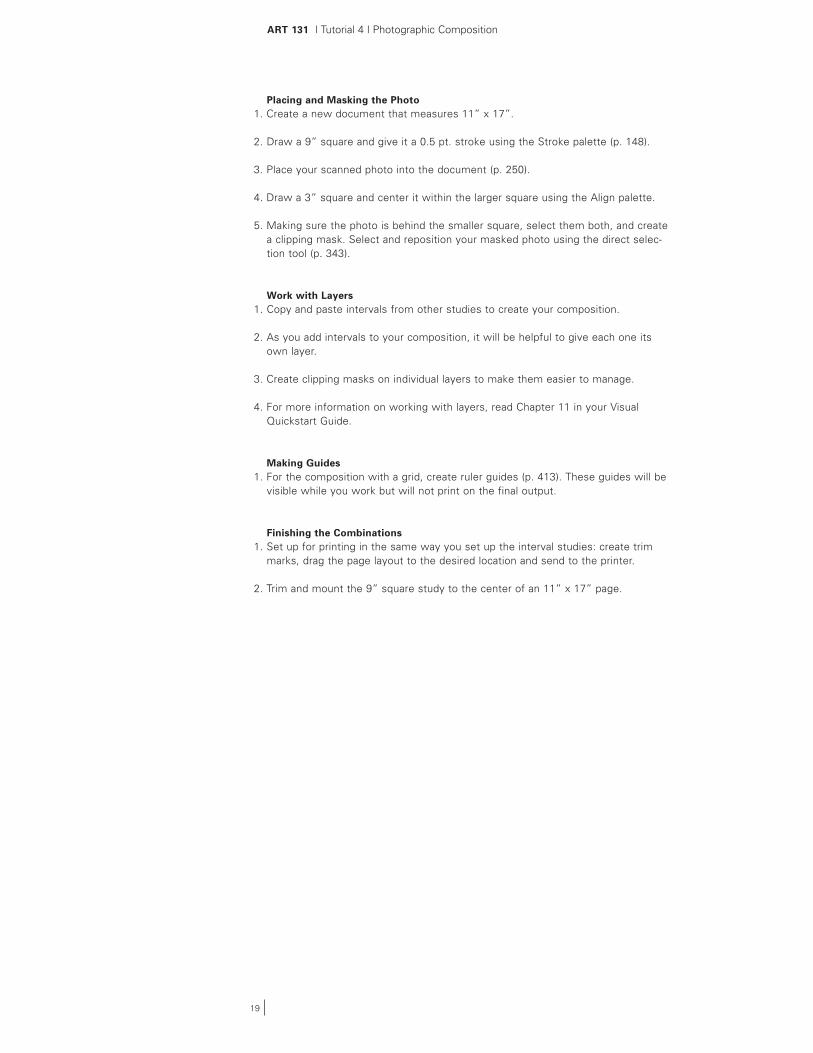
Placing and Masking the Photo1. Create a new document that measures 11” x 17”.
2. Draw a 9” square and give it a 0.5 pt. stroke using the Stroke palette (p. 148).
3. Place your scanned photo into the document (p. 250).
4. Draw a 3” square and center it within the larger square using the Align palette.
5. Making sure the photo is behind the smaller square, select them both, and create a clipping mask. Select and reposition your masked photo using the direct selec-tion tool (p. 343).
Work with Layers1. Copy and paste intervals from other studies to create your composition.
2. As you add intervals to your composition, it will be helpful to give each one its own layer.
3. Create clipping masks on individual layers to make them easier to manage.
4. For more information on working with layers, read Chapter 11 in your Visual Quickstart Guide.
Making Guides1. For the composition with a grid, create ruler guides (p. 413). These guides will be
visible while you work but will not print on the final output.
Finishing the Combinations1. Set up for printing in the same way you set up the interval studies: create trim
marks, drag the page layout to the desired location and send to the printer.
2. Trim and mount the 9” square study to the center of an 11” x 17” page.
ART 131 | Tutorial 4 | Photographic Composition
19
ART 131 | Submissions Notebook
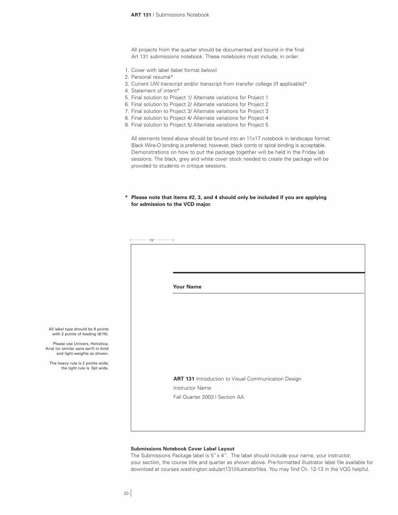
All projects from the quarter should be documented and bound in the final Art 131 submissions notebook. These notebooks must include, in order:
1. Cover with label (label format below)2. Personal resumé*3. Current UW transcript and/or transcript from transfer college [If applicable]*4. Statement of intent*5. Final solution to Project 1/ Alternate variations for Project 16. Final solution to Project 2/ Alternate variations for Project 27. Final solution to Project 3/ Alternate variations for Project 38. Final solution to Project 4/ Alternate variations for Project 49. Final solution to Project 5/ Alternate variations for Project 5
All elements listed above should be bound into an 11x17 notebook in landscape format. Black Wire-O binding is preferred; however, black comb or spiral binding is acceptable. Demonstrations on how to put the package together will be held in the Friday lab sessions. The black, grey and white cover stock needed to create the package will be provided to students in critique sessions.
* Please note that items #2, 3, and 4 should only be included if you are applying for admission to the VCD major.
Submissions Notebook Cover Label LayoutThe Submissions Package label is 5” x 4”. The label should include your name, your instructor, your section, the course title and quarter as shown above. Pre-formatted illustrator label file available for download at courses.washington.edu/art131/illustratorfiles. You may find Ch. 12-13 in the VQG helpful.
ART 131 Introduction to Visual Communication Design
Instructor Name
Fall Quarter 2003 | Section AA
Your Name
7/8”
20
All label type should be 8 points with 2 points of leading (8/10).
Please use Univers, Helvetica, Arial (or similar sans serif) in bold
and light weights as shown.
The heavy rule is 2 points wide; the light rule is .5pt wide.

ART 131 | Submissions Packet Layout
Cover
Resume Transcript
Project 1: Regular Rhythm
Project 4: Photo Oppositions
Project 5:Thematic Composition
Project 5:With grid
Bind resume, transcript and statement of intent along the 11” side.
Binding Shops
Phil’s Custom Bindery2315 Western Avenue206.728.1541
The Copy Company616 6th Avenue South206.622.4050
Kinko’s3042 NE 45th St.206.524.6629
Kinko’s810 NE 45 St.206.545.7218
Ave Copy Center4141 University Way NESuite 103206.633.1837
Rams Copy Center4144 University Way NE206.632.6630
(Wire-O binding is only available at Phil’s and The Copy Company.)
11”
10”
Project 3:Perpendicular
Project 3:Acute/Obtuse
Project 3: Implied Shape
Project 1: Alternating Rhythm
Project 1: Increasing Rhythm 1
Project 1: Increasing Rhythm 2
Project 1: Increasing Rhythm 3
5” 2”
21
Statement of Intent
(Mount original photos.)
Revised projects follow the originals. Label these projects as ‘Final, revised.’ Show alternate solutions at reduced size (fit 2-4 solutions per sheet). Label as “Alternate Solutions.”Reduced alternate solutions may be setup and output directly on 11”x 17” laser paper;(no need to mount alternate solutions.)
Project 2:Shape Studies
Project 2: Shape Studies
Project 1: Alternate solutions
Project 2: Alternate solutions
Project 3: Alternate solutions
Project 4: Alternate solutions
Project 5: Alternate solutions
Project 4: Photo Oppositions
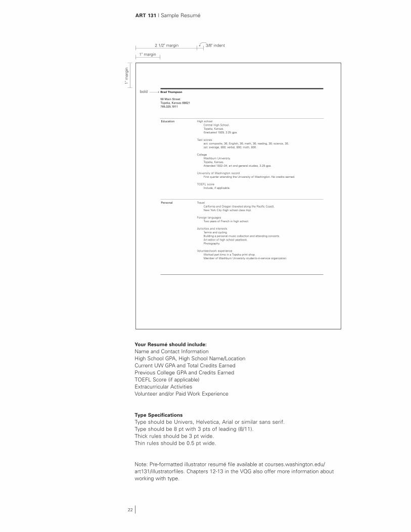
ART 131 | Sample Resumé
Your Resumé should include: Name and Contact Information High School GPA, High School Name/Location Current UW GPA and Total Credits Earned Previous College GPA and Credits Earned TOEFL Score (if applicable) Extracurricular Activities Volunteer and/or Paid Work Experience
Type Specifications Type should be Univers, Helvetica, Arial or similar sans serif. Type should be 8 pt with 3 pts of leading (8/11). Thick rules should be 3 pt wide. Thin rules should be 0.5 pt wide.
Note: Pre-formatted illustrator resumé file available at courses.washington.edu/art131/illustratorfiles. Chapters 12-13 in the VQG also offer more information about working with type.
Brad Thompson
59 Main StreetTopeka, Kansas 66621785.325.1911
High schoolCentral High School.Topeka, Kansas.Graduated 1929, 3.25 gpa.
Test scoresact: composite, 36; English, 36; math, 36; reading, 36; science, 36.sat: average, 800; verbal, 800; math, 800.
CollegeWashburn University.Topeka, Kansas.Attended 1932–34, art and general studies, 3.25 gpa.
University of Washington recordFirst quarter attending the University of Washington. No credits earned.
TOEFL scoreInclude, if applicable.
TravelCalifornia and Oregon (traveled along the Pacific Coast). New York City (high school class trip).
Foreign languagesTwo years of French in high school.
Activities and interestsTennis and cycling.Building a personal music collection and attending concerts.Art editor of high school yearbook.Photography.
Volunteer/work experienceWorked part-time in a Topeka print shop.Member of Washburn University students-in-service organization.
Education
Personal
1" m
argi
n
1" margin
2 1/2" margin 3/8" indent
bold
22

ART 131 | Sample Statement of Intent
The statement of intent should address your background and reasons for interest in the Visual Communication Design major. We are especially interested in how you see the VCD program relative to other programs and your interests/career goals.
You may wish to consult the following publications to learn more about career opportunities in design:
Careers by Design by Roz GoldfarbGraphic Design: A Career Guide and Education Directory, edited by Sharon Poggenpohl Looking Closer: Critical Writings on Graphic Design (Volumes 1, 2, 3)
You may also want to visit the AIGA website at www.aiga.org.The section for students under “Especially for...” is particularly helpful, and includes a brief description of what graphic design is, differences between design programs, how to select a design school, etc.
Note: A pre-formatted illustrator statement of intent file is available at courses.washington.edu/art131/illustratorfiles. Chapters 12-13 in the VQG also pro-vide more information about working with type.
The following short essay is a sample statement of intent received from a prospective VCD major:
The best way to explain my interest in the field of professional graphic design is to provide a short history. I am an adult returning to college after a 20 year hiatus. I entered the production side of the field about 12 years ago, with only the skills acquired from a 1-year vocational education. My understanding of professional design practice has evolved mainly through my experience in the working environment of journalism and newspaper publication.
I am very excited about what the UW Visual Communication Design program can offer me, based on the experiences I have had to date in Art 131. I would describe the UW design program as predominately focused on “design thinking”. The faculty emphasize the critical examination of communication issues rather than superficial style. This well defined and organized approach engages my intellectual curiosity. I enjoy all the steps of the process, from the definition of the problem to the creation of iterative variations, to the crafting of the final execution.
Furthermore, I am also drawn to the cultural and social emphasis of the program. My interaction with the program faculty thus far shows that they believe design can make a contribution to, or an impact on, society on the larger scale. I was moved by this quote from faculty member Douglas Wadden (from AIGA: Graphic Design Education):
“We want students to understand the responsibility associated with design as a means of education, social and public communication…They need to…aspire to a seriousness of purpose…to recognize the potential to contribute to the larger goals of society and business.”
What I feel I can offer the program is an insatiable appetite for every piece of information, and an enthusiastic willingness to endure the rigor of the educational process. I am committed to design, and I strive to bring a mature perspective to my work and genuine caring for my fellow students. I look forward to the continual challenges that I know the program will provide, and I anticipate three years of hard but rewarding effort.
23


![Matila Ghyka] the Geometry of Art and Life](https://img.pdfslide.us/doc/110x75/563dba5d550346aa9aa4ff3e/matila-ghyka-the-geometry-of-art-and-life-566c72c15c186.jpg)