Embed Size (px)
Citation preview

ArcGIS®
9Using ArcMap
Copyright © 2000–2005 ESRIAll rights reserved.Printed in the United States of America.
The information contained in this document is the exclusive property of ESRI. This work is protected under United States copyright law and other international copyright treaties andconventions. No part of this work may be reproduced or transmitted in any form or by any means, electronic or mechanical, including photocopying and recording, or by any information storageor retrieval system, except as expressly permitted in writing by ESRI. All requests should be sent to Attention: Contracts Manager, ESRI, 380 New York Street, Redlands, CA 92373-8100,USA.
The information contained in this document is subject to change without notice.
DATA CREDITSQuick-Start Tutorial Data: Wilson, North Carolina.Population Density—Conterminous United States Map: U.S. Department of Census.The African Landscape Map: Major Habitat Types—Conservation Science Program, WWF-US; Rainfall—ArcAtlas™, ESRI, Redlands, California; Population data from EROS Data CenterUSGS/UNEP.Amazonia Map: Conservation International.Forest Buffer Zone—100 Meters Map: U.S. Forest Service (Tongass Region).Horn of Africa Map: Basemap data from ArcWorld™ (1:3M), ESRI, Redlands, California; DEM and Hillshade from EROS Data Center USGS/UNEP.Mexico: ESRI Data & Maps CDs, ESRI, Redlands, California.Mexico: 1990 Population: ESRI Data & Maps CDs, ESRI, Redlands, California.Population Density in Florida (2001): ESRI Data & Maps CDs, ESRI, Redlands, California.Rhode Island, the Smallest State in the United States: Elevation data from the USGS, EROS Data Center; other data from ESRI Data & Maps CDs, ESRI, Redlands, California.Countries of the European Union: Member States and Candidate Country information from EUROPA (The European Union On-Line); ESRI Data & Maps CDs, ESRI, Redlands,California.Mexico Population Density Map: ESRI Data & Maps CDs, ESRI, Redlands, California.Health Care in the United States Map: Population data from U.S. Department of Census; Health Service Areas from the trustees of Dartmouth College; Service Providers data fromHealthcare Financing Administration.Clark County Land Use Map: Clark County Office, Washington State.Southeast Asia Population Distribution Map: ArcWorld (1:3M), ESRI, Redlands, California.Global 200—World’s Biologically Outstanding Ecoregions Map: Ecoregions data from Conservation Science Program, WWF-US; Country boundaries from ArcWorld (1:3M), ESRI,Redlands, California.Australia Map: Major Habitat Types data from Conservation Science Program, WWF-US; Basemap from ArcWorld (1:3M), ESRI, Redlands, California.New Hampshire Telecom Map: Geographic Data Technology, Inc.Redlands Image: Courtesy of Emerge, a division of TASC.
CONTRIBUTING WRITERSMelanie Harlow, Rhonda Pfaff, Michael Minami, Alan Hatakeyama, Andy Mitchell, Bob Booth, Bruce Payne, Cory Eicher, Eleanor Blades, Ian Sims,
Jonathan Bailey, Pat Brennan, Sandy Stephens, Simon Woo
U.S. GOVERNMENT RESTRICTED/LIMITED RIGHTSAny software, documentation, and/or data delivered hereunder is subject to the terms of the License Agreement. In no event shall the U.S. Government acquire greater than RESTRICTED/LIMITED RIGHTS. At a minimum, use, duplication, or disclosure by the U.S. Government is subject to restrictions as set forth in FAR §52.227-14 Alternates I, II, and III (JUN 1987); FAR§52.227-19 (JUN 1987) and/or FAR §12.211/12.212 (Commercial Technical Data/Computer Software); and DFARS §252.227-7015 (NOV 1995) (Technical Data) and/or DFARS §227.7202(Computer Software), as applicable. Contractor/Manufacturer is ESRI, 380 New York Street, Redlands, CA 92373-8100, USA.
ESRI, the ESRI globe logo, ArcInfo, ArcEditor, ArcView, ArcMap, ArcCatalog, ArcGIS, ArcReader, ArcSDE, SDE, ArcObjects, ArcIMS, ArcPress, ArcToolbox, GIS by ESRI, the ArcGIS logo,Geography Network, the Geography Network logo, www.geographynetwork.com, and www.esri.com are trademarks, registered trademarks, or service marks of ESRI in the United States, theEuropean Community, or certain other jurisdictions.
The Microsoft Internet Explorer logo is a trademark of Microsoft Corporation.
Other companies and products mentioned herein are trademarks or registered trademarks of their respective trademark owners.
Attribution.PMD 02/10/2005, 3:42 PM1
IN THIS CHAPTER
13
Quick-start tutorial 2• Exercise 1: Exploring your data
• Exercise 2: Working withgeographic features
• Exercise 3: Working with tables
• Exercise 4: Editing features
• Exercise 5: Working with mapelements
The best way to learn ArcMap is to try it yourself. This tutorial guides youthrough some basic ArcMap skills as you create and print a set of maps for acounty that is planning to expand its airport.
Residents of the county have identified several issues they are concernedabout. These include noise affecting schools and houses near the airport andincreased traffic along major roads. In this tutorial, you’ll first create and printa map showing schools near the airport. Then you’ll place this map—alongwith two other maps that show land use surrounding the airport and populationdensity for the county—on a wall-sized poster for display.
In the tutorial, you’ll learn how to:
• Display map features.
• Add data to your map.
• Edit geographic data.
• Work with data tables.
• Query and select geographic features.
• Create a summary chart.
• Lay out and print a map.
There are five exercises. Each exercise takes between 30 and 45 minutes tocomplete. You can work through the entire tutorial or complete each lessonone at a time.
ch02-tutorial.pmd 02/10/2005, 9:02 AM13
14 USING ARCMAP
Exercise 1: Exploring your data
In this exercise, you’ll create a map showing locations ofschools near the airport, along with a noise contour, to seewhich schools may be affected by noise from the airport.The noise contour is based on the 65 Community NoiseEquivalency Level (CNEL), which indicates areasexperiencing more than 65 decibels of noise, averaged overa 24-hour period. In many cases, buildings within the65 CNEL will need soundproofing or other mitigationmeasures.
The exercises in this chapter use the tutorial data distributedwith ArcMap. The default install location of the data isC:\ArcGIS\ArcTutor\Map. The exercises require that youhave write access to this data. If you don’t, you’ll need tocopy the data to a location that you do have write accessto.
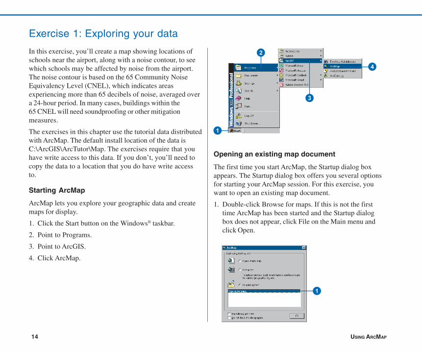
Starting ArcMap
ArcMap lets you explore your geographic data and createmaps for display.
1. Click the Start button on the Windows® taskbar.
2. Point to Programs.
3. Point to ArcGIS.
4. Click ArcMap.
Opening an existing map document
The first time you start ArcMap, the Startup dialog boxappears. The Startup dialog box offers you several optionsfor starting your ArcMap session. For this exercise, youwant to open an existing map document.
1. Double-click Browse for maps. If this is not the firsttime ArcMap has been started and the Startup dialogbox does not appear, click File on the Main menu andclick Open.
1
1
2
3
4
ch02-tutorial.pmd 02/10/2005, 9:02 AM14

QUICK-START TUTORIAL 15
2. In the dialog box, click the Look in dropdown arrow, andnavigate to the Map folder on the local drive where youinstalled the tutorial data (the default installation path isC:\ArcGIS\ArcTutor\Map).
3. Double-click airport.mxd. ArcMap opens the map.
This particular map contains the following layers in a dataframe called Schools:
schools locations of elementary, middle, high, andprivate schools
runways location of airport runways
arterials major roads
cnel65 the noise contour
airport_area the proposed airport expansion zone
county the county boundary
The map currently displays the arterials, noise contour,airport area, and county boundary. Their boxes are checkedin the table of contents.
ArcMap stores a map as a map document (.mxd) so youcan redisplay it, modify it, or share it with other ArcMapusers. The map document doesn’t store the actual data, butrather references the data stored on disk along withinformation about how it should be displayed. The mapdocument also stores other information about the map, suchas its size and the map elements it includes (title, scalebar,and so on).
To the left of the ArcMap display window is the table ofcontents, showing you which geographic layers areavailable to display. To the right is the map display area.
Table of contents Map display area
2
3
ch02-tutorial.pmd 02/10/2005, 9:02 AM15
16 USING ARCMAP
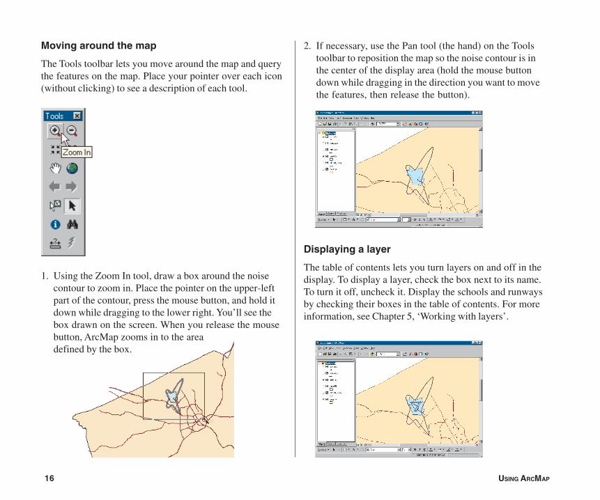
Moving around the map
The Tools toolbar lets you move around the map and querythe features on the map. Place your pointer over each icon(without clicking) to see a description of each tool.
1. Using the Zoom In tool, draw a box around the noisecontour to zoom in. Place the pointer on the upper-leftpart of the contour, press the mouse button, and hold itdown while dragging to the lower right. You’ll see thebox drawn on the screen. When you release the mousebutton, ArcMap zooms in to the areadefined by the box.
2. If necessary, use the Pan tool (the hand) on the Toolstoolbar to reposition the map so the noise contour is inthe center of the display area (hold the mouse buttondown while dragging in the direction you want to movethe features, then release the button).
Displaying a layer
The table of contents lets you turn layers on and off in thedisplay. To display a layer, check the box next to its name.To turn it off, uncheck it. Display the schools and runwaysby checking their boxes in the table of contents. For moreinformation, see Chapter 5, ‘Working with layers’.
ch02-tutorial.pmd 02/10/2005, 9:02 AM16

QUICK-START TUTORIAL 17
Changing the display symbol
ArcMap lets you change the colors and symbols you use todisplay features. You’ll change the symbols for schoolsfrom a dot to a standard symbol used for schools on manymaps.
1. Click the dot symbol in the table of contents to displaythe Symbol Selector window.
2. Scroll down until you find the School 1 symbol. Click it.
3. Click OK. The schools are drawn with the new symbol.
You can also open the symbol dialog box by right-clickingthe layer name, choosing Properties from the menu thatappears, and clicking the Symbology tab. To simply changethe color of a symbol, right-click the symbol in the table ofcontents to display the color palette. For more informationon changing display symbols, see Chapter 6, ‘Symbolizingfeatures’.
1
2
3
ch02-tutorial.pmd 02/10/2005, 9:02 AM17
18 USING ARCMAP
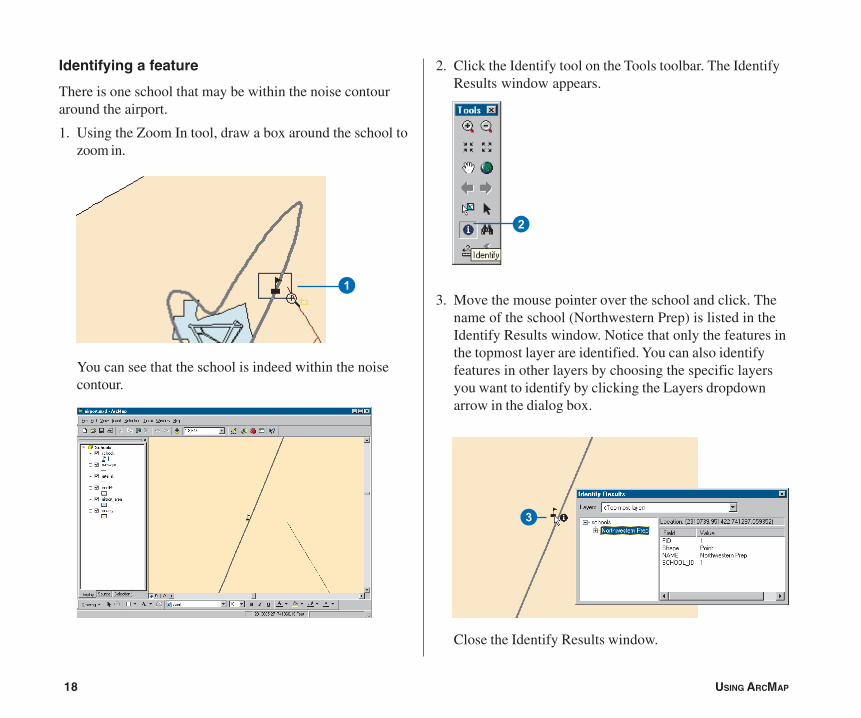
Identifying a feature
There is one school that may be within the noise contouraround the airport.
1. Using the Zoom In tool, draw a box around the school tozoom in.
You can see that the school is indeed within the noisecontour.
2. Click the Identify tool on the Tools toolbar. The IdentifyResults window appears.
3. Move the mouse pointer over the school and click. Thename of the school (Northwestern Prep) is listed in theIdentify Results window. Notice that only the features inthe topmost layer are identified. You can also identifyfeatures in other layers by choosing the specific layersyou want to identify by clicking the Layers dropdownarrow in the dialog box.
Close the Identify Results window.
1
3
2
ch02-tutorial.pmd 02/10/2005, 9:02 AM18

QUICK-START TUTORIAL 19
4. Click the Back button on the Tools toolbar to return toyour previous view.
Adding graphics
You can add text and other graphics to your display usingthe Draw toolbar at the bottom of the ArcMap window.
1. Click the New Text button. The pointer changes to acrosshair with an A.
2. Move the mouse pointer near the school you identifiedand click.
3. In the text box that appears, type “Northwestern Prep”and press Enter.
A blue dotted line surrounds the text, indicating it iscurrently selected. You can drag the text to a newposition by clicking and holding down the mouse buttonwhile dragging the text, then releasing the button.
4
1
3
4. When you’re finished positioning the text near theschool, click outside the text box to deselect it.
For more information on working with text, see Chapter 7,‘Working with graphics and text’.
ch02-tutorial.pmd 02/10/2005, 9:02 AM19
20 USING ARCMAP
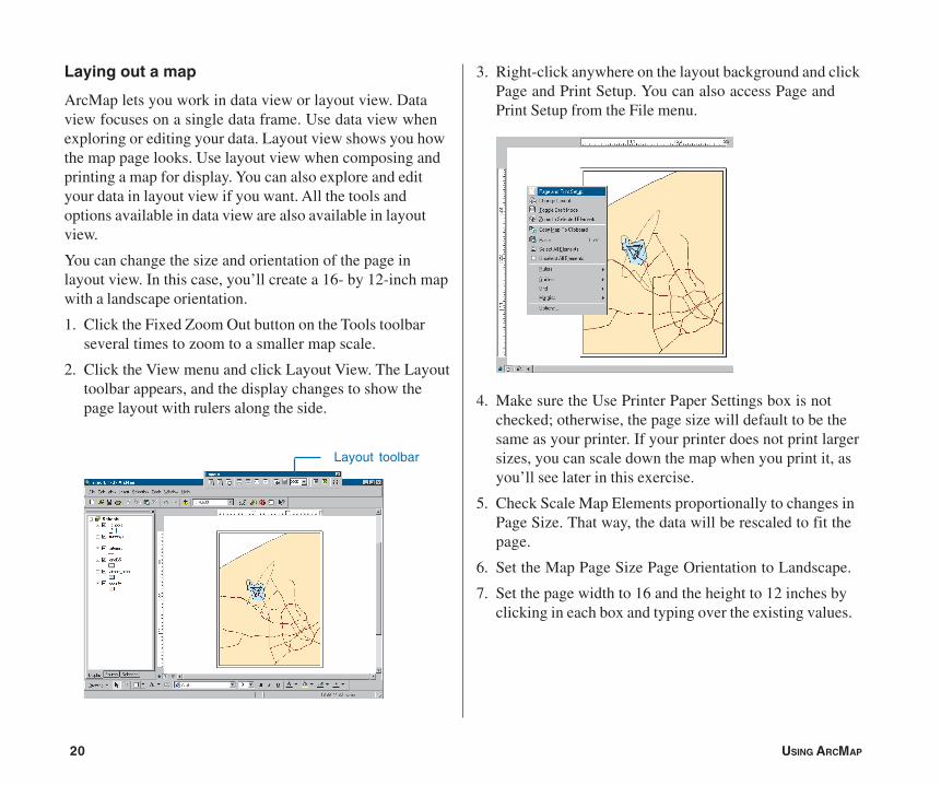
Laying out a map
ArcMap lets you work in data view or layout view. Dataview focuses on a single data frame. Use data view whenexploring or editing your data. Layout view shows you howthe map page looks. Use layout view when composing andprinting a map for display. You can also explore and edityour data in layout view if you want. All the tools andoptions available in data view are also available in layoutview.
You can change the size and orientation of the page inlayout view. In this case, you’ll create a 16- by 12-inch mapwith a landscape orientation.
1. Click the Fixed Zoom Out button on the Tools toolbarseveral times to zoom to a smaller map scale.
2. Click the View menu and click Layout View. The Layouttoolbar appears, and the display changes to show thepage layout with rulers along the side.
3. Right-click anywhere on the layout background and clickPage and Print Setup. You can also access Page andPrint Setup from the File menu.
4. Make sure the Use Printer Paper Settings box is notchecked; otherwise, the page size will default to be thesame as your printer. If your printer does not print largersizes, you can scale down the map when you print it, asyou’ll see later in this exercise.
5. Check Scale Map Elements proportionally to changes inPage Size. That way, the data will be rescaled to fit thepage.
6. Set the Map Page Size Page Orientation to Landscape.
7. Set the page width to 16 and the height to 12 inches byclicking in each box and typing over the existing values.
Layout toolbar
ch02-tutorial.pmd 02/10/2005, 9:02 AM20

QUICK-START TUTORIAL 21
Zooming in on the page
The Layout toolbar controls your view of the scale andposition of the whole map, as opposed to the data layers onthe map. By default, the map size is set so you can see allof it. But at this scale it’s hard to see the school name.
1. Click Zoom to 100% on the Layout toolbar. The page isdisplayed at the actual printed size so you can see thedetail.
2. Click the Pan button on the Layout toolbar and drag themap to the lower left so you can see the name of theschool.
8. Click OK. The page display and rulers change to reflectthe new size and orientation. You may need to resizeyour data frame manually to make it look like the mapbelow. To do this, click the Select Elements tool on theTools toolbar, click the data frame, and resize the dataframe using the blue selection handles.
1
2
5 8
6
7
4
ch02-tutorial.pmd 02/10/2005, 9:02 AM21

22 USING ARCMAP
3. Click the Zoom Whole Page button on the Layouttoolbar to see the entire page again.
Inserting map elements
ArcMap makes it easy to add titles, legends, North arrows,and scalebars to your map.
1. Click Insert on the Main menu and click Title. In the boxthat appears, type the title for your map, “Schools andNoise Contour”, and press Enter.
3
ch02-tutorial.pmd 02/10/2005, 9:02 AM22

QUICK-START TUTORIAL 23
2. On the Draw toolbar at the bottom of the window, clickthe Text Size dropdown arrow and click 36 to changethe title to 36 point.
3. Click the title and drag it so it’s centered at the top of themap.
The Draw toolbar lets you add and change the format—font, size, color, and so on—of text and graphicelements, such as boxes, callout lines, or circles, on yourmap.
4. Click Insert and click Legend.
The Legend Wizard appears.
5. Click Next several times to step through the wizardaccepting the default legend parameters. Click Finishwhen done.
3
ch02-tutorial.pmd 02/10/2005, 9:02 AM23

24 USING ARCMAP
By default, ArcMap scales the legend to the page andincludes all the layers that are currently displayed. Youcan modify the legend by right-clicking it and choosingProperties from the menu that appears. For now, just usethe default legend.
6. Click and drag the legend to the lower-left corner of themap.
7. Click Insert and click North Arrow. The North ArrowSelector window appears.
8. Click ESRI North 1 and click OK. Click and drag theNorth arrow so it is to the right of the legend.
ch02-tutorial.pmd 02/10/2005, 9:02 AM24
QUICK-START TUTORIAL 25
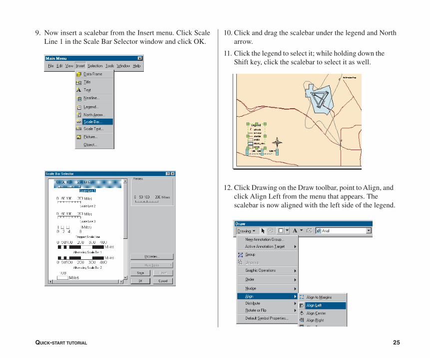
9. Now insert a scalebar from the Insert menu. Click ScaleLine 1 in the Scale Bar Selector window and click OK.
10. Click and drag the scalebar under the legend and Northarrow.
11. Click the legend to select it; while holding down theShift key, click the scalebar to select it as well.
12. Click Drawing on the Draw toolbar, point to Align, andclick Align Left from the menu that appears. Thescalebar is now aligned with the left side of the legend.
ch02-tutorial.pmd 02/10/2005, 9:02 AM25
26 USING ARCMAP
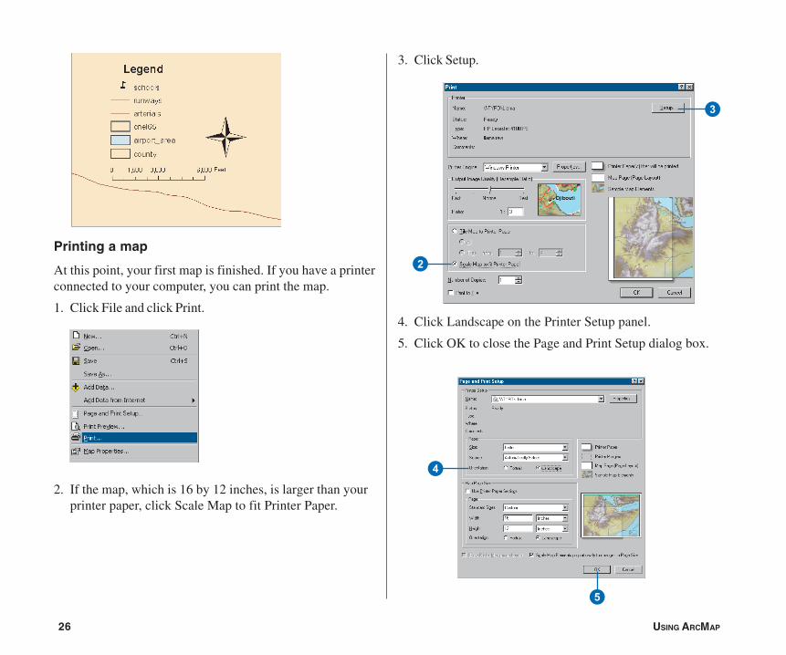
Printing a map
At this point, your first map is finished. If you have a printerconnected to your computer, you can print the map.
1. Click File and click Print.
2. If the map, which is 16 by 12 inches, is larger than yourprinter paper, click Scale Map to fit Printer Paper.
3. Click Setup.
4. Click Landscape on the Printer Setup panel.
5. Click OK to close the Page and Print Setup dialog box.
3
2
5
4
ch02-tutorial.pmd 02/10/2005, 9:02 AM26

QUICK-START TUTORIAL 27
6. Click OK on the Print dialog box to print your map.
Saving a map
Save your map in the folder with the tutorial data. First,though, ensure that ArcMap uses the full pathname of thelocation of the data on your system. The airport map wascreated using relative pathnames, so ArcMap would findand display the data after the ArcTutor\Map folder is copiedto your system.
1. Click File and click Map Properties.
2. Click Data Source Options on the Properties dialog box.
3. Click Store full path names and click OK.
4. Click OK on the Map Properties dialog box.
Now save a copy of your map. You’ll use this copy in thesubsequent exercises.
1. Click File and click Save As.
2. In the File name box, type “airport_ex”.
3. Click Save.
You can continue with the tutorial or stop and complete it ata later time.
2
23
3
ch02-tutorial.pmd 02/10/2005, 9:02 AM27
28 USING ARCMAP
Exercise 2: Working with geographic features
In this exercise, you’ll map the amount of each land usetype within the noise contour. You’ll add data to your map,draw features based on an attribute, select specificfeatures, and summarize them in a chart.
If necessary, start ArcMap, navigate to the folder whereyou saved the map from Exercise 1 (airport_ex), and openthe map.
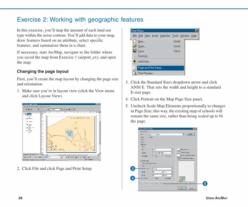
Changing the page layout
First, you’ll create the map layout by changing the page sizeand orientation.
1. Make sure you’re in layout view (click the View menuand click Layout View).
2. Click File and click Page and Print Setup.
3. Click the Standard Sizes dropdown arrow and clickANSI E. That sets the width and height to a standardE-size page.
4. Click Portrait on the Map Page Size panel.
5. Uncheck Scale Map Elements proportionally to changesin Page Size; this way, the existing map of schools willremain the same size, rather than being scaled up to fitthe page.
3
45
ch02-tutorial.pmd 02/10/2005, 9:02 AM28
QUICK-START TUTORIAL 29
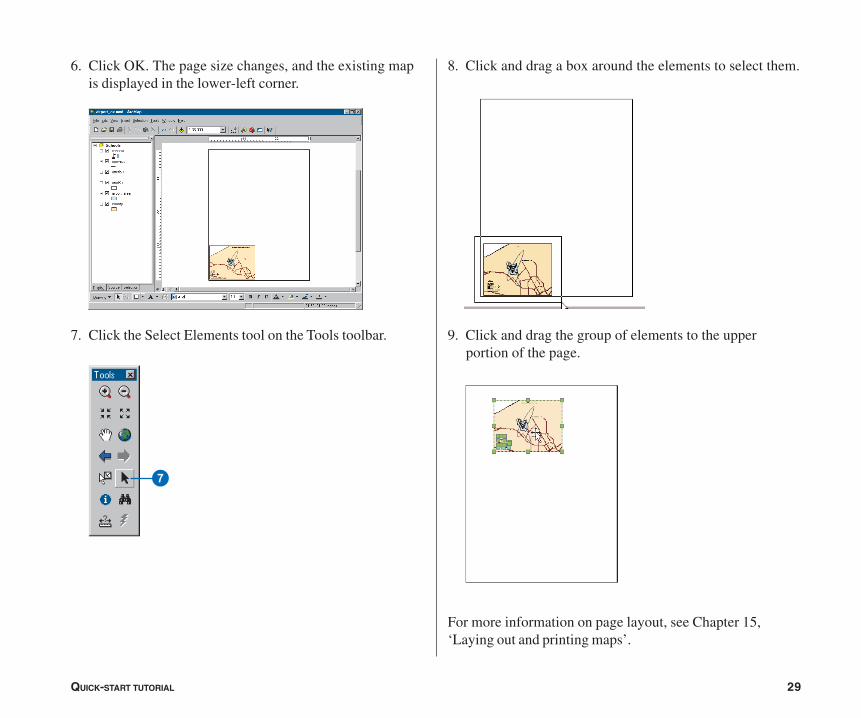
6. Click OK. The page size changes, and the existing mapis displayed in the lower-left corner.
7. Click the Select Elements tool on the Tools toolbar.
7
8. Click and drag a box around the elements to select them.
9. Click and drag the group of elements to the upperportion of the page.
For more information on page layout, see Chapter 15,‘Laying out and printing maps’.
ch02-tutorial.pmd 02/10/2005, 9:02 AM29
30 USING ARCMAP
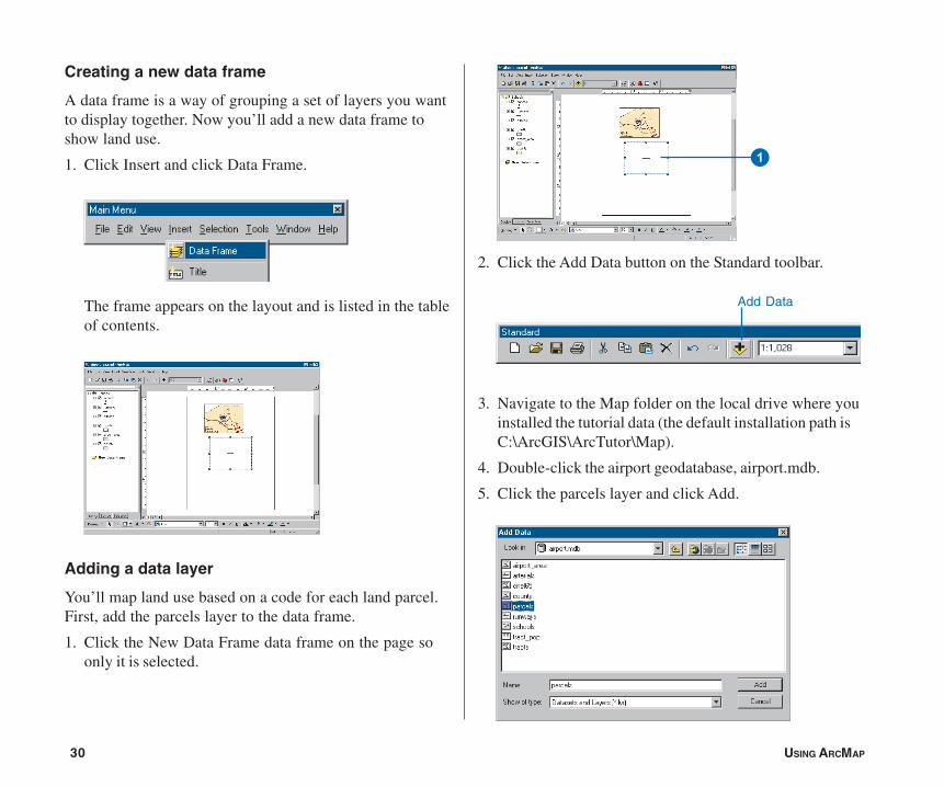
Creating a new data frame
A data frame is a way of grouping a set of layers you wantto display together. Now you’ll add a new data frame toshow land use.
1. Click Insert and click Data Frame.
The frame appears on the layout and is listed in the tableof contents.
Adding a data layer
You’ll map land use based on a code for each land parcel.First, add the parcels layer to the data frame.
1. Click the New Data Frame data frame on the page soonly it is selected.
2. Click the Add Data button on the Standard toolbar.
3. Navigate to the Map folder on the local drive where youinstalled the tutorial data (the default installation path isC:\ArcGIS\ArcTutor\Map).
4. Double-click the airport geodatabase, airport.mdb.
5. Click the parcels layer and click Add.
Add Data
1
ch02-tutorial.pmd 02/10/2005, 9:02 AM30
QUICK-START TUTORIAL 31
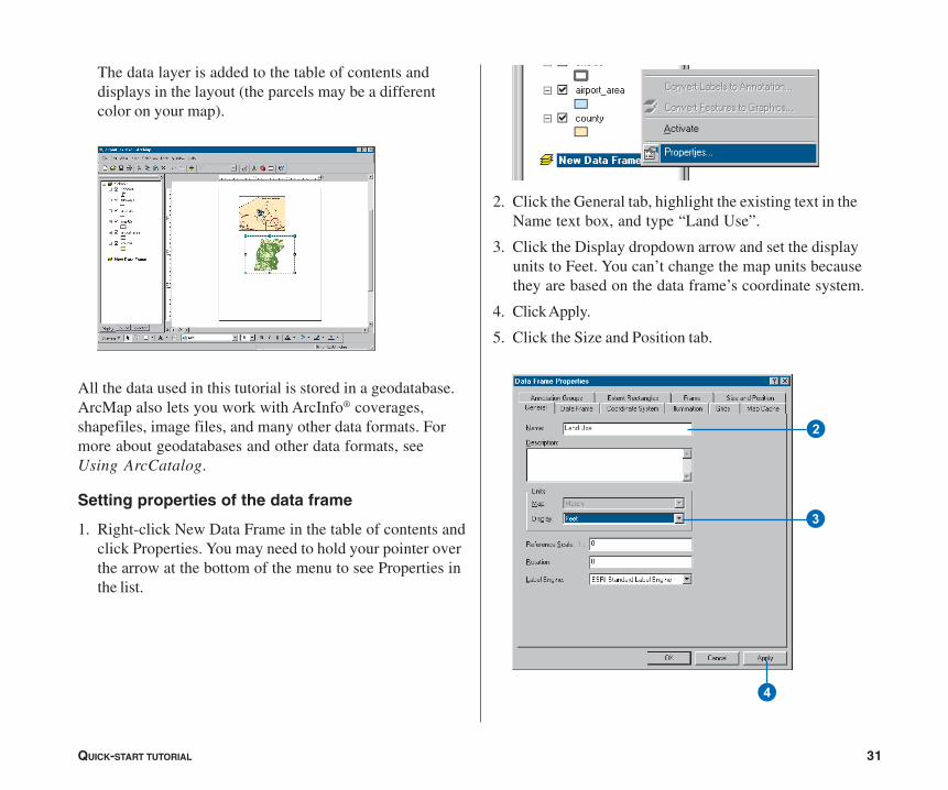
The data layer is added to the table of contents anddisplays in the layout (the parcels may be a differentcolor on your map).
All the data used in this tutorial is stored in a geodatabase.ArcMap also lets you work with ArcInfo® coverages,shapefiles, image files, and many other data formats. Formore about geodatabases and other data formats, seeUsing ArcCatalog.
Setting properties of the data frame
1. Right-click New Data Frame in the table of contents andclick Properties. You may need to hold your pointer overthe arrow at the bottom of the menu to see Properties inthe list.
2. Click the General tab, highlight the existing text in theName text box, and type “Land Use”.
3. Click the Display dropdown arrow and set the displayunits to Feet. You can’t change the map units becausethey are based on the data frame’s coordinate system.
4. Click Apply.
5. Click the Size and Position tab.
3
2
4
ch02-tutorial.pmd 02/10/2005, 9:02 AM31

32 USING ARCMAP
6. Set the X position to 15 and the Y position to 15 bytyping in the text boxes. This sets how far the lower-leftcorner of the data frame is, in inches, from the lower-left corner of the page. (You can specify X,Y positionfor another location on the data frame by clicking theappropriate box on the diagram.)
You can specify the position of any object on the page—the data frame itself, text, legends, and so on—either byselecting and dragging them or by setting the X and Yposition explicitly.
7. Click OK. The data frame is repositioned.
The data frame is highlighted with a blue square, and itsname is bold in the table of contents, indicating it is theframe you’re currently working with.
8. Hold down the Shift key and click the top data frame onthe page so both frames are selected.
9. Click Drawing on the Draw toolbar, point to Distribute,and click Make Same Size.
6
5
ch02-tutorial.pmd 02/10/2005, 9:02 AM32
QUICK-START TUTORIAL 33
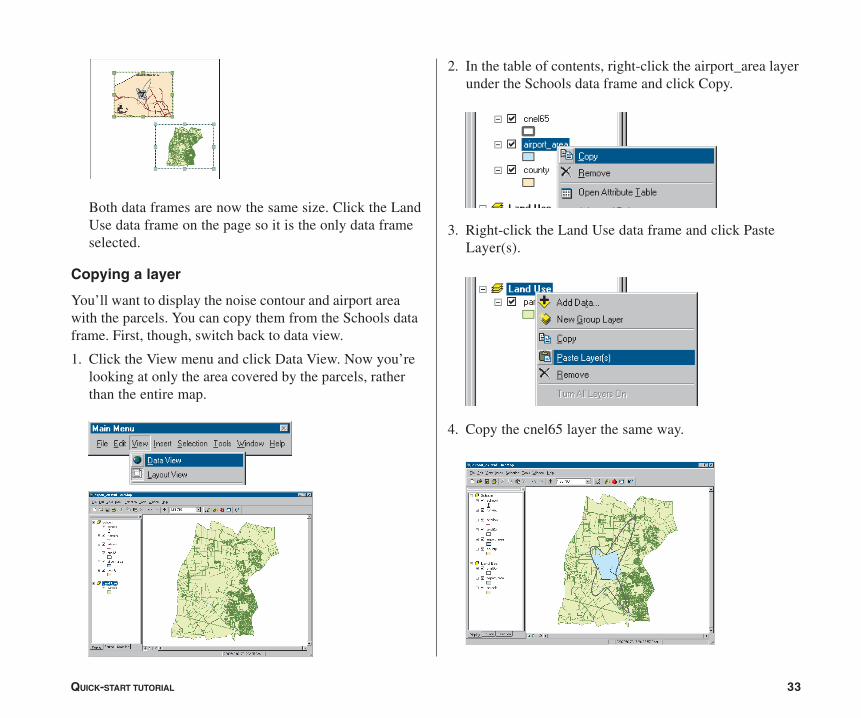
Both data frames are now the same size. Click the LandUse data frame on the page so it is the only data frameselected.
Copying a layer
You’ll want to display the noise contour and airport areawith the parcels. You can copy them from the Schools dataframe. First, though, switch back to data view.
1. Click the View menu and click Data View. Now you’relooking at only the area covered by the parcels, ratherthan the entire map.
2. In the table of contents, right-click the airport_area layerunder the Schools data frame and click Copy.
3. Right-click the Land Use data frame and click PasteLayer(s).
4. Copy the cnel65 layer the same way.
ch02-tutorial.pmd 02/10/2005, 9:02 AM33
34 USING ARCMAP
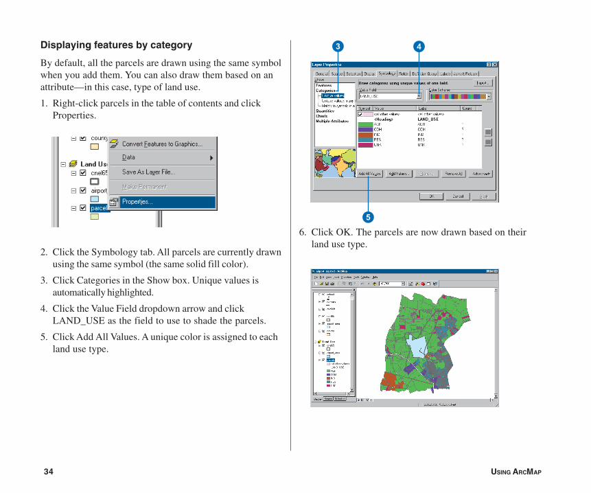
Displaying features by category
By default, all the parcels are drawn using the same symbolwhen you add them. You can also draw them based on anattribute—in this case, type of land use.
1. Right-click parcels in the table of contents and clickProperties.
2. Click the Symbology tab. All parcels are currently drawnusing the same symbol (the same solid fill color).
3. Click Categories in the Show box. Unique values isautomatically highlighted.
4. Click the Value Field dropdown arrow and clickLAND_USE as the field to use to shade the parcels.
5. Click Add All Values. A unique color is assigned to eachland use type.
6. Click OK. The parcels are now drawn based on theirland use type.
5
3 4
ch02-tutorial.pmd 02/10/2005, 9:02 AM34
QUICK-START TUTORIAL 35
6
7
3 4
5
Using a style
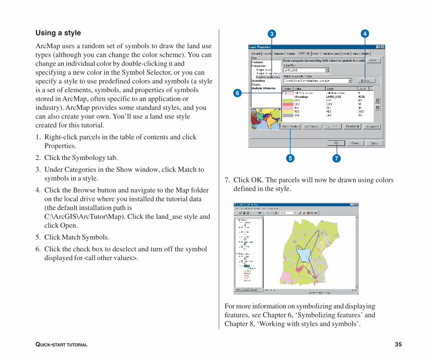
ArcMap uses a random set of symbols to draw the land usetypes (although you can change the color scheme). You canchange an individual color by double-clicking it andspecifying a new color in the Symbol Selector, or you canspecify a style to use predefined colors and symbols (a styleis a set of elements, symbols, and properties of symbolsstored in ArcMap, often specific to an application orindustry). ArcMap provides some standard styles, and youcan also create your own. You’ll use a land use stylecreated for this tutorial.
1. Right-click parcels in the table of contents and clickProperties.
2. Click the Symbology tab.
3. Under Categories in the Show window, click Match tosymbols in a style.
4. Click the Browse button and navigate to the Map folderon the local drive where you installed the tutorial data(the default installation path isC:\ArcGIS\ArcTutor\Map). Click the land_use style andclick Open.
5. Click Match Symbols.
6. Click the check box to deselect and turn off the symboldisplayed for <all other values>.
7. Click OK. The parcels will now be drawn using colorsdefined in the style.
For more information on symbolizing and displayingfeatures, see Chapter 6, ‘Symbolizing features’ andChapter 8, ‘Working with styles and symbols’.
ch02-tutorial.pmd 02/10/2005, 9:02 AM35

36 USING ARCMAP
6
43
2
5
Selecting features geographically
To find out how much of each land use is within the noisecontour, select only those parcels within the contour.
1. Click Selection and click Select By Location.
The Select By Location dialog box guides you throughcreating a geographic query.
2. In the first box, click the dropdown arrow and clickselect features from.
3. In the second box, check parcels as the layer to selectfeatures from.
4. Click the dropdown arrow for the third box and clickintersect. This will select those features in parcels thatintersect the features of cnel65.
5. In the last box, click the dropdown arrow and clickcnel65 as the layer to select by.
6. Click Apply. The selected parcels are outlined in a thickline.
7. Close the Select By Location dialog box. Notice that anyparcel even partially inside the contour is included.
For more on selection, see Chapter 13, ‘Querying maps’.
ch02-tutorial.pmd 02/10/2005, 9:02 AM36
QUICK-START TUTORIAL 37
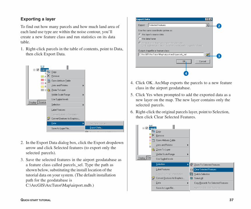
Exporting a layer
To find out how many parcels and how much land area ofeach land use type are within the noise contour, you’llcreate a new feature class and run statistics on its datatable.
1. Right-click parcels in the table of contents, point to Data,then click Export Data.
2. In the Export Data dialog box, click the Export dropdownarrow and click Selected features (to export only theselected parcels).
3. Save the selected features in the airport geodatabase asa feature class called parcels_sel. Type the path asshown below, substituting the install location of thetutorial data on your system. (The default installationpath for the geodatabase isC:\ArcGIS\ArcTutor\Map\airport.mdb.)
4. Click OK. ArcMap exports the parcels to a new featureclass in the airport geodatabase.
5. Click Yes when prompted to add the exported data as anew layer on the map. The new layer contains only theselected parcels.
6. Right-click the original parcels layer, point to Selection,then click Clear Selected Features.
2
3
4
ch02-tutorial.pmd 02/10/2005, 9:02 AM37
38 USING ARCMAP
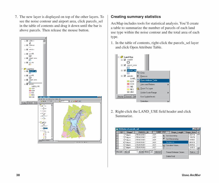
7. The new layer is displayed on top of the other layers. Tosee the noise contour and airport area, click parcels_selin the table of contents and drag it down until the bar isabove parcels. Then release the mouse button.
Creating summary statistics
ArcMap includes tools for statistical analysis. You’ll createa table to summarize the number of parcels of each landuse type within the noise contour and the total area of eachtype.
1. In the table of contents, right-click the parcels_sel layerand click Open Attribute Table.
2. Right-click the LAND_USE field header and clickSummarize.
ch02-tutorial.pmd 02/10/2005, 9:02 AM38

QUICK-START TUTORIAL 39
3
4
5
6
3. Make sure the field to summarize is LAND_USE.
4. Click the plus sign next to Shape_Area to expand it.Check Sum to summarize the area by land use type.
5. Create the output table in the airport geodatabase andname it lu_frequency.
6. Click OK. ArcMap creates a new table with a recordfor each land use type showing the number of parcels ofthat type and the total land area (in square feet).
7. Click Yes when prompted to add the resulting table tothe map. Close the parcels_sel attribute table.
Opening a table
You may have noticed that when the table is added to themap, the table of contents switches from the Display tab tothe Source tab (at the bottom of the table of contents). TheSource tab shows the location of all data in the table ofcontents; this is useful when editing data in ArcMapbecause it shows you which layers are in the sameworkspace. (When you edit in ArcMap, you edit an entireworkspace; that is, all the layers in the workspace areavailable for editing.) The Source tab also lists all tables.Tables don’t show up when the Display tab is selectedsince a table is not a geographic feature that gets displayedon the map.
1. Right-click lu_frequency in the table of contents andclick Open. You can see the number of parcels and thetotal area (in square feet) of each land use type.
2. Close the table window.
ch02-tutorial.pmd 02/10/2005, 9:02 AM39

40 USING ARCMAP
7
8
9
Q
3
4
5
6
2
Making a graph
Next you’ll create a column graph showing the number ofparcels of each land use type.
1. Click the Tools menu, point to Graphs, and click Create.The Graph Wizard appears.
2. On the Graph Wizard dialog box, click the Column graphand click Next.
3. Click lu_frequency as the table containing the data tograph.
4. Make sure that Use selected set of features or recordsis not checked.
5. Check the field Count_LAND_USE as the field tograph.
6. Click Graph data series using Records and click Next.
7. Type “Land Use in Noise Contour” as the title.
8. Check Label X Axis With and click LAND_USE as thelabeling field.
9. Uncheck Show Legend.
10. Check Show Graph on Layout and click Finish.
The graph appears on the layout. You can see that most ofthe parcels are residential.
ch02-tutorial.pmd 02/10/2005, 9:02 AM40
QUICK-START TUTORIAL 41
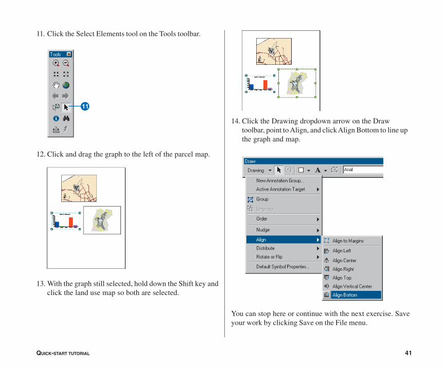
11. Click the Select Elements tool on the Tools toolbar.
12. Click and drag the graph to the left of the parcel map.
13. With the graph still selected, hold down the Shift key andclick the land use map so both are selected.
W
14. Click the Drawing dropdown arrow on the Drawtoolbar, point to Align, and click Align Bottom to line upthe graph and map.
You can stop here or continue with the next exercise. Saveyour work by clicking Save on the File menu.
ch02-tutorial.pmd 02/10/2005, 9:02 AM41
42 USING ARCMAP
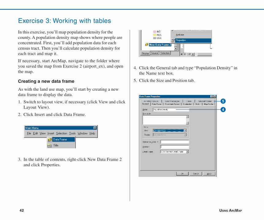
Exercise 3: Working with tables
In this exercise, you’ll map population density for thecounty. A population density map shows where people areconcentrated. First, you’ll add population data for eachcensus tract. Then you’ll calculate population density foreach tract and map it.
If necessary, start ArcMap, navigate to the folder whereyou saved the map from Exercise 2 (airport_ex), and openthe map.
Creating a new data frame
As with the land use map, you’ll start by creating a newdata frame to display the data.
1. Switch to layout view, if necessary (click View and clickLayout View).
2. Click Insert and click Data Frame.
3. In the table of contents, right-click New Data Frame 2and click Properties.
4. Click the General tab and type “Population Density” inthe Name text box.
5. Click the Size and Position tab.
5
4
ch02-tutorial.pmd 02/10/2005, 9:02 AM42

QUICK-START TUTORIAL 43
6. Set the X position to 9 and the Y position to 2.5.
7. Click OK.
10. Click the Population Density data frame on the page soit is the only one selected.
Adding data from ArcCatalog
You’ll add the layers you need by dragging them fromArcCatalog™.
1. Start ArcCatalog by clicking the ArcCatalog button onthe Standard toolbar in ArcMap. Position the ArcCatalogand ArcMap windows so ArcMap is visible behind theArcCatalog window.
8. Hold down the Shift key and click the middle data frame(Land Use) on the page so both frames are selected.
9. Click Drawing on the Draw toolbar, point to Distribute,and click Make Same Size.
The data frames are now the same size.
7
6
ArcCatalog
ch02-tutorial.pmd 02/10/2005, 9:02 AM43

44 USING ARCMAP
2. In ArcCatalog, navigate to the Map folder on the localdrive where you installed the tutorial data (the defaultinstallation path is C:\ArcGIS\ArcTutor\Map).
3. Click the plus sign next to the Map folder to list thecontents.
4. Click the airport geodatabase icon to display the contentsin the right panel.
5. In the right panel, click arterials.
6. Hold down the Ctrl key and click tracts and airport_areato select them as well. The layers are highlighted as youselect them.
7. Point to arterials, hold down the left mouse button, anddrag the pointer over the ArcMap layout view(anywhere is fine).
8. Release the mouse button. All three layers are added tothe new data frame.
9. Close ArcCatalog.
10. Click tracts in the ArcMap table of contents so only it isselected. Right-click tracts and click Zoom To Layer.The map redraws to show all the tracts and centersthem in the data frame.
7
ch02-tutorial.pmd 02/10/2005, 9:02 AM44

QUICK-START TUTORIAL 45
11. Right-click the Population Density data frame in thetable of contents and click Properties.
12. Click the General tab, click the Display dropdown arrow,and set the display units to Feet. You can’t change themap units because they are based on the data frame’scoordinate system. Click OK.
Adding tabular data
You also need to add the table containing the populationdata to your data frame.
1. In ArcMap, click the Add Data button.
2. Navigate to the Map folder on the local drive where youinstalled the tutorial data (the default installation path is
C:\ArcGIS\ArcTutor\Map) and double-click the airportgeodatabase.
3. Click tract_pop (the icon looks like a table).
4. Click Add. The table is added to the Population Densitydata frame in the table of contents. ArcMap activatesthe Source tab so you can access the table.
Joining tables
The next step is to join the table containing the populationdata to the census tract data table. You’ll do this using thecensus tract ID as the common field.
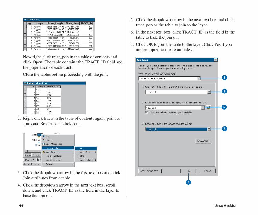
1. Right-click tracts in the table of contents and click OpenAttribute Table to see the existing attributes including thecensus tract ID.
1
E
ch02-tutorial.pmd 02/10/2005, 9:02 AM45
46 USING ARCMAP
Now right-click tract_pop in the table of contents andclick Open. The table contains the TRACT_ID field andthe population of each tract.
Close the tables before proceeding with the join.
2. Right-click tracts in the table of contents again, point toJoins and Relates, and click Join.
3. Click the dropdown arrow in the first text box and clickJoin attributes from a table.
4. Click the dropdown arrow in the next text box, scrolldown, and click TRACT_ID as the field in the layer tobase the join on.
5. Click the dropdown arrow in the next text box and clicktract_pop as the table to join to the layer.
6. In the next text box, click TRACT_ID as the field in thetable to base the join on.
7. Click OK to join the table to the layer. Click Yes if youare prompted to create an index.
3
4
5
6
7
ch02-tutorial.pmd 02/10/2005, 9:02 AM46
QUICK-START TUTORIAL 47
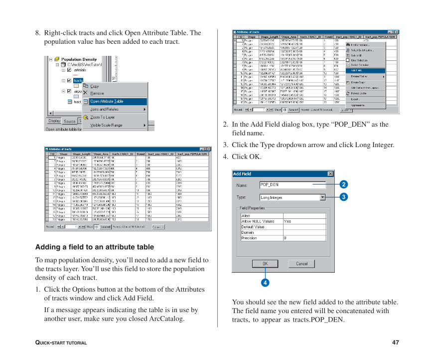
8. Right-click tracts and click Open Attribute Table. Thepopulation value has been added to each tract.
Adding a field to an attribute table
To map population density, you’ll need to add a new field tothe tracts layer. You’ll use this field to store the populationdensity of each tract.
1. Click the Options button at the bottom of the Attributesof tracts window and click Add Field.
If a message appears indicating the table is in use byanother user, make sure you closed ArcCatalog.
2. In the Add Field dialog box, type “POP_DEN” as thefield name.
3. Click the Type dropdown arrow and click Long Integer.
4. Click OK.
You should see the new field added to the attribute table.The field name you entered will be concatenated withtracts, to appear as tracts.POP_DEN.
2
3
4
ch02-tutorial.pmd 02/10/2005, 9:02 AM47
48 USING ARCMAP
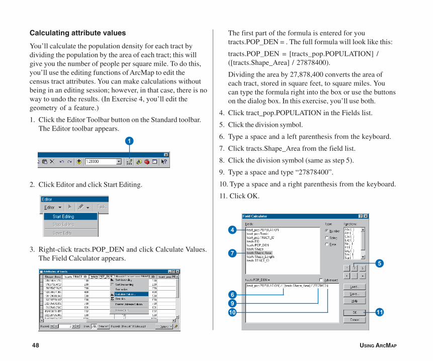
The first part of the formula is entered for youtracts.POP_DEN = . The full formula will look like this:
tracts.POP_DEN = [tracts_pop.POPULATION] /([tracts.Shape_Area] / 27878400).
Dividing the area by 27,878,400 converts the area ofeach tract, stored in square feet, to square miles. Youcan type the formula right into the box or use the buttonson the dialog box. In this exercise, you’ll use both.
4. Click tract_pop.POPULATION in the Fields list.
5. Click the division symbol.
6. Type a space and a left parenthesis from the keyboard.
7. Click tracts.Shape_Area from the field list.
8. Click the division symbol (same as step 5).
9. Type a space and type “27878400”.
10. Type a space and a right parenthesis from the keyboard.
11. Click OK.
Calculating attribute values
You’ll calculate the population density for each tract bydividing the population by the area of each tract; this willgive you the number of people per square mile. To do this,you’ll use the editing functions of ArcMap to edit thecensus tract attributes. You can make calculations withoutbeing in an editing session; however, in that case, there is noway to undo the results. (In Exercise 4, you’ll edit thegeometry of a feature.)
1. Click the Editor Toolbar button on the Standard toolbar.The Editor toolbar appears.
2. Click Editor and click Start Editing.
3. Right-click tracts.POP_DEN and click Calculate Values.The Field Calculator appears.
1
W
4
7
69Q
5
ch02-tutorial.pmd 02/10/2005, 9:14 AM48
QUICK-START TUTORIAL 49
When the dialog box closes, you can see the populationdensity values for each tract in people per square mile inthe table.
12. Click the Editor menu on the Editor toolbar and clickStop Editing.
13. Click Yes when prompted to save your edits.
14. Close the Editor toolbar and close the attribute table.
For more information on adding and calculating attributes,see Chapter 10, ‘Working with tables’.
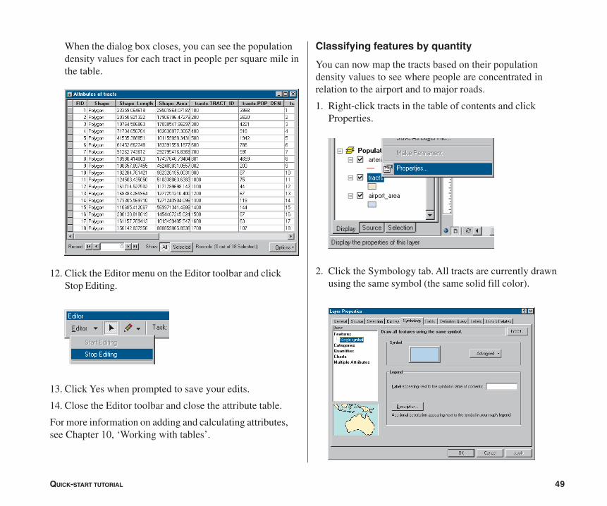
Classifying features by quantity
You can now map the tracts based on their populationdensity values to see where people are concentrated inrelation to the airport and to major roads.
1. Right-click tracts in the table of contents and clickProperties.
2. Click the Symbology tab. All tracts are currently drawnusing the same symbol (the same solid fill color).
ch02-tutorial.pmd 02/10/2005, 9:02 AM49

50 USING ARCMAP
3. Click Quantities in the Show box. Graduated colors isautomatically highlighted.
4. Click the Value dropdown arrow and clicktracts.POP_DEN as the field to use to shade the tracts.
5. Click the Color Ramp dropdown arrow and click the bluecolor ramp.
ArcMap chooses a classification scheme and the number ofclasses for you. You can modify these by clicking theClassify button in the Layer Properties dialog box. For now,just use the default classification.
6. Click OK.
7. Click the Display tab at the bottom of the table ofcontents.
8. Arterials should be at the top of the layers list. If not,click arterials in the table of contents and drag it to thetop of the layers list in the Population Density dataframe. Click airport_area and drag it so it is just belowarterials. Now these layers draw on top of the tracts.
9. Switch to data view to get a closer look at the tracts.Click View and click Data View.
For more on classifying and displaying data, see Chapter 6,‘Symbolizing features’.
You’ve now completed Exercise 3. You can continue withthe next exercise or continue at a later time. Be sure tosave your work by clicking Save on the File menu.
4
3
5
ch02-tutorial.pmd 02/10/2005, 9:02 AM50

QUICK-START TUTORIAL 51
Exercise 4: Editing features
You can use ArcMap to edit your data as well as createmaps. In this exercise you’ll extend the airport road tocreate a new loop road joining an existing arterial road. Thisexercise is a brief introduction to editing, which is coveredin more detail in Editing in ArcMap.
If necessary, start ArcMap, navigate to the folder whereyou saved the map from Exercise 3 (airport_ex), and openthe map.
Exporting data
You’ll be working with the Schools data frame. First, makea copy of the arterials data. That way, in case you need to,you can start over again with the original data.
1. Switch to data view by clicking the View menu andclicking Data View, if necessary.
2. Right-click the Schools data frame in the table ofcontents and click Activate.
3. Right-click arterials, point to Data, and click Export Data.
4. Click the Export dropdown arrow and click All features.
5. Click Use the same coordinate system as this layer’ssource data.
6. Save the new feature class as arterials_new in theairport geodatabase (the default installation path isC:\ArcGIS\ArcTutor\Map\airport.mdb).
2
4
5
7
6
ch02-tutorial.pmd 02/10/2005, 9:02 AM51

52 USING ARCMAP
7. Click OK to export the data.
8. Click Yes when prompted to add the layer to the map.
Using Export makes a copy of the data itself. If you’dchosen Copy from the menu, you’d be copying the layer,which is only a pointer to the underlying data andinformation about how the data is displayed.
Creating a new feature
You edit features in ArcMap using the Editor toolbar. All thelayers in a workspace are available for editing within thesame editing session. You specify which layer (the “target”)new features will be added to.
1. Click the Zoom In button on the Tools toolbar and zoomin to the area around the existing road and the roadyou’re adding.
2. Turn off the cnel65 and airport_area layers byunchecking the boxes next to them in the table ofcontents so you can more easily see the existing roads.
Zoom in tothis area.
2
ch02-tutorial.pmd 02/10/2005, 9:02 AM52
QUICK-START TUTORIAL 53
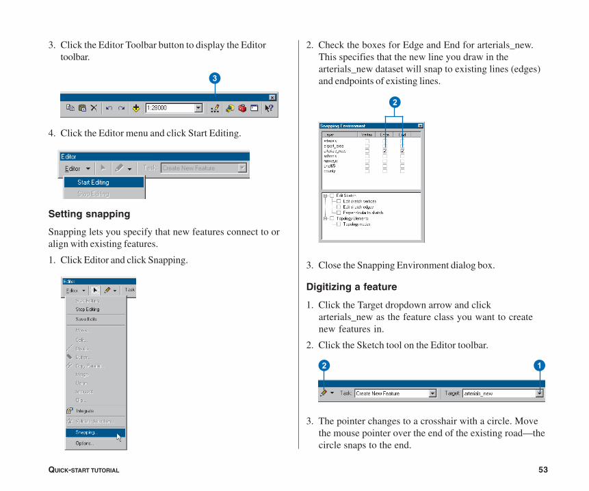
2. Check the boxes for Edge and End for arterials_new.This specifies that the new line you draw in thearterials_new dataset will snap to existing lines (edges)and endpoints of existing lines.
3. Close the Snapping Environment dialog box.
Digitizing a feature
1. Click the Target dropdown arrow and clickarterials_new as the feature class you want to createnew features in.
2. Click the Sketch tool on the Editor toolbar.
3. The pointer changes to a crosshair with a circle. Movethe mouse pointer over the end of the existing road—thecircle snaps to the end.
3. Click the Editor Toolbar button to display the Editortoolbar.
4. Click the Editor menu and click Start Editing.
Setting snapping
Snapping lets you specify that new features connect to oralign with existing features.
1. Click Editor and click Snapping.
2
3
12
ch02-tutorial.pmd 02/10/2005, 9:02 AM53
54 USING ARCMAP
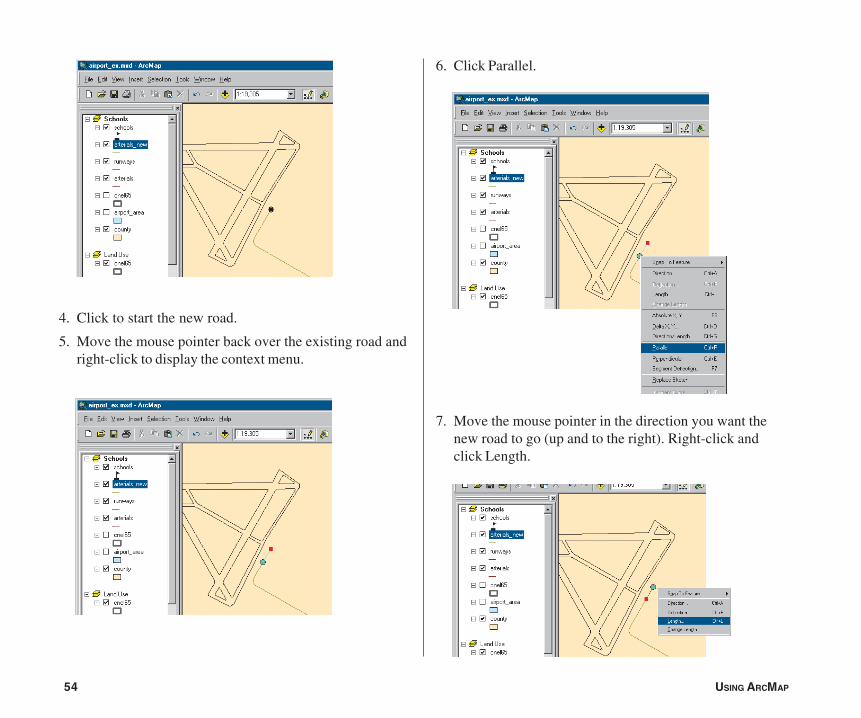
4. Click to start the new road.
5. Move the mouse pointer back over the existing road andright-click to display the context menu.
6. Click Parallel.
7. Move the mouse pointer in the direction you want thenew road to go (up and to the right). Right-click andclick Length.
ch02-tutorial.pmd 02/10/2005, 9:02 AM54

QUICK-START TUTORIAL 55
8. Type “900” (map units) and press Enter. ArcMap placesa vertex at the correct location.
9. Right-click again and click Tangent Curve.
10. Click the dropdown arrow in the upper box and clickArc Length. Click the box to the right and type a lengthof “400”. In the lower box, click the dropdown arrowand click Delta Angle. Click the box to the right andtype “90” (degrees). Click the button next to Right, ifnecessary. Then press Enter.
ArcMap draws the curve.
ch02-tutorial.pmd 02/10/2005, 9:02 AM55
56 USING ARCMAP
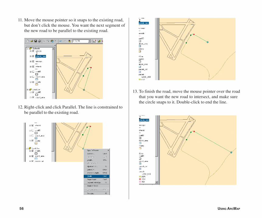
11. Move the mouse pointer so it snaps to the existing road,but don’t click the mouse. You want the next segment ofthe new road to be parallel to the existing road.
12. Right-click and click Parallel. The line is constrained tobe parallel to the existing road.
13. To finish the road, move the mouse pointer over the roadthat you want the new road to intersect, and make surethe circle snaps to it. Double-click to end the line.
ch02-tutorial.pmd 02/10/2005, 9:02 AM56

QUICK-START TUTORIAL 57
2
The new road is highlighted in a thick blue line.
Adding attributes to new features
You can also add the name of the new road.
1. Click the Attributes button on the Editor toolbar.
2. Click next to NAME on the list of attributes, type“AIRPORT DR”, and press Enter.
3. Close the Attributes window.
4. Click the Editor menu and click Stop Editing. Click Yeswhen prompted to save your edits.
5. Close the Editor toolbar.
1
ch02-tutorial.pmd 02/10/2005, 9:02 AM57
58 USING ARCMAP
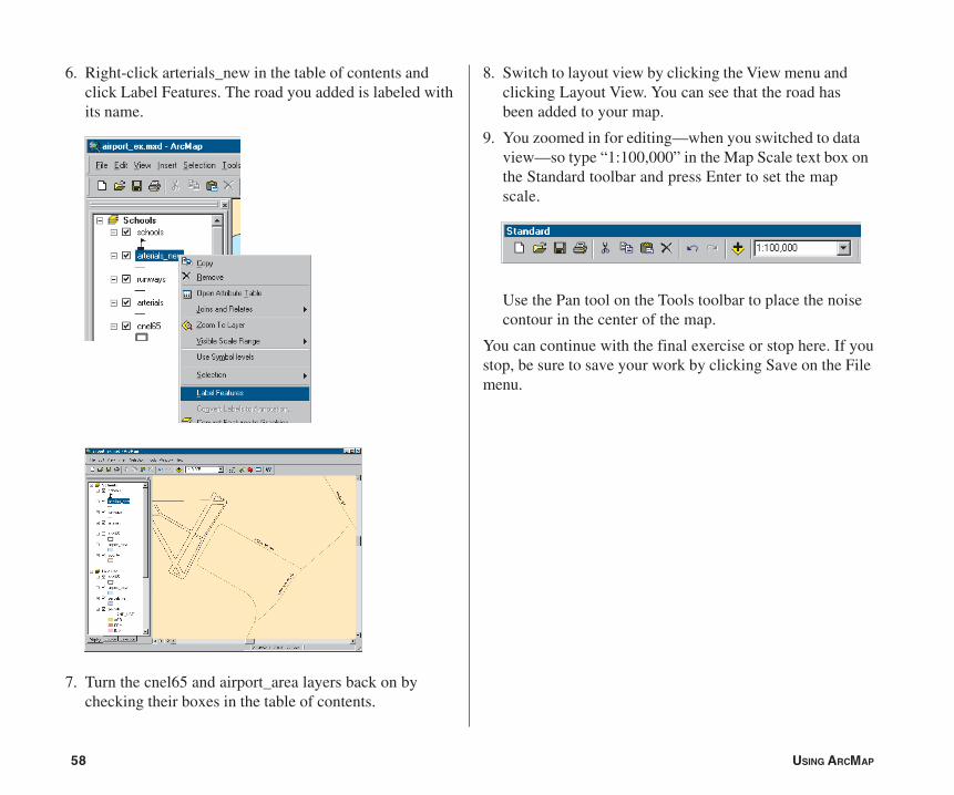
6. Right-click arterials_new in the table of contents andclick Label Features. The road you added is labeled withits name.
7. Turn the cnel65 and airport_area layers back on bychecking their boxes in the table of contents.
8. Switch to layout view by clicking the View menu andclicking Layout View. You can see that the road hasbeen added to your map.
9. You zoomed in for editing—when you switched to dataview—so type “1:100,000” in the Map Scale text box onthe Standard toolbar and press Enter to set the mapscale.
Use the Pan tool on the Tools toolbar to place the noisecontour in the center of the map.
You can continue with the final exercise or stop here. If youstop, be sure to save your work by clicking Save on the Filemenu.
ch02-tutorial.pmd 02/10/2005, 9:02 AM58

QUICK-START TUTORIAL 59
Exercise 5: Working with map elements
In this exercise, you’ll add additional map elements tocomplete your poster and print it.
If necessary, start ArcMap, navigate to the folder whereyou saved the map from Exercise 4 (airport_ex), and openthe map.
Adding a background, titles, legends, andscalebars
1. Switch to layout view by clicking the View menu andclicking Layout View, if necessary.
2. Click the Land Use data frame on the page so it’shighlighted. In the table of contents, uncheck theparcels_sel layer so it’s not displayed—that way, themap will show the land use types within the noisecontour. 4. Click the Frame tab. Click the Background dropdown
arrow and click Sand. Click OK.
3. Right-click the data frame and click Properties.
42
ch02-tutorial.pmd 02/10/2005, 9:03 AM59

60 USING ARCMAP
8. Drag the title onto the Land Use data frame, as shownbelow.
9. Click Insert and click Legend.
The Legend Wizard appears.
10. Click Next several times to step through the wizard,accepting the default legend parameters. Click Finishwhen you’re done.
5. Click Insert and click Title.
6. Type “Land Use within Noise Contour” in the text boxand press Enter.
7. Click the Text Size dropdown arrow on the Drawtoolbar. Click 36 to make the title 36 point.
6
8
ch02-tutorial.pmd 02/10/2005, 9:03 AM60
QUICK-START TUTORIAL 61
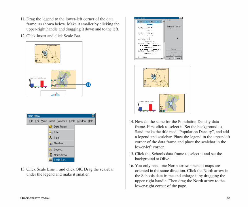
11. Drag the legend to the lower-left corner of the dataframe, as shown below. Make it smaller by clicking theupper-right handle and dragging it down and to the left.
12. Click Insert and click Scale Bar.
13. Click Scale Line 1 and click OK. Drag the scalebarunder the legend and make it smaller.
14. Now do the same for the Population Density dataframe. First click to select it. Set the background toSand, make the title read “Population Density”, and adda legend and scalebar. Place the legend in the upper-leftcorner of the data frame and place the scalebar in thelower-left corner.
15. Click the Schools data frame to select it and set thebackground to Olive.
16. You only need one North arrow since all maps areoriented in the same direction. Click the North arrow inthe Schools data frame and enlarge it by dragging theupper-right handle. Then drag the North arrow to thelower-right corner of the page.
W
ch02-tutorial.pmd 02/10/2005, 9:03 AM61
62 USING ARCMAP
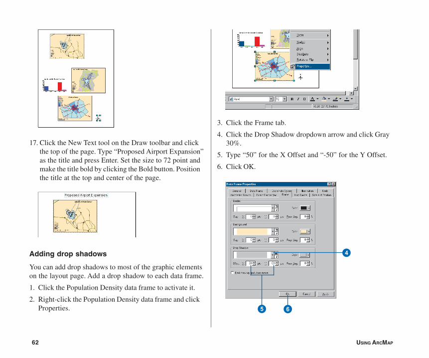
17. Click the New Text tool on the Draw toolbar and clickthe top of the page. Type “Proposed Airport Expansion”as the title and press Enter. Set the size to 72 point andmake the title bold by clicking the Bold button. Positionthe title at the top and center of the page.
Adding drop shadows
You can add drop shadows to most of the graphic elementson the layout page. Add a drop shadow to each data frame.
1. Click the Population Density data frame to activate it.
2. Right-click the Population Density data frame and clickProperties.
3. Click the Frame tab.
4. Click the Drop Shadow dropdown arrow and click Gray30%.
5. Type “50” for the X Offset and “-50” for the Y Offset.
6. Click OK.
65
4
ch02-tutorial.pmd 02/10/2005, 9:03 AM62
QUICK-START TUTORIAL 63
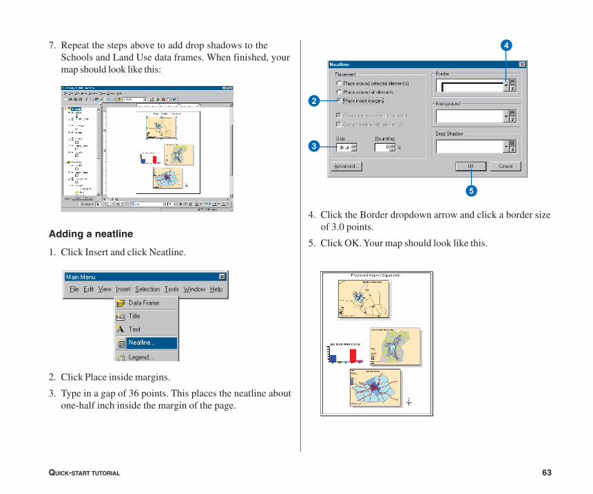
7. Repeat the steps above to add drop shadows to theSchools and Land Use data frames. When finished, yourmap should look like this:
Adding a neatline
1. Click Insert and click Neatline.
2. Click Place inside margins.
3. Type in a gap of 36 points. This places the neatline aboutone-half inch inside the margin of the page.
4. Click the Border dropdown arrow and click a border sizeof 3.0 points.
5. Click OK. Your map should look like this.
4
2
3
5
ch02-tutorial.pmd 02/10/2005, 9:03 AM63
64 USING ARCMAP
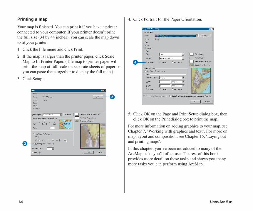
Printing a map
Your map is finished. You can print it if you have a printerconnected to your computer. If your printer doesn’t printthe full size (34 by 44 inches), you can scale the map downto fit your printer.
1. Click the File menu and click Print.
2. If the map is larger than the printer paper, click ScaleMap to fit Printer Paper. (Tile map to printer paper willprint the map at full scale on separate sheets of paper soyou can paste them together to display the full map.)
3. Click Setup.
2
3
4. Click Portrait for the Paper Orientation.
5. Click OK on the Page and Print Setup dialog box, thenclick OK on the Print dialog box to print the map.
For more information on adding graphics to your map, seeChapter 7, ‘Working with graphics and text’. For more onmap layout and composition, see Chapter 15, ‘Laying outand printing maps’.
In this chapter, you’ve been introduced to many of theArcMap tasks you’ll often use. The rest of this bookprovides more detail on these tasks and shows you manymore tasks you can perform using ArcMap.
4
ch02-tutorial.pmd 02/10/2005, 9:03 AM64

![SNS Planning Elements Tabletop Exercise [Exercise Location] [Exercise Date] [Insert Logo Here]](https://img.pdfslide.us/doc/110x75/5a4d1b3a7f8b9ab05999e3c9/sns-planning-elements-tabletop-exercise-exercise-location-exercise-date.jpg)

![EDS Demobilization Tabletop Exercise [Exercise Location] [Exercise Date] [Insert Logo Here]](https://img.pdfslide.us/doc/110x75/56649e865503460f94b898d0/eds-demobilization-tabletop-exercise-exercise-location-exercise-date-insert.jpg)

![STATEWIDE MEDICAL AND HEALTH EXERCISE PHASE III: TABLETOP EXERCISE [Exercise Name/Exercise Date]](https://img.pdfslide.us/doc/110x75/56649e535503460f94b48b86/statewide-medical-and-health-exercise-phase-iii-tabletop-exercise-exercise.jpg)


![[Exercise Name] Exercise Plan](https://img.pdfslide.us/doc/110x75/629a016aca1e2365472404dc/exercise-name-exercise-plan.jpg)


![[EXERCISE NAME} Player Briefing [Exercise Date] Player Briefing [Exercise Date]](https://img.pdfslide.us/doc/110x75/56649ee65503460f94bf6431/exercise-name-player-briefing-exercise-date-player-briefing-exercise-date.jpg)
![EDS Security Tabletop Exercise [Exercise Location] [Exercise Date] [Insert Logo Here]](https://img.pdfslide.us/doc/110x75/56649dbb5503460f94aac3ec/eds-security-tabletop-exercise-exercise-location-exercise-date-insert.jpg)
![EDS Public Information Tabletop Exercise [Exercise Location] [Exercise Date] [Insert Logo Here]](https://img.pdfslide.us/doc/110x75/56649cdd5503460f949a8064/eds-public-information-tabletop-exercise-exercise-location-exercise-date.jpg)