Embed Size (px)
Citation preview

Department of Mechanical and Aerospace Engineering
APPROACH TO ENERGY RELATED CITY MAPPING
FOR UTILITIES AND LOCAL AUTHORITIES
Author: Patrícia Vidal Gea
Supervisor: Dr. Joe Clarke
A thesis submitted in partial fulfilment for the requirement of the degree
Master of Science
Sustainable Engineering: Renewable Energy Systems and the Environment
2012

Approach to energy related city mapping for utilities and local authorities.
MSc Renewable Energy Systems & the Environment 2 of 111
Copyright Declaration
This thesis is the result of the author’s original research. It has been composed by the
author and has not been previously submitted for examination which has led to the
award of a degree.
The copyright of this thesis belongs to the author under the terms of the United
Kingdom Copyright Acts as qualified by University of Strathclyde Regulation 3.50.
Due acknowledgement must always be made of the use of any material contained in, or
derived from, this thesis.
Signed: Date: 7th September 2012

Approach to energy related city mapping for utilities and local authorities.
MSc Renewable Energy Systems & the Environment 3 of 111
Abstract
At present, society is becoming more self conscious about the fact that carbon
emissions should be reduced to minimize the impact of a climate change with
hypothetical anthropogenic origins. This belief has lead countries all over the world to
establish ambitious carbon restrictive targets. Moreover, buildings energy consumption
is responsible for roughly a 40% of the total European greenhouse gas emissions [1],
thus, it seems that this sector has a key role to play in helping achieve the government
targets.
On the other hand, we are moving fast towards smarter cities, which will be based
on information systems. Smart metering systems are meant to be installed in the
majority of households by 2019 [2], one of their roles being to provide real time high
resolution consumption data to utilities. The benefits of modelling this information in
order to obtain a better knowledge of the current system seem evident. Therefore, the
aim of this project will be to perform an approach to carbon mapping in urban areas by
means of GIS software in order to show, in first instance, its potential for accomplishing
the government targets and further to explore the range of possibilities that this software
can offer to utilities and local authorities.
The steps in this project are: detection of the options that GIS software can offer in
the energy field, determination of the information that is considered relevant for the
previous purposes and is going to be included in the maps; identification of the
information sources; definition of the data treatment prior to representation, exploration
of the different viable representation techniques and consultation to energy experts.
The results include a list of functionalities that GIS offers to utilities and local
authorities and an extensive research on the best ways to represent energy related data in
urban areas.

Approach to energy related city mapping for utilities and local authorities.
MSc Renewable Energy Systems & the Environment 4 of 111
Acknowledgments
I want to express my sincere thanks to my supervisor, Dr. Joe Clarke, for his support
and good advice throughout the project realisation. Also special thanks to Dr. Jae-Min
Kim, of the ESRU department, for his time and dedication.
I would also like to thank Derek Drummond and Ciaran Higgins from Scottish Power,
for their time and help.
My gratitude to Dr. Michael Grant, who listened to my queries at the initial stage of my
project and helped me to move forward.
Special thanks to all the anonymous energy experts who contributed to this project.
I would also like to extend my thanks to my family, partner and friends for their unique
unconditional support.
Finally, my most sincere thanks to the ‘Iberdrola Foundation’, which gave me the
opportunity to study this Master’s degree and have a unique life experience.

Approach to energy related city mapping for utilities and local authorities.
MSc Renewable Energy Systems & the Environment 5 of 111
Table of contents
COPYRIGHT DECLARATION ............................................................................................... 2
ABSTRACT................................................................................................................................. 3
ACKNOWLEDGMENTS .......................................................................................................... 4
LIST OF FIGURES .................................................................................................................... 7
LIST OF TABLES .................................................................................................................... 10
1. INTRODUCTION ............................................................................................................. 11
1.1. OBJECTIVES ..................................................................................................................... 12 1.2. METHOD ........................................................................................................................... 12
2. KEY CONCEPTS.............................................................................................................. 13
2.1. PREVIOUS WORK .............................................................................................................. 13 2.2. INTRODUCTION TO GEOGRAPHIC INFORMATION SYSTEMS (GIS) ............................... 17 2.3. DATA SOURCES, MANAGEMENT AND ANALYSIS ............................................................. 23 2.3.1. DATA SOURCES.............................................................................................................. 23 2.3.1.1. Energy related data ..................................................................................................... 24 2.3.1.1.1. Measured data .......................................................................................................... 24 2.3.1.1.2. Data coming from simulations................................................................................. 24 2.3.1.2. Census and survey data............................................................................................... 24 2.3.1.3. Geographical data ....................................................................................................... 25 2.3.2. DATA MANAGEMENT ..................................................................................................... 25 2.3.3. DATA ANALYSIS ............................................................................................................. 27
3. SYSTEM’S FUNCTIONALITY....................................................................................... 28
4. MAPPING PROCESS STAGES: DATA TREATMENT, REPRESENTAT ION AND INTERPRETATION ................................................................................................................ 33
4.1. DATA TREATMENT ........................................................................................................... 33 4.1.1. OBTAINING A POWER CONSUMPTION VALUE FROM CONTINUOUS ENERGY METERING
LECTURES.................................................................................................................................... 33 4.1.2. OBTAINING CARBON EQUIVALENT EMISSIONS FROM ENERGY CONSUMPTION .............. 34 4.1.2.1. Conversion of gas consumption into carbon emissions.............................................. 35 4.1.2.2. Conversion of electrical consumption into carbon emissions..................................... 35 4.2. DATA REPRESENTATION .................................................................................................. 36 4.2.1. DATA DISPLAY INTRODUCTION...................................................................................... 36 4.2.2. SCENARIO CREATION..................................................................................................... 37 4.2.3. GENERAL RULES FOR ONE VARIABLE INFORMATION DISPLAYING................................ 40 4.2.3.1. Map scale issues.......................................................................................................... 40 4.2.3.2. Symbol selection......................................................................................................... 45 4.2.3.2.1. Symbol size.............................................................................................................. 45

Approach to energy related city mapping for utilities and local authorities.
MSc Renewable Energy Systems & the Environment 6 of 111
4.2.3.2.2. Symbol colour.......................................................................................................... 47 4.2.3.2.3. Symbol shape........................................................................................................... 50 4.2.3.2.4. Symbol texture......................................................................................................... 51 4.2.3.3. Data classing ............................................................................................................... 52 4.2.4. SIMULTANEOUS REPRESENTATION OF MULTIPLE VARIABLES....................................... 55 4.2.4.1. Graphical multivariable representation....................................................................... 56 4.2.4.1.1. Representation of two attributes using GIS tools..................................................... 56 4.2.4.1.2. Representation of three or more attributes using GIS tools ..................................... 77 4.2.4.2. Mathematical combination of variables...................................................................... 78 4.3. MAPS INTERPRETATION : ENERGY EXPERTS JUDGEMENT ............................................ 84
5. CONCLUSIONS ................................................................................................................ 93
6. FURTHER WORK............................................................................................................ 95
REFERENCES.......................................................................................................................... 96
ADDITIONAL REFERENCES............................................................................................. 100
APPENDIX 1 – ENERGY EXPERTS QUESTIONNAIRE................................................ 101

Approach to energy related city mapping for utilities and local authorities.
MSc Renewable Energy Systems & the Environment 7 of 111
List of figures
Fig. 1 – Representation of Glasgow carbon emissions. Source: [5]............................... 13 Fig. 2 – Representation of United Kingdom (UK) domestic energy consumption (2009) using GIS. Source: [6]. ................................................................................................... 14 Fig. 3 – Representation of the energy consumed for different purposes in a city area. Source: [7]. ..................................................................................................................... 15 Fig. 4 – Clusters of high and low energy consumers. Source: [8].................................. 15 Fig. 5 – Representation of the buildings EPC rating. Source: [9]. ................................. 16 Fig. 6 – GIS systems functionality. ................................................................................ 17 Fig. 7 – QGIS 1.7.4. interface. Source: [11]................................................................... 18 Fig. 8 – Representation of the same reality using two different methods: vector and raster layers. Source: [12]............................................................................................... 19 Fig. 9 – Information display of one point. Source: [11]................................................. 19 Fig. 10 – Attribute table. Source: [11]............................................................................ 20 Fig. 11 – Objects in space. Source: [11]......................................................................... 20 Fig. 12 – Continuous variation over space. Source: [13]. ..............................................21 Fig. 13 – Choropleth map............................................................................................... 21 Fig. 14 - Isoline map. Source: [14]................................................................................. 21 Fig. 15 – Data processing. .............................................................................................. 23 Fig. 16 – Explanation of the Concepts accuracy and precision. Source: [18]................ 24 Fig. 17 – The data management process......................................................................... 25 Fig. 18 – GIS functionalities. ......................................................................................... 28 Fig. 19 – Example of a summer demand profile curve. Source: [30]............................. 33 Fig. 20 – Example of a winter demand profile curve. Source: [30]. .............................. 34 Fig. 21 – Interaction between the variables that can be represented in the maps........... 36 Fig. 22 – Part of the scenario created attribute table. ..................................................... 40 Fig. 23 – Zoom 1 view. .................................................................................................. 41 Fig. 24 – Zoom 2 view: small areas division.................................................................. 42 Fig. 25 – Zoom 2 view: big areas division. .................................................................... 42 Fig. 26 – Zoom 3 view: small areas division.................................................................. 43 Fig. 27 – Zoom 4 view: big areas division. .................................................................... 43 Fig. 28 – Information display using points in ‘Streets view’ (zoom 1).......................... 44 Fig. 29 – Data representation using points in ‘Wards view’ (zoom 2)........................... 44 Fig. 30 – Data representation using polygons in ‘Wards view’ (zoom 2)...................... 45 Fig. 31 – Points, lines and areas different sizes. Source: [38]........................................ 45 Fig. 32 – Symbol variable size for data representation. ................................................. 46 Fig. 33 – Pictogram variable size for data representation. Source: [39]. ....................... 46 Fig. 34 – Cartogram scaling the size of the United States of America (USA) to be proportional to the number of electoral votes. Source: [40]...........................................47 Fig. 35 – Variation in colour hue, value and intensity for points, lines and polygons. Source: [38]. ................................................................................................................... 47 Fig. 36 - Sequential scale with colours transition: yellow-orange-red........................... 48 Fig. 37 – Traffic light colour scale. ................................................................................ 48 Fig. 38 – Spectral colour scale. ...................................................................................... 49 Fig. 39 – Sequential simple one colour scale: Red......................................................... 49 Fig. 40 – Cold to hot colour scale................................................................................... 50 Fig. 41 – Simple markers. Source: [11].......................................................................... 50 Fig. 42 – Font markers. Source: [11].............................................................................. 50

Approach to energy related city mapping for utilities and local authorities.
MSc Renewable Energy Systems & the Environment 8 of 111
Fig. 43 – SVG . Source: [11]. ......................................................................................... 50 Fig. 44 – Different textures for points, lines and polygons. Source: [38]. ..................... 51 Fig. 45 – Use of different densities to represent one variable values............................. 51 Fig. 46 – Equal intervals breaks. .................................................................................... 52 Fig. 47 – Quantiles. ........................................................................................................ 53 Fig. 48 – Natural breaks. ................................................................................................ 53 Fig. 49 – Standard deviation breaks. .............................................................................. 54 Fig. 50 – Pretty breaks.................................................................................................... 54 Fig. 51 – Data represented in a histogram. Source: [42]. ............................................... 55 Fig. 52 – Two variables city view (IG’s divisions): colour-coded quantitative variable & texture-coded qualitative variable (3 possible values). .................................................. 57 Fig. 53 - Two variables city view (IG’s divisions): colour-coded quantitative variable & colour-coded qualitative variable (3 possible values). ................................................... 58 Fig. 54 – Two variables city view (wards divisions): Colour-coded quantitative variable & qualitative variable represented using pie charts (3 possible values)......................... 58 Fig. 55 – Two variables city view (wards divisions): Colour-coded qualitative variable (3 possible values) & quantitative variable represented using bar charts....................... 59 Fig. 56 – Two variables ward view (DZ’s divisions): colour-coded quantitative variable & texture-coded qualitative variable (3 possible values). .............................................. 60 Fig. 57 – Two variables ward view (DZ’s divisions): colour-coded quantitative variable & colour-coded qualitative variable (3 possible values). ............................................... 60 Fig. 58 – Two variables ward view (IG’s divisions): Colour-coded quantitative variable & qualitative variable represented alphabetically (3 possible values). .......................... 61 Fig. 59 – Two variables ward view (IG’s divisions): colour-coded qualitative variable (3 possible values) & quantitative variable represented using bar charts........................... 61 Fig. 60 – Two variables streets view: colour-coded quantitative variable & shape-coded qualitative variable (3 possible values). ......................................................................... 62 Fig. 61 - Two variables streets view: size-coded quantitative variable & colour-coded qualitative variable (3 possible values). ......................................................................... 63 Fig. 62 – Energy efficiency rating graph for homes. Source: [44]................................. 64 Fig. 63 – Two variables city view (wards divisions): colour-coded qualitative variable (7 possible values) & quantitative variable represented by bars. ................................... 64 Fig. 64 – Two variables city view (wards divisions): Colour-coded quantitative variable & qualitative variable (7 possible values) represented using pie charts......................... 65 Fig. 65 – Two variables streets view: Colour-coded qualitative variable (7 possible values) & size-coded quantitative variable..................................................................... 66 Fig. 66 – Two variables city view (IG’s division): Colour-coded variable A (7 possible values) & texture-coded variable B (3 possible values). ................................................ 67 Fig. 67 - Two variables city view (wards division): Colour-coded variable A (7 possible values) & variable B (3 possible values) represented using pie charts. ......................... 68 Fig. 68 – Two variables city view (wards division): Colour-coded variable B (3 possible values) & variable A (7 possible values) represented using pie charts. ......................... 68 Fig. 69 – Two variables city view (wards division): Colour-coded variable A (7 possible values) & colour-coded variable B (3 possible values).................................................. 69 Fig. 70 – Two variables city view (wards division): Colour-coded variable B (3 possible values) & colour-coded variable A (7 possible values).................................................. 69 Fig. 71 – Two variables city view (wards division): Colour-coded variable A (7 possible values) & size-coded variable B (3 possible values)...................................................... 70 Fig. 72 – Two variables city view (wards division): Colour-coded variable B (3 possible values) & alphabetical-coded variable A (7 possible values)......................................... 70

Approach to energy related city mapping for utilities and local authorities.
MSc Renewable Energy Systems & the Environment 9 of 111
Fig. 73 – Two variables streets view: Colour-coded variable A (7 possible values) & size-coded variable B (3 possible values). ..................................................................... 71 Fig. 74 – Two variables city view (IG’s division): Colour-coded variable 1 & colour-coded variable 2.............................................................................................................. 72 Fig. 75 – Two variables city view (IG’s division): Colour-coded variable 2 & colour-coded variable 1.............................................................................................................. 73 Fig. 76 – Two variables city view (wards division): Colour-coded variable 1 & variable 2 represented using bar charts. ....................................................................................... 73 Fig. 77 – Two variables city view (wards division): Colour-coded variable 2 & variable 1 represented using bar charts. ....................................................................................... 74 Fig. 78 – Two variables city view (IG’s division): Colour-coded variable 1 & texture-coded variable 2.............................................................................................................. 74 Fig. 79 – Two variables city view (IG’s division): Colour-coded variable 2 & texture-coded variable 1.............................................................................................................. 75 Fig. 80 – Two variables streets view: Colour-coded variable 1 & size-coded variable 2......................................................................................................................................... 76 Fig. 81 – Two variables streets view: Colour-coded variable 2 & size-coded variable 1......................................................................................................................................... 76 Fig. 82 – Three variables city view (wards division): Colour-coded qualitative variable (7 possible values), texture-coded quantitative variable and size-coded qualitative variable (3 possible values). ........................................................................................... 77 Fig. 83 – Two variables city view (IG’s division). Information filtered by average inhabitants’ age under 30 years. ..................................................................................... 78 Fig. 84 – Monovariable layer. ........................................................................................ 80 Fig. 85 – Multivariable layer. ......................................................................................... 81 Fig. 86 – Weighing factors option 1. .............................................................................. 82 Fig. 87 – Weighing factors option 2. .............................................................................. 83 Fig. 88 – Answers to question 1 presented in a pie chart. .............................................. 84 Fig. 89 – Answers to question 2 presented in a pie chart. .............................................. 85 Fig. 90 – Answers to question 3 presented in a pie chart. .............................................. 86 Fig. 91 – Answers to question 4 presented in a pie chart. .............................................. 87 Fig. 92 – Answers to question 5 presented in a pie chart. .............................................. 88 Fig. 93 – Answers to question 6 presented in a pie chart. .............................................. 89 Fig. 94 – Answers to question 7 presented in a pie chart. .............................................. 90 Fig. 95 – Answers to question 8 presented in a pie chart. .............................................. 91

Approach to energy related city mapping for utilities and local authorities.
MSc Renewable Energy Systems & the Environment 10 of 111
List of tables
Table 1 – Energy related data. ........................................................................................ 30 Table 2 – Census and survey data. ................................................................................. 31 Table 3 – Geographical data........................................................................................... 31 Table 4 – Costs and benefits of using GIS. Source: [15] ...............................................32 Table 5 – UK fuel mix breakdown. Source: [32]. .......................................................... 35 Table 6 – Attribute table................................................................................................. 38 Table 7 – Generation of ‘Atribute table’ contents.......................................................... 39 Table 8 – Zoom levels and divisions. ............................................................................. 41 Table 9 – Selected variables, given relevance, and three possible weighing factor percentages. .................................................................................................................... 81

Approach to energy related city mapping for utilities and local authorities.
MSc Renewable Energy Systems & the Environment 11 of 111
1. Introduction
We live in an era where society is becoming more self-conscious about the existence
of a climate change with hypothetical anthropogenic origins. Many measures are being
put in place at all levels to reduce carbon emissions, such as ‘the 20-20-20 targets’ at
European level, where Europe is committed by 2020 to reduce the carbon emissions at
least by 20% compared to 1990 levels, to produce 20% of the energy consumed in the
EU with renewable resources and to reduce the energy consumption by 20% compared
to the projected levels by improving energy efficiency, which became law on June 2009
[3]; or at smaller level, the ‘Climate Change (Scotland) Act 2009’, committing
Scotland to a legally-binding 42% reduction in carbon emissions by 2020 against 1990
levels, and an 80% by 2050 [4].
Moreover buildings energy consumption (households + services) accounts for
roughly a 40-45% of the total energy use in Europe, generating significant amounts of
CO2 [1]. Thus, it is important to have a deeper knowledge of the sector emissions
generation, so that higher emitting sources can be detected, analysed, and action can be
taken in order to reduce them and get closer to the carbon commitments.
At the same time, big changes are being imposed to utilities as we move towards
smarter cities, entailing larger renewable energy deployment, smart metering and
deployment of technology information systems. Thus, huge amounts of data will be
generated by the electric network that, if well processed, can be a major source of
information on societies’ current energy consumption behaviour. Geographic
Information Systems (GIS) are an adequate tool for displaying information on maps,
such as consumed energy, energy price or equivalent carbon emissions1.
Although historically GIS tools have been used for several purposes, there is no
information available which reports on the handling of this issue. Therefore, the aim of
this project will be to perform an approach to carbon mapping in urban areas by means
of GIS software in order to show, in first instance, its potential for accomplishing the
government targets and further on explore the range of possibilities that this software
can offer to utilities and local authorities.
1 Equivalent carbon emissions of a dwelling: The total emissions generated by energy consumption,
calculated depending on the type of fuel, and in the case of electricity, depending on the balance of
generating sources.

Approach to energy related city mapping for utilities and local authorities.
MSc Renewable Energy Systems & the Environment 12 of 111
1.1. Objectives
The main purpose of this project is to prototype an approach to carbon city mapping
in order to increase the understanding of its potential for utilities and local authorities.
To do so, special attention will be put in detecting the possibilities that this tool can
offer to the described users as well as the data treatment, representation processes and
maps interpretation.
An artificial scenario will be created for representation purposes; however, it is only
intended to be illustrative of the possibilities that GIS software offers for utilities and
local authorities when using real, confidential data.
1.2. Method
To perform this approach, different main aspects will be studied in depth:
- Functionalities detection (section 3): It is the core of the project. An extensive
analysis on the range of options that GIS offers to utilities and local authorities
in relation to energy consumption will be detailed.
- Data treatment (section 4.1): All the processes that occur once the desired data
is detected until the moment when it is ready for representation, including data
filtering, combination, transformation, etc.
- Data representation (section 4.2): There is not only one single way to represent
energy data in maps; therefore, an approach to different representation
techniques will be done, using the conjecture & test method.
- Maps interpretation (section 4.3): The opinion of several energy experts will
be taken into consideration to conclude which techniques are more effective for
the energy data representation purposes.
Finally, limitations of the current approach will be identified and further work
suggested.

Approach to energy related city mapping for utilities and local authorities.
MSc Renewable Energy Systems & the Environment 13 of 111
2. Key concepts
2.1. Previous work
Previous studies have been carried out using GIS in relation to carbon emissions:
• Representation of total carbon emissions of a city (data from regional energy
statistics).
Fig. 1 – Representation of Glasgow carbon emissions. Source: [5].

Approach to energy related city mapping for utilities and local authorities.
MSc Renewable Energy Systems & the Environment 14 of 111
Also, previous work has been done in relation to energy consumption representation
in maps:
• Maps showing domestic, industrial and commercial electricity consumption at
local authority level:
Fig. 2 – Representation of United Kingdom (UK) domestic energy consumption (2009) using GIS.
Source: [6].

Approach to energy related city mapping for utilities and local authorities.
MSc Renewable Energy Systems & the Environment 15 of 111
• Observation of the relationship between energy consumption and the building
final purpose.
Fig. 3 – Representation of the energy consumed for different purposes in a city area. Source: [7].
• Study of the effect of changes in energy consumption patterns in relation to
different dwelling types and ownership.
Fig. 4 – Clusters of high and low energy consumers. Source: [8].

Approach to energy related city mapping for utilities and local authorities.
MSc Renewable Energy Systems & the Environment 16 of 111
Finally, GIS mapping has also already been used for displaying characteristics of the
building energy stock:
• Representation of energy performance certificate of buildings (EPC) to suggest a
‘Zone Energy Indicator’:
Fig. 5 – Representation of the buildings EPC rating. Source: [9].
However, the approach that is going to be presented in this project has two main
innovative aspects: the energy data origin comes from direct metering-lectures and it
considers the inclusion of different information attributes in a single map.

Approach to energy related city mapping for utilities and local authorities.
MSc Renewable Energy Systems & the Environment 17 of 111
2.2. Introduction to geographic information systems (GIS)
GIS are a very powerful tool that allows mapping data that previously could only be
displayed on a table, which allows trends and patterns to be detected. These systems
work by loading some georeferenced data as well as the maps of the area of interest.
This data is treated and presented in a suitable way (the information output can be
presented in many different ways, but what is important is that it must be consistent
with human capacity for perception). This generates an output, which consists of
information, a valuable resource that needs to be interpreted. Moreover, having the
appropriate knowledge can be a crucial factor in order to have a good understanding of
the situation and therefore extract the right conclusions.
Fig. 6 – GIS systems functionality.
GIS have been used since the late 1960s at different scales and with several different
purposes, e. g. analysing the factors causing a situation; assisting in decision making
processes, assessing risks or displaying forecasting. The main initial barrier of this
technology was the accessibility to digital data; however, soon after several countries
set up coordinating bodies in order to formulate and regulate national geographic
information strategies.
There are different GIS software packages available in the market at present, such as
ArcGis, Clark Labs IDRISI Selva, etc. However, the development of GIS open source2
programs has been notable in recent years (different websites can be found in internet
listing open source and commercial GIS software). Some of the most common open
source GIS packages are: Quantum GIS (QGIS), GeoServer, GRASS GIS, OpenMap,
etc. Chen, D. et al (2010) looked over 30 open source packages to identify a list of the
most suitable to be used for a specific purpose (entailing particular needs). The study
2 Open source: Means that the source code is easily accessible, and it can be modified, and distributed for
non-commercial purposes.

Approach to energy related city mapping for utilities and local authorities.
MSc Renewable Energy Systems & the Environment 18 of 111
highlighted that although QGIS cannot be installed in Windows Vista, it can run in
different operating systems, such as Windows or Linux. Moreover, tests showed that its
startup time is significantly faster than others, it works satisfactorily with large size
images and it has low demand for computing resources [10]. For the aforementioned
reasons, the software package selected for this project has been: Quantum GIS 1.7.4.
[11].
QGIS program interface can be roughly divided into the following main areas:
1- Menu and tool bars
2- Map legend
3- Map view
4- Map overview
Fig. 7 – QGIS 1.7.4. interface. Source: [11].
Information is stored in GIS in layers, which can be hidden or displayed in the map
view when desired. Hence, a map output is the result of overlaying different information
layers.
There are two different ways to represent the same information, using vector layers
or raster layers:
2
1
3
4

Approach to energy related city mapping for utilities and local authorities.
MSc Renewable Energy Systems & the Environment 19 of 111
Fig. 8 – Representation of the same reality using two different methods: vector and raster layers.
Source: [12].
• Vector layers: Are represented by means of discrete points, e.g. airports
location; lines, e.g. pipelines or roads; or polygons, e.g. the regions of the
country.
• Raster layers: Are images made up of grids of rectangles or squares, each
having a different colour.
Each entity in the map is defined in terms of its geographical location (spatial
coordinates) and their attributes or properties. This information can be requested when
desired for a single entity, as shown below:
Fig. 9 – Information display of one point. Source: [11].
Approach to energy related city mapping for utilities and local authorities.
MSc Renewable Energy Systems & the Environment 20 of 111
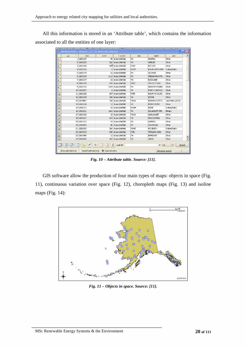
All this information is stored in an ‘Attribute table’, which contains the information
associated to all the entities of one layer:
Fig. 10 – Attribute table. Source: [11].
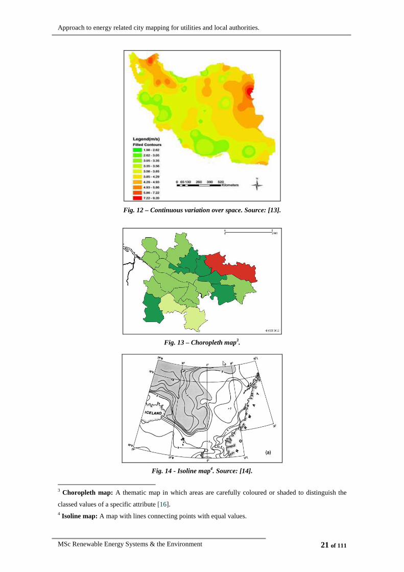
GIS software allow the production of four main types of maps: objects in space (Fig.
11), continuous variation over space (Fig. 12), choropleth maps (Fig. 13) and isoline
maps (Fig. 14):
Fig. 11 – Objects in space. Source: [11].
Approach to energy related city mapping for utilities and local authorities.
MSc Renewable Energy Systems & the Environment 21 of 111
Fig. 12 – Continuous variation over space. Source: [13].
Fig. 13 – Choropleth map3.
Fig. 14 - Isoline map4. Source: [14].
3 Choropleth map: A thematic map in which areas are carefully coloured or shaded to distinguish the
classed values of a specific attribute [16]. 4 Isoline map: A map with lines connecting points with equal values.

Approach to energy related city mapping for utilities and local authorities.
MSc Renewable Energy Systems & the Environment 22 of 111
Heywood et al. (1995) proved that the slight differences in the way different GIS
implement similar methods, can entail different results. Thus, it is crucial to understand
the way GIS software works, enabling any results to be understood and explained
correctly [15].

Approach to energy related city mapping for utilities and local authorities.
MSc Renewable Energy Systems & the Environment 23 of 111
2.3. Data sources, management and analysis
The different stages of data processing (Fig. 15), entailing the identification of data
sources, data management processes and the final maps analysis and interpretation will
be developed in this section.
Fig. 15 – Data processing.
2.3.1. Data sources
Defining the problem of study and selecting the appropriate data are crucial steps in
the design of any GIS project. Hence, a good project design is indispensable for an
appropriate output. Once the data needed in each case is determined, the identification
of the possible data sources can be completed.
Data representation in the built environment has a huge potential, since it can
provide very valuable information to companies and local authorities. However, it also
contains several significant concerns:
• The first one is how ethical it is to associate private population-related data with
discrete geographical locations. To solve this, different masking techniques can
be used to make the results anonymous so that the minimum entity can be a
single house.
• Also, there is a common technical problem: there are many sources of
population data, but these are usually not associated to any geographical
location, so a spatial referencing process is needed.
• Data quality is also crucial to have reliable results. Geographic data has three
components: spatial, temporal and thematic. Data has a good quality when it is
accurate, precise, has good resolution, is complete and consistent in the three
aforementioned aspects [17].

Approach to energy related city mapping for utilities and local authorities.
MSc Renewable Energy Systems & the Environment 24 of 111
Fig. 16 – Explanation of the Concepts accuracy and precision. Source: [18].
2.3.1.1. Energy related data
There are two main sources of energy related data: measured data and data coming
from simulations.
2.3.1.1.1. Measured data
Utilities have the consumption register of all their clients, which has been obtained
by a metering lecture. At present, in many cases this lecture is done manually by a
worker of the company, with an approximate frequency of one visit per month;
however, we are moving towards a metering system providing continuous lectures, with
intervals between 15 and 30 minutes, so the availability of electrical and gas
consumption data for all the households within the area of study will be an assumption
of this project.
2.3.1.1.2. Data coming from simulations
Data can also come from simulations. Different specific software can be used to
obtain energy consumption values, for example: a software where the inputs are the
house area, number of rooms, etc., and the output: average electrical consumption.
Data from simulations is very useful particularly for future scenarios predictions.
2.3.1.2. Census and survey data
• Building stock information: Local authorities are in possession of buildings
features information: year of construction, dwelling cadastral value, EPC rating,
etc.
• Census information: Local authorities also have information about its citizens:
age, sex, social insurance number, profession, income, etc. (This government
trend of defining each citizen by a series of numbers was defined in 1996 by
Mark Poster as ‘digital citizens’ [19]).
Approach to energy related city mapping for utilities and local authorities.
MSc Renewable Energy Systems & the Environment 25 of 111
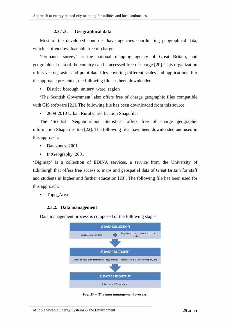
2.3.1.3. Geographical data
Most of the developed countries have agencies coordinating geographical data,
which is often downloadable free of charge.
‘Ordnance survey’ is the national mapping agency of Great Britain, and
geographical data of the country can be accessed free of charge [20]. This organization
offers vector, raster and point data files covering different scales and applications. For
the approach presented, the following file has been downloaded:
• District_borough_unitary_ward_region
‘The Scottish Government’ also offers free of charge geographic files compatible
with GIS software [21]. The following file has been downloaded from this source:
• 2009-2010 Urban Rural Classification Shapefiles
The ‘Scottish Neighbourhood Statistics’ offers free of charge geographic
information Shapefiles too [22]. The following files have been downloaded and used in
this approach:
• Datazones_2001
• IntGeography_2001
‘Digimap’ is a collection of EDINA services, a service from the University of
Edinburgh that offers free access to maps and geospatial data of Great Britain for staff
and students in higher and further education [23]. The following file has been used for
this approach:
• Topo_Area
2.3.2. Data management
Data management process is composed of the following stages:
Fig. 17 – The data management process.

Approach to energy related city mapping for utilities and local authorities.
MSc Renewable Energy Systems & the Environment 26 of 111
1) Data collection: Once the required data has been defined according to the project
requirements, it will be collected. At present, technology provides automatic data
collection devices that allow a large amount of data to be otained, in order to better
know the reality. However, this data needs to be dealt with in an easy manner that
allows storing and treating it, so that it can be converted into a suitable output that
provides the information needed. Databases are the management method most
commonly used, which consist of a set of structured data, being usually accessed by
means of a database management systems (DBMS), a set of computer programmes that
will allow users to deal with data without needing to know how it is physically
structured and stored in the computer. DBMS offer different options to present the data
in a suitable manner for the user’s purpose, allowing the data to be ordered under
specific criteria, filtered, summarised or combined to provide specific information.
However, databases also have limitations. Oxborrow [24] summarises the main
databases problems as:
• Complexity: Its utilisation may require users training.
• Cost: The overall cost includes software development and design stages,
maintenance and data storage.
• Inefficiencies in processing: When happening, will require time to get fixed up.
• Rigidity: Some databases do not accept long text strings, or other types of data.
Moreover, special attention needs to be put on data backup, recovery, auditing and
security.
The definition and filling of the database with real data (data encoding process) is
often a very time-consuming process (data input and updating can represent
approximately an 80% of the duration of many large-scale GIS projects [25]) and its
importance cannot be underestimated. The different data input methods are: manual
entry (keycoding), digital data transfer, digitalisation or scanning processes.
At present, the incorporation of GIS systems by multinational companies, local
authorities, etc. is growing; being the software compatibility with the existing internal
databases a crucial aspect for its success. These multi-user applications have specific
needs, such as security, reliability, integrity, performance and current access by
different users often using intranet systems. In most cases there is a specific department
working with GIS, controlling the data and the access to it, and dealing with all the
issues described in this chapter.

Approach to energy related city mapping for utilities and local authorities.
MSc Renewable Energy Systems & the Environment 27 of 111
Some of the most commonly used DBMS packages are:
• Open source: mySQL, PostgreSQL, etc.
• Proprietary software: Oracle, Microsoft SQL server, etc.
2) Data treatment: Once data has been collected, it undertakes different
transformation processes, depending on the final purposes, which can include data
classification, standardisation, aggregation, interpolation, error correction, etc. Errors
are inevitable along these processes (stages 1 and 2), and its minimisation is crucial, as
the reliability of the results will depend on the data quality. Linking databases to GIS
provides a further level of data value.
3) Database output: Once the necessary data has been collected from different
sources, a common ‘Coordinates reference system’ to work with needs to be chosen (a
commonly used system is WGS84, which is a global projection system). Also, when
combining data from datasets collected by different entities, knowing the metadata5 is
necessary in order to know whether it is sensible or not to represent the different data
together in a single map [26].
The data output format will depend on the map’s purpose, the audience to whom the
results are directed and the cost constraints. The huge amount of possibilities offered by
GIS software can make the maps design a very time consuming process, but at the same
time very effective.
2.3.3. Data analysis
Once the data has been collected, treated and represented, the analysis of the results
takes place, which most of the times consists in identifying spatial patterns, and where
answers to some questions can be given and decisions be made. To do so, GIS provides
some functions such as: measurement of lengths, perimeters and areas, distance
calculations, point in polygon queries (e.g. is there an entity with a specific attribute in a
given area?), shape analysis, etc.
5 Metadata: By definition it is ‘data about data’. It is a file normally attached to data files, which
indicates the origins, quality and applicability of the data.

Approach to energy related city mapping for utilities and local authorities.
MSc Renewable Energy Systems & the Environment 28 of 111
3. System’s functionality
This is a time of major changes for electrical utilities, which will have to adapt to
new government regulations in a small period of time. The adoption of GIS can be a
useful tool helping this purpose, as will be detailed in this section.
For the specific purpose of this project, which is meant to be useful to utilities
supplying gas and electricity to a specific urban area, as well as the competent local
authorities the specific functionalities have been categorised as follows:
Fig. 18 – GIS functionalities.
• Tracking previously implemented projects or policies: Previously implemented
policies can be tracked along the time to detect if they are accomplishing their
original purposes, and if they are not, analyse the current present situation and
the causes that have led to it. This can be done by representing the variables
change in a single map, which can be become relatively complex to perceive, or
by displaying a series of single maps, each one representing a moment in time
and comparing them, which tends to be easier to interpret, as it gives the user an
idea of change in time. Finally, performing an animation with the maps just
mentioned is believed to be an excellent way to introduce the temporal
component to spatial data. Some examples of this kind of functionality in the

Approach to energy related city mapping for utilities and local authorities.
MSc Renewable Energy Systems & the Environment 29 of 111
energy field would be the implementation of distributed generation technologies
(e.g. district heating) or the tracking of buildings energy consumption after
efficiency improvement actions have taken place.
• Action planning (supporting decision tool): Different strategic actions are
continuously being implemented in urban areas. Having access to information
directly or indirectly related to the decision topic will allow a decision making
process that takes into account a higher number of factors, ending up with
overall better results. Most of the time, choropleth maps are the most appropriate
for decision making, as they transmit information in a very clear and
understandable manner. An example of action planning would be the measures
implemented in order to achieve the climate change targets of a specific urban
area. The representation of the policy limitations on a map is also very useful for
action planning.
• Business, social and environmental opportunities detection: the overlap of
different layers can highlight some causality relations leading to undesirable
situations. Hence, once they are detected, action can be taken in order to be
improved. Also specific needs can be detected, creating business opportunities.
Some examples can be the detection of an area with overall higher carbon
emissions, where action should be taken in order to decrease it, the identification
of where and when infrastructure upgrades are appropriate (e.g. transmission
lines) or the feasibility of a new project depending on the surrounding area.
• Future prediction modelling: The representation on a map of the prediction of a
future situation can pinpoint specific needs and generate actions in order to
progress and take actions in advance, in order to avoid or minimise future
problems. For example, the needs of substations modifications can be studied in
a scenario with high deployment of small scale renewable and feed in tariffs.
For all the purposes exposed above, an example of the kind of information that has
been considered relevant to be included in a GIS system within the energy sector is as
follows:

Approach to energy related city mapping for utilities and local authorities.
MSc Renewable Energy Systems & the Environment 30 of 111
ATTRIBUTE UNITS
Electrical consumption
[kWh/year]
[kWh/year/person]
[kWh/year/m2]
Gas consumption
[kWh/year]
[kWh/year/person]
[kWh/year/m2]
Equivalent carbon emissions coming from electric consumption
[kg CO2/year]
[kg CO2/year/person]
[kg CO2/ year/m2]
Equivalent carbon emissions coming from gas consumption
[kg CO2/year]
[kg CO2/year/person]
[kg CO2/ year/m2]
Fuel poverty6
income
tsfuel cos
[%]
Heat to power ratio7 (X:Y)
Table 1 – Energy related data.
ATTRIBUTE UNITS (QUANTITATIVE VARIABLE) /
CLASSING (QUALITATIVE VARIABLE)
Floor area [m2]
Building type
Detached house (DH)
Semi-detached house (SD)
Flat (FL).
EPC building rating [A to G]
Heating type
Electric heaters (EH)
Gas fired heaters (GH)
HVAC (HV)
6 Fuel poverty: A household suffers from fuel poverty if more than 10% of its economic income is used
to pay heating in order to maintain a satisfactory temperature [28]. 7 Heat to power ratio: It is a ratio used to evaluate the suitability of a CHP system in a specific site. The
value represents the amount of usable heat generated per each unit of electricity generated [29].

Approach to energy related city mapping for utilities and local authorities.
MSc Renewable Energy Systems & the Environment 31 of 111
Sky availability [m2]
Number of inhabitants per dwelling -
Average inhabitants age Years old
Table 2 – Census and survey data.
ATTRIBUTE UNITS
Geographic information Mountains, rivers, oceans, lakes, landform…
Administration information City boundaries, districts…
Roads Motorways, major roads, minor roads…
Generic urban information Postcodes, street names…
Soil type Residential, commercial, parks, industrial…
Table 3 – Geographical data.
Organizations such as multinational companies, local governments or utilities are
using GIS more and more for a whole range of applications, like marketing, facilities
location and engineering applications following two main objectives: driving down
costs and improving customer service [27]. However, the decision of whether to install
a GIS system, which includes justifying the investment cost, can be complicated. Clear
objectives need to be defined prior to software acquisition; moreover, costs and benefits
need to be listed and assessed. Some of the more common are compiled in the following
table:

Approach to energy related city mapping for utilities and local authorities.
MSc Renewable Energy Systems & the Environment 32 of 111
Table 4 – Costs and benefits of using GIS. Source: [15]
A cost-benefit analysis may be a good exercise to help taking this decision; however
some of the costs and benefits of GIS may not be easy to quantify, especially the
indirect ones.

Approach to energy related city mapping for utilities and local authorities.
MSc Renewable Energy Systems & the Environment 33 of 111
4. Mapping process stages: data treatment, representation and
interpretation
A complete approach to energy related information mapping, which includes data
treatment, representation and interpretation, is going to be developed in this section.
4.1. Data treatment
Before being displayed on a map, data must be analysed and many times treated,
which includes filtering it, combining it, transforming it, etc. It is very important that
data quality is assured along this process, as map reliability will depend on it.
One of the most important processes in the representation of energy related data is
the data calculation processes. There are two main calculations that will be completed
for the purpose of this project: to obtain a electricity usage value (kWh/year) from a
continuous energy metering lecture (kWh), and to transform the units of the consumed
fuel or electricity (kWh/year) into carbon emissions (Kg CO2/year).
4.1.1. Obtaining a power consumption value from continuous energy
metering lectures
One of the assumptions of this project is that in few years time, continuous metering
systems will be installed around Scotland, so utilities will have 15 min. resolution
consumption data at their disposal, which represented daily will be:
Demand profile curve - Summer day
0
20
40
60
80
100
120
140
160
0 2 4 6 8 10 12 14 16 18 20 22
Hour
De
ma
nd
(k
W) Total
Electrical
Gas
Fig. 19 – Example of a summer demand profile curve. Source: [30].

Approach to energy related city mapping for utilities and local authorities.
MSc Renewable Energy Systems & the Environment 34 of 111
Demand profile curve - Winter day
0
20
40
60
80
100
120
140
160
180
0 2 4 6 8 10 12 14 16 18 20 22
Hour
De
ma
nd
(k
W) Total
Electrical
Gas
Fig. 20 – Example of a winter demand profile curve. Source: [30].
The consumed power8 is going to be expressed, for the project purposes, in
kWh/year. The suggested method to calculate this power value is the ‘trapezoidal rule’,
which consists in discretizing the curve into several intervals (in this case of 15
minutes), and approximating the area under it by:
∫+−≈
b
a
bfafabdxxf
2
)()()·()( (Equation 1)
being ‘a’ and ‘b’ the first and last hour value of each interval.
The values obtained for each of the 15 minutes intervals are added up for a whole
year, and the resulting number is the annual energy consumption for a specific dwelling.
These values have been found to be roughly 10000 kWh/year of gas consumption and
3000 kWh/year of electrical consumption, for a domestic building in Glasgow city.
4.1.2. Obtaining carbon equivalent emissions from energy consumption
Once the annual consumed energy is known, it can be converted into carbon
emissions by means of the spreadsheet ‘emissions’ [31], which allows the conversion of
different types of fuels consumption (kWh/year) into carbon emissions (g of CO2/year).
The following equations for both gas and electricity have been obtained from this
spreadsheet and have been used to obtain the carbon emission values that are displayed
in the maps.
8 Consumed power: rate at which energy is consumed.

Approach to energy related city mapping for utilities and local authorities.
MSc Renewable Energy Systems & the Environment 35 of 111
4.1.2.1. Conversion of gas consumption into carbon emissions
The equation obtained from the spreadsheet is the following:
xy ·3716.244= (Equation 2)
where ‘x’ represents the amount of gas consumed in a period of time (in kWh/time
period) and ‘y’ the carbon emissions released from this consumption (in grams/time
period).
4.1.2.2. Conversion of electrical consumption into carbon emissions
The amount of emissions released per unit of energy consumed depends on the fuel
mix that has been used to obtain the electricity. For the period 1 April 2010 to 31 March
2011, the UK fuel mix was as follows [32]:
ENERGY SOURCE %
Coal 28.9
Natural gas 44.2
Nuclear 17.3
Renewables 7.9
Other 1.7
Table 5 – UK fuel mix breakdown. Source: [32].
Thus, the values presented in Table 5 have been introduced into the ‘emissions’
spreadsheet to obtain the following equation:
01.2·03.3254 −= xy (Equation 3)
where ‘x’ represents the amount of gas consumed in a period of time (in kWh/time
period) and ‘y’ represents the carbon emissions released from this consumption (in
grams/time period).

Approach to energy related city mapping for utilities and local authorities.
MSc Renewable Energy Systems & the Environment 36 of 111
4.2. Data representation
There exist multiple ways to represent data on a map, some are better than others,
some are valid and some not; however there is not one single answer to this question.
Therefore, an extensive study has been carried out to determine which the most suitable
techniques for displaying energy related information are.
The method that has been used for this purpose is conjecture & test. Hence, some
initial representation techniques have been presented, which have been subsequently
evaluated by several energy experts in order to determine their effectiveness.
4.2.1. Data display introduction
In section 3 System’s functionality, the different information attributes that are
considered to be of interest for this project are listed. This information cannot be
displayed all at once, as the resulting maps would be overcrowded. Therefore, the first
step is to study which combination of attributes could be represented at the same time in
a single map.
It is sensible to represent just one parameter of energy data per map except for the
case when the proportion of electrical and gas consumption wants to be compared.
Different census attributes can be represented in a single map, as well as dwelling
characteristics. Moreover, both census and dwelling characteristics attributes can be
represented together to provide a higher level of information. These possible
combinations are represented in Fig. 21:
Fig. 21 – Interaction between the variables that can be represented in the maps.

Approach to energy related city mapping for utilities and local authorities.
MSc Renewable Energy Systems & the Environment 37 of 111
4.2.2. Scenario creation
In order to show the capabilities of the GIS techniques for the aforementioned
purposes, data is needed. Certainly, real data would be subjected to confidentiality
issues, as has been previously explained in section 2.3.1 Data sources, therefore, an
artificial scenario will be created. The area selected for this study has been Glasgow
city, due to real building geographical data availability provided by the ESRU
department of the University of Strathclyde. Nevertheless, the conclusions of this
approach to representation methods will be valid for any urban area.
For displaying the data, an attribute table must be created, which shows some of the
selected attributes:
ATTRIBUTE MEANING UNITS OF
MEASURE DESCRIPTION ORIGIN
X x geographic
coordinate - Numeric value
Geographic
data base
Y y geographic
coordinate - Numeric value
Geographic
data base
Ref dwelling
reference code -
Alphanumeric
chain Created
Heating_ty Heating type -
1 – Electric
heating
2 – Gas heating
3 – HVAC9
Local
authorities
EPC_rating
Energy
Performance
Certificate rating
-
1 – Energy
efficient
to
7 – Not energy
efficient)
Local
authorities
Area Dwelling area m2 Numeric value Local
authorities
9 HVAC: Heating, ventilation and air conditioning.

Approach to energy related city mapping for utilities and local authorities.
MSc Renewable Energy Systems & the Environment 38 of 111
Cad_value Cadastral value £ Numeric value Local
authorities
Hh_ty Household type -
1 – Household
with children
2 – Single parent
households
3 – Single person
household
Local
authorities
Aver_age
Dwelling
inhabitants
average age
Years old Numeric value Local
authorities
N_inhabitants Number of
inhabitants - Numeric value
Local
authorities
HP_ratio Heat to power
ratio -
Numeric value :
Numeric value See Table 7
F_pov Fuel poverty - Percentage Local
authorities
Elec_cons Electrical
consumption year
kWh Numeric value See Table 7
Gas_cons Gas consumption year
kWh Numeric value See Table 7
Elec_em
Carbon emissions
from the
electrical
consumption
year
COkg 2 Numeric value See Table 7
Gas_em
Carbon emissions
from the gas
consumption year
COkg 2 Numeric value See Table 7
Total_em Total carbon
emissions year
COkg 2 Numeric value See Table 7
Table 6 – Attribute table.

Approach to energy related city mapping for utilities and local authorities.
MSc Renewable Energy Systems & the Environment 39 of 111
The following table shows the data origins and calculations that are carried out in an
external database and imported into the ‘Attribute table’:
ATTRIBUTE MEANING UNIT OF
MEASURE
COLLECTION
METHOD VALUE ORIGIN
Date
Date of
lecture
collection
- dd/mm/yy Utilities automatic collection
Time
Time of
lecture
collection
- hh:mm:ss Utilities automatic collection
Elect_lect
Meter
electric
lecture
kWh Numeric value Utilities automatic collection
Gas_lect Meter gas
lecture kWh Numeric value Utilities automatic collection
Elec_cons Electrical
consumption year
kWh Numeric value ( )( )1__·35040 −− nn lectElectlectElect
Gas_cons Gas
consumption year
kWh Numeric value ( )( )1__·35040 −− nn lectGaslectGas
Elec_em
Carbon
emissions
from the
electrical
consumption
year
COkg 2 Numeric value 1000
01.2_·03.3254_
365
1
−=
∑=n
consElecemElec
Gas_em
Carbon
emissions
from the gas
consumption
year
COkg 2 Numeric value 1000
_·3716.244_
365
1∑
== n
consGasemGas
Total_em Total carbon
emissions year
COkg 2 Alphanumeric
chain emGasemElecemTotal ___ +=
HP_ratio Heat to
power ratio -
Numeric value :
Numeric value consElec
consGasratioHP
_
__ =
Table 7 – Generation of ‘Atribute table’ contents.
Approach to energy related city mapping for utilities and local authorities.
MSc Renewable Energy Systems & the Environment 40 of 111
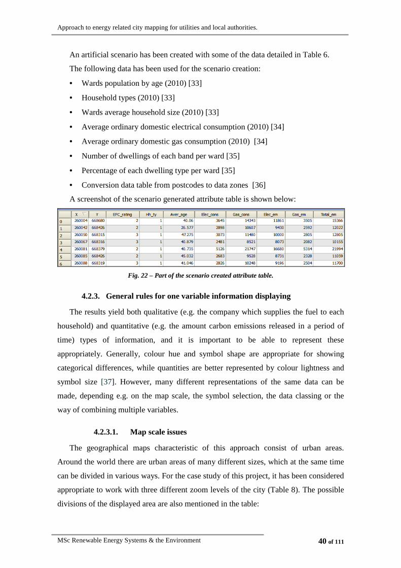
An artificial scenario has been created with some of the data detailed in Table 6.
The following data has been used for the scenario creation:
• Wards population by age (2010) [33]
• Household types (2010) [33]
• Wards average household size (2010) [33]
• Average ordinary domestic electrical consumption (2010) [34]
• Average ordinary domestic gas consumption (2010) [34]
• Number of dwellings of each band per ward [35]
• Percentage of each dwelling type per ward [35]
• Conversion data table from postcodes to data zones [36]
A screenshot of the scenario generated attribute table is shown below:
Fig. 22 – Part of the scenario created attribute table.
4.2.3. General rules for one variable information displaying
The results yield both qualitative (e.g. the company which supplies the fuel to each
household) and quantitative (e.g. the amount carbon emissions released in a period of
time) types of information, and it is important to be able to represent these
appropriately. Generally, colour hue and symbol shape are appropriate for showing
categorical differences, while quantities are better represented by colour lightness and
symbol size [37]. However, many different representations of the same data can be
made, depending e.g. on the map scale, the symbol selection, the data classing or the
way of combining multiple variables.
4.2.3.1. Map scale issues
The geographical maps characteristic of this approach consist of urban areas.
Around the world there are urban areas of many different sizes, which at the same time
can be divided in various ways. For the case study of this project, it has been considered
appropriate to work with three different zoom levels of the city (Table 8). The possible
divisions of the displayed area are also mentioned in the table:

Approach to energy related city mapping for utilities and local authorities.
MSc Renewable Energy Systems & the Environment 41 of 111
ZOOM LEVEL OF DETAIL POSSIBLE DIVISIONS IMAGE
Zoom 1 Streets view - Fig. 23
District Zones10 (DZ) Fig. 24 Zoom 2 Wards view
Intermediate Geography11 (IG) Fig. 25
Intermediate Geography (IG) Fig. 26 Zoom 3 City view
Wards12 Fig. 27
Table 8 – Zoom levels and divisions.
Fig. 23 – Zoom 1 view.
10 Data zones: Small areas in which Scotland is divided, each containing at least 500 residents, which
were created from 2001 Census Output Areas. Source: [16]. 11 Intermediate Geography: A geography division used in Scotland, which areas are built from grouping
data zones and fit into council area boundaries. They contain at least 2500 inhabitants. Source: [16]. 12 Wards: Electoral wards or divisions are the base of UK administrative geography (all other higher
units are built up from them). Source: [16].

Approach to energy related city mapping for utilities and local authorities.
MSc Renewable Energy Systems & the Environment 42 of 111
Fig. 24 – Zoom 2 view: small areas division.
Fig. 25 – Zoom 2 view: big areas division.

Approach to energy related city mapping for utilities and local authorities.
MSc Renewable Energy Systems & the Environment 43 of 111
Fig. 26 – Zoom 3 view: small areas division.
Fig. 27 – Zoom 4 view: big areas division.
In general terms, data must always be legible, and overcrowded maps, as well as
difficult to read maps, must be avoided. Different zoom levels may need different
representation techniques for displaying the same data, e.g. representing carbon
emissions data in Zoom 1 (Fig. 28) or in Zoom 2 (Fig. 29) using the same technique
does not result in appropriate results.

Approach to energy related city mapping for utilities and local authorities.
MSc Renewable Energy Systems & the Environment 44 of 111
Fig. 28 – Information display using points in ‘Streets view’ (zoom 1).
Fig. 29 – Data representation using points in ‘Wards view’ (zoom 2).

Approach to energy related city mapping for utilities and local authorities.
MSc Renewable Energy Systems & the Environment 45 of 111
Thus, it is necessary to aggregate the information using polygons (Fig. 30):
Fig. 30 – Data representation using polygons in ‘Wards view’ (zoom 2).
Therefore, the purpose of this project will be to explore the representation
techniques for the data of interest in order to achieve clear and concise maps.
4.2.3.2. Symbol selection
The appropriate choice of the symbols for representing the information is crucial for
a good understanding. Symbols can have different sizes, textures, colours, orientations
and shapes, and the combination of these characteristics can lead to a clear map, or a
confusing or non-understandable map. How to select the most appropriate
characteristics is going to be explained in detail in the following sections.
4.2.3.2.1. Symbol size
The symbol size is often used to represent the magnitude of the represented
variables; therefore it is mainly used for representing quantitative variables.
Fig. 31 – Points, lines and areas different sizes. Source: [38].
Approach to energy related city mapping for utilities and local authorities.
MSc Renewable Energy Systems & the Environment 46 of 111
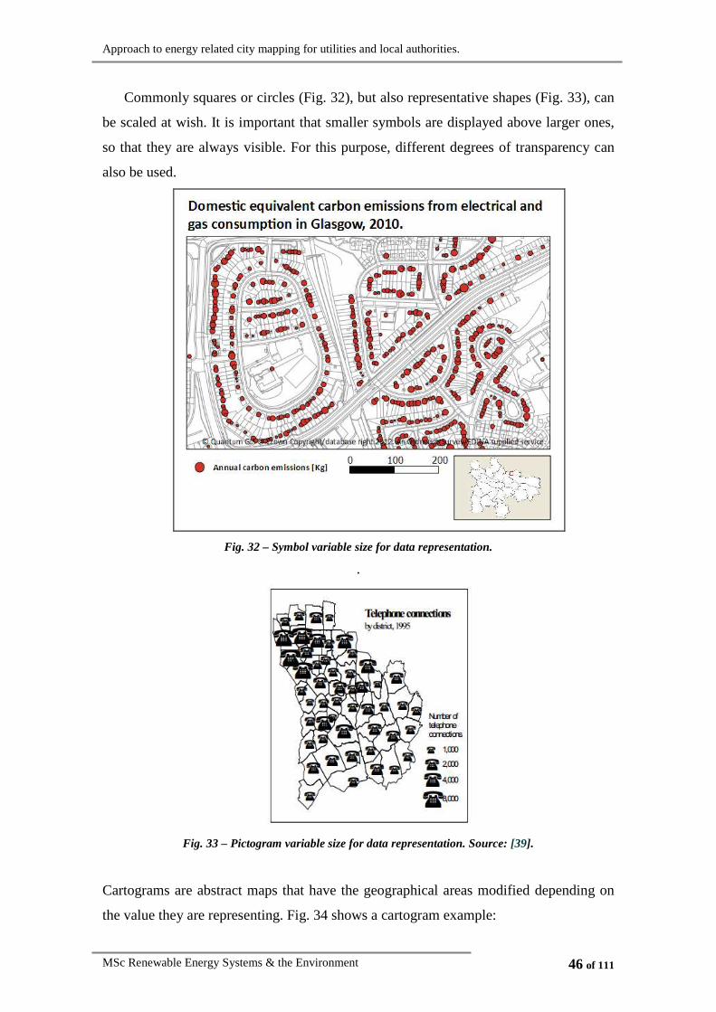
Commonly squares or circles (Fig. 32), but also representative shapes (Fig. 33), can
be scaled at wish. It is important that smaller symbols are displayed above larger ones,
so that they are always visible. For this purpose, different degrees of transparency can
also be used.
Fig. 32 – Symbol variable size for data representation.
.
Fig. 33 – Pictogram variable size for data representation. Source: [39].
Cartograms are abstract maps that have the geographical areas modified depending on
the value they are representing. Fig. 34 shows a cartogram example:

Approach to energy related city mapping for utilities and local authorities.
MSc Renewable Energy Systems & the Environment 47 of 111
Fig. 34 – Cartogram scaling the size of the United States of America (USA) to be proportional to the
number of electoral votes. Source: [40].
4.2.3.2.2. Symbol colour
The colours that are selected are a key issue in maps representation, as the
appropriate option can simplify and increase understanding, while a poor colour choice,
can confuse the reader. Different colour hues, values and intensities can be used for
different purposes. The following figure summarises the different colour options, and
the purpose for which are most appropriate, whether to show quantitative or qualitative
differences:
Fig. 35 – Variation in colour hue, value and intensity for points, lines and polygons. Source: [38].
Variations of colour hue can be found very often, particularly if they are adjacent in
the spectrum, such as ‘yellow-orange-red’ (Fig. 36). There are some other hub
combinations commonly used, such as the traffic-light signalling, with green standing
for ‘yes’ or ‘good’ and red standing for ‘no’ or ‘bad’ and yellow representing an
intermediate state (Fig. 37), or spectral (rainbow) schemes, which are commonly used
as they are found to be easy to read by many users (shown in Fig. 38). Moreover, there
exist some typical combinations like ‘light-to-dark’ colours for low-to-high values (red
is used in Fig. 39).

Approach to energy related city mapping for utilities and local authorities.
MSc Renewable Energy Systems & the Environment 48 of 111
Fig. 36 - Sequential scale with colours transition: yellow-orange-red
Fig. 37 – Traffic light colour scale.

Approach to energy related city mapping for utilities and local authorities.
MSc Renewable Energy Systems & the Environment 49 of 111
Fig. 38 – Spectral colour scale.
Fig. 39 – Sequential simple one colour scale: Red.

Approach to energy related city mapping for utilities and local authorities.
MSc Renewable Energy Systems & the Environment 50 of 111
Fig. 40 – Cold to hot colour scale.
4.2.3.2.3. Symbol shape
GIS software offers many options as for the symbols, which can be ‘simple
markers’ (Fig. 41), ‘font markers’ (Fig. 42) or ‘scalable vector graphics’ (SVG) (Fig.
43).
Fig. 41 – Simple markers. Source: [11].
Fig. 42 – Font markers. Source: [11].
Fig. 43 – SVG . Source: [11].

Approach to energy related city mapping for utilities and local authorities.
MSc Renewable Energy Systems & the Environment 51 of 111
Although lines and polygons can also be composed by different symbols, it is not
frequently used.
4.2.3.2.4. Symbol texture
The use of different textures can be applied to points, lines and polygons (Fig. 44);
nevertheless it is more often used in data represented by polygons. Changes in texture
can both represent quantitative and qualitative variables.
Fig. 44 – Different textures for points, lines and polygons. Source: [38].
Fig. 45 shows an example of data represented by areas with different textures.
However, colours are more often used for the representation of a single variable in a
map, and texture variations are frequently used when combining two or more variables
displayed in the same map.
Fig. 45 – Use of different densities to represent one variable values.
Approach to energy related city mapping for utilities and local authorities.
MSc Renewable Energy Systems & the Environment 52 of 111
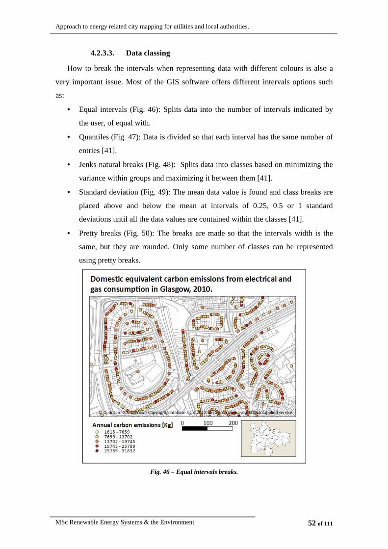
4.2.3.3. Data classing
How to break the intervals when representing data with different colours is also a
very important issue. Most of the GIS software offers different intervals options such
as:
• Equal intervals (Fig. 46): Splits data into the number of intervals indicated by
the user, of equal with.
• Quantiles (Fig. 47): Data is divided so that each interval has the same number of
entries [41].
• Jenks natural breaks (Fig. 48): Splits data into classes based on minimizing the
variance within groups and maximizing it between them [41].
• Standard deviation (Fig. 49): The mean data value is found and class breaks are
placed above and below the mean at intervals of 0.25, 0.5 or 1 standard
deviations until all the data values are contained within the classes [41].
• Pretty breaks (Fig. 50): The breaks are made so that the intervals width is the
same, but they are rounded. Only some number of classes can be represented
using pretty breaks.
Fig. 46 – Equal intervals breaks.

Approach to energy related city mapping for utilities and local authorities.
MSc Renewable Energy Systems & the Environment 53 of 111
Fig. 47 – Quantiles.
Fig. 48 – Natural breaks.

Approach to energy related city mapping for utilities and local authorities.
MSc Renewable Energy Systems & the Environment 54 of 111
Fig. 49 – Standard deviation breaks.
Fig. 50 – Pretty breaks.

Approach to energy related city mapping for utilities and local authorities.
MSc Renewable Energy Systems & the Environment 55 of 111
Cartographers suggest representing the data of interest in a histogram, such as the
one shown in Fig. 51, in order to help decide how to break down the data in to intervals.
Representing the extreme data in their own groups and the other using a standard
method is in general a good technique. The final breakdowns will depend on whether
there is any particular issue that needs to be emphasized in the map.
Fig. 51 – Data represented in a histogram. Source: [42].
Generally, having a higher number of intervals means that more detailed
information is provided, but the maps become more confusing, as the identification of
one colour in the legend becomes tougher. Some authors like Brewer (2006) [37] claim
that seven classes is often the maximum for a choropleth map to be readable, however,
other authors make more conservative statements, such as Heywood et al. [25] who
specify that in most cases a maximum of five classes are sufficient for most mapping
purposes.
4.2.4. Simultaneous representation of multiple variables
Until this point, information representation techniques have been reviewed, but only
the representation of a single information attribute has been considered. Nevertheless,
one of the interesting aspects about GIS systems is that different layers of information
can be displayed at the same time, so patterns can be detected.
There are two main ways to represent more than one information attribute at the
same time; the first one is to express the different data using different symbol attributes
and combining them on the map, while the second method consists of mathematically
combining different information attributes to represent one single variable on the map.

Approach to energy related city mapping for utilities and local authorities.
MSc Renewable Energy Systems & the Environment 56 of 111
4.2.4.1. Graphical multivariable representation
The representation of ‘two’ and ‘three or more’ attributes will be analysed
separately.
4.2.4.1.1. Representation of two attributes using GIS tools
GIS tools allow representing different information attributes by means of combining
shapes, colours, sizes, densities, textures and orientations. To create the maps, some of
the data introduced in section 4.2.1 Data display introduction will be represented on the
three zoom levels that where presented in section 4.2.3.1 Map scale issues.
Many different two variables combinations could be displayed at the same time. For
example:
• Domestic equivalent carbon emissions from electrical and gas consumption &
dwelling type (flat, terraced house, detached house, etc.).
• Domestic equivalent carbon emissions from electrical and gas consumption &
dwelling inhabitants age.
• Domestic equivalent carbon emissions from electrical and gas consumption &
dwelling EPC rating.
• …
The representation techniques of two variables will depend of the type of variables
(quantitative or qualitative), thus the three possible combinations between qualitative
and quantitative variables will be exemplified:
1.
HOUSEHOLD EQUIVALENT
EMISSIONS
quantitative variable
&
HOUSEHOLD TYPE
qualitative variable
(3 possible values)
ZOOM 1: City view
In the city view zoom the entities are represented by polygons, therefore, the
following ways to display the variables are considered appropriate:
• Colour-coded quantitative variable & shape-coded qualitative variable (Fig. 52).
• Colour-coded quantitative variable & colour-coded qualitative variable (Fig.
53).

Approach to energy related city mapping for utilities and local authorities.
MSc Renewable Energy Systems & the Environment 57 of 111
• Colour-coded quantitative variable & qualitative variable represented using pie
charts (Fig. 54).
• Colour-coded qualitative variable & quantitative variable represented using bar
charts (Fig. 55).
Fig. 52 – Two variables city view (IG’s divisions): colour-coded quantitative variable & texture-coded
qualitative variable (3 possible values).

Approach to energy related city mapping for utilities and local authorities.
MSc Renewable Energy Systems & the Environment 58 of 111
Fig. 53 - Two variables city view (IG’s divisions): colour-coded quantitative variable & colour-coded
qualitative variable (3 possible values).
Fig. 54 – Two variables city view (wards divisions): Colour-coded quantitative variable & qualitative
variable represented using pie charts (3 possible values).

Approach to energy related city mapping for utilities and local authorities.
MSc Renewable Energy Systems & the Environment 59 of 111
Fig. 55 – Two variables city view (wards divisions): Colour-coded qualitative variable (3 possible
values) & quantitative variable represented using bar charts.
The selected division areas of the city for Fig. 52 and Fig. 53 has been IG’s, as the
information transmitted by the map when the divisions are smaller is higher, and in
these cases the results can be clearly read. However, for Fig. 54 and Fig. 55, the selected
division has been wards and not GI’s; the reason is the presence of diagrams (pie and
bar charts), which tend to occupy a large space.
ZOOM 2: Ward view
In the ward zoom view, the variables are also represented by polygons, and two
zones’ divisions are suitable: DZ’s and GI’s, as a division into wards would not provide
enough information. In this case, the possible representations are:
• Colour-coded quantitative variable & shape-coded qualitative variable (Fig. 56).
• Colour-coded quantitative variable & colour-coded qualitative variable (Fig.
57).
• Colour-coded quantitative variable & qualitative variable represented
alphabetically (Fig. 58).
• Colour-coded qualitative variable & quantitative variable represented using bar
charts (Fig. 59).

Approach to energy related city mapping for utilities and local authorities.
MSc Renewable Energy Systems & the Environment 60 of 111
Fig. 56 – Two variables ward view (DZ’s divisions): colour-coded quantitative variable & texture-coded
qualitative variable (3 possible values).
Fig. 57 – Two variables ward view (DZ’s divisions): colour-coded quantitative variable & colour-coded
qualitative variable (3 possible values).

Approach to energy related city mapping for utilities and local authorities.
MSc Renewable Energy Systems & the Environment 61 of 111
Fig. 58 – Two variables ward view (IG’s divisions): Colour-coded quantitative variable & qualitative
variable represented alphabetically (3 possible values).
Fig. 59 – Two variables ward view (IG’s divisions): colour-coded qualitative variable (3 possible
values) & quantitative variable represented using bar charts.

Approach to energy related city mapping for utilities and local authorities.
MSc Renewable Energy Systems & the Environment 62 of 111
In this case, the maps combining different colours and textures (Fig. 56 and Fig. 57)
have been divided into DZ’s, as they can be read easily and provide a higher level of
information. On the other hand, maps displaying symbols, or charts (Fig. 58 and Fig.
59) have been divided into IG’s, as a way to facilitate the map lecture.
ZOOM 3: Streets view
The ‘streets view’ zoom allows the representation of the data using points, instead
of areas. Up to two variables can therefore be displayed combining:
• Colour-coded quantitative variable and shape-coded qualitative variable (Fig.
60).
• Colour-coded qualitative variable and size-coded quantitative variable (Fig. 61).
Fig. 60 – Two variables streets view: colour-coded quantitative variable & shape-coded qualitative
variable (3 possible values).

Approach to energy related city mapping for utilities and local authorities.
MSc Renewable Energy Systems & the Environment 63 of 111
Fig. 61 - Two variables streets view: size-coded quantitative variable & colour-coded qualitative
variable (3 possible values).
However, there are some special cases where a variable is commonly associated to
one specific representation, e.g. a colour or a shape; in those cases it is sensible to
represent it following the established criterion. A clear example is dwellings EPC
rating, which is a qualitative variable that can take 7 different values (from A to G),
which is strongly associated to a colour scale (Fig. 62). Thus, it would seem sensible for
maps with variables represented by polygons (zooms one and two) to display the
emissions size-based (using bars), and use a colour scale to represent the EPC rating
grade (Fig. 63), and for dot represented maps, to display colour-coded EPC rating and
size-coded emissions (Fig. 65).

Approach to energy related city mapping for utilities and local authorities.
MSc Renewable Energy Systems & the Environment 64 of 111
Fig. 62 – Energy efficiency rating graph for homes. Source: [44].
ZOOM 1: City view
Fig. 63 – Two variables city view (wards divisions): colour-coded qualitative variable (7 possible
values) & quantitative variable represented by bars.
Another possibility to represent these two variables is to classify the emissions
colour-coded and to add a pie chart with the proportion of dwellings of each rating (Fig.
64). Most of the time, including a second level of information using pie charts is only
possible for maps in which the information is displayed using polygons (zooms one and
two), as if pie charts where exposed above the points, those would be covered and the
first information level would be lost. The polygons must have a considerable size so that
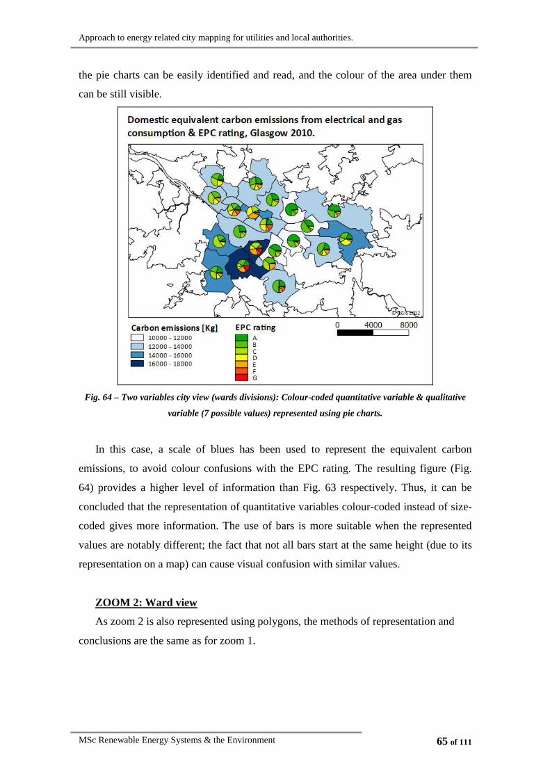
Approach to energy related city mapping for utilities and local authorities.
MSc Renewable Energy Systems & the Environment 65 of 111
the pie charts can be easily identified and read, and the colour of the area under them
can be still visible.
Fig. 64 – Two variables city view (wards divisions): Colour-coded quantitative variable & qualitative
variable (7 possible values) represented using pie charts.
In this case, a scale of blues has been used to represent the equivalent carbon
emissions, to avoid colour confusions with the EPC rating. The resulting figure (Fig.
64) provides a higher level of information than Fig. 63 respectively. Thus, it can be
concluded that the representation of quantitative variables colour-coded instead of size-
coded gives more information. The use of bars is more suitable when the represented
values are notably different; the fact that not all bars start at the same height (due to its
representation on a map) can cause visual confusion with similar values.
ZOOM 2: Ward view
As zoom 2 is also represented using polygons, the methods of representation and
conclusions are the same as for zoom 1.

Approach to energy related city mapping for utilities and local authorities.
MSc Renewable Energy Systems & the Environment 66 of 111
ZOOM 3: Streets view
In this case the variables are represented using points. The most logical displaying
option for zoom 3 is to represent the average dwellings EPC rating colour-coded and the
emissions size-coded. The use of pie charts only makes sense for areas that are
composed by different points, but not for the representation of single dot entities.
Fig. 65 – Two variables streets view: Colour-coded qualitative variable (7 possible values) & size-coded
quantitative variable.
2.
LEVEL OF HOUSEHOLD
EQUIVALENT CARBON EMISSIONS
qualitative variable
(3 possible values)
&
DWELLINGS EPC RATING
qualitative variable
(7 possible values)
ZOOM 1: City view
For the representation of two qualitative variables using polygons, it will be
distinguished between the variable with higher number of possible values (variable A –
in this case EPC rating) and the one with lower number of possible values (variable B –
in this case the level of carbon emissions). The following options are suitable for
polygons display:
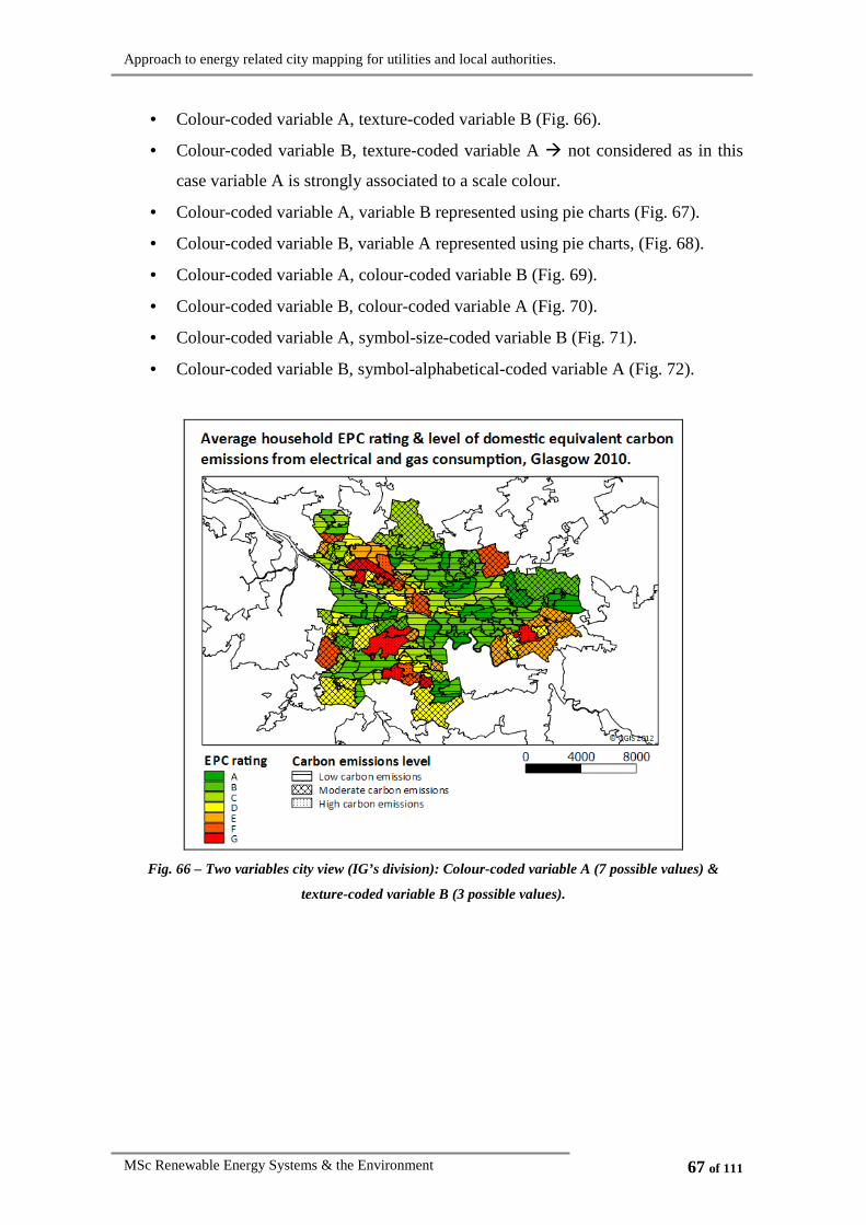
Approach to energy related city mapping for utilities and local authorities.
MSc Renewable Energy Systems & the Environment 67 of 111
• Colour-coded variable A, texture-coded variable B (Fig. 66).
• Colour-coded variable B, texture-coded variable A � not considered as in this
case variable A is strongly associated to a scale colour.
• Colour-coded variable A, variable B represented using pie charts (Fig. 67).
• Colour-coded variable B, variable A represented using pie charts, (Fig. 68).
• Colour-coded variable A, colour-coded variable B (Fig. 69).
• Colour-coded variable B, colour-coded variable A (Fig. 70).
• Colour-coded variable A, symbol-size-coded variable B (Fig. 71).
• Colour-coded variable B, symbol-alphabetical-coded variable A (Fig. 72).
Fig. 66 – Two variables city view (IG’s division): Colour-coded variable A (7 possible values) &
texture-coded variable B (3 possible values).
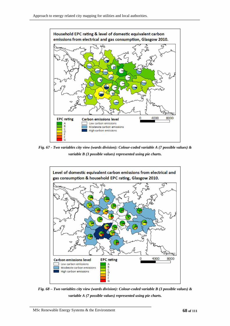
Approach to energy related city mapping for utilities and local authorities.
MSc Renewable Energy Systems & the Environment 68 of 111
Fig. 67 - Two variables city view (wards division): Colour-coded variable A (7 possible values) &
variable B (3 possible values) represented using pie charts.
Fig. 68 – Two variables city view (wards division): Colour-coded variable B (3 possible values) &
variable A (7 possible values) represented using pie charts.

Approach to energy related city mapping for utilities and local authorities.
MSc Renewable Energy Systems & the Environment 69 of 111
Fig. 69 – Two variables city view (wards division): Colour-coded variable A (7 possible values) &
colour-coded variable B (3 possible values).
Fig. 70 – Two variables city view (wards division): Colour-coded variable B (3 possible values) &
colour-coded variable A (7 possible values).

Approach to energy related city mapping for utilities and local authorities.
MSc Renewable Energy Systems & the Environment 70 of 111
Fig. 71 – Two variables city view (wards division): Colour-coded variable A (7 possible values) & size-
coded variable B (3 possible values).
Fig. 72 – Two variables city view (wards division): Colour-coded variable B (3 possible values) &
alphabetical-coded variable A (7 possible values).

Approach to energy related city mapping for utilities and local authorities.
MSc Renewable Energy Systems & the Environment 71 of 111
In general, maps with colours are more visual than the ones with alphabetical
symbols. Also, if there is one variable more relevant than the other it is recommended to
display it under the secondary variable, occupying a bigger area. Also it is
recommended when combining two colours to use pale ones for the background, and
use shiny ones for the second attribute, usually displayed in a smaller area above the
first one. It is also advisable to use pie charts whenever it is possible, as they provide
more information and can be easily read.
ZOOM 2: Ward view
The representation techniques and conclusions are the same than for zoom 1.
ZOOM 3: Streets view
The logical representation for the selected variables in a street view zoom level is to
represent EPC rating colour-coded and level of carbon emissions size-coded (Fig. 73).
Other representation techniques could also be used, particularly for the second variable,
such as shape-coded, texture-coded or even orientation-coded. However the logic will
determine the selected representation technique every time.
Fig. 73 – Two variables streets view: Colour-coded variable A (7 possible values) & size-coded variable
B (3 possible values).

Approach to energy related city mapping for utilities and local authorities.
MSc Renewable Energy Systems & the Environment 72 of 111
3. HOUSEHOLD EQUIVALENT CARBON
EMISSIONS
quantitative variable
&
INHABITANTS AVERAGE
AGE
quantitative variable
For the representation of two quantitative variables, the proposed options are the
following ones:
• Colour-coded variable 1 and colour-coded variable 2 (Fig. 74).
• Colour-coded variable 2 and colour-coded variable 1 (Fig. 75).
• Colour-coded variable 1 and variable 2 represented in a bar diagram (Fig. 76).
• Colour-coded variable 2 and variable 1 represented in a bar diagram (Fig. 77).
• Colour-coded variable 1 and texture-coded variable 2 (Fig. 78).
• Colour-coded variable 2 and texture-coded variable 1 (Fig. 79).
ZOOM 1: City view
Fig. 74 – Two variables city view (IG’s division): Colour-coded variable 1 & colour-coded variable 2.

Approach to energy related city mapping for utilities and local authorities.
MSc Renewable Energy Systems & the Environment 73 of 111
Fig. 75 – Two variables city view (IG’s division): Colour-coded variable 2 & colour-coded variable 1.
Fig. 76 – Two variables city view (wards division): Colour-coded variable 1 & variable 2 represented
using bar charts.

Approach to energy related city mapping for utilities and local authorities.
MSc Renewable Energy Systems & the Environment 74 of 111
Fig. 77 – Two variables city view (wards division): Colour-coded variable 2 & variable 1 represented
using bar charts.
Fig. 78 – Two variables city view (IG’s division): Colour-coded variable 1 & texture-coded variable 2.

Approach to energy related city mapping for utilities and local authorities.
MSc Renewable Energy Systems & the Environment 75 of 111
Fig. 79 – Two variables city view (IG’s division): Colour-coded variable 2 & texture-coded variable 1.
It is more sensible to represent the quantitative variable that has more differentiated
numbers using bars, and the other one colour-coded, in this case Fig. 76 and Fig. 77
represent the same information; however the second one is easier to understand.
When combining a colour-coded variable with a texture-coded variable it is
important that the colours used are light while ensuring that the quantitative texture-
coded variable are not divided into many divisions, as both things will make the map
more difficult to read.
ZOOM 2: Ward view
Zoom 2 has the same representation options as shown for zoom 1, therefore the
conclusions are the same.
ZOOM 3: Streets view
For the streets view representation, it is recommended to combine both quantitative
variables one colour-coded and the other one size-coded and vice versa.
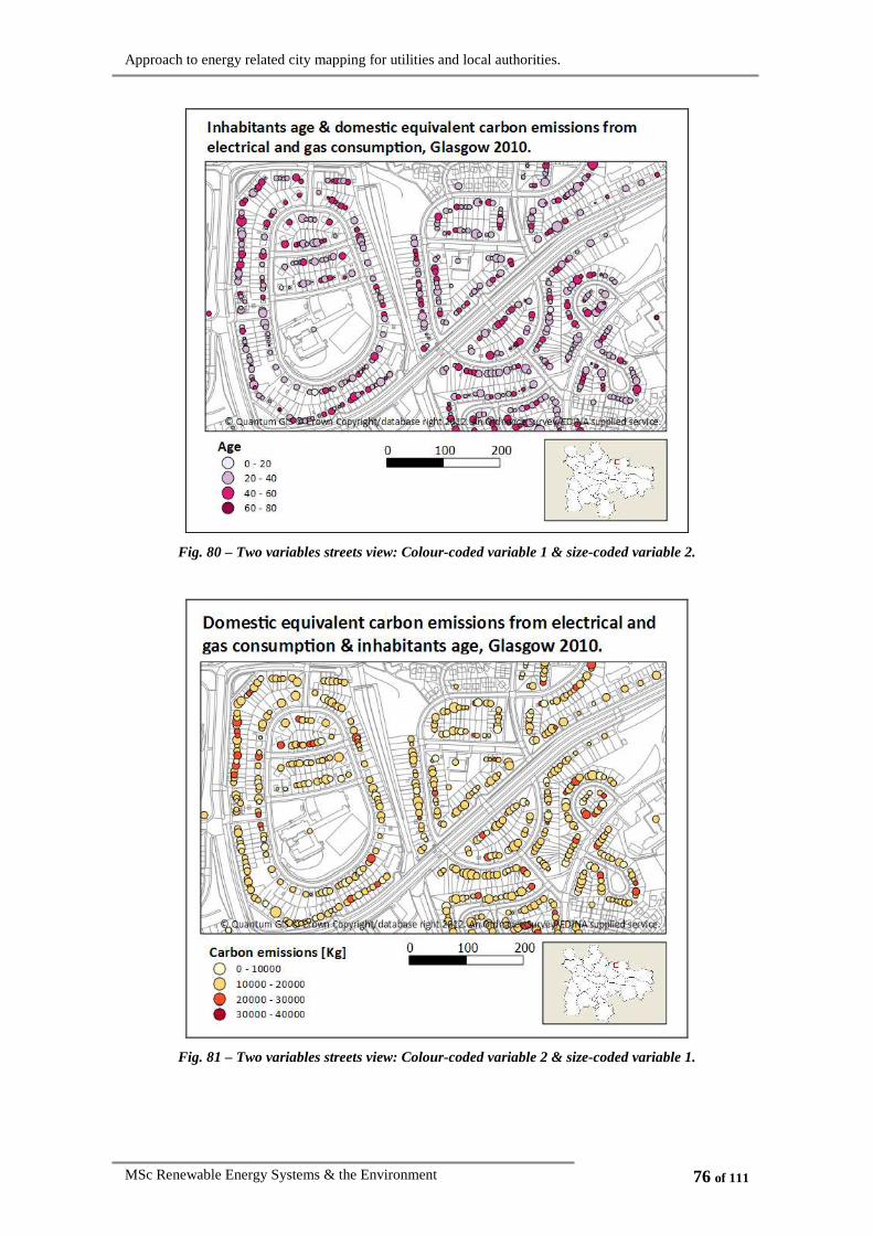
Approach to energy related city mapping for utilities and local authorities.
MSc Renewable Energy Systems & the Environment 76 of 111
Fig. 80 – Two variables streets view: Colour-coded variable 1 & size-coded variable 2.
Fig. 81 – Two variables streets view: Colour-coded variable 2 & size-coded variable 1.

Approach to energy related city mapping for utilities and local authorities.
MSc Renewable Energy Systems & the Environment 77 of 111
4.2.4.1.2. Representation of three or more attributes using GIS tools
Representing three variables in the same map can only be done on a few occasions.
As we have seen in section 4.2.4.1 Graphical multivariable representation, most of the
maps already combine different coding systems to display two variables; therefore,
representing a third would result in an overcrowded map. Only in a few cases, with
maps divided into big areas, would it be feasible to include a third variable. One
example of this is e.g. Fig. 71, in which another variable could be represented, e.g. the
number of household inhabitants:
Fig. 82 – Three variables city view (wards division): Colour-coded qualitative variable (7 possible
values), texture-coded quantitative variable and size-coded qualitative variable (3 possible values).
Therefore, to add a third variable in polygon represented maps, it is recommended
that they are divided into big areas and the colours used are significantly different.
On the other hand ‘queries’ can be a suitable solution for displaying further
information. A ‘query’ consists on displaying only the variables that fulfil a specific
requirement, e.g. Fig. 66 does not seem to be able to include any other variable;
however, somebody could be interested in knowing if there is any pattern between the
two displayed variables (EPC rating and carbon emissions level) and the number of

Approach to energy related city mapping for utilities and local authorities.
MSc Renewable Energy Systems & the Environment 78 of 111
inhabitants. Therefore a query like: ‘show only the data of the IG areas in which the
average inhabitants’ age is under 30 years old’ (Fig. 83).
Fig. 83 – Two variables city view (IG’s division). Information filtered by average inhabitants’ age
under 30 years.
Queries can be more complex, e.g.:
• ‘Or’ condition: Show only areas with average age under 30 years or above 40.
• ‘And’ condition: Show areas which suffer from fuel poverty and are not located
in a specific ward.
• Different variables combination: Show areas with age under 30 years and
suffering from fuel poverty.
• …
The same queries can be done when the data is represented using dots instead of
polygons.
4.2.4.2. Mathematical combination of variables
Different information attributes can be mathematically combined in order to be
represented in one single GIS attribute. The main purpose of combining more than one
variable is usually to support decisions for spatial location, which will be based on
measurable attributes of the alternatives being considered (this process is known as

Approach to energy related city mapping for utilities and local authorities.
MSc Renewable Energy Systems & the Environment 79 of 111
multi-criteria evaluation (MCE)). One decision example would be: ‘which areas of the
city are more suitable for the installation of small scale solar thermal panels?’ A
possible combination of variables would be the following:
HOUSEHOLD EQUIVALENT CARBON EMISSIONS
FROM GAS CONSUMPTION
quantitative variable
& SKY ACCESS
quantitative variable
To express the suitability of installing small scale renewables (SSR), different
scores are given to each of the attributes (criteria) by means of weighing factors,
depending on its relevance. The procedure to combine two or more variables (xi) is the
following:
1. Weights (wi) must be assigned to each of the variables as a percentage,
representing their relevance. The sum of all the weights must add to 100%.
∑=
=n
iiw
0
1 (Equation 4)
2. The data must be standardized, so that it continuously varies from e.g. 0-1, 0-
100, 0-250, etc. representing in all cases the worst and the best situation, or
vice versa. The most commonly used way of standardization is:
xx
xii
xX
minmax
min
−−= (Equation 5)
Where Xi = standarized value of the variable
xi = original value of the variable
minx = minimum value of the variable series
maxx = maximum value of the variable series
3. The procedure for combining them is: for each entity, the result of multiplying
each of the standardised variables by its corresponding weight is added, as
shown in the following expression:
{ }nn XwXwXwX *...** 2211 +++= (Equation 6)
Where X = suitability index for location of a spatial entity
wi = weighing factor
Xi = standardised variable value

Approach to energy related city mapping for utilities and local authorities.
MSc Renewable Energy Systems & the Environment 80 of 111
The distinction between factors and constraints is important. They are both criteria,
but while a constraint is a Boolean criteria (it can be yes or no), being the legislation a
typical example, the factors are criteria that define a degree of suitability, usually
represented by scores.
Therefore, a one variable map like Fig. 84, showing just the household equivalent
carbon emissions, becomes Fig. 85, which is represented using the same colour scale,
but represents the conjunction of both variables, household equivalent carbon emissions
and sky access, in this case equally averaged:
Fig. 84 – Monovariable layer.

Approach to energy related city mapping for utilities and local authorities.
MSc Renewable Energy Systems & the Environment 81 of 111
Fig. 85 – Multivariable layer.
More than two variables with different weighs can be combined. The chosen factors
can be highly relevant on the results output, e.g. if a utility wants to install SSR thermal
devices, the factors that it may be interested to know are:
• Dwelling equivalent carbon emissions
• Sky access
• Average age of the dwelling inhabitants
• Property cadastral value
These factors must be analysed by an expert’s committee and a relevance degree
must be assigned to each of the variables. Table 9 reflects two possible weighing
options.
FACTOR RELEVANCE OPTION 1 OPTION 2
Sky access Yes/No >60% >60%
Equivalent carbon emissions High 50% 60%
Property cadastral value Moderate 25% 30%
Average age of the dwelling inhabitants Moderate 25% 10%
Σ 100% 100%
Table 9 – Selected variables, given relevance, and three possible weighing factor percentages.

Approach to energy related city mapping for utilities and local authorities.
MSc Renewable Energy Systems & the Environment 82 of 111
All the data has been standardized so it goes from 0 to 1. The obtained values do not
have any units, but their representation by means of a colour scale allows making a
qualitative judgement for the suitability of the devices installation, for that purpose a
breakdown of 5 equal intervals has been selected (see section 4.2.3.3 Data classing),
dividing the suitability into the following categories: ‘very low’, ‘low’, ‘moderate’,
‘high’, ‘very high’. The results of representing the two options described in Table 9 are
shown below:
Fig. 86 – Weighing factors option 1.

Approach to energy related city mapping for utilities and local authorities.
MSc Renewable Energy Systems & the Environment 83 of 111
Fig. 87 – Weighing factors option 2.
As it can be seen, in this case, the difference between Fig. 86 and Fig. 87 is not very
significant, although some slight variations can be detected. This fact will depend on the
case of study and the number of variables considered. The same process can be used on
a choropleth map, where the difference between the maps is more evident to the naked
eye.
Thus, the final result will depend on who did the MCE, the data quality and the
selection of the criteria and weighing factors. Moreover, Kristin Shrader-Frechette
(2000) illustrates the potential for models13 to be differently interpreted depending on
the motivations of policy makers [44].
Even though MCE is often used, it has some limitations: e.g. the linearly factors
standardisation it doubtingly the most appropriate way of doing it. Moreover, even
though the chosen weights are usually established by experts, there is not a single
answer, and the results output can be highly dependant on the chosen values.
13 Models: Simplification of the reality.
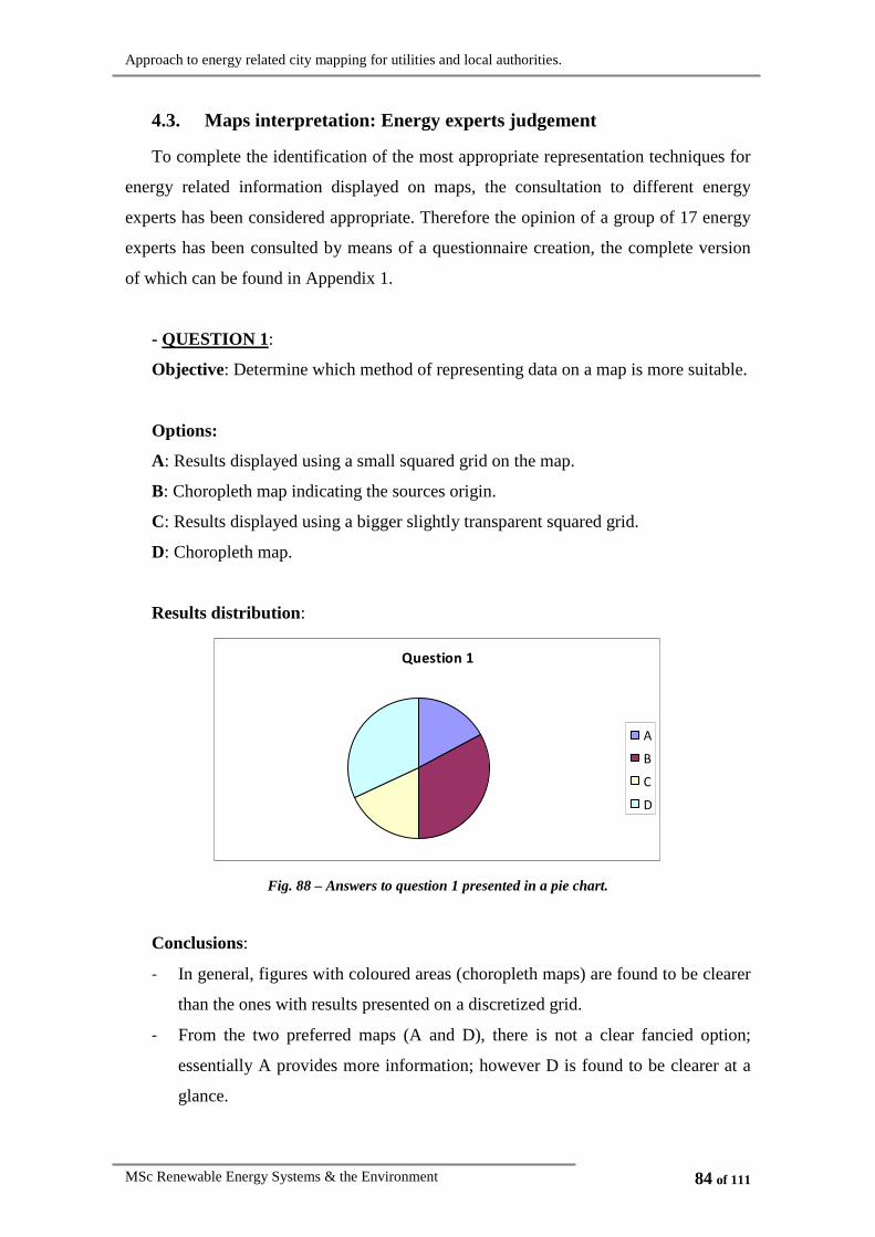
Approach to energy related city mapping for utilities and local authorities.
MSc Renewable Energy Systems & the Environment 84 of 111
4.3. Maps interpretation: Energy experts judgement
To complete the identification of the most appropriate representation techniques for
energy related information displayed on maps, the consultation to different energy
experts has been considered appropriate. Therefore the opinion of a group of 17 energy
experts has been consulted by means of a questionnaire creation, the complete version
of which can be found in Appendix 1.
- QUESTION 1:
Objective: Determine which method of representing data on a map is more suitable.
Options:
A: Results displayed using a small squared grid on the map.
B: Choropleth map indicating the sources origin.
C: Results displayed using a bigger slightly transparent squared grid.
D: Choropleth map.
Results distribution:
Question 1
A
B
C
D
Fig. 88 – Answers to question 1 presented in a pie chart.
Conclusions:
- In general, figures with coloured areas (choropleth maps) are found to be clearer
than the ones with results presented on a discretized grid.
- From the two preferred maps (A and D), there is not a clear fancied option;
essentially A provides more information; however D is found to be clearer at a
glance.

Approach to energy related city mapping for utilities and local authorities.
MSc Renewable Energy Systems & the Environment 85 of 111
- QUESTION 2:
Objective: Determine which colour scale is better to represent carbon emissions.
Options:
A: Change in colour hue: yellow to red.
B: Traffic light colour scale: green to yellow to red.
C: Spectral (rainbow) scale.
D: Light to dark (reds).
E: Cold to hot: Blue to red.
Results distribution:
Question 2
A
B
C
D
E
Fig. 89 – Answers to question 2 presented in a pie chart.
Conclusions:
- To represent equivalent carbon emissions ‘the traffic light colour scale’ (green to
yellow to red) is the most liked opition.
- The options: ‘change in colour hue’: yellow_to_red, ‘light to dark’ (reds) and
‘spectral (rainbow) scale’ are also found appropriate for carbon emissions
representation.
- In general, the option ‘cold to hot’ (blue to red) is the less liked to represent
carbon emissions.

Approach to energy related city mapping for utilities and local authorities.
MSc Renewable Energy Systems & the Environment 86 of 111
- QUESTION 3:
Objective: The purpose was to see which classing was better if we wanted detect
the buildings with higher carbon emissions.
Options:
A: Natural breaks.
B: Quantiles.
C: Equal interval breaks.
D: Standard deviation.
E: Pretty breaks.
Results distribution:
Question 3
A
B
C
D
E
Fig. 90 – Answers to question 3 presented in a pie chart.
Conclusions:
- Even though the classing with pretty breaks did not allow the detection of any
point in the higher rank, the map with 3 useful breaks (considerably less
information than the other maps) was often chose by some of the experts as a
first preference, highlighting the importance of this kind of breaks for a better
understanding.
- Even though the information provided with the standard deviation division was
higher (as the number of intervals was bigger) probably the fact that the picture
did not show any point in the higher rank dissuaded its choice.
- The preferred options as chosen by the energy experts were as follows:
quantiles, natural breaks and equal interval breaks, showing that in general
higher number of darker points in the figure were preferred.

Approach to energy related city mapping for utilities and local authorities.
MSc Renewable Energy Systems & the Environment 87 of 111
- The personal conclusion extracted from the experts’ response is that in most
cases none of the classing methods offered by the software were adequate for
presenting the data. The values classing will logically vary depending on the
map’s purpose, but an appropriate classing will be made based on the data
histogram, moreover the interval limits should not be any number, but they
should be made at least slightly ‘pretty’.
- QUESTION 4:
Objective: In this case the preferred way of combining two variables in a small
zoom map was questioned.
Options:
A: Colour-coded variable 1, texture-coded variable 2.
B: Colour-coded variable 1, texture colour-coded variable 2.
C: Colour-coded variable 1, variable 2 presented in pie charts.
D: Colour-coded variable 1, variable 2 presented in bar charts.
Results distribution:
Question 4
A
B
C
D
Fig. 91 – Answers to question 4 presented in a pie chart.
Conclusions:
- The clearly preferred option, was the one displaying pie charts, followed by the
combination of colours and textures.
- Bars were found to be slightly confusing; however, the concept of representing
gas, electrical and total emissions in three different bars was liked.

Approach to energy related city mapping for utilities and local authorities.
MSc Renewable Energy Systems & the Environment 88 of 111
- The representation of colour-coded texture was the least liked, as it was found to
be confusing.
- QUESTION 5:
Objective: The objective was the same as in question 4, but with a larger zoom
detail.
Options:
A: Colour-coded variable 1, texture-coded variable 2.
B: Colour-coded variable 1, texture colour-coded variable 2.
C: Colour-coded variable 1, alphabetically represented variable 2.
D: Colour-coded variable 1, variable 2 represented in bar charts.
Results distribution:
Question 5
A
B
C
D
Fig. 92 – Answers to question 5 presented in a pie chart.
Conclusions:
- The representation using letters is found clear enough.
- In general, the three options: mixing colours and textures, colours and letters and
colours and bars are found useful in general.
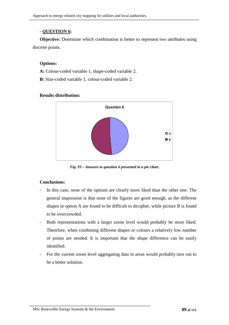
Approach to energy related city mapping for utilities and local authorities.
MSc Renewable Energy Systems & the Environment 89 of 111
- QUESTION 6:
Objective: Determine which combination is better to represent two attributes using
discrete points.
Options:
A: Colour-coded variable 1, shape-coded variable 2.
B: Size-coded variable 1, colour-coded variable 2.
Results distribution:
Question 6
A
B
Fig. 93 – Answers to question 6 presented in a pie chart.
Conclusions:
- In this case, none of the options are clearly more liked than the other one. The
general impression is that none of the figures are good enough, as the different
shapes in option A are found to be difficult to decipher, while picture B is found
to be overcrowded.
- Both representations with a larger zoom level would probably be more liked.
Therefore, when combining different shapes or colours a relatively low number
of points are needed. It is important that the shape difference can be easily
identified.
- For the current zoom level aggregating data in areas would probably turn out to
be a better solution.
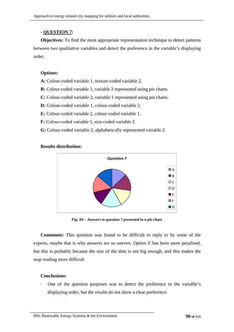
Approach to energy related city mapping for utilities and local authorities.
MSc Renewable Energy Systems & the Environment 90 of 111
- QUESTION 7:
Objectives: To find the most appropriate representation technique to detect patterns
between two qualitative variables and detect the preference in the variable’s displaying
order.
Options:
A: Colour-coded variable 1, texture-coded variable 2.
B: Colour-coded variable 1, variable 2 represented using pie charts.
C: Colour-coded variable 2, variable 1 represented using pie charts.
D: Colour-coded variable 1, colour-coded variable 2.
E: Colour-coded variable 2, colour-coded variable 1.
F: Colour-coded variable 1, size-coded variable 2.
G: Colour-coded variable 2, alphabetically represented variable 2.
Results distribution:
Question 7
A
B
C
D
E
F
G
Fig. 94 – Answers to question 7 presented in a pie chart.
Comments: This question was found to be difficult to reply to by some of the
experts, maybe that is why answers are so uneven. Option E has been more penalised,
but this is probably because the size of the dots is not big enough, and this makes the
map reading more difficult.
Conclusions:
- One of the question purposes was to detect the preference in the variable’s
displaying order, but the results do not show a clear preference.

Approach to energy related city mapping for utilities and local authorities.
MSc Renewable Energy Systems & the Environment 91 of 111
- It can be seen that when the carbon emissions are displayed below, the preferred
option for displaying EPC rating is pie charts, followed by letters and the least
preferred option is colours.
- When the emissions are presented on coloured-EPC rating, the preferred options
are: colour-coded, size-coded, pie chart and texture-coded.
- Even though the combination of colours and textures would seem a good way
for detecting patterns, this is the least liked option. Probably a lower number of
divisions and an intensity graduate pattern would be found more useful.
- QUESTION 8:
Objectives: To detect the preference in the variable’s displaying order and also
which representation technique was better for detecting patterns between two variables
(one quantitative and one qualitative).
Options:
A: Colour-coded variable 1, colour-coded variable 2 (smaller size).
B: Colour-coded variable 2, colour-coded variable 1 (smaller size).
C: Colour-coded variable 1, variable 2 represented in a bar chart.
D: Colour-coded variable 2, variable 1 represented in a bar chart.
E: Texture-coded variable 1, colour-coded variable 2.
F: Texture-coded variable 2, colour-coded variable 1.
Results distribution:
Question 8
A
B
C
D
E
F
Fig. 95 – Answers to question 8 presented in a pie chart.

Approach to energy related city mapping for utilities and local authorities.
MSc Renewable Energy Systems & the Environment 92 of 111
Conclusions:
- To detect the relationship degree between two variables, three possible
combinations where presented: colour-coded & colour-coded, colour-coded &
bar coded and colour-coded & texture-coded. The experts coincide that the bars
are the less favourite option, as they find its reading confusing, followed by
texture-coded, while the preferred option is to combine two different colour-
coded variables, although they agreed that both colour scales should not have
many divisions and its representation should be big enough to allow the map to
be read easily.

Approach to energy related city mapping for utilities and local authorities.
MSc Renewable Energy Systems & the Environment 93 of 111
5. Conclusions
GIS is a very powerful tool that is going to be used more and more often in the
future. In this thesis, different functionalities, data treatment and representation
techniques have been explored to display energy related information in maps. This is
thought to be a useful tool for utilities and local authorities in many ways, as they can:
• Have a support decision tool for action planning.
• Detect business and environmental opportunities.
• Track the effect of previously implemented action plans.
• Model future predictions.
As for the representation techniques, different conclusions on how data should be
displayed have been made:
• In general, maps classed into higher number of intervals provide more detailed
information; however, they become more confusing as the colours identification
in the legend becomes tougher.
• In a two variables map, the addition of further information layers is subject to
maps with big area divisions, which at the same time entails lower resolution.
• The representation of quantitative variables size-coded does allow the
comparison between entities, but does not provide as much information as
colour-coded represented quantitative variables.
• The use of bars to express quantitative variables in choropleth maps can become
confusing if the represented values are not significantly different.
• The use of pie charts only makes sense for areas that are composed by different
points, but not for the representation of single dot entities.
• If one variable is more relevant than another, it is recommended that it is
displayed under the less important one.
• When combining two colours, it is good practice to use pale colours for the
variable underneath and shine ones for the secondary attribute, usually displayed
in a smaller area above the first one.
• The use of pie charts it highly recommended, as they provide a further level of
information and are very visual.

Approach to energy related city mapping for utilities and local authorities.
MSc Renewable Energy Systems & the Environment 94 of 111
• When using the MCE method, the result will depend on who did the MCE, the
data quality and the selection of the criteria and weighing factors.
• Queries can be a suitable solution for filtering the information shown in maps
that already have two attributes.
• If a third level of information needs to be added in a map, it is necessary that the
main area be divided into big divisions (more data aggregated, lower
information level) allowing a proper reading.
• The display of more than three attributes in a single map is not recommended.
Also, the experts’ consultation has lead to the following conclusions:
• Choropleth maps are found to be very clear and useful for transmitting
information.
• The preferred colours for representing carbon emissions are the ‘traffic light
colour scale’ (green, yellow, red), followed by the change in colour hue (yellow
to red) and then ‘light to dark’ (red).
• The classing needs to be done case-specific (based on the data histogram and the
map’s purpose). Moreover it is very important to make the interval limits as
pretty as possible to make the comprehension easier.
• In general, when combining two variables, when presenting the first one colour-
coded, the preferred ways of presenting the second variable are: pie charts,
colour-coded, size-coded and by means of letters, while the ones less preferred
are bar charts and texture-coded.

Approach to energy related city mapping for utilities and local authorities.
MSc Renewable Energy Systems & the Environment 95 of 111
6. Further work
As for the presented functionality of the system, it could be improved with:
• Representation of other none-metered types of heating, e.g. wood/biomass,
oil, liquefied petroleum gas (LPG) or bottled gas, coal/other processed solid
fuel, etc.
Other functionalities of GIS:
• Once a GIS system has been installed in a utility, it can be used for many
other purposes, such as presentation of information, internal objectives
tracking, etc.
Better conversion from metering lectures to carbon emissions:
• The equations used to convert energy metering into carbon emissions does
not include the equivalent emissions of the transmission process (losses).
Further work for better conclusions:
• The comparison of the same urban area maps with energy consumption
information for summer and winter seasons would provide a deeper level of
knowledge of the current situation, which would lead to more accurate
conclusions.
• Representation in the maps and further comparison of carbon emissions per
m2, carbon emissions/person, etc.
• Create different maps for electrical and thermal demands and the associated
carbon emissions.
Approach to energy related city mapping for utilities and local authorities.
MSc Renewable Energy Systems & the Environment 96 of 111
References
[1] UNEP (2007) BUILDINGS AND CLIMATE CHANGE. Status, Challenges and
Opportunities. [online; accessed 24.05.12]
http://www.unep.fr/shared/publications/pdf/DTIx0916xPA-
BuildingsClimate.pdf
[2] Department of Energy & Climate Change (2012) Smart meters [online; accessed
30.05.2012]
http://www.decc.gov.uk/en/content/cms/tackling/smart_meters/smart_meter
s.aspx
[3] European Commission. Climate Action. (2010) The 20-20-20 targets [online;
accessed 10.06.2012]
http://ec.europa.eu/clima/policies/package/index_en.htm
[4] The Scottish Government (2020) Climate Change (Scotland) Act 2009 [online;
accessed 10.06.2012]
http://www.scotland.gov.uk/Topics/Environment/climatechange/scotlands-
action/climatechangeact/
[5] Sustainable Glasgow (2010) Sustainable Glasgow Report 2010 [online; accessed
10.08.2012]
http://www.glasgow.gov.uk/NR/rdonlyres/E4E3CBEB-51FA-42BF-9C0A-
112E49C95C71/0/SustainableGlasgowReport.pdf
[6] Department of Energy & Climate Change (2010) Maps showing domestic,
industrial and commercial electricity consumption at local authority level.
PUBLICATION URN 10D/1028.
http://www.decc.gov.uk/assets/decc/statistics/regional/file41499.pdf
[7] Howard, B.; Parshall, L.; Thompson, J.; Hammer, S.; Dickinson J. & Modi, V.
(2012) ‘Spatial distribution of urban building energy consumption by end use’
Energy and Buildings, vol. 45, pp. 141-151.
[8] Keith J. Baker, R. Mark Rylatt (2008) ‘Improving the prediction of UK domestic
energy-demand using annual consumption-data’. Applied Energy, vol. 85, pp.
475-482.

Approach to energy related city mapping for utilities and local authorities.
MSc Renewable Energy Systems & the Environment 97 of 111
[9] Fabbri, K.; Zuppiroli, M. & Ambrogio, K. (2012) ‘Heritage buildings and
energy performance: Mapping with GIS tools’ Energy and Buildings, vol. 48,
pp. 137-145.
[10] Chen, D.; Shams, S.; Carmona-Moreno, C. & Leone, A. (2010) ‘Assessment of
open source GIS software for water resources management in developing
countries’ Journal of Hydro-environment Research, vol. 4, pp. 253-254.
[11] QGIS Development Team (2012) Version 1.7.4. disponible [online; accessed
22.05.2012]
http://www.qgis.org/
[12] Ph.D. Pau Fonseca i Casas (2012) GEOSim [online; accessed 31.07.2012]
http://www-eio.upc.edu/~pau/?q=node/18
[13] Alamdari, P.; Nematollahi, O. and Mirhosseini, M. (2012) ‘Assessment of wind
energy in Iran: A review’ Renewable and Sustainable Energy Reviews, vol. 16,
pp. 836-860.
[14] Bjørklund, K.R.; Cortese, G.; Swanberg, N. and Schrader, H.J. (1998)
‘Radiolarian faunal provinces in surface sediments of the Greenland, Iceland and
Norwegian (GIN) Seas’ Marine Micropaleontology, vol. 35, pp. 105-140.
[15] Heywood, D. I.; Oliver. J & Tomlinson, S. (1995) ‘Building an exploratory
multi-criteria modelling environment for spatial decision support’. In: Heywood,
I.; Cornelius, S. and Carver, S. (2006) ‘An introduction to geographical
information systems’. Pearson education limited, Harlow (UK).
[16] Office for National Statistics (2012) A Beginner’s Guide to UK Geography.
Glossary [online; accessed 27.05.12]
http://www.ons.gov.uk/ons/guide-method/geography/beginner-s-
guide/glossary/index.html
[17] Longley, P. A.; Goodchild, M. F.; Maguire, D. J. & Rhind D. W. (2010)
Geographical Information Systems. Volume 1. Principles and Technical Issues.
John Wiley & Sons, Inc, New York (USA).
[18] esri (2007) Geodatabases That Are Easier to Set Up and Manage. [online;
accessed 12.08.2012]
http://www.esri.com/news/arcuser/0807/gdb_precision.html

Approach to energy related city mapping for utilities and local authorities.
MSc Renewable Energy Systems & the Environment 98 of 111
[19] Poster, M. (1996) ‘Databases as Discourse, or Electronic Interpellations.’ In
Computers, Surveillance and Privacy, ed. By D. Lyon and E. Zureik.
Minneapolis: University of Minnestoa Press.
[20] Ordnance Survey (2012) OS Open Data [online; accessed 12.05.2012]
https://www.ordnancesurvey.co.uk/opendatadownload/products.html
[21] The Scottish Government (2010) 2009-2010 Urban Rural Classificaiton
associated shapefiles [online; accessed 28.05.2012]
http://www.scotland.gov.uk/Topics/Statistics/About/Methodology/2010URS
hape
[22] Scottish Neighbourhood Statistics (2012) Geography [online; accessed
13.06.2012]
http://www.sns.gov.uk/Downloads/DownloadGeography.aspx
[23] EDINA (2012) Digimap [online; accessed 22.05.2012]
http://edina.ac.uk/digimap/
[24] Oxborrow E P (1989) Databases and Database Systems: Concepts and Issues,
2nd edn. Chartwell Bratt, Sweden. In: Heywood, I.; Cornelius, S. and Carver, S.
(2006) An introduction to geographical information systems. Pearson education
limited, Harlow (UK).
[25] Heywood, I.; Cornelius, S. and Carver, S. (2006) An introduction to
geographical information systems. Pearson education limited, Harlow (UK).
[26] Nadine Schuurman (2004) GIS: a short introduction. UK: Blackwell Publishing
[27] Longley, P. A.; Goodchild, M. F.; Maguire, D. J. & Rhind D. W. (2010)
Geographical Information Systems. Volume 2. Management Issues and
Applications. John Wiley & Sons, Inc, New York (USA).
[28] Department of Energy & Climate Change (2012) Fuel poverty statistics [online;
accessed 25.07.2012]
http://www.decc.gov.uk/en/content/cms/statistics/fuelpov_stats/fuelpov_stats
.aspx
[29] Carbon trust (2012) Introducing combined heat and power [online; accessed
25.07.2012]
www.carbontrust.com/media/19529/ctv044_introducing_combined_heat_an
d_power.pdf

Approach to energy related city mapping for utilities and local authorities.
MSc Renewable Energy Systems & the Environment 99 of 111
[30] The future of Small Scale Renewables (2012) Demand profiles [online; accessed
10.08.2012]
http://www.esru.strath.ac.uk/EandE/Web_sites/11-
12/Small_scale_renewables/demand.html
[31] Spreadsheet ‘emissions’, handed over by the ESRU department in Strathclyde
University.
[32] Department of Energy & Climate Change (2012) Fuel mix disclosure data table
[online; accessed 03.06.2012]
http://www.decc.gov.uk/en/content/cms/statistics/energy_stats/fuel_mix/fuel
_mix.aspx
[33] Glasgow city council (2012) Ward Factsheets [online; accessed 18.07.2012]
http://www.glasgow.gov.uk/en/AboutGlasgow/Factsheets/Wards/
[34] Department of Energy & Climate Change (2010) MLSOA electricity and gas:
2010 [online; accessed 18.07.2012]
http://www.decc.gov.uk/en/content/cms/statistics/energy_stats/regional/mlso
a_llsoa/mlsoa_2010/mlsoa_2010.aspx
[35] Scottish Neighbourhood Statistics (2011) Report: Glasgow dwellings
information [online; accessed 18.07.2012]
http://www.sns.gov.uk/Reports/Table.aspx?ReportId=7&SessionKey={fd53f
922-8482-451b-b4d3-
fb333359d340}&ReportType=Indicator&LatestData=False
[36] The Scottish Government (2012) 0090481- Glasgow City [online; accessed
18.07.2012]
www.scotland.gov.uk/Resource/Doc/933/0090481.xls
[37] Cynthia, A. Brewer (2006) ‘Basic Mapping Principles for Visualizing Cancer
Data Using Geographic Information Systems (GIS)’ Am J Prev Med 2006; 30
(2S):S25-S36).
[38] Making Maps: DIY CARTOGRAPHY (2008) Map Symbols: Showing
Multivariate Data with Texture [online; accessed 01.07.2012]
http://makingmaps.net/2008/02/13/map-symbols-showing-multivariate-
data-with-texture/
[39] United Nations (2009) Handbook on Geospatial Infrastructure in Support of
Census Activities. United Nations: New York.

Approach to energy related city mapping for utilities and local authorities.
MSc Renewable Energy Systems & the Environment 100 of 111
[40] Newman M. E. J. (2008) Maps of the 2008 US presidential election results
[online; accessed 07.08.2012]
http://www-personal.umich.edu/~mejn/election/2008/
[41] esri (2002) GIS Dictionary [online; accessed 01.08.2012]
http://support.esri.com/en/knowledgebase/Gisdictionary/browse
[42] Florida solar energy center (2007) Energy Efficient Schools: 1996 Energy
Survey [online; accessed 08.08.2012]
http://www.fsec.ucf.edu/en/research/buildings/schools/energysurvey.htm
[43] Directgov (2012) Energy performance certificates – what they are [online;
accessed 12.07.2012]
http://www.direct.gov.uk/en/homeandcommunity/buyingandsellingyourho
me/energyperformancecertificates/dg_177026
[44] Shrader-Frechette, K. (2000). ‘Reading the Riddle of Nuclear Waste: Idealized
Geological Models and Positivist Epistemology’. In Earth Matters: The Earth
Sciences, Philosophy, and the Claims of Community, ed. By R. Frodeman.
Upper Saddle River, NJ: Prentice Hall.
Additional references
Quantum GIS User guide. Version 1.7.0 “Wroclaw” [online; accessed 22.05.2012]
http://download.osgeo.org/qgis/doc/manual/qgis-1.7.0_user_guide_en.pdf

Approach to energy related city mapping for utilities and local authorities.
MSc Renewable Energy Systems & the Environment 101 of 111
Appendix 1 – Energy experts questionnaire
Slide 1
Slide 2

Approach to energy related city mapping for utilities and local authorities.
MSc Renewable Energy Systems & the Environment 102 of 111
Question 1

Approach to energy related city mapping for utilities and local authorities.
MSc Renewable Energy Systems & the Environment 103 of 111
Question 2
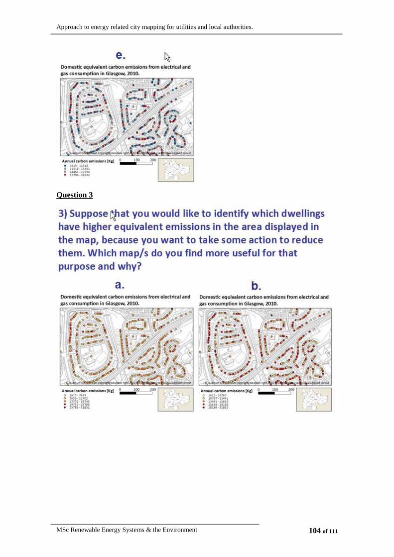
Approach to energy related city mapping for utilities and local authorities.
MSc Renewable Energy Systems & the Environment 104 of 111
Question 3
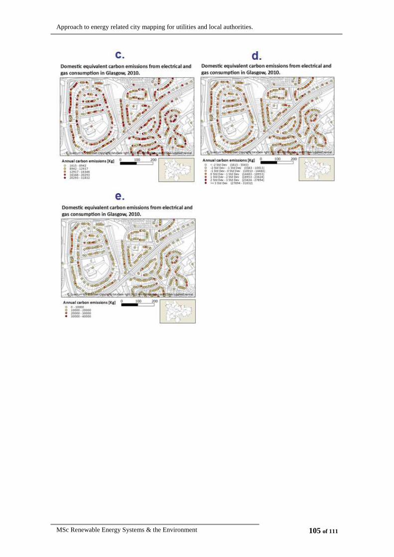
Approach to energy related city mapping for utilities and local authorities.
MSc Renewable Energy Systems & the Environment 105 of 111

Approach to energy related city mapping for utilities and local authorities.
MSc Renewable Energy Systems & the Environment 106 of 111
Question 4

Approach to energy related city mapping for utilities and local authorities.
MSc Renewable Energy Systems & the Environment 107 of 111
Question 5

Approach to energy related city mapping for utilities and local authorities.
MSc Renewable Energy Systems & the Environment 108 of 111
Question 6
Question 7

Approach to energy related city mapping for utilities and local authorities.
MSc Renewable Energy Systems & the Environment 109 of 111

Approach to energy related city mapping for utilities and local authorities.
MSc Renewable Energy Systems & the Environment 110 of 111
Question 8

Approach to energy related city mapping for utilities and local authorities.
MSc Renewable Energy Systems & the Environment 111 of 111