Embed Size (px)
Citation preview
Applying Colour Theory to Visual Design
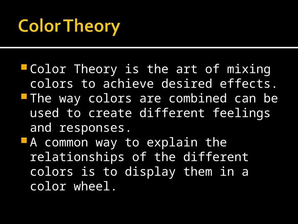
Color Theory is the art of mixing colors to achieve desired effects.
The way colors are combined can be used to create different feelings and responses.
A common way to explain the relationships of the different colors is to display them in a color wheel.
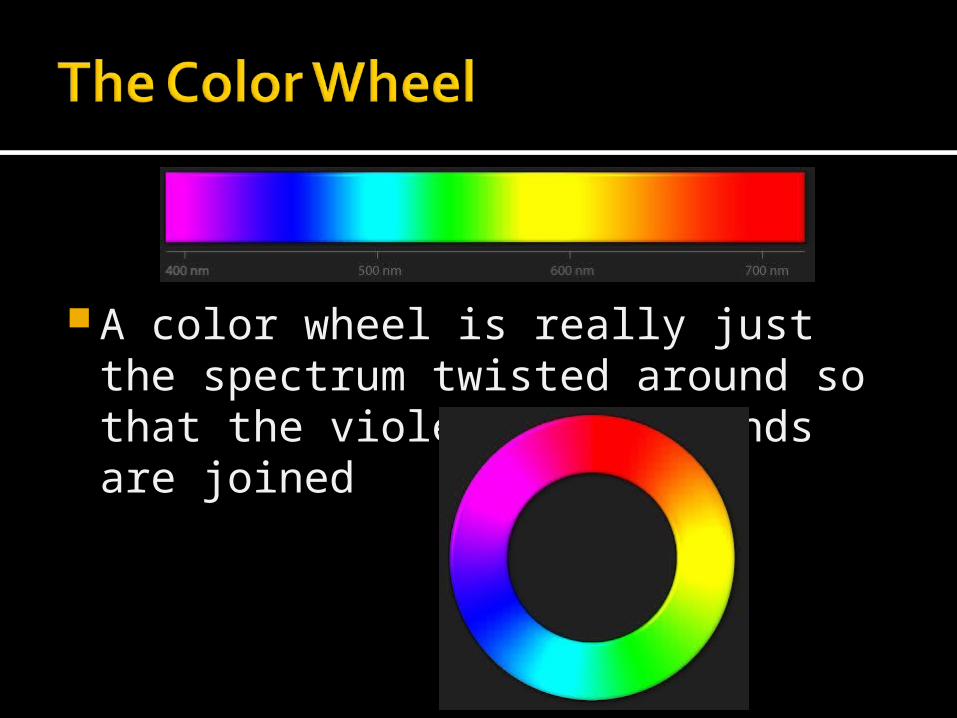
A color wheel is really just the spectrum twisted around so that the violet and red ends are joined
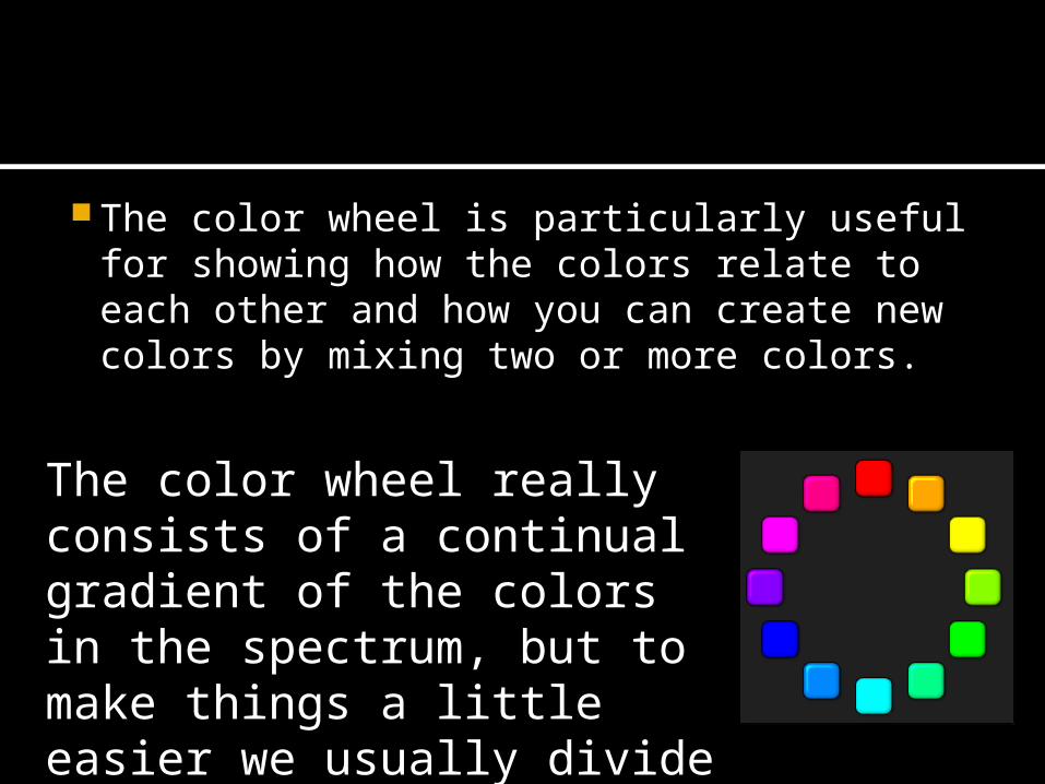
The color wheel is particularly useful for showing how the colors relate to each other and how you can create new colors by mixing two or more colors.
The color wheel really consists of a continual gradient of the colors in the spectrum, but to make things a little easier we usually divide the wheel into twelve distinct colors.
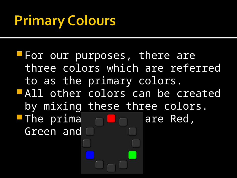
For our purposes, there are three colors which are referred to as the primary colors.
All other colors can be created by mixing these three colors.
The primary colors are Red, Green and Blue.
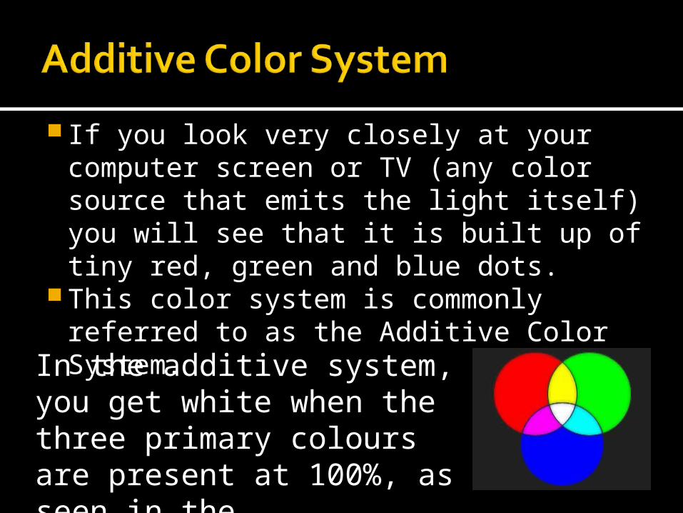
If you look very closely at your computer screen or TV (any color source that emits the light itself) you will see that it is built up of tiny red, green and blue dots.
This color system is commonly referred to as the Additive Color System.
In the additive system, you get white when the three primary colours are present at 100%, as seen in the illustration.
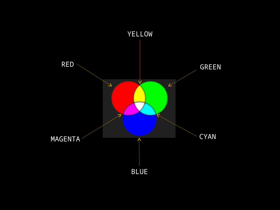
RED
YELLOW
GREEN
CYAN
BLUE
MAGENTA
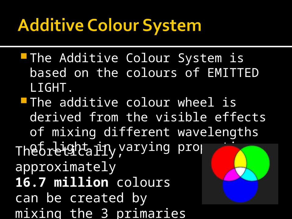
The Additive Colour System is based on the colours of EMITTED LIGHT.
The additive colour wheel is derived from the visible effects of mixing different wavelengths of light in varying proportions.
Theoretically, approximately16.7 million colours can be created by mixing the 3 primaries in varying degrees.
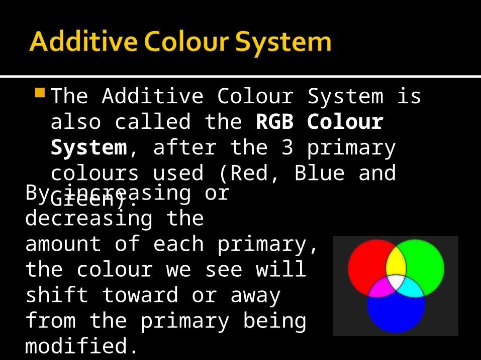
The Additive Colour System is also called the RGB Colour System, after the 3 primary colours used (Red, Blue and Green).
By increasing or decreasing the amount of each primary, the colour we see will shift toward or away from the primary being modified.http://www.huevaluechroma.com/042.php

Try this…G:\Website\Colour\colour.html
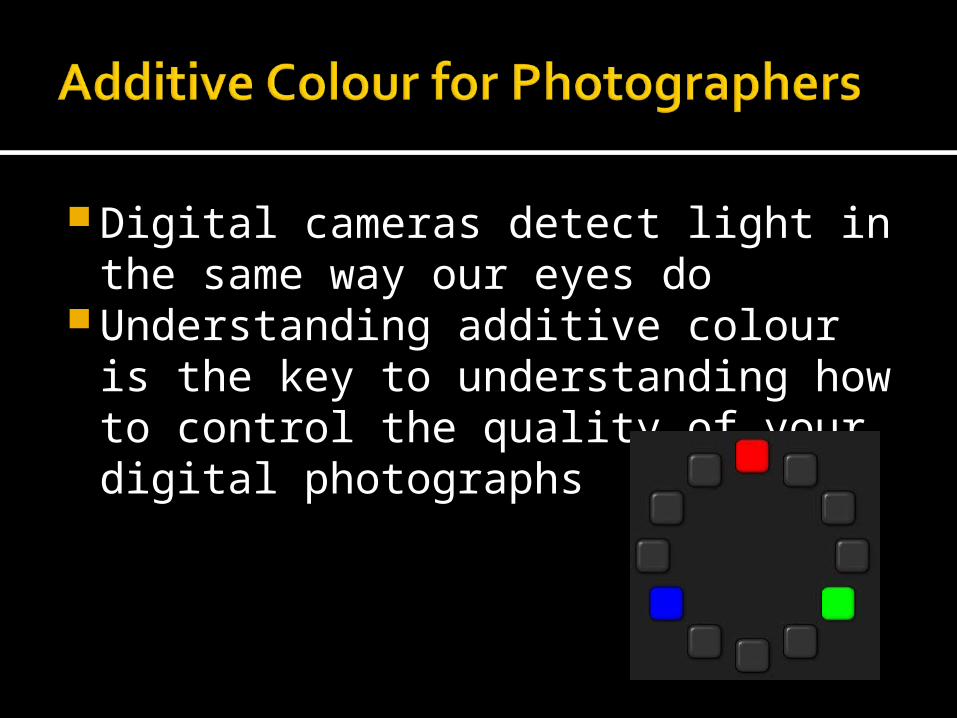
Digital cameras detect light in the same way our eyes do
Understanding additive colour is the key to understanding how to control the quality of your digital photographs
Your digital camera can only detect red, blue and green wavelengths of light. It uses a microprocessor to combine the varying intensities of the light that it “sees” to create an image.
Unfortunately, the quality of light changes with time of day and the type of lighting being used.
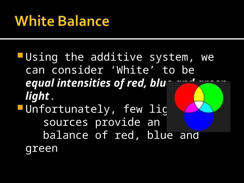
Using the additive system, we can consider ‘White’ to be equal intensities of red, blue and green light.
Unfortunately, few light sources provide an equal balance of red, blue and green
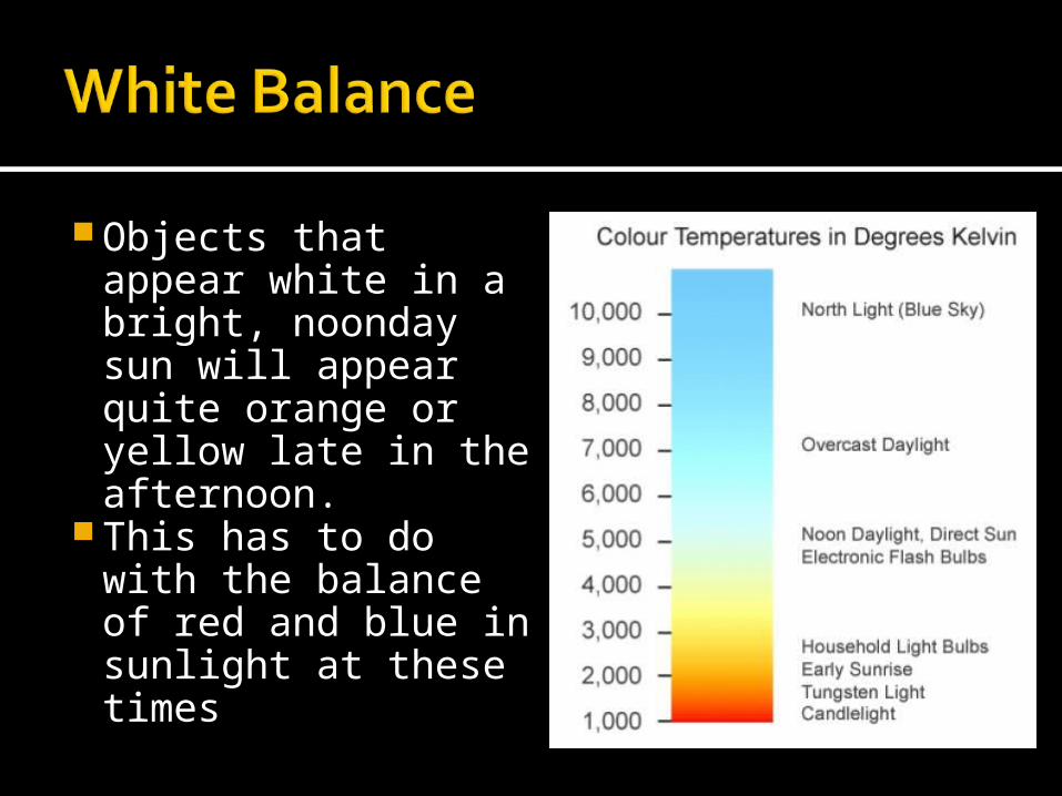
Objects that appear white in a bright, noonday sun will appear quite orange or yellow late in the afternoon.
This has to do with the balance of red and blue in sunlight at these times
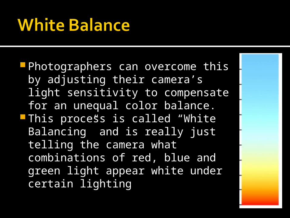
Photographers can overcome this by adjusting their camera’s light sensitivity to compensate for an unequal color balance.
This process is called “White Balancing” and is really just telling the camera what combinations of red, blue and green light appear white under certain lighting
RED
YELLOW
GREEN
CYAN
BLUE
MAGENTA
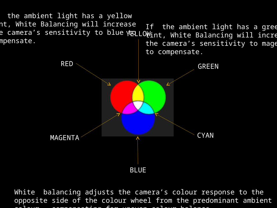
White balancing adjusts the camera’s colour response to the opposite side of the colour wheel from the predominant ambient colour , compensating for uneven colour balance.
If the ambient light has a yellowtint, White Balancing will increase the camera’s sensitivity to blue to compensate.
If the ambient light has a greentint, White Balancing will increase the camera’s sensitivity to magentato compensate.
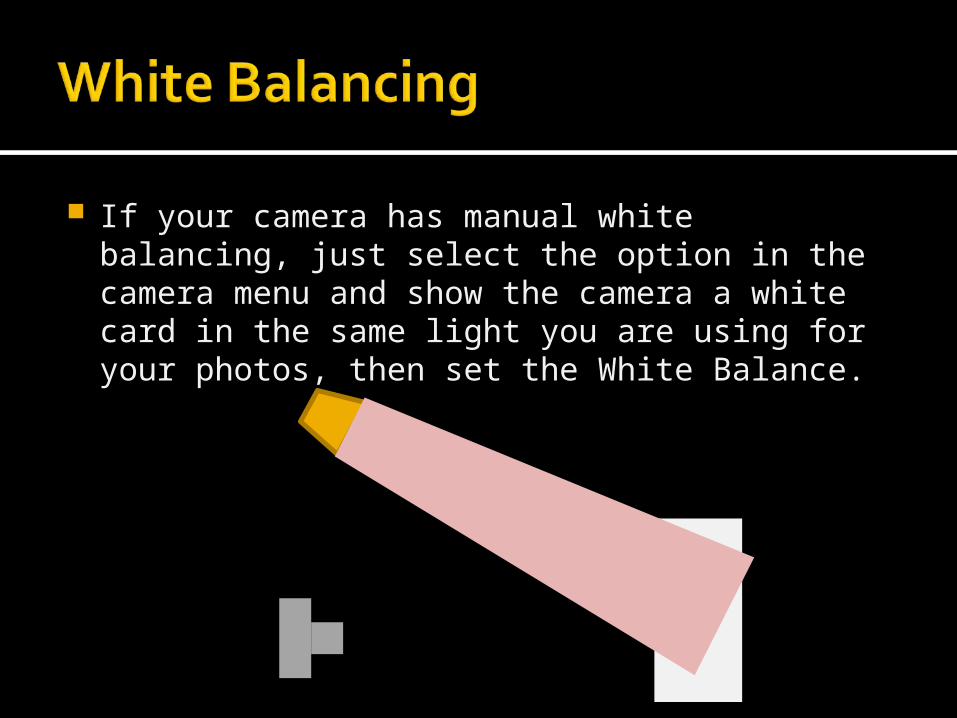
If your camera has manual white balancing, just select the option in the camera menu and show the camera a white card in the same light you are using for your photos, then set the White Balance.