Embed Size (px)
Citation preview
Page 1 of 2
Appendix 1 985
Transformations of FunctionsIdentify the effects of transformations on the graphs of quadratic,exponential, absolute value, and radical functions.
Sometimes a basic function can be related to other functions through transformations.In such instances, the basic function is called a
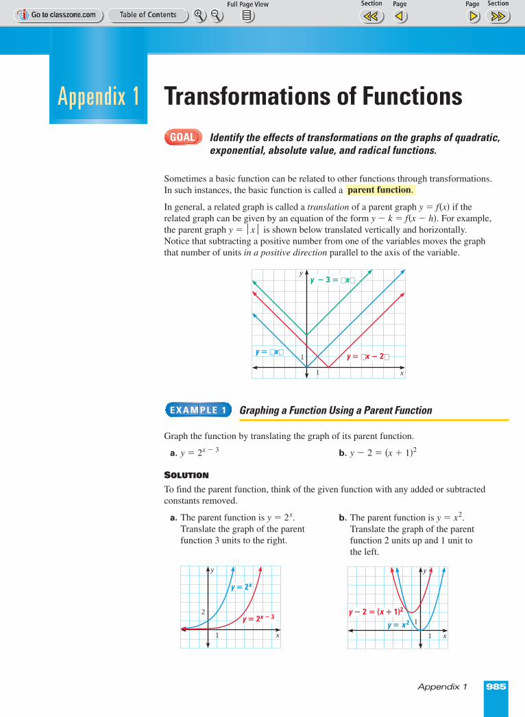
In general, a related graph is called a translation of a parent graph y � f(x) if therelated graph can be given by an equation of the form y � k = f(x � h). For example,the parent graph y � |x| is shown below translated vertically and horizontally.Notice that subtracting a positive number from one of the variables moves the graphthat number of units in a positive direction parallel to the axis of the variable.
Graphing a Function Using a Parent Function
Graph the function by translating the graph of its parent function.
a. y � 2x º 3 b. y � 2 � (x � 1)2
SOLUTION
To find the parent function, think of the given function with any added or subtractedconstants removed.
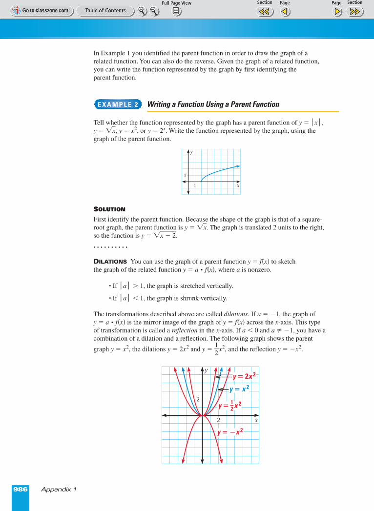
a. The parent function is y � 2x.Translate the graph of the parentfunction 3 units to the right.
E X A M P L E 1
parent function.
GOAL
Appendix 1
y
x
1
1
y � x
y � 3 � x
y � x � 2
b. The parent function is y � x2.Translate the graph of the parentfunction 2 units up and 1 unit tothe left.
y � 2x
y � 2x � 3
y
x
2
1
y
x
y � 2 � (x � 1)2
1
1
y � x 2
Page 1 of 2
986 Appendix 1
In Example 1 you identified the parent function in order to draw the graph of arelated function. You can also do the reverse. Given the graph of a related function,you can write the function represented by the graph by first identifying the parent function.
Writing a Function Using a Parent Function
Tell whether the function represented by the graph has a parent function of y � |x|, y � �x�, y � x2, or y � 2x. Write the function represented by the graph, using thegraph of the parent function.
SOLUTION
First identify the parent function. Because the shape of the graph is that of a square-root graph, the parent function is y � �x�. The graph is translated 2 units to the right,so the function is y � �x � 2�.
. . . . . . . . . .
DILATIONS You can use the graph of a parent function y � f(x) to sketchthe graph of the related function y � a p f(x), where a is nonzero.
• If |a| > 1, the graph is stretched vertically.
• If |a| < 1, the graph is shrunk vertically.
The transformations described above are called dilations. If a � �1, the graph of y � a p f(x) is the mirror image of the graph of y � f(x) across the x-axis. This typeof transformation is called a reflection in the x-axis. If a < 0 and a ≠ �1, you have acombination of a dilation and a reflection. The following graph shows the parent
graph y � x2, the dilations y � 2x2 and y � �12
�x2, and the reflection y � �x2.
E X A M P L E 2
y
x
1
1
y � x 2
y � 2x 2
y � �x 2
y � x 21�2
y
x
2
2
Page 1 of 2
Appendix 1 987
Sketching the Graph of a Dilated Function
Sketch the graph of the function, using the graph of its parent function.
a. y � 4 p 3x b. y � ��13
� |x|
SOLUTION
a. First graph the parent function, y � 3x. Then identify several key points, such as (0, 1) and (1, 3). Since |4| > 1, increase the y-coordinate of each key point by a factor of 4. Plot and connect the new points.
EXERCISES
Graph the function.
1. y � (x � 3)2 2. y � 4 � �x + 2� 3. y � 1 � |x � 4|
4. y � 3 � �x � 1� 5. y � 3|x| 6. y � �4x
7. y � �14
�(x � 1)2 8. y � ��12
�|x| 9. y � 2 p 3x + 1
Tell whether the graph has a parent function of y = |x|, y = �x�, y = x2, ory = 2x. Then write the function represented by the graph.
10. 11. 12.
13. 14. 15.
E X A M P L E 3
y � 3x
y � 4 p 3x
(0, 4)
(0, 1)
(1, 3)
y
x
5
1
(1, 12)
(3, �1)(�3, �1)
(�3, 3) (3, 3)
y � � x1�3
y
x
2
3
y � x
y
x
1
1
y
x
1
1
y
x
1
1
y
x
1
1
y
x
1
1
y
x
1
1
b. First graph the parent function, y � |x|.Identify several key points on the graphof the parent function, such as (�3, 3),
(0, 0), and (3, 3). Since |��13
�| < 1 and
��13
� < 0, decrease the y-coordinate of
each key point by a factor of �13
� and
reflect the points in the x-axis. Plot andconnect the new points.
Page 1 of 2
988 Appendix 1
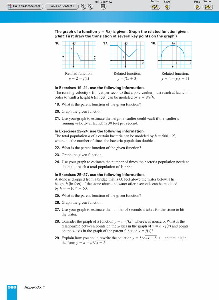
The graph of a function y = f(x) is given. Graph the related function given.(Hint: First draw the translation of several key points on the graph.)
16. 17. 18.
In Exercises 19–21, use the following information.The running velocity v (in feet per second) that a pole vaulter must reach at launch inorder to vault a height h (in feet) can be modeled by v � 8�h�.
19. What is the parent function of the given function?
20. Graph the given function.
21. Use your graph to estimate the height a vaulter could vault if the vaulter’srunning velocity at launch is 30 feet per second.
In Exercises 22–24, use the following information.The total population b of a certain bacteria can be modeled by b � 500 p 2t, where t is the number of times the bacteria population doubles.
22. What is the parent function of the given function?
23. Graph the given function.
24. Use your graph to estimate the number of times the bacteria population needs todouble to reach a total population of 10,000.
In Exercises 25–27, use the following information.A stone is dropped from a bridge that is 60 feet above the water below. Theheight h (in feet) of the stone above the water after t seconds can be modeledby h � �16t2 � 60.
25. What is the parent function of the given function?
26. Graph the given function.
27. Use your graph to estimate the number of seconds it takes for the stone to hit the water.
28. Consider the graph of a function y � a • f(x), where a is nonzero. What is therelationship between points on the x-axis in the graph of y � a p f(x) and pointson the x-axis in the graph of the parent function y � f(x)?
29. Explain how you could rewrite the equation y � 5�4x � 8� � 1 so that it is inthe form y � k � a�x � h�.
Related function:y � 2 = f(x)
Related function:y � f(x � 3)
Related function:y � 4 � f(x � 1)
y
x
2
1
y
x
1
1
y
x
1
1
Page 1 of 2
Appendix 2 989
Modeling Data with FunctionsModel data using linear, quadratic, or exponential functions;estimate the correlation coefficient for a set of data.
Data can sometimes be modeled by a function. Drawing a scatter plot of the data canhelp you recognize the type of function that best models the data. You can then useone of the regression features on a graphing calculator to find and graph an equationof the best-fitting model.
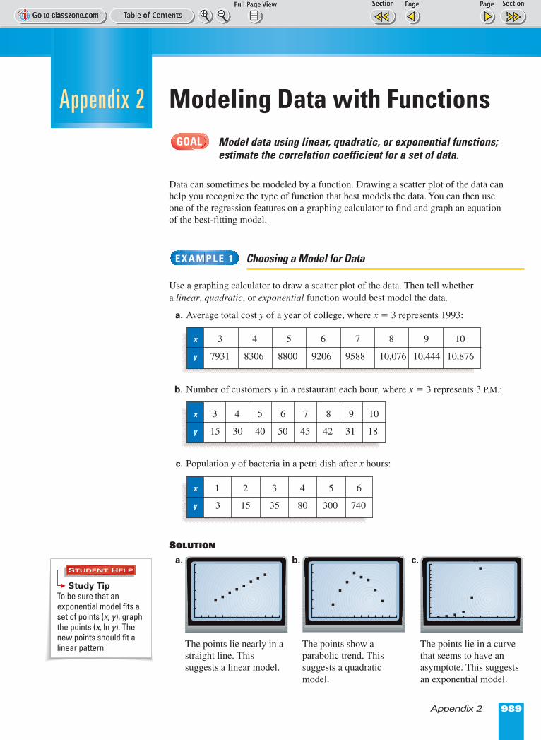
Choosing a Model for Data
Use a graphing calculator to draw a scatter plot of the data. Then tell whethera linear, quadratic, or exponential function would best model the data.
a. Average total cost y of a year of college, where x = 3 represents 1993:
b. Number of customers y in a restaurant each hour, where x = 3 represents 3 P.M.:
c. Population y of bacteria in a petri dish after x hours:
SOLUTION
a. b. c. c.
E X A M P L E 1
GOAL
Appendix 2
The points lie in a curvethat seems to have anasymptote. This suggestsan exponential model.
The points show aparabolic trend. Thissuggests a quadraticmodel.
The points lie nearly in astraight line. Thissuggests a linear model.
x 3 4 5 6 7 8 9 10
y 7931 8306 8800 9206 9588 10,076 10,444 10,876
x 3 4 5 6 7 8 9 10
y 15 30 40 50 45 42 31 18
x 1 2 3 4 5 6
y 3 15 35 80 300 740
STUDENT HELP
Study Tip To be sure that anexponential model fits aset of points (x, y), graphthe points (x, ln y). Thenew points should fit alinear pattern.
Page 1 of 2
STUDENT HELP
Look BackFor help with linear,quadratic, andexponential regression,see pp. 107, 308, and 510.
990 Appendix 2
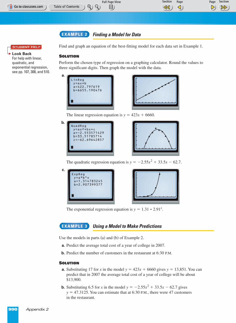
Finding a Model for Data
Find and graph an equation of the best-fitting model for each data set in Example 1.
SOLUTION
Perform the chosen type of regression on a graphing calculator. Round the values tothree significant digits. Then graph the model with the data.
a.
The linear regression equation is y � 423x � 6660.
b.
The quadratic regression equation is y � �2.55x2 � 33.5x � 62.7.
c.
The exponential regression equation is y � 1.31 p 2.91x.
Using a Model to Make Predictions
Use the models in parts (a) and (b) of Example 2.
a. Predict the average total cost of a year of college in 2007.
b. Predict the number of customers in the restaurant at 6:30 P.M.
SOLUTION
a. Substituting 17 for x in the model y = 423x � 6660 gives y � 13,851. You canpredict that in 2007 the average total cost of a year of college will be about$13,900.
b. Substituting 6.5 for x in the model y � �2.55x2 � 33.5x � 62.7 gives y � 47.3125. You can estimate that at 6:30 P.M., there were 47 customers in the restaurant.
E X A M P L E 3
E X A M P L E 2
LinReg y=ax+b a=422.797619 b=6655.190476
QuadReg y=ax2+bx+c a=-2.553571429 b=33.51785714 c=-62.69642857
ExpReg y=a*b^x a=1.314783245 b=2.907399377
Page 1 of 2
Appendix 2 991
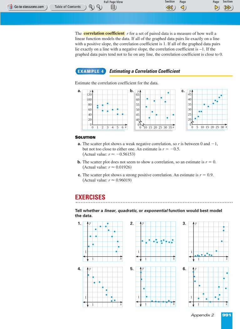
The r for a set of paired data is a measure of how well alinear function models the data. If all of the graphed data pairs lie exactly on a linewith a positive slope, the correlation coefficient is 1. If all of the graphed data pairslie exactly on a line with a negative slope, the correlation coefficient is –1. If thegraphed data pairs tend not to lie on any line, the correlation coefficient is close to 0.
Estimating a Correlation Coefficient
Estimate the correlation coefficient for the data.
a. b. c.
SOLUTION
a. The scatter plot shows a weak negative correlation, so r is between 0 and �1, but not too close to either one. An estimate is r � �0.5. (Actual value: r ≈ �0.56153)
b. The scatter plot does not seem to show a correlation, so an estimate is r � 0.(Actual value: r ≈ 0.01926)
c. The scatter plot shows a strong positive correlation. An estimate is r � 0.9.(Actual value: r ≈ 0.96019)
EXERCISES
Tell whether a linear, quadratic, or exponential function would best modelthe data.
1. 2. 3.
4. 5. 6.
E X A M P L E 4
correlation coefficient
y
x0 2
80
60
40
20
0
100
120
4 61 3 5
y
x0 15
55
50
45
40
0
60
65
25 3510 20 30
y
x0 10
35
30
25
20
0
40
45
20 305 15 25
y
x1
1
y
x1
1
y
x1
1
y
x1
1
y
x1
1
x1
1
y
Page 1 of 2
992 Appendix 2
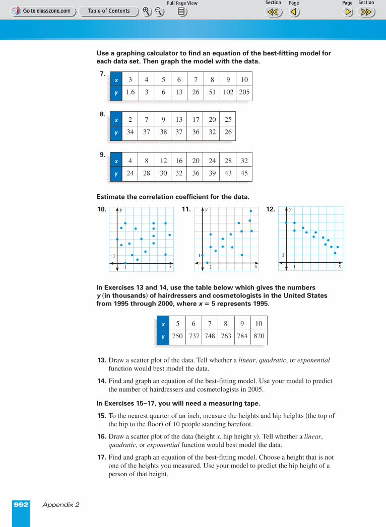
Use a graphing calculator to find an equation of the best-fitting model foreach data set. Then graph the model with the data.
7.
8.
9.
Estimate the correlation coefficient for the data.
10. 11. 12.
In Exercises 13 and 14, use the table below which gives the numbers y (in thousands) of hairdressers and cosmetologists in the United Statesfrom 1995 through 2000, where x � 5 represents 1995.
13. Draw a scatter plot of the data. Tell whether a linear, quadratic, or exponentialfunction would best model the data.
14. Find and graph an equation of the best-fitting model. Use your model to predictthe number of hairdressers and cosmetologists in 2005.
In Exercises 15–17, you will need a measuring tape.
15. To the nearest quarter of an inch, measure the heights and hip heights (the top ofthe hip to the floor) of 10 people standing barefoot.
16. Draw a scatter plot of the data (height x, hip height y). Tell whether a linear,quadratic, or exponential function would best model the data.
17. Find and graph an equation of the best-fitting model. Choose a height that is notone of the heights you measured. Use your model to predict the hip height of aperson of that height.
x 3 4 5 6 7 8 9 10
y 1.6 3 6 13 26 51 102 205
x 2 7 9 13 17 20 25
y 34 37 38 37 36 32 26
x 4 8 12 16 20 24 28 32
y 24 28 30 32 36 39 43 45
y
x1
1
y
x1
1
y
x1
1
x 5 6 7 8 9 10
y 750 737 748 763 784 820
Page 1 of 2
Appendix 3 993
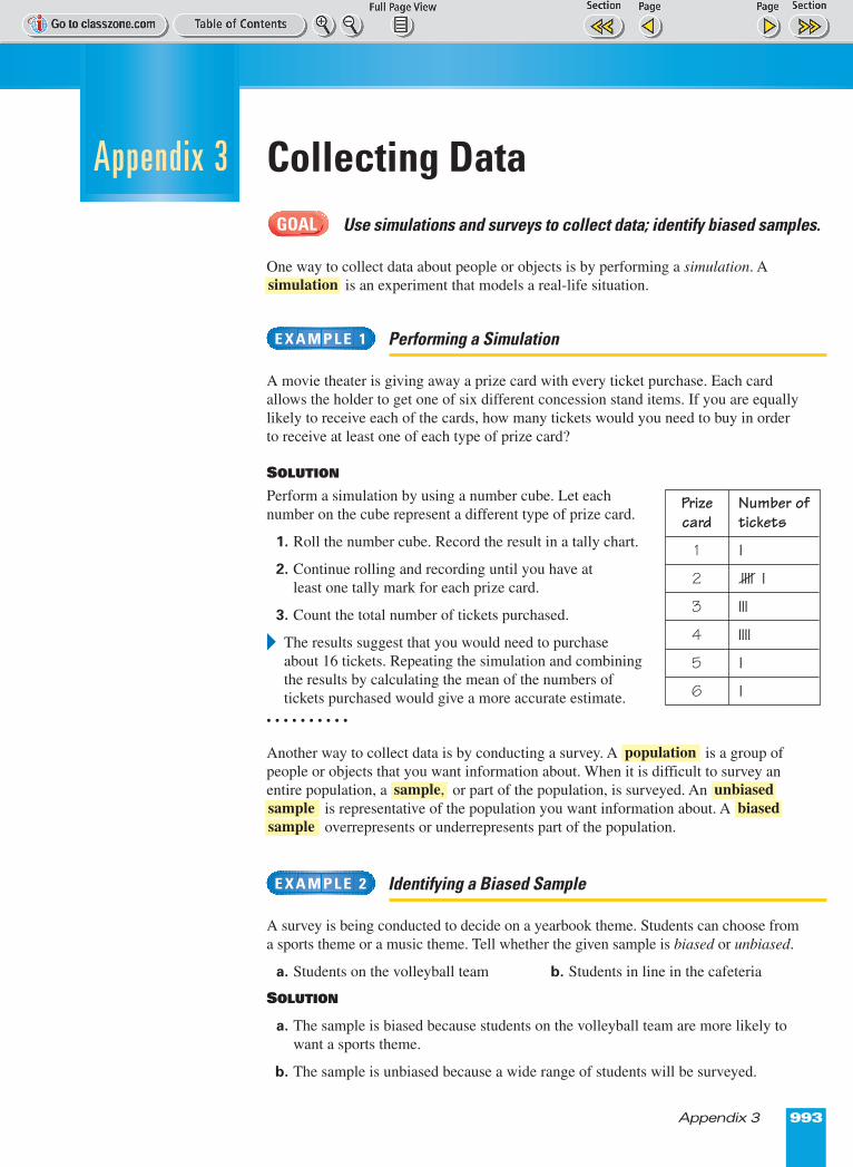
Collecting DataUse simulations and surveys to collect data; identify biased samples.
One way to collect data about people or objects is by performing a simulation. Ais an experiment that models a real-life situation.
Performing a Simulation
A movie theater is giving away a prize card with every ticket purchase. Each cardallows the holder to get one of six different concession stand items. If you are equallylikely to receive each of the cards, how many tickets would you need to buy in orderto receive at least one of each type of prize card?
SOLUTION
Perform a simulation by using a number cube. Let each number on the cube represent a different type of prize card.
1. Roll the number cube. Record the result in a tally chart.
2. Continue rolling and recording until you have at least one tally mark for each prize card.
3. Count the total number of tickets purchased.
� The results suggest that you would need to purchaseabout 16 tickets. Repeating the simulation and combiningthe results by calculating the mean of the numbers of tickets purchased would give a more accurate estimate.
• • • • • • • • • •
Another way to collect data is by conducting a survey. A is a group ofpeople or objects that you want information about. When it is difficult to survey anentire population, a or part of the population, is surveyed. An
is representative of the population you want information about. A overrepresents or underrepresents part of the population.
Identifying a Biased Sample
A survey is being conducted to decide on a yearbook theme. Students can choose froma sports theme or a music theme. Tell whether the given sample is biased or unbiased.
a. Students on the volleyball team b. Students in line in the cafeteria
SOLUTION
a. The sample is biased because students on the volleyball team are more likely towant a sports theme.
b. The sample is unbiased because a wide range of students will be surveyed.
E X A M P L E 2
samplebiasedsample
unbiasedsample,
population
E X A M P L E 1
simulation
GOAL
Appendix 3
Prize Number of card tickets
1 1
2 51
3 3
4 4
5 1
6 1

Page 1 of 2
994 Appendix 3
In a simulation, such as the one in Example 1, the results are more accurate if youincrease the number of times you perform the simulation. Similarly, as the size of asample increases, the sample will more accurately represent the population.
Because a sample is an approximation of an entire population, the results of a surveymay not be exact. A is a percent that indicates aninterval that is likely, but not certain, to contain the exact result.
Finding a Margin of Sampling Error
In a survey of 1600 voters, 51% said they voted for candidate A.
a. What is the margin of sampling error for the survey?
b. Give an interval that is likely to contain the exact percent of all voters who votedfor candidate A.
SOLUTION
a. Use the formula for the margin of sampling error.
S ≈ Write margin of sampling error formula.
≈ Substitute 1600 for n.
≈ 0.025 Simplify.
� The margin of sampling error is about 2.5%.
b. To find the interval, take the percent of people in the sample who voted forcandidate A, 51%, and subtract and add the margin of sampling error, 2.5%.
� It is likely that the exact percent of all voters who voted for candidate A isbetween 48.5% and 53.5%.
52%48% 54% 55%47% 49% 50% 51%
51% � 2.5% � 48.5% 51% � 2.5% � 53.5%
53%
1��1600�
1��n�
E X A M P L E 3
margin of sampling error
For a random sample of size n, taken from a large population, the margin ofsampling error S can be approximated by this formula:
S ≈ 1��n�
MARGIN OF SAMPLING ERROR
Page 1 of 2
Appendix 3 995
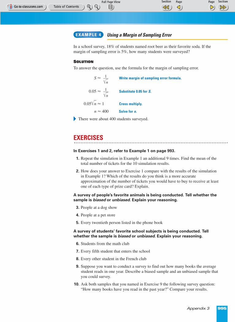
Using a Margin of Sampling Error
In a school survey, 18% of students named root beer as their favorite soda. If themargin of sampling error is 5%, how many students were surveyed?
SOLUTION
To answer the question, use the formula for the margin of sampling error.
S ≈ Write margin of sampling error formula.
0.05 ≈ Substitute 0.05 for S.
0.05�n� ≈ 1 Cross multiply.
n ≈ 400 Solve for n.
� There were about 400 students surveyed.
EXERCISES
In Exercises 1 and 2, refer to Example 1 on page 993.
1. Repeat the simulation in Example 1 an additional 9 times. Find the mean of thetotal number of tickets for the 10 simulation results.
2. How does your answer to Exercise 1 compare with the results of the simulationin Example 1? Which of the results do you think is a more accurateapproximation of the number of tickets you would have to buy to receive at leastone of each type of prize card? Explain.
A survey of people’s favorite animals is being conducted. Tell whether thesample is biased or unbiased. Explain your reasoning.
3. People at a dog show
4. People at a pet store
5. Every twentieth person listed in the phone book
A survey of students’ favorite school subjects is being conducted. Tellwhether the sample is biased or unbiased. Explain your reasoning.
6. Students from the math club
7. Every fifth student that enters the school
8. Every other student in the French club
9. Suppose you want to conduct a survey to find out how many books the averagestudent reads in one year. Describe a biased sample and an unbiased sample thatyou could survey.
10. Ask both samples that you named in Exercise 9 the following survey question:“How many books have you read in the past year?” Compare your results.
1��n�
1��n�
E X A M P L E 4
Page 1 of 2
996 Appendix 3
Find the margin of sampling error for a survey with the given sample size.Round your answer to the nearest tenth of a percent.
11. 330 12. 10,000 13. 575
14. 1000 15. 2250 16. 900
Find the smallest sample size required for the given margin of samplingerror. Round your answer to the nearest whole number.
17. 4% 18. 6% 19. 3.5%
20. 2.8% 21. 5.2% 22. 1.5%
In Exercises 23–25, design and perform a simulation to answer thequestion. Perform the simulation at least 10 times. (Hint: You may want toconsider using a coin, a number cube, or index cards in a paper bag.)
23. You are playing a game of chance in which you are equally likely to win or lose.About how many times would you have to play the game in order to win at leastonce and lose at least once?
24. A gumball machine contains pink, blue, and white gumballs. There are twice asmany pink gumballs as blue gumballs, and three times as many blue gumballs aswhite gumballs. If gumballs are randomly dispensed from the machine, what isthe experimental probability of getting a blue gumball?
25. A brand of cereal has one of five different colored toy cars in each box. There areequal numbers of the blue, yellow, silver, and green cars. There are twice asmany red cars as there are blue cars. Assuming the cars are randomly placed inboxes of cereal, about how many boxes would you have to buy in order to obtainat least one of each kind of car?
In Exercises 26–28, a survey reported that 15%, or 315 students, preferhaving gym class during the last period of the day.
26. How many students were surveyed?
27. What is the margin of sampling error? Round your answer to the nearest tenth ofa percent.
28. Give an interval that is likely to contain the exact percent of all students whoprefer to have gym class during the last period.
In Exercises 29–32, a survey reported that 235 of the 500 voters in a samplevoted for candidate A and the rest voted for candidate B.
29. What percent of the voters in the sample voted for candidate A? What percent ofthe voters in the sample voted for candidate B?
30. What is the margin of sampling error? Round your answer to the nearest tenth ofa percent.
31. For each candidate, give an interval that is likely to contain the exact percent ofall voters who voted for the candidate.
32. Based on your answer from Exercise 31, can you determine which candidatewon? Explain.
33. What happens to the margin of sampling error as sample size increases? Give anexample to support your answer.
Page 1 of 2
Appendix 4 997
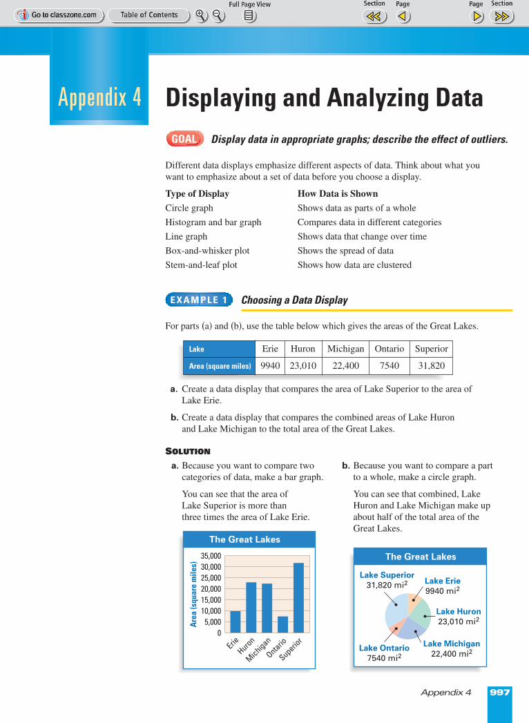
Displaying and Analyzing DataDisplay data in appropriate graphs; describe the effect of outliers.
Different data displays emphasize different aspects of data. Think about what youwant to emphasize about a set of data before you choose a display.
Type of Display How Data is Shown
Circle graph Shows data as parts of a whole
Histogram and bar graph Compares data in different categories
Line graph Shows data that change over time
Box-and-whisker plot Shows the spread of data
Stem-and-leaf plot Shows how data are clustered
Choosing a Data Display
For parts (a) and (b), use the table below which gives the areas of the Great Lakes.
a. Create a data display that compares the area of Lake Superior to the area of Lake Erie.
b. Create a data display that compares the combined areas of Lake Huron and Lake Michigan to the total area of the Great Lakes.
SOLUTION
a. Because you want to compare two categories of data, make a bar graph.
You can see that the area of Lake Superior is more than three times the area of Lake Erie.
E X A M P L E 1
GOAL
ErieHuron
Are
a (s
quar
e m
iles)
35,00030,00025,00020,00015,00010,0005,000
0
Ontario
Michigan
Superior
The Great Lakes
Lake Erie
9940 mi2
Lake Huron
23,010 mi2
Lake Michigan
22,400 mi2Lake Ontario
7540 mi2
Lake Superior
31,820 mi2
The Great Lakes
b. Because you want to compare a partto a whole, make a circle graph.
You can see that combined, LakeHuron and Lake Michigan make upabout half of the total area of theGreat Lakes.
Lake Erie Huron Michigan Ontario Superior
Area (square miles) 9940 23,010 22,400 7540 31,820
Appendix 4
Page 1 of 2
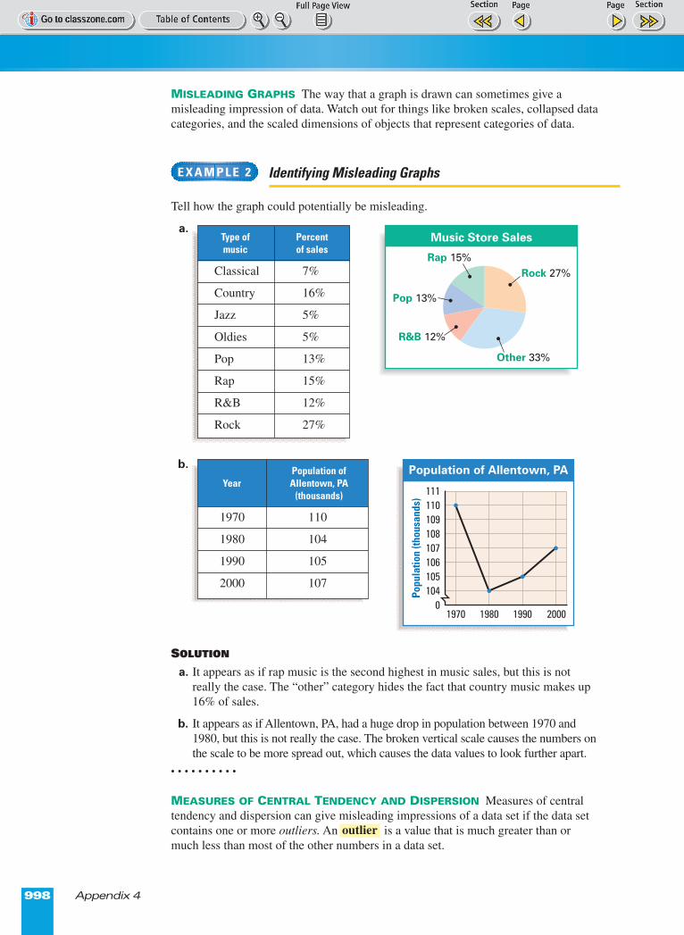
MISLEADING GRAPHS The way that a graph is drawn can sometimes give amisleading impression of data. Watch out for things like broken scales, collapsed datacategories, and the scaled dimensions of objects that represent categories of data.
Identifying Misleading Graphs
Tell how the graph could potentially be misleading.
a.
b.
SOLUTION
a. It appears as if rap music is the second highest in music sales, but this is notreally the case. The “other” category hides the fact that country music makes up16% of sales.
b. It appears as if Allentown, PA, had a huge drop in population between 1970 and1980, but this is not really the case. The broken vertical scale causes the numbers onthe scale to be more spread out, which causes the data values to look further apart.
• • • • • • • • • •
MEASURES OF CENTRAL TENDENCY AND DISPERSION Measures of centraltendency and dispersion can give misleading impressions of a data set if the data setcontains one or more outliers. An is a value that is much greater than ormuch less than most of the other numbers in a data set.
outlier
Popu
latio
n (th
ousa
nds)
111110109108107106105104
0
Population of Allentown, PA
1970 1980 1990 2000
Rock 27%
Other 33%
R&B 12%
Pop 13%
Rap 15%
Music Store Sales
E X A M P L E 2
998 Appendix 4
Population ofYear Allentown, PA
(thousands)
1970 110
1980 104
1990 105
2000 107
Type of Percent music of sales
Classical 7%
Country 16%
Jazz 5%
Oldies 5%
Pop 13%
Rap 15%
R&B 12%
Rock 27%
Page 1 of 2
Appendix 4 999
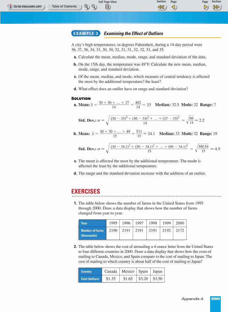
Examining the Effect of Outliers
A city’s high temperatures, in degrees Fahrenheit, during a 14-day period were 36, 37, 36, 34, 33, 30, 30, 32, 31, 31, 32, 32, 33, and 35.
a. Calculate the mean, median, mode, range, and standard deviation of the data.
b. On the 15th day, the temperature was 49°F. Calculate the new mean, median,mode, range, and standard deviation.
c. Of the mean, median, and mode, which measure of central tendency is affectedthe most by the additional temperature? the least?
d. What effect does an outlier have on range and standard deviation?
SOLUTION
a. Mean: x� = = �41642
� = 33 Median: 32.5 Mode: 32 Range: 7
Std. Dev.: ß = ����� = ��61
84�� ≈ 2.2
b. Mean: x� = = �51151
� ≈ 34.1 Median: 33 Mode: 32 Range: 19
Std. Dev.: ß ≈ �����= ≈ 4.5
c. The mean is affected the most by the additional temperature. The mode isaffected the least by the additional temperature.
d. The range and the standard deviation increase with the addition of an outlier.
EXERCISES
1. The table below shows the number of farms in the United States from 1995through 2000. Draw a data display that shows how the number of farms changed from year to year.
2. The table below shows the cost of airmailing a 4-ounce letter from the United Statesto four different countries in 2000. Draw a data display that shows how the costs ofmailing to Canada, Mexico, and Spain compare to the cost of mailing to Japan. Thecost of mailing to which country is about half of the cost of mailing to Japan?
��30
105.54��(30 � 34.1)2 + (30 � 34.1)2 + … + (49 � 34.1)2
������15
30 + 30 + … + 49���
15
(30 � 33)2 + (30 � 33)2 + … + (37 � 33)2�����
14
30 + 30 + … + 37���
14
E X A M P L E 3
Year 1995 1996 1997 1998 1999 2000
Number of farms 2196 2191 2191 2191 2192 2172(thousands)
Country Canada Mexico Spain Japan
Cost (dollars) $1.35 $1.65 $3.20 $3.50
Page 1 of 2
1000 Appendix 4
In Exercises 3 and 4, use the following prices (in dollars) of CDs in a sale binat a music store.
3.99, 10.99, 14.99, 4.99, 8.99, 15.99, 10.99, 5.99, 12.99, 8.99, 11.99, 17.99
3. Draw a data display that can be used to visually compare the number of CDs that cost between $1.00 and $5.99 to the number of CDs that cost between$16.00 and $20.99. How do these two categories compare?
4. Draw a data display that can be used to find the range of the upper half of theprices. Then find the range of the upper half of the prices.
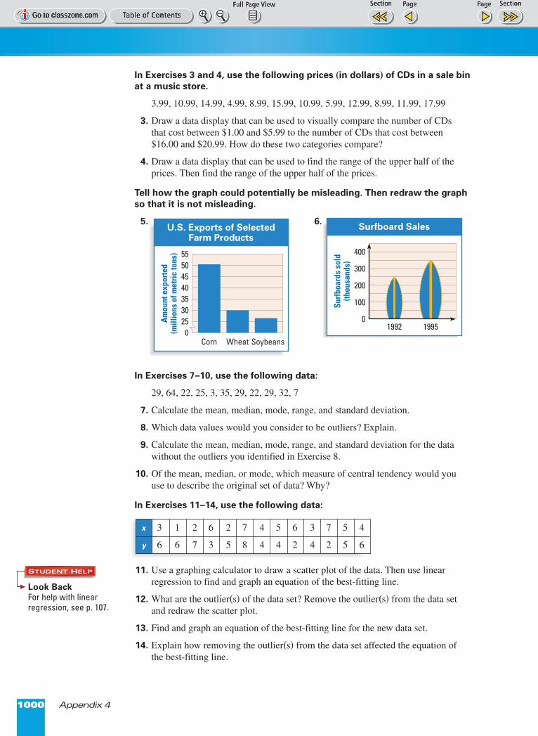
Tell how the graph could potentially be misleading. Then redraw the graphso that it is not misleading.
5. 6.
In Exercises 7–10, use the following data:
29, 64, 22, 25, 3, 35, 29, 22, 29, 32, 7
7. Calculate the mean, median, mode, range, and standard deviation.
8. Which data values would you consider to be outliers? Explain.
9. Calculate the mean, median, mode, range, and standard deviation for the datawithout the outliers you identified in Exercise 8.
10. Of the mean, median, or mode, which measure of central tendency would youuse to describe the original set of data? Why?
In Exercises 11–14, use the following data:
11. Use a graphing calculator to draw a scatter plot of the data. Then use linearregression to find and graph an equation of the best-fitting line.
12. What are the outlier(s) of the data set? Remove the outlier(s) from the data setand redraw the scatter plot.
13. Find and graph an equation of the best-fitting line for the new data set.
14. Explain how removing the outlier(s) from the data set affected the equation ofthe best-fitting line.
Surf
boar
ds s
old
(thou
sand
s)
400
300
200
100
01992 1995
Surfboard Sales
Am
ount
exp
orte
d(m
illio
ns o
f met
ric
tons
) 555045403530250
Corn SoybeansWheat
U.S. Exports of SelectedFarm Products
x 3 1 2 6 2 7 4 5 6 3 7 5 4
y 6 6 7 3 5 8 4 4 2 4 2 5 6
Look Back For help with linearregression, see p. 107.
STUDENT HELP