Embed Size (px)
Citation preview

8/3/2019 Anylsis of Magazine c,c,
http://slidepdf.com/reader/full/anylsis-of-magazine-cc 1/10
THE CONTENTS PAGE
Content (mode of address - comment on types of articles and how they target their readership, images, text, colours)Juxtaposition of elements (space, layout, connotations of juxtapositioning)
Target Audience
Mainstream market
particularly with males, the
reason for this being that Wiz
khalifa is a popular recording
artist with teenagers and
young adults and is featured
on most music networks,
The rolling stones master
head has been placed at the
top and centred as it shows
that is it the title as well as
clearly informing the viewer
that it is a Rolling Stones
official magazine. It has been
sent to the back so the main
image appears bigger and
clearer. The title is coloured
red to connote energy and
youth, with the magazine
directed at young music
lovers. The general lexis used
‘Rolling Stones’ itself denoted
music as it is one of the most
The mode of address on this cover page is
implied by the Rolling Stones title which
engages people who desire fame or are
addicted to knowing the ins and outs of
celebrity life, as well as the fonts used as the
colour pallet of black, white and red screams
fame and elegance. The phrases on the cover
such as New faces 2011 and the name of the
celebrity on the main picture Wiz khalifa help to
sell the magazine. The initial font also helps to
sell the magazine as it is young and hip which
helps to attract a younger market.
The main cover image is of the famous
recording artist Wiz Kahlifa who recently came
into the music seen with multiple hits, now
wonder Rolling Stones dedicated an article to
him. The cover picture talks to the audience as
those familiar of him or his music will instantly
recognise him and begin to read, his
costume/clothing also speaks to the reader as
it could give them some idea of a trend for theseason. The lighting of the picture is bright to
emphasis the features of the shot such as the
tattoo on his left eye, the tattoo on his neck,
his gold chain or the wink he is doing. It is a
mid angle close up, which together with the
previously elements presented creates a
dynamic professional picture that is both clear
and informative.This also matches the cover
line as it sates New Fces, and this is a close up
of the Artists face.

8/3/2019 Anylsis of Magazine c,c,
http://slidepdf.com/reader/full/anylsis-of-magazine-cc 2/10
THE CONTENTS PAGE
Content (mode of address - comment on types of articles and how they target their readership, images, text, colours)Juxtaposition of elements (space, layout, connotations of juxtapositioning)
Target Audience
This type of magazine would attract a
mainstream market; however it does example
niche tastes in music. I was able to figure thisout from the colour scheme used and the
example of music given (Jessie J), typically the
magazine would attract both genders, however
more commonly it would be generalised to the
female market as the colours used are typically
feminine, cherry red and pinks. Also the pop
genre is built around teenage girls.
The main image used on the cover is of the
pop sensation Jessie J who has taken the UK
pop scene by storm with her debut album; Q is
exactly the magazine to cover her mixed genre
of pop and spoken word rhyme. The positioning
of various elements speaks to the reader to
give them a perspective of the magazinescontents, the models positioning implies s
afresh new edge which is Q’s typical design.
Lighting on the picture is used to emphasis the
models face and elements of her outfit, the
white background is shadowed to give it a
realistic effect. Her costume/clothing also gives
us further information about the magazines
typical conventions; she is dressed in an
abstract unusual piece of clothing with mirrors
the magazines conventions.
This sell line helps to get the magazine
purchased as it is Q’s motto which would give
the magazine a themed phrase. ‘Discover
great music’ automatically grabs the reader’s
attention, not visible but if read it will gets the
reader thinking. Even though it is a cheesy line
the symbolic meaning and chosen words such
as discover would captivate the consumer.
However it is a small font and plain colour
which might be due to the house style and
colour pallet.
The master head Q takes up a very minimal
amount of space, it is very simply constructed
using basic typography, would be a formal font
such as Times New Roman and is coloured
white,. It is also enlarged for a better effect,
although you may think it is very unimportant
and usual it has a great impact, as it has a red
background it easily catches the consumers
eye and makes them generate a thought about
the master head, it is also a universal master
head that can be applied to any genre of
recording Artist.

8/3/2019 Anylsis of Magazine c,c,
http://slidepdf.com/reader/full/anylsis-of-magazine-cc 3/10
THE CONTENTS PAGE
Content (mode of address - comment on types of articles and how they target their readership, images, text, colours)Juxtaposition of elements (space, layout, connotations of juxtapositioning)
The master head of this magazine is very large
and uses the rule of thirds well as it covers a
majority of the upper tier, it is clear and well
customized with good typography. As it is a
large bold font is can be themed to any genre
of music and also is highly visible. The word
‘Blender’ co notates a mixture of combined
elements, which is really what the magazinesabout as it explores different genres from Rock
to Rap
The main cover image is of the pop sensation
Katy Perry that has proved very successful
from her recent albums. Blender have a wide
range of artists from whom they cover each
week, the image is just what is needed for this
type of magazine, a snared pose that suggests
attitude and teenage behaviour, which is the
ideal market. The costume/clothing is very pop
star; it would attract male audience as well as
female (in inspiration of fashion). The colours in
her clothing are vibrant and coordinated which
match the cover lines. The lighting on the
picture is very bright to emphasis all of her
features, figure and accessories (Headband
etc). The white backround also complements
elements in the picture by highlighting the
bright colours.
Target Market
For this magazine the Target market is
typically teenagers and young adults, with an
interest in wide range of music. However this
particular issue would be directed at girls as it
uses colours that are typically famine such as
pink. Also the cover model is a female who
The sell lines on this particular issue are very
unusual, the ones that stand out are the Katy
Perry ‘Kiss ‘N’ Tell’ line which gives the
consumer information about the article within.

8/3/2019 Anylsis of Magazine c,c,
http://slidepdf.com/reader/full/anylsis-of-magazine-cc 4/10
THE CONTENTS PAGE
Content (mode of address - comment on types of articles and how they target their readership, images, text, colours)Juxtaposition of elements (space, layout, connotations of juxtapositioning)
Th main image here of hit band The courteners
targets readers who are interested in indie
music, it speaks to the reader through the mise
en scene, as it shows a vast open land and thetypical boy band pose.
The text follows the typical Style with the bold
white text in a contrasting back round, here it
is black and here it is red. The main text used
to write the contents a formal yet rugged font
that matches magazines and ideal reader’s
personnel.
The spacing on this contents page is limited,
everything is almost crammed together, which
saves space and cost of printing. It also
resembles the clustered music life, meaning the
main image is of indie rockers who would most
likely live in fast passed messy environments.
(T ical rockers stereot e)

8/3/2019 Anylsis of Magazine c,c,
http://slidepdf.com/reader/full/anylsis-of-magazine-cc 5/10
THE CONTENTS PAGE
Content (mode of address - comment on types of articles and how they target their readership, images, text, colours)Juxtaposition of elements (space, layout, connotations of juxtapositioning)
The main cover image on this contents
page is similar to the front cover analysed
for Blender, it is of Katy Perry holding a
gigantic Mario-like mushroom. The
costume matches the mushroom shown,
using bright colours breaks the simplicity
of the contents page it also stands out and
would attract the consumer. The
mushroom could co notate the craziness
of the ma azine or Kat ’s music which
The master head on the page uses clever
typography to construct a bold title which
contrasts with the white background and is in
theme with the rest of the page. The
typography is basic, a cool pop style font with
a black stars look fill colour, which is centred
and takes up most of the space on the rule of
thirds first tier.
The main text on the contents page is a plain
black font which almost resembles the main
master heads font; there text on the page
takes up very little space as everything is
widely spaced out to create a simplistic effect.
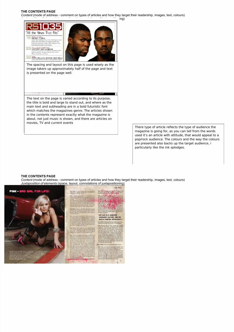
The main image presented on this contents page is a mid
shot of two icons on the rap industry they are both side by
side and facing the camera to give off a mean, straight on
look which resembles the issue being addressed. The
costume used represents the vibe/mood of the main topic of
the magazine, as both artists are wearing dull darker
colours.
8/3/2019 Anylsis of Magazine c,c,
http://slidepdf.com/reader/full/anylsis-of-magazine-cc 6/10
THE CONTENTS PAGE
Content (mode of address - comment on types of articles and how they target their readership, images, text, colours)Juxtaposition of elements (space, layout, connotations of juxtapositioning)
The spacing and layout on this page is used wisely as the
image takers up approximately half of the page and text
is presented on the page well.
The text on the page is varied according to its purpose,
the title is bold and large to stand out, and where as the
main text and subheading are in a bold futuristic font
which matches the magazines genre. The articles shown
in the contents represent exactly what the magazine is
about, not just music is shown, and there are articles on
movies, TV and current events
The main image on this page is of a famous singer
called Pink she is posing on the floor while giving a
rude gesture this presents the raw attitude of the
magazine and shows us the culture that is presented.
This shows the readership of the magazine, as
rock/pop fans would be interested in this type of
article.
There type of article reflects the type of audience the
magazine is going for, as you can tell from the words
used it’s an article with attitude, that would appeal to a
pop/rock audience. The colours and the way the colours
are presented also backs up the target audience, i
particularly like the ink splodges.

8/3/2019 Anylsis of Magazine c,c,
http://slidepdf.com/reader/full/anylsis-of-magazine-cc 7/10
THE CONTENTS PAGE
Content (mode of address - comment on types of articles and how they target their readership, images, text, colours)Juxtaposition of elements (space, layout, connotations of juxtapositioning)

8/3/2019 Anylsis of Magazine c,c,
http://slidepdf.com/reader/full/anylsis-of-magazine-cc 8/10
THE CONTENTS PAGE
Content (mode of address - comment on types of articles and how they target their readership, images, text, colours)Juxtaposition of elements (space, layout, connotations of juxtapositioning)
The way in which spacing is used in this rock magazine
is unusual they have crammed everything on to the
second page but they have also added information tothe first one, the banners and cover lines all explain
the magazine, were ready to rock implies a hard
hitting article. As well as The usual suspects cover line.
The colours used on this page also resemble the genre
as the colours are greyscale and dull, which represent
boredom possibly or anger.
The images on this page also reflect the audience andgenre, as they are very abstract and unusual, to
contract the picture at the top of the second is very
happy and lively.
This double page spread is unusual and i chose this as it is very abstract an
unique, i will incorporate elements of this in my double page spread as uses a
variety of good techniques. The colours used reflect the dark genre, as well as
the title.
The spacing is used well and a majority of the two pages is used which means
that the viewers eyes are always in the article. The costume and clothing of
the woman is very messy and open, which also reflects the gene which could
help to sell the magazine.

8/3/2019 Anylsis of Magazine c,c,
http://slidepdf.com/reader/full/anylsis-of-magazine-cc 9/10
THE CONTENTS PAGE
Content (mode of address - comment on types of articles and how they target their readership, images, text, colours)Juxtaposition of elements (space, layout, connotations of juxtapositioning)

8/3/2019 Anylsis of Magazine c,c,
http://slidepdf.com/reader/full/anylsis-of-magazine-cc 10/10
THE CONTENTS PAGE
Content (mode of address - comment on types of articles and how they target their readership, images, text, colours)Juxtaposition of elements (space, layout, connotations of juxtapositioning)