Embed Size (px)
Citation preview
71
CHAPTER 6
Analysis of counts of trees
Analysis of counts of treesOne way by which patterns in the species matrix can be analysed is to analyse for each species separately. In this manual, we describe two methods by which species can be analysed separately: (i) analysing the counts obtained throughout the survey; and (ii) analysis of species presence-absence data. The latter method is described in the next chapter.
This section describes the analysis of species abundance as the number of individuals. The methods could also be used to analyse the total number of individuals per site, or the total number of species per site. Other measures of species abundance such as cross-sectional area or cover percentages could also be analysed.
Regression models are introduced and used in this chapter. They are a basis for much statistical analysis and there is much that could be said about them. Here we can only point in few directions.
What is a regression model?Regression analysis is a method by which the pattern in one response variable is predicted from the pattern of one or several explanatory variables. The better the predictions explain the pattern, the better the model represents the data.
Imagine that you want to analyse the influence of elevation (the explanatory variable) on the abundance of a certain Acacia species (the response variable). To analyse the relationship, you measured the abundance of the species and the elevation on 11 sample plots, taking samples at regular elevation intervals of 100 m in between 500 and 1500 m. If you want to examine the
relationship between abundance and elevation, then start by plotting the data and looking for a pattern. If there appears to be a linear relationship between elevation and abundance, then you could describe this relationship with a linear regression model (we will see that many types of regression models exist). The linear regression model will model the relationship between elevation and abundance as a straight line. To predict the position of the straight line, the linear regression model will estimate the parameters a and b of the following regression model: Abundance = a + b × elevation + deviation. Once the parameters a and b are estimated, the straight line that predicts the expected abundance for a specific elevation can be calculated. The performance of the model can be measured by how well it describes the variation in abundance. When the differences between the measured abundance and the predicted abundance are small, then the variance explained by the model will be large. It is also possible to test the hypothesis of no relationship. The significance level (P) is sometimes used to decide whether there is evidence for a relationship or not.
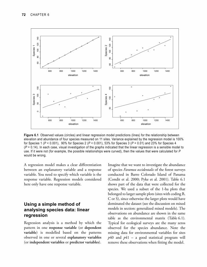
Figure 6.1 gives examples of observations and predictions from a linear regression model for four species. The variance explained by the model decreases from Species 1 to Species 4, which can be observed from the larger differences between the observed abundances (circles) and the predicted abundances (straight line). The significance level for the test of no relationship between elevation and abundance also increases from Species 1 to Species 4. For Species 4, there is no evidence for a linear relationship between elevation and abundance (P = 0.14)
72 CHAPTER 6
Figure 6.1 Observed values (circles) and linear regression model predictions (lines) for the relationship between elevation and abundance of four species measured on 11 sites. Variance explained by the regression model is 100% for Species 1 (P < 0.001), 90% for Species 2 (P < 0.001), 53% for Species 3 (P = 0.01) and 23% for Species 4 (P = 0.14). In each case, visual investigation of the graphs indicated that the linear regression is a sensible model to use. If it were not (for example, the possible relationships were curved), then the values that were calculated for P would be wrong.
A regression model makes a clear differentiation between an explanatory variable and a response variable. You need to specify which variable is the response variable. Regression models considered here only have one response variable.
Using a simple method of analysing species data: linear regressionRegression analysis is a method by which the pattern in one response variable (or dependent variable) is modelled based on the patterns observed in one or several explanatory variables (or independent variables or predictor variables).
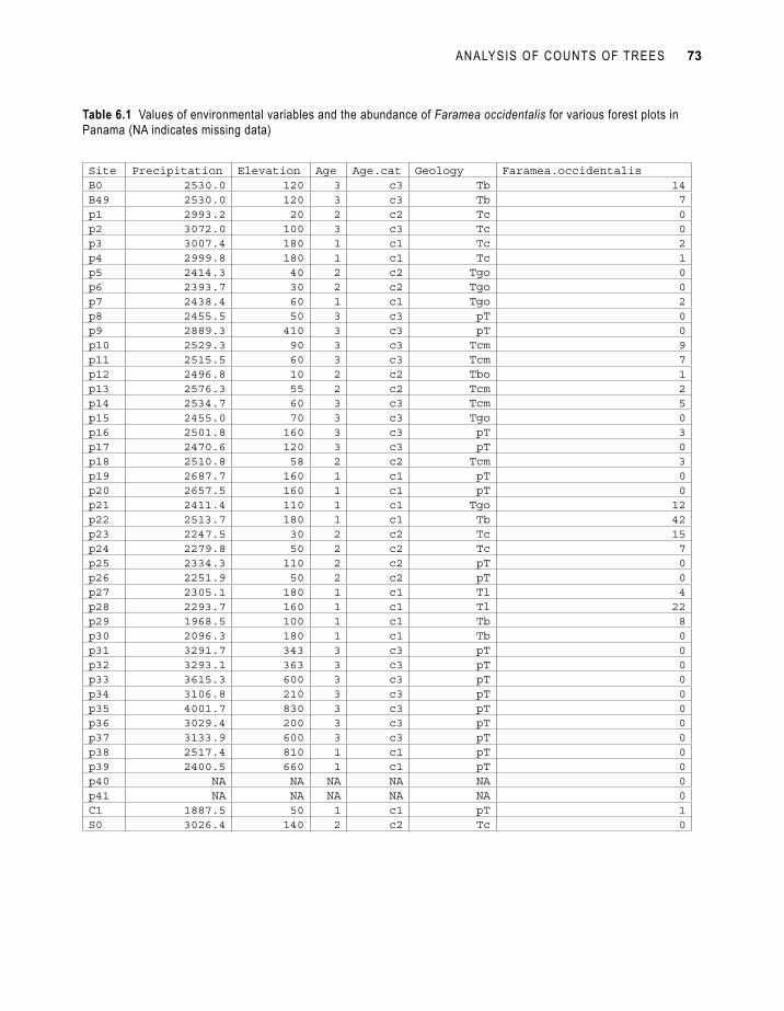
Imagine that we want to investigate the abundance of species Faramea occidentalis of the forest surveys conducted in Barro Colorado Island of Panama (Condit et al. 2000; Pyke et al. 2001). Table 6.1 shows part of the data that were collected for the species. We used a subset of the 1-ha plots that belonged to larger sample plots (sites with coding B, C or S), since otherwise the larger plots would have dominated the dataset (see the discussion on mixed models in section: generalized mixed models). The observations on abundance are shown in the same table as the environmental matrix (Table 6.1). Typical for ecological surveys are the many zeros observed for the species abundance. Note the missing data for environmental variables for sites p40 and p41 – a good statistical program will remove these observations when fitting the model.
ANALYSIS OF COUNTS OF TREES 73
Site Precipitation Elevation Age Age.cat Geology Faramea.occidentalisB0 2530.0 120 3 c3 Tb 14B49 2530.0 120 3 c3 Tb 7p1 2993.2 20 2 c2 Tc 0p2 3072.0 100 3 c3 Tc 0p3 3007.4 180 1 c1 Tc 2p4 2999.8 180 1 c1 Tc 1p5 2414.3 40 2 c2 Tgo 0p6 2393.7 30 2 c2 Tgo 0p7 2438.4 60 1 c1 Tgo 2p8 2455.5 50 3 c3 pT 0p9 2889.3 410 3 c3 pT 0p10 2529.3 90 3 c3 Tcm 9p11 2515.5 60 3 c3 Tcm 7p12 2496.8 10 2 c2 Tbo 1p13 2576.3 55 2 c2 Tcm 2p14 2534.7 60 3 c3 Tcm 5p15 2455.0 70 3 c3 Tgo 0p16 2501.8 160 3 c3 pT 3p17 2470.6 120 3 c3 pT 0p18 2510.8 58 2 c2 Tcm 3p19 2687.7 160 1 c1 pT 0p20 2657.5 160 1 c1 pT 0p21 2411.4 110 1 c1 Tgo 12p22 2513.7 180 1 c1 Tb 42p23 2247.5 30 2 c2 Tc 15p24 2279.8 50 2 c2 Tc 7p25 2334.3 110 2 c2 pT 0p26 2251.9 50 2 c2 pT 0p27 2305.1 180 1 c1 Tl 4p28 2293.7 160 1 c1 Tl 22p29 1968.5 100 1 c1 Tb 8p30 2096.3 180 1 c1 Tb 0p31 3291.7 343 3 c3 pT 0p32 3293.1 363 3 c3 pT 0p33 3615.3 600 3 c3 pT 0p34 3106.8 210 3 c3 pT 0p35 4001.7 830 3 c3 pT 0p36 3029.4 200 3 c3 pT 0p37 3133.9 600 3 c3 pT 0p38 2517.4 810 1 c1 pT 0p39 2400.5 660 1 c1 pT 0p40 NA NA NA NA NA 0p41 NA NA NA NA NA 0C1 1887.5 50 1 c1 pT 1S0 3026.4 140 2 c2 Tc 0
Table 6.1 Values of environmental variables and the abundance of Faramea occidentalis for various forest plots in Panama (NA indicates missing data)
74 CHAPTER 6
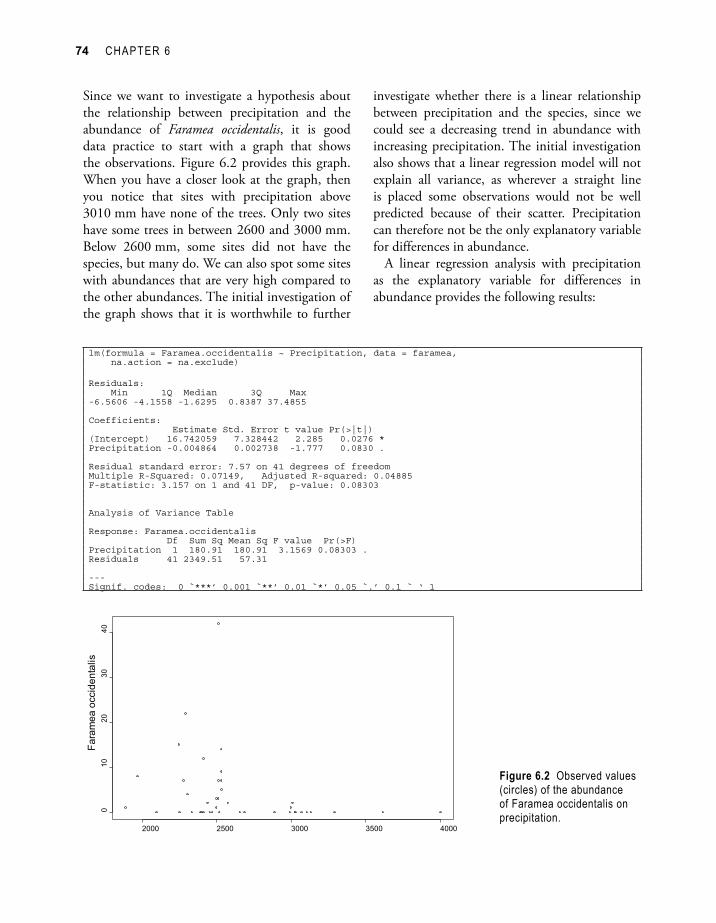
Since we want to investigate a hypothesis about the relationship between precipitation and the abundance of Faramea occidentalis, it is good data practice to start with a graph that shows the observations. Figure 6.2 provides this graph. When you have a closer look at the graph, then you notice that sites with precipitation above 3010 mm have none of the trees. Only two sites have some trees in between 2600 and 3000 mm. Below 2600 mm, some sites did not have the species, but many do. We can also spot some sites with abundances that are very high compared to the other abundances. The initial investigation of the graph shows that it is worthwhile to further
Figure 6.2 Observed values (circles) of the abundance of Faramea occidentalis on precipitation.
investigate whether there is a linear relationship between precipitation and the species, since we could see a decreasing trend in abundance with increasing precipitation. The initial investigation also shows that a linear regression model will not explain all variance, as wherever a straight line is placed some observations would not be well predicted because of their scatter. Precipitation can therefore not be the only explanatory variable for differences in abundance.
A linear regression analysis with precipitation as the explanatory variable for differences in abundance provides the following results:
lm(formula = Faramea.occidentalis ~ Precipitation, data = faramea, na.action = na.exclude)
Residuals: Min 1Q Median 3Q Max -6.5606 -4.1558 -1.6295 0.8387 37.4855
Coefficients: Estimate Std. Error t value Pr(>|t|) (Intercept) 16.742059 7.328442 2.285 0.0276 *Precipitation -0.004864 0.002738 -1.777 0.0830 .
Residual standard error: 7.57 on 41 degrees of freedomMultiple R-Squared: 0.07149, Adjusted R-squared: 0.04885 F-statistic: 3.157 on 1 and 41 DF, p-value: 0.08303
Analysis of Variance Table
Response: Faramea.occidentalis Df Sum Sq Mean Sq F value Pr(>F) Precipitation 1 180.91 180.91 3.1569 0.08303 .Residuals 41 2349.51 57.31
---Signif. codes: 0 `***’ 0.001 `**’ 0.01 `*’ 0.05 `.’ 0.1 ` ‘ 1
ANALYSIS OF COUNTS OF TREES 75
What do these results mean? We will take you step-by-step through the output to indicate the interpretation.
The formula shows that in this model, the number of trees of Faramea occidentalis is the response variable (at the left of the ~) and precipitation is the explanatory variable (at the right of the ~).
This formula is R language for the model that we fitted. This model has the form of:
Faramea occidentalis = a + b × precipitation + deviation
In this model, the values for Faramea occidentalis and precipitation are the variables of Table 6.1, with observed values for each site, except p40 and p41.
The a and b parameters are the coefficients or parameters of the model. The software will estimate values for these coefficients. Another name for parameter a is the intercept and for b is the slope. Once you have the estimates of the coefficients, then you can calculate the predicted or expected value for each site, based on the explanatory variables. You can then calculate the predicted abundance of a + b × 2530 for site B0 (since precipitation at B0 is 2530 mm), and a + b × 2993.2 for site p1 (since precipitation at p1 is 2993.2 mm).
Imagine for instance that the model estimated that coefficient a = 1 and coefficient b = 0.02. In this case, we expect an abundance of 1 + 0.02 × 2530 = 51.6 for site B0 and an abundance of 1 + 0.02 × 2993.2 = 60.864 for site p1. In case the model calculated a = 0 and b = 0.01, then we expect 25.3 for site B0 and 29.932 for site p1.
The model will be estimated in a way that the predicted values will be as close as possible to the observed values. The residual is the difference between the observed and the predicted value. For the model that calculated an expected abundance of 51.6 for site B0, the residual is thus 14 – 51.6 = –37.6. The model is estimated in a way that will minimize the sum of the squared residuals.
Next in the output after the model, the distribution of residuals is provided. The information gives the minimum, maximum and first and third quartile of the residuals (check chapter 2 how these statistics are calculated). These values allow getting a quick view of the quality of the model. The smaller the residuals are, the better the quality of the model. We can especially notice the large maximum value of 37.4855. Checking how residuals are distributed for a good model is discussed in further detail below (section: checking the residuals of the linear model).
Next in the output, we get the estimated values of the coefficients. The model estimated values of 16.742059 for coefficient a and –0.004864 for coefficient b. These coefficients allow you to calculate the predicted abundance. For site B0, this means that the predicted abundance equals 16.742059 – 0.004864 × 2530 = 4.43, and the residual equals 14 – 4.43 = 9.57.
The standard errors describe the precision with which parameters are estimated. The t values and probability values were calculated to test whether the coefficients could be equal to 0.
The test for the coefficient for precipitation, b, is built on the idea that behind the sample data is a relationship between abundance and rainfall, that we could find exactly if we took a large enough sample of sites. The test examines the hypothesis that the underlying value of b in this hypothetical model is zero. The low (but not small) value of P = 0.083 can be interpreted as providing some, but not strong, evidence that the regression coefficient is not zero.
Statistical significance tests such as this t-test are widely used and useful in analysis of experimental and observational data. However they are also often misunderstood and hence misused. All statistical tests depend on assumptions about the data (even so-called ‘non-parametric’ tests) which can be phrased as a model. In most cases the model describes some pattern, relationship or differences which are of interest. Many of the tests carried out examine whether the data support the notion of
76 CHAPTER 6
a relationship, or whether the data are consistent with a simpler (‘null’) model in which there are no differences or relationships. The tests look at how ‘likely’ the observed data are if the underlying null model describes the real world. If the data are likely to occur even in the absence of the hypothesized relationship, they do not support the hypothesis. If, on the other hand, they are unlikely to occur if the null model is true, this is taken as evidence that the null model does not reflect the real world, and some relationship or differences exist. The significance level (P) is the measure of ‘how likely’. A low significance level, close to zero, is interpreted as the data not supporting the null hypothesis. A larger significance level is interpreted as no evidence in the data against the null hypothesis.
Three common problems with using statistical significance tests are:1. Not realizing that the tests' results depend entirely
on the statistical models behind the tests being realistic and suitable for the data. It is therefore necessary to understand what these models are and how to check if they are appropriate.
2. Not understanding that the significance level P provides a measure of ‘strength of evidence’. There is no cut-off value above which we can say ‘not significant’, even though, for historical reasons, the value of P=0.05 is still sometimes treated that way.
3. Neither the null or alternative models are demonstrated to be ‘true’ by the results of a test. As a simple example, a test may compare diversity in two land uses. If there is ‘no significant difference’ it does NOT mean that diversity does not differ between land uses. It means your data have not been sufficient to demonstrate a difference. This might be because there is no difference, or it might be because your data are not adequate for detecting the differences which are there. Regarding the last point, there are methods
available to help decide if you have sufficient data
to detect the sort of effects you are interested in. A ‘power analysis’ can be carried out, or effects estimated together with a confidence interval. Ask a biometrician for help!
The multiple R-squared value gives the fraction of variance that is explained by the model. If this fraction is close to 1, then the model explains almost all of the variance. This means that the residuals will be very small, and the predicted and observed values will be close together. The multiple R-squared is thus an expression of the goodness-of-fit or quality of the model (under the assumption that the measured values were realistic). For this model, the value of R-squared = 0.071 (or 7.1%) means that the model only explains a small fraction of the total variance.
The adjusted R-squared value adjusts the multiple R-squared value to the degrees of freedom of the regression model. The purpose of the correction is to enable comparisons between regressions with different datasets, but some researchers have found out that the statistic is not very good at doing that. We are also of the opinion that the adjusted R-squared value provides little extra information than provided by the multiple R-squared value and the results of the F-test (discussed in the next paragraph).
The F statistic tests whether there is no evidence that the model explains some of the variance. You could notice also that the significance level (P = 0.08) is the same as for the coefficient of precipitation given earlier. This is to be expected since the model had only one explanatory variable.
Finally, an analysis of variance or ANOVA table is given. Analysis of variance and generalizations of it, are widely used in assessing and understanding statistical models. They are basic statistical tools which you will need to become familiar with and perhaps refer to a more detailed text. Dalgaard (2002) contains a simple description of the ideas and the tools within R software. Analysis of variance arises from thinking of statistical analysis and modelling as trying to explain variation in the

ANALYSIS OF COUNTS OF TREES 77
response variable. If there was no variation (all the values of the response equal) there is no analysis to do. If the response is related to an explanatory variable, x, then variation in x will lead to variation in the response. Hence a relationship may ‘explain’ some of the variation. If the explanatory variable is a category or grouping variable, it explains variation in the response if the values of the response within a group tend to be more similar than those in different groups.
The ANOVA table splits up the total variance in the response into components that are explained by each explanatory variable and a residual. This is calculated through sums-of-squares that are then divided by the degrees of freedom, resulting in a mean square. Mean squares are actually variances, since this is the way by which variance is calculated. ANOVA tables give important information on the magnitudes of variance explained by the explanatory variables. The magnitude of variance is an expression of the importance of the explanatory variable in explaining the linear pattern of the response variable.
The significance level values provided by the ANOVA table also relate to tests about the parameters of an underlying model being zero. We can see once again that this significance level is the same as the significance level calculated by earlier tests (P = 0.08), indicating some, but not strong, evidence that precipitation contributes to explaining abundance.
The results of the model can also be analysed in a graphical way. Since the linear regression model fits a straight line that attempts to get as close as possible to the observed values, we can compare the predictions with the actual observations. Figure 6.3 shows this comparison. The dashed lines added to Figure 6.3 show where we are 95% certain that the regression line is. The dotted line of Figure 6.3 corresponds to the area where we expect that 95% of the new observations will be (actually where we expect where the first new observation will be 95% of cases, conditional on the value of precipitation for this observation). These lines are constructed from the probability distribution functions that are assumed to have generated the data.
Figure 6.3 Observed values (circles) and predicted values (connected by line) for the linear regression model of the abundance of Faramea occidentalis on precipitation. The dashed lines show the 95% confidence interval for the mean, the dotted line the upper 95% prediction interval for new observations.
78 CHAPTER 6
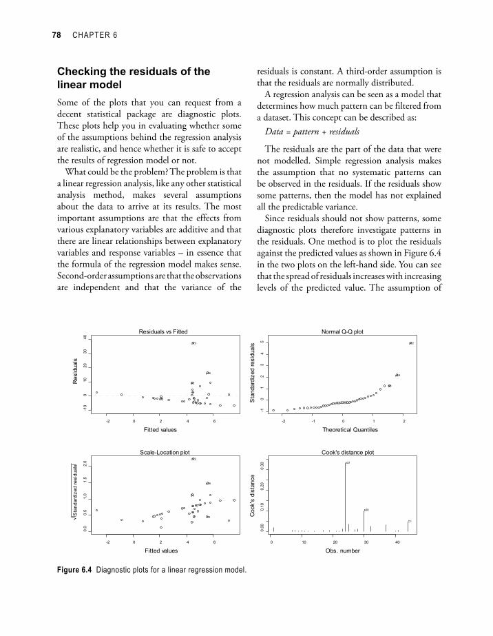
Checking the residuals of the linear modelSome of the plots that you can request from a decent statistical package are diagnostic plots. These plots help you in evaluating whether some of the assumptions behind the regression analysis are realistic, and hence whether it is safe to accept the results of regression model or not.
What could be the problem? The problem is that a linear regression analysis, like any other statistical analysis method, makes several assumptions about the data to arrive at its results. The most important assumptions are that the effects from various explanatory variables are additive and that there are linear relationships between explanatory variables and response variables – in essence that the formula of the regression model makes sense. Second-order assumptions are that the observations are independent and that the variance of the
residuals is constant. A third-order assumption is that the residuals are normally distributed.
A regression analysis can be seen as a model that determines how much pattern can be filtered from a dataset. This concept can be described as:
Data = pattern + residuals
The residuals are the part of the data that were not modelled. Simple regression analysis makes the assumption that no systematic patterns can be observed in the residuals. If the residuals show some patterns, then the model has not explained all the predictable variance.
Since residuals should not show patterns, some diagnostic plots therefore investigate patterns in the residuals. One method is to plot the residuals against the predicted values as shown in Figure 6.4 in the two plots on the left-hand side. You can see that the spread of residuals increases with increasing levels of the predicted value. The assumption of
Figure 6.4 Diagnostic plots for a linear regression model.
ANALYSIS OF COUNTS OF TREES 79
constant variance is not very realistic. As seen in chapter 2 (Figure 2.3), a variable that is normally distributed will result in a straight line in a Q-Q plot. This provides another method for checking the residuals, since residuals are expected to be normally distributed. The Q-Q plot that is shown on the upper right-hand side shows that residuals are not normally distributed.
The Cook’s distance graph (lower-right) shows observations that have an important influence on the results. If site p22 was removed from the dataset, then different results would be obtained. How such observations can be handled is discussed in further detail at the end of this chapter.
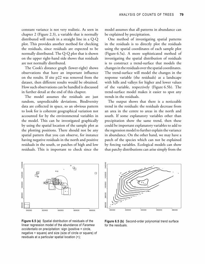
The model assumes the residuals are just random, unpredictable deviations. Biodiversity data are collected in space, so an obvious pattern to look for is coherent geographical variation not accounted for by the environmental variables in the model. This can be investigated graphically by using the spatial location of the sample plot as the plotting positions. There should not be any spatial pattern that you can observe, for instance having negative residuals in the north and positive residuals in the south, or patches of high and low residuals. This is important to check since the
model assumes that all patterns in abundance can be explained by precipitation.
One method of investigating spatial patterns in the residuals is to directly plot the residuals using the spatial coordinates of each sample plot (Figure 6.5a). A more sophisticated method of investigating the spatial distribution of residuals is to construct a trend-surface that models the changes in the residuals over the spatial coordinates. The trend-surface will model the changes in the response variable (the residuals) as a landscape with hills and valleys for higher and lower values of the variable, respectively (Figure 6.5b). The trend-surface model makes it easier to spot any trends in the residuals.
The output shows that there is a noticeable trend in the residuals: the residuals decrease from an area in the centre to areas in the north and south. If some explanatory variables other than precipitation show the same trend, then these could be important explanatory variables to add to the regression model to further explain the variance in abundance. On the other hand, we may have a patch of the species which can not be explained by forcing variables. Ecological models can show that patchy distributions can arise simply from the
Figure 6.5 (a) Spatial distribution of residuals of the linear regression model of the abundance of Faramea occidentalis on precipitation: sign (positive = circle, negative = square) and size (size of circle or square) of residuals at a particular spatial location (+);
Figure 6.5 (b) Second-order polynomial trend surface for the residuals.
80 CHAPTER 6
natural dynamics of the species and do not have to be driven by environmental variables.
When patterns in the residuals show that the assumptions of the model are unreasonable (as seen above), then we should look for better models (such as those listed later in this chapter). It is very important that the assumptions of the model apply when you want to make any conclusions from the results of the model.
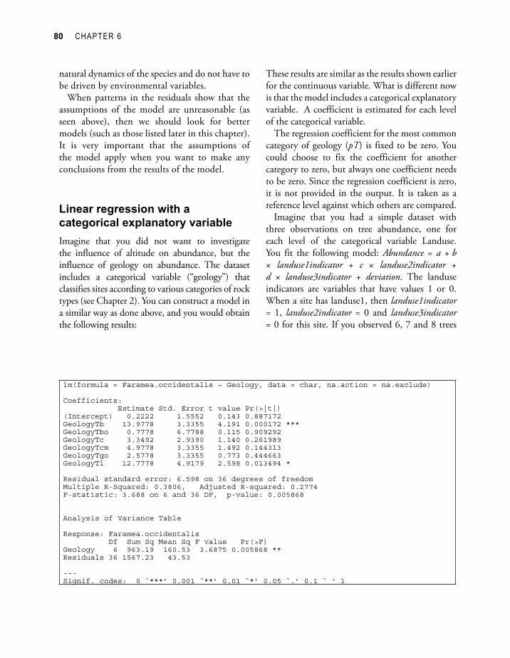
Linear regression with a categorical explanatory variableImagine that you did not want to investigate the influence of altitude on abundance, but the influence of geology on abundance. The dataset includes a categorical variable (“geology”) that classifies sites according to various categories of rock types (see Chapter 2). You can construct a model in a similar way as done above, and you would obtain the following results:
lm(formula = Faramea.occidentalis ~ Geology, data = char, na.action = na.exclude)
Coefficients: Estimate Std. Error t value Pr(>|t|) (Intercept) 0.2222 1.5552 0.143 0.887172 GeologyTb 13.9778 3.3355 4.191 0.000172 ***GeologyTbo 0.7778 6.7788 0.115 0.909292 GeologyTc 3.3492 2.9390 1.140 0.261989 GeologyTcm 4.9778 3.3355 1.492 0.144313 GeologyTgo 2.5778 3.3355 0.773 0.444663 GeologyTl 12.7778 4.9179 2.598 0.013494 *
Residual standard error: 6.598 on 36 degrees of freedomMultiple R-Squared: 0.3806, Adjusted R-squared: 0.2774 F-statistic: 3.688 on 6 and 36 DF, p-value: 0.005868
Analysis of Variance Table
Response: Faramea.occidentalis Df Sum Sq Mean Sq F value Pr(>F) Geology 6 963.19 160.53 3.6875 0.005868 **Residuals 36 1567.23 43.53
---Signif. codes: 0 `***’ 0.001 `**’ 0.01 `*’ 0.05 `.’ 0.1 ` ‘ 1
These results are similar as the results shown earlier for the continuous variable. What is different now is that the model includes a categorical explanatory variable. A coefficient is estimated for each level of the categorical variable.
The regression coefficient for the most common category of geology (pT) is fixed to be zero. You could choose to fix the coefficient for another category to zero, but always one coefficient needs to be zero. Since the regression coefficient is zero, it is not provided in the output. It is taken as a reference level against which others are compared.
Imagine that you had a simple dataset with three observations on tree abundance, one for each level of the categorical variable Landuse. You fit the following model: Abundance = a + b × landuse1indicator + c × landuse2indicator + d × landuse3indicator + deviation. The landuse indicators are variables that have values 1 or 0. When a site has landuse1, then landuse1indicator = 1, landuse2indicator = 0 and landuse3indicator = 0 for this site. If you observed 6, 7 and 8 trees

ANALYSIS OF COUNTS OF TREES 81
for landuse1, landuse2 and landuse3 respectively, then a perfect fit would be provided by estimating a=5, b=1, c=2 and d=3. However, another perfect fit would be provided by estimating a=4, b=2, c=3 and d=4. From the infinite number of possible combinations, combination a=6, b=0, c=1 and d=2 is selected by setting b=0.
The same choice was made in the regression model by opting that the regression coefficient of pT was fixed to be zero. For our example, we thus predict an abundance of 0.2222 + 0 = 0.2222 for category pT and an abundance of 0.2222 + 13.9778 = 14.20 for category Tb.
The interpretation of the results is analogous to the interpretation of regression model with a quantitative explanatory variable. For example, there is evidence that sites with geology Tb contain more of the species than sites of geology pT since a low significance level was estimated (P < 0.001). There is no evidence that sites of geology Tbo
contain more trees than sites of geology pT since a high significance level was estimated (P = 0.909).
The multiple R-squared value shows that the model explains 38% (0.3806) of variance. The significance level of the F-test indicates that the model provides evidence for a linear relationship between geology and abundance (P = 0.0058). The ANOVA table provides the same information since we only had one explanatory variable.
The graphical presentation of the model is given in Figure 6.6. The observed values are presented as circles, the predicted values for each category of geology by the full lines. You could check that the predicted values correspond to those calculated earlier based on the regression coefficients. In this simple case they are actually just the means for each category. The dashed and dotted thick lines show where we are 95% certain that the average and next value for each category will be.
Figure 6.6 Observed values (circles) and predicted values (full line) for the linear regression model of the abundance of Faramea occidentalis on geology. The dashed lines show the 95% confidence interval for the mean, the dotted lines the 95% prediction interval for new observations.

82 CHAPTER 6
Using generalized models when the residuals of a linear regression are not normally distributed: the Poisson, quasi-Poisson and negative binomial modelsGeneralized linear models (GLM) were invented to deal with situation where observations are not normally distributed or where other aspects of the linear regression model are not appropriate. They fit a wider, more general class of models that can cope with other situations. In the case of counts data, you know that values should never be negative, but a simple linear regression model provides no guarantee that you would obtain such results. For instance, in Figure 6.3 you can see that the model predicts negative abundances when precipitation is larger than 3500 mm. This is not a realistic result, as we know that abundance can not be negative. By choosing the appropriate GLM, you will only obtain realistic values.
There are many types of GLM that can be constructed. A GLM is characterized by two functions. One function (the link function) describes how the mean of the response variable depends on the linear predictors (the explanatory variables). The second function (the variance function) captures how the variance of the response variable depends on the mean. The same information is usually provided by the following formulae (µ: mean of the response variable y; x: explanatory variable; a, b: regression coefficients; var: variance; : dispersion parameter):
Link function: g(µ) = a + b1 × x1 + b2 × x2 + b3 × x3 + …
Variance function: var(y) = × V(µ)
The types of GLM that are shown here use the log link and the Poisson, quasi-Poisson and negative binomial variance functions. These are types of GLM that are sometimes appropriate for counts data.
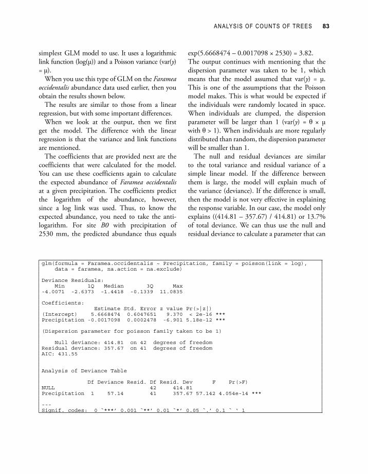
The Poisson GLM (with log link) is the
As with a continuous variable, we should proceed with checking diagnostic plots for the patterns in the residuals. In this manual, the diagnostic plots will only be given for the first regression analysis in order to save some space, however. Remember to always check the diagnostic plots for a regression analysis.
Transforming the response variable when the residuals are not normally distributedOne way of overcoming the problem with the increasing variance of residuals for larger values of the response variables is to transform the response variable. Some common transformations used with count data are the logarithmic transformation and the square-root transformation. These transformations are not tricks that hide the actual patterns, but are useful tools to reveal patterns.
The major disadvantage of using transformations is that you are not modelling the patterns of the observations that you made, but patterns of the transformed observations. When you interpret your results, you are actually interpreting the transformed observations. In some cases, you may not feel comfortable in interpreting transformed observations. In other cases, such interpretation can seem logical. For instance, the pH scale to measure acidity is actually a logarithmic scale.
Note that the log transformation can not be used if the response variable includes zeros. Log(0) is not defined. A practical solution in such cases is to calculate the transformed value of n as log(n+1) or log(n+0.1) instead of log(n). The results depend on what is added, introducing a certain arbitrariness to the analysis.
Because of the problems with transformations, we advise to use more modern approaches to data analysis such as the GLM methods that are introduced immediately below.
ANALYSIS OF COUNTS OF TREES 83
simplest GLM model to use. It uses a logarithmic link function (log(µ)) and a Poisson variance (var(y) = µ).
When you use this type of GLM on the Faramea occidentalis abundance data used earlier, then you obtain the results shown below.
The results are similar to those from a linear regression, but with some important differences.
When we look at the output, then we first get the model. The difference with the linear regression is that the variance and link functions are mentioned.
The coefficients that are provided next are the coefficients that were calculated for the model. You can use these coefficients again to calculate the expected abundance of Faramea occidentalis at a given precipitation. The coefficients predict the logarithm of the abundance, however, since a log link was used. Thus, to know the expected abundance, you need to take the anti-logarithm. For site B0 with precipitation of 2530 mm, the predicted abundance thus equals
exp(5.6668474 – 0.0017098 × 2530) = 3.82.The output continues with mentioning that the dispersion parameter was taken to be 1, which means that the model assumed that var(y) = µ. This is one of the assumptions that the Poisson model makes. This is what would be expected if the individuals were randomly located in space. When individuals are clumped, the dispersion parameter will be larger than 1 (var(y) = × µ with > 1). When individuals are more regularly distributed than random, the dispersion parameter will be smaller than 1.
The null and residual deviances are similar to the total variance and residual variance of a simple linear model. If the difference between them is large, the model will explain much of the variance (deviance). If the difference is small, then the model is not very effective in explaining the response variable. In our case, the model only explains ((414.81 – 357.67) / 414.81) or 13.7% of total deviance. We can thus use the null and residual deviance to calculate a parameter that can
glm(formula = Faramea.occidentalis ~ Precipitation, family = poisson(link = log), data = faramea, na.action = na.exclude)
Deviance Residuals: Min 1Q Median 3Q Max -4.0071 -2.6373 -1.4418 -0.1339 11.0835
Coefficients: Estimate Std. Error z value Pr(>|z|) (Intercept) 5.6668474 0.6047651 9.370 < 2e-16 ***Precipitation -0.0017098 0.0002478 -6.901 5.18e-12 ***
(Dispersion parameter for poisson family taken to be 1)
Null deviance: 414.81 on 42 degrees of freedomResidual deviance: 357.67 on 41 degrees of freedomAIC: 431.55
Analysis of Deviance Table
Df Deviance Resid. Df Resid. Dev F Pr(>F) NULL 42 414.81 Precipitation 1 57.14 41 357.67 57.142 4.054e-14 ***
---Signif. codes: 0 `***’ 0.001 `**’ 0.01 `*’ 0.05 `.’ 0.1 ` ‘ 1
84 CHAPTER 6
be interpreted in the same way as the multiple-R-squared value of a simple linear regression.
The ANOVA table also does not mention ‘variances’ but reports ‘deviances’ instead. The similar name already indicates that deviances can be interpreted in the same way as the variances of a GLM. Although the model is not very efficient in explaining the abundance of Faramea occidentalis, there is evidence that precipitation explains some of the deviance since the F-test has a small significance level (P < 0.001). Note that evidence for explaining some of the deviance does not mean that much deviance is explained. It is therefore necessary to check for both the significance level (to judge whether there is an effect) and the deviance explained (to judge how important the effect is). You could check that the deviance explained by precipitation and the residual deviance sum up to the null deviance.
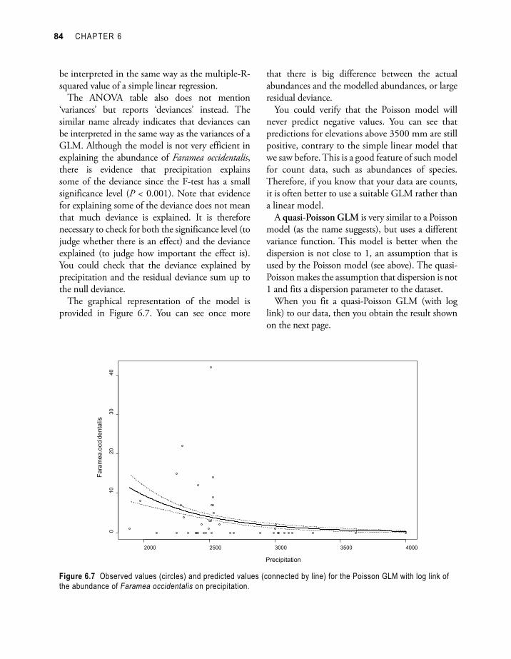
The graphical representation of the model is provided in Figure 6.7. You can see once more
Figure 6.7 Observed values (circles) and predicted values (connected by line) for the Poisson GLM with log link of the abundance of Faramea occidentalis on precipitation.
that there is big difference between the actual abundances and the modelled abundances, or large residual deviance.
You could verify that the Poisson model will never predict negative values. You can see that predictions for elevations above 3500 mm are still positive, contrary to the simple linear model that we saw before. This is a good feature of such model for count data, such as abundances of species. Therefore, if you know that your data are counts, it is often better to use a suitable GLM rather than a linear model.
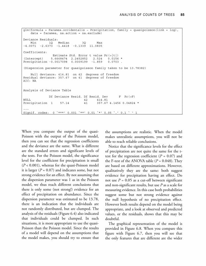
A quasi-Poisson GLM is very similar to a Poisson model (as the name suggests), but uses a different variance function. This model is better when the dispersion is not close to 1, an assumption that is used by the Poisson model (see above). The quasi-Poisson makes the assumption that dispersion is not 1 and fits a dispersion parameter to the dataset.
When you fit a quasi-Poisson GLM (with log link) to our data, then you obtain the result shown on the next page.
ANALYSIS OF COUNTS OF TREES 85
glm(formula = Faramea.occidentalis ~ Precipitation, family = quasipoisson(link = log), data = faramea, na.action = na.exclude)
Deviance Residuals: Min 1Q Median 3Q Max -4.0071 -2.6373 -1.4418 -0.1339 11.0835
Coefficients: Estimate Std. Error t value Pr(>|t|) (Intercept) 5.6668474 2.2452852 2.524 0.0156 *Precipitation -0.0017098 0.0009199 -1.859 0.0703 .
(Dispersion parameter for quasipoisson family taken to be 13.78382)
Null deviance: 414.81 on 42 degrees of freedomResidual deviance: 357.67 on 41 degrees of freedomAIC: NA
Analysis of Deviance Table
Df Deviance Resid. Df Resid. Dev F Pr(>F) NULL 42 414.81 Precipitation 1 57.14 41 357.67 4.1456 0.04824 *
---Signif. codes: 0 `***’ 0.001 `**’ 0.01 `*’ 0.05 `.’ 0.1 ` ‘ 1
When you compare the output of the quasi-Poisson with the output of the Poisson model, then you can see that the regression coefficients and the deviance are the same. What is different are the standard errors and significant levels of the tests. For the Poisson model, the significance level for the coefficient for precipitation is small (P < 0.001), whereas for the quasi-Poisson model it is larger (P = 0.07) and indicates some, but not strong evidence for an effect. By not assuming that the dispersion parameter was 1 as in the Poisson model, we thus reach different conclusions that there is only some (not strong!) evidence for an effect of precipitation on abundance. Since the dispersion parameter was estimated to be 13.78, there is an indication that the individuals are not randomly distributed, but are clumped. The analysis of the residuals (Figure 6.4) also indicated that individuals could be clumped. In such situations, it is more appropriate to use the quasi-Poisson than the Poisson model. Since the results of a model will depend on the assumptions that the model makes, you should try to ensure that
the assumptions are realistic. When the model makes unrealistic assumptions, you will not be able to reach reliable conclusions.
Notice that the significance levels for the effect of precipitation are not quite the same for the t-test for the regression coefficient (P = 0.07) and the F-test of the ANOVA table (P = 0.048). They are based on different approximations. However, qualitatively they are the same: both suggest evidence for precipitation having an effect. Do not use P = 0.05 as a cut-off between significant and non-significant results, but use P as a scale for measuring evidence. In this case both probabilities suggest some but not strong evidence against the null hypothesis of no precipitation effect. However both results depend on the model being appropriate, and a look at observed and predicted values, or the residuals, shows that this may be doubtful.
The graphical representation of the model is provided in Figure 6.8. When you compare this figure with Figure 6.7, then you will see that the only features that are different are the wider

86 CHAPTER 6
confidence intervals (dashed lines) in Figure 6.8, reflecting the large estimated dispersion parameter, compared with the inappropriately fixed value of 1 in Figure 6.7.
The negative binomial GLM is another model that can be used for situations where dispersion is higher than 1, or where individuals are clumped and not randomly distributed. Since organisms often show a clumped distribution, this model will often be suitable for ecological research. Whereas the quasi-Poisson model does not correspond to a known statistical distribution, the negative binomial model is one of several statistical models that model clumping. The negative binomial model is a model with one parameter more than the Poisson model, the parameter theta or k. This parameter models the clumping in the data, ranging from zero to infinity. Values of theta close to zero indicate clumping, whereas larger values indicate distribution that is more random. An infinite value of theta gives a Poisson distribution with dispersion equal to one.
When you fit a negative binomial GLM (with log link) to the same data that we used before, then you
Figure 6.8 Observed values (circles) and predicted values (connected by line) for the quasi-Poisson GLM with log link of the abundance of Faramea occidentalis on precipitation.
will obtain the result shown on the next page.You can see that the output is similar to the
outputs of the Poisson and quasi-Poisson models. The model coefficients are different for the negative binomial GLM, however. As for the Poisson model, there is evidence that precipitation has an effect on abundance since a small significance level is calculated for the coefficient for precipitation and in the ANOVA table (P < 0.001). By modelling clumping directly rather than by a second-order assumption as in the quasi-Poisson GLM, we thus obtain a different result.
We can see that a small value was estimated for theta (0.3057), since it can theoretically range from zero to infinity. This provides evidence that individuals are clumped.
Figure 6.9 provides the graphical presentation of the results of the negative binomial model (with log link). You can see that the model predicts very large abundance at lower precipitation levels. Since the observed abundances at the lowest precipitation levels are not the highest, we should be sceptical about these results – remember that the residuals should not show any patterns.
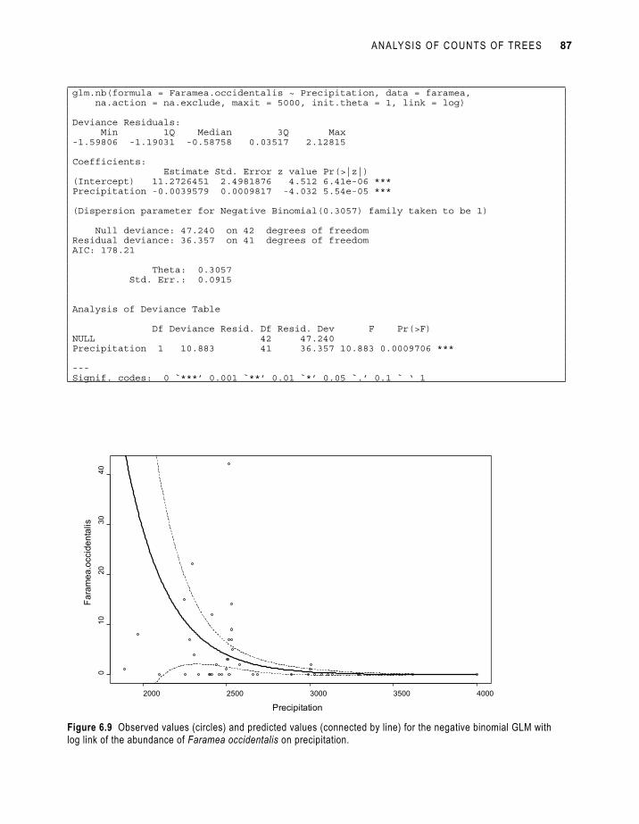
ANALYSIS OF COUNTS OF TREES 87
glm.nb(formula = Faramea.occidentalis ~ Precipitation, data = faramea, na.action = na.exclude, maxit = 5000, init.theta = 1, link = log)
Deviance Residuals: Min 1Q Median 3Q Max -1.59806 -1.19031 -0.58758 0.03517 2.12815
Coefficients: Estimate Std. Error z value Pr(>|z|) (Intercept) 11.2726451 2.4981876 4.512 6.41e-06 ***Precipitation -0.0039579 0.0009817 -4.032 5.54e-05 ***
(Dispersion parameter for Negative Binomial(0.3057) family taken to be 1)
Null deviance: 47.240 on 42 degrees of freedomResidual deviance: 36.357 on 41 degrees of freedomAIC: 178.21
Theta: 0.3057 Std. Err.: 0.0915
Analysis of Deviance Table
Df Deviance Resid. Df Resid. Dev F Pr(>F) NULL 42 47.240 Precipitation 1 10.883 41 36.357 10.883 0.0009706 ***
---Signif. codes: 0 `***’ 0.001 `**’ 0.01 `*’ 0.05 `.’ 0.1 ` ‘ 1
Figure 6.9 Observed values (circles) and predicted values (connected by line) for the negative binomial GLM with log link of the abundance of Faramea occidentalis on precipitation.
88 CHAPTER 6
Using generalized additive models
Generalized additive models (GAM) are more general than GLM. They are based on smoothing – they fit a model that can follow the pattern in the data more closely. Because of this smoothing, the relationships with the explanatory variables are not linear any longer. A smoothing function is a line that flows more freely between the observations than a straight line. Returning to the symbolic description of the assumptions that we used for a GLM, the variance function remains the same, but the explanatory variables part of the model changes into:
Link function: g(µ) = a + b1 × x1 + b2 × x2 + s1(x3) + s2(x4) +…
The functions s1 and s2 are smooth functions of x that are defined in a way which allows a lot of flexibility in the curve.
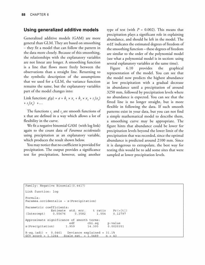
We fit a negative binomial GAM (with log link) again to the count data of Faramea occidentalis using precipitation as an explanatory variable, which produces the result shown below.
You may notice that no coefficient is provided for precipitation. The output provides a significance test for precipitation, however, using another
Family: Negative Binomial(0.4417)
Link function: log
Formula:Faramea.occidentalis ~ s(Precipitation)
Parametric coefficients: Estimate std. err. t ratio Pr(>|t|)(Intercept) 0.55676 0.3582 1.554 0.12797
Approximate significance of smooth terms: edf chi.sq p-values(Precipitation) 1.959 14.393 0.0020351
R-sq.(adj) = 0.0461 Deviance explained = 31.1%GCV score = 1.1264 Scale est. = 1.0489 n = 43
type of test (with P = 0.002). This means that precipitation plays a significant role in explaining abundance, and should be left in the model. The edf indicates the estimated degrees of freedom of the smoothing function – these degrees of freedom are similar to the order of the polynomial model (see what a polynomial model is in section: using several explanatory variables at the same time).
Figure 6.10 provides the graphical representation of the model. You can see that the model now predicts the highest abundance at low precipitation with a gradual decrease in abundance until a precipitation of around 3250 mm, followed by precipitation levels where no abundance is expected. You can see that the fitted line is no longer straight, but is more flexible in following the data. If such smooth patterns exist in your data, but you can not find a simple mathematical model to describe them, a smoothing curve may be appropriate. The figure hints that abundance could be lower for precipitation levels beyond the lower limit of the precipitation that was recorded, since the optimal abundance is predicted around 2100 mm. Since it is dangerous to extrapolate, the best way for testing this would be to add some sites that were sampled at lower precipitation levels.

ANALYSIS OF COUNTS OF TREES 89
Using several explanatory variables at the same time
In the previous models, we only used one explanatory variable for each model. We can use several explanatory variables at the same time, however. Such regression is called a multiple regression. You can construct models that use several (or all) of the explanatory variables that you have – an example is provided later in this chapter.
You can also construct models that use new explanatory variables that were derived from existing explanatory variables. The first example of multiple regression is of the second category. The explanatory variables that will be used are the precipitation and precipitation squared. Precipition2 is easily calculated by squaring each value of precipitation – for site B0 the value for precipitation2 = 25302 = 2530 × 2530 = 6400900. When you add square or higher order powers of
Figure 6.10 Observed values (circles) and predicted values (connected by line) for the negative binomial GAM (with log link) of the abundance of Faramea occidentalis on precipitation.
existing variables, then you are fitting a polynomial model. A second-order polynomial model includes powers of original variable until the second order, a fourth-order polynomial model includes powers of the original variable until the fourth order (thus variable, variable2, variable3 and variable4). If we are investigating the relationship between precipitation and abundance with a second-order polynomial model, we fit the coefficients a, b and c of the polynomial model: Abundance = a + b × precipitation + c × precipitation2 + deviation.
By constructing a polynomial model, you can fit curved lines. Using polynomial models thus provides an alternative approach to fitting curved relationships than the smoothing approach shown earlier.
A negative binomial GLM (with log link) of the abundance of Faramea occidentalis using the second-order polynomial of precipitation gives the result shown on the next page.
90 CHAPTER 6
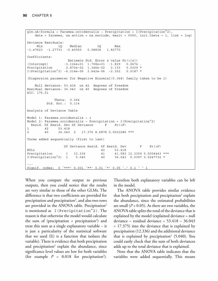
glm.nb(formula = Faramea.occidentalis ~ Precipitation + I(Precipitation^2), data = faramea, na.action = na.exclude, maxit = 5000, init.theta = 1, link = log)
Deviance Residuals: Min 1Q Median 3Q Max -1.47623 -1.27733 -0.40550 0.08838 1.82770
Coefficients: Estimate Std. Error z value Pr(>|z|) (Intercept) -3.124e+01 1.708e+01 -1.829 0.0674 .Precipitation 2.872e-02 1.346e-02 2.133 0.0329 *I(Precipitation^2) -6.214e-06 2.642e-06 -2.352 0.0187 *
(Dispersion parameter for Negative Binomial(0.364) family taken to be 1)
Null deviance: 53.418 on 42 degrees of freedomResidual deviance: 36.043 on 40 degrees of freedomAIC: 175.51
Theta: 0.364 Std. Err.: 0.114
Analysis of Deviance Table
Model 1: Faramea.occidentalis ~ 1Model 2: Faramea.occidentalis ~ Precipitation + I(Precipitation^2) Resid. Df Resid. Dev Df Deviance F Pr(>F) 1 42 53.418 2 40 36.043 2 17.376 8.6878 0.0001686 ***
Terms added sequentially (first to last)
Df Deviance Resid. Df Resid. Dev F Pr(>F) NULL 42 53.418 Precipitation 1 12.336 41 41.083 12.3359 0.0004443 ***I(Precipitation^2) 1 5.040 40 36.043 5.0397 0.0247732 *
---Signif. codes: 0 `***’ 0.001 `**’ 0.01 `*’ 0.05 `.’ 0.1 ` ‘ 1
When you compare the output to previous outputs, then you could notice that the results are very similar to those of the other GLMs. The difference is that two coefficients are provided for precipitation and precipitation2, and also two rows are provided in the ANOVA table. Precipitation2 is mentioned as I(Precipitation^2). The reason is that otherwise the model would calculate the sum of (precipitation + precipitation2) and treat this sum as a single explanatory variable – it is just a particularity of the statistical software that we used (I() is a function that isolates the variable). There is evidence that both precipitation and precipitation2 explain the abundance, since significance level values are low for both variables (for example P = 0.018 for precipitation2).
Therefore both explanatory variables can be left in the model.
The ANOVA table provides similar evidence that both precipitation and precipitation2 explain the abundance, since the estimated probabilities are small (P < 0.05). As there are two variables, the ANOVA table splits the total of the deviance that is explained by the model (explained deviance = null deviance – residual deviance = 53.418 – 36.043 = 17.375) into the deviance that is explained by precipitation (12.336) and the additional deviance that is explained by precipitation2 (5.040). You could easily check that the sum of both deviances adds up to the total deviance that is explained.
Note that the ANOVA table indicates that the variables were added sequentially. This means
ANALYSIS OF COUNTS OF TREES 91
that first the deviance that was explained by precipitation was calculated. After calculating that deviance, the additional deviance that is explained by precipitation2 is calculated. If you would change the order, then you would obtain different values for deviance. The reason that the sequence will alter the results is that there is correlation between the variables (or the variables are not orthogonal). Because of the correlation, some of the deviance that would be explained by a variable will be explained by a variable that was added into the model earlier – once some deviance was explained, it can not be explained again. For a polynomial model, it makes sense to order variables in order of increasing power as shown in the example, and not to add precipitation2 before precipitation.
The ANOVA table also listed a comparison between the null model and the model with both variables. This is the GLM alternative to the F-test of a simple linear regression, and it also calculates the significance of the complete model.
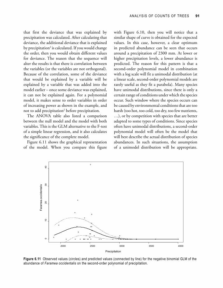
Figure 6.11 shows the graphical representation of the model. When you compare this figure
with Figure 6.10, then you will notice that a similar shape of curve is obtained for the expected values. In this case, however, a clear optimum in predicted abundance can be seen that occurs around a precipitation of 2300 mm. At lower or higher precipitation levels, a lower abundance is predicted. The reason for this pattern is that a second-order polynomial model in combination with a log scale will fit a unimodal distribution (at a linear scale, second-order polynomial models are rarely useful as they fit a parabola). Many species have unimodal distributions, since there is only a certain range of conditions under which the species occur. Such window where the species occurs can be caused by environmental conditions that are too harsh (too hot, too cold, too dry, too few nutrients, …), or by competition with species that are better adapted to some types of conditions. Since species often have unimodal distributions, a second-order polynomial model will often be the model that will best describe the actual distribution of species abundances. In such situations, the assumption of a unimodel distribution will be appropriate.
Figure 6.11 Observed values (circles) and predicted values (connected by line) for the negative binomial GLM of the abundance of Faramea occidentalis on the second-order polynomial of precipitation.
92 CHAPTER 6
Note however that the second order polynomial will always give a symmetrical unimodal response. The fact that the fitted response is of that shape is determined by the model type. Whether it fits your data well still needs examining.
In multiple regression models, the explanatory variables that are used do not have to be polynomials of the same variable. The result shown on the next page was obtained by using the categorical variables age and geology, and the second-order polynomials for the quantitative variables precipitation and elevation to explain abundance with a negative binomial GLM with log link.
Note first that although it is technically possible to construct models that include many different explanatory variables, that models should correspond to hypotheses about the influence of an explanatory variable on the response variable. The choice of explanatory variables that are measured in the first place should be based on such hypotheses, which should be realistic or plausible relationships that reflect what we know of ecology.
We analysed age as if it was a categorical variable. Since age is an ordinal variable, we could also have analysed it as if it was a quantitative variable (see Chapter 2). We analysed age as a categorical variable since an analysis with age as a quantitative variable indicated that there was no evidence that age had an effect (see how to interprete ANOVA tables lower in this section and check for yourself with a model where age is a quantitative variable).
As we saw in the outputs of other models, the formula and the distribution of residuals is provided first, followed by the regression coefficients.
Again we can see one regression coefficient for the continuous variables (precipitation, precipitation2, elevation and elevation2), and regression coefficients for all but one of the levels of the categorical variables (age and geology). We can see that small significance levels were estimated for the majority of variables.
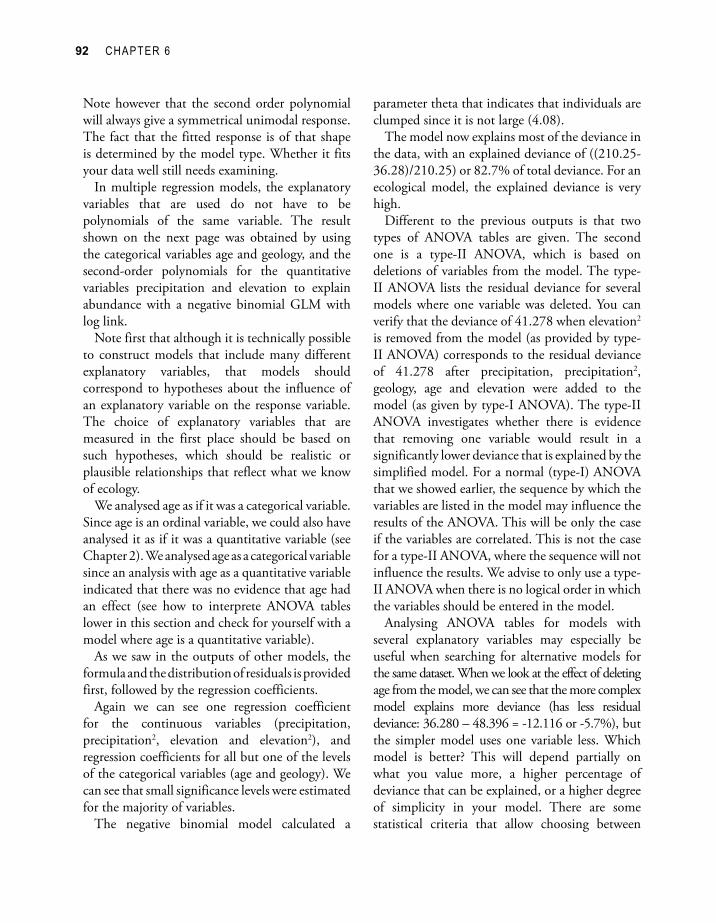
The negative binomial model calculated a
parameter theta that indicates that individuals are clumped since it is not large (4.08).
The model now explains most of the deviance in the data, with an explained deviance of ((210.25-36.28)/210.25) or 82.7% of total deviance. For an ecological model, the explained deviance is very high.
Different to the previous outputs is that two types of ANOVA tables are given. The second one is a type-II ANOVA, which is based on deletions of variables from the model. The type-II ANOVA lists the residual deviance for several models where one variable was deleted. You can verify that the deviance of 41.278 when elevation2 is removed from the model (as provided by type-II ANOVA) corresponds to the residual deviance of 41.278 after precipitation, precipitation2, geology, age and elevation were added to the model (as given by type-I ANOVA). The type-II ANOVA investigates whether there is evidence that removing one variable would result in a significantly lower deviance that is explained by the simplified model. For a normal (type-I) ANOVA that we showed earlier, the sequence by which the variables are listed in the model may influence the results of the ANOVA. This will be only the case if the variables are correlated. This is not the case for a type-II ANOVA, where the sequence will not influence the results. We advise to only use a type-II ANOVA when there is no logical order in which the variables should be entered in the model.
Analysing ANOVA tables for models with several explanatory variables may especially be useful when searching for alternative models for the same dataset. When we look at the effect of deleting age from the model, we can see that the more complex model explains more deviance (has less residual deviance: 36.280 – 48.396 = -12.116 or -5.7%), but the simpler model uses one variable less. Which model is better? This will depend partially on what you value more, a higher percentage of deviance that can be explained, or a higher degree of simplicity in your model. There are some statistical criteria that allow choosing between
ANALYSIS OF COUNTS OF TREES 93
glm.nb(formula = Faramea.occidentalis ~ Precipitation + I(Precipitation^2) + Geology + Age.cat + Elevation + I(Elevation^2), data = faramea, na.action = na.exclude, maxit = 5000, init.theta = 1, link = log)
Deviance Residuals: Min 1Q Median 3Q Max -2.908282 -0.590816 -0.008352 0.136604 2.446988
Coefficients: Estimate Std. Error z value Pr(>|z|) (Intercept) -8.800e+01 1.775e+01 -4.957 7.14e-07 ***Precipitation 7.277e-02 1.438e-02 5.060 4.20e-07 ***I(Precipitation^2) -1.514e-05 2.931e-06 -5.165 2.40e-07 ***GeologyTb 2.752e+00 6.374e-01 4.318 1.57e-05 ***GeologyTbo 3.422e+00 1.754e+00 1.951 0.050999 . GeologyTc 5.018e+00 9.283e-01 5.405 6.48e-08 ***GeologyTcm 2.683e+00 7.106e-01 3.776 0.000159 ***GeologyTgo -9.910e-02 8.894e-01 -0.111 0.911288 GeologyTl 1.593e+00 7.763e-01 2.052 0.040217 * Age.catc2 -3.230e+00 9.734e-01 -3.318 0.000906 ***Age.catc3 -2.162e+00 7.652e-01 -2.825 0.004727 ** Elevation 4.973e-02 2.613e-02 1.903 0.057029 . I(Elevation^2) -2.387e-04 1.102e-04 -2.167 0.030248 *
(Dispersion parameter for Negative Binomial(4.0754) family taken to be 1)
Null deviance: 210.25 on 42 degrees of freedomResidual deviance: 36.28 on 30 degrees of freedomAIC: 152.99
Theta: 4.08 Std. Err.: 2.39
Analysis of Deviance Table
Model 1: Faramea.occidentalis ~ 1Model 2: Faramea.occidentalis ~ Precipitation + I(Precipitation^2) + Geology + Age.cat + Elevation + I(Elevation^2)
Resid. Df Resid. Dev Df Deviance F Pr(>F) 1 42 210.25 2 30 36.28 12 173.97 14.497 < 2.2e-16 ***
Terms added sequentially (first to last)
Df Deviance Resid. Df Resid. Dev F Pr(>F) NULL 42 210.246 Precipitation 1 41.361 41 168.885 41.3610 1.266e-10 ***I(Precipitation^2) 1 24.410 40 144.475 24.4098 7.787e-07 ***Geology 6 80.851 34 63.624 13.4752 2.383e-15 ***Age.cat 2 17.732 32 45.892 8.8660 0.0001411 ***Elevation 1 4.614 31 41.278 4.6143 0.0317067 * I(Elevation^2) 1 4.998 30 36.280 4.9976 0.0253821 *
Single term deletions
Df Deviance AIC F value Pr(F) <none> 36.280 150.986 Precipitation 1 67.045 179.750 25.4393 2.059e-05 ***I(Precipitation^2) 1 70.773 183.479 28.5223 8.902e-06 ***Geology 6 106.457 209.163 9.6716 6.123e-06 ***Age.cat 2 48.396 159.102 5.0095 0.01327 * Elevation 1 39.930 152.636 3.0186 0.09257 . I(Elevation^2) 1 41.278 153.983 4.1326 0.05100 .
---Signif. codes: 0 `***’ 0.001 `**’ 0.01 `*’ 0.05 `.’ 0.1 ` ‘ 1

94 CHAPTER 6
two models. These criteria use different methods of penalizing extra deviance explained with extra explanatory variables. These are very similar to ANOVA in comparing whether the extra deviance explained by model 1 is significantly higher than the deviance explained by model 2. One of such criteria uses the AIC (or Akaike Information Criterion). A model with a lower AIC has a better combination of simplicity and explained deviance – provided that you agree with the way that simplicity and explained deviance are weighted by the AIC. The type-II ANOVA table provides the AIC for the most complex and all models with one deleted variable. We can see that the most
complex model has the lowest AIC (150.986) of all the models, which suggests that all variables should be included in the model (although it is a probably worth again to remind you that we assume that only variables were measured for which there was a prior hypothesis that they could explain abundance).
Figure 6.12 plots the predicted abundance against precipitation. We can see in this figure that a complex pattern occurs, since the abundance is now regressed against all the explanatory variables. We therefore do not see the effect of precipitation only, but of the other variables as well. We can see that the observed abundances are predicted better.
Figure 6.12 Observed values (circles) and predictions (lines) for the negative binomial GLM with log link of the abundance of Faramea occidentalis on geology, age category and the second-order polynomials of precipitation and elevation.
ANALYSIS OF COUNTS OF TREES 95
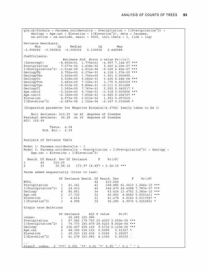
We can check the predictions for an explanatory variable in isolation by using a termplot. Figure 6.13 provides the termplot for age for the last model that we fitted. The full lines show the abundance that is predicted by the model coefficients. We can see that lower abundance is predicted for age categories 2 and 3, since the confidence intervals do not overlap with the confidence interval for age category 1. We can also see that the deviance that is explained by age is relatively small by comparing the difference between the predicted abundance and the actual abundance. Another feature of the data is that the lowest abundance is predicted for age category 2. Updating our model by using age as a continuous variable shows that there is no evidence that age has an effect – we can not assume that there is a straight line that will fit the effect of age on abundance. Allowing for different predicted abundances for each age category provides a better fit to our data.
Figure 6.13 Observed values (circles) and predicted values (lines) for the termplot for age category for the negative binomial GLM with log link of the abundance of Faramea occidentalis on geology, age category and the second-order polynomials of precipitation and elevation. The rugplots show the distribution of the x and y values by adding a random term for values that are tied (for example, there are only three categories of age but the rugplots show the number of observations within each category).
Generalized Mixed ModelsA lot more could be said about the models that we utilized already. The scope of this manual is too limited, however, to cover these models in more detail. For example, all the models here assume that the random residuals are uncorrelated. This might often be unreasonable, for example if a hierarchical sampling and measurement scheme were used. Mixed models have been developed for such situations (Quinn and Keough 2002).
The original dataset that we analysed here actually also had been sampled and measured in a hierarchical way (with 50 B sites), but we avoided the problem by only using the first and last sampled B site to remove the dominance of those sites in the dataset. We opted for this approach as this avoided the need for mixed models, and because the original dataset mixed data from different types of sample plots, something discussed in chapter 2. This type of practical approach to overcoming a

96 CHAPTER 6
statistical analysis problem is important. The final result may not be optimal if it does not use all available data, but it is clear and valid.
Choice of the best modelThe most important criterion to guide you when you are given a choice between various models is that the assumptions of the models need to be realistic. We showed that the residuals of the models were used to check the reliability of the regression models, which guided us towards generalized linear models.
You may also favour models with a good balance between explanatory power and simplicity. Some tests (such as the AIC) may be used to help you in selecting the model with the best balance.
Analysing diversityThe examples that we provided in this chapter were for the number of trees of a particular species for each site. You can do the same analysis for the total number of species per site, or for the total number of trees per site. The methodology is exactly the same as the response variable is again calculated as a count of the number of objects found in each site, only that it is not the count of the trees of a single species but the count of the number of species or the total number of trees.
You could also perform the same calculations for a measure of diversity (see chapter on diversity) that was calculated for each site.
All these other calculations are possible, in principle. You will need to do diagnostic tests (as with the previous models) to check whether the assumptions of the model were met. In case that this is the case, then you can rely on the results.
ReferencesCondit R, Pitman N, Leigh EG, Chave J, Terborgh
J, Foster RB, Nuñez P, Aguilar S, Valencia R, Villa G, Muller-Landau HC, Losos E and Hubbell SP. 2002. Beta-diversity in tropical forest trees. Science 295, 666–669. (dataset used as example)
Dalgaard P. 2002. Introductory Statistics with R. New York: Springer.
Fewster RM, Buckland ST, Siriwardena GM, Baillie SR and Wilson JD. 2000. Analysis of population trends for farmland birds using generalized additive models. Ecology 81: 1970-1984.
Fowler J, Cohen L and Jarvis P. 1998. Practical statistics for field biology. Chichester: John Wiley and sons.
Gotelli NJ and Ellison AM. 2004. A primer of ecological statistics. Sunderland: Sinauer Associates.
Hayek L-AC and Buzas MA. 1997. Surveying natural populations. New York: Columbia University Press.
Jongman RH, ter Braak CJF and Van Tongeren, OFR. 1995. Data analysis in community and landscape ecology. Cambridge: Cambridge University Press.
Kent M and Coker P. 1992. Vegetation description and analysis: a practical approach. London:Belhaven Press.
Legendre P and Legendre L. 1998. Numerical ecology. Amsterdam: Elsevier Science BV.
Pyke CR, Condit R, Aguilar S and Lao S. 2001. Floristic composition across a climatic gradient in a neotropical lowland forest. Journal of Vegetation Science 12: 553-566. (dataset used as example)
Quinn GP and Keough MJ. 2002. Experimental design and data analysis for biologists. Cambridge: Cambridge University Press. (recommended as first priority for reading)

ANALYSIS OF COUNTS OF TREES 97
Shaw PJA. 2003. Multivariate statistics for the environmental sciences. London: Hodder Arnold.
Shaw RG and Mitchell-Olds T. 1993. Anova for unbalanced data: an overview. Ecology 74: 1638-1645.
Underwood AJ. 1997. Experiments in ecology: their logical design and interpretation using analysis of variance. Cambridge: Cambridge University Press.
White GC and Bennets RE. 1996. Analysis of frequency count data using the negative binomial distribution. Ecology 77: 2549-2557.

98 CHAPTER 6
Doing the analyses with the menu options of Biodiversity.R
Load the datasets Panama species.txt and Panama environmental.txt, and make them the species and environmental datasets, respectively. Give them the names “spec” and “faramea”.
Data > Import data > from text file… (Panama species.txt) Enter name for dataset: specData > Import data > from text file… (Panama environmental.txt) Enter name for dataset: farameaBiodiversity > Community Matrix > Select community dataset… Data set: specBiodiversity > Environmental Matrix > Select environmental dataset… Data set: faramea
These are the original datasets, to use the reduced datasets that will be analysed, remove the sites where there is missing information on the variable “Analysed”.
Biodiversity > Community matrix > Remove NA from environmental dataset… Select variable: Analysed
As an alternative, load the dataset Faramea.txt, and make it both the species and environmental dataset (as both the species and environmental information is in the same dataset).
Data > Import data > from text file… (Faramea.txt) Enter name for dataset: farameaBiodiversity > Community Matrix > Select community dataset… Data set: farameaBiodiversity > Environmental Matrix > Select environmental dataset… Data set: faramea
To calculate a linear regression model:Biodiversity > Analysis of species as response > Species abundance as response… Model options: linear model Response: Faramea.occidentalis Explanatory: Precipitation print summary print anova Plot options: diagnostic plots Plot variable: Precipitation Plot options: diagnostic plots Plot options: term plot Plot options: effect plot

ANALYSIS OF COUNTS OF TREES 99
To calculate a generalized linear regression model (GLM):Biodiversity > Analysis of species as response > Species abundance as response… Model options: Poisson model Response: Faramea.occidentalis Explanatory: Precipitation print summary print anova Model options: quasi-Poisson model Model options: negative binomial model
To calculate a generalized additive regression model (GAM):Biodiversity > Analysis of species as response > Species abundance as response… Model options: gam model Response: Faramea.occidentalis Explanatory: s(Precipitation) print summary
To calculate a multiple regression model:Biodiversity > Analysis of species as response > Species abundance as response… Model options: negative binomial model Response: Faramea.occidentalis Explanatory: Precipitation + I(Precipitation^2) print summary print anova
100 CHAPTER 6
Doing the analyses with the command options of Biodiversity.R
Load the dataset Faramea.txt and give it the name “faramea”.faramea <- read.table(file=”D://my files/Faramea.txt”)
To calculate a linear regression model:Count.model1 <- lm(Faramea.occidentalis ~ Precipitation,
data=faramea, na.action=na.exclude)
summary(Count.model1)
fitted(Count.model1)
predict(Count.model1, interval=’confidence’)
residuals(Count.model1)
shapiro.test(residuals(Count.model1))
ks.test(residuals(Count.model1), pnorm)
anova(Count.model1,test=’F’)
Count.model2 <- lm(Faramea.occidentalis ~ Age.cat, data=faramea, na.action=na.exclude)
levene.test(residuals(Count.model2), na.omit(faramea)$Age.cat)
To plot a linear regression model:plot(Count.model1)
termplot(Count.model1, se=T, partial.resid=T, rug=T, terms=’Precipitation’)
plot(effect(‘Precipitation’, Count.model1))
To check for the spatial distribution of residuals:surface.1 <- residuals.surface(Count.model1, na.omit(faramea),
‘UTM.EW’, ‘UTM.NS’, gam=F, npol=1, plotit=T, bubble=F, fill=F)
surface.2 <- residuals.surface(Count.model1, na.omit(faramea), ‘UTM.EW’, ‘UTM.NS’, gam=F, npol=2, plotit=T, bubble=F, fill=F)
surface.2 <- residuals.surface(Count.model1, na.omit(faramea), ‘UTM.EW’, ‘UTM.NS’, gam=F, npol=2, plotit=T, bubble=T, fill=F)
surface.gam <- residuals.surface(Count.model1, na.omit(faramea), ‘UTM.EW’, ‘UTM.NS’, gam=T, npol=2, plotit=T, bubble=F, fill=T)
summary(surface.1)
anova(surface.1)
correlogram(surface.1, nint=10)
summary(surface.gam)

ANALYSIS OF COUNTS OF TREES 101
To calculate a generalized linear regression model (GLM):Count.model3 <- glm(formula = Faramea.occidentalis ~
Precipitation, family = poisson(),data=faramea, na.action=na.exclude)
summary(Count.model3)
anova(Count.model3,test=’F’)
predict(Count.model3, type=’response’, se.fit=T)
Count.model4 <- glm(formula = Faramea.occidentalis ~ Precipitation, family = quasipoisson(), data=faramea, na.action=na.exclude)
Count.model5 <- glm.nb(Faramea.occidentalis ~ Precipitation, maxit = 5000, init.theta = 1, data=faramea, na.action=na.exclude)
To calculate a generalized additive regression model (GAM):Count.model6 <- gam(Faramea.occidentalis ~ s(Precipitation),
family=poisson(), data = na.omit(faramea))
summary(Count.model6)
predict(Count.model6, type=’response’, se.fit=T)
To calculate a multiple regression model:Count.model7 <- glm.nb(Faramea.occidentalis ~ Precipitation
+ I(Precipitation^2), maxit = 5000, init.theta = 1, data=faramea, na.action=na.exclude)
summary(Count.model7)
anova(Count.model7, test=’F’)
Anova(Count.model7, type=’II’, test=’Wald’)
vif(lm(Faramea.occidentalis ~ Precipitation + I(Precipitation^2), data=faramea, na.action=na.exclude)


![[06 - Junho 2011]](https://img.pdfslide.us/doc/110x75/568c0f4c1a28ab955a939c03/06-junho-2011.jpg)