Embed Size (px)
Citation preview
April 1983 Report No. STAN-(X83-965
An Approach to Type Designand Text Composition in Indian Scripts
bY
Pijush K. Ghosh
Department of Computer Science
Stanford UniversityStanford, CA 94305

Computer Science DepartmentReport No.STAN-CS-83-965
An Approach toType Design and Text Composition
In Indian Scripts
PIJUSI-I K. GHOSH
with a preface by
Donald IL Knuth
Research sponsored by
National Science Foundation IST -8201926United Nations Development Program
Systems Development Foundation
COMPUTER SCIENCE DEPARTMENTStanford University

Preface
For the past several months, Stanford’s digital typography projecthas had the good fortune to have been visited by Mr. P.K. Ghosh,who was awarded a fellowship by the United Nations DevelopmentProgram. Mr. Ghosh was born in Calcutta in 1952, and afterreceiving an M.Tech degree from the University of Calcutta in 1978he has been a scientific officer at the National Centre for SoftwareDevelopment and Computing Techniques, which is part of the TataInstitute of Fundamental Research in Bombay.
We are delighted to discover that the methods we had developedfor English language typography have proved to be useful for thescripts of languages we had known little about. Mr. Ghosh hasdiscovered, in fact, that two apparently different systems of writinghave much in common; and he demonstrates in this report thatthe same computer tools can be used for both, in spite of theirhistorical independence. This actually sheds new light on how thetools can be improved for use in English, so we have had a mostproductive two-way exchange. I sincerely hope that this pioneeringwork will facilitate the printing of all kinds of literature in Indiaand elsewhere.
Donald E. KnuthApril, 1983

Acknowledgements
It is a very personal need for me to express my thanks for the supportthat I found wherever I turned. Above all I am extremely gratefulto Prof. Donald E. Knuth without whose invaluable guidance, en-couragement and support this work would never have been done. Hispioneering work in digital typography has made it possible to extendthis new technology to Indian scripts. Prof. R. Narasimhan servedas my mentor at the National Centre for Software Development andComputing Techniques, T.I.F.R., India; I hope he has not countedthe hours he spent in reading my long letters and writing back hisindispensable suggestions in preparing this report. Dr. S.P. Mudur’searlier works and keen interest has helped me a lot. Almost all themembers of the Digital Typography Project at Stanford listened tomy ideas and offered suggestions for improvement. At the risk ofcommitting many sins of ommission I mention only Prof. CharlesBigelow, John Hobby, Scott Kim, David Siegel, Daniel Mills, CarolTwombly and Lynn Ruggles. I wish to thank Mr. Louis Rosenblumof the Graphic Art Research Foundation for his expert comments. Iam particularly beholden to Mr. R.K. Joshi whose excellent drawingshave enabled me to add the Appendix D of this report. It also re-mains to acknowledge with gratitude the help and cooperation of Ms.Phyllis Winkler in helping prepare this manuscript for typesetting.

About This Report
The knowledge of letters exerts a dual enchantment. When it un-covers the relationships between a series of arbitrary symbols andthe sounds of speech, it fills us with joy. For others the visible ex-pression of the letters, their graphical forms, their history and theirdevelopment become fascinating. The advent of digital informationtechnology has opened new vistas in the concept of letter forms.Unfortunately the graphics industry in India has remained almostunaffected by these technological advances, especially in the fieldof type design and text composition. This report strives to demon-strate how to use various tools and techniques, so that the newtechnology can cope with the plurality of Indian scripts. To startwith all you need to know is the basic shapes of the letters of theRoman alphabet and the sounds they represent. With this slenderthread of knowledge an enjoyable study of letter design and textcomposition in Indian scripts can begin.

Contents
I Unity Among Diversity 1Scripts in vogue 1The Origin 2
2 The Set 4Glossary of the Technical Terms to be used 4Scheme of Pronunciation 5Devanagari Alphabet Set 6
3 Old Is Gold 11The Prologue 11The Story 11Writing Materials and Their Effects on Indian Scripts 14Early Printing in Devanagari 19
4 Text Composition 22Basic Features of Indian Languages 22Conjunct Consonants 23Problem of Text Composition in Indian Scripts 23A Viable Solution 24Assign Codes to Indian Scripts 25Design of Keyboard 27Algorithm for Akshara Composition 29
5 NCSD 33Lettering Design 33A Few Prerequisites 34Qualities of Good Lettering 44Design of NCSD 4G
6 References 52
A The Dissection Room
B The Metafont Programs
C The Sample Pages
D For The Future Designers
E Extra Characters For High Quality Printing

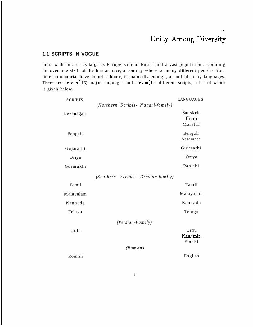
1Unity Among Diversity
1.1 SCRIPTS IN VOGUE
India with an area as large as Europe without Russia and a vast population accountingfor over one sixth of the human race, a country where so many different peoples fromtime immemorial have found a home, is, naturally enough, a land of many languages.There are sixteen( 16) major languages and eleven(l1) different scripts, a list of whichis given below:
SCRIPTS
Devanagari
Bengali
Gujarathi
Oriya
Gurmukhi
Tamil
Malayalam
Kannada
Telugu
Urdu
LANGUAGES
(Northern Scripts- Nagari-family)
SanskritHindi
Marathi
BengaliAssamese
Gujarathi
Oriya
Panjabi
(Southern Scripts- Dravida-family)
Tamil
Malayalam
Kannada
Telugu
(Persian-Family)
UrduKashmiri
Sindhi
Roman
(Roman)
1
English
Unlike the other scripts, Urdu and Roman (naturally) were not developed locallyand had come down from Moslems and British rulers. Slighted extended Arabic(to include few extra consonants) can take care of Urdu script. Anyway, I will beconcerned with the first nine major scripts in India.
1.2 THE ORIGIN
Although Nagari-family of scripts seem to be good deal different from Dravidian fam-ily, all those alphabets are ultimately descendent from the Brahmi script of ancientIndia (probably in the tenth century B.C. -derived either from the fire-Aryan scriptor from semitic system of writing). As its very name suggests the Brahmi script wasinvented for the preservation of Brahma or Veda (the oldest collection of hymns-the richest material in Hindu philosophy and religion). The religion and belief of theancient Hindus required that the Vedas should be correctly pronounced; it could bedone only through a teacher (or a Brahamana ), who could recite the Vedas correctly,and not from a manuscript. Therefore the hand-written manuscripts were not at allpopular and were used by the teacher for his own reference. Thus the scripts werechanging from time to time, but there was a general uniformity of script up to afew centuries after Christ. Then local variations became accentuated in the differentprovinces. We have the Dravidian scripts or Southern scripts, an important devel-opment of which was the Pallava (c.500 A.D.), and this ultimately became Telugu,Kannada, Tamil and Malayalam. We have the Northern variations of Brahmi, succes-sively the Kushana and the Gupta-Brahmi, the Siddhamatrka of the 7th century A.D.
This last evolution of Brahmi in North India gave rise to three distinct groups duringthe closing centuries of the first millennium A.D., viz, the Panjabi (Gurumukhi), the
* Bengali-Assamese-Oriya, and Devanagari. The Gujarathi alphabet is but a cursive orbroken form of Devanagari.
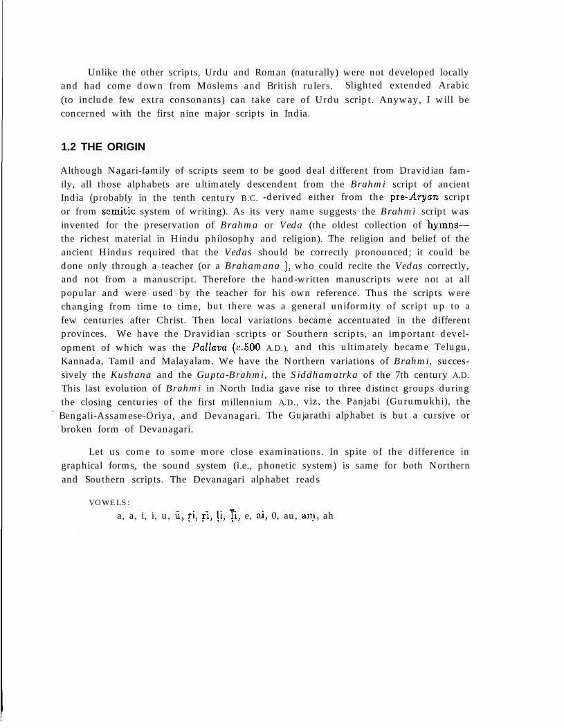
Let us come to some more close examinations. In spite of the difference ingraphical forms, the sound system (i.e., phonetic system) is same for both Northernand Southern scripts. The Devanagari alphabet reads
VOWELS:
a, a, i, i, u, U, ri, ri, li, 3, e, ai, 0, au, an-r, ah
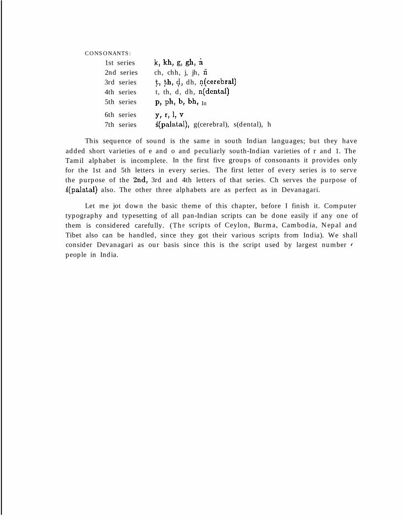
CONSONANTS:
1st series k, kh, g, gh, i2nd series ch, chh, j, jh, ii3rd series t, th, d, dh, n(cerebral)4th series t, th, d, dh, n(dental)5th series P, Ph, b, bh In
6th series Y, r, 1, v7th series g(palatal), g(cerebral), s(dental), h
This sequence of sound is the same in south Indian languages; but they haveadded short varieties of e and o and peculiarly south-Indian varieties of r and 1. TheTamil alphabet is incomplete. In the first five groups of consonants it provides onlyfor the 1st and 5th letters in every series. The first letter of every series is to servethe purpose of the kd, 3rd and 4th letters of that series. Ch serves the purpose ofS(palata1) also. The other three alphabets are as perfect as in Devanagari.
Let me jot down the basic theme of this chapter, before I finish it. Computertypography and typesetting of all pan-Indian scripts can be done easily if any one ofthem is considered carefully. (The scripts of Ceylon, Burma, Cambodia, Nepal andTibet also can be handled, since they got their various scripts from India). We shallconsider Devanagari as our basis since this is the script used by largest number cpeople in India.
2The Set
2.1 GLOSSARY OF THE TECHNICAL TERMS TO BE USED
It is customary to put the glossary at the end. However, I feel this chapter maybe well-understood if the readers become familiar with a few terms that will be usedfrequently. This chapter contains the Devanagari character set (graphical forms) witha brief introduction to the Indian mode of spelling. People who have a basic knowledgeof phonetics can omit this glossary portion.
Aspirant: The use of more wind and addition of the h-sound to a non-aspirant. (InDevanagari the second and fourth letters of all consonant series, as well asthe 7th series, are aspirants).
Cerebral: Letters that are pronounced by touching the roof of the mouth with thetongue (as ‘t’ in ‘put’).
Dental: Letters that are produced by touching the teeth by the tongue (as ‘n’ in‘now’).
Dipthong: Two vowel sounds pronounced in a single syllable (as 5’ in ‘find’ or ‘u’ in‘utensils’).
Guttural: Letters pronounced from the throat (as ‘k’ in ‘king’).
Labial: Letters pronounced by lips (as ‘p’ in ‘pan’).
Nasal: The letter in pronouncing which, the wind passes partly through the nose (as‘ng’ in ‘song’).
Sibilant: The letters that give a hissing sound at the time of pronunciation (as ‘s’ in‘school’).
Sonant: The letters that have softer sounds (as ‘1’ in ‘law’).
Palatal: When the upper blade of the tongue contacts the frontal hard palate of themouth, we get palatal sounds (as ‘ch’ in ‘Chinese’).
2.2 SCHEME OF PRONUNCIATION:
In order to follow the Indian mode of spelling, one should use the International Scriptfollwed by the phoneticians. But the International Script is too complex for non-technical readers, so I shall use the simpler conventional system. According to thisscheme,
1. The long vowels are represented by bars (5, I, ti), whereas the short oneswithout bars. For example,
SHORT LONG
a pot/pat/ a /arm/i sit i see/G/u put ii too/tu/ etc.
2. A few special vowels are represented by dots at the bottom, liker Krishna etc.
3. Cerebral consonants are represented by dots below, e.g.,;t t i m e d daily etc.
4. A few letters are represented in some clumsy way and you might needsome personal help from people who are familiar with Devanagari script andspelling.
NOTE: The names of the letters in my METAFONT files do not follow the above scheme. One
obvious reason is that I cannot use accents within my program. The scheme I followed
can be described briefly like this:
1. Long form of the vowels like a, U etc. are represented by repeating the letter twice,
e.g., ii=aa etc.
2. The cerebral letters are expressed by using the roman letters twice, e.g., t=tt etc.
3. A roman letter or combination of letters that alone sounds nearer to the sound of the
Indian let tcr is used for naming. The best example is the letter ‘c’ which alone sounds
like ‘i’ as in ‘pit’.
4. In all other cases I follow the phonetic scheme.
5
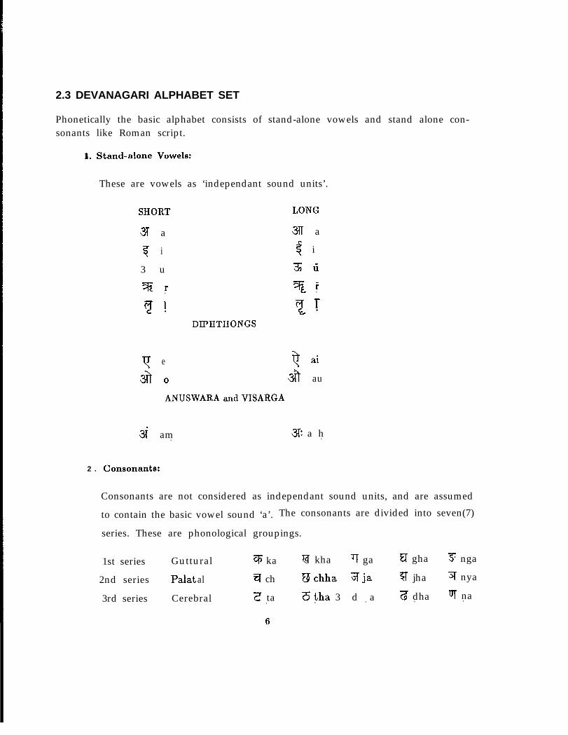
2.3 DEVANAGARI ALPHABET SET
Phonetically the basic alphabet consists of stand-alone vowels and stand alone con-sonants like Roman script.
a. Stand-alone Vowels:
These are vowels as ‘independant sound units’.
SHORT LONG
3 a 3lT a
T i $ i
3 u 3 Ii
Z r 3 r. .
DIPHTHONGS
Y e Q ai
33 0 38 au
ANUSWARA and VISARGA
3i am. 3% a h.
2 . Consonants:
Consonants are not considered as independant sound units, and are assumedto contain the basic vowel sound ‘a’. The consonants are divided into seven(7)
series. These are phonological groupings.
1st series Guttural q ka V kha TT ga FI gha 3; nga
2nd series Palat al q ch Uchha jrja q jha q nya
3rd series Cerebral Z ta 6tha 3 d a 3 dha UT na. . . . .
6
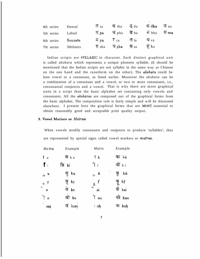
4th series Dental ?f ta ST tha q da $dha 7 na
5th series
6th series7th series
Labial
SonantsSibilants
g Pa V; pha a ba Y bha qma
q Ya T ra T;T la q va
7 sha $ sha ?f sa fha
Indian scripts are SYLLABIC in character. Each distinct graphical unitis called akshara which represents a unique phonetic syllable. (It should bementioned that the Indian scripts are not syllabic in the same way as Chineseon the one hand and the cuneiform on the other). The a~shara could belone vowel or a consonant, as listed earlier. Moreover the akshara can bea combination of a consonant and a vowel, or two or more consonants, i.e.,consonantal conjuncts and a vowel. That is why there are more graphicalunits in a script than the basic alphabet set containing only vowels andconsonants. All the aksharas are composed out of the graphical forms fromthe basic alphabet. The composition rule is fairly simple and will be discussedelsewhere. I present here the graphical forms that are MOST essential toobtain reasonably good and acceptable print quality output.
3. Vowel Markers or Matras:
When vowels modify consonants and conjuncts to produce ‘syllables’, they
are represented by special signs called vowel markers or matras.
Ma tra Example Matra Example
r a
f i
q k a
f%ki
T a
“t i
%T ka
$ k i
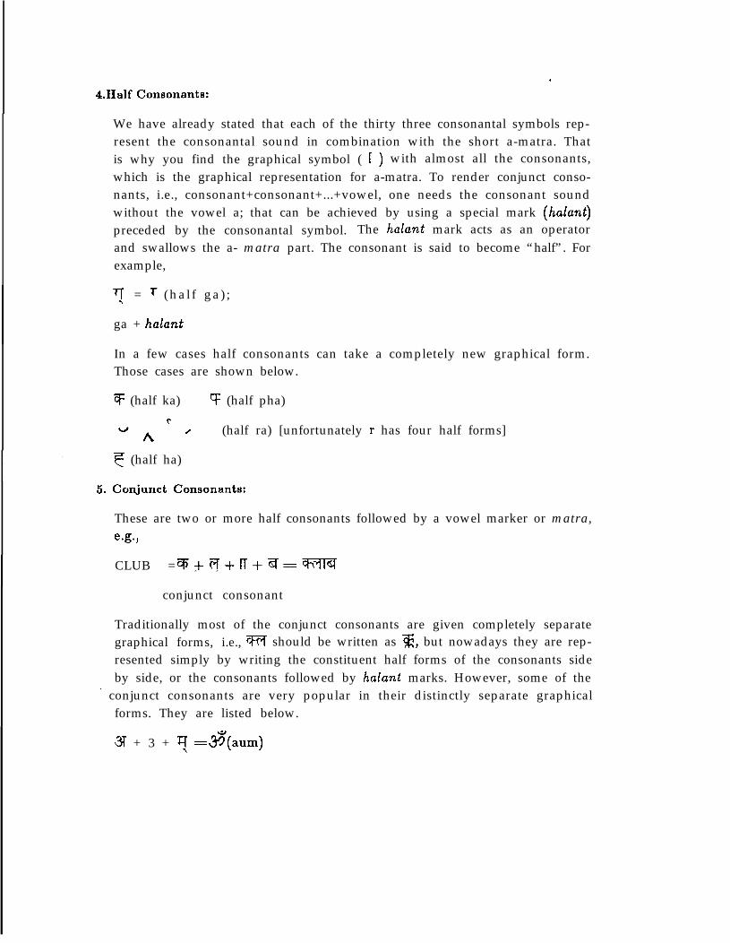
4.Half Consonants:.
We have already stated that each of the thirty three consonantal symbols rep-resent the consonantal sound in combination with the short a-matra. Thatis why you find the graphical symbol ( 1 ) with almost all the consonants,which is the graphical representation for a-matra. To render conjunct conso-nants, i.e., consonant+consonant+...+vowel, one needs the consonant soundwithout the vowel a; that can be achieved by using a special mark (halant)preceded by the consonantal symbol. The halant mark acts as an operatorand swallows the a- matra part. The consonant is said to become “half”. Forexample,
+r\ = r (hal f ga) ;
ga + halant
In a few cases half consonants can take a completely new graphical form.Those cases are shown below.
q (half ka) cf (half pha)t
uh ’ (half ra) [unfortunately r has four half forms]
F (half ha)
5. Conjunct Consonants:
These are two or more half consonants followed by a vowel marker or matra,e-g.,
CLUB = , ,%+T;T+rT+~=rn
conjunct consonant
Traditionally most of the conjunct consonants are given completely separategraphical forms, i.e., Vl should be written as g, but nowadays they are rep-resented simply by writing the constituent half forms of the consonants sideby side, or the consonants followed by halant marks. However, some of the
’ conjunct consonants are very popular in their distinctly separate graphicalforms. They are listed below.
3I + 3 + 7 =$(aum)
T + q = u (l-ha)3 + 3T = 3 (jnya)\? + T = 3 (tra)
$ + 4 = a (dya)
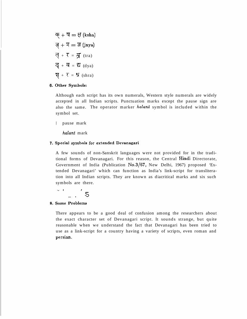
?l + i- = p;T (shra)16. Other Symbols:
Although each script has its own numerals, Western style numerals are widelyaccepted in all Indian scripts. Punctuation marks except the pause sign arealso the same. The operator marker halant symbol is included within thesymbol set.
I pause mark
halant mark
7. Special symbols for extended Devanagari
A few sounds of non-Sanskrit languages were not provided for in the tradi-tional forms of Devanagari. For this reason, the Central Hindi Directorate,Government of India (Publication No.3/67, New Delhi, 1967) proposed ‘Ex-tended Devanagari’ which can function as India’s link-script for translitera-tion into all Indian scripts. They are known as diacritical marks and six suchsymbols are there.” I J
- n s8. Some Problems
There appears to be a good deal of confusion among the researchers aboutthe exact character set of Devanagari script. It sounds strange, but quitereasonable when we understand the fact that Devanagari has been tried touse as a link-script for a country having a variety of scripts, even roman andpersian.
This is not a proper place to deal with thbse controversial issues, but I ‘wouldlike to point out a few problems relevent for type design and text compositionin Devanagari.
1. Some of the letters are so much similar to the others in shape that thereremains a finite chance of confusion between Y (bha) and i-r (wJ); a (gha)and a(dha); and q @ha) and m (mm). There is a recommendation thatthe graphical shapes of Y, W and V should be slightly modified to removesuch confusion.
2. Many letters have two established forms that are quite different from eachother. For example, q andbf; . In the matter of -joining two consonantalcharacters more than one style are in vogue. For example, ‘kka’ is writtenboth as m and @. @en some of the words are written in two differentways. For example, m and m.
3. The lower dot to signify five Arabic sounds has been rejected by someas superfluous while others stick to it. Some printers represent anotherArabic sound ‘ain’ by giving a dot under 3.
4. One of Dhe illogical features of the script is the system af the application ofvowel markers to the consonants. The natural place of the matras is afterthe consonants, but in Devanagari only a few matras are put after theconsonants. Among the rest some are marked over the consonants, someunder them and there is one matra ‘i’ ( f) whose mark is given before theconsonants. The mechanical writing (for example, composition by Lino-type machines) has some features different from those of the traditionalwriting. For example, \3 or c\ matras are not put under the characters be-cause a different matrix is used for any matra and it can come only beforeor after a character.
IO
*.
3Old Is Gold
3.1 THE PROLOGUE
Emil Ruder’s important book on typography (Typography, 1981) states very clearlythat,
“ The written character is and remains the basis of every typo
graphical activity. It is not a creation of our century. The written
character goes far back in time, spanning the vast distance from
early hieroglyphics to the abstract written symbols of today and
involving many contradictions. The typographer must be familiar
with the evolution and recognize its problems so that he can do
justice to the task of the future.”
I would, however, like to assure the reader that I am not going to introducea section on Indian palaeography, although I know it would be one of the mostfacinating and instructive studies. My basic aim is to present, in brief, the materialsand techniques of writing of ancient India. This enables the reader
1. to understand more the basic shape and rhythm of the Devanagari script;
2. to realize why South Indian group of scripts differ from Nothern groups; and
3. to get an idea of the tye of strokes involved in designing the letters of variousIndian scripts.
3.2 THE STORY
‘Every script contains the spirit of its age’ (Type Sign Symbols, A. Frutiger, 1980).The effect of the technical bearings of the writing tool, primarily the pen and ma-terial of writing, on letter forms is in evidence and recognized everywhere. The stiffand sluggish clay employed by the ancient Assyrians was the primary reason for thecuneiform or wedged-shaped symbols; the use of the waxed surface of tablets by theGreeks and Romans compelled a broken and disconnected style of writing; the frail
papyrus made a light touch and slender characters necessary. But when smooth andhard-surfaced vellum was introduced, firm, clear letters with marked contrasts of fineand thick strokes became the fashion. This is the transformation history of Romanscript in short.
11
Printing began as an aid to the art of the scribes, not as an indepenvdcnt art.The earlier printers, in their anxiety to compete successfully with manuscript books,adopted the existing written letter forms and did not question their entire suitabilityas shapes for reproduction into metal types. Nor did either printer or founder, formany years until printing had been recognized for its own sake, make any attemptto seek or create letter foyms better adapted to type reproduction than the writtencharacters.
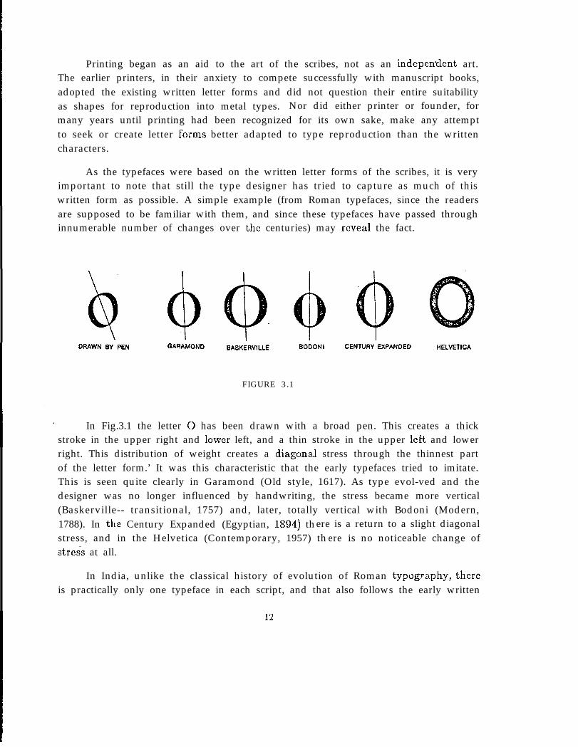
As the typefaces were based on the written letter forms of the scribes, it is veryimportant to note that still the type designer has tried to capture as much of thiswritten form as possible. A simple example (from Roman typefaces, since the readersare supposed to be familiar with them, and since these typefaces have passed throughinnumerable number of changes over the centuries) may reveal the fact.
I DRAWN BY PEN GARAMOND BASKERVILLE BODONI CENTURY EXPANDED HELVETICA
FIGURE 3.1
In Fig.3.1 the letter 0 has been drawn with a broad pen. This creates a thickstroke in the upper right and lower left, and a thin stroke in the upper left and lowerright. This distribution of weight creates a diagona,] stress through the thinnest partof the letter form.’ It was this characteristic that the early typefaces tried to imitate.This is seen quite clearly in Garamond (Old style, 1617). As type evol-ved and thedesigner was no longer influenced by handwriting, the stress became more vertical(Baskerville-- transitional, 1757) and, later, totally vertical with Bodoni (Modern,1788). In thz Century Expanded (Egyptian, lSD4) there is a return to a slight diagonalstress, and in the Helvetica (Contemporary, 1957) th ere is no noticeable change ofstress at all.
In India, unlike the classical history of evolution of Roman typogriiphy, thereis practically only one typeface in each script, and that also follows the early written
forms as far as possible. Practically no work has been done on Indian typographyas yet, and the earliest typefaces are being used all over the country without anyconsiderable modifications. The reasons for this gloomy picture (I am not going todiscuss the country’s socio-economic effect on typography, although this is the mostimportant factor) is mainly because of the following reasons:
1. In Europe printing from movable types was introduced in the middlle of thefifteenth century. (A copy of a letter of Indulgence now preserved at TheHague has the date of November 15, 1954. This is the first authentic date wehave on any printed document.) Printing in India began in the late eighteenthcentury and it took quite sometime to become popular in regional languages.
2. The main bottleneck is the large number of complex graphical forms in eachscript.
3. Another problem has been that there are so many regional scripts. TheRoman is the only script used uniformly throughout India.
4. In the eighth century, Emperor Charlemagne compelled the employing ofskilled copyists and printing came at a time when the illuminated manuscripthad reached its greatest period of perfection, and fifteen centuries of artis-tic traditions furnished beautiful models for the printers use. In India, bycontrast much more stress was given on correct pronunciation of texts, andit was emphasised that the text should be memorised. The use of writtentexts for teaching or reciting was not regarded as honorable. Because of this,Indian printers had limited number of models for their use.
The history of the art of writing in India, like the history of ancient India ingeneral, however, is quite exciting and interested readers may refer to the writings ofD. Diringer, G. Grierson, G. Buhler, G.H. Ojha, R.B. Pandey, S.K. Chatterjee and S.Saran for detailed study.
13
. .
3.3 WRITING MATERIALS AND THEIR EFFECTS ON INDIAN SCRIPTS
Ever since man made first scratch on the wall of a cave he has impressed by the
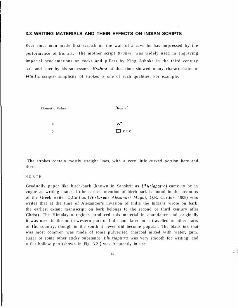
performance of his art. The mother script Brahmi was widely used in engravingimperial proclamations on rocks and pillars by King Ashoka in the third centuryB.C. and later by his successors. Brahmi at that time showed many characteristics ofsemitic scripts- simplicity of strokes is one of such qualities. For example,
Phonetic Value
ab
Urahmi
t-f-u e t c .
The strokes contain mostly straight lines, with a very little curved portion here andthere.
I ’ N O R T H
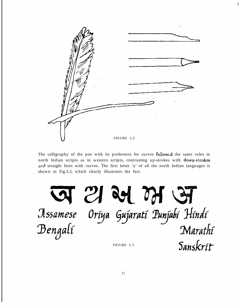
Gradually paper like birch-bark (known in Sanskrit as Bhurjupatru) came to be invogue as writing material (the earliest mention of birch-bark is found in the accountsof the Greek writer Q.Curtius (Historiule Alexandri Magni, Q.R. Curtius, 1908) whowrites that at the time of Alexander’s invasion of India the Indians wrote on bark;the earliest extant manuscript on bark belongs to the second or third century afterChrist). The Himalayan regions produced this material in abundance and originallyit was used in the north-western part of India and later on it travelled to other partsof the country; though in the south it never did become popular. The black ink thatwas most common was made of some pulverised charcoal mixed with water, gum,sugar or some other sticky substance. Bhurjaputra was very smooth for writing, anda flat hollow pen (shown in Fig. 3.2 ) was frequently in use.
14
3
FIGURE 3.2
The calligraphy of the pen with its preference for curves followed the same rules innorth Indian scripts as in western scripts, contrasting up-strokes with .down-strokesIznd straight lines with curves. The first letter ‘a’ of all the north Indian languages isshown in Fig.3.3, which clearly illustrates the fact.
FIGURE 3.3
15
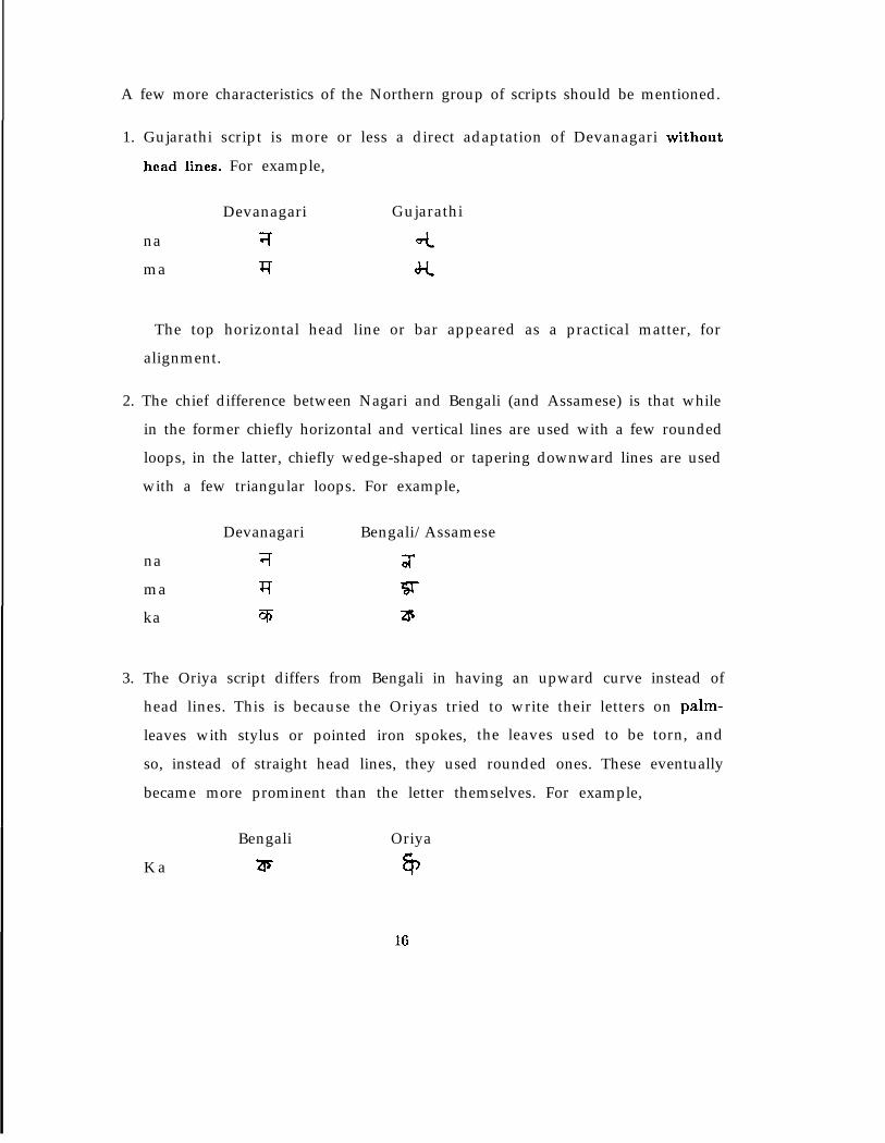
A few more characteristics of the Northern group of scripts should be mentioned.
1. Gujarathi script is more or less a direct adaptation of Devanagari without
head lines. For example,
Devanagari Gujarathi
na 7 4ma J? J-t
The top horizontal head line or bar appeared as a practical matter, foralignment.
2. The chief difference between Nagari and Bengali (and Assamese) is that whilein the former chiefly horizontal and vertical lines are used with a few roundedloops, in the latter, chiefly wedge-shaped or tapering downward lines are usedwith a few triangular loops. For example,
namaka
Devanagari Bengali/Assamese
7 ;xq ‘ST% a
3. The Oriya script differs from Bengali in having an upward curve instead ofhead lines. This is because the Oriyas tried to write their letters on palm-leaves with stylus or pointed iron spokes, the leaves used to be torn, and
so, instead of straight head lines, they used rounded ones. These eventuallybecame more prominent than the letter themselves. For example,
K aBengali
a;Oriya
6)
16
SOUTH .
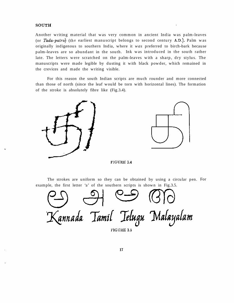
Y
Another writing material that was very common in ancient India was palm-leaves(or Tada-patra) (the earliest manuscript belongs to second century A.D.). Palm wasoriginally indigenous to southern India, where it was preferred to birch-bark becausepalm-leaves are so abundant in the south. Ink was introduced in the south ratherlate. The letters were scratched on the palm-leaves with a sharp, dry stylus. Themanuscripts were made legible by dusting it with black powder, which remained inthe crevices and made the writing visible.
For this reason the south Indian scripts are much rounder and more connectedthan those of north (since the leaf would be torn with horizontal lines). The formationof the stroke is absolutely fibre like (Fig.3.4).
FIGURE 3.4
The strokes are uniform so they can be obtained by using a circular pen. Forexample, the first letter ‘a’ of the southern scripts is shown in Fig.3.5.
FIGURE 3.5
17
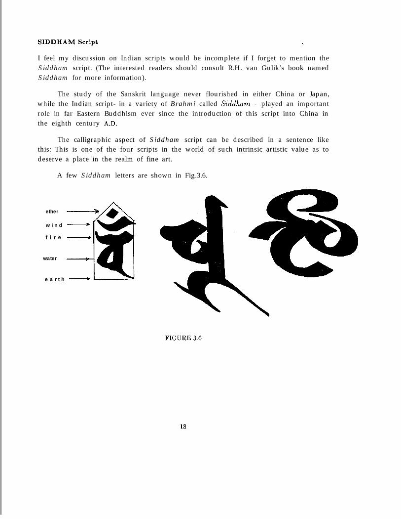
SIDDHAM Script . .
I feel my discussion on Indian scripts would be incomplete if I forget to mention theSiddham script. (The interested readers should consult R.H. van Gulik’s book namedSiddham for more information).
The study of the Sanskrit language never flourished in either China or Japan,while the Indian script- in a variety of Brahmi called Siddham-- played an importantrole in far Eastern Buddhism ever since the introduction of this script into China inthe eighth century A.D.
The calligraphic aspect of Siddham script can be described in a sentence likethis: This is one of the four scripts in the world of such intrinsic artistic value as todeserve a place in the realm of fine art.
A few Siddham letters are shown in Fig.3.6.
w i n d ____+
f i r e ____+
water
e a r t h ___+)
ether
FIGURE 3.6
18
3.4 EARLY PRINTING IN DEVANAGARI
Printing with movable metal types was introduced to India as a result of Europeanpenetration in the country. The first printing-press in India was set up by PortugueseJesuits at Goa in the year 1556. The local speech of Goa was Konkani- a variety ofMarathi. All the early Konkani works from Goa were printed with roman types.
In 1576-7 a blacksmith Joao GonSalves prepared just fifty Konkani letters andmatrices (most probably in Devanagari script), but died the next year without com-pleting the font.
The earliest printed specimens of Devanagari are in books produced in Europe.The oldest among them is the wood-cut signature of a ship’s captain from Diu (islandof Gujarath) on a bill of sale of goods to John Saris, General of East India Company’sEighth Voyage. This was reproduced in Samuel Purcha’s Purchas his pilgrimes (4thedition) printed at London in 1625.
In the 1740s movable Devanagari types were cast in Rome at the Congregatiode Propaganda Fide press, on the orders of Pope Urban VIII. The letters were de-signed by Indian converts studying in Rome. These are the earliest known movableDevanagari types successfully cast in either India or Europe. These types were firstused to print Indian words in Antonio Giorgi’s Alphabetum tibetanum in 1759 andthe expanded version in 1762, recasting some missing types. In 1771, the Alphabeturnbrammhanicum, an extensive treatise on Devanagari syllabary was issued from thepress. Giambattista Bodoni’s Manuale tipografico (2nd edition, vol 2, Parma, 1818)included a specimen of Bracmanico types clearly modelled on the Congretio’s Devana-gari font.
In 1789, the Chronicle Press, Calcutta, issued volume one of The new Asiatickmiscellancy containing Sanskrit and Dakkhini-Urdu verses printed with Devanagaritypes locally cast. This is the earliest known use of movable Devanagari types inIndia. The same press issued Ulfaz udwiyeh, a medical dictionary with 600 Hindustaninames printed in the same Devanagari types in 1793. The London typefounder JosephJackson prepared a Devanagari font for William Kirkpatrick. In 1799, a small part ofKirkpatrick’s work New hindvi grammar was printed in Calcutta using Jackson’s font.Peter Spalding at the East India Company’s Calcutta mint also cast Devanagari typesfor printing the Hindi translations of government regulations from 1793 onwards. InJune 1796, these types were also used in an official notice in the Calcutta Gazette-the first appearance of Devanagari in a newspaper.
19
The Serampore Baptist mission press in Bengal (near Calcutta) under Carey,Marshman and Ward dominated the early 19th century’s printing in India. In itstype-foundry in 1803 Panchanan Karmakar, a Bengali blacksmith (who earlier cut aBengali font) with Charles Wilkins produced a Devanagari font first used in 1805 toprint St. Matthew in Marathi and Carey’s Marathi grammar. During the years 1800 to1838, of 212,000 Biblical volumes issued from Serampore, nearly 65,000 of these wereprinted in Devanagari. In 1818 Serampore published a Hindi monthly Digadarshna-the first ‘all-Devanagari’ periodical. The other notable Devanagari presses at thattime were the Hindoostanee Press, Calcutta(l802- ), Babu Ram’s Sanskrit Press,Calcutta( 1807- ) and the Baptist Mission Press, Calcutta(l818- ).
After Calcutta, Bombay became the center of Devanagari printing in India. Inthe year 1805, the Bhagavadgita was block-printed in Miraj. This was done on copperplates by a smith trained at Nana Fadnavis’ craft school at Poona. In 1816 AmericanCongregationalists set up a press in Bombay under Horatio Bardwell with Devanagaritypes from Calcutta. The Bombay Native Education Society had many school booksprinted in Devanagari such as the Panchopakhyana at the Courier Press in 1822 withtypes of Wilkins’ design imported from England. Elijah Webster and Thomas Grahamsuccessfully substituted half-letters for conjuncts and reduced the size of Devanagaritypes while also improving the letters’ shape. This was done in the American MissionPress’ own type-foundry (set up in 1836). G anapat Krsnaji and Javji Dadaji, onceapprenticed to Graham, also contributed greatly to Devanagari typography.
From 1820s printing by lithography became popular in India. Excellent litho-graphic stones found locally made it economical and it reproduced the scribal handeasier for the majority to read than letterpress. The lithographic presses worthy tomention were, the Greenway family’s press at Kanpur(l830- ), the Bombay Govern-ment Lithographic Press( 1824- ) and George Jervis’s Press at Poona(1830- ).
Devanagari printing developed in England in the early 19th century because theEast India Company sought to print oriental works locally rather than import themfrom India, especially for its training college at Haileybury(l806- ). Moreover, therise of indology in continental Europe led to the casting of excellent Devanagari fontsin Germany and France. Among them, Figgin’s, Bodoni’s, Delafond’s and Vibert’sdesign are worth mentioned.
1 This is not a place to discuss in detail of the history of printing art in Devanagariand the readers may refer to the works of the individuals I have mentioned. Anywayfor the curious readers I am adding an example page (Fig.3.7) from C.R. Lanman’s ASanskrit Reader printed at Harvard University Press, Massachusetts in 1884.
20
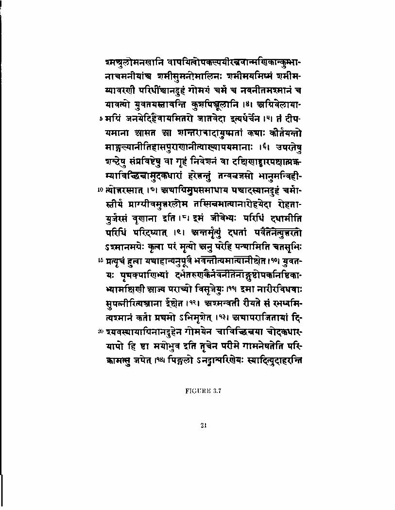
FIGURE 3.7
21
4Text Compo&tion
This report is primarily intended for discussing a few issues of type design in Indianscripts, mainly Devanagari. For Indian scripts, however, the text composition prob-lems cannot be separated from the problems of typeface design and this chapter mayhelp the reader to comprehend the way they are inter-mingled.
4.1 BASIC FEATURES OF INDIAN LANGUAGES
1. Because of common origin, Sanskrit and all local languages possess identicalstructure with marginal variations.
2. Indian languages are phonetic. The phonetic accuracy of the languagescompares well with that of the modern phonetic transcriptions.
3. The basic graphical unit is called akshara which represents a unique phoneticsyllable.
4. Each script has quite a large akshara set, sometimes leading to eight hundredindividual graphical forms.
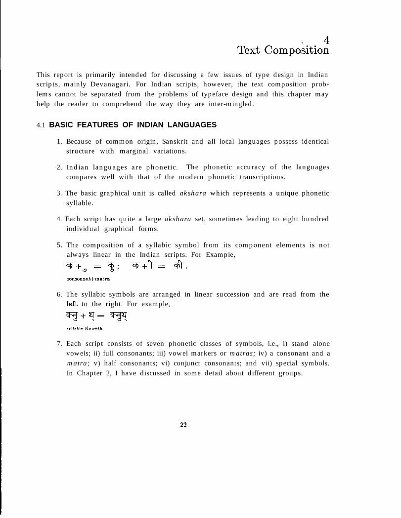
5. The composition of a syllabic symbol from its component elements is notalways linear in the Indian scripts. For Example,q+a = 3; %+‘t= da.consonant+rnatra
6. The syllabic symbols are arranged in linear succession and are read from theleft to the right. For example,
?I+?= v?syllable Knu+th
7. Each script consists of seven phonetic classes of symbols, i.e., i) stand alonevowels; ii) full consonants; iii) vowel markers or matras; iv) a consonant and amatra; v) half consonants; vi) conjunct consonants; and vii) special symbols.In Chapter 2, I have discussed in some detail about different groups.
22
4.2 CONJUNCT CONSONANTS
I mentioned already that to generate a conjunct consonant, i.e., consonant+ conso-nant+ . . ..+vowel combination, we need consonants without a-matra and that can be
. achieved by using a special symbol mark called halant. The rendering of conjunctconsonants is a special problem for Indian syllabic writing.
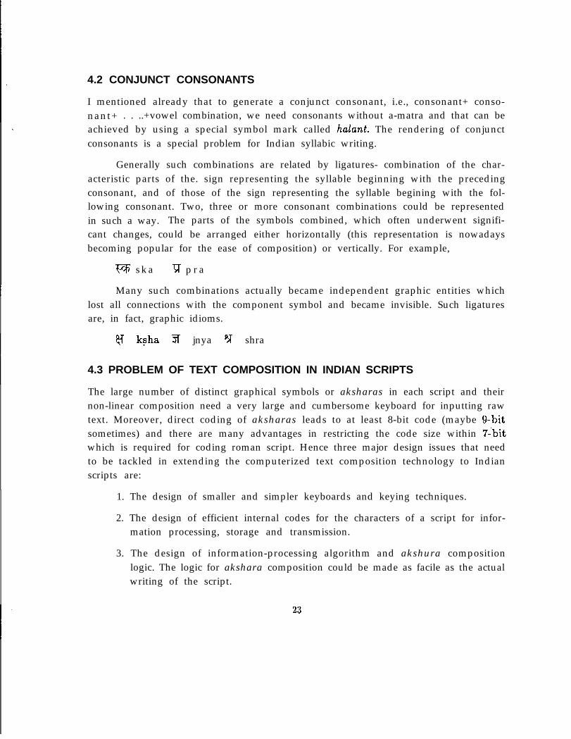
Generally such combinations are related by ligatures- combination of the char-acteristic parts of the. sign representing the syllable beginning with the precedingconsonant, and of those of the sign representing the syllable begining with the fol-lowing consonant. Two, three or more consonant combinations could be representedin such a way. The parts of the symbols combined, which often underwent signifi-cant changes, could be arranged either horizontally (this representation is nowadaysbecoming popular for the ease of composition) or vertically. For example,
VF s k a ‘l;r p r a
Many such combinations actually became independent graphic entities whichlost all connections with the component symbol and became invisible. Such ligaturesare, in fact, graphic idioms.
8 ksha 3 jnya p;T shra
4.3 PROBLEM OF TEXT COMPOSITION IN INDIAN SCRIPTS
The large number of distinct graphical symbols or aksharas in each script and theirnon-linear composition need a very large and cumbersome keyboard for inputting rawtext. Moreover, direct coding of aksharas leads to at least 8-bit code (maybe g-bitsometimes) and there are many advantages in restricting the code size within 7ibitwhich is required for coding roman script. Hence three major design issues that needto be tackled in extending the computerized text composition technology to Indianscripts are:
1. The design of smaller and simpler keyboards and keying techniques.
2. The design of efficient internal codes for the characters of a script for infor-mation processing, storage and transmission.
3. The design of information-processing algorithm and akshura compositionlogic. The logic for akshara composition could be made as facile as the actualwriting of the script.
23
4.4 A VIABLE SOLUTION
LetS: character set in an Indian scriptV: stand-alone vowel set in the script;C: consonant set;M:matra set;X: a consonant plus a mutra set;H: half consonant set;h: hulant sign;0: other special symbol set;Y: conjunct consonant set.
Therefore,S=(V, C, M, H, h, 0, X, Y).
As far as graphical representation is concerned the eight members of S aredisjoint, but from phonological point of view only V, C, h and 0 are basic set- theremaining four sound sets are the product sets of them.
What I would like to infer from this discussion is this:
Any ukshara or syllable can be considered as a molecule with its consonantaland vowel radicals as atoms. Thus the elements of V, C, h and 0 are the phonologicalatoms and phonetically all aksharas are composed out of the elements from the basicphonetic atom set A.
A=(V, C, h, 0).
There is a dispute between the phoneticians in India over the issue of choos-ing a phonetic atom set. Some people consider the half consonant set H to be theprimary consonantal sound set, instead of the full consonant set. They argue thata half consonant, when combines with the vowel sound ‘a’, forms a full consonant.Therefore,
A=(V, H, h, 0).
24
However, the basic idea remains the same and we are provided with a viablesolution of the problems as mentioned before. Let me explain this in some more detail.
4.5 ASSIGN CODES TO INDIAN SCRIPTS
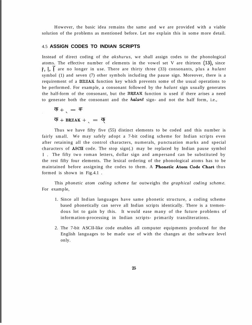
Instead of direct coding of the akshurus, we shall assign codes to the phonologicalatoms. The effective number of elements in the vowel set V are thirteen (13), sinceT, 1, T are no longer in use. There are thirty three (33) consonants, plus a hulantsymbol (1) and seven (7) other symbols including the pause sign. Moreover, there is arequirement of a BREAK function key which prevents some of the usual operations tobe performed. For example, a consonant followed by the halunt sign usually generatesthe half-form of the consonant, but the BREAK function is used if there arises a needto generate both the consonant and the hulunt sign- and not the half form, i.e.,
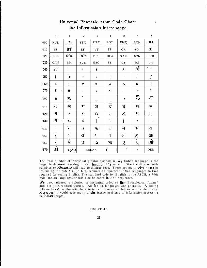
Thus we have fifty five (55) distinct elements to be coded and this number isfairly small. We may safely adopt a 7-bit coding scheme for Indian scripts evenafter retaining all the control characters, numerals, punctuation marks and specialcharacters of ASCII code. The stop sign(.) may be replaced by Indian pause symbolI . The fifty two roman letters, dollar sign and ampersand can be substituted bythe rest fifty four elements. The lexical ordering of the phonological atoms has to bemaintained before assigning the codes to them. A Phonetic Atom Code Chart thusformed is shown in Fig.4.1 .
This phonetic atom coding scheme far outweighs the graphical coding scheme.For example,
1. Since all Indian languages have same phonetic structure, a coding schemebased phonetically can serve all Indian scripts identically. There is a tremen-dous lot to gain by this. It would ease many of the future problems ofinformation-processing in Indian scripts- primarily transliterations.
2. The 7-bit ASCII-like code enables all computer equipments produced for theEnglish languages to be made use of with the changes at the software levelonly.
25
‘000
‘010
‘020
‘030
‘040
‘050
‘060
‘070
‘100
‘110
‘120
‘130
‘140
‘150
‘160
‘170
Universal Phonetic Atom Code Chartfor Information Interchange
. .
0 1 2 3 4 5 6 7
NUL SOII STX ETX EOT ENQ ACK BEL
BS IIT LF VT FF CR SO Sl
DLE DC1 DC2 DC3 DC4 NAK SYN ETB
CAN EM SUB ESC FS GS RS u s”
SP ! a # x 3j *#
( ) * + J - 1 /
0 1 2 3 4 5 6 7
8. 9 : ; < = > ?
0 3: ’ 3T- J 5
% Gl- 7T FT 3; q @ 3
5r 3T z ?5 5 z v-7
s-q Q [. \ ] - -
1 7 g v; a Y JT q
T T;f a ?I q Ff c 3lT-
7 -$ 3 3 % y Q ia
$ <a> BREAK ( 1 ) - DEL1
The total number of individual graphic symbols in auy Indian language is toolarge, basic ones reaching to two hundred lifty or so. Direct coding of suchsyllables or Akahurcra will lead to a large code. There arc many advzntxgcs inrestricting the code size (in bits) required to represent Indian languages to thatrequired for coding English. The standard code for English is the ASCII, a 7-bitcode. Indian languages should also be coded in 7-bit sequences.We have adopted a solution of assigning codes to the “Phonological Atoms”and not to Graphical Forms. All ludian languages are phonetic. A codingscheme based on phonetic characteristics car] serve all Indian scripts identically.Moreover, it would ease many of the future problems of information-processingin Iudian scripts.
FIGURE 4.1
26
.
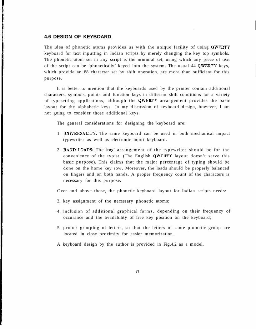
4.6 DESIGN OF KEYBOARD
The idea of phonetic atoms provides us with the unique facility of using QWERTYkeyboard for text inputting in Indian scripts by merely changing the key top symbols.The phonetic atom set in any script is the minimal set, using which any piece of textof the script can be ‘phonetically’ keyed into the system. The usual 44 QWERTY keys,which provide an 88 character set by shift operation, are more than sufficient for thispurpose.
It is better to mention that the keyboards used by the printer contain additionalcharacters, symbols, points and function keys in different shift conditions for a varietyof typesetting applications, although the QWERTY arrangement provides the basiclayout for the alphabetic keys. In my discussion of keyboard design, however, I amnot going to consider those additional keys.
The general considerations for designing the keyboard are:
1. UNIVERSALITY: The same keyboard can be used in both mechanical impacttypewriter as well as electronic input keyboard.
2. HAND LOADS: The key. arrangement of the typewriter should be for theconvenience of the typist. (The English QWERTY layout doesn’t serve thisbasic purpose). This claims that the major percentage of typing should bedone on the home key row. Moreover, the loads should be properly balancedon fingers and on both hands. A proper frequency count of the characters isnecessary for this purpose.
Over and above those, the phonetic keyboard layout for Indian scripts needs:
3. key assignment of the necessary phonetic atoms;
4. inclusion of additional graphical forms, depending on their frequency ofoccurance and the availability of free key position on the keyboard;
5. proper grouping of letters, so that the letters of same phonetic group arelocated in close proximity for easier memorization.
A keyboard design by the author is provided in Fig.4.2 as a model.
27
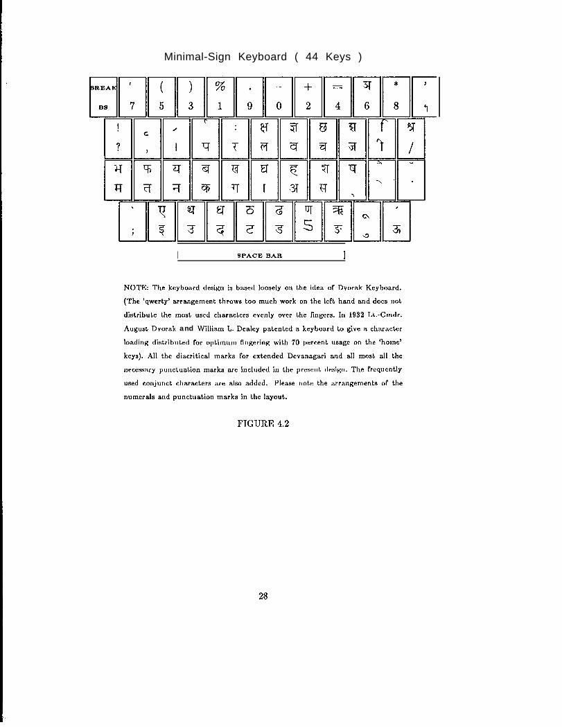
Minimal-Sign Keyboard ( 44 Keys )
I SPACE BAR I
NOTE: The keyboard design is based loosely on the idea of Dvorak Keyboard.
(The ‘qwerty’ arrangement throws too much work on the left hand and does not
distribute the most used characters evenly over the fingers. In 1932 Lt.-Cmdr.
August Dvorak and William L. Dealey patented a keyboard to give a character
loading distributed for optimum fingering with 70 percent usage on the ‘home’
keys). All the diacritical marks for extended Devanagari and all most all the
necessary punctuation marks are included in the present design. The frequently
used conjunct characters are also added. Please note the arrangements of the
numerals and punctuation marks in the layout.
FIGURE 4.2
25
An important point to be noted here is that because of the way keyboard designhas taken place, there is no one-to-one correspondence between keys and the internalcodes. This happens primarily for the following reasons:
1. Frequently occuring additional forms, as mentioned above, are included forefficient input of text. These additional forms are ‘phonetic molecules’ andinternally will be represented by a sequence of two or more phonetic atomcodes. For example,
=llO, 171, 154.
2. It would be possible to input some akshara by a single key-stroke as well asa combination of key strokes from the minimal set and both should result inthe same internal representation.
However, a simple software module for ‘key code to phonetic atom code trans-lation’ solves the problem.
4.7 ALGORITHM FOR AKSHARA COMPOSITION
The basic philosophy behind our akshara composition logic is this: A sequence ofphonetic codes represents a syllable here. Therefore, to generate a complex or fusedgraphical form, one has to input, in sequence, its consonantal and vowel atoms. Thecorresponding code (or codes) emitted by each key stroke is stored in the computermemory. From this sequence of phonetic codes a computer program then decideswhat the corresponding print code (or codes) should be (it is to be mentioned thateach and every distinct graphical form has been given a unique print code for itsproper identification) for the graphical form and passes it on to the output machinefor its actual representation.
From the programming point of view, each phonetic atom has its own treestructure which connects the atom codes and the print codes of the aksharas. Themain procedure is to walk through that tree, compare the code sequence stored in thememory with that of the tree and arrive at the correct print code (or codes).
20
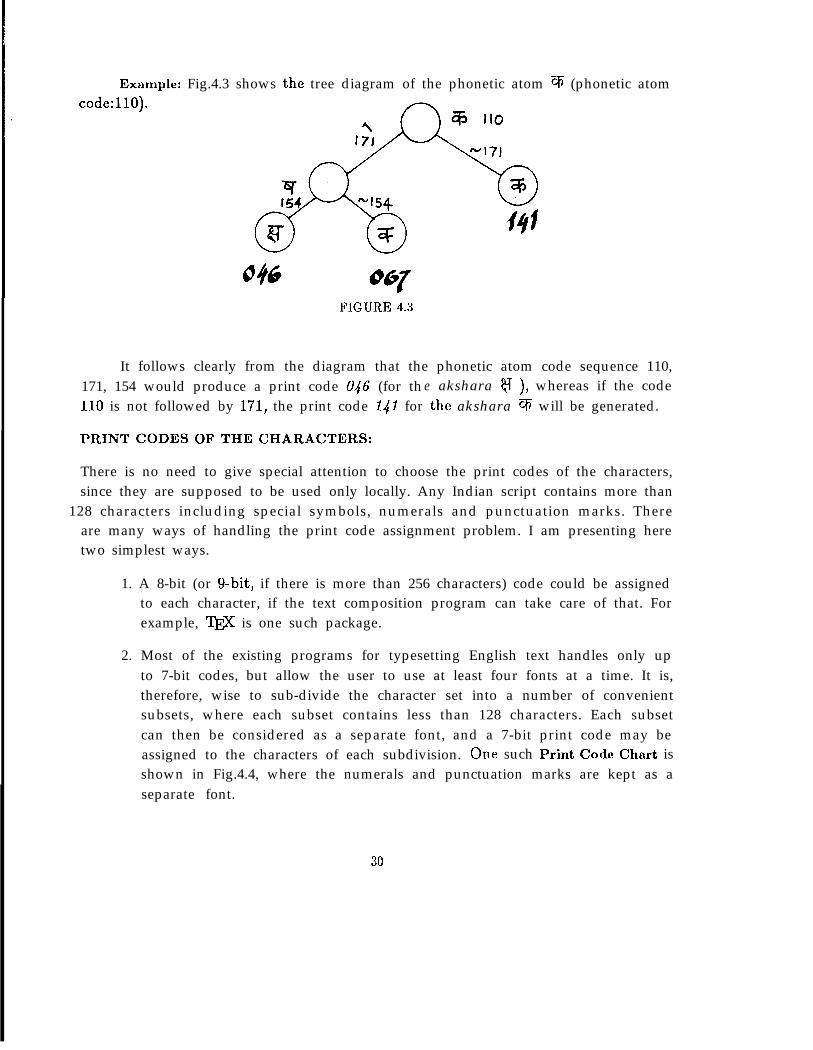
Example: Fig.4.3 shows the tree diagram of the phonetic atom q (phonetic atomcode:llO).
FIGURE 4.3
It follows clearly from the diagram that the phonetic atom code sequence 110,171, 154 would produce a print code U46 (for th e akshara v ), whereas if the code110 is not followed by 171, the print code 141 for the akshara V will be generated.
PRINT CODES OF THE CHARACTERS:
There is no need to give special attention to choose the print codes of the characters,since they are supposed to be used only locally. Any Indian script contains more than
128 characters including special symbols, numerals and punctuation marks. Thereare many ways of handling the print code assignment problem. I am presenting heretwo simplest ways.
1. A 8-bit (or g-bit, if there is more than 256 characters) code could be assignedto each character, if the text composition program can take care of that. Forexample, T&jX is one such package.
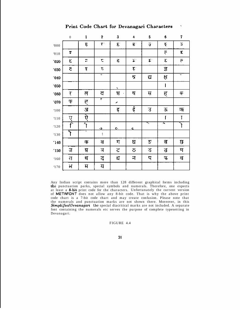
2. Most of the existing programs for typesetting English text handles only upto 7-bit codes, but allow the user to use at least four fonts at a time. It is,therefore, wise to sub-divide the character set into a number of convenientsubsets, where each subset contains less than 128 characters. Each subsetcan then be considered as a separate font, and a 7-bit print code may beassigned to the characters of each subdivision. One such Print Code Chart isshown in Fig.4.4, where the numerals and punctuation marks are kept as aseparate font.
30
‘000
‘010
‘020
‘030
‘040
‘050
‘060
‘070
‘100
‘110
‘120
‘130
‘140
‘150
‘160
‘170
Print Code Chart for Devanagari Characters ..
0 1 2 3 4 5 6 7
Any Indian script contains more than 128 different graphical forms includingthe punctuation parks, special symbols and numerals. Therefore, one expectsat least a &bit print code for the characters. Unfortunately the current versionof METRFONT does not allow any 8-bit code. That is why the above printcode chart is a 7-bit code chart and may create confusion. Please note thatthe numerals and punctuation marks are not shown there. Moreover, in thisSimplifiedDevanagari the special diacritical marks are not included. A separatefont containing the numerals etc serves the purpose of complete typesetting inDevanagari.
FIGURE 4.4
31
HYPHENATION: .
The hyphenation rules for Indian scripts are trivial since each akshara represents aunique phonetic syllable.
A FEW PROBLEMS:
A few illogical features of the Indian scripts make the Akshara Composition Logic abit difficult. Some of the immediate problems that arise are the following.
1. In Devanagari all the matras except one are written after the consonants andthat is quite logical from phonetic viewpoint. The discrepancy is for matra-i( f, which is written before the consonants. Moreover, this feature is notuniform in all other languages- more than one preceding matras are therein Bengali, Tamil and Malayalam.
2. The graphical symbol reph ( ’ ) is one of the four forms of half ra. InDevanagari the stand-alone vowel long-i ( f ) graphically resembles the vowelshort-i ( 7 ) plus reph ( ’ ), which is phonetically illogical. The same phoneticproblem exists for o- (7 ) and au-matra (4 ) that can be graphically formedfrom Smatra ( r ) and e- r ) or ai-matra (” ).
There are some more. However, the solutions can be provided by adding an‘exception handler module’ with the main routine.
32
5NCSD
5.1 LETTERING DESIGN
Following the discipline of letters cut in stone came the freedom of written letterswhich was followed by the firmer discipline of letters cast in a rigid system of metaltypes. Photocomposition allows more freedom where light and lenses can play a lot oftricks and deceptions. Now with the advent of digital typography we are again backto the infinite freedom of letterforms. Many critics often raise their voice against thisnew freedom. They find that lettering today is a confusing variety of styles, withstandards of design and practice crumbling while eccentricity flourishes. Typographyhas a rich traditions and a correspondingly solid and extensive foundation of rules andrequirements, for execution and appearance of the work. On the other hand, there areothers who consider this foundation all too solid, its rules and doctrinal philosophyrestrict the evolution of letterforms which are linked to new tools and technology. Thetremendous speed and continuing reductions in cost of digital typesetting comparedto analog typography ‘may rival in significance the Renaissance shift from script toprint.’ At this transitional period it is really hard to find out unambiguous principlesof construction of letters. However, I can recall Frutiger in this occasion who states,
“The replacement of mechanical by electronic methods, of relief type by thefocussing screen and the photographic emulsion, does not make any basic differenceto the fact that type represents and will remain above all a human problem.”
For the last few years I have been studying Devanagari typefaces designed atdifferent times using different tools and techniques. We are in touch with thousands ofcontemporary roman type faces and quite a number of roman type fonts designed onthe basis of past styles. I strongly feel that there are a few basic design considerations,some basic principles and pre-requisites, which arc totally independent of materialand technology; they do not differ whether it is a roman lettering design or anyIndian script. In this section I would like to note down those basic principles whichI followed to design my Devanagari fonts KSD. I claim no fresh discoveries, but onlycareful editing of ideas of different typographers of different periods of history, whichhelped me in my lettering design- directly or indirectly. (Most of the time I have setexamples from roman scripts, since almost all the readers are expected to be familiarwith that).
33
5.2 A FEW PRE-REQUISITES
1. An awareness of historical developments:
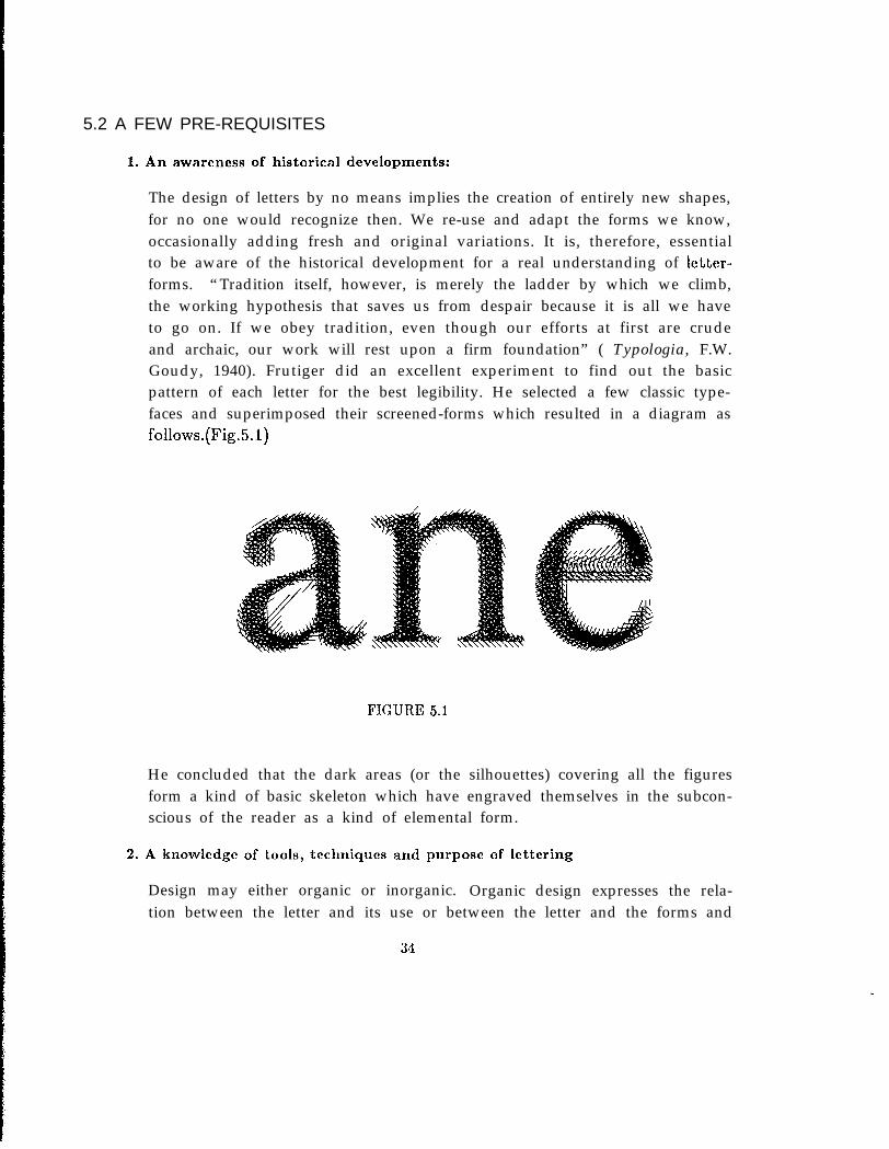
The design of letters by no means implies the creation of entirely new shapes,for no one would recognize then. We re-use and adapt the forms we know,occasionally adding fresh and original variations. It is, therefore, essentialto be aware of the historical development for a real understanding of letter-forms. “Tradition itself, however, is merely the ladder by which we climb,the working hypothesis that saves us from despair because it is all we haveto go on. If we obey tradition, even though our efforts at first are crudeand archaic, our work will rest upon a firm foundation” ( Typologia, F.W.Goudy, 1940). Frutiger did an excellent experiment to find out the basicpattern of each letter for the best legibility. He selected a few classic type-faces and superimposed their screened-forms which resulted in a diagram asfollows.(Fig.5.1)
FIGURE 5.1
He concluded that the dark areas (or the silhouettes) covering all the figuresform a kind of basic skeleton which have engraved themselves in the subcon-scious of the reader as a kind of elemental form.
2. A knowledge of tools, techniques and purpose of lettering
Design may either organic or inorganic. Organic design expresses the rela-tion between the letter and its use or between the letter and the forms and
34
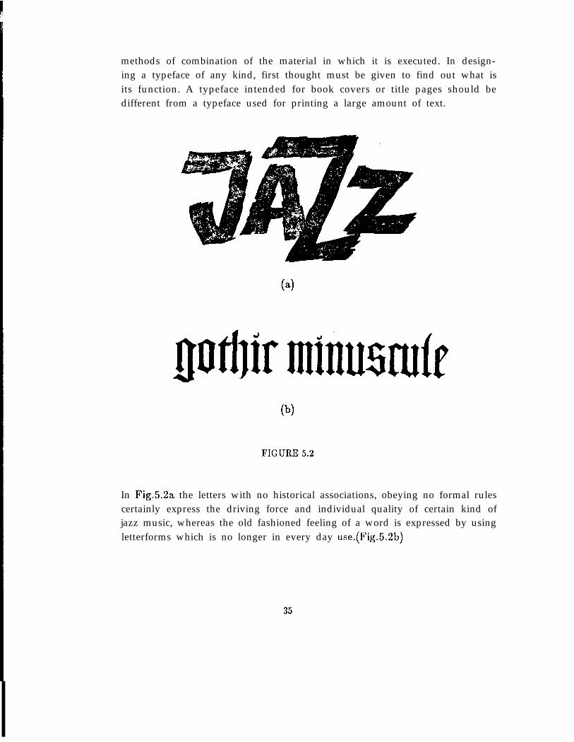
methods of combination of the material in which it is executed. In design-ing a typeface of any kind, first thought must be given to find out what isits function. A typeface intended for book covers or title pages should bedifferent from a typeface used for printing a large amount of text.
(b)
FIGURE 5.2
In Fig.5.2a the letters with no historical associations, obeying no formal rulescertainly express the driving force and individual quality of certain kind ofjazz music, whereas the old fashioned feeling of a word is expressed by usingletterforms which is no longer in every day use.(Fig.5.2b)
35
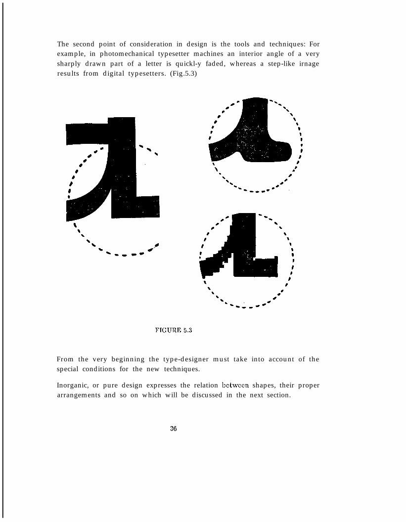
The second point of consideration in design is the tools and techniques: Forexample, in photomechanical typesetter machines an interior angle of a verysharply drawn part of a letter is quickl-y faded, whereas a step-like irnageresults from digital typesetters. (Fig.5.3)
i A
FIGURE 5.3
From the very beginning the type-designer must take into account of thespecial conditions for the new techniques.
Inorganic, or pure design expresses the relation between shapes, their properarrangements and so on which will be discussed in the next section.
36
3. Understanding the difference between written letters and built-up letters
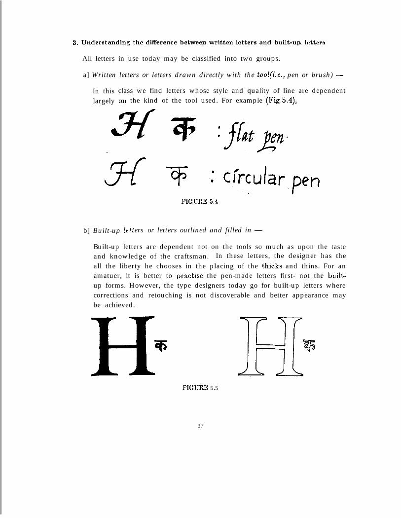
All letters in use today may be classified into two groups.
a] Written letters or letters drawn directly with the tool(i.e., pen or brush) -
In this class we find letters whose style and quality of line are dependentlargely on the kind of the tool used. For example (Fig.5.4),
b] Built-up 1e tters or letters outlined and filled in -
Built-up letters are dependent not on the tools so much as upon the tasteand knowledge of the craftsman. In these letters, the designer has theall the liberty he chooses in the placing of the thicks and thins. For anamatuer, it is better to practise the pen-made letters first- not the built-up forms. However, the type designers today go for built-up letters wherecorrections and retouching is not discoverable and better appearance maybe achieved.
l?IGURE 5.5
37
4. Proper grouping of letters . .
Disregarding all calculations, geometrical or otherwise, the designer has be-fore him the problem of proper grouping of letters. This grouping is essentialfor type design to understand the similarities and disimilarities of differentletters in an alphabet. Depending on requirements, there may be differenttype of groupings. For example,
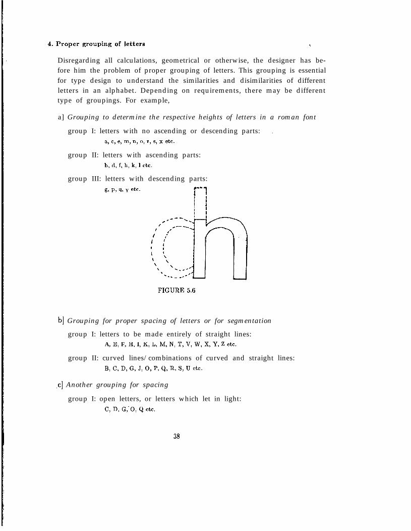
a] Grouping to determine the respective heights of letters in a roman font
group I: letters with no ascending or descending parts: .a, c, e, m, n, 0, r, 5, x etc.
group II: letters with ascending parts:b, d, f, h, k, 1 etc.
group III: letters with descending parts:g, P, 9, Y etc.
f--j
’ JI
FIGURE 5.6
b] Grouping for proper spacing of letters or for segmentation
group I: letters to be made entirely of straight lines:A, E, F, H, I, K, L, M, N, T, V, W, X, Y, Z etc.
group II: curved lines/combinations of curved and straight lines:B, C, D, G, J, 0, I’, Q, R, S, U etc.
-cl Another grouping for spacing
group I: open letters, or letters which let in light:C, D, G,-0, Q etc.
38
group II: letters which darken or tend to close:B, H, R, K, E, M, W etc.
d] Grouping according to widths of letters
group I: letters about as wide as they are tall:C, D, G, 0, Q etc.
group II: letters 4/5 width of the height:A, H, N, U, V, Y, Z etc.
group II: narrow letters:B, E, F, J, P, L, R etc.
Even we can think of phonetic groupings of letters for some particular appli-cation.
Although it is quite easy to sub-divide the letters of Devanagari charactersinto a number of convenient groups according to requirements, I would liketo show one example. I have discussed on the groupings depending on thewidths and heights of the letters in Sec.5 of this chapter.
a] Grouping of letters having similar curve segments
group I: letters with arc segment and vertical bar:w?l-~a
group II: letters with a two kink curve and vertical bar:Q@W
group III: letters with ,fork:wJT%$
group IV: open letters:=w?
5. Awareness of some geometrical, optical and organic aspects
Our visual perception and our aesthetic sense are superior to geometric con-structions. The typeface which looks ‘right’ to the eye, a human organ, cannot be constructed from totally geometrical considerations. For example, theeye tends to magnify all horizontal lines and to diminish vertical ones. A fewoptical illusions in this context may be mentioned which are important fortype design.
39
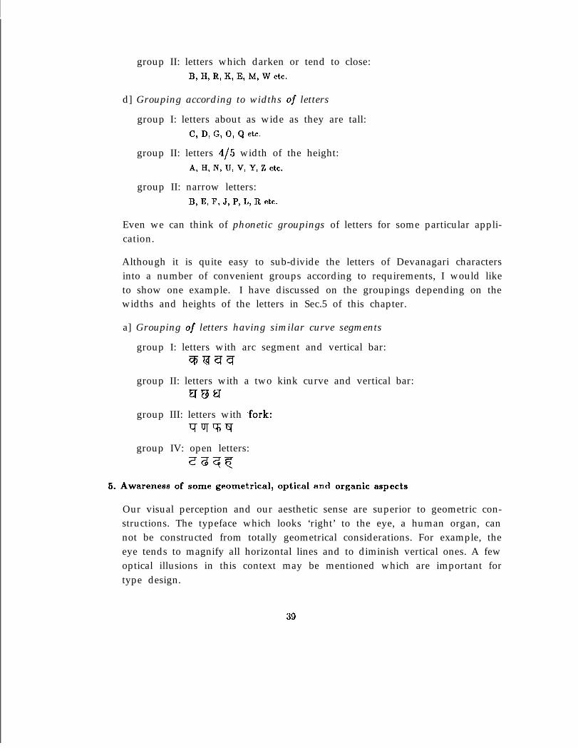
1. To the eye, the geometric square looks greater. in width than in height.An optical square must therefore be slightly increased in height.
I I Iv v v
Li1
FIGURE 5.7
2. The horizontal divisions, which are central, appear to be lower. The tophalves appear larger or wider than the bottom halves. Therefore, foroptical balance the horizontal division should be raised to the opticalcenter line above the actual center line.
FIGURE 5.8
40
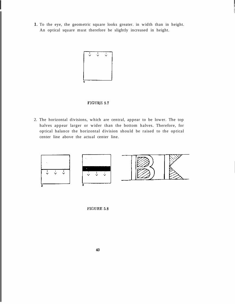
3. The thick horizontal bar looks fatter than a bar of equal thickness placesvertically.
--I TFIGURE 5.9
4. A square appears to be wider than the triangle and the circle althoughtheir their widths happens to be same. This is due to the area of thecircle is 0.7854 of a square unit and that of triangle is I/2 a square unit.
FIGURE 5.10
5. At the junction of straight and curved strokes, and of two curved strokes,an excess of weight is apparent. A progressive reduction in the radii ofthe outer curves as they meet the junction will cure this visual effect.
FIGURE 5.11
41
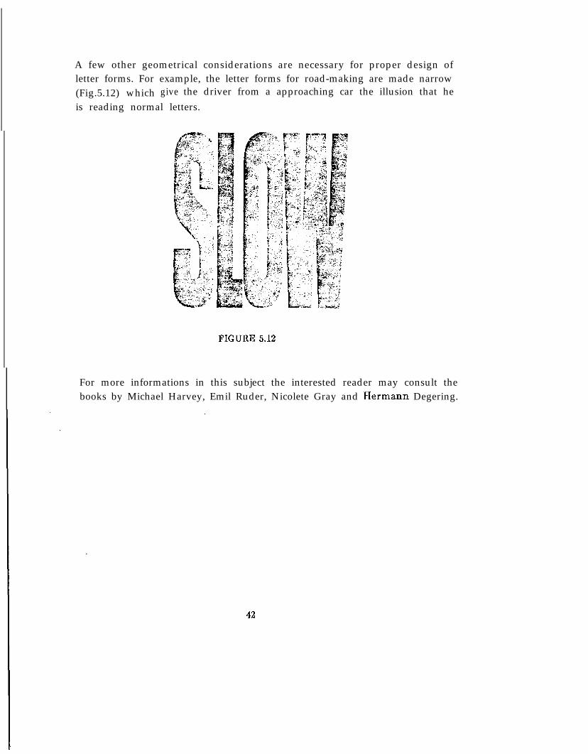
A few other geometrical considerations are necessary for proper design ofletter forms. For example, the letter forms for road-making are made narrow(Fig.5.12) which give the driver from a approaching car the illusion that heis reading normal letters.
FIGURE 5.12
For more informations in this subject the interested reader may consult thebooks by Michael Harvey, Emil Ruder, Nicolete Gray and Hermann Degering.
42
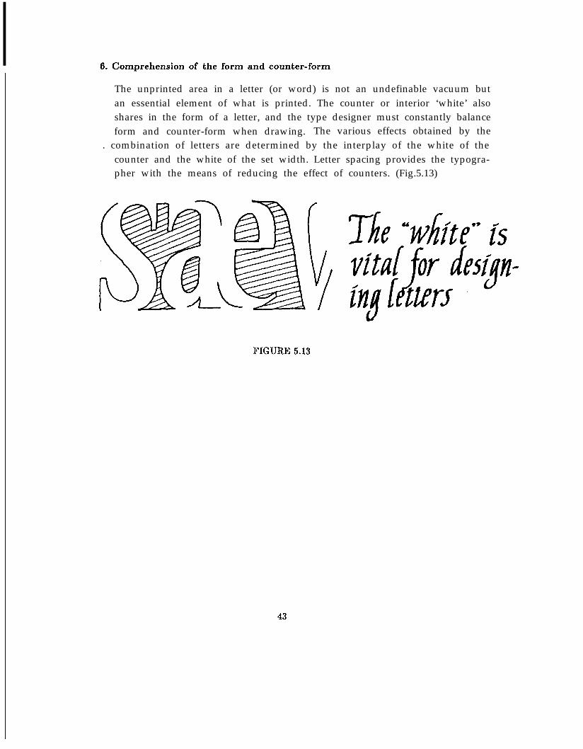
6. Comprehension of the form and counter-form
The unprinted area in a letter (or word) is not an undefinable vacuum butan essential element of what is printed. The counter or interior ‘white’ alsoshares in the form of a letter, and the type designer must constantly balanceform and counter-form when drawing. The various effects obtained by the
. combination of letters are determined by the interplay of the white of thecounter and the white of the set width. Letter spacing provides the typogra-pher with the means of reducing the effect of counters. (Fig.5.13)
FIGURE 5.13
43
5.3 QUALITIES OF GOOD LETTERING
The first general virtue of lettering is readability, the second, fitness for a given use.Fitness is a general term which is comprised of two qualities- beauty and character.
Let us analyse these three qualities into some more detail.
a] READABILITY
1. Simplicity- Books are printed in order to be read- not to be seen. Inthis context Stanley Morison has said it best:“The good type-designertherfore realises that, for a new fount to be successful, it has to be sogood that only very few recognize its novelty. If readers do not notice theconsummate reticence and rare discipline of a new type, it is probably agood letter”. A type should be so simple to make the printing invisible.
2. Distinctiveness- In an alphabet each letter is different in graphical formfrom the other. The distinguishing characteristics of each letter shouldbe strongly marked.
3. Proportion- By the term ‘proportion’ we mean, no part of a lettershould be over exaggerated or dwarfed. Letters are used in combinationto form words and sentences, and no one of them should stand out fromits fellows or draw attention to itself. This point may require experimentto determine the limits of variety permissible without sacrificing beautyof form and proper spacing between letters.
b] BEAUTY
4. Beauty of form- The basic form of a letter should be beautiful. If theform is fundamentally wrong, no added ornament by way of disguise canrectify it. Each letter should look like a living individual- not a merecollection of parts.
5. Beauty of uniformity- The ancient craftsmen who cut the historic in-criptions in stones, it seems, were more concerned for a harmony of theirletters than with mere details of execution. By assimilating correspond-ing parts- ‘bodies’, ‘limbs’, ‘heads’ etc.- the designer should achieve the‘family likeness’ of the different letters, so that they go well together.
44
6. Beauty of arrangement- The most beautifully designed letters may bespoilt if they are not well arranged or spaced. In lettering two elementsare alternated to form the series: one of these elements is the lettersthemselves, often called ‘black’; the other is the spaces between theletters or ‘white’. Without an equal distribution of the white, the generalfitness or the unity is lost, the letter won’t appear to belong to each otheras part of a complete design and legibility will suffer.
c]CHARACTER
7. Personality- Although the fundamental shapes of letters are now fixed,yet the designer is free. Goudy in his book The Alphabet and Elementsof Lettering presented six drawings of a Lombardic capital ‘A’ to illus-trate this point. There is enough scope to show the characteristics thatdistinguish one designer’s hand from another’s. Let the artist get atthe underlying form and cautiously work out his own variations. ‘Merecopies involve loss of vitality- every real work of art, even the humblest,is inimitable’.
45
5.4 DESIGN OF NCSD
KS0 which stands for Novice Calligrapher’s Simple Devanagari, is a font family de-signed by P. K. Ghosh at the Department of Computer Science, Stanford University,during the period July-October, 1982, using TI~X and METAFONT system of D. E.Knuth. The general design principles that were followed at the time of designingKS0 have been discussed in the previous part of this chapter. Yet there are a fewmore points to be added, because Indian scripts are quite different from roman types.For example, the text composition in Indian scripts is non-linear and each script con-tains a large number of distinct graphical forms compared to only I&y two letterforms in reman. Roman type marches along a base line, while Indian scripts hangfrom an upper line. There are lot of other differences also. Moreover, a completelynew design tool has been used to design the typeface.
1. The design model
The nCSD type is not in any sense a copy of any early font- it is original.However, the idea of the font description came from an archaic Jain Nagariscript in a late-15th-century manuscript of the Kulpasutra. The questionnaturally arises why the author choose an old manuscript as model ratherthan a contemporary type font. This is mainly for the following reasons.
a] The new ideas and printing techniques at different ages trimmed, filed,and one might even say ‘ground down’ the original calligraphic forms ofthe roman scripts, while so far the Indian letters have been copied bythe type-founders and matrix-makers in accordance with the original penstrokes. The tradition which has embalmed and preserved the thoughtsand experiments of generations of scribes must be superior to the effortsof a beginner in the craft, and even though our efforts at first may becrude and archaic, our work will rest upon a firm foundation.
b] Many lettering artists have the opinion that no pencil-outlined forms,later filled in with ink can give so vivid a quality of life, variety and har-mony as those written directly and spontaneously with a, pen or brush.The METRFONT system provides the artist to define a pen of his ownand the path which the pen travels in producing a letter. A calligraphicaproach which was adopted is best suited for such a system, as well asfor designing Indian scripts.
46
2. A few experiments . .
The design of KS0 was considered as a research project and a few novelexperiments were performed for better understanding of the design isues.
a] Each letter was considered as a 2-D picture composed of a few basicpen-strokes. Some of the constituent strokes, such as horizontal top baror vertical bar are common for almost all characters. A careful strokeanalysis method proves that there are a few more stroke elements thatare frequently used. All the basic pen strokes were generated separatelyand conceptually they were grouped and pasted together to form a letter.This method of Stroke Analysis and Synthesis is adopted with an ideathat a context-free grammer may be evolved in future for SyntacticLetter Form Generation.
b] Conjunct characters can be formed by using the halant sign after fullconsonants or directly typing the complex/half character if it is availableon the keyboard. A BREAK key has been provided if one wants to printspecifically the halant sign after full consonant (see the words Knuthor Scott in the sample pages). Actually the ligature list in the KS0metafont program contains almost the full forest information of half,full and conjunct characters of Devanagari script.
c] The type composition in Indian scripts are nonlinear and it is taken careof automatically by the present system. For example, you don’t haveto be worried how the vowel-markers like u-matras/ai-matra appear atthe bottom/top of the previous character. Type your text linearly froma Roman Keyboard and you will get your text printed with all sortsof complex nonlinear composition (sometimes it might be three level ormore, but it does not matter).
3. Metafont programs for KS0 font family
a] Variable parameters: One of the most important issues in metafont-description of a letter is the choice and use of parameters- the param-eters that are assigned different values for generating different fonts froma single description. The parameters chosen for KS0 fonts can be subdi-vided into three sets-- i) Global parameters that affect all the members(i.e., the letters) of a font; ii) Semi-global parameters that change onlythe members of some particular group of letters. iii) Local parameters
47
that are concerned with some particular letters. A careful optimality hasbeen maintained in choosing the type and number of parameters. Theyare not too many/too complex so that other designers become perplexedto use them in future. At the same time they are sufficient enough toproduce at least thirty different fonts that are reasonably good. More-over they are conceptually simple enough to comprehend.
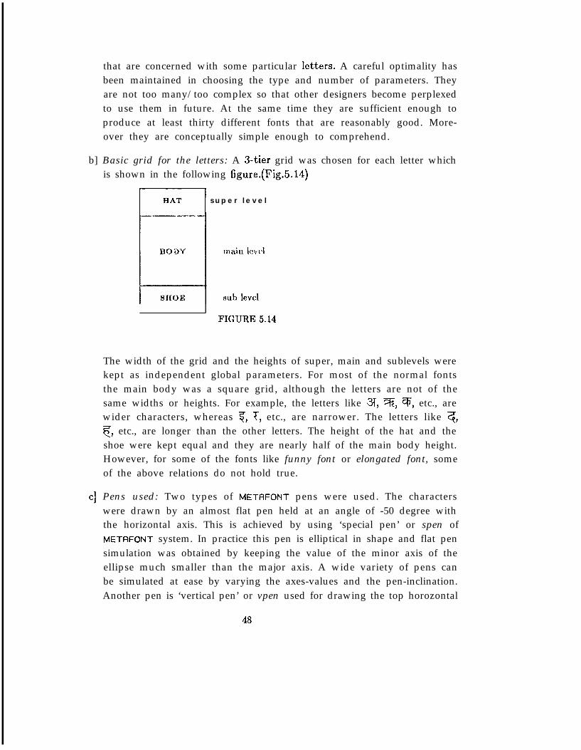
b] Basic grid for the letters: A 3-tier grid was chosen for each letter whichis shown in the following figure.(Fig.5.14)
jH*T s u p e r l e v e l
FIGURE 5.14
The width of the grid and the heights of super, main and sublevels werekept as independent global parameters. For most of the normal fontsthe main body was a square grid, although the letters are not of thesame widths or heights. For example, the letters like 3, 3, q, etc., arewider characters, whereas 7, T, etc., are narrower. The letters like 3,c, etc., are longer than the other letters. The height of the hat and theshoe were kept equal and they are nearly half of the main body height.However, for some of the fonts like funny font or elongated font, someof the above relations do not hold true.
Pens used: Two types of METAFONT pens were used. The characterswere drawn by an almost flat pen held at an angle of -50 degree withthe horizontal axis. This is achieved by using ‘special pen’ or spen ofMETAFONT system. In practice this pen is elliptical in shape and flat pensimulation was obtained by keeping the value of the minor axis of theellipse much smaller than the major axis. A wide variety of pens canbe simulated at ease by varying the axes-values and the pen-inclination.Another pen is ‘vertical pen’ or vpen used for drawing the top horozontal
48
4
4
fl
bar. However, this vpen can be replaced by spen if the designer wouldlike to use the same pen all through out his work.
Spacing be tureen letters: It should be mentioned specifically that thespacing between the letters is defined in terms of variable parameters.The type designer has enough scope to play with those parameters andset them differently for different fonts.
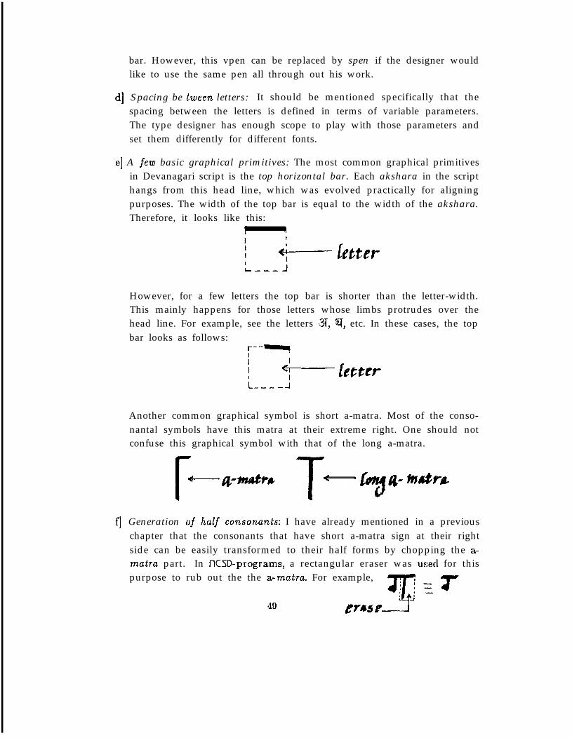
A few basic graphical primitives: The most common graphical primitivesin Devanagari script is the top horizontal bar. Each akshara in the scripthangs from this head line, which was evolved practically for aligningpurposes. The width of the top bar is equal to the width of the akshara.Therefore, it looks like this:
r \
IL --- J
However, for a few letters the top bar is shorter than the letter-width.This mainly happens for those letters whose limbs protrudes over thehead line. For example, see the letters 3, 91, etc. In these cases, the topbar looks as follows:
fII L fetterI
Another common graphical symbol is short a-matra. Most of the conso-nantal symbols have this matra at their extreme right. One should notconfuse this graphical symbol with that of the long a-matra.
Generation of half consonants: I have already mentioned in a previouschapter that the consonants that have short a-matra sign at their rightside can be easily transformed to their half forms by chopping the a-matra part. In KSD-programs, a rectangular eraser was usecl for thispurpose to rub out the the a-matra. For example,
One can, however, adopt the method of synthesis, i.e., originally gener-ating the half forms and afterwards pasting the a-matra in the right forproducing the full consonants.
Some of the consonants like q, CF;, c, etc. have completely new graphicalpatterns for half forms. Some others have no separate half forms andrepresented by the full forms followed by the halant sign.
g] Same strokes with different techniques: The same stroke has been gen-erated at different times using different tools of the METAFONT system.This may enable the designers in future to better understand the easeand problem in generating different kind of strokes as well as the basicstructure of each type of stroke in some more detail.
h] Devanagari script and the problem of digitization at low resolution: Thegraphical forms of the aksharas have too many curve portions which
cause great problems when they are digitized at medium or low resolu-tion. Due to jaggedness, the letters start loosing their finer details andsmoothness in a quicker rate than roman letters. In fact, type face below15 point size looks ugly when produced by the low resolution printerslike Dover or Canon.
i] The sample pages: METAFONT allows the designer to generate differentfonts by changing the values of the variable parameters of the programs.
Three fonts of KSD family are available on the Xerox Dover printer(resolution: 384 dots per inch) at the Department of Computer Science,Stanford University. NCSDlO is a 20 point face; NCSDSL is also a 20point type, but slanted and slightly bolder than NCSDIO. NCSDBB is a30 point bold Devanagari face.
Imagen’s Canon printer (resolution: 240 dots per inch) provides thirtydifferent experimental fonts, some of which are shown here.
The sample page THE COLLECTION and a few other pages contain a fewlines of a poem by Vidyapati, one of the most popular poet of India inthe 14th centuary A.D. and who is still popular in some parts of India.The choice of Vidyapati is for the following reasons:
1. His poems have the fragrance of the old tradition of India and canexpress most effectively the fundamental frequency of nCSs fonts.
50
2. Vidyapati is read throughout four different language areas, namelythose of Hindi, Bengali, Assamese and Maithili.
3. His poems have multi-dimensional flavors, like hymns dedicated toGod, lyrics dealing with Vaisnava themes, songs for festive occasionas well as erotic poems.
The fonts were chosen for THE COLLECTION page in such a way toproduce the effect of a hand-written manuscript.
j] Print code chart: The Dover printer samples provide a code chart ofDevanagari characters. I should mention specifically that it is the PrintCode chart- and not the Phonetic Atom Code Chart. The Devanagaricharacter set shown in the sample pages is not the Extended set. Atpresent METAFONT provides only 128 characters per font. Many vacantplaces are kept which could accommodate extra characters in the font infuture if necessary. The punctuation marks and other common symbolsare obtained from roman fonts.
51
6Refer&es
1. S. Krishnaswami Aiyangar, The Beginnings of South Indian History, Madras,1928. .
2. Donald M. Anderson, The Art of Written Forms, Publisher: Holt, Rinehartand Winston, Inc., New York.
3. M. Andronov, A Standard Grammar of Modern and Classical Tamil, NewCentury Book House, Madras, 1969.
4. J.H. Benson, A.G. Carey, The Elements of Lettering, McGraw-Hill Book Co.,Inc., 1950.
5. J.A. Bondy, The ‘graph theory’ of the Greek alphabet, Graph Theory andApplications, Y. Alavi et al., eds., Berlin, Springer-Verlag, 1972.
6. G. Buhler, Indian Palaeography, India Antiquary, 1904, Appendix; IndianStudies; Detail Report on a tour in Search of Sanskrit MSS made in Kashmir,Rajputana and Central India, Bombay, 1877.
7. A.C. Burnell, Elements of South Indian Palaeography, Mangalore, 1878.
8. E.M. Catich, The Origin of the Roman Serif, The Catfish Press, Davenport,Iowa, 1968.
9. Central Hindi Directorate, Ministry of Education, Govt. of India, StandardDevanagari Script, Publication No.3/67, Nov.29, 1966.
10. Suniti Kumar Chatterji, Languages and Literatures of Modern India, PrakashBhavan, Calcutta, 1963.
11. A.K. Coomarswamy, History of Indian and Indonesian Art, London, 1927.
12. P.J.M. Coueignoux, Generation of Roman Printed Fonts, Ph.D.Theses, Dept.of Electrical Engineering, M.I.T., June, 1975.
13. James Craig, Designing with Type, Watson-Guptill Publication, New York.
14. David Diringer, The Alphabet: A Key to the History of Mankind, PhilosophicalLibrary, New York, 1948.
52
15. Albrecht Durer, Underweysung der Messung mit dem Zirckel und Richtscheyt,Nuremberg, 1525. An English translation of the section of the alphabets hasbeen published as Albrecht Durer, Of the just shaping of letters, R.T. Nichol,trans., Dover, New York, 1965.
16. Fred Eager, The Italic Way of Beautiful handwriting, Macmillan PublishingCo., New York, 1974.
17. Alfred Fairbank, A Book of Scripts, Penguin.
18. Alfred Fairbank, A Handwriting Manual, Faber and Faber, London.
19. Adrian Frutiger, Type Sign Symbols, ABC Edition, Zurich, 1980.
20. P.K. Ghosh, Introducing Interactive Computer Drawing to the Students ofCalligraphy and Art with the help of PALATINO system, CSI Bangalore Re-port, India, April 1982.
21. P.K. Ghosh, Structure of a Language and their Composition, presented at theSecond World Instrumentation Symposium and International Trade Exposi-tion (WISITEX Sl), India, April 1981.
22. P.K. Ghosh, S.P. Mudur, Computer-aided Text Composition in Indian Scripts,presented at the International Symposium on Informatics for Development(INFORMATICS Sl), March 1981.
23. P.K. Ghosh, R. Sujata, A Graphical Approach to Typesetting, ComputerSociety of India Annual Convention, January 1982.
24. Frederic W. Goudy, Typologia: Studies in type design and type making withcomments on the invention of typography, the first types, legibility and fineprinting, Berkeley, Calif., Univ. of California Press, 1940.
25. Frederic W. Goudy, The alphabets and Elements of Lettering, Dover, NewYork, 1963.
26. Nicolete Gray, Lettering as Drawing, Taplinger, New York, 1982.
27. George A. Grierson, Linguistic Survey of India, Calcutta, 1904-1928.
28. R.H. van Gulik, Siddham: An essay on the history of Sanskrit studies inChina and Japan, Indian Academi of Indian Culture, New Delhi, 1953.
53
29. F. Harary, Typographs, Visible Language 7, 1973. . .
30. Michael Harvey, Lettering Design: Form and Skill in the Design and Use ofLetters, Bonanza Books, New York, 1980.
31. V.V. Ivanov, V.N. Toporov, Sanskrit, Nauka Publishing House, Moscow, 1968.
32. Subhadra Jha (Editor), The Songs of Vidyapati, published by Motilal BanarasiDas, Banaras, 1954.
33. Jinavijaya, Prachinah Jain Lekha-samgraha (Collection of Old Jain Writings),Bhavanagar, Jain Atmanand Sabha, 1921.
34. Edward Johnston, Writing and Illuminating and Lettering, Pitman, London,Taplinger, New York, A Pentalic Book, 1971.
35. Donald E. Knuth, The Computer Modern Family of Typefaces, StanfordComputer Science Report, STAN-CS-80-780, January 1980.
36. Donald E. Knuth, The Concept of a Mcta-Font, Visible Language, VolumeXVI, No.1, 1982.
37. Donald E. Knuth, TeX and METAFONT: New Directions in Typesetting,Digital Press, Bedford, Massachusetts, 1979.
38. Donald E. Knuth, The TeX Book, a pre-preliminary edition for people whocan’t wait, Stanford Computer Science Department, December 1982.
39. A. Maire, Material used to write before the Invention of Printing, Washinhton,1904.
40. S.C. Majumdar, Phonetic Changes in Indo-Aryan Languages, Research Tnsti-tute for prakit and Jainology, Vaishali, 1974.
41. William A. Mason, The History of Art of Writing, The Macmillan Co., NewYork, 1920.
42. M.V. Mathews, Carol Lochbaum and Judith A. Moss, Three Fonts of Com-puter Drawn Letters, Communications of the ACM IO, 1967.
43. Karl Menninger, Number Words and Number Symbols, MIT Press, 1969.
44. Stanley Morison, Type Designs of The past and The Present, London, 1926.
54
45. S.P. Mudur, P.K. Ghosh, R. Sujata, Software Development JOT ComputerTypography and Type Design, NCSDCT Research Review, Bombay, April1982.
46. S.P. Mudur, L.S. Wakankar, P.K. Ghosh, Design Information Report on TextComposition in Devanagari, NCSDCT, Bombay, September 1980. (Reprintedby RIND, Madras, Jan 1981).
47. Pran Nath, Sumero-Egyptian Origin of the Aryans and Rgveda, Journal ofthe Banaras Hindu University, Vol I, No.2, 1937.
48. Friedrich Neugebauer, The Mystic Art of Written Forms. Translation byBruce Kennett, Neugebauer Press, Boston, 1980.
49. Gaurishankar Hirachand Ojha, Bharatiya Prachina-Lipimala (Indian Palaeog-raphy), Ajmer, 1918.
50. A.S. Osley (Editor), Calligraphy and Palaeography, Faber and Faber, London.
51. Raj Bali Pandey, Indian Palaeography Part I, published by Motilal BanarasiDas, Nepali Khapra, Varanasi, 1957.
52. Dan Pedoe, Geometry and the Liberal Arts, St. martin’s Press, New York,1976.
53. Arther H. Phillips, Handbook of Computer-aided Composition, Marcel Dekker,Inc., New York, 1976.
54. Ben Rosen, Type and Typography, Van Nostrand Reinhold Company, NewYork, 1976.
55. Emil Ruder, Typography, Visual Communication Books, Hastings House,Publ., Inc, New York, 1981.
56. Saraswati Saran, India’s National Writing, Publisher: Munshiram Manohar-lal, Delhi, 1969.
57. H. Krishna Sastri, South Indian Inscriptions, Madras, 1917.
58. A.C. Shaw, The Formal Description and Parsing of Pictures, SLAC ReportNo.84, Stanford University, 1968.
59. G. Shaw, The Evolution of Types in Devanagari Script, Monotype Recorder,New series: Number 2, September, 1980.
55
60. Jacqueline Svaren, Written Letters, The Bond Wheelwright Comp. Publish-ers, Freeport, Marine.
61. S.B. Tannahill, P’s and Q’s, Doubleday, Doran and Co., Inc., New York,1939.
62. W.W. Tarn, The Greeks in Bactria and India, Cam., 1938.
63. Isaac Taylor, The Alphabet: An Account of the Origin and Development ofLetters, Vol I and II, Kegan Paul, Trench and Co., London, 1883.
64. A.T. Turnbull, R.N. Baird, The Gruphics of Communication, Publisher: Holt,Reinehart and Winston, 1975.
65. Berthold L. Ullman, Ancient Writing and Its InJuence, Cooper Square Pub-lishers, Inc., New York.
66. L.A. Waddel, The Indo-Sumerian Seals Deciphered: The Aryan Origin of theAlphabet, London Luzac and Co., 1927.
67. Egon Weiss, The Design of Lettering, The Pencil Points Press, Inc., New York,1932.
68. Hermann Zapf, About Alphabets: Some Marginal Notes on Type Design,M.I.T. Press, 1970.
69. Herman Zauf. Manuale lirypographicum, MIT Press, 1970.
56
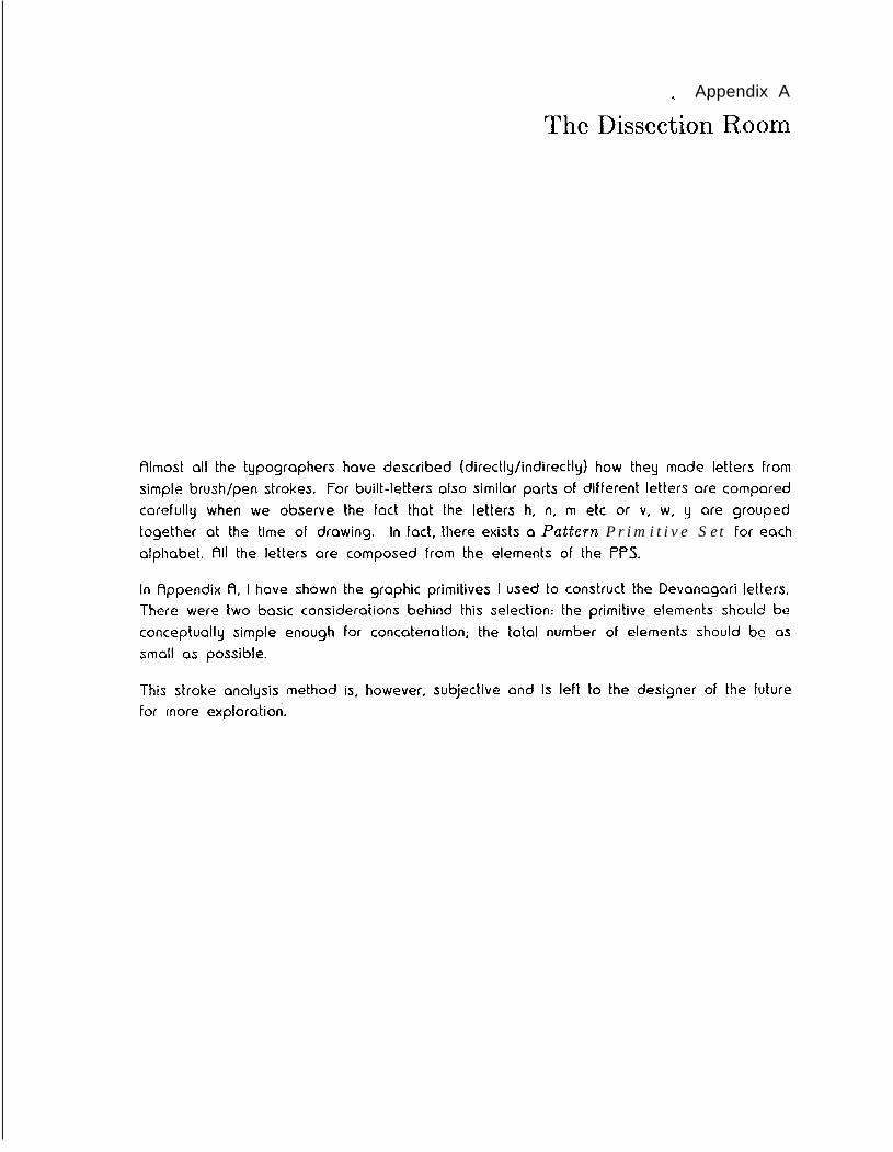
Appendix A
The Dissection Room
Almost all the typographers have described (directly/indirectly) how they made letters fromsimple brush/pen strokes. For built-letters also similar parts of different letters are comparedcarefully when we observe the fact that the letters h, n, m etc or v, w, y are groupedtogether at the time of drawing. In fact, there exists a Pattern Primitive Set for eachalphabet. All the letters are composed from the elements of the PPS.
In Appendix A, I have shown the graphic primitives I used to construct the Devanagari letters.There were two basic considerations behind this selection: the primitive elements should beconceptually simple enough For concatenation; the total number of elements should be assmall as possible.
This stroke analysis method is, however, subjective and is left to the designer of the futurefor more exploration.
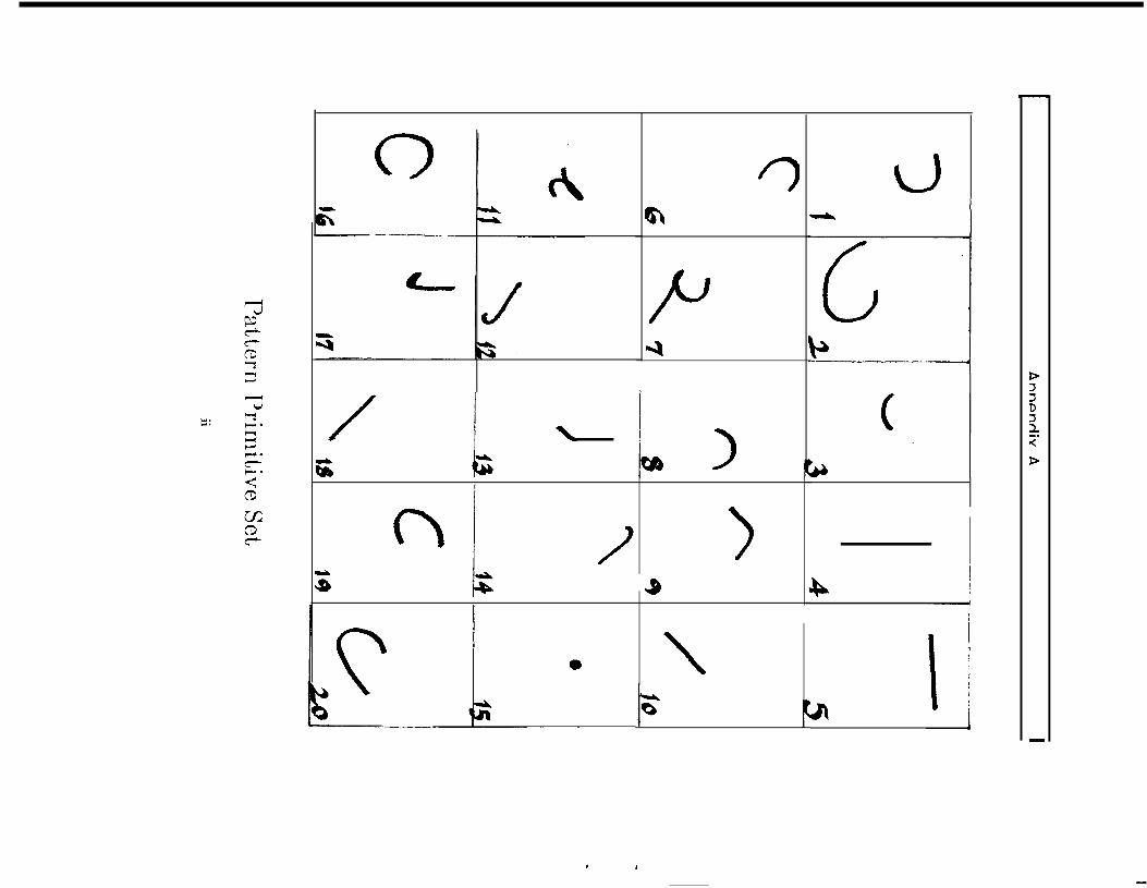
n3; I
* ,
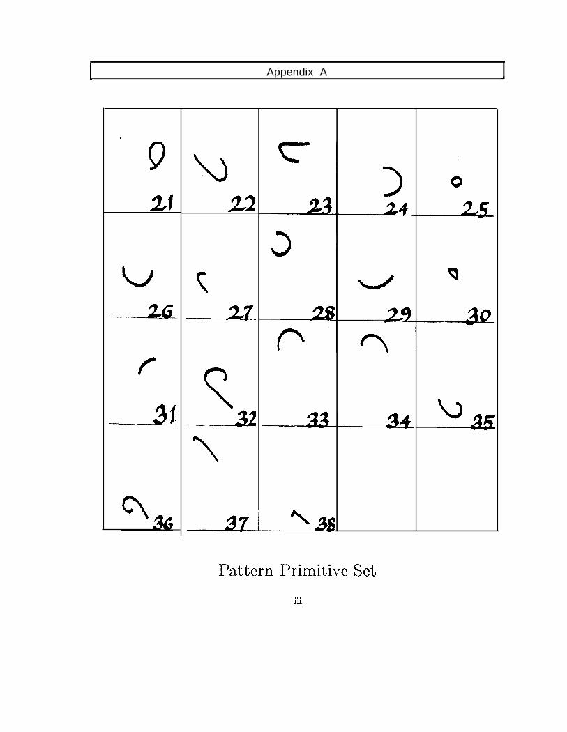
Appendix A
.
9
21
f
-31
u
33
c,
9
Pattern Primitive Set*..111
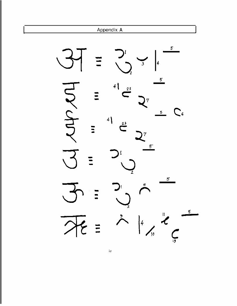
Appendix A
3
31
\>2
4 13c
5(I
4
5
27
5c6
4\ 23c72
5
7 I 6
II4
5
c19
iv
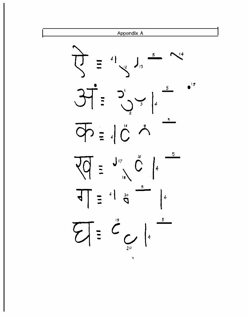
Appendix A.
5
32
4
b
n
Jr7 6\ I 4I64 1
19
C
I
4
5
30P
ClJ I 42*
V
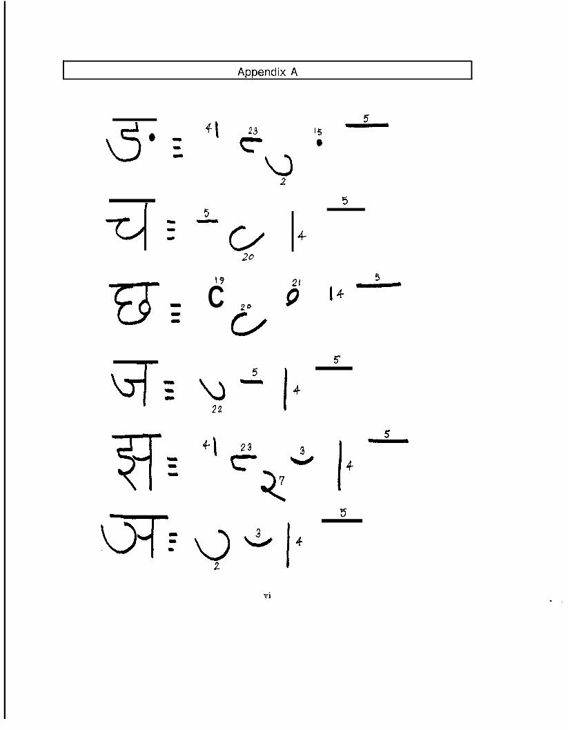
Appendix A
4\ 23
19
C 20CA
5
u-22
+I 23
2
4-
21
9
I 4
3
5
I 4
5
15
4
vi
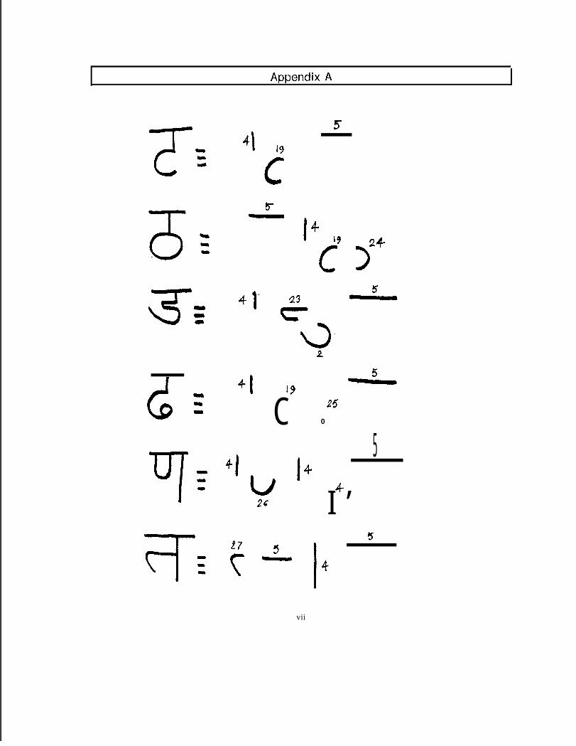
Appendix A
I 4‘9
c
24
>
C 250
41 I 4
I/2s
5
I ’4-
vii
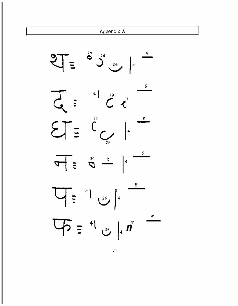
Appendix A
G250 28
3a
5
I
\
4
T=-
19
CCA
30
v
4 1
“I
20
5
4
I
4
5
5
5
I
8
26b 4 n
. . .VI11
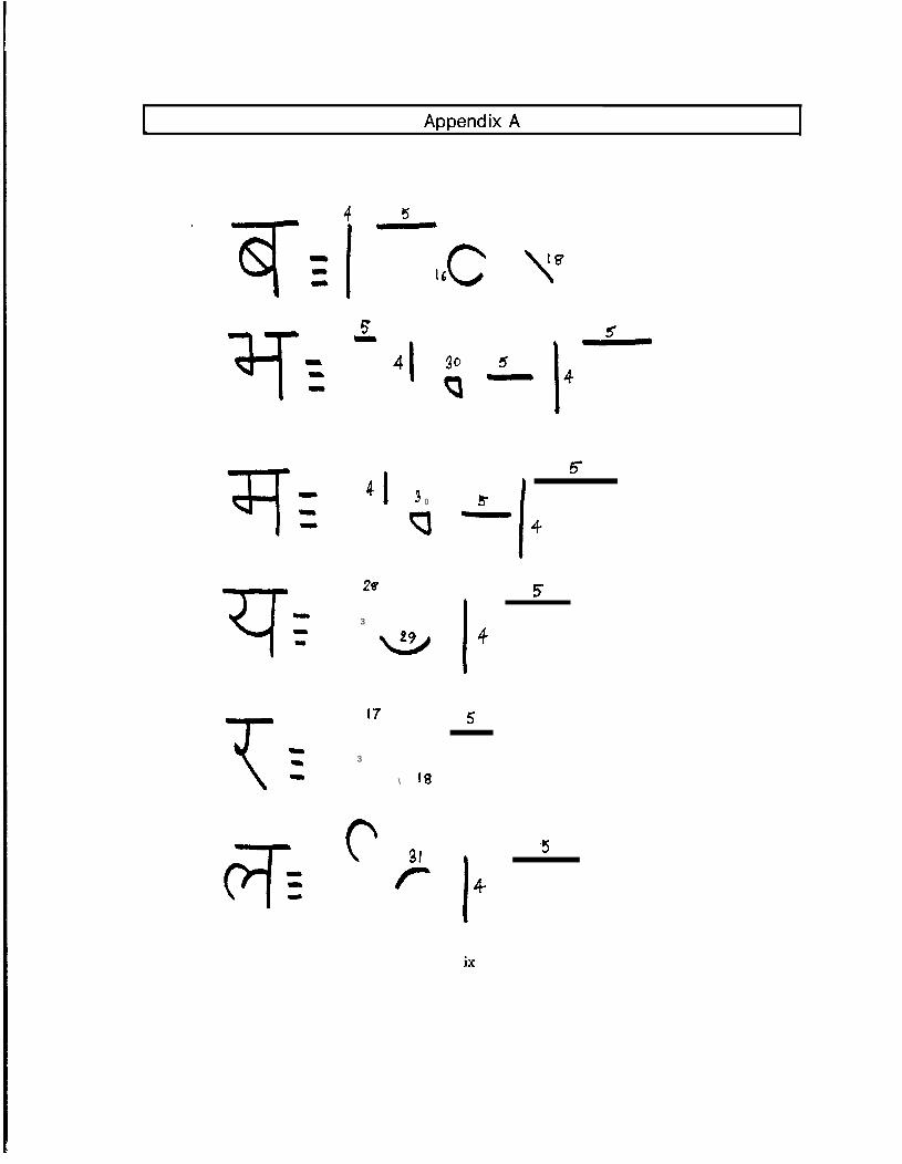
Appendix A
516C
541
41 3 0
0
28
3
w
17
3
\ 18
6c 31r
55-4I
5
I
4
5
,KJ
I 4ix
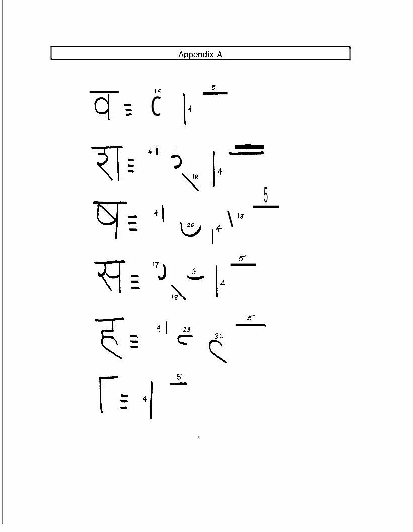
h Appendix A
16
C41
4 I
173
13 h?\
\‘8
41 23
cr
5I 4
5
I\18
4
5
I 4
5
32cX
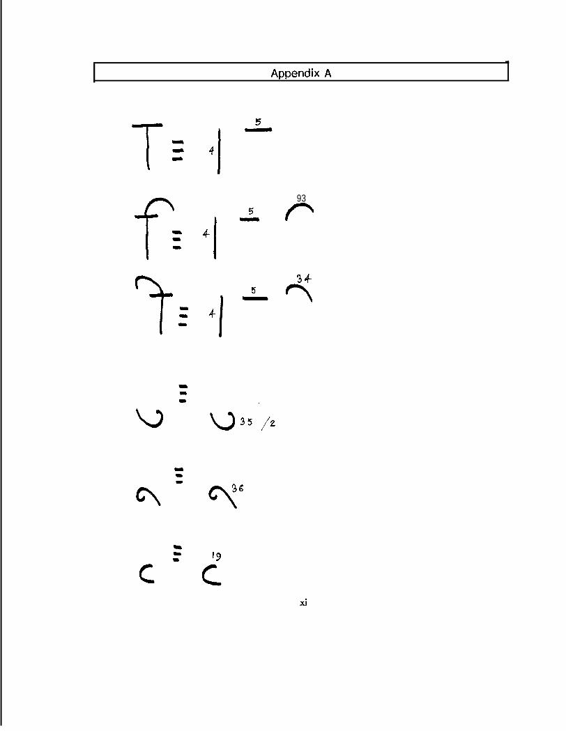
Appendix A
4 I
4I
4
I
935 P
34
- r\5
xi
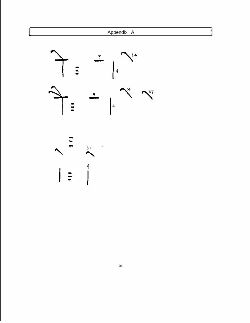
Appendix A
‘t \14
I 4
y Y4
4
I- I
xii
Appendix B
The Metafoni Programs
The M E T A F O N T programs for the KS0 font family are presented in Appendix 0. Theseprograms are simple enough to comprehend, but they do not express the full capabilitiesof METAFONT system. It is, therefore, advisable to go through the programs written byD.E. Hnuth for his Computer Modern Roman fonts which show how to use the METAFONTtechniques efficiently to design a family of typefaces.

Appendix B
1. NCSD FILES
#----------------------------------------------------------------K'/,The who'le NCSD files are divided into three separate files.%The GLOBAL file contains the global. parameters used.'/IThe SUBRTN file contains a number of useful subroutines.%The DEVNAG file contains the programs of the Devanagari 'Letters.%%------___---___---__---------------------------------------------
mode= ?; %input appropriate modemodegrid=l; '/cwhen modegrid is 1 it draws the basic grid.detail.=l; %detail=l means, draw the arrows around the grid.input g'loba'l;input subrtn;input devnag;'/( -------- --- ----- - ___---___---____-___-------- - _---- - ___---__----
ii
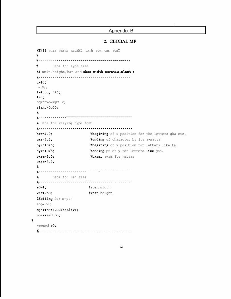
Appendix B
2. GLOBAL.MF
%THIS FILE KEEPS GLOBAL DATA FOR ONE FONT%%_-_____---------------------------------------
% Data for Type size'/(( unit,height,hat and shoe,width,exratio,sIant )36 ----------------------------------------------u=lO;h=lOu;t=4.5u; d=t;'I=h;sqrttwo=sqrt 2;sl.ant=O.OO;%%----------- ---------------------------------
'/( Data for varying type font% -----------------------------------------------
bxr=4.0; %begining of x position for the letters gha etc.exr=4.5; %ending of character by its a-matrabyr=lO/b; xbegining of y position for letters like ta.eyr=10/3; '/tending pt of y for letters Iike gha.bxrm=S.O; %bxrm, exrm for matrasexrm=4.5;K%------------------------ ------ - ---------------
% Data for Pen sizeX_-__------------------------------------------
wO=l; %vpen widthwl=l.&l; '/Cvpen height%Setting for s-penang=-50;mjaxis=(l000/686)*wl;mnaxis=O.&;
36vpenwd w0;
. . .Ill
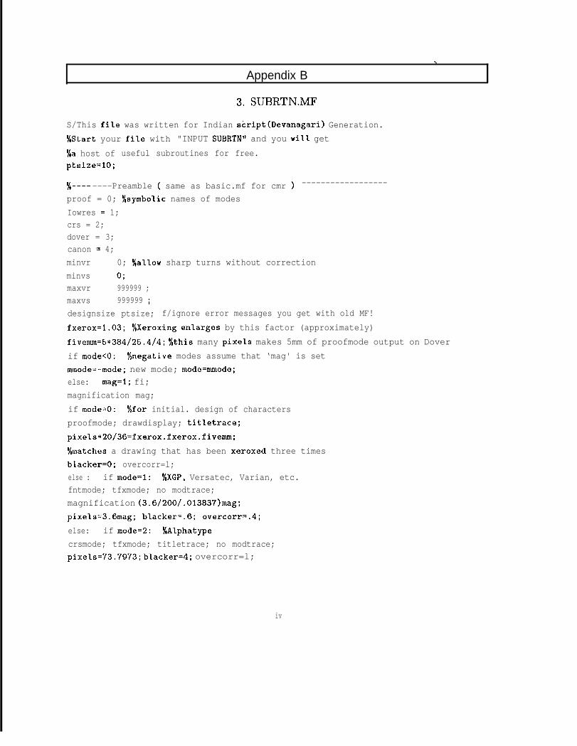
Appendix B
3. SUBRTN.MF
S/This file was written for Indian script(Devanagari) Generation.%Start your file with "INPUT SUBRTN" and you will get%a host of useful subroutines for free.ptsize=lO;
@ ----h ----Preamble ( same as basic.mf for cmr ) ------------------
proof = 0; O/csymboIic names of modesIowres = 1;crs = 2;dover = 3;canon = 4;minvr 0; '/callow sharp turns without correctionminvs 0;maxvr 999999 ;maxvs 999999 ;designsize ptsize; f/ignore error messages you get with old MF!fxerox=l.03; %Xeroxing enlarges by this factor (approximately)fivemm=5*384/25.4/4; fSthis many pixels makes 5mm of proofmode output on Doverif mode<O: Yanegative modes assume that ‘mag' is setmmode=-mode; new mode; mode=mmode;else: mag=l; fi;magnification mag;if mode=O: '/ofor initial. design of charactersproofmode; drawdisplay; titletrace;pixels*20/36=fxerox.fxerox.fivemm;%matches a drawing that has been xeroxed three timesbIacker=O; overcorr=l;else : if mode=l: %XGP, Versatec, Varian, etc.fntmode; tfxmode; no modtrace;magnification (3.6/200/.013837)mag;pixels=3.6mag; blacker=.6; overcorr=.4;else: if mode=2: f/Alphatypecrsmode; tfxmode; titletrace; no modtrace;pixels=73.7973; bIacker=4; overcorr=l;
iv
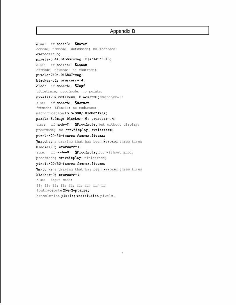
Appendix BI
else: if mode=3: %Doverocmode; tfmmode; dotwdmode; no modtrace;overcorr=.6;pixels=384*.013837*mag; bIacker=0.75;else: if mode=4: Wanonchrmode; tfxmode; no modtrace;pixeI.s=240*.013837*mag;bIacker=.2; overcorr=.4;else: if mode=5: %Zapftitletrace; proofmode; no points;pixels*20/36=fivemm; bIacker=O; overcorr=l;else: if mode=6: %Hornetfntmode; tfxmode; no modtrace;magnification (3.6/300/.013837)mag;pixels=3.6mag; blacker=.6; overcorr=.4;else: if mode=7: %Proofmode, but without display;proofmode; no drawdisplay; titletrace;pixels*20/36=fxerox.fxerox.fivemm;%matches a drawing that has been xeroxed three timesbIacker=O; overcorr=l;else: if mode=8: %Proofmode, but without grid;proofmode; drawdisplay; titletrace;pixels*20/36=fxerox.fxerox.fivemm;%matches a drawing that has been xeroxed three timesbl.acker=O; overcorr=l;else: input mode;fi; fi; fi; fi; fi; fi; fi; fi; fi;fontfacebyte 254-2*ptsize;hresolution pixels; vresoIution pixels.
V
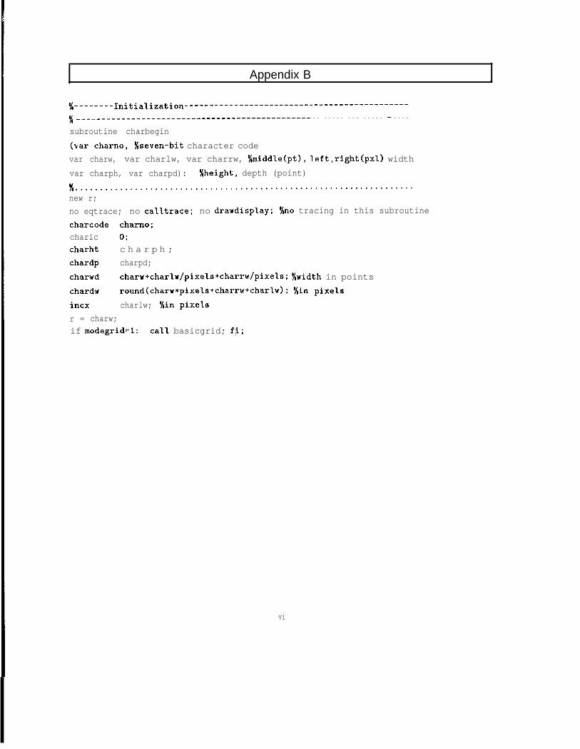
Appendix B .
‘/(-------- Initia~ization---------------------------------------------
5/ ____________________--------------------------- - - - - - - - - - - - - - - - - - - - -
subroutine charbegin(var charno, '/cseven-bit character codevar charw, var charlw, var charrw, %middle(pt), left,right(pxl) widthvar charph, var charpd): '/,height, depth (point)
Y,....................................................................new r;no eqtrace; no calltrace; no drawdisplay; '/,no tracing in this subroutinecharcode charno;charic 0;charht c h a r p h ;chardp charpd;charwd charw+charIw/pixels+charrw/pixeIs; S/,width in pointschardw round(charw*pixels+charrw+charIw); f/in pixelsincx charlw; '/tin pixelsr = charw;if modegrid=l: calI basicgrid; fi;
vi
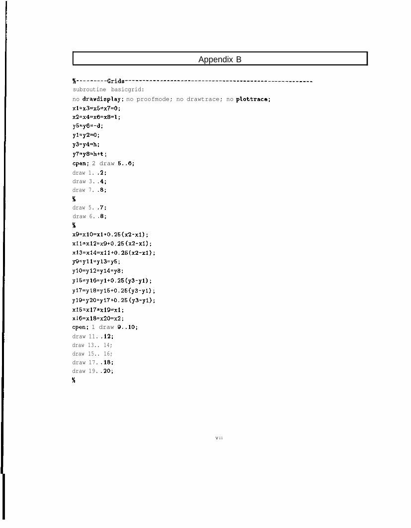
Appendix B
%---------Grids -----------------^------------------------------------
subroutine basicgrid:no drawdisplay; no proofmode; no drawtrace; no plottrace;x1=x3=x5=x7=0;x2=x4=x6=x8=1;yS=y6=-d;yl=y2=0;y3=y4=h;y7=y8=h+t ;cpen; 2 draw 5..6;draw 1. .2;draw 3. .4;draw 7. .8;Xdraw 5. .7;draw 6. .8;%x9=x10=x1+0.25(x2-x1);x11=x12=x9+0.25 (x2-x1) ;x13=x14=x11+0.25(x2-x1) ;y9=yll=yl3=y5;ylO=yl2=yl4=y8;yl5=yl6=yl+O.25(y3-y1);yl7=yl8=yl5+0.25(y3-y1);yl9=y2O=yl7+0.25 (y3-yl) ;x15=x17=x19=x1;x16=x18=x20=x2;cpen; 1 draw 9..10;draw 11. .12;draw 13.. 14;draw 15.. 16;draw 17. .18;draw 19. .20;36
V i i
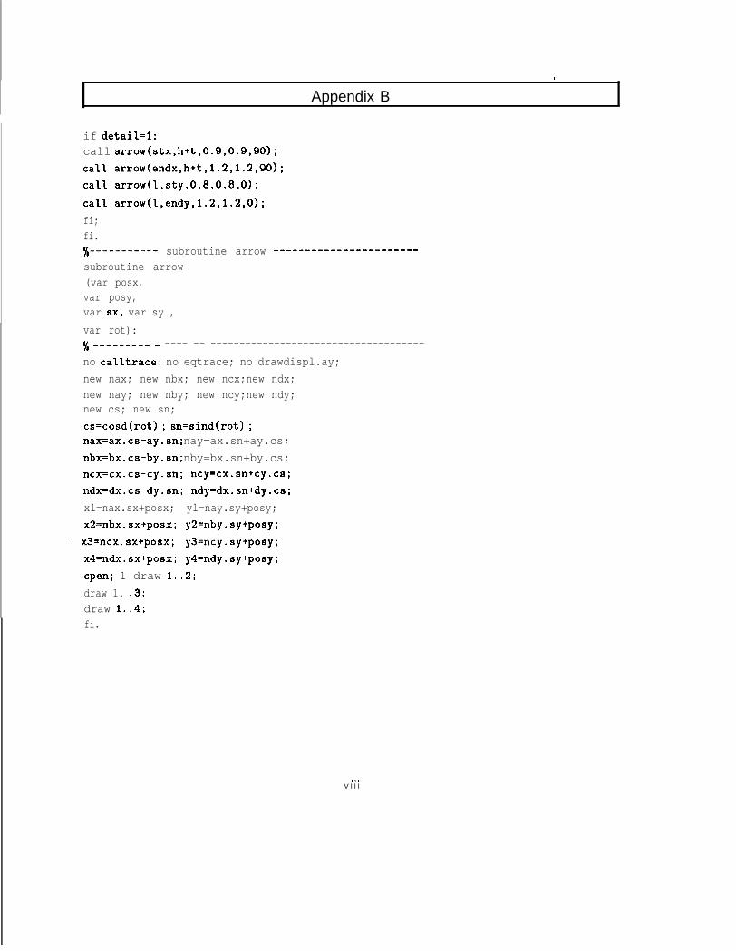
.
Appendix B
if detail=l:call arrow(stx,h+t,0.9,0.9,90);ca‘l1 arrow(endx,h+t,l.2,1.2,90);cal’l arrow(I,sty,0.8,0.8,0);calI arrow(I,endy,l.2,1.2,0);fi;fi.#--------- subroutine arrow _----------------------
subroutine arrow(var posx,var posy,var 8x, var sy ,var rot):% _____---- - ---- -- -------------------------------------no calltrace; no eqtrace; no drawdispl.ay;new nax; new nbx; new ncx;new ndx;new nay; new nby; new ncy;new ndy;new cs; new sn;cs=cosd(rot) ; sn=sind(rot) ;nax=ax.cs-ay.sn; nay=ax.sn+ay.cs;nbx=bx.cs-by.sn; nby=bx.sn+by.cs;ncx=cx.cs-cy.sn; ncy=cx.sn+cy.cs;ndx=dx.cs-dy.sn; ndy=dx.sn+dy.cs;xl=nax.sx+posx; yl=nay.sy+posy;x2=nbx.sx+posx; y2=nby.sy+posy;
* x3=ncx.sx+posx; y3=ncy.sy+posy;x4=ndx.sx+posx; y4=ndy.sy+posy;cpen; 1 draw 1..2;draw 1. .3;draw 1..4;fi.
. . .V l l l
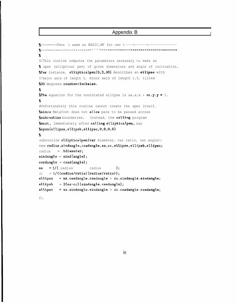
I Appendix B I
‘/(--------Pens ( same as BASIC.MF for cmr )----T------Y--------------'/,---T----------^-c------f ------'--------.-----.3-------l-----f'-----' _
x _S/This routine computes the parameters necessary to make an'/, spen (elliptical pen) of given dimensions and angle of inclination.'/,For instance, elIipticalpen(3,2,30) describes an ellipse withf/major axis of length 3, minor axis of length 1.5, tiltedX30 degrees counterclockwise.
X%The equation for the nonrotated ellipse is aa.x.x + cc.y.y = 1.K#Unfortunately this routine cannot create the spen itself,'/csince Metafont does not allow pens to be passed across$&subroutine boundaries. Instead, the calling programS/must, immediately after calling elIipticaIpen, say%spen(ellipsa,ellipsb,e1l.ipsc,O,O,O,O)
%subroutine ellipticalpen(var diameter, var ratio, var angle):new radius,sindang~e,cosdangle,aa,cc,e~~ipsa,e~~ipsb~e~~ipsc;radius = .5diameter;sindangle = sind(angle);cosdangle = cosd(angIe);aa = I/( radius radius 1;cc = l/((radius/ratio)(radius/ratio));ellipsa = aa.cosdangle.cosdangle + cc.sindangle.sindangle;e'L'Lipsb = 2(aa-cc)(sindangIe.cosdangle);elI.ipsc = aa.sindangle.sindangle + cc.cosdang1e.cosdangl,e;
fi.
ix
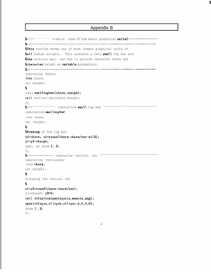
Appendix B
‘/,---- - - - - - - - - - -a-matra (one of the basic graphical units)----------------
%This routine draws one of most common graphical units ofS/a11 Indian scripts. This contains a very small top bar and'/Cthe vertical bar; one has to provide character width andkharacter height as variab'le parameters.%______--__------_---________^___________-------------------------------subroutine Amatra(var charw,var charph):%call sma1ltopbar(charw,charph);ca'll vertical.bar(charw,charph);fi.3/(-- ------------- subroutine small top bar -------------------------------
subroutine smalltopbar(var charw,var charph):%%Drawing of the top barx2=charw; xl=round(charw-charw/exr-wl/2);yl=y2=charph;vpen; wl draw 1..2;fi.%------------- subroutine vertical. bar ----------------------------------subroutine verticalbar(var char-w,var charph):KS/Drawing the vertical bar
%xl=x2=round(charw-charw/exr);yl=charph; y2=0;call ellipticalpen(mjaxis,mnaxis,ang);spen(ellipsa,ellipsb,ellipsc,O,O,O,O);draw 1..2;fi.
X
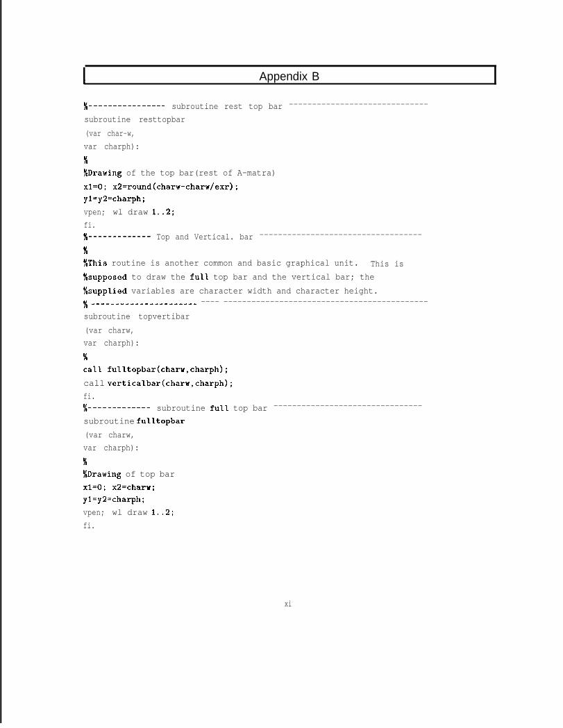
I Appendix B
% ------ - --------- subroutine rest top bar ------------------------------
subroutine resttopbar(var char-w,var charph):KXDrawing of the top bar(rest of A-matra)x1=0; x2=round(charw-charw/exr);yl=y2=charph;vpen; wl draw 1..2;fi.%---------- Top and Vertical. bar -----------------------------------
mSThis routine is another common and basic graphical unit. This is%supposed to draw the ful'l top bar and the vertical bar; the'/csupp'lied variables are character width and character height.x ________------------_^ ---- --------------------------------------------subroutine topvertibar(var charw,var charph):
3:calI fulltopbar(charw,charph);call verticalbar(charw,charph);fi.%---------- subroutine full. top bar --------------------------------
subroutine fu'l'ltopbar(var charw,var charph):
%%Drawing of top barx1=0; x2=charw;yl=ya=charph;vpen; wl draw 1..2;fi.
xi
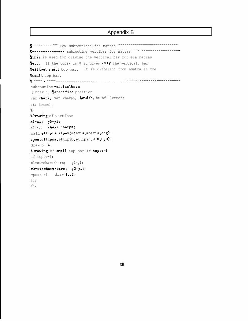
Appendix B
‘/(----- ___- --- Few subroutines for matras -----------------------------%-- -_-- - _------ - subroutine vertibar for matras -------_-------_------
'/IThis is used for drawing the vertical bar for e,a-matrasS/etc. If the topsw is 0 it gives onl.y the vertical. barNwithout small top bar. It is different from amatra in the'/csmaIl. top bar.
I 5/ ----- - ----- ____-____-__---___-_______^_____________-----------------~subroutine verticalbarm(index i, '/rspecifies positionvar charw, var charph, '/cwidth, ht of 'lettersvar topsw):
'/,Drawing of vertibarx3=xi; y3=yi;x4=x3; y4=yi-charph;call ellipticalpen(mjaxis,mnaxis,ang);spen(ellipsa,el.lipsb,eI1ipsc,O,O,O.O);draw 3..4;%Drawing of smal.1 top bar if topsw=lif topsw=l:xl=xi-charw/bxrm; yl=yi;x2=xi+charw/exrm; y2=yi;vpen; wl draw 1..2;fi;fi.
xii
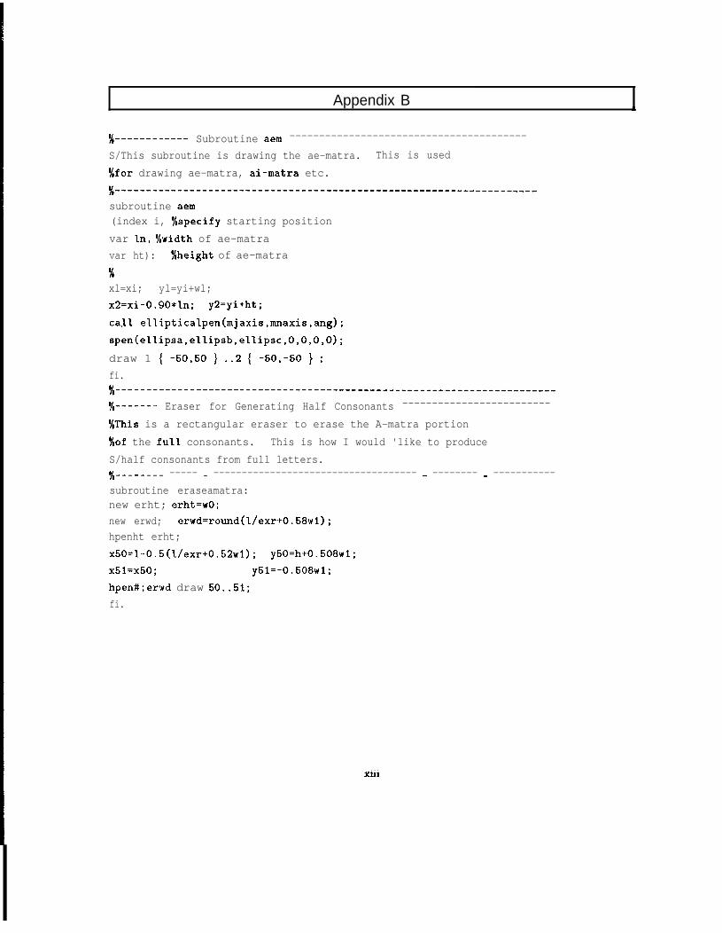
Appendix B
%--------- Subroutine aem ----------------------------------------
S/This subroutine is drawing the ae-matra. This is used3/far drawing ae-matra, ai-matra etc.
%_^-__-_-------------------------------------------------------------
subroutine aem(index i, '/cspecify starting positionvar 'In, '/cwidth of ae-matravar ht): %height of ae-matra
%xl=xi; yl=yi+wl;x2=xi-O.QO*In; y2=yi+ht;caI.1 ellipticalpen(mjaxis,mnaxis,ang);spen(el.Iipsa,eIIipsb,el.1ipsc,O,O,O,O);draw 1 { -50,50 } ..2 { -5O,-50 } ;fi.%______---___-----------------------------------------------------------‘/(----- Eraser for Generating Half Consonants -------------------------
%This is a rectangular eraser to erase the A-matra portion'/cof the fu11 consonants. This is how I would 'like to produceS/half consonants from full letters.s/,------- ----- - ------------------------------------ - -------- - -----------subroutine eraseamatra:new erht; erht=wO;new erwd; erwd=round(I/exr+0.58wl);hpenht erht;x50=I-0.5(l./exr+0.52wl); y50=h+0.568wl;x51=x50; y51=-0.508~1;hpen#;erwd draw 50..51;fi.
. . .Xlll
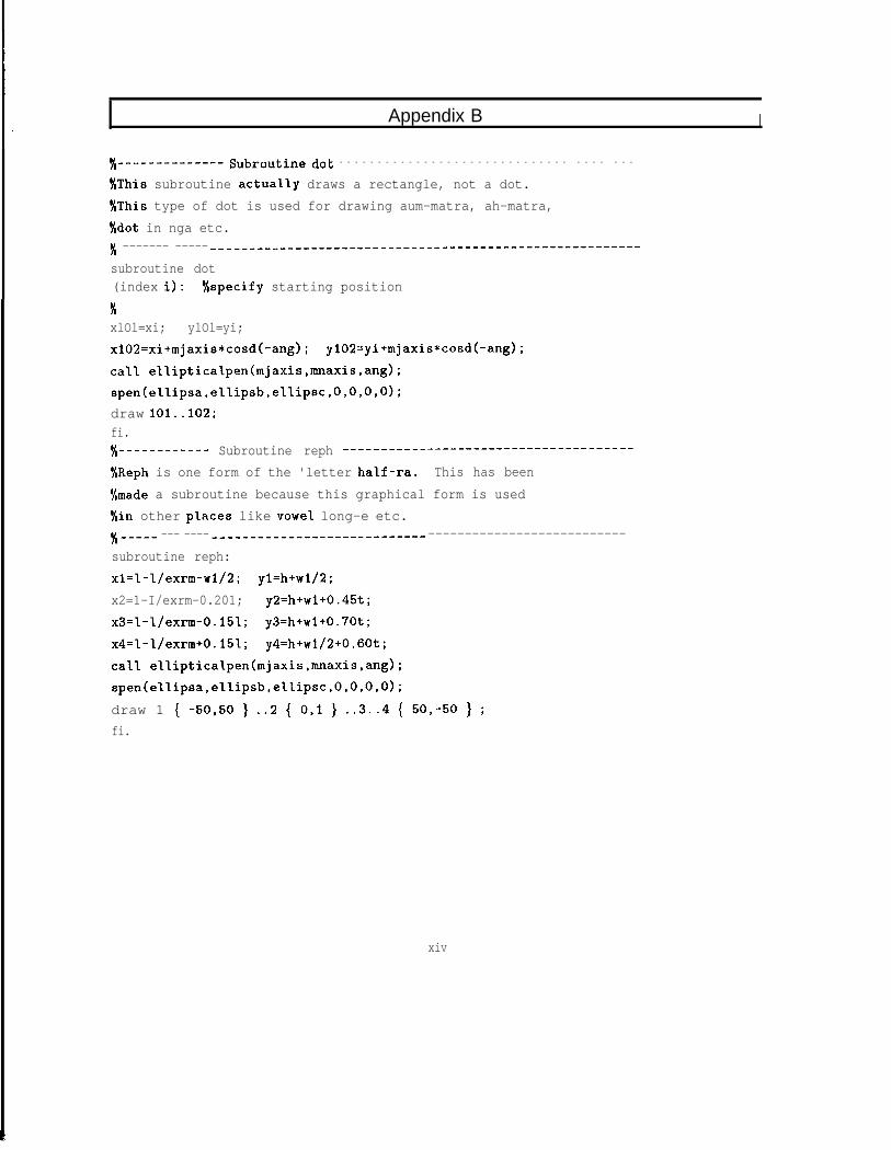
Appendix B I
#-------------- Subroutine dot - - - - - - - - - - - - - - - - - - - - - - - - - - - - - - - - - - - - -
%This subroutine actua'l'ly draws a rectangle, not a dot.'/,This type of dot is used for drawing aum-matra, ah-matra,S/dot in nga etc.'/, ------- ----- ----_--______-____--------------------------------------subroutine dot(index i): '/cspecify starting position
3;xlOl=xi; ylOl=yi;xl02=xi+mjaxis*cosd(-ang); yl02=yi+mjaxis*cosd(-ang);ca'll elIipticalpen(mjaxis,mnaxis,ang);spen(el.l.ipsa,eIlipsb,eIIipsc,O,O,O,O);draw 101..102;fi.%---------- Subroutine reph ______--------------------------------
%Reph is one form of the 'letter hal.f-ra. This has been'/,made a subroutine because this graphical form is usedf/in other places like vowe'l long-e etc.'/( _---- --- ---- ____---___-__-______-------- ---------------------------subroutine reph:x1=1-l./exrm-wl/2; yl=h+wl/2;x2=1-I/exrm-0.201; y2=h+w1+0.45t;x3=1-l/exrm-0.151; y3=h+w1+0.70t;x4=1-I/exrm+0.151; y4=h+w1/2+0.60t;calI eIliptical.pen(mjaxis,mnaxis,ang);spen(el~ipsa,ellipsb,eI~ipsc,O,O,O,O);draw 1 { -50,50 } ..2 { 0,l } ..3..4 { 50,-50 } ;fi.
xiv
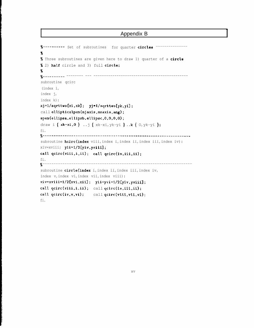
Appendix B
%--------- Set of subroutines for quarter circles ---------------
%'!( Three subroutines are given here to draw 1) quarter of a circle% 2) ha'lf circle and 3) full circle;%%---------- -------- --- ---------------------------------------------subroutine qcirc(index i,index j,index k):xj=l/sqrttwo[xi,xk]; yj=l/sqrttwo[yk,yi];call elIipticalpen(mjaxis,mnaxis,ang);spen(ellipsa,e~lipsb,eI~i.psc,O,O,O,O);draw i { xk-xi,0 } ..j { xk-xi,yk-yi } ..k { O,yk-yi };fi.% _______------------------------------------------------------------
subroutine hcirctindex viii,index i,index ii,index iii,index iv):xiv=xviii; yii=1/2[yiv,yviiiJ;caI1 qcirc(viii,i,ii); calI qcirc(iv,iii,ii);fi.%--------------------------------------------------------------------
subroutine circlecindex i,index ii,index iii,index iv,index v,index vi,index vii,index viii):xiv=xviii=l/2[xvi,xii]; yii-yvi=l/:![yiv,yviii];caI.1 qcirc(viii,i,ii); call qcirc(iv,iii,ii);call qcirc(iv,v,vi); call qcirc(viii,vii,vi);fi.
xv
Appendix B
4. DEVNAG.MF (a few selected routines)
% --------------DEVANAGARI LETTERS---------------------------’-^’
%This file contains character set for DEVANAGARINalphabet. This file, preceded by global..mf and%subrtn.mf enables u to generate a pixel file for%Devanagari script. But do not forget to specify'/("mode" iniatially, if u don't want shouting from%the system.
%_--_-_-_________--__--------------------------------------------
xvi
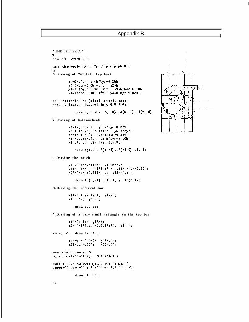
I
Appendix B I
” THE LETTER A ” ;%new sf t ; sft=0.171;
call charbegin('A,l.l7pl,lsp,rsp,ph,O);%% Drawing of thz left top hook
xl=O+sft; yl=h/byr+0.25h;x2=l/bxr+O.O5l+sft: y2=h;x3=7-l/exr-0.301+sft; y3=h/byr+O.l8h;x4=l/bxr-O.lOl+sft; y4=h/byr-0.02h;
call ellipticalpen(mjaxis,mnaxis,ang);spen(ellipsa,ellipsb,ellipsc,O,O,O,O);
draw l{5O,SO}..2{l,O}..3{O,-l}..4{-l,O};
% Drawing of bottom hook
x5=l/bxr+sft; y5=h/byr-0.02h;x6=1-l/exr-0,25l+sft: y6=h/eyr;x7=l/bxr+sft; y7=h/eyr-0.25h:x8=-O.l21+sft; y8=h/byr-0.20h;x9=0+sft; y9=h/eyr-O.lOh;
draw 5{1,0}..6{0,-1}..7{-1,0}..9..8;
% Drawing the notch
x10=1-l/exr+sft; ylO=h/byr;x11=1-l/exr-O.l5l+sft; yll=h/byr-0.15h;x?2=l/bxr+O.lOl+sft; yl2=h/byr;
draw lO{O,-l}..ll{-1,0}..12{0,1);
% Drawing the vertical bar
x17=1-l/exr+sft; y17=h;x18=x17; ylO-0;
draw 1'1..10;
% Drawing of a very small triangle on the top bar
xl3=l+sft; y13=h;x14=1-2*l/exr-O.O61+sft; yl4=h;
vpon; WI draw 14..13;
x15=x14-0.061; y15=y14;x16=x141.051; y16=y14;
new mjaxism.mnaxism;mjaxism=wl/sinci(50); mnL:x-ism=lu;
call ellipticalpcn(mjaxis,mnaxism,ang);spen(ellipsa,~ilipsb,ellipsc,O,O,O,O) #;
draw 15..16;
fi.
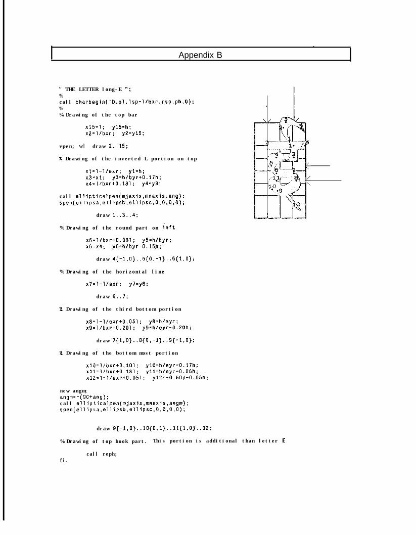
Appendix B
" THE LETTER long-E I';%call charbegin('D,pl,lsp-l/bxr,rsp,ph,O):%% Drawing of the top bar
X15=1 ; y15=h ;x2=l/bxr; y2=y15 ;
vpen; wl draw 2..15;
% Drawing of the inverted L portion on top
x1=1-l/exr: yl=h;x3=x1; y3=h/byr+O.l7h;x4=l/bxr+0.181; y4=y3 ;
call ellipticalpen(mjaxis,mnaxis,ang);spen(ellipsa,ellipsb,ellipsc,O,O,O,O);
draw 1..3..4:
% Drawing of the round part on Teft
x5=l/bxr+0.081; y5=h/byr;x6=x4; y6=h/byr-0.15.h;
draw 4{-1.0}..5{0,-1}..6{1,0}:
% Drawing of the horizontal line
x7=1-l/exr; y7=y6;
draw 6..7;
% Drawing of the third bottom portion
x8=1-l/exr+0.051; y8=h/eyr;x9=l/bxr+0.201; y9=h/eyr-0.20h;
draw 7{1,0}..8{0,-1}..9{-l,O}:
% Drawing of the bottom most portion
x10=l/bxr+0.101; ylO=h/eyr-0.17h:xll=l/bxr+0.181 ; yll=h/eyr-0.05h;x12=1-l/exr+0.051; y12=-0.50d-0.05h;
new angm;angm=-(90+ang);call ellipticalpen(mjaxis,mnaxis,angm);spen(ellipsa,ellipsb,ellipsc,O,O,O,O);
draw 9{-1,0}..10{0,1}..11{1,0}..12;
% Drawing of top hook part. This portion is additional than letter E
call reph;fi.
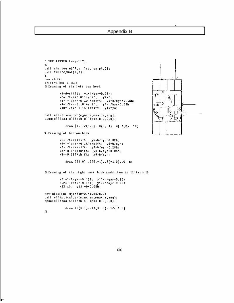
.
, Appendix B
W THE LETTER long-U ";%call charbegin('F,pl,lsp,rsp,ph,O);call fulltopbar(l,h);%new shift:shift=l/bxr-0.151;% Drawing of the left top hook
xl=O+shift; yl=h/byr+0.25h;x2=l/bxr+O.Oll+shift; y2=h;x3=1-l/exr-0.30ltshift; y3=h/byr+O.l5h;x4=libxr-O.lOl+shift; y4=h/byr-0.03h;xlO=l/bxr-0.15ltshift; ylO=y4;
call ellipticalpen(mjaxis,mnaxis,ang);spen(ellipsa,ellipsb,ellipsc,O,O,O,O);
draw (1..)2{1,0}..3{0,-1}..4{-l,O}..lO;
% Drawing of bottom hook
x5=l/bxr+shift; y5=h/byr-0.02h;x6=1-l/exr-0.25l+shift; y6=h/eyr:x7=l/bxrtshift; y7=h/eyr-0.25h;x8=-0.05ltshift; y8=h/eyr+O.O5h;x9=-O.O2l+shift; y9=h/eyr;
draw 5{1,0}..6{0,-1}..7{-1,0}..9..8;
% Drawing of the right most hook (addition to UU from U)
x11=1-l/exr+0.151; yll=h/eyr-tO.lOh;x12=1-l/exr+0.051; y12=h/eyr-0.25h;x13=x6; y13=y6-0.05h;
new mjaxism; mjaxism=w1*1000/800;call ellipticalpen(mjaxism,mnaxis,ang);spen~ellipsa,ellipsb,el:ipsc,O,O,O,O);
fi.draw 13{0,1}..11{0,-1}..12{-1.0);
xix
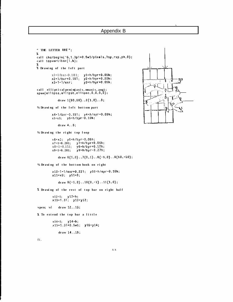
Appendix B
0 THE LETTER RR1 “;%call charbegin('G,1.3pl+0.5wl/pixels,lsp,rsp,ph,O);call topvertibar(l,h);%% Drawing of the left part
x l = l / b x r - 0 . 1 8 1 ; yl=h/byr+O.O5h;x2=l/bxr+0.151; y2=h/byr+0.20h;x3=1-l/exr; y3=h/byr+O.O5h;
call ellipticalpen(mjaxis,mnaxis,ang);spen(ellipsa,ellipsb,ellipsc,O,O,O,O);
draw 1{50,50}..2{1,0}..3;
% Drawing of the left bottom part
x4=l/bxr-0.151; y4=h/eyr-0.05h;x5=x3; y5=h/byr-O.lOh;
draw 4..5;
% Drawing the right top loop
x6=x3; yG=h/byr-0.05h;x7=1+0.201; y7=h/byr+O.O5h;x8=1+0.151; y8=h/byr+O.l2h;x9=1+0.281; y9=h/byr-0.27h;
draw 6{l,O}..7{O.l}..8{-l,O}..9{5O,-5O}:
% Drawing of the bottom hook on right
x10-l-l/exr+0.221; ylO-h/eyr-0.15h;x11=x9; yll=O ;
draw 9{-l,O}..lO{O,-l}..ll{l,O};
% Drawing of the rest of top bar on right half
x12=1; y12=h;x13=1.31; y13=y12;
vpen; wl draw 12..13;
% To extend the top bar a little
x14=1; y14-h;x15=1.31+0.5w1; y15=y14;
draw 14..15;
fi.
x x
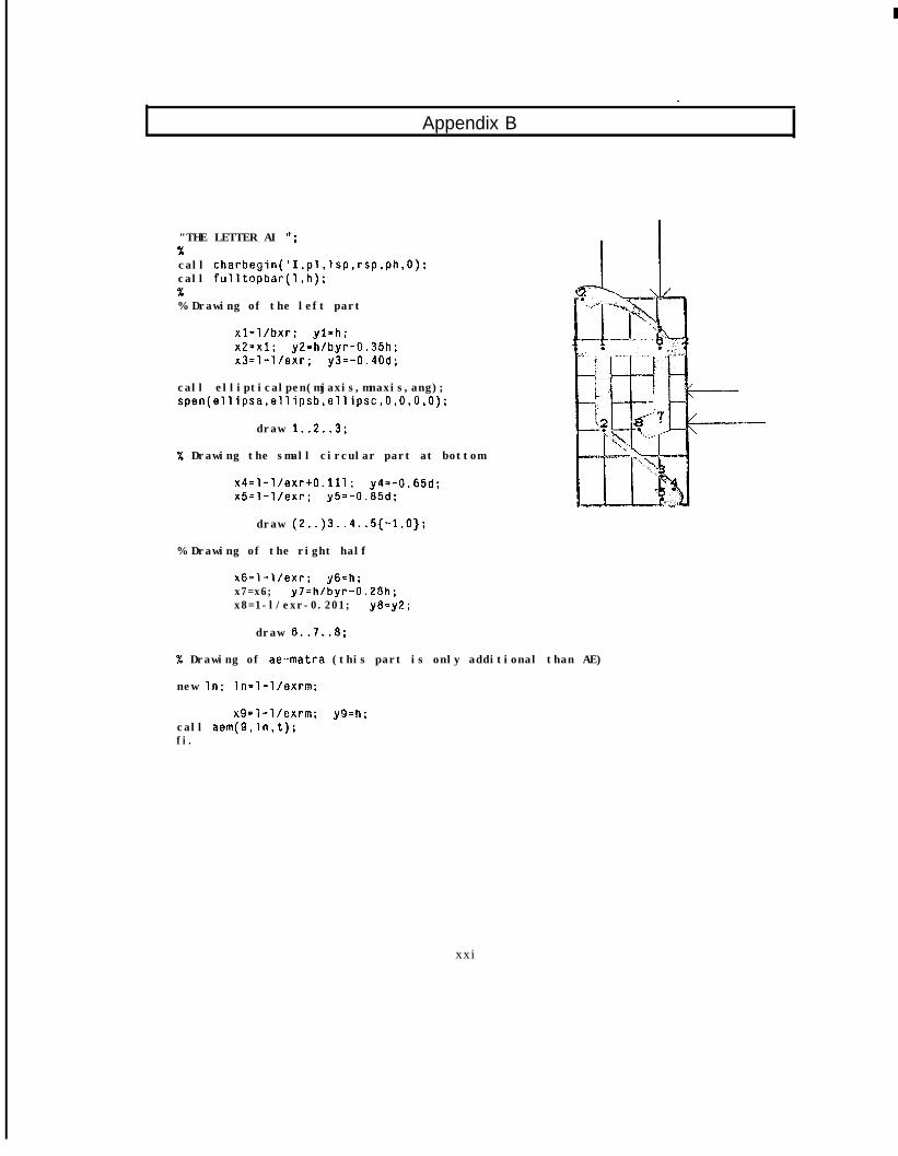
Appendix B. .
"THE LETTER AI ";%call charbegin('I,pl,lsp,rsp,ph,O);call fulltopbar(l,h);%% Drawing of the left part
xl=l/bxr: yl=h;x2=x1; y2=h/byr-0.35h:x3=1-l/exr; y3=-0.40d;
call ellipticalpen(mjaxis,mnaxis,ang);spen(ellipsa.ellipsb,ellipsc,O,O,O,O);
draw 1..2..3:
% Drawing the small circular part at bottom
x4=1-l/exr+O.lll: y4=-0.65d;x5=1-l/exr; y5=-0.85d;
draw (2..)3..4..5{-1,O);
% Drawing of the right half
x6=1-l/exr; y6=h;x7=x6; y7=h/byr-0.28h;x8=1-l/exr-0.201; y8=y2 ;
draw 6..7..8;
% Drawing of ae-matra (this part is only additional than AE)
new In; ln=l-l/exrm;
x9=1-l/cxrm; y9=h;call aem(g,ln,t);fi.
xxi
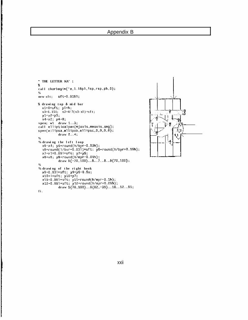
Appendix B
W THE LETTER KA" ;%call charbegin('a,l.l5pl,lsp,rsp,ph,O);%new sft; sft=0.0151;
% drawing top & mid barxl=O+sft; yl=h;x3=1.151; x2=4/7(x3-xl)+sft;yl=y2=y3;x4=x2; y4=0;
vpen; wl draw 1..3;call ellipticalpen(mjaxis,mnaxis,ang);spen(ellipsa,ellipsb,ellipsc,O,O,O,O);
draw 2..4;%% drawing the left loop
x5-x4; y5=round(h/byr-0.03h);x6=round(l/bxr-O.O31)+sft; y6=round(h/byr+O.l6h);x7=x1+0,051+sft; y7=y5;x8=x6; ya=round(h/eyr-O.Olh);
draw 5{-70,100}..6..7..8..5{70,100};%% drawing of the right hook
x9=0.931+sft; y9=y6-0.5u;xlO=l+sft; ylO=y7:xll=0.861+sft; yll=round(h/eyr-O.lh);x12=0.951+sft; yl2=round(h/eyr+O.O5h)i
draw 5{70,100}..9{82,-35}..10..12..11;fi.
xxii
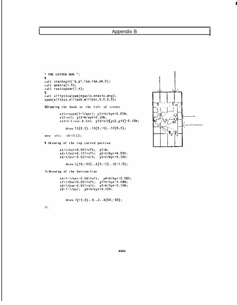
1( THE LETTER KHA ";%call charbegin('b,pl,lsp,rsp,ph,O);call amatra(l,h);call resttopbar(1.h);%call ellipticalpen(mjaxis,mnaxis,ang);spen(ellipsa,ellipsb,ellipsc,O,O,O,O);
XDrawing the hook at the left of a-matra
xll=round(l-l/exr); yll=h/byr+O.Olh:x12=x11; yl2=h/eyr+O.l5h;x13=1-l/exr-0.331; y13=1/2[y12,yll]-O.lOh;
draw 11{0,1}..13{0,-1}..12{0,1};
new sft; sft=-0.121;
% Drawing of the top curved portion
xl=l/bxr+O.O5l+sft; yl=h;x2=l/bxr+O .12l+sft; y2=h/byr+O.Olh;x3=l/bxr-O.O3l+sft; y3=h/byr-0.15h;
draw l{lO,-50}..2{0,-1}..3{-1.0);
% Drawing of the bottom line
x4=1-l/exr-O.O8l+sft; y4=h/eyr-0.28h;x7=l/bxr+O.O5l+sft; y7=h/byr-0.08h;x8=l/bxr-O.Oll+sT’t; y8=h/byr-O.lOh;x9=1-l/exr; y9=h/eyr+O.lOh;
draw 7{-1,0}..8..3..4{50,-30);
fi.
. . .?cxIll
I Appendix B ,
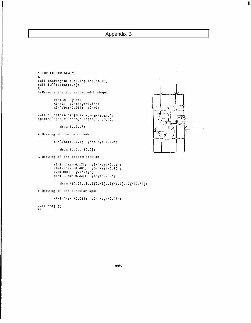
I Appendix B
It THE LETTER NGA ";%call charbegin('e,pl,lsp,rsp,ph,O):call fulltopbar(1.h):%% Drawing the top reflected-L shape:
x1=1/2; yl=h;x2=x1; y2=h/byr+O.l5h;x3=l/bxr-0.031; y3=y2;
call ellipticalpen(mjaxis,mnaxis,ang);spen(ellipsa,ellipsb,ellipsc,O,O,O,O);
draw 1..2.,3;
"6 Drawing of the left hook
x4=l/bxr+0.171; y4=h/byr-O.lOh;
draw 2..3..4{1,0};
% Drawing of the bottom portion
x5=1-l/exr-0.171; y5=h/eyr-O.Olh;x6=1-l/exr-0.401; y6=h/eyr-0.25h;x7=0.081; y7=h/eyr;x8=1-l/exr-0.221; y8=y4-0.02h;
draw 4{1,O}..8..5{O,-1}..6{-1,O}..7{-3O,5O};
% Drawing of the circular spot
x9=1-.l/exr+O.Oll; y9=h/by'r-0.08h;
call dot(g);fi
XXiV
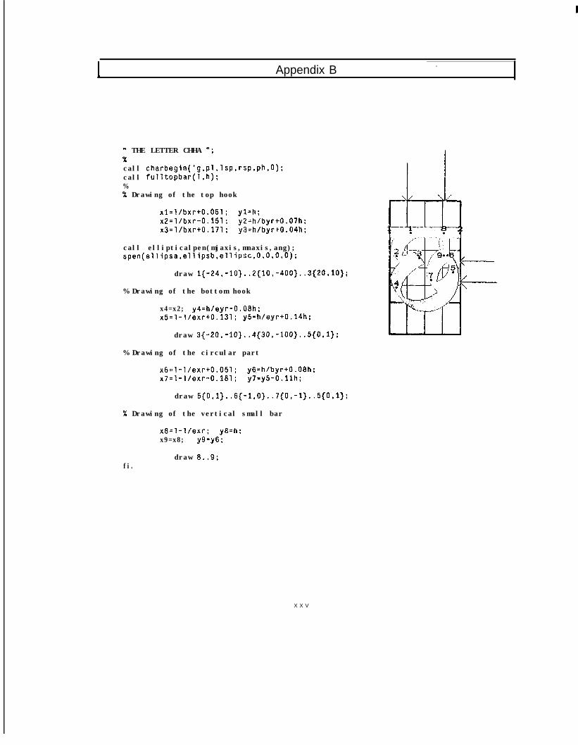
I
Appendix B . .
1( THE LETTER CHHA '*;
call charbegin('g,pl,lsp,rsp,ph,O):call fulltopbar(l,h);%% Drawing of the top hook
xl=l/bxr+0.051; yl=h;x2=l/bxr-0.151; y2=h/byr+O.O7h;x3=l/bxr+0.171; y3=h/byr+O.O4h:
call ellipticalpen(mjaxis,mnaxis,ang);spen(ellipsa,ellipsb,ellipsc,O,O,O,O);
draw l{-24,-10}..2{10,-400}..3{20,10};
% Drawing of the bottom hook
x4=x2; y4=hfeyr-0.08h;x5=1-l/exr+0.131; y5=h/eyr+O.l4h;
draw 3{-20,-10}..4{30,-100}..5{0,1};
% Drawing of the circular part
x6=1-l/exr+0.051; y6=h/byr+O.O8h;x7=1-l/exr-0.181; y7=y5-O.llh;
draw 5{0,1}.. 6{-1,0}..7{0,-1}..5{0,1};
% Drawing of the vertical small bar
x8=1-l/exr; y8=h;x9=x8; y9=y6 ;
draw 8..9;fi.
X X V
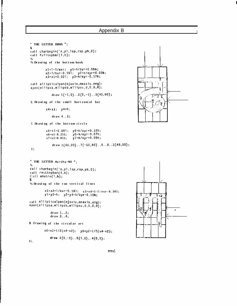
Appendix B I
11 THE LETTER DDHA ";xcall charbegin('n,pl,lsp,rsp.ph,O);call fulltopbar(l,h);%% Drawing of the bottom hook
x1=1-l/exr; yl=h/byr+O.O!jh;x2=l/bxr-0.151; y2=h/eyr+O.O3h;x3=x1+0.031; y3=h/eyr-0.17h;
call ellipticalpen(mjaxis,mnaxis,ang);spen(ellipsa,ellipsb,ellipsc,o,O,O,O);
draw I{-1,0}..2{0,-1}..3{40,6o};
"/, Drawing of the small horizontal bar
x4=x1; y4=h;
draw 4..1;
:'. Drawing of the bottom circle
x5=x1-0.081; y5-h/eyr+O.lOh;x6=x1-0.251; y6=h/eyr-0.07h;x7=x1+0.051; y7=h/eyr+O.O9h;
draw 3{40,90)..7{-50,80}..5..6..3{40,9o};fi.
W THE LETTER murdha-NA I';%call charbegin('o,pl,lsp,rsp,ph,o);call resttopbar(l,h);C a l l amatra(l,h);x% Drawing of the two vertical lines
xl=x2=l/bxr-0.101; x3=x4=1-l/exr-0.301;yl=y3=h; y2=y4=h/byr-O.lOh;
call ellipticalpen(mjaxis,mnaxis,ang);sPen(ellipsa,ellipsb,ellipsc,o,o,o,o)~
draw 1..2;draw 3..4;
% Qrawing of the circular arc
x5=x2+1/2(x4-x2); y5=y2-1/2(x4-x2);
fi.draw 2{o,-1}..5{1,0}..4{0,i};
xxvi
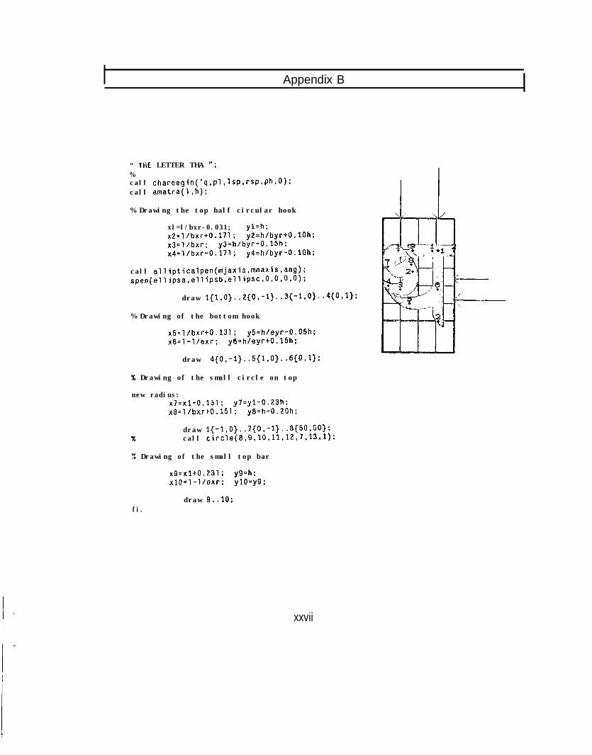
Appendix B
W THE LETTER THA ";%call charbegin('q,p'l,lsPSrsPvPh~O):call amatra(1.h):
% Drawing the top half circular hook
xl=l/bxr-0.031; yl=h:x2=l/bxrt0.171: y2=h/byr+O.lOh;x3=l/bxr; y3=h/byr-0.15h;x4=l/bxr-0.171; y4=h/byr-O.lOh;
call ellipticalpen(mjaxis,mnaxis,ang);spen(ellipsa.ellipsb,ellipsC,O,O.O,O):
draw 1{1,0}..2{0.-1}..3{-1,0}..4{0,1}:
% Drawing of the bottom hook
x5=l/bxr+0.131: y5=h/eyr-0.05h;x6=1-l/exr; y6=h/eyr+O.l5h;
draw 4{0,-1}..5{1,0}..6{0,1};
% Drawing of the small circle on top
new radius:x7=x1-0.151: y7=yl-0.23h;x8=l/bxr+0.151; y8=h-0.20h;
%draw l{-1,0}..7{0,-1}..8{50,50};call circ1e(8,9.10,11,12,7,13,1):
'X Drawing of the small top bar
x9=x1+0.231 ; y9=h;x10=1-l/exr; ylO-y9;
fi.draw 9..10;
xxvii
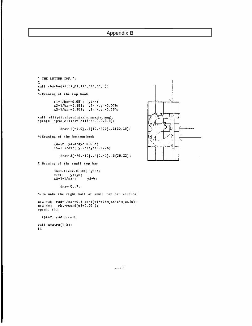
, Appendix B
(( THE LETTER DHA ";%call charbegin('s,pl,lsp,rsp,ph,O):%% Drawing of the top hook
xl=l/bxr+0.051; yl=h;x2=l/bxr-0.151; y2=h/byr+O.O7h;x3=l/bxr+0.301; y3=h/byr+O.lOh:
call ellipticalpen(mjaxis,mnaxis,ang);spen(ellipsa,ellipsb,ellipsc,O,O,O,O);
draw l{-1,0}..2{10,-400}..3{20,10};
% Drawing of the bottom hook
x4=x2; y4=h/eyr-0.03h;x5=1-l/exr; y5=h/eyr+O.O27h;
draw 3{-20,-10}..4{0,-1}..5{20,22};
% Drawing of the small top bar
x6=1-l/exr-0.301; y6=h;x7=1; y7=y6;x8=1-l/exr; y8=h;
draw 6..7;
% To make the right half of small top bar vertical
new rwd; rwd=l/exrt0.5 sqrt(wl*wl+mjaxis*mjaxis);new rht; rht=round(wl+O.O5h);rpenht rht;
rpentl; rwd draw 8;
call amatra(l,h);fi.
. . .x x v 1 1 1
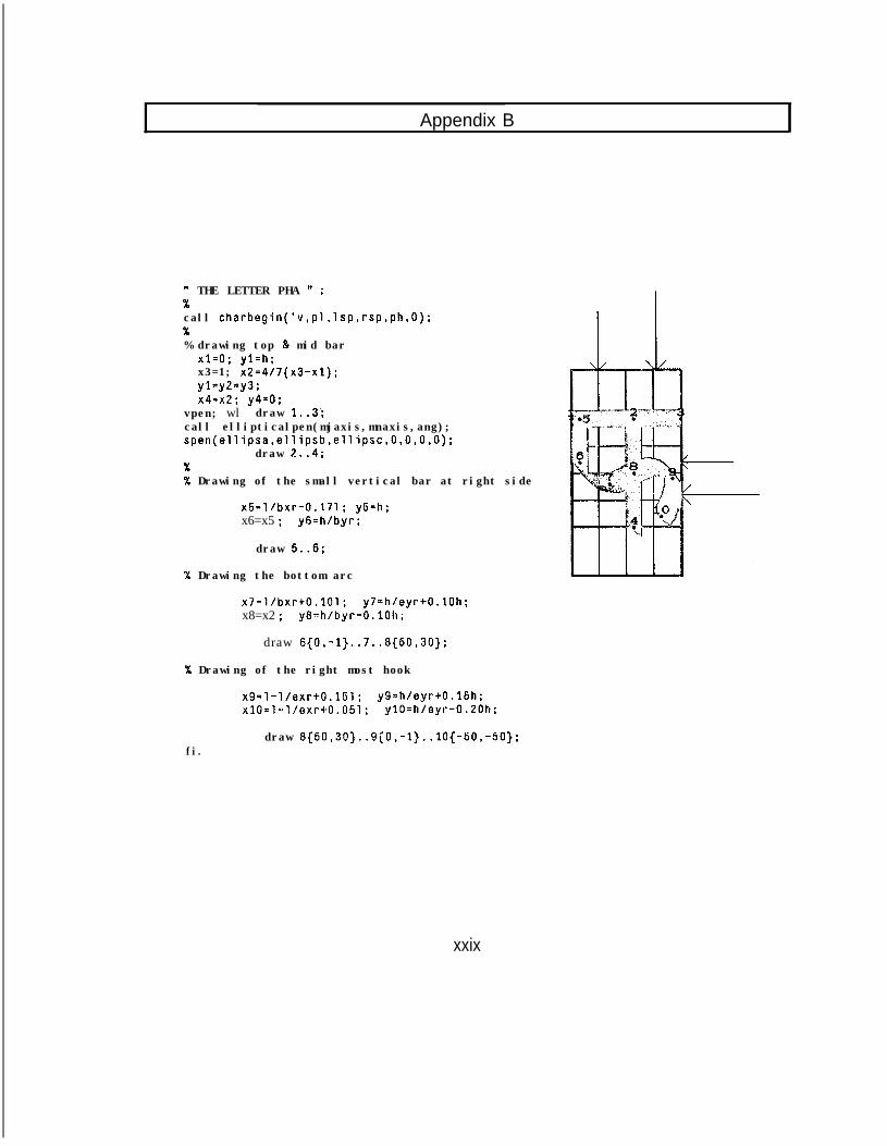
Appendix B
W THE LETTER PHA 1( ;%call charbegin('v,pl,lsp,rsp,ph,O);X% drawing top & mid bar
x1=0; yl=h;x3=1; x2=4/7(x3-x1);yl=y2=y3:x4=x2; y4=0;
vpen; wl draw 1..3:call ellipticalpen(mjaxis,mnaxis,ang);spen(ellipsa,ellipsb,ellipsc,O,O,O,O);
draw 2..4;%% Drawing of the small vertical bar at right side
x5=l/bxr-0.171; y5=h;x6=x5 ; y6=h/byr;
draw 5..6;
% Drawing the bottom arc
x7=l/bxr+0.101; y7=h/eyr+O.lOh;x8=x2 ; y8=h/byr-0.101~;
draw 6(0,-l} ..7..8{50,30};
% Drawing of the right most hook
x9=1-l/exr+0.151; y9=h/eyr+O.l5h;x10=1-l/exr+0.051; ylO=h/eyr-0.20h;
fi.draw 8{50,30)..9{0,-l}..lO{-50);
xxix
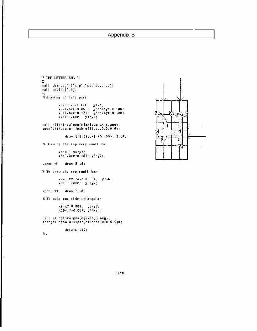
Appendix BI
W THE LETTER BHA ";%call charbegin('x,pl,lsp,rsp,ph,O):call amatra(l,h);%% drawing of left part
xl=l/bxr-0.171; yl=h;x2=l/bxr-0.051; y2=h/eyr-O.lOh;x3=l/bxr-0.171; y3=h/eyr+O.l2h;x4=1-l/exr; y4=y3 ;
call ellipticalpen(mjaxis,mnaxis,ang);spen(ellipsa,ellipsb,ellipsc,O,O,O,O);
draw 1{1,0}..2{-25,-50}..3..4;
% Drawing the top very small bar
x5=0; y5=yl;x6=1/bxr-0.151; y6=yl;
vpen; wl draw 5..6;
% To draw the top small bar
x7=1-2*l/exr-0.051; y7=h;x8=1-l/exr; y8=y7 ;
vpen: wl draw 7..8;
% To make one side triangular
x9=x7-0.061; y9=y7 ;x10=x7+0.061; ylO=y7;
call ellipticalpen(mjaxis,u,ang):spen(ellipsa,ellipsb,ellipsc,O,O,O.O)#:
fi.draw 9. .lO;
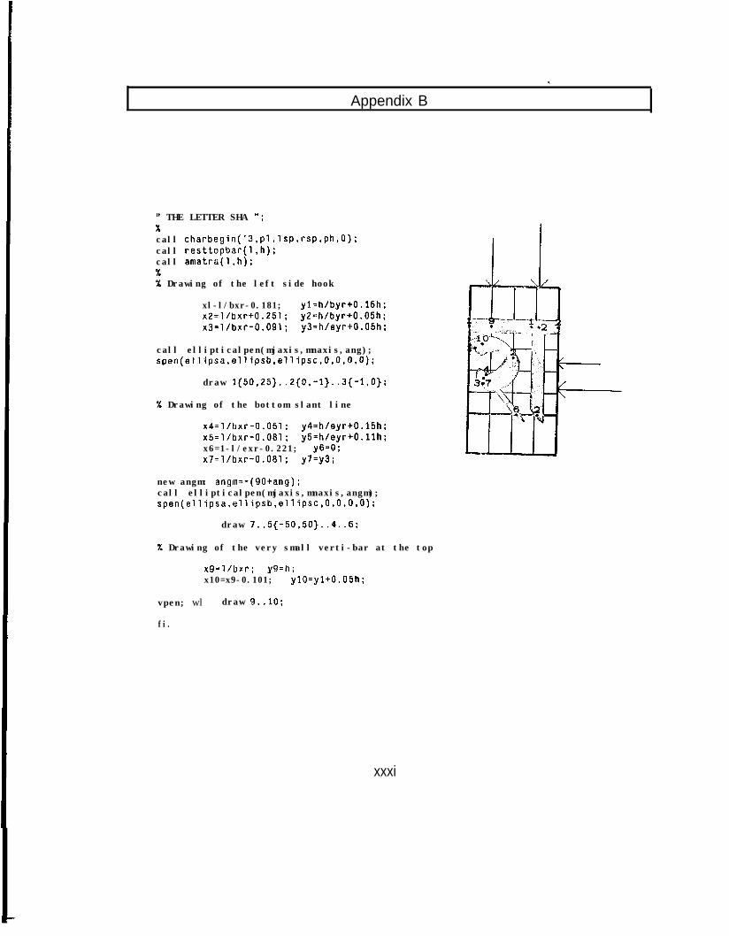
Appendix B. .
1, THE LETTER SHA ";Xcall charbegin('3,pl,lsp,rsp,ph,O);call resttopbar(l,h);call amatra(l,h);%% Drawing of the left side hook
xl-l/bxr-0.181; yl=h/byr+O.l5h;x2=l/bxr+0.251; y2=h/byr+O.O5h;x3=l/bxr-0.091; y3=h/eyr+O.O5h;
call ellipticalpen(mjaxis,mnaxis,ang);spen(ellipsa,ellipsb,ellipsc,O,O,O,O);
draw 1{50,25}.. 2{0,-1}..3{-1,O);
% Drawing of the bottom slant line
x4=l/bxr-0.051; y4=h/eyr+O.l5h;x5=l/bxr-0.081; y5=h/eyr+O.llh;x6=1-l/exr-0.221; y6=0;x7=l/bxr-0.081; y7=y3;
new angm: angm=-(gOtang);call ellipticalpen(mjaxis,mnaxis,angm);spen(ellipsa,ellipsb,ellipsc,O,O,O,O);
draw 7..5{-50,50}..4..6;
% Drawing of the very small verti-bar at the top
x9=l/brr; y9=h;x10=x9-0.101; ylO=yl+O.O5h;
vpen; wl draw 9..10;
fi.
xxxi
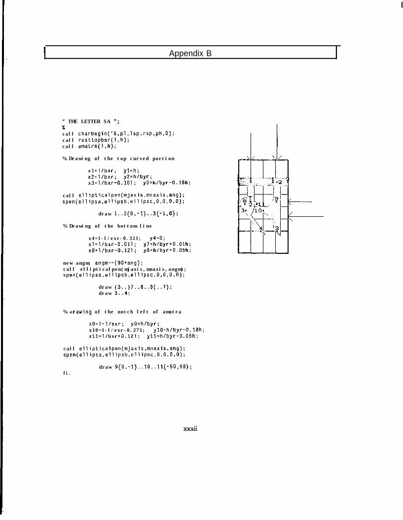
I Appendix B
W THE LETTER SA ";%call charbegin('5,pl,lsp,rsp,ph,O):call resttopbar(l,h);call amatra(1.h);
% Drawing of the top curved portion
xl=l/bxr; yl=h;x2=l/bxr; y2=h/byr;x3=l/bxr-0.101; y3=h/byr-0.18h;
call ellipticalpen(mjaxis,mnaxis,ang);spen(ellipsa,ellipsb,ellipsc,O,O,O,O);
draw 1..2{0, -1}..3{-1,O);
% Drawing of the bottom line
x4=1-l/exr-0.321; y4=0;x7=l/bxr-0.011; y7=h/byr+O.Olh;x8=l/bxr-0.121; y8=h/byr-0.05h;
new angm; angm=-(gOtang);call ellipticalpen(mjaxis,mnaxis,angm);spen(ellipsa,ellipsb,ellipsc,O,O,O,O);
draw (3..)7..8..3(..7);draw 3..4;
% xrawing of the notch left of amatra
x9=1-l/exr; y9=h/byr;x10=1-l/exr-0.271; ylO=h/byr-0.18h;xll=l/bxr+0.121; yll=h/byr-0.05h;
call ellipticalpen(mjaxis,moaxis,ang);spen(ellipsa,ellipsb,cllipsc,O,O,O,O);
fi.draw 9(0,-l}.. 10..11{-50,50}~
di
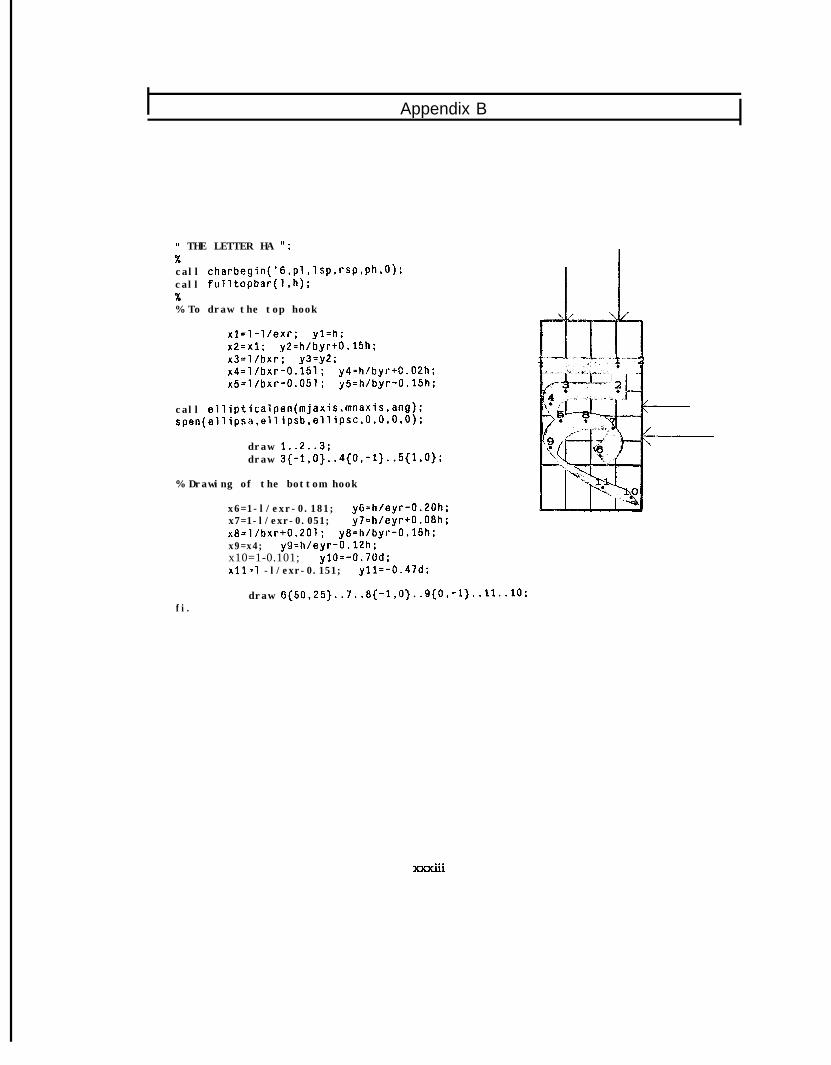
Appendix B
W THE LETTER HA ":
call charbegin('6,pl,lsp,rsp,ph,O);call fulltopbar(l,h);%% To draw the top hook
x1=1-l/exr; yl=h;x2=x1; y2=h/byr+O.l5h;x3=l/hxr; y3=y2;x4=l/bxr-0.151; y4=h/byr+O.O2h;x5=l/bxr-0.051; y5=h/byr-0.15h;
call ellipticalpen(mjaxis,mnaxis,ang);spen(ellipsa,ellipsb,ellipsc,O,O.O,O);
draw 1..2..3;draw 3{-1,0}..4{0,-1}..5{1,0);
% Drawing of the bottom hook
x6=1-l/exr-0.181; y6=h/eyr-0.20h;x7=1-l/exr-0.051; y7=h/oyr+O.O8h;x8=l/bxr+0.201; y8=h/byr-0.15h;x9=x4; y9=h/eyr-0.12h;x10=1-0.101; ylO=-0.70d;x11=1 -l/exr-0.151; yll=-0.47d;
draw 6{50,25}..7..8{-1,0}..9{0,-l}..ll..lO;fi.
. . .XXXlll
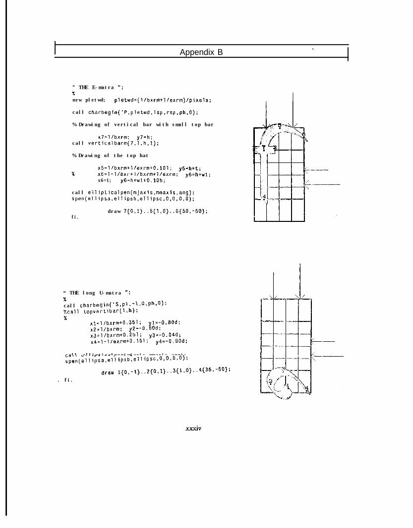
Appendix B
" THE E-matra 'I;%new pletwd; pletwd=(l/bxrm+l/exrm)/pixels;
call charbegin('P,pletwd,lsp,rsp,ph,O);
% Drawing of vertical bar with small top bar
x7=l/bxrm; y7=h;call verticalbarm(7,l,h,l);
% Drawing of the top hat
%x5=1/bxrm+1/exrm+0.101; y5=h+t;x6=1-l/bxr+l/bxrm+l/exrm; y6=htwl;x6=1; y6=h+wl+O.lOh;
call ellipticalpen(mjaxis,mnaxis,ang);spen(ellipsa,ellipsb,ellipsc,O,O,O,O);
fi.draw 7{0,1}..5{1,0}..6(50,-50);
M THE long U-matra O;%call charbegin('S,pl,-l,O,ph,O);%call topvertibar(l,h);%
xl=l/bxrm+0.351; yl=-0.80d;x2=l/bxrm; y2=-0.60d;x3=l/bxrm+0.251; y3=-0.04d;x4=1-l/exrmc0.151; y4=-0.90d;
call ellipticalpen(mjaxis,mnaxis,ang);spen(ellipsa,ellipsb,ellipsc,O.O,O,O);
. fi.draw itO,-1}..2{O,1}..3{1,0}..4{35,-50);
XXXiV
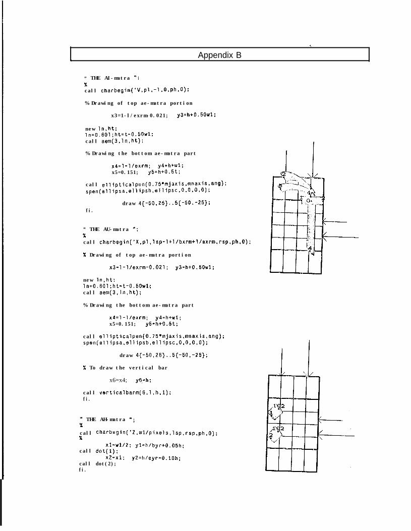
, Appendix B. .
WI THE AI-matra ";%call charbegin('V,pl,-l,O,ph,O);
% Drawing of top ae-matra portion
x3=1-l/exrm-0.021; y3=h+0.50wl:
new ln,ht;ln=0.601;ht=t-0.5OWl;call aem(3,ln,ht);
% Drawing the bottom ae-matra part
x4=1-l/exrm; y4=h+wl;x5=0.151; y5=h+0.5t;
call ellipticalpen(0.75*mjaxis,mnaxis.ang):spen(ellipsa,ellipsh,ellipSC,O,O,O);
draw 4(-50,25}..5{-50,-25);fi.
" THE AU-matra ";%call charbegin('X,pl,lsp-l+l/bxrm+l/exrm,rsp,ph,O);
% Drawing of top ae-matra portion
x3=1-l/exrm-0.021; y3=h+0.50wl;
new ln,ht;ln=0.601;ht=t-0.50wl;call aem(3,ln,ht);
% Drawing the bottom ae-matra part
x4=1-l/exrm; y4=h+wl;x5=0.151; y5=h+0.5t:
call ellipticalpen(0.75*mjaxis,mnaxis,ang);spen(ellipsa,ellipsb,ellipsc,O,O,O,O);
draw 4{-50,25}..5{-50,-25);
% To draw the vertical bar
x6=x4; y6=h;
call verticalbarm(B,l,h,l);fi.
It THE AH-matra ";%call charbegin('Z,wl/pixels,lsp,rsp,ph,O):X
xl=W1/2; yl=h/byrtO.O5h;call dot(l);
x2=x1; y2=h/eyr-O.lOh;call dot(2);fi.
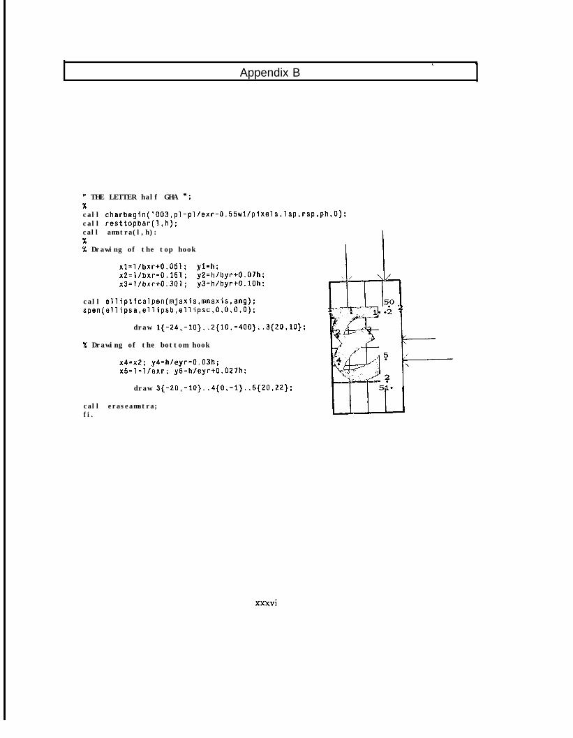
Appendix Bc I
" THE LETTER half GHA ":
call charbegin('003,pl-pl/exr-0.55wl/pixels,lsp,rsp,ph,O):call resttopbar(l,h);call amatra(l,h):%% Drawing of the top hook
xl=l/bxr+0.051; yl=h;x2=l/bxr-0.151; y2=h/byr+O.O7h;x3=l/bxr+0.301: y3=h/byr+O.lOh;
call ellipticalpen(mjaxis,mnaxis,ang);spen(ellipsa,ellipsb,ellipsc,O,O,O,O):
draw l{-24,-10}..2{10,-400}..3{20,10};
% Drawing of the bottom hook
x4=x2: y4=h/eyr-0.03h;x5=1-l/exr; y5=h./eyr+O.O27h;
draw 3{-20,-10}..4{0,-1}..5{20,22};
call eraseamatra;fi.
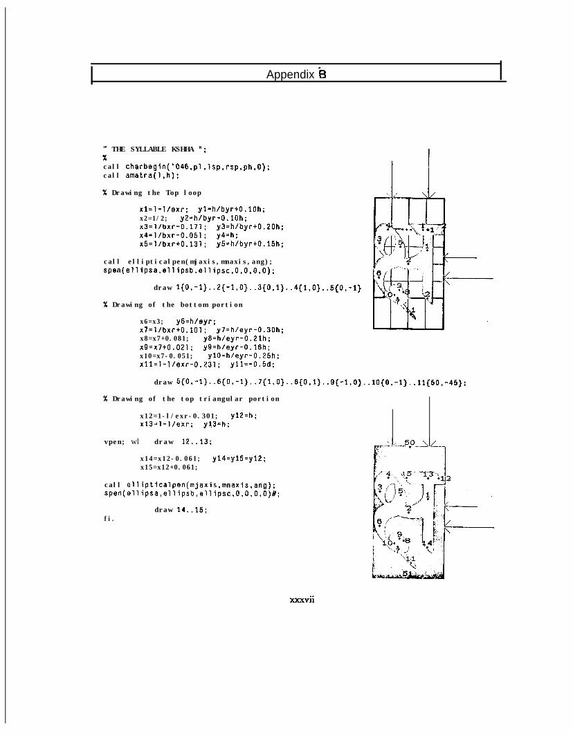
Appendix k3
W THE SYLLABLE KSHHA ";%call charbegin('046,pl,lsp,rsp,ph,O);call amatra(l,h);
% Drawing the Top loop
x1=1-l/exr; yl=h/byr+O.lOh;x2=1/2; y2=h/byr-O.lOh;x3=l/bxr-0.171; y3=h/byr+0.20h;x4=l/bxr-0.051; y4=h;x5=l/bxr+0.131: y5=h/byr+O.l5h;
call ellipticalpen(mjaxis,mnaxis,ang);spen(ellipsa,ellipsb.ellipsc,O,O,O,O);
draw 1{O,-l}..2{-1,O}..3{O,1}..4{1,O}..5{O,-i}
% Drawing of the bottom portion
x6=x3; y6=h/eyr;x7=l/bxr+0.101; y7=h/eyr-0.30h;x8=x7+0.081; y8=h/eyr-0.2lh:x9=x7+0.021; y9=h/eyr-0.18h;x10=x7-0.051; ylO=h/eyr-0.25h;x11=1-l/exr-0.231; yll=-0.5d;
draw 5{O,-1}..6{O,-1}..7{1,O}..8{O,1}..9{-1,O}..lO{O,-l}..ii{5O,-45};
% Drawing of the top triangular portion
x12=1-l/exr-0.301; y12=h ;x13=1-l/exr; y!3=h:
vpen; wl draw 12..13;
x14=x12-0.061; y14=y15=yl2;x15=x12+0.061;
call ellipticalpen(mjaxis,mnaxis,ang);spen(ellipsa,ellipsb,ellipsc,O,O,O,O)#;
fi.draw 14..15;
xxxvii
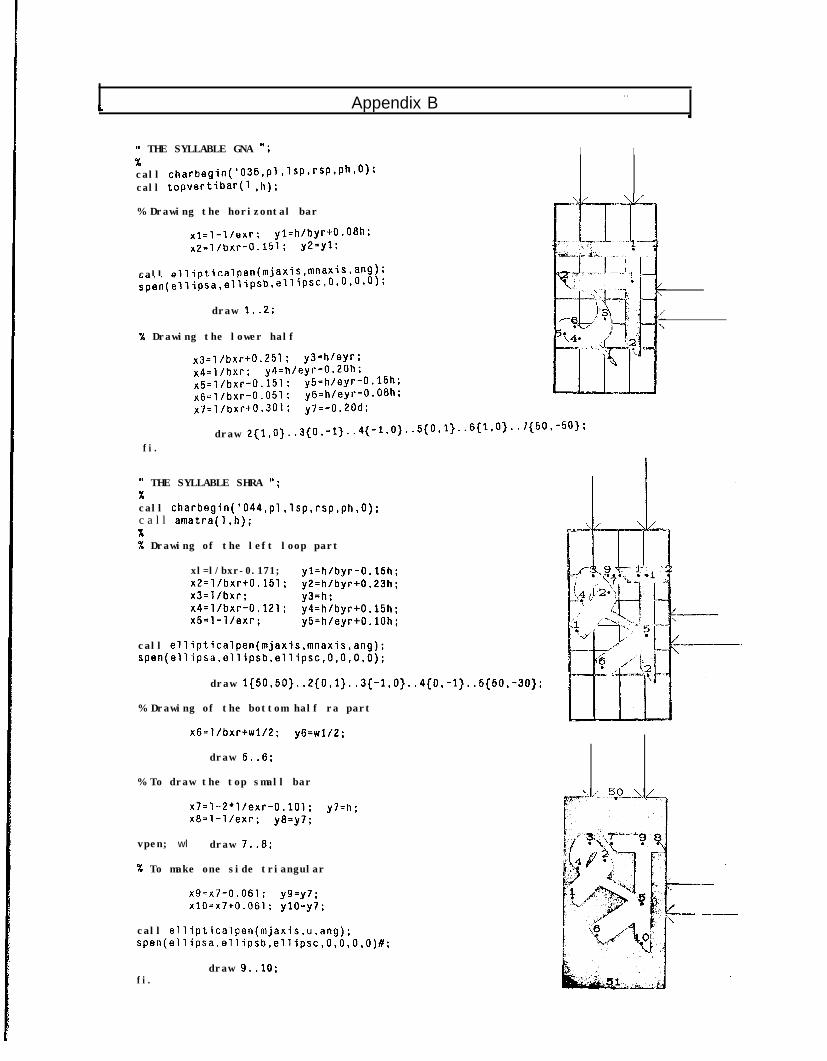
c Appendix B. .
\
)t THE SYLLABLE GNA -; I IXcall charbegin('036,pl,lsp,rsP,Ph.O):call topvertibar(1 ,h);
% Drawing the horizontal bar
x1=1-l/exr; yl=h/byrtO.O8h;x2=l/bxr-0.151; y2=yl;
call ellipticalpen(mjaxis,mnaxis,ang);spen(ellipsa,ellipsb.ellipsc,O.O,O,O);
draw 1..2;
X Drawing the lower half
x3=l/bxr+0.251; y3=h/eyr;x4=l/bxr; y4=h/eyr-0.20h:x5=l/bxr-0.151: y5=h/eyr-0.15h;x6=l/bxr-0.051; y6=h/eyr-0.08h;x7=l/bxrt0.301; y7=-0.20d;
draw 2{1.0}..3{0.-1}..4{-l.0}..5{0.1)..6{~.O3.~ 7{50,-50);
fi.
(1 THE SYLLABLE SHRA ";%call charbegin('044,pl,lsp,rsp,ph,O);c a l l amatra(l,h);%% Drawing of the left loop part
xl=l/bxr-0.171; yl=h/byr-0.15h;x2=l/bxr+0.151; y2=h/byr+0.23h;x3=l/bxr; y3=h:x4=l/bxr-0.121 ; y4=h/byr+O.l5h;x5=1-l/exr; y5=h/eyr+O.lOh;
call ellipticalpen(mjaxis,mnaxis,ang);spen(ellipsa,ellipsb,ellipsc,O,O,O,O):
draw l{5O,5O}..2{O,l}..3{-l,O}..4{O,-l}..5{5O,-3O}:
% Drawing of the bottom half ra part
x6=l/bxr+wl/2; y6=w1/2;
draw 5..6;
% To draw the top small bar
x7=1--2*l/exr-0.101; y7=h ;x8=1-l/exr; y8=y7;
vpen; wl draw 7..8;
% To make one side triangular
x9=x7-0.061; y9=y7 ;x10=x7+0.061; ylO=y7;
call ellipticalpen(mjaxis,u,ang);spen(ellipsa.ellipsb,ellipsc,O,O,O,O)#;
fi.draw 9..10;
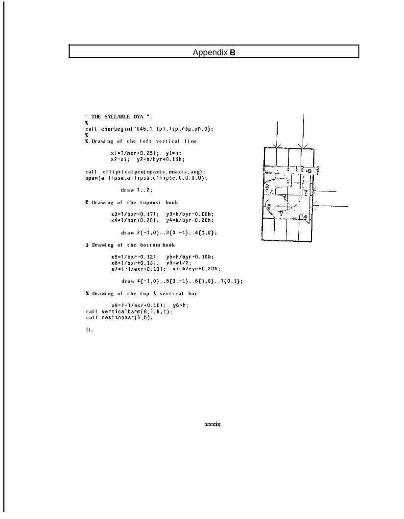
Appendix 6
11 THE SYLLABLE DYA ";%call charbegin('045,l.lpl,lsp,rsp,ph,O):%% Drawing of the left vertical line
xl=l/bxr+0.251; yl=h;x2=x1; y2=h/byr+O.l5h;
call ellipticalpen(mjaxis,mnaxis,ang);spen(ellipsa,ellipsb,ellipsc,O,O,O,O);
draw 1..2;
% Drawing of the topmost hook
x3=l/bxr-0.171: y3=h/byr-O.OOh;x4=l/bxr+0.201; y4=h/byr-0.20h:
draw 2{-1,0}..3(0,-1}..4{1,0}:
SC Drawing of the bottom hook
x5=l/bxr-0.121; y5=h/eyr-O.lOh;x6=l/bxr+0.131; y6=w1/2;x7=1-l/exr+O.lOl; y7=h/eyr+0.20h;
draw 4{-l,O}..S{O,-1}..6{1,0}..7{0,1}:
% Drawing of the top & vertical bar
x8=1-l/exr+O.lOl; y8=h;call verticalbarm(8,l,h,l);call resttopbar(1.h);
fi.
xxxix
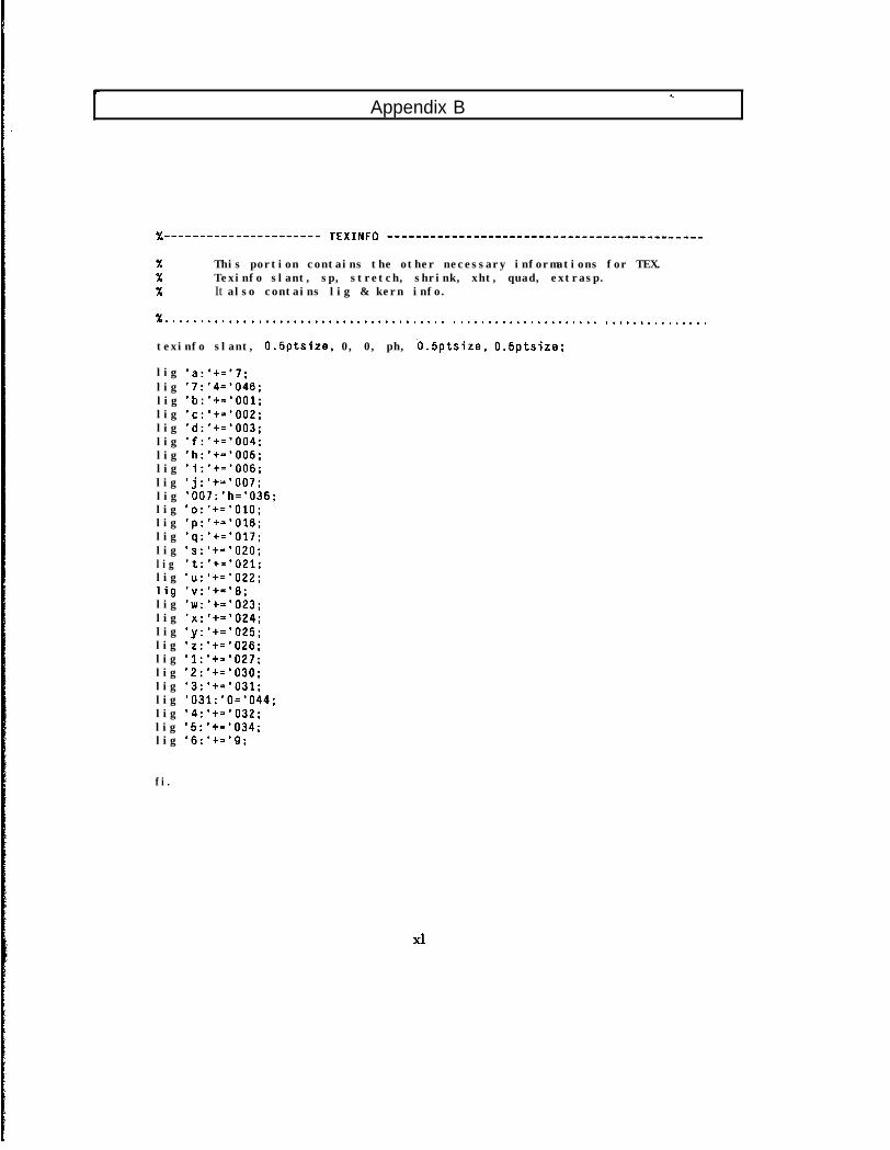
Appendix B
%---------------------- TE)(INFO --------------------------------------------
% This portion contains the other necessary informations for TEX.% Texinfo slant, sp, stretch, shrink, xht, quad, extrasp.% It also contains lig & kern info.
% . . . . . . . . . . . . . . . . . . . . . . . . . . . . . . . . . . . . . . . . . . . . . . . . . . . . . . . . . . . . . . . . . . . . . . . . . . . .
texinfo slant, 0.5ptsize, 0, 0, ph, b.5ptsize. O.Sptsize;
lig 'a:'+='7;lig '7:'4='046;lig 'b:'+='OOl;lig 'c:'+='OO2;lig 'd:'+='003;lig 'f:'+='004;lig 'h:'+='005;lig 'i:'t='OO6;lig 'j:'+='OO7;lig '007:'h='036;lig 'o:'+='OlO;lig 'p:'t='O16;lig 'q:'t='O17;lig 's:'+='O20;lig 't:'+='021;lig 'u:'+='O22;lig 'v:'t='a;lig 'w:'t='O23;lig 'x:*+=*024;lig 'y:'t='O25;lig 'z:'t='O26;lig '1:'+='027;lig '2:'+='030;lig '3:'+='031;lig '031:'0='044;lig '4:'+='032;lig '5:'+='034;lig '6:'+='9;
fi.
xl
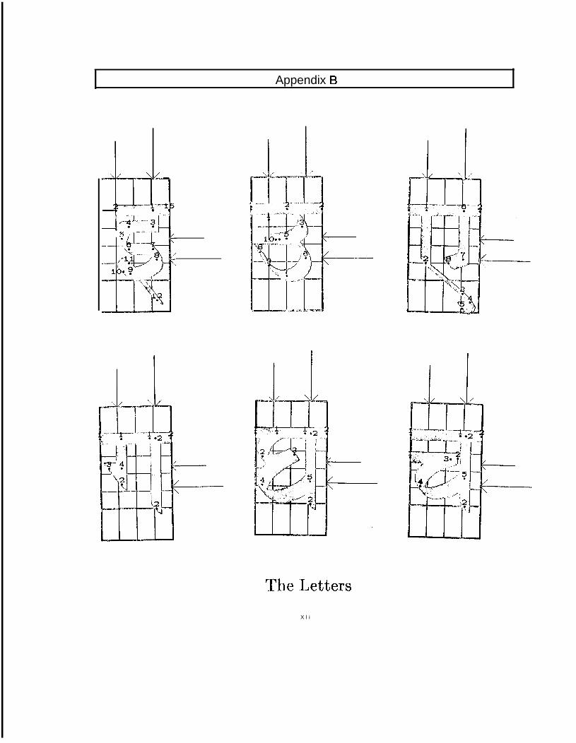
Appendix B
-f .*-,.
The LettersX l i
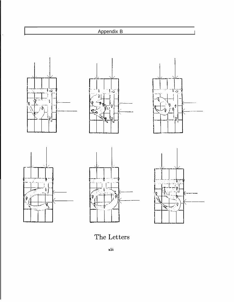
Appendix B I
/’c-
--
X,--
- ..-.-
The Lettersxiii
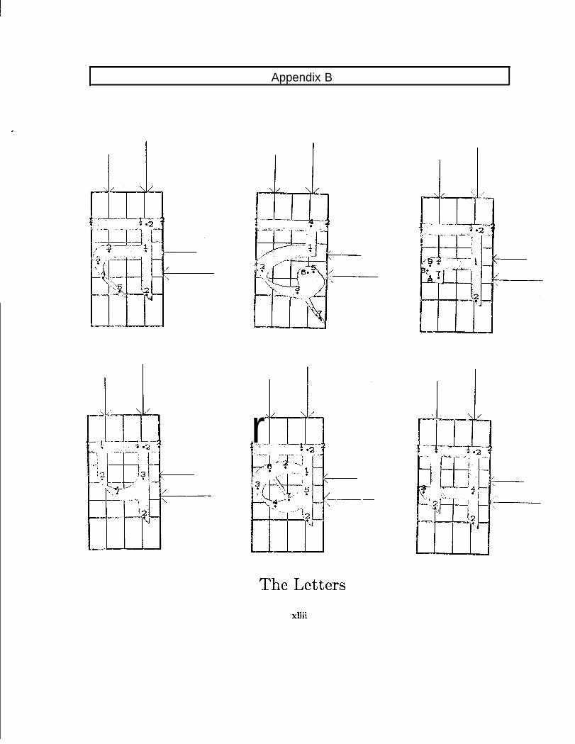
Appendix B
r*
The Lettersxliii
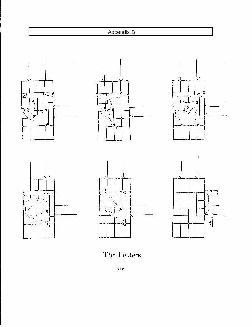
Appendix B
“...-_
---I-=-.- --.$.
The LettersXliV
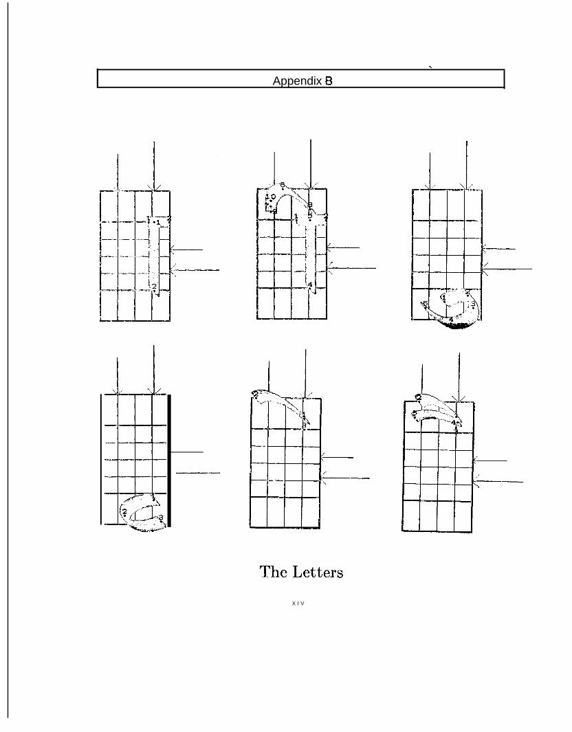
Appendix Bt
,
/---l
The LettersX I V
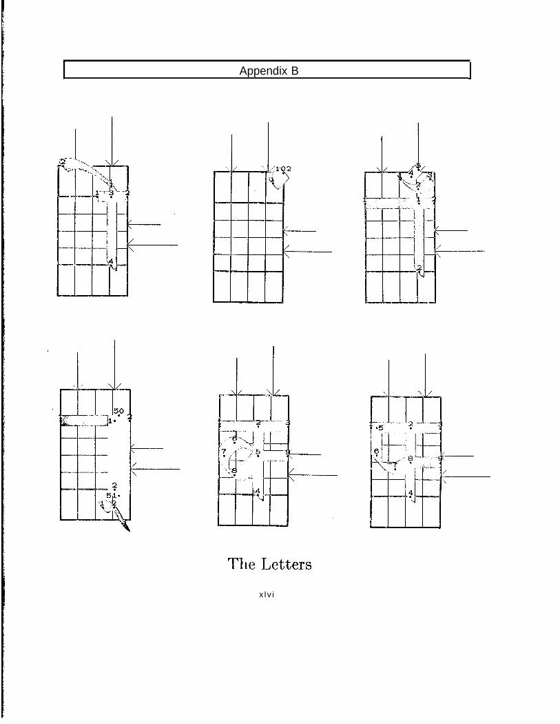
Appendix B I
The Lettersx lv i
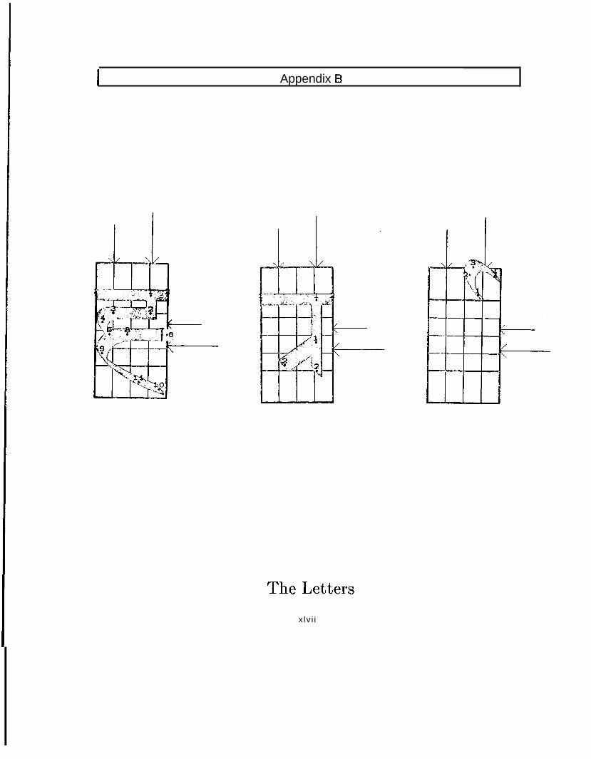
I Appendix 8
The Lettersxlv i i

--
Appendix C
The Sahple Pages
Typography is not considered as a branch of fine arts, rather it should be so good thatthe printing will be invisible. The sample pages are not designed to present a few piecesof artistic works, but only to give the readers an idea how the printing in KSD fonts looklike. In some cases the letters may seem to be ugly. It is because I could not preventmyself to show the readers h o w M E T A F O N T can generate a family of typefaces from asingle definition of font.
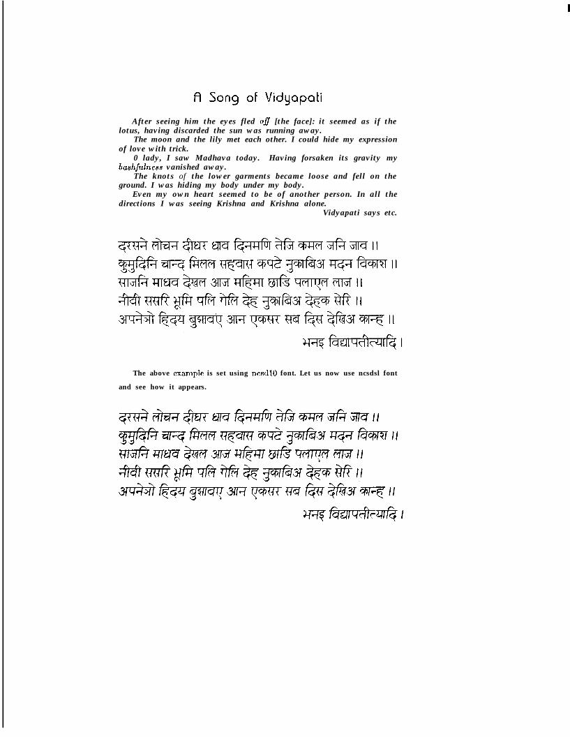
A Song of VidyapatiAfter seeing him the eyes fled 08 [the face]: it seemed as if the
lotus, having discarded the sun was running away.The moon and the lily met each other. I could hide my expression
of love with trick.0 lady, I saw Madhava today. Having forsaken its gravity my
bash/ulness vanished away.The knots of the lower garments became loose and fell on the
ground. I was hiding my body under my body.Even my own heart seemed to be of another person. In all the
directions I was seeing Krishna and Krishna alone.Vidyapati says etc.
The above cxamplc is set using ncsdlO font. Let us now use ncsdsl font
and see how it appears.

The same example is now set using ncsdb‘bfont. I know it won’t look good, but will giveyou an idea of the font.
These three Devanagari fonts are available at
Stanford for ready use. As I have mentioned
in my report, twenty seven more are available
for you if you are very curious about different
fonts. However, most of them are really ugly, I
can assure you.
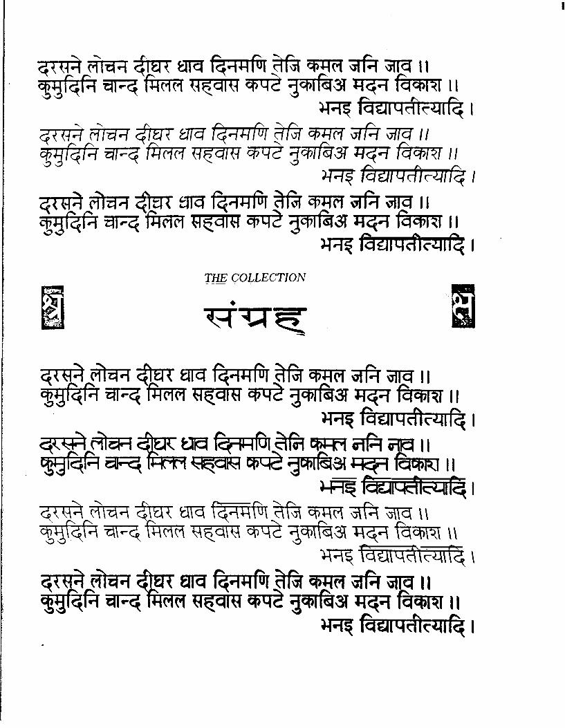
.
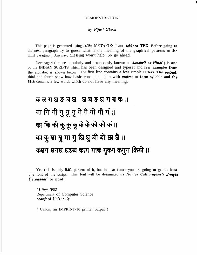
I
DEMONSTRATION
by Pijusb Gbosh
This page is generated using tdika METAFONT and lekhuni TEX. Before going tothe next paragraph try to guess what is the meaning of the graphical patterns in thethird paragraph. Anyway, guessing won’t help. So go ahead.
Devanagari ( more popularly and erroneously known as Sansifitit or Hkdi ) is oneof the INDIAN SCRIPTS which has been designed and typeset and few examples fromthe alphabet is shown below. The first line contains a few simple letters. The second,third and fourth show how basic consonants join with muhas to form syllable and thefifth contains a few words which do not have any meaning.
Yes t.his is only 0.01 percent of it, but in near future you are going to get at leastone font of the script. This font will be designated as Novice Calligrapher’s SimpteDevanagari or ncsd.
Ol-Sep-1982Department of Computer ScienceStanford University
( Canon, an IMPRINT-10 printer output )

‘000
‘010
‘020
‘030
‘040
‘050
‘060
‘070
‘100
‘110
‘120
‘130
‘140
‘150
‘160
‘170
NCSDIO
0 1 2 3 4 5 6 7
Nagari, ‘city-writing’, or its modern form known as DEVANAGARI (‘divine’ 01:‘royal Nagari) is perhaps the most irnportant of Indian scripts. It is used forwriting Sanskrit, the classical language of India. Dcvanagari is the basic script fora number of Indo-Aryan languages, notably Ilindi and Marathi but also Maithili,Hihari, ltajasthani. In Nepal it serves for writing Nepali and the Tibeto-Burmanlanguage Newari.
N C S ID s t a n d s f o r No?lice Cdigrapher’s S i m p l e Devcmagari, d e s i g n e d b yl’.K.Ghosh u s i n g I’@ a n d M E T R F O N T system o f D.E.Knuth. T h e font-description is based on a 15th-century manuscript and emphasis has been givento keep the tradition which has embalmed and preserved the thoughts and ex-periments of generations of workers.
It is betler to note that a conjunct charact(:r can bc formed by typing either theI half character or the full charactor f’ollowed by halant sign. If you wish to get a
sentence like,
you have to use NCSDlO font with the following key sequence, ’ rU2tOcOQ xOOpaQ u;sOt I’lPu 6V, l’h5yIJY 5Y5+aTp PlbQ hOp& 6VY . ’ A Idler way is toamark the key tops with proper symbols and type t.ho text directly.
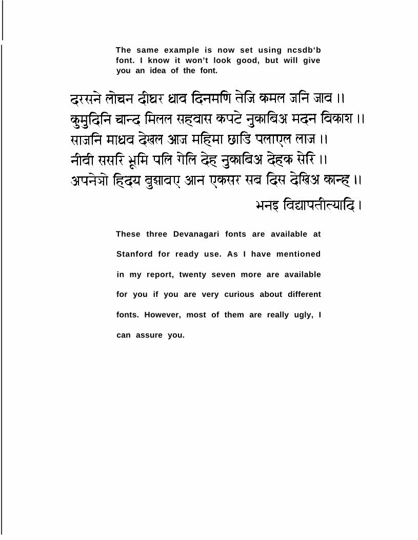
The same example is now set using ncsdb‘bfont. I know it won’t look good, but will giveyou an idea of the font.
These three Devanagari fonts are available at
Stanford for ready use. As I have mentioned
in my report, twenty seven more are available
for you if you are very curious about different
fonts. However, most of them are really ugly, I
can assure you.

.
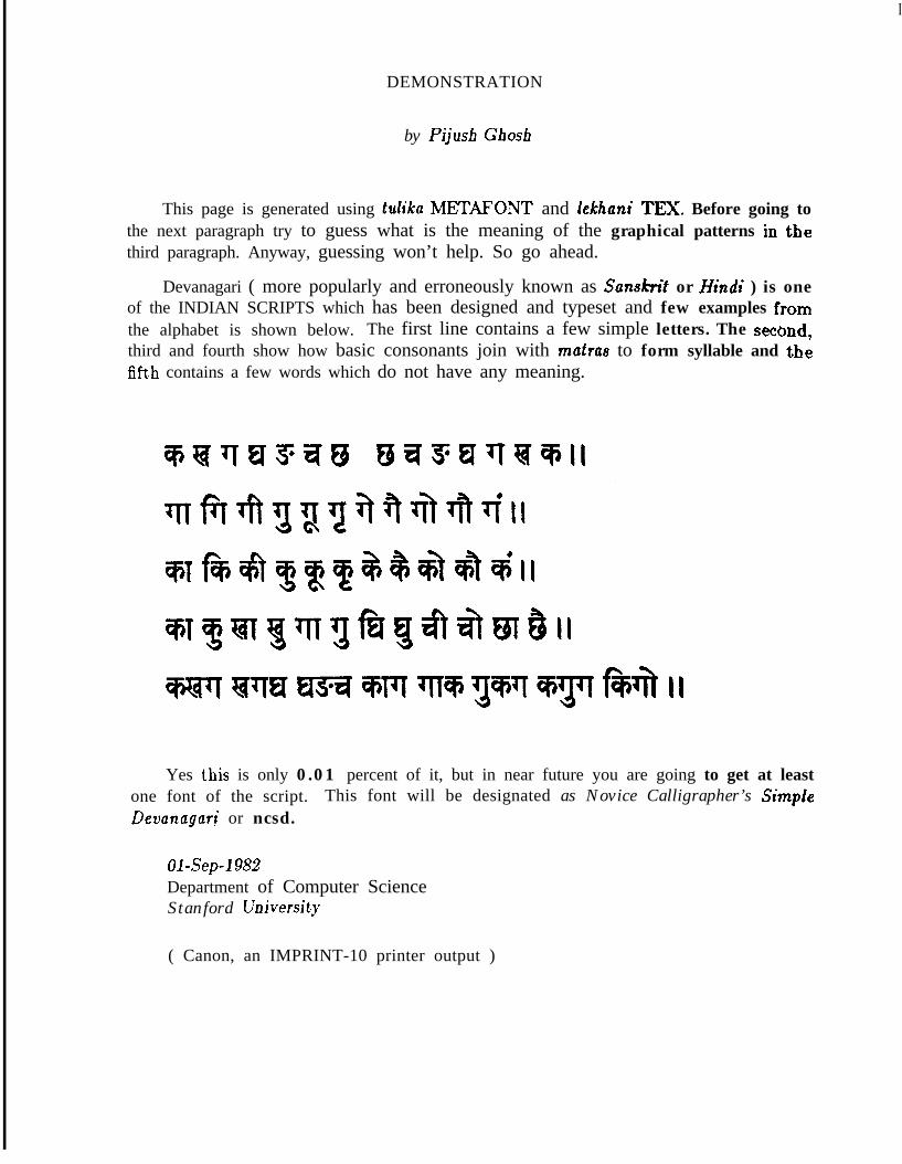
I
DEMONSTRATION
by Pijusb Gbosh
This page is generated using tdika METAFONT and lekhuni TEX. Before going tothe next paragraph try to guess what is the meaning of the graphical patterns in thethird paragraph. Anyway, guessing won’t help. So go ahead.
Devanagari ( more popularly and erroneously known as Sansifitit or Hkdi ) is oneof the INDIAN SCRIPTS which has been designed and typeset and few examples fromthe alphabet is shown below. The first line contains a few simple letters. The second,third and fourth show how basic consonants join with muhas to form syllable and thefifth contains a few words which do not have any meaning.
Yes t.his is only 0.01 percent of it, but in near future you are going to get at leastone font of the script. This font will be designated as Novice Calligrapher’s SimpteDevanagari or ncsd.
Ol-Sep-1982Department of Computer ScienceStanford University
( Canon, an IMPRINT-10 printer output )
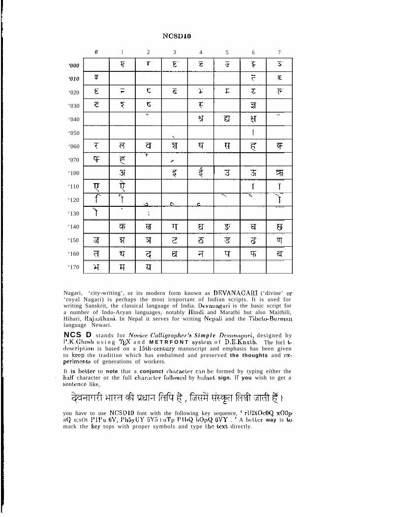
‘000
‘010
‘020
‘030
‘040
‘050
‘060
‘070
‘100
‘110
‘120
‘130
‘140
‘150
‘160
‘170
NCSDIO
0 1 2 3 4 5 6 7
Nagari, ‘city-writing’, or its modern form known as DEVANAGARI (‘divine’ 01:‘royal Nagari) is perhaps the most irnportant of Indian scripts. It is used forwriting Sanskrit, the classical language of India. Dcvanagari is the basic script fora number of Indo-Aryan languages, notably Ilindi and Marathi but also Maithili,Hihari, ltajasthani. In Nepal it serves for writing Nepali and the Tibeto-Burmanlanguage Newari.
NCS D stands for No?lice Cdigrapher’s Simple Devcmagari, designed byl’.K.Ghosh u s i n g I’@ a n d M E T R F O N T system o f D.E.Knuth. The for1 t-description is based on a 15th-century manuscript and emphasis has been givento keep the tradition which has embalmed and preserved the thoughts and ex-perinlents of generations of workers.
It is betler to note that a conjunct charactor can bc formed by typing either theI half character or the full charactor f’ollowed by halant sign. If you wish to get a
sentence like,
you have to use NCSDlO font with the following key sequence, ’ rU2tOcOQ xOOpaQ u;sOt I’lPu 6V, l’h5yIJY 5Y5+aTp PlbQ 110pQ 6VY . ’ A Idler way is toamark the key tops with proper symbols and type t.ho text directly.
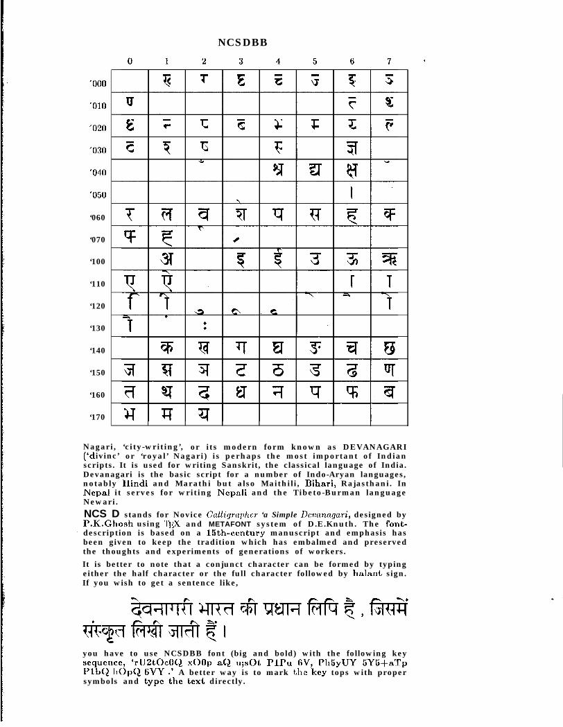
‘060
‘070
‘100
‘110
‘120
‘130
‘140
‘150
‘160
‘170
NCSDBB
Nagari, ‘city-writing’, or its modern form known as DEVANAGARI(‘d ivinc’ or ‘royal’ Nagari) is perhaps the most important of Indianscripts. It is used for writing Sanskrit, the classical language of India.Devanagari is the basic script for a number of Indo-Aryan languages,notably IIindi and Marathi but also Maithili, Bihari, Rajasthani. InNepal it serves for writing Nepali and the Tibeto-Burman languageNewari.NCS D stands for Novice Cdlitp-apILcr ‘a Simple Dcvunngari, designed byP.K.Ghosh using 7\11$ and METAFONT system of D.E.Knuth. The font-
1 description is based on a 15th-century manuscript and emphasis hasbeen given to keep the tradition which has embalmed and preservedthe thoughts and experiments of generations of workers.It is better to note that a conjunct character can be formed by typingeither the half character or the full character followed by halant sign.If you wish to get a sentence like,
you have to use NCSDBB font (big and bold) with the following keyscqucncc, ‘rU2tOcOQ xOOp aQ u;sOt PlPu GV, Ph5yUY 5Y5+aTpPlbQ 110pQ 6VY .’ A better way is to mark the key tops with propersymbols and type tl1e text directly.
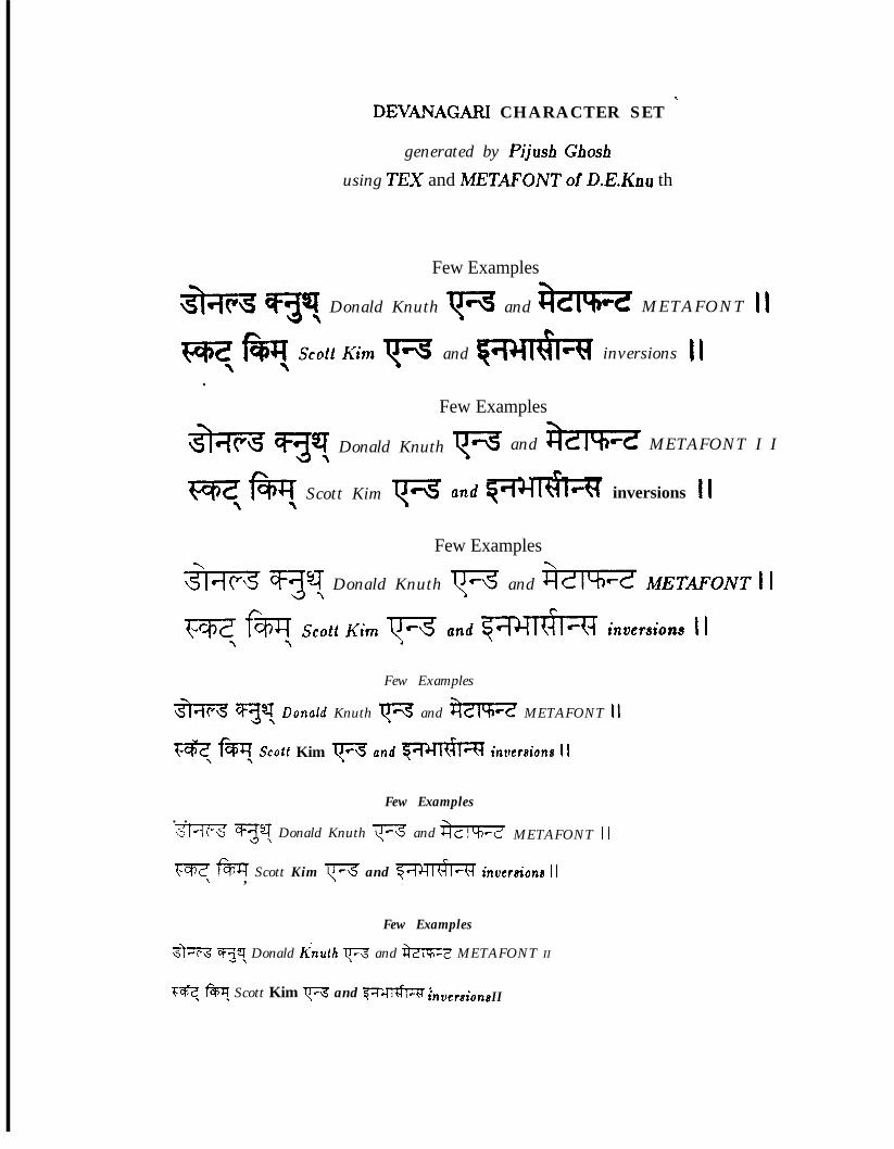
DEVANAGARI CHARACTER SET x
generated by Pijush Ghoshusing TEX and METXFONT of D.E.Knu th
Few Examples
Donald Knuth rd and 8zTw METAFONT 11
and inversions II
Few Examples
;3h?;3 ‘qy Donald Knuth
WzfaT Scott Kim rc-3
p-\s and $m METAFONT I It
c inversions II
Few Examples
Donald Knuth p-6 and 3zwz METAFONT 1 i
Few Examples
m ‘;F;J4! Donuld Knuth v and m METAFONT 11
Fe, cm, Scott Kim w and mq invetcrions 11
. .Few Examples
m yy Donald Knuth v and- METAFONT 11
m m Scott Kim (-3 and ‘w4m inversiona 11\ ,
Few Examples
%?7Z -9 Donald Knuth v and &YlV? METAFONT II\
Fe, fWy Scott Kim w and $T&~=R ’tnoetsions I I
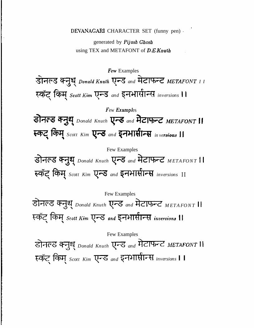
’DEVANAGAFU CHARACTER SET (funny pen) -
generated by Pijusb Gbosh
using TEX and METAFONT of D.E.Knuth .
Few Examples
F and Gm A4ETRFONT I I
and ‘w&m inversions 1 1
r ew nxampf es
Donald Knuth p and tLtrc METAFONT 11
t(=ez h, Scott Kim p and 54c3 N in ve rsions II
Few Examples
*w Donald Knuth ‘r=8 and am? METAFONT 1 t
wmmc
Scott Kim vc\s and qmiulckf inversions I IA \
Few Examples
Donald Knuth {‘3 and kT%=z METAFONT 11
Few Examples
%$%% qy Donald Knuth ‘F and j?zTFz iL4ETAFOIVT 11
Fern\ \ Scott Kim ‘F and ‘bill inversions I I
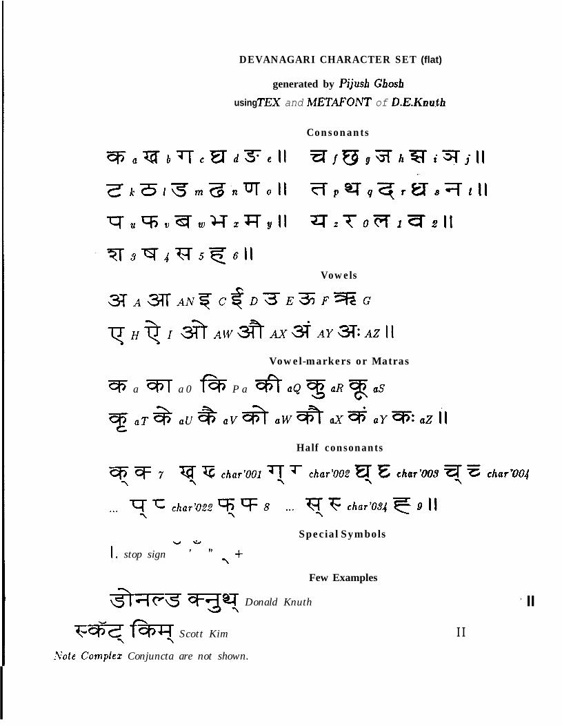
DEVANAGARI CHARACTER SET (flat)
generated by Pijush Gbosh
using TEX and METAFONT of D.E.Knuth
Consonants
Vowels
Vowel-markers or Matras
q a m a 0 * P a -oft a& ‘3 aR ‘T aS
Half consonants
1
w
I . stop sign
*s
Special Symbols7 79
,+
Few Examples
-3F Donald Knuth
Fe ‘ffw Scott KimI 7Xote Complez Conjuncta are not shown.
* II
I I
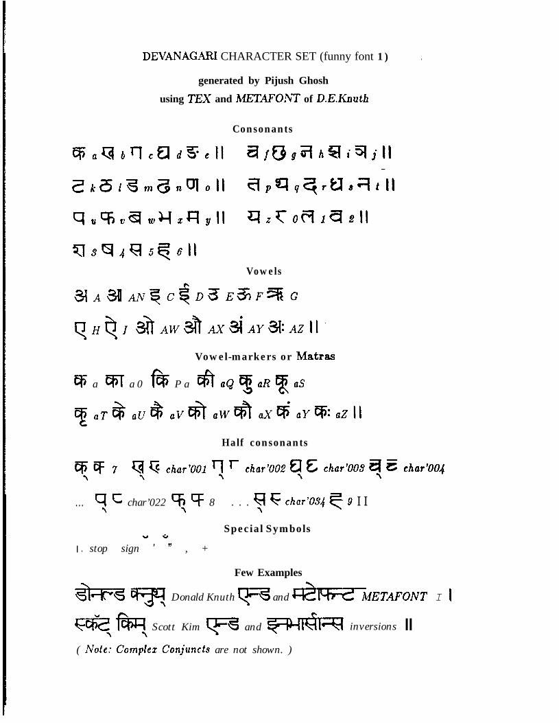
DEVANAGARI CHARACTER SET (funny font 1) .
generated by Pijush Ghosh
using TEX and METAFOAVT of D.E.Knuth
Consonants
Vowels
Vowel-markers or Matras
% a FfiT a 0 f& P a & a& 3 aR a aS
Half consonants
. . . q C char’022 % cf 8\ ‘\ . . . FI F char’034 q 9 I I\
Special SymbolsY *I . stop sign ’ ” , +
Few Examples
*w
YDonald Knuth q and %IYd METAFONT I I
ezfhc
Scott Kim q and wIq[A inversions II( Note: Complex Conjuncts are not shown. )
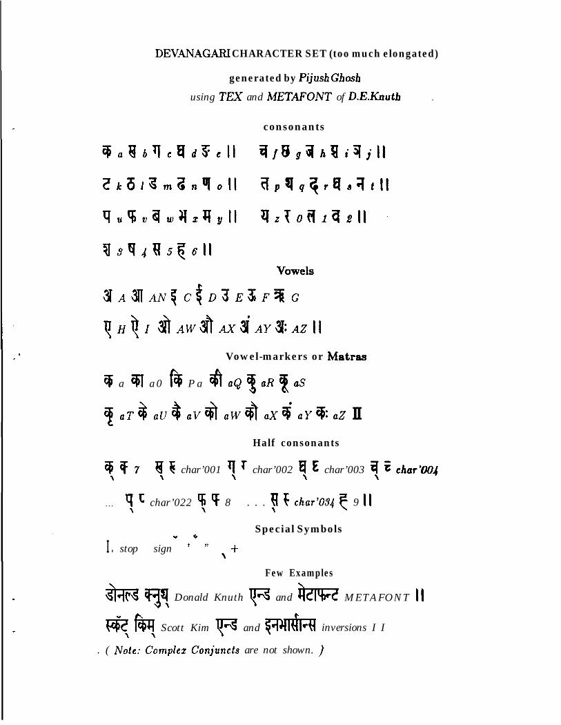
DEVANAGARJ CHARACTER SET (too much elongated)
generated by Pijush Ghosf~
using TEX and ME7”ONT of D.E.Knuth
consonants
.
8* Vowel-markers or Matras
q a w a 0 f$ P a a a& 3 aR % aS
UT8 sub av+ acv~ uxi aY%zZ IIHalf consonants
9 T 7\ a 6 char’001 v r char’002 $ & char’003 q E char’004\ \ \ \
. . . q c char’022 5 v 8\ \ . . . q F char’084 7 9 II\
Special SymbolsY 6I . stop sign ’ 9’ \+
Few Examples
+-v!
Donald Knuth \r6 and tit METAFONT 11
l?Hm Scott Kim F and m inversions I I
. ( i&e: C\omplez Conjuncts are not shown. )
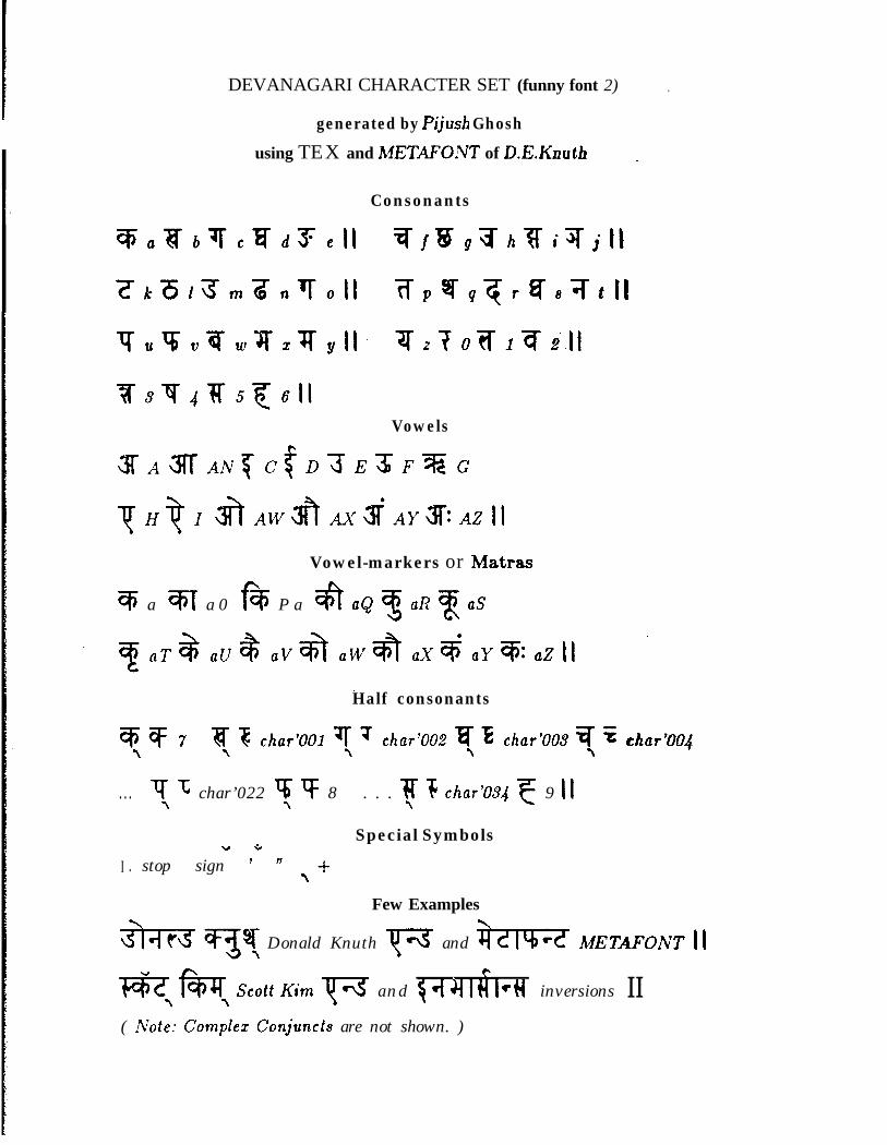
DEVANAGARI CHARACTER SET (funny font 2) .
generated by Pijusb Ghosh
using TEX and METXFOXT of D.E.Knuth
Consonants
Vowels
Vowel-markers or Matras
@ a m a 0 f% P a $i a& $! aR % US
Half consonants
. . . q T; char’022 ‘v; F 8\ \ . . . v F char’084 F 9 11\
Y * Special Symbols
I . stop sign ’ ” ,+Few Examples
Donald Knuth ‘F and b=Tw IUETMONT II
*hrc
ScottKim F and $441N1 cq inversions I I( Not>: Comilez Conjuncts are not shown. )
Appendix D
For The Future Designers
The following pages contain nicely drawn Devanagari letters on the graph sheets forthe designers of the future. They are designed by R.K. Joshi, one of the most famouscalligraphers of India. They were specifically designed for digitization, which can be doneeither by METRFONT system or some other systems like IKARUS. However, I expect anybodywho wants to use these drawings as model of his design would be kind enough to takepermission from mr. Joshi.
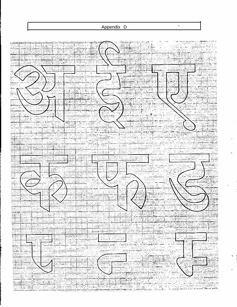
,
Appendix D C
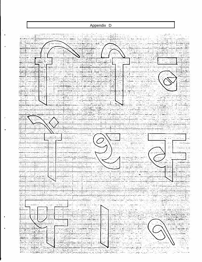
Appendix D
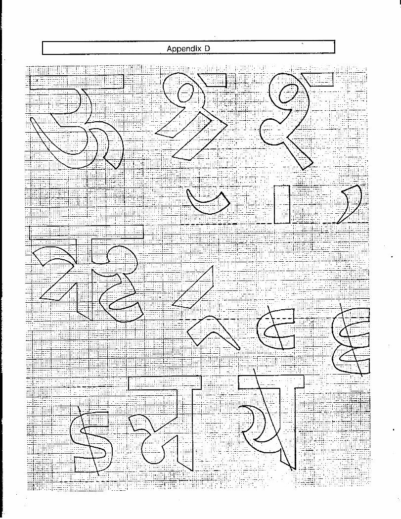
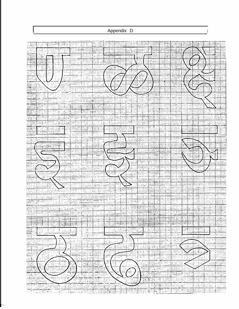
I Appendix D I
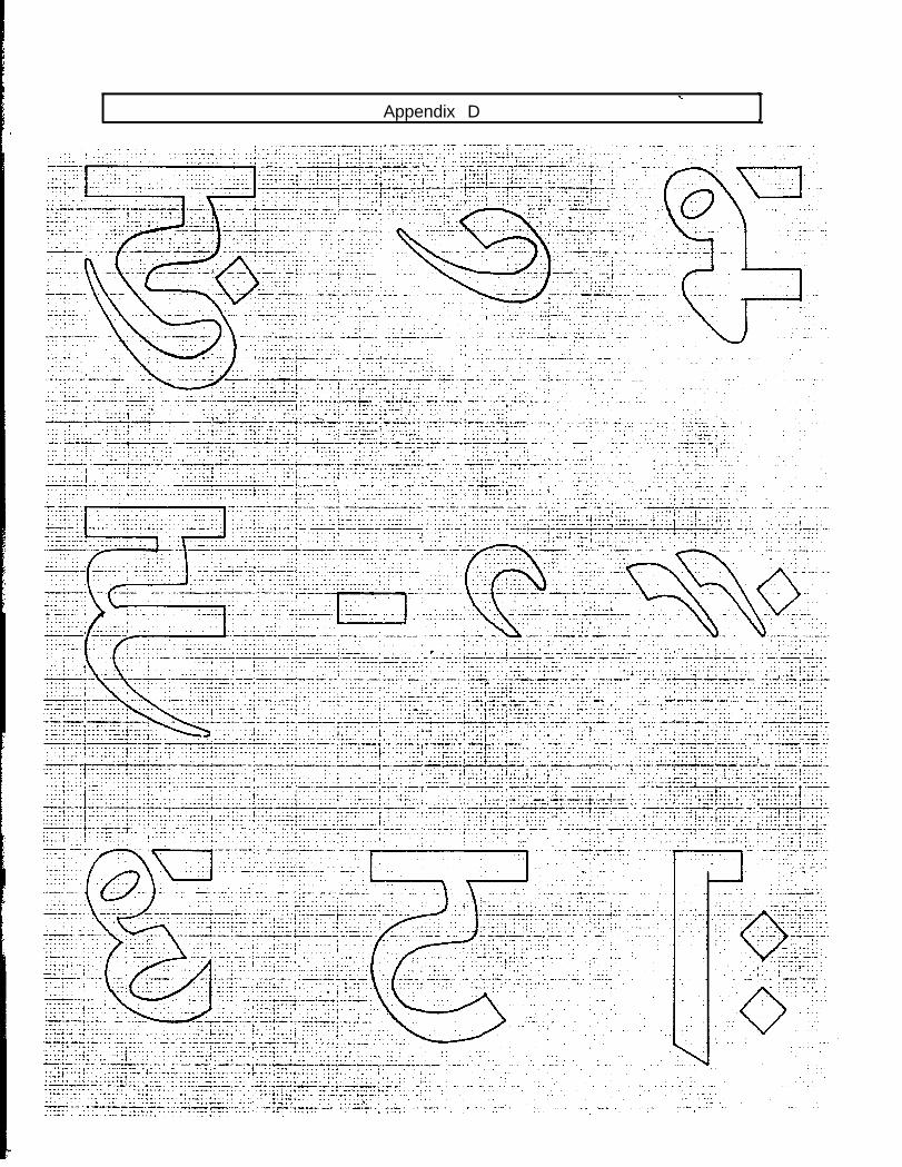
a.*
Appendix D *
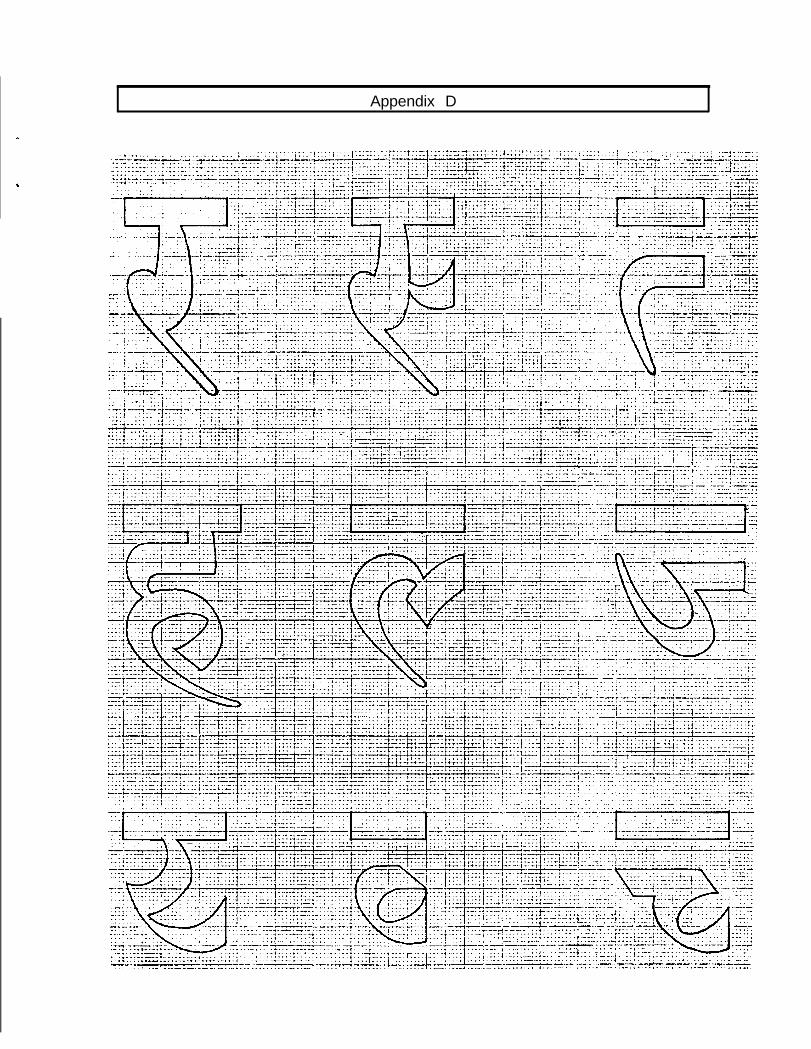
Appendix D
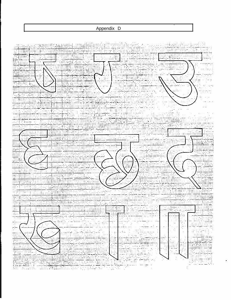
Appendix D
,. . . . . .. , . . . .- I _ . . . . .
- -. . , . - . . . .--...*; . ..-..- . .-- . _, . .- v.... . . . . * _._.I _..
,_...,. .--A -.; .*:.;. :‘:;::r; . . .__.,.
..__ . . . . ..-..-e..... ;. . . . . ,* ..__.. . . . . _.
. . . . .i. - I___ - . . . . . . . . i.; _.. . - _ -___ I - .- -‘ye WyyTl.. . .- _-_.-_ I-.LLL.‘..‘--.-‘r..I-;lr.z.L -,-L.-II-L -.--.e^,.-r.- :..: -.--- :.,7 .- ._. - ..-_ y-- -. . . . . . . ._ --:Ix::. ::.f.-.‘:“.-.: . . . . . . : : _. ._ . L . . ., .“!I.;. -, ^../ . . . . . :. . . . . . ..- . . . .._ . . .-,... 7-... . . . . . . - . . . . . . :.
_.... .:..,
. _. . . _... .
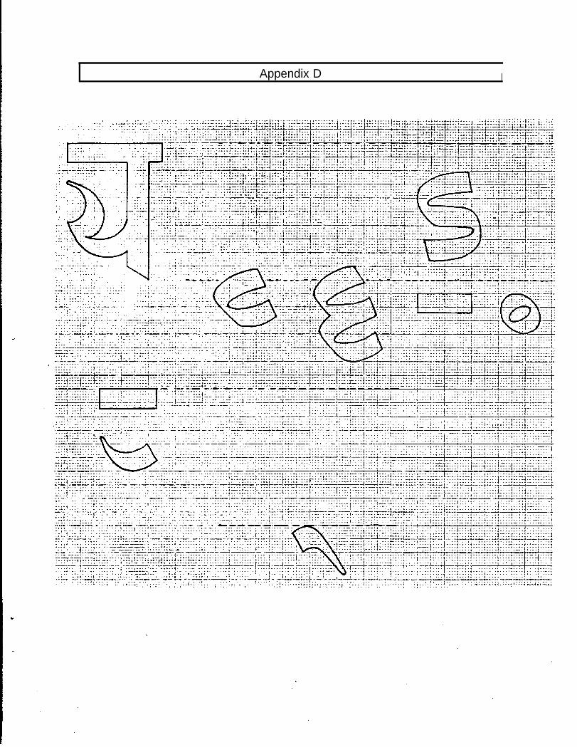
Appendix D I
! ...- : .....
... * ) ... ...-. ... ........;
t ..................
.. . .i. ......... . t.. ...... ...... .. , . .* .... .:.:...
....:.
._.. +..... ...T’...+ * - I_.... i

. . Appendix E
Extra Characters For High Quality Printing
Traditionally most of the conjunct consonants are given completely separate graphical forms.nowadays For the ease of composition, they are frequently represented by writing theconstituent half forms of the consonants side by side, or the full consonants followed byhalant marks. However, For very high quality printing those graphic idioms are still in use. InAppendix E, I am adding almost an exhaustive list of the conjunct consonants of Devanagariscript for the ambitious printers.
Appendix E
x kta
F-T / kthuI
m I ktya35 1 kha
4i ~ kna
Zm / kma
W ! kmya
w i XYa
‘4i I kraI
Wt 1 krya
ai , kla
k+
kcma
k$ya
ktt’a
ksa
kha
kh
i &l&l
1 khya
kly a
kca
kcya
Appendix E
I dhyai dhra
I clhlca
:)na
1n
’ nyhya
nta
n tya
91 tra
ntha
97da
n&a
1 n&a
n&a
ndhya
9~ c?iira
dhca
nna
nnya
9rpra
vh
n9na
9lya
nz;a
ma
Pa
P
33ta
PtYa
PfrYaPna
PP
PPhpma
Appendix E
Ya
Y-ya
YYa
Yrayra
raru
rii
la1
lka
f9a
liDalma
b/aIla
It-a
va
V
cya
t-7-a
22-a
Ba
ska
skha
stastra
stha
sna
va!Phacoma
smya
SYCl
sra
sea
ssa
hahts
hii
hr
iv


![[965] A2 Physics A](https://img.pdfslide.us/doc/110x75/619317476802834fb254d6db/965-a2-physics-a.jpg)