Embed Size (px)
Citation preview
An Approach for Intuitive Visualization ofErgonomic Issues
Walentin Heft1, Michael Spitzhirn2, Angelika C. Bullinger2, andPaul Rosenthal1
1Visual Computing Laboratory, Department of Computer Science,Technische Universitat Chemnitz, Germany
2Ergonomics and Innovation Management, Mechanical Engineering,Technische Universitat Chemnitz, Germany
{walentin.heft,paul.rosenthal}@informatik.tu-chemnitz.de
{michael.spitzhirn,angelika.bullinger-hoffmann}@mb.tu-chemnitz.de
Abstract. Ergonomics is the science of human work. One goal is theadaption of work to the human, thus to create better working conditionsand to avoid health risks. Even today, analyses of workstations are stillsometimes done with pen and paper. Whereby increasingly often digitalhuman models and corresponding evaluation methods are used. Due tothe mass of data and the variety of possible analyses which come alongwith a simulation, the interpretation of the outcomes can take a longtime. We introduce a new concept, which enables a quick and under-standable visualization and navigation of critical ergonomic situationsand their causes. There are filter mechanisms available for changing thelevel of detail. These enable a representation for specific target groups.Prior to the development of the concept, expert interviews were con-ducted to specify the user requirements. Each iteration step of the designprocess was evaluated in cooperation with ergonomics experts.
Keywords: Overview visualization, glyph-based visualization, ergonomics,concept study
1 Introduction
An important property of visualization is its interactive nature. It is necessaryto consider some simulation results, analyze them, and change parameters fora better understanding. Typically, a reconsideration from another viewpoint orcomparison of the several outcomes has to be conducted. Furthermore, user in-teraction is often needed because of the mass of data which is not perceptibly ata glance. Especially in research and industry, experts use visual analytics toolsto detect ergonomic problems [1]. Modest circumstances concerning ergonomicscould increase working time and costs. During the beginning of professional er-gonomics, ergonomists used life-size human models and prototypes, for example,to design vehicle interior. These days they are using computers and ergonomicssoftware tools, such as digital human models (DHM), to visualize results for a

2 An Approach for Intuitive Visualization of Ergonomic Issues
fast processing and understanding. Although many ergonomists still use tablesin hard copy for their analysis, the following surveys show the importance ofergonomics software tools in all areas of product planning, manufacture, andusage. The results of a survey carried out by Wischniewski [2] indicate that forthe majority of the sample, ergonomics tools are important today. Most of the 30domain experts, which participated in the survey, think that these tools will takean inherent part of virtual ergonomics evaluation in the future. Another surveycarried out by Muhlstedt [1] with 59 experts also emphasizes the importance ofergonomics tools. Especially the analysis function in the matter of visualization(as picture or video) next to measurement, and posture were considered to berelevant.
2 Usergroups and Requirements
In order to create an interactive visualization of ergonomics information, we hadto determine the possible user group and their requirements. Often several tar-get groups work on the same data base, but with different intension and fromdifferent angles. For this purpose we interviewed professionals in the field ofergonomics, the occupational health and safety department (HSE), and indus-trial engineering (IE) from Deutsche Bahn AG (German Railways). Six expertsparticipated in this workshop. A further workshop was held at the VolkswagenAG with two experts. We identified the main groups and their requirements inmoderated interviews. All things considered, we obtain three main areas. In thefirst area experts are responsible for planning and designing of work processes.This includes professionals of HSE, IE, as well as planers and designers. Thelatter define the final design in collaboration with ergonomists, HSE, and theIE. They are also responsible for the implementation of the working system. Theindustrial engineers set, among other things, time standards. A further groupproduces the goods. Here, workers are responsible for the correct execution ofthe working task and they are assisted by the team leader. The team leader takesthe responsibility for decision-making, monitoring, and advisory to maintain thequality and quantity goals in the production. The person has also to decide aboutthe deployment. Hereby, the work requirements and individual productivities ofthe corresponding employee have to be matched [3–5]. The last area consists ofthe work council and management. The former is the representative of workers’interests. The management deals with economic aspects. This also includes theinvestment costs of workplace design. In the following, the mentioned require-ments of the participants of the workshops are explained in more detail. Therespondents expressed their desire for an easier handling. In general, existingergonomics tools are too complicated, as they told us. There is a high learningcurve and a new incorporation is necessary after a few months without using thecorresponding software, in particular in DHMs. In order to counter these prob-lems, explanations, such as mouse-over info boxes on all interactive elementsare wanted. The second wish was a user-friendly representation of the analysisdata. The design should have an eye-catching character. In their experience, most

An Approach for Intuitive Visualization of Ergonomic Issues 3
non-ergonomists aren’t interested in tables. Color coding is preferred over tables.Furthermore, as the ergonomists mentioned, intuitive and sustainable graphicaluser interfaces are requested to demonstrate the ergonomic-critical situation inworkshops, which are held for the workers. Many workers do their work alreadyfor years in the same manner. They very often lack the understanding of the ne-cessity of the advantages the workers obtain due to ergonomic analyses of theirworkplaces. In addition, a prioritization is required to set a focus on major prob-lems, such as bending. A visualization of ergonomic data should also considerthat the same data has to presented in different forms, depending on whetherthey talk in front of the management or the workers. In result, important er-gonomic issues should be visible at a glance and additional information shouldbe provided on demand in a simple way.
3 State of the Art
We have recently presented an overview about the state of the art in virtualergonomics with regard to visualization issues [6]. Although the variety of visualmetaphors is quite broad, the used approaches seem very simplistic and in manycases not human centered enough to facilitate an optimal process by ergonomists.There are several methods to conduct ergonomic analyzes of workplaces, e.g.,posture or load. We want to briefly introduce two of them, RULA and EAWS.The ergonomic tool RULA (”Rapid Upper Limb Assessment”) can be utilizedto investigate ”the exposure of workers to risk factors associated with work re-lated upper limb disorders” [7]. It is a gross screening method which evaluatesthe body posture (upper arms, lower arms, wrists, neck, trunk, and legs), basedon the body angles, the applied forces and loads, the proportion of static mus-cle work, and the number of repetitions. The result is a rating of the workingconditions, which ranges from one (no risk) to seven (high risk). In addition,a separate evaluation of the single body segments can be done. The use of themethod is easy to learn [8]. With the ergonomic system EAWS (”ErgonomicAssessment Worksheet”), the biomechanical risk factors for musculoskeletal dis-orders can be evaluated during a working shift. The evaluation process consistsof different sections, such as an assessment of additional ergonomic loads (forexample caused by working on moving objects) or an assessment of static or highrepetitive postures. EAWS is more complex and the method requires significantmore information for a judgment than the method RULA.
As mentioned before (see Section 1), ergonomic investigations in companiesare often carried out by measuring or capturing data using paper-pencil methodsand simple software support. As ergonomic reports, standardized sheets, suchas the EAWS scoring sheet or simple diagrams, are applied as visualization. Inaddition, ergonomic maps or exposure registers are used for the documentationof an ergonomic evaluation of several work stations. The visualization of thiskind of work is typically done using simple floor plan sketches or plain (Excel-)tables. A workstations can also receive a color coding according to the common

4 An Approach for Intuitive Visualization of Ergonomic Issues
standard DIN EN 614 (green, yellow, red) or separate evaluation points for asharper disjunction [9].
Digital human models are becoming more and more popular [10]. However,the usage in companies is currently limited [11]. The presentation of ergonomicresults with software is often bounded to lists, simple dialogs, or simple graphs.An excerpt of the most common representations of ergonomic reports in digitalhuman models can be found in Figures 1 and 2. The introduced tools are not
Fig. 1. Ergonomic report of RULA in the DHM ”Human Builder”. On the left-handside, the ergonomists have the possibility to tune the analysis results for the corre-sponding body side, the final score, as well as further parameters. On the right-handside, there are color coded fields for several body parts. The colors indicate the levelof stress on the body joints.
Fig. 2. Ergonomic report of RULA in the DHM ”Jack” [12]. The report is displayedin a 3D scene. Here, a static pose of a male worker is considered. The analysis resultsare color coded for several body parts (e.g., the elbow or the shoulder), as shown inthe bottom left corner.

An Approach for Intuitive Visualization of Ergonomic Issues 5
able to pass the above mentioned design requirements. There is no possibilityto select the depth of analysis and only information about a static pose can bedisplayed, instead of an overall view. The current visualization in DHM does notsupport the user in analyzing ergonomic critical situations in an adequate way.The current presentation tends to demonstrate data in the absence of a contextrelation and without the possibility to change the depth and range of analyzing.
4 Related Work
Since time-oriented data is relevant in many practical situations, the visual-ization of such data has a long tradition [13] and still many recent work ex-ists [14–16]. However, visualizations in digital human models for showing criticalergonomic situations or illustrating time-oriented processes are very limited. Theconcept of timelines is used in LifeLines [17]. LifeLines was developed to createan overview over certain events in the life of a person. Therefore, the authorsmake investigations in hospitals, to receive facts about deseases, visits to thedoctor, and so on. The presence of all import information at one stage enablesthe doctors to make a better prognosis about the medical condition and to offera more suitable therapy. However, an overview of a huge amount of data canstill quickly lead to confusion. LifeFlow [18] delivers a possibility to counteractthis circumstance with event sequences (series of temporal distinct and consecu-tive events). Matchpad [19] presents an interactive glyph-based visualization forrealtime sport events. The events are directly visualized in an overview, duringthe match. SoundRiver [20] makes an audio-visual mapping to illustrate soundeffects from audio sources, like movies (e.g., for hearing-impaired viewers). Inthis way, it symbolizes the noise of an airplane as an icon with a small aircraft,for example.
5 Evaluation Procedure
Based on the investigation of the user requirements (see Section 2), a firstmockup was designed (see Figure 3). We evaluated this concept with an in-formal survey and with the help of five ergonomic and usability experts thatdid not participate in the initial workshops. At the beginning of the survey, theparticipants were explained the aim and the single tasks of the respective partsof the mockup. After that, they had several minutes of time to internalize thevisualization. Following, the interview was conducted. The experts were askedabout the single components and the overall impression. On basis of the feedbackand several further feedback loops, the new concept was designed in an iterativeprocess.
6 Design Process
The initial (Figure 3) and the final version (Figure 4) follow the Shneidermansseeking mantra ”overview first, zoom and filter, then details-on-demand” [21].

6 An Approach for Intuitive Visualization of Ergonomic Issues
Nevertheless, our user study led to significant changes, related to the initialdesign.
The general concept shall contain a timeline for an overall view of all criticalsituations. We have deliberately avoided to display the overall workflow. Firstof all, ergonomic problem cases require a special investigation. In the initial
Fig. 3. Initial concept. (1) Timeline (2) Legend (3) Slider (4) Evaluation-scores (5)Pictogram with additional stress hints (6) Distance time between critical situations (7)Video sequence player (8) Further information about critical situations
version the design point (dp) 1 of Figure 3 shows the timeline with verticalcolored bars. The bars are located at the time, where the corresponding criticalissues occurred. The colors refer to the legend beneath the timeline (Figure 3:dp 2) and indicate the method, which delivers a poor score for an ergonomicevent. The height of a bar depicts the severity of the problem. We use a slider(Figure 3: dp 3) to specify the moment where to start with the analysis. Fromthat point on, the following six critical ergonomic situations are displayed inmore detail. The related results (Figure 3: dp 4) are shown at a glance. Everyvalue, in the colored boxes, represents the analysis result of the correspondingevaluation method. These colors also relate to the legend (Figure 3: dp 2), aspreviously mentioned. In addition to the analysis scores, further information isnecessary, such as the adverse posture of the worker as pictogram (Figure 3: dp
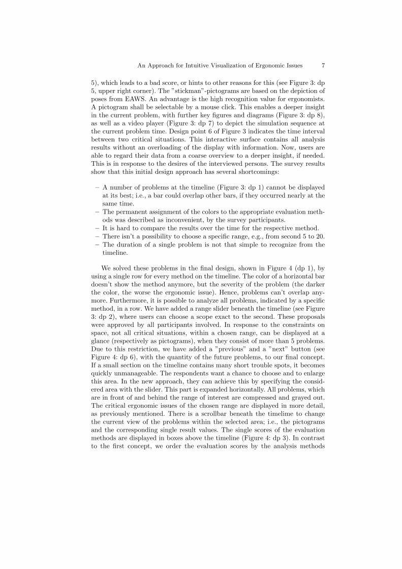
An Approach for Intuitive Visualization of Ergonomic Issues 7
5), which leads to a bad score, or hints to other reasons for this (see Figure 3: dp5, upper right corner). The ”stickman”-pictograms are based on the depiction ofposes from EAWS. An advantage is the high recognition value for ergonomists.A pictogram shall be selectable by a mouse click. This enables a deeper insightin the current problem, with further key figures and diagrams (Figure 3: dp 8),as well as a video player (Figure 3: dp 7) to depict the simulation sequence atthe current problem time. Design point 6 of Figure 3 indicates the time intervalbetween two critical situations. This interactive surface contains all analysisresults without an overloading of the display with information. Now, users areable to regard their data from a coarse overview to a deeper insight, if needed.This is in response to the desires of the interviewed persons. The survey resultsshow that this initial design approach has several shortcomings:
– A number of problems at the timeline (Figure 3: dp 1) cannot be displayedat its best; i.e., a bar could overlap other bars, if they occurred nearly at thesame time.
– The permanent assignment of the colors to the appropriate evaluation meth-ods was described as inconvenient, by the survey participants.
– It is hard to compare the results over the time for the respective method.– There isn’t a possibility to choose a specific range, e.g., from second 5 to 20.– The duration of a single problem is not that simple to recognize from the
timeline.
We solved these problems in the final design, shown in Figure 4 (dp 1), byusing a single row for every method on the timeline. The color of a horizontal bardoesn’t show the method anymore, but the severity of the problem (the darkerthe color, the worse the ergonomic issue). Hence, problems can’t overlap any-more. Furthermore, it is possible to analyze all problems, indicated by a specificmethod, in a row. We have added a range slider beneath the timeline (see Figure3: dp 2), where users can choose a scope exact to the second. These proposalswere approved by all participants involved. In response to the constraints onspace, not all critical situations, within a chosen range, can be displayed at aglance (respectively as pictograms), when they consist of more than 5 problems.Due to this restriction, we have added a ”previous” and a ”next” button (seeFigure 4: dp 6), with the quantity of the future problems, to our final concept.If a small section on the timeline contains many short trouble spots, it becomesquickly unmanageable. The respondents want a chance to choose and to enlargethis area. In the new approach, they can achieve this by specifying the consid-ered area with the slider. This part is expanded horizontally. All problems, whichare in front of and behind the range of interest are compressed and grayed out.The critical ergonomic issues of the chosen range are displayed in more detail,as previously mentioned. There is a scrollbar beneath the timelime to changethe current view of the problems within the selected area; i.e., the pictogramsand the corresponding single result values. The single scores of the evaluationmethods are displayed in boxes above the timeline (Figure 4: dp 3). In contrastto the first concept, we order the evaluation scores by the analysis methods
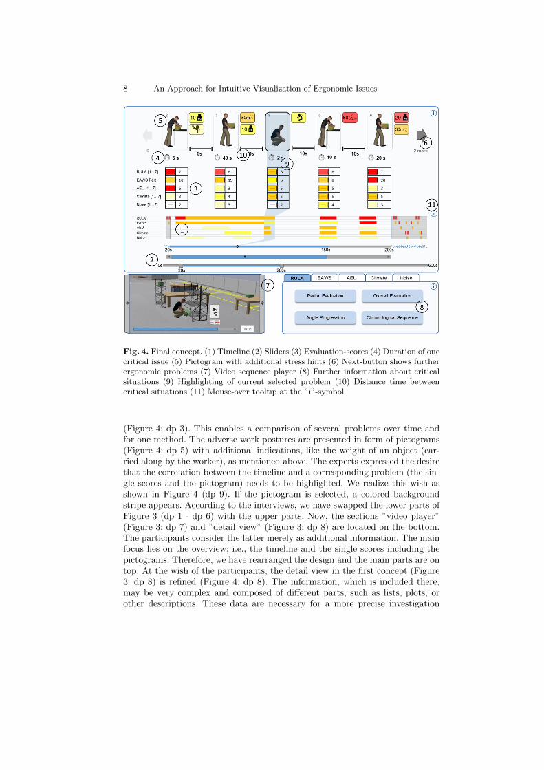
8 An Approach for Intuitive Visualization of Ergonomic Issues
Fig. 4. Final concept. (1) Timeline (2) Sliders (3) Evaluation-scores (4) Duration of onecritical issue (5) Pictogram with additional stress hints (6) Next-button shows furtherergonomic problems (7) Video sequence player (8) Further information about criticalsituations (9) Highlighting of current selected problem (10) Distance time betweencritical situations (11) Mouse-over tooltip at the ”i”-symbol
(Figure 4: dp 3). This enables a comparison of several problems over time andfor one method. The adverse work postures are presented in form of pictograms(Figure 4: dp 5) with additional indications, like the weight of an object (car-ried along by the worker), as mentioned above. The experts expressed the desirethat the correlation between the timeline and a corresponding problem (the sin-gle scores and the pictogram) needs to be highlighted. We realize this wish asshown in Figure 4 (dp 9). If the pictogram is selected, a colored backgroundstripe appears. According to the interviews, we have swapped the lower parts ofFigure 3 (dp 1 - dp 6) with the upper parts. Now, the sections ”video player”(Figure 3: dp 7) and ”detail view” (Figure 3: dp 8) are located on the bottom.The participants consider the latter merely as additional information. The mainfocus lies on the overview; i.e., the timeline and the single scores including thepictograms. Therefore, we have rearranged the design and the main parts are ontop. At the wish of the participants, the detail view in the first concept (Figure3: dp 8) is refined (Figure 4: dp 8). The information, which is included there,may be very complex and composed of different parts, such as lists, plots, orother descriptions. These data are necessary for a more precise investigation

An Approach for Intuitive Visualization of Ergonomic Issues 9
and are requested on demand. Hence, subcategories were introduced in the newconcept, in order to avoid an overloading of the graphical user interface withinformation which are not required in each case. In addition, the results of allanalysis methods for the current issue are provided over several tabs. Therefore,an ergonomist can examine possible relations between the outcomes of severalanalysis methods. The duration of one critical issue (Figure 4: dp 4) is evenmore important than the time interval between the problems (Figure 4: dp 10),especially if the worker carries a heavy weight over longer distance. Hence, wehave appended this time designation at the request of the ergonomists. As a re-sult of the survey we changed the ”stickman”-pictograms (Figure 5, left) to the”digital human model”-pictograms (Figure 5, right). Although, it is to be notedthat the participants were discordant in this issue. Nevertheless, the majorityapproved the modification, due to the more realistic representation. The usageof this alternative allows a good assessment of the body posture, especially of3D movements, such as trunk rotations.
Fig. 5. Pictogram in the style of a stickman (left) and more realistic as digital humanmodel (right)
In order to simplify the usage, some interviewees have proposed to providemouse-over info boxes direct at the interactive parts. We deviated from this pro-posal, since permanently opening boxes during navigation might be cumbersomefor the users. Nevertheless, we have realized this idea by adding tooltips at theright-hand edge of the display (Figure 4: dp 11), which are accepted generally.
7 Conclusions
In this paper, we have discussed two concepts to visualize ergonomic analysisdata and to explore it. The first concept (Figure 3) was prepared on basis ofseveral expert interviews. We have realized the requirements of the experts, suchas an intuitive handling, a first overview of all critical situations, as well as theproviding of deeper information on demand. An evaluation of this prototype withexperts from the field of ergonomics, visualization, and usability led to significantchanges in our initial concept (Figure 3). This demonstrates the importance ofour user studies. The disadvantages of the first concept were highlighted andeliminated in several iterative loops. Furthermore, we explained why we usepictograms (see Figure 5) and why we changed the order of certain graphicalelements in the final concept, as a result of the survey.

10 An Approach for Intuitive Visualization of Ergonomic Issues
References
1. J. Muhlstedt. Entwicklung eines Modells dynamisch-muskularer Arbeits-beanspruchungen auf Basis digitaler Menschmodelle. Universitatsverlag Chemnitz,2012.
2. Sascha Wischniewski. Delphi survey: Digital ergonomics 2025 -trends and strategies for increasing product usability and design-ing safe, healthy and competitive socio-technical work systems.http://mreed.umtri.umich.edu/DHM2013Proceedings/, 2013.
3. British Standards Institute Staff. Safety of Machinery. Ergonomic Design Princi-ples. Terminology and General Principles. B S I Standards, 2006.
4. DGVU. Rolle und Aufgabe der Fachkraft fur Arbeitssicherheit.http://www.dguv.de/sifa-online/Fachkraft-f%C3%BCr-Arbeitssicherheit/Rolle-und-Aufgabe/index.jsp. 20.02.2015.
5. C.M. Schlick, R. Bruder, and H. Luczak. Arbeitswissenschaft. Springer BerlinHeidelberg, 2010.
6. W. Heft, M. Spitzhirn, and P. Rosenthal. A survey on visualization in industrialergonomics. In P. Rosenthal, R. S. Laramee, M. Kirby, and G. L. Kindlmann,editors, Proceedings of the EuroVis Workshop on Reproducibility, Verification, andValidation in Visualization, pages 7–8, Leipzig, Germany, 2013. Eurographics As-sociation.
7. L McAtamney and E Nigel Corlett. Rula: a survey method for the investigationof work-related upper limb disorders. Applied ergonomics, 24(2):91–9, April 1993.
8. FIOH. Rula (rapid upper limb assessment).http://www.ttl.fi/en/ergonomics/methods/. 20.02.2015.
9. Michaela Kugler, Max Bierwirth, Karlheinz Schaub, Andrea Sinn-Behrendt,Alexandra Feith, Kazem Ghezel-Ahmadi, and Ralph Bruder. Forderschwerpunkt2007: KoBRA - Kooperationsprogramm zu normativem Management von Belastun-gen und Risiken bei korperlicher Arbeit: Ergonomie in der Industrie - aber wie?;Handlungshilfe fur den schrittweisen Aufbau eines einfachen Ergonomiemanage-ments. ... Bundesanst. fur Arbeitschutz und Arbeitsmedizin, 2010.
10. Nadia Magnenat-Thalmann and Daniel Thalmann. Handbook of Virtual Humans.Wiley, Chichester, 2004.
11. Birgit Spanner-Ulmer and Jens Muhlstedt. Digitale Menschmodelle als Werkzeugevirtueller Ergonomie: Ergebnisse einer empirischen Studie. Industrie-Management:Zeitschrift fur industrielle Geschaftsprozesse, 26(4, (8)):69–72, 2010.
12. Siemens. Jack. http://blog.industrysoftware.automation.siemens.com/blog/2009/03/19/are-digital-humans-cool/. 20.02.2015.
13. H.L. Gantt. Work, Wages, and Profits. Industrial management library. EngineeringMagazine Company, 1913.
14. Wolfgang Aigner, Silvia Miksch, Heidrun Schuman, and C. Tominski. Visualiza-tion of Time-Oriented Data. Human-Computer Interaction. Springer Verlag, 1stedition, 2011.
15. Paul Rosenthal, Linda Pfeiffer, Nicholas Hugo Muller, and Peter Ohler. Visruption:Intuitive and efficient visualization of temporal airline disruption data. Comput.Graph. Forum, 32(3):81–90, 2013.
16. Jian Zhao, Fanny Chevalier, and Ravin Balakrishnan. Kronominer: Using multi-foci navigation for the visual exploration of time-series data. In Proceedings ofthe SIGCHI Conference on Human Factors in Computing Systems, CHI ’11, pages1737–1746, New York, NY, USA, 2011. ACM.

An Approach for Intuitive Visualization of Ergonomic Issues 11
17. Catherine Plaisant, Brett Milash, Anne Rose, Seth Widoff, and Ben Shneiderman.Lifelines: Visualizing personal histories. In Proceedings of the SIGCHI Conferenceon Human Factors in Computing Systems, CHI ’96, pages 221–227, New York, NY,USA, 1996. ACM.
18. Krist Wongsuphasawat, John Alexis Guerra Gomez, Catherine Plaisant,Taowei David Wang, Meirav Taieb-Maimon, and Ben Shneiderman. Lifeflow: visu-alizing an overview of event sequences (video preview). In Desney S. Tan, SaleemaAmershi, Bo Begole, Wendy A. Kellogg, and Manas Tungare, editors, CHI Ex-tended Abstracts, pages 507–510. ACM, 2011.
19. P. A. Legg, D. H. S. Chung, M. L. Parry, M. W. Jones, R. Long, I. W. Griffiths,and M. Chen. Matchpad: Interactive glyph-based visualization for real-time sportsperformance analysis. Comp. Graph. Forum, 31(3pt4):1255–1264, June 2012.
20. Heike Janicke, Rita Borgo, J. S. D. Mason, and Min Chen. Soundriver:Semantically-rich sound illustration. Comput. Graph. Forum, 29(2):357–366, 2010.
21. Ben Shneiderman. The eyes have it: A task by data type taxonomy for informationvisualizations. In Proceedings of the 1996 IEEE Symposium on Visual Languages,VL ’96, pages 336–, Washington, DC, USA, 1996. IEEE Computer Society.