Embed Size (px)
Citation preview
Serdica J. Computing 6 (2012), 349–368
AN ANALYSIS OF COLOUR SEMANTICS IN ART IMAGES
Krassimira Ivanova∗
Abstract. The article briefly presents the results achieved by the PhDproject R-1875 “Search in Art Image Collections Based on Colour Seman-tics”, Hasselt University, which finished successfully. The main goals of thiswork were to provide a detailed analysis of the colour theories, especiallyon existing interconnections in successful colour combinations, as well as toformalize them in order to implement automated extraction from digitizedartworks.
1. Introduction. The field of art image retrieval has to overcome amajor challenge: it needs to accommodate the obvious difference between thedigital technologies that are limited within pixels capture and human expectation
ACM Computing Classification System (1998): H.3.3; I.4.7.Key words: Colour Theories, Content-based Image Retrieval, Metadata Extraction, Cultural
Heritage.*This article presents the principal results of the Ph.D. thesis A Novel Method for Content-
Based Image Retrieval in Art Image Collections Utilizing Colour Semantics by KrassimiraIvanova (Institute of Mathematics and Informatics, BAS), successfully defended at Hasselt Uni-versity in Belgium, Faculty of Science, on 15 November 2011.
350 Krassimira Ivanova
for perceiving various semantic, aesthetic and cultural messages which the artworksends to the viewer.
Colour perception underpins multiple aspects in art image analysis. Theyrange from the physical nature of light to physiological specifics of the humanvision system, psychological peculiarities and socio-cultural grounds in which theartwork was created, as well as these of the recipient of the message.
In the process of perception, figure-ground separation is the first cognitivestep. Colour plays an important but secondary role. The colour responses aremore connected to human emotions than to the rational mind. This propertyitself makes the colours’ influence on human perception pivotal. The presence ofone or more colours in different proportions conveys different messages, which canaugment or suppress the perception of the observed objects. In the field of imageretrieval the ways of perceiving colours and colour combinations as similar ordissimilar is crucial when one has to extract images based on a criterion reflectingthe level of emotional perception, or to search for any specific characteristics ofthe artist’s expressiveness.
The colour impact on people depends on multiple factors with physicallaws and physiology being only the beginning. Further along this process of psy-chological perception plays an important role, with both the particular psycholog-ical state and the socio-cultural environment in which a character of a person iscomposed playing a role. Perception of colour brings up the whole emotional andmental identity of the artist as well as of the observer, joining their intelligence,memory, ideology, ethics, aesthetics and other sensations.
The main goals of the dissertation [1] were to provide a detailed analysisof the colour theories, especially on existing interconnections in successful colourcombinations, as well as to formalize them in order to implement automatedextraction from digitized artworks.
The article presents the proposed approaches for analysing colour seman-tics in art images. Section two draws attention to the phenomenon of colourinteraction. Section three contains a theoretical description of the proposed ap-proach. In Section four we discuss the experimental software system APICAS,which integrates the functions that retrieve the described features, and the toolsfor query answering and for making statistical and data mining analysis. Sectionfive contains some experimental results. Finally, conclusions and future work arepresented.
2. Colour Interactions and Influences. Johannes Itten [2] hasgiven a very good formulation of the messages that one artwork sends to theviewer. He points out three basic directions of evincing colour aesthetics:
An Analysis of Colour Semantics in Art Images 351
– Impression (visually);– Expression (emotionally);– Construction (symbolically).These characteristics are mutually connected and cannot live of full value
alone: symbolism without visual accuracy and without emotional force would bemerely an anaemic formalism; visually impressive effect without symbolic verityand emotional power would be a banal imitative naturalism; emotional effectwithout constructive symbolic content or visual strength would be limited to theplane of sentimental expression. Each artist works according to his temperament,and emphasizes one or another of these aspects [2].
Different styles in art paintings are connected with the techniques em-ployed on one side and the artist’s aesthetic expression on the other. The processof forming an artist style is a very complicated one, where current fashionablepainting styles, the social background and personal character of the artist playsignificant role. All these factors lead to forming some common trends in artmovements and some specific features which distinguish one movement from an-other, one artist style from another, one artist period from another, etc. On theother hand the theme of the paintings also stamps specifics and can be taken intoaccount. The compositions in different types of images (portraits, landscapes,town views, mythological and religious scenes, or everyday scenes) also set somerules, aesthetically imposed for some period.
Since Antiquity many scientists and artists have studied the phenomenonof colour interconnections:
– philosophers, such as Aristotle, who formulated questions about the differ-ence of violet near white or black in “De meteorologica”;
– artists, such as Leonardo da Vinci, who probably was the first to notice thatwhen observed adjacently, colours influence each other;
– Isaac Newton (c. 1670), who dispersed light to its components from anelectromagnetic point of view;
– Johann Heinrich Lambert and Ignaz Shiffermuller, who in parallel (1772)first presented colour pyramids and argued that three primary colours canconstruct all others;
– Philipp Otto Runge (1807), who looked from a chemical stance and made thefirst experiments with mixtures of colours in order to establish the primaryones;
– and many others.
352 Krassimira Ivanova
So, from a physiological point of view, two main types of contrast can bediscerned: simultaneous and successive contrasts.
– Simultaneous contrast argues that when colours interact, they are capableto change in appearance, depending on particular relationships with sur-rounding colours (initially suggested in 1839 by Michel Eugene Chevreul).
– Successive contrast means that the eye spontaneously generates the com-plementary colour even when the hue is absent (this explains the so-calledafterimage phenomenon).
– These two types are based on the idea that “The human eye is satisfied (inequilibrium) only when the complementary colour relation is established”.
Here is the time to mention the Bauhaus school in Weimar, where in thefirst half of the previous century Josef Albers, Adolf Hoelzel, and Johannes Ittendeveloped their theories of successful colour combinations. They formalize similarbasic types of harmonies and contrasts, used in art paintings.
Josef Albers (1888–1976) stated that one colour could have many “read-ings”, depending on both lighting and the context in which it is placed. Coloursinteract and are modified in appearance by other colours in accordance with threeguiding rules: (1) Light/dark value contrast ; (2) Complementary reaction; (3) Sub-traction [3].
Adolf Hoelzel (1853–1934) suggested seven contrast groups, based on hisown understanding of the colour wheels, and each contrast marks some qualityof colour perception: (1) Contrast of the hue; (2) Light-Dark ; (3) Cold-Warm;(4) Complementary ; (5) Gloss-Mat ; (6) Much-Little; (7) Colour-Achromatic [4].
Johannes Itten (1888–1967) expanded the theories of Hoelzel and Albers.Through his research he also devised seven methodologies for coordinating coloursutilizing the hue’s contrasting properties: (1) Contrast of hue; (2) Lightdark con-trast ; (3) Coldwarm contrast ; (4) Complementary contrast ; (5) Simultaneous con-trast ; (6) Contrast of saturation; (7) Contrast of proportion [2].
Let’s mention some examples of colour combinations used in artists’practice:
– the monochromatic and the analogous schemes are usually used to empha-size some visual unity – loneliness (e.g., in the paintings of Picasso’s Blueperiod), quietness, joy, etc.;
– the variety of colours is used for influencing more complex associations,for instance as Itten said of Botticelli’s painting “Lamentation over theDead Christ”: “The totality of hues symbolizes the cosmic significance ofthe epochal event”;
An Analysis of Colour Semantics in Art Images 353
– the strongest light–dark contrast is typical for Rembrandt’s works. As Ittensaid, to Rembrandt colour becomes materialized light-energy, charged withtension when pure light colours often shine like jewels in dark surrounding;
– it is interesting that the two Cubists painters Gris and Braque applied to-tally different approaches to using saturation of colours – while Gris usedrelatively pure different colours, Braque’s compositions are based mainly ongradient in saturation of one colour;
– the contrasts are often used in combination. For instance in van Gogh’spainting “Cafe Terrace at Night” light–dark contrast is used in combinationof the opposite hues yellow and blue.
3. Proposed Features. We examine three types of colour features:
– visual features, which represent colour distribution in the images;
– global features that reflect colour harmonies and contrasts in art images;
– local features, based on vector quantization (VQ) of MPEG7 descriptors.
We use these features for:
– analysing the colour distribution in art images;
– searching the images by higher-level concepts, concerning harmonies andcontrasts;
– analysing how more detailed information on semantic and abstraction con-tent of art images based on MPEG7 descriptors with significant dimension-ality reduction can be captured;
– classifying art images by different abstraction criteria, such as artists’ names,periods or movements or semantic profile as genre of the art image.
3.1. Chosen Colour Model. A colour model is an abstract mathemat-ical model for describing the colour as a numerical vector, usually with three orfour values, which are called colour components. Different models serve variousdomains – from physics and colorimetry, through painting, architecture, and de-sign, to digital coding for printers, monitors and TV. History and practice showthat a perfect colour model cannot be created: one is suitable to supplying com-pact coding and transmitting colour characteristics, another is easily perceivedby humans, etc. From a human point of view, it is easiest to define colour as a
354 Krassimira Ivanova
composition of three components – hue, saturation and lightness. Hue means thename of the colour – red, orange, etc. Black, different shades of gray and whiteare called achromatic. Saturation measures the hue intensity or brilliance of asample, its dullness or vividness. Lightness refers to relative light and dark in asample [5]. Such a view on colour facilitates the structuring of colour contrastsand harmonies are evinced in art images. Even in the light of these three colourcomponents there are several colour models, which have strengths and weaknesses.
RED
VIO
LE
T
BLU
E
GREEN
YELLO
W
OR
AN
GE
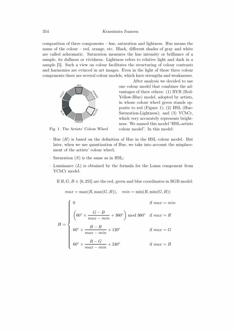
Fig. 1. The Artists’ Colour Wheel
After analysis we decided to useone colour model that combines the ad-vantages of three others: (1) RYB (Red-Yellow-Blue) model, adopted by artists,in whose colour wheel green stands op-posite to red (Figure 1); (2) HSL (Hue-Saturation-Lightness); and (3) YCbCr,which very accurately represents bright-ness. We named this model “HSL-artistscolour model”. In this model:
– Hue (H) is based on the definition of Hue in the HSL colour model. Butlater, when we use quantization of Hue, we take into account the misplace-ment of the artists’ colour wheel;
– Saturation (S) is the same as in HSL;
– Luminance (L) is obtained by the formula for the Luma component fromYCbCr model.
If R,G,B ∈ [0, 255] are the red, green and blue coordinates in RGB model:
max = max(R,max(G,B)), min = min(R,min(G,B))
H =
0 if max = min
(
60◦ ×G − B
max − min+ 360◦
)
mod 360◦ if max = R
60◦ ×B − R
max − min+ 120◦ if max = G
60◦ ×R − G
max − min+ 240◦ if max = B
An Analysis of Colour Semantics in Art Images 355
S =
0 if max = min
max − min
max + minif max + min ≤ 1/2
max − min
2 − (max + min)if max + min > 1/2
L =0.299 ∗ R + 0.587 ∗ G + 0.114 ∗ B
255.
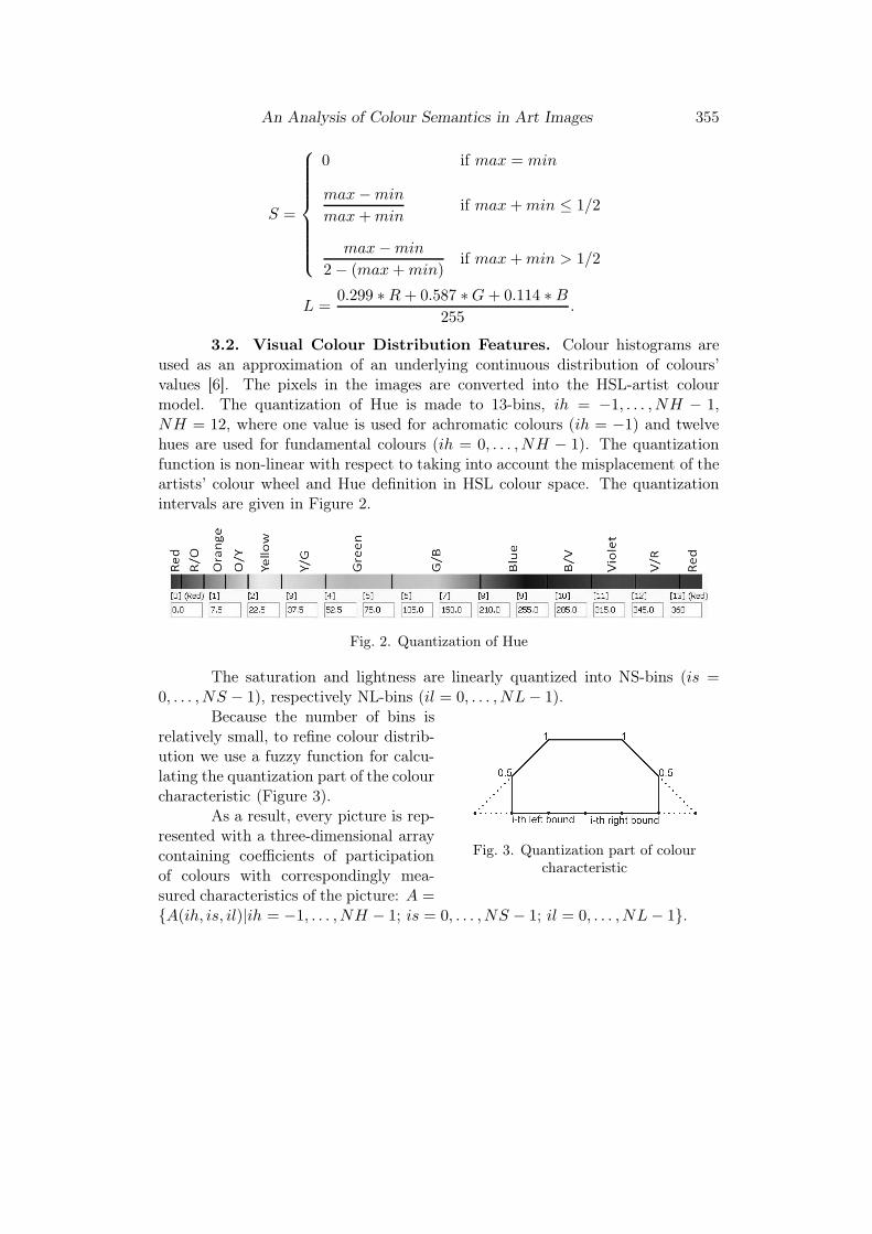
3.2. Visual Colour Distribution Features. Colour histograms areused as an approximation of an underlying continuous distribution of colours’values [6]. The pixels in the images are converted into the HSL-artist colourmodel. The quantization of Hue is made to 13-bins, ih = −1, . . . , NH − 1,NH = 12, where one value is used for achromatic colours (ih = −1) and twelvehues are used for fundamental colours (ih = 0, . . . , NH − 1). The quantizationfunction is non-linear with respect to taking into account the misplacement of theartists’ colour wheel and Hue definition in HSL colour space. The quantizationintervals are given in Figure 2.
Fig. 2. Quantization of Hue
The saturation and lightness are linearly quantized into NS-bins (is =0, . . . , NS − 1), respectively NL-bins (il = 0, . . . , NL − 1).
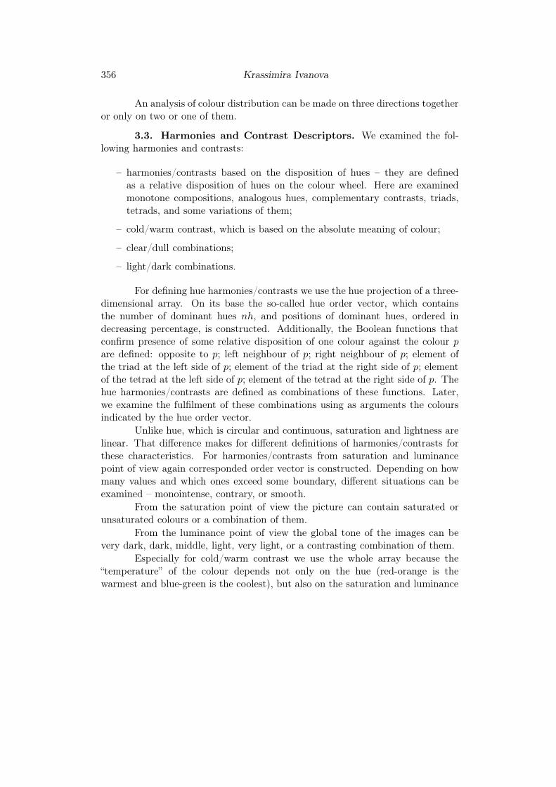
Fig. 3. Quantization part of colourcharacteristic
Because the number of bins isrelatively small, to refine colour distrib-ution we use a fuzzy function for calcu-lating the quantization part of the colourcharacteristic (Figure 3).
As a result, every picture is rep-resented with a three-dimensional arraycontaining coefficients of participationof colours with correspondingly mea-sured characteristics of the picture: A ={A(ih, is, il)|ih = −1, . . . , NH − 1; is = 0, . . . , NS − 1; il = 0, . . . , NL − 1}.
356 Krassimira Ivanova
An analysis of colour distribution can be made on three directions togetheror only on two or one of them.
3.3. Harmonies and Contrast Descriptors. We examined the fol-lowing harmonies and contrasts:
– harmonies/contrasts based on the disposition of hues – they are definedas a relative disposition of hues on the colour wheel. Here are examinedmonotone compositions, analogous hues, complementary contrasts, triads,tetrads, and some variations of them;
– cold/warm contrast, which is based on the absolute meaning of colour;
– clear/dull combinations;
– light/dark combinations.
For defining hue harmonies/contrasts we use the hue projection of a three-dimensional array. On its base the so-called hue order vector, which containsthe number of dominant hues nh, and positions of dominant hues, ordered indecreasing percentage, is constructed. Additionally, the Boolean functions thatconfirm presence of some relative disposition of one colour against the colour pare defined: opposite to p; left neighbour of p; right neighbour of p; element ofthe triad at the left side of p; element of the triad at the right side of p; elementof the tetrad at the left side of p; element of the tetrad at the right side of p. Thehue harmonies/contrasts are defined as combinations of these functions. Later,we examine the fulfilment of these combinations using as arguments the coloursindicated by the hue order vector.
Unlike hue, which is circular and continuous, saturation and lightness arelinear. That difference makes for different definitions of harmonies/contrasts forthese characteristics. For harmonies/contrasts from saturation and luminancepoint of view again corresponded order vector is constructed. Depending on howmany values and which ones exceed some boundary, different situations can beexamined – monointense, contrary, or smooth.
From the saturation point of view the picture can contain saturated orunsaturated colours or a combination of them.
From the luminance point of view the global tone of the images can bevery dark, dark, middle, light, very light, or a contrasting combination of them.
Especially for cold/warm contrast we use the whole array because the“temperature” of the colour depends not only on the hue (red-orange is thewarmest and blue-green is the coolest), but also on the saturation and luminance

An Analysis of Colour Semantics in Art Images 357
(for instance: increasing the lightness in unsaturated colours leads to an increas-ing of coldness and increasing the lightness of saturated colours cause expandingof both families of warm and cold colours).
The comprehensive definitions of these descriptors are given in [7] and [1].
3.4. Local VQ MPEG-7 Descriptors. The third group of descriptorsare based on a vector quantization of MPEG-7 descriptors over the partitionedimages [8]. They are used to analyse the possibilities of capturing more detailedinformation on the semantic and abstraction content of art images. MPEG-7descriptors are complex descriptors, which provide a good presentation of differenttypes of visual features [9]. These complex structures need specific processing andcannot be properly interpreted by generic classification algorithms. In our work wefocus on the following MPEG-7 descriptors: Scalable Colour (SC); Colour Layout(CL); Colour Structure (CS); Dominant Colour (DC); Edge Histogram (EH);Homogeneous Texture (HT), which are used for describing the image content.Vector quantisation is used as a tool for dimensionality reduction.
In our approach we split the images into m×n non-overlapping rectangles(tiles). The tiles are marked as (i, j), where i ∈ 1, . . . ,m and j ∈ 1, . . . , n. Theindex i increases from the left tile to the right tile and the index j increases fromthe top tile to the bottom tile of the image. Some of the pictures of the collectionare included into the learning set, the rest of the pictures remain in the testingset.
For each MPEG7 descriptor X ∈ {SC,CL,CS,DC,EH,HT} the algo-rithm consists of following steps:
– for all tiles of paintings feature vectors are calculated;
– the clustering procedure is applied on the vectors received from the tiles ofthe learning set (the number of clusters is given as parameter);
– each cluster is named with the serial number of clustering procedure;
the tiles from the learning set receives labels corresponding to the clustername where they belong;
– the centroids of clusters are calculated;
– the tiles of the examining set receive the value of the examined feature equalto the cluster number of the closest centoid using L1 metric.
As a result, each image is represented by a feature vector with x×m× nattributes, where x is the number of MPEG7 descriptors. A specific feature of this
358 Krassimira Ivanova
approach is that the obtained attributes are nominal. The main purpose of theprepared datasets after implementing this approach is to examine the significanceof the attributes and the local/global trade-off for class prediction.
4. The APICAS System. In order to establish an environment fortesting the proposed features we developed the experimental system APICAS –an acronym from “Art Painting Image Colour Aesthetics and Semantics”.
The main system functions can be categorized into the following groups:
– data entry – establishing connections with image sources as well as supplyingcontrolling textual metadata;
– feature extraction – such functions produce automated metadata for imagelabelling;
– query interface – part of the user-interface functions, connected with re-ceiving the tasks from the consumer. Here an image bank is used in orderto select “an example” for searching images with greatest similarity to theselected image. The metadata bank is used for constructing a “controlledvocabulary”, from which users can select desired feature(s);
– query processing – analysis of extracted metadata, their potential to matchthe user query for receiving images with specified colour harmonies or con-trast or to be used for building an artist practice profile or movement de-scription;
– visualization – the other part of the user-interface functions, connected withvisualizing the received results. A variety of tools is used, such as imagesets (whole images or patches), attribute data sets, distance files, graphics,knowledge analysis results, etc.
The system is realized using CodeGear Delphi 2007 for Win32. As meta-data the storage space Arm 32, property of FOI Creative Ltd., is used. Forobtaining the MPEG7 descriptors APICAS refers to the Multimedia ContentManagement System MILOS [10]. For obtaining the results of multidimensionalscaling we used the open component-based data mining and machine learningsoftware suite ORANGE [11]. As clustering algorithm the program “vcluster”,which is part of the CLUTO open source software package [12], is implementedin the system. As a knowledge analysis and testing environment, we used thedata mining analysis environment PaGaNe [13][14] and Waikato Environment forKnowledge Analysis (WEKA) [15].
An Analysis of Colour Semantics in Art Images 359
5. Experimental Results. The datasets we used for our experimentsinclude 600 paintings by 18 artists from different movements of West European finearts – Botticelli, Michelangelo, Raphael (Renaissance); Caravaggio, Rembrandt,Rubens (Baroque); Friedrich, Goya, Turner (Romanticism); Monet, Pissarro, Sis-ley (Impressionism); Braque, Gris, Leger (Cubism); Klimt, Miro, Mucha (ModernArt); and one group which represents the Iconographical Style of the Eastern me-dieval culture. In order to simplify the statistical processing we used an equalnumber of paintings by each artist; only the group of Icons was twice the size ofother sets.
For the predictive analysis we use the classifiers OneR, JRip, J48 andPGN, which are representatives of different classification schemes (Decision Rules,Decision Trees, Associative Classifiers), but all create rules, or can be writtenas rules, on whose base the recognition process is made. The experiments aremade using 5-fold cross-validation and applying Chimerge discretization with 95%significance level for numerical attributes.
The results of the descriptive analysis are compared with the domainknowledge. For the predictive analysis we use classical hold-out measures such asaccuracy for classification and recall and precision for retrieval.
5.1. Analysis of the Colour Distribution.
Descriptive Analysis. The descriptive analysis of the colour distribution ofone projection revealed some general trends for pictures that we used as a normal-izing factor in determining harmonies/contrast descriptors. On the other hand,it showed some specific characteristics of the periods which have an explanationof technical or socio-cultural character.
For instance, the predominant presence of warm colours (red-orange spec-trum) in paintings are due to the colouring of faces and bodies on one side, andusing materials and varnish which acquired a yellowish tinge on the other side.Not without importance is the fact that cold hues such as blue and green arenon-durable under the influence of light. On the other hand, the technical artists’practices of some movements did not use the colour green – this colour was re-placed by brown. For instance, the experiments by Constable at the beginningof the 19th century to capture the inevitable light and shade effects of nature byusing more green colours were not accepted by their colleagues [16]. From a satu-ration point of view the most distinctive is the Eastern iconographic style, whichuses canonical representation of the figures with more schematic lines and purecolours. Some common trends for most movements concerning luminance are alsoseen. Only Baroque is considerably different with the big presence of dark andvery dark colours.
360 Krassimira Ivanova
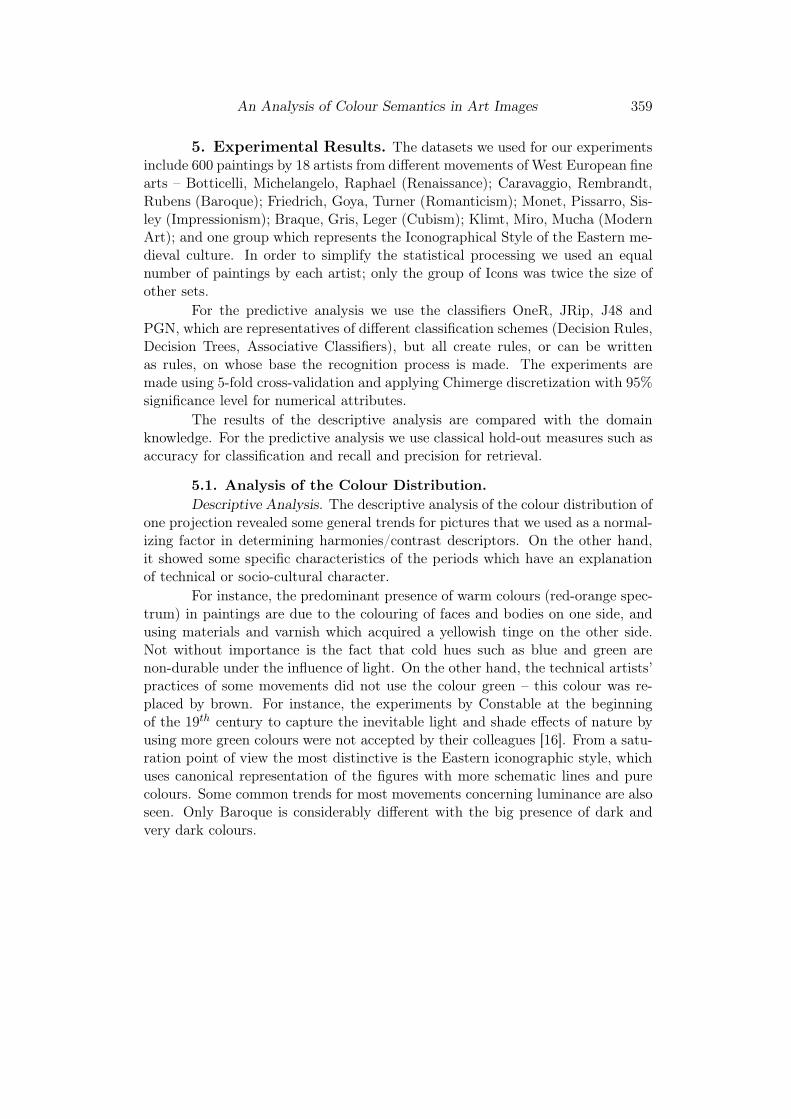
The descriptive analysis of two projections (in this case hue and lightness)shows that the periods are relatively divided into two big groups – classical andcontemporary – with warmer tones in classic paintings and the presence of cold incontemporary paintings with variations in brightness in the different movements(Figure 4 and Figure 5).
Fig. 4. Hue-Luminance Distribution for Icons, Renaissance and Baroque
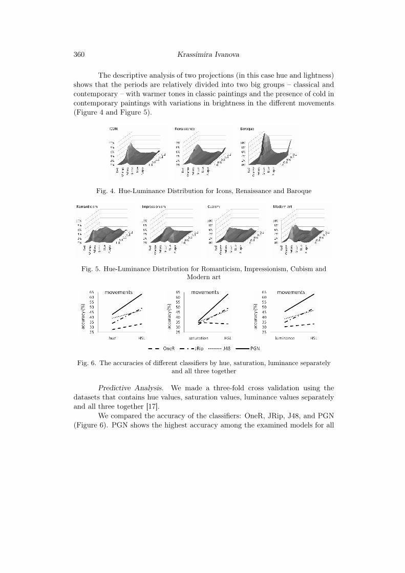
Fig. 5. Hue-Luminance Distribution for Romanticism, Impressionism, Cubism andModern art
Fig. 6. The accuracies of different classifiers by hue, saturation, luminance separatelyand all three together
Predictive Analysis. We made a three-fold cross validation using thedatasets that contains hue values, saturation values, luminance values separatelyand all three together [17].
We compared the accuracy of the classifiers: OneR, JRip, J48, and PGN(Figure 6). PGN shows the highest accuracy among the examined models for all
An Analysis of Colour Semantics in Art Images 361
datasets. PGN showed the greatest increase in accuracy when considering thethree characteristics together, which confirms that the associative classifiers (inparticular PGN) have the best opportunity for the extraction of specific combi-nations of attribute values.
5.2. Analysis of the Harmonies/contrast Descriptors. This groupof experiments was focused on the analysis of the automatic annotation of imageswith harmonies/contrast descriptors. These high-level characteristics can be usedin the processes of categorization in order to uncover cultural influences and spe-cific techniques, as well as for recourse discovery with given characteristics closelyassociated with emotional reactions caused by the images. These characteristicsrelate to the elements of the abstract space of the image content.
Descriptive Analysis. The analysis of the use of different contrasts ofhue in the pictures showed that very often partial triads are found in the land-scapes (Pissarro, Sisley). Despite the high abstractionism of Cubism, partialtriads have also been seen (Gris, Leger). Triads are often used in Botticelli andGoya’s paintings, as an exponent of the complexity of the composition. Paint-ings with monochromatic and analogous harmonies contain other expressive tech-niques, e.g., light/dark contrast in Baroque, saturation gradient in Cubism (es-pecially in Braque’s style), etc.
The distribution of images based on cold/warm contrast also shows sometrends: the high predominance of warm paintings in Icon style can be explainedwith the Orthodox tradition for using gold paints as well as red colour as a symbolof sacrifice and martyrdom. The big presence of dark warm colours is specific forBaroque. Presenting nature in paintings is typical for Romanticism, which leadsto strengthening the presence of cold (green and blue) tones. This tendencyincreases in Impressionism. Intensive study of nature led the Impressionists to anentirely new colour rendition. The study of sunlight, which alters the local tonesof natural objects, and of light in the atmospheric world of landscape, providedthe Impressionist painters with new essential patterns [2].
The distribution of light/dark combinations in paintings also has certaintendencies that have their explanation in technical and psychological aspects. Forexample, the use of dark tones and dark–light contrast in Baroque is linked tothe search for maximum expressiveness on the one hand and with the practiceof painting by candlelight in the studio on the other hand [16]. Also, the specialattention to studying the capture of light in the Impressionists’ paintings wasfacilitated by the very practical fact that the chemical factories started productionof paints in tubes and artists had the opportunity to go outdoors.
362 Krassimira Ivanova
Fig. 7. Accuracy of different classifiers – based on harmonies/contrast descriptors
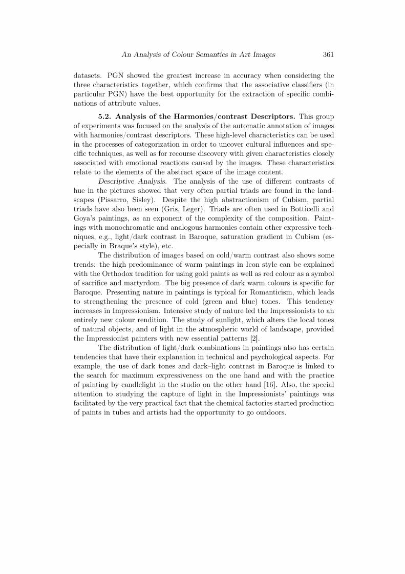
Predictive Analysis. The harmonies/contrast features try to extract veryglobal colour combination constructs. Because of this we do not expect that suchfeatures can be used for exact classification of movements or artists. We putthese descriptors into the classification task in order to see whether there are anytendencies.
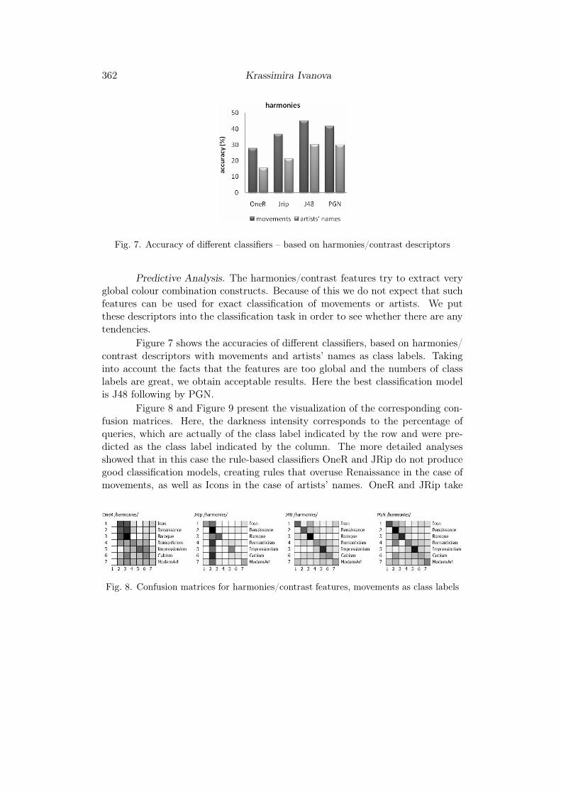
Figure 7 shows the accuracies of different classifiers, based on harmonies/contrast descriptors with movements and artists’ names as class labels. Takinginto account the facts that the features are too global and the numbers of classlabels are great, we obtain acceptable results. Here the best classification modelis J48 following by PGN.
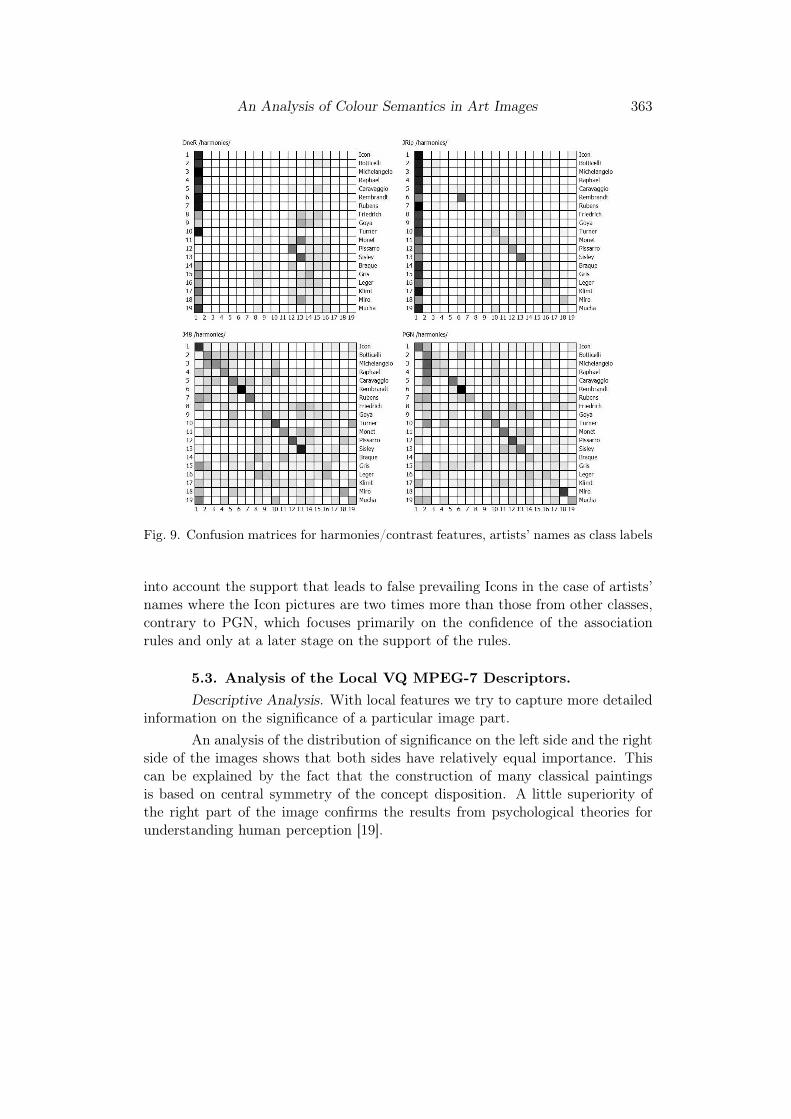
Figure 8 and Figure 9 present the visualization of the corresponding con-fusion matrices. Here, the darkness intensity corresponds to the percentage ofqueries, which are actually of the class label indicated by the row and were pre-dicted as the class label indicated by the column. The more detailed analysesshowed that in this case the rule-based classifiers OneR and JRip do not producegood classification models, creating rules that overuse Renaissance in the case ofmovements, as well as Icons in the case of artists’ names. OneR and JRip take
Fig. 8. Confusion matrices for harmonies/contrast features, movements as class labels
An Analysis of Colour Semantics in Art Images 363
Fig. 9. Confusion matrices for harmonies/contrast features, artists’ names as class labels
into account the support that leads to false prevailing Icons in the case of artists’names where the Icon pictures are two times more than those from other classes,contrary to PGN, which focuses primarily on the confidence of the associationrules and only at a later stage on the support of the rules.
5.3. Analysis of the Local VQ MPEG-7 Descriptors.
Descriptive Analysis. With local features we try to capture more detailedinformation on the significance of a particular image part.
An analysis of the distribution of significance on the left side and the rightside of the images shows that both sides have relatively equal importance. Thiscan be explained by the fact that the construction of many classical paintingsis based on central symmetry of the concept disposition. A little superiority ofthe right part of the image confirms the results from psychological theories forunderstanding human perception [19].
364 Krassimira Ivanova
(a) n = 5 (b) n = 6 (c) n = 7
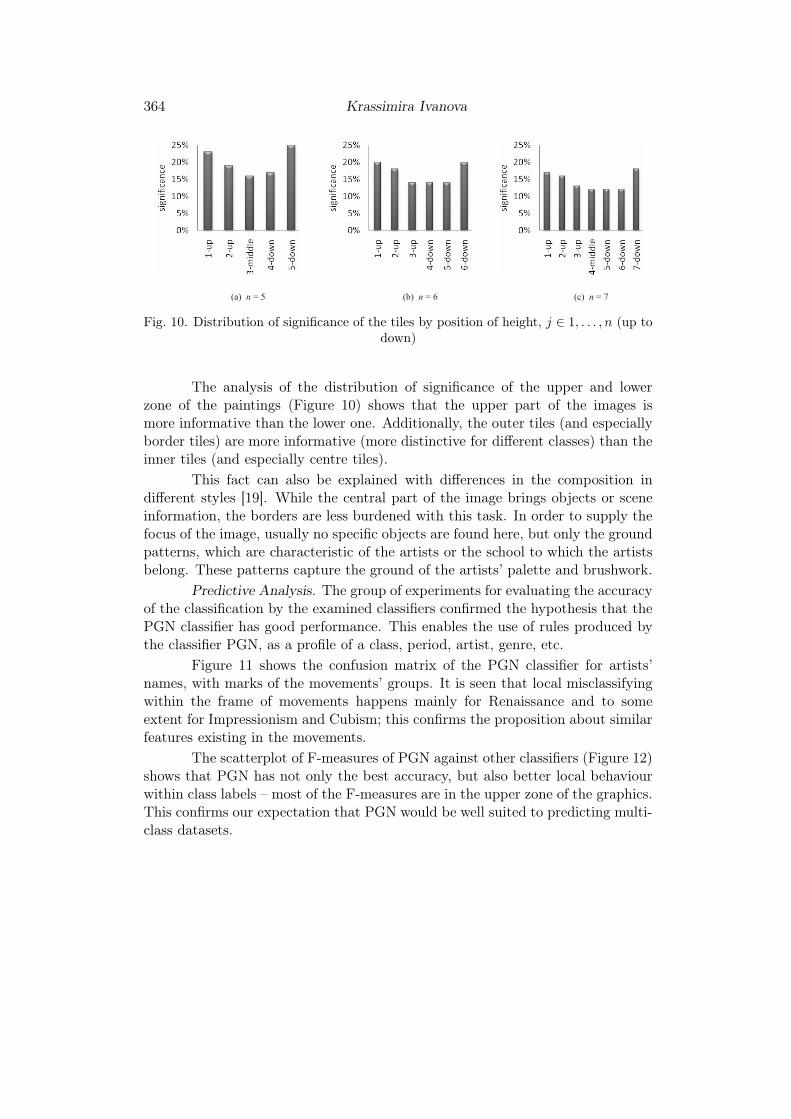
Fig. 10. Distribution of significance of the tiles by position of height, j ∈ 1, . . . , n (up todown)
The analysis of the distribution of significance of the upper and lowerzone of the paintings (Figure 10) shows that the upper part of the images ismore informative than the lower one. Additionally, the outer tiles (and especiallyborder tiles) are more informative (more distinctive for different classes) than theinner tiles (and especially centre tiles).
This fact can also be explained with differences in the composition indifferent styles [19]. While the central part of the image brings objects or sceneinformation, the borders are less burdened with this task. In order to supply thefocus of the image, usually no specific objects are found here, but only the groundpatterns, which are characteristic of the artists or the school to which the artistsbelong. These patterns capture the ground of the artists’ palette and brushwork.
Predictive Analysis. The group of experiments for evaluating the accuracyof the classification by the examined classifiers confirmed the hypothesis that thePGN classifier has good performance. This enables the use of rules produced bythe classifier PGN, as a profile of a class, period, artist, genre, etc.
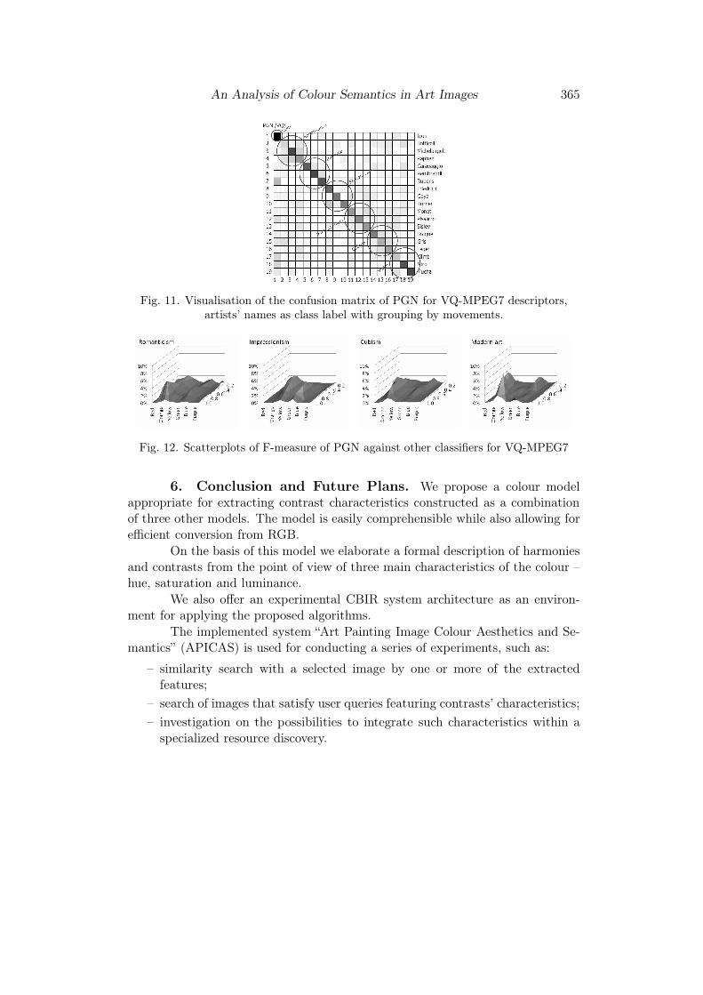
Figure 11 shows the confusion matrix of the PGN classifier for artists’names, with marks of the movements’ groups. It is seen that local misclassifyingwithin the frame of movements happens mainly for Renaissance and to someextent for Impressionism and Cubism; this confirms the proposition about similarfeatures existing in the movements.
The scatterplot of F-measures of PGN against other classifiers (Figure 12)shows that PGN has not only the best accuracy, but also better local behaviourwithin class labels – most of the F-measures are in the upper zone of the graphics.This confirms our expectation that PGN would be well suited to predicting multi-class datasets.
An Analysis of Colour Semantics in Art Images 365
Fig. 11. Visualisation of the confusion matrix of PGN for VQ-MPEG7 descriptors,artists’ names as class label with grouping by movements.
Fig. 12. Scatterplots of F-measure of PGN against other classifiers for VQ-MPEG7
6. Conclusion and Future Plans. We propose a colour modelappropriate for extracting contrast characteristics constructed as a combinationof three other models. The model is easily comprehensible while also allowing forefficient conversion from RGB.
On the basis of this model we elaborate a formal description of harmoniesand contrasts from the point of view of three main characteristics of the colour –hue, saturation and luminance.
We also offer an experimental CBIR system architecture as an environ-ment for applying the proposed algorithms.
The implemented system “Art Painting Image Colour Aesthetics and Se-mantics” (APICAS) is used for conducting a series of experiments, such as:
– similarity search with a selected image by one or more of the extractedfeatures;
– search of images that satisfy user queries featuring contrasts’ characteristics;
– investigation on the possibilities to integrate such characteristics within aspecialized resource discovery.
366 Krassimira Ivanova
Experiments were made to evaluate the features’ added value. The de-scriptive analysis shows the common trends and specifics of examined featureprojections. The predictive analysis with classification, especially tree classifiersand associative classifiers, shows the benefits of using such features within therecognition process of artists’ styles, movements or groups of movements.
The plans for further research are focused on:
– analysing the possibilities of using SIFT-descriptors [20] as a ground fordefining upper-layer concepts;
– focusing on the processes of throwing out redundant attributes in order toachieve clearer and faster results;
– applying already extracted as well as newly developed attributes and corre-sponding methods in the field of analysis of Eastern Iconographical paintingschools (especially the Bulgarian tradition) and themes within the icons.
The growing number of digitised cultural heritage collections broughtusers’ access to art collections to a radically new level. Accessibility, however,is hindered by the very large volume of available resources, which calls for newapproaches in resource discovery building on methods for content based imageanalysis; this would enhance search using not only available metadata but alsouser preferences related to the image content.
R EFER EN CES
[1] Ivanova K. A Novel Method for Content-Based Image Retrieval in Art Im-age Collections Utilizing Colour Semantics. PhD Thesis, Hasselt University,Belgium, 2011.
[2] Itten J. The Art of Color: the Subjective Experience and Objective Ratio-nale of Color. Reinhold Publishing Corporation of New York, 1961.
[3] Albers J. Interaction of Colors. New Haven, Yale University Press, 1963,Rev. ed. 1975.
[4] Gage J. Colour and Culture: Practice and Meaning from Antiquity to Ab-straction. Thames and Hudson, London, 1993.
[5] Holtzschue L. Understanding Colors. John Wiley & Sons, 2006.
An Analysis of Colour Semantics in Art Images 367
[6] Ivanova K., P. Stanchev, B. Dimitrov. Analysis of the distributions ofcolor characteristics in art painting images. Serdica Journal of Computing, 2(2008), No 2, 111–136.
[7] Ivanova K., P. Stanchev, K. Vanhoof. Automatic tagging of art imageswith color harmonies and contrasts characteristics in art image collections.Int. Journal on Advances in Software, 3 (2010), No 3&4, 474–484.
[8] Ivanova K., P. Stanchev, E. Velikova, K. Vanhoof, B. Depaire, R.
Kannan, I. Mitov, K. Markov. Features for art painting classificationbased on vector quantization of MPEG7 descriptors. In: Proc. of the SecondInt. Conf. on Data Engineering and Management ICDEM, India, 2010, LNCS,Vol. 6411, Springer, 2012, 146–153.
[9] International Standard ISO/IEC 15938-3 Multimedia Content Descrip-tion Interface – Part 3: Visual. http://www.iso.org/iso/iso_catalogue/catalogue_tc/catalogue_detail.htm?csnumber=34230
[10] Amato G., C. Gennaro, F. Rabitti, P. Savino. Milos: a multimediacontent management system for digital library applications. Research andAdvanced Technology for Digital Libraries. LNCS, Vol. 3232, Springer, 2004,14–25.
[11] Demsar J., B. Zupan, G. Leban, T. Curk. Orange: from experimentalmachine learning to interactive data mining. White Paper, Faculty of Com-puter and Information Science, University of Ljubljana, 2004.
[12] Karypis G. CLUTO: A Clustering Toolkit Release 2.1.1. Tech. Report: 02-017, University of Minnesota, Department of Computer Science, Minneapolis,2003.
[13] Mitov I., K. Ivanova, K. Markov, V. Velychko, K. Vanhoof, P.
Stanchev. “PaGaNe” – A classification machine learning system based onthe multidimensional numbered information spaces. World Scientific Pro-ceedings Series on Computer Engineering and Information Science, 2 (2009),279–286.
[14] Mitov I. Class Association Rule Mining Using Multi-Dimensional NumberedInformation Spaces. PhD Thesis, Hasselt University, Belgium, 2011.
[15] Witten I., E. Frank. Data Mining: Practical Machine Learning Tools andTechniques. 2nd Ed., Morgan Kaufmann, San Francisco, 2005.
368 Krassimira Ivanova
[16] Raychev R. The Colors in the Art, Sofia. Lik Publ, 2005 (in Bulgarian).
[17] Ivanova K., I. Mitov, P. Stanchev, M. Dobreva, K. Vanhoof, B.
Depaire. Applying associative classifier PGN for digitised cultural heritageresource discovery. In: Proc. of the 1st Int. Conf. “Digital Preservation andPresentation of Cultural Heritage”, V. Tarnovo, 2011, 117–126.
[18] Koenig B. Color Workbook. Prentice Hall, Third ed., 2010.
[19] Arnheim R. Art and Visual Perception: A Psychology of the Creative Eye.University of California Press, Berkeley, 1974.
[20] Lowe D. Object recognition from local scale-invariant features. In: Proc. ofthe Int. Conf. on Computer Vision, Corfu, 1999, 1150–1157.
Krassimira Ivanova
Institute of Mathematics and Informatics
Bulgarian Academy of Sciences
Acad. G. Bonchev Str., Block 8
1113 Sofia, Bulgaria
e-mal: [email protected]
Received February 12, 2012
Final Accepted April 26, 2012