Embed Size (px)
Citation preview
v1.0 2013 KS2 Page 1 of 26
All Wales Core Data Set
Key Stage 2
Guidance Notes
Overview
School Improvement and Effectiveness in Wales is underpinned by a strong focus on self evaluation, challenge and support.
The ‘All Wales Core Data Set’ provides a consistent and balanced suite of contextual analyses, supported with guidance and training. It is intended to support school self evaluation and performance improvement, and inform work with Estyn, Local Authorities and regional consortia.
The ‘All Wales Core Data Set’ is designed to provide analyses of the Foundation Phase and key stages, and external examination results in fixed formats and to provide performance comparisons using a range of contextual factors. The format of the reports is designed to be accessible to all those involved in the school self evaluation process, contributing to the development of a high performance culture and by facilitating the sharing of good practice. The reports also support Estyn’s 2010 inspection framework by contributing to school self evaluation procedures and by providing a consistent data set for both schools and inspection teams.
Families of Schools
The 2008 Estyn report noted that not all schools could easily consider their performance against that of other similar schools and share good practice because, in many local authorities, there was no formal agreement between the local authority and schools to openly share performance data and/or there may not have been suitable comparator schools within the locality.
To facilitate sharing of good practice, the ‘All Wales Core Data Set’ contains comparative performance data compiled from contextually similar schools. ‘Families’ of schools have been created by initially grouping them based on size and linguistic delivery and then within each high level grouping, schools are ordered in descending order according to the values of an index of ‘challenge’, calculated as follows.
• 50% x the proportion of pupils of statutory school age eligible for free school meals, plus
• 30% x the proportion of pupils of statutory school age who live in an area classed as in the 20% most deprived parts of Wales using the 2011 Welsh Index of Multiple Deprivation (WIMD), plus
• 10% x the proportion of pupils of statutory school age subject to school action plus or with a statement of special educational needs (SEN), plus
• 10% x the proportion of pupils of statutory school age who are either new to the English language (or Welsh where relevant), at an early acquisition stage or developing competence.
v1.0 2013 KS2 Page 2 of 26
A three year average of data from PLASC 2010-2013 is used for the first three variables.
Deprivation is measured using the overall Welsh Index of Multiple Deprivation (WIMD) 2011, so pupils with an English postcode are excluded from both the numerator and denominator of the second variable.
Once the schools are ordered using this index, they are then split into batches of around 11 to form the families. Within each family, the first family member in the group is the most challenged and the last in the group the least challenged.
The criteria used to form the groups ensures that, in the vast majority of cases, family members are statistically more alike and comparisons between them fairer. By comparing your school’s performance with other schools in your family, it should be possible to identify your school’s strengths and weaker areas. It should also be possible to identify schools within your family who achieve better outcomes in particular areas. Knowing the names of your family schools will allow you to contact them in order to seek advice and identify good practice. Other family schools may contact you for similar purposes. From 2011, the list of all families and family members has been made available via Ffynnon and LAs in order to help facilitate sharing of best practice.
The families were initially fixed for three years and have been revised in July 2013. The methodology has remained the same but the data used is 2013 data. The families will again be fixed for three years in order to allow sufficient time for new relationships between schools to develop. The development of school families does not preclude local cluster, consortium or any other collaborative arrangements. Rather it extends and complements other opportunities to work together and disseminate good practice.
v1.0 2013 KS2 Page 3 of 26
General Principles
Effective self evaluation requires schools to pose three main questions:
1. How well are we doing?
2. What needs to be improved?
3. What must we do to improve?
The data pack can help you address these questions in the following ways:
• The performance graphs show your school’s current results and performance trends over five years. The graphs also show a range of important comparisons. This will allow you to consider your school’s results against local and national performance as well as against the outcomes for schools in your ‘family’.
• Comparing your results with similar schools may indicate particular strengths and areas for development i.e. areas that might be improved. The actual (percentage) differences in performance will inevitably vary from year to year. Therefore, it is preferable to focus on trends and relative differences in performance in order to determine strengths and areas of concern.
• Investigating the learning and teaching approaches used within high performing but contextually similar schools may reveal strategies which would help your school to improve.
Data alone is unlikely to provide solutions to identified issues. Instead, it raises questions – the answers to which might provide a solution. Most questions can only be addressed by schools themselves and when considering pupil level performance data and a wide range of contextual information which may affect pupil outcomes. The data sets within the reports are derived from pupil level data already held within centres. This will allow schools to ‘drill down’ their analyses in specific areas and for individual pupils when seeking underlying issues indicated by the reports.
Using the Data Sets
The data is presented in a pictorial form wherever possible so that trends and patterns are more easily identifiable and the information is accessible to a wide audience. Where graphs are inappropriate, tables of numerical data have been simplified and presented in a consistent format.
The guidance notes that follow are designed to help you interpret the tables and graphs within your school data pack. Examples from each section of the pack are included and commentaries arranged under three headings:
1. What does the graph show? – To expand on the title of the graph to aid understanding and interpretation.
2. Why is this important? – To indicate the main purpose of the data.
3. Querying the data? - To suggest questions to interrogate the data. Typical questions include:
• What are the trends for subjects or other performance indicators?
• In which subjects or performance indicators do pupils do best?

v1.0 2013 KS2 Page 4 of 26
• In which subjects or performance indicators do pupils do less well?
• How do we compare against local averages?
• How do we compare against national averages?
• How do we compare with similar schools (i.e. benchmarking)?
• What contextual factors may have impacted on pupil school outcomes?
Remember to look for themes over time, across groups of pupils or subject areas and to consider issues that the graphs might raise in context.
The data pack only tells part of the story; it is for each school, supported by their local authority to consider it alongside other evidence and local knowledge in order to inform school self evaluation, target setting and planning.
We welcome feedback, please contact us at [email protected].
v1.0 2013 KS2 Page 5 of 26
Health Warnings
Considerable care needs to be taken when interpreting data particularly with regard to the following:
Small cohorts
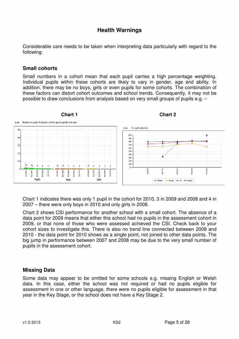
Small numbers in a cohort mean that each pupil carries a high percentage weighting. Individual pupils within these cohorts are likely to vary in gender, age and ability. In addition, there may be no boys, girls or even pupils for some cohorts. The combination of these factors can distort cohort outcomes and school trends. Consequently, it may not be possible to draw conclusions from analysis based on very small groups of pupils e.g. –
Chart 1 Chart 2
Chart 1 indicates there was only 1 pupil in the cohort for 2010, 3 in 2009 and 2008 and 4 in 2007 – there were only boys in 2010 and only girls in 2008.
Chart 2 shows CSI performance for another school with a small cohort. The absence of a data point for 2009 means that either this school had no pupils in the assessment cohort in 2009, or that none of those who were assessed achieved the CSI. Check back to your cohort sizes to investigate this. There is also no trend line connected between 2008 and 2010 - the data point for 2010 shows as a single point, not joined to other data points. The big jump in performance between 2007 and 2008 may be due to the very small number of pupils in the assessment cohort.
Missing Data
Some data may appear to be omitted for some schools e.g. missing English or Welsh data. In this case, either the school was not required or had no pupils eligible for assessment in one or other language, there were no pupils eligible for assessment in that year in the Key Stage, or the school does not have a Key Stage 2.
v1.0 2013 KS2 Page 6 of 26
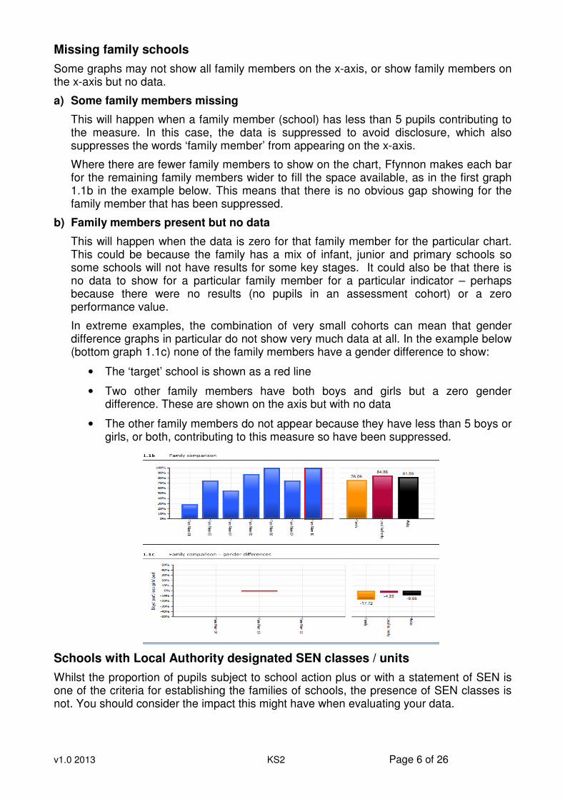
Missing family schools
Some graphs may not show all family members on the x-axis, or show family members on the x-axis but no data.
a) Some family members missing
This will happen when a family member (school) has less than 5 pupils contributing to the measure. In this case, the data is suppressed to avoid disclosure, which also suppresses the words ‘family member’ from appearing on the x-axis.
Where there are fewer family members to show on the chart, Ffynnon makes each bar for the remaining family members wider to fill the space available, as in the first graph 1.1b in the example below. This means that there is no obvious gap showing for the family member that has been suppressed.
b) Family members present but no data
This will happen when the data is zero for that family member for the particular chart. This could be because the family has a mix of infant, junior and primary schools so some schools will not have results for some key stages. It could also be that there is no data to show for a particular family member for a particular indicator – perhaps because there were no results (no pupils in an assessment cohort) or a zero performance value.
In extreme examples, the combination of very small cohorts can mean that gender difference graphs in particular do not show very much data at all. In the example below (bottom graph 1.1c) none of the family members have a gender difference to show:
• The ‘target’ school is shown as a red line
• Two other family members have both boys and girls but a zero gender difference. These are shown on the axis but with no data
• The other family members do not appear because they have less than 5 boys or girls, or both, contributing to this measure so have been suppressed.
Schools with Local Authority designated SEN classes / units
Whilst the proportion of pupils subject to school action plus or with a statement of SEN is one of the criteria for establishing the families of schools, the presence of SEN classes is not. You should consider the impact this might have when evaluating your data.

v1.0 2013 KS2 Page 7 of 26
Decimal places on charts
All charts are calculated to 2 decimal places; however, some charts may show some data labels to 1 or 0 decimal places. This is due to the system not displaying a final 0 (zero) after the decimal point. For example 90.00 will be displayed as 90, and 90.10 will be displayed as 90.1.
Welsh Language Assessment
There remains some confusion over the requirements to assess and report Welsh language achievement at the end of key stages.
The requirement to provide teacher assessments for Welsh first language (Cymraeg) is based on which language the pupil is taught through but also changes according to key stage.
11 year old pupils taught through the medium of Welsh are required to be assessed in both Welsh as a first language and English. The higher of the two results is used to calculate the CSI.
11 year old pupils taught through the medium of English are required to be assessed in English and ‘Welsh as a second language’ but only English is reported to the Welsh Government.
v1.0 2013 KS2 Page 8 of 26
School Contextual Information
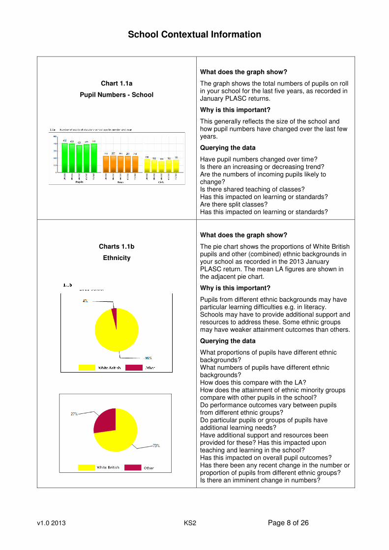
Chart 1.1a
Pupil Numbers - School
What does the graph show?
The graph shows the total numbers of pupils on roll in your school for the last five years, as recorded in January PLASC returns.
Why is this important?
This generally reflects the size of the school and how pupil numbers have changed over the last few years.
Querying the data
Have pupil numbers changed over time? Is there an increasing or decreasing trend? Are the numbers of incoming pupils likely to change? Is there shared teaching of classes? Has this impacted on learning or standards? Are there split classes? Has this impacted on learning or standards?
Charts 1.1b
Ethnicity
What does the graph show?
The pie chart shows the proportions of White British pupils and other (combined) ethnic backgrounds in your school as recorded in the 2013 January PLASC return. The mean LA figures are shown in the adjacent pie chart.
Why is this important?
Pupils from different ethnic backgrounds may have particular learning difficulties e.g. in literacy. Schools may have to provide additional support and resources to address these. Some ethnic groups may have weaker attainment outcomes than others.
Querying the data
What proportions of pupils have different ethnic backgrounds? What numbers of pupils have different ethnic backgrounds? How does this compare with the LA? How does the attainment of ethnic minority groups compare with other pupils in the school? Do performance outcomes vary between pupils from different ethnic groups? Do particular pupils or groups of pupils have additional learning needs? Have additional support and resources been provided for these? Has this impacted upon teaching and learning in the school? Has this impacted on overall pupil outcomes? Has there been any recent change in the number or proportion of pupils from different ethnic groups? Is there an imminent change in numbers?
v1.0 2013 KS2 Page 9 of 26
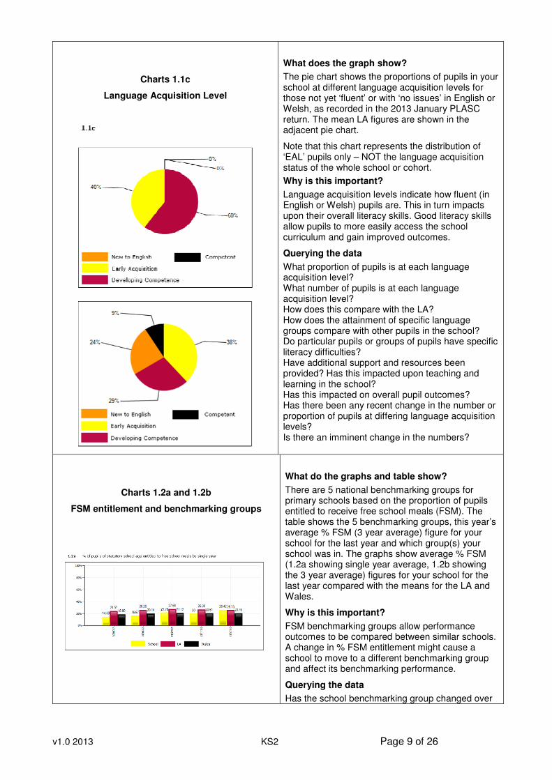
Charts 1.1c
Language Acquisition Level
What does the graph show?
The pie chart shows the proportions of pupils in your school at different language acquisition levels for those not yet ‘fluent’ or with ‘no issues’ in English or Welsh, as recorded in the 2013 January PLASC return. The mean LA figures are shown in the adjacent pie chart.
Note that this chart represents the distribution of ‘EAL’ pupils only – NOT the language acquisition status of the whole school or cohort.
Why is this important?
Language acquisition levels indicate how fluent (in English or Welsh) pupils are. This in turn impacts upon their overall literacy skills. Good literacy skills allow pupils to more easily access the school curriculum and gain improved outcomes.
Querying the data
What proportion of pupils is at each language acquisition level? What number of pupils is at each language acquisition level? How does this compare with the LA? How does the attainment of specific language groups compare with other pupils in the school? Do particular pupils or groups of pupils have specific literacy difficulties? Have additional support and resources been provided? Has this impacted upon teaching and learning in the school? Has this impacted on overall pupil outcomes? Has there been any recent change in the number or proportion of pupils at differing language acquisition levels? Is there an imminent change in the numbers?
Charts 1.2a and 1.2b
FSM entitlement and benchmarking groups
What do the graphs and table show?
There are 5 national benchmarking groups for primary schools based on the proportion of pupils entitled to receive free school meals (FSM). The table shows the 5 benchmarking groups, this year’s average % FSM (3 year average) figure for your school for the last year and which group(s) your school was in. The graphs show average % FSM (1.2a showing single year average, 1.2b showing the 3 year average) figures for your school for the last year compared with the means for the LA and Wales.
Why is this important?
FSM benchmarking groups allow performance outcomes to be compared between similar schools. A change in % FSM entitlement might cause a school to move to a different benchmarking group and affect its benchmarking performance.
Querying the data
Has the school benchmarking group changed over
v1.0 2013 KS2 Page 10 of 26
time? Has this affected the school’s national benchmarking performance? Is the school advantaged or disadvantaged by being at the top or bottom of the FSM range? Is the % FSM figure for the school exceptional e.g. 65% FSM? How has this impacted on pupil outcomes?
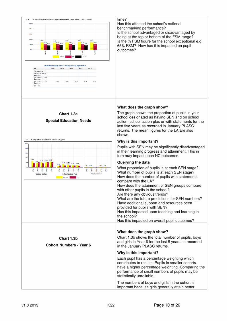
Chart 1.3a
Special Education Needs
What does the graph show?
The graph shows the proportion of pupils in your school designated as having SEN and on school action, school action plus or with statements for the last five years as recorded in January PLASC returns. The mean figures for the LA are also shown.
Why is this important?
Pupils with SEN may be significantly disadvantaged in their learning progress and attainment. This in turn may impact upon NC outcomes.
Querying the data
What proportion of pupils is at each SEN stage? What number of pupils is at each SEN stage? How does the number of pupils with statements compare with the LA? How does the attainment of SEN groups compare with other pupils in the school? Are there any obvious trends? What are the future predictions for SEN numbers? Have additional support and resources been provided for pupils with SEN? Has this impacted upon teaching and learning in the school? Has this impacted on overall pupil outcomes?
Chart 1.3b
Cohort Numbers - Year 6
What does the graph show?
Chart 1.3b shows the total number of pupils, boys and girls in Year 6 for the last 5 years as recorded in the January PLASC returns.
Why is this important?
Each pupil has a percentage weighting which contributes to results. Pupils in smaller cohorts have a higher percentage weighting. Comparing the performance of small numbers of pupils may be statistically unreliable.
The numbers of boys and girls in the cohort is important because girls generally attain better
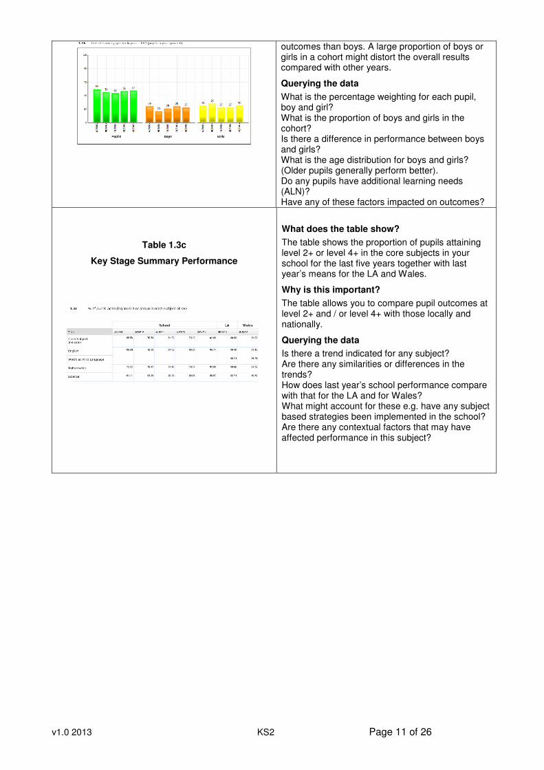
v1.0 2013 KS2 Page 11 of 26
outcomes than boys. A large proportion of boys or girls in a cohort might distort the overall results compared with other years.
Querying the data
What is the percentage weighting for each pupil, boy and girl? What is the proportion of boys and girls in the cohort? Is there a difference in performance between boys and girls? What is the age distribution for boys and girls? (Older pupils generally perform better). Do any pupils have additional learning needs (ALN)? Have any of these factors impacted on outcomes?
Table 1.3c
Key Stage Summary Performance
What does the table show?
The table shows the proportion of pupils attaining level 2+ or level 4+ in the core subjects in your school for the last five years together with last year’s means for the LA and Wales.
Why is this important?
The table allows you to compare pupil outcomes at level 2+ and / or level 4+ with those locally and nationally.
Querying the data
Is there a trend indicated for any subject? Are there any similarities or differences in the trends? How does last year’s school performance compare with that for the LA and for Wales? What might account for these e.g. have any subject based strategies been implemented in the school? Are there any contextual factors that may have affected performance in this subject?
v1.0 2013 KS2 Page 12 of 26
School Performance Data
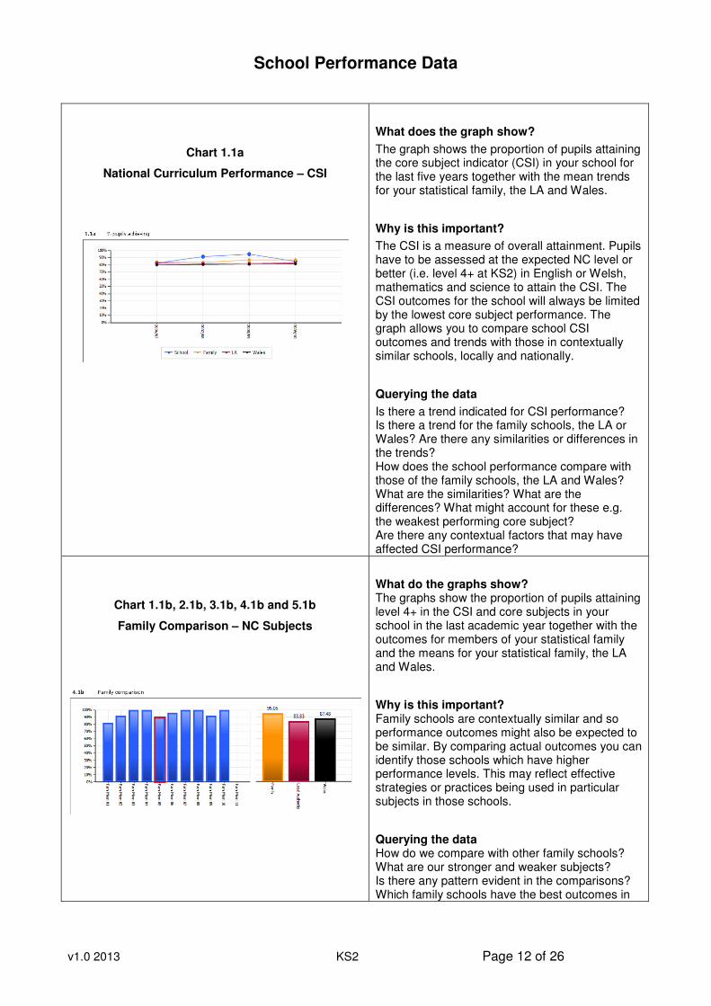
Chart 1.1a
National Curriculum Performance – CSI
What does the graph show?
The graph shows the proportion of pupils attaining the core subject indicator (CSI) in your school for the last five years together with the mean trends for your statistical family, the LA and Wales.
Why is this important?
The CSI is a measure of overall attainment. Pupils have to be assessed at the expected NC level or better (i.e. level 4+ at KS2) in English or Welsh, mathematics and science to attain the CSI. The CSI outcomes for the school will always be limited by the lowest core subject performance. The graph allows you to compare school CSI outcomes and trends with those in contextually similar schools, locally and nationally.
Querying the data
Is there a trend indicated for CSI performance? Is there a trend for the family schools, the LA or Wales? Are there any similarities or differences in the trends? How does the school performance compare with those of the family schools, the LA and Wales? What are the similarities? What are the differences? What might account for these e.g. the weakest performing core subject? Are there any contextual factors that may have affected CSI performance?
Chart 1.1b, 2.1b, 3.1b, 4.1b and 5.1b
Family Comparison – NC Subjects
What do the graphs show? The graphs show the proportion of pupils attaining level 4+ in the CSI and core subjects in your school in the last academic year together with the outcomes for members of your statistical family and the means for your statistical family, the LA and Wales.
Why is this important? Family schools are contextually similar and so performance outcomes might also be expected to be similar. By comparing actual outcomes you can identify those schools which have higher performance levels. This may reflect effective strategies or practices being used in particular subjects in those schools.
Querying the data How do we compare with other family schools? What are our stronger and weaker subjects? Is there any pattern evident in the comparisons? Which family schools have the best outcomes in
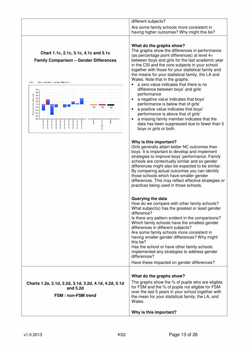
v1.0 2013 KS2 Page 13 of 26
different subjects?
Are some family schools more consistent in having higher outcomes? Why might this be?
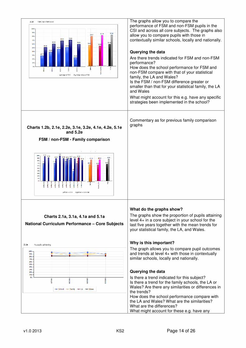
Chart 1.1c, 2.1c, 3.1c, 4.1c and 5.1c
Family Comparison – Gender Differences
What do the graphs show? The graphs show the differences in performance (as percentage point differences) at level 4+ between boys and girls for the last academic year in the CSI and the core subjects in your school together with those for your statistical family and the means for your statistical family, the LA and Wales. Note that in the graphs:
• a zero value indicates that there is no difference between boys’ and girls’ performance
• a negative value indicates that boys’ performance is below that of girls’
• a positive value indicates that boys’ performance is above that of girls’
• a missing family member indicates that the data has been suppressed due to fewer than 5 boys or girls or both.
Why is this important? Girls generally attain better NC outcomes than boys. It is important to develop and implement strategies to improve boys’ performance. Family schools are contextually similar and so gender differences might also be expected to be similar. By comparing actual outcomes you can identify those schools which have smaller gender differences. This may reflect effective strategies or practices being used in those schools.
Querying the data How do we compare with other family schools? What subject(s) has the greatest or least gender difference? Is there any pattern evident in the comparisons? Which family schools have the smallest gender differences in different subjects? Are some family schools more consistent in having smaller gender differences? Why might this be? Has the school or have other family schools implemented any strategies to address gender differences?
Have these impacted on gender differences?
Charts 1.2a, 2.1d, 2.2d, 3.1d, 3.2d, 4.1d, 4.2d, 5.1d and 5.2d
FSM / non-FSM trend
What do the graphs show?
The graphs show the % of pupils who are eligible for FSM and the % of pupils not eligible for FSM over the last 5 years in your school together with the mean for your statistical family, the LA, and Wales.
Why is this important?
v1.0 2013 KS2 Page 14 of 26
The graphs allow you to compare the performance of FSM and non-FSM pupils in the CSI and across all core subjects. The graphs also allow you to compare pupils with those in contextually similar schools, locally and nationally.
Querying the data
Are there trends indicated for FSM and non-FSM performance? How does the school performance for FSM and non-FSM compare with that of your statistical family, the LA and Wales? Is the FSM / non-FSM difference greater or smaller than that for your statistical family, the LA and Wales
What might account for this e.g. have any specific strategies been implemented in the school?
Charts 1.2b, 2.1e, 2.2e, 3.1e, 3.2e, 4.1e, 4.2e, 5.1e and 5.2e
FSM / non-FSM - Family comparison
Commentary as for previous family comparison graphs
Charts 2.1a, 3.1a, 4.1a and 5.1a
National Curriculum Performance – Core Subjects
What do the graphs show?
The graphs show the proportion of pupils attaining level 4+ in a core subject in your school for the last five years together with the mean trends for your statistical family, the LA, and Wales.
Why is this important?
The graph allows you to compare pupil outcomes and trends at level 4+ with those in contextually similar schools, locally and nationally.
Querying the data
Is there a trend indicated for this subject? Is there a trend for the family schools, the LA or Wales? Are there any similarities or differences in the trends? How does the school performance compare with the LA and Wales? What are the similarities? What are the differences? What might account for these e.g. have any
v1.0 2013 KS2 Page 15 of 26
subject based strategies been implemented in the school? Are there any contextual factors that may have affected performance in this subject?
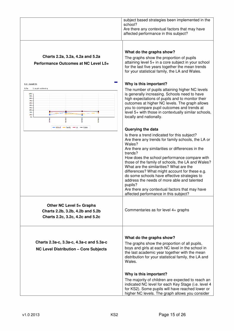
Charts 2.2a, 3.2a, 4.2a and 5.2a
Performance Outcomes at NC Level L5+
What do the graphs show?
The graphs show the proportion of pupils attaining level 5+ in a core subject in your school for the last five years together the mean trends for your statistical family, the LA and Wales.
Why is this important?
The number of pupils attaining higher NC levels is generally increasing. Schools need to have high expectations of pupils and to monitor their outcomes at higher NC levels. The graph allows you to compare pupil outcomes and trends at level 5+ with those in contextually similar schools, locally and nationally.
Querying the data
Is there a trend indicated for this subject? Are there any trends for family schools, the LA or Wales? Are there any similarities or differences in the trends? How does the school performance compare with those of the family of schools, the LA and Wales? What are the similarities? What are the differences? What might account for these e.g. do some schools have effective strategies to address the needs of more able and talented pupils? Are there any contextual factors that may have affected performance in this subject?
Other NC Level 5+ Graphs
Charts 2.2b, 3.2b, 4.2b and 5.2b
Charts 2.2c, 3.2c, 4.2c and 5.2c
Commentaries as for level 4+ graphs
Charts 2.3a-c, 3.3a-c, 4.3a-c and 5.3a-c
NC Level Distribution – Core Subjects
What do the graphs show?
The graphs show the proportion of all pupils, boys and girls at each NC level in the school in the last academic year together with the mean distribution for your statistical family, the LA and Wales.
Why is this important?
The majority of children are expected to reach an indicated NC level for each Key Stage (i.e. level 4 for KS2). Some pupils will have reached lower or higher NC levels. The graph allows you consider
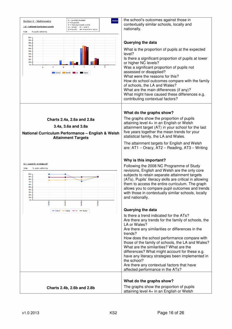
v1.0 2013 KS2 Page 16 of 26
the school’s outcomes against those in contextually similar schools, locally and nationally.
Querying the data
What is the proportion of pupils at the expected level? Is there a significant proportion of pupils at lower or higher NC levels? Was a significant proportion of pupils not assessed or disapplied? What were the reasons for this? How do school outcomes compare with the family of schools, the LA and Wales? What are the main differences (if any)? What might have caused these differences e.g. contributing contextual factors?
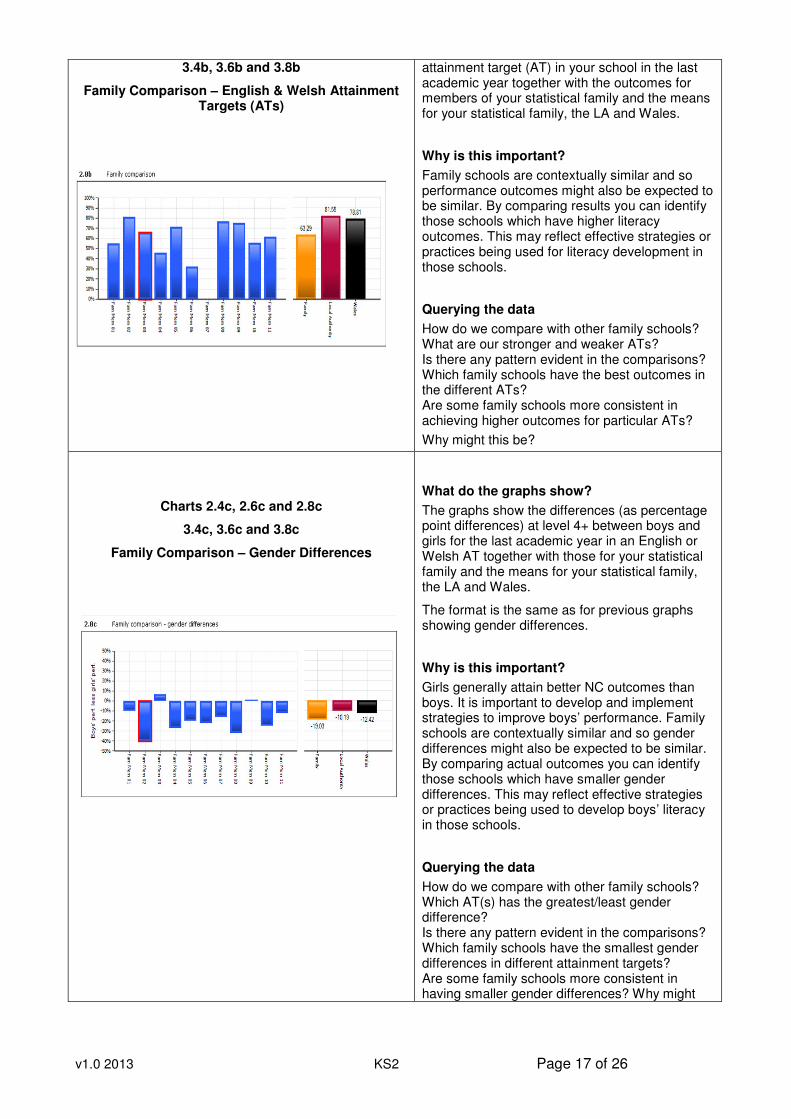
Charts 2.4a, 2.6a and 2.8a
3.4a, 3.6a and 3.8a
National Curriculum Performance – English & Welsh Attainment Targets
What do the graphs show?
The graphs show the proportion of pupils attaining level 4+ in an English or Welsh attainment target (AT) in your school for the last five years together the mean trends for your statistical family, the LA and Wales.
The attainment targets for English and Welsh are: AT1 – Oracy, AT2 – Reading, AT3 – Writing
Why is this important?
Following the 2008 NC Programme of Study revisions, English and Welsh are the only core subjects to retain separate attainment targets (ATs). Pupils’ literacy skills are critical in allowing them to access the entire curriculum. The graph allows you to compare pupil outcomes and trends with those in contextually similar schools, locally and nationally.
Querying the data
Is there a trend indicated for the ATs? Are there any trends for the family of schools, the LA or Wales? Are there any similarities or differences in the trends? How does the school performance compare with those of the family of schools, the LA and Wales? What are the similarities? What are the differences? What might account for these e.g. have any literacy strategies been implemented in the school? Are there any contextual factors that have affected performance in the ATs?
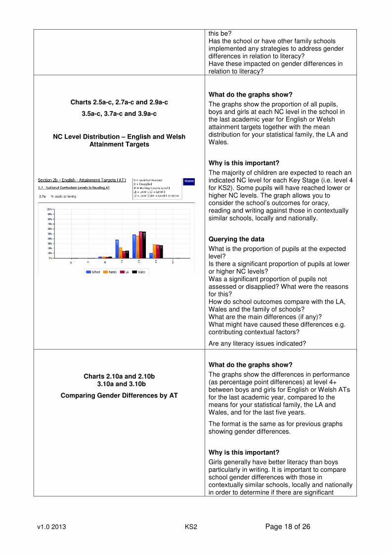
Charts 2.4b, 2.6b and 2.8b
What do the graphs show?
The graphs show the proportion of pupils attaining level 4+ in an English or Welsh
v1.0 2013 KS2 Page 17 of 26
3.4b, 3.6b and 3.8b
Family Comparison – English & Welsh Attainment Targets (ATs)
attainment target (AT) in your school in the last academic year together with the outcomes for members of your statistical family and the means for your statistical family, the LA and Wales.
Why is this important?
Family schools are contextually similar and so performance outcomes might also be expected to be similar. By comparing results you can identify those schools which have higher literacy outcomes. This may reflect effective strategies or practices being used for literacy development in those schools.
Querying the data
How do we compare with other family schools? What are our stronger and weaker ATs? Is there any pattern evident in the comparisons? Which family schools have the best outcomes in the different ATs? Are some family schools more consistent in achieving higher outcomes for particular ATs?
Why might this be?
Charts 2.4c, 2.6c and 2.8c
3.4c, 3.6c and 3.8c
Family Comparison – Gender Differences
What do the graphs show?
The graphs show the differences (as percentage point differences) at level 4+ between boys and girls for the last academic year in an English or Welsh AT together with those for your statistical family and the means for your statistical family, the LA and Wales.
The format is the same as for previous graphs showing gender differences.
Why is this important?
Girls generally attain better NC outcomes than boys. It is important to develop and implement strategies to improve boys’ performance. Family schools are contextually similar and so gender differences might also be expected to be similar. By comparing actual outcomes you can identify those schools which have smaller gender differences. This may reflect effective strategies or practices being used to develop boys’ literacy in those schools.
Querying the data
How do we compare with other family schools? Which AT(s) has the greatest/least gender difference? Is there any pattern evident in the comparisons? Which family schools have the smallest gender differences in different attainment targets? Are some family schools more consistent in having smaller gender differences? Why might
v1.0 2013 KS2 Page 18 of 26
this be? Has the school or have other family schools implemented any strategies to address gender differences in relation to literacy? Have these impacted on gender differences in relation to literacy?
Charts 2.5a-c, 2.7a-c and 2.9a-c
3.5a-c, 3.7a-c and 3.9a-c
NC Level Distribution – English and Welsh Attainment Targets
What do the graphs show?
The graphs show the proportion of all pupils, boys and girls at each NC level in the school in the last academic year for English or Welsh attainment targets together with the mean distribution for your statistical family, the LA and Wales.
Why is this important?
The majority of children are expected to reach an indicated NC level for each Key Stage (i.e. level 4 for KS2). Some pupils will have reached lower or higher NC levels. The graph allows you to consider the school’s outcomes for oracy, reading and writing against those in contextually similar schools, locally and nationally.
Querying the data
What is the proportion of pupils at the expected level? Is there a significant proportion of pupils at lower or higher NC levels? Was a significant proportion of pupils not assessed or disapplied? What were the reasons for this? How do school outcomes compare with the LA, Wales and the family of schools? What are the main differences (if any)? What might have caused these differences e.g. contributing contextual factors?
Are any literacy issues indicated?
Charts 2.10a and 2.10b 3.10a and 3.10b
Comparing Gender Differences by AT
What do the graphs show?
The graphs show the differences in performance (as percentage point differences) at level 4+ between boys and girls for English or Welsh ATs for the last academic year, compared to the means for your statistical family, the LA and Wales, and for the last five years.
The format is the same as for previous graphs showing gender differences.
Why is this important?
Girls generally have better literacy than boys particularly in writing. It is important to compare school gender differences with those in contextually similar schools, locally and nationally in order to determine if there are significant
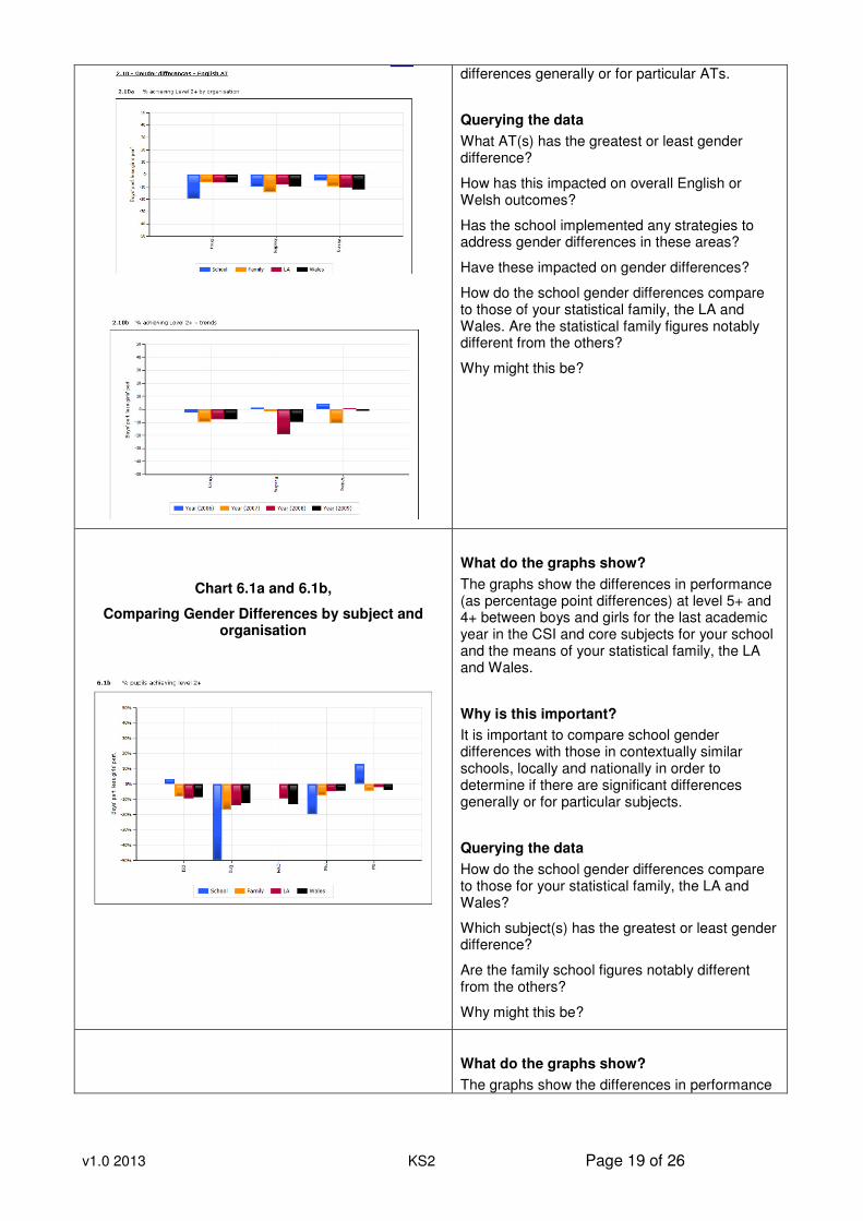
v1.0 2013 KS2 Page 19 of 26
differences generally or for particular ATs.
Querying the data
What AT(s) has the greatest or least gender difference?
How has this impacted on overall English or Welsh outcomes?
Has the school implemented any strategies to address gender differences in these areas?
Have these impacted on gender differences?
How do the school gender differences compare to those of your statistical family, the LA and Wales. Are the statistical family figures notably different from the others?
Why might this be?
Chart 6.1a and 6.1b,
Comparing Gender Differences by subject and organisation
What do the graphs show?
The graphs show the differences in performance (as percentage point differences) at level 5+ and 4+ between boys and girls for the last academic year in the CSI and core subjects for your school and the means of your statistical family, the LA and Wales.
Why is this important?
It is important to compare school gender differences with those in contextually similar schools, locally and nationally in order to determine if there are significant differences generally or for particular subjects.
Querying the data
How do the school gender differences compare to those for your statistical family, the LA and Wales?
Which subject(s) has the greatest or least gender difference?
Are the family school figures notably different from the others?
Why might this be?
What do the graphs show?
The graphs show the differences in performance
v1.0 2013 KS2 Page 20 of 26
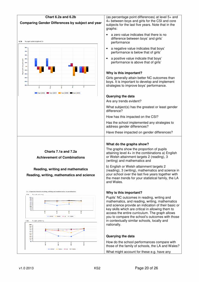
Chart 6.2a and 6.2b
Comparing Gender Differences by subject and year
(as percentage point differences) at level 5+ and 4+ between boys and girls for the CSI and core subjects for the last five years. Note that in the graphs:
• a zero value indicates that there is no difference between boys’ and girls’ performance
• a negative value indicates that boys’ performance is below that of girls’
• a positive value indicate that boys’ performance is above that of girls’
Why is this important?
Girls generally attain better NC outcomes than boys. It is important to develop and implement strategies to improve boys’ performance.
Querying the data
Are any trends evident?
What subject(s) has the greatest or least gender difference?
How has this impacted on the CSI?
Has the school implemented any strategies to address gender differences?
Have these impacted on gender differences?
Charts 7.1a and 7.2a
Achievement of Combinations
Reading, writing and mathematics
Reading, writing, mathematics and science
What do the graphs show?
The graphs show the proportion of pupils attaining level 4+ in the combinations a) English or Welsh attainment targets 2 (reading), 3 (writing) and mathematics and
b) English or Welsh attainment targets 2 (reading), 3 (writing), mathematics and science in your school over the last five years together with the mean trends for your statistical family, the LA and Wales.
Why is this important?
Pupils’ NC outcomes in reading, writing and mathematics, and reading, writing, mathematics and science provide an indication of their basic or key skills which are critical in allowing them to access the entire curriculum. The graph allows you to compare the school’s outcomes with those in contextually similar schools, locally and nationally.
Querying the data
How do the school performances compare with those of the family of schools, the LA and Wales?
What might account for these e.g. have any
v1.0 2013 KS2 Page 21 of 26
specific literacy, numeracy or basic skills strategies been implemented in the school?
Have these impacted upon pupil outcomes?
Are there any contextual factors that may have affected performance in these areas?
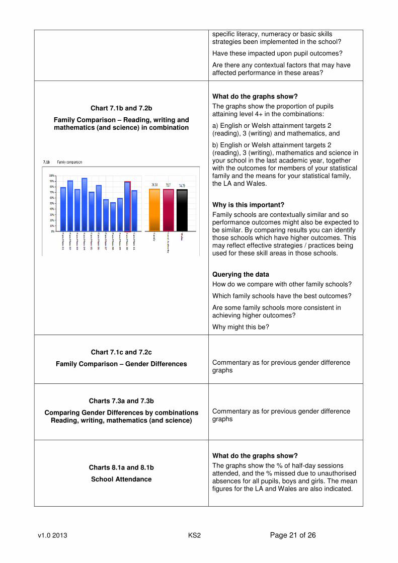
Chart 7.1b and 7.2b
Family Comparison – Reading, writing and mathematics (and science) in combination
What do the graphs show?
The graphs show the proportion of pupils attaining level 4+ in the combinations:
a) English or Welsh attainment targets 2 (reading), 3 (writing) and mathematics, and
b) English or Welsh attainment targets 2 (reading), 3 (writing), mathematics and science in your school in the last academic year, together with the outcomes for members of your statistical family and the means for your statistical family, the LA and Wales.
Why is this important?
Family schools are contextually similar and so performance outcomes might also be expected to be similar. By comparing results you can identify those schools which have higher outcomes. This may reflect effective strategies / practices being used for these skill areas in those schools.
Querying the data
How do we compare with other family schools?
Which family schools have the best outcomes?
Are some family schools more consistent in achieving higher outcomes?
Why might this be?
Chart 7.1c and 7.2c
Family Comparison – Gender Differences
Commentary as for previous gender difference graphs
Charts 7.3a and 7.3b
Comparing Gender Differences by combinations Reading, writing, mathematics (and science)
Commentary as for previous gender difference graphs
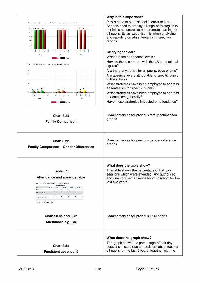
Charts 8.1a and 8.1b
School Attendance
What do the graphs show?
The graphs show the % of half-day sessions attended, and the % missed due to unauthorised absences for all pupils, boys and girls. The mean figures for the LA and Wales are also indicated.
v1.0 2013 KS2 Page 22 of 26
Why is this important?
Pupils need to be in school in order to learn. Schools need to employ a range of strategies to minimise absenteeism and promote learning for all pupils. Estyn recognise this when analysing and reporting on absenteeism in inspection reports.
Querying the data
What are the attendance levels?
How do these compare with the LA and national figures?
Are there any trends for all pupils, boys or girls?
Are absence levels attributable to specific pupils in the school?
What strategies have been employed to address absenteeism for specific pupils?
What strategies have been employed to address absenteeism generally?
Have these strategies impacted on attendance?
Chart 8.2a
Family Comparison
Commentary as for previous family comparison graphs
Chart 8.2b
Family Comparison – Gender Differences
Commentary as for previous gender difference graphs
Table 8.3
Attendance and absence table
What does the table show?
The table shows the percentage of half day sessions which were attended, and authorised and unauthorised absence for your school for the last five years.
Charts 8.4a and 8.4b
Attendance by FSM
Commentary as for previous FSM charts
Chart 8.5a
Persistent absence %
What does the graph show?
The graph shows the percentage of half-day sessions missed due to persistent absentees for all pupils for the last 5 years, together with the
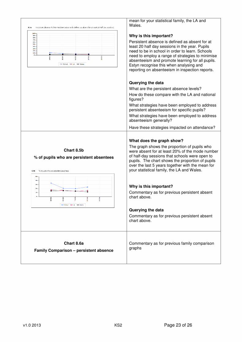
v1.0 2013 KS2 Page 23 of 26
mean for your statistical family, the LA and Wales.
Why is this important?
Persistent absence is defined as absent for at least 20 half day sessions in the year. Pupils need to be in school in order to learn. Schools need to employ a range of strategies to minimise absenteeism and promote learning for all pupils. Estyn recognise this when analysing and reporting on absenteeism in inspection reports.
Querying the data
What are the persistent absence levels?
How do these compare with the LA and national figures?
What strategies have been employed to address persistent absenteeism for specific pupils?
What strategies have been employed to address absenteeism generally?
Have these strategies impacted on attendance?
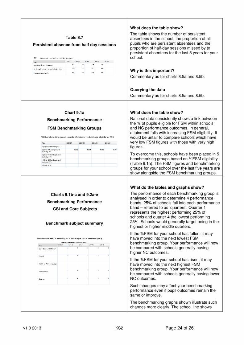
Chart 8.5b
% of pupils who are persistent absentees
What does the graph show?
The graph shows the proportion of pupils who were absent for at least 20% of the mode number of half-day sessions that schools were open to pupils. The chart shows the proportion of pupils over the last 5 years together with the mean for your statistical family, the LA and Wales.
Why is this important?
Commentary as for previous persistent absent chart above.
Querying the data
Commentary as for previous persistent absent chart above.
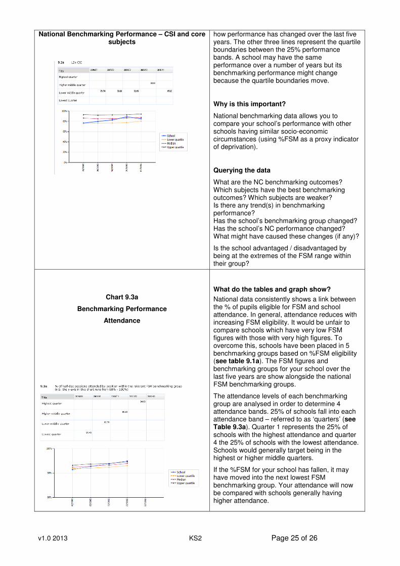
Chart 8.6a
Family Comparison – persistent absence
Commentary as for previous family comparison graphs
v1.0 2013 KS2 Page 24 of 26
Table 8.7
Persistent absence from half day sessions
What does the table show?
The table shows the number of persistent absentees in the school, the proportion of all pupils who are persistent absentees and the proportion of half-day sessions missed by to persistent absentees for the last 5 years for your school.
Why is this important?
Commentary as for charts 8.5a and 8.5b.
Querying the data
Commentary as for charts 8.5a and 8.5b.
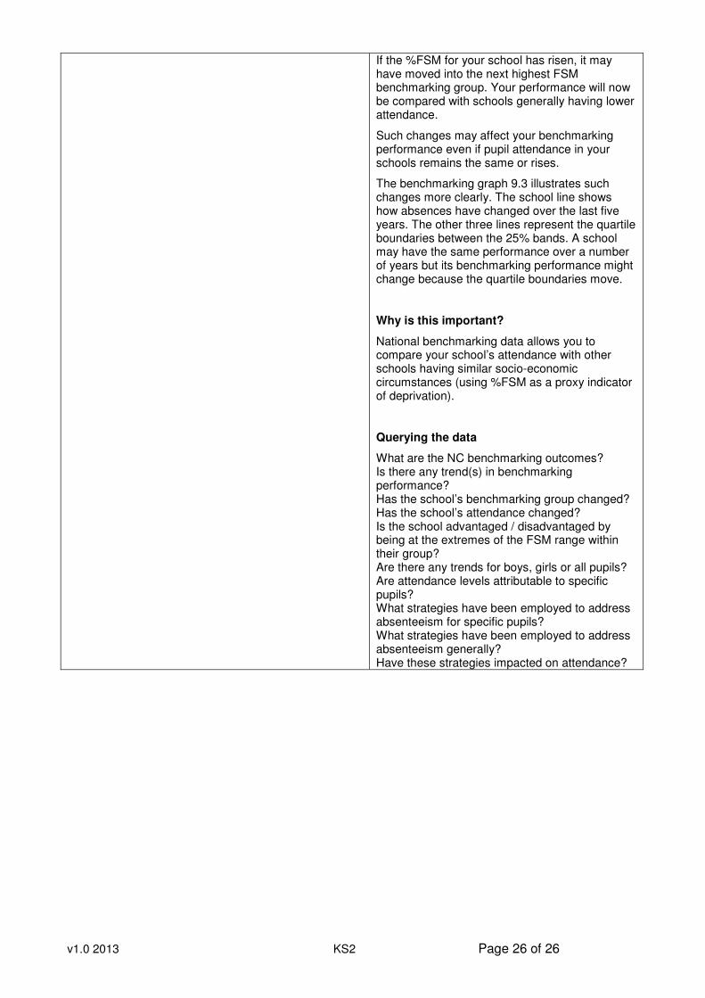
Chart 9.1a
Benchmarking Performance
FSM Benchmarking Groups
What does the table show?
National data consistently shows a link between the % of pupils eligible for FSM within schools and NC performance outcomes. In general, attainment falls with increasing FSM eligibility. It would be unfair to compare schools which have very low FSM figures with those with very high figures.
To overcome this, schools have been placed in 5 benchmarking groups based on %FSM eligibility (Table 9.1a). The FSM figures and benchmarking groups for your school over the last five years are show alongside the FSM benchmarking groups.
Charts 9.1b-c and 9.2a-e
Benchmarking Performance
CSI and Core Subjects
Benchmark subject summary
What do the tables and graphs show?
The performance of each benchmarking group is analysed in order to determine 4 performance bands. 25% of schools fall into each performance band – referred to as ‘quarters’. Quarter 1 represents the highest performing 25% of schools and quarter 4 the lowest performing 25%. Schools would generally target being in the highest or higher middle quarters.
If the %FSM for your school has fallen, it may have moved into the next lowest FSM benchmarking group. Your performance will now be compared with schools generally having higher NC outcomes.
If the %FSM for your school has risen, it may have moved into the next highest FSM benchmarking group. Your performance will now be compared with schools generally having lower NC outcomes.
Such changes may affect your benchmarking performance even if pupil outcomes remain the same or improve.
The benchmarking graphs shown illustrate such changes more clearly. The school line shows
v1.0 2013 KS2 Page 25 of 26
National Benchmarking Performance – CSI and core subjects
how performance has changed over the last five years. The other three lines represent the quartile boundaries between the 25% performance bands. A school may have the same performance over a number of years but its benchmarking performance might change because the quartile boundaries move.
Why is this important?
National benchmarking data allows you to compare your school’s performance with other schools having similar socio-economic circumstances (using %FSM as a proxy indicator of deprivation).
Querying the data
What are the NC benchmarking outcomes? Which subjects have the best benchmarking outcomes? Which subjects are weaker? Is there any trend(s) in benchmarking performance? Has the school’s benchmarking group changed? Has the school’s NC performance changed? What might have caused these changes (if any)?
Is the school advantaged / disadvantaged by being at the extremes of the FSM range within their group?
Chart 9.3a
Benchmarking Performance
Attendance
What do the tables and graph show?
National data consistently shows a link between the % of pupils eligible for FSM and school attendance. In general, attendance reduces with increasing FSM eligibility. It would be unfair to compare schools which have very low FSM figures with those with very high figures. To overcome this, schools have been placed in 5 benchmarking groups based on %FSM eligibility (see table 9.1a). The FSM figures and benchmarking groups for your school over the last five years are show alongside the national FSM benchmarking groups.
The attendance levels of each benchmarking group are analysed in order to determine 4 attendance bands. 25% of schools fall into each attendance band – referred to as ‘quarters’ (see Table 9.3a). Quarter 1 represents the 25% of schools with the highest attendance and quarter 4 the 25% of schools with the lowest attendance. Schools would generally target being in the highest or higher middle quarters.
If the %FSM for your school has fallen, it may have moved into the next lowest FSM benchmarking group. Your attendance will now be compared with schools generally having higher attendance.
v1.0 2013 KS2 Page 26 of 26
If the %FSM for your school has risen, it may have moved into the next highest FSM benchmarking group. Your performance will now be compared with schools generally having lower attendance.
Such changes may affect your benchmarking performance even if pupil attendance in your schools remains the same or rises.
The benchmarking graph 9.3 illustrates such changes more clearly. The school line shows how absences have changed over the last five years. The other three lines represent the quartile boundaries between the 25% bands. A school may have the same performance over a number of years but its benchmarking performance might change because the quartile boundaries move.
Why is this important?
National benchmarking data allows you to compare your school’s attendance with other schools having similar socio-economic circumstances (using %FSM as a proxy indicator of deprivation).
Querying the data
What are the NC benchmarking outcomes? Is there any trend(s) in benchmarking performance? Has the school’s benchmarking group changed? Has the school’s attendance changed? Is the school advantaged / disadvantaged by being at the extremes of the FSM range within their group? Are there any trends for boys, girls or all pupils? Are attendance levels attributable to specific pupils? What strategies have been employed to address absenteeism for specific pupils? What strategies have been employed to address absenteeism generally? Have these strategies impacted on attendance?