Embed Size (px)
Citation preview
8/12/2019 Aldus Manutius
http://slidepdf.com/reader/full/aldus-manutius 1/7
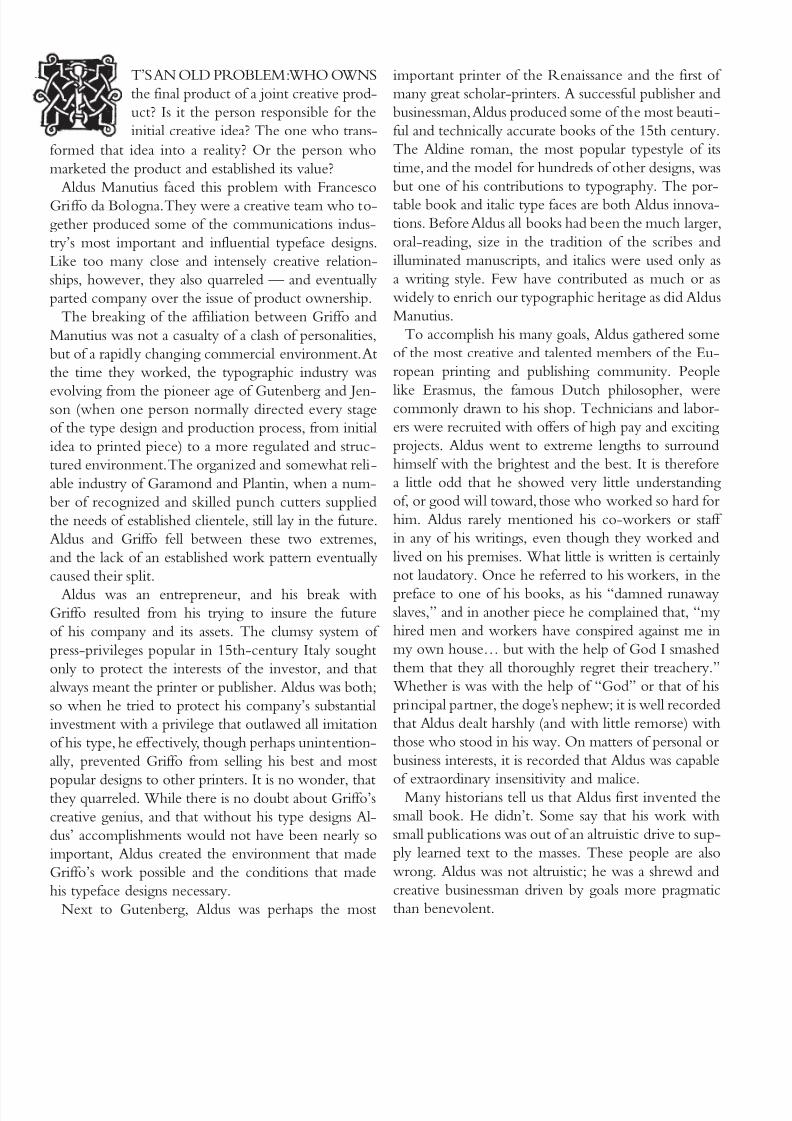
ALDUS MANUTIUSBY ALLAN HALEY
REPRINTED FROM
U&
lc.February 1986
Woodcut portrait of Aldus Manutius.
8/12/2019 Aldus Manutius
http://slidepdf.com/reader/full/aldus-manutius 2/7
8/12/2019 Aldus Manutius
http://slidepdf.com/reader/full/aldus-manutius 3/7
There were small books prior to Aldus’, but the ma-
jority of printed material was large; the kind meant for
libraries, bookstands, and reading aloud. When Aldus
began his work, the printing industry was less than 50
years old and still bound by the traditions of the scribes
and manuscripts. Small books, or octavos (made from
single sheets folded three times, each sheet forming
eight leaves, or sixteen pages, of about 6 × 9 inches),
were published prior to Aldus. As early as 1470, over 30
years before Aldus’ first work, Jenson had printed some
small religious texts. There were others, but one very
important aspect separates those earlier books from
Aldus’ small texts: all the previous editions were of a
religious or devotional nature. It was felt that prayer
was the only occasion which required an individual
to carry a book on one’s person. The scholar was ex-
pected to read from a large book sitting on a lectern
Aldus’ originality lay in applying what had previously
been a specialized book form to a new and wider field
Aldus was a marketeer, not a humanitarian.
The story has evolved that Aldus created the small
book for those who could not previously afford lit-
erature. The logic is that his smaller books cost less
to produce, and that these reduced costs were passed
along to the consumer. Aldus never said that his books
were cheap. He said on many occasions that they were
beautiful, that they were technically perfect, and that
they were convenient — but never that they were in-
expensive or meant for a mass audience. It has been
suggested that Aldus would probably “writhe in his
grave” if he knew that many printing scholars heralded
him as the originator of the paperback.
Aldus worked for the wealthy and the successful. Hisoctavos were intended for busy people of affairs; those
who criss-crossed 15th- and 16th-century Europe on
the errands of nobility and business of state. Aldus cre-
ated his small books for the secular intellectuals of Re-
naissance Europe: the people who filled the growing
number of universities to prepare for employment as
government officials and public servants. These were
the people of the “educational revolution” in 16th
century Europe.
Even though Aldus’ small books were not intended
to expand the knowledge of the masses, it still remainsthat they were a vital development in the emancipa-
tion of learning. The “fairy tale” of books for every-
body may not be true, but the fact of his small books’
importance, worth, and influence certainly is. For this
alone Aldus could be remembered and revered. He
made reading convenient and learning “user friendly.”
He set a precedence for personal books of high caliber
And he created texts which were portable, yet lacked
none of the beauty, or quality, of the larger library edi-
tions.Directly tied to the typographic fairy tale of the
invention of the portable book is the myth of Aldus
invention of italic type. The story is told
that Aldus paid Griffo to develop a cur-
sive type that would save space in his small
books. It is said that Aldus’ goal was to cut
paper costs and thus make his publications
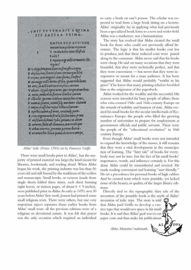
Aldus’ italic (Venice 1501) cut by Francesco Griffo.
Aldus Manutius’ trademark.
8/12/2019 Aldus Manutius
http://slidepdf.com/reader/full/aldus-manutius 4/7
cheaper. Then, as now, paper was expensive, but saving
paper was not Aldus’s goal in creating italic type.
Early 16th-century printers spoke of “writing” a
typeset page as if it were a letter to a friend. As this
somewhat unusual terminology, by today’s standards,
implies, the typeface provided a much closer link be-
tween printer and reader than it does today. Particu-
lar styles of type were reserved for specific groups of
readers. Aldus was not so much trying to save space, as
appeal to the educated, worldly, and wealthy.
Aldus’ italic evolved from a popular writing style of
the educated. Its heritage can be traced back to Nic-
colo de Niccoli, an Italian scholar of the early 15th
century. De Niccoli started to oblique and add flourish
to his letters when, it is said, “he wished to write in a
faster, more relaxed fashion than usual.” By mid-cen-
tury other scholars began to imitate his writing style,
and by the late 1400s, italic became the official writingstyle of the learned and professional scribes of south-
ern Italy. In fact, it came to be called cancellaresca be-
cause of the amount of work done in this hand for the
city chancelleries.
The cursive style of writing had been developed by
the same scholars and learned government officials for
whom Aldus created his books. In adapting it to print,
he and Griffo were making their books more com-
fortable for their intended audience. Today, we would
call this creative marketing. The important thing is that
Aldus took a somewhat exclusive writing style (almostan art form) and turned it into a typeface, — a product
that would appeal to, and benefit, a growing and eager
audience.
Like any astute business person, Aldus was very aware
of the potential value of this product. And in an effort
to defend his exclusive right to use it, he sought the
first known privileges on an entire type style. This was
breaking new ground; previously only specific titles
were protected, but Aldus had friends in high places.
In 1502, the Venetian senate granted his italics officialprotection. Not satisfied, Aldus sought additional, and
what he believed was maximum, security from theft.
He even had his types protected by papal decree. Aldus
was one of the best protected publishers and type de-
velopers of his time, and perhaps for all time.
Unfortunately, this was to little avail. Aldus’ italics
were almost immediately copied. First by Griffo, who
felt that the design was, after all, his; later by contem-
porary Italian and French printers. The Italians called
the design “Aldino,” at least referring to its originator.
By others it was called, after Italy, “italic.” Where he
could, Aldus fought those who copied his design, some
through legal means, others through tough, aggressive
business tactics.
In both he was swift and ruthless. Unfortunately, he
was also for the most part, unsuccessful. His italics be-
came the model for generations of cursive designs. Al-
dus gave the typographic community one of its most
important and beautiful tools — but not entirely will-
ingly.
For all Aldus’ efforts to protect his italic font it is
interesting that he never sought to protect any of his
roman fonts. In fact, from his lack of promoting the
books that he set in these designs, it can be gathered
that he cared little for them at all.Perhaps this was because, with few exceptions,
in 15th-century Italy little work of importance was
printed in roman type. Most scholarly work was set
in Greek. (Aldus was very proud and protective of his
Greek type.)
He used his roman types seldom, and only for piec-
es sponsored by wealthy clients or academic friends.
Many of his roman types were, as a consequence, con-
sidered rather poor in design. All but one.
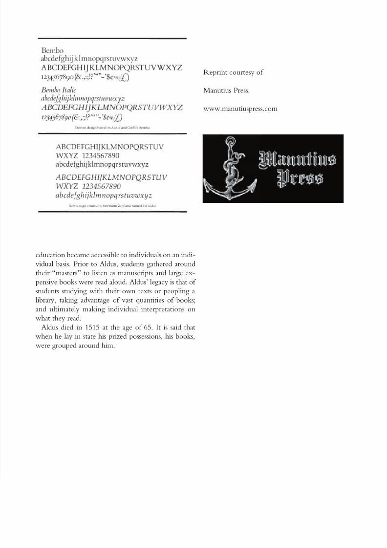
In February of 1496, Aldus published an otherwise
insignificant essay by the Italian scholar, Pietro Bembo.The type used for the text became popular instantly
and so famous that it influenced typeface design for
generations. Posterity has come to regard the Bembo
type as Aldus’ and Griffo’s masterpiece.
The design was lighter and more harmonious in
weight than earlier romans, making text set in it invit-
ing, and certainly easier to read. The basic design was
further enhanced by the introduction, three years later,
of a font of corresponding capital letters. (The Bembo
roman was initially produced as only a lowercase fontwith capitals pulled from other faces). The capitals are
not quite as tall as the ascenders and blend exception-
ally well with the lowercase. Bembo has a more pro-
nounced weight stress than previous romans; it is more
even in color, and the serifs are lighter and more deli-
cate. Aldus’ and Griffo’s original Bembo design begins
to look like the romans we use today. This face, which
8/12/2019 Aldus Manutius
http://slidepdf.com/reader/full/aldus-manutius 5/7
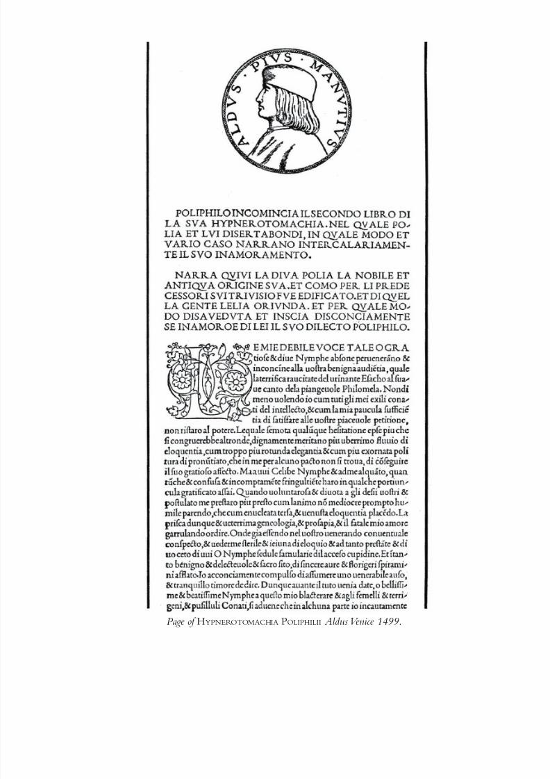
Page of H YPNEROTOMACHIA POLIPHILII Aldus Venice 1499.
8/12/2019 Aldus Manutius
http://slidepdf.com/reader/full/aldus-manutius 6/7
was modestly launched in a 60-page favor to a friend,
and which became eminently popular in Italy, soon
found its way into France. The design was brought to
the attention of Garamond, the famous French type-
founder, and through his efforts to duplicate it the
design eventually spread its influence into Germany,
Holland, and the rest of Europe. The Aldine roman was
to become the foundation of new typeface designs for
hundreds of years.
Aldus entered printing rather late in life—after age
40. There is much conjecture among type scholars as
to why Aldus left a life of comparative ease as a suc-
cessful scholar with a noble constituency; for one of
toil, labor, and the financial uncertainty of establishing
a printing press and publishing business.
Little is said of Aldus in history books, except those
dealing with a specialized field of Venetian or Italian life
of the 15th and 16th centuries. Yet it is said that with-out him, or someone like him, the Renaissance in Italy
and Europe would not have been so rapid. It was Aldus
that put the classics into the hands of the new middle
class, which had become wealthy and sought the same
privileges and cultural opportunities for themselves as
those possessed by the nobility. Aldus produced well
over 1,200 titles (some still in existence).
If you were to ask Aldus, he would have told you
that publishing the Greek classics was his most impor-
tant accomplishment. Over 90 percent of his produc-
tion was devoted to this area. It is even said that in hisshop, he made a rule that nothing but Greek should
be spoken during the working day in order to more
completely create a classical atmosphere. Aldus’ con-
tributions to the heritage of printing and typography
go far beyond the publishing of Greek texts. They are
both numerous and conspicuous. He was an eminent
scholar-printer, one of the first, and one of the most
influential. There were others who were more com-
mercially successful, but few that have had the lasting
impact of his Dolphin Press. His prestige grew almostspontaneously. It survived attacks in his lifetime, and
not only survived, but flourished, in the four and a half
centuries since his death.
His roman type, which served to inspire the work of
Garamond, and countless other type designers, must
be recorded as a milestone in typographic achieve-
ment. Few typeface designs have had such a profound
and long-lasting influence on succeeding typeface de-
velopment efforts.
The Aldine italic, although it is fashionable to criti-
cize the design by current standards, became the modelfor most subsequent italic types. When first shown, it
met with great and almost instant success. True, its cre-
ation was motivated more by business than altruistic
reasons; but the final product displaced all previously
designed cursives, and added an important, valuable
tool to typographic communication.
As an advocate of education and a catalyst of so-
cial improvement, Aldus holds a firm position. Even
though his books were not produced as inexpensive
volumes for the less fortunate reader, his decision to
enter the printing and publishing trade, and to give upthe secure and comfortable life of a well-patronized
scholar, must have been arrived at out of a goal to bring
education and learning to a wider audience. His work
meant that eventually students would no longer have
to rely on manuscripts and libraries of the wealthy for
inspiration and guidance. Because of Aldus’ work that
dependence became a thing of the past. The process of
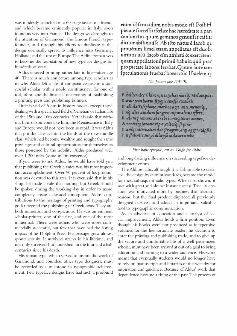
The Jenson face (1470),
First italic typeface, cut by Griffo for Aldus.
8/12/2019 Aldus Manutius
http://slidepdf.com/reader/full/aldus-manutius 7/7
education became accessible to individuals on an indi-
vidual basis. Prior to Aldus, students gathered around
their “masters” to listen as manuscripts and large ex-
pensive books were read aloud. Aldus’ legacy is that of
students studying with their own texts or peopling a
library, taking advantage of vast quantities of books;
and ultimately making individual interpretations on
what they read.
Aldus died in 1515 at the age of 65. It is said that
when he lay in state his prized possessions, his books,
were grouped around him.
Reprint courtesy of
Manutius Press.
www.manutiuspress.com


![warburg.sas.ac.uk · Symbolum Apostolum. Evangelium Johannis [fragment]. Pythagoras, Aureaverba. Pseudo-Phocylides, Moralia [all Greek and Latin] Venice: Aldus Manutius, Romanus,](https://img.pdfslide.us/doc/110x75/5bcca86e09d3f218478bdde5/-symbolum-apostolum-evangelium-johannis-fragment-pythagoras-aureaverba.jpg)