Embed Size (px)
Citation preview

Agricultural Statistics and
Climate Change
8th Edition August 2017

3
Contents
National Statistics
Introduction
Introduction; Purpose of this publication: Data sources: Geographic coverage: Comparisons over time.
Summary - Greenhouse gas emissions from agriculture: a framework of leading indicators
Overview; Table 1: Indicator summaries.
Section 1 - Emissions from agriculture
UK agricultural sector estimated emissions: Drivers of emissions; Total emissions; Nitrous oxide
emissions; Methane emissions; Carbon dioxide emissions; Uncertainty in emissions.
Section 2 - Intermediate outcomes and contextual factors
Background Information; Headline measures of agricultural input, output and productivity; Drivers of
change in productivity in the context of greenhouse gas emissions; Contextual factors - Livestock
numbers and areas of key crops; Dairy; Beef; Sheep; Pigs; Poultry; Land and nutrient use; Fuel use;
Contextual factors - Prices of inputs and outputs; Trends in UKs ability to meet domestic demand and
contribute to the international market.
Section 3 - Farmer attitudes and uptake of on-farm mitigation measures
Background Information; Farmer attitudes and views; Uptake of on-farm measures.
Section 4 - Emerging evidence
Ongoing Research Projects; The Greenhouse Gas Platform.
Section 5 - International comparisons
International comparisons of GHG emissions per unit of agricultural production; International
comparisons of productivity; Yields and greenhouse gas risk factors - Cereals; Milk.
Appendix
Glossary

4
National Statistics
The following statistics are “National Statistics” (official statistics that comply with
the National Statistics code of practice).
Summary - Greenhouse gas emissions from agriculture: a framework of leading indicators
Indicator 5: beef and sheep breeding regimes.
Indicator 6: ratio of dairy cow feed production to milk production.
Indicator 7: feed conversion ratio for table birds.
Indicator 8: manufactured fertiliser application.
Section 1 - Emissions from agriculture
1.1, 1.2, 1.3, 1.4
Section 2 - Intermediate outcomes and contextual factors
2.1, 2.2, 2.3
2.4 (excluding longevity and fertility and animal health)
2.5 (excluding age at which cattle under 4 years are slaughtered, longevity and fertility and animal
health)
2.6 (excluding surviving lamb percentage)
2.7 (excluding feed conversion ratio of the fattening herd and live weight gain of rearing and finishing
herds, kilogrammes weaned per sow and pig mortality)
2.8, 2.9 (excluding soil nitrogen balance)
2.10, 2.11
Section 3 - Farmer attitudes and up take of on-farm mitigation measures
3.1, 3.2
Section 4 - Emerging Evidence
No data in this section are National Statistics
Section 5 - International Comparisons
No data in this section are National Statistics Further information on National Statistics can be found on the UK Statistics Authority website at: http://www.statisticsauthority.gov.uk/

5
Introduction
This is the eighth edition of Agricultural Statistics and Climate Change. This edition includes links to
the results from the 2017 Farm Practices Survey, the 2016 British Survey of Fertiliser Practice and
updates the indicator framework monitoring greenhouse gas emissions from agriculture. Other charts
and tables have also been updated where new data are available.
In line with the requirements set out in the Climate Change Act 2008 and as part of international
obligations, the UK Government is committed to adopting policies that will reduce greenhouse gas
(GHG) emissions across the economy by at least 80%, from 1990 levels, by 2050. Agriculture will
need to play its part in this reduction, but faces unique challenges in that action to reduce GHG
emissions has to be considered in the context of long-term policy debates around food security, land
use and natural resources. A decline in agricultural activity in the UK may well lead to a decline in
domestic GHG emissions (or vice versa), but such activity is also driven by a complex interaction of
subsidies, regulation, and international markets, as well as by producer, retailer and consumer
preferences. As in other sectors, it would not make sense to drive down emissions from UK
agriculture by relying more on the import of products that are at least as GHG intensive: this would
effectively export the emissions resulting from food consumption, causing “carbon leakage”.
However, there are measures that farmers can implement now that would lower GHG emissions at
minimal or no extra cost and indeed would also be positive from a farm business case. The
Government believes that it is right for the agricultural industry to take responsibility for reducing its
emissions and so has encouraged an industry partnership to lead in tackling the challenge. The
Agriculture Industry GHG Action Plan: Framework for Action (published in February 2010) outlined
how reductions could be made through greater resource efficiency, generally involving changes in
farming practice which are also good in terms of business operations. Examples include nutrient
management (through efficient use of fertilisers or slurry / manures) and feed efficiency as part of
good animal husbandry. The GHG Action Plan is now one of several industry led initiatives working
within the Campaign for the Farmed Environment1.
The individual sector-bodies are also taking action to reduce emissions through environmental
product roadmaps2. The Dairy, Beef and Lamb, and Pig meat product roadmaps all encourage
farmers to employ better management techniques and farming practices. While work by the
Agricultural and Horticultural Development Board on the Farm Scale Resource Use Efficiency
1 http://www.cfeonline.org.uk/
2 Down to Earth - The Beef and Sheep Roadmap Phase 3:
https://www.google.com/url?q=http://www.eblex.org.uk/wp/wp-content/uploads/2013/04/roadmap_3_-
_down_to_earth_180112-final-
report.pdf&sa=U&ei=uJdwU46WMoPIsASxhoKABA&ved=0CAYQFjAB&client=internal-uds-
cse&usg=AFQjCNHZZx62oOPqefUngdNcSJorf9ptUQ
Dairy Roadmap - our route towards environmental success, DairyCo. 9 May 2011
http://www.dairyco.net/news/press-releases/may-2011/dairy-industry-on-route-to-environmental-success.aspx
Dairy Roadmap – Environmental Sustainability Report 2013
http://www.dairyco.org.uk/resources-library/research-development/environment/dairy-roadmap-2013 /
Advancing together - a roadmap for the English Pig industry - The British Pig Executive (BPEX). 27 April 2011
Positive Progress - an update on the roadmap for the environmental sustainability of the English Pig industry -
The British Pig Executive (BPEX) 21 January 2014 http://www.bpex.org.uk/environment-hub/climate-
change/PigIndustryRoadmap.aspx

6
Calculator3 looks to build awareness on the way farm management decisions can impact on the
environment and the economy.
During 2012, Defra, working collaboratively with a range of stakeholders, carried out a review of
progress in reducing GHG emissions from agriculture. The final report4, acknowledged the progress
made by the industry so far and concluded that the overall ambition of reducing annual GHG
emissions from agriculture by 3 Mt carbon dioxide equivalent by the third carbon budget was
achievable, subject to continued focus and effort by the industry. The report also set out plans for a
further review of progress in 2016.
The 2016 review5, published in February 2017, assesses the performance of the GHG Action Plan
during the period 2012 through to the end of 2015. The review draws on evidence from a range of
government and industry sources to illustrate the activities undertaken as part of the action plan and
examine their effectiveness. It recognises that the GHG Action Plan has helped to drive the uptake
of mitigation methods that have delivered just under a third of the target reduction in emissions. To
achieve the target of 3 Mt CO2e by 2022 the GHG Action Plan has to drive further uptake of mitigation
methods already proving effective. Going forward Defra will continue to work in collaboration with
industry to identify how they can most effectively support them in achieving this target.
Government continues to improve the science base: in partnership with the Devolved Administrations,
the Government has invested over £12 million, over a four and half year period, to strengthen our
understanding of on farm emissions. Improved emissions factors are being incorporated into the UK
agricultural GHG inventory and implementation of the new model is anticipated for the 2017 inventory
submission. When complete, this work should enable greater precision in reporting GHG emissions
from the sector, so that positive changes made to farming practices to reduce GHG emissions will be
properly recognised in the inventory.
Purpose of this publication
This publication brings together existing statistics on agriculture in order to help inform the
understanding of the link between agricultural practices and GHG emissions. It summarises
available statistics that relate directly and indirectly to emissions and links to statistics on farmer
attitudes to climate change mitigation and uptake of mitigation measures. It also incorporates
information on developing research and provides some international comparisons.
Data sources
Data sources are shown on charts/referenced in footnotes. The Glossary provides links to
methodology details of the original data sources.
3 http://www.ahdb.org.uk/projects/ResourceUseEfficiency.aspx
4 The 2012 review report and supporting papers are available on the internet at:
https://www.gov.uk/government/publications/2012-review-of-progress-in-reducing-greenhouse-gas-emissions-
from-english-agriculture
5 The 2016 review is available on the internet at: https://www.gov.uk/government/publications/greenhouse-gas-
action-plan-ghgap-2016-review

7
Geographic coverage
Climate change mitigation in agriculture is a devolved issue, and Defra has policy responsibility for
England. This publication aims to provide measures based on England, however this is not always
possible and in some instances measures are GB or UK based.
Comparisons over time
Data series are shown from 1990 onwards wherever possible. In some instances comparable data
are not available from 1990, and in these cases the closest available year is shown. In summarising
the data ‘long term’ and ‘short term’ comparisons are made6.
6 Here, long term refers to comparisons back to 1990 or the closest year, and short term refers to changes within
the last 5 years

8
Summary: greenhouse gas emissions from
agriculture - a framework of leading indicators
The indicator framework aims to assess progress in reducing greenhouse gas (GHG) emissions whilst
research is undertaken to improve the UK agricultural GHG inventory.
The framework, initially developed as part of the 2012 review of progress in reducing GHG emissions
from English agriculture7, consists of ten key indicators covering farmer attitudes and knowledge, the
uptake of mitigation methods and the GHG emission intensity of production8 in key agricultural
sectors. As far as possible, it reflects the farm practices which are aligned to the Industry’s
Greenhouse Gas Action Plan9 and acknowledges the indicators set out in the Committee on Climate
Change annual progress reports10.
A brief overview of the revised methodology used from 2013 onwards for indicators 2, 9 and 10 is
available at the end of this summary. Detailed indicator assessments which include more information
on data sources, methodology and statistical background can be found on the internet at:
https://www.gov.uk/government/statistical-data-sets/greenhouse-gas-emissions-from-agriculture-
indicators
Note: indicators 2, 9 and 10 (pages 10 and 14) were updated with 2017 data on the 22nd of August
2017.
Overview
For some indicators (such as farmer attitudes) there are limited data currently available to assess long
term trends and the short term suggests little change. Where longer term data are available, a current
assessment shows the overall picture to be mixed. Over the last 10 years there is a positive long
term trend for the soil nitrogen balance (a high level indicator of environmental pressure) and for the
derived manufactured nitrogen use efficiency11 for barley, oilseed rape and sugar beet. For
intermediate outcomes relating to GHG emission intensity10 for the livestock sector there has been
either little overall change in the longer term trend (e.g. feed conversion ratios for poultry) or some
deterioration (e.g. feed conversion ratios for the pig finishing herd). However, when assessed over
the most recent 2 years, the indicators suggest positive trends in the case of intermediate outcomes
relating to pigs, dairy, poultry and some key crops.
Indicators 2, 9 and 10 focus on the uptake of particular mitigation methods (including those relating to
organic fertiliser management and application) and provide a measure of progress towards achieving
the industry’s ambition to reduce agricultural production emissions by 3 Mt CO2 equivalent by 2020
compared to a 2007 baseline. Together these indicators suggest that, by early 2017, a 1.3 Mt CO2
equivalent reduction in GHG had been achieved, around 27% of the estimated maximum technical
potential12,13. A key component has been the uptake of practices relating to nutrient management,
such as the use of fertiliser recommendation systems.
7 https://www.gov.uk/government/publications/2012-review-of-progress-in-reducing-greenhouse-gas-emissions-from-english-agriculture 8 GHG produced per tonne of crop or litre of milk or kilogramme of meat produced. 9 http://www.nfuonline.com/science-environment/climate-change/ghg-emissions--agricultures-action-plan/ 10 http://www.theccc.org.uk/reports/3rd-progress-report http://www.theccc.org.uk/reports/2012-progress-report 11 Calculated as the quantity of crop produced per unit of applied manufactured nitrogen fertiliser. 12 Maximum technical potential is the amount that could be saved if all mitigation potential was enacted
regardless of cost assuming no prior implementation of measures.

9
The current status of each of the individual indicators has been summarised below. Symbols have been used to provide an indication of progress:
Clear improvement Little or no change ≈
Clear deterioration Insufficient or no comparable data …
Methodology 2013 onwards
Indicators 2, 9 and 10 use estimates of potential and achieved GHG emission reductions that have
been calculated using the FARMSCOPER tool developed by ADAS for Defra14. The data feeding into
this model are drawn from a variety of sources including land use and livestock population data from
the June Agricultural Survey. The majority of the data relating to the uptake of the mitigation methods
within these indicators are from Defra’s Farm Practices Survey and the British Survey of Fertiliser
Practice. In 2013, in order to gain a more refined picture of the level of uptake of mitigation
measures, responses from these surveys have, wherever possible, been divided into those from
farms within and outside Nitrate Vulnerable Zones. This was not done for the initial assessment in
November 2012 and changes seen here reflect this improved method rather than any marked
variation in uptake.
Livestock indicators
The indicators focused on livestock give an insight into the efficiency of production where this can
impact on GHG emissions and are intended to be viewed within the context of animal welfare
regulations and legislation. To examine the wider potential implications of GHG mitigation measures,
including animal health and welfare, Defra commissioned research project AC0226 - Quantifying,
monitoring and minimising wider impacts of GHG mitigation measures15.
13 The 2016 assessment includes potential GHG reductions associated to the processing of livestock manures by
anaerobic digestion which were not included in earlier years.
14 C The initial version of Farmscoper was developed by ADAS under Defra projects WQ0106 http://randd.defra.gov.uk/Default.aspx?Menu=Menu&Module=More&Location=None&Completed=0&ProjectID=14421 and FF0204 http://randd.defra.gov.uk/Default.aspx?Menu=Menu&Module=More&Location=None&ProjectID=17635&FromSearch=Y&Publisher=1&SearchText=FF0204&SortString=ProjectCode&SortOrder=Asc&Paging=10#Description . The current version (version 3) used in the analysis here has been further developed and expanded under Defra project SCF0104.: http://randd.defra.gov.uk/Default.aspx?Module=More&Location=None&ProjectID=18702
15http://randd.defra.gov.uk/Default.aspx?Menu=Menu&Module=More&Location=None&ProjectID=17780&FromS
earch=Y&Publisher=1&SearchText=AC0226&SortString=ProjectCode&SortOrder=Asc&Paging=10#Description

10
Table 1: Indicator summaries
Overarching indicators
1 Attitudes & knowledge
Assessment: behaviour change can be a long process. Measuring awareness of the sources of
emissions and intentions to change practice can provide a leading indicator of uptake of mitigation
methods and help to highlight motivations and barriers. However, changing attitudes are not the only
driver for the adoption of mitigation methods; research suggests that business sustainability and
financial implications are important drivers for change.
10% of farmers reported that it was “very important” to consider GHGs when making decisions
relating to their land, crops and livestock and a further 39% thought it “fairly important”, which was
no change on 2016. Just over half of respondents placed little or no importance on considering
GHGs when making decisions or thought their farm did not produce GHG emissions.
Overall, 56% of farmers were taking actions to reduce emissions, again little change on 2016. Of
these, larger farms were more likely to be taking action than smaller farms.
For those farmers not undertaking any actions to reduce GHG emissions, informational barriers
were important, with both lack of information (34%) and lack of clarity about what to do (33%)
cited as barriers by this group. 47% did not believe any action was necessary, which was no
change on 2016.
More details on farmer attitudes can be found in Section 3.1.
Current Status Long term (last 10 years): … Short term (last 2 years): ≈
2 Uptake of mitigation methods
Assessment: there are a wide range of farm practices that can reduce GHG emissions from
agriculture. Monitoring the uptake of these mitigation methods provides an indicator of progress
towards achieving the industry’s ambition to reduce agricultural production emissions by 3 M tCO2
equivalent (e) by 2020 compared to a 2007 baseline.
By February 2017, approximately 0.9 Mt CO2e reduction in GHG emissions had been achieved
from the uptake of the key mitigation methods within this indicator. This compares to an estimated
maximum technical potential16 reduction of 2.8 Mt CO2e were all of these methods to be fully
implemented on relevant farms.
Mitigation methods related to nutrient management (e.g. fertiliser spreader calibration) collectively
provide the greatest potential emissions reduction (0.9 Mt CO2e). By 2017, uptake of these
methods has been assessed to have delivered an estimated GHG reduction of 0.4 Mt CO2e,
around 37% of the maximum technical potential reduction.
More details on uptake of mitigation methods can be found in Section 3.2.
Current Status Long term (last 10 years): … Short term (last 2 years):
≈
16 Maximum technical potential is the amount that could be saved if all mitigation potential was enacted
regardless of cost assuming no prior implementation of measures

11
Overarching indicators
3 Soil nitrogen balance
Assessment: the soil nitrogen balance is a high level indicator of potential environmental pressure
providing a measure of the total loading of nitrogen on agricultural soils. Whilst a shortage of nutrients
can limit the productivity of agricultural soils, a surplus of these nutrients poses a serious
environmental risk. The balances do not estimate the actual losses of nutrients to the environment
(e.g. to water or to air) but significant nutrient surpluses are directly linked with losses to the
environment.
The nitrogen surplus (kg/ha) in England has fallen by 21% since 2000. The main drivers have
been reductions in the application of inorganic (manufactured) fertilisers (particularly to grass) and
manure production (due to lower livestock numbers), partially offset by a reduction in the nitrogen
offtake (particularly forage).
Provisional figures show that the nitrogen balance increased 5% between 2015 and 2016. This
has been driven by a decrease in overall offtake (mainly via harvested crops) while inputs
remained virtually unchanged. The decrease in offtake reflects a reduction in overall harvested
production compared to the high levels seen in 2015. For more details of the soil nitrogen
balance see Section 2.9.1.
Current Status
Long term (last 10 years): Short term (last 2 years): ≈
Sector specific indicators
4 Pig sector: feed conversion ratio for finishing herd (GB)
Assessment: the feed conversion ratio is a measure of the amount of feed required to produce 1
kilogramme of pig live weight. More efficient use of feed has the potential to reduce GHG emissions
intensity17 and improve productivity (see Livestock indicators note at the beginning of summary).
The feed conversion ratio (FCR) for the pig finishing herd deteriorated from around 1995 to 2009,
albeit with some fluctuations, an indication that more feed has been required to produce 1 kg of
pig live weight. This suggests higher levels of GHG emissions from the GB finishing herd over
this period.
Several factors could explain this including the trend towards heavier finishing weights, changes
in production systems and disease. As the FCR is a broad indicator of feed use efficiency and
GHG emissions, it is not possible to separate the effects of different factors (such as type of feed)
on GHG emissions from the finishing herd.
Since 2010 there has been an improvement in the FCR with less feed used to produce 1 kg of pig
live weight. This, coupled with the rise in carcase weights, suggests an improvement in feed use
efficiency and reduction in GHG emissions. More details on the on the pig sector can be found in
Section 2.7.
Current Status Long term (last 10 years): Short term (last 2 years):
17 GHG emitted per tonne of crop, litre of milk or kilogramme of meat produced.

12
Sector specific indicators
5 Grazing livestock sector: beef and sheep breeding regimes
Assessment: the selection of useful traits can help improve herd and flock productivity and efficiency
which can in turn influence GHG emissions intensity18. The Estimated Breeding Value (EBV) is an
estimate of the genetic merit an animal possesses for a given trait or characteristic. The EBV is used
here as a proxy measure for on-farm GHG emissions intensity (see Livestock indicators note at the
beginning of summary).
Overall in 2017, bulls and rams with a high EBV were used at least “most of the time” on 31% of
farms breeding beef cattle and 20% of those breeding lambs. This is virtually no change on 2016
levels.
For farms breeding lambs, uptake on lowland farms was greater than those in Less Favoured
Areas (LFA) (24% and 14% respectively). For farms breeding beef cattle the difference was less
marked with uptake on lowland farms 26% compared to 25% on LFA farms.
There are differences between farm sizes, with uptake greatest on larger farms.
For more details on the beef and sheep sectors see Section 2.5 and Section 2.6.
Current Status
Long term (last 10 years): … Short term (last 2 years):
6 Dairy sector: ratio of dairy cow feed production to milk production
Assessment: using milk yields in conjunction with trends in inputs (such as feed) provides an
indication of GHG emissions19 intensity in the dairy sector. The ratio of dairy cow compound and
blended feed production to milk production is used here as proxy measure for on-farm GHG
emissions intensity (see Livestock indicators note at the beginning of summary). It is recognised
that the picture is complex and this indicator is not ideal. Firstly, it considers production of feed rather
than overall dry matter consumption but perhaps more importantly it does not attempt to assess the
consumption of concentrates produced by on-farm mixing, or of grazed or conserved forage. We will
continue to investigate other data sources to improve this indicator.
Although there have been some fluctuations over the period since 2005 the rate of increase of
compound and blended feed production has outstripped that of average milk yields suggesting an
increase in GHG emissions intensity.
In the shorter term the ratio has fallen, driven by a decrease in feed use, suggesting an improving
emissions intensity for milk production.
More details on the dairy sector can be found in Section 2.4.
Current Status
Long term (last 10 years): Short term (last 2 years):
18 GHG emitted per tonne of crop, litre of milk or kilogramme of meat produced.

13
Sector specific indicators
7 Poultry sector: feed conversion ratio for table birds
Assessment: more efficient use of feed has the potential to increase productivity and reduce GHG
emissions intensity19. The feed conversion ratio (FCR) is a measure of the amount of feed required
(kg) to produce 1 kilogramme of poultrymeat (dressed carcase weight). The indicator provides an
overall measure of feed efficiency. Within this there are differences between production systems and
species. It is used here as a proxy measure for on-farm GHG emissions intensity (see Livestock
indicators note at the beginning of summary).
There was a slight upward trend in the overall FCR for table birds between 2001 and 2008,
suggesting a possible increase in GHG emissions intensity.
The was some improvement in the FCR between 2010 and 2013 and the last two years have
seen an overall improving (downward) trend.
For more details on the poultry sector see Section 2.8.
Current Status
Long term (last 10 years): ≈ Short term (last 2 years):
8 Cereals and other crops: manufactured fertiliser application
Assessment: more efficient use of nitrogen fertilisers has the potential to increase productivity and
reduce risks to the environment. The ratio of the weight of crops produced to the weight of
manufactured nitrogen fertiliser applied provides a proxy measure for the intensity of GHG
emissions20.
Since 2000, there has been little overall change in the apparent nitrogen use efficiency of wheat.
However, the last 2 years have seen some improvements in yields after reductions in recent
years (particularly due to weather conditions in 2012) which has led to more wheat being
produced per tonne of nitrogen applied.
Trends for winter and spring barley are similar to those for wheat. Over the last 10 years the
intensity measure for winter oilseed rape has seen a light upward trend peaking in 2013. The
short term downward trend for sugar beet has been driven by lower yields in 2015 and 2016.
More details on crop production can be found in Section 2.3 and Section 2.9.
Current Status Long term (last 10 years) Short term (last 2 years)
Wheat
Winter barley
Spring barley
Winter oilseed rape
Sugar beet
≈
≈
19 GHG emitted per tonne of crop, litre of milk or kilogramme of meat produced.
14
Sector specific indicators
9 Slurry and manure
Assessment: systems for the management of manure and slurry are relevant to the control of
environmental risks to air and water including GHGs. Monitoring uptake of relevant mitigation
methods provides an indicator of progress towards achieving the industry’s ambition to reduce
agricultural production GHG emissions by 3 Mt CO2 equivalent (e) by 2020 compared to a 2007
baseline.
Estimates indicate that the maximum technical potential21 GHG reduction from uptake of
mitigation methods relating to slurry and manure (which include types of storage, the use of
liquid/solid manure separation techniques and anaerobic digestion (AD) systems) is
approximately 1.5 Mt CO2e.
Uptake of these mitigation methods by February 2017 suggests that the GHG reduction achieved
has been approximately 0.05 Mt CO2e which is a similar level to 2015 and 2016.
Estimates from the Farmscoper tool suggest that the use of manures and slurries for anaerobic
digestion has a GHG reduction potential outweighing that from improved storage of slurries and
manures. However, significant start-up and running costs are barriers to uptake. In 2017, survey
data indicated that 3% of all farms processed slurries for AD; a similar level to 2016 but an
increase on previous years (from 2008) when the level was around 1-2%.
For more details on slurry and manure see Section 2.9.2 and Section 3.2.
Current Status
Long term (last 10 years): … Short term (last 2 years): ≈
10 Organic fertiliser application
Assessment: the form, method and timing of application for organic fertilisers can influence GHG
emissions. Monitoring these factors provides an indicator of progress towards achieving the industry’s
ambition to reduce agricultural production emissions by 3 Mt CO2 equivalent (e) by 2020 compared to
a 2007 baseline.
By February 2017, approximately 0.37 Mt CO2e reduction in GHG emissions had been achieved
from the uptake of the mitigation methods (which include the timing of applications and application
methods) within this indicator20. This compares to an estimated maximum technical potential21
reduction of 0.46 Mt CO2e were all of these methods to be fully implemented on relevant farms.
For more details on organic fertiliser application see Section 2.9.2 and Section 3.2.
Current Status Long term (last 10 years): …
Short term (last 2 years):
20 The assessment of the practices “Do not spread FYM to fields at high risk times” and “Do not spread slurry or
poultry manure at high risk times” have been revised in 2017. Data for 2015 and 2016 have also been updated
to reflect the change and allow a comparison
21 Maximum technical potential is the amount that could be saved if all mitigation potential was enacted
regardless of cost assuming no prior implementation of measures.

15
Section 1: Emissions from agriculture
UK agriculture estimated greenhouse gas emissions
Table 2: UK estimated greenhouse gas emissions for agriculture between 1990 and 2015 22
2015 estimate
(million tonnes CO2 equivalent) % Change since 1990
Total GHG emissions 49.1 -17%
Nitrous oxide 16.3 -15%
Methane 27.7 -15%
Carbon dioxide 5.2 -26%
Drivers of emissions
Drivers of recorded sector emissions: The methodology used to report agricultural emissions has
been predominantly based on the number of livestock animals and the amount of nitrogen-based
fertiliser applied to land. A variety of important factors influence emissions which are not captured by
this methodology (see “Other drivers of emissions” below for details); research23 has been undertaken
to better reflect the position. The results of this research are being incorporated into an upgraded
greenhouse gas (GHG) inventory for agriculture and implementation of the new model is anticipated
for the 2017 inventory submission.
Other drivers of emissions: There are other factors which are not captured in estimated emissions, but
which are likely to affect the true level of emissions. For example, some areas of farming practice will
have an impact, e.g. timing of fertiliser application, efficiency of fertiliser use, feed conversion ratios,
genetic improvements. Some of these relate to efficiency: there have been productivity gains in the
sector, through more efficient use of inputs over the last twenty years and some of these gains will
have had a positive impact, though some may have had a negative impact on emissions. Soil
moisture and pH are also highly important to soil emissions. On a national basis these drivers are
expected to have a subtle, but significant impact, rather than a dramatic impact on the true level of
emissions over the period. On a regional basis, the drivers of soil emissions are likely to have a more
dramatic impact for some land use types.
22 The entire time series is revised each year to take account of methodological improvements in the UK
emissions inventory.
23 www.ghgplatform.org.uk

16
1.1 Total emissions
The chart below provides an overall picture of the level of estimated greenhouse gas (GHG)
emissions from agriculture. In 2015, when compared to total emissions from all sectors, agriculture
was the source of:
10% of total GHG emissions in the UK,
71% of total nitrous oxide emissions,
53% of total methane emissions,
1% of total carbon dioxide emissions.
0.0
10.0
20.0
30.0
40.0
50.0
60.0
70.0
1990 1992 1994 1996 1998 2000 2002 2004 2006 2008 2010 2012 2014
Greenhouse gas emissions from UK agriculture
UK Agriculture: total GHG emissions Nitrous oxide emissions
Methane emissions Carbon dioxide emissions
Source: Department for Business, Energy & Industrial Strategy
Million tonnes carbon dioxide equivalent

17
1.2 Nitrous oxide emissions
Direct emissions of nitrous oxide (N2O) from agricultural soils are estimated for the following: use of
inorganic fertiliser, biological fixation of nitrogen by crops, ploughing in crop residues, cultivation of
histosols (organic soils), spreading animal manures on land and manures dropped by animals grazing
in the field. In addition to these, the following indirect emission sources are estimated: emission of
nitrous oxide from atmospheric deposition of agricultural nitric oxide (NOx) and ammonia (NH3) and
the emission of nitrous oxide from leaching of agricultural nitrate and runoff. Also, nitrous oxide
emissions from manures during storage are calculated for a number of animal waste management
systems.
The fall in estimated nitrous oxide emissions over the last twenty years has been driven by substantial
reductions in the overall application rate for nitrogen fertilisers, particularly to grassland; whilst arable
application rates have remained relatively stable, grassland application rates have reduced. Over this
period, wheat yields have increased, suggesting that the UK is producing more wheat for the same
amount of nitrogen. Further measures relating to the intensity of emissions are covered in Section 2.
0.0
5.0
10.0
15.0
20.0
25.0
1990 1992 1994 1996 1998 2000 2002 2004 2006 2008 2010 2012 2014
Million tonnes carbon dioxide equivalent
Emissions of nitrous oxide from UK agriculture by source
Total nitrous oxide emissions from UK agriculture
Direct soil emissions (a)
Other (b)
(a) Direct soil emissions consists of leaching/ runoff, synthetic fertiliser, manure as an organic fertiliser, atmospheric deposition, improved grassland soils, crop residues, cultivation of organic soils, N-fix crops, deposited manure on pasture (unmanaged).
(b) Other includes: stationary and mobile combustion, wastes and field burning of agricultural wastes. Source: Departmentf for Business, Energy & Industrial Strategy

18
1.3 Methane emissions
Agriculture is estimated to have been the source of 53% of the UK’s methane (CH4) emissions in
2015. Methane is produced as a by-product of enteric fermentation and from the decomposition of
manure under anaerobic conditions. Enteric fermentation is a digestive process whereby feed
constituents are broken down by micro-organisms into simple molecules. Both ruminant animals (e.g.
cattle and sheep), and non-ruminant animals (e.g. pigs and horses) produce methane, although
ruminants are the largest source per unit of feed intake. When manure is stored or treated as a liquid
in a lagoon, pond or tank it tends to decompose anaerobically and produce a significant quantity of
methane. When manure is handled as a solid or when it is deposited on pastures, it tends to
decompose aerobically and little or no methane is produced. Hence the system of manure
management used affects emission rates.
The majority of the fall in estimated methane emissions since 1990 is due to reductions in the
numbers of cattle and sheep in the UK. Measures relating to the GHG emissions intensity of
agriculture are explored in Section 2.
0.0
5.0
10.0
15.0
20.0
25.0
30.0
35.0
1990 1992 1994 1996 1998 2000 2002 2004 2006 2008 2010 2012 2014
Emissions of methane from UK agriculture by source
UK Agriculture: methane emissions Enteric fermentation: cattle
Enteric fermentation: sheep Enteric fermentation: other
Manure management
Million tonnes carbon dioxide equivalent
Source: Department for Business, Energy & Industrial Strategy
19
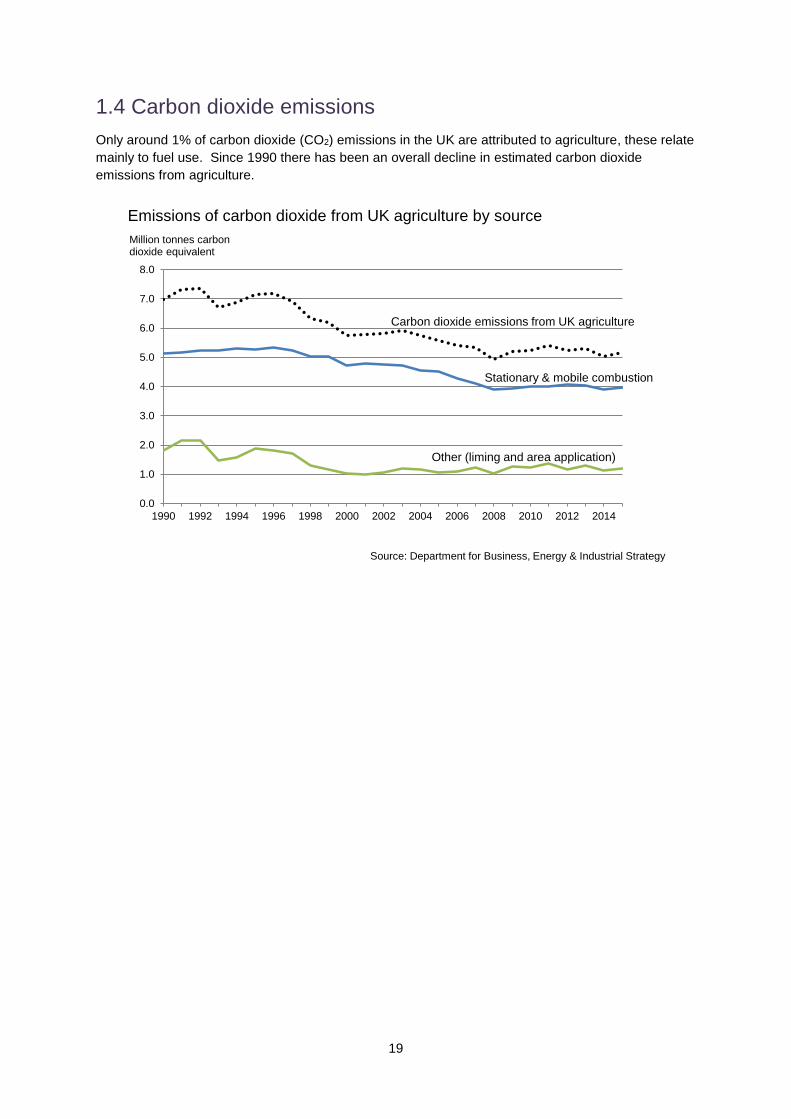
1.4 Carbon dioxide emissions
Only around 1% of carbon dioxide (CO2) emissions in the UK are attributed to agriculture, these relate
mainly to fuel use. Since 1990 there has been an overall decline in estimated carbon dioxide
emissions from agriculture.
0.0
1.0
2.0
3.0
4.0
5.0
6.0
7.0
8.0
1990 1992 1994 1996 1998 2000 2002 2004 2006 2008 2010 2012 2014
Carbon dioxide emissions from UK agriculture
Million tonnes carbon dioxide equivalent
Stationary & mobile combustion
Other (liming and area application)
Source: Department for Business, Energy & Industrial Strategy
Emissions of carbon dioxide from UK agriculture by source

20
1.5 Uncertainty in emissions
There are relatively large uncertainties in estimating agricultural emissions as they are generated by
heterogeneous natural systems for which we do not have precise measures. Uncertainties around
N2O emissions are particularly large; they incorporate spatial and temporal variation in emissions
factors (e.g. soil texture variations etc), and more structural uncertainties relating to the way the
farming industry and biological processes are represented in the current model. Some of these
uncertainties are already understood to some extent, whilst others have undergone further research
as part of the recent inventory improvement programme.
The table below shows uncertainties in the current methodology and reflects recent improvements in
the analysis 24 although, it will not be possible to remove all uncertainty.
Table 3: Emissions uncertainty
IPCC Category Gas 2015 emissions
(Gg CO2e) Combined activity and emission
factor uncertainty (%)
3A Enteric fermentation Methane 24,254.13 13.7%
3B Manure management
Methane 3,529.27 4.8%
Nitrous oxide 1,476.10 68.1%
3D Agricultural soils Nitrous oxide 14,448.84 53.3%
Source: UK National Inventory Report Annex 225
Section 2 summarises a range of statistics which provide an indication of changes in the intensity of
emissions from agriculture in terms of the quantity of GHGs per unit of output.
24The 95% confidence interval given in the “Analysis of uncertainties in the estimates of nitrous oxide and methane emissions in the UK’s greenhouse gas inventory for agriculture” for the estimate of total N2O
emissions from soils in 2010 is (−56%, +143%). This reduced uncertainty reflects improved analysis and
is substantially different to that given by Brown et al. (2012). Their confidence interval, based on expert
opinion, was (−93%, +253%). However (−56%, +143%) is still much larger than that derived by Monni
et al. (2007) who quote a 95% confidence interval of (−52%, +70%). Their analysis was based on more
conservative estimates for the uncertainty in emissions factors (from IPCC 1997) whereas the 95%
confidence interval of (−56%, +143%) was derived using more recent IPCC guidelines (Eggleston et al., 2006).
25 http://unfccc.int/national_reports/annex_i_ghg_inventories/national_inventories_submissions/items/10116.php
21
Section 2: Intermediate outcomes and
contextual factors
This section provides statistics and commentary on some of the key intermediate outcomes and,
where possible, proxy measures for greenhouse gas (GHG) intensity, i.e. GHG emissions per tonne
of crop or litre of milk or kilogramme of meat produced (Sections 2.1, 2.2 and 2.4 to 2.10). Some
examples of the intermediate outcomes covered are productivity, animal longevity and fertility,
application rates of manufactured nitrogen and soil nitrogen balances.
The section also covers some of the main contextual factors, such as crop areas, numbers of
breeding livestock, prices of agricultural inputs (i.e. animal feed and fertiliser) and prices of agricultural
products received by farmers (Sections 2.3, 2.11 and 2.12). Crop areas and the number of breeding
livestock indicate overall levels of activity, whilst prices help to explain some of the drivers for changes
in this activity.
Background information
By applying best practice, farmers can reduce their GHG intensity (GHG produced per tonne of crop or litre of milk or kilogramme of meat produced) and make a positive contribution to climate change mitigation by:
improving the efficiency and effectiveness of nitrogen use in cropping systems,
improving the efficiency of feed conversion in livestock systems,
storing manures in ways that reduce emissions, and
protecting and enhancing carbon stores in soils and trees.
It is important to recognise that reducing the GHG intensity of production may not necessarily reduce
total UK GHG emissions. All other things being equal, this would increase the competitiveness of the
sector, making it more able to compete in international markets. This in turn could encourage an
increase in the numbers of livestock or area under crops, which in some circumstances might result in
an overall increase in UK agricultural emissions, even where unit intensity has decreased. However,
as noted in the introduction, agricultural activity in UK emissions has to be viewed in the broader
policy context, including the demand for food. Failure to take action to reduce emissions in the UK
could result in “carbon leakage”, where production moves abroad. This would not reduce overall
global GHG emissions and could put pressure on sensitive landscapes or habitats overseas.
Improved nitrogen use efficiency in cropping systems can be achieved through improved crop nutrient
management; for example by:
ensuring that all nutrients are in balance to ensure maximum uptake by the crop,
ensuring that the correct quantity of nitrogen (manufactured and organic) is applied to match
crop growth needs,
ensuring that nutrients are applied to the crop at the right time and in a manner most likely to
ensure uptake (e.g. using band spreaders),
minimising nutrient requirements through selecting the right crop, cultivar and nutrient regime
for its intended end use.
Improved feed conversion can be achieved in livestock systems by:
ensuring that livestock diets are well-matched to animal needs,
providing better quality diets,
breeding animals that produce more offspring or milk and that are less likely to suffer from
lameness or mastitis,
ensuring all animals are healthy (e.g. not subject to endemic diseases which reduce yields
and conditions such as Bovine Viral Diarrhoea, liver fluke, mastitis or lameness).

22
2.1 Headline measures of agricultural input, output and productivity26
This section provides a brief summary of how efficiently the agricultural industry uses resources
based on headline measures of input, output and productivity. Total factor productivity measures the
volume of agricultural output per unit of input, where the input measure includes intermediate
consumption, fixed capital, labour and land and covers all businesses engaged in farming activities,
including specialist contractors.
60
80
100
120
140
1990 1994 1998 2002 2006 2010 2014
Index 1990 = 100
Source: Defra Statistics
Total factor productivity, UK
All outputs
All inputs & entrepreneurial labour
Total factor productivity
Trends
Total factor productivity has risen over the period with reduced inputs a driving factor since the late
1990s. Since 2005 total factor productivity has remained relatively level with some year to year
variations. In the shorter term, total factor productivity is estimated to have fallen by 2.3% between
2015 and 2016. This was driven by a fall in overall levels of production combined with static volumes
of inputs. Some of the change in productivity, although not all of it, will have a bearing on greenhouse
gas intensity, and this is explored in the following section.
26 Measuring productivity is not straightforward and comparisons need to be interpreted carefully because
performance is often shaped by factors outside farmers’ control, such as climate, topography and location.

23
2.2 Drivers of change in productivity in the context of greenhouse gas emissions
Table 4 shows the main agricultural outputs and inputs based on volume indices27. This broadly
illustrates the main drivers of change in the headline measures.
Animal feed forms the greatest contribution to inputs; there was a slight fall between 2015 and 2016.
Increases between 2013 and 2015 reflected poor forage stocks due to unfavourable weather
conditions which resulted in the need to buy feed in. Some inputs, such as animal feed, fertiliser,
energy, are more closely related to greenhouse gas (GHG) intensity than others (maintenance,
equipment), whilst others are unlikely to be associated with emissions (other goods and services).
This information provides an aggregate picture of the productivity of the industry. However, in the
context of emissions it can help inform understanding when used together with information from the
rest of this publication. Productivity gains may be related to overall improved GHG intensity given that
fertiliser and energy inputs have decreased since 1990, however the increase in animal feed is likely
to have offset some of this improvement.
Table 4: Main drivers of change in productivity
Volume indices 1990=100
1990 2000 2005 2010 2014 2016
Headline measures Output
100.0 98.3 99.0 98.7 105.6 104.7
Input
100.0 87.2 80.8 81.5 83.4 84.2
Total Factor Productivity
100.0 112.8 122.6 121.2 126.6 124.3
Approx. contribution to output Main outputs (based on 1990 - 2016 average)
Output of cereals 12% 100.0 111.4 94.2 97.5 115.8 104.6
Output of vegetables & horticultural products
10% 100.0 88.7 85.6 82.5 82.5 82.4
Livestock output primarily for meat
28% 100.0 94.6 94.0 91.8 94.3 99.3
Milk 17% 100.0 93.6 93.2 89.8 97.4 96.8
Approx. contribution to input
Main inputs (based on 1990 - 2016 average)
Energy 5% 100.0 88.8 71.7 75.5 72.4 74.0
Fertiliser 6% 100.0 77.7 65.4 56.8 57.1 58.6
Animal feed 19% 100.0 100.5 104.9 114.5 116.0 120.1
Maintenance 6% 100.0 77.4 66.3 73.0 78.1 78.3
Equipment 7% 100.0 93.0 84.9 89.5 101.8 106.8
Other goods and services 13% 100.0 96.4 99.0 94.9 91.8 92.9
Source: Defra statistics
27 Volume indices are calculated by taking a weighted average of volume relatives (volume relatives are the
volume in year n / volume in year n-1) using the monetary values of components of the aggregated index as weights.

24
2.3 Contextual factor: livestock numbers and areas of key crops and grasses
Indices of breeding livestock
Rationale
Livestock, particularly cattle28, are a major source of greenhouse gas (GHG) emissions. They emit
methane as a result of enteric fermentation29 and their manures release nitrous oxide. Trends in
livestock populations are presented to illustrate changes in the basic drivers of emissions. GHG
intensity30 is explored in the sections which follow.
0
50
100
150
200
1990 1992 1994 1996 1998 2000 2002 2004 2006 2008 2010 2012 2014 2016
Dairy herd
Beef herd
Sheepbreeding flock
Pig breedingherd
Total poultry
Changes in selected livestock populations, EnglandIndex 1990=100
Source: June Agricultural Survey, Cattle Tracing Sysytem
Break in series
Notes: Cattle population changes are based on the June Agricultural Survey up to 2004 and Cattle Tracing
System data from 2005 onwards. Dairy and beef herds are defined as cows and heifers that have calved.
Estimates for 2009 onwards are not directly comparable to earlier years due to a large number of inactive
holdings being removed from the survey register following the 2010 census and the introduction of a survey
threshold. Further details can be found in the June Survey methodology report at:
https://www.gov.uk/structure-of-the-agricultural-industry-survey-notes-and-guidance
Trends
There has been a long term downward trend in the number of dairy cows since the introduction of milk
quotas in 1984. The beef (or suckler) herd increased during the 1990s linked to headage based
payments for suckler cows and switches from milk production. Changes to subsidy schemes in 2000
28 Both ruminant animals (e.g. cattle and sheep), and non-ruminant animals (e.g. pigs and horses) produce
methane, although ruminants are the largest source per unit of feed intake.
29 Enteric fermentation is a digestive process whereby carbohydrates are broken down by micro-organisms into
simple molecules. Methane is produced as a by-product of enteric fermentation.
30 GHG emitted per tonne of crop, litre of milk or kilogramme of meat produced.

25
and the 2001 Foot and Mouth (FMD) outbreak led to substantial reductions in the number of beef
cows. However, numbers recovered to some extent and have remained relatively stable since.
There was little overall change in the size of the sheep breeding flock during the 1990s, largely due to
quota limits. As for the beef herd, changes to subsidy schemes in 2000 and the FMD outbreak in
2001 resulted in a substantial reduction in ewe numbers. There was a further decline following the last
CAP reforms in 2004 but ewe numbers have seen an increase in more recent in years.
The breeding pig population shows an overall downward trend, particularly since the mid 1990s. This
is due to a number of factors including problems with disease and high feed prices, however numbers
have remained relatively stable over the last 5 years.
Poultry numbers generally increased between 1990 and 2004. This was followed, until recently, by
an overall declining trend. Several factors influenced this; rising input costs (particularly for feed but
also lighting, heating and labour) led to reduced profit margins or even losses with some producers
leaving the industry. The introduction of legislation (preparation for the conventional cage ban in 2012
and the Integrated Pollution Prevention Control rules) also increased input cost over the period.
Outbreaks of Avian Influenza between 2006 and 2008 may have been an influencing factor too.
However, more recently there have been increases in numbers.
Crops and grasses
Rationale
Trends in crop and grass areas are shown to illustrate other key drivers of emissions. Levels of
emissions are dependent on a range of factors primarily the nitrogen quantity applied but also
including: timing and application method used. Nitrogen requirements differ between the type of
"crop" grown (including grass).
0
1,000
2,000
3,000
4,000
5,000
6,000
1990 1992 1994 1996 1998 2000 2002 2004 2006 2008 2010 2012 2014 2016
Arable land and grassland, England
Thousand hectares
Source: Defra, June Agricultural Survey
Break in series
Grasses at least 5 years old, rough grazing
Arable land (a)
Grasses less than 5 years old (b)
(a) Excludes fallow and set-aside land. Includes grasses less than 5 years old. (b) Grasses less than 5 years old are shown separately but are also included within “Arable land”.

26
0
100
200
300
400
500
600
700
800
1990 1992 1994 1996 1998 2000 2002 2004 2006 2008 2010 2012 2014 2016
Woodland, bare fallow, set-aside* and other land, England
Woodland
Set-aside & bare fallow
All other land (includes buildings, roads, ponds, yards and non-agricultural land)
Thousand hectaresBreak in series
Source: Defra, June Agricultural Survey
Thousand hectares
Source: Defra, June Agricultural Survey* Set-aside removed in 2008
0
500
1,000
1,500
2,000
2,500
1990 1992 1994 1996 1998 2000 2002 2004 2006 2008 2010 2012 2014 2016
Wheat, barley, maize and oilseed rape areas*, England
Source: Defra, June Agricultural Survey
Break in seriesThousand hectares
* Excludes areas grown on set-aside land
Wheat
Barley
Oilseed rape
Maize
Note: estimates for 2009 onwards are not directly comparable with earlier years due to a large number of
inactive holdings being removed from the survey register following the 2010 census and the introduction of a
survey threshold. Further details can be found in the June Survey methodology report at:
https://www.gov.uk/structure-of-the-agricultural-industry-survey-notes-and-guidance
27
Trends
The main crops grown in England are wheat, barley and oilseed rape; together these accounted for
34% of utilised agricultural land in 2016.
The total area of cropped land increased (by 14%) in 2008 following the removal of set-aside
requirements as farmers responded to high global cereal prices by planting more wheat.
There was a gradual increase in the area of permanent grassland (grass at least 5 years old) from
2000 which peaked in 2008. The reasons for this are unclear but it could be due, in part, to increased
survey coverage of agricultural holdings rather than actual increases in grassland areas. Following
the FMD outbreak in 2001 an increased number of farms were registered with holding numbers for
animal health and disease control purposes. The introduction of the Single Payment Scheme (SPS)
in 2005 may also have resulted in an increase in registered holdings and may have led some farmers
to reclassify grassland on their June Survey returns to reflect SPS requirements for recording grass.
The area of (primarily forage) maize increased from 116 thousand hectares in 2000 to 182 thousand
hectares in 2016. Whilst there have been some fluctuations across this period, the overall trend is
upwards. Although largely grown on holdings with dairy cows, in recent years there have also been
increases on other types of farms31 and from 2014 data have been collected on the area of maize
grown as a feedstock for anaerobic digestion. In 2014 this amounted to 29 thousand hectares,
increasing to 52 thousand hectares in 2016.
Within this section we have shown that there have been changes in the number of livestock and in
agricultural land use in England. This has had an impact on the total level of emissions. Additionally,
any changes in productivity may have had an impact on the intensity of emissions - that is, the
emissions of GHGs per tonne of crop or litre of milk or kilogramme of meat produced. Because it is
not currently possible to calculate emissions on farms directly, proxy measures are required to help
understand intensity; these include for example, ratio of feed production to milk produced. Sections
2.4 to 2.10 consider proxies for intensity and some other key measures.
31 http://webarchive.nationalarchives.gov.uk/20130315143000/http://www.defra.gov.uk/statistics/files/defra-stats-
foodfarm-environ-obs-research-cattle-dairy09-jun09.pdf

28
2.4 Dairy
Since the introduction of milk quotas in 1984 there has been a significant reduction in the number of
dairy cows in England overall, an important driver in the reduction in greenhouse gas (GHG)
emissions. It is not possible to calculate emissions or emissions intensity on farms directly. For this
reason proxy measures have been developed which are associated with emissions; these include
output per unit of feed, longevity, fertility and mortality. In this section we explore productivity in the
dairy sector and how this relates to GHG emissions intensity.
2.4.1 Dairy: efficiency of output
Ratio of dairy cow feed production to milk production
Rationale
Considering milk yields in conjunction with trends in inputs (such as dry matter feed) provides an
indication of GHG intensity in the dairy sector. The ratio of dairy cow feed production to milk
production is used here as a proxy measure for on-farm GHG emission intensity.
The ratio of dairy cow feed production to milk production is the GHG indicator32 for the dairy sector.
More details of this can be found in the Summary earlier in the publication and in the full indicator text
at: https://www.gov.uk/government/statistical-data-sets/greenhouse-gas-emissions-from-agriculture-
indicators
60
80
100
120
140
160
180
200
1990 1992 1994 1996 1998 2000 2002 2004 2006 2008 2010 2012 2014 2016
Ratio of compoundand blend feedproduction to milkproduction perannum (GB)
Milk yield per dairycow per annum(GB)
Compound andblend feedproduction per dairycow per annum(GB)
Index 1990=100
Source: Defra statsitics
Ratio of dairy cow compound and blend feed production to milk production per annum, GB
32 The ten GHG indicators cover farmer attitudes and knowledge, uptake of mitigation methods and the GHG
emission intensity of production across key agricultural sectors.

29
Trends
In terms of moving towards the desired outcome, milk yields per dairy cow have increased since
1990. However, for much of the last decade the rate of increase of compound and blended feed
production has been greater than the rate of increase in average milk yields. This might suggest that
overall there has been a reduction in feed efficiency and an increase in GHG intensity. In the shorter
term, the ratio of compound and blend feed production to milk production has fallen, driven by a
decrease in feed production. This indicates improving emission intensity for milk production. The
picture is complex however because the quantity of compound and blend feed produced (shown in
the chart) will be influenced by changes in the availability of on-farm feeds, forages and grazed grass
but for which data are not currently available.
Weight of cull cows
Rationale
Live weight can also be used as a proxy for milk yield; all other things being equal, a heavier cow will
produce more milk than a lighter one. As limited information is currently available on live weight, the
carcase weight of cull cows (cows culled at the end of their productive life) is considered here as a
proxy for live weight. The chart below provides an index of cull cow carcase weights. This includes
cull cows from both the dairy and suckler (beef) herds.
0
20
40
60
80
100
120
140
1990 1992 1994 1996 1998 2000 2002 2004 2006 2008 2010 2012 2014 2016
Average cull cow carcase weights, UK
Average carcase weight
Average carcase weight during restrictions relating to animals over 30 months enteringthe food chain
Index 1990=100
The much lower carcase weights between 1997 and 2005 (shown by the dashed line) are due to
restrictions prohibiting beef from animals aged over thirty months from entering the food chain.
Source: Slaughterhouse surveys, Defra, The Scottish Government, DARD (NI)
Note: it is not possible to distinguish between dairy and beef cows from the slaughter statistics.
Trends
On average, cull cows are now heavier than in the 1990s. Genetic selection for milk yield has
increased the mature weight in dairy cattle leading to the overall increase, despite there being
relatively fewer dairy cows now than 20 years ago.
Figures since 2006 (by which time the restrictions prohibiting beef from animals aged over thirty
months from entering the food chain had been lifted) do not show any clear upward (or downward)
trend. Milk yields have increased more than the carcase weight of cull cows.

30
2.4.2 Dairy: longevity and fertility
Rationale
Increased fertility rates and longevity of breeding animals will help secure reductions in GHG
emissions as fewer replacement females will be required to deliver the same level of production. This
would also reduce an ‘overhead’ cost of milk production.
Age of dairy herd (breeding animals)
The chart below shows the median age and inter quartile range of female dairy cattle aged 30 months
and over.
0
1
2
3
4
5
6
7
8
Jan 01 Jan 03 Jan 05 Jan 07 Jan 09 Jan 11 Jan 13 Jan 15 Jan 17
Age of female dairy cattle aged over 30 months, monthly data, GB
Years
Source: Defra, RADAR Cattle Tracing System
Upper quartile
Median
Lower quartile
Trends
The median age of the dairy breeding herd (cows aged over 30 months) is slightly higher than in
2001, but has declined a little over the last five years. The increase between 2001 and 2004 is
thought to be due to a recovery following the 2001 outbreak of Foot and Mouth Disease (FMD) and
changes to restrictions associated with Bovine Spongifom Encephalopathy (BSE) where Over Thirty
Month scheme and Older Cattle Disposal scheme impact on the trends. The current situation does
not suggest any significant increase in the age of breeding herds above levels prior to FMD and BSE
restrictions.
The inter quartile range (IQR) is given to assess the spread of the age of cattle. An increase in
longevity will be demonstrated by an increase in the median or an increase in the IQR, such that the
upper quartile increases by more than the lower quartile. The IQR for dairy cattle ages has been
relatively stable since 2007 although recent decreases in the upper quartile suggest a slight reduction
in longevity.
Further information on the distribution of dairy cows by age in months can be found at (ii) in the
Appendix.

31
Calf registrations per cow (at present, data are not separately available for dairy and beef cattle33)
0.0
0.1
0.2
0.3
0.4
0.5
0.6
0.7
0.8
0.9
1.0
2001 2002 2003 2004 2005 2006 2007 2008 2009 2010 2011 2012 2013 2014 2015 2016
Calf registrations per cow, GB
Source: Defra, RADAR Cattle Tracing System
Number of calf registrations per cow
Calf registrations per cow over 30 months
Female calf registrations per cow over 30 months
Trends
Overall, the numbers of calf registrations per cow have remained relatively stable over the 16 year
period for which data are available, although recent indications suggest an increasing number of
registrations per cow.
33 No distinction is made between dairy and beef animals. Male dairy calves are under reported in CTS and in
the 'Calf registrations per female cow over 30 months' measure the number is modelled on beef calf registrations. The approach taken is consistent with Agriculture and Horticulture Development Board (AHDB) methodology.

32
Number of calvings
0
50000
100000
150000
200000
250000
300000
350000
400000
450000
1st 2nd 3rd 4th 5th 6th 7th 8th 9th 10th 11th 12th &above
Number of calvings by dairy cows, GB 2006, 2010 and 2016
2006
2010
2016
Number of dairy cows
Derfa, RADAR Cattle Tacing Sysytem
Trends
In 2016, 1.42 million dairy cows had calves compared to 1.41 million in 2006. Of these, the proportion
of dairy cows that calved for the first time (the effective replacement rate) was 30% in 2016 compared
to 27% in 2006, while the proportion calving for a second time increased from 21% in 2006 to 24% in
2016.
Data for 2016 suggest that the number of dairy cows having 4 or more calves is at the highest level
since 2011.

33
2.4.3 Dairy: animal health
On-farm mortality
Rationale
Reductions in on-farm mortality34 will lead to less wastage. Reduced disease will lead to greater
productivity. For cattle, overall mortality may be a better indicator than the incidence of specific
diseases for which we do not have full data.
0
10
20
30
40
50
60
Jan 02 Jan 03 Jan 04 Jan 05 Jan 06 Jan 07 Jan 08 Jan 09 Jan 10 Jan 11 Jan 12 Jan 13 Jan 14 Jan 15 Jan 16
On-farm mortality for dairy cattle, GB
Deaths per 100,000 animal days - 13 month centred moving averages
Source: Defra, RADAR Cattle Tracing System
Under 6 months
Over 24 months
6 to 24 months
Trends
There was an overall reduction in on-farm mortality for registered dairy calves (under 6 months)
between 2007 and early 2010. This was followed by an increase during 2010. It is not clear why this
increase occurred as there were no obvious causes, such as a disease outbreak or adverse weather
conditions. There has been some fluctuation since then; levels are now similar to those seen at the
start of 2010. For dairy cattle age 6 to 24 months there has been little variation in on-farm mortality
since 2009 but for those in the over 24 month category there has been a slight downward trend.
34 On-farm mortality rate is defined as the number of deaths per 100,000 days at risk on agricultural premises. It
is calculated using the number of cattle deaths divided by the number of cattle days in the period. The number of cattle days in the period represents 1 day for each animal each day. For example, if 5 animals were present on a location for 20 days the sum of the animal days would be 100. Conversely, if 20 animals were present on a location for 5 days the sum of the animal days would also be 100. This means, for any specified risk to the cattle in an area, that areas with a high density of cattle can be compared directly with areas with a low density of cattle.
On-farm mortality was calculated by analysing only those premises that were registered as being agricultural and therefore excludes deaths at slaughter houses.
34
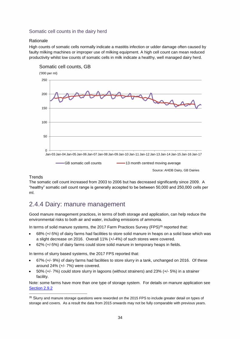
Somatic cell counts in the dairy herd
Rationale
High counts of somatic cells normally indicate a mastitis infection or udder damage often caused by
faulty milking machines or improper use of milking equipment. A high cell count can mean reduced
productivity whilst low counts of somatic cells in milk indicate a healthy, well managed dairy herd.
0
50
100
150
200
250
Jan-03 Jan-04 Jan-05 Jan-06 Jan-07 Jan-08 Jan-09 Jan-10 Jan-11 Jan-12 Jan-13 Jan-14 Jan-15 Jan-16 Jan-17
GB somatic cell counts 13 month centred moving average
Somatic cell counts, GB
('000 per ml)
Source: AHDB Dairy, GB Dairies
Trends The somatic cell count increased from 2003 to 2006 but has decreased significantly since 2009. A
“healthy” somatic cell count range is generally accepted to be between 50,000 and 250,000 cells per
ml.
2.4.4 Dairy: manure management
Good manure management practices, in terms of both storage and application, can help reduce the
environmental risks to both air and water, including emissions of ammonia.
In terms of solid manure systems, the 2017 Farm Practices Survey (FPS)35 reported that:
68% (+/-5%) of dairy farms had facilities to store solid manure in heaps on a solid base which was
a slight decrease on 2016. Overall 11% (+/-4%) of such stores were covered.
62% (+/-5%) of dairy farms could store solid manure in temporary heaps in fields.
In terms of slurry based systems, the 2017 FPS reported that:
67% (+/- 9%) of dairy farms had facilities to store slurry in a tank, unchanged on 2016. Of these
around 24% (+/- 7%) were covered.
50% (+/- 7%) could store slurry in lagoons (without strainers) and 23% (+/- 5%) in a strainer
facility.
Note: some farms have more than one type of storage system. For details on manure application see
Section 2.9.2
35 Slurry and manure storage questions were reworded on the 2015 FPS to include greater detail on types of
storage and covers. As a result the data from 2015 onwards may not be fully comparable with previous years.

35
2.4.5 Dairy: economic position
Table 5: Gross margins from dairy herds grouped by economic performance band, England
2014/15 2015/16
Low
performers High
performers All Low
performers High
performers All
(£/head unless otherwise stated) (bottom 25%) (top 25%)
(bottom 25%) (top 25%)
Average herd size (head) 67 293 162 66 274 159
Forage area (hectares per head)
0.6 0.5 0.5 0.6 0.4 0.5
Yield (litre per cow) 6,368 8,384 7,827 6,686 8,922 8,241
Price (pence per litre) 29 31 31 21 27 25
Milk sales 1,867 2,623 2,405 1,436 2,384 2,083
Calf sales & transfers out 116 97 106 134 102 115
Miscellaneous output 6 0 1 30 14 15
Less herd depreciation -218 -207 -209 -169 -181 -181
Enterprise output/cow 1,770 2,514 2,303 1,431 2,319 2,032
Variable costs
Concentrates 624 727 683 523 664 614
Conc/litre(pence) 10 9 9 8 7 7
Coarse fodder 64 47 50 60 44 39
Vet and medicine costs 71 79 78 68 79 75
Other livestock costs 176 178 178 176 188 178
Forage variable costs 82 95 100 72 84 87
Fert/litre (pence) 0.7 0.9 0.8 0.8 0.6 0.7
Total variable costs/cow 1,017 1,126 1,089 899 1,059 992
Gross margin/cow 753 1,388 1,214 532 1,260 1,040
Variable costs pence/litre 16 13 14 13 12 12
Source: Farm Business Survey
Table 5 provides a comparison of gross margins for dairy herds between low and high economic
performance groups. Data from the Farm Business Survey indicates that the average milk yield for
high performing farms was around 33% higher than low performing farms in 2015/16, virtually
unchanged from 2014/15. Whilst high performing farms tend to spend more per cow than low
performing farms, the percentage difference increased from 11% more in 2014/15 to 18% more in
2015/16. The cost per litre of milk was 7% greater for high performers in 2014/15, rising to 24%
higher in 2015/16. Fertiliser costs per litre of milk were lower for high performing groups across both
years. Concentrated feed is the greatest input cost for both groups with high performers spending
27% more than lower performing enterprises in 2015/16.
The top 25% of performers achieved higher gross margins overall, influenced by the more favourable
price per litre of milk they achieved in both years. In terms of gross margin per cow, the overall gap
between the high and low performers grew between 2014/15 and 2015/16, following the longer term
trend36.
36 For longer term trends see Section 2.4 of 2nd Edition of Agricultural Statistics and Climate Change at:
http://webarchive.nationalarchives.gov.uk/20130305023126/http://www.defra.gov.uk/statistics/files/defra-stats-foodfarm-enviro-climate-climatechange-120203.pdf

36
2.4.6 Dairy: summary
In the longer term, compound and blended feed production increased at a greater rate than the
average milk yield, suggesting an overall reduction in feed efficiency and an increase in GHG
intensity. In the shorter term however, the ratio of compound and blend feed production to milk
production has fallen, driven by a decrease in feed production. This indicates improving emission
intensity for milk production. With respect to milk production, increased milk yields have partially
offset reduced cow numbers (Section 2.3).
Information from the Farm Business Survey indicates that the difference between high and low
economic performance groups is largely driven by yield and average milk price achieved (Section
2.11 for average milk prices). In terms of gross margin per cow, the overall gap between the high
and low performers increased between 2014/15 and 2015/16. Further details of economic and GHG
performance in the dairy sector can be found in Section 4 of the 2nd Edition of Agricultural Statistics
and Climate Change at:
http://webarchive.nationalarchives.gov.uk/20130221211227/http://www.defra.gov.uk/statistics/foodfarm/enviro/climate/ Over the last 6 years, the average age of breeding animals has decreased slightly which may suggest
a slight decline in longevity. Overall, calf registrations have increased marginally in the last 7 years to
around 0.91 per breeding cow (note due to data availability this is for both dairy and beef cattle).
There have been fluctuations in on-farm mortality for registered dairy calves (under 6 months old) and
levels are currently similar to those seen in 2010, prior to a period of increased mortality. For dairy
cattle aged 6 to 24 months there has been little change since 2009 while for those over 24 months
levels of on-farm mortality have seen a slight downward trend. Somatic cell counts have reduced
significantly since 2009. Taking all these factors into consideration suggests that there may have
been a reduction in the intensity of GHG emissions from the dairy sector.
2.4.7 Dairy: further developments
Current statistics provide a partial picture of the relevant drivers of GHG emissions as, for example, it
is not possible to calculate milk production per kilogramme live weight. The following measures would
provide a more complete picture but not all can feasibly be populated with robust data in the short
term; although some of the data are collected through the Cattle Tracing System there are significant
complexities in extracting it from its current format.
Calving interval (reasons why intervals are longer than expected)
Age at first calving
Number of lactations
Live weight split by beef and dairy
Herd replacement rate (via lactation number)
Number of calves available for finishing as beef
Calving season
Grazing days
Percentage of milk from grass based systems
Reasons for culling

37
2.4.8 Dairy: notes on data collection methodology and uncertainty
Milk production and feed production
i) The data on compound and blended feed production shown here are from the survey returns of
all of the major GB animal feed companies. Data on raw material use, stocks and production of
the various categories of compound animal feed are recorded. The major producers typically
cover 90% of total animal feed production surveyed each month. The remaining smaller
companies are sampled annually in December for their figures in the preceding 12 months.
Sampling errors of the production estimates are small. Links to the survey methodology are given
in the Appendix.
ii) On-farm production of animal feed is not covered here, nor are transfers between farms or
exports of compound feed. However, trade in compound feeds in the UK is not significant (unlike
trade in raw ingredients used to produce compound feeds).
iii) Annual milk production based on data supplied by the Scottish Government and information
collected through a producer survey.
Information from the Cattle Tracing System
iv) The CTS is an administrative dataset and all cattle in GB are included in the dataset. Thus
estimates shown here are based on the full cattle population. Links to the methodology are given
in the Appendix.
Farm Business Survey
v) Where the sample size is relatively small, confidence intervals can be quite large, and care needs
to be taken with interpretation of the significance of the differences. A link to information on the
Farm Business Survey methodology is given in the Appendix.

38
2.5 Beef
2.5.1 Beef: efficiency of output
Weight at slaughter
Rationale
More efficient finishing37 has the potential to reduce emissions and increase productivity. It is
desirable for average carcase weights to increase, though not at the expense of increased intensity of
emissions, i.e. greenhouse gas (GHG) emissions per kilogramme of meat produced.
0
50
100
150
200
250
300
350
400
1990 1992 1994 1996 1998 2000 2002 2004 2006 2008 2010 2012 2014 2016
Steers Heifers Young Bulls
Cattle: average home killed dressed carcase weights from prime cattle, UK
Kilogrammes per head
Source: Slaughterhouse Surveys, Defra, The Scottish Government, DARD (NI)
Trends Since 1990 there has been an overall increase in the average carcase weight of prime beef cattle
although the rate of increase has been slower in more recent years.
37 Finishing is the feeding process used prior to slaughter for cattle or sheep intended for meat production.

39
Age at which cattle under 4 years are slaughtered
Rationale Both the average meat produced per animal (see previous page), and the age of cattle at slaughter
are factors in determining emissions. Considering these jointly helps to inform understanding of the
emissions intensity. Here we use the median as a measure of age at slaughter. It is also relevant to
understand the age distribution; the lower and upper quartiles provide a measure of this. The second
chart provides more details of the age at which animals have been slaughtered since 2006. Cattle
over 4 years have been excluded as these will primarily be breeding animals.
0
5
10
15
20
25
30
35
2006 2007 2008 2009 2010 2011 2012 2013 2014 2015 2016
Age at slaughter for female cattle under 4 years, GB
Age in Months
Defra, RADAR Cattle Tracing System
Upper quartile
Lower quartile
Median
0
10,000
20,000
30,000
40,000
50,000
60,000
70,000
0 2 4 6 8 10 12 14 16 18 20 22 24 26 28 30 32 34 36 38 40 42 44 46 48
2006
2010
2016
Age at slaughter for female cattle under 4 years in 2006, 2010 & 2016, GB
Defra, RADAR Cattle Tracing System
Number of animals
Age in months

40
0
5
10
15
20
25
30
2006 2007 2008 2009 2010 2011 2012 2013 2014 2015 2016
Age at slaughter for male cattle under 4 years, GB
Age in Months
Defra, RADAR Cattle Tracing System
Upper quartile
Median
Lower quartile
0
20,000
40,000
60,000
80,000
100,000
120,000
0 2 4 6 8 10 12 14 16 18 20 22 24 26 28 30 32 34 36 38 40 42 44 46 48
2006
2010
2016
Age at slaughter for male cattle under 4 years in 2006, 2010 & 2016, GB
Number of animals
Age in monthsDefra, RADAR Cattle Tracing System
Trends
The average age at slaughter of both male and female cattle (under 4 years old) has remained at a
similar level since 2006 although a slight decline was seen in 2011 and 2012, particularly in male
cattle. There has been some increase in the number of animals slaughtered beyond 30 months as
meat from older animals is now allowed to enter the food chain, but there is still a significant dip
around 30 months. The overall increase in average carcase weights, with little change in the age at
slaughter suggests the intensity of GHG emissions may have improved slightly since 2006.

41
2.5.2 Beef: longevity and fertility
Rationale
Increased fertility rates and longevity of breeding animals will help secure reductions in GHG
emissions given that, all things being equal, fewer breeding females would be required.
Age of beef herd (breeding animals)
In the following chart, we consider the median age and inter quartile range of female cattle aged 30
months and over.
0
2
4
6
8
10
12
Jan-01 Jan-03 Jan-05 Jan-07 Jan-09 Jan-11 Jan-13 Jan-15 Jan-17
Age of female beef cattle aged over 30 months, monthly data, GB
Years
Source: Defra, RADAR Cattle Tracing System
Age of female beef cattle aged over 30 months, monthly data, GB
Years
Source: Defra, RADAR Cattle Tracing System
Lower quartile
Median
Upper quartile
Trends
The median age of the beef breeding herd (cows aged over 30 months) has increased since 2001 but
has remained relatively stable since 2007. This rise is thought to be due to a recovery following Foot
and Mouth (FMD) and changes to restrictions associated with Bovine Spongiform Encephalopathy
(BSE) (where Over Thirty Month scheme and Older Cattle Disposal scheme impact on the trends).
The data do not suggest any significant increase in age of breeding cattle above levels prior to FMD
and BSE restrictions.
The inter quartile range (IQR) is given to assess the spread of the age of cattle. Increased longevity in
the beef breeding herd will be demonstrated by an increase in the median or an increase in the IQR,
such that the upper quartile increases by more than the lower quartile. The IQR for beef cattle ages
has increased since 2007 and the upper quartile has changed more than the lower quartile implying
an increase in the overall longevity. For distribution of beef cows by age in months please see (iii) in
the Appendix.

42
Calf registrations per cow (at present data is only available for all dairy and beef animals)
See Section 2.4 Dairy. The overall levels have remained relatively stable with no major upward or
downward trend.
Number of calvings
0
50,000
100,000
150,000
200,000
250,000
1st 2nd 3rd 4th 5th 6th 7th 8th 9th 10th 11th 12th 13th 14th &above
Number of calvings by beef cows, GB 2006, 2010 and 2016
2006
2010
2016
Number of beef cows
Derfa, Cattle Tacing Sysytem
Trends
In 2016, 1.19 million beef cows had calves compared to 1.30 million in 2006. Of these, 18% calved for
the first time (the effective replacement rate) in 2016, a slight increase on 2006 when the level was
16%. The proportion calving for a second time has remained virtually unchanged over the period
standing at 15% in both 2006 and 2016.
In recent years there has been an increase in the number and proportion of beef cows calving over 8
times; from around 47 thousand in 2006 to 134 thousand in 2016 with a peak of 149 thousand in
2012. This trend suggests that overall longevity within the breeding herd has increased across this
period.

43
2.5.3 Beef: animal health
On-farm mortality
Rationale
All other things being equal, reductions in on-farm mortality38 will lead to fewer animals being required
for a given level of food production. Reduced disease should also lead to greater productivity. For
cattle, overall mortality may be a better indicator than specific disease levels (for which we do not
have full data in many cases).
0
5
10
15
20
25
30
Jan 02 Jan 03 Jan 04 Jan 05 Jan 06 Jan 07 Jan 08 Jan 09 Jan 10 Jan 11 Jan 12 Jan 13 Jan 14 Jan 15 Jan 16
Mortality for beef cattle, GB
Deaths per 100,000 animal day s - 13 month centred moving averages
Source: Defra, RADAR Cattle Tracing System
Under 6 months
Over 24 months
6 to 24 months
Trends
Although there have been fluctuations across the period, there has been an overall reduction in the
on-farm mortality of beef calves (under 6 months) between 2006 and 2012. It is not clear why the
increases towards the end of 2012 occurred as there are no obvious causes, such as a disease
outbreak. Current levels have seen a rise, but are still lower than the peak seen in 2012. For beef
cattle aged 6 months and above there have also been fluctuations but overall there has been a slight
downward trend in on-farm mortality since 2002.
38 On-farm mortality rate is defined as the number of deaths per 100,000 days at risk on agricultural premises. It
is calculated using the number of cattle deaths divided by the number of cattle days in the period. The number of cattle days in the period represents 1 day for each animal each day. For example, if 5 animals were present on a location for 20 days the sum of the animal days would be 100. Conversely, if 20 animals were present on a location for 5 days the sum of the animal days would also be 100. This means, for any specified risk to the cattle in an area, that areas with a high density of cattle can be compared directly with areas with a low density of cattle. On-farm mortality was calculated by analysing only premises that were registered as being an agricultural premise. Therefore, this data excludes deaths at slaughter houses.

44
2.5.4 Beef: manure management
Good manure management practices, in terms of both storage and application, can help reduce the
environmental risks to both air and water, including emissions of ammonia.
For grazing livestock farms the 2017 Farm Practices Survey (FPS)39 reported that:
53% (+/-6%) of lowland farms had facilities to store solid manure in heaps on a solid base.
For those in less favoured areas (LFA) the proportion was 73% (+/- 8%) in 2017. In both
cases this was 4% higher than in 2016. These stores were covered on 18% (+/- 7%) of
lowland farms and 22% (+/- 8%) of LFA.
In 2017, 60% (+/-6%) of lowland farms had facilities to store solid manure in temporary heaps
in fields. For LFA farms the proportion was 44% (+/- 8%). This was a decrease of 6% and
5% respectively on 2016.
15% (+/- 6%) of lowland grazing livestock farms were able to store slurry in a tank, of these
22% (+/-16%) were covered. 24% (+/- 8%) of LFA farms had facilities to store slurry in tanks,
of these 24% (+/-14%) were covered.
For details of manure application see Section 2.9.2
2.5.5 Beef: economic position
Table 6: Gross margins for finished cattle (£ per head), 2012/13 - 2015/16 England
Finished cattle from calves & stores from the dairy herd
Finished cattle from calves & stores from the suckler herd
12/13 13/14 14/15 15/16 12/13 13/14 14/15 15/16
Average herd size (head) 136 146 167 141 98 91 76 73
Finished livestock sales 574 618 554 555 1,202 1,432 933 888
Other cattle/ throughput 149 154 67 96 6 43 100 91
Less herd depreciation /calf & store cattle purchases
-191 -236 -173 -241 -707 -873 -582 -562
Enterprise output 532 537 448 411 502 603 452 418
Variable costs
Concentrates 226 187 182 136 192 239 140 121
Coarse fodder 14 14 10 5 8 12 9 10
Vet and medicine costs 16 11 11 11 13 12 13 13
Other livestock costs 52 57 49 52 73 76 64 62
Forage variable costs 43 53 43 40 45 43 38 35
Total variable costs 350 326 295 244 330 382 265 242
Gross margin per cow 182 211 153 167 172 221 187 176
Source: Farm Business Survey
39 Slurry and manure storage questions were reworded on the 2015 Farm Practices Survey. As a result the data
from 2015 onwards may not be fully comparable with previous years.

45
Table 6 provides a comparison of beef cattle gross margins from the Farm Business Survey based on
standard output typology40. Figures are in £ per head and have not been adjusted to reflect price
changes due to inflation.
2012/13 to 2015/16 saw an overall decrease in total variable costs for finished calves and stores from
both the dairy herd and the suckler herd. Enterprise output increased between 2012/13 and 2013/14
for both categories before falling in the following 2 years. In 2015/16 there was a 9% increase in
gross margins per cow for dairy calves and stores compared to 2015/14. This was driven by a 17%
reduction in variable costs, partially offset by a reduction in enterprise output. Gross margins per cow
for beef calves and stores decreased by 6% compared to 2014/15. While enterprise output saw a
similar reduction to dairy, here total viable costs fell by a smaller percentage.
2.5.6 Beef: summary
Since 1990, average carcase weights have increased. At the same time the age at which animals are
being slaughtered has remained at a broadly similar level, although there was a slight reduction in the
median age at slaughter between 2010 and 2012, particularly in male cattle.
The median age of the beef herd has changed little since pre Bovine Spongiform Encephalopathy
(BSE) and Foot and Mouth Disease (FMD) restrictions, though overall longevity has increased. There
has been an overall reduction in the on-farm mortality of registered beef calves (under 6 months)
between 2006 and 2012. Following increases towards the end of 2012 current levels are similar to
those seen before that peak. For beef cattle aged 6 months and above there has been a slight
decrease in on-farm mortality since 2002. Calving numbers suggest that more beef cows are
productive for longer. Considering all these factors together suggests that, all other things being
equal, the intensity of GHG emissions may have reduced.
2.5.7 Beef: further developments
Current statistics provide a partial picture of the relevant drivers of GHG emissions. The following
measures would help provide a more complete picture but not all can feasibly be populated with
robust data in the short term; although some of the data are collected through the Cattle Tracing
System (CTS) there are significant complexities in extracting it from the current format.
System including winter forage from maize or grass silage or hay and concentrate level
Housing period, which can vary considerably from year to year
More information on combining age and weight at slaughter
Fat score at slaughter
Calving interval
Grassland management including legume use
40 Further details about farm typology can be found at
https://www.gov.uk/government/uploads/system/uploads/attachment_data/file/182207/defra-stats-foodfarm-
landuselivestock-june-results-typology.pdf

46
2.5.8 Beef: notes on data collection methodology and uncertainty
Meat production
i) Carcase weights given here are from the Defra Slaughter house surveys. These surveys cover
all the major slaughter houses, and are subject to small sampling errors. Links to the survey
methodology are given in the Appendix.
Information from the Cattle Tracing System
ii) The CTS is an administrative dataset and all cattle in GB are included in the dataset. Thus
estimates shown here are based on the full cattle population. Links to the methodology are given
in the Appendix.
Farm Business Survey
iii) Where the sample size is relatively small, confidence intervals can be quite large, and care needs
to be taken with interpretation of the significance of the differences. A link to information on the
Farm Business Survey methodology is given in the Appendix.

47
2.6 Sheep
2.6.1 Sheep: efficiency of output
Weight at slaughter
Rationale Reducing age at slaughter has the potential to reduce intensity of greenhouse gas (GHG) emissions
(defined as GHG emitted per kilogramme of meat produced) by increasing growth rate through breed
improvement, feeding and health management. However, an increase in the annual average carcase
weights as a consequence of lambs being slaughtered later will not improve the intensity of
emissions. A move to later slaughtering would be evident from a change in the monthly slaughtering
pattern.
16.0
16.5
17.0
17.5
18.0
18.5
19.0
19.5
20.0
1990 1992 1994 1996 1998 2000 2002 2004 2006 2008 2010 2012 2014 2016
Average dressed carcase weight for sheep and lambs, UK
Kilograms per head
Source: Slaughterhouse surveys, Defra, The Scottish Government, DARD (NI)
Note: excludes ewes and rams

48
Monthly distribution of slaughter weights and marketing pattern
15.0
16.0
17.0
18.0
19.0
20.0
21.0
May Jun Jul Aug Sep Oct Nov Dec Jan Feb Mar Apr
1990/91
2010/11
2016/17
Kilogrammes per head
Source: Slaughterhouse surveys, Defra, The Scottish Government, DARD (NI)
Average dressed carcase weights for clean sheep and lambs, UK
0%
2%
4%
6%
8%
10%
12%
14%
May Jun Jul Aug Sep Oct Nov Dec Jan Feb Mar Apr
1990/91
2010/11
2016/17
Per cent slaughtered
Source: Slaughterhouse surveys, Defra, The Scottish Government, DARD (NI)
Monthly marketing pattern for clean sheep and lambs, UK
Trends
Average carcase weights for sheep and lambs have increased overall since 1990; after remaining
relatively stable during the 1990s carcase weights increased steadily between 2000 and 2004/05.
This will, in part, have been driven by farmers finishing to greater weights to achieve better prices.
The peak in 2007 is probably due to the effects of the Foot and Mouth Disease (FMD) outbreak in that
year which resulted in some producers retaining lambs on farm for longer. The increase in carcase

49
weights has taken place across the year with no sustained changes to the monthly marketing pattern
over time to suggest a move to later finishing. Changes within years tend to be shorter term reactions
to weather and prices. For instance, the wet summer of 2012 led to problems finishing lambs and
resulted in delayed marketings and lower carcase weights than in 2011.
2.6.2 Sheep: longevity and fertility
Surviving lamb percentage
Rationale Increased fertility rates and longevity of breeding animals could help reduce greenhouse gas (GHG)
emissions intensity because fewer breeding females would be required for the same level of output.
By assessing the “surviving lamb percentage” (based on populations and slaughter statistics - see
below for definition) it is possible to gain an overall indication of both the productivity of the ewe flock
and lamb survival; all other things being equal an increase will represent an improvement in
emissions intensity.
90
95
100
105
110
115
120
125
1990 1992 1994 1996 1998 2000 2002 2004 2006 2008 2010 2012 2014 2016
Surviving lamb percentage, GBPer cent
Source: Defra statistics, AHDB survey of auction markets
Trends There has been an overall upward trend in the surviving lamb percentage over the last 10 years. In
the shorter term, following the high survival rate in 2011 (helped by favourable weather conditions) the
surviving lamb percentage fell slightly in 2012 before reaching the highest level since 1990 in 2014.
Definition of the surviving lamb percentage
The lambing percentage is calculated as (A + B)/(C + D)*100, where
A: Number of lambs at June (source June Survey)
B: Number of lambs born after December, but slaughtered before June (i.e. new
season lamb slaughter), source: AHDB and Defra slaughter stats
C: Number of breeding ewes at December (source December Survey)
D: Number of ewe lambs put to the ram at December (source December Survey)
Note: the survival of lambs is dependent on weather conditions, and this needs to be considered when
interpreting year on year changes.

50
2.6.3 Sheep: economic context
Table 7: Gross margins for breeding ewes (£/head), England 2012/13 - 2015/16
Lowland breeding ewes LFA breeding ewes
12/13 13/14 14/15 15/16 12/13 13/14 14/15 15/16
Average flock size (head) 273 283 281 273 438 431 410 445
Forage area (hectares per head)
0.2 0.2 0.2 0.2 0.3 0.3 0.2 0.2
Finished livestock sales 76 83 86 81 41 40 45 44
Store sales 11 9 10 8 16 16 21 9
Other lamb throughput 20 14 20 17 20 19 24 24
Miscellaneous revenue 4 3 3 3 3 2 2 2
Less flock depreciation -13 -14 -14 -12 -11 -12 -14 -11
Enterprise output 98 94 105 96 69 65 77 69
Variable costs
Concentrates 20 23 20 18 14 19 14 14
Coarse fodder 2 2 2 2 5 6 7 6
Vet and medicine costs 7 7 7 8 6 6 7 7
Other livestock costs 12 12 13 14 8 9 9 9
Other crop costs 9 10 9 8 4 5 4 5
Total variable costs 49 53 51 50 37 44 41 41
Gross margin per ewe 49 41 55 46 32 21 36 28
Source: Farm Business Survey Table 7 provides a comparison of gross margins for breeding ewes on lowland and Less Favoured
Area (LFA) farms from the Farm Business Survey. Figures are in £ per head and have not been
adjusted to reflect price changes due to inflation.
Gross margins per ewe have fluctuated across the period for both lowland and LFA ewes. The gross
margin per lowland ewe was £46 in 2015/16 while for LFA ewes the figure was £28; this was an
decrease of 16% and 23% respectively on 2014/15 reflecting a fall in enterprise output while variable
costs remained virtually unchanged.
2.6.4 Sheep: summary
Carcase weights for lambs have increased since 1990 and this has occurred across the year,
suggesting that there has not been a sustained move to later slaughtering but that more are being
finished41 at greater weights. This change can be explained as a result of a combination of
productivity gains, restrictions on the movement of the animals during the FMD outbreak and the
reduction in the uplands which are generally of lower weight. Overall trends in the last 5 years
suggest that ewe flock fertility and lamb survival have improved with 2014 seeing the highest
surviving lamb percentage of the period since 1990.
41 Finishing is the feeding process prior to slaughter for cattle and sheep intended for meat production.

51
2.6.5 Sheep: further developments
Current statistics provide a partial picture of the relevant drivers of GHG emissions. The following are
the most relevant pieces of information which are currently not included. Not all of the following can
feasibly be populated with robust data in the short term.
More information on the age at which lambs are slaughtered. This would be about providing
more detail than is currently available.
Measures of the longevity of breeding flock. This information represents an important gap. It
is not clear if this could be populated with data in the short term.
2.6.6 Sheep: notes on data collection methodology and uncertainty
Meat production
i) Carcase weights given here are from the Defra Slaughter house surveys. These surveys
cover all the major slaughter houses and are subject to small sampling errors. Links to the
survey methodology are given in the Appendix.
Farm Business Survey
ii) Where the sample size is relatively small, confidence intervals can be quite large, and care
needs to be taken with interpretation of the significance of the differences. A link to
information on the Farm Business Survey methodology is given in the Appendix.

52
2.7 Pigs
2.7.1 Pigs: efficiency of output (finishing pigs feed conversion and daily
gain)
Weight at slaughter and daily live weight gain
Rationale Increasing slaughter weight spreads the costs of production per kilogramme of pig meat but may
increase absolute emissions per finished pig. Improving daily live weight gain reduces the time to
finish at a fixed slaughter weight, resulting in improved productivity and reduced greenhouse (GHG)
emissions.
0
10
20
30
40
50
60
70
80
90
1990 1992 1994 1996 1998 2000 2002 2004 2006 2008 2010 2012 2014 2016
Average dressed carcase weights for clean pigs, UK
Kilogrammes per head
Source: Slaughterhouse Surveys , Defra, The Scottish Government, DARD (NI)
0
100
200
300
400
500
600
700
800
900
Mar-09 Mar-10 Mar-11 Mar-12 Mar-13 Mar-14 Mar-15 Mar-16
Daily live weight gain rearing and finishing herds, GB
Grammes per day
Source: AHDB Pork
Finishing herd 35 - 110 kg
Rearing herd 7 - 35kg
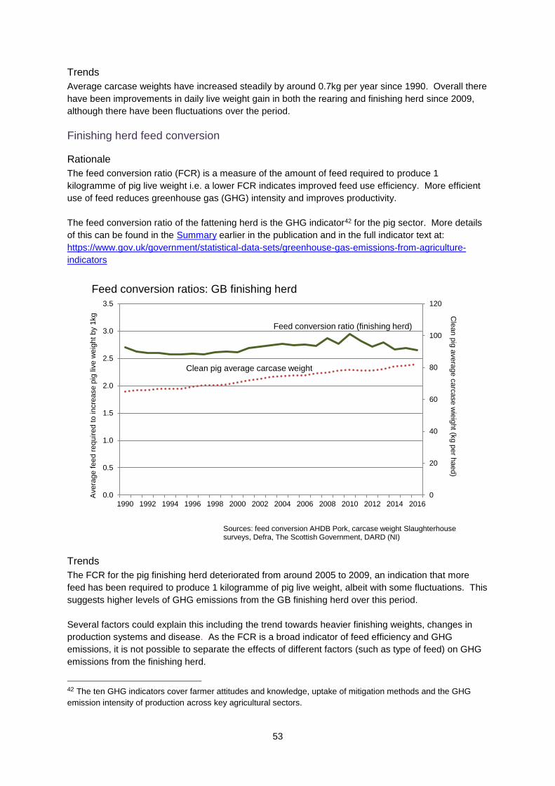
53
Trends
Average carcase weights have increased steadily by around 0.7kg per year since 1990. Overall there
have been improvements in daily live weight gain in both the rearing and finishing herd since 2009,
although there have been fluctuations over the period.
Finishing herd feed conversion
Rationale
The feed conversion ratio (FCR) is a measure of the amount of feed required to produce 1
kilogramme of pig live weight i.e. a lower FCR indicates improved feed use efficiency. More efficient
use of feed reduces greenhouse gas (GHG) intensity and improves productivity.
The feed conversion ratio of the fattening herd is the GHG indicator42 for the pig sector. More details
of this can be found in the Summary earlier in the publication and in the full indicator text at:
https://www.gov.uk/government/statistical-data-sets/greenhouse-gas-emissions-from-agriculture-
indicators
0
20
40
60
80
100
120
0.0
0.5
1.0
1.5
2.0
2.5
3.0
3.5
1990 1992 1994 1996 1998 2000 2002 2004 2006 2008 2010 2012 2014 2016
Feed conversion ratios: GB finishing herd
Avera
ge f
eed r
equired t
o incre
ase p
ig liv
e w
eig
ht
by 1
kg C
lean p
ig a
vera
ge c
arc
ase
wie
ight (k
g p
er h
aed)
Sources: feed conversion AHDB Pork, carcase weight Slaughterhouse surveys, Defra, The Scottish Government, DARD (NI)
Feed conversion ratio (finishing herd)
Clean pig average carcase weight
Trends
The FCR for the pig finishing herd deteriorated from around 2005 to 2009, an indication that more
feed has been required to produce 1 kilogramme of pig live weight, albeit with some fluctuations. This
suggests higher levels of GHG emissions from the GB finishing herd over this period.
Several factors could explain this including the trend towards heavier finishing weights, changes in
production systems and disease. As the FCR is a broad indicator of feed efficiency and GHG
emissions, it is not possible to separate the effects of different factors (such as type of feed) on GHG
emissions from the finishing herd.
42 The ten GHG indicators cover farmer attitudes and knowledge, uptake of mitigation methods and the GHG
emission intensity of production across key agricultural sectors.

54
Since 2010 there has been an improvement in the FCR although again with some fluctuations. At
the same time average clean pig carcase weight has steadily increased. This suggests improvements
in feed use efficiency and a reduction in GHG emissions.
2.7.2 Pigs: animal health and fertility (sow productivity and piglet
mortality)
Sow productivity
Rationale
A trend in the average number of clean pigs marketed per week per sow and kilogramme weaned per
sow per year provide a measure of sow productivity and in turn an indicator of GHG emissions from
the breeding herd.
0.20
0.25
0.30
0.35
0.40
0.45
0.50
0.55
Jan-90 Jan-92 Jan-94 Jan-96 Jan-98 Jan-00 Jan-02 Jan-04 Jan-06 Jan-08 Jan-10 Jan-12 Jan-14 Jan-16
Sow productivity, GB
Average number of clean pigs marketed per week per sow
Source: Agricultural surveys Defra, Slaughterhouse surveys, Defra, The Scottish Government, DARD (NI)
Trends
Clean pigs marketed per sow per week dip around 2003/04 but there has been a steady upward trend
since then and current levels exceed the previous high points of the late 1990s. Disease is likely to
have influenced this trend, for example swine flu in 2000 and Foot and Mouth Disease (FMD) in 2001
- both of which contributed to a loss of productivity. Additionally, non-notifiable pig wasting diseases
were prevalent from the late 1990s, though these are considered to have been brought under better
control since 2004.
The trend towards outdoor production may have offset some of the productivity gains seen in recent
years. The following chart compares trends in sow productivity through piglets weaned in indoor and
outdoor systems. There are numerous reasons for this difference between the 2 systems: the impact
of adverse weather conditions on piglet survival, seasonal infertility, lighter piglet weaning weights due
to differences in nutrient intake and energy balance and differing selection objectives (with indoor
genotypes selected for prolificacy and outdoor for robustness).

55
0.0
5.0
10.0
15.0
20.0
25.0
30.0
Mar-10 Mar-11 Mar-12 Mar-13 Mar-14 Mar-15 Mar-16
Piglets weaned per sow per year, GB
Piglets per sow
Source: AHDB Pork
Indoor breeding herd
Outdoor breeding herd
Mortality
Rationale
All other things being equal, reductions in pre-weaning piglet mortality require fewer breeding animals
to produce an equivalent number of weaned pigs.
0
2
4
6
8
10
12
14
Mar-06 Mar-07 Mar-08 Mar-09 Mar-10 Mar-11 Mar-12 Mar-13 Mar-14 Mar-15 Mar-16
Average pig mortality, GB
Percentage
Source: AHDB Pork
Pre-weaning mortality
Post-weaning mortality
Note, the break in the series indicates a change in methodology, including a change in the sample size which increased from the breeding herd in Q4 (December) of 2007 to the rearing and feeding herd in Q1 (March) of 2008.

56
Trends The data suggests that there appears to have been little change in pre weaning mortality over much
of the period shown although reductions have been seen over the last 2 years. The step change in
the chart is associated with a change in the sample size which increased from the fourth quarter of
2007 (December) for breeding herd and from the first quarter (March) of 2008 for the rearing and
feeding herd. Reductions have also been seen in post weaning mortality in the past 2 years and it is
possible that there have been some reductions in post-weaning mortality over the entire period,
although changes to the sample at the end of 2007 mean it is difficult to interpret the overall long term
trend.
2.7.3 Pigs: housing and manure/slurry management
The type of manure application method, the housing system used (e.g. the type of manure/slurry
management), whether pigs are kept outdoors and systems which relate to length of time to finish can
all have an effect on the levels of GHG emissions.
Trends The results of the Farm Practices Survey 2009 give some details on pig housing and can be found in
Section 2.7 of the third edition of Agriculture and Climate Change at:
https://www.gov.uk/government/organisations/department-for-environment-food-rural-
affairs/series/agricultural-statistics-and-climate-change
The 2017 Farm Practices Survey (FPS) surveyed 183 holdings with pigs. From this relatively small
sample it is difficult to draw a precise conclusion; however, they do provide an approximate indication
that:
58% (+/- 9%) of holdings with pigs had storage facilities for solid manure on a solid base.
68% (+/- 20%) of holdings with pigs could store in a tank; of these 38% (+/- 19%) were covered.
51% (+/- 17%) could store slurry in a lagoon without a strainer and 18% (+/- 10%) in storage with a strainer. 9% (+/- 8%) stored slurry in another type of store. There is insufficient evidence to draw conclusion on the proportions with covers.
For details on manure/slurry application see Section 2.9.2

57
2.7.4 Pigs: economic position
Table 8: Gross margins for breeding sows (£/head), England 2012/13 to 2015/16
2012/13 2013/14 2014/15 2015/16
Average herd size 135 138 162 204
Finished livestock sales 1,960 2,439 2,330 2,003
Store sales 186 135 136 179
Miscellaneous revenue 1 1 1 1
Less herd depreciation -1 -8 -8 -44
Enterprise output 2,148 2,568 2,459 2,139
Variable costs
Concentrates 1,393 1,523 1,448 1,318
Vet and medicine costs 51 70 78 78
Other livestock costs 144 154 187 179
Heating 0 2 2 0
Total variable costs 1,589 1,749 1,714 1,567
Gross margin/sow 560 819 745 563
Source: Farm Business Survey
Table 8 provides a comparison of gross margins for breeding sows from the Farm Business Survey.
Figures are in £ per head and have not been adjusted to reflect price changes due to inflation. Gross
margins per sow fluctuated across the period with increases in 2013/14 and 2014/15. 2015/16 saw a
24% decrease in gross margins to £563 per sow, this reflects a reduction in enterprise output which
was only partially offset by a decrease in variable costs.
2.7.5 Pigs: summary
Carcase weights have increased steadily since 1990, however there was a gradual but continuous
loss in feed conversion in the GB finishing herd from around 1995 to 2009 suggesting a loss of feed
use efficiency and in turn higher GHG emissions from finishing pigs. This trend has been largely
reversed since 2010, the improved efficiency suggesting a reduction in GHG emissions.
Pre-weaning mortality has remained above 12% for several years, although reductions have been
seen over the last 3 years. Post-weaning mortality has gradually fallen over time from around 6% to
nearer 4%. From 2004 and onwards, sow productivity (clean pigs marketed per week per sow) has
steadily improved, which suggests a reduction in GHG emissions from the GB breeding herd.
2.7.6 Pigs: further developments
Current statistics provide only a partial picture of the relevant drivers of GHG emissions. The
following are the most relevant pieces of information which are currently not included. Not all of them
can feasibly be populated with robust data in the short term.
More productivity measures such as: rearing feed conversion ratio; average live weight; feed
consumed per sow. This would be about providing more detailed information than is currently
provided in this section. Some data are available although currently for relatively short
timescales.

58
2.7.7 Pigs: notes on data collection methodology and uncertainty
Meat production
i) Carcase weights given here are from the Defra Slaughter house surveys. These surveys
cover all the major slaughter houses, and are subject to small sampling errors. Links to the
survey methodology are given in the Appendix.
Farm Business Survey
ii) Where the sample size is relatively small, confidence intervals can be quite large, and care
needs to be taken with interpretation of the significance of the differences. A link to
information on the Farm Business Survey methodology is given in the Appendix.
AHDB Pork data43
iii) Data are taken from publicly available datasets published on the AHDB Pork website. These
are not official government statistics. The data are collected by Agrosoft Ltd from customers
submitting regular data. Agrosoft Ltd verifies all data before delivery / publication.
43 AHDB Pork is a division of the Agriculture and Horticulture Development Board representing pig levy payers in
England.

59
2.8 Poultry
2.8.1 Poultry: efficiency of output
Feed conversion ratio44
Rationale More efficient use of feed has the potential to increase productivity and reduce greenhouse gas
(GHG) emissions intensity. The feed conversion ratio (FCR) is a measure of the amount of feed
required (in kilogrammes) to produce 1 kilogramme of poultrymeat (dressed carcase weight). The
quantity of poultry feed produced per kilogramme of poultrymeat produced is used here as a proxy
measure for the intensity of on-farm GHG emissions.
The feed conversion ratio for table birds is the GHG indicator45 used for the poultry sector. More
details of this can be found in the Summary earlier in the publication and in the full indicator text at:
https://www.gov.uk/government/statistical-data-sets/greenhouse-gas-emissions-from-agriculture-
indicators
0.0
1.0
2.0
3.0
4.0
5.0
6.0
Jan-01 Jan-03 Jan-05 Jan-07 Jan-09 Jan-11 Jan-13 Jan-15 Jan-17
Kilogrammes of feed per kilogramme of poultrymeat, GB
Table birds
Table birds(movingaverage)
Kilogrammes
Source: Defra, Hatcheries and Poultry Slaughterhouse Surveys, Integrated Poultry Unit Survey
Trends The chart above shows that the overall moving average trend is relatively stable; a slight upward
trend since 2007 has been largely reversed between 2010 and 2013 while recent years have seen an
overall downward trend in the moving average.
44 For data availability reasons the feed conversion ratio (FCR) shown is kilogrammes of feed per kilogrammes of
meat based on carcase weights. The FCR is more usually expressed in relation to live weight. Carcase weight
is approximately 75% of the live weight which would give a lower ratio feed per kilogrammes of meat produced.
45 The ten GHG indicators cover farmer attitudes and knowledge, uptake of mitigation methods and the GHG
emission intensity of production across key agricultural sectors.

60
Aggregated data for all table birds provides an overall measure of feed efficiency. However, within
this there are differences between species. The following charts are presented to illustrate this and
show FCRs for broilers (chickens bred and raised specifically for meat production) and turkeys. Whilst
there will also be differences between production systems, data are not readily available to allow such
a breakdown to be made.
The average FCR for broilers is consistently lower than for all table birds, but follows a similar trend.
Within this, there will be variations between different rearing systems, such as indoor rearing and
organic production. In addition, a significant proportion of birds are reared to an older age (and have
a higher resulting FCR) as a deliberate marketing choice. Overall, the average liveweight of broilers
at slaughter was marginally higher in 2016 than 10 years ago.
0.0
1.0
2.0
3.0
4.0
5.0
6.0
Jan-01 Jan-03 Jan-05 Jan-07 Jan-09 Jan-11 Jan-13 Jan-15 Jan-17
Kg of feedper kg ofmeat frombroilers
Kg of feedper kg ofmeat(movingaverage)
Kilogrammes
Broilers: kilogrammes of feed per kilogramme of meat, GB
Source: Defra, Hatcheries and Poultry Slaughterhouse Surveys, Integrated Poultry Unit Survey

61
0.0
1.0
2.0
3.0
4.0
5.0
6.0
Jan-01 Jan-03 Jan-05 Jan-07 Jan-09 Jan-11 Jan-13 Jan-15 Jan-17
Kg of feedper kg ofmeat fromturkeys
Kg of feedper kg ofmeat(movingaverage)
Kilogrammes
Turkeys: kilogrammes of feed per kilogramme of meat, GB
Source: Defra, Hatcheries and Poultry Slaughterhouse Surveys, Integrated Poultry Unit Survey The average turkey FCR is higher than that for chickens but follows a broadly similar trend albeit
more exaggerated. The trend has fluctuated over the period but has not changed significantly
although the average liveweight at slaughter increased by 9% between 2001 and 2016.
2.8.2 Poultry: housing and manure management
Housing systems and type of manure management, for example use of in-house litter drying and
incorporation time of manure, can have an effect on the levels of emissions. Whilst some data were
collected as part of the 2009 Farm Practices Survey the implementation of the EU-wide ban on the
keeping of hens in conventional cages at the beginning of 2012 means that this may no longer be
reflective of the current situation.
2.8.3 Poultry: summary
Defra has limited information from national level datasets for the poultry sector. From information
which is available the underlying trend in feed conversion for ‘table birds’ increased marginally from
2001 followed by a decrease between 2010 and 2013 and the last two years have seen an overall
downward trend with the moving average currently standing at the lowest level seen since 2001.
Similar trends can be seen in the FCR of broilers and turkeys.
2.8.4 Poultry: further developments
Limited information is currently provided on the poultry sector. The main factors proposed for the
inventory development relate to information on housing type and system. The feasibility of providing
robust data in the short term is not clear at present.

62
2.8.5 Poultry: notes on data collection methodology and uncertainty
Meat production and feed production
i) Meat production is derived from Defra’s survey of poultry slaughterhouses and registered
hatcheries in England and Wales and similar surveys run by The Rural & Environment
Research and Analysis Directorate for Scotland. Links to the survey methodologies are given
in the Appendix.
ii) Data on feed production are from the survey returns of all of the major GB animal feed
companies. The survey records data on raw material use, stocks and production of the
various categories of compound animal feed. The major producers typically cover 90% of total
animal feed production surveyed each month. The remaining smaller companies are
sampled annually in December for their figures in the preceding 12 months. Sampling errors
of the production estimates are small. Links to the survey methodology are given in the
Appendix.
iii) Feed data are sourced from Defra’s Integrated Poultry Units Survey. This survey covers all of
the major GB poultry feed manufacturers of integrated poultry units. The accuracy of the
results is very high as they are based on a census carried out across all companies. Links to
the survey methodology are given in the Appendix.

63
2.9 Land and Nutrient Use
Background information
Inputs of manufactured or livestock derived nitrogen fertilisers are critical to maintain yields of food
and fodder crops46, but the yield benefits of nitrogen application come at the expense of polluting
losses to air and water and emissions of greenhouse gasses (GHG). Losses can be minimised by
reducing the surplus in soils or reducing the risk of this surplus being lost to the environment by
implementing on-farm efficiency measures and best practice management techniques. This section
covers the outcomes associated with the uptake of these practices by considering GHG intensity
measures, while Section 3 presents information on attitudes towards, and uptake of, specific on-farm
practices.
GHG emissions from nitrogen fertilisers principally arise directly from the soil as microbes transform
fertilisers in the nitrification and denitrification processes (see Figure 2). Some losses can occur
within the first few days of application. However, significant losses also occur indirectly after nitrogen
has leached from soils into water courses, or after gaseous loss as ammonia followed by deposition
to soils. In both cases, there are potentially detrimental impacts on biodiversity and human health.
Figure 1: Soil, Nitrogen and Emissions
A number of factors influence the level of GHG emissions resulting from a given level of nitrogen
applications. These include land use, the soil nitrogen content before application, the organic carbon
content of the soil, the soil moisture content and compaction of the soil (the latter two are associated
with reduced soil aeration).
Within this publication we focus on GHG emissions intensity, a reduction in absolute levels of nitrogen
would however provide a number of environmental benefits.
46 http://www.bis.gov.uk/assets/foresight/docs/food-and-farming/science/11-573-sr31-fertiliser-availability-in-
resource-limited-world.pdf

64
2.9.1 Land and nutrient use: efficiency of output
Long term measure of change: Crop production per unit of manufactured N applied47
Rationale Trends in crop yields provide a headline measure of productivity; more efficient use of nitrogen
fertiliser has the potential to increase productivity and reduce the environmental risk. The ratio of the
weight of crops produced to the weight of manufactured nitrogen fertiliser applied provides a proxy
measure for the intensity of greenhouse gas (GHG) emissions. This section does not cover slurries
and manures which are considered in 2.9.2 Land and nutrient use: application of organic nitrogen.
Manufactured fertiliser application is the GHG indicator48 for the cereal and other cropping sector.
More details of this can be found in the Summary earlier in the publication and in the full indicator text
at: https://www.gov.uk/government/statistical-data-sets/greenhouse-gas-emissions-from-agriculture-
indicators
Random factors in crop production (such as the weather) also impact on yields. This measure is,
therefore, more suitable for monitoring change over the longer term (5 to 10 years). The measures
referred to here are 5 year centred moving average trends which smooth the random year on year
variation present in the time series. The latest year for which figures are available using this method
is 2014. Any later estimates of the trend are less certain as these cannot use a 5 year trend so are
annual point estimates only and as such are relatively volatile and influenced by external factors.
Application rates of nitrogen based fertiliser per hectare provide an indication of short term changes
(year on year) and are explored later in this section.
90
95
100
105
110
115
120
125
130
1990 1992 1994 1996 1998 2000 2002 2004 2006 2008 2010 2012 2014
Intensity proxy(wheat produced perunit of N fertiliserapplied: 5 yearmoving average)
Wheat yield (5 yearmoving average)
N fertiliser applicationrate (5 year movingaverage)
Index 1990=100
Source: British Survey of Fertiliser Practice, Defra Cereal and Oilseed Rape Production Survey
Wheat produced per unit of manufactured N fertiliser applied, England
For an illustration of the magnitude of the trend and irregular components of the time series for wheat
please see (iv) in the Appendix.
47 This measure does not include organic nitrogen from manure or slurry. 48 The ten GHG indicators cover farmer attitudes and knowledge, uptake of mitigation methods and the GHG
emission intensity of production across key agricultural sectors.

65
90
95
100
105
110
115
120
125
130
135
140
1990 1992 1994 1996 1998 2000 2002 2004 2006 2008 2010 2012 2014
Intensity proxy(spring barleyproduced per unit ofN fertiliser applied: 5year movingaverage)
Spring barley yield (5year movingaverage)
N fertiliser applicationrate (5 year movingaverage)
Spring barley produced per unit of manufactured N fertiliser applied, EnglandIndex 1990=100
Source: British Survey of Fertiliser Practice, Defra Cereal and Oilseed Rape Production Survey
90
95
100
105
110
115
120
125
130
1990 1992 1994 1996 1998 2000 2002 2004 2006 2008 2010 2012 2014
Intensity proxy (winterbarley produced perunit of N fertiliserapplied: 5 year movingaverage)
Winter barley yield (5year moving average)
N fertiliser applicationrate (5 year movingaverage)
Winter barley produced per unit of manufactured N fertiliser applied, EnglandIndex 1990=100
Source: British Survey of Fertiliser Practice, Defra Cereal and Oilseed Rape Production Survey

66
0
50
100
150
200
250
1990 1992 1994 1996 1998 2000 2002 2004 2006 2008 2010 2012 2014
Intensity proxy(winter osr producedper unit of N fertiliserapplied: 5 yearmoving average)
Winter osr yield (5year movingaverage)
N fertiliserapplication rate (5year movingaverage)
Index 1990=100
Winter oilseed rape produced per unit of manufactured N fertiliser applied, England
Source: British Survey of Fertiliser Practice, Defra Cereal and Oilseed Rape Production Survey
0
50
100
150
200
250
1990 1992 1994 1996 1998 2000 2002 2004 2006 2008 2010 2012 2014
Intensity proxy (sugarbeet produced per unitof N fertiliser applied:5 year movingaverage)
Sugar beet yield (5year moving average)
N fertiliser applicationrate (5 year movingaverage)
Sugar beet produced per unit of manufactured N fertiliser applied, England
Index 1990=100
Source: British Survey of Fertiliser Practice, Defra Agricultural in the UK
Trends
Long term measure of change: since 1990 there has been an increase in the quantity of wheat
produced per unit of manufactured nitrogen applied. Much of the increase took place during the 1990s
as wheat yields increased whilst application rates remained relatively constant.
The trend in wheat yields has remained relatively stable since 2000 with changes in the intensity
measure driven by overall application rates (increasing application rates between 2000 and 2005;

67
reducing thereafter). The last 2 harvests have seen some improvement in yields after reductions in
recent years (particularly 2012 due to weather conditions) which led to more wheat being produced
per unit of nitrogen applied.
The trends for the intensity measures for winter and spring barley are similar to those for wheat
although the weather in 2012 affected barley yields to a much lesser extent. Over the last 10 years
the intensity measure for winter oilseed rape has seen a slight upward trend peaking in 2013 (the 5
year moving average of 2011 to 2015).
For sugar beet, until 2014, the trend had been consistently upward since 1990. Historically bonuses
were offered by British Sugar for low amino-nitrogen levels, which may have influenced this trend.
More recently, the sugar industry in England has undergone considerable restructuring following
reform of the EU sugar regime in 2006. The closure of factories in York and Allscott led to a
concentration of production in Eastern England and an “outgoers” scheme (announced in 201049)
aimed to redistribute contract tonnage from low yielding producers (particularly those furthest from
factories) to those achieving higher average yields. The downward short term trend for sugar beet has
been driven by lower yields in 2015 and 2016
Latest position: 2017 harvest
There is variability in production from year to year due to weather, disease, and pest pressure
affecting yields. Early indications for 2017 show that crops have benefited from good drilling
conditions in autumn 2016, which allowed farmers to proceed with winter crops as planned. Crop
development has been good despite the driest October for 40 years impacting plantings in Eastern
areas. Spring planting got off to a slow start with heavy rainfall causing problems with
drilling / sprays applications in late February and early March. Drier conditions at the end of March
enabled soils to dry out sufficiently for preparation and drilling to commence. Key factors for this
year’s cropping included CAP greening and Ecological Focus Area (EFA) requirements, recognition
that continued action needs to be taken on black grass e.g. more spring cropping (especially spring
barley) and incidences of some pests and diseases e.g. cabbage stem flea beetle, Septoria and
Eyespot. Damage from slugs and wood pigeons is not expected to have a major effect on yields.
For wheat the planted area is expected to be around 1% lower than last year. Most winter wheat is
in good condition with development ahead of last year and pests and weeds have been largely
controlled. Areas of winter barley are expected to show a decrease of around 10% whereas the
area of Spring barley (which is looked on as a third crop for CAP greening requirements and to help
black grass control) is forecast to increase by around 17%. The areas of largest increase are those
most affected by blackgrass: there is little change in the far south and Scotland. The oat area is
forecast to be around 8% less than last year. Oats are a cheap crop to grow and usually profitable
with strong demand from the oat milling sector. However, the challenge presented by ryegrass and
blackgrass has limited the growing area.
The oilseed rape (OSR) area is forecast to decline by around 4%, which would be the fifth
successive fall. There are key regional differences, with the Eastern region showing a decrease of
around 28% reflecting difficulties with flea beetles and lack of moisture hampering crop establishment.
In other areas, such as the West Midlands, South and Scotland, the area has increased due to the
lure of attractive market prices.
The area of field beans and peas increased considerably in 2015 and 2016 as farmers considered
pulses the best way to achieve the 5% of arable area to go into EFAs. However the area is expected
49 http://www.britishsugar.co.uk/Media/2010/new_beet_deal.aspx

68
to fall by around 6% in 2017 (still above the 5 year average). The market for beans has realised
expectations, additionally growers are looking to alternative crops to meet EFA requirements.
The area for other crops on arable land includes potatoes, sugar beet, vegetables and forage crops
and is expected to rise by around 9% mainly due to increased area of maize and rye for anaerobic
digestion and increased demand for sugar beet from British Sugar.
Short term measure of change: manufactured nitrogen application per hectare
Rationale
Trends in average application rates provide a short term indication of (GHG) emissions intensity
(since they are less affected by random factors which impact on yields).
0
50
100
150
200
250
1990 1992 1994 1996 1998 2000 2002 2004 2006 2008 2010 2012 2014 2016
Average nitrogen fertiliser application rates, England and Wales
Source: British Survey of Fertiliser Practice
Application rate = kg/ha
*All tillage includes crops but not bare fallow, set-aside or grassland
All tillage*
Grass
0
50
100
150
200
250
1990 1992 1994 1996 1998 2000 2002 2004 2006 2008 2010 2012 2014 2016
Winter wheat Spring barley Winter OSR
Main crop potatoes Sugar beet
Average nitrogen fertiliser application rates, England and WalesApplication rate = kg/ha
Source: British Survey of Fertiliser Practice

69
Trends
Short term measure of change: the overall application rate for manufactured nitrogen fertilisers has
fallen substantially over the last 20 years. Whilst arable application rates have remained relatively
stable, grassland application rates have reduced; accounting for the majority of the fall in recorded
nitrous oxide emissions. As shown in the previous section, cereal yields have increased over this
period, leading to more cereals being produced for roughly the same amount of manufactured
nitrogen applied.
Soil nitrogen balance
The soil nitrogen balance provides a measure of the total loading of nitrogen on agricultural soils each
year.
Rationale The overall balance of nitrogen50 provides a high level indicator of potential environmental pressure
allowing comparisons over time and between countries. All other things being equal, more efficient
use of manufactured and organic nitrogen fertilisers will result in a declining nitrogen balance which
will in turn lead to a reduced risk of nitrous oxide emissions and other environmental pressures.
0
200
400
600
800
1,000
1,200
1,400
1,600
1,800
1990 1992 1994 1996 1998 2000 2002 2004 2006 2008 2010 2012 2014 2016
Nitrogen balance from agriculture, UK and EnglandThousand tonnes
Source: Defra statistics
Break in series
UK
England
Note: from 2010 in England, June Survey data for land and animals are collected only for commercial farms51 resulting in a break in series.
Trends The estimates of nitrogen balances show an overall decline over the last 20 years. This will be
associated with a lower risk of all forms of nitrogen loss to the environment.
Provisional estimates for 201652 suggest that the nitrogen balance for England was a surplus of 694
thousand tonnes. This is an increase of 39 thousand tonnes (6%) compared to 2015 but a reduction
50 The nitrogen balance is the difference between nitrogen inputs (including manufactured and organic fertilisers),
and off-takes (via crop/livestock production and fodder for livestock, including grass). 51 See https://www.gov.uk/government/uploads/system/uploads/attachment_data/file/182206/defra-stats-
foodfarm-landuselivestock-june-junemethodology-20120126.pdf for information on the thresholds applied.

70
of 170 thousand tonnes compared to 2000. The increase between 2015 and 2016 has been driven by
a decrease in overall offtake (mainly via harvested crops) while inputs remained virtually unchanged.
The decrease in offtake reflects a reduction in overall harvested production compared to the high
levels seen in 2015.
2.9.2 Land and nutrient use: application of organic nitrogen
This section has largely focused on the application of manufactured nitrogen. Organic manures are
also an important source of nitrogen but data on the volume of manures applied are sparse.
Historically, the British Survey of Fertiliser Practice (BSFP) has focussed on the application of
manufactured fertilisers although in more recent years it has also collected information on the use and
movement of organic manures. However, it should be remembered that the underlying sample design
is constructed to measure manufactured fertiliser usage and may not represent the population of
farmers using organic manures as robustly.
Organic manures applied to agricultural land may be produced on farm by livestock as slurries,
farmyard manure (FYM) and poultry manures or imported from other sources such as treated sewage
sludges (also called bio-solids) and some industrial ‘wastes’ such as paper waste or brewery effluent.
Of the 1,144 farms in the 2016 BSFP around 65% (784) used organic manures on at least one field
on the farm. Table 9 shows the percentage of farms using each type of manure in Great Britain
between 2006 and 2016.
Table 9: Percentage (%) of farms using each type of manure, GB 2006 to 2016
None Cattle FYM
Cattle slurry Pig FYM
Pig slurry
Layer manure
Broiler/ turkey litter
Other FYM Other
2006 30 59 19 2 1 2 2 3 3
2007 33 56 20 1 1 2 2 2 3
2008 31 55 18 3 1 2 3 5 4
2009 32 53 17 2 1 2 2 3 4
2010 33 53 17 2 1 2 2 4 4
2011 32 53 17 2 1 2 2 5 5
2012 36 48 19 2 1 2 2 4 5
2013 35 51 17 2 1 3 2 5 4
2014 34 52 16 2 1 2 1 4 4
2015 35 50 16 1 1 2 2 6 4
2016 35 51 16 2 1 2 2 6 4
Source: British Survey of Fertiliser Practice
Manure from beef and dairy farms is by far the largest volume of manure type generated in Great
Britain. The percentage of farms using cattle FYM has declined by 8% since 2006, whereas the use of
cattle slurry is more consistent over the period and was used on 16% of farms in 2016. Not all of the
manure generated by a farm is necessarily retained for use by that farm and excess manure/slurry
can be exported for use elsewhere.
52 The latest estimates for UK soil nutrient balances can be found under “Soils” at:
https://www.gov.uk/government/organisations/department-for-environment-food-rural-affairs/series/agri-environment-analysis

71
Application methods for slurry
Methods of slurry application can have a bearing on GHG emissions; slurries can have high GHG
emissions since the majority of the nitrogen content is in available forms. This high available nitrogen
content can also make them prone to indirect emissions from ammonia losses. Certain methods of
application, such as injection or use of a trailing shoe can help mitigate these losses. Both slurry
injection and band spreading application techniques are also good mitigation methods for ammonia
(which is associated with secondary GHG emissions).
The following chart compares the percentage of farms using each type of slurry application method in
Great Britain in 2008, 2010, 2012 and 2016. The data serve as a guide only. They do not account for
the area of each farm receiving slurry (or any variation in the rate at which slurry may have been
applied using different application methods). Notwithstanding these considerations, it is clear that
broadcast application is by far the most widespread method adopted.
0
10
20
30
40
50
60
70
80
90
100
Broadcast Band spread Shallowinjection
Deep injection Rain gun Rotating boom
2008
2010
2012
2016
Application methods for slurry, GB 2008, 2010, 2012 and 2016
Source: British Survey of Fertiliser Practice
% of farms
Application of slurries to land in the autumn and winter months can be less effective (as there is little
or no crop uptake) and may be associated with environmental losses. These indirect emissions from
slurry can potentially be high unless careful storage and application management is in place. Table 10
shows the timing of applications of different organic manure types for 2016 (as a proportion of fields
receiving applications of each manure type). The crops have been classified as either “winter sown”,
“spring sown” or “grass”. This segmentation highlights the prevalence of applications in August and
September for winter sown crops (prior to drilling), whereas spring sown and grass fields are
predominantly treated between November and April.

72
Table 10: Percentage (%) of fields receiving each organic manure type by sowing season and timing, GB 2016
Cattle FYM
Cattle slurry
Pig FYM
Pig slurry
Layer manure
Broiler/ turkey litter
Other FYM
Other farm
manure Bio-
solids
Other non-farm
Winter sown
August 3 0 39 17 18 16 5 0 18 1
September 8 1 29 12 19 32 10 0 40 22
October 2 0 8 13 3 1 0 0 10 0
Winter (Nov-Jan) 0 0 0 0 0 0 0 0 0 0
Spring (Feb-Apr) 0 1 0 9 2 8 1 0 6 9
Summer (May - Jul) 1 0 1 0 0 3 1 0 0 0
Spring sown
August 0 1 0 0 1 0 3 0 0 0
September 0 0 4 5 12 0 0 1 3 0
October 1 1 1 0 0 0 0 0 0 0
Winter (Nov-Jan) 2 0 0 0 0 0 4 11 3 2
Spring (Feb-Apr) 14 5 12 16 11 15 17 1 10 15
Summer (May - Jul) 1 1 0 0 2 1 0 0 0 5
Grass
August 8 6 1 5 6 0 11 0 0 0
September 7 4 0 6 1 0 2 5 2 0
October 5 3 0 0 0 0 4 0 0 0
Winter (Nov-Jan) 8 8 0 0 0 3 4 21 0 6
Spring (Feb-Apr) 27 43 4 12 10 8 20 42 4 22
Summer (May - Jul) 12 26 0 6 14 13 18 19 3 16
Source: British Survey of Fertiliser Practice Organic manures are valuable sources of the major plant nutrients, including nitrogen, and their use
can lead to a reduction in applications of manufactured fertiliser. The BSFP does not ask farmers
directly whether they make adjustments to fertiliser inputs as a result of using manure. However, an
indication of possible adjustments has been derived by comparing fields that received manure with
those that did not (Table 11). Organic fields, which use no mineral fertilisers, have been excluded
from these comparisons since they would distort the influence of manures on mineral application
rates. The trend for reduced manufactured nitrogen rates on fields also receiving manure is evident
across all major tillage crops throughout the period, with the exception of potatoes in 2010 and 2013.

73
Table 11: Overall application rates (kg/ha) of manufactured nitrogen fertiliser to tillage crops with and without applications of organic manure, GB 2008 - 2016
2008 2009 2010 2011 2012 2013 2014 2015 2016
Winter wheat with manure 161 180 187 179 170 175 167 179 177
without manure 183 192 197 198 190 187 192 196 193
Spring barley
with manure 88 89 91 97 95 96 100 95 93
without manure 101 107 108 107 105 113 113 111 112
Winter barley
with manure 122 138 138 137 140 141 137 147 135
without manure 137 142 146 144 145 145 147 148 150
Potatoes (maincrop)
with manure 154 155 139 146 133 183 137 126 124
without manure 156 185 138 178 136 167 149 178 140
Sugar beet with manure 80 88 87 81 89 87 89 92 93
without manure 89 101 96 99 99 103 101 105 100
Oilseed rape (winter)
with manure 159 176 175 174 166 161 175 174 153
without manure 197 191 204 203 191 187 195 197 187
Source: British Survey of Fertiliser Practice
2.9.3 Land and nutrient use: impact of farm performance
Table 12 below provides a comparison of winter wheat gross margins per hectare for 2014/15 and
2015/16 for economically low and high performing farms.
Table 12: Gross margins per hectare of winter wheat, England
2014/15 2015/16
£ per ha unless Low High All Low High All
Otherwise stated (bottom 25%) (top 25%)
(bottom 25%) (top 25%)
Average crop area (ha) 14 156 65 14 154 64
Average yield (tonnes/ha) 7 9 9 8 10 10
Average price/tonne(£) 122 133 130 109 116 115
Crops sales 818 1,252 1,166 871 1,194 1,118
Straw 83 46 56 59 41 47
Total crops output 901 1,298 1,222 930 1,235 1,165
Variable costs
Seed 88 71 72 79 67 70
Fertiliser 190 206 206 209 196 199
Crop protection 198 215 210 224 218 214
Other crop costs 38 33 35 45 40 42
Total variable costs 514 524 523 557 522 525
Gross margin 387 774 699 374 714 641
Source: Farm Business Survey
Economically high performing farms have, on average, about ten times the area of wheat than lower
performing farms and achieve greater yields driving the better levels of achieved output. In 2015/16,
total variable costs on high performing farms were 6% lower than those of lower performing farms
with seed costs displayed the biggest variation between the two groups. In terms of overall gross
margins, the gap between low and high performing farming narrowed a little in 2015/16 compared to
2014/15.

74
2.9.4 Land and nutrient use: soil carbon
Soil carbon
The extent to which soil carbon sequestration can offset agricultural emissions in the UK is
uncertain at present but the best available science indicates that potential in the UK is limited.
There may, however, be significant potential to reduce carbon emissions from the UK’s peat soils,
particularly where they are highly degraded or modified. Further information on changes to
greenhouse gas emissions through changes to peatland management will be better understood
following research scheduled to report in 2017. It is known that soils can accumulate carbon as a
result of some land use changes (for example through conversion of arable land to permanent
grassland) or under appropriate management conditions, for example through increasing applications
of organic materials (e.g. compost or other organic materials diverted from landfill and not previously
spread to land) to arable soils. Such changes are generally small, temporary and sensitive to
management practice.
Short term increases in soil carbon stocks have been estimated in EU funded programmes over time
periods of 3-5 years using high tech measurements of carbon dioxide (CO2) above the soil surface.
There are large uncertainties associated with the methods employed in such studies, and overall the
estimated rates of soil carbon increase were not significantly different from zero i.e. the results could
have been due to chance alone because of the high variability of the measurements. Longer term
studies measuring soil carbon concentrations over multi-decadal time periods seem to indicate that
after any change in management, soil carbon will change to reach a new equilibrium concentration.
This means that soils cannot indefinitely continue to store carbon, but rather tend to accumulate
carbon rapidly at first before stabilising in the long term. Such changes occur over the order of 20 to
100 years, and are rapidly reversed if management reverts to the original practice. This is particularly
true of grassland to arable conversions, so grass leys in crop rotations appear to have limited
potential to sequester carbon on a permanent basis.
In comparison to many EU soils (particularly those of southern Europe), the UK tends to have fairly
high soil carbon concentrations and whilst there are uncertainties surrounding the data on trends of
soil carbon in the UK (with countryside survey data indicating no significant changes whilst the
National Soils Inventory indicates losses of soil carbon) there is little evidence to support the
conclusion that soil carbon sequestration can significantly offset UK emissions. There is some
evidence to suggest that UK arable soils may be losing soil carbon, both through the National Soils
Inventory data and in observational studies. Other evidence suggests that arable soils may now be
reaching or are at a new lower equilibrium level following previous losses due to drainage and historic
land use change.
There may be some scope to identify management practices to increase soil carbon concentrations in
arable systems under UK conditions, or at least reduce further losses. In many parts of the world,
minimal or zero tillage systems seem to result in increases in soil carbon concentrations, at least at
the soil surface. Research on minimum tillage in the UK (and other parts of the world) indicates a
redistribution of soil carbon with depth rather than large absolute increases in soil carbon
sequestration. Unfortunately, for the soil types predominant in the UK, compaction may be an issue
under reduced tillage systems with consequent increases in nitrous oxide emissions. Given the
relative strength of nitrous oxide as a greenhouse gas these enhanced emissions are likely to exceed
any benefit of soil carbon sequestration.

75
2.9.5 Land and nutrient use: summary
The GHG emissions intensity of cereal production has reduced significantly over the last 20 years
through improved yields from constant amounts of nitrogen based fertiliser. Cattle manure is the
predominant source of organic nitrogen across farms in Great Britain although the percentage of
farms using cattle FYM has declined by 8% since 2006. The proportion of farms using cattle slurry
has remained little changed over the same period although is currently 3% lower than 2006. The
2016 BSFP again indicated that broadcast application remained the most common method adopted
for both pig and cattle slurries. This suggests that there could be scope to reduce emission intensity
and indirect emissions if other methods of application were adopted.
2.9.6 Land and nutrient use: further developments
Considerable work has been carried out in recent years to improve our understanding emissions
related to land and nutrients. Much of this has taken place under the greenhouse gas inventory
improvement programme. More details of this can be found in Section 4 . Information on individual
projects relating to this area can also be found in Section 2.9 of the 7th edition of Agriculture and
Climate Change at:
https://www.gov.uk/government/uploads/system/uploads/attachment_data/file/552438/agriclimate-
7edition-12sep16.pdf
2.9.7 Land and nutrient use: notes on data collection methodology and uncertainty
British Survey of Fertiliser Practice
i) The reliability of estimates of manufactured nitrogen from the BSFP are quantified in the
annual report. This states that in 2016: for winter wheat the GB overall application rate was
188 kg/ha and standard error was 2.6 kg/ha; for sugar beet the GB overall application rate
was 97 kg/ha and standard error 4.7 kg/ha; for main crop potatoes the overall application rate
was 134 kg/ha and the standard error was 9.4 kg/ha. A link to the report including more on
the methodology and sampling errors is given in the Appendix.
Cereal Production
ii) The reliability of the estimates of cereal yields are quantified in the Cereal and Oilseed Rape
Production annual time series dataset. For wheat in 2016, the yield estimate for England was
7.9 tonnes per ha, and the 95% confidence interval was +/- 0.1. Information on other crops is
given in the time series dataset, a link to this can be found in the Appendix.
Soil Nitrogen Balance
iii) The soil nitrogen balances are compiled using a system which draws on many data sources
combined with a set of coefficients. The level of uncertainty around the components of soil
surface balances has been explored, although an overall level of uncertainty for the overall
balances has not been derived. Much of the activity data has quantified low levels of
uncertainty, though some of the factors are expected to have a large degree of uncertainty.
Links to the methodology reports are given in the Appendix.

76
Farm Business Survey
iv) Where the sample size is relatively small, confidence intervals can be quite large, and care
needs to be taken with interpretation of the significance of the differences. A link to
information on the Farm Business Survey methodology is given in the Appendix.

77
2.10 Fuel use
2.10.1 Fuel use in agriculture
Rationale Modern agriculture is reliant on mechanisation. Although the fuel needed to power this is the main
source of carbon dioxide from agriculture, it only accounts for 11% of all agricultural GHG emissions.
60
70
80
90
100
110
120
1990 1992 1994 1996 1998 2000 2002 2004 2006 2008 2010 2012 2014 2016
Volume of fuels used in agriculture, UK
All outputs
Volume of fuel
Volume of fuelper unit ofoutput
Index 1990=100
Source: Defra, Farm Business Survey
Trends Since 1990 there has been an overall decrease in the volume of motor and machinery fuel53 used,
with some year on year variation. Additionally, total agricultural output has been largely similar to
1990 levels across the period, although with some fluctuation, thus the volume of fuel per unit of
output has fallen since 1990.
2.10.2 Fuel use: further developments
The information presented here is used within the agricultural accounts, and is derived from fuel
values, and price information. This means that the headline measures over the long term are reliable.
However it would be of value to have more detailed information on the actual volume of fuel, as well
as information on the type of fuel (red diesel, LPG, natural gas, fuel oil, petrol, (and possibly coal on
old horticultural units). It is not clear at present whether this information is available.
53 Volume indices are calculated by taking a weighted average of volume relatives (volume relatives are the
volume in year n / volume in year n-1) using the monetary values of components of the aggregated index as weights.

78
2.10.3 Fuel use: notes on data collection methodology and uncertainty
Farm Business Survey
i) Where the sample size is relatively small, confidence intervals can be quite large, and care
needs to be taken with interpretation of the significance of the differences. A link to
information on the Farm Business Survey methodology is given in the Appendix.

79
2.11 Contextual factors: prices of inputs and outputs
Output prices
Rationale Prices of both inputs and outputs can influence management and business decisions taken by
farmers which can in turn have an impact on greenhouse gas (GHG) emissions from the agricultural
sector. For example, market prices may influence the use of mineral fertilisers and the age at which
livestock are slaughtered.
0
20
40
60
80
100
120
140
160
180
200
1990 1992 1994 1996 1998 2000 2002 2004 2006 2008 2010 2012 2014 2016
Livestock Prices, UK
Cattle Pigs Sheep
Index 2010=100
Source: Defra, Agricultural Price Index
Trends
Livestock prices are influenced by exchange rates, the UK (and global) supply and demand situation
and other factors such as disease outbreaks. After remaining relatively stable between 2003 and
2007 cattle, sheep and pig prices all rose sharply in 2008 and 2009.
Cattle price increases in 2008 and 2009 were driven by lower supplies of prime cattle and strong
domestic demand combined with increased export demand (due to the exchange rate). The
subsequent reduction in prices in 2010 was the result of increased supplies. More recently, an
increase in demand and lack of supply led to increased prices, which continued through to 2013. The
horsemeat revelations also added significant upwards pressure to beef prices during the spring and
summer of 2013 as demand for British beef intensified. Following the record high in 2013 cattle and
calf prices fell in 2014 although there was a slight recovery in 2015.
Sheep prices increased in 2008, supported by tight domestic supplies and a strong export market. In
2011, strong competition for British lamb (driven by reduced global supplies stemming from a
shortage of New Zealand lamb) continued to result in considerably higher prices which reached
record levels. During 2012 there was a drop in lamb prices influenced by the bad weather, limiting
finishing and tightening supplies. Prices peaked in 2014. This was followed by a fall of 7% in 2015,
although 2016 did bring some recovery in price.

80
Pig prices have improved in recent years, largely in response to higher production costs but also as a
result of increased demand both at home and on the continent. However, 2014 saw a steady fall
which continued across 2015 and 2016.
0
20
40
60
80
100
120
140
160
180
200
1990 1992 1994 1996 1998 2000 2002 2004 2006 2008 2010 2012 2014 2016
Crop, milk and egg prices, UK
Cereals Industrial Crops
Fresh Fruit Fresh vegetables
Milk Eggs Source: Defra, Agricultural Price Index
Index 2010=100
Trends Fluctuations in cereal prices have generally been a result of the global supply and demand situation
and currency movements. From 2006, cereal prices rose steeply peaking in 2008, this year also saw
a peak in prices of industrial crops, fresh fruit, milk and eggs; only fresh vegetables were unaffected.
2009 brought a reduction in prices across all categories except eggs although 2010 and 2011 saw
increases in cereal and industrial crop prices. Average cereal prices rose in 2011 due to tight global
stocks and strong demand. They remained high as a result of weather conditions in 2012 and a tight
world market. More recently, 2014 and 2015 cereal prices were below those seen in 2013, influenced
by increased global production and stocks. Prices increased slowly through 2016 driven by a weaker
pound, lower UK harvest and falling global stocks but this was too little to produce an increase on the
year overall.
Increased prices for fresh vegetables in 2010 were the result of a number of factors: wet weather
reduced imports from Spain while UK weather conditions affected domestic supplies. More recently
the poor weather conditions in 2012 reduced fresh vegetable production resulting in large price
increases. Price increases continued during 2013 before falling by 13% in 2014. Since then prices
have increased with rises for most types of vegetables.
In the long term milk prices have fluctuated but show an overall increase since 2000. In the shorter
term prices fell significantly during the second half of 2014; high domestic production combined with
falling returns from global commodity markets having a large impact. In 2015, milk volume rose with
monthly domestic production consistently higher than 2014. Good grazing due to favourable weather
conditions led to high milk yields. This contributed to an abundance of supply and subsequent fall in
milk price; a trend which continued across 2015 and 2016.

81
Input prices
Trends The cattle, pigs, poultry and sheep sectors all purchase compound feed. Purchaser prices (the price
paid by producers for agricultural inputs) for compound (and straight) feedingstuffs are influenced by
changes in cereal and oilseed prices, although farmers can mitigate some of the price increase seen
here by substituting for different forms of animal feed. More recent increases in animal feed price, for
example in 2012, are linked to poor harvests, particularly in Australia and the USA, and the increasing
interest in biofuels, primarily abroad and to a more limited extent in the UK, has added some pressure
to the demand side of the market. By contrast in 2014 and 2015 average prices for animal
feedingstuffs decreased reflecting the lower price of cereals in those years. This was largely due to
abundant global supplies. In 2016, animal feedingstuff prices followed a similar pattern to cereals
with increases through the year but, as with cereals, these were not enough to produce a increase on
the year overall.
Prices of straight nitrogen peaked sharply in 2008 resulting in slightly lower levels of usage of nitrogen
fertilisers, as illustrated in Section 2.9.
0
20
40
60
80
100
120
140
160
180
200
1990 1992 1994 1996 1998 2000 2002 2004 2006 2008 2010 2012 2014 2016
Purchase prices of agricultural production, UK
Total inputs of agricultural production Energy and lubricants
Straight nitrogen Straight feedstuffs
Compound feedstuffs
Index 2010=100
Source: Defra, Agricultural Price Index

82
2.12 Contextual factors: trends in UKs ability to meet domestic demand and contribute to the international market
Rationale All other things being equal, greenhouse gas (GHG) emissions associated with UK production would
fall if UK production was displaced by produce from international competitors. However this would not
result in a reduction in emissions intensity. Measures of UK production as a percentage of UK
consumption are shown here to provide an indication of displacement and hence any ‘carbon
leakage’. These measures only provide an overview and do not capture the GHG emissions
associated with food production. However, they do provide a useful high level summary.
0
20
40
60
80
100
120
140
1990 1992 1994 1996 1998 2000 2002 2004 2006 2008 2010 2012 2014 2016
UK selfsufficiency inall food(farmgatevalue)
UK selfsufficiencyindigenousfood
Note, measures of production to new supply ratio for commodities shown in the following chart are volume based, whilst this headline measure of production to supply ratio in all food is a value at the farm-gate measure.
Source: Defra, Agriculture in the UK
Percentage
UK production to supply ratio ("self sufficiency") in food
0
20
40
60
80
100
120
140
1990 1992 1994 1996 1998 2000 2002 2004 2006 2008 2010 2012 2014 2016
Cereals
Beef and veal
Pigs & pigmeat
Mutton & lamb
Poultrymeat
Note, measures of production to new supply ratio for commodities shown are volume based, whilst the headline measure of production in the above chart of supply ratio in all food is a value at the farm-gate measure.
Source: Defra, Agriculture in the UK
Percentage
UK production to supply ratio ("self sufficiency") in key commodities

83
-20%
0%
20%
40%
60%
80%
100%
1990 2000 2010 2016
Origin of food consumed in the UK: 1990, 2000, 2010 and 2016
Australasia
Rest of Europe
Asia
South America
North America
Africa
EU (c)
UK (a)
UK exports (b)
UK exports (b)
UK consumption (a)
Based on the farm-gate value of raw food
(a) Consumption of UK origin consists of UK domestic production minus UK exports
(b) UK exports are given as a percentage of total UK consumption. Source: Defra, Agirculture in the UK
Trends UK consumption of agricultural products and carbon leakage: whilst production in the UK has fallen
overall for some commodities since 1990, which may result in lower total emissions, in the main,
domestic production (in particular meat) has been replaced with imports. Therefore, any reduction of
emissions in the UK will have been at the expense of increases overseas. There is insufficient
evidence to say with any certainty that this displacement will have been of a significantly different
level of GHG intensity (that is, GHGs produced per tonne of grain, litre of milk or kilogramme of meat
produced).

84
UK domestic demand and production of agricultural products
The impact of changes in domestic demand for agricultural products on price is
limited as UK farmers are price takers within the wider international market
The theory of supply and demand would suggest that a fall in domestic demand might be expected to
translate into a fall in price for agricultural products in the UK. However, the influences on food prices
are subject to international factors (e.g. UK pig prices follow wider EU prices over time), and coupled
with the fact that domestic demand is small relative to global demand, changes in UK demand would
not be expected to have a significant impact on prices in an international market.
With any reduced demand domestically, exports of agricultural products should rise We would therefore expect change in domestic demand to impact on trade flows, rather than on
prices. For example, given a rising global demand, but a falling domestic demand, UK producers
would find international markets more attractive relative to domestic markets, even with the additional
costs of exporting. Hence, exports should rise. Similarly, those countries currently exporting to the
UK would, if prices started to fall as a consequence of falling demand, assess whether to continue
exporting the same quantities to the UK or perhaps instead redirect exports to markets with a better
price. This change in trade flows would ‘re-balance’ supply and demand until the UK price was equal
to international prices; UK imports would fall while exports would rise.
We can expect greater volatility for individual items than is seen at the all outputs level, and there will
be some parts of the market where local supply/demand will have more of a bearing, but overall
overseas trade flows will soon adjust to dampen down the impact of any price differential that
emerges between the UK and the wider EU and international market as a consequence of changes to
UK demand.
This adjustment through trade flows can be illustrated by looking at trends in UK production and
consumption of pigmeat since the late 1990s. UK pigmeat production reduced by 37% between 1998
and 2010 while at the same time UK consumption rose by 5%. This imbalance between rising UK
demand, and falling domestic production was not reflected in higher prices, rather UK prices over the
period continued to follow the trends seen across the EU. But, UK imports rose by 64% and exports
fell by 58% thus demonstrating how trade flows adjust to dampen down any differences in price that
emerge.

85
Section 3: Farmer attitudes and uptake of
on-farm mitigation measures
Background information
The following section provides key summary statistics on farmer attitudes and views - what
farmers think about greenhouse gases (GHGs) and their uptake of a range of mitigation measures.
The farming industry, in England and the UK is comprised of a large number of relatively small
businesses. The characteristics of the many businesses and individual farmers are critical to the
uptake of climate change mitigation measures where there is a need for farmers to understand the
issues and be willing and able to implement measures. Understanding what practices are adopted,
and why, can help highlight the barriers and motivations to action on GHGs.
Many farmers recognise the significance of GHG emissions but some remain unconvinced about the
business benefits of reducing emissions. Greater understanding of GHG emissions is likely to
encourage adoption of practices to reduce emissions, although this is not guaranteed. A greater
understanding may also lead to the adoption of more measures and cost-effective solutions for
reducing agricultural GHGs that fit with the farm business.
While research suggests that most practices to reduce GHG emissions could save farmers money
(and many farmers are likely to be influenced to change their practices because it makes good
business sense) there are several key barriers to uptake which are non-financial, or not directly
financial. These include a lack of willingness to undertake (e.g. limited trust in what is being asked
and the outcomes that will result) and a lack of ability to undertake (e.g. a lack of understanding,
skills, time or capital). Whilst most farm businesses should be able to implement key actions, not all
measures are suitable for all farm businesses.
The industry-led Greenhouse Gas Action Plan (now linked with Tried & Tested within the Campaign
for the Farmed Environment) is intended to convey coherent messages covering good farming
practices which include resource use efficiency and nutrient management as well as farmland
biodiversity and resource protection.
This Chapter links to data on farmer understanding and awareness of actions towards reducing GHG
emissions. This includes actions undertaken to reduce emissions and motivations and barriers to
action.

86
3.1 Farmer understanding, awareness and uptake of actions towards reducing GHGs
Awareness of greenhouse gas emissions
Measuring awareness of the importance of GHGs for the farm business and sources of emissions can
provide an indication of the ease with which mitigation measures will be adopted and help to highlight
motivations and barriers. However, whilst important, improving understanding and attitudes towards
GHGs are not a guarantee of the adoption of mitigation practices; business sustainability and financial
implications are important drivers for change.
Attitudes to, and knowledge of GHGs is one of the GHG indicators and covers all farming sectors.
More details of the indicator can be found in the Summary earlier in the publication and in the full
indicator text at: https://www.gov.uk/government/statistical-data-sets/greenhouse-gas-emissions-from-
agriculture-indicators
The 2017 Farm Practices Survey (FPS) indicated that 49% of farmers thought it important to consider
GHGs when making farm business decisions, whilst 42% considered it not important. These results
show little change when compared to the 2016 FPS. There were a relatively small number that still
consider that their farm did not produce GHGs (9%). Dairy farms placed the greatest importance on
GHGs followed by other cropping and cereal farms.
10%
39%
33%
9%
9% Very important
Fairly important
Not very important
Not at all important
My farm does not produce GHGs
How important is it to consider GHGs when taking decisions about crops, land and livestock?
Source: Farm Practices Survey 2017
41% of farmers thought that reducing emissions would improve farm profitability, no change on 2016.
Dairy and cereal were the most likely to recognise the link to profitability while grazing livestock
farmers were less convinced.

87
Of those strongly agreeing that reducing GHGs increases profitability 14% were still not taking any
actions (compared to 17% in 2016) while 26% of those strongly disagreeing that reducing GHGs
would increase profitability nevertheless took action (compared to 32% in 2016).
0%
20%
40%
60%
80%
100%
Strongly agree Agree Disagree Strongly disagree
Reducing GHGs contributes to profitability?
Proportion of farmers taking action to reduce greenhouse gas emissions by views on link to profitability % of holdings taking action
Source: Farm Practices Survey 2017
What farmers say they do to reduce greenhouse gas emissions
The 2017 FPS results indicated that 56% of farmers were taking actions to reduce emissions. Larger
farms were more likely to be taking action than smaller farms. Less favoured Area (LFA) and lowland
grazing livestock farms were less likely to be taking action (40% and 41% respectively) than other
farm types. The results are broadly similar to 2016 but indicate an increase in uptake of actions
amongst LFA farms to a level closer to that seen in 2015. Unsurprisingly, those who think that
reducing emissions is important are more likely to undertake an action to reduce, e.g. 84% of those
who thought it was very important, took action.
The most common actions to reduce GHG emissions (cited by more than half of those undertaking
actions in 2017) were recycling, improving nitrogen fertiliser application and improving energy
efficiency. These are actions that are relevant to most farm enterprises. Those actions more suited to
livestock enterprises had a lower level of uptake.

88
0% 20% 40% 60% 80% 100%
Recycling waste materials from the farm
Improving energy efficiency
Improving nitrogen fertiliser application accuracy
Improving efficiency of manure/slurry management& application
Increasing use of clover in grassland
Improving nitrogen feed efficiency
Increasing use of legumes in crop rotation
Taking other actions
Proportion of holdings taking action
Actions being taken by farmers to reduce greenhouse gas emissions
Source: Farm Practices Survey 2017
In general, larger farms were more likely to take action, but there were some key differences between
enterprises which reflected the nature of the business. Grazing livestock, dairy and mixed farm types
had the highest uptake of clover in grassland (as fits the nature of management). However, grazing
livestock and mixed enterprises were less likely to take action when compared to dairy farms in
relation to manure / slurry management and feed efficiency. This suggests that there are still
opportunities for improved practice. In another example, 91% of cereals and 93% of other cropping
farm types are taking actions to improve nitrogen fertiliser application compared to 72% of dairy
farms. Figures for grazing livestock farms are lower (44% of lowland farms and 49% of LFA farms)
although both these are increases on 2016. It is also recognised that not all enterprises apply
nitrogen fertiliser e.g. organic farms and some grazing livestock farms. In 2017, 56% of both LFA and
lowland grazing livestock farms were improving slurry / manure management compared to 79% of
dairy enterprises. Less than a third of grazing livestock farms were improving nitrogen feed efficiency
compared to 63% for dairy enterprises, similar levels to those seen since.
What are the main motivations for undertaking the actions to reduce greenhouse gas emissions?
Most farmers (84%) consider it to be good practice to undertake action to reduce GHGs and concern
for the environment is also a strong positive motivator (64%). Just over half undertake the actions to
improve profitability and 20% to fit with market demands. Regulatory reasons for the actions e.g.
around nutrient management, were a motivation for 41% of farmers. Again, these results show little
change to levels seen since 2014.

89
0% 20% 40% 60% 80% 100%
Consider it good business practice
Concern for the environment
To improve profitability
Regulation
To meet market demands
Any other motivations
Proportion of holdings taking action
Main motivations for holdings taking action to reduce greenhouse gas emissions
Source: Farm Practices Survey 2017
What farmers say are the barriers to reducing emissions
For those farmers not undertaking any actions to reduce GHG emissions, informational barriers are
important i.e. the lack of information (34%) and lack of clarity on what to do (33%) were key reasons
for not taking action. This could be described as ‘personal capacity for action’. However, there is also
a wider issue around understanding or willingness to take action with 47% not believing any action is
necessary,17% believing there is not much they can do and 10% believing they have done enough.
With the exception of those not believing any action is necessary (40% in 2015) these findings show
little variation from those in the FPS surveys of 2013 to 2016. Actual financial barriers are smaller in
comparison, with 21% saying not enough incentive and 14% too expensive. Some smaller farms
considered that they did not produce enough emissions (54% thought action was not necessary for
this reason compared to 23% of larger farms). The recognition that action was necessary also varied
by farm type with only 14% of dairy farms thinking they did not need to take action compared to 54%
of grazing livestock farms (LFA and lowland) and 52% of other cropping farms.
For those already taking actions, financial barriers are stronger (30% saying too expensive).
Information barriers are still important i.e. the lack of information (29%) and lack of clarity on what to
do (27%). However, the need to take action was reflected in only 15% believing that action is not
necessary and just 6% believing that there is not much they can do. Around a third (34%) of those
taking action believe that they have already done enough. The recognition of the need for action
again varied by farm type with only 6% of dairy farms thinking they did not need to take action
compared to 27% of LFA grazing farms.
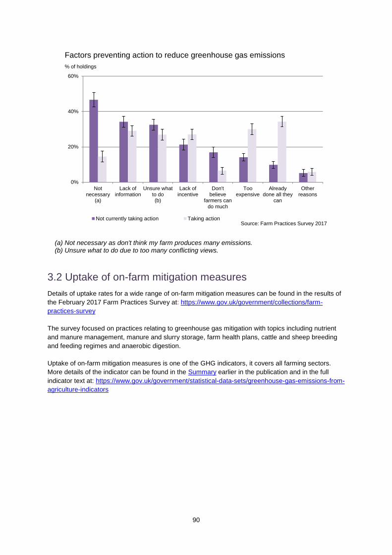
90
0%
20%
40%
60%
Notnecessary
(a)
Lack ofinformation
Unsure whatto do(b)
Lack ofincentive
Don'tbelieve
farmers cando much
Tooexpensive
Alreadydone all they
can
Otherreasons
Not currently taking action Taking action
Factors preventing action to reduce greenhouse gas emissions
% of holdings
Source: Farm Practices Survey 2017
(a) Not necessary as don't think my farm produces many emissions. (b) Unsure what to do due to too many conflicting views.
3.2 Uptake of on-farm mitigation measures
Details of uptake rates for a wide range of on-farm mitigation measures can be found in the results of
the February 2017 Farm Practices Survey at: https://www.gov.uk/government/collections/farm-
practices-survey
The survey focused on practices relating to greenhouse gas mitigation with topics including nutrient
and manure management, manure and slurry storage, farm health plans, cattle and sheep breeding
and feeding regimes and anaerobic digestion.
Uptake of on-farm mitigation measures is one of the GHG indicators, it covers all farming sectors.
More details of the indicator can be found in the Summary earlier in the publication and in the full
indicator text at: https://www.gov.uk/government/statistical-data-sets/greenhouse-gas-emissions-from-
agriculture-indicators

91
Section 4: Emerging evidence
This section highlights research and development around greenhouse gas (GHG) emissions and
mitigation in the agricultural sector
4.1 Ongoing Research Projects
A range of ongoing research projects are underway to support the R&D platform and efforts by the
agricultural sector to reduce emissions. These cover livestock and forage improvement, crop
improvement, more efficient use of fertilisers on crops and protein in animal diets and collation of
evidence to encourage implementation of the industry’s GHG Action Plan. Evidence generated by
these projects have been fed into the inventory improvement programme. Details of these and other
projects can be found on the internet at: http://randd.defra.gov.uk/
4.2 The Greenhouse Gas Platform
Defra and the Devolved Administration Governments have supported the development of an
improved Greenhouse Gas Inventory for direct methane (CH4) and nitrous oxide (N2O) emissions
from agriculture through a five-year research programme: the Greenhouse Gas Platform. The
Platform comprises three, closely-linked projects, which will improve the accuracy and resolution of
the United Kingdom’s national reporting system including the development of regionally-specific
emission factors to reflect current and changing specific practices and production systems within
agriculture. These will enable better forecasting and monitoring of performance against the wider UK
target emission reductions set by the UK Climate Change Act (2008) as well as targets set in the
legislation and policies of Devolved Administrations. The project will also help the agricultural industry
track uptake of mitigation measures included within the greenhouse gas reduction plans and sector-
specific roadmaps.
The Greenhouse Gas Platform consists of the following three projects:
Data Management and Modelling: project AC0114 - brings together existing and newly-
researched activity and emissions data to create a new, more-disaggregated inventory model
and a set of revised emission factors with an assessment of uncertainty. Improved
calculations methodologies for soil N2O emissions have already been developed by AC0114
and implemented in the current inventory submission. Work on a fully revised inventory
continues; implementation of the new model is anticipated for the 2017 inventory submission.
Methane (ResearCH4) project: AC0115 - developed new enteric CH4 emission factors from
different ruminant species, breeds and genotypes (and their manures) under a range of
typical farming systems. This project has now completed and the final report can be found
online54.
Nitrous Oxide (InveN2Ory) project: AC0116 - improving quantification through measuring and
modelling N2O emissions from different nitrogen inputs as influenced by season, climate,
crop, soil types and conditions, and land management representative of UK farming systems.
This project has now completed, and the final report is undergoing independent peer review
by a panel of international experts.
54http://randd.defra.gov.uk/Default.aspx?Menu=Menu&Module=More&Location=None&Completed=0&ProjectID=
17180

92
In January 2015, Defra also launched a parallel ‘Representative Feeds and Diets’ project (SCF0203)
to assist with the collation of necessary information on the quality and composition of ruminant
livestock diets, to support the operational inventory. Outputs from all the projects are closely
coordinated with Defra project SCF0102, which will calculate and deliver the annual UK agricultural
greenhouse gas and ammonia inventories (and projections) for submission to the United Nations
Framework Convention on Climate Change (UNFCC), the UK’s component administrations, and the
United Nations Convention on Long-range Transboundary Air Pollution, respectively. Improved
emissions factors are being incorporated into the UK agricultural GHG inventory and it is planned to
use the fully revised smart inventory model in the 2017 inventory.
A legacy has also been left by the GHG Platform projects. Created through interactions between
policy makers, industry and the research community, a new data archive has been produced in
collaboration with the Demonstration Test Catchment data archive. The archive will enable the
information generated to be preserved and also be freely available.
More information on each of the Platform projects can be found at: http://www.environmentdata.org

93
Section 5 International comparisons
This section provides international comparisons of both the productivity and greenhouse gas (GHG)
intensity of agriculture. There are many challenges with making international comparisons due to
differing farming systems, lack of comparable data and, in some instances, a lack of data. In
exploring international comparisons for GHGs, two illustrative examples are given for cereals and
milk. Here, where available, yields are considered alongside factors associated with risk of high GHG
intensity.
5.1 International comparisons of GHG emissions per unit of agricultural production
Comparisons of agricultural GHG emissions across countries are difficult, not only because of data
availability but also due to the differing types of agriculture undertaken in each country. It is possible
to gain some indication of carbon intensity across countries by assessing agricultural emissions on
the basis of emissions per unit of output (expressed in financial rather than biological or physical
terms) although this is still largely driven by the mix of farming undertaken within different countries.
The chart below considers the UNFCCC (Annex1)55 countries in this way for 2014 (latest data
published data available).
0
1
2
3
4
5
6
7
Icela
nd
Lie
chte
nste
in
Irela
nd
Luxem
bourg
New
Ze
ala
nd
Norw
ay
Fin
lan
d
Be
laru
s
Au
str
alia
Latv
ia
Slo
venia
United K
ingdom
United S
tate
s
Russia
n F
edera
tio
n
Sw
eden
Jap
an
Sw
itzerlan
d
Lith
uania
Canada
Cze
ch R
epublic
Esto
nia
Fra
nce
Slo
vakia
Cro
atia
Germ
any
Rom
ania
Po
rtuga
l
Denm
ark
Ukra
ine
Be
lgiu
m
Au
str
ia
Bu
lga
ria
Po
lan
d
Neth
erla
nds
Tu
rkey
Ma
lta
Gre
ece
Italy
Hungary
Sp
ain
Agricultural emissions in CO2 equivalent per unit of gross agricultural production, 2014
Kg per $
Note: Gross agricultural production expressed in constant 2004-2006 prices. Sources: FAO, UNFCCC
Spain, Italy and Greece have some of the lowest levels of emissions per unit of gross agricultural
production. This reflects the production of high value crops with low emissions (for example, olives
and grapes) in these countries. Countries such as New Zealand and Ireland have some of the
55 Annex I Parties to the United Nations Framework Convention on Climate Change (UNFCCC) include the
industrialized countries that were members of the OECD (Organisation for Economic Co-operation and Development) in 1992, plus countries with economies in transition (the EIT Parties), including the Russian Federation, the Baltic States, and several Central and Eastern European States.
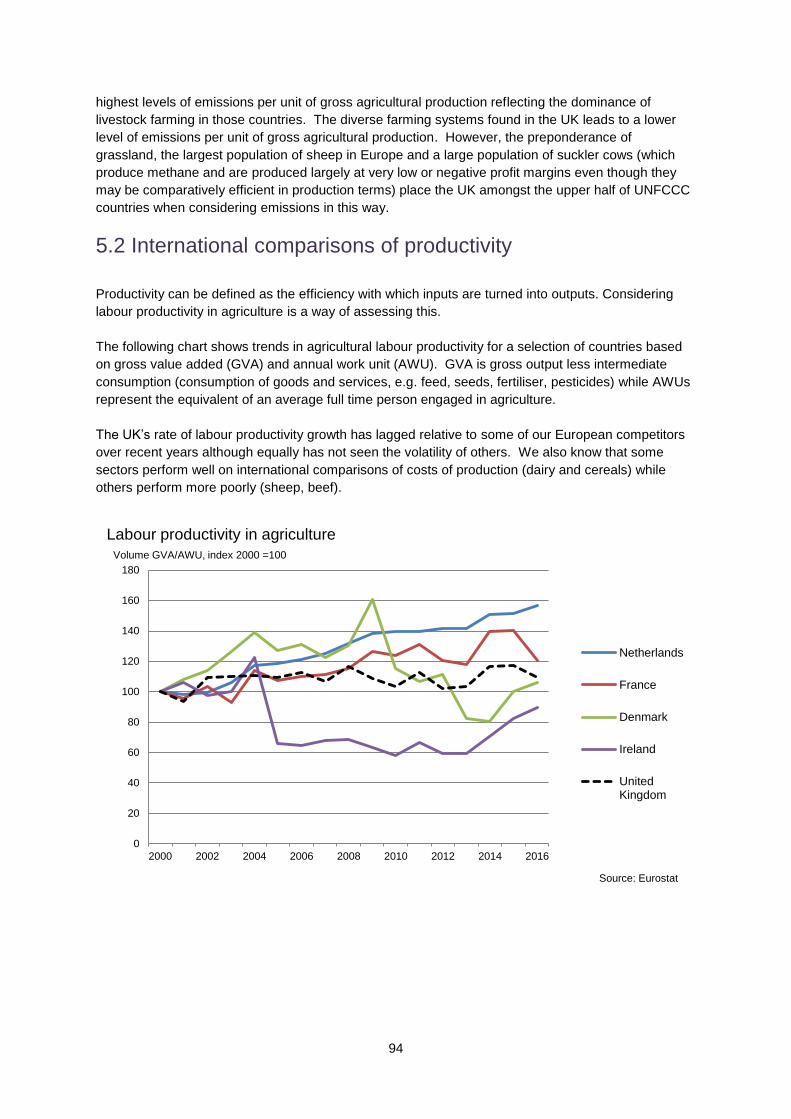
94
highest levels of emissions per unit of gross agricultural production reflecting the dominance of
livestock farming in those countries. The diverse farming systems found in the UK leads to a lower
level of emissions per unit of gross agricultural production. However, the preponderance of
grassland, the largest population of sheep in Europe and a large population of suckler cows (which
produce methane and are produced largely at very low or negative profit margins even though they
may be comparatively efficient in production terms) place the UK amongst the upper half of UNFCCC
countries when considering emissions in this way.
5.2 International comparisons of productivity
Productivity can be defined as the efficiency with which inputs are turned into outputs. Considering
labour productivity in agriculture is a way of assessing this.
The following chart shows trends in agricultural labour productivity for a selection of countries based
on gross value added (GVA) and annual work unit (AWU). GVA is gross output less intermediate
consumption (consumption of goods and services, e.g. feed, seeds, fertiliser, pesticides) while AWUs
represent the equivalent of an average full time person engaged in agriculture.
The UK’s rate of labour productivity growth has lagged relative to some of our European competitors
over recent years although equally has not seen the volatility of others. We also know that some
sectors perform well on international comparisons of costs of production (dairy and cereals) while
others perform more poorly (sheep, beef).
0
20
40
60
80
100
120
140
160
180
2000 2002 2004 2006 2008 2010 2012 2014 2016
Labour productivity in agriculture
Netherlands
France
Denmark
Ireland
UnitedKingdom
Volume GVA/AWU, index 2000 =100
Source: Eurostat

95
5.3 Yields and GHG risk factors: cereals
Wheat and barley are the main cereal crops produced in the UK. Other cereals of global importance
such as maize, sorghum and rice are not included here.
In 2014 (latest data available), the UK accounted for 2% of the world’s production of wheat and 5% of
barley (source: FAO). The following charts show trends in wheat and barley yields for a selection of
countries with broadly similar characteristics (such as climate and type of crops grown) over the last
twenty years. UK wheat and barley yields have both risen by over 10% over this period.
0
1
2
3
4
5
6
7
8
9
1991 1993 1995 1997 1999 2001 2003 2005 2007 2009 2011 2013
Wheat yields (3 year moving average) 1990 to 2014
Canada
France
Netherlands
New Zealand
United Kingdom
Source: FAO
Yield (tonnes per ha)
0
1
2
3
4
5
6
7
8
9
1991 1993 1995 1997 1999 2001 2003 2005 2007 2009 2011 2013
Barley yields (3 year moving average) 1990 to 2014
Canada
France
Netherlands
New Zealand
United Kingdom
Source: FAO
Yield (tonnes per ha)

96
Focussing on cereal yields has its limitations since nitrous oxide emissions are produced from
sources other than cereals such as pastures and fodder crops etc. An approach which considers the
efficiency of all nitrogen use (the percentage ratio of total nitrogen uptake by crops and forage to the
total nitrogen available from fertiliser, livestock manure and other nitrogen inputs) and the balance is
potentially enlightening in understanding risks of high GHG intensity. A comparison illustrating this
can be found in Section 5.3 of the 3rd edition of Agricultural Statistics and Climate Change at:
https://www.gov.uk/government/publications/agricultural-statistics-and-climate-change
5.4 Yields and GHG risk factors: milk
The chart below provides some international comparison of milk yields. Whilst yields do not provide a
measure of the intensity of GHG emissions, for the countries shown, yields will be positively
correlated with the levels of input (there is limited information available to quantify this). For example:
New Zealand and Ireland’s dairy production systems may be defined as low-input/low-output
(around 4 thousand litres per cow / year). Feeding is based mainly on grazing.
The USA’s dairy production systems may be classified as high-input/high-output (around 8,400
litres per cow/year). Feeding is based mainly on grass/maize silage and compound feed.
Germany’s dairy production systems may be classified as high-input/high-output (around 7,100
litres per cow/year). Feeding is based mainly on grass/maize silage and compound feed.
0
2,000
4,000
6,000
8,000
10,000
12,000
1990 1992 1994 1996 1998 2000 2002 2004 2006 2008 2010 2012 2014
Milk yields, 1990 to 2014
Belgium
Denmark
France
Germany
Ireland
Netherlands
Poland
New Zealand
UnitedKingdom
United Statesof America
Milk yields, litres per cow per annum
Source: FAO
The following chart shows a country level comparison of milk production to dairy cow compound feed
production. As explained in Section 2.4, the ratio of milk produced to compound feed production can
be used as a proxy measure for the emissions intensity of the dairy sector.
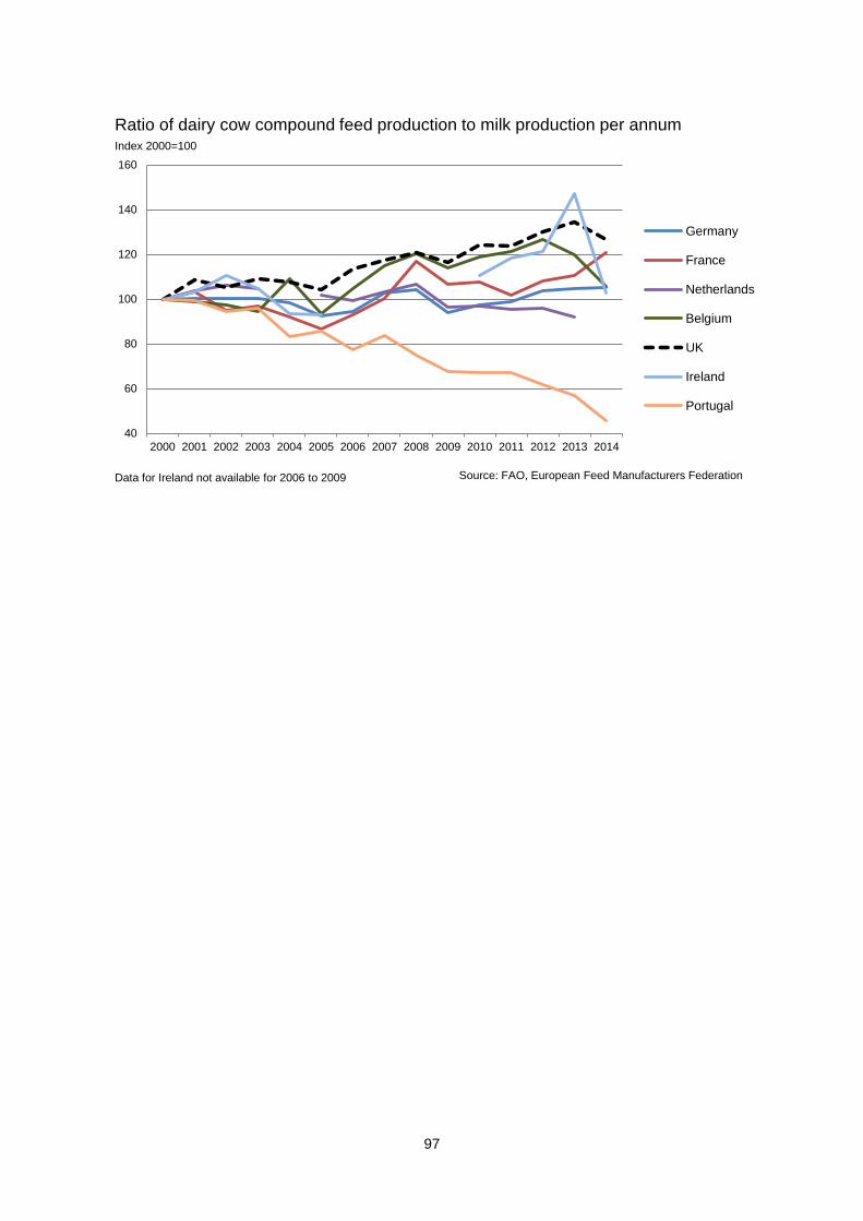
97
40
60
80
100
120
140
160
2000 2001 2002 2003 2004 2005 2006 2007 2008 2009 2010 2011 2012 2013 2014
Germany
France
Netherlands
Belgium
UK
Ireland
Portugal
Index 2000=100
Ratio of dairy cow compound feed production to milk production per annum
Source: FAO, European Feed Manufacturers FederationData for Ireland not available for 2006 to 2009

98
Appendix
(i) Methodology details for source data
Agricultural Price Index https://www.gov.uk/government/organisations/department-for-environment-food-rural-affairs/series/agricultural-price-indices AHDB auction market reports http://www.eblex.org.uk/markets/ British Survey of Fertiliser Practice – section A2 https://www.gov.uk/government/organisations/department-for-environment-food-rural-affairs/series/fertiliser-usage Cattle Tracing System - see under “cattle populations” heading: https://www.gov.uk/structure-of-the-agricultural-industry-survey-notes-and-guidance Cereal and Oilseed Rape Production Survey - methodology notes see page 22 https://www.gov.uk/government/statistics/farming-statistics-final-crop-areas-yields-livestock-populations-and-agricultural-workforce-at-1-june-2016-uk Cereal and Oilseed Rape Production Survey - annual timeseries dataset https://www.gov.uk/government/uploads/system/uploads/attachment_data/file/579404/structure-june-ukcerealoilseed-20Dec2016.xls Emissions data methodology - compilation and methodology at: https://www.gov.uk/government/publications/uk-greenhouse-gas-emissions-explanatory-notes Farm Business Survey - data collection and methodology: https://www.gov.uk/farm-business-survey-technical-notes-and-guidance Farm Practices Surveys 2008 - 2011 see under “National Archive”, Farm Practices Survey 2012 (Greenhouse gas mitigation measures) - page 3-4, Farm Practices Survey 2013 (Greenhouse gas mitigation measures) - pages 37-39, Farm Practices Survey 2014 (Greenhouse gas mitigation measures) - pages 34-35 Farm Practices Survey 2015 (Greenhouse gas mitigation measures) - pages 33-34 Farm Practices Survey 2016 (Greenhouse gas mitigation measures) - pages 36-37 Farm Practices Survey 2017 (Greenhouse gas mitigation measures) - pages 34-35 https://www.gov.uk/government/organisations/department-for-environment-food-rural-affairs/series/farm-practices-survey GB Animal feed statistics – Animal feed methodology paper https://www.gov.uk/government/publications/animal-feed-production Poultry Slaughterhouse and Hatcheries Surveys - “information” tab in the UK Poultry meat production monthly dataset: https://www.gov.uk/government/publications/poultry-and-poultry-meat-statistics Integrated Poultry Unit Survey - Animal feed methodology paper https://www.gov.uk/government/publications/animal-feed-production June Agricultural Survey: https://www.gov.uk/structure-of-the-agricultural-industry-survey-notes-and-guidance Milk production data are from surveys run by Defra, RERAD, DARDNI on the utilisation of milk by dairies. Information on the survey methodology are given at: http://www.defra.gov.uk/statistics/foodfarm/food/milk/milk-utilisation/

99
National Soils Inventory: http://www.landis.org.uk/data/nsi.cfm Slaughterhouse Survey - see monthly dataset “information” tab: https://www.gov.uk/government/statistics/cattle-sheep-and-pig-slaughter Soil Nutrient Balances Information on the methodology for deriving Soil Nutrient Balances can be found under “Soils” at: https://www.gov.uk/government/organisations/department-for-environment-food-rural-affairs/series/agri-environment-analysis See link “strategic evidence funded project: UK agriculture nutrient balances methodology review” for the ADAS report ‘Soil Nutrient Balances Draft Report June 2010’ which explores uncertainty. The Countryside Survey: http://www.countrysidesurvey.org.uk/

100
(ii) Distribution of dairy cows by age in years
0.0%
0.5%
1.0%
1.5%
2.0%
2.5%
2.6 3.8 5.1 6.3 7.6 8.8 10.1 11.3 12.6 13.8 15.1 16.3 17.6 18.8
2002
2008
2016
Distribution of dairy cattle by age in years, GB
Age in years
The number of animals on which the percentage shown is based, is an average of the number of animals in each month of the year Source: Defra RADAR, Cattle Tracing System
Percentage of dairy cows
(iii) Distribution of beef cows by age in years
0.0%
0.2%
0.4%
0.6%
0.8%
1.0%
1.2%
1.4%
1.6%
1.8%
2.6 3.8 5.1 6.3 7.6 8.8 10.1 11.3 12.6 13.8 15.1 16.3 17.6 18.8
2002
2008
2016
Distribution of beef cattle by age in years, GB
Percentage of beef cows
The number of animals on which the percentage shown is based, is an average of the number of animals in each month of the year
Age in years
Source: Defra, RADAR Cattle Tracing System

101
(iv) Wheat production per unit of manufactured N applied
The following charts illustrate the magnitude of the trend and irregular components of the time series
given in Section 2.9. The charts show wheat only, similar charts for the other crops shown in Section
2.9 can be obtained by contacting [email protected]
6.0
6.5
7.0
7.5
8.0
8.5
9.0
1990 1992 1994 1996 1998 2000 2002 2004 2006 2008 2010 2012 2014 2016
Yield
Yield 5 yearmovingaverage
Tonnes per ha
Wheat yield, England
Source: Defra Cereal Production Survey
-1.5
-1.0
-0.5
0.0
0.5
1.0
1.5
1990 1992 1994 1996 1998 2000 2002 2004 2006 2008 2010 2012 2014
Yield -irregularcomponent
Tonnes per ha
Wheat yield irregular component*, England
Source: Defra Cereal Production Survey
*Yield minus 5 year moving average of yield

102
(iv) Wheat production per unit of manufactured N applied (continued)
0.160
0.165
0.170
0.175
0.180
0.185
0.190
0.195
0.200
1990 1992 1994 1996 1998 2000 2002 2004 2006 2008 2010 2012 2014 2016
Applicationrate (tonnesper ha)
Applicationrate (tonnesper ha) 5year movingaverage
N application rate per ha
Wheat N application rate, England
Source: British Survey of Fertiliser Practice
-0.020
-0.015
-0.010
-0.005
0.000
0.005
0.010
0.015
0.020
1990 1992 1994 1996 1998 2000 2002 2004 2006 2008 2010 2012 2014
Application rate- irregularcomponent
N application rate per ha
Wheat N application rate irregular component*, England
N application rate per ha
Source: British Survey of Fertiliser Practice
*N application rate minus 5 year moving average of N application rate

103
(iv) Wheat production per unit of manufactured N applied (continued)
30.0
32.0
34.0
36.0
38.0
40.0
42.0
44.0
46.0
48.0
50.0
1990 1992 1994 1996 1998 2000 2002 2004 2006 2008 2010 2012 2014 2016
Intensityproxy (tonnesproduced pertonne of N)
Intensityproxy 5 yearmovingaverage
Tonnes of crop per tonne of N
Wheat N intensity, England
Source: British Survey of Fertiliser Practice, Defra Cereal Production Survey
-15
-10
-5
0
5
10
15
1990 1992 1994 1996 1998 2000 2002 2004 2006 2008 2010 2012 2014
N intensity -irregularcomponent
Tonnes of crop per tonne of N
Wheat N intensity irregular component*, England
Source: British Survey of Fertiliser Practice, Defra Cereal Production Survey
*N intensity minus 5 year moving average of N intensity

104
Glossary
Annual work unit (AWU) An annual work unit represents the equivalent of an average full time person engaged in agriculture. BSE
Bovine spongiform encephalopathy is a fatal disease in cattle that causes degeneration in the brain and
spinal cord. BSE is commonly known as ‘mad cow disease’.
Carcase weights The weight of the meat produced from an animal. Cold dressed carcase weights are recorded. Cattle Tracing System (CTS)
The CTS records births, deaths and all movements of cattle as well as breed types and gender. It is
mandatory for every bovine animal to have a passport and ear tag and for owners to report every
movement via the CTS.
Clean pigs Pigs bred purely for meat production. Dairy herd and beef herd
Unless otherwise stated, the dairy herd refers to those breeding animals which produce milk, and the beef
herd refers to those breeding animals which produce offspring for slaughter. The beef herd is also
commonly referred to as the suckler herd.
Estimated Breeding Values (EBV) Estimated Breeding Values estimate the genetic worth of animals using desirable traits such as meat production. Feed conversion ratio (FCR)
A measure of an animal's efficiency in converting feed mass into increased body mass expressed as feed
per kg of liveweight; a low FCR is more efficient than a high FCR.
Finishing Finishing is the feeding process used prior to slaughter for cattle or sheep intended for meat production.
Greenhouse gas intensity
Greenhouse gases produced per tonne of grain or litre of milk or kilogramme of beef. This may also be
referred to as GHG efficiency.
Gross valued added (GVA)
Gross valued added is the gross output less intermediate consumption (consumption of goods and
services, e.g. feed, seeds, fertiliser, pesticides).
Less favoured areas (LFA) Less favoured areas are land that is classified as difficult to farm due to limitations such as climate, location
or features of the landscape (e.g. mountainous or hilly areas).
Marketing pattern The pattern of animals slaughtered per month over the course of a year. Over thirty month scheme (OTMS)
In March 1996 the EU imposed a worldwide ban on the export of bovine and bovine products from the UK
due to BSE in UK cattle. The Over Thirty Month (OTM) Rule prohibited beef from animals aged over thirty
months from entering the food chain. The Over Thirty Month Slaughter Scheme (OTMS) provided a

105
disposal outlet for OTM cattle which could not be sold for the food chain. Cattle entering the scheme were
slaughtered and destroyed with compensation paid to the farmer.
Pig fattening herd Pigs intended for meat production. Profitable Lifetime Index (PLI) PLI is a scoring system to identify cattle with the best ‘genetic merit’. It is used when choosing bulls to breed with dairy cattle. The PLI uses a combination of attributes including life expectancy, health, fertility and milk production. Soil nitrogen balance The soil nitrogen balance is a measure of the total loading of nitrogen on agricultural soils over the crop year. Total Factor Productivity (TFP)
Total factor productivity shows the volume of output leaving the industry per unit of all inputs including fixed
capital and labour. It includes all businesses engaged in farming activities including specialist contractors.
UNFCC countries
Parties to the United Nations Framework Convention on Climate Change (UNFCCC) include the
industrialized countries that were members of the OECD (Organisation for Economic Co-operation and
Development) in 1992, plus countries with economies in transition (the EIT Parties), including the Russian
Federation, the Baltic States, and several Central and Eastern European States.