Embed Size (px)
Citation preview
1
African Poverty is Falling...Much Faster than You Think!
Maxim Pinkovskiy, Massachusetts Institute of Technology
Xavier Sala‐i‐Martin, Columbia University and NBER1
Jan 17th, 2010
Abstract:
The conventional wisdom that Africa is not reducing poverty is wrong. Using the methodology of Pinkovskiy and Sala‐i‐Martin (2009), we estimate income distributions, poverty rates, and inequality and welfare indices for African countries for the period 1970‐2006. We show that: (1) African poverty is falling and is falling rapidly. (2) If present trends continue, the poverty Millennium Development Goal of halving the proportion of people with incomes less than one dollar a day will be achieved on time. (3) The growth spurt that began in 1995 decreased African income inequality instead of increasing it. (4) African poverty reduction is remarkably general: it cannot be explained by a large country, or even by a single set of countries possessing some beneficial geographical or historical characteristic. All classes of countries, including those with disadvantageous geography and history, experience reductions in poverty. In particular, poverty fell for both landlocked as well as coastal countries; for mineral‐rich as well as mineral‐poor countries; for countries with favorable or with unfavorable agriculture; for countries regardless of colonial origin; and for countries with below‐ or above‐median slave exports per capita during the African slave trade
1 Pinkovskiy would like to thank the Paul and Daisy Soros Fellowship for New Americans and the National Science Foundation Graduate Research Fellowship Program for funding. This work represents the opinion of the writers alone, and all remaining errors are our own.

2
1 Introduction
After three decades of zero or negative growth, Africa began a growth spurt around 1995 that
has been sustained at least to 2006. Some analysts claim that this growth trend has not been
strong enough to reduce poverty. For example, in its 2008 Millennium Development Goals
Report, the United Nations Development Program contends that “the goal of cutting in half the
proportion of people in the developing world living on less than $1 a day by 2015 remains within
reach. However, this achievement will be due largely to extraordinary economic success in most
of Asia. In contrast, previous estimates suggest that little progress was made in reducing
extreme poverty in sub‐Saharan Africa.” The World Bank concurs: “In 1990, 28.3 percent of the
people in low and middle‐income countries lived on less than $1 a day. By 1999 the share had
fallen to 21.6 percent, driven mainly by strong growth in China and India (…) In Sub‐Saharan,
where the GDP per capita fell by 5 percent, the extreme poverty rate rose from 47.4 percent in
1990 to 49 percent in 1999. The numbers are believed to be still rising” (World Bank (2004).) The
U.N. Millenium Campaign Deputy Director for Africa says: “Poverty continues to intensify due to
the exclusion of groups of people on the basis of class, caste, gender, disability, age, race,
religion and other status,” (UN Millenium Campaign (2009).) This conventional wisdom is further
documented and critically reviewed in Easterly (2009).
It is also believed that most of the recent African growth is due to rising oil and natural
resource prices, which entails a redistribution of income from mineral‐poor countries to
mineral‐rich countries (Collier (2006).) Moreover, gains from natural resource wealth are
believed to accrue to very narrow elites and to be irrelevant for poverty reduction. These claims
imply that African growth should be accompanied by rapidly rising inequality, which is testable
with data.
In this paper, we use the methodology of Pinkovskiy and Sala‐i‐Martin (2009) to
estimate income distributions for African countries, and compute their poverty rates, and
inequality and welfare indices for the period 1970‐2006. Our results show that the conventional
wisdom that Africa is not reducing poverty is wrong. In fact, since 1995, African poverty has
been falling steadily. Moreover, contrary to the commonly held idea that African growth is
largely based on natural resources and helps only the rich and well‐connected, we show that
Africa’s income distribution has become less rather than more unequal than it was in 1995, and
therefore, that a great deal of this growth has accrued to the poor. Specifically, Africa’s growth

3
trend in 1995 has been accompanied by a symmetric, sustained reduction in poverty that places
it on track to achieve the Millennium Development Goal of halving poverty within a few years of
2015. If countries hit by exceptional adverse shocks like Congo‐Zaire2 converge to the average
African poverty rate, then the first poverty MDG will actually be achieved two years in advance
of 2015.
Not only has poverty fallen in Africa as a whole, but this decline has been remarkably
general across types of countries that the literature suggests should have different growth
performances. In particular, poverty fell for both landlocked as well as coastal countries; for
mineral‐rich as well as mineral‐poor countries; for countries with favorable or with unfavorable
agriculture; for countries regardless of colonial origin; and for countries with below‐ or above‐
median slave exports per capita during the African slave trade.3 Hence, the substantial decline in
poverty is not driven by any particular country or set of countries.
The rest of the paper is organized as follows. Section 2 provides a brief description of
the data and the statistical procedure to estimate the income distributions of African countries
and of all of Africa in every year in the sample period. Section 3 describes the evolution of the
income distributions. Section 4 analyzes the evolution of poverty rates in Africa. Section 5
provides measures of inequality and welfare. Section 6 discusses the evolution of poverty for
various African regions. Section 7 provides robustness checks, and section 8 concludes.
2 Data and statistical procedure
We use national accounts purchasing‐power‐parity (PPP)‐adjusted GDP data from Penn
World Tables, Mark 6.2. We use this series because it is the standard GDP series used in the
study of economic growth (Barro and Sala‐i‐Martin 2004). In the robustness checks, we
2 The Democratic Republic of Congo was called Zaire for most of our sample period (until 1997). We will refer to the country as Congo‐Zaire in this paper. 3 Bloom and Sachs (1998) suggest that landlocked countries, or countries with unfavorable agriculture have poorer performance than geographically advantaged countries. La Porta et al. (1999) argue that the identity of the colonizer may matter for subsequent economic development. Nunn (2008) presents evidence that the impact of the African slave trade was highly persistent, and affected recent African performance.

4
experiment with other national accounts‐based series with comprehensive coverage of all
countries and years we consider, but with different corrections for PPP.
We obtain inequality data from the WIDER‐DS dataset, pioneered by Deininger and
Squire (1996) and maintained by the United Nations University. The dataset provides Gini
coefficients and quintile shares for countries and years in which income or consumption surveys
were conducted. In order to maintain comparability of the survey data, we select surveys from
WIDER‐DS following special criteria and we adjust surveys with consumption data so that they
are comparable to surveys with income data, which is described in detail by Pinkovskiy and Sala‐
i‐Martin (2009). Overall, we have 118 surveys for the 48 African countries considered.
Our procedure exactly follows Pinkovskiy and Sala‐i‐Martin (2009). The crux of the
methodology is to assume that the distribution of income in each country and each year has the
same functional form, with changes in GDP and inequality manifesting themselves through
changes in the parameters of this form only. Then, we use the survey data to recover the
functional form parameters, and from these parameters we can compute any statistic of the
distribution of income for any country or for all of Africa that we want. Following Pinkovskiy and
Sala‐i‐Martin (2009), our baseline functional form is lognormal but, as a robustness check, we
also consider Gamma, and Weibull distributions. These distributions are mathematically
convenient because they have a single parameter that determines the mean of the distribution
(the scale parameter), and a single parameter that determines the degree of inequality of the
distribution (the distribution parameter). In particular, the Gini coefficient and the quintile
shares of each distribution are functions of the distribution parameter alone. Hence, it is very
easy to compute the distribution parameter on the basis of the survey data alone, and then to
compute the scale parameter on the basis of the distribution parameter and GDP, so that the
mean of the distribution of each country is given exactly by GDP. We proceed as follows:
I) For country‐years with surveys, our baseline method for obtaining the distributional
parameter is to choose the distributional parameter that minimizes the sum of squared
deviations between the quintile shares in the data and the theoretical predicted quintile shares
based on the distributional parameter. In our robustness section we experiment with two
methods. The first is to invert the theoretical expression for the Gini coefficient. The second
method is similar to the baseline method, except we replace the 5 quintile shares by the three
middle quintile shares divided by the total share of the middle 60%, and minimize the squared
5
deviations of these three numbers from their theoretically predicted values. We ignore the top
and bottom quintile shares because there may be considerable doubt as to the accuracy of the
surveys in reporting the incomes of the very rich (who may be unwilling to participate, or who
may lie outright to conceal their income) and the very poor (whose income may be in kind, and
hence, converted into a monetary equivalent with error). Using only the three middle shares
avoids these problems so long as all survey respondents are correctly placed into the quintile of
the sample that they belong to, which is much more likely than that their income is reported
correctly.
II) For countries and years without survey data, we impute a Gini coefficient, which we
then invert to get the distributional parameter. If the country in question has two or more
surveys in other years, we impute the Ginis for a year without data by interpolating and
extrapolating the series of Gini coefficients we have from WIDER‐DS. In the robustness section,
we experiment with different interpolation and extrapolation procedures in the robustness
checks. We then compute the average of the Gini series for all countries with two or more
surveys (weighting such countries equally). For countries with no surveys, we impute this
average Gini series. For countries with exactly one survey, we impute the average Gini series but
shift it vertically to coincide with the single observation of the Gini for that country in the year in
which this observation is made.
III) For each country in each year, we compute the scale parameter from GDP and the
distributional parameter.
IV) Using the assumed functional forms and the calculated parameters, we compute
poverty and inequality statistics for each country, for all of Africa, and for any groups of
countries of special interest.
In our robustness checks, we experiment with varying the GDP source, the assumed
functional form, the method of interpolation and extrapolation, and the method of recovering
the distributional parameter. We list these variations below:
a) We consider GDP from the Penn World Tables, 6.2; GDP from Angus Maddison’s
website (dated 2007), which uses different PPP adjustments from the Penn World Tables; and
GDP from the World Bank’s World Development Indicators, with data from both before and

6
after the 2007 PPP revision by the World Bank. Hence, we experiment with a wide variety of
purchasing power parity adjustments.
b) We consider three parametric functional forms for the income distribution:
lognormal, gamma and Weibull. The lognormal functional form is very commonly used, whereas
the gamma and Weibull tend to predict more inequality for the same quintile shares than the
lognormal form.
c) We consider three methods of extrapolation and interpolation: i) horizontal
extrapolation and piecewise cubic interpolation, ii) linear interpolation and extrapolation, iii)
horizontal interpolation and horizontal extrapolation, although if the last two surveys happened
in consecutive years, linear extrapolation is used. Linear extrapolation allows for greater
variation of inequality in the period after our data ends, and allows strong responses of
inequality to trends at the point at which our data ends.
d) We consider three methods of recovering distribution parameters from data: i)
minimize least squares of quintiles, ii) minimize least squares of ratios of each of the middle
three quintiles to their sum, iii) invert the Gini.
For our baseline estimates, we make the following choices:
• GDP data from PWT 6.2
• Cubic splines to interpolate between available survey data, and extrapolate by
horizontal projection.
• Lognormal distributions in all countries, and recover scale parameters from least
squares minimization on quintiles.
These choices are most consistent with the previous literature on measuring world
income distribution and with the growth literature in general.
3 Dynamics of the African Distribution of Income
Figures 1 through 4 present graphs of distributions of income for Africa as well as for
various African countries. To have a visual anchor, each of the graphs contains three vertical

7
lines corresponding to daily incomes of $1, $2 and $3. The one‐dollar‐a‐day poverty line
corresponds to 554 dollars per year, since the “poverty line” referred to in the United Nations’
Millenium Development Goals was originally defined by the World Bank as one dollar a day in
1985 prices, and $365 in 1985 US dollars is $554 in 2000 US dollars, the currency unit of the
Penn World Tables. The $2/day and $3/day thresholds are exactly twice and three times the
$1/day line.
Figure 1 plots the 1970 distributions for the largest countries (Nigeria, Ethiopia, Congo‐
Zaire and South Africa) as well as for the entire continent. We see that the mode of the
Ethiopian distribution is the lowest while the South African mode is the highest. However, the
dispersion of the Nigerian distribution is so large that the number of Nigerians at the lowest
levels of income is larger than that of any other large African country. The mode of African
distribution is located slightly above the $1/day line while the $2/day and $3/day lines are far
above the mode.
While things were pretty much unchanged in 1990 (Figure 2), there are noticeable
changes by 2006 (Figure 3): the distributions for Nigeria and Ethiopia shift to the right, while
Congo‐Zaire collapses. The modes of the Nigerian and Ethiopian distributions in 1990 were
below the $1/day line; by 2006 they are well above it, and the Nigerian mode is approaching
two dollars a day. However, about two thirds of the Congo‐Zaire distribution lies to the left of
the one‐dollar‐a‐day poverty line while virtually the entire distribution is to the left of the
$3/day threshold. For the continent as a whole, there is a slight movement of the distribution to
the right. We notice that the mode of the distribution moves away from the $1/day line and
gets close to the $2/day line.
To observe the dynamics, Figure 4 plots the African distributions for 1970, 1990, 2000
and 2006. If we look at the bottom of the distribution we notice a deterioration between 1970
and 1990: African poverty increased over these two decades. However, there seems to be some
improvement after 1990. The 2000 and especially the 2006 distributions move to the right,
indicating that poverty in Africa declined.

8
Figure 1
050
000
1000
00P
opul
atio
n
2 4 6 8 10 12Log Income
Africa Nigeria Ethiopia
Congo-Zaire South Africa
The three vertical lines show the $1, $2 and $3/day poverty lines respectively
African Income Distribution in Year 1970
Figure 2
050
000
1000
0015
0000
2000
00P
opul
atio
n
2 4 6 8 10 12Log Income
Africa Nigeria Ethiopia
Congo-Zaire South Africa
The three vertical lines show the $1, $2 and $3/day poverty lines respectively
African Income Distribution in Year 1990

9
Figure 3
010
0000
2000
0030
0000
Pop
ulat
ion
2 4 6 8 10 12Log Income
Africa Nigeria Ethiopia
Congo-Zaire South Africa
The three vertical lines show the $1, $2 and $3/day poverty lines respectively
African Income Distribution in Year 2006
Figure 4
010
0000
2000
0030
0000
Pop
ulat
ion
2 4 6 8 10 12Log Income
1970 1990 2000 2006
The three vertical lines show the $1, $2 and $3/day poverty lines respectively
African Income Distribution: 1970-2006

10
4 Poverty To better assess the evolution of poverty, Figure 5 and Table I display the yearly African poverty
rate between 1970 and 2006. The poverty rate in 1970 was 0.398. That is, close to 40% of the
entire population lived with less than one dollar a day in Africa in 1970. After a small decline
during the first half of the seventies, the rate jumped to around 0.42 in 1985 and stayed more or
less at that level for a decade. In 1995 there is a dramatic change in trend: the poverty rate
began a decline that led to a ten percentage point reduction by 2006.
What caused this dramatic change? The answer can be seen in Figure 6, where the
poverty rate is plotted along with African GDP per capita. The evolution of poverty is an almost
exact mirror image of the evolution of GDP per capita. That is, the driving force that explains the
substantial reduction in poverty between 1995 and 2006 is economic growth. A similar
conclusion is reached if we analyze the evolution of poverty and GDP per capita for the largest
countries in the region. Figures 7‐10 show that, for Ethiopia, South Africa, Nigeria and Congo‐
Zaire, poverty and GDP per capita are mirror images of each other.
Figure 5
.3
.35
.4
.45
Pove
rty R
ate
1970 1980 1990 2000 2010Year
Baseline $1/Day Poverty Rate, Africa 1970-2006

11
Figure 6
1600
1700
1800
1900
2000
GD
P pe
r Cap
ita
.3
.35
.4
.45
1970 1980 1990 2000 2010Year
Poverty Rate, $1/Day GDP per capita
Pov
erty
Rat
e$1/Day Poverty and Growth in Sub-Saharan Africa, 1970-2006
Figure 7
400
500
600
700
800
900
GD
P p
er C
apita
.3
.4
.5
.6
.7
.8
1970 1980 1990 2000 2010Year
Poverty Rate, $1/Day GDP per capita
Pov
erty
Rat
e
$1/Day Poverty and Growth in Ethiopia, 1970-2006

12
Figure 8
6000
7000
8000
9000
10000
GD
P p
er C
apita
.02
.03
.04
.05
.06
.07
1970 1980 1990 2000 2010Year
Poverty Rate, $1/Day GDP per capita
Pov
erty
Rat
e$1/Day Poverty and Growth in South Africa, 1970-2006
Figure 9
900
1000
1100
1200
1300G
DP
per
Cap
ita
.25
.3
.35
.4
.45
.5
1970 1980 1990 2000 2010Year
Poverty Rate, $1/Day GDP per capita
Pov
erty
Rat
e
$1/Day Poverty and Growth in Nigeria, 1970-2006
13
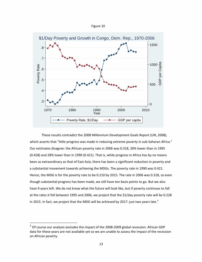
Figure 10
0
500
1000
1500
GD
P p
er C
apita
.3
.4
.5
.6
.7
.8
1970 1980 1990 2000 2010Year
Poverty Rate, $1/Day GDP per capita
Pov
erty
Rat
e$1/Day Poverty and Growth in Congo, Dem. Rep., 1970-2006
These results contradict the 2008 Millennium Development Goals Report (UN, 2008),
which asserts that “little progress was made in reducing extreme poverty in sub‐Saharan Africa.”
Our estimates disagree: the African poverty rate in 2006 was 0.318, 30% lower than in 1995
(0.428) and 28% lower than in 1990 (0.421). That is, while progress in Africa has by no means
been as extraordinary as that of East Asia, there has been a significant reduction in poverty and
a substantial movement towards achieving the MDGs. The poverty rate in 1990 was 0.421.
Hence, the MDG is for the poverty rate to be 0.210 by 2015. The rate in 2006 was 0.318, so even
though substantial progress has been made, we still have ten basis points to go. But we also
have 9 years left. We do not know what the future will look like, but if poverty continues to fall
at the rates it fell between 1995 and 2006, we project that the $1/day poverty rate will be 0.228
in 2015. In fact, we project that the MDG will be achieved by 2017: just two years late.4
4 Of course our analysis excludes the impact of the 2008‐2009 global recession. African GDP data for these years are not available yet so we are unable to assess the impact of the recession on African poverty.

14
One reason why the MDGs are projected to be achieved two years late is the poor
performance of Congo‐Zaire over the last decade. Naturally, this poor economic performance
has to do with the war that took place in that country during that decade. If we exclude Congo‐
Zaire from our sample, the African poverty rate in 1990 was 0.417. Hence, the MDG is to cut
that number to 0.209 by 2015. The poverty rate in 2006 was 0.279. Projecting the rate of
progress between 1995 and 2006 into the future, we expect the African poverty rate to be 0.211
in 2012 and 0.200 in 2013. That is, the MDG will be achieved two to three years ahead of time!
Of course we don’t know whether poverty will continue to decline at the rates it fell
between 1995 and 2006. But then again, we do not think that there is anything magic about
2015 either. And we do not think there is anything special about “halving the 1990 poverty
rate”. In other words, the MDGs are interesting goals but if the 1990 poverty rate is cut by one
half in 2016 or 2020 rather than 2015, so what? The main point is that Africa has been moving in
the right direction and, while progress has not been as substantial and spectacular as in Asia,
poverty has been falling and it has been falling substantially. We should not let the literal
interpretation of the MDGs turn good news (Africa is rapidly moving in the right direction) into
bad news (Africa will not achieve the MDGs on time).5
Column 2 of Table I displays the evolution of the $2/day poverty rate. The rate was
0.652 in 1970, it increased to 0.679 by 1995 and then it started a declining trend to 0.595 by
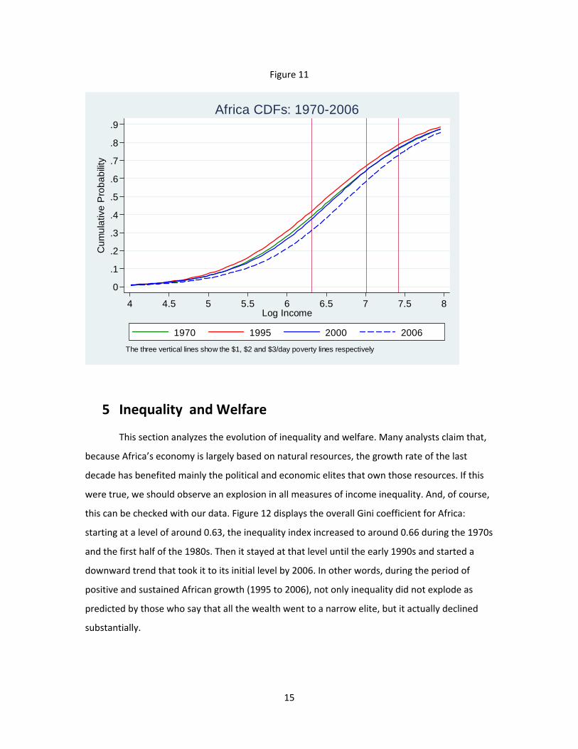
2006. Figure 11 displays the cumulative distribution function of the African distribution of
income. The image of the CDF corresponds to the poverty rate if the poverty threshold
happened to be the level of income in the horizontal axis. We see that for most conceivable
poverty lines, the poverty rate between 1990 and 2006 has fallen. In particular, this is true for
the $1/day, $2/day and $3/day lines, which are also displayed in the Figure as vertical lines.
5 Easterly (2009)
15
Figure 11
0
.1
.2
.3
.4
.5
.6
.7
.8
.9
Cum
ulat
ive
Pro
babi
lity
4 4.5 5 5.5 6 6.5 7 7.5 8Log Income
1970 1995 2000 2006The three vertical lines show the $1, $2 and $3/day poverty lines respectively
Africa CDFs: 1970-2006
5 Inequality and Welfare
This section analyzes the evolution of inequality and welfare. Many analysts claim that,
because Africa’s economy is largely based on natural resources, the growth rate of the last
decade has benefited mainly the political and economic elites that own those resources. If this
were true, we should observe an explosion in all measures of income inequality. And, of course,
this can be checked with our data. Figure 12 displays the overall Gini coefficient for Africa:
starting at a level of around 0.63, the inequality index increased to around 0.66 during the 1970s
and the first half of the 1980s. Then it stayed at that level until the early 1990s and started a
downward trend that took it to its initial level by 2006. In other words, during the period of
positive and sustained African growth (1995 to 2006), not only inequality did not explode as
predicted by those who say that all the wealth went to a narrow elite, but it actually declined
substantially.

16
As is well known (e.g. Cowell (2000)), the Gini coefficient is not decomposable in the
sense that the sum of “within‐country inequality” and “between‐country inequality” do not add
up to “global inequality”. Two measures of inequality that are decomposable are the Mean
Logarithmic Deviation (MLD) and the Theil Index. The two belong to the family of Generalized
Entropy (GE) indexes: the MLD is the GE Index with coefficient zero and the Theil index is the GE
index with coefficient one. Figures 13 and 14 show global African inequality according to both
the MLD and Theil indexes. They both follow a pattern similar to that of the Gini: increasing
between 1970 and 1985, remaining at that level for a few years and, in 1990, beginning a
downward trend until 2006.
When we decompose the overall inequality index into its two components we see that,
in 1970, most of the overall African inequality can be accounted for by within‐country
inequality. Within‐country inequality, however, declines over the sample period (indicating that
it is not true that all the extra income generated by the growth process that took place between
1990 and 2006 went to a few) while between‐country inequality increases, by 2006, the within‐
and between‐country inequality measures are about the same. That is, by 2006, half of the
overall inequality is accounted for by the within‐country component and the other half by the
between‐country component.
Our estimates of African inequality allow us to measure African welfare. For example,
Amartya Sen (1976) proposed a measure of welfare equal to GDP per capita time one minus the
Gini coefficient. Since we have estimated the Gini coefficient, we can calculate the Sen index for
Africa. The results are displayed in Figure 15: African welfare declined substantially between
1970 and 1995, but the trend was reversed dramatically between 1995 and 2006. During this
decade, the two components of the index moved in the same direction: mean income increased
and overall inequality declined. Hence, African welfare improved.

17
Figure 12
.63
.64
.65
.66
.67G
ini C
oeffi
cien
t
1970 1980 1990 2000 2010Year
Gini Inequality in Africa
Figure 13
.2
.4
.6
.8
GE
(0) I
nequ
ality
1970 1980 1990 2000 2010Year
Total Between Countries Within Countries
Between vs. Within Inequality in Africa: GE(0)

18
Figure 14
.4
.6
.8
1G
E(1
) Ine
qual
ity
1970 1980 1990 2000 2010Year
Total Between Countries Within Countries
Between vs. Within Inequality in Africa: GE(1)
Figure 15
550
600
650
700
750
Sen
Wel
fare
1970 1980 1990 2000 2010Year
Rising Sen Welfare in Africa

19
6 Regional Analysis It is interesting to see whether African poverty reduction has been not only fast, but also
general across characteristics of countries that the literature has identified as important for
development. Bloom and Sachs (1998) point to adverse geography as a cause of slow
development: in particular, countries that have unfavorable agriculture should be poorer than
countries with more favorable conditions. Collier (2006) argues that coastal countries will
perform better than landlocked countries in general. Also, mineral‐rich countries should have
been better‐positioned than mineral‐poor countries to take advantage of the increase in natural
resource prices in the 2000s. For example, the 2008 UN Millennium Development Goals Report
states that “since 2002, one of the factors contributing to growth in many developing countries...
has been the increased prices of commodities, including oil. For exporters, this has been a boon.
But higher commodity prices, particularly oil prices, have dampened growth in countries
importing these products. Many are among the poorest countries in the world.” Collier (2006),
suggests that being mineral‐rich or mineral‐poor will matter differently for coastal and
landlocked countries.
Others have suggested that troubled history may have a persistent effect on growth
performance. Nunn (2008), for example, argues that the African slave trade had “particularly
detrimental consequences, including social and ethnic fragmentation, political instability and a
weakening of states, and the corruption of judicial institutions,” which led the parts of Africa
most affected by the slave trade to grow much slower than the parts that were not. La Porta et
al. (1999) suggest that the identity of the colonizer mattered substantially for development.
Since these factors are permanent (and cannot be changed with good policy), they imply that
some parts of Africa may be at a persistent growth disadvantage relative to others.
In this section, we show the differential growth and poverty reduction performance of these
types of African countries. Figure 16 breaks down Africa into landlocked and coastal countries.
The list of countries in each category is provided in Appendix Table I. Panel A shows that
between 1970 and 2006, both GDP per capita and the growth rate were larger for coastal than
for landlocked countries. Panel B displays the evolution of the poverty rate for the two regions.
As expected, the poverty rate for coastal countries is smaller. The interesting phenomenon,
however, is that poverty in landlocked countries has also fallen. In fact, it has fallen faster than
in coastal regions, especially over the last decade. Poverty in the mid‐1990s was close to 55% for
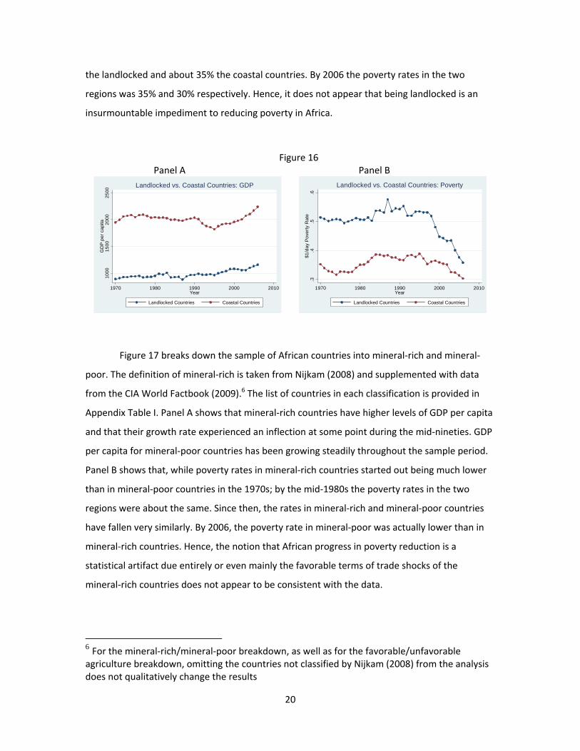
20
the landlocked and about 35% the coastal countries. By 2006 the poverty rates in the two
regions was 35% and 30% respectively. Hence, it does not appear that being landlocked is an
insurmountable impediment to reducing poverty in Africa.
Figure 16 Panel A Panel B
1000
1500
2000
2500
GD
P p
er c
apita
1970 1980 1990 2000 2010Year
Landlocked Countries Coastal Countries
Landlocked vs. Coastal Countries: GDP
.3
.4.5
.6$1
/day
Pov
erty
Rat
e
1970 1980 1990 2000 2010Year
Landlocked Countries Coastal Countries
Landlocked vs. Coastal Countries: Poverty
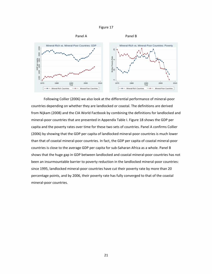
Figure 17 breaks down the sample of African countries into mineral‐rich and mineral‐
poor. The definition of mineral‐rich is taken from Nijkam (2008) and supplemented with data
from the CIA World Factbook (2009).6 The list of countries in each classification is provided in
Appendix Table I. Panel A shows that mineral‐rich countries have higher levels of GDP per capita
and that their growth rate experienced an inflection at some point during the mid‐nineties. GDP
per capita for mineral‐poor countries has been growing steadily throughout the sample period.
Panel B shows that, while poverty rates in mineral‐rich countries started out being much lower
than in mineral‐poor countries in the 1970s; by the mid‐1980s the poverty rates in the two
regions were about the same. Since then, the rates in mineral‐rich and mineral‐poor countries
have fallen very similarly. By 2006, the poverty rate in mineral‐poor was actually lower than in
mineral‐rich countries. Hence, the notion that African progress in poverty reduction is a
statistical artifact due entirely or even mainly the favorable terms of trade shocks of the
mineral‐rich countries does not appear to be consistent with the data.
6 For the mineral‐rich/mineral‐poor breakdown, as well as for the favorable/unfavorable agriculture breakdown, omitting the countries not classified by Nijkam (2008) from the analysis does not qualitatively change the results
21
Figure 17
Panel A Panel B 12
0014
0016
0018
0020
0022
00G
DP
per
cap
ita
1970 1980 1990 2000 2010Year
Mineral-Rich Countries Mineral-Poor Countries
Mineral-Rich vs. Mineral-Poor Countries: GDP
.3.3
5.4
.45
$1/d
ay P
over
ty R
ate
1970 1980 1990 2000 2010Year
Mineral-Rich Countries Mineral-Poor Countries
Mineral-Rich vs. Mineral-Poor Countries: Poverty
Following Collier (2006) we also look at the differential performance of mineral‐poor
countries depending on whether they are landlocked or coastal. The definitions are derived
from Nijkam (2008) and the CIA World Factbook by combining the definitions for landlocked and
mineral‐poor countries that are presented in Appendix Table I. Figure 18 shows the GDP per
capita and the poverty rates over time for these two sets of countries. Panel A confirms Collier
(2006) by showing that the GDP per capita of landlocked mineral‐poor countries is much lower
than that of coastal mineral‐poor countries. In fact, the GDP per capita of coastal mineral‐poor
countries is close to the average GDP per capita for sub‐Saharan Africa as a whole. Panel B
shows that the huge gap in GDP between landlocked and coastal mineral‐poor countries has not
been an insurmountable barrier to poverty reduction in the landlocked mineral‐poor countries:
since 1995, landlocked mineral‐poor countries have cut their poverty rate by more than 20
percentage points, and by 2006, their poverty rate has fully converged to that of the coastal
mineral‐poor countries.

22
Figure 18
Panel A Panel B 50
010
0015
0020
00G
DP
per
cap
ita
1970 1980 1990 2000 2010Year
Landlocked Mineral-Poor Countries Coastal Mineral-Poor Countries
Landlocked vs. Coastal Mineral-Poor Countries: GDP
.2.3
.4.5
.6$1
/day
Pov
erty
Rat
e
1970 1980 1990 2000 2010Year
Landlocked Mineral-Poor Countries Coastal Mineral-Poor Countries
Landlocked vs. Coastal Mineral-Poor Countries: Poverty
We now compare the performance of countries with favorable and unfavorable
agricultural environments. The definition of favorable and unfavorable agriculture is taken from
Nijkam (2008) and supplemented with data from the CIA World Factbook (2009). The list of
countries in each category is provided in Appendix Table I. Panel A of Figure 19 shows that
African countries with favorable agricultural environments are richer although countries with
unfavorable agriculture seem to have converged over the last ten years. Panel B shows that the
speed at which poverty has fallen in the unfavorable agriculture countries has been staggering:
from more than 50% in the mid‐nineties to just above 30% in 2006. The poverty rate of
countries with favorable agricultural environments has fluctuated around 35% throughout the
sample period, with a decline at the end of the sample period. Interestingly, the rate in 2006
was lower in the unfavorable than in the favorable countries, even though it was more than 10
basis points higher only ten years earlier.

23
Figure 19
Panel A Panel B 12
0014
0016
0018
0020
00
1970 1980 1990 2000 2010Year
Favorable Agriculture Countries Unfavorable Agriculture Countries
GD
P p
er c
apita
Favorable vs. Unfavorable Agriculture Countries: GDP
.3.3
5.4
.45
.5
1970 1980 1990 2000 2010Year
Favorable Agriculture Countries Unfavorable Agriculture Countries
$1/d
ay P
over
ty R
ate
Favorable vs. Unfavorable Agriculture Countries: Poverty
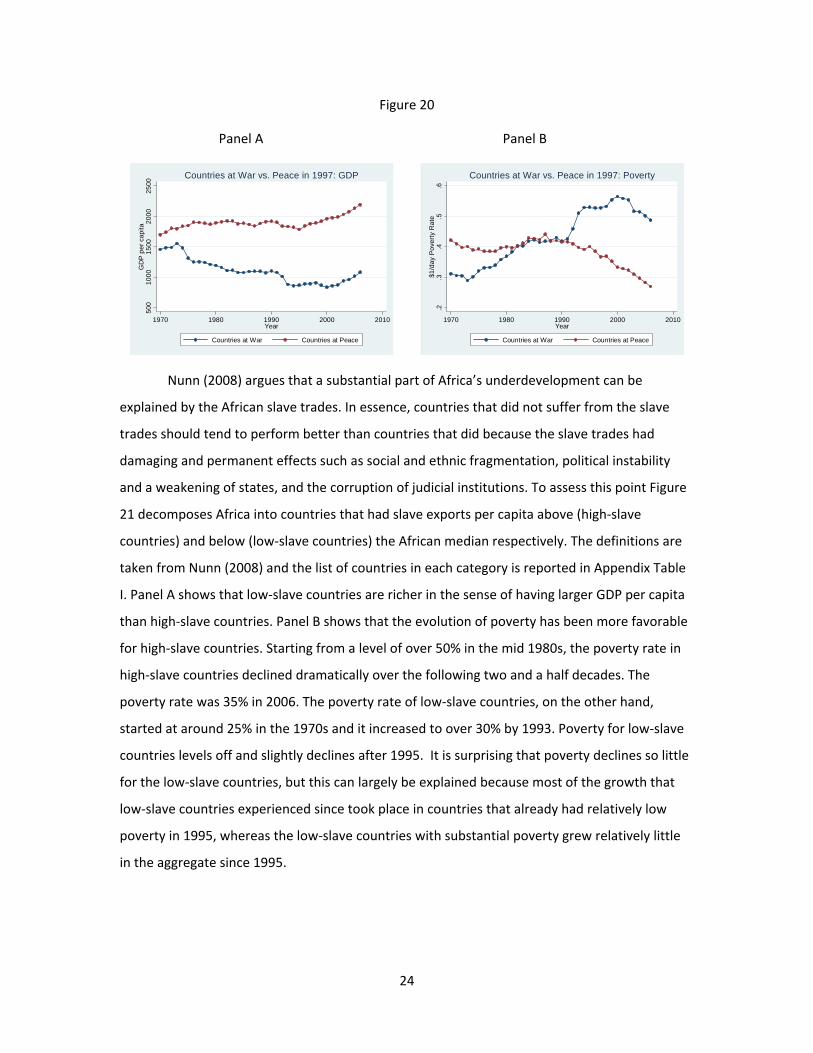
We now compare the performance of countries at war with countries at peace. Since
many African countries have been at war at some point during the sample period, we use 1997
(the last year of the availability of Correlates of War data) as a breaking point. A country is
labeled to be at war if it was at war in 1997 and it is labeled to be at peace if it is at peace in
1997 according to the Correlates of War dataset (Sarkees 2000). Appendix Table I provides a list
of countries at war in 1997. Figure 20 shows the differential performance of both sets of
countries. Countries at peace are richer and have experienced positive growth rates almost
constantly during the sample period. Countries at war, on the other hand, experienced negative
growth between 1970 and 2000 and a slight positive growth rate between 2000 and 2006. Panel
B shows that the poverty rate of countries at peace was close to 40% in 1970 (larger than the
rate of countries at war!). The rate remained almost constant for twenty years. But in 1990, the
poverty rate of countries at peace started to decline. The rate was close to 25% by 2006. The
poverty rate of countries at war, on the other hand, started at about 30% in 1970 and grew to
about 55% by 2000. A small improvement during the last five years left the rate at just below
50% in 2006.
24
Figure 20
Panel A Panel B 50
010
0015
0020
0025
00G
DP
per
cap
ita
1970 1980 1990 2000 2010Year
Countries at War Countries at Peace
Countries at War vs. Peace in 1997: GDP
.2.3
.4.5
.6$1
/day
Pov
erty
Rat
e
1970 1980 1990 2000 2010Year
Countries at War Countries at Peace
Countries at War vs. Peace in 1997: Poverty
Nunn (2008) argues that a substantial part of Africa’s underdevelopment can be
explained by the African slave trades. In essence, countries that did not suffer from the slave
trades should tend to perform better than countries that did because the slave trades had
damaging and permanent effects such as social and ethnic fragmentation, political instability
and a weakening of states, and the corruption of judicial institutions. To assess this point Figure
21 decomposes Africa into countries that had slave exports per capita above (high‐slave
countries) and below (low‐slave countries) the African median respectively. The definitions are
taken from Nunn (2008) and the list of countries in each category is reported in Appendix Table
I. Panel A shows that low‐slave countries are richer in the sense of having larger GDP per capita
than high‐slave countries. Panel B shows that the evolution of poverty has been more favorable
for high‐slave countries. Starting from a level of over 50% in the mid 1980s, the poverty rate in
high‐slave countries declined dramatically over the following two and a half decades. The
poverty rate was 35% in 2006. The poverty rate of low‐slave countries, on the other hand,
started at around 25% in the 1970s and it increased to over 30% by 1993. Poverty for low‐slave
countries levels off and slightly declines after 1995. It is surprising that poverty declines so little
for the low‐slave countries, but this can largely be explained because most of the growth that
low‐slave countries experienced since took place in countries that already had relatively low
poverty in 1995, whereas the low‐slave countries with substantial poverty grew relatively little
in the aggregate since 1995.

25
Figure 21
Panel A Panel B 10
0020
0030
0040
00G
DP
per
cap
ita
1970 1980 1990 2000 2010Year
High-Slave Countries Low-Slave Countries
High-Slave vs. Low-Slave Countries: GDP
.25
.3.3
5.4
.45
.5$1
/day
Pov
erty
Rat
e
1970 1980 1990 2000 2010Year
High-Slave Countries Low-Slave Countries
High-Slave vs. Low-Slave Countries: Poverty
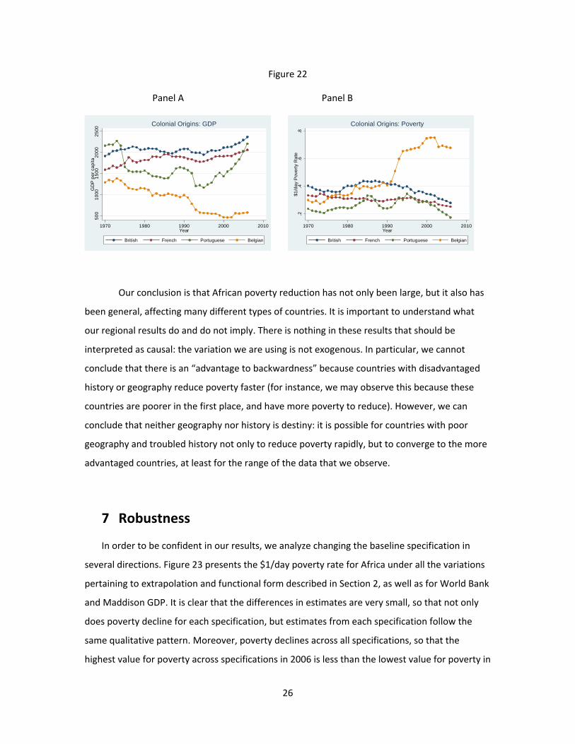
Finally, we compare the experience of African countries by colonial origin. La Porta et
al. (1999) argue that colonized countries inherited the legal framework of their colonizers and
that some legal frameworks are more favorable to development than others. Panel A of Figure
22 displays the evolution of GDP. Former British colonies are richer than former French colonies.
Portuguese colonies started out being the richest in 1970 but their GDP per capita declined
rapidly in the 1970s due to the civil wars in Angola (1975‐2002) and Mozambique (1977‐1992).
The positive growth rates over the last decade allowed the Portuguese colonies to become
richer than the French colonies (although not richer than the British colonies) by 2006. Belgian
former colonies (essentially Congo‐Zaire and the two small countries of Rwanda and Burundi)
witnessed a continued decline in GDP because of the poor performance of Congo‐Zaire during
the conflict surrounding the end of the Mobutu regime in 1997. The Congo war meant that
poverty in the former Belgian colonies increased dramatically between 1990 and 2006 (Panel B).
The evolution of poverty has been favorable for British, French and Portuguese colonies since
the mid 1990s.
26
Figure 22
Panel A Panel B 50
010
0015
0020
0025
00G
DP
per
cap
ita
1970 1980 1990 2000 2010Year
British French Portuguese Belgian
Colonial Origins: GDP
.2.4
.6.8
$1/d
ay P
over
ty R
ate
1970 1980 1990 2000 2010Year
British French Portuguese Belgian
Colonial Origins: Poverty
Our conclusion is that African poverty reduction has not only been large, but it also has
been general, affecting many different types of countries. It is important to understand what
our regional results do and do not imply. There is nothing in these results that should be
interpreted as causal: the variation we are using is not exogenous. In particular, we cannot
conclude that there is an “advantage to backwardness” because countries with disadvantaged
history or geography reduce poverty faster (for instance, we may observe this because these
countries are poorer in the first place, and have more poverty to reduce). However, we can
conclude that neither geography nor history is destiny: it is possible for countries with poor
geography and troubled history not only to reduce poverty rapidly, but to converge to the more
advantaged countries, at least for the range of the data that we observe.
7 Robustness In order to be confident in our results, we analyze changing the baseline specification in
several directions. Figure 23 presents the $1/day poverty rate for Africa under all the variations
pertaining to extrapolation and functional form described in Section 2, as well as for World Bank
and Maddison GDP. It is clear that the differences in estimates are very small, so that not only
does poverty decline for each specification, but estimates from each specification follow the
same qualitative pattern. Moreover, poverty declines across all specifications, so that the
highest value for poverty across specifications in 2006 is less than the lowest value for poverty in

27
1970 (the starting year) or in 1995 (the year in which the declining trend begins). The only series
that do not substantively match the baseline series are those for which the inequality
parameters were produced by inverting the Gini, or by using the middle three quintiles only, as
well as the series based on World Bank GDP after the PPP revision, which are shown in Figure
24. However, these three series also follow the same qualitative pattern as the baseline.
Interestingly, the series based on the middle three quintiles, which should not depend on
mismeasurements of income at the top or at the bottom of the distribution, shows a lower level
of poverty for the entire sample period, which suggests that if the functional form assumption is
correct, then mismeasurement of income takes place primarily for the poor, probably through
undervaluing in‐kind income.
Figures 25 and 26 present the series of the Gini coefficient for Africa. We again see that
most of the series follow the baseline very closely. Only the series for different methods of
computing lognormal parameters from quintiles and the series for Maddison GDP exhibiting
large deviations from the baseline, but still with largely the same qualitative trends. The same is
true for Figures 27 and 28, which show the series of Sen Welfare.
We also use these variations, alongside with the standard variations of excluding one
large country, to perform a robustness check on our predictions for when the Millennium
Development Goals will be achieved. Table II shows the results of the extrapolations. The MDGs
are achieved in 2027 or earlier for all variations, with the MDGs achieved between 2013 and
2020 for most variations. While for some variations (e.g. using revised World Bank GDP), the
MDGs are achieved twelve years behind schedule, for most of them, the MDGs are late by no
more than 5 years, and for all of them, the poverty‐reducing performance of Africa over the past
11 years (1995‐2006) suggests that the Millennium Development Goals will be met in a
reasonable amount of time. Table III shows the results of the extrapolations if Congo‐Zaire is
excluded from extrapolation, which assumes that as Congo‐Zaire recovers from its war, it will
reduce poverty sufficiently quickly to converge to the African mean poverty level. Then, the
MDGs are met by 2015, except for the variations involving changing the source of GDP, and
even then, the Millennium Development Goals are met by 2022. In results not reported, we
check that the regional results described in Section 6 are valid qualitatively with the omission of
any large country.

28
A final, but important, concern is that our results are being driven by survey selection.
First, the number of surveys declines for the last years of the sample. If our extrapolation
procedure understates inequality in Africa for these years, then poverty reduction will appear
greater than it really is. This concern is partially addressed by our variations for extrapolation;
neither the series with linear extrapolation nor the one with horizontal extrapolation vary much
from the baseline series. Since the linear extrapolation series is sensitive to trends in inequality
at the end of the sample period, this means that there were no incipient trends for inequality to
rise in large African countries, which might have produced rising inequality in Africa overall that
might have prevented growth from translating into poverty reduction. A further concern is that
the surveys at the beginning of the period tend to be income surveys, whereas the surveys at
the end of the period overwhelmingly are consumption surveys, and income is more unequally
distributed than consumption is. Hence, the fall in inequality that we observe during the 1990s
and the 2000s might simply be a result of inadequately correcting for the fact that consumption
inequality is lower than income inequality.
To investigate theses concerns explicitly, we plot the poverty and inequality series
alongside with measures of survey availability: We construct the fraction of Africans either
covered by an income survey, or with there being an income survey in their country both before
and after the given year, for each year, and similarly for consumption surveys. These fractions
are the income and consumption “cores” plotted in Figures 29 and 30, and they show the extent
of coverage of income and consumption surveys. Looking at Figure 29, we see that the decline in
poverty rates begins long after most surveys are consumption surveys, and that the trend in
poverty decline is nearly identical (though slightly smaller) before the collapses in the fraction
covered by surveys in 2000 and 2003 as afterwards. Moreover, from Figure 30 we see that while
the collapse in survey coverage is accompanied by a leveling off of the Gini, this leveling off
breaks a long‐running downward trend in the Gini, and so, if anything, exaggerates inequality in
the years 2002‐2006. The decline in the Gini over the 1990s occurs long after the time that most
of the surveys become consumption surveys, and occurs under a high survey coverage rate. To
argue that we are understating inequality in the later parts of the sample period, one needs to
assert that this declining trend broke abruptly in 2002‐2006, and there is nothing in the data to
support such an assertion.

29
Figure 23
.3
.35
.4
.45P
over
ty R
ate
1970 1980 1990 2000 2010Year
$1/day Poverty, hybrid $1/day Poverty, linear $1/day Poverty, gamma
$1/day Poverty, weibull $1/day Poverty, optimal $1/day Poverty, WB
$1/day Poverty, Maddison $1/day Poverty, Baseline
Falling Poverty in Africa
Figure 24
.3
.35
.4
.45
.5
Pov
erty
Rat
e
1970 1980 1990 2000 2010Year
$1/day Poverty, WB PPP Revision $1/day Poverty, Ginis
$1/day Poverty, Adjusted $1/day Poverty, Baseline
Falling Poverty in Africa: Large Deviations

30
Figure 25
.62
.63
.64
.65
.66
.67G
ini C
oeffi
cien
t
1970 1980 1990 2000 2010Year
Gini Coefficient, hybrid Gini Coefficient, linear Gini Coefficient, gamma
Gini Coefficient, weibull Gini Coefficient, optimal Gini Coefficient, WB
Gini Coefficient, WB PPP Revision Gini Coefficient, Baseline
Inequality in Africa
Figure 26
.55
.6
.65
.7
Gin
i Coe
ffici
ent
1970 1980 1990 2000 2010Year
Gini Coefficient, Maddison Gini Coefficient, Ginis
Gini Coefficient, Adjusted Gini Coefficient, Baseline
Inequality in Africa: Large Deviations

31
Figure 27
550
600
650
700
750S
en W
elfa
re
1970 1980 1990 2000 2010Year
Sen Welfare, hybrid Sen Welfare, linear Sen Welfare, gamma
Sen Welfare, weibull Sen Welfare, optimal Sen Welfare, WB
Sen Welfare, Maddison Sen Welfare, Baseline
Rising Welfare in Africa
Figure 28
400
500
600
700
800
Sen
Wel
fare
1970 1980 1990 2000 2010Year
Sen Welfare, WB PPP Revision Sen Welfare, Ginis
Sen Welfare, Adjusted Sen Welfare, Baseline
Rising Welfare in Africa: Large Deviations

32
Figure 29
.3.3
5.4
.45
$1/d
ay P
over
ty
0.2
.4.6
Cov
erag
e R
ate
1970 1980 1990 2000 2010year...
Income Coverage Consumption Coverage$1/day Poverty Rate
Interpolations between consumption and income surves are not considered covered
Consumption and Income Interpolation: Poverty
Figure 30
.63
.64
.65
.66
.67
Gin
i Coe
ffici
ent
0.2
.4.6
Cov
erag
e R
ate
1970 1980 1990 2000 2010year...
Income Coverage Consumption CoverageGini Coefficient
Interpolations between consumption and income surves are not considered covered
Consumption and Income Interpolation: Inequality

33
8 Conclusion Our main conclusion is that Africa is reducing poverty, and doing it much faster than we
thought. The growth from the period 1995‐2006, far from benefiting only the elites, has been
sufficiently widely spread that both total African inequality and African within‐country inequality
actually declined over this period. In particular, the speed at which Africa has reduced poverty
since 1995 puts it on track to achieve the Millennium Development Goal of halving poverty
relative to 1990 by 2015 on time or, at worst, a couple of years late. If Congo‐Zaire converges to
Africa once it is stabilized, the MDG will be achieved by 2012, three years before the target date.
These results are qualitatively robust to changes in our methodology, including using different
data sources and assumptions for what happens to inequality when inequality data is not
available.
We also find that the African poverty reduction is remarkably general: it cannot be
explained by a large country, or even by a single set of countries possessing some beneficial
geographical or historical characteristic. All classes of countries, including those with
disadvantageous geography and history, experience reductions in poverty. In particular, poverty
fell for both landlocked as well as coastal countries; for mineral‐rich as well as mineral‐poor
countries; for countries with favorable or with unfavorable agriculture; for countries regardless
of colonial origin; and for countries with below‐ or above‐median slave exports per capita during
the African slave trade. This observation is particularly important because it shows that poor
geography and history have not posed insurmountable obstacles to poverty reduction. The
lesson we draw is largely optimistic: even the most benighted parts of the poorest continent can
set themselves firmly on the trend of limiting and even eradicating poverty within the space of a
decade.

34
Bibliography
Barro, Robert and Xavier Sala‐i‐Martin (2004): Economic Growth. MIT Press: Cambridge, MA.
Bloom, David E., and Jeffrey D. Sachs. 1998. “Geography, Demography, and Economic Growth in Africa.” Brookings Papers on Economic Activity no. 2: 207‐273.
CIA World Factbook (2009). https://www.cia.gov/library/publications/the‐world‐factbook/index.html
Collier, Paul (2006), “Africa: Geography and Growth”, (Journal TEN, Federal Reserve Bank of Kansas City, Fall)
Cowell, Frank. (2000) .Measuring Inequality. In Atkinson T. and Bourguignon F. eds. Handbook of Income Distribution, Elsevier.
Deininger, Klaus, and Lyn Squire. (1996). .A New Data Set Measuring Income Inequality. World Bank Economic Review, X, 565.591.
Easterly, William (2009), “How the Millennium Development Goals are Unfair to Africa”, World Development, January 2009
Heston, Allan, Robert Summers, and Bettina Aten, (2006) Penn World Table Version 6.2, Center for International Comparisons at the University of Pennsylvania (CICUP).
La Porta, Rafael; Florencio Lopez de Silanes, Andrei Shleifer and Robert Vishny (1999) “The Quality of Government.” Journal of Law, Economics and Organization 15(1): 222‐79
Maddison, Angus (2007). Historical Statistics of the World Economy: 1‐2003 A.D. http://www.ggdc.net/maddison/ Date Accessed: November 11 2007.
Nijkam, Ousmanou (2008). “Do Resource‐rich and Resource‐poor Sub‐Saharan African Countries Grow Differently?” Manuscript, University of Yaoundé.
Nunn, Nathan. 2008. “The Long‐Term Effects of Africa’s Slave Trades.” Quarterly Journal of Economics 123, no. 1: 139‐176.
Pinkovskiy, Maxim and Xavier Sala‐i‐Martin (2009). “Parametric Estimations of the World Distribution of Income.” NBER Working Paper #15433
Sarkees, Meredith Reid (2000). “The Correlates of War Data on War: An Update to 1997,” Conflict Management and Peace Science, 18/1: 123‐144.
Sen, Amartya K. 1976. "Real National Income." Review of Economic Studies 43, no. 1: 19‐39.
United Nations (2008): The Millennium Development Goals Report. http://www.un.org/millenniumgoals/pdf/The%20Millennium%20Development%20Goals%20Report%202008.pdf
Unitd Nations Millenium Campaign (2009), http://www.endpoverty2015.org/africa/news/un‐millennium‐campaign‐petitions‐african‐governments‐address‐inequality‐and‐unemployment/07/may/09 (Accessed January 6, 2009)
UNU‐WIDER World Income Inequality Database, Version 2.0c, May 2008
World Bank: World Development Indicators 2008. Accessed June 1, 2008.
World Bank (2004), “Millennium Development Goals”, (http://web.worldbank.org/WBSITE/EXTERNAL/EXTABOUTUS/0,,contentMDK:20104132~menuPK:250991~pagePK:43912~piPK:44037~theSitePK:29708,00.html). Date accessed January 6th, 2009.

35
Appendix Table I: Classification of Countries
Country La
ndlo
cked
Min
eral
Ric
h
Favo
rabl
e
Agr
icul
ture
Brit
ish
Col
ony
Fren
ch
Col
ony
Por
tugu
ese
Col
ony
Bel
gian
C
olon
y
Hig
h S
lave
E
xpor
ts
War
in
1997
Angola 0 1 0 0 0 1 0 1 1Burundi 1 0 0 0 0 0 1 0 1Benin 0 0 1 0 1 0 0 1 0Burkina Faso 1 0 0 0 1 0 0 1 0Botswana 1 1 0 1 0 0 0 0 0Central African Republic 1 1 1 0 1 0 0 0 0Cote d'Ivoire 0 0 1 0 1 0 0 1 0Cameroon 0 1 1 0 1 0 0 0 0Congo, Rep. 0 1 1 0 1 0 0 1 1Comoros 0 0 0 0 1 0 0 0 0Cape Verde 0 0 0 0 0 1 0 0 0Ethiopia 1 0 0 0 0 0 0 1 0Gabon 0 1 0 0 1 0 0 0 0Ghana 0 0 1 1 0 0 0 1 0Guinea 0 1 1 0 1 0 0 1 0Gambia, The 0 0 1 1 0 0 0 1 0Guinea-Bissau 0 0 1 0 0 1 0 1 0Equatorial Guinea 0 1 0 0 0 0 0 0 0Kenya 0 0 1 1 0 0 0 0 0Lesotho 1 1 1 1 0 0 0 0 0Madagascar 0 0 0 0 1 0 0 1 0Mali 1 0 0 0 1 0 0 1 0Mozambique 0 0 0 0 0 1 0 1 0Mauritania 0 1 0 0 1 0 0 1 0Mauritius 0 0 0 1 0 0 0 0 0Malawi 1 0 1 1 0 0 0 1 0Namibia 0 1 0 1 0 0 0 0 0Niger 1 1 0 0 1 0 0 0 0Nigeria 0 1 1 1 0 0 0 1 0Rwanda 1 0 0 0 0 0 1 0 1Senegal 0 0 1 0 1 0 0 1 0Seychelles 0 0 0 0 1 0 0 0 0Togo 0 0 1 0 1 0 0 1 0Tunisia 0 0 0 0 1 0 0 0 0Tanzania 0 1 0 1 0 0 0 1 0Uganda 1 1 1 1 0 0 0 0 1South Africa 0 1 1 1 0 0 0 0 0Congo, Dem. Rep. 0 1 1 0 0 0 1 1 1Zambia 1 1 1 1 0 0 0 0 0Zimbabwe 1 0 1 1 0 0 0 0 0Sao Tome and Principe 0 0 1 0 0 1 0 0 0Chad 1 1 0 0 1 0 0 1 0Sierra Leone 0 1 1 1 0 0 0 1 0Liberia 0 1 0 0 0 0 0 0 0Sudan 0 1 1 1 0 0 0 1 1Somalia 0 0 0 0 0 0 0 0 1Swaziland 0 0 1 1 0 0 0 0 0Eritrea 0 0 0 0 0 0 0 1 0Total 48 19 23 17 18 5 3 24 8
Note: “1” indicates country belongs to category, “0” that it does not belong, red numbers indicate imputation on basis of CIA World Factbook. Sources: for geographical variables, Nijkam (2008) and the CIA World Factbook, for the war variable, Correlates of War (2008).

36
Tables
Table I: African Poverty Rates and Projections
Year
$1/day Poverty
$2/day Poverty
1970 0.398 0.6521971 0.388 0.6431972 0.378 0.6341973 0.377 0.6341974 0.370 0.6281975 0.377 0.6371976 0.374 0.6341977 0.374 0.6341978 0.376 0.6341979 0.388 0.6441980 0.393 0.6491981 0.394 0.6481982 0.402 0.6531983 0.410 0.6601984 0.427 0.6731985 0.426 0.6711986 0.421 0.6661987 0.436 0.6721988 0.419 0.6631989 0.423 0.6621990 0.416 0.6581991 0.419 0.6591992 0.420 0.6661993 0.422 0.6711994 0.421 0.6721995 0.428 0.6791996 0.415 0.6661997 0.401 0.6571998 0.404 0.657
Year
$1/day Poverty
$2/day Poverty
1999 0.396 0.6542000 0.383 0.6522001 0.378 0.6492002 0.374 0.6452003 0.355 0.6302004 0.345 0.6222005 0.331 0.6092006 0.318 0.5952007 0.308 0.5872008 0.298 0.5792009 0.288 0.5722010 0.278 0.5642011 0.268 0.5572012 0.258 0.5492013 0.248 0.5412014 0.238 0.5342015 0.228 0.5262016 0.218 0.5182017 0.208 0.5112018 0.198 0.5032019 0.188 0.4962020 0.178 0.4882021 0.168 0.4802022 0.158 0.4732023 0.148 0.4652024 0.138 0.4572025 0.128 0.450
Note: red numbers are projections based on linear extrapolation at the average poverty reduction rate between 1995 and 2006.

37
Table II: African Poverty Reduction, Sensitivity Analysis Variation
Poverty Rate in 1990
Poverty Rate in 2006
Percentage Poverty Reduction 1990-2006
Projected Poverty in 2015
Projected Poverty Reduction, 1990-2015
Year in which MDG Attained
Baseline 41.6% 31.8% -23.5% 22.8% -45.2% 2017 Hybrid Extrapolation 41.5% 30.9% -25.6% 21.3% -48.7% 2016 Linear Extrapolation 41.5% 29.2% -29.6% 17.9% -56.8% 2013 Ginis 45.4% 35.7% -21.4% 27.1% -40.3% 2020 Adjusted 38.0% 28.3% -25.6% 19.8% -48.0% 2016 Gamma, Ginis 45.4% 36.7% -19.1% 29.6% -34.9% 2024 Gamma, Regular 41.6% 32.8% -21.1% 25.2% -39.4% 2020 Gamma, Adjusted 34.6% 26.5% -23.5% 19.3% -44.3% 2017 Weibull, Ginis 44.9% 36.5% -18.7% 29.4% -34.6% 2024 Weibull, Regular 41.3% 33.0% -20.2% 25.6% -38.0% 2021 Weibull, Adjusted 34.1% 26.4% -22.4% 19.8% -42.0% 2019 Optimal, Ginis 45.4% 35.7% -21.4% 27.0% -40.4% 2020 Optimal, Regular 41.6% 31.8% -23.6% 22.8% -45.3% 2017 Optimal, Adjusted 37.9% 28.2% -25.7% 19.7% -48.1% 2016 World Bank 40.2% 33.1% -17.6% 25.5% -36.6% 2021 Maddison 39.4% 35.3%* -10.4%* 27.2% -31.1% 2026 World Bank, PPP Revision 48.6% 40.5% -16.6% 33.6% -30.9% 2027 Excludes Nigeria 40.6% 33.2% -18.3% 25.9% -36.2% 2022 Excludes Ethiopia 38.4% 32.2% -16.1% 25.0% -34.9% 2022 Excludes Congo-Zaire 41.3% 27.9% -32.3% 17.7% -57.0% 2012 Excludes South Africa 44.4% 33.6% -24.3% 23.9% -46.3% 2017 Excludes Sudan 41.5% 32.0% -22.9% 23.0% -44.6% 2017 Excludes Tanzania 40.2% 32.0% -20.4% 24.3% -39.4% 2020 Excludes Kenya 41.5% 31.5% -24.2% 21.6% -48.0% 2016 Excludes Uganda 41.0% 31.4% -23.4% 22.4% -45.4% 2017 Note: We assume that poverty declines linearly at the average rate of decline between 1995 and 2006 * The Maddison GDP series we use goes up to 2003 instead of 2006

38
Table III: African Poverty Reduction, excluding Congo-Zaire: Sensitivity Analysis
Variation Poverty Rate
in 1990 Poverty Rate in
2006Percentage Poverty
ReductionProjected Poverty
in 2015 Projected Poverty
Reduction, 1990-2015Year in which
MDG Achieved Baseline 41.3% 27.9% -32.3% 17.7% -57.0% 2012 Hybrid Extrapolation 41.2% 26.9% -34.6% 16.1% -60.8% 2011 Linear Extrapolation 41.2% 25.1% -39.0% 12.5% -69.6% 2009 Ginis 45.1% 32.1% -28.8% 22.4% -50.3% 2015 Adjusted 37.7% 24.2% -36.0% 14.5% -61.7% 2011 Gamma, Ginis 45.3% 33.6% -25.7% 25.5% -43.6% 2018 Gamma, Regular 41.4% 29.4% -28.9% 20.7% -49.9% 2015 Gamma, Adjusted 34.5% 22.5% -34.7% 14.2% -58.8% 2012 Weibull, Ginis 44.7% 33.4% -25.4% 25.3% -43.4% 2018 Weibull, Regular 41.2% 29.7% -27.9% 21.3% -48.3% 2016 Weibull, Adjusted 33.9% 22.6% -33.4% 14.8% -56.3% 2013 Optimal, Ginis 45.0% 32.0% -28.8% 22.3% -50.4% 2015 Optimal, Regular 41.3% 27.9% -32.4% 17.7% -57.1% 2012 Optimal, Adjusted 37.6% 24.0% -36.1% 14.3% -61.9% 2011 World Bank 41.1% 31.1% -24.1% 22.6% -44.9% 2017 Maddison 38.4% 31.4%* -18.3%* 21.3% -44.4% 2018 World Bank, PPP Revision 47.1% 36.8% -21.9% 29.2% -38.0% 2022
* The Maddison GDP series we use goes up to 2003 instead of 2006


![Global illicit drug trends 2001 [U.N]](https://img.pdfslide.us/doc/110x75/586906e81a28abc92d8b9366/global-illicit-drug-trends-2001-un.jpg)