Embed Size (px)
DESCRIPTION
Aesop's project docuement
Citation preview
Laura Cortesrationale
•
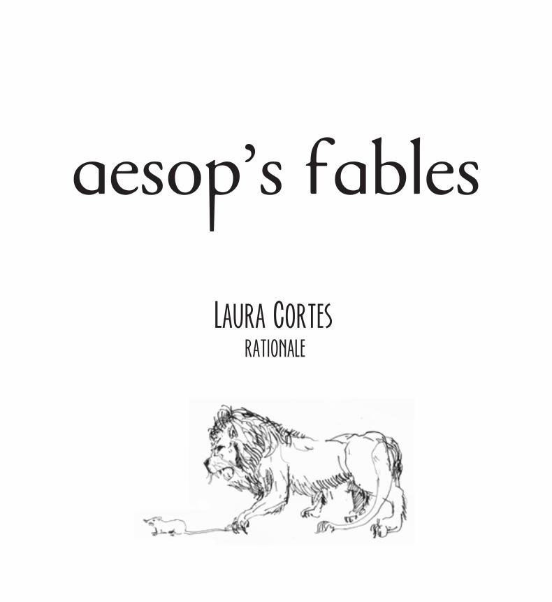
aesop's fables
Aesop’s Fables or the Aesopica are a collection of fables credited to Aesop, a slave and story-teller believed to have lived in ancient Greece between 620 and 560 BCE.
The book Aesop’s fables compiles 3 stories with a really strong moral: The Lion and The MouseThe Dog and The ShadowThe Ants and The Grasshopper
It is perfect for parents that want to teach their children between 6 and 9 years old, about moral and citizenship.It has a really great feature: the original stories don’t specify the moral in the end of the fable. This way the parents can make an exercise/game with their children, where they brainstorm together about the fable history.
•
aesop's fables
In the end of the fable there’s a white box so the parents can write the fable’s moral.
It’s a project that has the possibility to grow, once it’s a compilation of different stories.The illustrations are one the strengths of the book: created by the plastic artist Sérgio Fernandes, the illustrations are really simple with few colours, which give me the possibility of playing with colours in the page background.They are easy to understand, which is very important when we’re talking about a book for young kids.
•
audience
Primary audience:
Children between 6 and 9 years old(Primary school)
Secondary audience:
Parents of the children (35-45 years old)Parents who like teaching their children about moral and citizenship.
•
design choices
Proportion
The page has 7in x 8in.This is because the illustrations occupy, in its majority a square shape.Also this proportion is not too big or too small and allows the illustrations to occupy a whole spread without distorting them, and also gives the possibility to have the illustrations in one page and the text in the other, and still have enough white space.
It’s a proportion that makes easy to hold and handle the book.
•
design choices
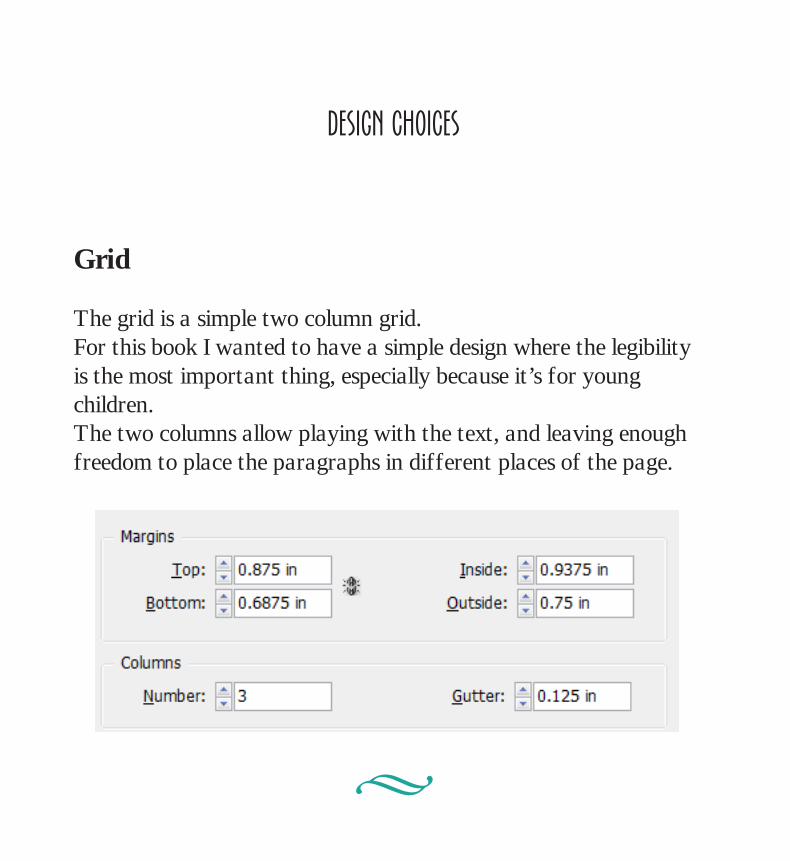
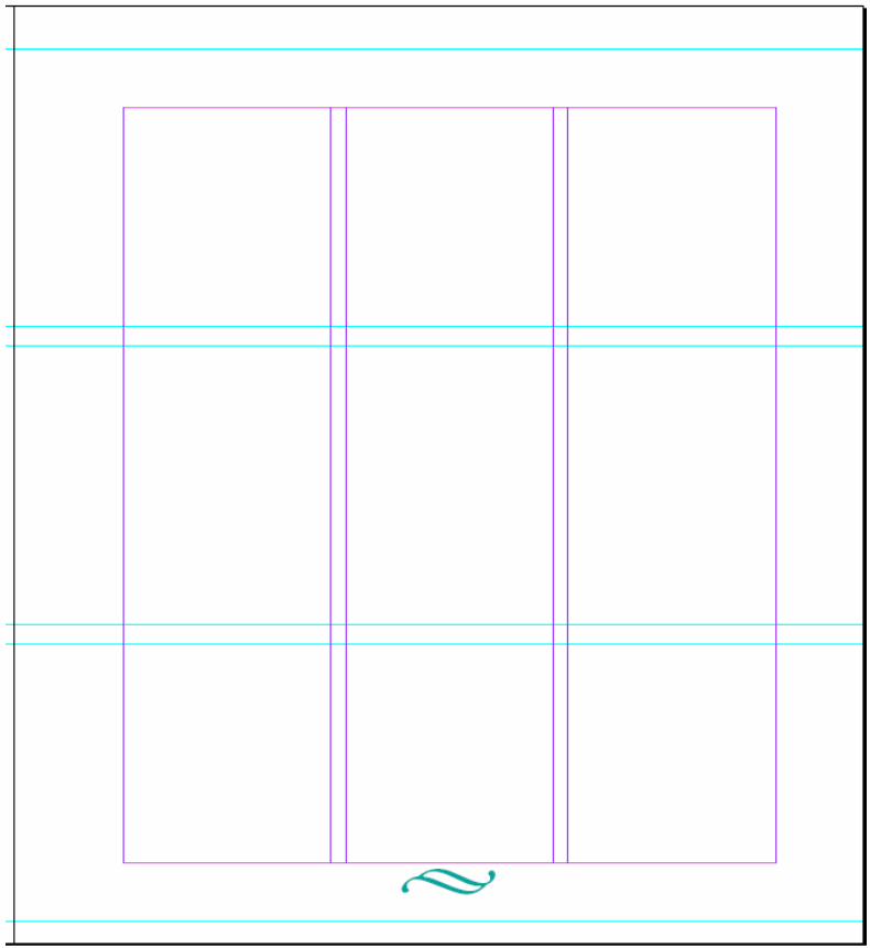
Grid
The grid is a simple two column grid.For this book I wanted to have a simple design where the legibility is the most important thing, especially because it’s for young children.The two columns allow playing with the text, and leaving enough freedom to place the paragraphs in different places of the page.
•
design choices
Typeface
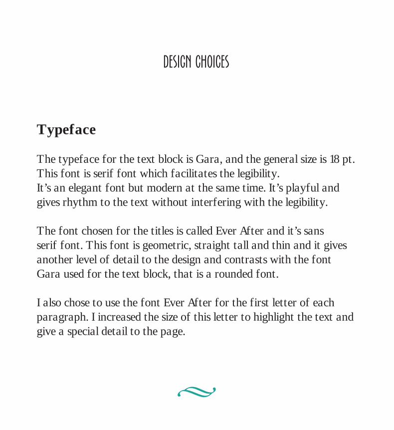
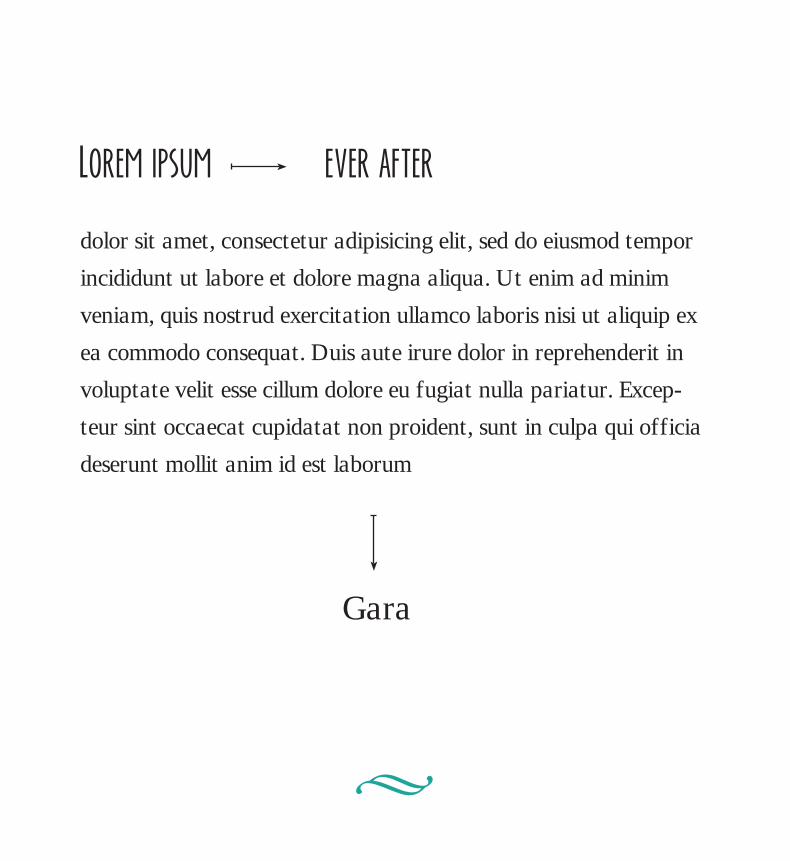
The typeface for the text block is Gara, and the general size is 18 pt.This font is serif font which facilitates the legibility. It’s an elegant font but modern at the same time. It’s playful and gives rhythm to the text without interfering with the legibility.
The font chosen for the titles is called Ever After and it’s sans serif font. This font is geometric, straight tall and thin and it gives another level of detail to the design and contrasts with the font Gara used for the text block, that is a rounded font.
I also chose to use the font Ever After for the first letter of each paragraph. I increased the size of this letter to highlight the text and give a special detail to the page.
•
dolor sit amet, consectetur adipisicing elit, sed do eiusmod tempor
incididunt ut labore et dolore magna aliqua. Ut enim ad minim
veniam, quis nostrud exercitation ullamco laboris nisi ut aliquip ex
ea commodo consequat. Duis aute irure dolor in reprehenderit in
voluptate velit esse cillum dolore eu fugiat nulla pariatur. Excep-
teur sint occaecat cupidatat non proident, sunt in culpa qui officia
deserunt mollit anim id est laborum
Lorem ipsum
Gara
ever after
•
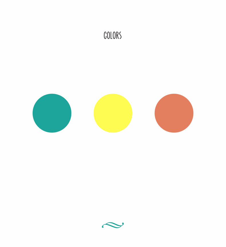
colors


![Aesop 600 B.C.E. - 564 B.C.E [Aesop's Fables]](https://img.pdfslide.us/doc/110x75/549e3198ac79591f768b4647/aesop-600-bce-564-bce-aesops-fables.jpg)