Embed Size (px)
Citation preview
Advanced Photoshop Tutorial: RTVF Chairs
Jeremy Moore; January 31, 2007
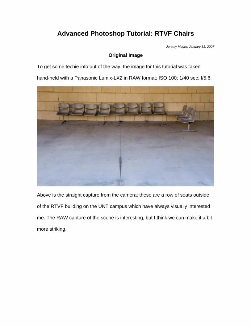
Original Image
To get some techie info out of the way, the image for this tutorial was taken
hand-held with a Panasonic Lumix-LX2 in RAW format; ISO 100; 1/40 sec; f/5.6.
Above is the straight capture from the camera; these are a row of seats outside
of the RTVF building on the UNT campus which have always visually interested
me. The RAW capture of the scene is interesting, but I think we can make it a bit
more striking.
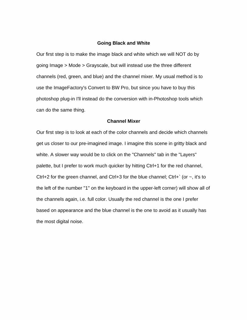
Going Black and White
Our first step is to make the image black and white which we will NOT do by
going Image > Mode > Grayscale, but will instead use the three different
channels (red, green, and blue) and the channel mixer. My usual method is to
use the ImageFactory's Convert to BW Pro, but since you have to buy this
photoshop plug-in I'll instead do the conversion with in-Photoshop tools which
can do the same thing.
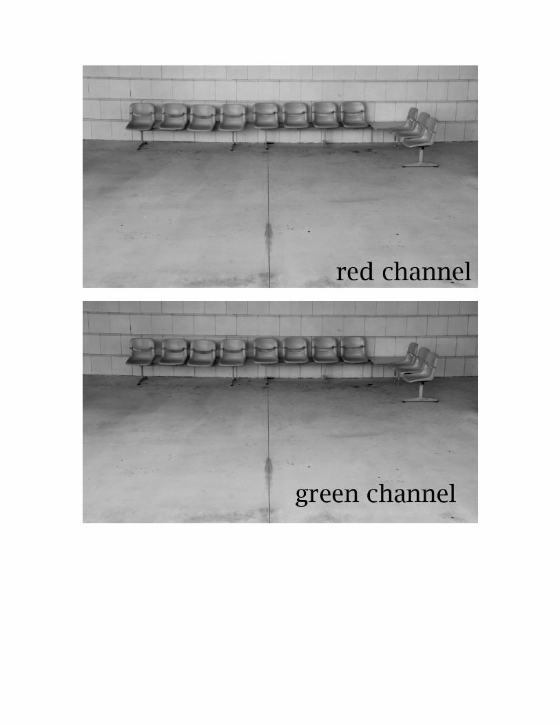
Channel Mixer
Our first step is to look at each of the color channels and decide which channels
get us closer to our pre-imagined image. I imagine this scene in gritty black and
white. A slower way would be to click on the "Channels" tab in the "Layers"
palette, but I prefer to work much quicker by hitting Ctrl+1 for the red channel,
Ctrl+2 for the green channel, and Ctrl+3 for the blue channel; Ctrl+` (or ~, it's to
the left of the number "1" on the keyboard in the upper-left corner) will show all of
the channels again, i.e. full color. Usually the red channel is the one I prefer
based on appearance and the blue channel is the one to avoid as it usually has
the most digital noise.
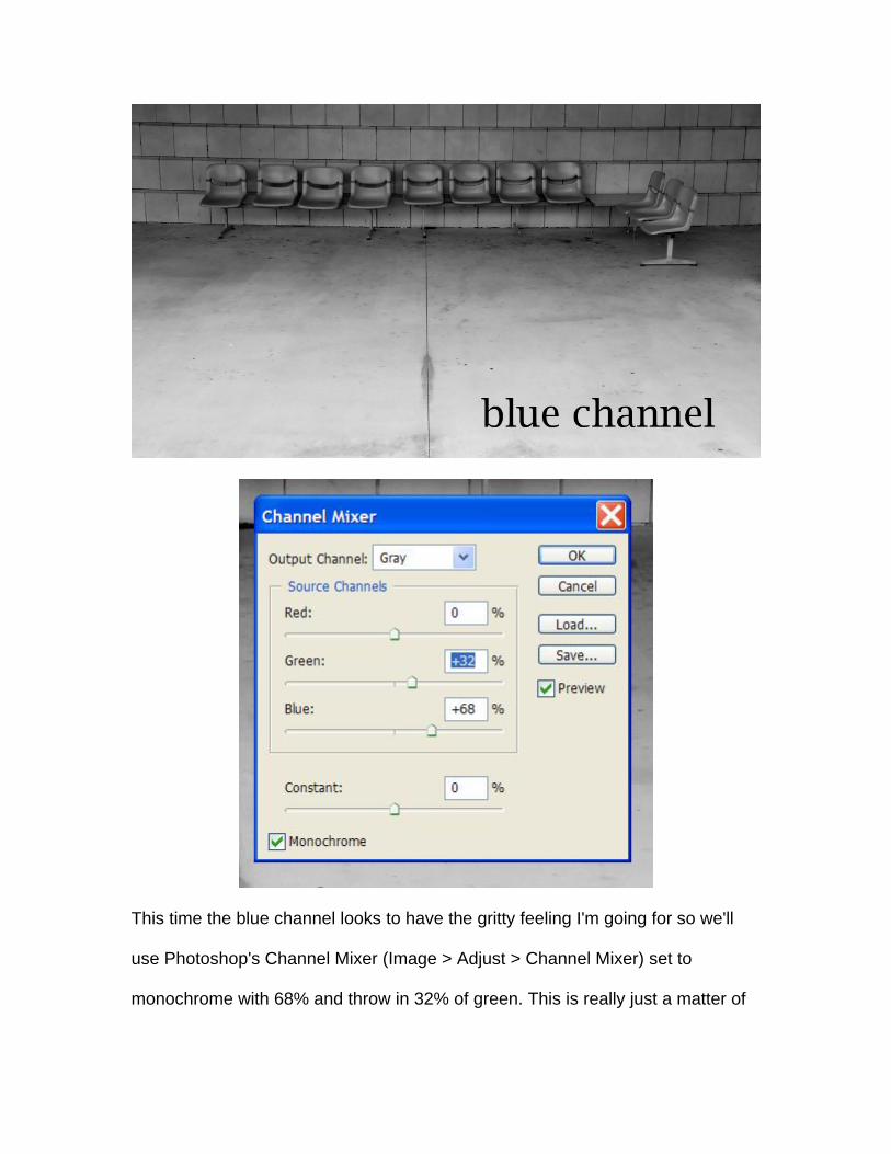
This time the blue channel looks to have the gritty feeling I'm going for so we'll
use Photoshop's Channel Mixer (Image > Adjust > Channel Mixer) set to
monochrome with 68% and throw in 32% of green. This is really just a matter of
playing and finding something that approximates the direction you want to move
in as we will fine-tune everything later.
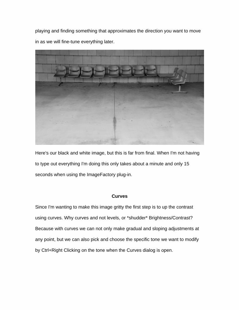
Here's our black and white image, but this is far from final. When I'm not having
to type out everything I'm doing this only takes about a minute and only 15
seconds when using the ImageFactory plug-in.
Curves
Since I'm wanting to make this image gritty the first step is to up the contrast
using curves. Why curves and not levels, or *shudder* Brightness/Contrast?
Because with curves we can not only make gradual and sloping adjustments at
any point, but we can also pick and choose the specific tone we want to modify
by Ctrl+Right Clicking on the tone when the Curves dialog is open.
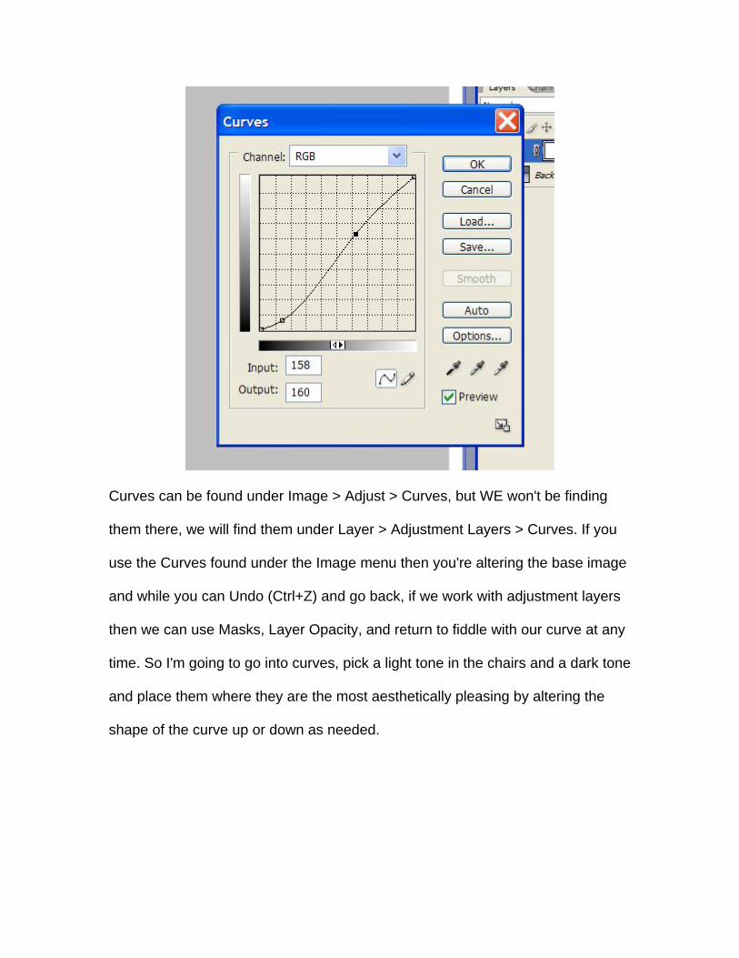
Curves can be found under Image > Adjust > Curves, but WE won't be finding
them there, we will find them under Layer > Adjustment Layers > Curves. If you
use the Curves found under the Image menu then you're altering the base image
and while you can Undo (Ctrl+Z) and go back, if we work with adjustment layers
then we can use Masks, Layer Opacity, and return to fiddle with our curve at any
time. So I'm going to go into curves, pick a light tone in the chairs and a dark tone
and place them where they are the most aesthetically pleasing by altering the
shape of the curve up or down as needed.
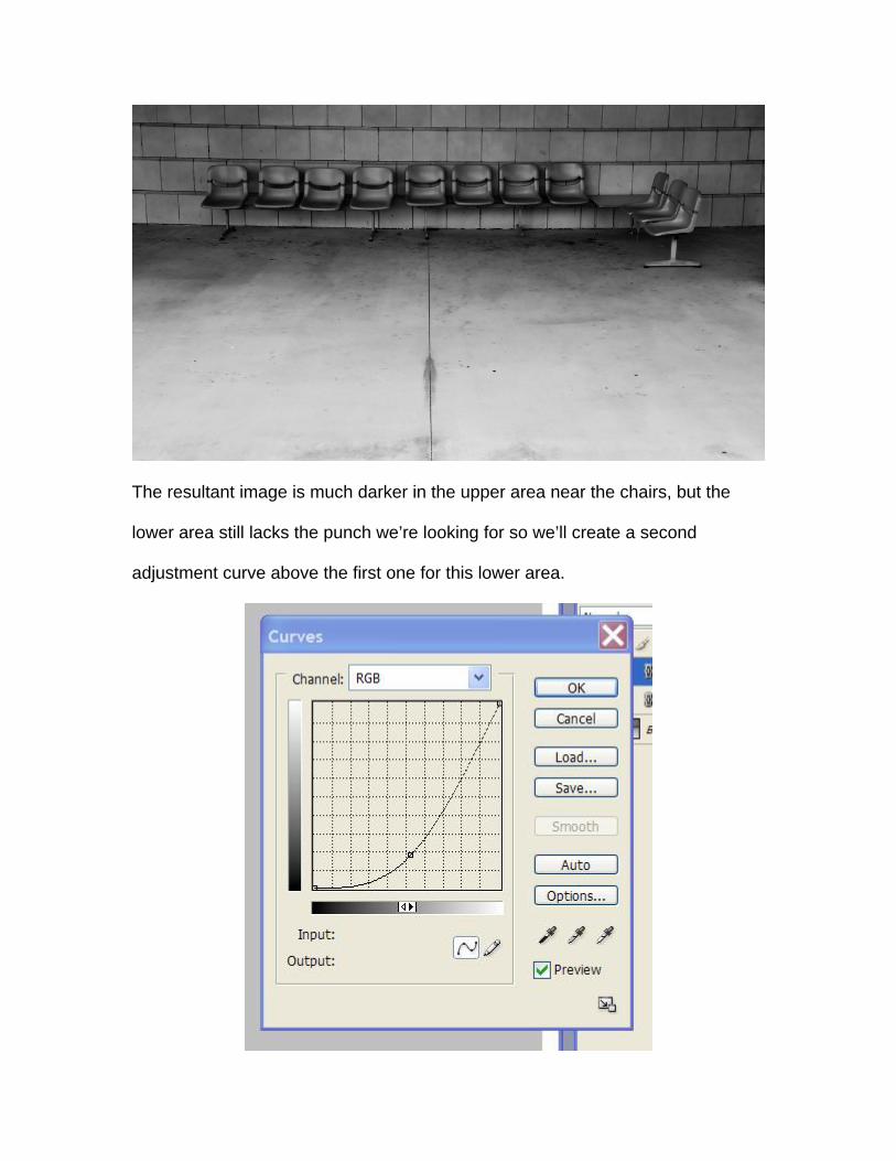
The resultant image is much darker in the upper area near the chairs, but the
lower area still lacks the punch we’re looking for so we’ll create a second
adjustment curve above the first one for this lower area.
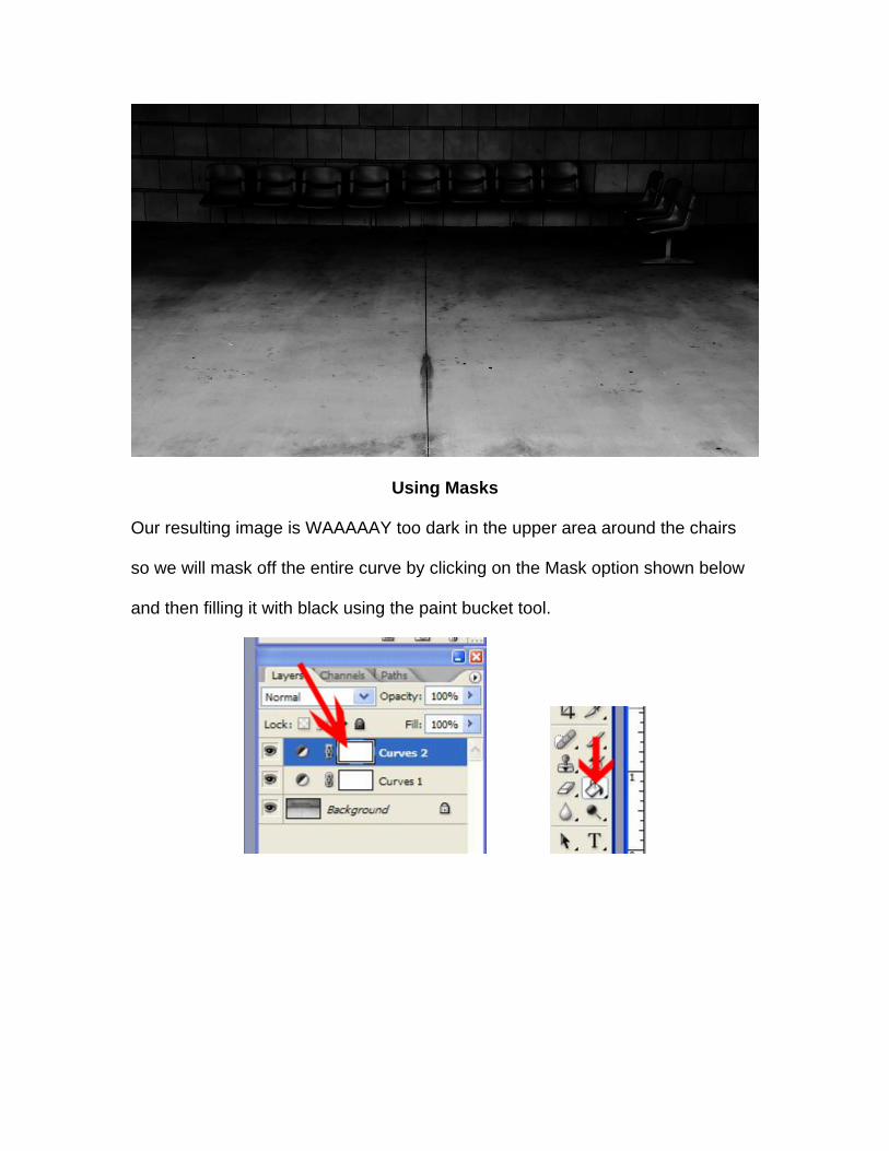
Using Masks
Our resulting image is WAAAAAY too dark in the upper area around the chairs
so we will mask off the entire curve by clicking on the Mask option shown below
and then filling it with black using the paint bucket tool.
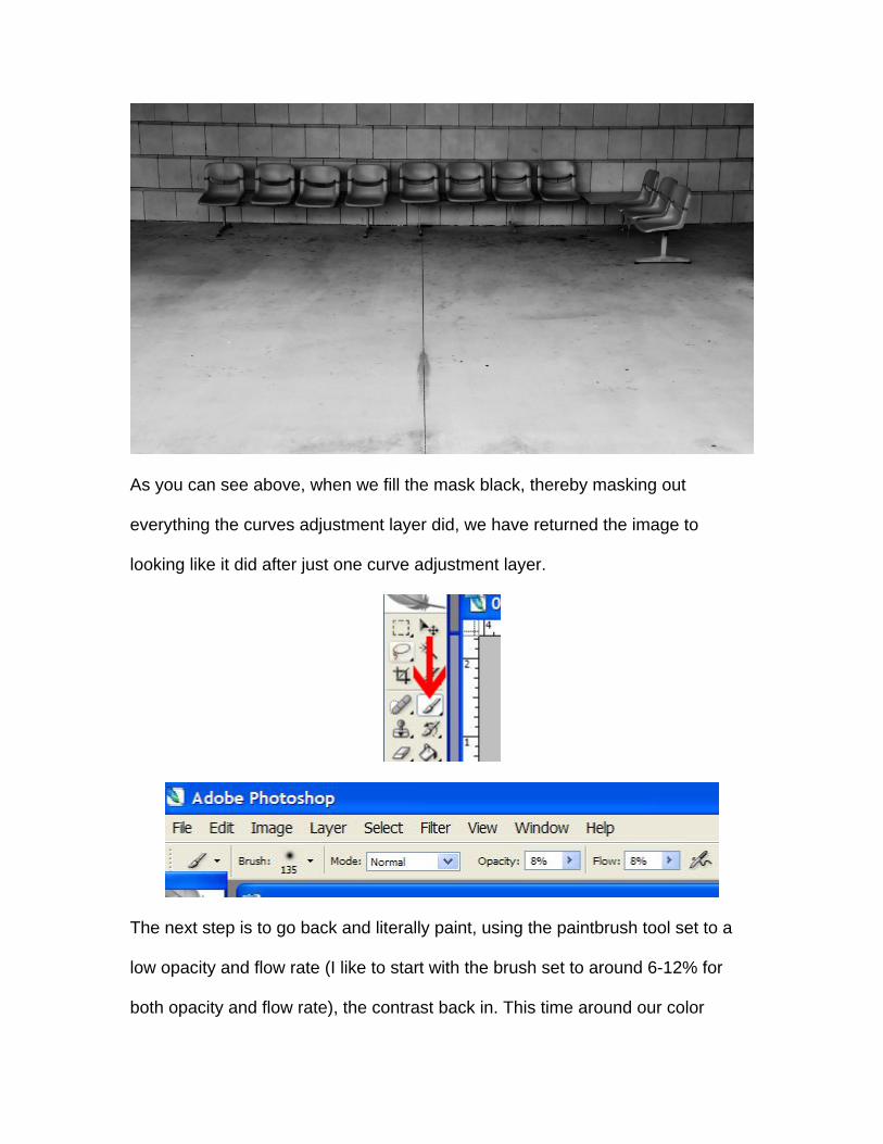
As you can see above, when we fill the mask black, thereby masking out
everything the curves adjustment layer did, we have returned the image to
looking like it did after just one curve adjustment layer.
The next step is to go back and literally paint, using the paintbrush tool set to a
low opacity and flow rate (I like to start with the brush set to around 6-12% for
both opacity and flow rate), the contrast back in. This time around our color
picker is set to white so we are slowly rubbing away at the black mask obscuring
our curves adjustment layer. All of the painting is done towards the bottom of the
image as we only want to pump up the contrast of the concrete in the lower half
of the photograph.
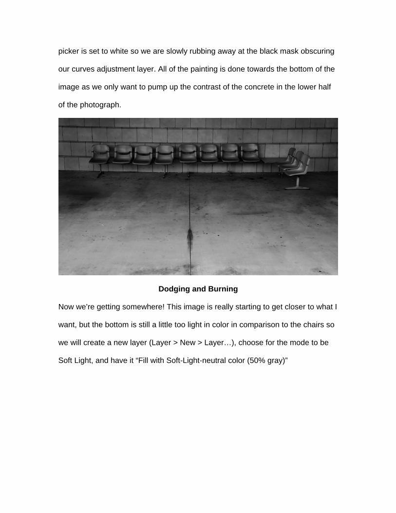
Dodging and Burning
Now we’re getting somewhere! This image is really starting to get closer to what I
want, but the bottom is still a little too light in color in comparison to the chairs so
we will create a new layer (Layer > New > Layer…), choose for the mode to be
Soft Light, and have it “Fill with Soft-Light-neutral color (50% gray)”
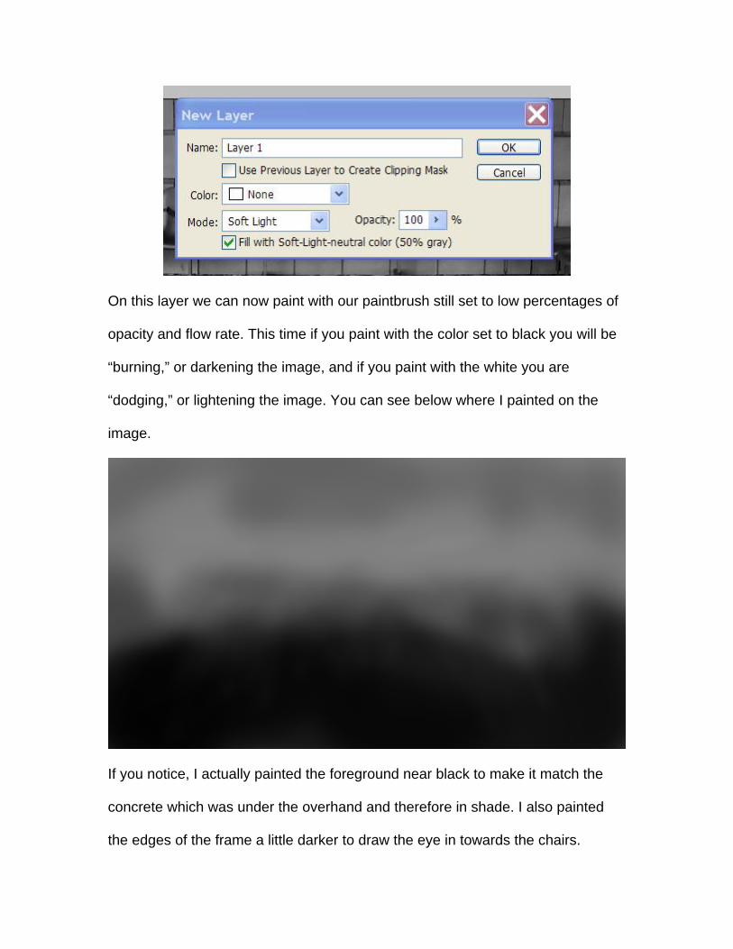
On this layer we can now paint with our paintbrush still set to low percentages of
opacity and flow rate. This time if you paint with the color set to black you will be
“burning,” or darkening the image, and if you paint with the white you are
“dodging,” or lightening the image. You can see below where I painted on the
image.
If you notice, I actually painted the foreground near black to make it match the
concrete which was under the overhand and therefore in shade. I also painted
the edges of the frame a little darker to draw the eye in towards the chairs.
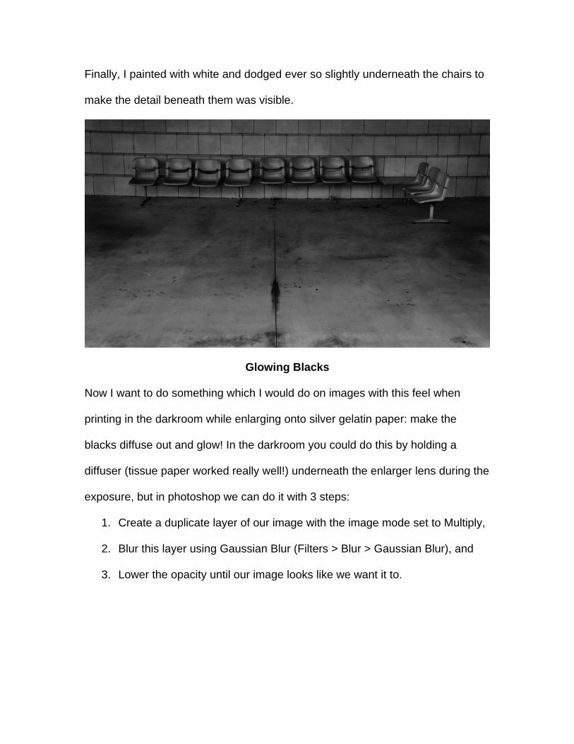
Finally, I painted with white and dodged ever so slightly underneath the chairs to
make the detail beneath them was visible.
Glowing Blacks
Now I want to do something which I would do on images with this feel when
printing in the darkroom while enlarging onto silver gelatin paper: make the
blacks diffuse out and glow! In the darkroom you could do this by holding a
diffuser (tissue paper worked really well!) underneath the enlarger lens during the
exposure, but in photoshop we can do it with 3 steps:
1. Create a duplicate layer of our image with the image mode set to Multiply,
2. Blur this layer using Gaussian Blur (Filters > Blur > Gaussian Blur), and
3. Lower the opacity until our image looks like we want it to.
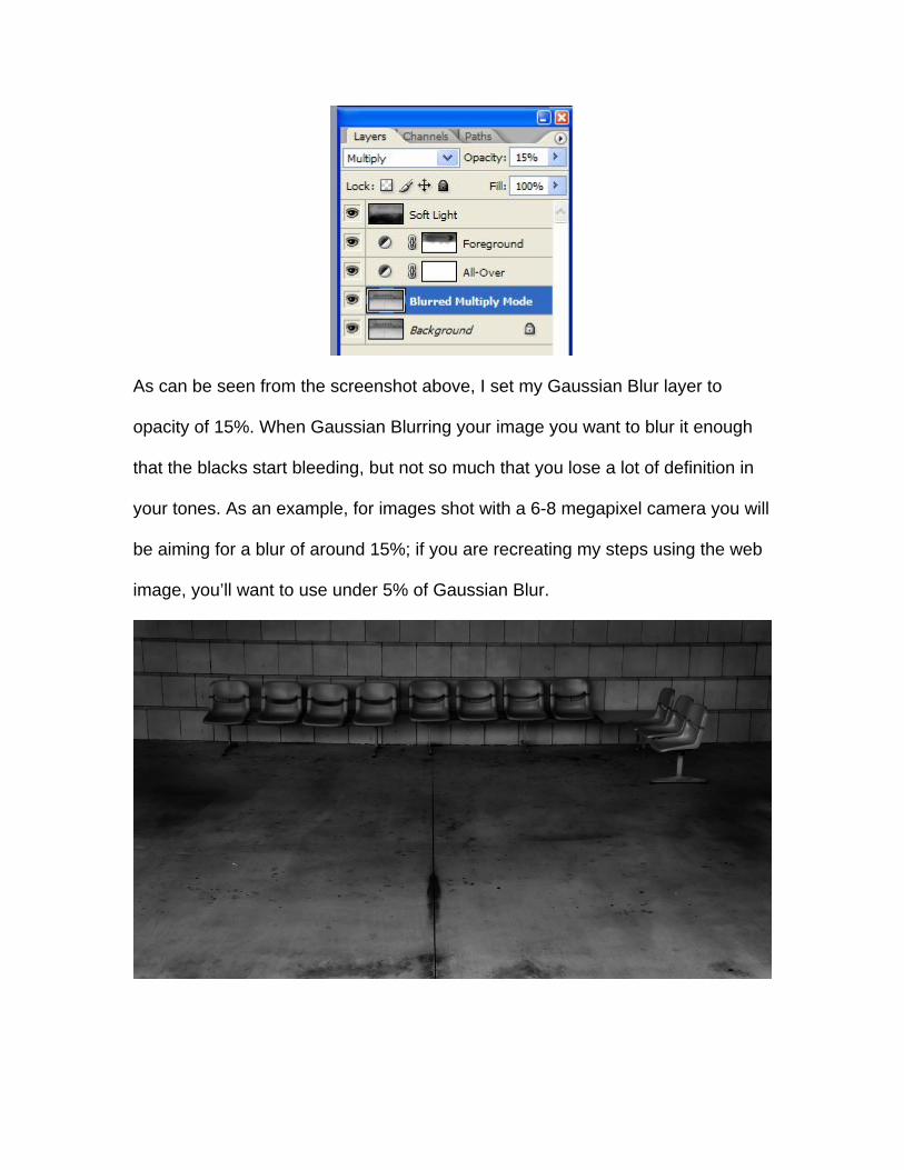
As can be seen from the screenshot above, I set my Gaussian Blur layer to
opacity of 15%. When Gaussian Blurring your image you want to blur it enough
that the blacks start bleeding, but not so much that you lose a lot of definition in
your tones. As an example, for images shot with a 6-8 megapixel camera you will
be aiming for a blur of around 15%; if you are recreating my steps using the web
image, you’ll want to use under 5% of Gaussian Blur.
Noise
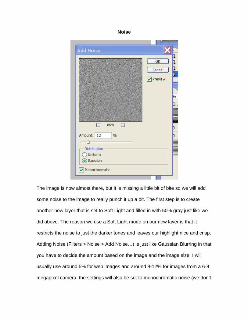
The image is now almost there, but it is missing a little bit of bite so we will add
some noise to the image to really punch it up a bit. The first step is to create
another new layer that is set to Soft Light and filled in with 50% gray just like we
did above. The reason we use a Soft Light mode on our new layer is that it
restricts the noise to just the darker tones and leaves our highlight nice and crisp.
Adding Noise (Filters > Noise > Add Noise…) is just like Gaussian Blurring in that
you have to decide the amount based on the image and the image size. I will
usually use around 5% for web images and around 8-12% for images from a 6-8
megapixel camera, the settings will also be set to monochromatic noise (we don’t
want the noise to be a random assortment of colors) and the distribution as
Gaussian which is random and more closely approximates film grain.
Final Image
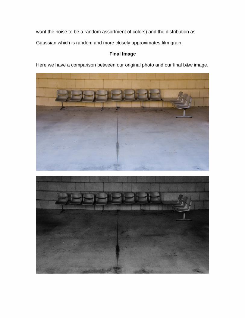
Here we have a comparison between our original photo and our final b&w image.