Embed Size (px)
Citation preview
Ableton Link
Add Ableton Linkto your application
Ableton Link
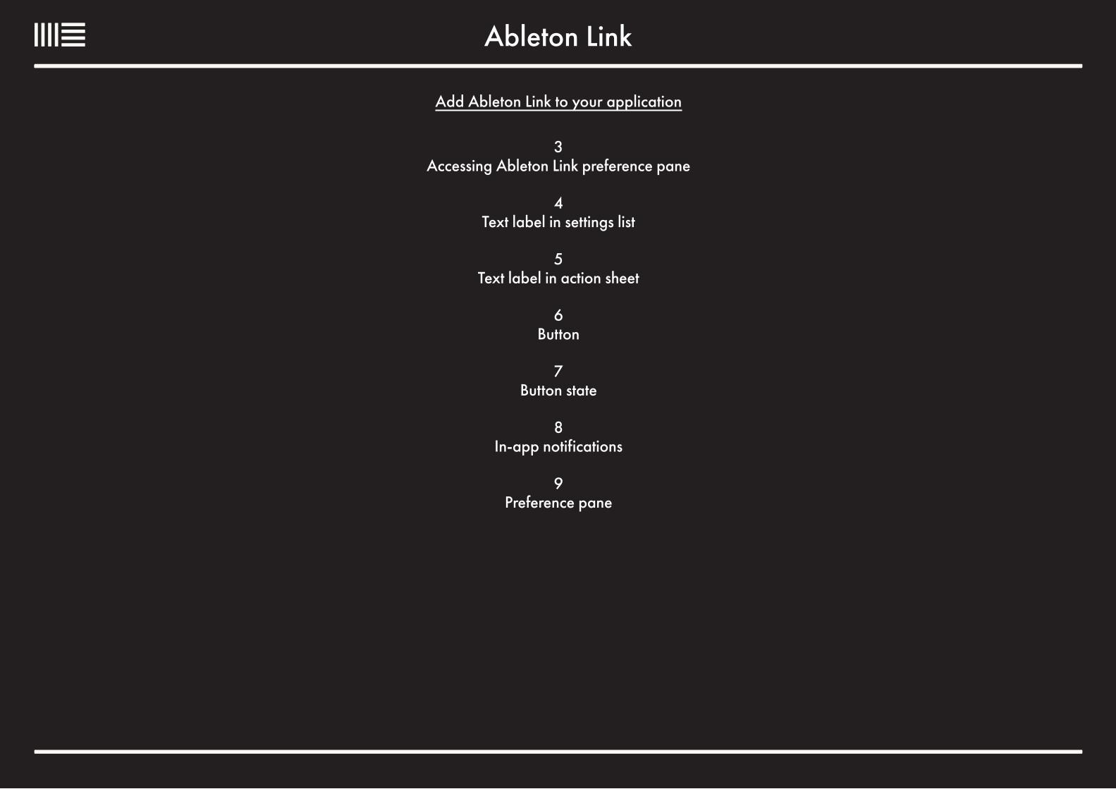
Add Ableton Link to your application
3 Accessing Ableton Link preference pane
4 Text label in settings list
5 Text label in action sheet
6 Button
7 Button state
8 In-app notifications
9 Preference pane
Ableton Link
Label
Label
Label
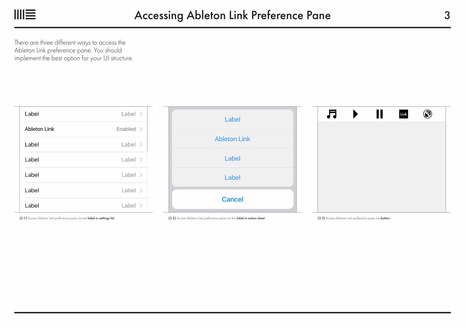
Accessing Ableton Link Preference Pane
There are three different ways to access the Ableton Link preference pane. You should implement the best option for your UI structure.
Ableton Link Enabled
(3.2) Access Ableton Link preference pane via text label in action sheet (3.3) Access Ableton Link preference pane via button(3.1) Access Ableton Link preference pane via text label in settings list
3
Text Label in Settings List
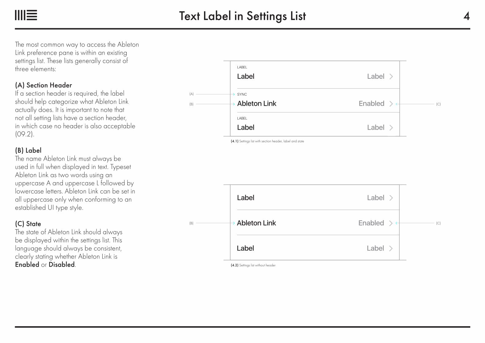
The most common way to access the Ableton Link preference pane is within an existing settings list. These lists generally consist of three elements:
(A) Section HeaderIf a section header is required, the label should help categorize what Ableton Link actually does. It is important to note that not all setting lists have a section header, in which case no header is also acceptable (09.2).
(B) LabelThe name Ableton Link must always be used in full when displayed in text. Typeset Ableton Link as two words using an uppercase A and uppercase L followed bylowercase letters. Ableton Link can be set in all uppercase only when conforming to anestablished UI type style.
(C) StateThe state of Ableton Link should always be displayed within the settings list. This language should always be consistent, clearly stating whether Ableton Link is Enabled or Disabled.
(A)
(B) (C)Ableton LinkSYNC
Enabled
LabelLABEL
Label
LabelLABEL
Label
(B) (C)
Label Label
Ableton Link Enabled
Label Label
(4.1) Settings list with section header, label and state
(4.2) Settings list without header
4
Text Label in Action Sheet
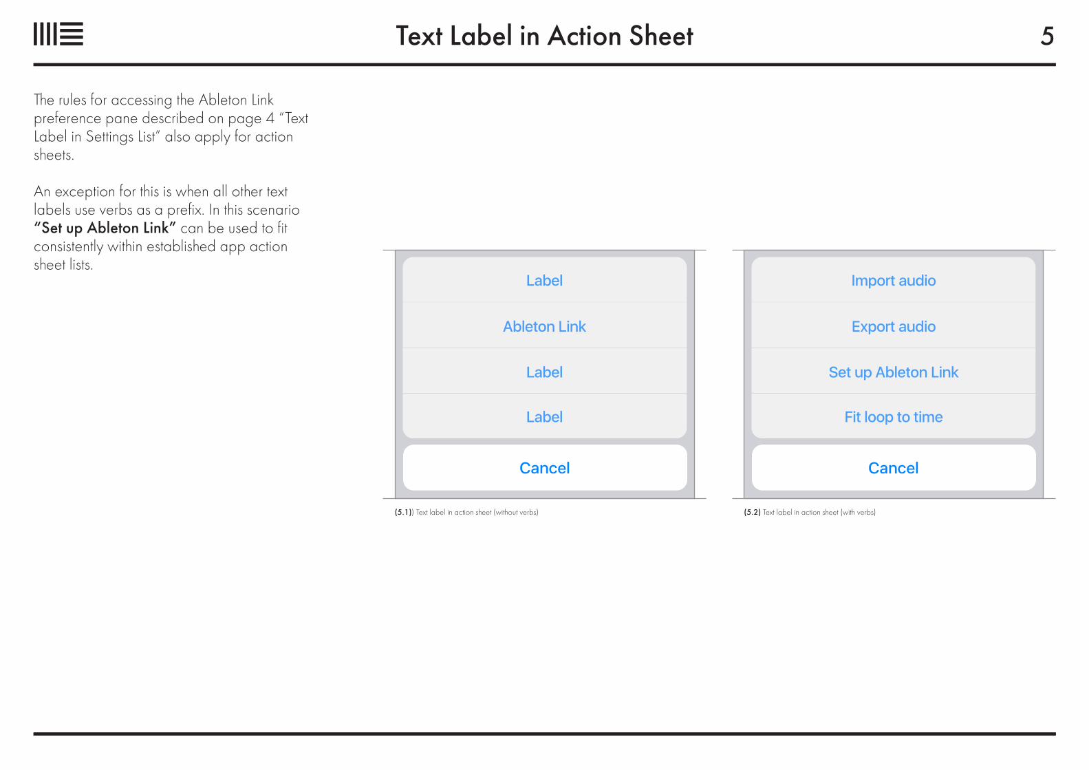
The rules for accessing the Ableton Link preference pane described on page 4 “Text Label in Settings List” also apply for action sheets.
An exception for this is when all other text labels use verbs as a prefix. In this scenario “Set up Ableton Link” can be used to fit consistently within established app action sheet lists.
Ableton Link Export audio
Import audioLabel
Set up Ableton LinkLabel
Fit loop to timeLabel
(5.1)) Text label in action sheet (without verbs) (5.2) Text label in action sheet (with verbs)
5
Button
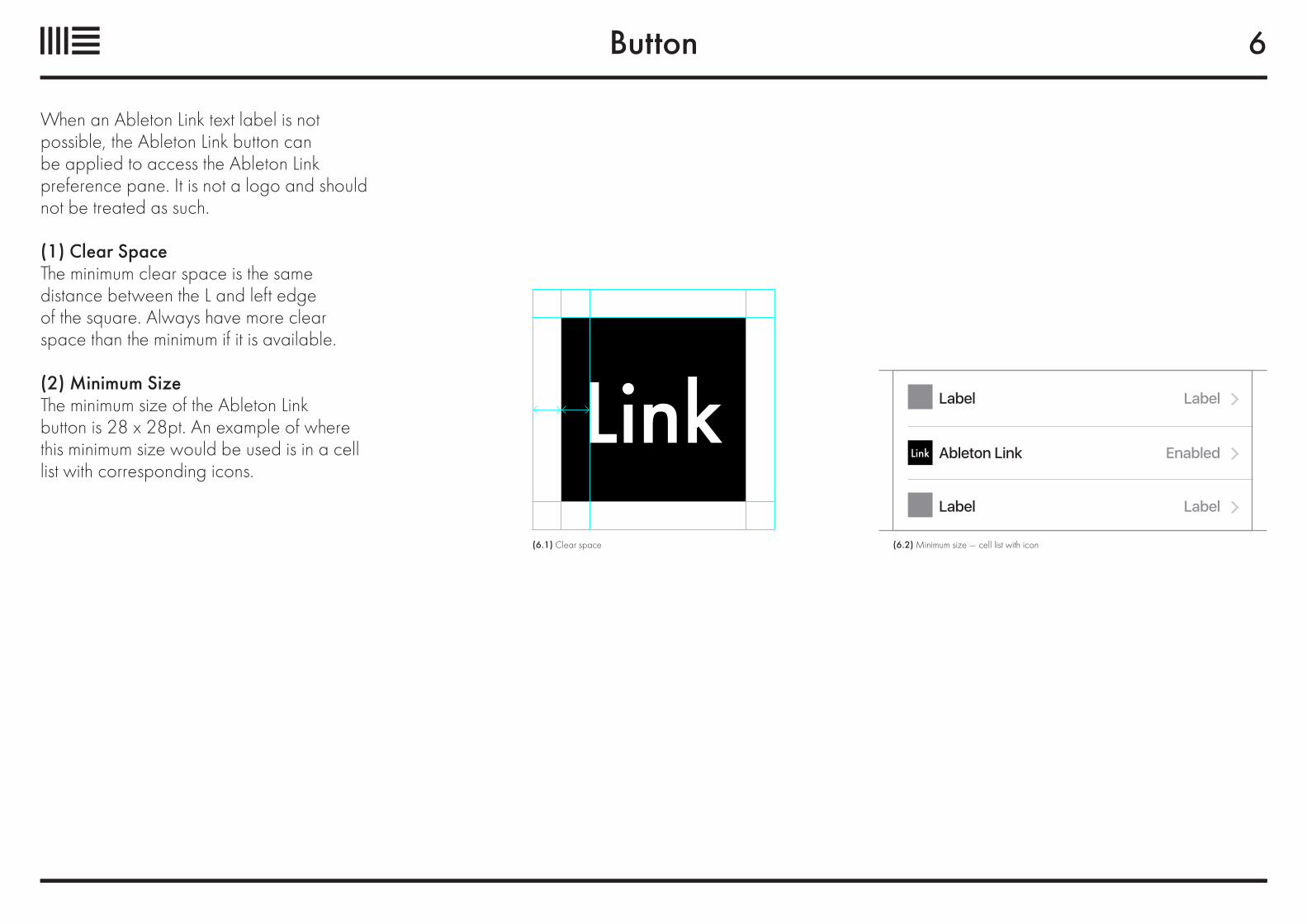
When an Ableton Link text label is not possible, the Ableton Link button can be applied to access the Ableton Link preference pane. It is not a logo and should not be treated as such.
(1) Clear SpaceThe minimum clear space is the same distance between the L and left edge of the square. Always have more clear space than the minimum if it is available.
(2) Minimum SizeThe minimum size of the Ableton Link button is 28 x 28pt. An example of where this minimum size would be used is in a cell list with corresponding icons.
(6.1) Clear space (6.2) Minimum size — cell list with icon
Ableton Link Enabled
Label Label
Label Label
6
Button State
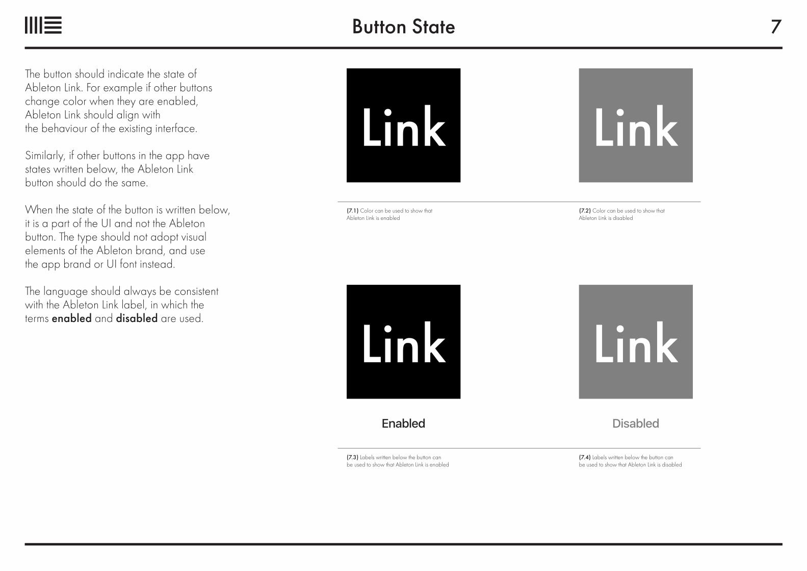
The button should indicate the state of Ableton Link. For example if other buttons change color when they are enabled, Ableton Link should align with the behaviour of the existing interface.
Similarly, if other buttons in the app have states written below, the Ableton Link button should do the same.
When the state of the button is written below, it is a part of the UI and not the Ableton button. The type should not adopt visual elements of the Ableton brand, and use the app brand or UI font instead.
The language should always be consistent with the Ableton Link label, in which the terms enabled and disabled are used.
Enabled Disabled
7
(7.1) Color can be used to show that Ableton Link is enabled
(7.2) Color can be used to show that Ableton Link is disabled
(7.3) Labels written below the button can be used to show that Ableton Link is enabled
(7.4) Labels written below the button can be used to show that Ableton Link is disabled
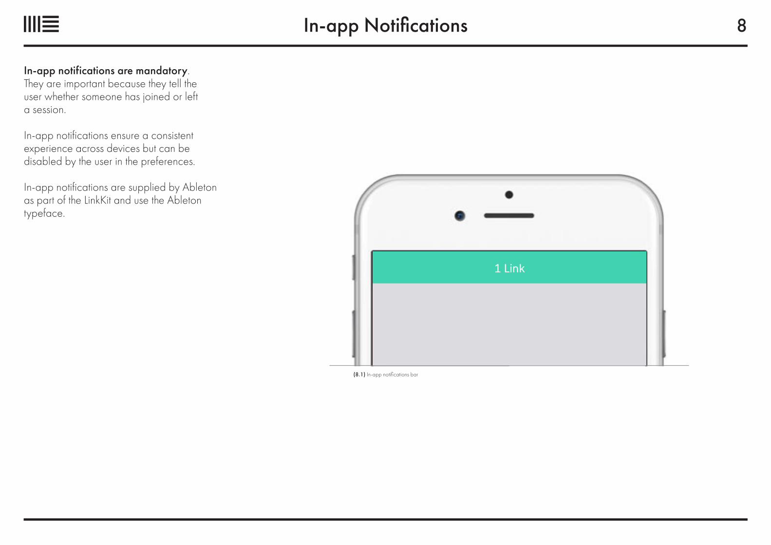
In-app Notifications
In-app notifications are mandatory. They are important because they tell the user whether someone has joined or left a session.
In-app notifications ensure a consistent experience across devices but can be disabled by the user in the preferences.
In-app notifications are supplied by Ableton as part of the LinkKit and use the Ableton typeface.
8
(8.1) In-app notifications bar
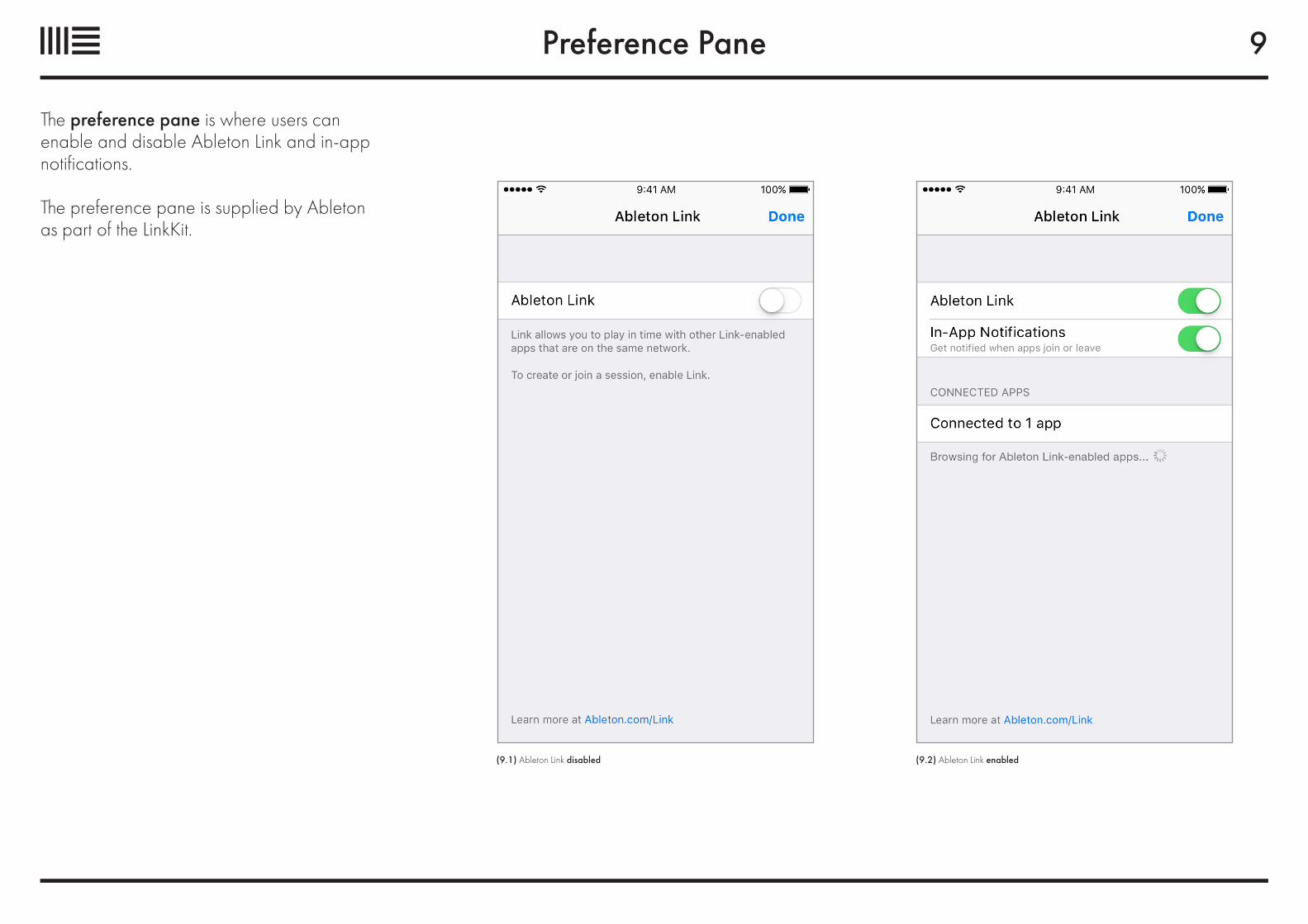
Preference Pane
The preference pane is where users can enable and disable Ableton Link and in-app notifications.
The preference pane is supplied by Ableton as part of the LinkKit.
(9.1) Ableton Link disabled (9.2) Ableton Link enabled
9
1.10
Ableton.com