Embed Size (px)
Citation preview

final spine = 0.4375"
ADAPTIVE WEB DESIGN
SECOND EDITIONGustafson
SECOND EDITION
LeveL Beginning / IntermediateCovers Web DesignCover Design Veerle Pieters
US $34.99 CAN $43.99
www.newriders.com
Building an elegant, functional website requires more than just knowing how to code. In Adaptive Web Design,
Second Edition, you’ll learn how to use progressive enhancement to build websites that work anywhere, won’t
break, are accessible by anyone—on any device—and are designed to work well into the future.
This new edition of Adaptive Web Design frames even more of the web design process in the lens of progressive
enhancement. You will learn how content strategy, UX, HTML, CSS, responsive web design, JavaScript,
server-side programming, and performance optimization all come together in the service of users on whatever
device they happen to use to access the web.
Understanding progressive enhancement will make you a better web professional, whether you’re a content
strategist, information architect, UX designer, visual designer, front-end developer, back-end developer, or
project manager. It will enable you to visualize experience as a continuum and craft interfaces that are capable of
reaching more users while simultaneously costing less money to develop. When you’ve mastered the tenets
and concepts of this book, you will see the web in a whole new way and gain web design superpowers that will
make you invaluable to your employer, clients, and the web as a whole. Visit http://adaptivewebdesign.info to
learn more.
The web is the first truly flexible design medium. But its flexibility affects more than our layouts: we’re
designing for networks both fast and slow, for devices both modern and not, for users who may not see a
screen at all. In this second edition of Adaptive Web Design, Aaron shows us how progressive enhancement
is the solution to all these challenges, and more.
— Ethan Marcotte, Designer; Author of Responsive Web Design
Adaptive Web Design should be one of the first books on the shelf of anyone building for the web. Showing
a deep understanding of the web, Aaron manages to cram nearly 20 years of insight into a book that is an
absolute pleasure to read. I dare you to try and read this book without a highlighter handy.
— Tim Kadlec, Author of Implementing Responsive Design
About the Author
As would be expected from a former manager of the Web Standards Project, Aaron Gustafson is passionate
about web standards and accessibility. He has been working on the web for nearly two decades and is a web
standards advocate at Microsoft, working closely with their browser team. He writes about whatever’s on his
mind at aaron-gustafson.com.
ADAPTIVE WEB DESIGN SECOND EDITIONCrafting Rich Experiences with Progressive Enhancement
9780134216140_AdaptiveWebDesign_Cvr.indd 1 10/19/15 11:12 AM


Adaptive Web Design, Second Edition Crafting Rich Experiences with Progressive EnhancementAaron Gustafson
New RidersFind us on the Web at www.newriders.comNew Riders is an imprint of Peachpit, a division of Pearson Education.To report errors, please send a note to [email protected]
Copyright © 2016 by Aaron Gustafson
Acquisitions Editor: Nikki Echler McDonaldProduction Editor: Tracey CroomDevelopment Editor: Stephanie TroethCopy Editor: Kim WimpsettProofer: Patricia PaneCompositor: Danielle FosterIndexer: James MinkinCover Design: Veerle PietersInterior Design: Ben DicksTechnical Editors: Chris Casciano, Craig Cook, and Steve Faulkner
Notice of RightsAll rights reserved. No part of this book may be reproduced or transmitted in any form by any means, electronic, mechanical, photocopying, recording, or otherwise, without the prior written permission of the publisher. For information on getting permission for reprints and excerpts, contact [email protected].
Notice of LiabilityThe information in this book is distributed on an “As Is” basis without warranty. While every precaution has been taken in the preparation of the book, neither the author nor Peachpit shall have any liability to any person or entity with respect to any loss or damage caused or alleged to be caused directly or indirectly by the instructions contained in this book or by the computer software and hardware products described in it.
TrademarksMany of the designations used by manufacturers and sellers to distinguish their products are claimed as trademarks. Where those designations appear in this book, and Peachpit was aware of a trademark claim, the designations appear as requested by the owner of the trademark. All other product names and services identified throughout this book are used in editorial fashion only and for the benefit of such companies with no intention of infringement of the trademark. No such use, or the use of any trade name, is intended to convey endorsement or other affiliation with this book.
ISBN 13: 9780134216140ISBN 10: 0134216148
9 8 7 6 5 4 3 2 1
Printed and bound in the United States of America

For Kelly

This page intentionally left blank

ACKNOWLEDGMENTSWithout the mentorship and assistance of so many of my friends and colleagues in this industry, not only would this book have never been written, but I would not have been in a position to write it. I’d like to take a moment to extend them my sincerest gratitude.
To Molly Holzschlag and Jeffrey Zeldman for taking me under their wings and helping me hone my skills as both a speaker and writer. And to the numerous conference organizers and publishers who’ve given me the opportunity to apply those skills.
To Steph Troeth for helping me organize my thoughts and the flow of this book. Her support, encouragement, and mangement of this project made the whole experience incredibly fulfilling and—dare I say—enjoyable!
To Chris Casciano, Craig Cook, and Steve Faulkner for keeping my code on the straight and narrow, highlighting my oversights, and ensuring I explained complex topics both simply and clearly. Their contributions were incredibly thoguhtful and appreciated.
To Tim Kadlec, Jeremy Keith, and Ethan Marcotte for reading my early drafts and saying such nice things about them.
To Veerle Pieters for making time in her busy schedule to update the look and feel of this book and design me an even more beautiful cover than she did for the first edition.
To Ben Dicks for his fantastic work on the interior layout and all the custom illustration work.
To Jeff, Matt, Adam, and the rest of the Perma team for creating a system to maintain web citations in perpetuity and for allowing me to add the links I referenced to their permenant collection.
To the fine folks at Pearson/New Riders: Nikki McDonald for championing this book’s move to Pearson and Tracey Croom and Mimi Heft for their invaluable help with the production of the book.
And, of course, to Kelly, for granting me the time to write this book, keeping me focused, and pushing me to get it done.

This page intentionally left blank
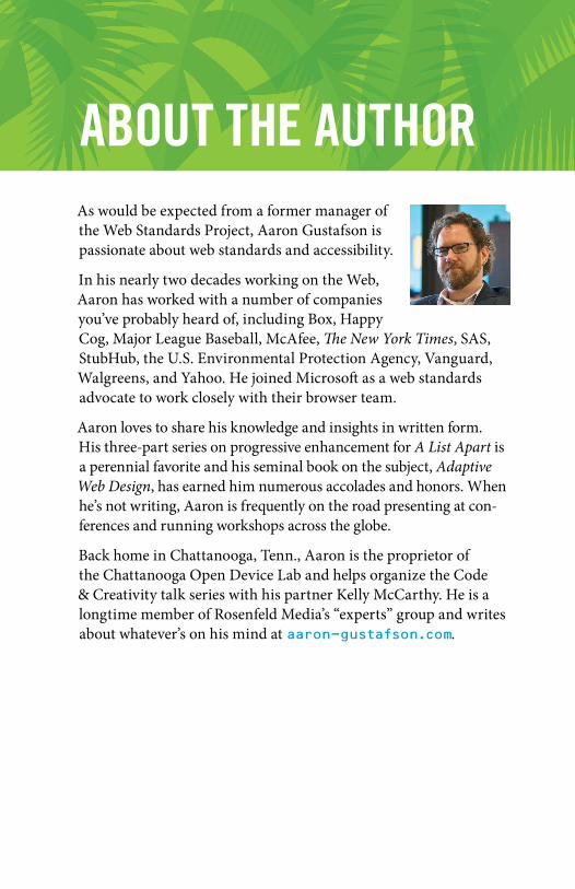
ABOUT THE AUTHORAs would be expected from a former manager of the Web Standards Project, Aaron Gustafson is passionate about web standards and accessibility.
In his nearly two decades working on the Web, Aaron has worked with a number of companies you’ve probably heard of, including Box, Happy Cog, Major League Baseball, McAfee, The New York Times, SAS, StubHub, the U.S. Environmental Protection Agency, Vanguard, Walgreens, and Yahoo. He joined Microsoft as a web standards advocate to work closely with their browser team.
Aaron loves to share his knowledge and insights in written form. His three-part series on progressive enhancement for A List Apart is a perennial favorite and his seminal book on the subject, Adaptive Web Design, has earned him numerous accolades and honors. When he’s not writing, Aaron is frequently on the road presenting at con-ferences and running workshops across the globe.
Back home in Chattanooga, Tenn., Aaron is the proprietor of the Chattanooga Open Device Lab and helps organize the Code & Creativity talk series with his partner Kelly McCarthy. He is a longtime member of Rosenfeld Media’s “experts” group and writes about whatever’s on his mind at aaron-gustafson.com.

This page intentionally left blank

CONTENTS Foreword xiii
Introduction xv
CHAPTER 1: Designing Experiences for People 1
Smart Code, Dumb Phones 2
When the Web Was Young 4
Technology vs. Experience 7
You Can’t Please Everyone 11
Support the Past, Optimize for the Future 12
Serving More for Less 16
Universal Accessibility 18
Thinking in Layers 20
This Is a Philosophy 23
CHAPTER 2: Content Is the Foundation 25
Avoid Zombie Copy 28
Design Meaningful Content 29
Craft the Conversation 31
Plan for the Unknown 35
Write for Real People 38

x CONTENTS
Consider Content Beyond Copy 39
Keep Data Entry Conversational 47
Don’t Fill Space 48
Let Content Lead the Way 51
CHAPTER 3: Markup Is an Enhancement 53
Learn from the Past 55
Illuminate Your Content 57
Mean What You Say 57
Embrace Classification and Identification 63
Make Deliberate Markup Choices 71
Clarify Interfaces with ARIA 83
Understand Fault Tolerance 86
Markup Conveys Meaning 91
CHAPTER 4: Visual Design Is an Enhancement 93
Design Systems, Not Pages 94
Don’t Design Yourself Into a Corner 100
Understand How CSS Works 104
Start Small and Be Responsive 121
Focus on Standards 133
Design Defensively 137
Hide Content Responsibly 139
The Flip Side: Generated Content 143

xiCONTENTS
Consider the Experience with Alternate Media and Inputs 145
Embrace Default Styles 152
Embrace the Continuum 155
CHAPTER 5: Interaction Is an Enhancement 157
Get Familiar with Potential Issues So You Can Avoid Them 160
Design a Baseline 165
Program Defensively 168
Establish Minimum Requirements for Enhancement 175
Cut Your Losses 177
Build What You Need 178
Describe What’s Going On 180
Write Code That Takes Declarative Instruction 182
Adapt the Interface 185
Apply No Styles Before Their Time 190
Enhance on Demand 192
Look Beyond the Mouse 195
Don’t Depend on the Network 201
Wield Your Power Wisely 206
CHAPTER 6: Crafting a Continuum 209
Map the Experience 210
Learn From the Past, Look to the Future 223
Be Ready for Anything 228

xii CONTENTS
Progressive Enhancement Checklist 230
Content 230
Markup 232
Design 233
Interaction 234
Further Reading 236
Index 241

FOREWORDI remember well when I got my hands on a copy of the first edition of Adaptive Web Design. I knew it would be good, but I didn’t expect to be quite so blown away after just one chapter. In that first chapter, Aaron managed to perfectly crystallize what I had been struggling to articulate for years on the true meaning of progressive enhancement.
In hindsight, I shouldn’t have been so surprised. Aaron is a multi-talented worker for the Web and has cultivated a deep knowledge of many areas—particularly accessibility. But his real talent lies not in his way with technology but in his way with people.
It’s all too easy for us—web designers and developers—to get caught up in the details of technical implementations. If we’re not careful, we can lose sight of the reasons why we’re designing and developing on the Web in the first place. Aaron can take you on a deep dive into the minutiae of markup, the secrets of CSS, and the jargon of JavaScript, while at the same time reminding you of why any of it matters: the people who will be accessing your work.
I suspect that Aaron struggles to come up with a title to describe what he does. Developer? Evangelist? Author? All those terms describe parts Aaron’s work, but they all fall short. I think the title that best describes Aaron Gustafson is…teacher.
Good teachers can work magic. They impart knowledge while weaving an entertaining tale at the same time. That’s exactly what Aaron does with this book.
You’re in for a treat. You’re about to read a story that is as instruc-tional as it is engrossing.
Take it away, teacher…
Jeremy Keith, Clearleft August 2015

This page intentionally left blank

INTRODUCTIONMost web design books are filled with great techniques and exam-ples that you can pick up and use right away. They’re often filled with reams of documentation on which HTML tags to use in which situa-tion and what each and every CSS property does. And most include some sort of sample project or projects for you to work along with in order to see how the code examples come together.
This is not that kind of book. This is a philosophy book about designing for the ever-changing, ever-evolving Web.
There are thousands of technique books out there for you to buy and hundreds of thousands of technique-based articles for you to read. Many of them are quite good. Sadly, however, most of them have a shelf life measured in months.
Technologies…browsers…toolsets…they’re constantly changing. I struggle to keep up and often find myself overwhelmed, adrift on a churning sea of far too many options and ways I could be building websites. When I’m being tossed hither and thither by the waves, I affix my gaze on the one thing that helps me get my bearings and make sense of what’s happening: the philosophy of progressive enhancement.
This philosophy—which is the heart and soul of an adaptive approach to web design—grounds me and helps me put any new technology, technique, or idea in perspective. Furthermore, it makes my sites more robust and capable of reaching more users with fewer headaches. It has made me a better web designer, and I know it can do the same for you.

“Anyone who slaps a ‘this page is best viewed with Browser X’ label on a Web page appears to be yearning for the bad old days, before the Web, when you had very little chance of reading a document written on another computer, another word processor, or another network.”
—TIM BERNERS LEE

CHAPTER 1:DESIGNING EXPERIENCES FOR PEOPLEThe one constant on the Web is change. There’s always a new design fad; a new darling language, framework, or tool; a shiny new device to view it on; or new ideas of what it means to be “on the Web.”
It’s exceptionally difficult to wrap your head around an industry that is constantly in flux. It makes my head hurt, and if you’ve been working on the web for a while, I suspect you might feel the same.
Having worked on the Web for nearly two decades, I’ve seen the cycle play out over and over. Java applets, Shockwave, Flash, Prototype, jQuery, 960gs, Bootstrap, Angular, React…. Technologies come and go, but the Web remains. Screens went from tiny to huge and then back to tiny again, but the Web remains. Walled gardens were built and then torn asunder to make way for “app” stores and (yes) more walled gardens, but the Web remains.
The Web remains because it is not a fixed screen size. The Web remains because it is not a specific device. The Web doesn’t need to be installed. The Web is inherently resilient and infinitely malleable. The Web has the capacity to go anywhere, do anything, and reach anyone.

2 ADAPTIVE WEB DESIGN
SMART CODE, DUMB PHONESIn early 2012, my company began working with a client who was struggling with the security of their mobile apps. They had numerous native apps that all followed the common convention of using a web service to authenticate users. They are a very security-conscious organization, and this setup was creating a bottleneck in deploying new security features. To roll out a new security feature to their users (for example, a security question like “What was the name of your first school?”), they had to go through an excruciatingly long, arduous, multistep process:
1. Implement the new security feature.2. Expose it via the web service.3. Update each app to use the new web service (which might
include user interface changes, and so on).4. Submit each app for approval.5. Hope their users downloaded the new version of the app.
They brought us in to reimagine the authentication flow as a web-based process that would launch inside an app—they had separate iPhone, iPad, and Android apps—and handle letting the app know whether and when the user had successfully logged in. This approach meant they could roll out new security features immedi-ately because the apps and the authentication flow would be loosely coupled. Letting users sign in through a web page within the native app would be a huge win for everyone involved.
Despite that the project was aimed at handling authentication for mobile apps on three specific platforms, we built the web pages without getting hung up on technology or screen sizes. Instead, we focused on the purpose of every interface component and every screen. The layouts were responsive from tiny screens all the way up to large ones, and we implemented HTML5 and JavaScript in completely unobtrusive ways. We wanted to take advantage of cool new things (such as native form validation) while still keeping the file sizes small and ensuring the pages would function in the absence of either technology.

3DESigNiNg ExPERiENCESfOR PEOPlE
A few months after completing the project, our client came back to us with a second project: They wanted to roll out the authentication flow to their “m-dot” users (people who visited their mobile-only website). They gave us a list of nearly 1,400 unique User Agent strings that had accessed the login screen over a two-day period and asked whether we could handle it. We parsed the list1 and were able to come up with a more manageable aggregate list of devices and device types to use in our testing. It was something like 25 devices that would cover roughly 97 percent of their 1,400 device spectrum. The last 3 percent was at the end of a long tail when it came to device usage, and we were comfortable assuming that fix-ing issues in the other 97 percent would likely cover them as well. That said, we were prepared to fix any additional issues when and if they cropped up.
Our budget for adding support for 1,400 new devices, includ-ing some heinous old browsers (for example, BlackBerry 4 and Openwave), was about one-third the budget of the original project that targeted only three.
Let that soak in for a second.
Now here’s the kicker: When all was said and done, we came in at roughly half of our proposed budget, in terms of both actual hours billed and time to completion. It was awesome for us because we delivered ahead of schedule—which made us look good—and it earned our client contact major kudos from his bosses because he’d saved the company serious money on the project (which rarely happens in the corporate world).
It’s worth noting that this accomplishment had nothing to do with our bug-squashing prowess or our speed—we just followed the philosophy of progressive enhancement.
1 With the help of a little script I cooked up: http://perma.cc/4EAE-Y9H5.
4 ADAPTIVE WEB DESIGN
Progressive enhancement is a web design philosophy that embrac-es the very nature of the Web. It isn’t about devices or browsers, and it’s not about which version of HTML or CSS you can use. Using progressive enhancement means you craft experiences that serve your users by giving them access to content without technological restrictions.
It sounds pretty amazing, and anything that amazing must be a lot of work, right? Actually, it’s not. Once you understand how pro-gressive enhancement works, or more importantly why it works, you’ll see it’s quite simple. As we often say, progressive enhance-ment just works.
During a presentation at the South by Southwest Interactive Festival in 2003, Steve Champion of the Web Standards Project offered the term progressive enhancement to describe his vision for a new way to think about web design—starting with the content and building out from there. Once you understand what progres-sive enhancement is all about, it’s hard to imagine approaching a project in any other way. It just makes sense. And yet, it took nearly a decade after the Web’s creation for this approach to web design to be proposed, let alone embraced.2
WHEN THE WEB WAS YOUNgIn the beginning there was text:3 the line mode browser.4 It has a black screen with green text (Figure 1.1). You know, it was the kind of program hackers use in the movies.
2 We’re still working on that one, which is the reason for this book.3 Well, technically, in the beginning there was a graphical browser called
WorldWideWeb (later Nexus), but it was available only on the NeXT operating system and never made it into general use.
4 Some of my friends and colleagues ventured back to CERN in 2013 to re-create the line mode browser using modern web technologies. They wrote about it, and you can try it out at http://perma.cc/2UYR-HVWP.

5DESigNiNg ExPERiENCESfOR PEOPlE
Figure 1.1 The line mode browser as re-created in 2013.
The line mode browser supported basic formatting such as indentation, centering, and the like, but that was about it. But it didn’t matter. It was 1990. The Web was an infant and was all about publishing and reading text-based content, so it didn’t need to look pretty.
By the time I got online five years later, things were a bit different. The National Center for Supercomputing Application’s Mosaic had brought the graphical side of the Web to the masses two years earlier, and Netscape’s Navigator was already a year old.5
But my experience of the Web in 1995 was not graphical. I was attending New College in Sarasota, Florida, and had to dial in to the campus’s server in order to access the Internet. It was all done over the command line, and I saw my first website—sony.com—in stark black and white (Figure 1.2).
I thought to myself This web thing is bullshit! and quickly discon-nected my modem in disgust.
5 Microsoft’s Internet Explorer had just been born.

6 ADAPTIVE WEB DESIGN
Figure 1.2 My best approximation of what I saw the first time I used Lynx to access sony.com: a black screen with white text saying nothing.
You know what? I was right: That experience was bullshit! Here was a website whose purpose was to disseminate information about Sony products and musicians and it had—effectively—no content. In other words, its purpose was lost.
How did this happen? Well, the folks who designed that version of sony.com had used images instead of actual page content. All the page text was rendered in JPEGs and GIFs. When they assembled the images onto the page, they failed to author alt text that provided access to that content. Anyone who couldn’t partake of what I’m sure was the pinnacle of mid–1990s web design was pretty much screwed.

7DESigNiNg ExPERiENCESfOR PEOPlE
And so there I was, taking my first tentative steps onto the Web and I was denied access to a site because the technology I was using to access it was not advanced enough. I felt like the short kid at the amusement park, feigning disinterest in the Tilt-a-Whirl be-cause I was the only one of my friends who was too small to ride it.
And just like my childhood height, my browser choice was not something I had control over. I couldn’t have just downloaded Mosaic or bought a copy of Netscape at my local Babbage’s and been on my merry way. Our school’s server didn’t support Point-to-Point Protocol (PPP) at the time, so I could browse only on the command line via Lynx.
That experience colored my perception of the Web and has stuck with me ever since, guiding my decisions as a web designer. I always think about my experience and the lack of accessibility the Web—well, sony.com specifically—had for me at the time. It sucked. I never want to make someone else feel like that.
TECHNOlOgY VS. ExPERiENCEWhen the Web was young, the technologies we used to create experiences for it were rapidly evolving. HTML was not standard-ized like it is today, and Microsoft and Netscape were taking turns adding new elements and behaviors in a seemingly eternal game of one-upmanship. We also had things like Java applets,6 RealMedia, Shockwave, Flash, and a host of other proprietary technologies that served only to complicate the page construction process and heaped additional requirements on our users.
6 Did you ever use one to make your content look like it was reflected in a pool of water? That was so cool!

8 ADAPTIVE WEB DESIGN
As an industry, we adopted the engineering concept of graceful degradation, which ensures a system can continue to work with a reduced service level even when part of it is unavailable or destroyed. In other words, it’s a philosophy meant to avoid catastrophe. In practice on the Web, this meant we assumed older browsers, or those without the necessary plug-ins, would get a poor experience. We rarely made the time to test in these scenarios, so we erected signs for our users:
This page works best in Internet Explorer.
This page looks best in Netscape.
You need Flash to use our website.
Keep out ye undesirables!
The graceful degradation philosophy amounted to giving the latest and greatest browsers the experience of a full-course meal, while tossing a few scraps to the sad folk unfortunate enough to be using an older or less-capable browser.
And when we really didn’t feel like testing in a browser, we’d just read the User Agent string on the server and erect a roadblock (Figure 1.3). 7 After all, we told ourselves, if we stop the user before they experience an error, we’re avoiding delivering a bad experience.
But is no experience better than a less than ideal experience? I don’t think so.
7 Of course, few of us even did that well. A lot of User Agent sniffing (as it’s called) is poorly done and results in false positives. It’s been the driving factor for the “evolution” of the User Agent string. Nicholas Zakas wrote a brilliant piece chronicling that: http://perma.cc/BR7M-JEDH.

9DESigNiNg ExPERiENCESfOR PEOPlE
Figure 1.3 An example roadblock page from Kodak.
lessons learned at the Bleeding EdgeSome time ago I worked on a Chrome app for WikiHow.8 As a Chrome app and a showpiece for the then-new Chrome Web Store, our client wanted it to have fancy CSS3 animations and tran-sitions, web fonts, a WebSQL database, offline support, and lots of other “HTML5” bells and whistles. And, as our target was a single browser, we relented when asked to go the single-page app route. The app was built to degrade gracefully (it blocked non-WebKit browsers), but it was not progressively enhanced.
Skip ahead about a year and our client returned, asking us to add support for Firefox and Internet Explorer (IE) 9+. Oh boy.
8 http://perma.cc/5KE9-GK88.

10 ADAPTIVE WEB DESIGN
Having built the site purely for WebKit, it was a bit of a challenge. In addition to implementation differences with the experimental CSS features, we also had to deal with the DOM (document object model) and JavaScript API (application programming interface) variance among the browsers. But the single biggest issue we ran into was the lack of WebSQL support in Firefox and IE.
You see, in the intervening year, WebSQL had been abandoned at the W3C (World Wide Web Consortium)—the organization that oversees most web standards—because of pushback (primarily from Mozilla and Microsoft). It was not available in either Firefox or IE, nor would it ever be. IndexedDB, the new replacement for WebSQL, had yet to be implemented in any production browser. So we ended up writing a wrapper on top of localStorage that looked a lot like SQL. Thankfully, that allowed us to avoid rewriting the bulk of the app. Incidentally, it also made the app a lot faster.
The total cost of the new compatibility project was around 40 percent of the budget to build the app the first time around. Without access to an alternate timeline, I can’t be certain, but my experience tells me it would have added less than 40 percent to the original project had we been given the leeway to build it using progressive enhancement. Plus, the end result would have been even better because it would have been able to function without JavaScript.
Based on conversations I’ve had with other designers, the 40 percent number seems pretty accurate—possibly even a bit low. I remember one conversation several years ago about Google Maps. When the team originally built Maps—in all of its Ajax-y glory—they didn’t make it accessible, and it required JavaScript. According to the source of this anecdote (who I have long forgot-ten), it took them almost twice as long to retrofit Maps as it would have taken had they built it from the ground up following progres-sive enhancement. As it’s purely anecdotal, you should take that with a grain of salt, but it’s food for thought.
Now consider this story in light of the one I shared earlier. Given the choice between a 40 percent budget increase to add support for 2 browsers and a 15 percent increase to add 1,400 browsers, I know

11DESigNiNg ExPERiENCESfOR PEOPlE
which option I’d choose. Progressive enhancement does require a bit more thoughtful consideration up front. But the extra time required diminishes with practice, and the philosophy pays huge dividends in the long run. More reach, less overhead, fewer headaches.
Progressive enhancement trounces graceful degradation when it comes to reaching more browsers, devices, and (ultimately) users for less money (and fewer headaches). But how?
For starters, progressive enhancement recognizes that experience is a continuum.
YOU CAN’T PlEASE EVERYONEProviding a pixel-perfect, wholly identical experience for each and every human being who tries to access your site would be impossi-ble. There are simply far too many factors to consider.
On the technical side of things, you’ve got screen size, display density, CPU (central processing unit) speed, amount of RAM (random-access memory), sensor availability, feature availability, interface methods…breathe…operating system, operating system version, browser, browser version, plug-ins, plug-in versions, net-work speed, network latency, network congestion, firewalls, proxies, routers, and probably a dozen other factors my mind is incapable of plucking from the whirlwind of technological considerations.
And that doesn’t even take into account your users’ experiences interacting with your work.
When it comes to people, you have to consider literacy level, read-ing level, amount of domain knowledge, cognitive impairments such as learning disabilities and dyslexia, attention deficit issues, environmental distractions, vision impairment, hearing impair-ment, motor impairment, how much they understand how to use their device, how much they understand how to use their browser, how well-versed in common web conventions they are, and a ton of other “human factors.”

12 ADAPTIVE WEB DESIGN
Every person is different, and everyone comes to the Web with their own set of special needs. Some needs develop over time and persist—blindness, for example. Others are transient, such as breaking your mousing arm. Still others are purely situational and dependent on the device you are using at the time and its technical capabilities or constraints.
Trying to devise one monolithic experience for each and every person to have in every context that considers every factor would be impossible. Given unlimited time and budget, you could proba-bly make it happen, but how often do you get to work under those conditions?9 Designing for a monolithic experience is a form of arrogance—it assumes you will always know your users’ context and what’s best for them. In reality, you often know far less than you think you do.
And yet, Sir Tim Berners Lee—the guy who invented the World Wide Web—had a vision for a Web that was portable, capable of going anywhere.10 Was he delusional?
SUPPORT THE PAST, OPTiMiZE fOR THE fUTUREBack in middle school, I wrote every paper in Word for MS-DOS. It was a piece of software that did one thing really well: It allowed the user to focus on writing.11 You didn’t have a whole lot of op-tions for formatting text, but it did what it needed to do, and it did it with aplomb.
9 If you do, in fact, get to work under these conditions, please let me know if you’re hiring.
10 You can read his proposal here: http://perma.cc/H8HW-DACS.11 In many ways, iA Writer—which I am using to write these very
words—reminds me a lot of it.

13DESigNiNg ExPERiENCESfOR PEOPlE
More than two decades later, it’s next to impossible for me to read the DOC files Word created for me. As an application, Word long abandoned support for reading and editing that generation of the DOC format.
Now I’m not saying that the stuff I wrote in middle school is really worth reading today (I’m sure it’s not), but I am only one of millions of people who authored content in Word for DOS. That content is largely lost to history because the format evolved in a way that made newer versions of Word incapable of reading those older files.
And that’s just one piece of software. We see these sort of “breaking changes” all the time in software, even on the Web. The popular JavaScript framework Angular changed so much between its 1.0 and 2.0 versions that developers had to rewrite their apps almost entirely to take advantage of its new features.
This is a huge challenge for archivists because even if they manage to hang on to a copy of the programs that originally authored these files, they also need to maintain machines capable of running the software (which is equally challenging).
When he conceived of the World Wide Web, Sir Tim Berners Lee wanted to avoid this problem. He wanted content on the Web to be robust and future-proof, so he made that a guiding principle of the web’s lingua franca, HTML. To wit, the HTML 2.0 spec says this:12
To facilitate experimentation and interoperability between implementations of various versions of HTML, the installed base of HTML user agents supports a superset of the HTML 2.0 language by reducing it to HTML 2.0: markup in the form of a start-tag or end-tag, whose generic identifier is not declared is mapped to nothing during tokenization. Undeclared attributes are treated similarly. The entire attribute specification of an unknown attribute (i.e., the unknown attribute and its value, if any) should be ignored.
12 http://perma.cc/H8HW-DACS

14 ADAPTIVE WEB DESIGN
In other words, browsers are instructed to ignore what they don’t understand. This is fault tolerance (another carry-over term from the world of engineering), and it’s central to the design of HTML as a language and CSS as well.13
Both languages were designed to be “forward compatible,” mean-ing everything you write today will work tomorrow and next year and in ten years. These languages were designed to evolve over time. By ignoring anything they don’t understand, browsers give these languages room to grow and adapt without ever reaching a point where the content they encapsulate and style would no longer be readable or run the risk of causing a browser to crash.
Fault tolerance makes it possible to browse an HTML5-driven website in Lynx and allows you to experiment with CSS3 fea-tures without worrying about breaking Internet Explorer 6. Understanding fault tolerance is the key to understanding pro-gressive enhancement. Fault tolerance is the reason progressive enhancement works and makes it possible to ensure all content delivered on the Web is accessible and available to everyone.
Maintaining Your SanityTrying to give everyone the same experience across the myriad device and browser combinations, especially considering the variety of human factors that affect how they interact with a page, would be a fool’s errand. It’s important to pick your battles. Web developer Brad Frost beautifully couched this approach as “support vs. optimization.”
Unless you want to hole yourself up in a cabin for the foreseeable future, you’re not going to be able to optimize your web experience for every single browser. What I’m really asking for here is consideration.
13 http://perma.cc/MW47-P99F

15DESigNiNg ExPERiENCESfOR PEOPlE
You don’t have to treat these browsers as equals to iOS and Android and no one is recommending that we have to serve up a crappy WAP site to the best smartphones on the market. It’s just about being more considerate and giving these people who want to interact with your site a functional experience. That requires removing comfortable assumptions about support and accounting for different use cases. There are ways to support lesser platforms while still optimizing for the best of the best.14
By following this approach, you enable your content to go as far as possible, unencumbered by the requirements of some partic-ular technology or capability. You can do this rather easily by focusing on the content and building up the experience, layer by layer, because the browser and device can adequately support that experience.
Progressive enhancement isn’t about browsers or devices or technologies. It’s about crafting experiences that serve your users by giving them access to content without technological restric-tions. Progressive enhancement doesn’t require that you provide the same experience to every user, nor does it preclude you from using the latest and greatest technologies; it simply asks that you honor your site’s purpose and respect your users by applying technologies in an intelligent way, layer upon layer, to craft an amazing experience.
Browsers, devices, and technologies will come and go. Marrying progressive enhancement with your desire to be innovative and do incredible things is entirely possible—as long as you’re smart about your choices and don’t allow yourself to be so distracted by the shiny and new that you lose sight of your site’s purpose or your users’ needs.
14 http://perma.cc/D9ZP-H953

16 ADAPTIVE WEB DESIGN
SERViNg MORE fOR lESSOf course, there are many folks who consider progressive enhance-ment—especially insofar as creating a non-JavaScript experience goes—a total waste of time. Take this comment a reader left on web developer Tim Kadlec’s blog post “Crippling the Web:”15
This is all fine and dandy, but not very real world. A cost-benefit analysis has to happen—what does that next user/visitor cost, and more importantly earn you? This idealistic approach would leave most broke if they had to consider “every user” when building a site. That’s why clothes come in small, medium, large, and extra-large. Most of us have to buy them that way because not everyone can afford a tailor made suit, much less an entire wardrobe. Your approach only works for those who can see the return.
Tim’s response was dead-on:
I think that’s where the difference between ‘support’ and ‘optimization’ comes into play. I’m certainly not saying to go out and buy every device under the sun, test on them, make sure things look and behave the same. You don’t necessarily have to optimize for all these different devices and scenarios (that’s where the cost-benefit analysis has to come in), but it’s often not very time consuming to at least support them on some level.
Progressive enhancement can get you a long way towards accomplishing that goal. Sometimes it’s as simple as doing something like ‘cutting the mustard’ to exclude older devices and browsers that might choke on advanced JS from having to try and deal with that. The experience isn’t the same, but if you’ve used progressive enhancement to make sure the markup is solid and not reliant on the JavaScript, it’s at least something that is usable for them.
15 http://perma.cc/AR56-T6GD
17DESigNiNg ExPERiENCESfOR PEOPlE
You can’t test every scenario, every browser, and every device. There just aren’t enough hours in the day even if someone was willing to spend the money on doing it—and guess what, they aren’t. You need to balance your desired reach with your realistic resources.
This is why progressive enhancement is so helpful. You can provide a baseline experience that anyone can use and then look for ways to im-prove it on the browsers and devices that are part of your test matrix.
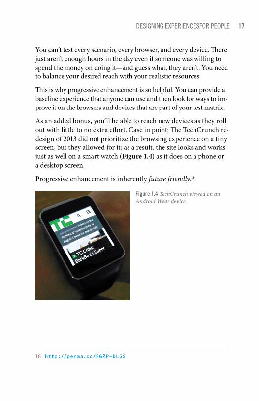
As an added bonus, you’ll be able to reach new devices as they roll out with little to no extra effort. Case in point: The TechCrunch re-design of 2013 did not prioritize the browsing experience on a tiny screen, but they allowed for it; as a result, the site looks and works just as well on a smart watch (Figure 1.4) as it does on a phone or a desktop screen.
Progressive enhancement is inherently future friendly.16
Figure 1.4 TechCrunch viewed on an Android Wear device.
16 http://perma.cc/EG2P-DLGS

18 ADAPTIVE WEB DESIGN
UNiVERSAl ACCESSiBiliTYSir Tim’s vision for the Web was that content could be created once and accessed from anywhere. Disparate but related pieces of “hypermedia”17 scattered across the globe could be connected to one another via links. Moreover, they would be retrievable by anyone on any device capable of reading HTML. For free.
Ultimately, Sir Tim’s vision is about accessibility.
For a great many of us, ensuring our websites are accessible is an afterthought. We talk a good game when it comes to “user centered” this or that but often treat the word accessibility as a synonym for “screen reader.”
Sure, people with visual impairments often use a screen reader to con-sume content. But they might also use a braille touch feedback device or a braille printer. They probably also use a keyboard. Or they may use a touchscreen in concert with audio cues. Or they may even use a camera to allow them to “read” content via optical character recogni-tion (OCR) and text-to-speech. And yes, visual impairment affects a decent percentage of the populace (especially as we age, which we all do), but it is only part of the “accessibility” puzzle.
We all benefit when designers consider accessibility. We all have special needs. “Accessibility” is about recognizing that fact and taking steps to address them.
People consume content and use interfaces in many different ways, some similar and some quite dissimilar to how you do it. Designing for universal accessibility means not imposing a certain world view—yours, your boss’s, or your client’s—on how or where someone is going to access your website, giving your users ultimate control on how they choose to consume your content.
The dimensions of interactive elements—links, buttons, and so on—and their proximity to one another is an important factor in
17 Sir Tim used the term hypermedia because he knew the Web would need to contain more than just text.
19DESigNiNg ExPERiENCESfOR PEOPlE
ensuring an interface actually registers your intent. Have you ever injured your dominant arm and had to mouse with your other one? It’s frustrating, especially when links are small or buttons are too close together. Visual design is an accessibility concern.
The color contrast between text and the background is an im-portant factor in ensuring content remains readable in different lighting situations. Some websites are nearly impossible to read on your phone while outside on a sunny day or when you’ve turned down the screen brightness to sip that last 5 percent of your battery life. Color choice is an accessibility concern.
The language you use on your sites and in your interfaces directly affects how easy it is for your users to understand what you do, the products you’re offering, and why it matters. It also affects how you make your users feel about themselves, their experience, and your company. Terms of service are a perfect example of this: No one reads them because they are alienating and unfriendly.18 Language is an accessibility concern.
The size of your web pages and their associated assets has a direct effect on how long your pages take to download, how much it costs your customers to access them, and (sometimes) even whether the content can be reached. One time I unwittingly played 30 minutes of a high-definition video while tethered to my phone, traveling abroad, thanks to YouTube’s auto-play “feature.”19 It cost me about $30. Bandwidth use and performance are accessibility concerns.
I could keep going, but I’m sure you get the point.
To me, accessibility is ultimately about ensuring people have equal opportunity to access your content while simultaneously recogniz-ing that we all have special needs—physical limitations, bandwidth limitations, device limitations—that may require each of us to have different experiences of the same web page.
18 Except Medium’s; they’re awesome! See http://perma.cc/EDS6-5VZC.19 http://perma.cc/CS5G-S72K

20 ADAPTIVE WEB DESIGN
When I load a website on my phone, for example, I am visually lim-ited by my screen resolution (especially if I am using a browser that encourages zooming), and I am limited in my ability to interact with buttons and links because I am browsing with my fingertips, which are far larger and less precise than a mouse cursor. On a touch-screen, I may need the experience to be slightly different, but I still need to be able to do whatever it is I came to the page to do. I need an experience, but moreover, I need the appropriate experience.
Experience doesn’t need to be one hulking, monolithic ideal. It can be different for different people. That may be hard to wrap your head around at times, but embracing it will help you reach more people with fewer headaches.
Experience can—and should—be crafted as a continuum. Progressive enhancement embraces that continuum.
THiNKiNg iN lAYERSOne analogy I like to use for progressive enhancement are Peanut M&M’s (Figure 1.5). At the center of each Peanut M&M’s candy is, well, the peanut. The peanut itself is a rich source of protein and fat—a great food that everyone can enjoy (except those with an allergy, of course). In a similar sense, the content of your website should be able to be enjoyed without embellishment.
Figure 1.5 A confectionary continuum from peanut to Peanut M&M’s.

21DESigNiNg ExPERiENCESfOR PEOPlE
Slather that peanut with some chocolate and you create a mouth-watering treat that, like the peanut, also tastes great. So too, content beautifully organized and arranged using CSS is often easier to understand and certainly more fun to consume.
By coating your nutty confection with a sugary candy shell, the experience of this treat is improved yet again. In a similar sense, you can cap off your beautiful designs with engaging JavaScript-driven interactions that ease your user’s movement through the content or bring it to life in unique and entertaining ways.
This is, of course, an oversimplification of progressive enhance-ment, but it gives you a general sense of how it works. Technologies applied as layers can create different experiences, each one equally valid (and tasty). And at the core of it all is the nut: great content.
Progressive enhancement asks you to begin with the core expe-rience that is universally accessible and improve that experience when you can. Benjamin Hoh eloquently put it this way: 20
[Progressive enhancement] keeps the design open to possibilities of sexiness in opportune contexts, rather than starting with a ‘whole’ experience that must be compromised.
More often than not, experience begins with content. Clear, well-written, and well-organized content provides solid footing for any web project. It’s important to ensure that content is universally available too, which means it needs to be addressable via HTTP.21
To enhance the meaning of your content, to make it more expres-sive, you use markup. Every element has a purpose. Some elevate the importance of a word or phrase, others clarify the role a selection of content is playing in the interface, and still others ag-gregate collections of elements into related sections of a document. Markup gives more meaning to your content.
20 http://perma.cc/MZK5-5AL921 As web developer Tantek Çelik puts it, “If it’s not curlable, it’s not on the
Web.” See http://perma.cc/6Y8C-AZB6.

22 ADAPTIVE WEB DESIGN
Visual design is a means of establishing hierarchy on a page. Contrast, repetition, proximity, and alignment help to guide users through your content quickly and easily. Visual design also helps you reinforce your brand and provide the most appropriate reading experience given the amount of screen real estate available to you.
You can use interaction as a means of reducing the friction of an interface. Hiding content until it is needed, providing real-time feedback based on user input, and enabling your users to accom-plish more on a single page without constant page refreshes go a long way in humanizing an interface. They help your users be more productive and, when done well, can even make your creations delightful to use.
These levels, when stacked upon one another, create an experience that grows richer with every step, but they are by no means the only experiences that will be had by a user. In fact, they are simply identifiable milestones on the path from the most basic experience to the most exceptional one (Figure 1.6). A user’s actual experi-ence may vary at one or more points along the path and that’s all right; as long as you keep progressive enhancement in mind, your customers will be well served.
A website built following the philosophy of progressive enhance-ment will be usable by anyone on any device, using any browser. A user on a text-based browser like Lynx won’t necessarily have the same experience as a user surfing with the latest version of Chrome, but the key is that the user will have a positive experience rather than no experience at all. The content of the website will be available, albeit with fewer bells and whistles.
In many ways, progressive enhancement is a Zen approach to web design: Control what you can up until the point at which you must relinquish control and let go.

23DESigNiNg ExPERiENCESfOR PEOPlE
BROWSER CAPABILITIES
US
ER
EXP
ER
IEN
CE
EnhancedBaseline
Figure 1.6 Progressive enhancement visualized: the user experience gets better as opportunity allows.
THiS iS A PHilOSOPHYProgressive enhancement is a philosophy that pays huge dividends in terms of time, cost, and reach. It reminds you to embrace the Web’s inherent “webbiness” and helps you reach your users where they are, in the most appropriate way possible.
It all begins with embracing the concept of experience as a con-tinuum. In the following chapters, you’ll explore what that means and how to integrate the progressive enhancement philosophy into your web design process.

This page intentionally left blank

INDEXaudio element, 88audit, design, 96Autoprefixer, 137
Bback link, 117, 119, 120background-color declaration, 111bandwidth use, 19Barebones software, 99Berners-Lee, Tim, 12, 13, 18, 236Block-Element-Modifier (BEM)
methodology, 65nblogs
planning for content on, 36source order on, 80–81
Boston Globe website, 127–131, 193Boulton, Mark, 35Bowman, Doug, 53nBradley, Adam, 217Brand, Zach, 37breakpoints, 131–132browsers
fault tolerance of, 14, 86–91hiding content from, 177–178line mode, 4–5native rendering by, 153–154
button creation, 57–60button element, 58
CCanon website, 187, 188cascade in CSS, 104, 106Cederholm, Dan, 238Çelik, Tantek, 21n, 66, 239Champion, Steve, 4checklist of key concepts, 230–235Chimero, Frank, 228, 236Chrome app, 8–9Clark, Joe, 46n, 238class attribute, HTML, 63–66class selector, CSS, 107, 108, 109nclick event, 198–199
AA List Apart website, 126abbreviation (abbr) element, 57accessibility, 18–20, 239accordion interfaces, 189–190, 221addEventListener method,
172–173, 176Adobe Typekit, 190–191ads, Wi-Fi, 159Airbnb, 167alert role, 85Allsopp, John, 208, 236alternate media, 148alternative interactions, 148–150AlzForum, 82, 178, 180, 181, 186, 194–195analytics and testing, 239anchor (a) element, 56, 58Andreessen, Marc, 86nAngular JavaScript, 13any-hover value, 150any-pointer and any-hover
values, 150Application Cache, 205ARIA, 59–60
clarifying interfaces with, 83–85describing states with, 180–182first rule of using, 84potential issues with, 61roles available in, 83, 84, 85styles triggered with, 191–192tabbed interfaces and, 179
aria-controls attribute, 179aria-describedby attribute, 179, 180aria-labelledby attribute, 179aria-selected attribute, 180–181article element, 72, 77at-rules, 115–116attachEvent method, 172–173“Attack of the Zombie Copy” (Kissane), 28attributesclass and id, 63–66data, 182–185

242 ADAPTIVE WEB DESIGN
client-side storage, 201–204CMS (content management system), 36–37collapsed elements, 141color declaration, 105color selection
accessibility and, 19CSS examples of, 105–107, 110–111defensive design and, 137–138
Comcast, 159, 164comments, conditional, 177–178concert hall analogy, 127, 130Conditional Comments, 177–178conditional logic, 168consistency of design, 96content, 25–51
cost-benefit analysis of, 39–43crafting conversation with, 31–35designing meaningful, 29–31empty space vs., 48–50enhancing with markup, 53–91fake text vs., 30generated, 143–145hiding, 139–143importance of, 21, 27key concepts checklist on, 230–231leading the way with, 51media used as, 39–47navigation vs., 77–78, 80performance related to, 42planning for unknown, 35–38problem situations and, 33–35providing alternate forms of, 44–47questions on forms as, 47–48recommended reading on, 237thinking about structured, 37–38visual design related to, 100–103writing for real people, 38zombie copy vs., 28–29
content management system (CMS), 36–37Contents Magazine, 79–80, 117continuum of experience, 20conversation
guidelines for crafting, 31–33problem situations and, 33–35questions on forms as, 47–48user interactions based on, 29
cookies, 201–202
copycontent equated with, 27guidelines for crafting, 31–32zombie or robotic, 28–29
cost-benefit analysis, 39–43crafting the conversation, 31–35“Crippling the Web” (Kadlec), 16Crockford, Douglas, 156CSS (Cascading Style Sheets), 104–121
at-rules in, 115–116cascade in, 104, 106fault tolerance and, 109–116feature detection for, 138–139hiding rule sets in, 112–116potential issues with, 61progressive navigation example,
116–121property fallbacks in, 110–111proximity in, 104–107recommended reading on, 238specificity in, 107–109
CSS gradients, 134–136CSS preprocessors, 137CSS Zen Garden, 112, 113
DDale, Tom, 166, 167data attributes, 182–185datalist element, 90dataset property, 184data-title attribute, 143–144Davidson, Mike, 53ndeclarative instruction, 182–185default styles, 152–154defensive design, 137–139defensive programming, 168–175
delegating behavior, 170–172isolating DOM manipulation, 169–170testing for feature support, 172–174verifying JQuery library, 174–175
delegating behavior, 170–172design, etymology of word, 29
See also visual designdesktop first approach, 124devices
mobile first approach to, 124, 125optimizing design for specific, 132–133See also mobile devices

243Index
dial-up modems, 223display property, 140div element, 58, 59, 215document outline, 72–77, 81document.querySelector
element, 176DOM manipulation, 169–170download attribute, 88Duckett, Jon, 238
Eembed element, 86–87embedded style sheets, 105, 106, 107Ember FastBoot, 167empty space, 48–50errors
CSS handling of, 109–116parsing, 109–110, 112, 125, 135types of JavaScript, 164See also fault tolerance
event bubbling phase, 170–171event capturing phase, 170–171event delegation, 170–172experience vs. technology, 7–11experimental features, 136explicit sectioning, 72, 73, 76
FFacebook
Open Graph protocol, 69–70photo-reporting tool, 25–26
fake text, 30Faulkner, Steve, 238, 239fault tolerance, 14
CSS and, 109–116defensive design and, 137–139HTML and, 86–91JavaScript and, 168
feature detectionCSS-based, 138–139JavaScript, 172–174
Feliz, Teylor, 239Fenton, Nicole, 237Fidelity website, 183, 184fieldset element, 72figcaption element, 108The Filament Group, 193filling space, 48–50
Flash movies, 86, 87flexible media, 122flowcharts, 210, 211fluid grids, 122font stacks, 191fonts, embedded, 190–191Forbes website, 49, 50forks, program, 173forms
client-side storage of, 204conversational questions on, 47–48
forward compatibility, 14Friedman, Vitaly, 238Frost, Brad, 14future friendliness, 17future-proof content, 13–14
GGawker Media, 157–158generated content, 143–145getActiveMQ function, 218getComputedStyle method, 218Give Central website, 187, 188Google
Maps development, 10semantic markup used by, 56Social Graph product, 67structured data testing tool, 70
graceful degradation, 8, 11gradients, CSS, 134–136Grigsby, Jason, 238Guardian website, 41, 42, 213
HHagans, Andy, 239Hawking, Stephen, 227Hay, Stephanie, 31Hay, Stephen, 95, 131, 237heading levels, 73Heilmann, Christian, 239Henry, Shawn Lawton, 46n, 239hiding content, 139–143
recommended approach to, 142–143techniques to avoid for, 140–141techniques to use sparingly for, 141–142
Hoh, Benjamin, 21horizontal scrolling tabs, 187Horton, Sarah, 239

244 ADAPTIVE WEB DESIGN
HTMLclass and id attributes, 63–66fault tolerance and, 14, 86–91future-proofing, 13–14heading levels, 73JavaScript and, 82microformats, 66–68recommended reading on, 238semantic markup, 56, 57See also markup
HTML5, 57explicit sectioning, 72, 73, 76first-class elements, 71
HTML5 Boilerplate, 174human factors, 11Hutchinson, Grant, 130Hyatt, Dave, 134hypermedia, 18
IiA Writer, 12nIBM Simon, 197id attribute, HTML, 63–66, 79id selector, CSS, 107, 108img element, 89, 214indented elements, 141–142indexedDB, 10, 205inline styles, 106–107input element, 58, 89installable websites, 205–206interaction, 157–207
adapting interfaces for, 185–190alternative methods of, 148–150applying styles for, 190–192building what you need for, 178–180Conditional Comments and, 177–178conversation as basis for, 29declarative instruction and, 182–185defensive programming for, 168–175describing using ARIA states, 180–182designing a baseline for, 165–168enhancement requirements for, 175–176feature detection and, 172–174, 175key concepts checklist on, 234–235keyboard functions for, 195–197lazy loading and, 192–195network issues and, 201–206potential problems with, 160–165
progressive enhancement and, 206–207recommended reading on, 238–239touchscreen functions for, 197–201voice-based, 225–228
Interface Experience Maps. See Ix Mapsinterface inventory, 96interfaces
accordion, 189–190, 221adapting for screens, 185–190clarifying with ARIA, 83–85describing with ARIA states, 180–182tabbed, 81–83, 178–180, 220–222
Internet Explorer (IE), 93, 125, 177–178invisible elements, 140isomorphic JavaScript, 166–167Ix Maps, 210–222
benefits of using, 212lazy loading images example, 213–220tabbed interface example, 220–222
JJava applets, 7JavaScript
avoiding on some browsers, 177–178data attributes accessed in, 184establishing minimum requirements
for, 175–176feature detection for, 172–174, 175HTML manipulated by, 82isomorphic, 166–167Ix Maps and, 214, 215, 217–220jQuery library and, 158, 174–175lazy loading of, 193, 195, 216–220localStorage property, 202–204network issues and, 201–204noscript element, 163–164potential problems with, 61, 160–165programming defensively with, 168–175progressive enhancement and, 162–165,
206–207recommended reading on, 238–239stories illustrating problems with,
157–159tabbed interfaces and, 82–83,
178–180, 220tabindex juggling, 196–197
Jehl, Scott, 237Jing software, 96

245Index
jQuery library, 158, 174–175jQuery Validation script, 183jump link, 116, 117
KKadlec, Tim, 16, 42, 237, 239Kaminsky, Dan, 159Keith, Jeremy, 52, 90, 217n, 236, 238, 239key concepts checklist, 230–235keyboard interactions, 195–197Kinect interactions, 148King, Liam, 30Kissane, Erin, 28, 237Klatt, Dennis, 227Kloos, Egor, 112Koch, Peter Paul, 239Kratzenstein, Christian, 227Krug, Steve, 237
Llanguage, accessibility of, 19Lawson, Bruce, 152, 238layer-applied technologies, 21lazy loading, 43, 192–195
Ix Maps example of, 213–220progressive enhancement and, 195
Lee, Kate Kiefer, 33, 237line lengths, 150line mode browser, 4–5link element, 191linked style sheets, 106links
anchor elements as, 58CSS example of, 116–117navigational, 84
list attribute, 90localStorage property, 202–204Lorem Ipsum copy, 30, 31Lynx browser, 6, 7, 22
MMacGrane, Karen, 30nMailChimp, 33–35main element, 57, 84ManifoldJS tool, 206man-in-the-middle attack, 159Mann, Merlin, 50mapping process. See Ix Maps
Marcotte, Ethan, 121, 237, 238markup, 53–91
ARIA used in, 83–85avoiding unnecessary, 81–83choosing elements for, 57–63class and id attributes in, 63–66deliberate choices using, 71–83document outline and, 72–77enhancing content using, 21, 55fault tolerance and, 86–91illuminating content with, 57key concepts checklist for, 232learning from the past with, 55–56meaning conveyed through, 91microformats and, 66–68potential issues using, 61RDFa and microdata, 68–70recommended reading on, 238source order in, 77–81
Martin, George R. R., 39max-width media query, 120–121,
122–123McGrane, Karen, 237meaning
content conveying, 29–31markup conveying, 91
media assignments, 145–146media content, 39–47
cost-benefit analysis of, 39–43max-width query for, 120–121providing alternates of, 44–47
media queries, 122, 125, 131, 149@media block, 121, 145, 148Meyer, Eric, 53n, 66, 146, 147, 238microdata, 68–69microformats, 66–68min-width media query, 123mobile devices
content vs. navigation on, 77–78mobile first approach and, 124, 125performance optimization for, 223–224
Mobile First (Wroblewski), 77Modernizr, 138, 173Molero, Gorka, 237Mosaic browser, 5MOSe technique, 112motion-based controls, 148mouse interactions, 195, 198

246 ADAPTIVE WEB DESIGN
Mullenweg, Matt, 66MVC framework, 166, 167
Nnamespacing, 185native rendering, 153–154natural-language processing, 225–226navigation
content vs., 77–78, 80progressive, 116–121
negatively indented elements, 141Nelson, Sarah B., 210Netscape Navigator, 5, 126network issues, 201–206New York Times website, 40, 71, 213Nichols College website, 80, 116–121,
214–219noscript element, 163–164, 194NPR website, 37, 143–145
Oobject element, 86–87offscreen elements, 142OmniGraffle software, 212on-demand enhancements, 192–195Open Graph protocol, 69–70operating system (OS) look/feel, 153–154optimization vs. support, 14–15, 16outline, document, 72–77, 81overdesigning websites, 95
PPage, Larry, 56npage performance, 42PageRank algorithm, 56parsing errors, 109–110, 125parsing script, 3nPattern Lab, 99, 132pattern libraries, 98–99Pattern Primer, 99PDFs, challenge of using, 46–47performance
accessibility related to, 19media content and, 42optimizing for mobile, 223–224user experience and, 42
picture element, 88–89Pinterest, 70placeholder text, 30n
Pointer Events, 200–201pointer-based interactions, 200–201Point-to-Point Protocol (PPP), 7Portis, Eric, 238positively indented elements, 141–142post-processors for CSS, 137PouchDB tool, 204Powazek, Derek, 237preprocessors for CSS, 137presentation role, 85printer-friendly pages, 146–148progressive enhancement, 3–4
benefits of, 228–229Boston Globe example of, 130–131continuum of experience and, 20cost effectiveness of, 10–11CSS example of, 116–121fault tolerance and, 14, 86–91future friendliness of, 17Ix Maps for exploring, 210–222JavaScript and, 162–165, 206–207key concepts checklist for, 230–235layer-applied technologies and, 21lazy loading and, 195mapping the experience of, 210–222mobile connections and, 223–224navigation example of, 116–121recommended reading on, 236–239screen size and, 224–225support vs. optimization and, 15, 16user experience and, 22–23
progressive navigation, 116–121property fallbacks, 110–111proximity in CSS, 104–107
Qqueries, media, 122, 125, 131Quesenbery, Whitney, 239
Rrace condition, 169Raggett, Dave, 64RDFa tags, 68, 69–70Redish, Janice, 237rel attribute, 66–67Responsive Design Workflow (Hay), 95responsive web design, 122–133
basic formula for, 122Boston Globe example of, 127–131

247Index
embracing fluidity in, 131–133recommended reading on, 237support vs. optimization in, 125–127
RGB color values, 111RGBa color values, 111Rieger, Bryan, 125roadblocks, 8, 9role attribute, 59–60, 83, 84, 85rule sets, hiding in CSS, 112–116
SSambells, Jeffrey, 238Samuels, Jason, 93, 132, 239Schema.org website, 69screen readers, 18, 227screen size
adapting the interface for, 185–190progressive enhancement and, 224–225visual design and, 124, 150–152
screen-capture software, 96script element, 174scripts
parsing, 3nService Worker, 205validation, 183
scroll jacking, 187search engine optimization (SEO), 78–79section element, 72, 77sectioning elements, 72, 73, 76–77select box, 153selectors in CSS, 107–109, 112, 114–115semantic markup
Google’s use of, 56illuminating content with, 57recommending reading on, 238
SEO (search engine optimization), 78–79server-rendered apps, 168Service Worker scripts, 205sessionStorage property, 202–204Sharp, Remy, 238Shea, Dave, 112nSimmons, Amber, 237skins, 154Skitch software, 96Sky Broadband, 158–159, 174small screen first approach, 124source order, 77–81space, empty, 48–50specificity in CSS, 107–109
speech synthesis, 225, 227Squirrel.js plugin, 203states, ARIA, 180–182Sticka, Tyler, 238structured content, 37–38structured data testing tool, 70style guides, 98Style Prototype, 99style tiles, 97–98styles
conservative use of, 138–139default, 152–154inline, 106–107tiles and guides for, 97–98when to apply, 190–192
support vs. optimization, 14–15, 16@supports block, 138–139
Ttabbed interfaces, 81–83
adapting for screens, 185–190ARIA attributes for, 179–180Ix maps example of, 220–222JavaScript and, 82–83, 178–180, 220keyboard navigation of, 196–197markup for building, 81
tabindex juggling, 196–197table element, 55–56:target pseudoclass, 118–119TechCrunch website, 17technology vs. experience, 7–11testing and analytics, 239text
fake or placeholder, 30line mode browser for, 4–5video games based on, 225, 226voice-based interactions and, 225–228
thumbnail images, 41, 43, 213–214touchend event, 198–199touchscreen interactions, 197–201transition property, 120, 133Turing Test, 226Twitter, 70, 167Typekit service, 190–191
UUI construction flows, 210universal accessibility, 18–20User Agent sniffing, 8n

248 ADAPTIVE WEB DESIGN
user experiencecontent strategy and, 43controlled by Web users, 161–162crafting the conversation for, 33page performance related to, 42progressive enhancement and, 22–23recommended reading on, 237
Vvan der Merwe, Rian, 30nVanguard website, 44, 45Veen, Jeffrey, 92, 100vendor prefixes, 133–137video element, 87–88viewport width (vw) units, 151–152virtual personal assistants, 227visibility property, 140visual design, 93–155
accessibility and, 19altered aesthetics and, 153conducting an audit of, 96conservative use of styles in, 138–139content as basis for, 100–103CSS overview for, 104–121default styles for, 152–154defensive design in, 137–139embracing the continuum in, 155finding the edges in, 102–103fluidity in, 131–133generated content in, 143–145hiding content in, 139–143interaction methods and, 148–150key concepts checklist for, 233–234larger screens and, 150–152media assignments for, 145–146page hierarchy and, 22pattern libraries for, 98–99printed page and, 146–148progressive navigation example,
116–121recommended reading on, 238responsive web design and, 122–133screen resolution and, 94specific devices and, 132–133standards considered in, 133–137style guides for, 98style tiles for, 97–98system vs. page, 94–99
Voice and Tone website, 33–34voice-based interactions, 225–228
WW3C (World Wide Web Consortium), 10Wachter-Boettcher, Sara, 237Walton, Trent, 237Warren, Samantha, 97watchResize function, 218Web, the
constancy of change on, 1early experiences on, 4–7installable sites on, 205–206recommended reading about, 236
web browsers. See browsersweb design process. See responsive
web designWeb Developer Toolbar, 72nWeb Standards Project, 53Web Standards Sherpa site, 74“Web’s Grain, The” (Chimero), 228WebSQL support, 10What Does My Site Cost? tool, 42Wi-Fi hotspots, 159window.addEventListener
method, 176window.localStorage method, 176Word for MS-DOS, 12–13words, power of, 27, 29, 31writing for real people, 38Wroblewski, Luke, 77, 237
XXFN microformat, 66–67XMLHttpRequest, 204
YYouTube, 19, 46n, 101
ZZakas, Nicholas, 8nZeldman, Jeffrey, 24, 126, 237z-index property, 119zombie copy, 28–29Zork video game, 225, 226


![Crafting Rich Experiences with Progressive Enhancement [Beyond Tellerrand 2011]](https://img.pdfslide.us/doc/110x75/54c70c654a79593b3d8b45bd/crafting-rich-experiences-with-progressive-enhancement-beyond-tellerrand-2011.jpg)