Embed Size (px)
Citation preview
Adapted from Your Guide to Desktop Publishing http://desktoppub.about.com/mbiopage.htm
Design Basics--Tips and Hints
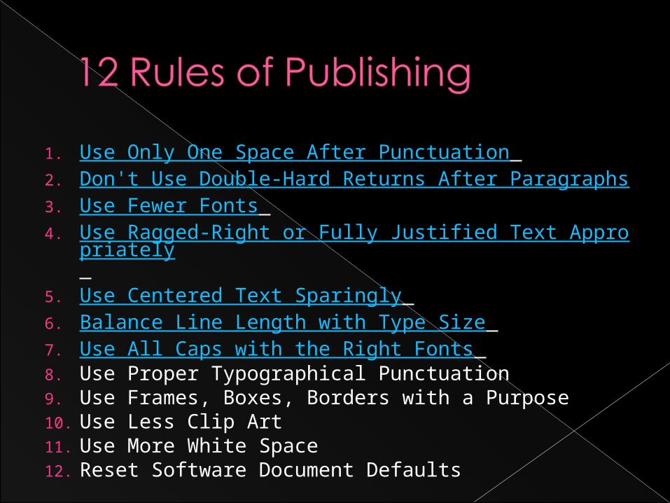
1. Use Only One Space After Punctuation 2. Don't Use Double-Hard Returns After Paragraphs 3. Use Fewer Fonts 4. Use Ragged-Right or Fully Justified Text Appropriat
ely
5. Use Centered Text Sparingly 6. Balance Line Length with Type Size 7. Use All Caps with the Right Fonts 8. Use Proper Typographical Punctuation 9. Use Frames, Boxes, Borders with a Purpose 10. Use Less Clip Art 11. Use More White Space 12. Reset Software Document Defaults
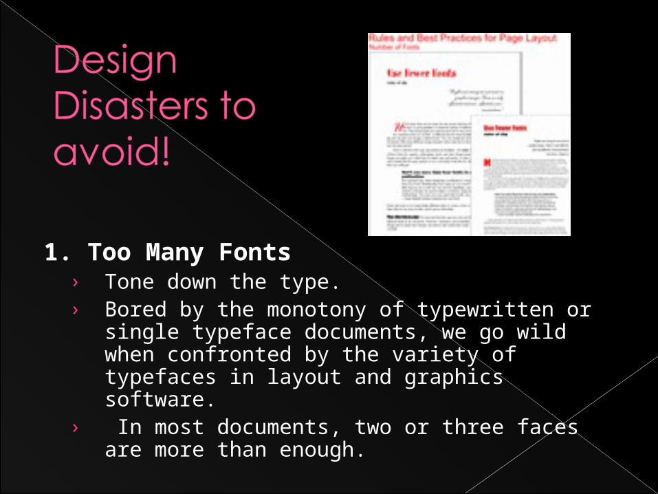
1. Too Many Fonts› Tone down the type. › Bored by the monotony of typewritten or
single typeface documents, we go wild when confronted by the variety of typefaces in layout and graphics software.
› In most documents, two or three faces are more than enough.
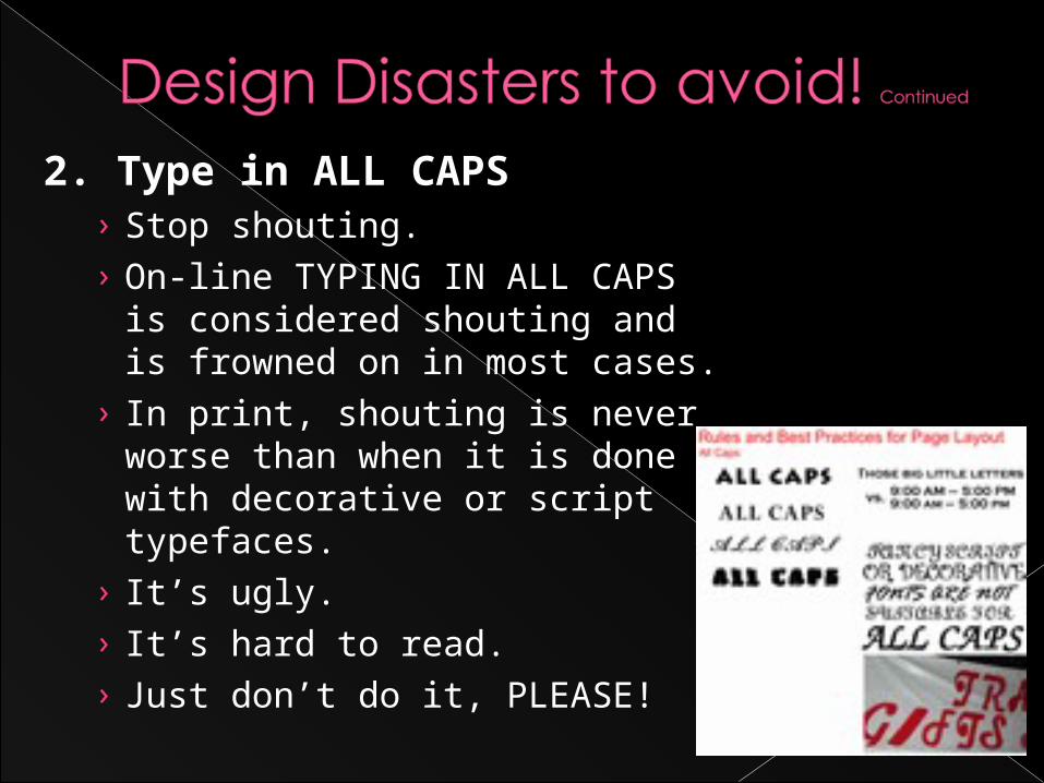
2. Type in ALL CAPS› Stop shouting. › On-line TYPING IN ALL CAPS is
considered shouting and is frowned on in most cases.
› In print, shouting is never worse than when it is done with decorative or script typefaces.
› It’s ugly. › It’s hard to read. › Just don’t do it, PLEASE!
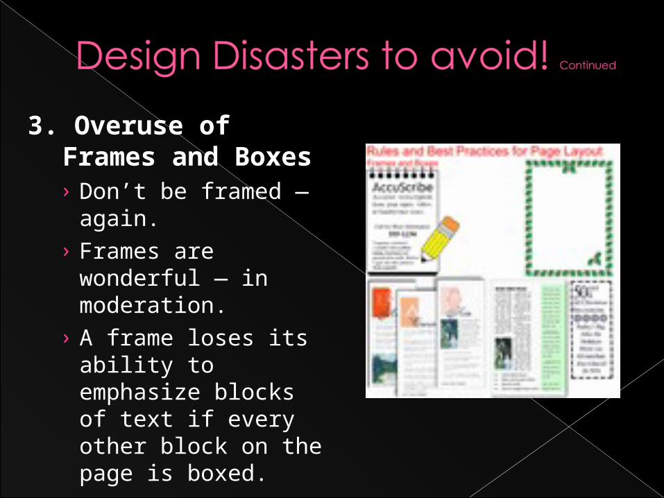
3. Overuse of Frames and Boxes› Don’t be framed —
again. › Frames are
wonderful — in moderation.
› A frame loses its ability to emphasize blocks of text if every other block on the page is boxed.
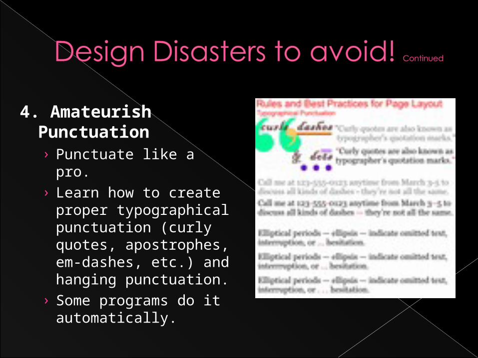
4. Amateurish Punctuation› Punctuate like a pro. › Learn how to create
proper typographical punctuation (curly quotes, apostrophes, em-dashes, etc.) and hanging punctuation.
› Some programs do it automatically.
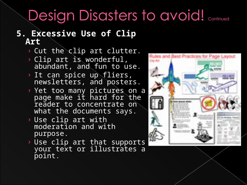
5. Excessive Use of Clip Art› Cut the clip art clutter. › Clip art is wonderful,
abundant, and fun to use. › It can spice up fliers,
newsletters, and posters. › Yet too many pictures on
a page make it hard for the reader to concentrate on what the documents says.
› Use clip art with moderation and with purpose.
› Use clip art that supports your text or illustrates a point.
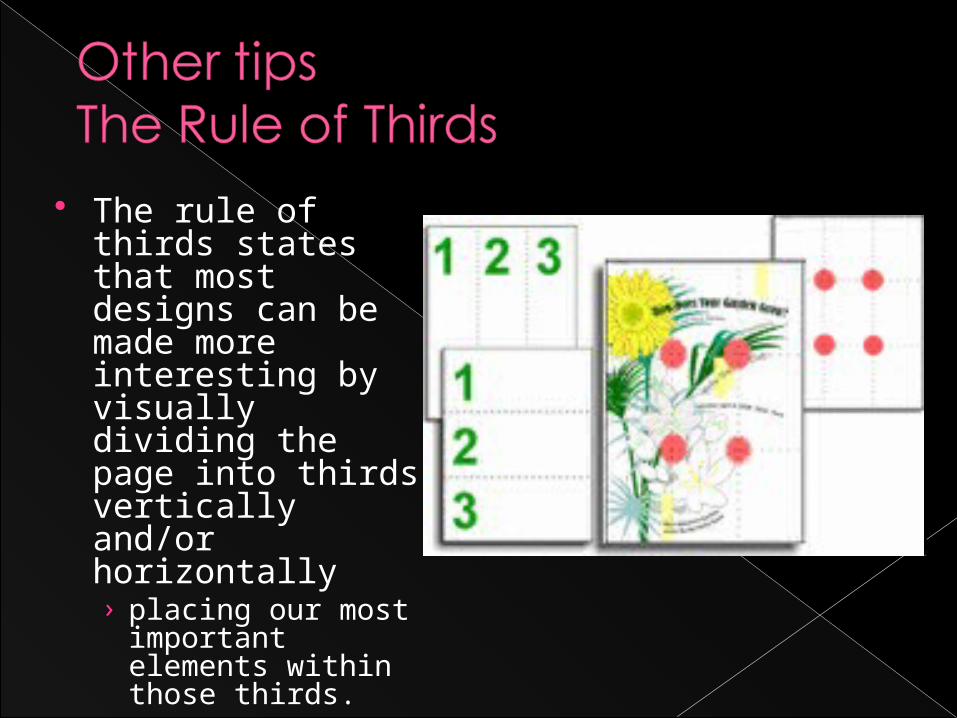
The rule of thirds states that most designs can be made more interesting by visually dividing the page into thirds vertically and/or horizontally › placing our most
important elements within those thirds.
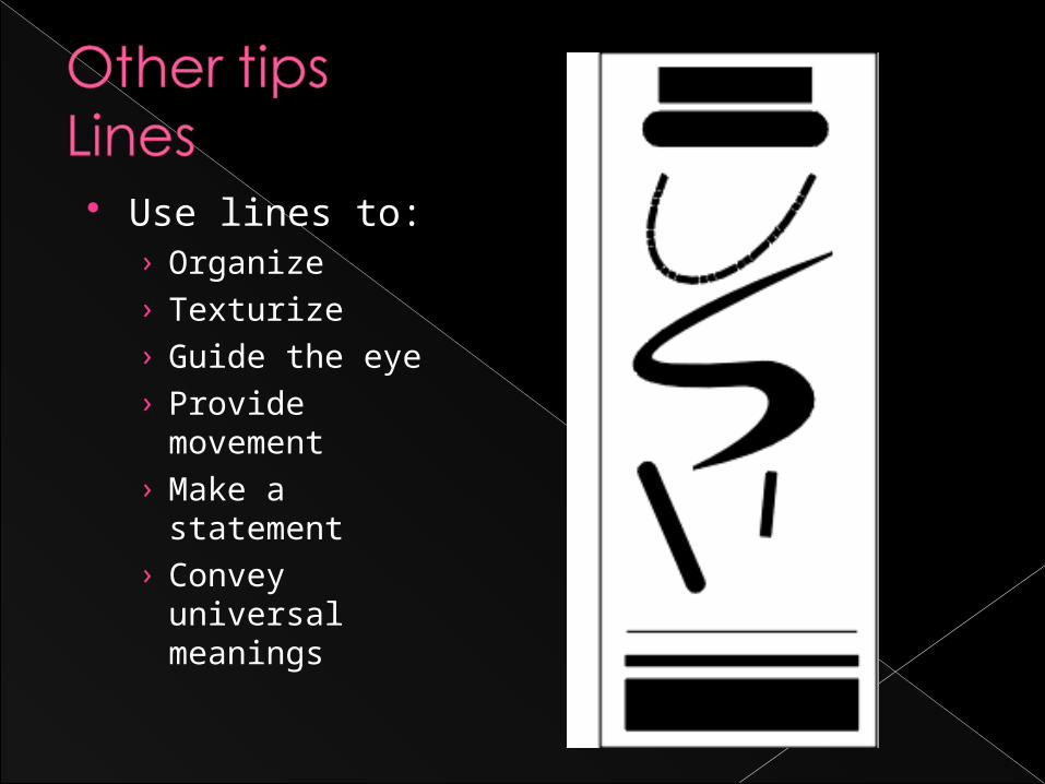
Use lines to:› Organize› Texturize› Guide the eye› Provide
movement› Make a
statement› Convey
universal meanings
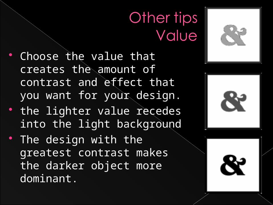
Choose the value that creates the amount of contrast and effect that you want for your design.
the lighter value recedes into the light background
The design with the greatest contrast makes the darker object more dominant.
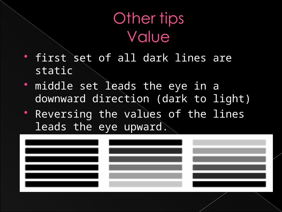
first set of all dark lines are static middle set leads the eye in a downward
direction (dark to light) Reversing the values of the lines leads
the eye upward.
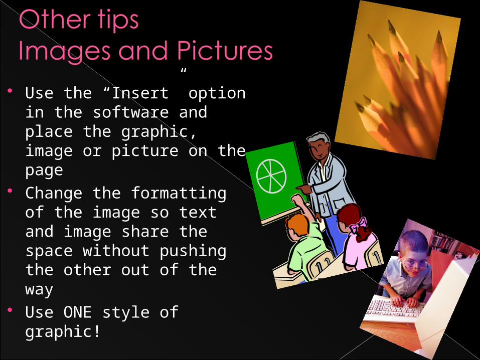
Use the “Insert” option in the software and place the graphic, image or picture on the page
Change the formatting of the image so text and image share the space without pushing the other out of the way
Use ONE style of graphic!
Increase the size of the picture or image proportionately
Grab a corner of the image and increase the length and width at the same time
Edit picture/graphic in a photo-editing software
Consider framing the picture with a border to draw attention or make the image stand out
Several factors affect the way we perceive color
One of those factors can be shown by the position of colors on the color wheel in relation to other colors
These color wheels take out all or some of the transitional colors so that you can more readily see the relationship of the colors to one another
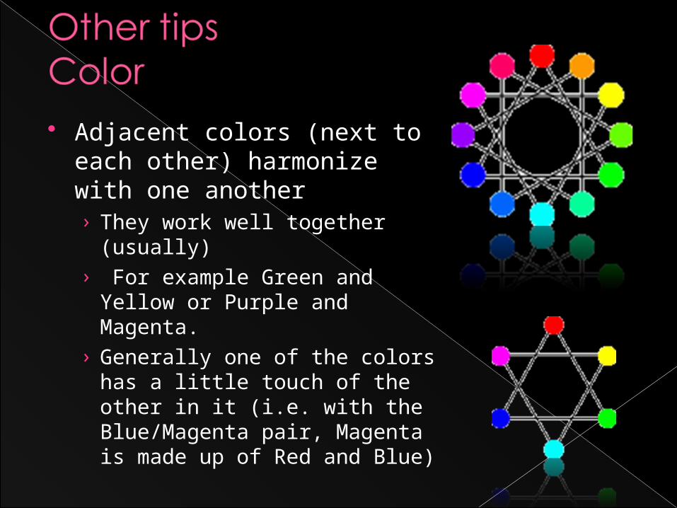
Adjacent colors (next to each other) harmonize with one another › They work well together
(usually)› For example Green and
Yellow or Purple and Magenta.
› Generally one of the colors has a little touch of the other in it (i.e. with the Blue/Magenta pair, Magenta is made up of Red and Blue)
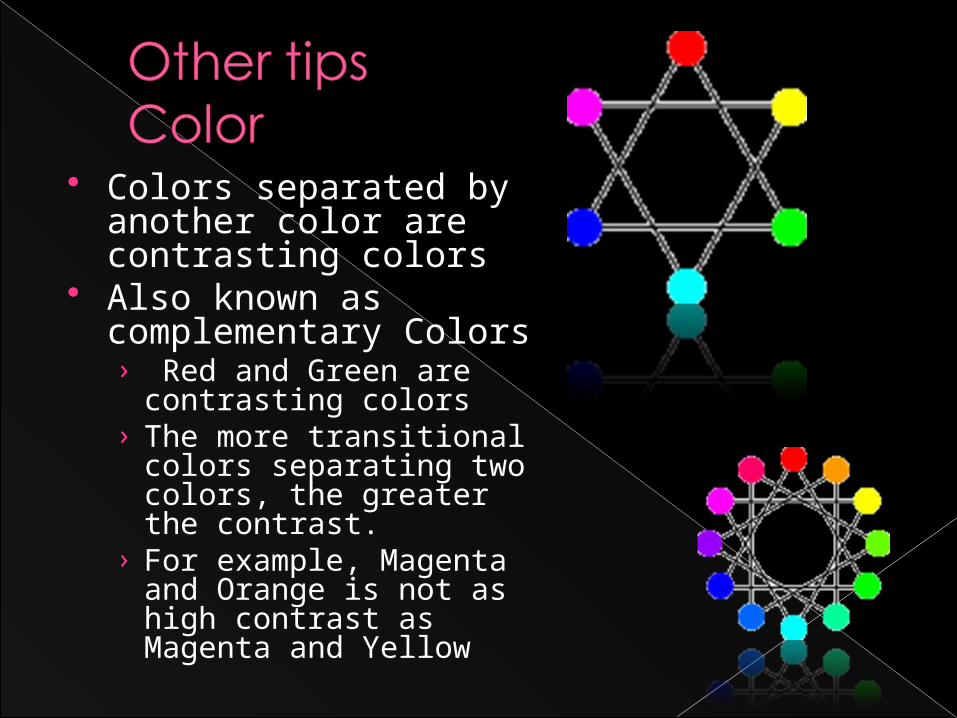
Colors separated by another color are contrasting colors
Also known as complementary Colors› Red and Green are
contrasting colors› The more transitional
colors separating two colors, the greater the contrast.
› For example, Magenta and Orange is not as high contrast as Magenta and Yellow
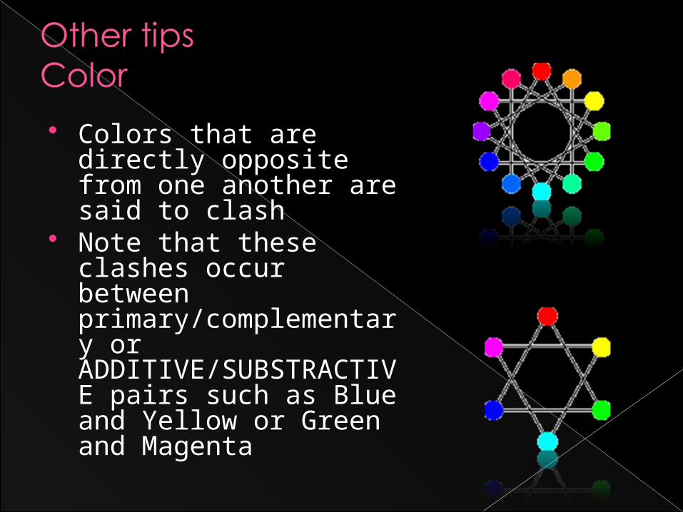
Colors that are directly opposite from one another are said to clash
Note that these clashes occur between primary/complementary or ADDITIVE/SUBSTRACTIVE pairs such as Blue and Yellow or Green and Magenta
Bear, J.H. (2008, January). Your Guide to Desktop Publishing. Retrieved February 13, 2008 from , Web site: http://desktoppub.about.com/mbiopage.htm
References