Embed Size (px)
DESCRIPTION
2014 Portfolio
Citation preview
Portfolio / Examples of WorkAdam RosekellyMaster of Science / Digital TechnologiesUMID: 39962921
adam rosekelly
F I E L D S
F I E L D S C O L L A B . C O M
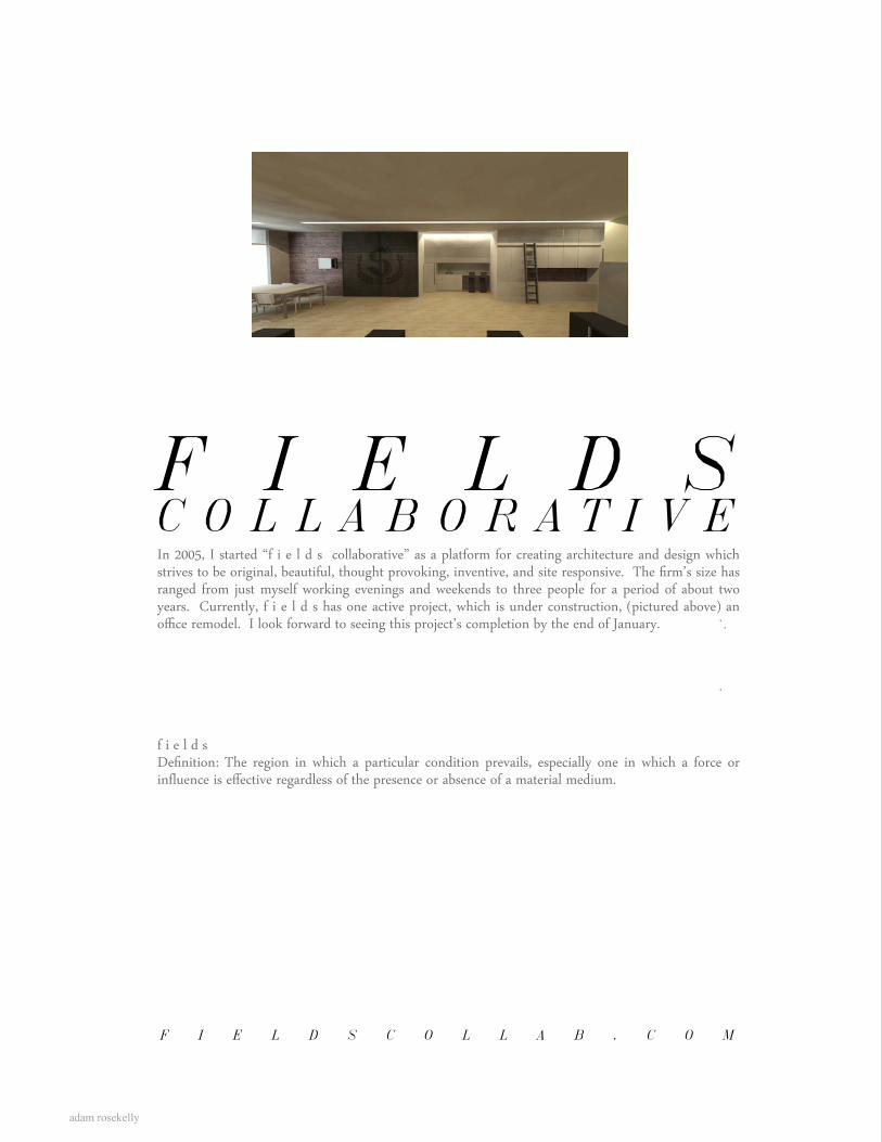
C O L L A B O R A T I V EIn 2005, I started “f i e l d s collaborative” as a platform for creating architecture and design which strives to be original, beautiful, thought provoking, inventive, and site responsive. The firm’s size has ranged from just myself working evenings and weekends to three people for a period of about two years. Currently, f i e l d s has one active project, which is under construction, (pictured above) an office remodel. I look forward to seeing this project’s completion by the end of January.
f i e l d sDefinition: The region in which a particular condition prevails, especially one in which a force or influence is effective regardless of the presence or absence of a material medium.
Scale:
f i e l d s collaborative
1/8" = 1'-0"
SCALISH CONSTRUCTION INTERIOR RENOVATIONRENDERINGS LINEAR LIGHT
AUGUST 22, 2013
REFLECTED CEILING PLAN
1. Installations / constructs p1 rgb 2011 p2 arch 2011 p3 binoceros 2011 p4 camera obscura 2011
2. f i e l d s collaborative p5 The Cheerio: Mixed-Use Development 2010-Current p6 Potrero Residence 2009 p7 Oxnard Medical Clinic Remodel 2008-2009 p8 Anaheim Medical Clinic Remodel 2009 p9 Ocean Front Walk Residence 2009 p10 Hillside Addition 2008-2010
3. Teaching p11 Kent State University 1st year design studio 1 2011 fall p12 Kent State University 1st year design studio 2 2012 spring p13 Progressive Arts Alliance - urban design 2011 fall p14 Progressive Arts Alliance - urban greenhouse 2012 spring
4. Furniture p15 plaster and light 2013 p16 reclaimed chair 2012 p17 rebar table 2012 p18 butcher block counter 2012 p19 suspended sculpture 2012 p20 suspended cabinet 2013 p21 suspended shelving 2013
5. Professional p22 Techne Health Services interior remodel 2011 p23 LDA competition 1 - bend 2013 p24 LDA competition 2 - 127 Larchmere 2013 p25 LDA competition 3 - Ohio City master plan 2013 p26 EOM Samitaur Tower 2005 p27 EOM Gabay Labrea - mixed use development 2005 p28 EOM Balandra - city master plan 2005 P29 EOM Sunset Doheney - mixed use office 2005
6. Academic p30 academic portfolio (summary) 2000-2004 p31 drawing and painting 2000-2004 p32 landscapes - sample writing 2013
CONTENTS
adam rosekelly
installations / constructs
1
adam rosekelly
p1
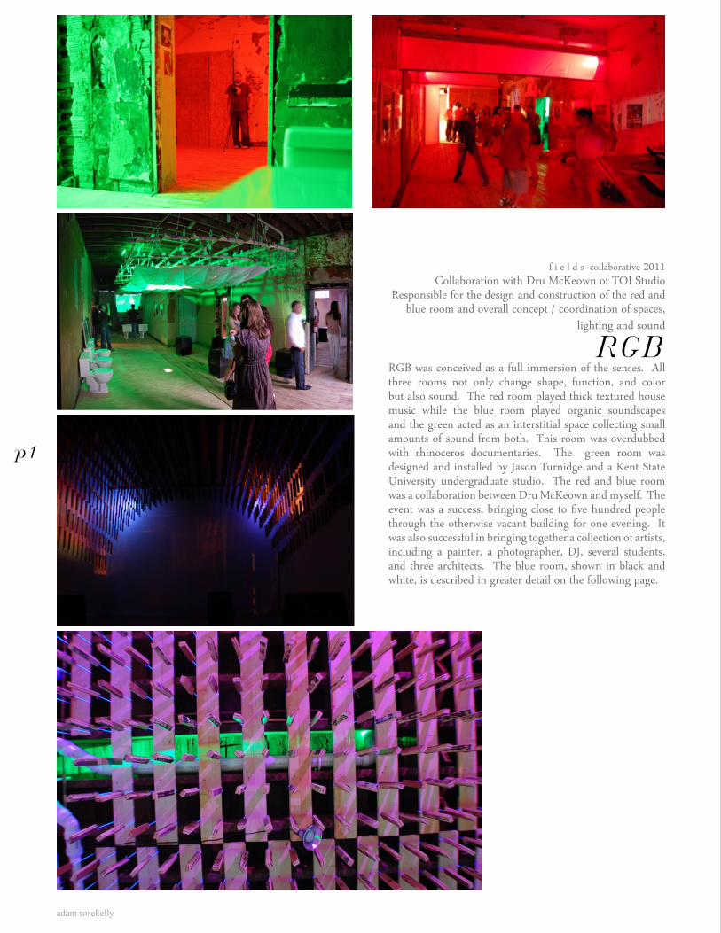
f i e l d s collaborative 2011Collaboration with Dru McKeown of TOI Studio
Responsible for the design and construction of the red and blue room and overall concept / coordination of spaces,
lighting and sound
RGBRGB was conceived as a full immersion of the senses. All three rooms not only change shape, function, and color but also sound. The red room played thick textured house music while the blue room played organic soundscapes and the green acted as an interstitial space collecting small amounts of sound from both. This room was overdubbed with rhinoceros documentaries. The green room was designed and installed by Jason Turnidge and a Kent State University undergraduate studio. The red and blue room was a collaboration between Dru McKeown and myself. The event was a success, bringing close to five hundred people through the otherwise vacant building for one evening. It was also successful in bringing together a collection of artists, including a painter, a photographer, DJ, several students, and three architects. The blue room, shown in black and white, is described in greater detail on the following page.
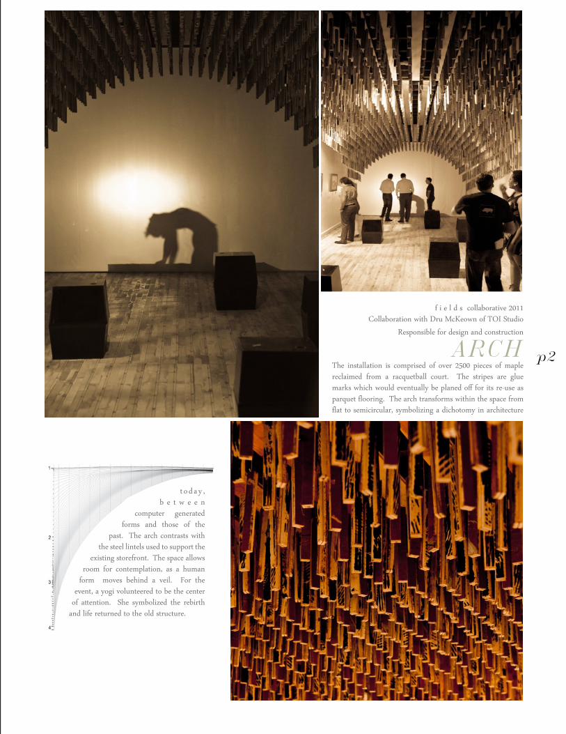
f i e l d s collaborative 2011Collaboration with Dru McKeown of TOI Studio
Responsible for design and construction
ARCHThe installation is comprised of over 2500 pieces of maple reclaimed from a racquetball court. The stripes are glue marks which would eventually be planed off for its re-use as parquet flooring. The arch transforms within the space from flat to semicircular, symbolizing a dichotomy in architecture
t o d a y , b e t w e e n
computer generated forms and those of the
past. The arch contrasts with the steel lintels used to support the
existing storefront. The space allows room for contemplation, as a human
form moves behind a veil. For the event, a yogi volunteered to be the center
of attention. She symbolized the rebirth and life returned to the old structure.
p2
adam rosekelly
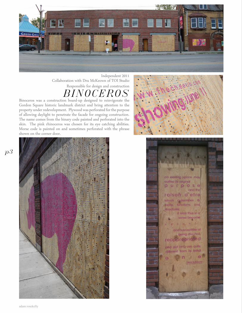
Independent 2011Collaboration with Dru McKeown of TOI Studio
Responsible for design and construction
BINOCEROSBinoceros was a construction board-up designed to reinvigorate the Gordon Square historic landmark district and bring attention to the property under redevelopment. Plywood was perforated for the purpose of allowing daylight to penetrate the facade for ongoing construction. The name comes from the binary code painted and perforated into the skin. The pink rhinoceros was chosen for its eye catching abilities. Morse code is painted on and sometimes perforated with the phrase shown on the corner door.
p3
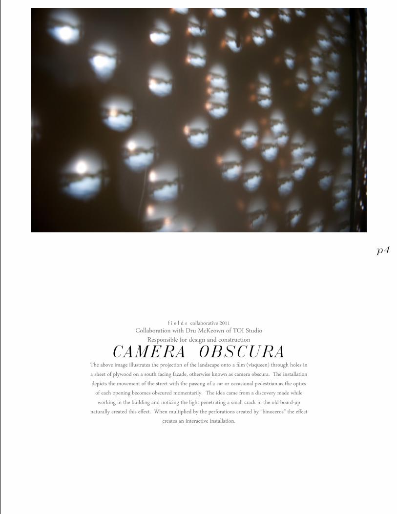
f i e l d s collaborative 2011Collaboration with Dru McKeown of TOI Studio
Responsible for design and construction
CAMERA OBSCURAThe above image illustrates the projection of the landscape onto a film (visqueen) through holes in
a sheet of plywood on a south facing facade, otherwise known as camera obscura. The installation
depicts the movement of the street with the passing of a car or occasional pedestrian as the optics
of each opening becomes obscured momentarily. The idea came from a discovery made while
working in the building and noticing the light penetrating a small crack in the old board-up
naturally created this effect. When multiplied by the perforations created by “binoceros” the effect
creates an interactive installation.
p4
adam rosekelly
f i e l d s collaborative
f i e l d s collaborative 2
Lake Superior through dirty glass, Upper Peninsula of Northern Michigan
adam rosekelly
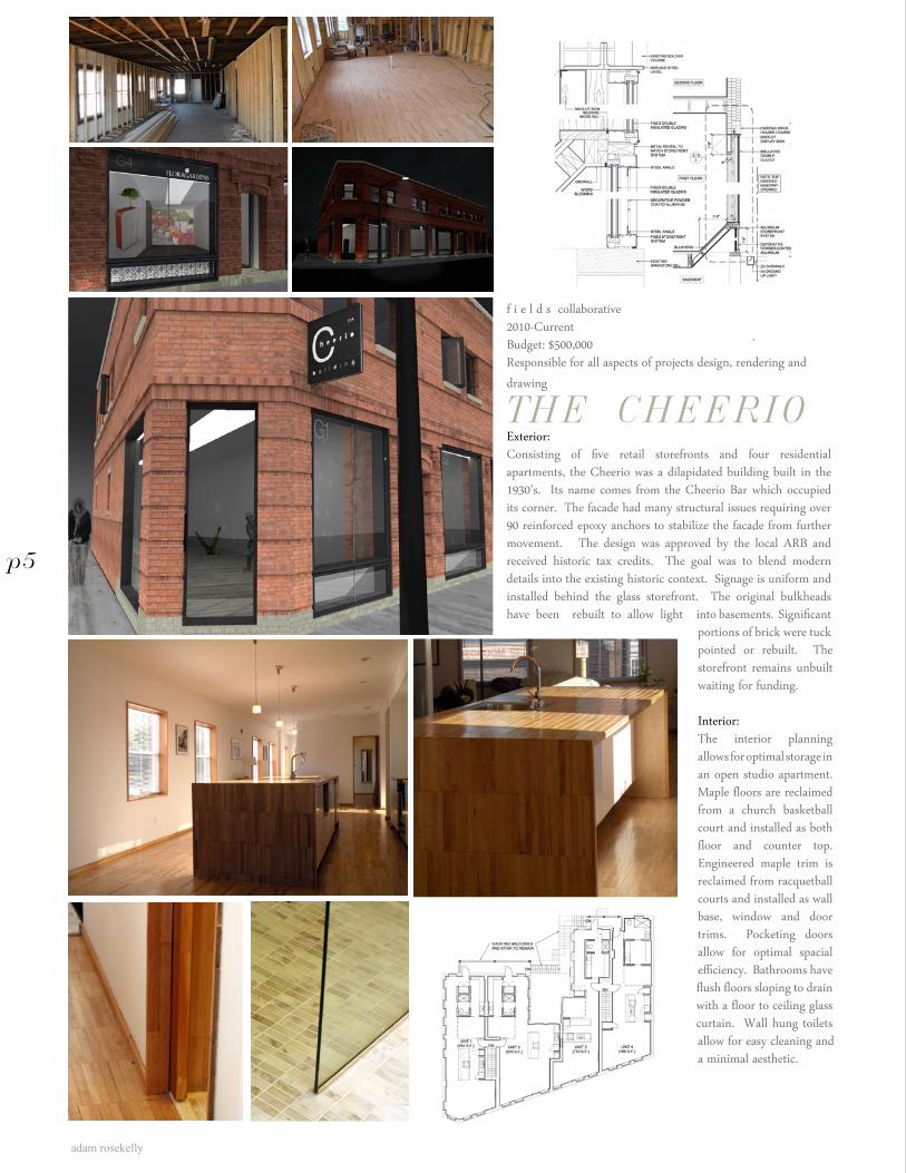
f i e l d s collaborative2010-CurrentBudget: $500,000Responsible for all aspects of projects design, rendering and drawing
THE CHEERIOExterior:Consisting of five retail storefronts and four residential apartments, the Cheerio was a dilapidated building built in the 1930’s. Its name comes from the Cheerio Bar which occupied its corner. The facade had many structural issues requiring over 90 reinforced epoxy anchors to stabilize the facade from further movement. The design was approved by the local ARB and received historic tax credits. The goal was to blend modern details into the existing historic context. Signage is uniform and installed behind the glass storefront. The original bulkheads have been rebuilt to allow light into basements. Significant
portions of brick were tuck pointed or rebuilt. The storefront remains unbuilt waiting for funding.
Interior:The interior planning allows for optimal storage in an open studio apartment. Maple floors are reclaimed from a church basketball court and installed as both floor and counter top. Engineered maple trim is reclaimed from racquetball courts and installed as wall base, window and door trims. Pocketing doors allow for optimal spacial efficiency. Bathrooms have flush floors sloping to drain with a floor to ceiling glass curtain. Wall hung toilets allow for easy cleaning and a minimal aesthetic.
p5
rock ribbon
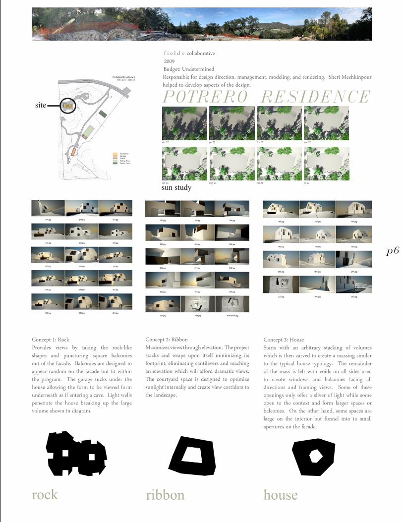
Concept 1: RockProvides views by taking the rock-like shapes and puncturing square balconies out of the facade. Balconies are designed to appear random on the facade but fit within the program. The garage tucks under the house allowing the form to be viewed form underneath as if entering a cave. Light wells penetrate the house breaking up the large volume shown in diagram.
Concept 3: HouseStarts with an arbitrary stacking of volumes which is then carved to create a massing similar to the typical house typology. The remainder of the mass is left with voids on all sides used to create windows and balconies facing all directions and framing views. Some of these openings only offer a sliver of light while some open to the context and form larger spaces or balconies. On the other hand, some spaces are large on the interior but funnel into to small apertures on the facade.
Concept 2: RibbonMaximizes views through elevation. The project stacks and wraps upon itself minimizing its footprint, eliminating cantilevers and reaching an elevation which will afford dramatic views. The courtyard space is designed to optimize sunlight internally and create view corridors to the landscape.
house
dec 22
apr 22
jan 22
may 22
feb 22
jun 22
mar 22
jul 22
f i e l d s collaborative2009Budget: UndeterminedResponsible for design direction, management, modeling, and rendering. Sheri Meshkinpour helped to develop aspects of the design.
POTRERO RESIDENCEsite
sun study
p6
adam rosekelly
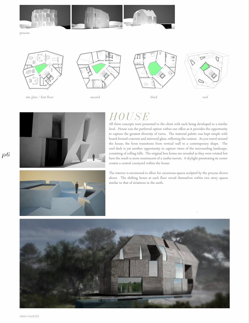
HOUSEAll three concepts were presented to the client with each being developed to a similar level. House was the preferred option within our office as it provides the opportunity to capture the greatest diversity of views. The material palette was kept simple with board-formed concrete and mirrored glass, reflecting the context. As you travel around the house, the form transitions from vertical wall to a contemporary shape. The roof deck is yet another opportunity to capture views of the surrounding landscape, consisting of rolling hills. The original box forms are revealed as they were rotated but here the result is more reminiscent of a castles turrets. A skylight penetrating its center creates a central courtyard within the house.
The interior is envisioned to allow for cavernous spaces sculpted by the process shown above. The shifting boxes at each floor reveal themselves within two story spaces similar to that of striations in the earth.
site plan / first floor second third roof
PO
RTR
ER
O R
ES
IDE
NC
EH
OU
SE
SC
HE
ME
April 13, 2009
SITE
PLA
N W
/ FIRS
T FLOO
R P
LAN
4835 G.S
.F.S
CA
LE: 1/16”=1’-0”
KITC
HE
N
KITC
HE
N
FAM
ILY RO
OMP
LAYR
OO
M
ME
CH
CO
UR
TYA
RD EN
TRY
LIVIN
GR
OO
M
DIN
ING
RO
OM
STO
ME
CH
PAN
TRY
DN
UP
SW
IMM
ING
PO
OL
GA
RD
EN
S
DO
WN
TO G
AR
AG
E
DN
process
p6
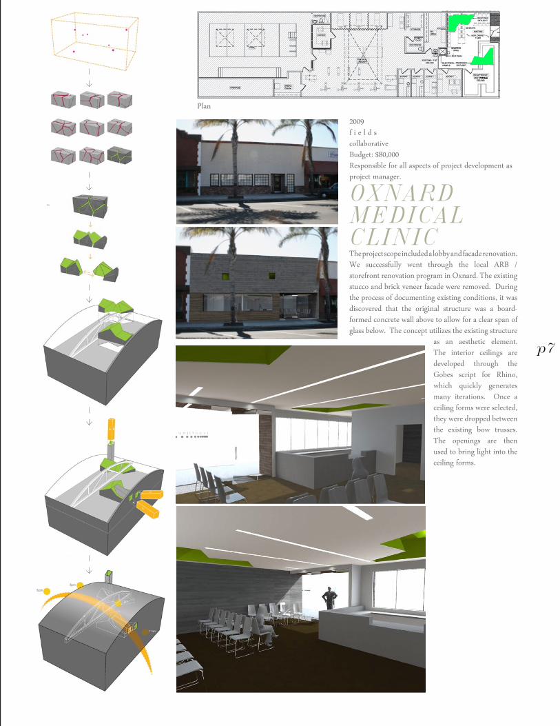
2009f i e l d scollaborativeBudget: $80,000Responsible for all aspects of project development as project manager.
OXNARD MEDICALCLINICThe project scope included a lobby and facade renovation. We successfully went through the local ARB / storefront renovation program in Oxnard. The existing stucco and brick veneer facade were removed. During the process of documenting existing conditions, it was discovered that the original structure was a board-formed concrete wall above to allow for a clear span of glass below. The concept utilizes the existing structure
as an aesthetic element. The interior ceilings are developed through the Gobes script for Rhino, which quickly generates many iterations. Once a ceiling forms were selected, they were dropped between the existing bow trusses. The openings are then used to bring light into the ceiling forms.
p7
Plan
adam rosekelly
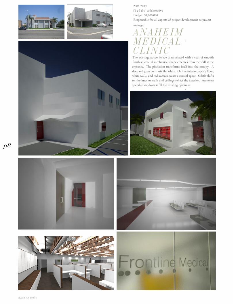
2008-2009f i e l d s collaborativeBudget: $1,000,000Responsible for all aspects of project development as project manager
ANAHEIM MEDICAL CLINICThe existing stucco facade is resurfaced with a coat of smooth finish stucco. A mechanical shape emerges from the wall at the entrance. The pixelation transforms itself into the canopy. A deep red glass contrasts the white. On the interior, epoxy floor, white walls, and red accents create a surreal space. Subtle shifts on the interior walls and ceilings reflect the exterior. Frameless operable windows infill the existing openings.
p8
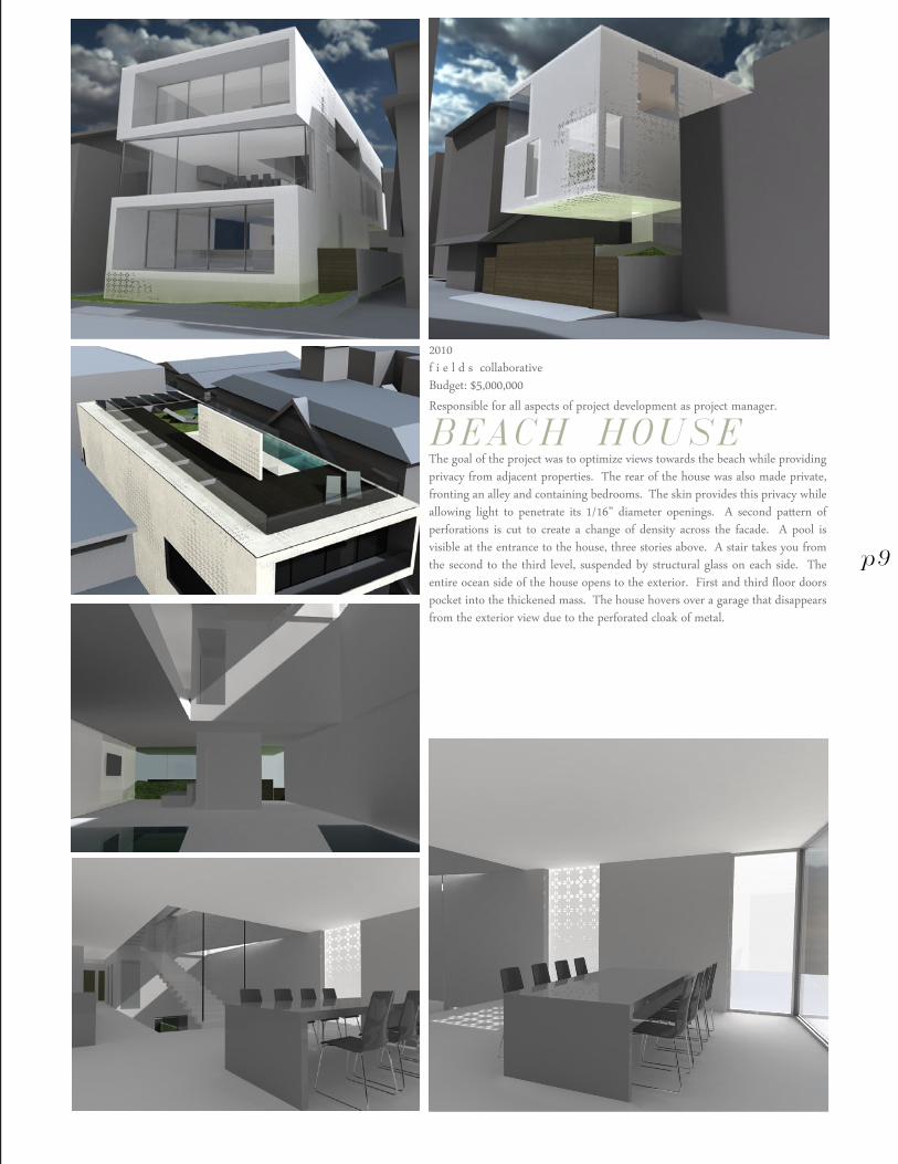
2010f i e l d s collaborativeBudget: $5,000,000Responsible for all aspects of project development as project manager.
BEACH HOUSEThe goal of the project was to optimize views towards the beach while providing privacy from adjacent properties. The rear of the house was also made private, fronting an alley and containing bedrooms. The skin provides this privacy while allowing light to penetrate its 1/16” diameter openings. A second pattern of perforations is cut to create a change of density across the facade. A pool is visible at the entrance to the house, three stories above. A stair takes you from the second to the third level, suspended by structural glass on each side. The entire ocean side of the house opens to the exterior. First and third floor doors pocket into the thickened mass. The house hovers over a garage that disappears from the exterior view due to the perforated cloak of metal.
p9
adam rosekelly
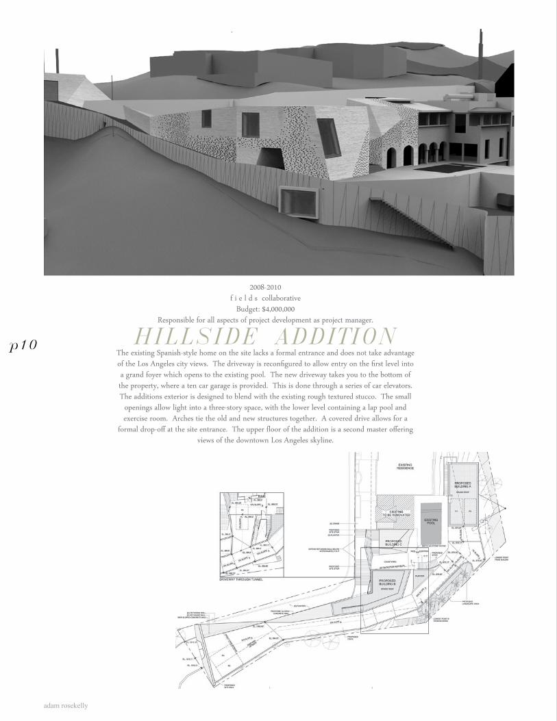
2008-2010f i e l d s collaborative
Budget: $4,000,000Responsible for all aspects of project development as project manager.
HILLSIDE ADDITIONThe existing Spanish-style home on the site lacks a formal entrance and does not take advantage of the Los Angeles city views. The driveway is reconfigured to allow entry on the first level into a grand foyer which opens to the existing pool. The new driveway takes you to the bottom of the property, where a ten car garage is provided. This is done through a series of car elevators. The additions exterior is designed to blend with the existing rough textured stucco. The small
openings allow light into a three-story space, with the lower level containing a lap pool and exercise room. Arches tie the old and new structures together. A covered drive allows for a
formal drop-off at the site entrance. The upper floor of the addition is a second master offering views of the downtown Los Angeles skyline.
p10
Alley, Cleveland OH
adam rosekelly
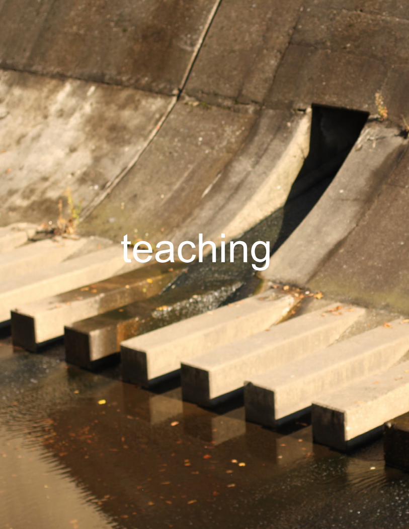
teaching
3
Dam, Cleveland Heights OH
adam rosekelly
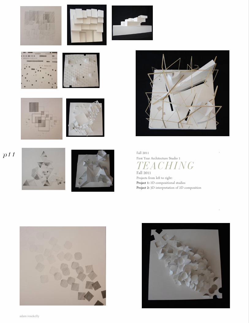
Fall 2011First Year Architecture Studio 1
TEACHINGFall 2011Projects from left to right:Project 1: 2D compositional studiesProject 2: 3D interpretation of 2D composition
p11
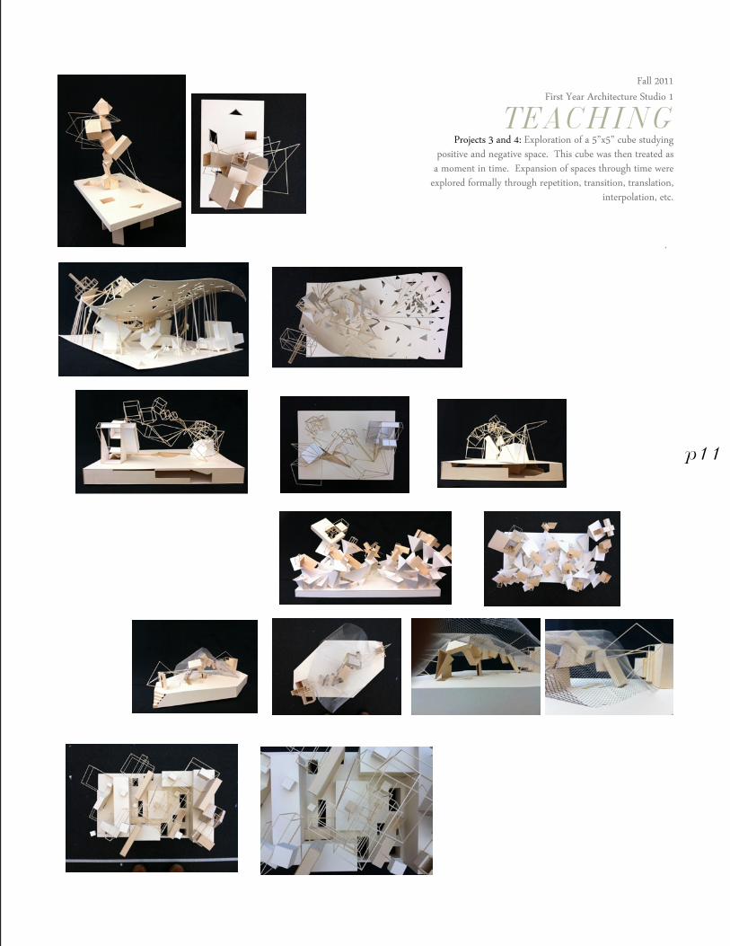
Fall 2011First Year Architecture Studio 1
TEACHINGProjects 3 and 4: Exploration of a 5”x5” cube studying
positive and negative space. This cube was then treated as a moment in time. Expansion of spaces through time were
explored formally through repetition, transition, translation, interpolation, etc.
p11
adam rosekelly
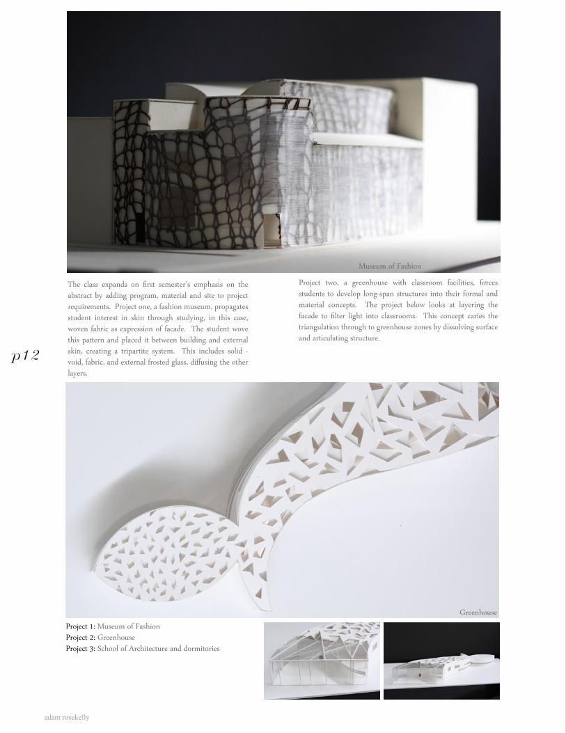
The class expands on first semester’s emphasis on the abstract by adding program, material and site to project requirements. Project one, a fashion museum, propagates student interest in skin through studying, in this case, woven fabric as expression of facade. The student wove this pattern and placed it between building and external skin, creating a tripartite system. This includes solid - void, fabric, and external frosted glass, diffusing the other layers.
p12
Project 1: Museum of FashionProject 2: GreenhouseProject 3: School of Architecture and dormitories
Museum of Fashion
Greenhouse
Project two, a greenhouse with classroom facilities, forces students to develop long-span structures into their formal and material concepts. The project below looks at layering the facade to filter light into classrooms. This concept caries the triangulation through to greenhouse zones by dissolving surface and articulating structure.
greenhouse
School of Architecture and Dormitories
p12
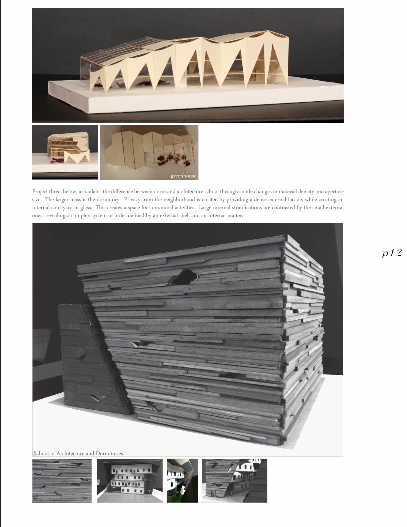
Project three, below, articulates the difference between dorm and architecture school through subtle changes in material density and aperture size. The larger mass is the dormitory. Privacy from the neighborhood is created by providing a dense external facade, while creating an internal courtyard of glass. This creates a space for communal activities. Large internal stratifications are contrasted by the small external ones, revealing a complex system of order defined by an external shell and an internal matter.
adam rosekelly
Fall 2011Progressive Arts Alliance (5 week seminar)
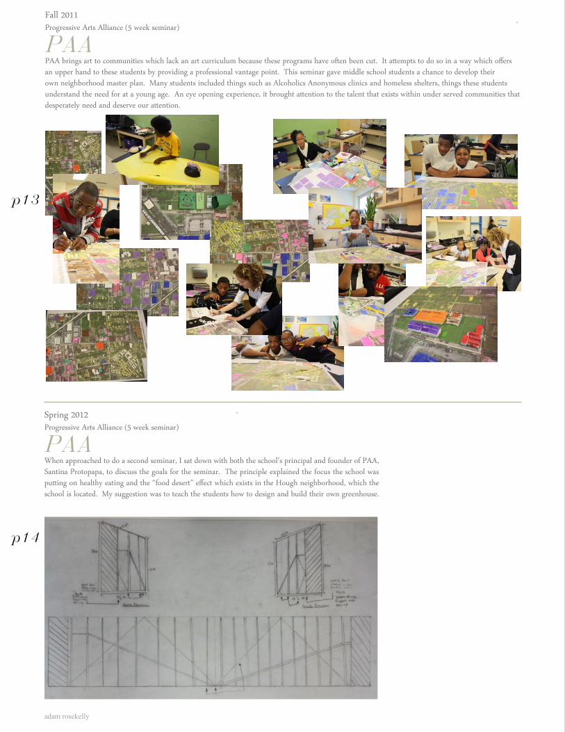
PAAPAA brings art to communities which lack an art curriculum because these programs have often been cut. It attempts to do so in a way which offers an upper hand to these students by providing a professional vantage point. This seminar gave middle school students a chance to develop their own neighborhood master plan. Many students included things such as Alcoholics Anonymous clinics and homeless shelters, things these students understand the need for at a young age. An eye opening experience, it brought attention to the talent that exists within under served communities that desperately need and deserve our attention.
Spring 2012Progressive Arts Alliance (5 week seminar)
PAAWhen approached to do a second seminar, I sat down with both the school’s principal and founder of PAA, Santina Protopapa, to discuss the goals for the seminar. The principle explained the focus the school was putting on healthy eating and the “food desert” effect which exists in the Hough neighborhood, which the school is located. My suggestion was to teach the students how to design and build their own greenhouse.
p13
p14
Student drawings
Student Presentations
p14
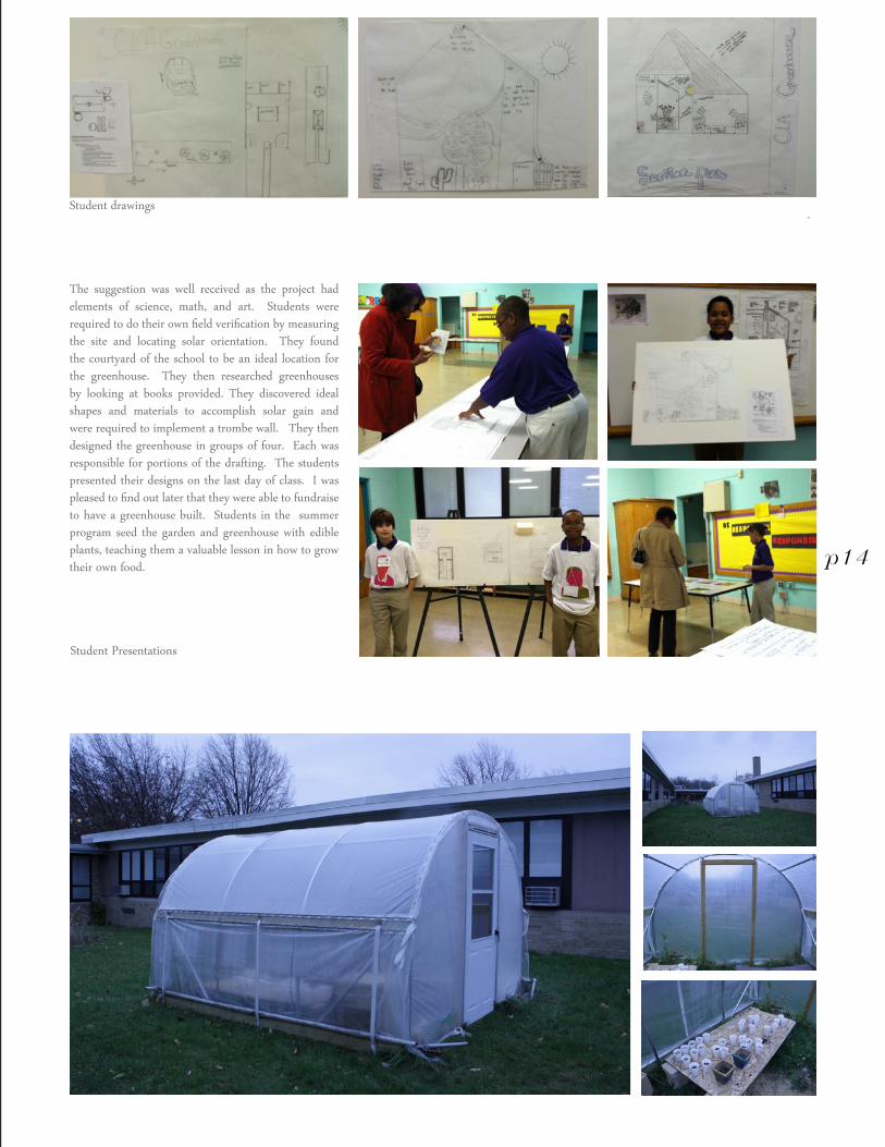
The suggestion was well received as the project had elements of science, math, and art. Students were required to do their own field verification by measuring the site and locating solar orientation. They found the courtyard of the school to be an ideal location for the greenhouse. They then researched greenhouses by looking at books provided. They discovered ideal shapes and materials to accomplish solar gain and were required to implement a trombe wall. They then designed the greenhouse in groups of four. Each was responsible for portions of the drafting. The students presented their designs on the last day of class. I was pleased to find out later that they were able to fundraise to have a greenhouse built. Students in the summer program seed the garden and greenhouse with edible plants, teaching them a valuable lesson in how to grow their own food.
adam rosekelly
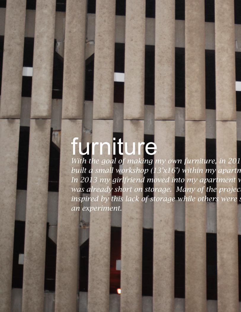
furnitureWith the goal of making my own furniture, in 2012 I built a small workshop (13’x16’) within my apartment. In 2013 my girlfriend moved into my apartment which was already short on storage. Many of the projects were inspired by this lack of storage while others were simply an experiment.
4
Parking garage, downtown Cleveland OH
With the goal of making my own furniture, in 2012 I built a small workshop (13’x16’) within my apartment. In 2013 my girlfriend moved into my apartment which was already short on storage. Many of the projects were inspired by this lack of storage while others were simply an experiment.
adam rosekelly
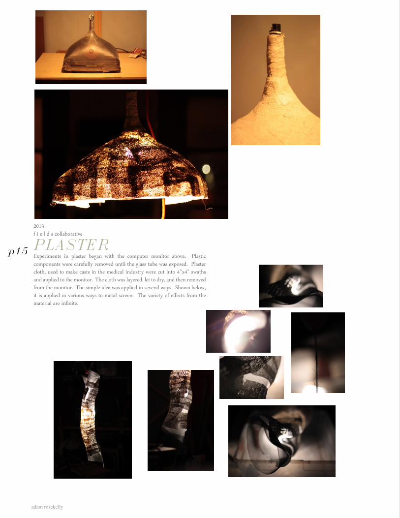
2013f i e l d s collaborative
PLASTERExperiments in plaster began with the computer monitor above. Plastic components were carefully removed until the glass tube was exposed. Plaster cloth, used to make casts in the medical industry were cut into 4”x4” swaths and applied to the monitor. The cloth was layered, let to dry, and then removed from the monitor. The simple idea was applied in several ways. Shown below, it is applied in various ways to metal screen. The variety of effects from the material are infinite.
p15
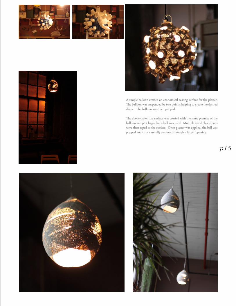
A simple balloon created an economical casting surface for the plaster. The balloon was suspended by two points, helping to create the desired shape. The balloon was then popped.
The above crater like surface was created with the same premise of the balloon accept a larger kid’s ball was used. Multiple sized plastic cups were then taped to the surface. Once plaster was applied, the ball was popped and cups carefully removed through a larger opening.
p15
adam rosekelly
p16
p17
2012f i e l d s collaborativeResponsible for design and construction
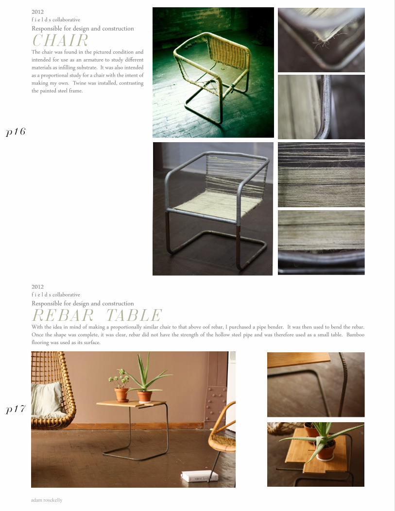
CHAIRThe chair was found in the pictured condition and intended for use as an armature to study different materials as infilling substrate. It was also intended as a proportional study for a chair with the intent of making my own. Twine was installed, contrasting the painted steel frame.
2012f i e l d s collaborative Responsible for design and construction
REBAR TABLEWith the idea in mind of making a proportionally similar chair to that above oof rebar, I purchased a pipe bender. It was then used to bend the rebar. Once the shape was complete, it was clear, rebar did not have the strength of the hollow steel pipe and was therefore used as a small table. Bamboo flooring was used as its surface.
2012f i e l d s collaborative Responsible for design and construction
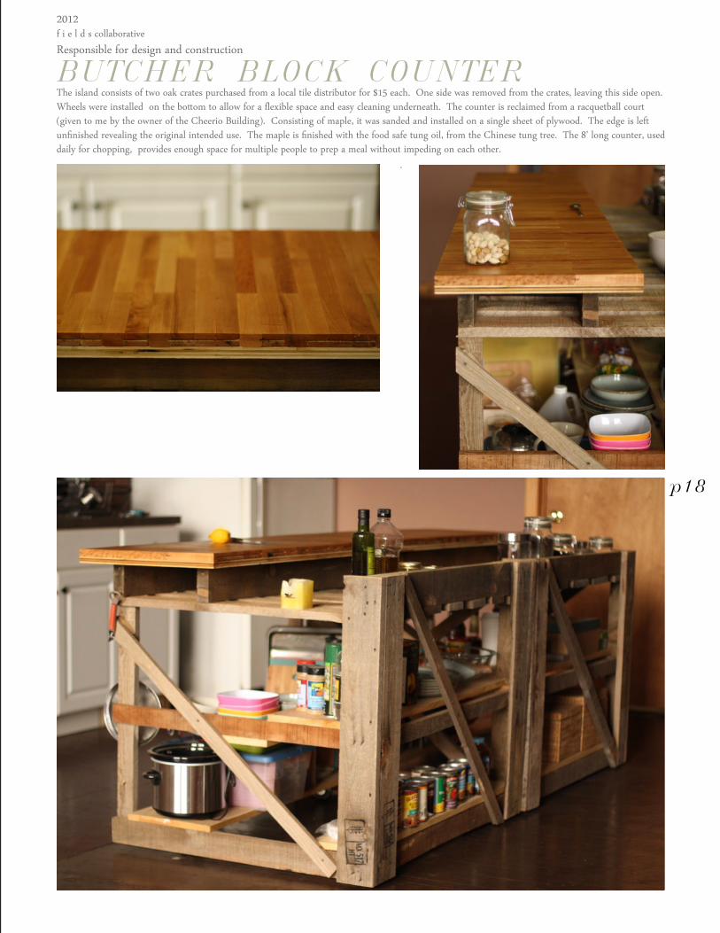
BUTCHER BLOCK COUNTERThe island consists of two oak crates purchased from a local tile distributor for $15 each. One side was removed from the crates, leaving this side open. Wheels were installed on the bottom to allow for a flexible space and easy cleaning underneath. The counter is reclaimed from a racquetball court (given to me by the owner of the Cheerio Building). Consisting of maple, it was sanded and installed on a single sheet of plywood. The edge is left unfinished revealing the original intended use. The maple is finished with the food safe tung oil, from the Chinese tung tree. The 8’ long counter, used daily for chopping, provides enough space for multiple people to prep a meal without impeding on each other.
p18
adam rosekelly
2013f i e l d s collaborativeResponsible for design and construction
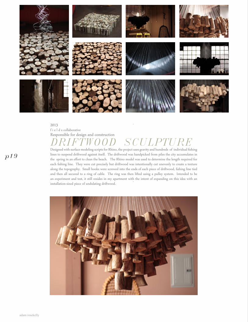
DRIFTWOOD SCULPTUREDesigned with surface modeling scripts for Rhino, the project uses gravity and hundreds of individual fishing lines to suspend driftwood against itself. The driftwood was handpicked from piles the city accumulates in the spring in an effort to clean the beach. The Rhino model was used to determine the length required for each fishing line. They were cut precisely but driftwood was intentionally cut unevenly to create a texture along the topography. Small hooks were screwed into the ends of each piece of driftwood, fishing line tied and then all secured to a ring of cable. The ring was then lifted using a pulley system. Intended to be an experiment and test, it still resides in my apartment with the intent of expanding on this idea with an installation-sized piece of undulating driftwood.
p19
2013f i e l d s collaborativeResponsible for design and construction with Katie Chew
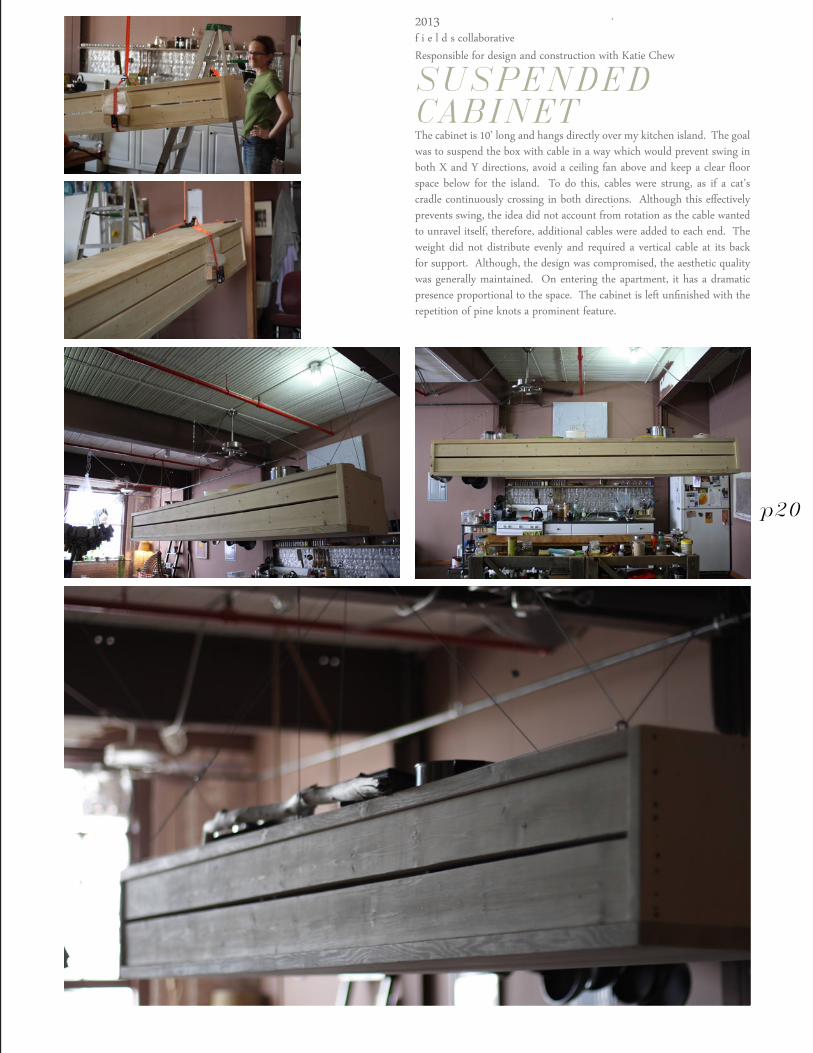
SUSPENDED CABINETThe cabinet is 10’ long and hangs directly over my kitchen island. The goal was to suspend the box with cable in a way which would prevent swing in both X and Y directions, avoid a ceiling fan above and keep a clear floor space below for the island. To do this, cables were strung, as if a cat’s cradle continuously crossing in both directions. Although this effectively prevents swing, the idea did not account from rotation as the cable wanted to unravel itself, therefore, additional cables were added to each end. The weight did not distribute evenly and required a vertical cable at its back for support. Although, the design was compromised, the aesthetic quality was generally maintained. On entering the apartment, it has a dramatic presence proportional to the space. The cabinet is left unfinished with the repetition of pine knots a prominent feature.
p20
adam rosekelly
2013f i e l d s collaborativeResponsible for design and construction with Katie Chew
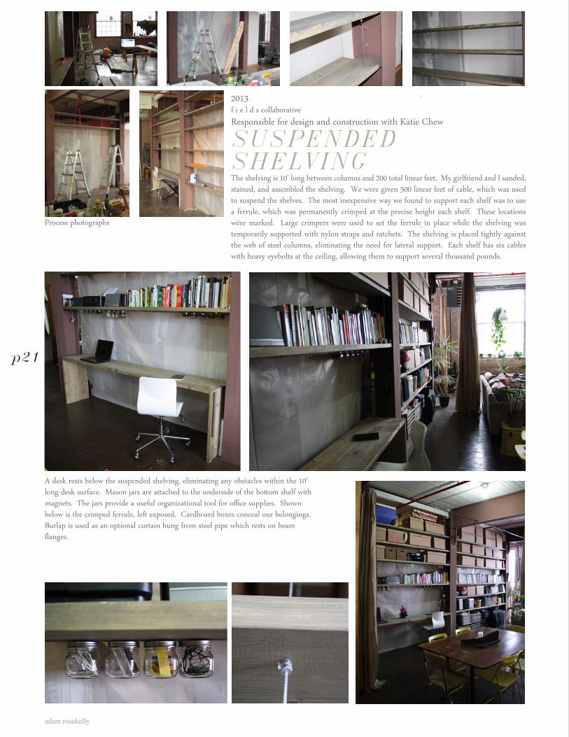
SUSPENDED SHELVINGThe shelving is 10’ long between columns and 200 total linear feet. My girlfriend and I sanded, stained, and assembled the shelving. We were given 500 linear feet of cable, which was used to suspend the shelves. The most inexpensive way we found to support each shelf was to use a ferrule, which was permanently crimped at the precise height each shelf. These locations were marked. Large crimpers were used to set the ferrule in place while the shelving was temporarily supported with nylon straps and ratchets. The shelving is placed tightly against the web of steel columns, eliminating the need for lateral support. Each shelf has six cables with heavy eyebolts at the ceiling, allowing them to support several thousand pounds.
A desk rests below the suspended shelving, eliminating any obstacles within the 10’ long desk surface. Mason jars are attached to the underside of the bottom shelf with magnets. The jars provide a useful organizational tool for office supplies. Shown below is the crimped ferrule, left exposed. Cardboard boxes conceal our belongings. Burlap is used as an optional curtain hung from steel pipe which rests on beam flanges.
Process photographs
p21
Alley, Cleveland OH

adam rosekelly
Professional

5
bug on a rock
adam rosekelly
Studio Techne Architects Spring 2012Budget: $50,000Responsible for design and construction documentation
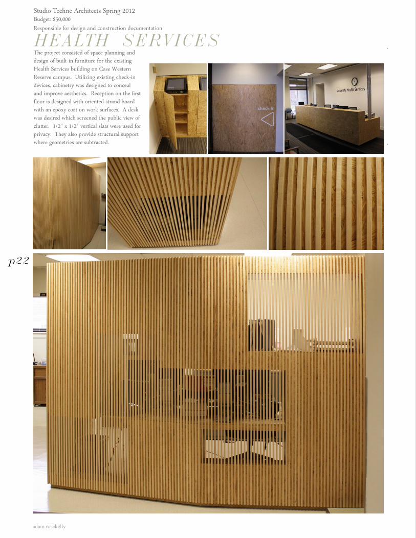
HEALTH SERVICESThe project consisted of space planning anddesign of built-in furniture for the existing Health Services building on Case Western Reserve campus. Utilizing existing check-in devices, cabinetry was designed to conceal and improve aesthetics. Reception on the first floor is designed with oriented strand board with an epoxy coat on work surfaces. A desk was desired which screened the public view of clutter. 1/2” x 1/2” vertical slats were used for privacy. They also provide structural support where geometries are subtracted.
p22
20LDA ArchitectsConcept 2 - Bend
Existing Building
Development UnderConstruction
EXISTING BUILDING
21LDA ArchitectsConcept 2 - Bend
Site
SITE
22LDA ArchitectsConcept 2 - Bend
Commercial / Common Area
Lobby
Entrance Plaza
Trash andStorage
Garage
GARAGE AND ENTRY LEVEL DIAGRAM
23LDA ArchitectsConcept 2 - Bend
Residential Massing
APARTMENT MASSING
24LDA ArchitectsConcept 2 - Bend
Bend
Bend
BEND FORM: ORIENT TO VIEW
25LDA ArchitectsConcept 2 - Bend
Building Circulationand Common Space
BUILDING CIRCULATION
27LDA ArchitectsConcept 2 - Bend
Subtract Balconies
SUBTRACT SPACE FOR BALCONIES THAT ORIENT TO LAKE
28LDA ArchitectsConcept 2 - Bend
Roof Patios
ARTICULATE GARAGE ROOF TO CREATE PATIOS
29LDA ArchitectsConcept 2 - Bend
ONE BEDROOMTWO BEDROOM
OPTION 1
PLANS
TWO BEDROOMOPTION 2
K
E E
E E
K
K
L L
L
B B1
B1
B2
B2
Ba Ba
BaBa
Bal
Bal
Bal
26LDA ArchitectsConcept 2 - Bend
Split into individualapartments
SPLIT CURVED FORM INTO UNITS
03LDA ArchitectsSITE ANALYSIS
VIEW EAST TO DOWNTOWN
04LDA ArchitectsSITE ANALYSIS
VIEW NORTH TO LAKE ERIE
05LDA ArchitectsSITE ANALYSIS
VIEW WEST TO EDGEWATER PARK
32LDA ArchitectsConcept 2 - Bend
SOUTH EAST
SOUTH WEST
31LDA ArchitectsConcept 2 - Bend
NORTH EAST
NORTH WEST
LDA Architects 20131 week competition - 1 of three concepts presentedTeam of four: Responsible for overall management, quality and presentation methods
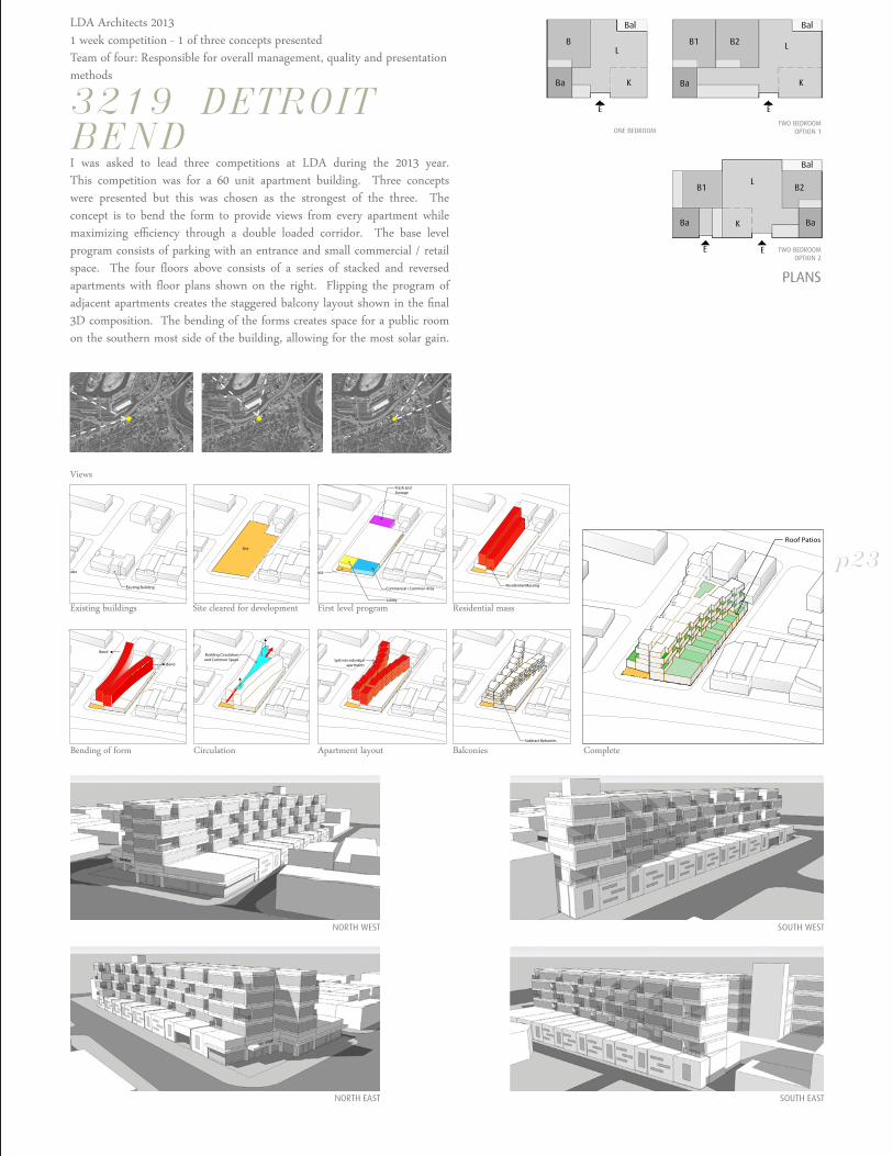
3219 DETROITBENDI was asked to lead three competitions at LDA during the 2013 year. This competition was for a 60 unit apartment building. Three concepts were presented but this was chosen as the strongest of the three. The concept is to bend the form to provide views from every apartment while maximizing efficiency through a double loaded corridor. The base level program consists of parking with an entrance and small commercial / retail space. The four floors above consists of a series of stacked and reversed apartments with floor plans shown on the right. Flipping the program of adjacent apartments creates the staggered balcony layout shown in the final 3D composition. The bending of the forms creates space for a public room on the southern most side of the building, allowing for the most solar gain.
Views
Existing buildings
Bending of form Circulation Apartment layout Balconies Complete
Site cleared for development First level program Residential mass
p23
adam rosekelly
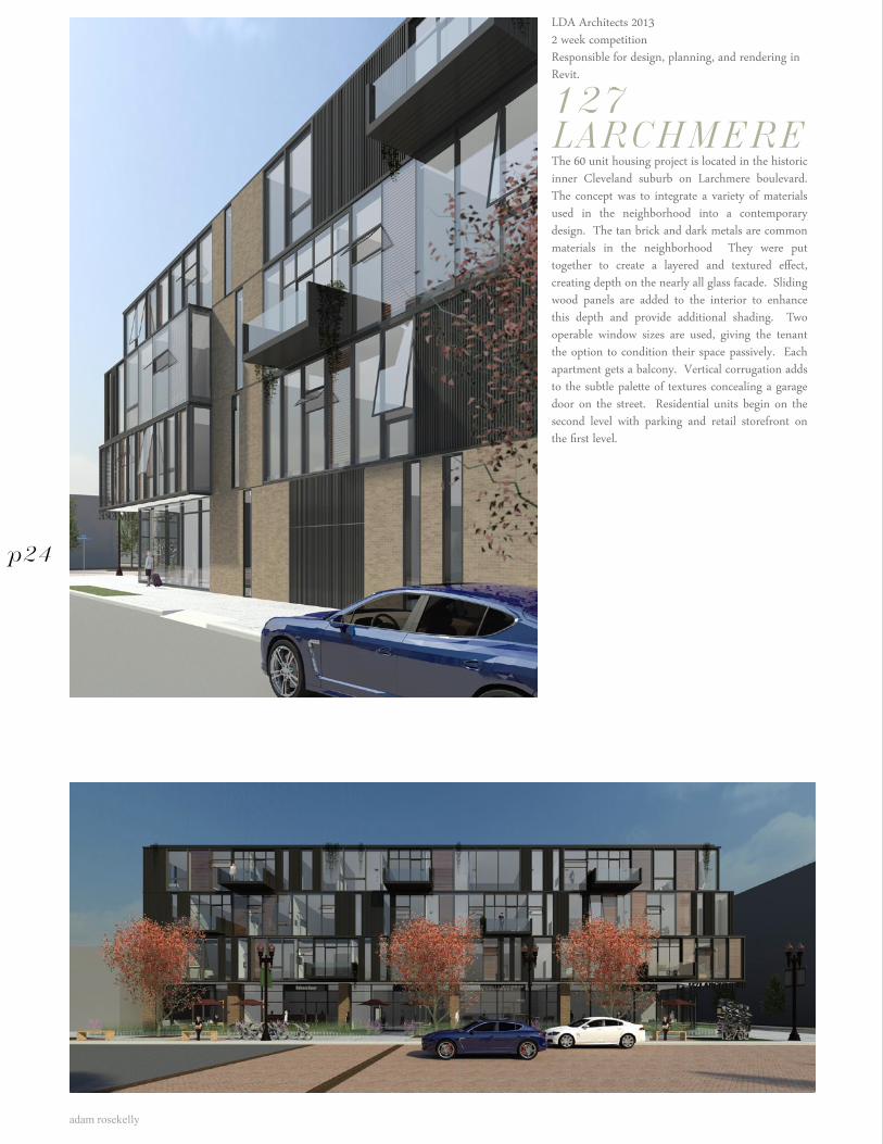
LDA Architects 20132 week competitionResponsible for design, planning, and rendering in Revit.
127LARCHMEREThe 60 unit housing project is located in the historic inner Cleveland suburb on Larchmere boulevard. The concept was to integrate a variety of materials used in the neighborhood into a contemporary design. The tan brick and dark metals are common materials in the neighborhood They were put together to create a layered and textured effect, creating depth on the nearly all glass facade. Sliding wood panels are added to the interior to enhance this depth and provide additional shading. Two operable window sizes are used, giving the tenant the option to condition their space passively. Each apartment gets a balcony. Vertical corrugation adds to the subtle palette of textures concealing a garage door on the street. Residential units begin on the second level with parking and retail storefront on the first level.
p24
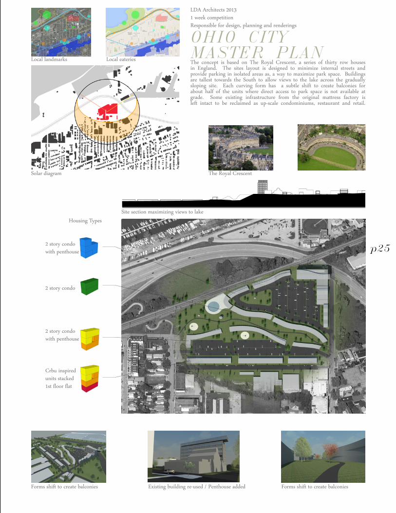
LDA Architects 20131 week competitionResponsible for design, planning and renderings
OHIO CITY MASTER PLANThe concept is based on The Royal Crescent, a series of thirty row houses in England. The sites layout is designed to minimize internal streets and provide parking in isolated areas as, a way to maximize park space. Buildings are tallest towards the South to allow views to the lake across the gradually sloping site. Each curving form has a subtle shift to create balconies for about half of the units where direct access to park space is not available at grade. Some existing infrastructure from the original mattress factory is left intact to be reclaimed as up-scale condominiums, restaurant and retail.
Housing Types
Solar diagram The Royal Crescent
Local landmarks Local eateries
Forms shift to create balconies Existing building re-used / Penthouse added Forms shift to create balconies
Site section maximizing views to lake
2 story condo
2 story condowith penthouse
Crbu inspiredunits stacked1st floor flat
2 story condowith penthouse
p25
adam rosekelly
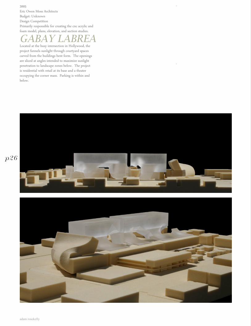
2005Eric Owen Moss ArchitectsBudget: UnknownDesign CompetitionPrimarily responsible for creating the cnc acrylic and foam model, plans, elevation, and section studies.
GABAY LABREALocated at the busy intersection in Hollywood, the project funnels sunlight through courtyard spaces carved from the buildings bent form. The openings are sliced at angles intended to maximize sunlight penetration to landscape zones below. The project is residential with retail at its base and a theater occupying the corner mass. Parking is within and below.
p26
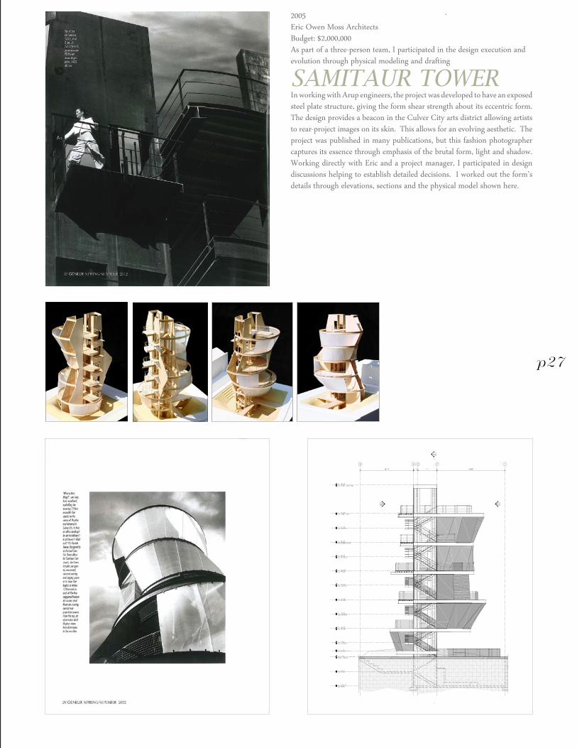
2005Eric Owen Moss ArchitectsBudget: $2,000,000As part of a three-person team, I participated in the design execution and evolution through physical modeling and drafting
SAMITAUR TOWERIn working with Arup engineers, the project was developed to have an exposed steel plate structure, giving the form shear strength about its eccentric form. The design provides a beacon in the Culver City arts district allowing artists to rear-project images on its skin. This allows for an evolving aesthetic. The project was published in many publications, but this fashion photographer captures its essence through emphasis of the brutal form, light and shadow. Working directly with Eric and a project manager, I participated in design discussions helping to establish detailed decisions. I worked out the form’s details through elevations, sections and the physical model shown here.
p27
adam rosekelly
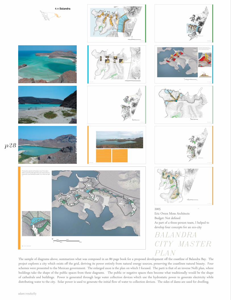
2005Eric Owen Moss ArchitectsBudget: Not definedAs part of a three-person team, I helped to develop four concepts for an eco-city
BALANDRA CITY MASTER PLAN
The sample of diagrams above, summarizes what was composed in an 80 page book for a proposed development off the coastline of Balandra Bay. The project explores a city which exists off the grid, deriving its power entirely from natural energy sources, preserving the coastlines natural beauty. Four schemes were presented to the Mexican government. The enlarged axon is the plan on which I focused. The parti is that of an inverse Nolli plan, where buildings take the shape of the public spaces from these diagrams. The public or negative spaces then become what traditionally would be the shape of cathedrals and buildings. Power is generated through large water collection devices which use the hydrostatic power to generate electricity while distributing water to the city. Solar power is used to generate the initial flow of water to collection devices. The sides of dams are used for dwelling.
p28
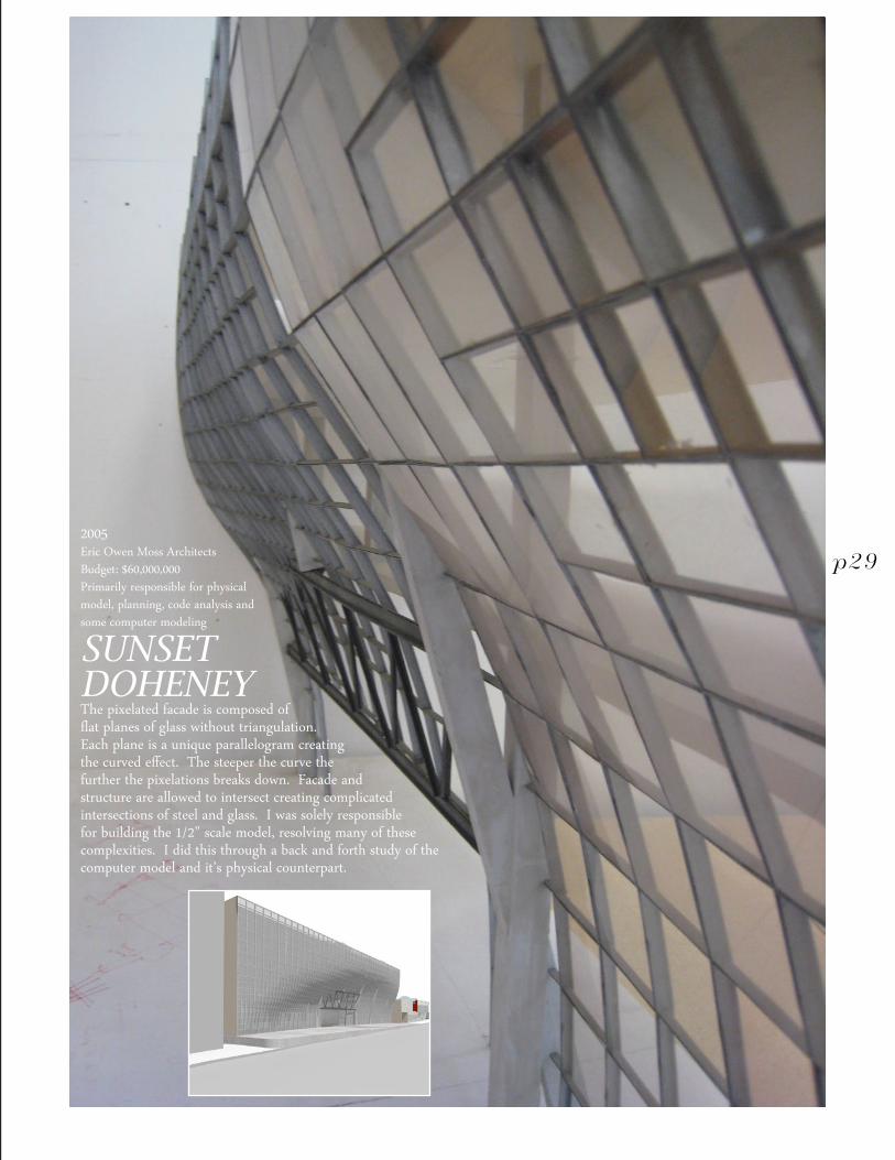
2005Eric Owen Moss ArchitectsBudget: $60,000,000Primarily responsible for physical model, planning, code analysis and some computer modeling
SUNSET DOHENEYThe pixelated facade is composed of flat planes of glass without triangulation. Each plane is a unique parallelogram creating the curved effect. The steeper the curve the further the pixelations breaks down. Facade and structure are allowed to intersect creating complicated intersections of steel and glass. I was solely responsible for building the 1/2” scale model, resolving many of these complexities. I did this through a back and forth study of the computer model and it’s physical counterpart.
p29

adam rosekelly
academic
6
Sand dunes and pine trees in the Upper Peninsula of Northern Michigan
adam rosekelly
p30
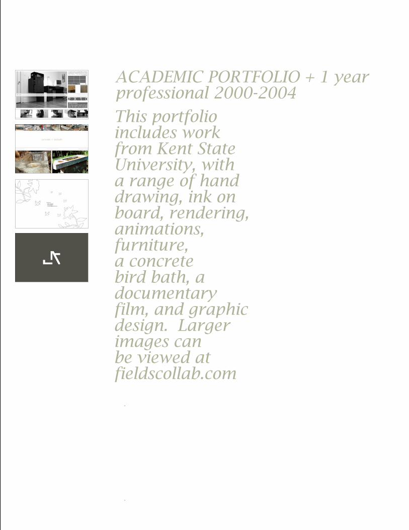
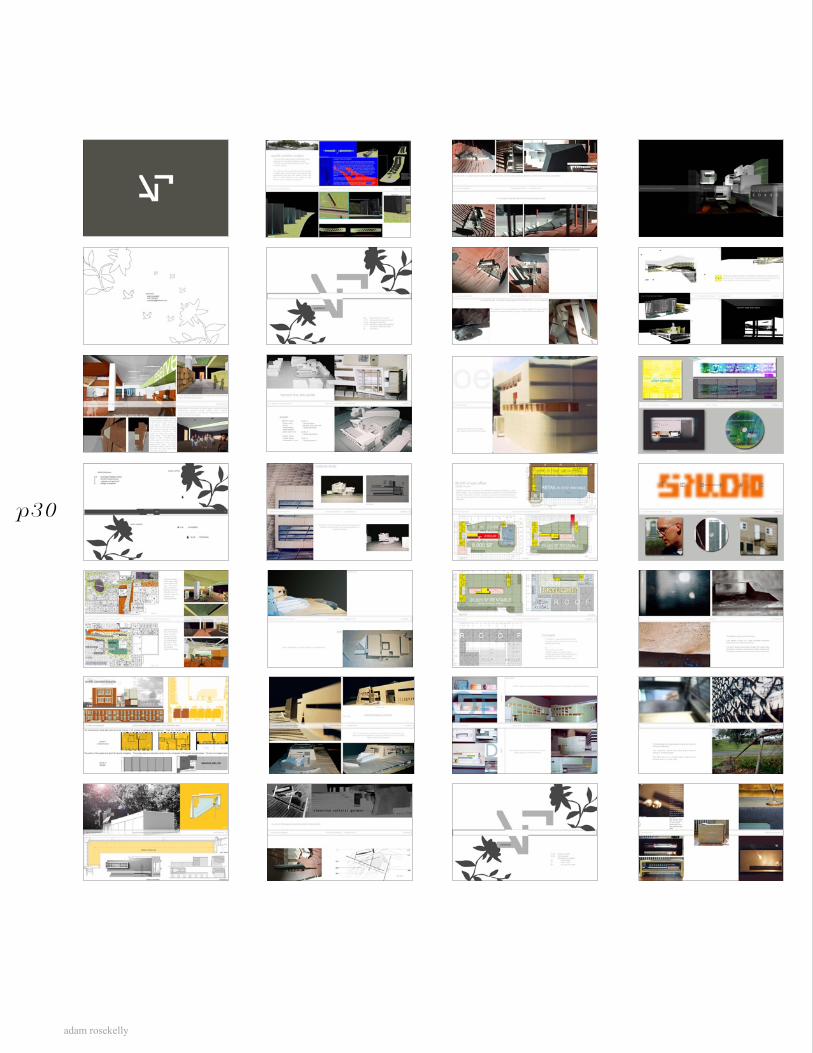
This portfolio includes work from Kent State University, with a range of hand drawing, ink on board, rendering, animations, furniture, a concrete bird bath, a documentary film, and graphic design. Larger images can be viewed at fieldscollab.com
ACADEMIC PORTFOLIO + 1 year professional 2000-2004
adam rosekelly
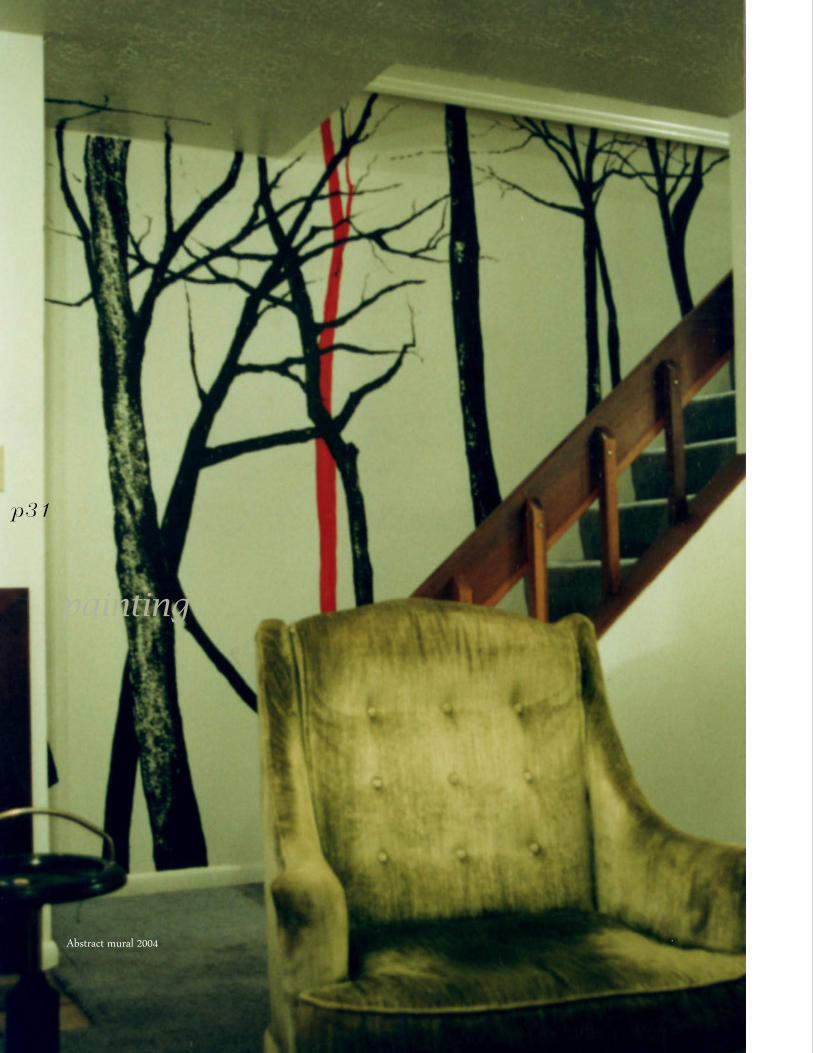
Abstract mural 2004
painting
p31
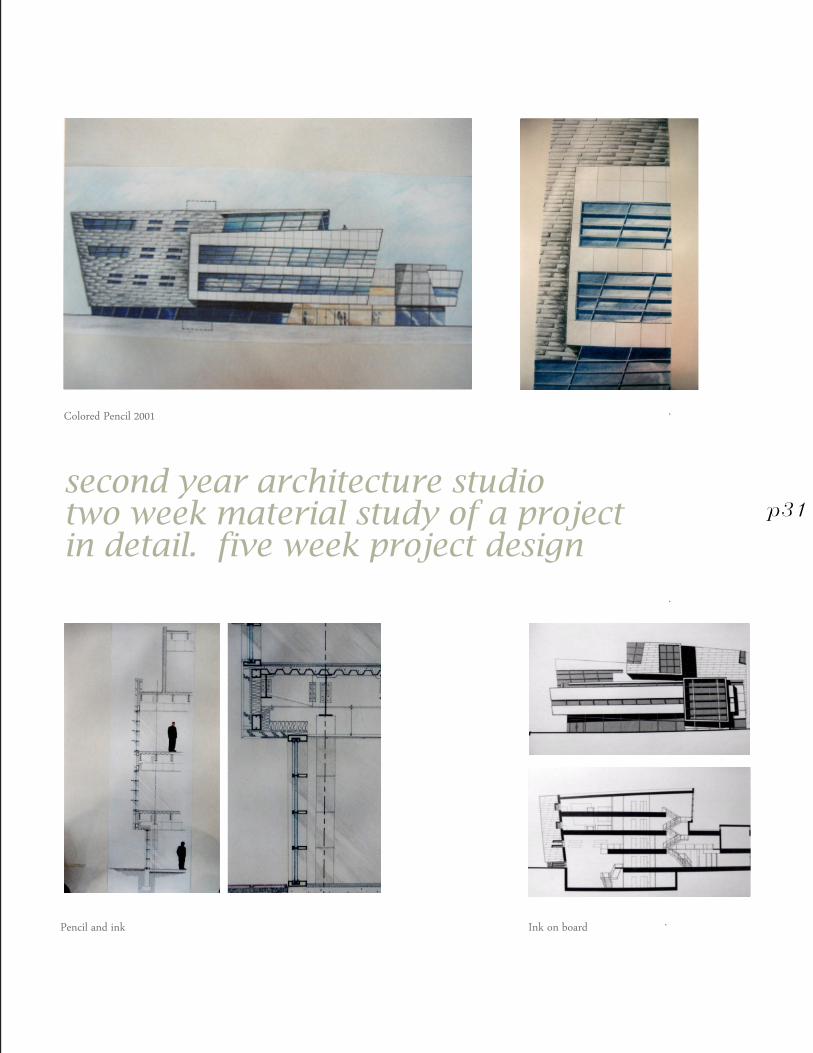
Colored Pencil 2001
Pencil and ink Ink on board
second year architecture studiotwo week material study of a project in detail. five week project design
p31
adam rosekelly
p31
f i e l d s collaborative
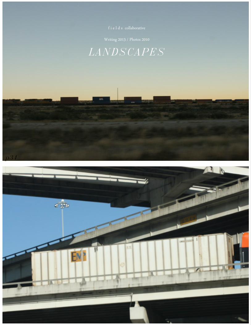
Writing 2013 / Photos 2010
LANDSCAPES
adam rosekelly
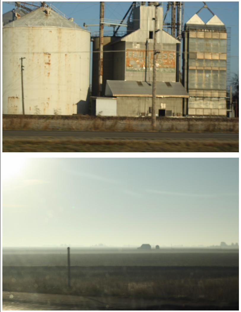
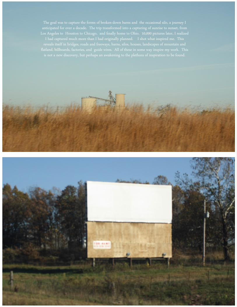
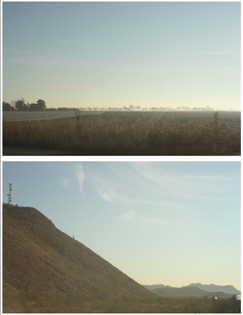
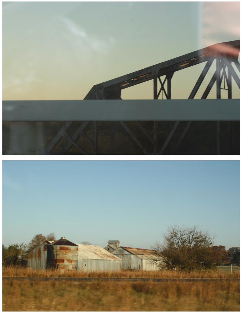
The goal was to capture the forms of broken-down barns and the occasional silo, a journey I anticipated for over a decade. The trip transformed into a capturing of sunrise to sunset, from
Los Angeles to Houston to Chicago, and finally home to Ohio. 10,000 pictures later, I realized I had captured much more than I had originally planned. I shot what inspired me. This
reveals itself in bridges, roads and freeways, barns, silos, houses, landscapes of mountain and flatland, billboards, factories, and guide wires. All of these in some way inspire my work. This
is not a new discovery, but perhaps an awakening to the plethora of inspiration to be found.
Photograph from rout 2, Cleveland Ohio
adam rosekelly
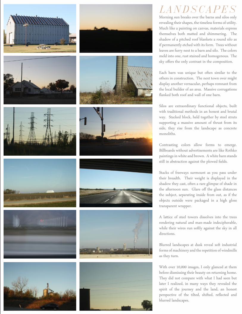
LANDSCAPES Morning sun breaks over the barns and silos only revealing their shapes, the timeless forms of utility. Much like a painting on canvas, materials express themselves both matted and shimmering. The shadow of a pitched roof blankets a round silo as if permanently etched with its form. Trees without leaves are furry next to a barn and silo. The colors meld into one, rust stained and homogenous. The sky offers the only contrast in the composition.
Each barn was unique but often similar to the others in construction. The next town over might display another vernacular, perhaps remnant from the local builder of an area. Massive corrugations flanked both roof and wall of one barn.
Silos are extraordinary functional objects, built with traditional methods in an honest and brutal way. Stacked block, held together by steel struts supporting a massive amount of thrust from its side, they rise from the landscape as concrete monoliths.
Contrasting colors allow forms to emerge. Billboards without advertisements are like Rothko paintings in white and brown. A white barn stands still in abstraction against the plowed fields.
Stacks of freeways surmount as you pass under their breadth. Their weight is displayed in the shadow they cast, often a rare glimpse of shade in the afternoon sun. Glare off the glass distances the subject, separating inside from out, as if the objects outside were packaged in a high gloss transparent wrapper.
A lattice of steel towers dissolves into the trees rendering natural and man-made indecipherable, while their wires run softly against the sky in all directions.
Blurred landscapes at dusk reveal soft industrial forms of machinery and the repetition of windmills as they turn.
With over 10,000 images, I only glanced at them before dismissing their beauty on returning home. They did not compare with what I had seen but later I realized, in many ways they revealed the spirit of the journey and the land, an honest perspective of the tilted, shifted, reflected and blurred landscapes.
adam rosekelly
Adam Rosekelly1400 East 30th StreetCleveland, OH 44114
C: 310.740.4934
fieldscollab.com