Embed Size (px)
Citation preview
The Sensemaking Processand Leverage Points for Analyst Technology
as Identified Through Cognitive Task Analysis
by Peter Pirolli and Stuart Card
Presented By: Charles Rojo
Abstract
• There have been few experimental studies of Intelligence Analysis.
• Of those that exist, few have been linked into the context of ‘expertise’ and ‘work’.
Abstract
• By analyzing results from cognitive task analysis and verbal protocols, this paper describes intelligence analysis as an example of sensemaking.
• It also suggests leverage points where technology (e.g. visualization) might assist sensemaking for intelligence analysis.
Introduction
• This work doesn’t seek small improvements to current techniques in intelligence analysis.
• It seeks to shed light on the process in greater depth, through empirical studies, to find the right leverage points that will have the biggest impact on improvement of analysis.
Introduction
• Intelligence analysis is a wide and variable task domain.
• Care must be taken when generalizing it based off particular intelligence tasks or analyst types.
• Ex: Human Intelligence Analyst vs. Financial Intelligence Analyst
Their tasks, knowledge, and skill sets are very different.
• Generalizations must be applicable to all aspects of intelligence analysis.
Introduction• This paper is a preliminary attempt to derive such
generalizations.• To do so,
‘cognitive task analysis’
and
‘think aloud protocols’
have been used to broadly characterize the process.
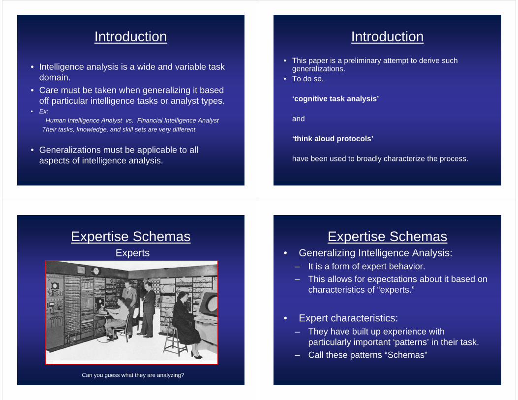
Expertise SchemasExperts
Can you guess what they are analyzing?
Expertise Schemas• Generalizing Intelligence Analysis:
– It is a form of expert behavior.– This allows for expectations about it based on
characteristics of “experts.”
• Expert characteristics:– They have built up experience with
particularly important ‘patterns’ in their task.– Call these patterns “Schemas”
Expertise Schemas• Expert characteristics:
– These schemas, more so than personal capacity, are key to expert performance.
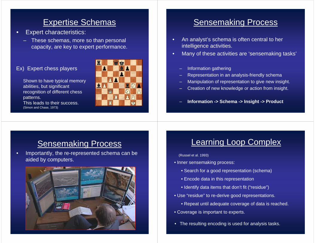
Ex) Expert chess players
Shown to have typical memory abilities, but significant recognition of different chess patterns. This leads to their success. (Simon and Chase, 1973)
Sensemaking Process
• An analyst’s schema is often central to her intelligence activities.
• Many of these activities are ‘sensemaking tasks’
– Information gathering– Representation in an analysis-friendly schema– Manipulation of representation to give new insight.– Creation of new knowledge or action from insight.
– Information -> Schema -> Insight -> Product
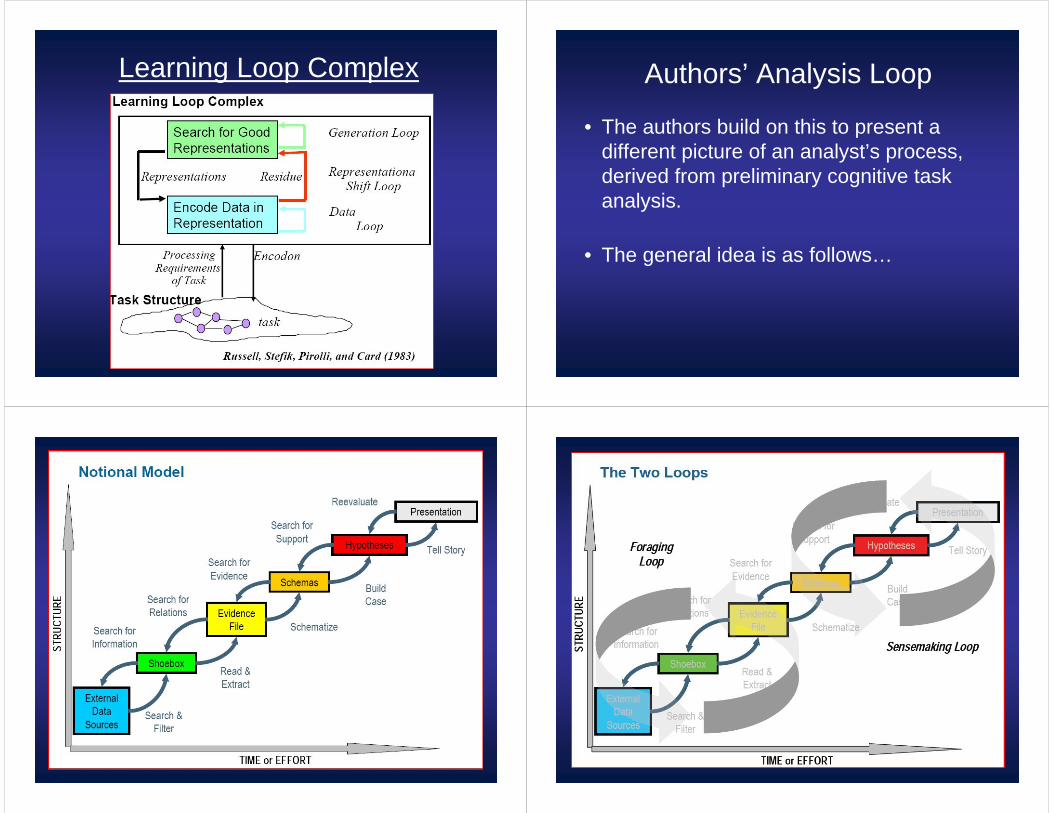
Sensemaking Process• Importantly, the re-represented schema can be
aided by computers.
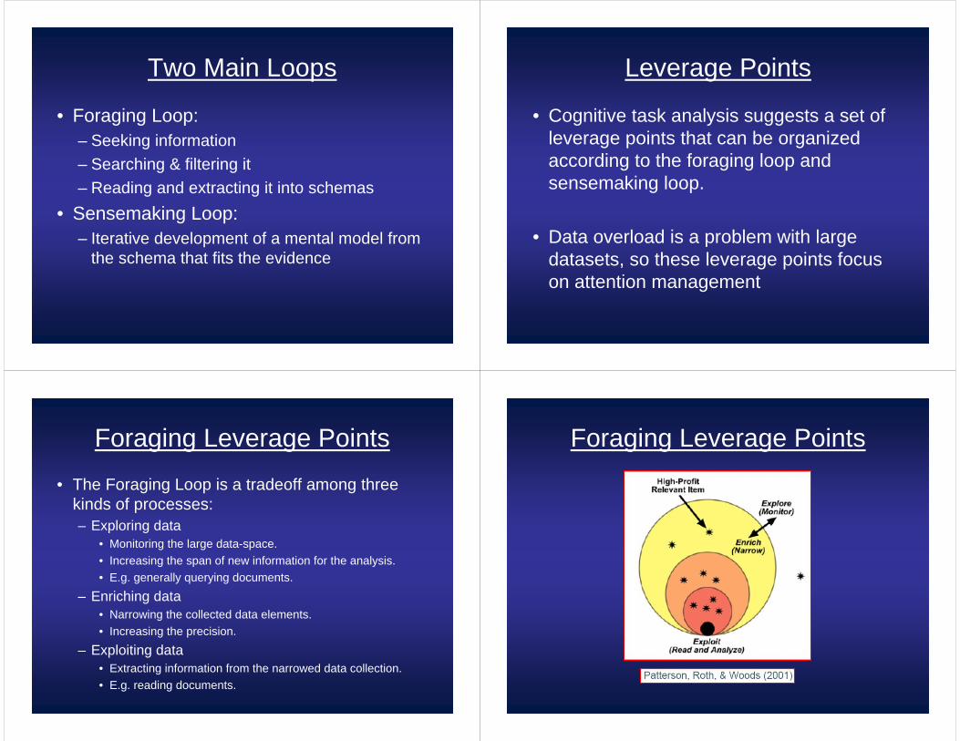
Learning Loop Complex
• Inner sensemaking process:
• Search for a good representation (schema)
• Encode data in this representation
• Identify data items that don’t fit (“residue”)
• Use “residue” to re-derive good representations.
• Repeat until adequate coverage of data is reached.
• Coverage is important to experts.
(Russel et al. 1993)
• The resulting encoding is used for analysis tasks.
Learning Loop Complex Authors’ Analysis Loop
• The authors build on this to present a different picture of an analyst’s process, derived from preliminary cognitive task analysis.
• The general idea is as follows…
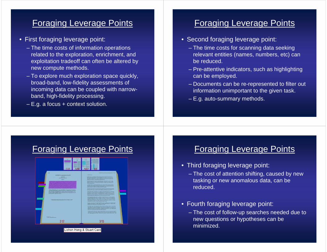
Two Main Loops
• Foraging Loop:– Seeking information– Searching & filtering it– Reading and extracting it into schemas
• Sensemaking Loop:– Iterative development of a mental model from
the schema that fits the evidence
Leverage Points
• Cognitive task analysis suggests a set of leverage points that can be organized according to the foraging loop and sensemaking loop.
• Data overload is a problem with large datasets, so these leverage points focus on attention management
Foraging Leverage Points
• The Foraging Loop is a tradeoff among three kinds of processes:– Exploring data
• Monitoring the large data-space.• Increasing the span of new information for the analysis. • E.g. generally querying documents.
– Enriching data• Narrowing the collected data elements.• Increasing the precision.
– Exploiting data• Extracting information from the narrowed data collection.• E.g. reading documents.
Foraging Leverage Points
Foraging Leverage Points
• First foraging leverage point:– The time costs of information operations
related to the exploration, enrichment, and exploitation tradeoff can often be altered by new compute methods.
– To explore much exploration space quickly, broad-band, low-fidelity assessments of incoming data can be coupled with narrow-band, high-fidelity processing.
– E.g. a focus + context solution.
Foraging Leverage Points
• Second foraging leverage point:– The time costs for scanning data seeking
relevant entities (names, numbers, etc) can be reduced.
– Pre-attentive indicators, such as highlighting can be employed.
– Documents can be re-represented to filter out information unimportant to the given task.
– E.g. auto-summary methods.
Foraging Leverage Points Foraging Leverage Points
• Third foraging leverage point:– The cost of attention shifting, caused by new
tasking or new anomalous data, can be reduced.
• Fourth foraging leverage point:– The cost of follow-up searches needed due to
new questions or hypotheses can be minimized.
Sense Making Leverage Points
• Sense making leverage points deal with problem structuring, evidentiary reasoning, and decision making.
• Cognitive biases, our inherent limitations, have a large impact on each of these points.
Sense Making Leverage Points
• First sense making leverage point:– The span of attention needed for evidence
and hypotheses can be reduced.- The amount of actively considerable
hypotheses, evidence, and relations is limited.– Information visualization and broad band
displays can offload information patterns for the analyst to external memory, expanding her working memory.
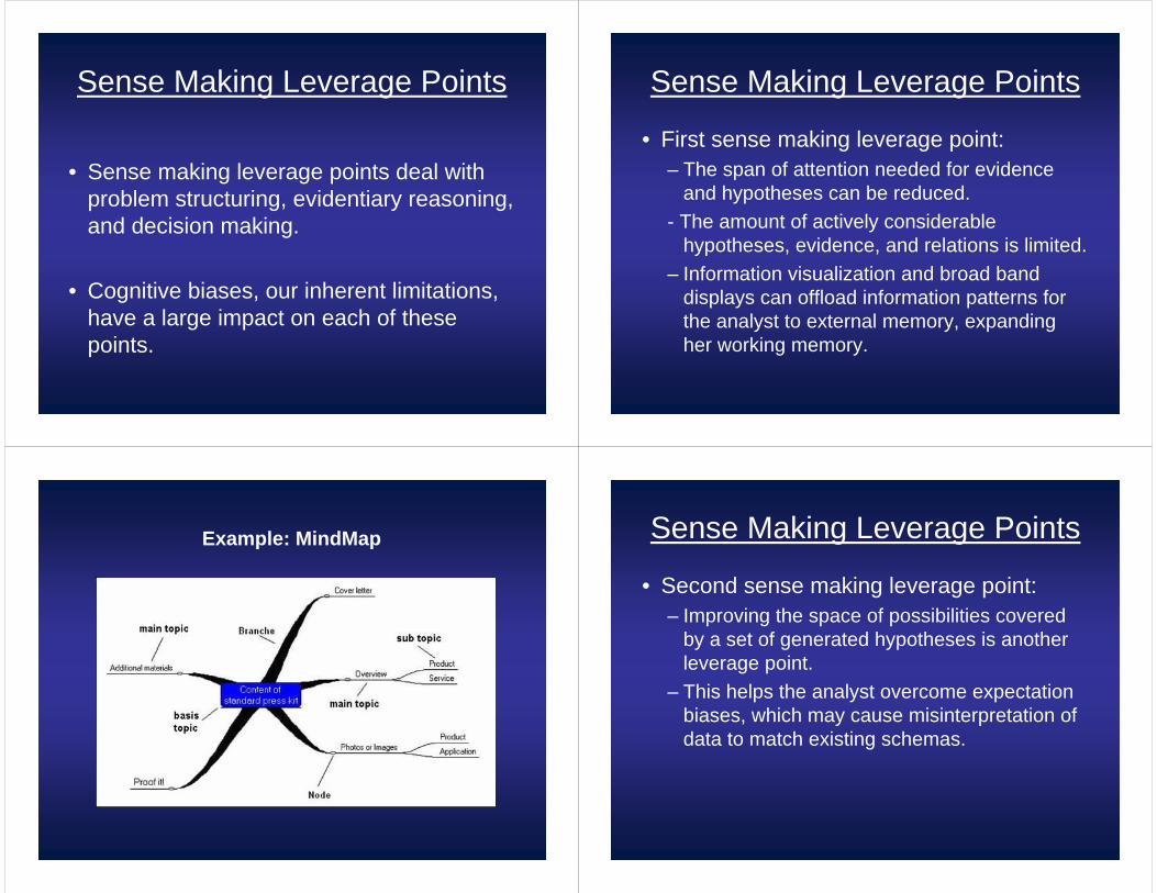
Example: MindMap Sense Making Leverage Points
• Second sense making leverage point:– Improving the space of possibilities covered
by a set of generated hypotheses is another leverage point.
– This helps the analyst overcome expectation biases, which may cause misinterpretation of data to match existing schemas.
Sense Making Leverage Points
• Third sense making leverage point:– A leverage point for tools is to distribute more
of the analyst’s attention to distinguishing evidence and to the search for non-conforming relations.
– This again fights the natural bias to ignore disconfirmation in hypotheses, the usual cause of misanalysis.
Leverage Points
• These leverage points provide a framework for new technology design principles and metrics. New tools can be assessed based on how they impact each point.
Interactive Focusand Context Visualization with Linked
2D/3D Scatterplots
By Harald Piringer,
Robert Kosara,
and Hewig Hauser
VRVis Research Center
Presented By: Charles Rojo
Their Software
Introduction
• 2D Scatterplots, the good:– Match well with direct interaction via 2D input
devices (mouse)– Used frequently
Introduction
• 2D Scatterplots, the bad:– Overplotting– Much information loss when mapping higher
dimensional data to 2D
Introduction
• Overcoming the bad of 2D with 3D:The Good:– 3D scatterplots reduce the overplotting effect.– Additional dimension in which to separate structure.
The Bad:– Interaction in 3D is more difficult.– Depth of points isn’t usually well indicated.
Introduction
• Volume rendering or binning points into larger objects have both been used to help render 3D scatter plots, but these introduce their own problems.
• For example, how is value frequency and value range in each bin represented?
Introduction
• Main Contributions:– Introduction of halos and depth-dependent
point size as depth cues for 3D scatterplots.– Use of histograms as a technique to highlight
the point distribution and density inside and outside the spatial focus.
– Use of three 2D ‘linked views’ to allow for interaction with the 3D space.
– Illustration of the usefulness of the combined approaches.
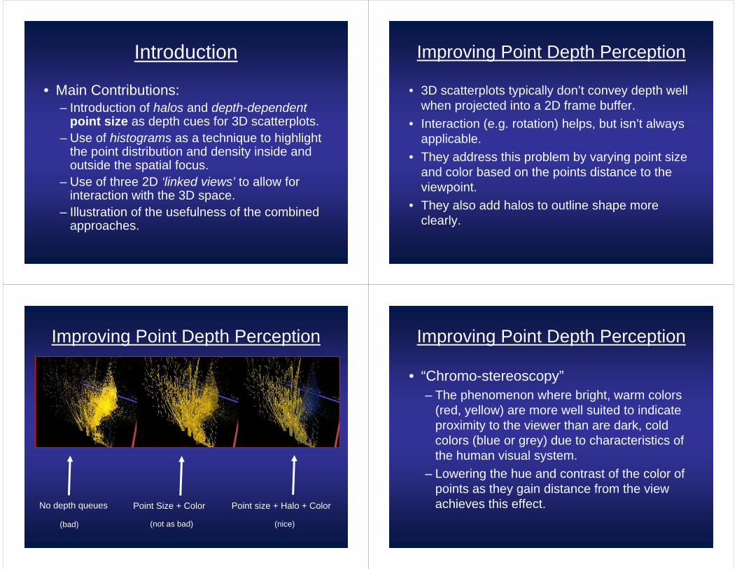
Improving Point Depth Perception
• 3D scatterplots typically don’t convey depth well when projected into a 2D frame buffer.
• Interaction (e.g. rotation) helps, but isn’t always applicable.
• They address this problem by varying point size and color based on the points distance to the viewpoint.
• They also add halos to outline shape more clearly.
Improving Point Depth Perception
No depth queues Point Size + Color Point size + Halo + Color
(nice)(bad) (not as bad)
Improving Point Depth Perception
• “Chromo-stereoscopy”– The phenomenon where bright, warm colors
(red, yellow) are more well suited to indicate proximity to the viewer than are dark, cold colors (blue or grey) due to characteristics of the human visual system.
– Lowering the hue and contrast of the color of points as they gain distance from the view achieves this effect.
Representing Point Density
• Point density at a given position is important information.
• Scatterplots don’t convey this information when many points appear in the same area, or are otherwise projected onto the same pixel.
• To prevent the loss of some of this information, the authors propose adding 2D histograms at each border plane of the 3D scatterplot cube.
Representing Point Density
The points are orthogonally projected to each end of the cube, yielding density information. The cube faces are divided into equally spaced ‘bins’ into which the density values fall.
The size of these bins is user-specified.
Representing Point Density
Each bin accumulates all the density values that fall within it, and the resulting accumulations are displayed in one of two ways.
Representing Point Density
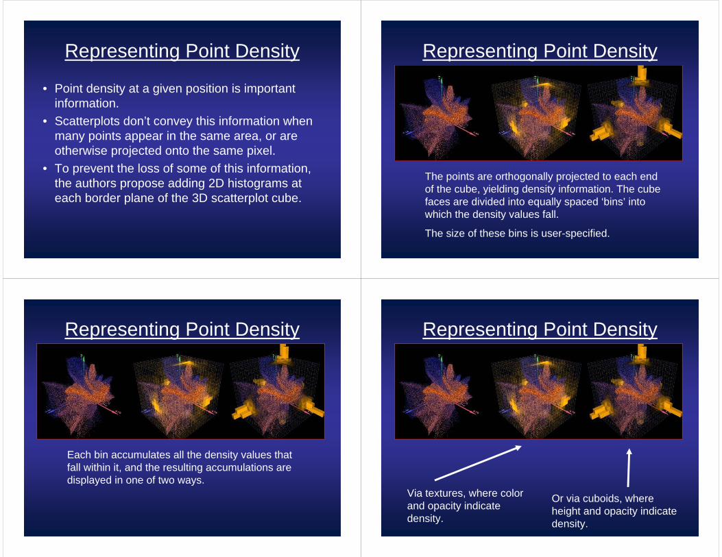
Via textures, where color and opacity indicate density.
Or via cuboids, where height and opacity indicate density.
Representing Point Density
• In both cases, the user may specify scale factors for the opacity. The authors also suggest allowing the user to toggle between a linear and a logarithmic histogram display.
• Logarithmic histograms are useful for noting slight differences in sparse areas.
Spatial Context Information
• Often, data in a 3D scatterplot is too large.• In this case, it’s important to allow for focusing
into a particular area of the data.• The authors propose allowing cubic cutouts of
the 3D scatterplot data to be displayed in a ‘spatial’ context.
• This context is essentially histogram data displayed in cuboid form, but reversed to indicate the densities of all points outside the focus, projected inward.
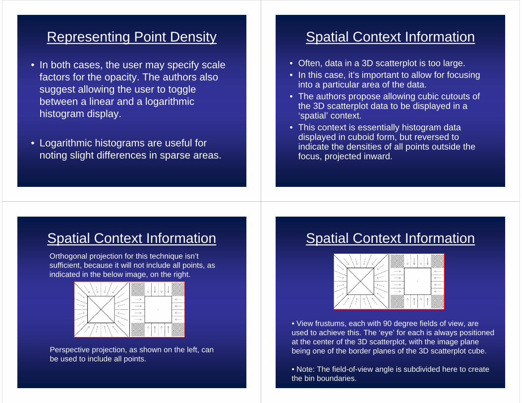
Spatial Context InformationOrthogonal projection for this technique isn’t sufficient, because it will not include all points, as indicated in the below image, on the right.
Perspective projection, as shown on the left, can be used to include all points.
Spatial Context Information
• View frustums, each with 90 degree fields of view, are used to achieve this. The ‘eye’ for each is always positioned at the center of the 3D scatterplot, with the image plane being one of the border planes of the 3D scatterplot cube.
• Note: The field-of-view angle is subdivided here to create the bin boundaries.
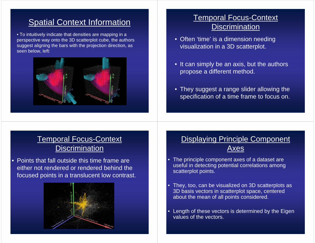
Spatial Context Information• To intuitively indicate that densities are mapping in a perspective way onto the 3D scatterplot cube, the authors suggest aligning the bars with the projection direction, as seen below, left:
Temporal Focus-Context Discrimination
• Often ‘time’ is a dimension needing visualization in a 3D scatterplot.
• It can simply be an axis, but the authors propose a different method.
• They suggest a range slider allowing the specification of a time frame to focus on.
Temporal Focus-Context Discrimination
• Points that fall outside this time frame are either not rendered or rendered behind the focused points in a translucent low contrast.
Displaying Principle Component Axes
• The principle component axes of a dataset are useful in detecting potential correlations among scatterplot points.
• They, too, can be visualized on 3D scatterplots as 3D basis vectors in scatterplot space, centered about the mean of all points considered.
• Length of these vectors is determined by the Eigen values of the vectors.
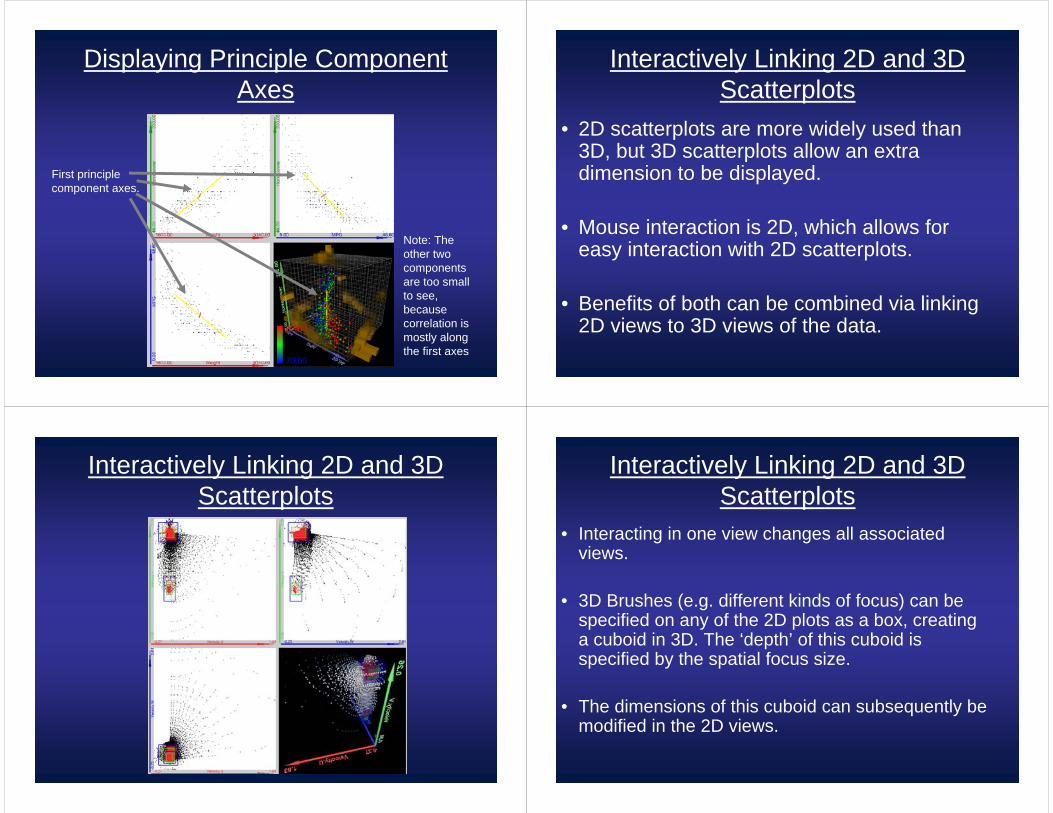
Displaying Principle Component Axes
First principle component axes.
Note: The other two components are too small to see, because correlation is mostly along the first axes
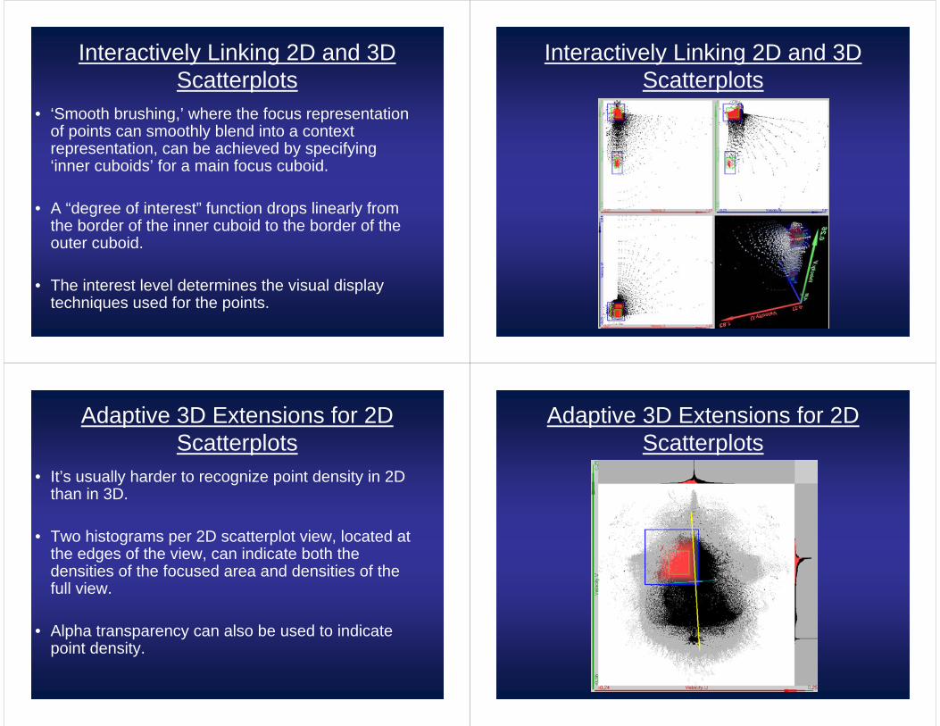
Interactively Linking 2D and 3D Scatterplots
• 2D scatterplots are more widely used than 3D, but 3D scatterplots allow an extra dimension to be displayed.
• Mouse interaction is 2D, which allows for easy interaction with 2D scatterplots.
• Benefits of both can be combined via linking 2D views to 3D views of the data.
Interactively Linking 2D and 3D Scatterplots
Interactively Linking 2D and 3D Scatterplots
• Interacting in one view changes all associated views.
• 3D Brushes (e.g. different kinds of focus) can be specified on any of the 2D plots as a box, creating a cuboid in 3D. The ‘depth’ of this cuboid is specified by the spatial focus size.
• The dimensions of this cuboid can subsequently be modified in the 2D views.
Interactively Linking 2D and 3D Scatterplots
• ‘Smooth brushing,’ where the focus representation of points can smoothly blend into a context representation, can be achieved by specifying ‘inner cuboids’ for a main focus cuboid.
• A “degree of interest” function drops linearly from the border of the inner cuboid to the border of the outer cuboid.
• The interest level determines the visual display techniques used for the points.
Interactively Linking 2D and 3D Scatterplots
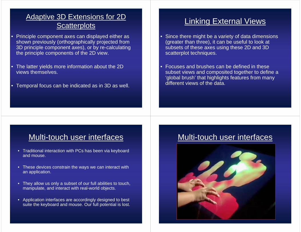
Adaptive 3D Extensions for 2D Scatterplots
• It’s usually harder to recognize point density in 2D than in 3D.
• Two histograms per 2D scatterplot view, located at the edges of the view, can indicate both the densities of the focused area and densities of the full view.
• Alpha transparency can also be used to indicate point density.
Adaptive 3D Extensions for 2D Scatterplots
Adaptive 3D Extensions for 2D Scatterplots
• Principle component axes can displayed either as shown previously (orthographically projected from 3D principle component axes), or by re-calculating the principle components of the 2D view.
• The latter yields more information about the 2D views themselves.
• Temporal focus can be indicated as in 3D as well.
Linking External Views
• Since there might be a variety of data dimensions (greater than three), it can be useful to look at subsets of these axes using these 2D and 3D scatterplot techniques.
• Focuses and brushes can be defined in these subset views and composited together to define a ‘global brush’ that highlights features from many different views of the data.
Multi-touch user interfaces• Traditional interaction with PCs has been via keyboard
and mouse.
• These devices constrain the ways we can interact with an application.
• They allow us only a subset of our full abilities to touch, manipulate, and interact with real-world objects.
• Application interfaces are accordingly designed to best suite the keyboard and mouse. Our full potential is lost.
Multi-touch user interfaces
Low-Cost Multi-Touch Sensing through Frustrated Total Internal Reflection
• Jeff Han devised a low-cost solution to multi-touch interaction with a computer.
• His screen uses a concept known as Frustrated Total Internal Reflectance (FTIR) to achieve easy-to-recognize contact points.
Jefferson Y. Han
Media Research Lab
NYU• Total internal reflection (TIR) is an
optical phenomenon that occurs when light strikes a medium (acrylic-air) boundary at a steep angle.
• If the refractive index is lower on the other side of the boundary, no light can pass through, so effectively all light is internally reflected in the medium.
Low-Cost Multi-Touch Sensing through Frustrated Total Internal Reflection
• When material (such as a finger) makes contact with a medium undergoing TIR, the internally reflecting light can be frustrated, causing light to escape the from the opposite end of the contact point.
Low-Cost Multi-Touch Sensing through Frustrated Total Internal Reflection Building a Touch Screen
• dundee.cs.queensu.ca/wiki/index.php/Building_a_Multi-Touch_Sensitive_Table
1 Large piece of Clear AcrylicIR LEDsIR cameraResistorsAC adapterProjector and semi-transparent diffusing surface
– Some are informally experimenting with LCDsRubber borders and Stand
Acrylic IR LEDs
Camera (need to modify for IR) Positioning• The camera should be positioned near the projector,
both of which should project upward onto the acrylic surface.
• The projector projects in the visible light spectrum, while the IR camera detects only frustrated infrared light in the acrylic from objects such as fingertips.
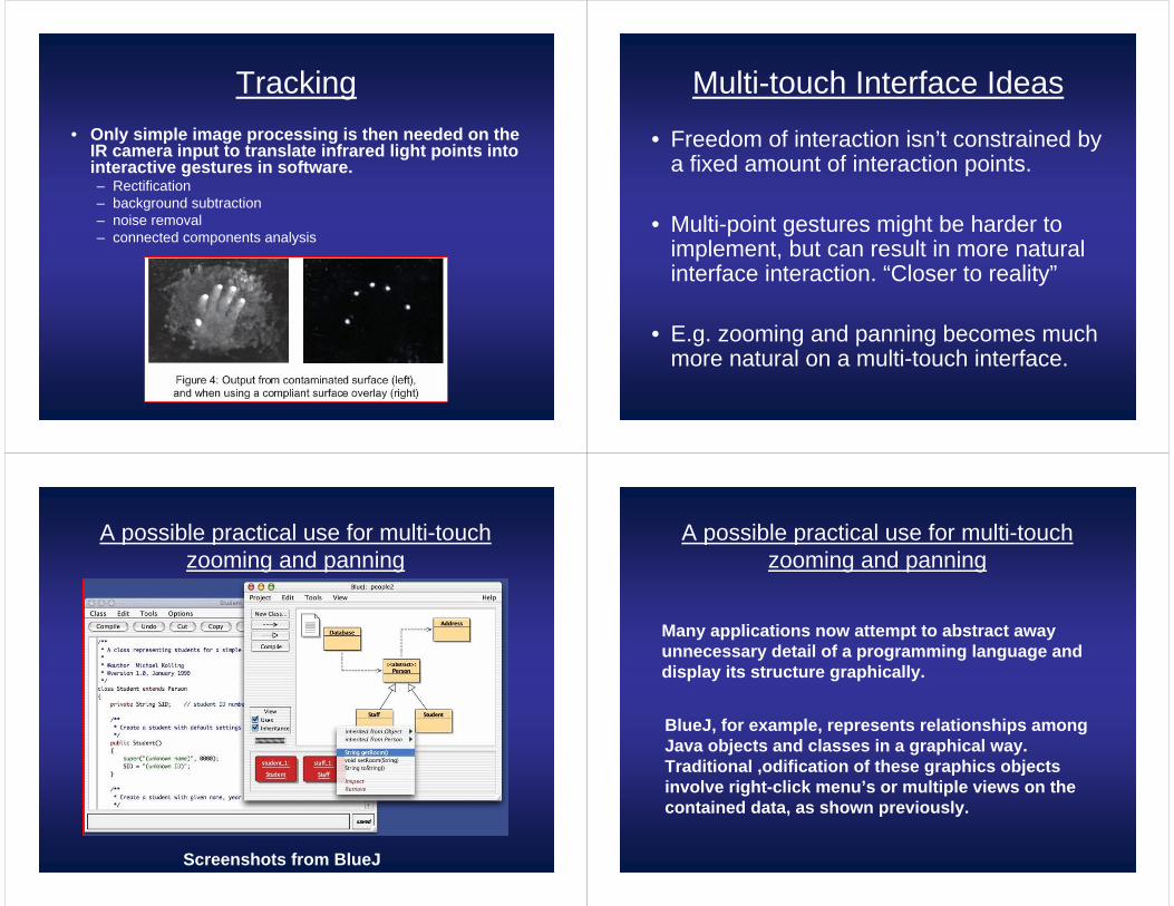
Tracking• Only simple image processing is then needed on the
IR camera input to translate infrared light points into interactive gestures in software.– Rectification– background subtraction– noise removal– connected components analysis
Multi-touch Interface Ideas
• Freedom of interaction isn’t constrained by a fixed amount of interaction points.
• Multi-point gestures might be harder to implement, but can result in more natural interface interaction. “Closer to reality”
• E.g. zooming and panning becomes much more natural on a multi-touch interface.
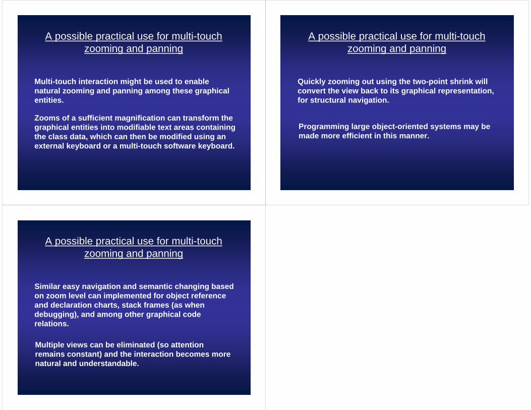
A possible practical use for multi-touch zooming and panning
Screenshots from BlueJ
A possible practical use for multi-touch zooming and panning
BlueJ, for example, represents relationships among Java objects and classes in a graphical way. Traditional ,odification of these graphics objects involve right-click menu’s or multiple views on the contained data, as shown previously.
Many applications now attempt to abstract away unnecessary detail of a programming language and display its structure graphically.
A possible practical use for multi-touch zooming and panning
Multi-touch interaction might be used to enable natural zooming and panning among these graphical entities.
Zooms of a sufficient magnification can transform the graphical entities into modifiable text areas containing the class data, which can then be modified using an external keyboard or a multi-touch software keyboard.
A possible practical use for multi-touch zooming and panning
Quickly zooming out using the two-point shrink will convert the view back to its graphical representation, for structural navigation.
Programming large object-oriented systems may be made more efficient in this manner.
A possible practical use for multi-touch zooming and panning
Similar easy navigation and semantic changing based on zoom level can implemented for object reference and declaration charts, stack frames (as when debugging), and among other graphical code relations.
Multiple views can be eliminated (so attention remains constant) and the interaction becomes more natural and understandable.