Embed Size (px)
Citation preview
Abstract
“RAPPACCINI’S DAUGHTER” BY NATHANIEL HAWTHORNE:
A VISUAL INTERPRETATION
by
ASHLEY N. PIERCE
APRIL, 2010
Chair: JOAN MANSFIELD SCHOOL OF ART & DESIGN
This document is in support of my thesis work, a series of illustrative images. By allowing
readers a closer look into my creative as well as technical processes, I hope to provide a guide to
my visual artwork. I will describe the process of how I created the series of images and the
environment in which they existed. My thesis exhibition consists of a visual interpretation of
Nathaniel Hawthorne’s short story, “Rappaccini’s Daughter” dated 1894. The two modes of
visual expression I have employed are digital illustration and installation. Digital illustration is a
broad term that references the use of one or more digital tools to create images. Installation is a
way of creating a focus on objects and their placement within a specific space. The intent of my
thesis exhibition was to marry the final illustrations with an installation of my studio source
materials as well as objects of inspiration for the final illustrations.

©Copyright 2010 ASHLEY N. PIERCE
“RAPPACCINI’S DAUGHTER” BY NATHANIEL HAWTHORNE:
A VISUAL INTERPRETATION
A Report of Creative Thesis
Presented To
The Faculty of the School of Art and Design
East Carolina University
In Partial Fulfillment
of the Requirements for the Degree
Master of Fine Arts
by
ASHLEY N. PIERCE APRIL 2010

UMI Number: 1476611
All rights reserved
INFORMATION TO ALL USERS The quality of this reproduction is dependent upon the quality of the copy submitted.
In the unlikely event that the author did not send a complete manuscript
and there are missing pages, these will be noted. Also, if material had to be removed, a note will indicate the deletion.
UMI 1476611
Copyright 2010 by ProQuest LLC. All rights reserved. This edition of the work is protected against
unauthorized copying under Title 17, United States Code.
ProQuest LLC 789 East Eisenhower Parkway
P.O. Box 1346 Ann Arbor, MI 48106-1346
IV
TABLE OF CONTENTS
INTRODUCTION…………………………………………………………………….…..1
STORY SYNOPSIS.…………………………………………………………………….. 2
MY IMAGES INSPIRED BY THIS STORY………………………………..………...... 3
REPRESENTATION: CONSTRUCTING THE IMAGES……………………….…….. 5
PROCESS: DIGITALLY COLORING LINE ART………………………………….… 13
INSTALLATION: OBJECTS IN SPACE…………………………………………….....45
ILLUSTRATIONS………………………………………………………………………53
CONCLUSION……………………………………………………………………….….65
REFERENCES………………………………………………………………….….....…66
TABLE OF FIGURES
IMAGES OF PROCESS: PHYSICAL COLLAGE (Figures 1-10)…………………..7-12
IMAGES OF PROCESS: DIGITALLY COLORING LINE ART (Figures 11-45)...13-43
IMAGES OF THE EXHIBITION (Figures 46-58)…………………………………..45-51
IMAGES OF THE ILLUSTRATIONS (Figures 59-78)……………………………..53-64
“RAPPACCINI’S DAUGHTER” BY NATHANIEL HAWTHORNE:
A VISUAL INTERPRETATION
by
ASHLEY N. PIERCE
APPROVED BY:
DIRECTOR OF THESIS: __________________________________________________ Joan Mansfield
COMMITTEE MEMBER: _________________________________________________
Christine Zoller
COMMITTEE MEMBER: _________________________________________________ Scott Eagle
COMMITTEE MEMBER: _________________________________________________
Punam Madhok, PhD DIRECTOR OF THE SCHOOL OF ART AND DESIGN: ________________________________________________
Michael Drought
DEAN OF THE GRADUATE SCHOOL: ________________________________________________
Paul J. Gemperline, PhD
INTRODUCTION
I first read “Rappaccini’s Daughter” in the third grade and was reminded of the
story when I traveled to Italy in the summer of 2008. “Rappaccini’s Daughter” centers
around themes of romance, danger, and tragic consequences. These are also the most
common themes in my sketchbooks and my personal work. The images that would
eventually appear in my thesis exhibition began as a series of collages that I composed
from sections of my sketchbook pages. One of the more elaborate drawings from my
Italy sketchbook was of a couple with a personified flower between them. The strange
flower between the two figures seemed to interact with each of them and it’s presence
was ominous and imposing. The flower also seemed personified like a character playing
an active role in the impending drama between the two figures. This was the central
image that inspired my use of “Rappaccini’s Daughter” as subject matter for my thesis
exhibition.
STORY SYNOPSIS
“Rappaccini’s Daughter” is a short story written by Nathaniel Hawthorne in 1894 and
set in medieval Padua, Italy. The story revolves around Beatrice Rappaccini, the
beautiful, kind, and innocent young daughter of the infamous scientist Signor Giacomo
Rappaccini. She has been isolated from all culture, civilization and friendship by her
father's diabolic understanding of botanical poisons and has become the victim of his
concentrated research. Throughout his daughter’s removed and fragile life, Signor
Rappaccini has raised a number of atypical poisonous plants in blind pursuit of scientific
knowledge. Signor Rappaccini infected his daughter with poison so that her very touch
will be fatal to all others.
Beatrice experiences a singular moment of pleasure when she falls passionately and
innocently in love with a young science student, Giovanni Guasconti. Giovanni is renting
an upstairs room that overlooks the garden that Beatrice tends for her father. Giovanni
witnesses that Beatrice’s touch and breath are both deadly to lizards, insects and flowers
raised elsewhere. In spite of this knowledge he becomes infatuated with her beauty and
charm. Beatrice and Giovanni share several emotionally intimate exchanges in the
garden. However, physical contact is not made, until one day when Beatrice grabs
Giovanni to prevent him from touching a poisonous flower, leaving a painful imprint
upon his arm. Giovanni soon becomes aware that he too has become poisonous and that a
life with Beatrice will come at the expense of any interaction with the outside world. In a
fit of anger Giovanni accuses Beatrice of infecting him. His callousness, joined with her
father's experiment, destroy the young woman and she dies tragically.
MY IMAGES INSPIRED BY THIS STORY
Rappaccini’s garden is the most significant location in “Rappaccini’s Daughter.”
This is apparent in my twenty-six final illustrations as only three of these resulting
images were completely devoid of botanical elements. A few of the plants incorporated
into the garden images were drawn from actual plants; some combined parts of several
plants, while others were completely imagined. I often worked this way moving back and
forth between drawing from source materials and filling in with decorative and intuitively
elaborated forms. Several of my completed images contained anatomical drawings of
human hearts, uprooted and disjointed plant imagery, snakes, spiders, and skulls which
allude to impending doom. Their use creates an unexpected juxtaposition to a refined and
feminine color palette.
The source for the story’s most integral and venomous flower was a sketch I had
done in Italy of a roadside weed that for me seemed to possess an otherworldly quality.
This quality made it an appropriate visual reference for representing Professor
Rappaccini’s toxic and botanical abomination. In the final images I resisted the urge to
anthropomorphize this flower, which would become like a character in its role moving
the plot forward. The flower which Professor Rappaccini conceived, subjected the world
to and irrevocably joined to his ill-fated daughter is the same flower, which so affected all
involved, causing Hawthorne’s cast of characters to cycle through drama and chaos and
spiral toward their eventual demise.

4
Gardens are constantly in flux. They are changeable places with serpentine vines,
repeating elements and organic flowing lines. The intensely layered visual information I
included in my garden images also hint at the layers of meaning and moral complexity of
the story. The use of repeating elements from various drawings expedited the process and
worked equally well to make the garden images read as various views of the same space
and to connect the separate images to one another as a set.
My biggest challenge in completing these images was depicting characters of
different ages in a way that would be unique, yet bear my personal style. Making the
characters consistently recognizable from image to image was also a challenge. Both
challenges required me to be innovative and analytical. The use of a unified color scheme
in the completed series of images also assisted in the creation of a cohesive body of work
REPRESENTATION: CONSTRUCTING THE IMAGES
From the pages of my sketchbook, I began tagging favorite and relevant images. I
then photocopied the tagged pages and collaged cut pieces of the photocopies back
together to create compositions that were either direct scenes from, or my own emotional
and creative responses to “Rappaccini’s Daughter.”
After I had the collages composed to my satisfaction, I began the process of
digitally adjusting value and color by adding areas of color behind the previously
collaged images. The playful collages were populated by the stylized figures that
characterize my illustration work. To hone the images further, I taped a large sheet of
tracing paper on top of each collage and traced out the areas that I intended to fill with
color. I developed a method of combining many sections of color on one page of tracing
paper. Then I traced each image, knowing all the while that though I intended sections to
be certain colors and values, I could change them once they were fully digitized. This
process is described in detail in the section that follows.
I scanned each photocopied collage and each tracing into Photoshop. I found
tabloid size paper (eleven by seventeen inches) to be large enough to house a complex
collage and small enough to be manageable. Additionally, this size format fit comfortably
on the Epson 10000XL scanner I was using to complete the next step. Scanning is a
process of collecting digital information about a physical object or image. Much like a
camera, a scanner makes an image based on light and information placed in front of it.
Cameras however are usually kept still while their subjects can move and a scanner has a
6
moving band that collects close and detailed information. Scanners are also specifically
designed to make digital images of two-dimensional objects.
The scanner was set at a resolution of five hundred dots per inch (500 dpi). I knew
this high resolution would result in rather large image files and that while they would be
less convenient to open, store, and handle, the large files would allow more options later
in cropping as well as in the size they could be successfully printed. When I use the term
“line art,” I am referring to the outlines of the collaged material, which are eventually the
top Layer. When I refer to “fills” or “fill Layers” I am referencing the areas that will
visually fill specific sections of the line art later adding clarity. Once the collaged images
and tracing paper fill Layers were all scanned and opened in Photoshop, I selected the
areas that I intended to keep using the “select similar” tool and deleted the areas I wanted
to become invisible by selecting and deleting inverse sections. I then stacked the
aforementioned images on Layers according to the process that is detailed in the
following section.
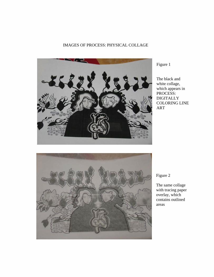
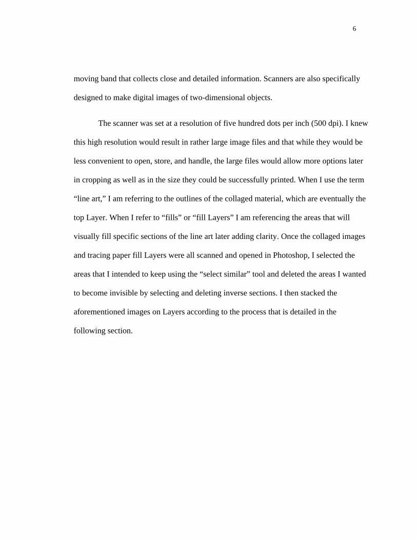
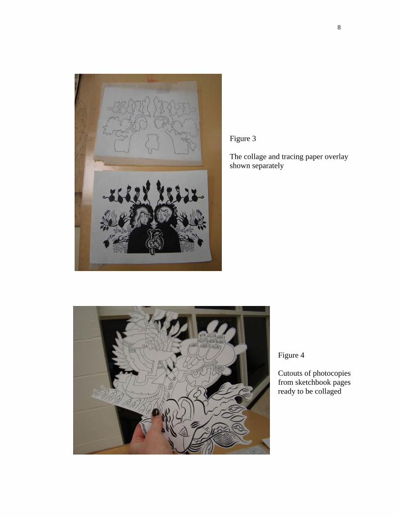
IMAGES OF PROCESS: PHYSICAL COLLAGE
Figure 1 The black and white collage, which appears in PROCESS: DIGITALLY COLORING LINE ART
Figure 2 The same collage with tracing paper overlay, which contains outlined areas
8
Figure 3 The collage and tracing paper overlay shown separately
Figure 4 Cutouts of photocopies from sketchbook pages ready to be collaged
9
Figure 5 Photocopied cutouts applied to red tabloid size paper
Figure 6 Photocopied elements combined on a page
10
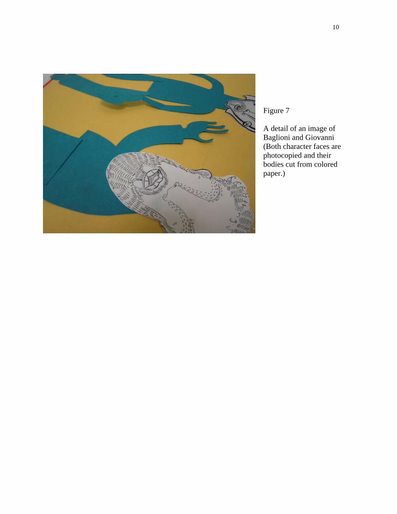
Figure 7 A detail of an image of Baglioni and Giovanni (Both character faces are photocopied and their bodies cut from colored paper.)
11
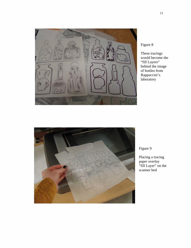
Figure 8 These tracings would become the “fill Layers” behind the image of bottles from Rappaccini’s laboratory
Figure 9 Placing a tracing paper overlay “fill Layer” on the scanner bed
12
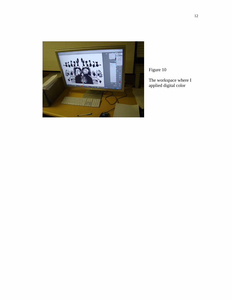
Figure 10 The workspace where I applied digital color
PROCESS: DIGITALLY COLORING LINE ART
The scanner I used to apply digital color to linear images is a thirteen by nineteen inch
Epson 1000XL. I placed the prepared line art face down on the scanner bed and used the
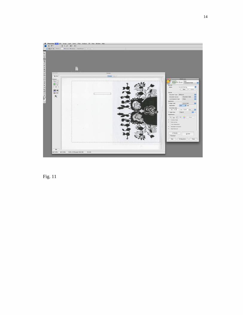
scanner’s edge to ensure that it was straight. I opened Photoshop and navigated to FILE,
then to IMPORT, selected Epson Expression 10000XL, and changed the scanner settings
to 500dpi and 24-bit color. I then adjusted the marquee and clicked the SCAN button as
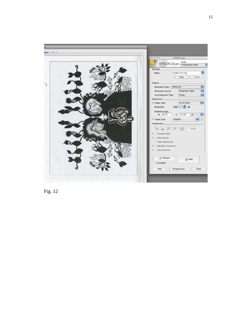
in Figure 11. Figure 12 is a detail of Figure 11.
14
Fig. 11
15
Fig. 12
16
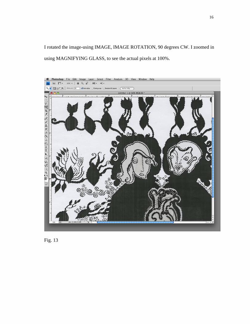
I rotated the image-using IMAGE, IMAGE ROTATION, 90 degrees CW. I zoomed in
using MAGNIFYING GLASS, to see the actual pixels at 100%.
Fig. 13

17
I unchecked CONTIGUOUS (un-checking contiguous ensured that all related areas
would be selected rather than just those areas that were touching one another). While
zoomed in, I selected the line art using the MAGIC WAND tool. I held down the SHIFT
key while clicking on additional areas of line art, which needed to be added to the
selection. I then used the key command APPLE zero to view the entire image in the
window checking that all necessary line art was included in the selection.
Fig. 14
18
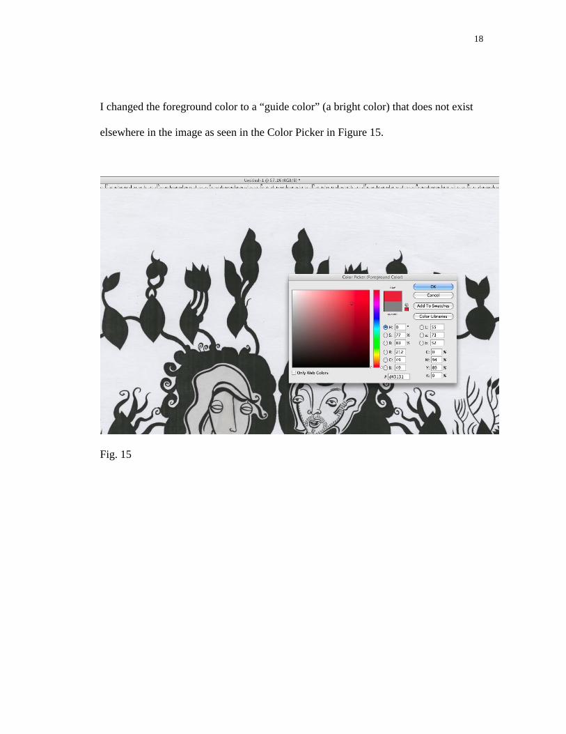
I changed the foreground color to a “guide color” (a bright color) that does not exist
elsewhere in the image as seen in the Color Picker in Figure 15.
Fig. 15
19
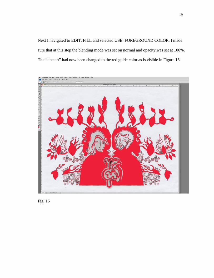
Next I navigated to EDIT, FILL and selected USE: FOREGROUND COLOR. I made
sure that at this step the blending mode was set on normal and opacity was set at 100%.
The “line art” had now been changed to the red guide color as is visible in Figure 16.
Fig. 16
20
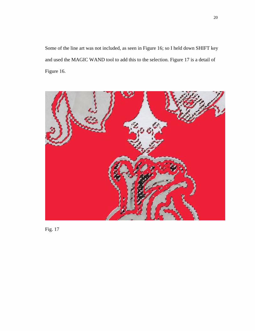
Some of the line art was not included, as seen in Figure 16; so I held down SHIFT key
and used the MAGIC WAND tool to add this to the selection. Figure 17 is a detail of
Figure 16.
Fig. 17
21
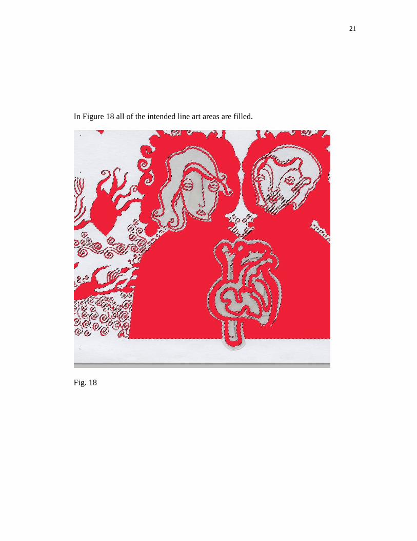
In Figure 18 all of the intended line art areas are filled.
Fig. 18
22
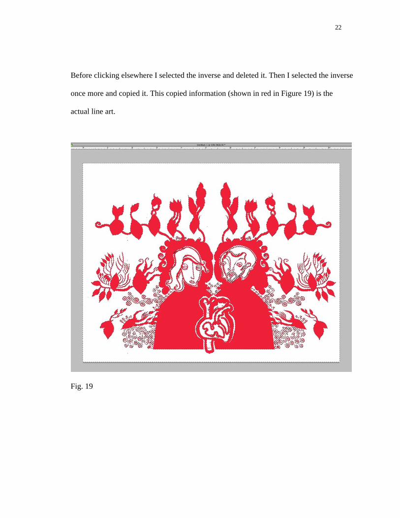
Before clicking elsewhere I selected the inverse and deleted it. Then I selected the inverse
once more and copied it. This copied information (shown in red in Figure 19) is the
actual line art.
Fig. 19
23
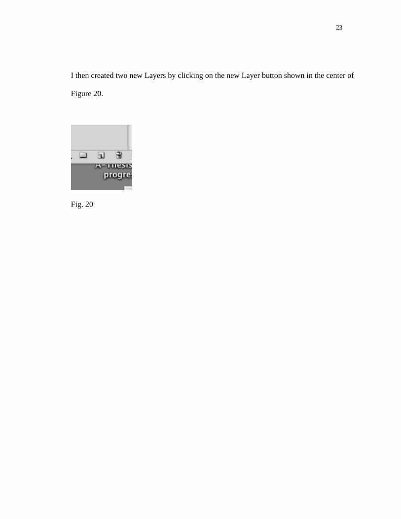
I then created two new Layers by clicking on the new Layer button shown in the center of
Figure 20.
Fig. 20
24
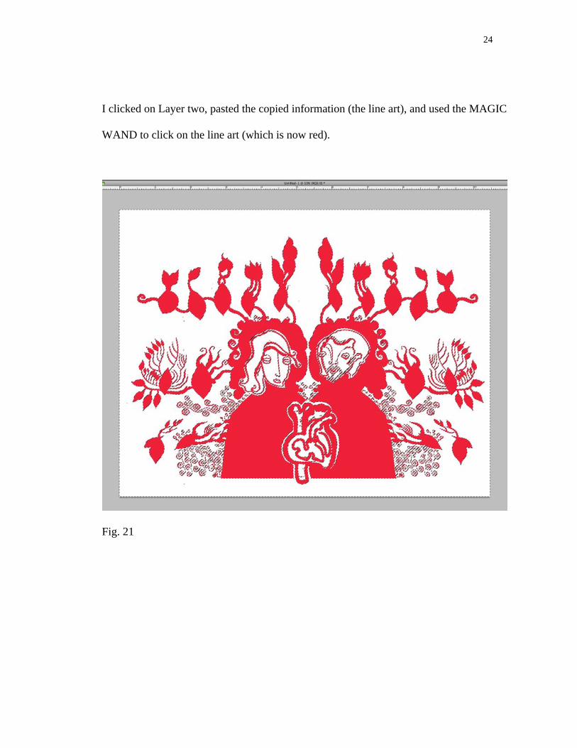
I clicked on Layer two, pasted the copied information (the line art), and used the MAGIC
WAND to click on the line art (which is now red).
Fig. 21
25
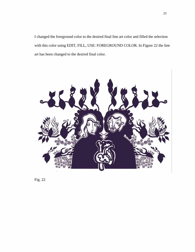
I changed the foreground color to the desired final line art color and filled the selection
with this color using EDIT, FILL, USE: FOREGROUND COLOR. In Figure 22 the line
art has been changed to the desired final color.
Fig. 22
26
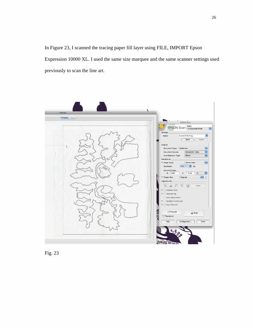
In Figure 23, I scanned the tracing paper fill layer using FILE, IMPORT Epson
Expression 10000 XL. I used the same size marquee and the same scanner settings used
previously to scan the line art.
Fig. 23
27
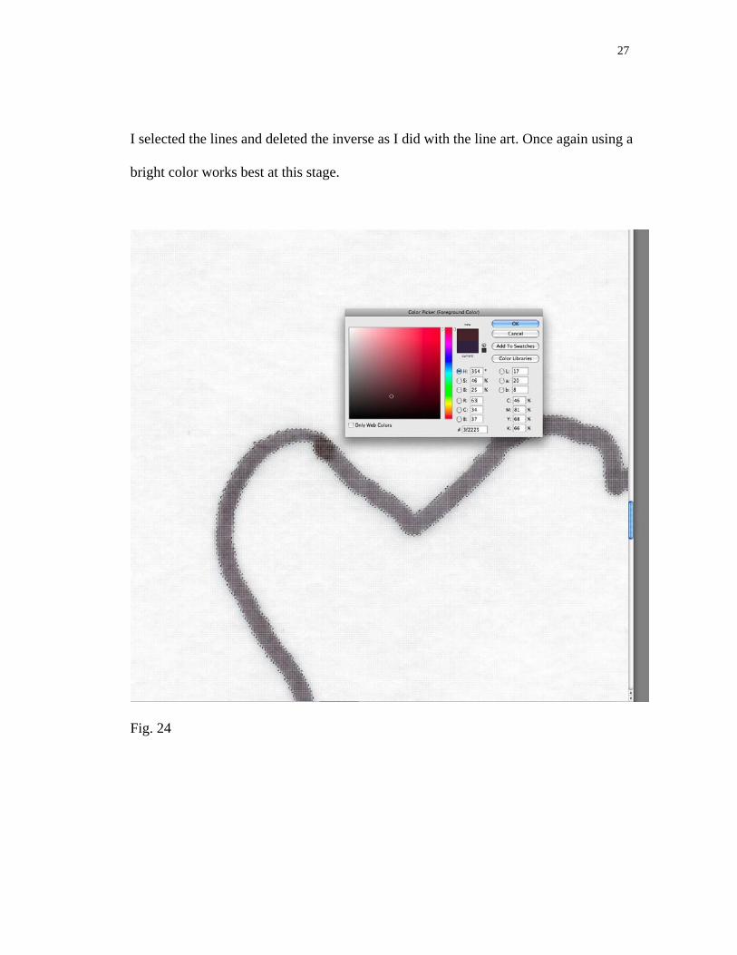
I selected the lines and deleted the inverse as I did with the line art. Once again using a
bright color works best at this stage.
Fig. 24
28
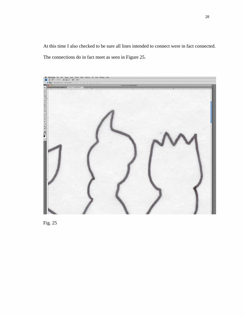
At this time I also checked to be sure all lines intended to connect were in fact connected.
The connections do in fact meet as seen in Figure 25.
Fig. 25
29
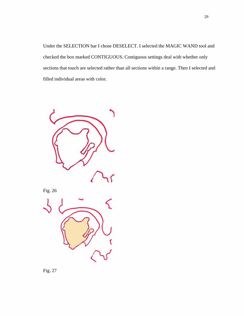
Under the SELECTION bar I chose DESELECT. I selected the MAGIC WAND tool and
checked the box marked CONTIGUOUS. Contiguous settings deal with whether only
sections that touch are selected rather than all sections within a range. Then I selected and
filled individual areas with color.
Fig. 26
Fig. 27
30
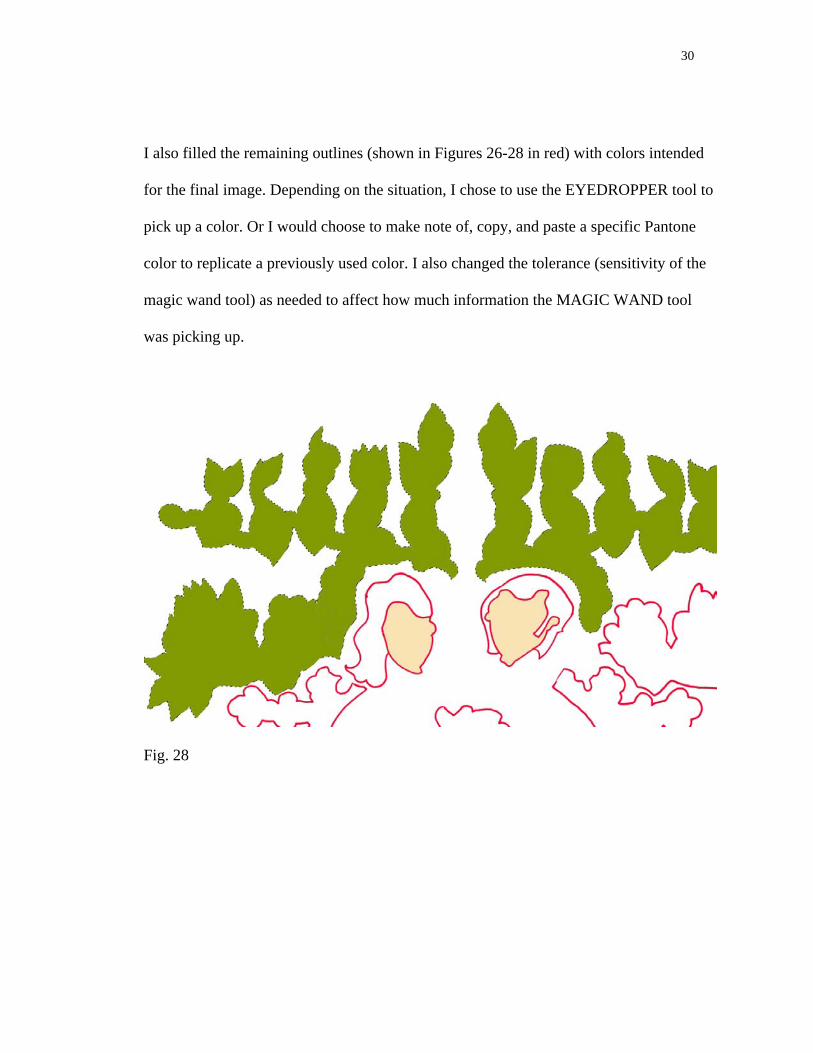
I also filled the remaining outlines (shown in Figures 26-28 in red) with colors intended
for the final image. Depending on the situation, I chose to use the EYEDROPPER tool to
pick up a color. Or I would choose to make note of, copy, and paste a specific Pantone
color to replicate a previously used color. I also changed the tolerance (sensitivity of the
magic wand tool) as needed to affect how much information the MAGIC WAND tool
was picking up.
Fig. 28
31
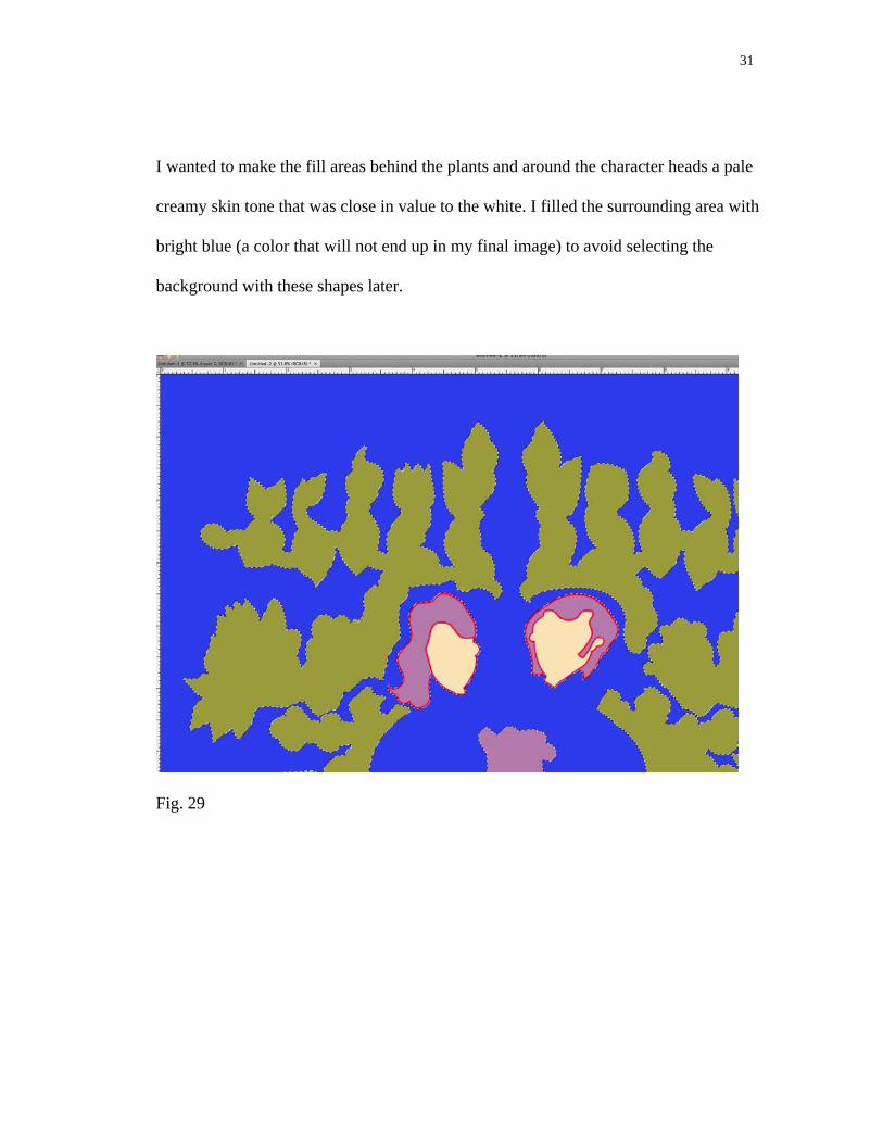
I wanted to make the fill areas behind the plants and around the character heads a pale
creamy skin tone that was close in value to the white. I filled the surrounding area with
bright blue (a color that will not end up in my final image) to avoid selecting the
background with these shapes later.
Fig. 29
32
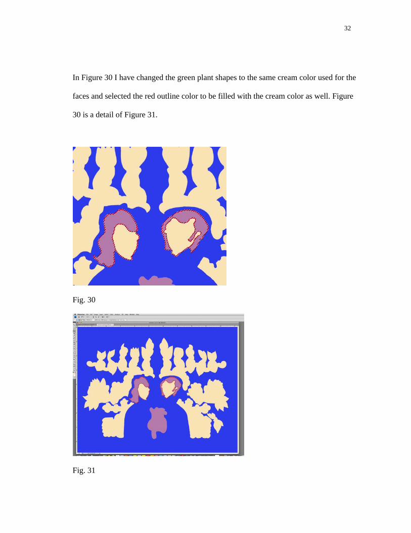
In Figure 30 I have changed the green plant shapes to the same cream color used for the
faces and selected the red outline color to be filled with the cream color as well. Figure
30 is a detail of Figure 31.
Fig. 30
Fig. 31
33
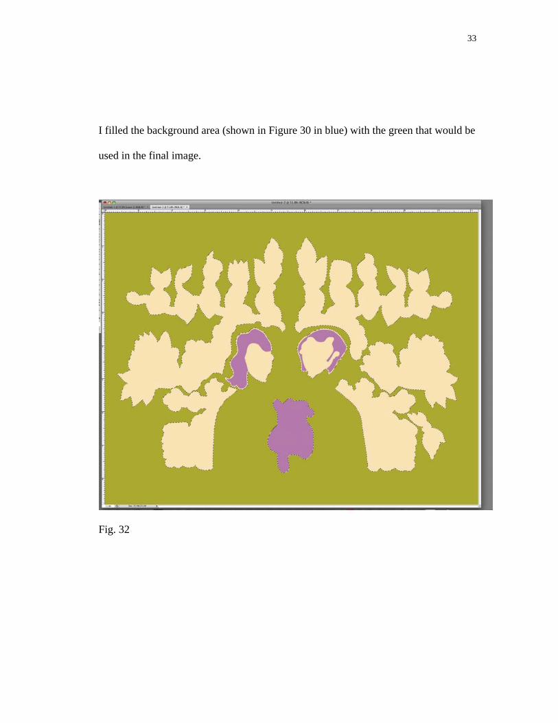
I filled the background area (shown in Figure 30 in blue) with the green that would be
used in the final image.
Fig. 32
34
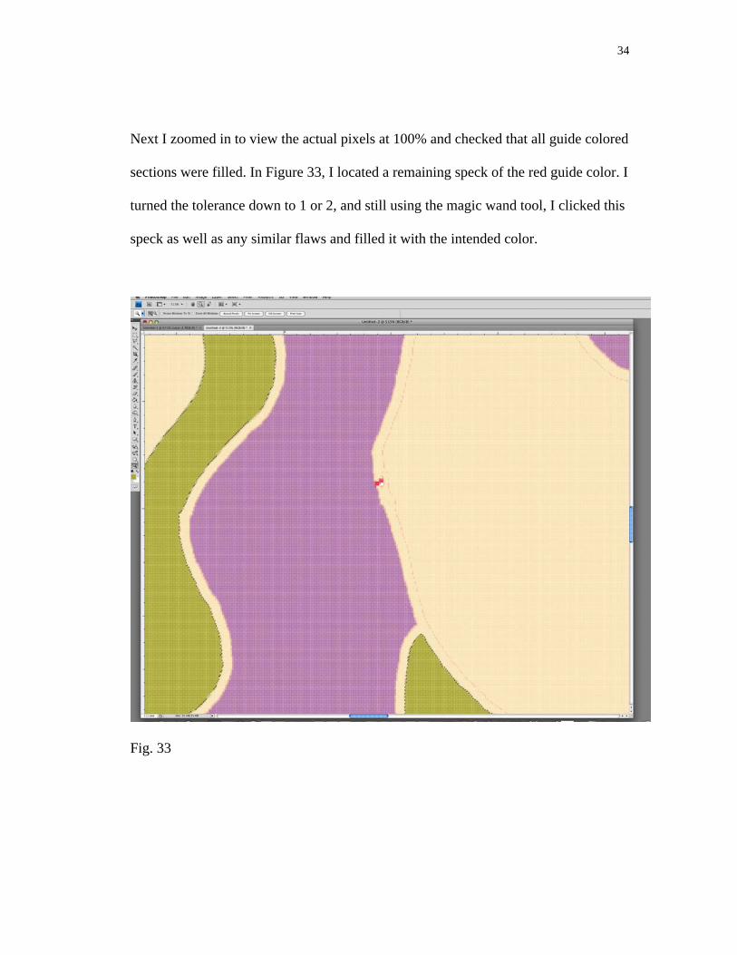
Next I zoomed in to view the actual pixels at 100% and checked that all guide colored
sections were filled. In Figure 33, I located a remaining speck of the red guide color. I
turned the tolerance down to 1 or 2, and still using the magic wand tool, I clicked this
speck as well as any similar flaws and filled it with the intended color.
Fig. 33
35
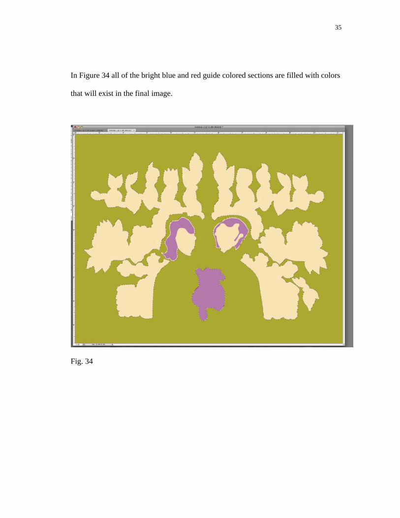
In Figure 34 all of the bright blue and red guide colored sections are filled with colors
that will exist in the final image.
Fig. 34
36
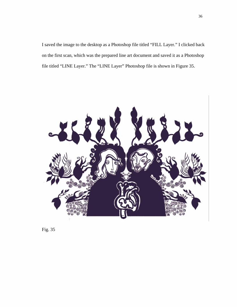
I saved the image to the desktop as a Photoshop file titled “FILL Layer.” I clicked back
on the first scan, which was the prepared line art document and saved it as a Photoshop
file titled “LINE Layer.” The “LINE Layer” Photoshop file is shown in Figure 35.
Fig. 35
37
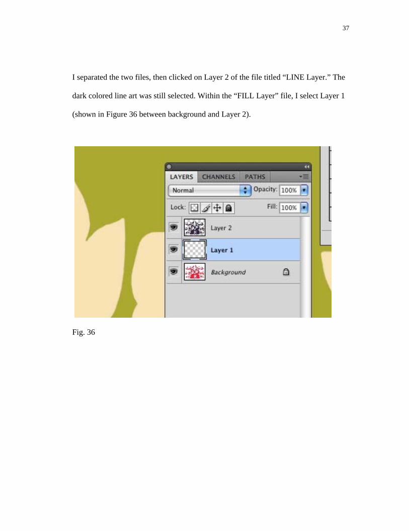
I separated the two files, then clicked on Layer 2 of the file titled “LINE Layer.” The
dark colored line art was still selected. Within the “FILL Layer” file, I select Layer 1
(shown in Figure 36 between background and Layer 2).
Fig. 36

38
I clicked back on the “fill Layer” file. Created a new Layer (Layer 1). On the Background
Layer, I selected all and copied this selection and pasted it onto Layer 1.
Fig. 37
39
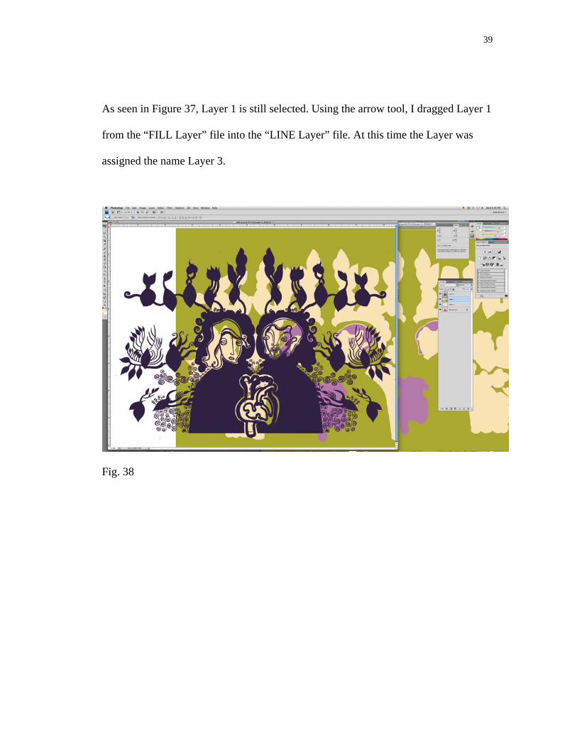
As seen in Figure 37, Layer 1 is still selected. Using the arrow tool, I dragged Layer 1
from the “FILL Layer” file into the “LINE Layer” file. At this time the Layer was
assigned the name Layer 3.
Fig. 38

40
I clicked on the image frame and moved the Layer until it fit comfortably behind the line
art, which was on Layer 2.
Fig. 39
41
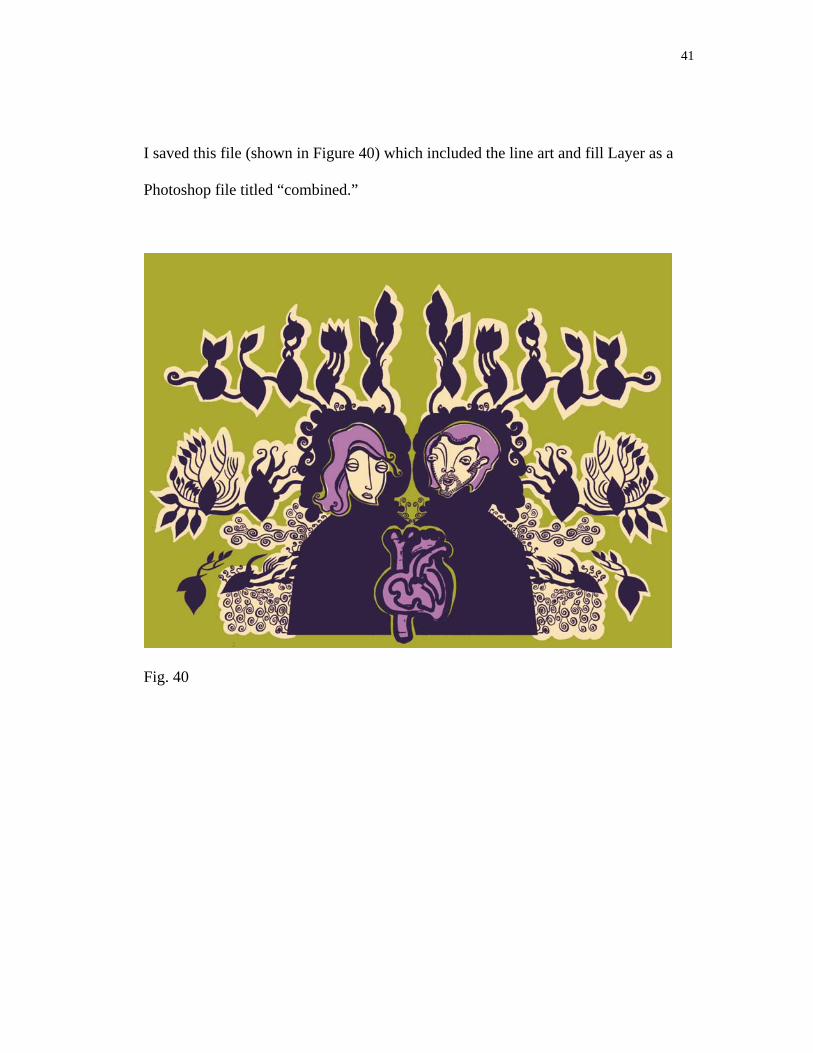
I saved this file (shown in Figure 40) which included the line art and fill Layer as a
Photoshop file titled “combined.”
Fig. 40

42
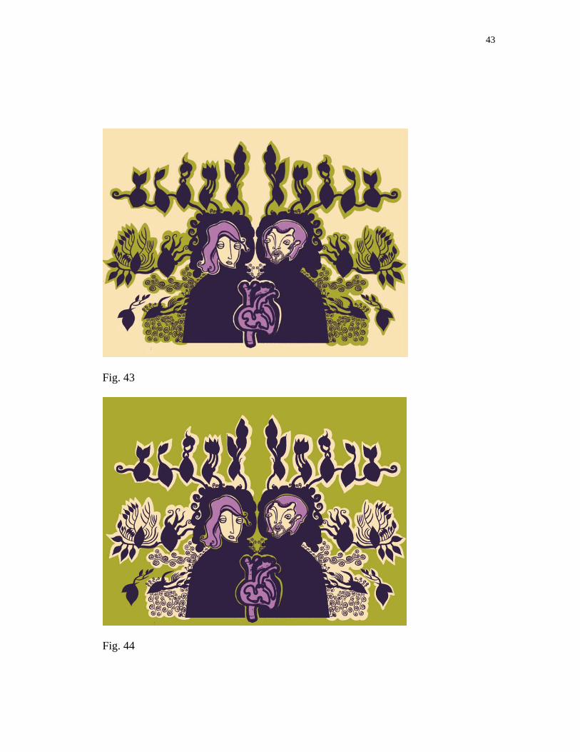
At this stage I easily adjusted colors and tried several color combinations. Figures 41-44
are examples of several color combinations applied to the image.
Fig. 41
Fig. 42
43
Fig. 43
Fig. 44
44
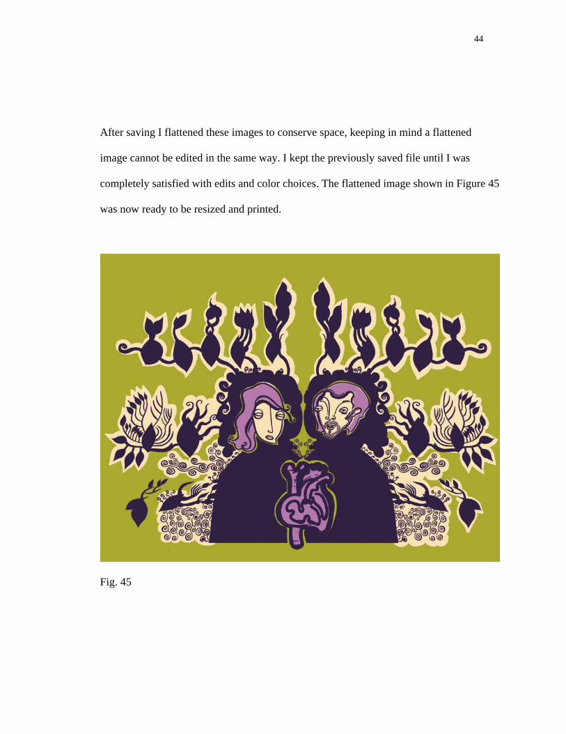
After saving I flattened these images to conserve space, keeping in mind a flattened
image cannot be edited in the same way. I kept the previously saved file until I was
completely satisfied with edits and color choices. The flattened image shown in Figure 45
was now ready to be resized and printed.
Fig. 45
INSTALLATION: OBJECTS IN SPACE
The completed digital illustrations were displayed in an environment I created in
the gallery space. I chose to install fabric and paper flowers that played off the colors in
the images and balanced the composition of the space. I hung the images in groups rather
than at eye level around the room to create visual balance. I was essentially composing
the entire room as a painting. I chose to include a couch that related well to the color
scheme. The couch, flowers, and fabric bathed the room in color. The couch also invited
viewers to rest and view the images from a slightly different point of view. I also chose to
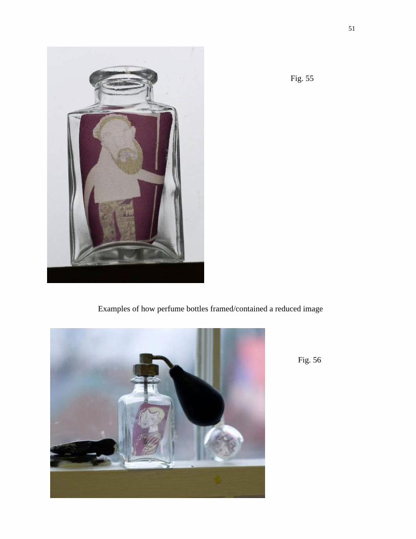
use my maternal grandmother’s collection of antique perfume bottles to contain some
smaller prints of my digital illustrations printed on vellum. The bottles were feminine and
decorative, and functioned as picture frames in how they contained, protected, and
displayed images.
The following is a series of images of the “Rappaccini’s Daughter” installation.
These images demonstrate the appearance of the exhibition as it was installed in the
gallery space.

46
Fig. 46 A view upon initially entering the room that housed my thesis exhibition
Fig. 47 The green velvet couch with four digital illustrations displayed above it
47
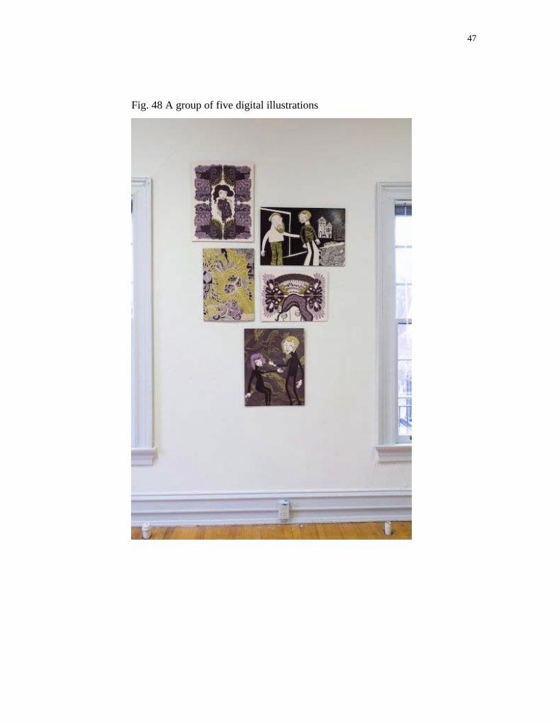
Fig. 48 A group of five digital illustrations
48
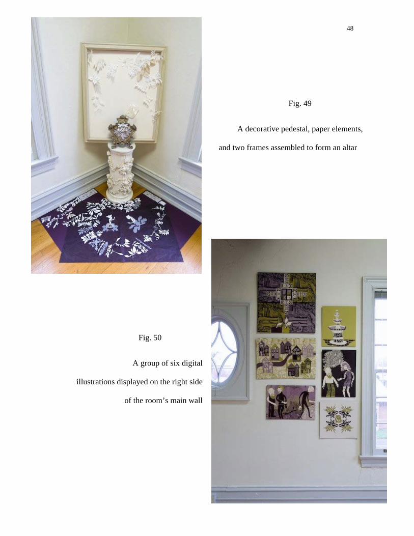
Fig. 49
A decorative pedestal, paper elements,
and two frames assembled to form an altar
Fig. 50
A group of six digital
illustrations displayed on the right side
of the room’s main wall
49
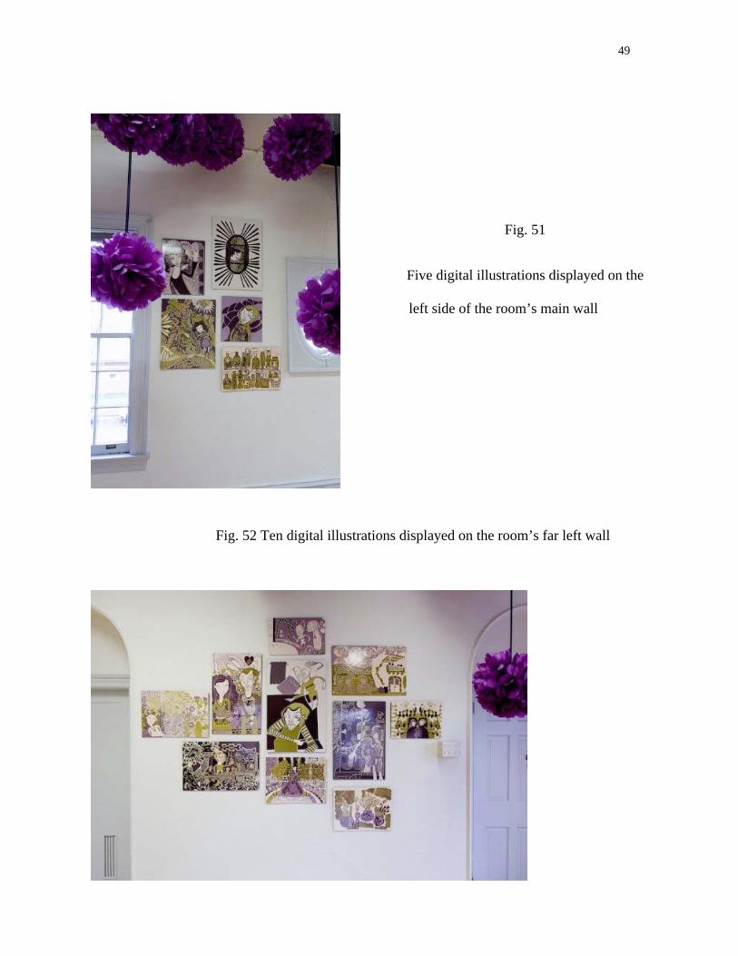
Fig. 51
Five digital illustrations displayed on the
left side of the room’s main wall
Fig. 52 Ten digital illustrations displayed on the room’s far left wall

50
Fig. 53
A detail of a paper element that was
suspended from the draped fabric
Fig. 54 A view of how an illustration was displayed within the space
51
Fig. 55
Examples of how perfume bottles framed/contained a reduced image
Fig. 56
52
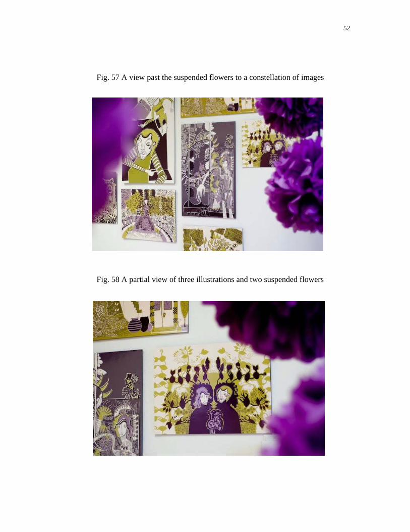
Fig. 57 A view past the suspended flowers to a constellation of images
Fig. 58 A partial view of three illustrations and two suspended flowers

ILLUSTRATIONS
The following are the final digital illustrations along with titles.
54
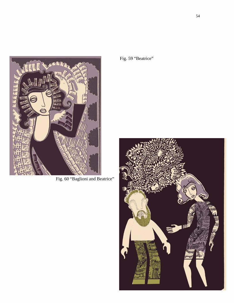
Fig. 59 “Beatrice”
Fig. 60 “Baglioni and Beatrice”
55
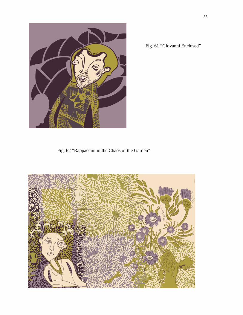
Fig. 61 “Giovanni Enclosed”
Fig. 62 “Rappaccini in the Chaos of the Garden”
56
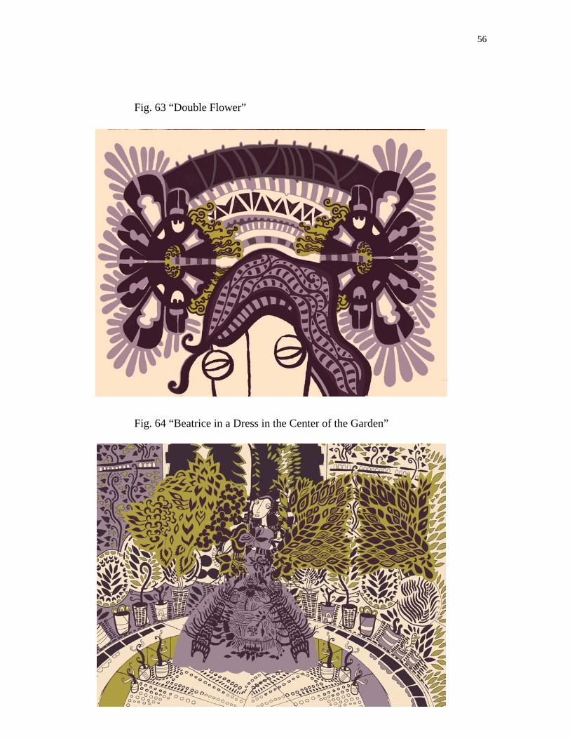
Fig. 63 “Double Flower”
Fig. 64 “Beatrice in a Dress in the Center of the Garden”
57
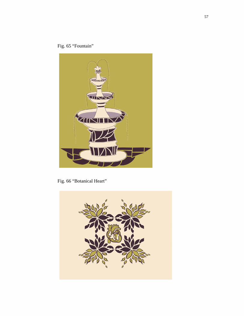
Fig. 65 “Fountain”
Fig. 66 “Botanical Heart”
58
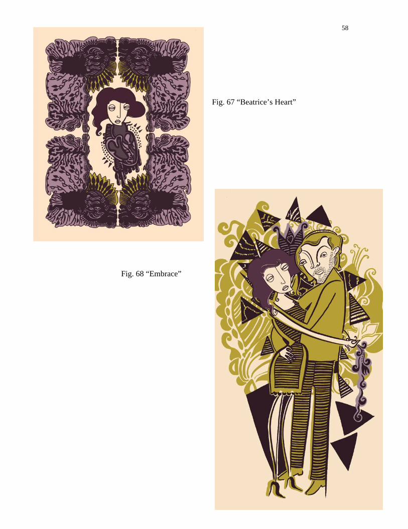
Fig. 67 “Beatrice’s Heart”
Fig. 68 “Embrace”
59
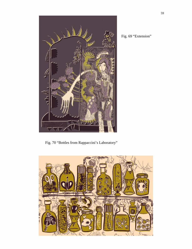
Fig. 69 “Extension”
Fig. 70 “Bottles from Rappaccini’s Laboratory”

60
Fig. 71
“Outside
View of the
Villa”
Fig. 72
“Beatrice
as Plant”
61
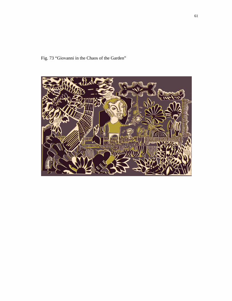
Fig. 73 “Giovanni in the Chaos of the Garden”
62
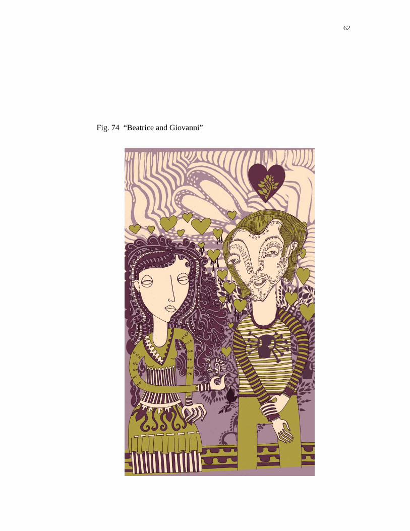
Fig. 74 “Beatrice and Giovanni”

63
Fig. 75 “Beatrice in Pattern”
Fig. 76 “Conflict in the Garden”
.
64
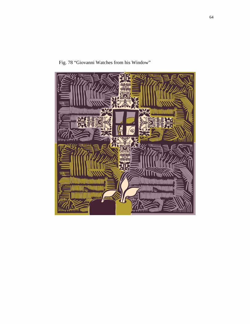
Fig. 78 “Giovanni Watches from his Window”
CONCLUSION
My creative responses to “Rappaccini’s Daughter” took the form of over a
hundred collages. Sixty of the collages were colored digitally and twenty-six were
displayed in the exhibition. Through this creative thesis I discovered an image-making
process that combined hands on work and the digital realm. The illustrations were
intuitive they were composed of repeating botanical elements and populated by the
stylized characters common to my work. The installation I created to showcase the series
of digital illustrations served to express the relationship between my intuitive creative
studio practices with the final illustrations. My purpose in creating this series of digital
illustrations was to bring Hawthorne’s famous and fascinating story to a new audience.
REFERENCES
The Best of Hawthorne. New York: Ronald Company, 1951. Print.
Critical Companion To Nathaniel Hawthorne: A Literary Reference to His Life and
Work. New York: Facts On File Inc, 2007. Print.
"Criticism of "Rappaccini's Daughter"" Virginia Commonwealth University. Web. 15
Feb. 2010. <http://www.vcu.edu/engweb/eng372/rappcrit.htm>.
Hawthorne's Conception of the Creative Process. Cambridge, Massachusetts: Harvard
UP, 1965. Print.
La Nouvelle Beatrice: Renaissance and Romance in "Rappaccini's Daughter" New
Brunswick: Rutgers UP, 1985. Print.
"Literary Criticism of Rappaccinis Daughter | Bookstove." Bookstove | Books, Literature.
Web. 15 Feb. 2010. <http://bookstove.com/classics/literary-criticism-of-
rappaccinis-daughter/>.
Nathaniel Hawthorne A Modest Man. Westport Connecticut: Greenwood, 1970. Print.
Nathaniel Hawthorne Captain of the Imagination. New York: Vanguard, 1968. Print.
Nathaniel Hawthorne. Minneapolis: University of Minnesota, 1962. Print.
Nathaniel Hawthorne. New Haven: College & UP, 1965. Print. Twayne's United States
Authors Ser.

Nathaniel Hawthorne The Man, His Tales and Romances. New York: Continuum, 1989.
Print.
Twice-Told Tales. New York: A.L. Burt Company, 1935. Print.