Embed Size (px)
Citation preview

Passion Driven Statistics:A Supportive, Project-Based, Multidisciplinary, Introductory Course
QAC201

CHAPTER 1
An Introduction
Overview
This statistics course is presented in the service of a project of your choosing and will offer you an intensive hands-on experi-ence in the quantitative research process. You will develop skills in 1) generating testable hypotheses; 2) understanding large data sets; 3) formatting and managing data; 4) conduct-ing descriptive and inferential statistical analyses; and 5) pre-senting results for expert and novice audiences. It is designed for students who are interested in developing skills that are useful for working with data and using statistical tools to ana-lyze them. No prior experience with data or statistics is re-quired.

ResourcesThis course is unlike any you have likely encountered in that you will be driving the content and direction of your own learning. In many ways we will be asking more from you than any other introductory course ever has. To support you in this challenge, there are a number of useful resources.
This Book: This book integrates the applied steps of a re-search project with the basic knowledge needed to meaning-fully engage in quantitative research. Much of the background on descriptive and inferential statistics has been drawn from the Open Learning Initiative, a not-for-profit educational project aimed at transforming instruction and improving learning outcomes for students.
Empowerment Through Statistical Computing: While there is widespread argument that introductory students need to learn statistical programming, opinions differ widely both within and across disciplines about the specific statistical soft-ware program that should be used. While many introductory
statistics courses cover the practical aspects of using a single software package, our focus will be more generally on comput-ing as a skill that will expand your capacity for statistical appli-cation and for engaging in deeper levels of quantitative reason-ing. Instead of providing “canned” exercises for you to repeat, you will be provided with flexible syntax for achieving a host of data management and analytic tasks in the pursuit of an-swers to questions of greatest interest to you. Most impor-tantly, syntax for four major packages (R, SAS, Stata, and SPSS) will be presented in the context of each step of the re-search process. While you will work in only one package, these resources were developed to help you move more easily be-tween and among statistical software packages as you con-tinue to conduct quantitative research in the future.
Loads of Support: Through the in-class workshop sessions and peer group exchanges, a great deal of individualized sup-port will be available to you. Taking advantage of this large amount of support means that you are succeeding in making the most of your experience in this course.
Network Drive: To provide access to data, software-specific programs, and the reliable backup of your work, you will also be using the course network drive (P:/QAC/QAC201). While you will have read/write access to your own folder, you will have read access to all of the folders, including those of other students. Aside from providing a centralized way to share files, the network drive is meant to function as a resource in support of collaboration. Put simply, our hope is that you work together!
2
Our approach is “statistics in the service of questions.” As such, the research question that you choose (from data sets made available to you) is of paramount importance to your learning experience. It must interest you enough that you will be willing to spend many hours thinking about it and analyzing data having to do with it.

An Introduction to Statistics
___________________Statistics plays a significant role across the physical and social sciences and is arguably the most salient point of intersection between diverse disciplines given that researchers constantly communicate information on varied topics through the com-mon language of statistics.
In a nutshell, what statistics is all about is converting data into useful information. Statistics is therefore a process where we are:
• Collecting Data
• Summarizing Data, and
• Interpreting Data
The process of statistics starts when we identify what group we want to study or learn something about. We call this group the population. Note the word “population” here (and in the entire course) is not just used to refer to people; it is used in the more broad statistical sense, where population can refer not only to people, but also to animals, things, etc. For exam-ple, we might be interested in:
• The opinions of the population of U.S. adults about thedeath penalty
• How the population of mice react to a certain chemical
• The average price of the population of all one-bedroomapartments in a certain city
Population, then, is the entire group that is the target of our interest.
In most cases, the population is so large that as much as we want to, there is absolutely no way that we can study all of it (imagine trying to get opinions of all U.S. adults about the death penalty...).
A more practical approach would be to examine and collect data only from a sub-group of the population, which we call a sample. We call this first step, which involves choosing a sam-ple and collecting data from it, Producing Data.
Since, for practical reasons, we need to compromise and exam-ine only a sub-group of the population rather than the whole
3
population, we should make an effort to choose a sample in such a way that it will represent the population as well.
For example, if we choose a sample from the population of U.S. adults, and ask their opinions about the death penalty, we do not want our sample to consist of only Republicans or only Democrats.
Once the data have been collected, what we have is a long list of answers to questions, or numbers, and in order to explore and make sense of the data, we need to summarize that list in a meaningful way. This second step, which consists of summa-rizing the collected data, is called Exploratory Data Analysis.
Now we’ve obtained the sample results and summarized them, but we are not done. Remember that our goal is to study the population, so what we want is to be able to draw conclusions about the population based on the sample results. Before we can do so, we need to look at how the sample we’re using may differ from the population as a whole, so that we can factor that into our analysis.
Finally, we can use what we’ve discovered about our sample to draw conclusions about our population. We call this final step Inference. This is the Big Picture of Statistics.
Since we will be relying on data that has already been produced, the focus of your individual project will be exploratory and inferential data analysis.
4
EXAMPLE
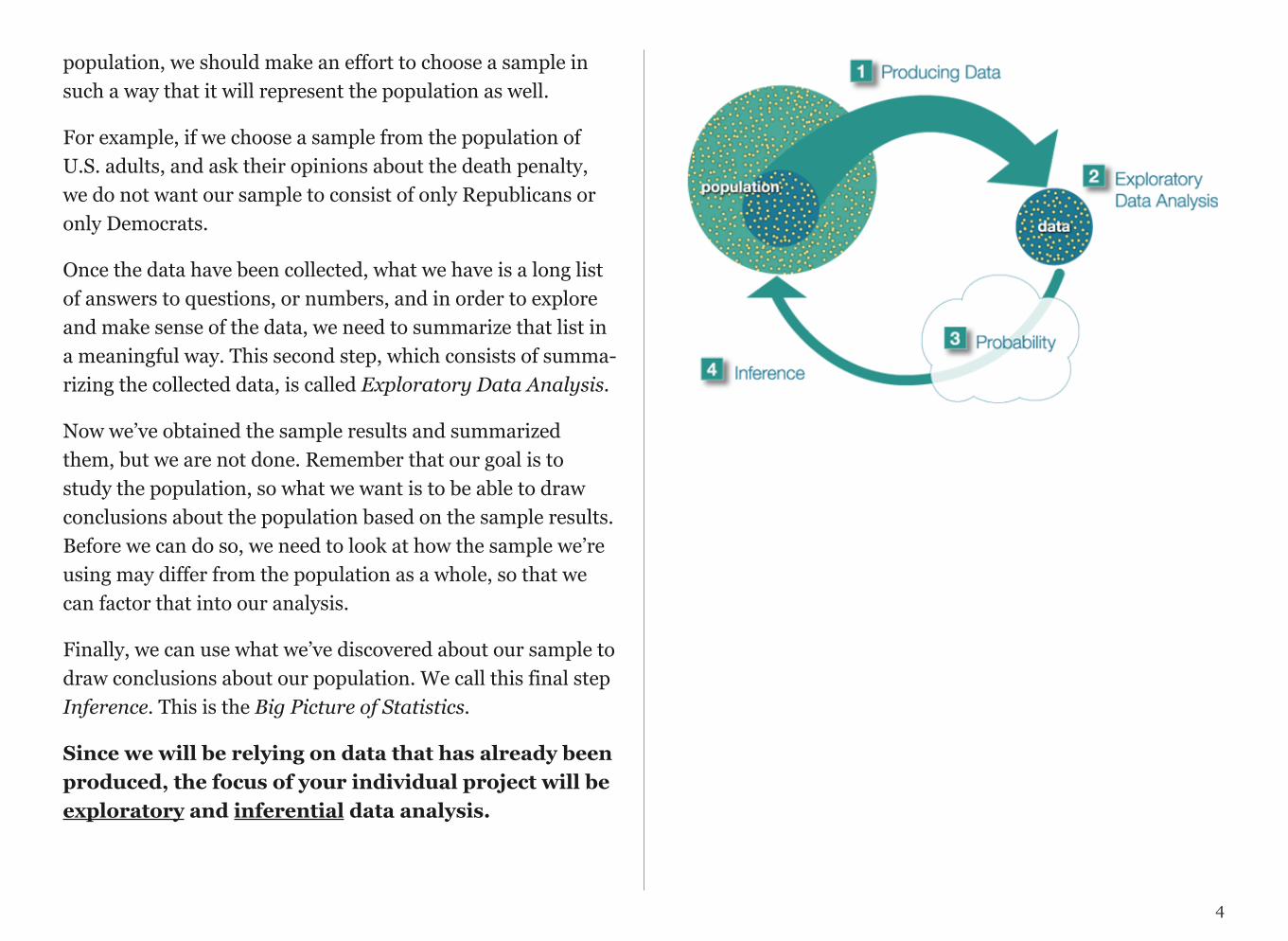
At the end of April 2005, a poll was conducted (by ABC News and the Washington Post), for the purpose of learning the opinions of U.S. adults about the death penalty.
1. Producing Data: A (representative) sample of 1,082 U.S. adultswas chosen, and each adult was asked whether he or she favored oropposed the death penalty.
2. Exploratory Data Analysis (EDA): The collected data wassummarized, and it was found that 65% of the sample’s adults favorthe death penalty for persons convicted of murder.
3. Inference: Based on the sample result (of 65% favoring the deathpenalty), it was concluded (within 95% confidence) that thepercentage of those who favor the death penalty in the populationis within 3% of what was obtained in the sample (i.e., between 62%and 68%). The following figure summarizes the example:
Final Notes:
Statistics education is often conducted within a discipline specific con-text or as generic mathematical training. Our goal is instead to create meaningful dialogue across disciplines. Ultimately, this experience is aimed at helping you on your way to engaging in interdisciplinary schol-arship at the highest levels.
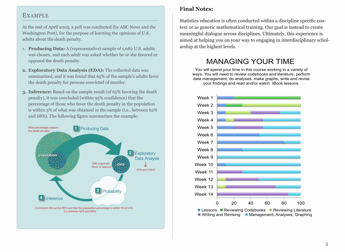
MANAGING YOUR TIME You will spend your time in this course working in a variety of
ways. You will need to review codebooks and literature, perform data management, do analyses, make graphs, write and revise
your findings and read and/or watch IBook lessons.
0 20 40 60 80 100
Week 1
Week 2
Week 3
Week 4
Week 5
Week 6
Week 7
Week 8
Week 9
Week 10
Week 11
Week 12
Week 13
Week 14
!!Lessons!!!!!Reviewing Codebooks !!Reviewing Literature !! Writing and Revising !!Management, Analyses, Graphing
5

CHAPTER 2
Data Sets and Code Books
Since we will not be producing data for this course, the first step of your project will be to choose a data set (from those made available) that offers the opportunity to conduct research on a general topic that will be of significant interest to you.
A full list will be presented in class. Here are a few examples:

Available Data Sets
The U.S. National Longitudinal Survey of Adolescent Health (AddHealth) is representative school-based survey of adolescents in grades 7-12 in the United States.
The U.S. National Epidemiological Survey on Alcohol and Related Conditions (NESARC) is a survey designed to determine the magnitude of alcohol use and psychiatric dis-orders in the U.S. population. It is a representative sample of the non-institutionalized popu-lation 18 years and older.
The Mars Craters Study (http://craters.sjrdesign.net) created by Stuart Robbins, presents a global database that in-cludes over 300,000 Mars craters 1 km or larger. Heavily cra-tered terrain on Mars was created between 4.2 and 3.8 billion years ago during a period of heavy bombardment (i.e. impacts of asteroids, proto-planets, and comets). Mars craters allow inferences into the ancient climate of Mars, and they add a key data point for the understand-ing of impact physics.
The Gapminder (http://www.gapminder.org/) data set includes numerous country-level indicators of health, wealth and development. For this course, the available data includes the most complete and recent indicators from 160+ countries.
7
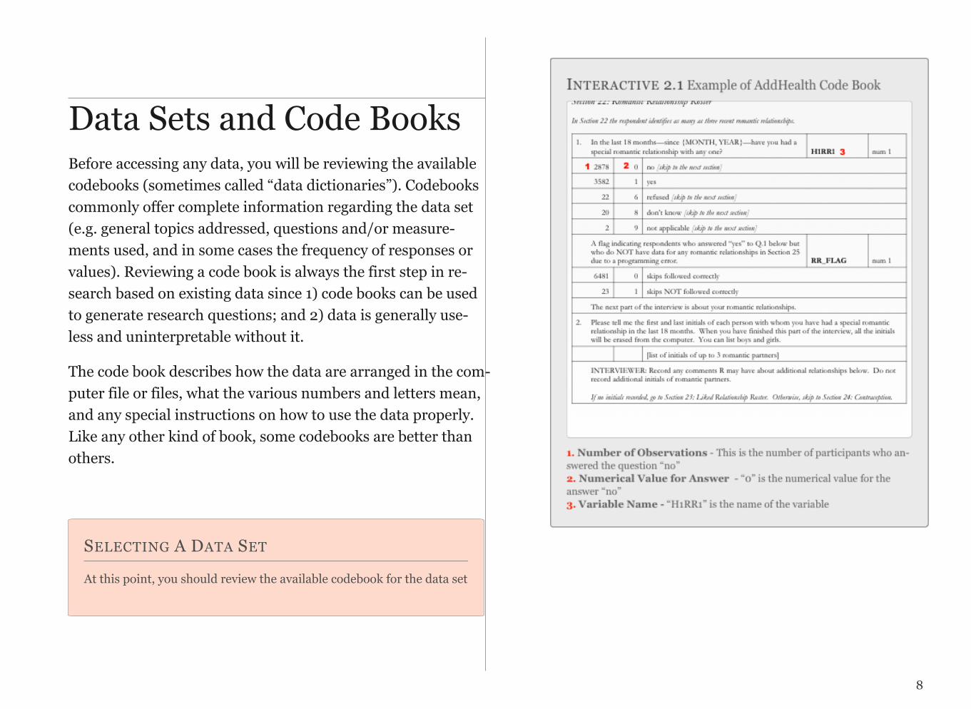
Data Sets and Code BooksBefore accessing any data, you will be reviewing the available codebooks (sometimes called “data dictionaries”). Codebooks commonly offer complete information regarding the data set (e.g. general topics addressed, questions and/or measure-ments used, and in some cases the frequency of responses or values). Reviewing a code book is always the first step in re-search based on existing data since 1) code books can be used to generate research questions; and 2) data is generally use-less and uninterpretable without it.
The code book describes how the data are arranged in the com-puter file or files, what the various numbers and letters mean, and any special instructions on how to use the data properly. Like any other kind of book, some codebooks are better than others.
SELECTING A DATA SET
At this point, you should review the available codebook for the data set
8

SELECTING A DATA SET ASSIGNMENT
Select a data set that you will work with. Submit through Moodle the abbreviated title of that data set (e.g. AddHealth, NESARC, Mars Crater, Gapminder, etc.).
In the same Moodle text box that you just typed the name of your data set, copy/paste the URL of your Tumblr blog.
9
CHAPTER 3
Data Architecture
What do we really mean by data?
Data are pieces of information about individuals or observa-tions organized into variables. By an individual or observa-tion, we mean a particular person or object. By a variable, we mean a particular characteristic of the individual or observa-tion.
A dataset is a collection of information, usually presented in tabular form. Each column represents a particular variable. Each row corresponds to a given individual (or observation) within the dataset.
Relying on datasets, statistics pulls all of the behavioral, physi-cal and social sciences together. It’s arguably the one language that we all have in common. While you may think that data is very, very different from discipline to discipline, it isn’t. What you measure is different, and your research question is obvi-ously dramatically different; whom you observe and whom you collect data from -- or what you collect data from -- can be very different, but once you have the data, approaches to analyzing it statistically are quite similar regardless of individual discipline.
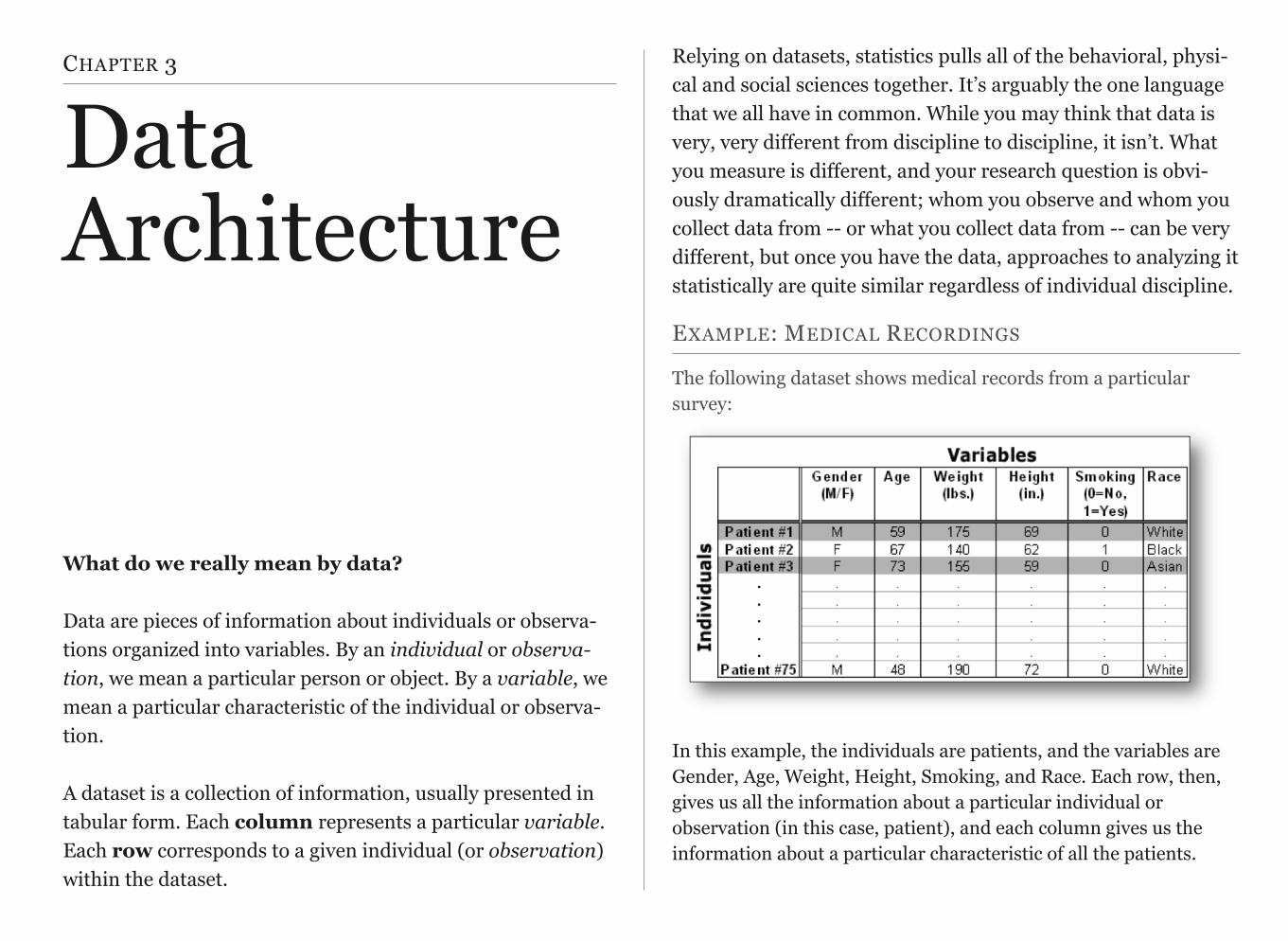
EXAMPLE: MEDICAL RECORDINGS
The following dataset shows medical records from a particular survey:
In this example, the individuals are patients, and the variables are Gender, Age, Weight, Height, Smoking, and Race. Each row, then, gives us all the information about a particular individual or observation (in this case, patient), and each column gives us the information about a particular characteristic of all the patients.
EXAMPLE: MEDICAL RECORDINGS (CONTINUED)
Variables can be classified into one of two types: quantitative or categorical.
• Quantitative Variables take numerical values andrepresent some kind of measurement
• Categorical Variables take category or label values andplace an individual into one of several groups. In ourexample of medical records, there are several variablesof each type:
• Age, Weight, and Height are quantitative variables
• Race, Gender, and Smoking are categorical variables
Notice that the values of the categorical variable, Smoking, have been coded as the numbers 0 or 1. It is quite common to code the values of a categorical variable as numbers, but you should remember that these are just codes (often called dummy codes). They have no arithmetic meaning (i.e., it does not make sense to add, subtract, multiply, divide, or compare the magnitude of such values.)
A unique identifier is a variable that is meant to distinctively define each of the individuals or observations in your data set. Examples might include serial numbers (for data on a particular product), social security numbers (for data on individual persons), or random numbers (generated for any type of observations). Every data set should have a variable that uniquely identifies the observations. In this
example, the patient number (1 through 75) is a unique identifier.
MEDICAL RECORDS ASSIGNMENT
Although you will be working with previously collected data, it is important to understand what data looks like as well as how it is coded and entered into a spreadsheet or dataset for analysis.
Using medical records for 5 patients seeking treatment in a hospital emergency room.
1. Select 4 variables recorded on the medical forms (one should bea unique identifier, at least one should be a quantitative variableand at least one should be a categorical variable)
2. Select a brief name (ideally 8 characters or less) for each variable
3. Determine what range of values is needed for recording eachvariable (create dummy codes as needed)
4. Label variables within an Excel spreadsheet
5. Enter data for each patient in the Excel spreadsheet
6. List the variable names, labels, types, and, response codes belowthe data set (i.e. the code book).
7. Post the Excel spreadsheet on your blog site.
11
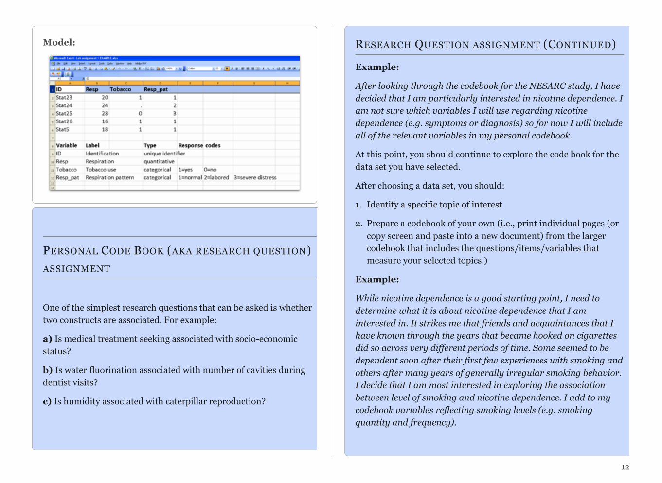
Model:
PERSONAL CODE BOOK (AKA RESEARCH QUESTION)
ASSIGNMENT
One of the simplest research questions that can be asked is whether two constructs are associated. For example:
a) Is medical treatment seeking associated with socio-economicstatus?
b) Is water fluorination associated with number of cavities duringdentist visits?
c) Is humidity associated with caterpillar reproduction?
RESEARCH QUESTION ASSIGNMENT (CONTINUED)
Example:
After looking through the codebook for the NESARC study, I have decided that I am particularly interested in nicotine dependence. I am not sure which variables I will use regarding nicotine dependence (e.g. symptoms or diagnosis) so for now I will include all of the relevant variables in my personal codebook.
At this point, you should continue to explore the code book for the data set you have selected.
After choosing a data set, you should:
1. Identify a specific topic of interest
2. Prepare a codebook of your own (i.e., print individual pages (orcopy screen and paste into a new document) from the largercodebook that includes the questions/items/variables thatmeasure your selected topics.)
Example:
While nicotine dependence is a good starting point, I need to determine what it is about nicotine dependence that I am interested in. It strikes me that friends and acquaintances that I have known through the years that became hooked on cigarettes did so across very different periods of time. Some seemed to be dependent soon after their first few experiences with smoking and others after many years of generally irregular smoking behavior. I decide that I am most interested in exploring the association between level of smoking and nicotine dependence. I add to my codebook variables reflecting smoking levels (e.g. smoking quantity and frequency).
12

13
During a second review of the codebook for the dataset that you have selected, you should:
1. Identify a second topic that you would like to explore in termsof its association with your original topic
2. Add questions/items/variables documenting this second topicto your personal codebook.
Following completion of the steps described above, show your instructor and peer mentor (in class) a hard copy of your personal codebook. Keep this in a folder or binder for your own use throughout the course.

CHAPTER 4
Conducting a Literature Review
At this point you have (1) generated a personal codebook re-flecting variables of interest to you from your data set; and (2) selected an association that you would like to test. You are now ready to conduct a literature review using primary source journal articles (i.e. those reporting original research findings).
This video describes the nature and content of primary source journal articles. It highlights the importance of conducting a literature review before initiating a research project.
Click here to view Movie 4.1 on Literature Review (6:06).
You should start your search using key words based on the two topics you have selected (note: search for their presence in the title of articles). You can then narrow your search as necessary based on the amount of relevant literature that you find.
Although some libraries have extensive paper collections of journals, you should focus on articles available online.
Secondary source literature including review articles and theoretical papers should be used only for needed back-ground on a topic.
MOVIE 4.1 Literature Review
It is important to identify and review primary sources either through your on-line search or by using the reference list from primary or secondary sources.
It may also be useful to limit your search to journal articles published in the past 5 years.
Note that as you read the literature, there should be an ex-change between your research question and what you are learning. The literature review may cause you to add to the complexity of your research question, further focus that question, or even abandon the question for another.
LITERATURE REVIEW
During your literature review, you should:
1. Identify primary source articles that address the association that you have decided to examine
2. Download relevant articles.
3. Read the articles that seem to test the association most directly.
4. Identify replicated and equivocal findings in order to generate a more focused question that may add to the literature. Give special attention to the “future research” sections of the articles that you read
5. Based on the literature, select additional questions/items/variables that may help you to understand the association of interest. In doing so, further refine your research question. Add relevant documentation (i.e. code book pages) to your personal codebook.
Example:
Given the association that I have decided to examine, I use such keywords as nicotine dependence, tobacco dependence, and smoking. After reading through several titles and abstracts, I notice that there has been relatively little attention in the research literature to the association between smoking exposure and nicotine dependence. I expand a bit to include other substance use that provides relevant background as well.
15

References:
Caraballo, R. S., Novak, S. P., & Asman, K. (2009). Linking quantity and frequency profiles of cigarette smoking to the presence of nicotine dependence symptoms among adolescent smokers: Findings from the 2004 National Youth Tobacco Survey. Nicotine & Tobacco Research, 11(1), 49-57.
Chen, K., Kandel, D.,(2002). Relationship between extent of cocaine use and dependence among adolescents and adults in the United States. Drug & Alcohol Dependence. 68, 65-85.
Chen, K., Kandel, D. B., Davies, M. (1997). Relationships between frequency and quantity of marijuana use and last year proxy dependence among adolescents and adults in the United States.Drug & Alcohol Dependence. 46, 53-67.
Decker, L., He, J. P., Kalaydjian, A., Swendsen, J., Degenhardt, L., Glantz, M., Merikangas, K. (2008). The importance of timing of transitions for risk of regular smoking and nicotine dependence. Annals of Behavioral Medicine, 36(1), 87-92.
Decker, L. C., Donny, E., Tiffany, S., Colby, S. M., Perrine, N., Clayton, R. R., & Network, T. (2007). The association between cigarette smoking and DSM-IV nicotine dependence among first year college students. Drug and Alcohol Dependence, 86(2-3), 106-114.
Lessov-Schlaggar, C. N., Hops, H., Brigham, J., Hudmon, K. S., Andrews, J. A., Tildesley, E., . . . Swan, G. E. (2008). Adolescent smoking trajectories and nicotine dependence. Nicotine & Tobacco Research, 10(2), 341-351.
Riggs, N. R., Chou, C. P., Li, C. Y., & Pentz, M. A. (2007). Adolescent to emerging adulthood smoking trajectories: When do smoking trajectories diverge, and do they predict early adulthood nicotine dependence? Nicotine & Tobacco Research, 9(11), 1147-1154.
Van De Ven, M. O. M., Greenwood, P. A., Engels, R., Olsson, C. A., & Patton, G. C. (2010). Patterns of adolescent smoking and later nicotine dependence in young adults: A 10-year prospective study. Public Health, 124(2), 65-70.
Based on my reading of the above articles as well as others, I have noted a few common and interesting themes:
1. While it is true that smoking exposure is a necessary require-ment for nicotine dependence, frequency and quantity of smok-ing are markedly imperfect indices for determining an individ-ual’s probability of exhibiting nicotine dependence (this is truefor other drugs as well)
2. The association may differ based on ethnicity, age, and gender(although there is little work on this)
3. One of the most potent risk factors consistently implicated inthe etiology of smoking behavior and nicotine dependence isdepression
I have decided to further focus my question by examining whether the association between nicotine dependence and depres-sion differs based on how much a person smokes. I am wonder-ing if at low levels of smoking compared to high levels, nicotine dependence is more common among individuals with major de-pression than those without major depression.
I add relevant depression questions/items/variables to my per-sonal codebook as well as several demographic measures (age, gender, ethnicity, etc.) and any other variables I may wish to con-sider.
16

CITATION ASSIGNMENT
Describe the association that you have decided to examine and key words you found helpful in your search. List at least 5 of the more appropriate references that you have found and read (TO RECEIVE CREDIT, YOU MUST USE ENDNOTE FOR THIS ASSIGNMENT). Describe findings and interesting themes that you have uncovered and list a tentative research question or two that you hope to pursue. Be brief and use bullets to cover these details. Post this on your blog site.
The example text on the previous two pages is a model for this assignment.
17

CHAPTER 5
Writing About Empirical Research
The goal of research is to disseminate your work and allow it to guide further study. As such, writing is an important and ongo-ing part of the research process.
Successful empirical writing minimizes descriptive or complex language so methodologies, conclusions, and theories are acces-sible to readers from all areas of expertise. Although this sounds easy, it is difficult to write clearly and concisely—espe-cially when writing an empirical paper for the first time. What follows is information about how you should structure your pa-per, so you can focus on precise writing. We offer advice on
how to write each section of a research proposal for an empirical paper; we discuss how to use evidence and sources in empirical writing; finally, we present conventions for empirical writing.
Writing a Research Proposal for Empirical Research
An empirical paper has six sections: title and abstract, introduc-tion, methodology, results, discussion, and references. A research proposal often has five sections: title, introduction, methodology, predicted results or implications, and references. Both paper types should have an “hourglass” shape: introduce broad statements, narrow to specific methodologies, and conclusions, and then broaden again to discuss the general significance and implications of your work. Thus, the beginning of your introduction and end of your discussion should contain your broadest statements, and the methodology and results sections should contain your most spe-cific statements.
Title
A title should summarize the main idea of your research question. It should be a concise statement of the main topic and should iden-tify the actual variables under investigation and the relationship between them. An example of a good title is “The association be-tween weather patterns and caterpillar reproduction”. A title should be fully explanatory when standing alone. You should avoid words that serve no useful purpose. For example, the words “method” and “results” do not normally appear in a title, nor should such redundancies as “A Study of” or “An Experimental
Investigation of” begin a title. Also, do not use causal lan-guage, for example, “the impact of”, “the effect of”, etc. Fi-nally, avoid using abbreviations in a title.
Model Title: The Association between Nicotine Dependence and Major Depression at Different Levels of Smoking Exposure
Introduction
The introduction describes the question you intend to investi-gate and how your research relates to other work in the field. It comprises opening statements and a literature review.
Opening Statements. Opening statements introduce your topic and rationale for study but are accessible to both non-specialists and specialists. Successful opening statements gradually introduce your topic with examples and explicit, if nontechnical, definitions of crucial terms. Avoid introducing the formal theory if one motivates your research and jargon specific to your topic; doing so makes your introduction seem forbidding to non-specialists and intellectually masturbatory to specialists. However, oversimplifying your opening state-ments will make your introduction seem condescending to non-specialists and boring to specialists.
Literature Review. The literature review summarizes the state of the field you investigate. Each statement in the literature re-view should build to the justification of your own research by identifying a hole in existing scholarship. Emphasize major
findings and key conclusions rather than citing tangentially related works. Assume your reader is basically knowledgeable about your topic rather than writing an exhaustive review. The following is a successful section of a literature review:
Through to the mid-1990s, most research suggested that academic censor-ship reduced college students’ respect for authority. However, results were inconsistent. In a landmark two-year case study of college student social dynamics, Jones (1996) found that college students’ respect for authority declined significantly after censorship was imposed. However, Jones relied exclusively on objective measures rather than self-reported measures of re-spect for authority.
Observe that the first two sentences identify trends in the lit-erature, the third sentence emphasizes major findings, and the fourth sentence suggests gaps in the literature that the pre-sent study will fill. Moreover, this literature review is success-ful because it summarizes findings and can be understood by specialists and non-specialists alike. Strive for this level of pre-cision in your literature review.
Important: The main evidence used in an empirical paper is data. Opinions and paraphrased statements, even if they corroborate your claim, are not evidence unless accompanied by empirical results.
The main sources used in an empirical paper are primary sources such as journal articles. When researching a topic, use the literature review and references sections of secondary sources to find primary sources related to your topic. When
19
searching online databases, look for articles that have been cited by other authors.
It is important to note that the literature review is an ar-gument that sets the stage for your research question. It is not an exhaustive review of research details.
Research Questions. Your introduction should build to and con-clude with the research questions or study objectives that you will address.
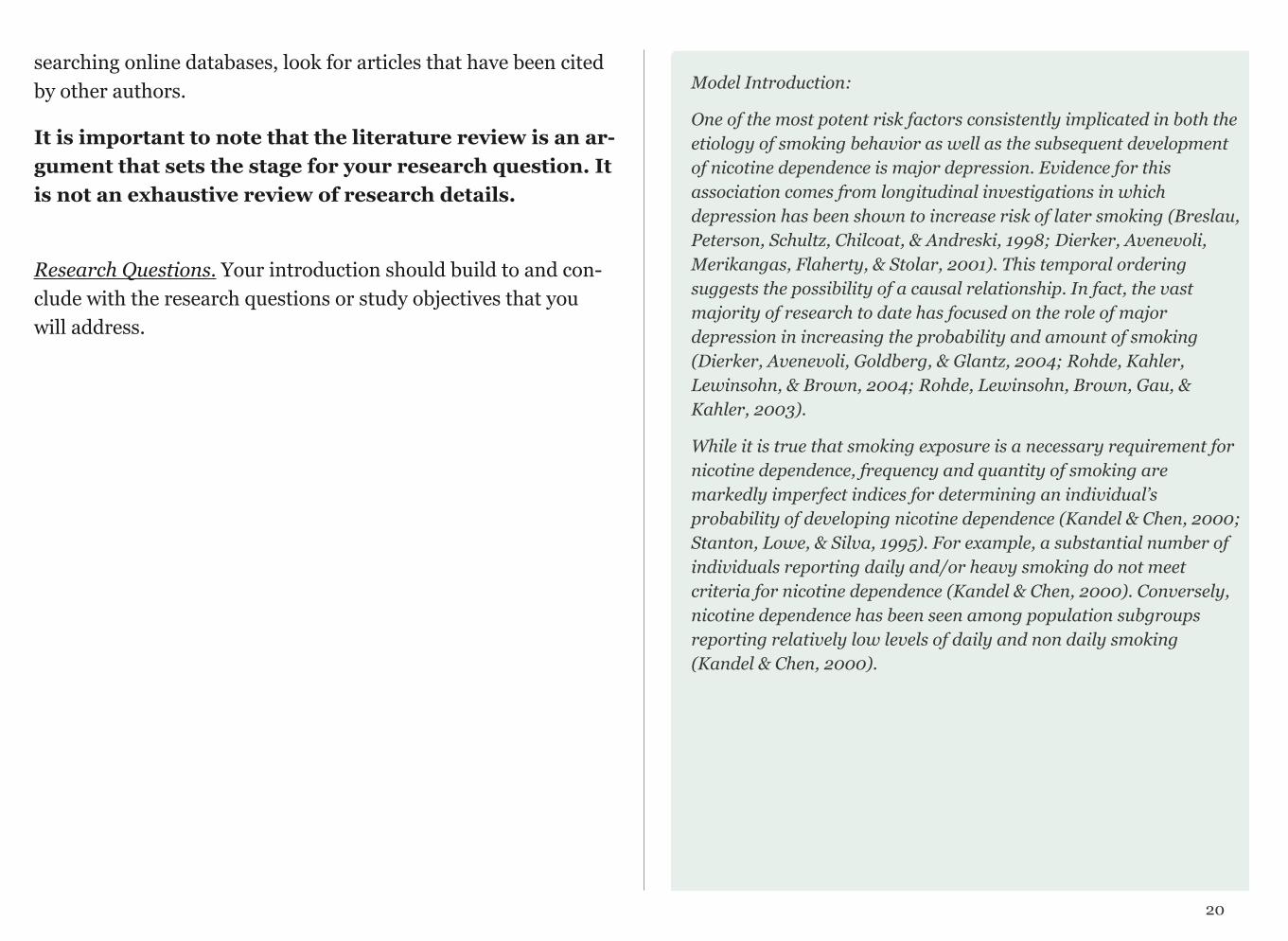
Model Introduction:
One of the most potent risk factors consistently implicated in both the etiology of smoking behavior as well as the subsequent development of nicotine dependence is major depression. Evidence for this association comes from longitudinal investigations in which depression has been shown to increase risk of later smoking (Breslau, Peterson, Schultz, Chilcoat, & Andreski, 1998; Dierker, Avenevoli, Merikangas, Flaherty, & Stolar, 2001). This temporal ordering suggests the possibility of a causal relationship. In fact, the vast majority of research to date has focused on the role of major depression in increasing the probability and amount of smoking (Dierker, Avenevoli, Goldberg, & Glantz, 2004; Rohde, Kahler, Lewinsohn, & Brown, 2004; Rohde, Lewinsohn, Brown, Gau, & Kahler, 2003).
While it is true that smoking exposure is a necessary requirement for nicotine dependence, frequency and quantity of smoking are markedly imperfect indices for determining an individual’s probability of developing nicotine dependence (Kandel & Chen, 2000; Stanton, Lowe, & Silva, 1995). For example, a substantial number of individuals reporting daily and/or heavy smoking do not meet criteria for nicotine dependence (Kandel & Chen, 2000). Conversely, nicotine dependence has been seen among population subgroups reporting relatively low levels of daily and non daily smoking (Kandel & Chen, 2000).
20

A complementary or alternate role that major depression may play is as a cause or signal of greater sensitivity to nicotine dependence, over and above an individual’s level of smoking exposure. While major depression has been shown to increase an individual’s probability of smoking initiation, regular use and nicotine dependence, it remains unclear whether it may signal greater sensitivity for nicotine dependence regardless of smoking quantity.
The present study will examine young adults from the National Epidemiologic Survey of Alcohol and Related Conditions (NESARC). The goals of the analysis will include 1) establishing the relationship between major depression and nicotine dependence; and 2) determining whether or not the relationship between major depression and nicotine dependence exists above and beyond smoking quantity.
Methods
The methods section describes how the research was conducted. It comprises discussions of your sample, measures, and proce-dures.
Sample. Identify who or what was studied (people, animals, etc.). Identify the level of analysis studied (individual, group, or aggre-gate). Describe observations vividly so your reader can distinguish them clearly. If you group observations, use meaningful names (“Low-Income Women”) rather than abbreviations (“PPM100”) or labels (“Control Group”). The following is successful section of a sample description:
The sample of 1,203 pregnant women was drawn from two public prenatal clinics in Texas and Maryland. The ethnic composition was African American (n = 414, 34.4%), Hispanic, primarily Mexican American (n = 412, 34.2%), and White (n = 377, 31.3%). Most women were between the ages of 20 and 29 years; 30% were teenagers. All were urban residents, and most (94%) had incomes below the pov-erty level as defined using each state’s criteria for Women, Infants, and Children (WIC) eligibility.
This sample description is successful because it identifies both the observations (1,203 pregnant women) and the location (two prena-tal clinics in Texas and Maryland). Furthermore, it describes the composition of the group ethnically and by income using language consistent with writing standards for the empirical research.
Procedures. Explain what participants/observations experienced. Discuss whether data were collected by surveillance, survey, case study, or another method. Discuss where data were collected and
21
the period over which they were collected. Mention observations discarded during data collection in this section, but discuss obser-vations discarded during data analysis in the results section. If ap-propriate, comment on the reliability of data collection here, rather than in the discussion. The following is a successful section of a procedures discussion:
Random sampling was used to recruit participants for this study. Surveyors went to considerable lengths to secure a high completion rate, including up to four call-backs, letters, and in some cases monetary incentives. Trained research assis-tants conducted face-to-face interviews with all study participants.
This procedures description is successful because it describes how the sample was collected (a random survey), which observations were discarded (surveys incomplete after callbacks, letters, and incentives), and how data were collected (during interviews). Con-clude your methodology section with a summary of your proce-dure and its overall purpose.
Measures. Describe the questions or measures of your participants/observations and relate these to the type of data you collected (quantitative or categorical). The following is a success-ful section of a measures discussion:
Attitude toward school was measured with a questionnaire developed for use in this study. It contains nine statements. The first three measure attitudes toward academic subjects; the next three measure attitudes toward teachers, counselors, and administrators; the last three measure attitudes toward the social environ-ment in the school. Participants were asked to rate each statement on a five-point scale from 1 (strongly disagree) to 5 (strongly agree).
This measures discussion is successful because it indicates how attitudes were measured (ranking on a five-point scale).
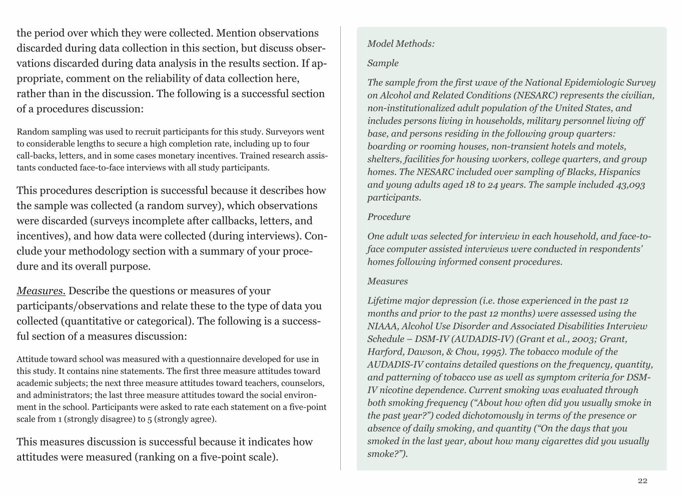
Model Methods:
Sample
The sample from the first wave of the National Epidemiologic Survey on Alcohol and Related Conditions (NESARC) represents the civilian, non-institutionalized adult population of the United States, and includes persons living in households, military personnel living off base, and persons residing in the following group quarters: boarding or rooming houses, non-transient hotels and motels, shelters, facilities for housing workers, college quarters, and group homes. The NESARC included over sampling of Blacks, Hispanics and young adults aged 18 to 24 years. The sample included 43,093 participants.
Procedure
One adult was selected for interview in each household, and face-to-face computer assisted interviews were conducted in respondents’ homes following informed consent procedures.
Measures
Lifetime major depression (i.e. those experienced in the past 12 months and prior to the past 12 months) were assessed using the NIAAA, Alcohol Use Disorder and Associated Disabilities Interview Schedule – DSM-IV (AUDADIS-IV) (Grant et al., 2003; Grant, Harford, Dawson, & Chou, 1995). The tobacco module of the AUDADIS-IV contains detailed questions on the frequency, quantity, and patterning of tobacco use as well as symptom criteria for DSM-IV nicotine dependence. Current smoking was evaluated through both smoking frequency (“About how often did you usually smoke in the past year?”) coded dichotomously in terms of the presence or absence of daily smoking, and quantity (“On the days that you smoked in the last year, about how many cigarettes did you usually smoke?”).
22
Predicted Results or Implications
It is important that this section includes real implications linked to possible results. Often writers use this section to merely state their research question. This is an important section of a research proposal and sometimes best written after you've had a few days to step away from your paper and allow yourself to put your ques-tion (and possible answers) into perspective.
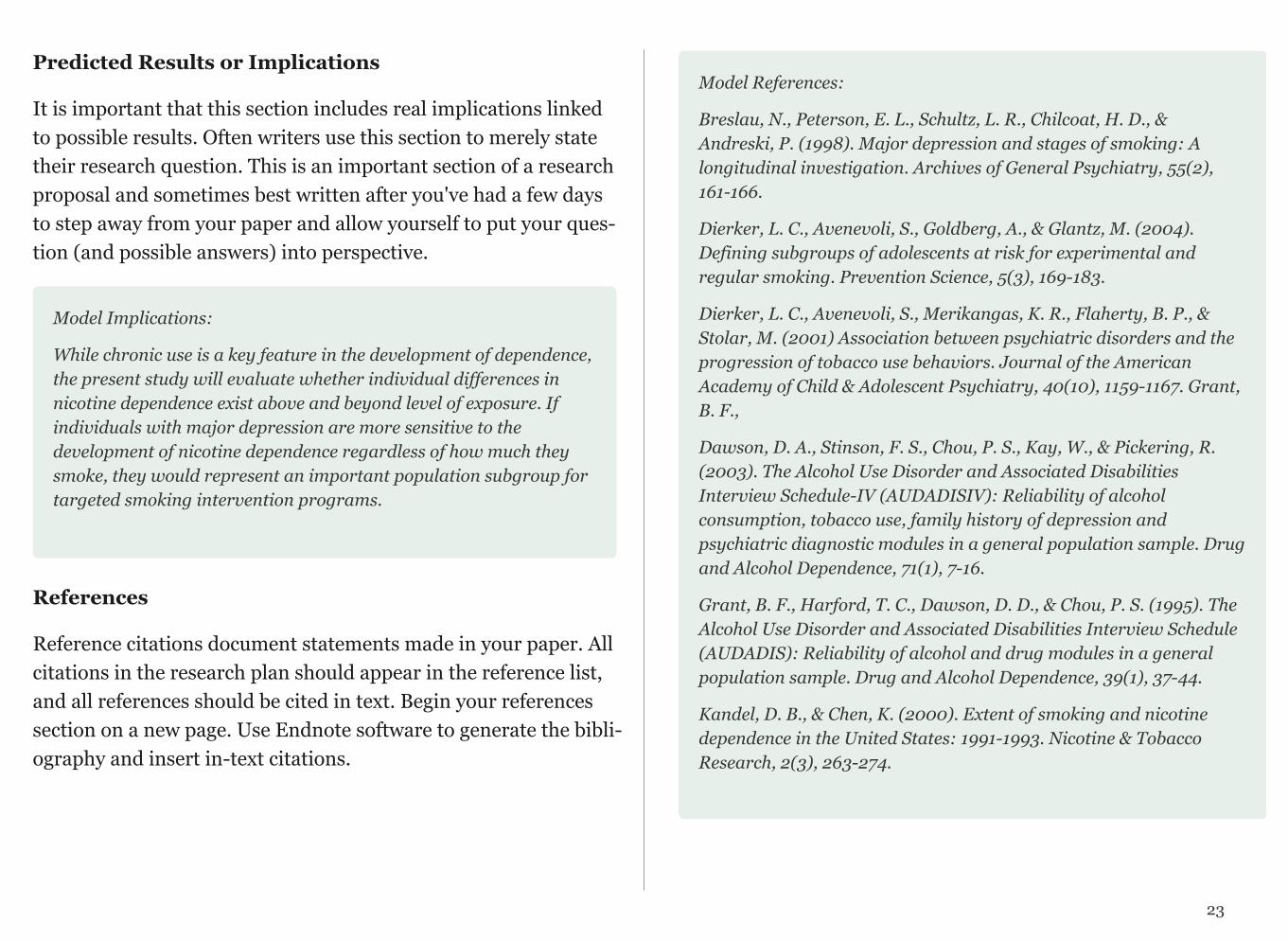
Model Implications:
While chronic use is a key feature in the development of dependence, the present study will evaluate whether individual differences in nicotine dependence exist above and beyond level of exposure. If individuals with major depression are more sensitive to the development of nicotine dependence regardless of how much they smoke, they would represent an important population subgroup for targeted smoking intervention programs.
References
Reference citations document statements made in your paper. All citations in the research plan should appear in the reference list, and all references should be cited in text. Begin your references section on a new page. Use Endnote software to generate the bibli-ography and insert in-text citations.
Model References:
Breslau, N., Peterson, E. L., Schultz, L. R., Chilcoat, H. D., & Andreski, P. (1998). Major depression and stages of smoking: A longitudinal investigation. Archives of General Psychiatry, 55(2), 161-166.
Dierker, L. C., Avenevoli, S., Goldberg, A., & Glantz, M. (2004). Defining subgroups of adolescents at risk for experimental and regular smoking. Prevention Science, 5(3), 169-183.
Dierker, L. C., Avenevoli, S., Merikangas, K. R., Flaherty, B. P., & Stolar, M. (2001) Association between psychiatric disorders and the progression of tobacco use behaviors. Journal of the American Academy of Child & Adolescent Psychiatry, 40(10), 1159-1167. Grant, B. F.,
Dawson, D. A., Stinson, F. S., Chou, P. S., Kay, W., & Pickering, R. (2003). The Alcohol Use Disorder and Associated Disabilities Interview Schedule-IV (AUDADISIV): Reliability of alcohol consumption, tobacco use, family history of depression and psychiatric diagnostic modules in a general population sample. Drug and Alcohol Dependence, 71(1), 7-16.
Grant, B. F., Harford, T. C., Dawson, D. D., & Chou, P. S. (1995). The Alcohol Use Disorder and Associated Disabilities Interview Schedule (AUDADIS): Reliability of alcohol and drug modules in a general population sample. Drug and Alcohol Dependence, 39(1), 37-44.
Kandel, D. B., & Chen, K. (2000). Extent of smoking and nicotine dependence in the United States: 1991-1993. Nicotine & Tobacco Research, 2(3), 263-274.
23

Rohde, P., Kahler, C. W., Lewinsohn, P. M., & Brown, R. A. (2004). Psychiatric disorders, familial factors, and cigarette smoking: II. Associations with progression to daily smoking. Nicotine & Tobacco Research, 6(1), 119-132.
Rohde, P., Lewinsohn, P. M., Brown, R. A., Gau, J. M., & Kahler, C. W. (2003). Psychiatric disorders, familial factors and cigarette smoking: I. Associations with smoking initiation. Nicotine & Tobacco Research, 5(1), 85-98.
Stanton, W. R., Lowe, J. B., & Silva, P. A. (1995). Antecedents of vulnerability and resilience to smoking among adolescents. Journal of Adolescent Health, 16(1), 71-77.
Writing Conventions
Avoid surprises. Lead your reader through your paper. Clearly explain your claims, your evidence, and how your evidence supports your claims. In each section, allude to your next sec-tion.
Avoid direct quotations. Instead, summarize other authors’ work. Include the name and year of an author in-line and in-clude their work in your references section.
Avoid language bias. Refer to people as those people refer to themselves. For a study, use “participants” rather than “sub-jects.”
Be succinct. Excise unnecessary words and sentences. Revise liberally.
Avoid jargon. Use jargon only if it more accurately denotes and connotes your meaning. Otherwise, use English. Define jargon explicitly, implicitly, or by example.
Voice. Use “I” and “We” sparingly (or ideally, never) and only to refer to the authors of a paper.
Note that every primary source article that you read as you conduct your literature review is a model of the kind of writing you are trying to accomplish.
Campus Resources
The Writing Program at Wesleyan offers a variety of excellent services. Tutors in the Writing Workshop can assist students at any stage of the writing process. Students seeking extra as-sistance are encouraged to apply for a Writing Mentor. Details about the Writing Program are available at: http://www.wesleyan.edu/writing/services/index.html
24

RESEARCH PLAN ASSIGNMENT
You will spend the next three weeks writing your research plan. This plan should include the following: Title, Author’s name, Introduction, Method, Implications, and References. The paper should be 4 to 5 pages double-spaced (including a page for references).
In preparation for writing the introduction section, you should have found and read at least 25 primary source articles, although only those that help provide important background and allow you to make an argument in support of your proposed research should be cited.
This assignment will be graded A-F and will act as the basis for your final poster. Your paper should be submitted through Moodle AND posted on your course blog .
25
CHAPTER 6
Working with Data
Now that you have a research question, it is time to look at the data. Raw data consist of long lists of numbers and/or labels that are not very informative. Exploratory Data Analysis (EDA) is how we make sense of the data by converting them from their raw form to a more informative one. In particular, EDA consists of:
• Organizing and summarizing the raw data,• Discovering important features and patterns in the data
and any striking deviations from those patterns, and then• Interpreting our findings in the context of the problem
We begin EDA by looking at one variable at a time (also known as univariate analysis).
In order to convert raw data into useful information we need to summarize and then examine the distribution of any variables of interest. By distribution of a variable, we mean:
• What values the variable takes, and
• How often the variable takes those values
Statistical Software
When working with data with more than just a few observations and/or variables requires specialized software. The use of syntax (or formal code) in the context of statistical software is a central skill that we will be teaching you in this course. We believe that it will greatly expand your capacity not only for statistical applica-tion but also for engaging in deeper levels of quantitative reason-ing about data.
Writing Your First Program
Empirical research is all about making decisions (the best ones possible with the information at hand). Please watch the video WORKING WITH DATA (SAS, R, Stata, SPSS). This will get you thinking about some of the earliest decisions you will need to make when working with your data (i.e. selecting col-umns and possibly rows).
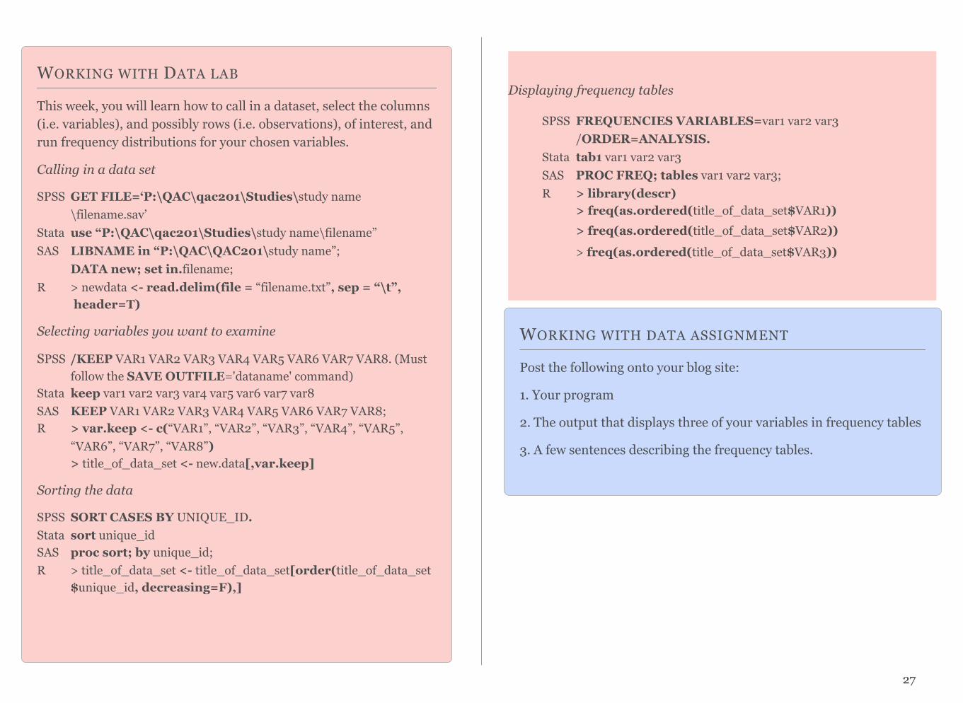
WORKING WITH DATA LAB
This week, you will learn how to call in a dataset, select the columns (i.e. variables), and possibly rows (i.e. observations), of interest, and run frequency distributions for your chosen variables.
Calling in a data set
SPSS GET FILE=‘P:\QAC\qac201\Studies\study name \filename.sav’
Stata use “P:\QAC\qac201\Studies\study name\filename” SAS LIBNAME in “P:\QAC\QAC201\study name”;
DATA new; set in.filename; R > newdata <- read.delim(file = “filename.txt”, sep = “\t”,
header=T)
Selecting variables you want to examine
SPSS /KEEP VAR1 VAR2 VAR3 VAR4 VAR5 VAR6 VAR7 VAR8. (Must follow the SAVE OUTFILE='dataname' command)
Stata keep var1 var2 var3 var4 var5 var6 var7 var8 SAS KEEP VAR1 VAR2 VAR3 VAR4 VAR5 VAR6 VAR7 VAR8; R > var.keep <- c(“VAR1”, “VAR2”, “VAR3”, “VAR4”, “VAR5”, “VAR6”, “VAR7”, “VAR8”)
> title_of_data_set <- new.data[,var.keep]
Sorting the data
SPSS SORT CASES BY UNIQUE_ID. Stata sort unique_id SAS proc sort; by unique_id;R > title_of_data_set <- title_of_data_set[order(title_of_data_set
$unique_id, decreasing=F),]
27
WORKING WITH DATA ASSIGNMENT
Post the following onto your blog site:
1. Your program
2. The output that displays three of your variables in frequency tables
3. A few sentences describing the frequency tables.
Displaying frequency tables
SPSS FREQUENCIES VARIABLES=var1 var2 var3/ORDER=ANALYSIS.
Stata tab1 var1 var2 var3 SAS PROC FREQ; tables var1 var2 var3;
R > library(descr)> freq(as.ordered(title_of_data_set$VAR1))> freq(as.ordered(title_of_data_set$VAR2)) > freq(as.ordered(title_of_data_set$VAR3))
CHAPTER 7
Data Management
Examining frequency distributions for each of your variables is the key to further guiding the decision making involved in quantitative research.
EXAMPLE:
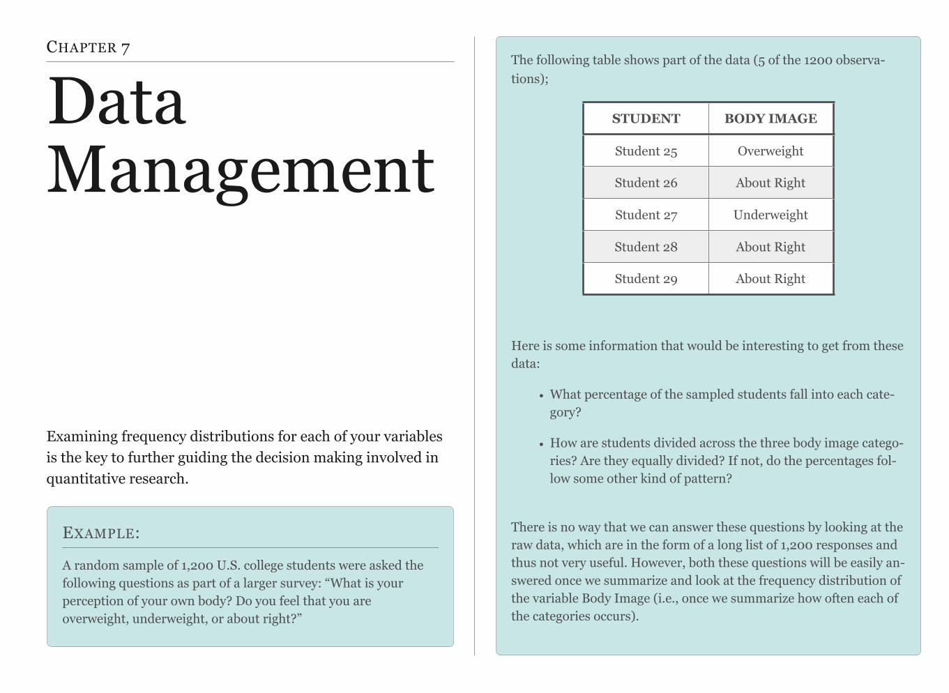
A random sample of 1,200 U.S. college students were asked the following questions as part of a larger survey: “What is your perception of your own body? Do you feel that you are overweight, underweight, or about right?”
The following table shows part of the data (5 of the 1200 observa-tions);
Here is some information that would be interesting to get from these data:
• What percentage of the sampled students fall into each cate-gory?
• How are students divided across the three body image catego-ries? Are they equally divided? If not, do the percentages fol-low some other kind of pattern?
There is no way that we can answer these questions by looking at the raw data, which are in the form of a long list of 1,200 responses and thus not very useful. However, both these questions will be easily an-swered once we summarize and look at the frequency distribution of the variable Body Image (i.e., once we summarize how often each of the categories occurs).
STUDENT BODY IMAGE
Student 25 Overweight
Student 26 About Right
Student 27 Underweight
Student 28 About Right
Student 29 About Right

In order to summarize the distribution of a categorical variable, we ask our statistical software program to create a table of the different values (categories) the variable takes, how many times each value oc-curs (count), and, more importantly, how often each value occurs (percentages). Here is the table (i.e. frequency distribution) for our example:
Body Image Distribution
Please watch DATA MANAGEMENT (SAS, R, Stata, SPSS)
29
CATEGORY COUNT PERCENTAGE
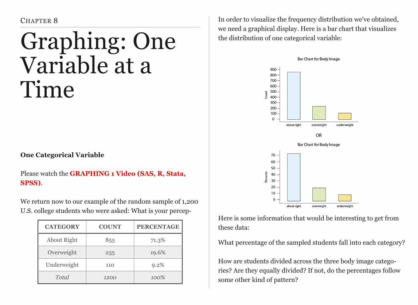
About Right 855 71.3%
Overweight 235 19.6%
Underweight 110 9.2%
Total 1200 100%
Basic Operations:
Examples:
1. Need to identify missing data
Often, you must define the response categories that represent missing data. For example, if the number 9 is used to represent a missing value, you must either designate in your program that this value represents missingness or else you must recode the variable into a missing data character that your statistical software recognizes. If you do not, the 9 will be treated as a real/meaningful value and will be included in each of your analyses.
SPSS RECODE var1 (9=SYSMIS). Stata replace var1=. if var1==9 SAS if VAR1=9 then VAR1=.; R > title_of_data_set$VAR1[title_of_data_set$VAR1==9] <- NA
2. Need to recode responses to “no” based on skip patterns
There are a number of skip outs in some data sets. For example, if we ask someone whether or not they have ever used marijuana, and they say “no”, it would not make sense to ask them more detailed questions about their marijuana use (e.g. quantity, frequency, onset,
SPSS EQ or = >= or GE
<= or LE > or GT < or LT NE
Stata .== >= <= > < !=
SAS EQ or = >= or GE
<= or LE > or GT < or LT NE
R .== >= <= > < !=
DATA MANAGEMENT
During the class session, we will begin to work through how to make decisions about data management and how to put those decisions into action.
An understanding of basic operations to be used with your statistical software is a good place to start.
impairment, etc.). When analyzing more detailed questions regarding marijuana (e.g. have you ever smoked marijuana daily for a month or more?), those individuals that never used the substance may show up as missing data. Since they have never used marijuana, we can assume that their answer is “no”, they have never smoked marijuana daily. This would need to be explicitly recoded. Note that we commonly code a no as 0 and a yes as 1.
SPSS RECODE var1 (SYSMIS=0).Stata replace var1=0 if var1==. SAS if VAR1=. then VAR1=0; R > title_of_data_set$VAR1[is.na(title_of_data_set$VAR1)] <- 0
3. Recoding string variables into numeric
It is important when preparing to run statistical analyses in most software packages, that all variables have response categories that are numeric rather than “string” or “character” (i.e. response categories are actual strings of characters and/or symbols). All variables with string responses must therefore be recoded into numeric values. These numeric values are known as dummy codes in that they carry no direct numeric meaning.
SPSS RECODE TREE (‘Maple’=1) (‘Oak’=2) INTO TREE_N.Stata generate TREE_N=.
replace TREE_N=1 if TREE=="Maple" replace TREE_N=2 if TREE=="Oak"
OR by using encode: encode TREE, gen(Tree_N)
SAS IF TREE=‘Maple’ then TREE_N=1; else if TREE= ‘Oak’ then TREE_N=2;
R (Not Necessary in R)
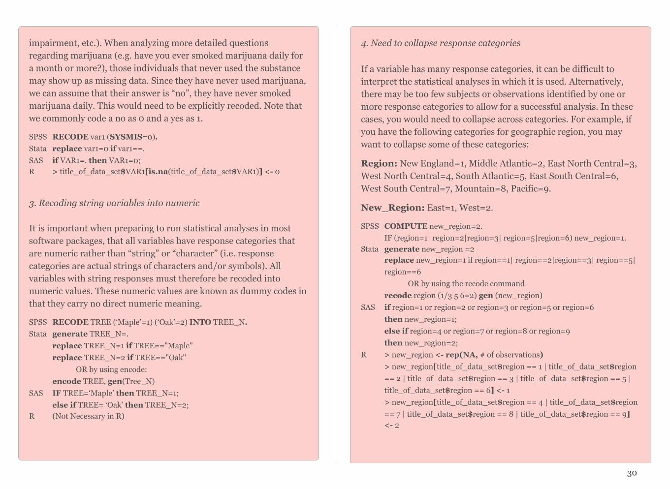
4. Need to collapse response categories
If a variable has many response categories, it can be difficult to interpret the statistical analyses in which it is used. Alternatively, there may be too few subjects or observations identified by one or more response categories to allow for a successful analysis. In these cases, you would need to collapse across categories. For example, if you have the following categories for geographic region, you may want to collapse some of these categories:
Region: New England=1, Middle Atlantic=2, East North Central=3, West North Central=4, South Atlantic=5, East South Central=6, West South Central=7, Mountain=8, Pacific=9.
New_Region: East=1, West=2.
SPSS COMPUTE new_region=2. IF (region=1| region=2|region=3| region=5|region=6) new_region=1.
Stata generate new_region =2replace new_region=1 if region==1| region==2|region==3| region==5|region==6
OR by using the recode commandrecode region (1/3 5 6=2) gen (new_region)
SAS if region=1 or region=2 or region=3 or region=5 or region=6 then new_region=1; else if region=4 or region=7 or region=8 or region=9 then new_region=2;
R > new_region <- rep(NA, # of observations)> new_region[title_of_data_set$region == 1 | title_of_data_set$region== 2 | title_of_data_set$region == 3 | title_of_data_set$region == 5 | title_of_data_set$region == 6] <- 1 > new_region[title_of_data_set$region == 4 | title_of_data_set$region == 7 | title_of_data_set$region == 8 | title_of_data_set$region == 9]
<- 2
30

5. Need to aggregate variables
In many cases, you will want to combine multiple variables into one. For example, while NESARC assesses several individual anxiety disorders, I may be interested in anxiety more generally. In this case I would create a general anxiety variable in which those individuals who received a diagnosis of social phobia, generalized anxiety disorder, specific phobia, panic disorder, agoraphobia, or obsessive compulsive disorder would be coded “yes” and those who were free from all of these diagnoses would be coded “no”.
SPSS IF (socphob=1|gad=1|specphob=1| panic=1|agora=1|ocd=1) anxiety=1. RECODE anxiety (SYSMIS=0).
Stata gen anxiety=1 if socphob==1|gad==1|specphob==1| panic==1|agora==1|ocd==1 replace anxiety=0 if anxiety==.
SAS if socphob=1 or gad=1 or specphob=1 or panic=1 or agora=1 or ocd=1 then anxiety=1; else anxiety=0;
R > anxiety <- rep(0, # of observations)> anxiety[title_of_data_set$socphob == 1 | title_of_data_set$gad==1 | title_of_data_set$panic == 1 | title_of_data_set$agora==1 | title_of_data_set$ocd == 1] <- 1
6. Need to create continuous variables
If you are working with a number of items that represent a single construct, it may be useful to create a composite variable/score. For example, I want to use a list of nicotine dependence symptoms meant to address the presence or absence of nicotine dependence (e.g. tolerance, withdrawal, craving, etc.). Rather than using a dichotomous variable (i.e. nicotine dependence present/absent), I want to examine the construct as a dimensional scale (i.e. number of nicotine dependence symptoms). In this case, I would want to recode each symptom variable so that yes=1 and no=0 and then sum the items so that they represent one composite score.
SPSS COMPUTE nd_sum=sum(nd_symptom1 nd_symptom2 nd_symptom3 nd_symptom4).
Stata egen nd_sum=rsum(nd_symptom1 nd_symptom2 nd_symptom3 nd_symptom4)
SAS nd_sum=sum (of nd_symptom1 nd_symptom2 nd_symptom3 nd_symptom4); R > nd_sum <- title_of_data_set$nd_symptom1 + title_of_data_set
$nd_symptom2 + title_of_data_set$nd_symptom3 + title_of_data_set$nd_symptom4 > title_of_data_set$nd_sum <- nd_sum
7. Labeling variables
Given the often cryptic names that variables are given, it can sometimes be useful to label them.
SPSS VARIABLE LABELS var1 ‘label’. Stata label variable var1 "label"SAS LABEL var1=‘label’; R > names(title_of_dataset)[names(title_of_dataset)=="var1"]
<- "label"
8. Need to create groups that will be compared to one another
Often, you will need to create groups or sub-samples from the data set for the purpose of making comparisons. It is important to be certain that the groups that you would like to compare are of adequate size and number. For example, if you were interested in comparing complications of depression in parents who had lost a child through miscarriage vs. parents who had lost a child in the first year of life, it would be important to have large enough groups of each. It would not be appropriate to attempt to compare 5000 observations in the miscarriage group to only 9 observations in the first year group.
31

9. Labeling variable responses/values
Given that nominal and ordinal variables have, or are given numeric response values (i.e. dummy codes), it can be useful to label those values so that the labels are displayed in your output.
SPSS VALUE LABELS variable 0 ‘value’ 1 ‘value’ 2 ‘value’ 3 ‘value’Stata label define name1 0 “value” 1 “value” 2 “value” 3 “value”
label values variable name1 SAS proc format; variable 0=“value” 1=“value” 2=“value” 3=“value”; R > levels(title_of_data_set$VARIABLE) <- c("value", “value")
10. Need to further subset the sample
When using large data sets, it is often necessary to subset the data so that you are including only those observations that can assist in answering your particular research question. In these cases, you may want to select your own sample from within the survey’s sampling frame. For example, if you are interested in identifying demographic predictors of depression among Type II diabetes patients, you would plan to subset the data to subjects endorsing Type II Diabetes.
SPSS /SELECT=diabetes2 EQ 1 (must be added as a command option)Stata if diabetes2==1 (put this after the command)SAS if diabetes2=1; (put in the data step before sorting the data) R > title_of_subsetted_data <- title_of_data_set[“diabetes2”==1, ]
DATA MANAGEMENT ASSIGNMENT
Post on your blog: 1. a program that manages your data; and 2. output that displays 3 of your secondary (i.e. data managed) variables as frequency tables.
HANDOUT: DATA MANAGEMENT
SPSS - Data ManagementStata - Data ManagementSAS - Data ManagementR - Data Management
32
HANDOUT: EXAMINING YOUR VARIABLES
SPSS - Examining Your VariablesStata - Examining Your VariablesSAS - Examining Your VariablesR - Examining Your Variables
CHAPTER 8
Graphing: One Variable at a Time
One Categorical Variable
Please watch the GRAPHING 1 Video (SAS, R, Stata, SPSS).
We return now to our example of the random sample of 1,200 U.S. college students who were asked: What is your percep-
In order to visualize the frequency distribution we've obtained, we need a graphical display. Here is a bar chart that visualizes the distribution of one categorical variable:
Here is some information that would be interesting to get from these data:
What percentage of the sampled students fall into each category?How are students divided across the three body image catego-ries? Are they equally divided? If not, do the percentages follow some other kind of pattern?
!
CATEGORY COUNT PERCENTAGE
About Right 855 71.3%
Overweight 235 19.6%
Underweight 110 9.2%
Total 1200 100%
Now that we have summarized the distribution of values in the Body Image variable, let's go back and interpret the results in the context of the questions that we posed:
34
Review 8.1 Multiple Choice
What is the difference between the two bar charts?
A. There is no difference.
B. The two bar charts represent the distributions of two different variables.
C. The first bar chart represents the count of respondents that chose each category, while the second bar chart rep-resents the percentage of respondents that chose each category.
D. The two bar charts represent the distribution of “Body-image” obtained from two different samples.
For the answer to this question, view the Appendix.
Review 8.2 Fill In The Blank
Question 1 of 4The results suggest that the students _____ equally divided across the three body images cate-gories.
A. Are
B. Are Not
Question 2 of 4The vast majority of students (71.3%) feel that they are _____.
A. About Right
B. Underweight
C. Overweight
Question 3 of 4Among the remainder of the students, more stu-dents (19.6%) feel that they are ____.
A. About Right
B. Underweight
C. Overweight
Question 4 of 4The body perception that occurred the least often was _____ (9.2%).
A. About Right
B. Underweight
C. Overweight
For the answer to these questions, view the Appendix.

One Quantitative Variable
We have explored the distribution of a categorical variable us-ing a bar chart supplemented by numerical measures (percent of observations in each category). In this section, we will learn how to display the distribution of a quantitative variable.
To display data from one quantitative variable graphically, we typically use the histogram.
35
EXAMPLE
Break the following range of values into intervals and count how many observations fall into each interval.
Exam Grades
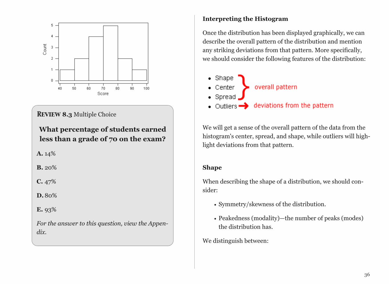
Here are the exam grades of 15 students:
88, 48, 60, 51, 57, 85, 69, 75, 97, 72, 71, 79, 65, 63, 73
We first need to break the range of values into intervals (also called "bins" or "classes"). In this case, since our dataset consists of exam scores, it will make sense to choose intervals that typically correspond to the range of a letter grade, 10 points wide: 40-50, 50-60, ... 90-100. By counting how many of the 15 observations fall in each of the intervals, we get the following table:
To construct the histogram from this table we plot the intervals on the X-axis, and show the number of observations in each interval (frequency of the interval) on the Y-axis, which is represented by the height of a rectangle located above the interval:
SCORE COUNT
[40-49) 1
[50-59) 2
[60-69) 3
[70-79) 4
[80-89) 5
[90-100] 1
Interpreting the Histogram
Once the distribution has been displayed graphically, we can describe the overall pattern of the distribution and mention any striking deviations from that pattern. More specifically, we should consider the following features of the distribution:
!We will get a sense of the overall pattern of the data from the histogram's center, spread, and shape, while outliers will high-light deviations from that pattern.
Shape
When describing the shape of a distribution, we should con-sider:
• Symmetry/skewness of the distribution.
• Peakedness (modality)—the number of peaks (modes) the distribution has.
We distinguish between:
!
36
Review 8.3 Multiple Choice
What percentage of students earned less than a grade of 70 on the exam?
A. 14%
B. 20%
C. 47%
D. 80%
E. 93%
For the answer to this question, view the Appen-dix.

Symmetric Distributions
!
!
!
Note that all three distributions are symmetric, but are differ-ent in their modality (peakedness). The first distribution is unimodal—it has one mode (roughly at 10) around which the observations are concentrated. The second distribution is bi-modal—it has two modes (roughly at 10 and 20) around which the observations are concentrated. The third distribution is kind of flat, or uniform. The distribution has no modes, or no value around which the observations are concentrated. Rather, we see that the observations are roughly uniformly dis-tributed among the different values.
Skewed Right Distributions
!
A distribution is called skewed right if, as in the histogram above, the right tail (larger values) is much longer than the left tail (small values). Note that in a skewed right distribu-tion, the bulk of the observations are small/medium, with a few observations that are much larger than the rest. An exam-ple of a real-life variable that has a skewed right distribution
37
is salary. Most people earn in the low/medium range of sala-ries, with a few exceptions (CEOs, professional athletes etc.) that are distributed along a large range (long "tail") of higher values.
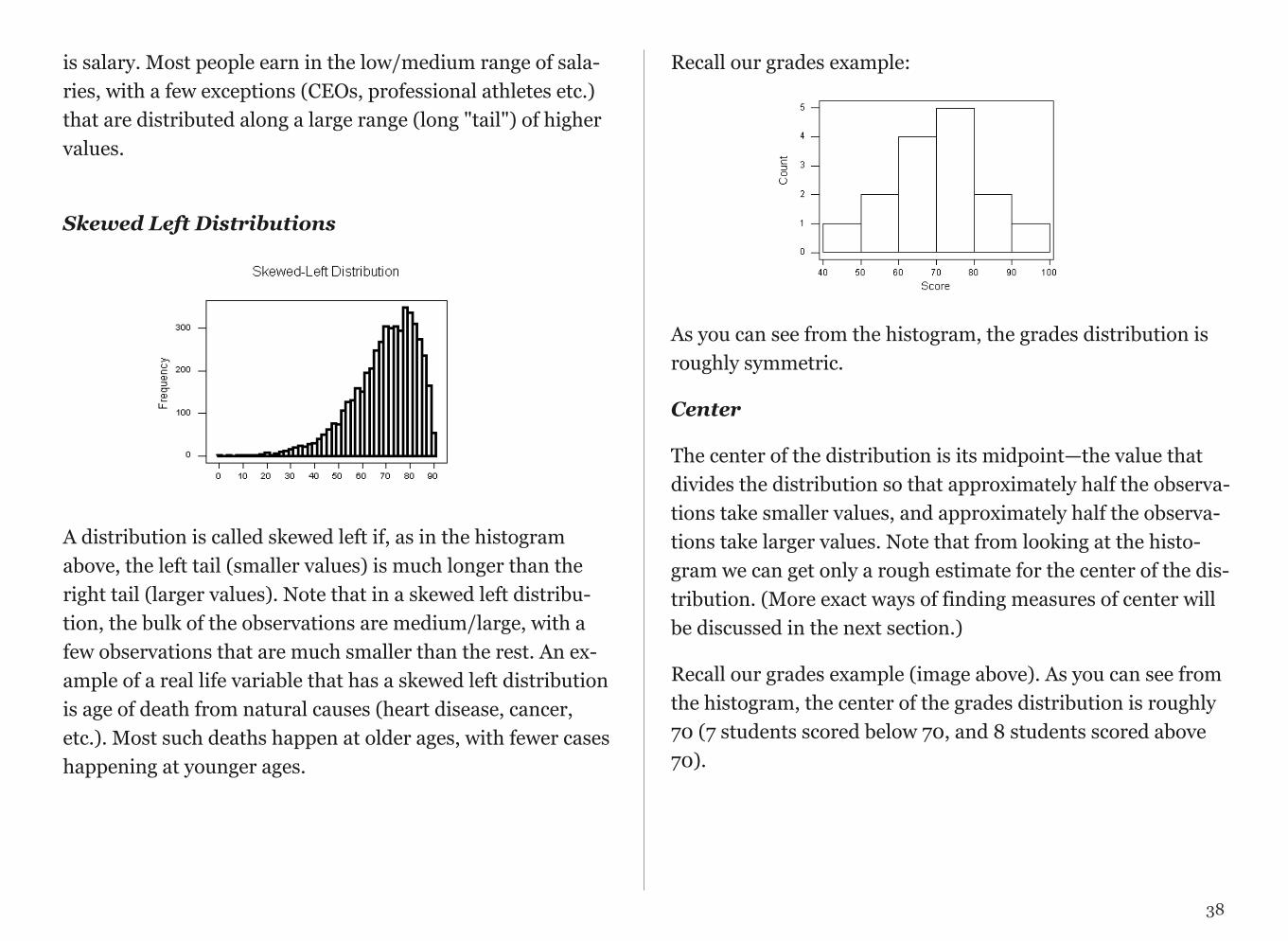
Skewed Left Distributions
!
A distribution is called skewed left if, as in the histogram above, the left tail (smaller values) is much longer than the right tail (larger values). Note that in a skewed left distribu-tion, the bulk of the observations are medium/large, with a few observations that are much smaller than the rest. An ex-ample of a real life variable that has a skewed left distribution is age of death from natural causes (heart disease, cancer, etc.). Most such deaths happen at older ages, with fewer cases happening at younger ages.
Recall our grades example:
!
As you can see from the histogram, the grades distribution is roughly symmetric.
Center
The center of the distribution is its midpoint—the value that divides the distribution so that approximately half the observa-tions take smaller values, and approximately half the observa-tions take larger values. Note that from looking at the histo-gram we can get only a rough estimate for the center of the dis-tribution. (More exact ways of finding measures of center will be discussed in the next section.)
Recall our grades example (image above). As you can see from the histogram, the center of the grades distribution is roughly 70 (7 students scored below 70, and 8 students scored above 70).
38
Spread
The spread (also called variability) of the distribution can be described by the approximate range covered by the data. From looking at the histogram, we can approximate the small-est observation (minimum), and the largest observation (maxi-mum), and thus approximate the range.
In our example:
approximate min: 45 (the middle of the lowest interval of scores) approximate max: 95 (the middle of the highest interval of scores) approximate range: 95-45=50
Review 8.4 Multiple Choice
What do you think the shape of the distribution of age of death from trauma (accident, murder, suicide, drug over-dose, etc.) would be when represented by a histogram? Why?
A. Symmetric - Uniform
B. Skewed Left
C. Skewed Right
D. Symmetric - Unimodal
E. Symmetric - Bimodal
For the answer to this question, view the Appendix.
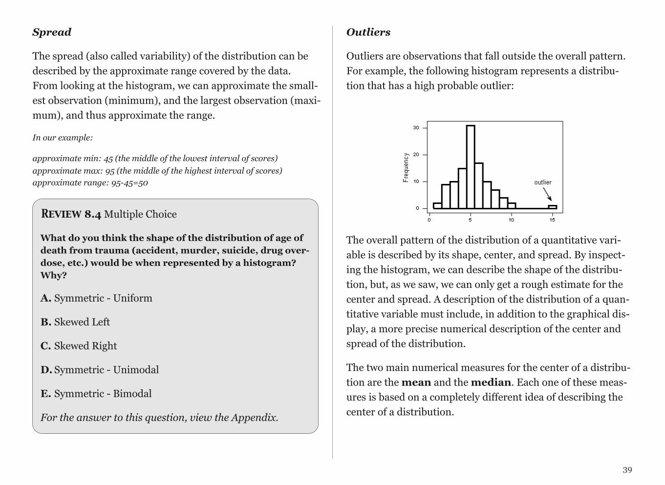
Outliers
Outliers are observations that fall outside the overall pattern. For example, the following histogram represents a distribu-tion that has a high probable outlier:
!The overall pattern of the distribution of a quantitative vari-able is described by its shape, center, and spread. By inspect-ing the histogram, we can describe the shape of the distribu-tion, but, as we saw, we can only get a rough estimate for the center and spread. A description of the distribution of a quan-titative variable must include, in addition to the graphical dis-play, a more precise numerical description of the center and spread of the distribution.
The two main numerical measures for the center of a distribu-tion are the mean and the median. Each one of these meas-ures is based on a completely different idea of describing the center of a distribution.
39
Mean
The mean is the average of a set of observations (i.e., the sum of the observations divided by the number of observations). If the n observations are x1, x2, ... ,xn, their mean, which we de-note by (and read x-bar), is therefore: = (x1 + x2 +...+xn)/n
World Cup Soccer Data were collected from the last three World Cup soccer tournaments. A total of 192 games were played. The table below lists the number of goals scored per game (not including any goals scored in shootouts).
TOTAL # OF GOALS GAME FREQ.
0 17
1 45
2 51
3 37
4 25
5 11
6 3
7 2
8 1
To find the mean number of goals scored per game, we would need to find the sum of all 192 numbers, then divide that sum by 192. Rather than add 192 numbers, we use the fact that the same numbers appear many times. For example, the number 0 appears 17 times, the number 1 appears 45 times, the number 2 appears 51 times, etc.
If we add up 17 zeros, we get 0. If we add up 45 ones, we get 45. If we add up 51 twos, we get 102. Repeated addition is multiplication.
Thus, the sum of the 192 numbers = 0(17) + 1(45) + 2(51) + 3(37) + 4(25) + 5(11) + 6(3) + 7(2) + 8(1) = 453.
The mean is 453 / 192 = 2.359.
This way of calculating a mean is sometimes referred to as a weighted average, since each value is "weighted" by its frequency.
Median
The median (M) is the midpoint of the distribution. It is the number such that half of the observations fall above and half fall below. To find the median:
• Order the data from smallest to largest• Consider whether n, the number of observations, is even
or odd.
• If n is odd, the median M is the center observation in the ordered list. This observation is the one "sit-ting" in the (n + 1) / 2 spot in the ordered list
• If n is even, the median M is the mean of the two center observations in the ordered list. These two observations are the ones "sitting" in the n / 2 and ( n / 2 ) + 1 spots in the ordered list.
40
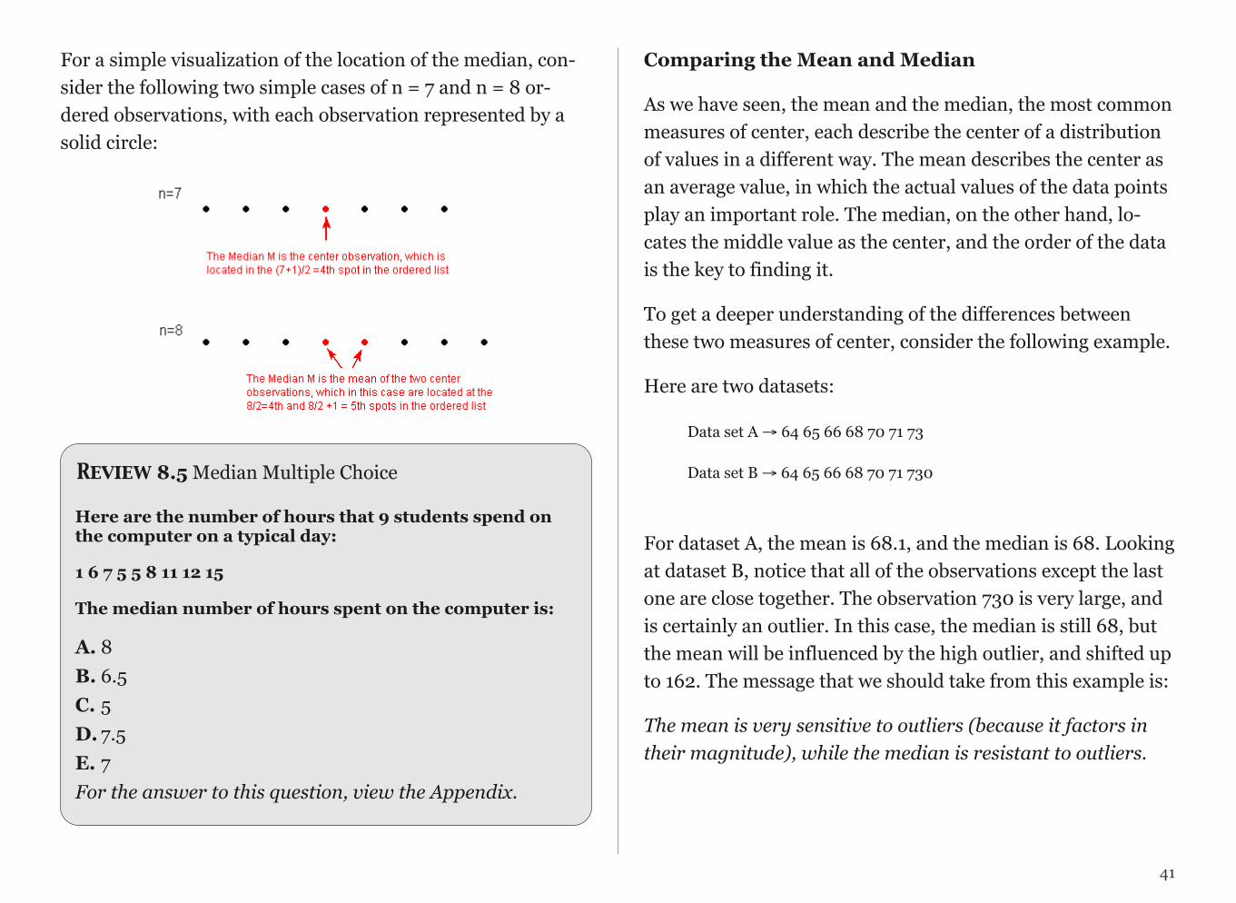
For a simple visualization of the location of the median, con-sider the following two simple cases of n = 7 and n = 8 or-dered observations, with each observation represented by a solid circle:
Review 8.5 Median Multiple Choice
Here are the number of hours that 9 students spend on the computer on a typical day:
1 6 7 5 5 8 11 12 15
The median number of hours spent on the computer is:
A. 8B. 6.5C. 5D. 7.5E. 7For the answer to this question, view the Appendix.
Comparing the Mean and Median
As we have seen, the mean and the median, the most common measures of center, each describe the center of a distribution of values in a different way. The mean describes the center as an average value, in which the actual values of the data points play an important role. The median, on the other hand, lo-cates the middle value as the center, and the order of the data is the key to finding it.
To get a deeper understanding of the differences between these two measures of center, consider the following example.
Here are two datasets:
Data set A → 64 65 66 68 70 71 73
Data set B → 64 65 66 68 70 71 730
For dataset A, the mean is 68.1, and the median is 68. Looking at dataset B, notice that all of the observations except the last one are close together. The observation 730 is very large, and is certainly an outlier. In this case, the median is still 68, but the mean will be influenced by the high outlier, and shifted up to 162. The message that we should take from this example is:
The mean is very sensitive to outliers (because it factors in their magnitude), while the median is resistant to outliers.
41
!

Therefore:
- For symmetric distributions with no outliers: is approxi-mately equal to M.
!
- For skewed right distributions and/or datasets with high out-liers: >M
!
- For skewed left distributions and/or datasets with low out-liers: <M
!
We will therefore use as a measure of center for symmetric distributions with no outliers. Otherwise, the median will be a more appropriate measure of the center of our data.
42

Review 8.6 Multiple Choice
Question 1 of 2
The Current Population Survey conducted by the Census Bureau records the incomes of a large sample of U.S. households each month. What will be the relationship be-tween the mean and median of the collected data?
A. The mean will be bigger than the median.
B. The mean will be smaller than the median.
C. The mean and the median will be about the same.
Question 2 of 2
The SAT Math scores of 1,000 future engineers and physi-cists are recorded. What will be the relationship between the mean and median of the col-lected data?
A. The mean will be bigger than the median.
B. The mean will be smaller than the median.
C. The mean and the median will be about the same.
Measures of Spread
So far we have learned about different ways to quantify the center of a distribution. A measure of center by itself is not enough, though, to describe a distribution. Consider the fol-lowing two distributions of exam scores. Both distributions are centered at 70 (the median of both distributions is approxi-mately 70), but the distributions are quite different. The first distribution has a much larger variability in scores compared to the second one.
!In order to describe the distribution, we therefore need to sup-plement the graphical display not only with a measure of cen-ter, but also with a measure of the variability (or spread) of the distribution.
Range
The range covered by the data is the most intuitive measure of variability. The range is exactly the distance between the small-est data point (Min) and the largest one (Max).
Range = Max - Min
43
Standard Deviation
The idea behind the standard deviation is to quantify the spread of a distribution by measuring how far the observa-tions are from their mean, . The standard deviation gives the average (or typical distance) between a data point and the mean, .
Notation
There are many notations for the standard deviation: SD, s, Sd, StDev. Here, we'll use SD as an abbreviation for standard deviation and use s as the symbol.
Calculation
In order to get a better understanding of the standard devia-tion, it would be useful to see an example of how it is calcu-lated. In practice, we will use statistical software to do the cal-culation.
Video Store Calculations
The following are the number of customers who entered a video store in 8 consecutive hours:
7, 9, 5, 13, 3, 11, 15, 9
To find the standard deviation of the number of hourly cus-tomers:
1. Find the mean, of your data: 7+9+5+. . .+98=9
2. Find the deviations from the mean: the difference betweeneach observation and the mean
(7 - 9), (9 - 9), (5 - 9), (13 - 9), (3 - 9), (11 - 9), (15 - 9), (9 - 9)
3. These numbers are -2, 0, -4, 4, -6, 2, 6, 0
4. Since the standard deviation is the average (typical) dis-tance between the data points and their mean, it would make sense to average the deviations we got. Note, however, that the sum of the deviations from the mean, , is 0 (add them up and see for yourself). This is always the case, and is the rea-son why we have to do a more complicated calculation to de-termine the standard deviation
5. Square each of the deviations:
The first few are:
(-2)^2 = 4, (0)^2 = 0, (-4)^2 = 16, and the rest are 16, 36, 4, 36, 0
6. Average the square deviations by adding them up and divid-ing by n - 1 (one less than the sample size):
4+0+16+16+36+4+36+0(8−1)=1127=16
• The reason why we "sort of" average the square devia-tions (divide by n - 1) rather than take the actual average(divide by n) is beyond the scope of the course at thispoint, but will be addressed later.
44
• This average of the squared deviations is called the vari-ance of the data.
7. The SD of the data is the square root of the variance: SD = 16 = 4
• Why do we take the square root? Note that 16 is an aver-age of the squared deviations, and therefore has differ-ent units of measurement. In this case 16 is measured in "squared customers", which obviously cannot be inter-preted. We therefore take the square root in order to compensate for the fact that we squared our deviations and in order to go back to the original unit of measure-ment.
Recall that the average number of customers who enter the store in an hour is 9. The interpretation of SD = 4 is that, on average, the actual number of customers that enter the store each hour is 4 away from 9.
UNIVARIATE GRAPHING LAB
There are a variety of conventional ways to visualize data - tables, histograms, bar graphs, etc. Now that your data have been managed, it is time to graph your variables one at a time and examine both center and spread.
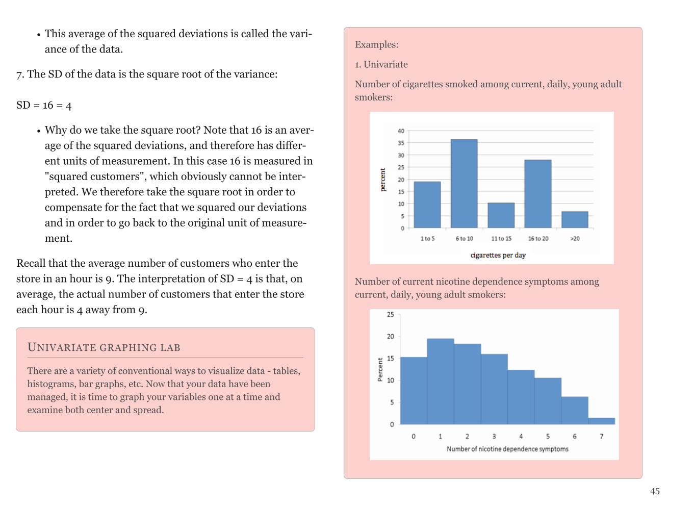
Examples:
1. Univariate
Number of cigarettes smoked among current, daily, young adult smokers:
Number of current nicotine dependence symptoms among current, daily, young adult smokers:
45
Code for Univariate Output (Categorical):
SPSS FREQUENCIES VARIABLES=var1 var2 var3 / ORDER=ANALYSIS.
Stata tab1 var1 var2 var3SAS PROC FREQ; tables var1 var2 var3;R > library(descr)
> freq(as.ordered(title_of_data_set$var1)) > freq(as.ordered(title_of_data_set$var2)) > freq(as.ordered(title_of_data_set$var3))
Code for Univariate Graph (Categorical):
SPSS use graphical user interface (GUI)
Stata histogram CategoricalVariable (must be binary 1 and 0)
SAS Proc GCHART; VBAR CategoricalVariable / Discrete type=PCT Width=30;
OR
ODS listing style=statistical; ods graphics on; proc freq; tables CategoricalVariable; run; ods graphics off;
R > require(descr) #load the required package > freq(title_of_dataset$CategoricalVariable)
Code for Univariate Output (Quantitative):
SPSS DESCRIPTIVES VARIABLES=var1 var2 var3 /STATISTICS=MEAN STDDEV
Stata summarize var1 var2 var3 SAS proc univariate; var var1 var2 var3; R > library(descr)
> freq(as.ordered(title_of_data_set$var1)) > freq(as.ordered(title_of_data_set$var2)) > freq(as.ordered(title_of_data_set$var3)) (or for mean and standard deviation)
46
HANDOUT: UNIVARIATE GRAPHING
SPSS Univariate Graphing HandoutStata Univariate Graphing HandoutSAS Univariate Graphing HandoutR Univariate Graphing Handout
UNIVARIATE GRAPHING ASSIGNMENT
Post univariate graphs of your two main constructs to your blog (i.e. data managed variables). Write a few sentences describing what your graphs reveal in terms of shape, spread, and center.
Code for Univariate Graph(Quantitative):
SPSS use graphical user interface (GUI)
Stata histogram QuantitativeVariable
SAS Proc GCHART; VBAR QuantitativeVariable;
R > hist(title_of_dataset$QuantitativeVariable)
CHAPTER 9
Graphing Relationships
So far we have dealt with data obtained from one variable (ei-ther categorical or quantitative) and learned how to describe the distribution of the variable using the appropriate visual displays and numerical measures. In this section, examining relationships, we will look at two variables at a time and, as the title suggests, explore the relationship between them using (as before) visual displays and numerical summaries.
While it is fundamentally important to know how to describe the distribution of a single variable, most studies (including yours) pose research questions that involve exploring the rela-tionship between two variables.
Here are a few examples of such research questions with the two variables highlighted:
Examples:
1. Is there a relationship between gender and test scores on a particular standardized test?
Other ways of phrasing the same research question:
• Is performance on the test related to gender?
• Is there a gender effect on test scores?
• Are there differences in test scores between males and females?
2. Is there a relationship between the type of light a baby sleeps with (no light, night-light, lamp) and whether the child devel-ops nearsightedness?
3. Are the smoking habits of a person (yes, no) related to the person's gender?
4. How well can we predict a student's freshman year GPA from his/her SAT score?
In most analyses involving two variables, each of the variables has a role. We distinguish between:
• the response variable (also known as the dependent vari-able (DV), or outcome)
• the explanatory variable (also known as the independent variable (IV), or the predictor)
At this point, we will be asking you to “impose” a causal

model on your research question, despite the fact that you will not be able to directly evaluate a causal relationship. This video defines the two types of variables you will be identifying and shows you how this decision will guide the kinds of graphing you do and the kind of statistical tests that you will ultimately use. Please watch GRAPHING 2 (SAS, R, Stata, SPSS).
Figure: Graphing Decisions Flow Chart
When graphing your data, it is important that each graph pro-vides clear and accurate summaries of the data that do not mis-lead. Please watch a GRAPHING RULES video for a few basic graphing guidelines to help you accomplish this goal.
BIVARIATE GRAPHING
(C->C) Prevalence of Nicotine Dependence (C) by Depression Status (C)*
(C->Q) Mean Number of Nicotine Dependence Symptoms (Q) by Depression Status (C)*
*among current, daily, young adult smokers
48

Code for Bivariate Output (Categorical Explanatory Variable and Categorical Response Variable):
SPSS CROSSTABS /TABLES=ResponseVariable by ExplanatoryVariable. /CELLS=COUNT ROW COLUMN TOTAL. Stata tab ResponseVariable ExplanatoryVariable, row column cell SAS Proc freq; tables ResponseVariable*ExplanatoryVariable R > table(title_of_data_set$ResponseVariable, title_of_data_set $ExplanatoryVariable) # for table > prop.table(table(title_of_data_set$ResponseVariable, title_of_data_set$ExplanatoryVariable)) # for cell %ages > prop.table(table(title_of_data_set$ResponseVariable, title_of_data_set$ExplanatoryVariable),1) # for row %ages > prop.table(table(title_of_data_set$ResponseVariable, title_of_data_set$ExplanatoryVariable),2) # for column %age > barplot(prop.table(table(title_of_data_set$ResponseVariable, title_of_data_set$ExplanatoryVariable),2)[rows,])) # for plots of column percentage
Code for Bivariate Bar Graph (Categorical Explanatory Variable and Categorical Response Variable):
SPSS use graphical user interface (GUI)
Stata graph bar (mean) ResponseVariable, over(ExplanatoryVariable)
SAS Proc GCHART; vbar ExplanatoryVariable /discrete type=mean sumvar=ResponseVariable descending;
R > table(title_of_dataset$ResponseVariable, title_of_dataset$Explanatory Variable) # for table > prop.table(table(title_of_dataset$ResponseVariable, title_of_dataset$ ExplanatoryVariable), 2) # for column percentages > barplot(prop.table(table(title_of_dataset$ResponseVariable, title_of_dataset$ExplanatoryVariable), 2)[rows,]) # for barplot
49
Code for Bivariate Output (Categorical Explanatory Variable and Quantitative Response Variable):
SPSS MEANS TABLES=ExplanatoryVariable by ResponseVariable /CELLS MEAN COUNT STDDEV. Stata bys ExplanatoryVariable: su ResponseVariable SAS proc sort; by ExplanatoryVariable; proc means; var ResponseVariable; by ExplanatoryVariable; R > by(title_of_data_set$ResponseVariable, title_of_data_set $ExplanatoryVariable, mean) # for table > barplot(by(title_of_data_set$ResponseVariable, title_of_data_set$ExplanatoryVariable, mean)) # for plots
Code for Bivariate Bar Graph (Categorical Explanatory Variable and Quantitative Response Variable):
SPSS use graphical user interface (GUI)
Stata graph box ResponseVariable, over(ExplanatoryVariable)
SAS Proc GCHART; vbar ExplanatoryVariable /discrete type=mean sumvar=ResponseVariable;
R > by(title_of_data$ResponseVariable, title_of_dataset $ExplanatoryVariable mean, na.rm=T) # for group means > barplot(by(title_of_data$ResponseVariable, title_of_dataset $ExplanatoryVariable, mean, na.rm=T)) # for barplot
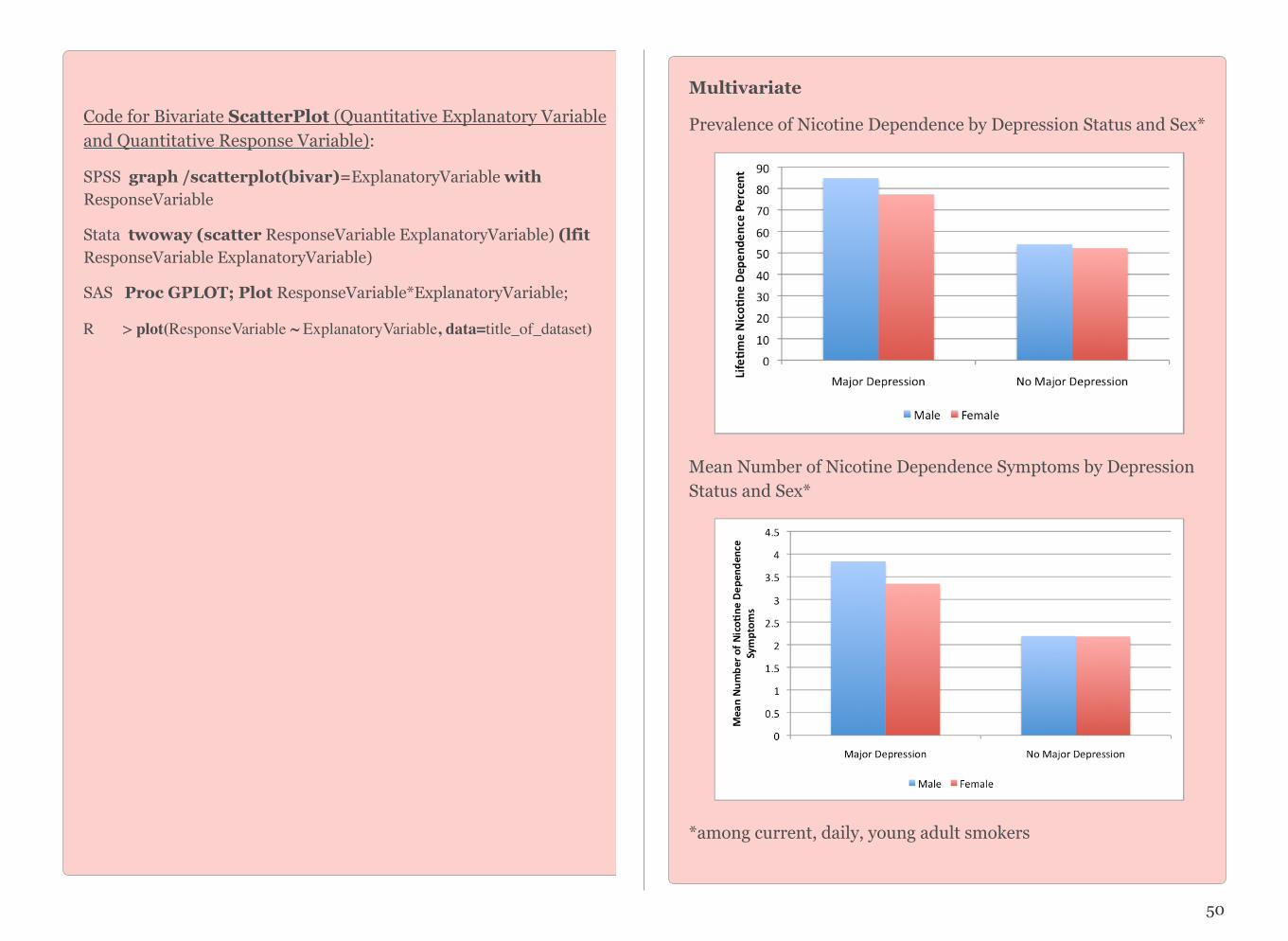
Code for Bivariate ScatterPlot (Quantitative Explanatory Variable and Quantitative Response Variable):
SPSS graph /scatterplot(bivar)=ExplanatoryVariable with ResponseVariable
Stata twoway (scatter ResponseVariable ExplanatoryVariable) (lfit ResponseVariable ExplanatoryVariable)
SAS Proc GPLOT; Plot ResponseVariable*ExplanatoryVariable;
R > plot(ResponseVariable ~ ExplanatoryVariable, data=title_of_dataset)
50
Multivariate
Prevalence of Nicotine Dependence by Depression Status and Sex*
Mean Number of Nicotine Dependence Symptoms by Depression Status and Sex*
*among current, daily, young adult smokers
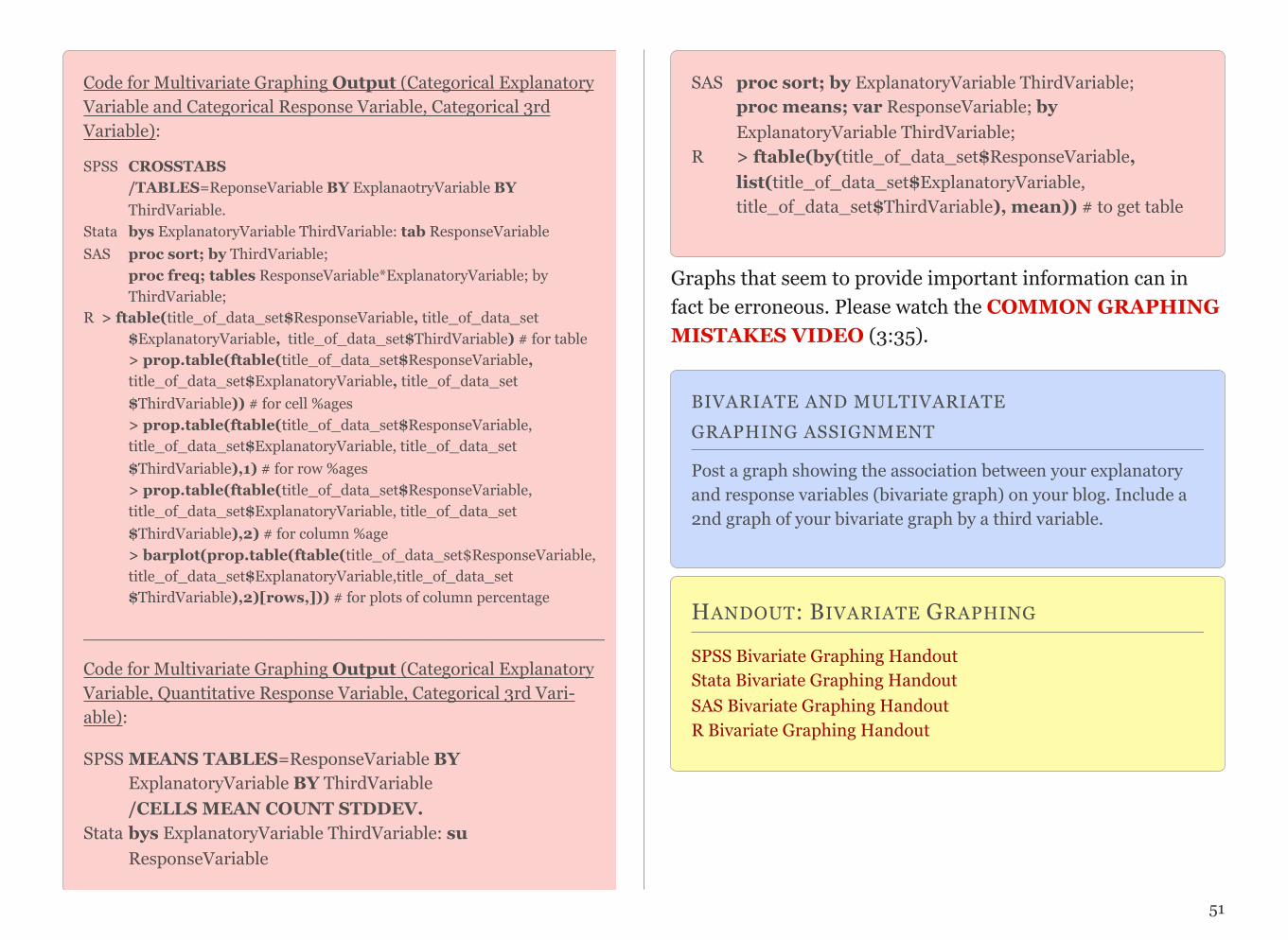
Code for Multivariate Graphing Output (Categorical Explanatory Variable and Categorical Response Variable, Categorical 3rd Variable):
SPSS CROSSTABS /TABLES=ReponseVariable BY ExplanaotryVariable BY ThirdVariable. Stata bys ExplanatoryVariable ThirdVariable: tab ResponseVariable SAS proc sort; by ThirdVariable; proc freq; tables ResponseVariable*ExplanatoryVariable; by ThirdVariable; R > ftable(title_of_data_set$ResponseVariable, title_of_data_set $ExplanatoryVariable, title_of_data_set$ThirdVariable) # for table > prop.table(ftable(title_of_data_set$ResponseVariable, title_of_data_set$ExplanatoryVariable, title_of_data_set $ThirdVariable)) # for cell %ages > prop.table(ftable(title_of_data_set$ResponseVariable, title_of_data_set$ExplanatoryVariable, title_of_data_set $ThirdVariable),1) # for row %ages > prop.table(ftable(title_of_data_set$ResponseVariable, title_of_data_set$ExplanatoryVariable, title_of_data_set $ThirdVariable),2) # for column %age > barplot(prop.table(ftable(title_of_data_set$ResponseVariable, title_of_data_set$ExplanatoryVariable,title_of_data_set $ThirdVariable),2)[rows,])) # for plots of column percentage
______________________________________________
Code for Multivariate Graphing Output (Categorical Explanatory Variable, Quantitative Response Variable, Categorical 3rd Vari-able):
SPSS MEANS TABLES=ResponseVariable BY ExplanatoryVariable BY ThirdVariable /CELLS MEAN COUNT STDDEV. Stata bys ExplanatoryVariable ThirdVariable: su ResponseVariable
SAS proc sort; by ExplanatoryVariable ThirdVariable; proc means; var ResponseVariable; by ExplanatoryVariable ThirdVariable;R > ftable(by(title_of_data_set$ResponseVariable, list(title_of_data_set$ExplanatoryVariable, title_of_data_set$ThirdVariable), mean)) # to get table
Graphs that seem to provide important information can in fact be erroneous. Please watch the COMMON GRAPHING MISTAKES VIDEO (3:35).
BIVARIATE AND MULTIVARIATE GRAPHING ASSIGNMENT
Post a graph showing the association between your explanatory and response variables (bivariate graph) on your blog. Include a 2nd graph of your bivariate graph by a third variable.
HANDOUT: BIVARIATE GRAPHING
SPSS Bivariate Graphing Handout Stata Bivariate Graphing Handout SAS Bivariate Graphing Handout R Bivariate Graphing Handout
51
CHAPTER 10
Hypothesis Testing
Thus far, we have focused on descriptive statistics. Through our examination of frequency distributions, graphical repre-sentations of our variables, and calculations of center and spread, the goal has been to describe and summarize data. Now you will be introduced to inferential statistics. In addi-tion to describing data, inferential statistics allow us to di-rectly test our hypothesis by evaluating (based on a sample) our research question with the goal of generalizing the results to the larger population from which the sample was drawn.
Hypothesis testing is one of the most important inferential tools of application of statistics to real life problems. It is used when we need to make decisions concerning populations on the basis of only sample information. A variety of statistical tests are used to arrive at these decisions (e.g. Analysis of Variance, Chi-Square Test of Independence, etc.). Steps involved in hypothe-sis testing include specifying the null (Ho) and alternate (Ha) hypotheses; choosing a sample; assessing the evidence; and making conclusions.
Statistical hypothesis testing is defined as assessing evi-dence provided by the data in favor of or against each hypothesis about the population.
The purpose of this section is to build your understanding about how statistical hypothesis testing works.
Please watch the INFERENCE Video.
Example:
To test what I have read in the scientific literature, I decide to evaluate whether or not there is a difference in smoking quan-tity (i.e. number of cigarettes smoked) according to whether or not an individual has a diagnosis of major depression.
Let's analyze this example using the 4 steps: Specifying the null (Ho) and alternate (Ha) hypotheses; choosing a sample; assess-ing the evidence; and making conclusions.
There are two opposing hypotheses for this question:
• There is no difference in smoking quantity between peo-ple with and without depression.
• There is a difference in smoking quantity between peo-ple with and without depression.
The first hypothesis (aka null hypothesis) basically says noth-ing special is going on between smoking and depression. In other words, that they are unrelated to one another. The sec-ond hypothesis (aka the alternate hypothesis) says that there is a relationship and allows that the difference in smoking be-tween those individuals with and without depression could be in either direction (i.e. individuals with depression may smoke more than individuals without depression or they may smoke less).
1. Choosing a Sample:
I chose the NESARC, a representative sample of 43,093 non-institutionalized adults in the U.S. As I am interested in evalu-ating these hypotheses only among individuals who are smok-ers and who are younger (rather than older) adults, I subset the NESARC data to individuals that are 1) current daily smok-ers (i.e. smoked every day in the month prior to the survey) are 2) are age 18 to 25. This sample (n=1320) showed the fol-lowing:
• Young adult, daily smokers with depression smoked an average of 13.9 cigarettes per day (s.d. 9.2).
• Young adult daily smokers without depression smoked on average 13.2 cigarettes per day (s.d 8.5)
While it is true that 13.9 cigarettes per day are more than 13.2 cigarettes per day, it is not at all clear that this is a large enough difference to reject the null hypothesis.
2. Assessing the Evidence:
In order to assess whether the data provide strong enough evi-dence against the null hypothesis (i.e. against the claim that there is no relationship between smoking and depression), we need to ask ourselves: How surprising is it to get a difference of 0.7 cigarettes smoked per day between our two groups (de-pression vs. no depression) assuming that the null hypothesis is true (i.e. there is no relationship between smoking and de-pression).
This is the step where we calculate how likely it is to get data like that observed when Ho is true. In a sense, this is the heart of the process, since we draw our conclusions based on this probability.
It turns out that the probability that we'll get a difference of this size in the mean number of cigarettes smoked in a ran-dom sample of 1320 participants is roughly .17 (do not worry about how this was calculated at this point).
53

3. Making Conclusions:
Well, we found that if the null hypothesis were true (i.e. there is no association) there is a probability of .17 of observing data like that observed.
Now you have to decide...
Do you think that a probability of .17 makes our data rare enough (surprising enough) under the null hypothesis so that the fact that we did observe it is enough evidence to reject the null hypothesis?
Or do you feel that a probability of .17 means that data like we observed are not very likely when the null hypothesis is true (not unlikely enough to conclude that getting such data is sufficient evidence to reject the null hypothesis).
Basically, this is your decision. However, it would be nice to have some kind of guideline about what is generally considered surprising enough.
The reason for using an inferential test is to get a p-value. The p-value determines whether or not we reject the null hy-pothesis. The p-value provides an estimate of how often we would get the obtained result by chance if in fact the null hy-pothesis were true. In statistics, a result is called statistically significant if it is unlikely to have occurred by chance alone. If the p-value is small (i.e. less than .05), this suggests that it is likely (more than 95% likely) that the association of interest would be present following repeated samples drawn from the population (aka a sampling distribution).
If this probability is very small, then that means that it would be very surprising to get data like that observed if the null hy-pothesis were true. The fact that we did not observe such data is therefore evidence supporting the null hypothesis, and we should accept it it. On the other hand, if this probability were very small, this means that observing data like that observed is surprising if the null hypothesis were true, so the fact that we observed such data provides evidence against the null hy-pothesis (i.e. suggests that there is an association between smoking and depression). This crucial probability, therefore, has a special name. It is called the p-value of the test.
In our examples, the p-value was given to you (and you were reassured that you didn't need to worry about how these were derived):
• P-Value = .17
Obviously, the smaller the p-value, the more surprising it is to get data like ours when the null hypothesis is true, and there-fore the stronger the evidence the data provide against the null. Looking at the p-value in our example we see that there is not adequate evidence to reject the null hypothesis. In other words, we fail to reject the null hypothesis that there is no association between smoking and depres-sion.
Since our conclusion is based on how small the p-value is, or in other words, how surprising our data are when the null hy-pothesis (Ho) is true, it would be nice to have some kind of
54

guideline or cutoff that will help determine how small the p-value must be, or how "rare" (unlikely) our data must be when Ho is true, for us to conclude that we have enough evidence to reject Ho.
This cutoff exists, and because it is so important, it has a spe-cial name. It is called the significance level of the test and is usually denoted by the Greek letter α. The most commonly used significance level is α = .05 (or 5%). This means that:
• if the p-value < α (usually .05), then the data we got is consid-ered to be "rare (or surprising) enough" when Ho is true, and we say that the data provide significant evidence against Ho, so we reject Ho and accept Ha.
• if the p-value > α (usually .05), then our data are not considered to be "surprising enough" when Ho is true, and we say that our data do not provide enough evidence to reject Ho (or, equiva-lently, that the data do not provide enough evidence to accept Ha).
!
Although you will always be interpreting the p-value for a statistical test, the specific statistical test that you will use to evaluate your hypotheses depends on the type of explanatory and response variables that you have.
Bivariate Statistical Tools:
C --> Q Analysis of Variance (ANOVA)
C --> C Chi-Square Test of Independence (X2)
Q --> Q Correlation Coefficient (r)
Q --> C Categorize Explanatory Variable and use Chi Square Test of Independence (C-->C)
55

The Big Idea Behind Inference
A sampling distribution is a distribution of all possible samples (of a given size) that could be drawn from the popula-tion. If you have a sampling distribution meant to estimate a mean (e.g. the average number of cigarettes smoked in a popu-lation), this would be represented as a distribution of frequen-cies of mean number of cigarettes for consecutive samples drawn from the population. Although we ultimately rely on only one sample, if that sample is representative of the larger population, inferential statistical tests allow us to estimate (with different levels of certainty) a mean (or other parameter such as a standard deviation, proportion, etc.) for the entire population. This idea is the foundation for each of the inferen-tial tools that you will be using this semester.
Please watch two videos focused on THE BIG IDEA BE-HIND INFERENCE (Video 1 (9:46) and Video 2 (13:42)).
56
MOVIE 10.1 The Big Idea Behind Inference pt. 1/2
MOVIE 10.2 The Big Idea Behind Inference pt. 2/2
CHAPTER 11
Analysis of Variance C Q
Please watch the ANALYSIS OF VARIANCE video (SAS, R, Stata, SPSS).
In our description of hypothesis testing in the previous chap-ter, we started with case C→Q, where the explanatory variable/independent variable/predictor (X=major depres-sion) is categorical and the response variable/dependent variable/outcome (Y=number of cigarettes smoked) is quanti-tative. Here is a similar example:
GPA and Year in College
Say that our variable of interest is the GPA of college students in the United States. Since GPA is quantitative, we do inference on µ, the (population) mean GPA among all U.S. college students. We are really interested in the relationship between GPA and college year:
X : year in college (1 = freshmen, 2 = sophomore, 3 = junior, 4 = senior) and
Y : GPA
In other words, we want to explore whether GPA is related to year in college. The way to think about this is that the popula-tion of U.S. college students is now broken into 4 sub-populations: freshmen, sophomores, juniors, and seniors. Within each of these four groups, we are interested in the GPA.
The inference must therefore involve the 4 sub-population means:
µ1 : mean GPA among freshmen in the United States
µ2 : mean GPA among sophomores in the United States
µ3 : mean GPA among juniors in the United States
µ4 : mean GPA among seniors in the United States
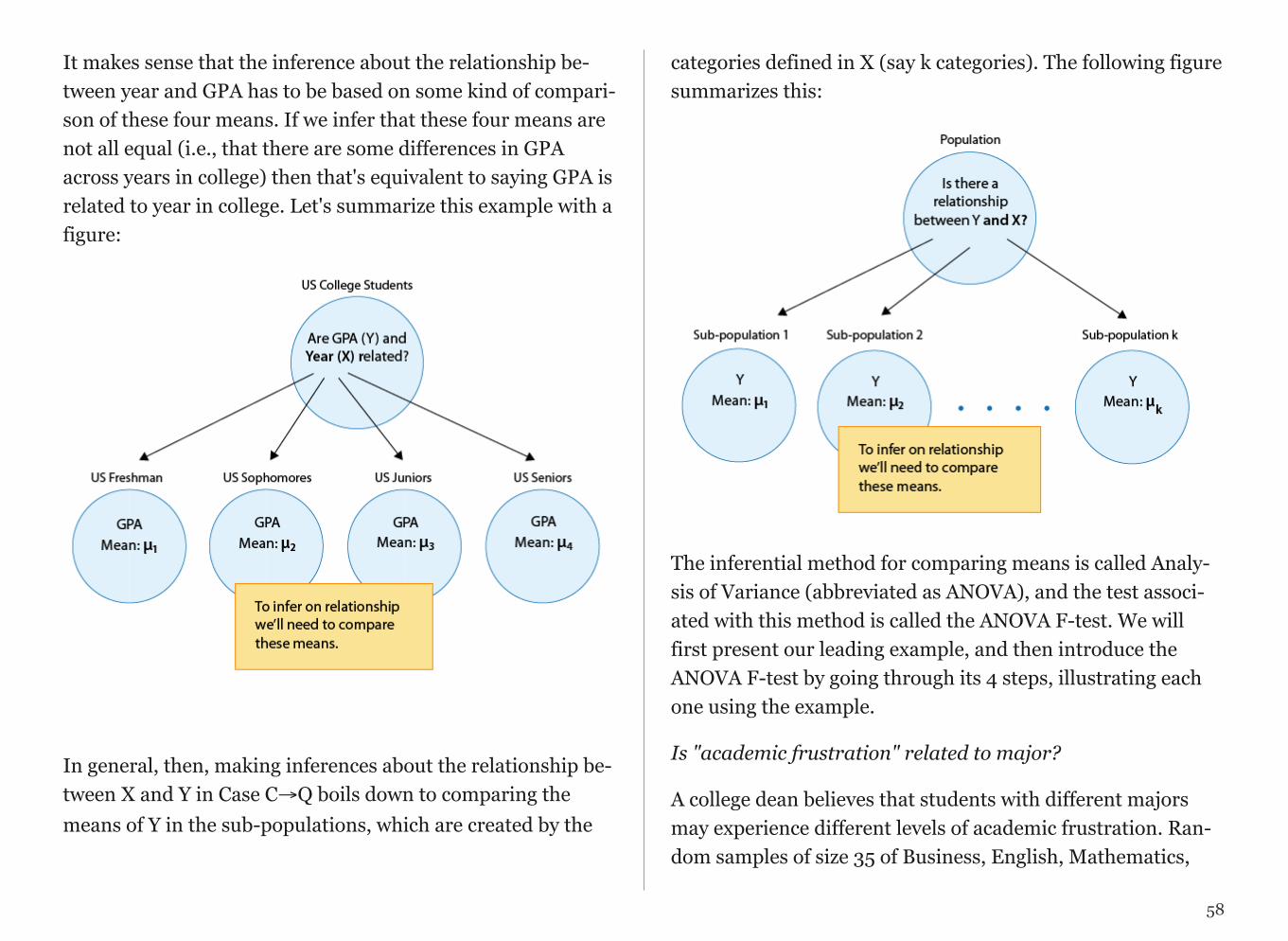
It makes sense that the inference about the relationship be-tween year and GPA has to be based on some kind of compari-son of these four means. If we infer that these four means are not all equal (i.e., that there are some differences in GPA across years in college) then that's equivalent to saying GPA is related to year in college. Let's summarize this example with a figure:
!
In general, then, making inferences about the relationship be-tween X and Y in Case C→Q boils down to comparing the means of Y in the sub-populations, which are created by the
categories defined in X (say k categories). The following figure summarizes this:
!
The inferential method for comparing means is called Analy-sis of Variance (abbreviated as ANOVA), and the test associ-ated with this method is called the ANOVA F-test. We will first present our leading example, and then introduce the ANOVA F-test by going through its 4 steps, illustrating each one using the example.
Is "academic frustration" related to major?
A college dean believes that students with different majors may experience different levels of academic frustration. Ran-dom samples of size 35 of Business, English, Mathematics,
58
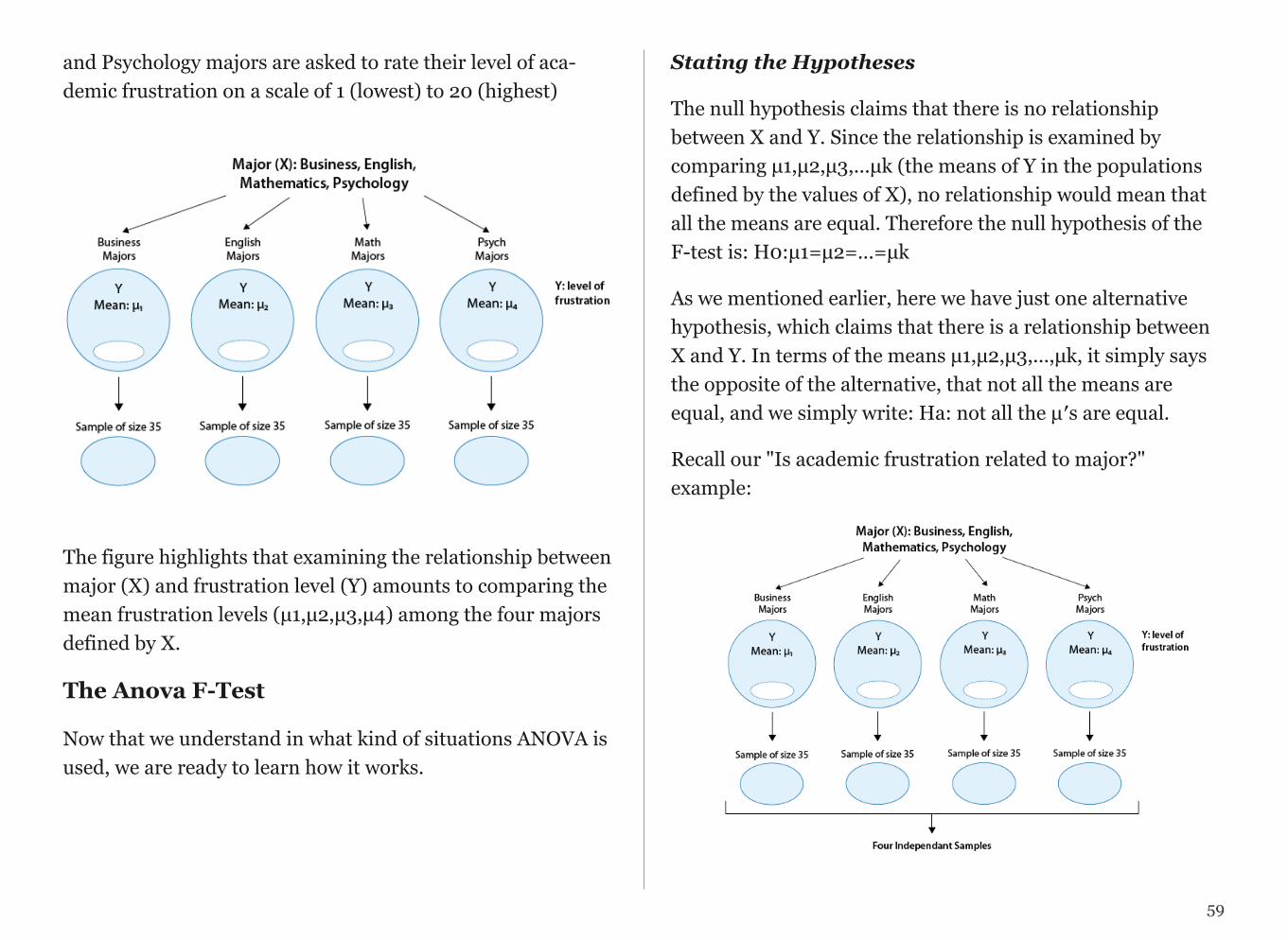
and Psychology majors are asked to rate their level of aca-demic frustration on a scale of 1 (lowest) to 20 (highest)
!
The figure highlights that examining the relationship between major (X) and frustration level (Y) amounts to comparing the mean frustration levels (µ1,µ2,µ3,µ4) among the four majors defined by X.
The Anova F-Test
Now that we understand in what kind of situations ANOVA is used, we are ready to learn how it works.
Stating the Hypotheses
The null hypothesis claims that there is no relationship between X and Y. Since the relationship is examined by comparing µ1,µ2,µ3,...µk (the means of Y in the populations defined by the values of X), no relationship would mean that all the means are equal. Therefore the null hypothesis of the F-test is: H0:µ1=µ2=...=µk
As we mentioned earlier, here we have just one alternative hypothesis, which claims that there is a relationship between X and Y. In terms of the means µ1,µ2,µ3,...,µk, it simply says the opposite of the alternative, that not all the means are equal, and we simply write: Ha: not all the µ′s are equal.
Recall our "Is academic frustration related to major?" example:
59
!
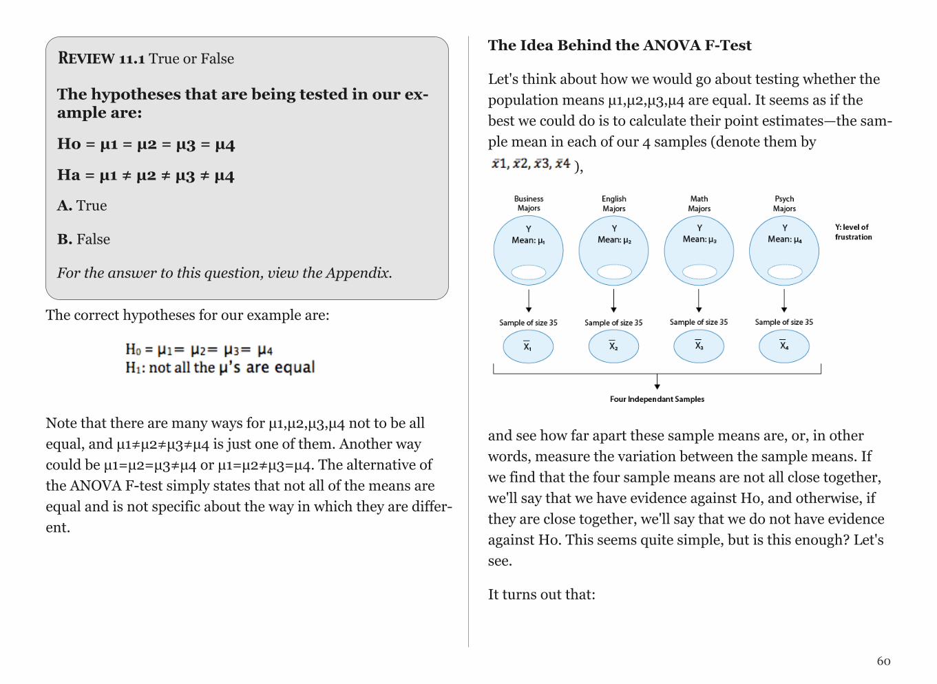
Review 11.1 True or False
The hypotheses that are being tested in our ex-ample are:
Ho = µ1 = µ2 = µ3 = µ4
Ha = µ1 ≠ µ2 ≠ µ3 ≠ µ4
A. True
B. False
For the answer to this question, view the Appendix.
The correct hypotheses for our example are:
Note that there are many ways for µ1,µ2,µ3,µ4 not to be all equal, and µ1≠µ2≠µ3≠µ4 is just one of them. Another way could be µ1=µ2=µ3≠µ4 or µ1=µ2≠µ3=µ4. The alternative of the ANOVA F-test simply states that not all of the means are equal and is not specific about the way in which they are differ-ent.
The Idea Behind the ANOVA F-Test
Let's think about how we would go about testing whether the population means µ1,µ2,µ3,µ4 are equal. It seems as if the best we could do is to calculate their point estimates—the sam-ple mean in each of our 4 samples (denote them by
),
!
and see how far apart these sample means are, or, in other words, measure the variation between the sample means. If we find that the four sample means are not all close together, we'll say that we have evidence against Ho, and otherwise, if they are close together, we'll say that we do not have evidence against Ho. This seems quite simple, but is this enough? Let's see.
It turns out that:
60
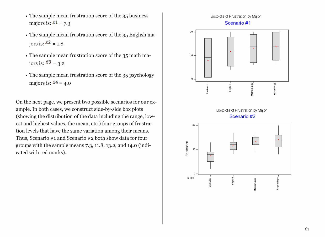
• The sample mean frustration score of the 35 business majors is: = 7.3
• The sample mean frustration score of the 35 English ma-
jors is: = 1.8
• The sample mean frustration score of the 35 math ma-jors is: = 3.2
• The sample mean frustration score of the 35 psychology majors is: = 4.0
On the next page, we present two possible scenarios for our ex-ample. In both cases, we construct side-by-side box plots (showing the distribution of the data including the range, low-est and highest values, the mean, etc.) four groups of frustra-tion levels that have the same variation among their means. Thus, Scenario #1 and Scenario #2 both show data for four groups with the sample means 7.3, 11.8, 13.2, and 14.0 (indi-cated with red marks).
!
!
61

Review 11.2 Multiple Choice
Look carefully at the graphs of both scenarios. For which of the two scenarios would you be willing to believe that samples have been taken from four groups which have the same population means?
A. Scenario 1
B. Scenario 2
For the answer to this question, view the Appendix.
The important difference between the two scenarios is that the first represents data with a large amount of variation within each of the four groups; the second represents data with a small amount of variation within each of the four groups.
Scenario 1, because of the large amount of spread within the groups, shows box plots with plenty of overlap. One could imagine the data arising from 4 random samples taken from 4 populations, all having the same mean of about 11 or 12. The first group of values may have been a bit on the low side, and the other three a bit on the high side, but such differences could conceivably have come about by chance. This would be the case if the null hypothesis, claiming equal population means, were true. Scenario 2, because of the small amount of spread within the groups, shows boxplots with very little over-lap. It would be very hard to believe that we are sampling from four groups that have equal population means. This
would be the case if the null hypothesis, claiming equal popu-lation means, were false.
Thus, in the language of hypothesis tests, we would say that if the data were configured as they are in scenario 1, we would not reject the null hypothesis that population mean frustra-tion levels were equal for the four majors. If the data were con-figured as they are in scenario 2, we would reject the null hy-pothesis, and we would conclude that mean frustration levels differ depending on major.
Let's summarize what we learned from this. The question we need to answer is: Are the differences among the sample means ( 's) due to true differences among the µ's (alternative hypothesis), or merely due to sampling variability (null hy-pothesis)?
In order to answer this question using our data, we obviously need to look at the variation among the sample means, but this alone is not enough. We need to look at the variation among the sample means relative to the variation within the groups. In other words, we need to look at the quantity:
!which measures to what extent the difference among the sam-pled groups' means dominates over the usual variation within
62
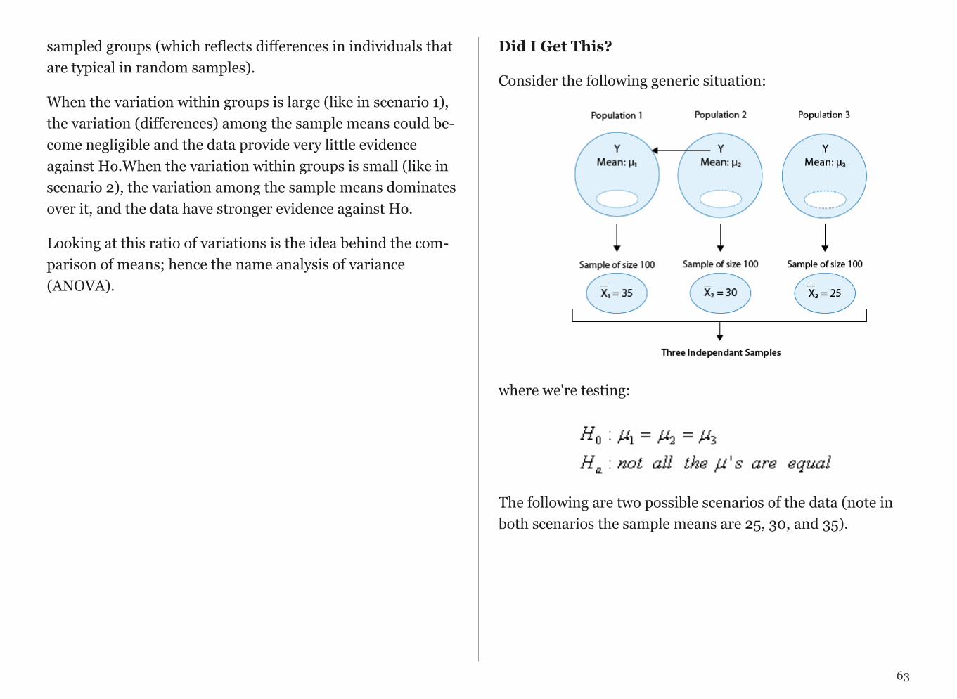
sampled groups (which reflects differences in individuals that are typical in random samples).
When the variation within groups is large (like in scenario 1), the variation (differences) among the sample means could be-come negligible and the data provide very little evidence against Ho.When the variation within groups is small (like in scenario 2), the variation among the sample means dominates over it, and the data have stronger evidence against Ho.
Looking at this ratio of variations is the idea behind the com-parison of means; hence the name analysis of variance (ANOVA).
Did I Get This?
Consider the following generic situation:
!
where we're testing:
!The following are two possible scenarios of the data (note in both scenarios the sample means are 25, 30, and 35).
63
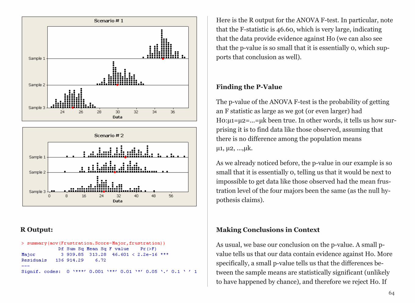
!
!
R Output:
!
Here is the R output for the ANOVA F-test. In particular, note that the F-statistic is 46.60, which is very large, indicating that the data provide evidence against Ho (we can also see that the p-value is so small that it is essentially 0, which sup-ports that conclusion as well).
Finding the P-Value
The p-value of the ANOVA F-test is the probability of getting an F statistic as large as we got (or even larger) had H0:µ1=µ2=...=µk been true. In other words, it tells us how sur-prising it is to find data like those observed, assuming that there is no difference among the population means µ1, µ2, ...,µk.
As we already noticed before, the p-value in our example is so small that it is essentially 0, telling us that it would be next to impossible to get data like those observed had the mean frus-tration level of the four majors been the same (as the null hy-pothesis claims).
Making Conclusions in Context
As usual, we base our conclusion on the p-value. A small p-value tells us that our data contain evidence against Ho. More specifically, a small p-value tells us that the differences be-tween the sample means are statistically significant (unlikely to have happened by chance), and therefore we reject Ho. If
64

the p-value is not small, the data do not provide enough evi-dence to reject Ho, and so we continue to believe that it may be true. A significance level (cut-off probability) of .05 can help determine what is considered a small p-value.
In our example, the p-value is extremely small (close to 0) in-dicating that our data provide extremely strong evidence to re-ject Ho. We conclude that the frustration level means of the four majors are not all the same, or, in other words, that ma-jors do have an effect on students' academic frustration levels at the school where the test was conducted.
Post Hoc Tests
When testing the relationship between your explanatory (X) and response variable (Y) in the context of ANOVA, your cate-gorical explanatory variable (X) may have more than two lev-els.
For example, when we examine the differences in mean GPA (Y) across different college years (X=freshman, sophomore, junior and senior) or the differences in mean frustration level (Y) by college major (X=Business, English, Mathematics, Psy-chology), there is just one alternative hypothesis, which claims that there is a relationship between X and Y.
In terms of the means µ1,µ2,µ3,...,µk,(ANOVA), it simply says the opposite of the alternative, that not all the means are equal.
Example:
Note that there are many ways for µ1,µ2,µ3,µ4 not to be all equal, and µ1≠µ2≠µ3≠µ4 is just one of them. Another way could be µ1=µ2=µ3≠µ4 or µ1=µ2≠µ3=µ4.
In the case where the explanatory variable (X) represents more than two groups, a significant ANOVA F test does not tell us which groups are different from the others.
To determine which groups are different from the others, we would need to perform post hoc tests. These tests, done after the ANOVA, are generally termed post hoc paired com-parisons. Post hoc paired comparisons (meaning “after the fact” or “af-ter data collection”) must be conducted in a particular way in order to prevent excessive Type I error.
Type I error occurs when you make an incorrect decision about the null hypothesis. Specifically, this type of error is made when your p-value makes you reject the null hypothesis (H0) when it is true. In other words, your p-value is suffi-ciently small for you to say that there is a real association, de-spite the fact that the differences you see are due to chance alone. The type I error rate equals your p-value and is denoted by the Greek letter α (alpha).
65
Although a Type I Error rate of .05 is considered acceptable (i.e. it is acceptable that 5 times out of 100 you will reject the null hypothesis when it is true), higher Type I error rates are not considered acceptable. If you were to use the significance level of .05 across multiple paired comparisons (for example, three) with p = .05, then the p rate across all three compari-sons is .05+.05+.05, or .15, yielding a 15% Type I Error rate. In other words, across the unprotected paired comparisons you will reject the null hypothesis when it is true, 15 times out of 100.
The purpose of running protected post hoc tests is that they allow you to conduct multiple paired comparisons without inflating the Type I Error rate.
For ANOVA, you can use one of several post hoc tests, each which control for Type I Error, while performing paired com-parisons (Duncan Multiple Range test, Dunnett’s Multiple Comparison test, Newman-Keuls test, Scheffe’s test, Tukey’s HSD test, Fisher’s LSD test, Sidak).
ANALYSIS OF VARIANCE
Analysis of variance assesses whether the means of two or more groups are statistically different from each other. This analysis is appropriate whenever you want to compare the means (quantitative variables) of groups (categorical variables). The null hypothesis is that there is no difference in the mean of the quantitative variable across groups (categorical variable), while the alternative is that there is a difference.
SPSS UNIANOVA QuantitativeResponse BY CategoricalExplanatory /POSTHOC=CategoricalExplanatory (TUKEY) /PRINT=ETASQ DESCRIPTIVE. Stata oneway QuantitativeResponse CategoricalExplanatory, sidak SAS Proc anova; class CategoricalExplanatory; model QuantitativeResponse=CategoricalExplanatory; means CategoricalExplanatory /duncan; R > TukeyHSD(aov(QuantitativeResponse ~ CategoricalExplanatory, data=title_of_data_set))
Note: exclude post hoc test from the syntax if your explanatory variable has only 2 levels (e.g yes and no). Include it when your explanatory variable has > 2 levels (e.g. red, white and blue).
66
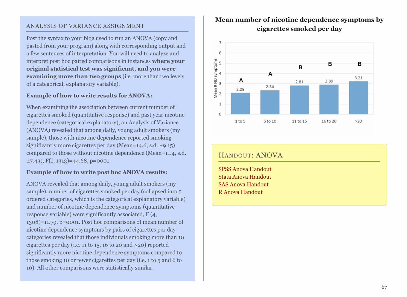
ANALYSIS OF VARIANCE ASSIGNMENT
Post the syntax to your blog used to run an ANOVA (copy and pasted from your program) along with corresponding output and a few sentences of interpretation. You will need to analyze and interpret post hoc paired comparisons in instances where your original statistical test was significant, and you were examining more than two groups (i.e. more than two levels of a categorical, explanatory variable).
Example of how to write results for ANOVA:
When examining the association between current number of cigarettes smoked (quantitative response) and past year nicotine dependence (categorical explanatory), an Analysis of Variance (ANOVA) revealed that among daily, young adult smokers (my sample), those with nicotine dependence reported smoking significantly more cigarettes per day (Mean=14.6, s.d. ±9.15) compared to those without nicotine dependence (Mean=11.4, s.d. ±7.43), F(1, 1313)=44.68, p=0001.
Example of how to write post hoc ANOVA results:
ANOVA revealed that among daily, young adult smokers (my sample), number of cigarettes smoked per day (collapsed into 5 ordered categories, which is the categorical explanatory variable) and number of nicotine dependence symptoms (quantitative response variable) were significantly associated, F (4, 1308)=11.79, p=0001. Post hoc comparisons of mean number of nicotine dependence symptoms by pairs of cigarettes per day categories revealed that those individuals smoking more than 10 cigarettes per day (i.e. 11 to 15, 16 to 20 and >20) reported significantly more nicotine dependence symptoms compared to those smoking 10 or fewer cigarettes per day (i.e. 1 to 5 and 6 to 10). All other comparisons were statistically similar.
Mean number of nicotine dependence symptoms by cigarettes smoked per day
HANDOUT: ANOVA
SPSS Anova Handout Stata Anova Handout SAS Anova HandoutR Anova Handout
67
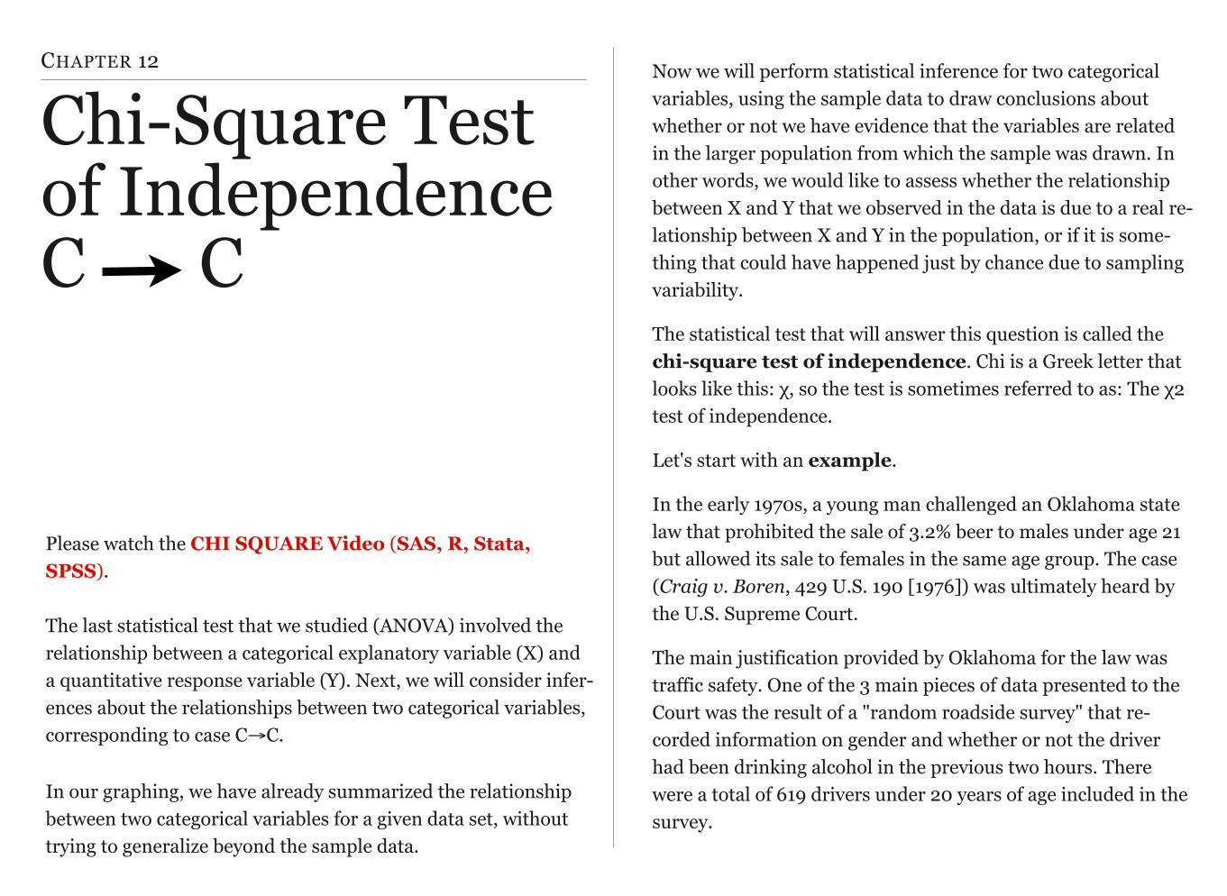
CHAPTER 12
Chi-Square Test of IndependenceC C
Please watch the CHI SQUARE Video (SAS, R, Stata, SPSS).
The last statistical test that we studied (ANOVA) involved the relationship between a categorical explanatory variable (X) and a quantitative response variable (Y). Next, we will consider infer-ences about the relationships between two categorical variables, corresponding to case C→C.
In our graphing, we have already summarized the relationship between two categorical variables for a given data set, without trying to generalize beyond the sample data.
Now we will perform statistical inference for two categorical variables, using the sample data to draw conclusions about whether or not we have evidence that the variables are related in the larger population from which the sample was drawn. In other words, we would like to assess whether the relationship between X and Y that we observed in the data is due to a real re-lationship between X and Y in the population, or if it is some-thing that could have happened just by chance due to sampling variability.
The statistical test that will answer this question is called the chi-square test of independence. Chi is a Greek letter that looks like this: χ, so the test is sometimes referred to as: The χ2 test of independence.
Let's start with an example.
In the early 1970s, a young man challenged an Oklahoma state law that prohibited the sale of 3.2% beer to males under age 21 but allowed its sale to females in the same age group. The case (Craig v. Boren, 429 U.S. 190 [1976]) was ultimately heard by the U.S. Supreme Court.
The main justification provided by Oklahoma for the law was traffic safety. One of the 3 main pieces of data presented to the Court was the result of a "random roadside survey" that re-corded information on gender and whether or not the driver had been drinking alcohol in the previous two hours. There were a total of 619 drivers under 20 years of age included in the survey.
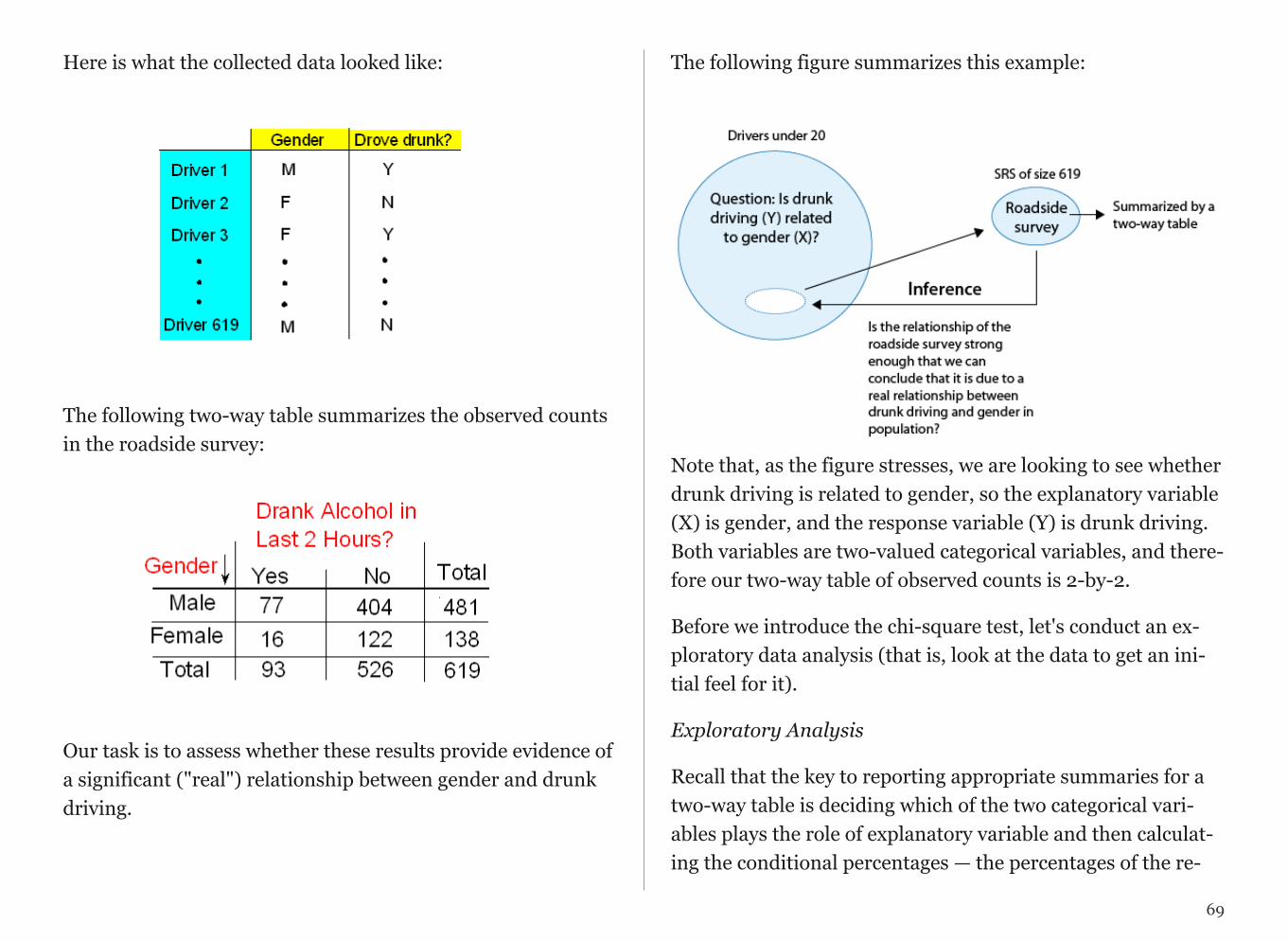
Here is what the collected data looked like:
The following two-way table summarizes the observed counts in the roadside survey:
Our task is to assess whether these results provide evidence of a significant ("real") relationship between gender and drunk driving.
The following figure summarizes this example:
!Note that, as the figure stresses, we are looking to see whether drunk driving is related to gender, so the explanatory variable (X) is gender, and the response variable (Y) is drunk driving. Both variables are two-valued categorical variables, and there-fore our two-way table of observed counts is 2-by-2.
Before we introduce the chi-square test, let's conduct an ex-ploratory data analysis (that is, look at the data to get an ini-tial feel for it).
Exploratory Analysis
Recall that the key to reporting appropriate summaries for a two-way table is deciding which of the two categorical vari-ables plays the role of explanatory variable and then calculat-ing the conditional percentages — the percentages of the re-
69
!
!

sponse variable for each value of the explanatory variable — separately. In this case, since the explanatory variable is gen-der, we would calculate the percentages of drivers who did (and did not) drink alcohol for males and females separately.
Here is the table of conditional percentages:
!
For the 619 sampled drivers, a larger percentage of males were found to be drunk than females (16.0% vs. 11.6%). Our data, in other words, provide some evidence that drunk driv-ing is related to gender; however, this in itself is not enough to conclude that such a relationship exists in the larger popula-tion of drivers under 20. We need to further investigate the data and decide between the following two points of view:
• The evidence provided by the roadside survey (16% vs. 11.6%) is strong enough to conclude (beyond a reason-able doubt) that it must be due to a relationship be-tween drunk driving and gender in the population of drivers under 20.
• The evidence provided by the roadside survey (16% vs. 11.6%) is not strong enough to make that conclu-sion and could just have happened by chance due to sampling variability, and not necessarily because a relationship exists in the population.
Actually, these two opposing points of view constitute the null and alternative hypotheses of the chi-square test for independ-ence, so now that we understand our example and what we still need to find out, let's introduce the four-step process of this test.
The Chi-Square Test of Independence
The chi-square test of independence examines our observed data and tells us whether we have enough evidence to con-clude beyond a reasonable doubt that two categorical vari-ables are related. Much like the previous part on the ANOVA F-test, we are going to introduce the hypotheses (step 1), and then discuss the idea behind the test, which will naturally lead to the test statistic (step 2).
Step 1: Stating the Hypothesis
Ho: There is no relationship between the two categorical vari-ables. (They are independent.)
Ha: There is a relationship between the two categorical vari-ables. (They are not independent.)
70
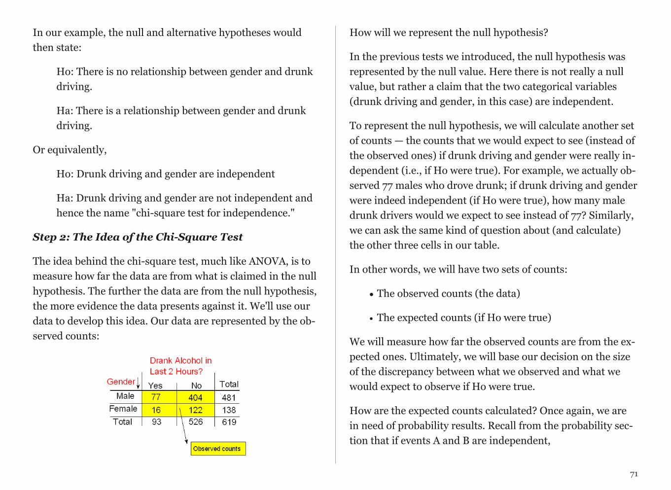
In our example, the null and alternative hypotheses would then state:
Ho: There is no relationship between gender and drunk driving.
Ha: There is a relationship between gender and drunk driving.
Or equivalently,
Ho: Drunk driving and gender are independent
Ha: Drunk driving and gender are not independent and hence the name "chi-square test for independence."
Step 2: The Idea of the Chi-Square Test
The idea behind the chi-square test, much like ANOVA, is to measure how far the data are from what is claimed in the null hypothesis. The further the data are from the null hypothesis, the more evidence the data presents against it. We'll use our data to develop this idea. Our data are represented by the ob-served counts:
!
How will we represent the null hypothesis?
In the previous tests we introduced, the null hypothesis was represented by the null value. Here there is not really a null value, but rather a claim that the two categorical variables (drunk driving and gender, in this case) are independent.
To represent the null hypothesis, we will calculate another set of counts — the counts that we would expect to see (instead of the observed ones) if drunk driving and gender were really in-dependent (i.e., if Ho were true). For example, we actually ob-served 77 males who drove drunk; if drunk driving and gender were indeed independent (if Ho were true), how many male drunk drivers would we expect to see instead of 77? Similarly, we can ask the same kind of question about (and calculate) the other three cells in our table.
In other words, we will have two sets of counts:
• The observed counts (the data)
• The expected counts (if Ho were true)
We will measure how far the observed counts are from the ex-pected ones. Ultimately, we will base our decision on the size of the discrepancy between what we observed and what we would expect to observe if Ho were true.
How are the expected counts calculated? Once again, we are in need of probability results. Recall from the probability sec-tion that if events A and B are independent,
71
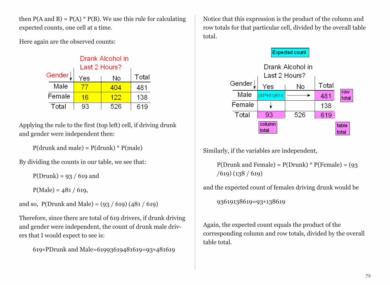
then P(A and B) = P(A) * P(B). We use this rule for calculating expected counts, one cell at a time.
Here again are the observed counts:
!
Applying the rule to the first (top left) cell, if driving drunk and gender were independent then:
P(drunk and male) = P(drunk) * P(male)
By dividing the counts in our table, we see that:
P(Drunk) = 93 / 619 and
P(Male) = 481 / 619,
and so, P(Drunk and Male) = (93 / 619) (481 / 619)
Therefore, since there are total of 619 drivers, if drunk driving and gender were independent, the count of drunk male driv-ers that I would expect to see is:
619∗PDrunk and Male=61993619481619=93∗481619
Notice that this expression is the product of the column and row totals for that particular cell, divided by the overall table total.
!
Similarly, if the variables are independent,
P(Drunk and Female) = P(Drunk) * P(Female) = (93 /619) (138 / 619)
and the expected count of females driving drunk would be
93619138619=93∗138619
Again, the expected count equals the product of the corresponding column and row totals, divided by the overall table total.
72

This will always be the case and will help streamline our calculations:
Here is the complete table of expected counts, followed by the table of observed counts:
!
!
Step 3: Finding the P-Value
The p-value for the chi-square test for independence is the probability of getting counts like those observed, assuming that the two variables are not related (which is claimed by the null hypothesis). The smaller the p-value, the more surprising
73
Review 12.1 Multiple Choice
Question 1 of 2
The expected count of males not driving drunk is:
A. (526*138)/619
B. (93*481)/619
C. (93*138)/619
D. (526*481)/619
Question 2 of 2
The expected count of females not driving drunk is:
A. (526*138)/619
B. (93*481)/619
C. (93*138)/619
D. (526*481)/619
it would be to get counts like we did if the null hypothesis were true.
Technically, the p-value is probability of observing χ2 as least as large as the one observed. Using statistical software, we find that the p-value for this test is 0.201.
Step 4: Stating the Conclusion in Context
As usual, we use the magnitude of the p-value to draw our con-clusions. A small p-value indicates that the evidence provided by the data is strong enough to reject Ho and conclude (be-yond a reasonable doubt) that the two variables are related. In particular, if a significance level of .05 is used, we will reject Ho if the p-value is less than .05.
A p-value of .201 is not small at all. There is no compelling sta-tistical evidence to reject Ho, and so we will continue to as-sume it may be true. Gender and drunk driving may be inde-pendent, and so the data suggest that a law that forbids sale of 3.2% beer to males and permits it to females is unwarranted. In fact, the Supreme Court, by a 7-2 majority, struck down the Oklahoma law as discriminatory and unjustified. In the major-ity opinion Justice Brennan wrote:
"Clearly, the protection of public health and safety represents an im-portant function of state and local governments. However, appellees' statistics in our view cannot support the conclusion that the gender-based distinction closely serves to achieve that objective and therefore the distinction cannot under [prior case law] withstand equal protec-tion challenge."
Post Hoc Tests
For post hoc tests following a Chi-Square, we use what is re-ferred to as the Bonferroni Adjustment. Like the post hoc tests used in the context of ANOVA, this adjustment is used to counteract the problem of Type I Error that occurs when mul-tiple comparisons are made. Following a Chi-Square test that includes an explanatory variable with 3 or more groups, we need to subset to each possible paired comparison. When in-terpreting these paired comparisons, rather than setting the α-level (p value) at .05, we divide .05 by the number of paired comparisons that we will be making. The result is our new α-level (p value). For example, if we have a significant Chi-Square when examining the association between number of cigarettes smoked per day (a 5 level categorical explanatory variable: 1-5 cigarettes; 6 -10 cigarettes; 11–15 cigarettes; 16-20 cigarettes; and >20) and nicotine dependence (a two level categorical response variable – yes vs. no), we will want to know which pairs of the 5 cigarette groups are different from one another with respect to rates of nicotine dependence.
In other words, we will make 10 comparisons (all possible comparisons). We will compare group 1 to 2; 1 to 3; 1 to 4; 1 to 5; 2 to 3; 2 to 4; 2 to 5; 3 to 4; 3 to 5; 4 to 5. When we evaluate the p-value for each of these post hoc chi-square tests, we will use .05/10=.005 as our alpha. If the p-value is < .005 then we will reject the null hypothesis. If it is > .005, we will fail to re-ject the null hypothesis.
74
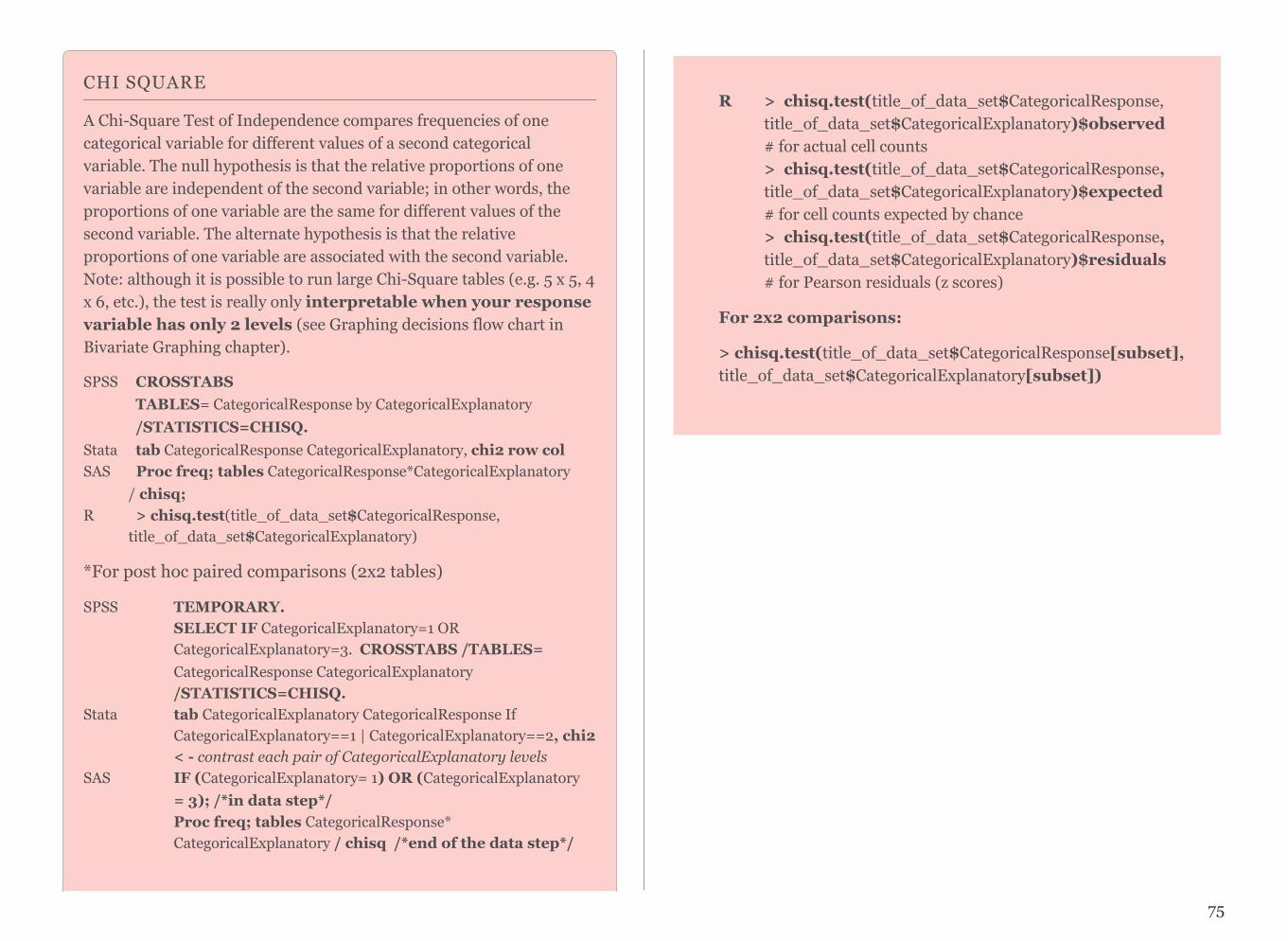
CHI SQUARE
A Chi-Square Test of Independence compares frequencies of one categorical variable for different values of a second categorical variable. The null hypothesis is that the relative proportions of one variable are independent of the second variable; in other words, the proportions of one variable are the same for different values of the second variable. The alternate hypothesis is that the relative proportions of one variable are associated with the second variable. Note: although it is possible to run large Chi-Square tables (e.g. 5 x 5, 4 x 6, etc.), the test is really only interpretable when your response variable has only 2 levels (see Graphing decisions flow chart in Bivariate Graphing chapter).
SPSS CROSSTABS TABLES= CategoricalResponse by CategoricalExplanatory /STATISTICS=CHISQ. Stata tab CategoricalResponse CategoricalExplanatory, chi2 row col SAS Proc freq; tables CategoricalResponse*CategoricalExplanatory / chisq; R > chisq.test(title_of_data_set$CategoricalResponse, title_of_data_set$CategoricalExplanatory)
*For post hoc paired comparisons (2x2 tables)
SPSS TEMPORARY. SELECT IF CategoricalExplanatory=1 OR CategoricalExplanatory=3. CROSSTABS /TABLES= CategoricalResponse CategoricalExplanatory /STATISTICS=CHISQ. Stata tab CategoricalExplanatory CategoricalResponse If CategoricalExplanatory==1 | CategoricalExplanatory==2, chi2 < - contrast each pair of CategoricalExplanatory levels SAS IF (CategoricalExplanatory= 1) OR (CategoricalExplanatory = 3); /*in data step*/ Proc freq; tables CategoricalResponse* CategoricalExplanatory / chisq /*end of the data step*/
75
R > chisq.test(title_of_data_set$CategoricalResponse, title_of_data_set$CategoricalExplanatory)$observed # for actual cell counts > chisq.test(title_of_data_set$CategoricalResponse, title_of_data_set$CategoricalExplanatory)$expected # for cell counts expected by chance > chisq.test(title_of_data_set$CategoricalResponse, title_of_data_set$CategoricalExplanatory)$residuals # for Pearson residuals (z scores)
For 2x2 comparisons:
> chisq.test(title_of_data_set$CategoricalResponse[subset], title_of_data_set$CategoricalExplanatory[subset])
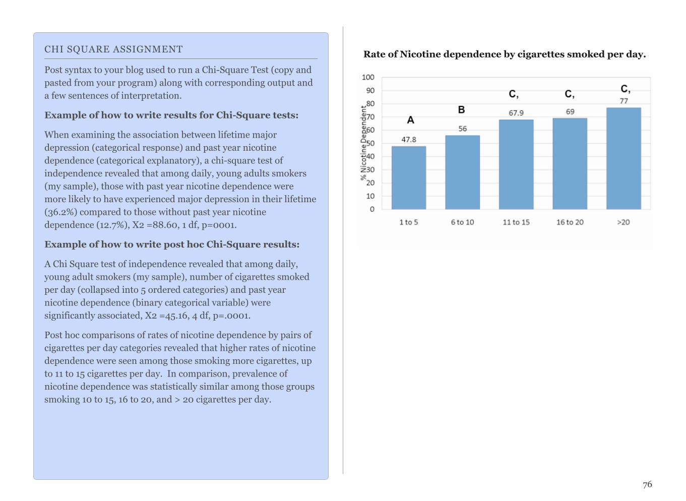
Rate of Nicotine dependence by cigarettes smoked per day.
76
CHI SQUARE ASSIGNMENT
Post syntax to your blog used to run a Chi-Square Test (copy and pasted from your program) along with corresponding output and a few sentences of interpretation.
Example of how to write results for Chi-Square tests:
When examining the association between lifetime major depression (categorical response) and past year nicotine dependence (categorical explanatory), a chi-square test of independence revealed that among daily, young adults smokers (my sample), those with past year nicotine dependence were more likely to have experienced major depression in their lifetime (36.2%) compared to those without past year nicotine dependence (12.7%), X2 =88.60, 1 df, p=0001.
Example of how to write post hoc Chi-Square results:
A Chi Square test of independence revealed that among daily, young adult smokers (my sample), number of cigarettes smoked per day (collapsed into 5 ordered categories) and past year nicotine dependence (binary categorical variable) were significantly associated, X2 =45.16, 4 df, p=.0001.
Post hoc comparisons of rates of nicotine dependence by pairs of cigarettes per day categories revealed that higher rates of nicotine dependence were seen among those smoking more cigarettes, up to 11 to 15 cigarettes per day. In comparison, prevalence of nicotine dependence was statistically similar among those groups smoking 10 to 15, 16 to 20, and > 20 cigarettes per day.

CHAPTER 13
Correlation Coefficient (r) Q Q
Please watch the CORRELATION Video (SAS, R, Stata, SPSS).
Q→Q is different in the sense that both variables are quantita-tive, and therefore, as you'll discover, this case will require a different kind of treatment and tools.
Let's start with an example:
Highway Signs
A Pennsylvania research firm conducted a study in which 30 drivers (of ages 18 to 82 years old) were sampled, and for each one, the maximum distance (in feet) at which he/she could read a newly designed sign was determined. The goal of this study was to explore the relationship between a driver's age and the maximum distance at which signs were legible, and then use the study's findings to improve safety for older drivers. (Reference: Utts and Heckard, Mind on Statistics (2002). Originally source: Data collected by Last Resource, Inc, Bellfonte, PA.)
Since the purpose of this study is to explore the effect of age on maximum legibility distance,
• the explanatory (X) variable is Age, and
• the response (Y) variable is Distance
Here is what the raw data looks like:
!

Note that the data structure is such that for each individual (in this case driver 1....driver 30) we have a pair of values (in this case representing the driver's age and distance). We can therefore think about these data as 30 pairs of values: (18, 510), (32, 410), (55, 420), ... , (82, 360).
The first step in exploring the relationship between driver age and sign legibility distance is to create an appropriate and in-formative graphical display. The appropriate graphical display for examining the relationship between two quantitative vari-ables is the scatterplot. Here is how a scatterplot is con-structed for our example:
To create a scatter-plot, each pair of values is plotted so that the value of the explanatory vari-able (X) is plotted on the horizontal axis, and the value of the response vari-able (Y) is plotted on the vertical axis. In other words, each individual (driver, in our ex-ample) appears on the scatterplot as a single point whose
X-coordinate is the value of the explanatory variable for that individual, and whose Y-coordinate is the value of the re-sponse variable.
Here is the completed scatterplot:
!
Interpreting the Scatterplot How do we explore the relationship between two quantitative variables using the scatterplot? What should we look at, or pay attention to?
Recall that when we described the distribution of a single quantitative variable with a histogram, we described the over-all pattern of the distribution (shape, center, spread) and any deviations from that pattern (outliers). We do the same thing
78!

with the scatterplot. The following figure summarizes this point:
!
As the figure explains, when describing the overall pattern of the relationship we look at its direction, form and strength.
The direction of the relationship can be positive, negative, or neither:
! ! !
A positive (or increasing) relationship means that an increase in one of the variables is associated with an increase in the other.
A negative (or decreasing) relationship means that an in-crease in one of the variables is associated with a decrease in the other.
Not all relationships can be classified as either positive or negative.
The form of the relationship is its general shape. When identi-fying the form, we try to find the simplest way to describe the shape of the scatterplot. There are many possible forms. Here are a couple that are quite common:
Relationships with a linear form are most simply described as points scattered about a line:
!
Relationships with a curvilinear form are most simply de-scribed as points dispersed around the same curved line:
79
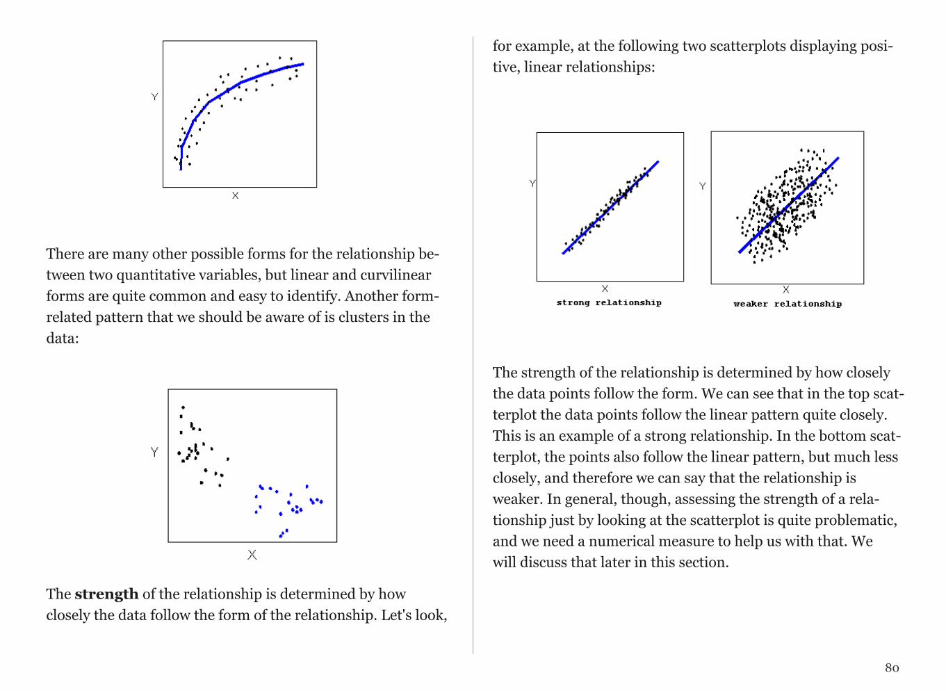
!
There are many other possible forms for the relationship be-tween two quantitative variables, but linear and curvilinear forms are quite common and easy to identify. Another form-related pattern that we should be aware of is clusters in the data:
!
The strength of the relationship is determined by how closely the data follow the form of the relationship. Let's look,
for example, at the following two scatterplots displaying posi-tive, linear relationships:
! !
The strength of the relationship is determined by how closely the data points follow the form. We can see that in the top scat-terplot the data points follow the linear pattern quite closely. This is an example of a strong relationship. In the bottom scat-terplot, the points also follow the linear pattern, but much less closely, and therefore we can say that the relationship is weaker. In general, though, assessing the strength of a rela-tionship just by looking at the scatterplot is quite problematic, and we need a numerical measure to help us with that. We will discuss that later in this section.
80

Data points that deviate from the pattern of the relationship are called outliers. We will see several examples of outliers during this section. Two outliers are illustrated in the scatterplot below:
!
Let's go back now to our example, and use the scatterplot to examine the relationship between the age of the driver and the maximum sign legibility distance. Here is the scatterplot:
!
The direction of the relationship is negative, which makes sense in context, since as you get older your eyesight weakens, and in particular older drivers tend to be able to read signs only at lesser distances. An arrow drawn over the scatterplot illustrates the negative direction of this relationship:
!
The form of the relationship seems to be linear. Notice how the points tend to be scattered about the line. Although, as we mentioned earlier, it is problematic to assess the strength without a numerical measure, the relationship appears to be moderately strong, as the data is fairly tightly scattered about the line. Finally, all the data points seem to "obey" the pattern—there do not appear to be any outliers.
81
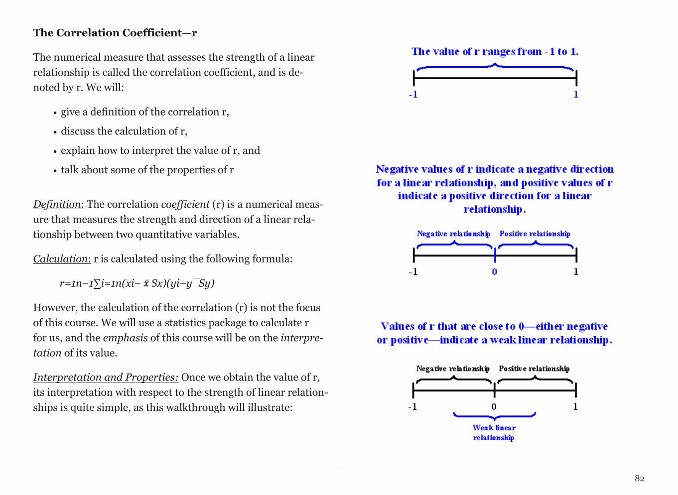
The Correlation Coefficient—r
The numerical measure that assesses the strength of a linear relationship is called the correlation coefficient, and is de-noted by r. We will:
• give a definition of the correlation r,
• discuss the calculation of r,
• explain how to interpret the value of r, and
• talk about some of the properties of r
Definition: The correlation coefficient (r) is a numerical meas-ure that measures the strength and direction of a linear rela-tionship between two quantitative variables.
Calculation: r is calculated using the following formula:
r=1n−1∑i=1n(xi− Sx)(yi−y¯Sy)
However, the calculation of the correlation (r) is not the focus of this course. We will use a statistics package to calculate r for us, and the emphasis of this course will be on the interpre-tation of its value.
Interpretation and Properties: Once we obtain the value of r, its interpretation with respect to the strength of linear relation-ships is quite simple, as this walkthrough will illustrate:
82
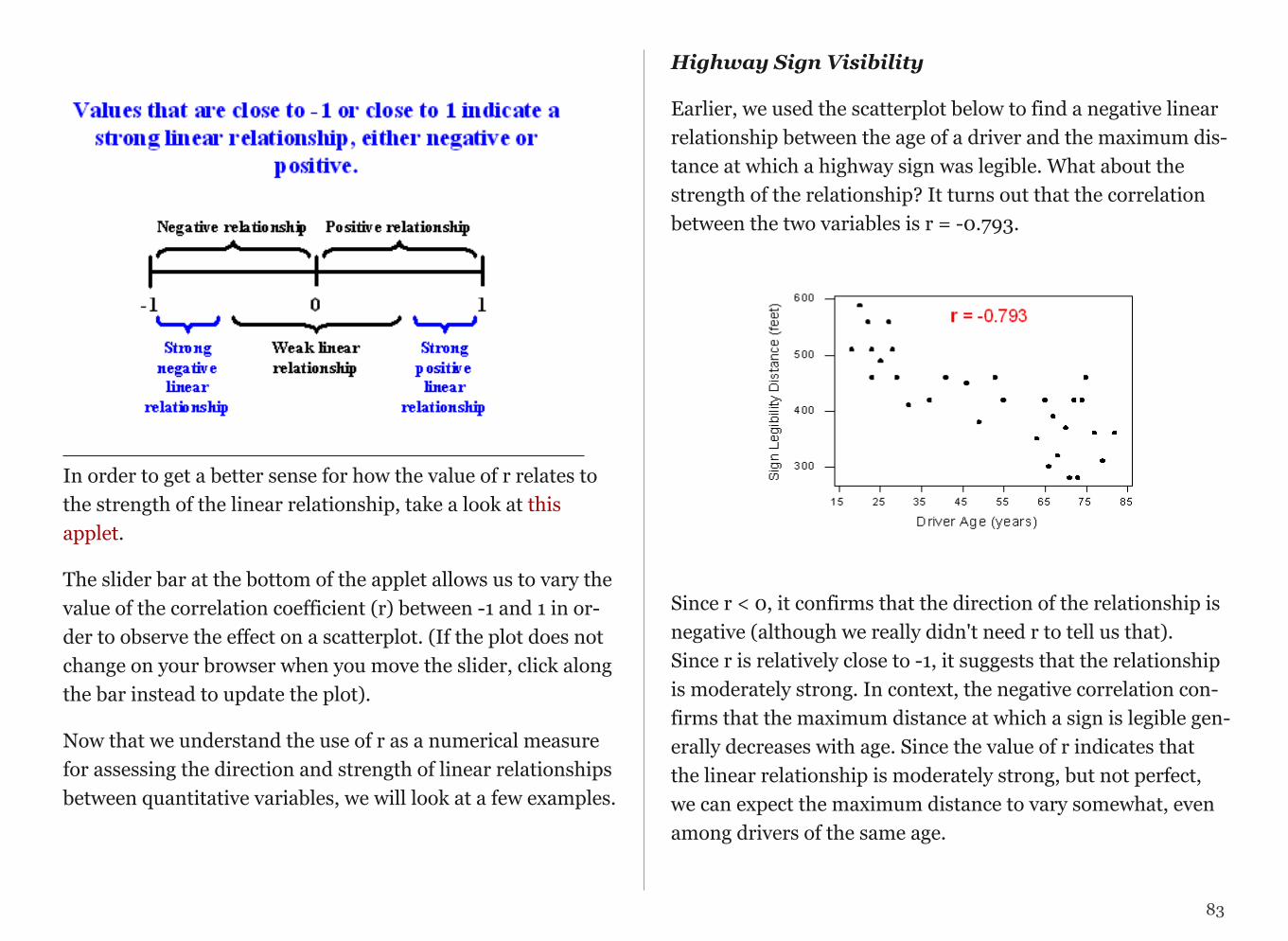
In order to get a better sense for how the value of r relates to the strength of the linear relationship, take a look at this applet.
The slider bar at the bottom of the applet allows us to vary the value of the correlation coefficient (r) between -1 and 1 in or-der to observe the effect on a scatterplot. (If the plot does not change on your browser when you move the slider, click along the bar instead to update the plot).
Now that we understand the use of r as a numerical measure for assessing the direction and strength of linear relationships between quantitative variables, we will look at a few examples.
Highway Sign Visibility
Earlier, we used the scatterplot below to find a negative linear relationship between the age of a driver and the maximum dis-tance at which a highway sign was legible. What about the strength of the relationship? It turns out that the correlation between the two variables is r = -0.793.
!
Since r < 0, it confirms that the direction of the relationship is negative (although we really didn't need r to tell us that). Since r is relatively close to -1, it suggests that the relationship is moderately strong. In context, the negative correlation con-firms that the maximum distance at which a sign is legible gen-erally decreases with age. Since the value of r indicates that the linear relationship is moderately strong, but not perfect, we can expect the maximum distance to vary somewhat, even among drivers of the same age.
83
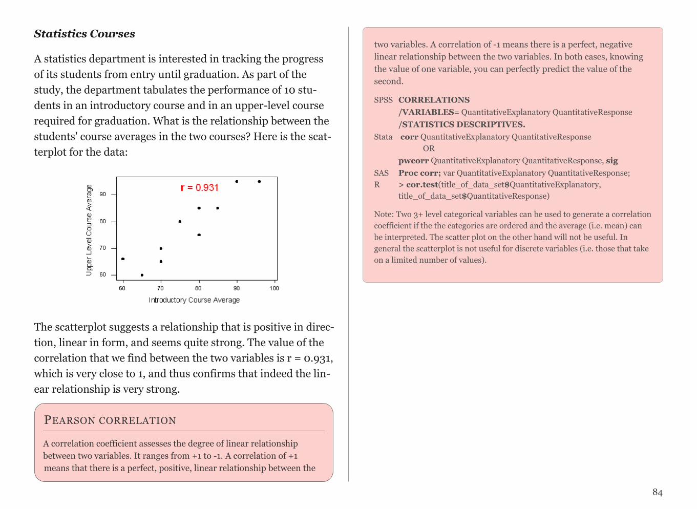
Statistics Courses
A statistics department is interested in tracking the progress of its students from entry until graduation. As part of the study, the department tabulates the performance of 10 stu-dents in an introductory course and in an upper-level course required for graduation. What is the relationship between the students' course averages in the two courses? Here is the scat-terplot for the data:
!
The scatterplot suggests a relationship that is positive in direc-tion, linear in form, and seems quite strong. The value of the correlation that we find between the two variables is r = 0.931, which is very close to 1, and thus confirms that indeed the lin-ear relationship is very strong.
two variables. A correlation of -1 means there is a perfect, negative linear relationship between the two variables. In both cases, knowing the value of one variable, you can perfectly predict the value of the second.
SPSS CORRELATIONS /VARIABLES= QuantitativeExplanatory QuantitativeResponse /STATISTICS DESCRIPTIVES. Stata corr QuantitativeExplanatory QuantitativeResponse OR pwcorr QuantitativeExplanatory QuantitativeResponse, sig SAS Proc corr; var QuantitativeExplanatory QuantitativeResponse; R > cor.test(title_of_data_set$QuantitativeExplanatory, title_of_data_set$QuantitativeResponse)
Note: Two 3+ level categorical variables can be used to generate a correlation coefficient if the the categories are ordered and the average (i.e. mean) can be interpreted. The scatter plot on the other hand will not be useful. In general the scatterplot is not useful for discrete variables (i.e. those that take on a limited number of values).
84
PEARSON CORRELATION
A correlation coefficient assesses the degree of linear relationship between two variables. It ranges from +1 to -1. A correlation of +1 means that there is a perfect, positive, linear relationship between the

PEARSON CORRELATION ASSIGNMENT
Post syntax to your blog used to generate a correlation coefficient (copy and pasted from your program) along with corresponding output and a few sentences of interpretation.
Note: When we square r, it tells us what proportion of the variability in one variable is described by variation in the second variable (aka R-Squared or Coefficient of Determination).
Example of how to write results for correlation coefficient: Among daily, young adult smokers (my sample), the correlation between number of cigarettes smoked per day (quantitative) and number of nicotine dependence symptoms experienced in the past year (quantitative) was 0.17 (p=.0001), suggesting that only 3% (i.e. 0.17 squared) of the variance in number of current nicotine dependence symptoms can be explained by number of cigarettes smoked per day.
85
CHAPTER 14
Exploring Moderation
Please watch the MODERATION Video (SAS, R, Stata, SPSS).
In statistics, moderation occurs when the relationship be-tween two variables depends on a third variable. In this case, the third variable is referred to as the moderating variable or simply the moderator. The effect of a moderating variable is often characterized statistically as an interaction; that is, a third variable that affects the direction and/or strength of the relation between your explanatory (X) and response (Y) vari-able.
Examples:
I have hypotheses about the association between smoking quan-tity and nicotine dependence for individuals with and without depression (the moderator). For example, for those with depres-sion, any amount of smoking may indicate substantial risk for nicotine dependence (i.e. at both low and high levels of daily smoking), while among those without depression, smoking quantity might be expected to be more clearly associated with likelihood of experiencing nicotine dependence (i.e. the more one smokes, the more likely they are to be nicotine dependent). In other words, I am hypothesizing a non-significant associa-tion between smoking and nicotine dependence for individuals with depression and a significant, positive association between smoking and nicotine dependence for individuals without de-pression.
To test this, I can run two ANOVA tests, one examining the association between nicotine dependence (categorical) and level of smoking (quantitative) for those with depression and one ex-amining the association between nicotine dependence (categori-cal) and level of smoking (quantitative) for those without de-pression.
The results show a significant association between smoking and nicotine dependence such that the greater the smoking, the higher the rate of nicotine dependence among those individuals with and without depression. In this example, we would say that depression does not moderate the relationship between smoking and nicotine dependence. In other words, the relation
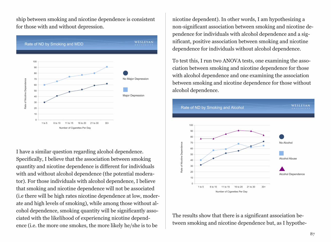
ship between smoking and nicotine dependence is consistent for those with and without depression.
Rate of ND by Smoking and MDD
0
10
20
30
40
50
60
70
80
90
100
1 to 5 6 to 10 11 to 15 16 to 20 21 to 30 30+
Rat
e of
Nic
otin
e D
epen
denc
e
Number of Cigarettes Per Day
No Major Depression
Major Depression
I have a similar question regarding alcohol dependence. Specifically, I believe that the association between smoking quantity and nicotine dependence is different for individuals with and without alcohol dependence (the potential modera-tor). For those individuals with alcohol dependence, I believe that smoking and nicotine dependence will not be associated (i.e there will be high rates nicotine dependence at low, moder-ate and high levels of smoking), while among those without al-cohol dependence, smoking quantity will be significantly asso-ciated with the likelihood of experiencing nicotine depend-ence (i.e. the more one smokes, the more likely he/she is to be
nicotine dependent). In other words, I am hypothesizing a non-significant association between smoking and nicotine de-pendence for individuals with alcohol dependence and a sig-nificant, positive association between smoking and nicotine dependence for individuals without alcohol dependence.
To test this, I run two ANOVA tests, one examining the asso-ciation between smoking and nicotine dependence for those with alcohol dependence and one examining the association between smoking and nicotine dependence for those without alcohol dependence.
Rate of ND by Smoking and Alcohol
0
10
20
30
40
50
60
70
80
90
100
1 to 5 6 to 10 11 to 15 16 to 20 21 to 30 30+
Rat
e of
Nic
otin
e D
epen
denc
e
Number of Cigarettes Per Day
Alcohol Abuse
No Alcohol
Alcohol Dependence
The results show that there is a significant association be-tween smoking and nicotine dependence but, as I hypothe-
87
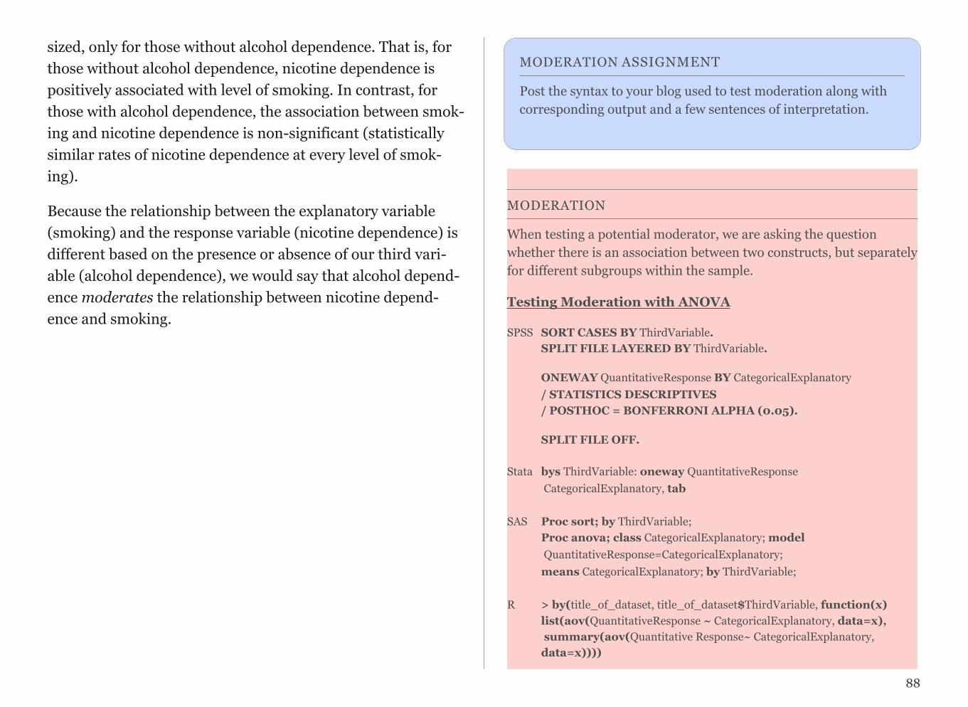
sized, only for those without alcohol dependence. That is, for those without alcohol dependence, nicotine dependence is positively associated with level of smoking. In contrast, for those with alcohol dependence, the association between smok-ing and nicotine dependence is non-significant (statistically similar rates of nicotine dependence at every level of smok-ing).
Because the relationship between the explanatory variable (smoking) and the response variable (nicotine dependence) is different based on the presence or absence of our third vari-able (alcohol dependence), we would say that alcohol depend-ence moderates the relationship between nicotine depend-ence and smoking.
MODERATION ASSIGNMENT
Post the syntax to your blog used to test moderation along with corresponding output and a few sentences of interpretation.
88
MODERATION
When testing a potential moderator, we are asking the question whether there is an association between two constructs, but separately for different subgroups within the sample.
Testing Moderation with ANOVA
SPSS SORT CASES BY ThirdVariable. SPLIT FILE LAYERED BY ThirdVariable.
ONEWAY QuantitativeResponse BY CategoricalExplanatory / STATISTICS DESCRIPTIVES / POSTHOC = BONFERRONI ALPHA (0.05).
SPLIT FILE OFF.Stata bys ThirdVariable: oneway QuantitativeResponse CategoricalExplanatory, tabSAS Proc sort; by ThirdVariable; Proc anova; class CategoricalExplanatory; model QuantitativeResponse=CategoricalExplanatory; means CategoricalExplanatory; by ThirdVariable;R > by(title_of_dataset, title_of_dataset$ThirdVariable, function(x) list(aov(QuantitativeResponse ~ CategoricalExplanatory, data=x), summary(aov(Quantitative Response~ CategoricalExplanatory, data=x))))
R > by(title_of_dataset, title_of_dataset$ThirdVariable, function(x) list(chisq.test(x$QuantitativeResponse , x$CategoricalExplanatory), chisq.test (x$QuantitativeResponse, x$CategoricalExplanatory)residuals))
Testing Moderation with CHI-SQUARE
SPSS CROSSTABS /TABLES = CategoricalResponse by CategoricalExplanatory by ThirdVariable /CELLS = COUNT ROW /STATISTICS = CHISQ. Stata bys ThirdVariable: tab CategoricalExplanatory CategoricalReponse, chi2 row
SAS Proc sort; by ThirdVariable; Proc freq; tables CategoricalResponse*CategoricalExplanatory / chisq; by ThirdVariable;
R > by(title_of_dataset, title_of_dataset$ThirdVariable, function(x) list(chisq.test(x$CategoricalResponse , x$CategorialExplanatory), chisq.test(x$CategoricalResponse, x$CategoricalExplanatory)residuals))
Testing for Moderation with PEARSON CORRELATION
SPSS SORT CASES BY ThirdVariable. SPLIT FILE LAYERED BY ThirdVariable.
CORRELATIONS /VARIABLES= QuantitativeExplanatory QuantitativeResponse /STATISTICS DESCRIPTIVES.
SPLIT FILE OFF.
Stata bys ThirdVar: corr QuantitativeExplanatory QuantitativeResponse (OR) bys ThirdVar: pwcorr QuantitativeExplanatory QuantitativeResponse, sig
SAS Proc sort; by ThirdVariable; Proc corr; var Quantitative Explanatory QuantitativeResponse; by ThirdVariable;
R > by(title_of_dataset, title_of_dataset$ThirdVariable, function(x) cor.test(~ QuantitaitveResponse + QuantitativeExplanatory, data=x))
Note: Third variable must be categorical. See example text in this chapter for how to write about moderation.
89
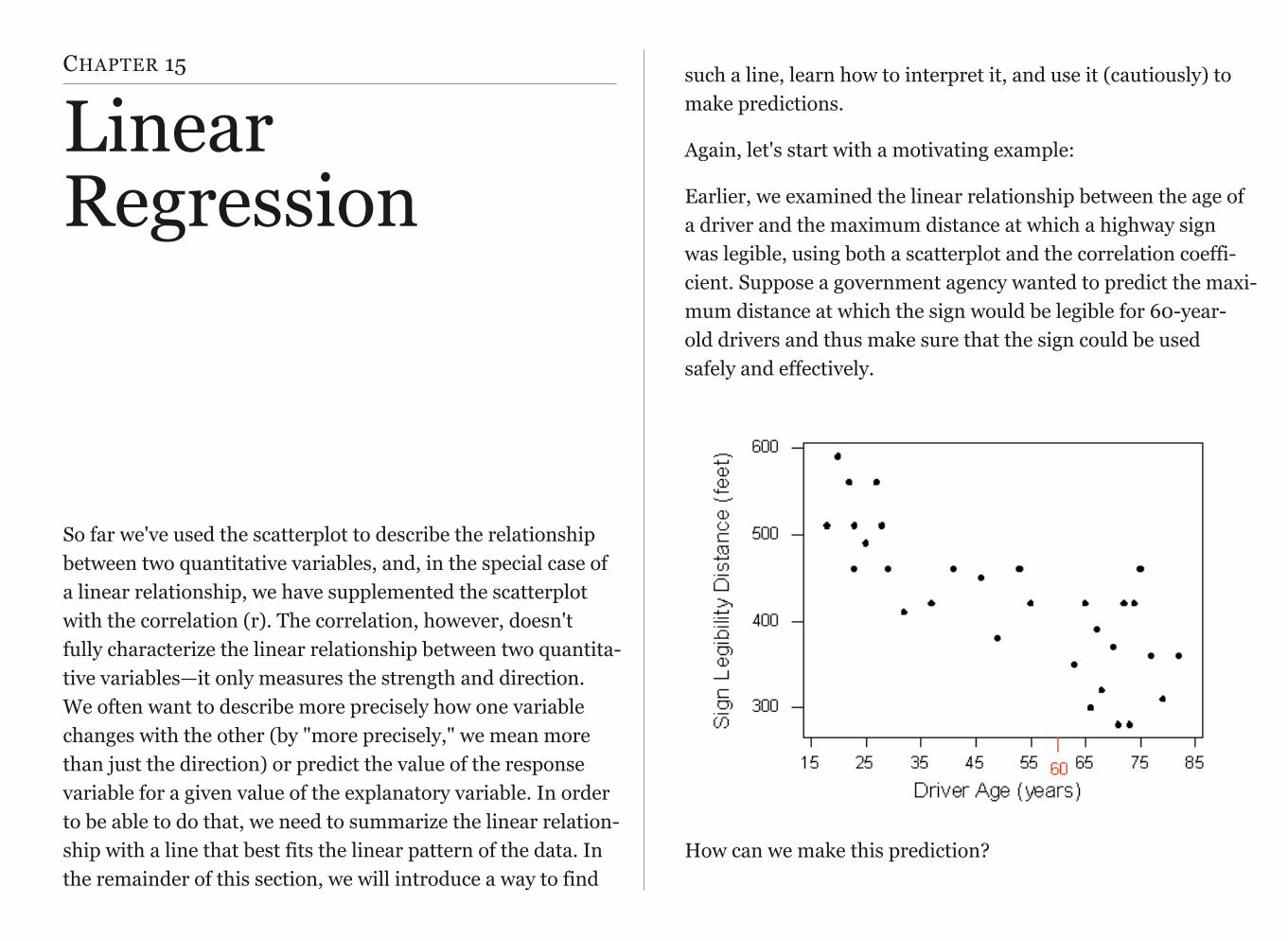
CHAPTER 15
Linear Regression
So far we've used the scatterplot to describe the relationship between two quantitative variables, and, in the special case of a linear relationship, we have supplemented the scatterplot with the correlation (r). The correlation, however, doesn't fully characterize the linear relationship between two quantita-tive variables—it only measures the strength and direction. We often want to describe more precisely how one variable changes with the other (by "more precisely," we mean more than just the direction) or predict the value of the response variable for a given value of the explanatory variable. In order to be able to do that, we need to summarize the linear relation-ship with a line that best fits the linear pattern of the data. In the remainder of this section, we will introduce a way to find
such a line, learn how to interpret it, and use it (cautiously) to make predictions.
Again, let's start with a motivating example:
Earlier, we examined the linear relationship between the age of a driver and the maximum distance at which a highway sign was legible, using both a scatterplot and the correlation coeffi-cient. Suppose a government agency wanted to predict the maxi-mum distance at which the sign would be legible for 60-year-old drivers and thus make sure that the sign could be used safely and effectively.
How can we make this prediction?

at which a sign is legible. The age for which an agency wishes to predict the legibility distance, 60, is marked in red.
It would be useful if we could find a line (such as the one that is presented on the scatterplot below) that represents the gen-eral pattern of the data.
Then we would sim-
ply use this line to find the dis-
tance that corre- sponds to an age of 60 like this:
and predict that 60-year-old drivers could see the sign from a distance of just under 400 feet.
How and why did we pick this particular line (the one shown in red in the above walkthrough) to describe the dependence of the maximum distance at which a sign is legible upon the age of a driver? What line exactly did we choose? We will re-turn to this example once we can answer that question with a bit more precision.
To understand how such a line is chosen, consider the follow-ing very simplified version of the age-distance example (we left just 6 of the drivers on the scat-terplot):
There are many lines that look like they would be good candidates to be the line that best fits the data:
91
!
!
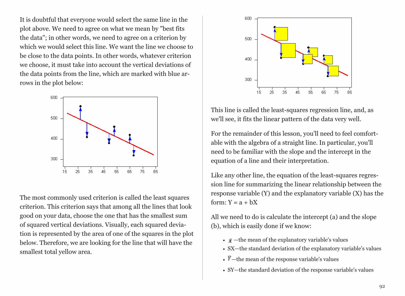
It is doubtful that everyone would select the same line in the plot above. We need to agree on what we mean by "best fits the data"; in other words, we need to agree on a criterion by which we would select this line. We want the line we choose to be close to the data points. In other words, whatever criterion we choose, it must take into account the vertical deviations of the data points from the line, which are marked with blue ar-rows in the plot below:
!
The most commonly used criterion is called the least squares criterion. This criterion says that among all the lines that look good on your data, choose the one that has the smallest sum of squared vertical deviations. Visually, each squared devia-tion is represented by the area of one of the squares in the plot below. Therefore, we are looking for the line that will have the smallest total yellow area.
!
This line is called the least-squares regression line, and, as we'll see, it fits the linear pattern of the data very well.
For the remainder of this lesson, you'll need to feel comfort-able with the algebra of a straight line. In particular, you'll need to be familiar with the slope and the intercept in the equation of a line and their interpretation.
Like any other line, the equation of the least-squares regres-sion line for summarizing the linear relationship between the response variable (Y) and the explanatory variable (X) has the form: Y = a + bX
All we need to do is calculate the intercept (a) and the slope (b), which is easily done if we know:
• — —the mean of the explanatory variable's values• SX—the standard deviation of the explanatory variable's values
• —the mean of the response variable's values
• SY—the standard deviation of the response variable's values
92
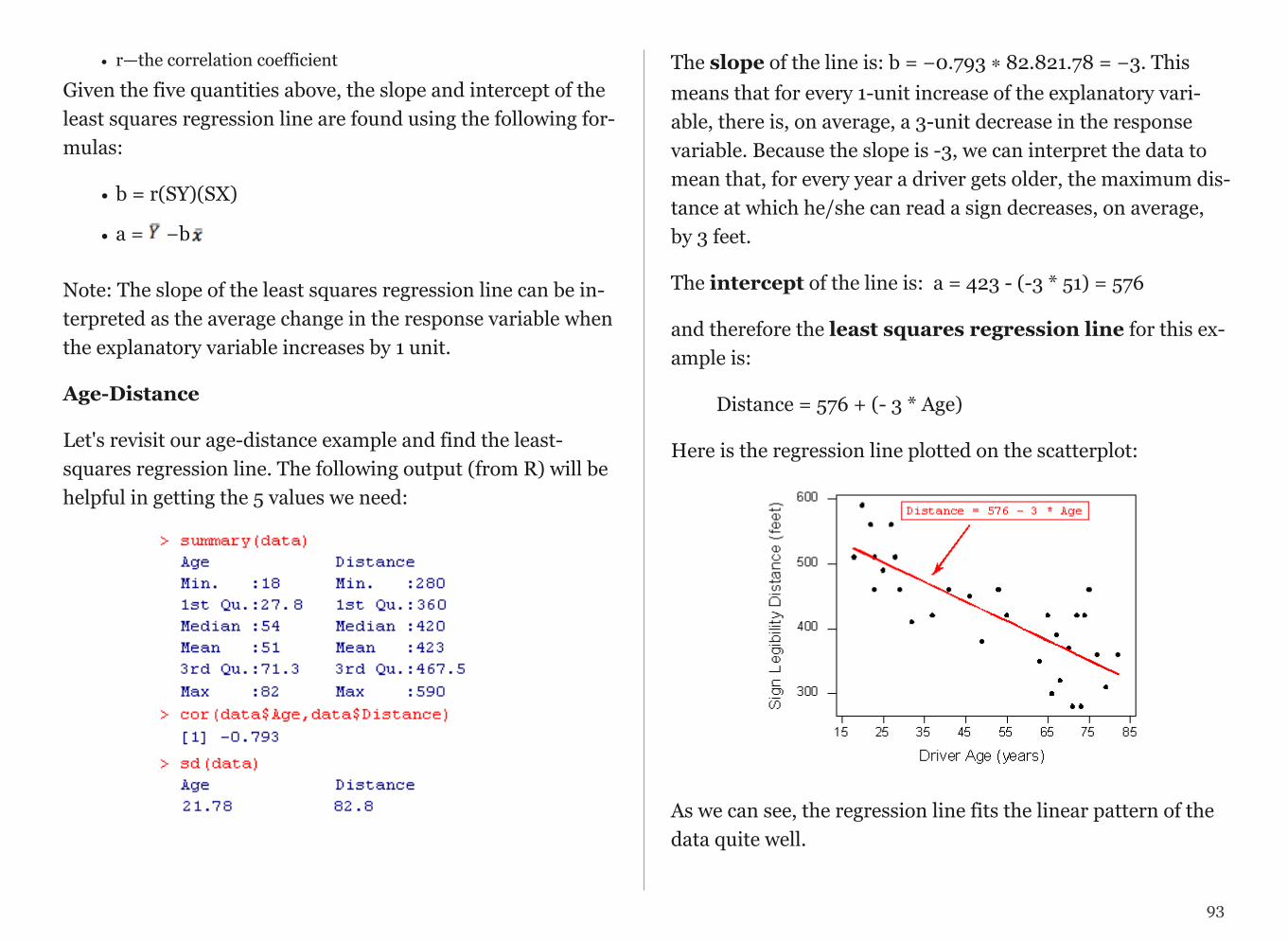
• r—the correlation coefficient
Given the five quantities above, the slope and intercept of the least squares regression line are found using the following for-mulas:
• b = r(SY)(SX)
• a = −b
Note: The slope of the least squares regression line can be in-terpreted as the average change in the response variable when the explanatory variable increases by 1 unit.
Age-Distance
Let's revisit our age-distance example and find the least-squares regression line. The following output (from R) will be helpful in getting the 5 values we need:
!
The slope of the line is: b = −0.793 ∗ 82.821.78 = −3. This means that for every 1-unit increase of the explanatory vari-able, there is, on average, a 3-unit decrease in the response variable. Because the slope is -3, we can interpret the data to mean that, for every year a driver gets older, the maximum dis-tance at which he/she can read a sign decreases, on average, by 3 feet.
The intercept of the line is: a = 423 - (-3 * 51) = 576
and therefore the least squares regression line for this ex-ample is:
Distance = 576 + (- 3 * Age)
Here is the regression line plotted on the scatterplot:
!
As we can see, the regression line fits the linear pattern of the data quite well.
93
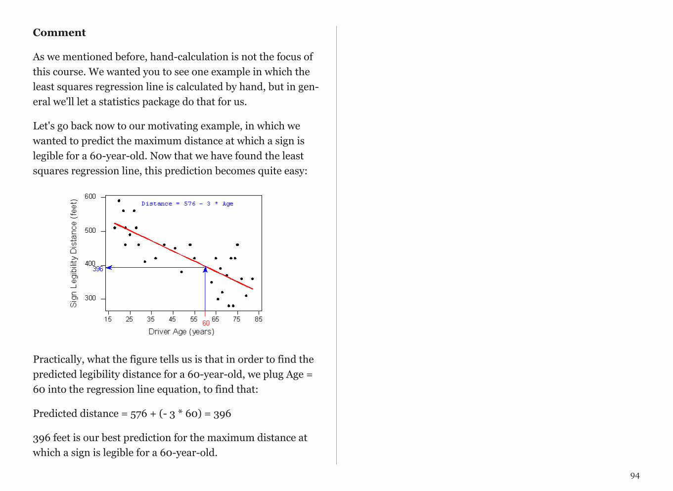
Comment
As we mentioned before, hand-calculation is not the focus of this course. We wanted you to see one example in which the least squares regression line is calculated by hand, but in gen-eral we'll let a statistics package do that for us.
Let's go back now to our motivating example, in which we wanted to predict the maximum distance at which a sign is legible for a 60-year-old. Now that we have found the least squares regression line, this prediction becomes quite easy:
!
Practically, what the figure tells us is that in order to find the predicted legibility distance for a 60-year-old, we plug Age = 60 into the regression line equation, to find that:
Predicted distance = 576 + (- 3 * 60) = 396
396 feet is our best prediction for the maximum distance at which a sign is legible for a 60-year-old.
94

CHAPTER 16
Sampling and Designing Studies
Suppose you want to determine the musical preferences of all students at your university based on a sample of students. Here are some examples of the many possible ways to pursue this problem.
Example #1:
Post a music-lovers' survey on a university Internet bulletin board, asking students to vote for their favorite type of music.
This is an example of a volunteer sample, where individuals have selected themselves to be included. Such a sample is al-most guaranteed to be biased. In general, volunteer samples tend to be comprised of individuals who have a particularly strong opinion about an issue and are looking for an opportu-nity to voice it. Whether the variable's values obtained from such a sample are over- or under-stated, and to what extent, cannot be determined. As a result, data obtained from a volun-tary response sample is quite useless when you think about the "Big Picture", since the sampled individuals only provide infor-mation about themselves, and we cannot generalize to any larger group at all.
Comment: It should be mentioned that in some cases volunteer samples are the only ethical way to obtain a sample. In medical studies, for example, in which new treatments are tested, sub-jects must choose to participate by signing a consent form that highlights the potential risks and benefits. As we will discuss in the next module, a volunteer sample is not so problematic in a study conducted for the purpose of comparing several treat-ments.
Example #2:
Stand outside the Student Union, across from the Fine Arts Building, and ask students passing by to respond to a
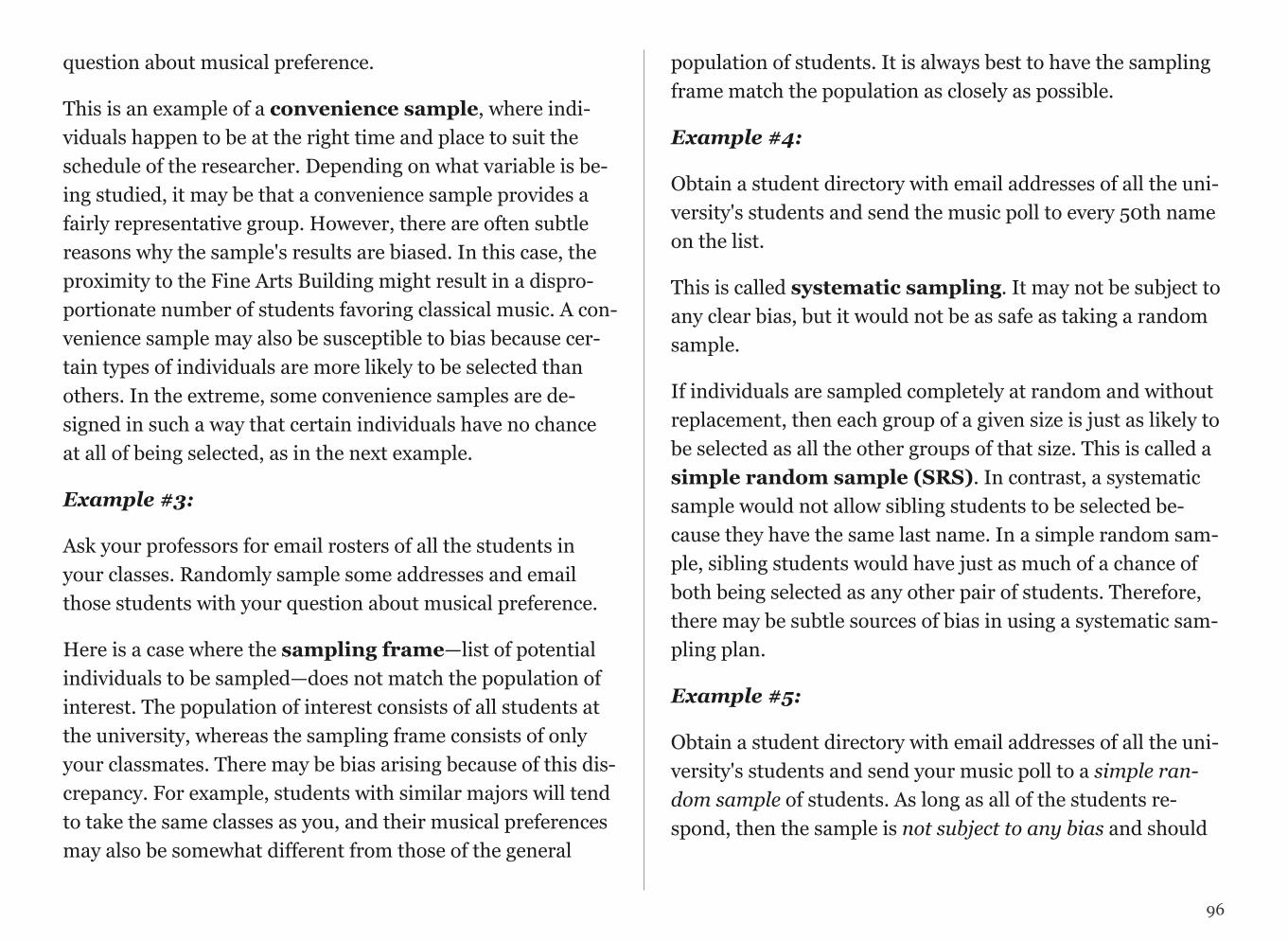
question about musical preference.
This is an example of a convenience sample, where indi-viduals happen to be at the right time and place to suit the schedule of the researcher. Depending on what variable is be-ing studied, it may be that a convenience sample provides a fairly representative group. However, there are often subtle reasons why the sample's results are biased. In this case, the proximity to the Fine Arts Building might result in a dispro-portionate number of students favoring classical music. A con-venience sample may also be susceptible to bias because cer-tain types of individuals are more likely to be selected than others. In the extreme, some convenience samples are de-signed in such a way that certain individuals have no chance at all of being selected, as in the next example.
Example #3:
Ask your professors for email rosters of all the students in your classes. Randomly sample some addresses and email those students with your question about musical preference.
Here is a case where the sampling frame—list of potential individuals to be sampled—does not match the population of interest. The population of interest consists of all students at the university, whereas the sampling frame consists of only your classmates. There may be bias arising because of this dis-crepancy. For example, students with similar majors will tend to take the same classes as you, and their musical preferences may also be somewhat different from those of the general
population of students. It is always best to have the sampling frame match the population as closely as possible.
Example #4:
Obtain a student directory with email addresses of all the uni-versity's students and send the music poll to every 50th name on the list.
This is called systematic sampling. It may not be subject to any clear bias, but it would not be as safe as taking a random sample.
If individuals are sampled completely at random and without replacement, then each group of a given size is just as likely to be selected as all the other groups of that size. This is called a simple random sample (SRS). In contrast, a systematic sample would not allow sibling students to be selected be-cause they have the same last name. In a simple random sam-ple, sibling students would have just as much of a chance of both being selected as any other pair of students. Therefore, there may be subtle sources of bias in using a systematic sam-pling plan.
Example #5:
Obtain a student directory with email addresses of all the uni-versity's students and send your music poll to a simple ran-dom sample of students. As long as all of the students re-spond, then the sample is not subject to any bias and should
96
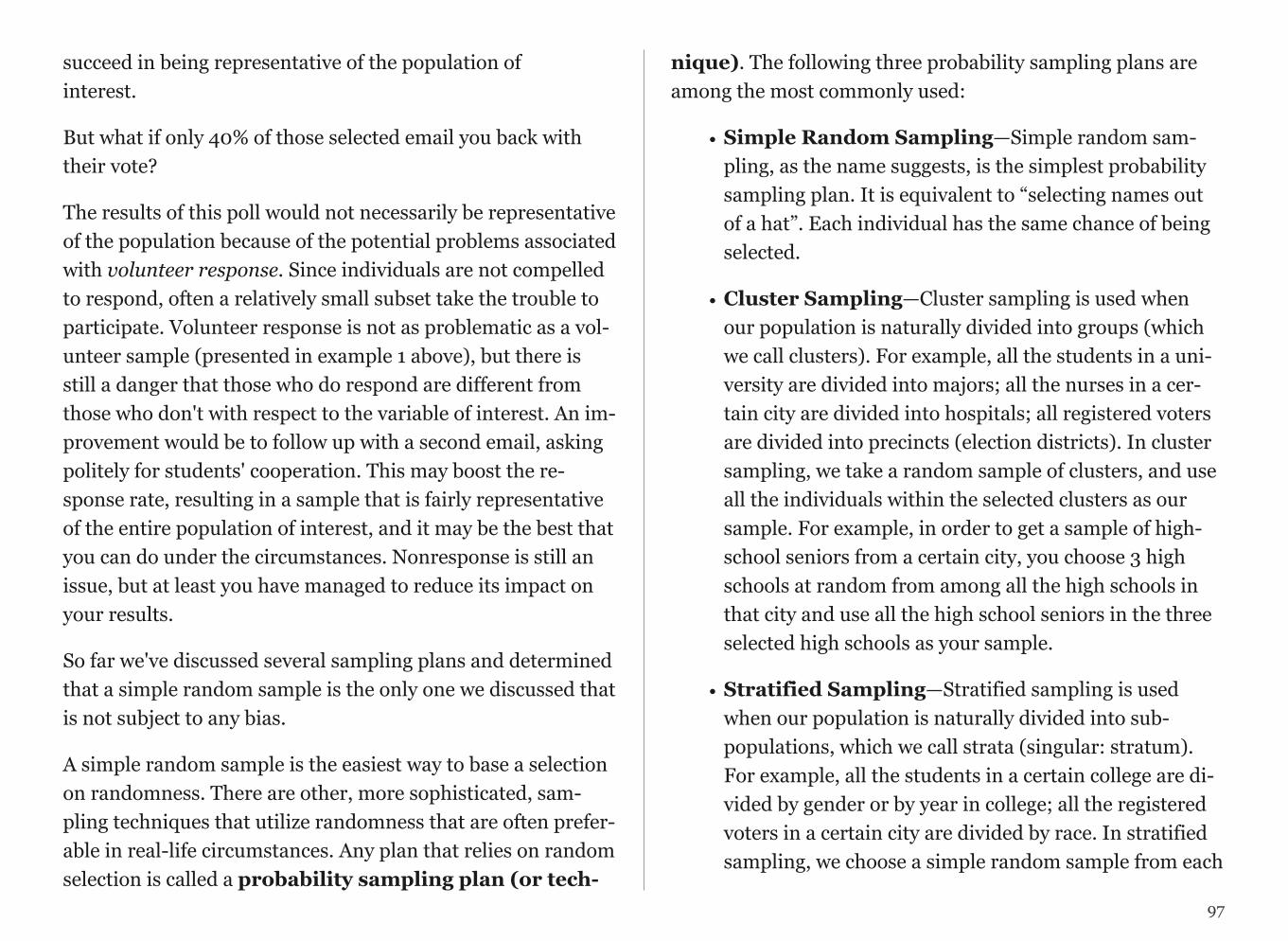
succeed in being representative of the population of interest.
But what if only 40% of those selected email you back with their vote?
The results of this poll would not necessarily be representative of the population because of the potential problems associated with volunteer response. Since individuals are not compelled to respond, often a relatively small subset take the trouble to participate. Volunteer response is not as problematic as a vol-unteer sample (presented in example 1 above), but there is still a danger that those who do respond are different from those who don't with respect to the variable of interest. An im-provement would be to follow up with a second email, asking politely for students' cooperation. This may boost the re-sponse rate, resulting in a sample that is fairly representative of the entire population of interest, and it may be the best that you can do under the circumstances. Nonresponse is still an issue, but at least you have managed to reduce its impact on your results.
So far we've discussed several sampling plans and determined that a simple random sample is the only one we discussed that is not subject to any bias.
A simple random sample is the easiest way to base a selection on randomness. There are other, more sophisticated, sam-pling techniques that utilize randomness that are often prefer-able in real-life circumstances. Any plan that relies on random selection is called a probability sampling plan (or tech-
nique). The following three probability sampling plans are among the most commonly used:
• Simple Random Sampling—Simple random sam-pling, as the name suggests, is the simplest probability sampling plan. It is equivalent to “selecting names out of a hat”. Each individual has the same chance of being selected.
• Cluster Sampling—Cluster sampling is used when our population is naturally divided into groups (which we call clusters). For example, all the students in a uni-versity are divided into majors; all the nurses in a cer-tain city are divided into hospitals; all registered voters are divided into precincts (election districts). In cluster sampling, we take a random sample of clusters, and use all the individuals within the selected clusters as our sample. For example, in order to get a sample of high-school seniors from a certain city, you choose 3 high schools at random from among all the high schools in that city and use all the high school seniors in the three selected high schools as your sample.
• Stratified Sampling—Stratified sampling is used when our population is naturally divided into sub-populations, which we call strata (singular: stratum). For example, all the students in a certain college are di-vided by gender or by year in college; all the registered voters in a certain city are divided by race. In stratified sampling, we choose a simple random sample from each
97

stratum, and our sample consists of all these simple ran-dom samples put together. For example, in order to get a random sample of high-school seniors from a certain city, we choose a random sample of 25 seniors from each of the high schools in that city. Our sample consists of all these samples put together.
Each of those probability sampling plans, if applied correctly, are not subject to any bias and thus produce samples that rep-resent well the population from which they were drawn.
Comment: Cluster vs. Stratified
Students sometimes get confused about the difference be-tween cluster sampling and stratified sampling. Even though both methods start out with the population somehow divided into groups, the two methods are very different. In cluster sampling, we take a random sample of whole groups of indi-viduals, while in stratified sampling we take a simple random sample from each group. For example, say we want to conduct a study on the sleeping habits of undergraduate students at a certain university and need to obtain a sample. The students are naturally divided by majors, and let's say that in this uni-versity there are 40 different majors. In cluster sampling, we would randomly choose, say, 5 majors (groups) out of the 40 and use all the students in these five majors as our sample. In stratified sampling, we would obtain a random sample of, say, 10 students from each of the 40 majors (groups) and use the 400 chosen students as the sample. Clearly in this example, stratified sampling is much better since the major of the stu-
dent might have an effect on the student's sleeping habits, and so we would like to make sure that we have representatives from all the different majors. We’ll stress this point again fol-lowing the example and activity.
Suppose you would like to study the job satisfaction of hospi-tal nurses in a certain city based on a sample. Besides taking a simple random sample, here are two additional ways to obtain such a sample.
1. Suppose that the city has 10 hospitals. Choose one of the 10 hospitals at random and interview all the nurses in that hospi-tal regarding their job satisfaction. This is an example of clus-ter sampling, in which the hospitals are the clusters.
2. Choose a random sample of 50 nurses from each of the 10 hospitals and interview these 50 * 10 = 500 regarding their job satisfaction. This is an example of stratified sampling, in which each hospital is a stratum.
Cluster or Stratified—Which One is Better?
Let’s go back and revisit the job satisfaction of hospital nurses example and discuss the pros and cons of the two sampling plans that are presented. Certainly, it will be much easier to conduct the study using the cluster sample because all inter-views are conducted in one hospital as opposed to the strati-fied sample, in which the interviews need to be conducted in 10 different hospitals. However, the hospital that a nurse works in probably has a direct impact on his/her job satisfac-tion, and, in that sense, getting data from just one hospital
98

might provide biased results. In this case, it will be very impor-tant to have representation from all the city hospitals, and therefore the stratified sample is definitely preferable. On the other hand, say that, instead of job satisfaction, our study fo-cuses on the age or weight of hospital nurses.
In this case, it is probably not as crucial to get representation from the different hospitals, and therefore the more easily ob-tained cluster sample might be preferable.
Designing Studies
Obviously, sampling is not done for its own sake. After this first stage in the data production process is completed, we come to the second stage, that of gaining information about the variables of interest from the sampled individuals. In this module we'll discuss three study designs; each design enables you to determine the values of the variables in a different way. You can:
- Carry out an observational study, in which values of the vari-able or variables of interest are recorded as they naturally oc-cur. There is no interference by the researchers who conduct the study.
- Take a sample survey, which is a particular type of observa-tional study in which individuals report variables' values them-selves, frequently by giving their opinions.
- Perform an experiment. Instead of assessing the values of the variables as they naturally occur, the researchers interfere,
and they are the ones who assign the values of the explanatory variable to the individuals. The researchers "take control" of the values of the explanatory variable because they want to see how changes in the value of the explanatory variable affect the response variable. (Note: By nature, any experiment involves at least two variables.)
The type of design used and the details of the design are cru-cial because they will determine what kind of conclusions we may draw from the results. In particular, when studying rela-tionships in the Exploratory Data Analysis unit, we stressed that an association between two variables does not guarantee that a causal relationship exists. In this module, we will ex-plore how the details of a study design play a crucial role in de-termining our ability to establish evidence of causation.
Identifying Study Design
Because each type of study design has its own advantages and trouble spots, it is important to begin by determining what type of study we are dealing with. The following example helps to illustrate how we can distinguish among the three ba-sic types of design mentioned in the introduction—observa-tional studies, sample surveys, and experiments.
Suppose researchers want to determine whether people tend to snack more while they watch television. In other words, the researchers would like to explore the relationship between the explanatory variable "TV" (a categorical variable that takes the values "on'" and "not on") and the response variable "snack consumption”.
99
Identify each of the following designs as being an observa-tional study, a sample survey, or an experiment.
1. Recruit participants for a study. While they are presumably waiting to be interviewed, half of the individuals sit in a wait-ing room with snacks available and a TV on. The other half sit in a waiting room with snacks available and no TV, just maga-zines. Researchers determine whether people consume more snacks in the TV setting.
This is an experiment, because the researchers take control of the explanatory variable of interest (TV on or not) by assign-ing each individual to either watch TV or not and determine the effect that has on the response variable of interest (snack consumption).
2. Recruit participants for a study. Give them journals to re-cord hour by hour their activities the following day, including when they watch TV and when they consume snacks. Deter-mine if snack consumption is higher during TV times.
This is an observational study, because the participants them-selves determine whether or not to watch TV. There is no at-tempt on the researchers' part to interfere.
3. Recruit participants for a study. Ask them to recall, for each hour of the previous day, whether they were watching TV and what snacks they consumed each hour. Determine whether snack consumption was higher during the TV times.
This is also an observational study; again, it was the partici-pants themselves who decided whether or not to watch TV. Do you see the difference between 2 and 3? See the comment be-low.
4. Poll a sample of individuals with the following question: “While watching TV, do you tend to snack: (a) less than usual; (b) more than or usual; or (c) the same amount as usual?”
This is a sample survey, because the individuals self-assess the relationship between TV watching and snacking.
Comment
Notice that, in Example 2, the values of the variables of inter-est (TV watching and snack consumption) are recorded for-ward in time. Such observational studies are called prospec-tive. In contrast, in Example 3, the values of the variables of interest are recorded backward in time. This is called a retro-spective observational study.
100
Experiments vs. Observational Studies
Before assessing the effectiveness of observational studies and experiments for producing evidence of a causal relationship between two variables, we will illustrate the essential differ-ences between these two designs.
Every day, a huge number of people are engaged in a struggle whose outcome could literally affect the length and quality of their life: they are trying to quit smoking. Just the array of techniques, products, and promises available shows that quit-ting is not easy, nor is its success guaranteed. Researchers would like to determine which of the following is the best method:
1. Drugs that alleviate nicotine addiction.
2. Therapy that trains smokers to quit.
3. A combination of drugs and therapy.
4. Neither form of intervention (quitting "cold turkey").
The explanatory variable is the method (1, 2, 3 or 4) , while the response variable is eventual success or failure in quitting. In an observational study, values of the explanatory variable occur naturally. In this case, this means that the participants themselves choose a method of trying to quit smoking. In an experiment, researchers assign the values of the explanatory variable. In other words, they tell people what method to use. Let us consider how we might compare the four techniques, via either an observational study or an experiment.
1. An observational study of the relationship between these two variables requires us to collect a representative sample from the population of smokers who are beginning to try to quit. We can imagine that a substantial proportion of that population is trying one of the four above methods. In order to obtain a representative sample, we might use a nationwide telephone survey to identify 1,000 smokers who are just begin-ning to quit smoking. We record which of the four methods the smokers use. One year later, we contact the same 1,000 in-dividuals and determine whether they succeeded.
2. In an experiment, we again collect a representative sample from the population of smokers who are just now trying to quit by using a nationwide telephone survey of 1,000 individu-als. This time, however, we divide the sample into 4 groups of 250 and assign each group to use one of the four methods to quit. One year later, we contact the same 1,000 individuals and determine whose attempts succeeded while using our des-ignated method.
101

The following figures illustrate the two study designs:
1. Observational Study:
!
2. Experiment:
!
Both the observational study and the experiment begin with a random sample from the population of smokers just now be-ginning to quit. In both cases, the individuals in the sample can be divided into categories based on the values of the ex-planatory variable: method used to quit. The response vari-able is success or failure after one year. Finally, in both cases, we would assess the relationship between the variables by comparing the proportions of success of the individuals using each method, using a two-way table and conditional percent-ages.
The only difference between the two methods is the way the sample is divided into categories for the explanatory variable (method). In the observational study, individuals are divided based upon the method by which they choose to quit smoking. The researcher does not assign the values of the explanatory variable, but rather records them as they naturally occur. In the experiment, the researcher deliberately assigns one of the four methods to each individual in the sample. The researcher intervenes by controlling the explanatory variable and then as-sesses its relationship with the response variable.
Now that we have outlined two possible study designs, let's re-turn to the original question: which of the four methods for quitting smoking is most successful? Suppose the study's re-sults indicate that individuals who try to quit with the combi-nation drug/therapy method have the highest rate of success, and those who try to quit with neither form of intervention have the lowest rate of success, as illustrated in the hypotheti-cal two-way table on the following page:
102

!
Can we conclude that using the combination drugs and ther-apy method caused the smokers to quit most successfully? Which type of design was implemented will play an important role in the answer to this question.
103

CHAPTER 17
Confounding and Multivariate Models
Causation and Observational Studies
Please watch the SIGNIFICANT ASSOCIATIONS DO NOT IMPLY CAUSATION video.
Suppose the observational study described on the previous pages were carried out, and researchers determined that the percentage succeeding with the combination drug/therapy method was highest, while the percentage succeeding with nei-ther therapy nor drugs was lowest. In other words, suppose there is clear evidence of an association between method used and success rate. Could they then conclude that the combina-tion drug/therapy method causes success more than using nei-ther therapy nor a drug?
!
It is at precisely this point that we confront the underlying weak-ness of most observational studies: some members of the sam-ple have opted for certain values of the explanatory variable (method of quitting), while others have opted for other values. It could be that those individuals may be different in additional ways that would also play a role in the response of interest. For instance, suppose women are more likely to choose certain methods to quit, and suppose women in general tend to quit more successfully than men. The data would make it appear that the method itself were responsible for success, whereas in truth it may just be that being female is the reason for success. We can express this scenario in terms of the key variables in-volved.
In addition to the explanatory variable (method) and the re-sponse variable (success or failure), a third lurking variable (gender) is tied in (or confounded) with the explanatory vari-able's values and may itself cause the response to be success or failure. The following diagram illustrates this situation.
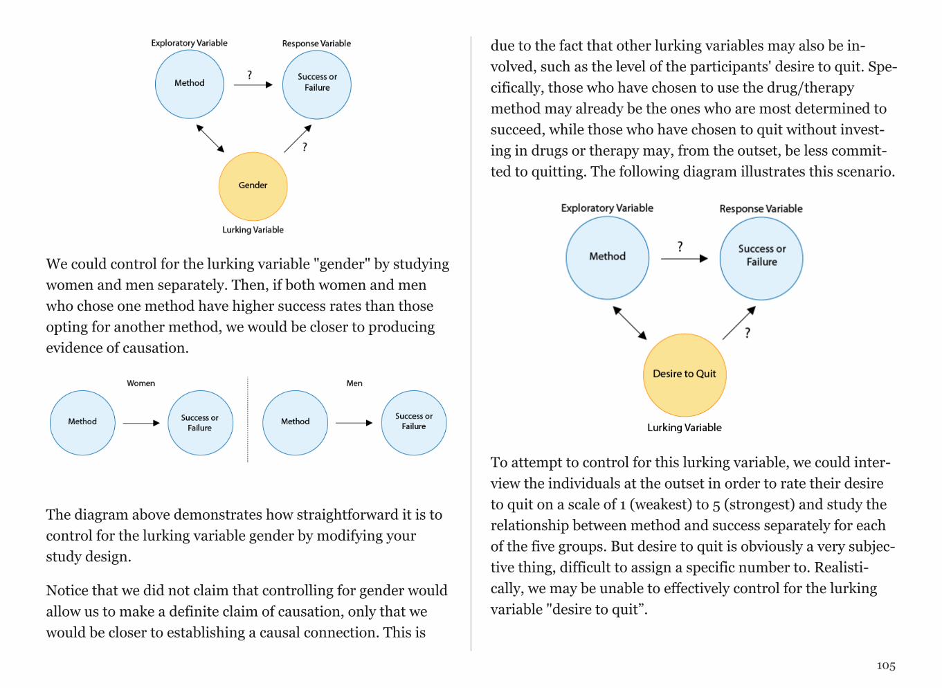
!
We could control for the lurking variable "gender" by studying women and men separately. Then, if both women and men who chose one method have higher success rates than those opting for another method, we would be closer to producing evidence of causation.
!
The diagram above demonstrates how straightforward it is to control for the lurking variable gender by modifying your study design.
Notice that we did not claim that controlling for gender would allow us to make a definite claim of causation, only that we would be closer to establishing a causal connection. This is
due to the fact that other lurking variables may also be in-volved, such as the level of the participants' desire to quit. Spe-cifically, those who have chosen to use the drug/therapy method may already be the ones who are most determined to succeed, while those who have chosen to quit without invest-ing in drugs or therapy may, from the outset, be less commit-ted to quitting. The following diagram illustrates this scenario.
!
To attempt to control for this lurking variable, we could inter-view the individuals at the outset in order to rate their desire to quit on a scale of 1 (weakest) to 5 (strongest) and study the relationship between method and success separately for each of the five groups. But desire to quit is obviously a very subjec-tive thing, difficult to assign a specific number to. Realisti-cally, we may be unable to effectively control for the lurking variable "desire to quit”.
105
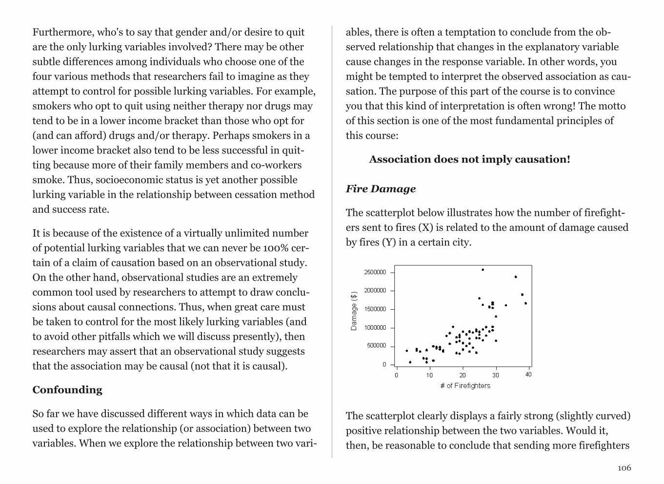
Furthermore, who's to say that gender and/or desire to quit are the only lurking variables involved? There may be other subtle differences among individuals who choose one of the four various methods that researchers fail to imagine as they attempt to control for possible lurking variables. For example, smokers who opt to quit using neither therapy nor drugs may tend to be in a lower income bracket than those who opt for (and can afford) drugs and/or therapy. Perhaps smokers in a lower income bracket also tend to be less successful in quit-ting because more of their family members and co-workers smoke. Thus, socioeconomic status is yet another possible lurking variable in the relationship between cessation method and success rate.
It is because of the existence of a virtually unlimited number of potential lurking variables that we can never be 100% cer-tain of a claim of causation based on an observational study. On the other hand, observational studies are an extremely common tool used by researchers to attempt to draw conclu-sions about causal connections. Thus, when great care must be taken to control for the most likely lurking variables (and to avoid other pitfalls which we will discuss presently), then researchers may assert that an observational study suggests that the association may be causal (not that it is causal).
Confounding
So far we have discussed different ways in which data can be used to explore the relationship (or association) between two variables. When we explore the relationship between two vari-
ables, there is often a temptation to conclude from the ob-served relationship that changes in the explanatory variable cause changes in the response variable. In other words, you might be tempted to interpret the observed association as cau-sation. The purpose of this part of the course is to convince you that this kind of interpretation is often wrong! The motto of this section is one of the most fundamental principles of this course:
Association does not imply causation!Fire Damage
The scatterplot below illustrates how the number of firefight-ers sent to fires (X) is related to the amount of damage caused by fires (Y) in a certain city.
!
The scatterplot clearly displays a fairly strong (slightly curved) positive relationship between the two variables. Would it, then, be reasonable to conclude that sending more firefighters
106
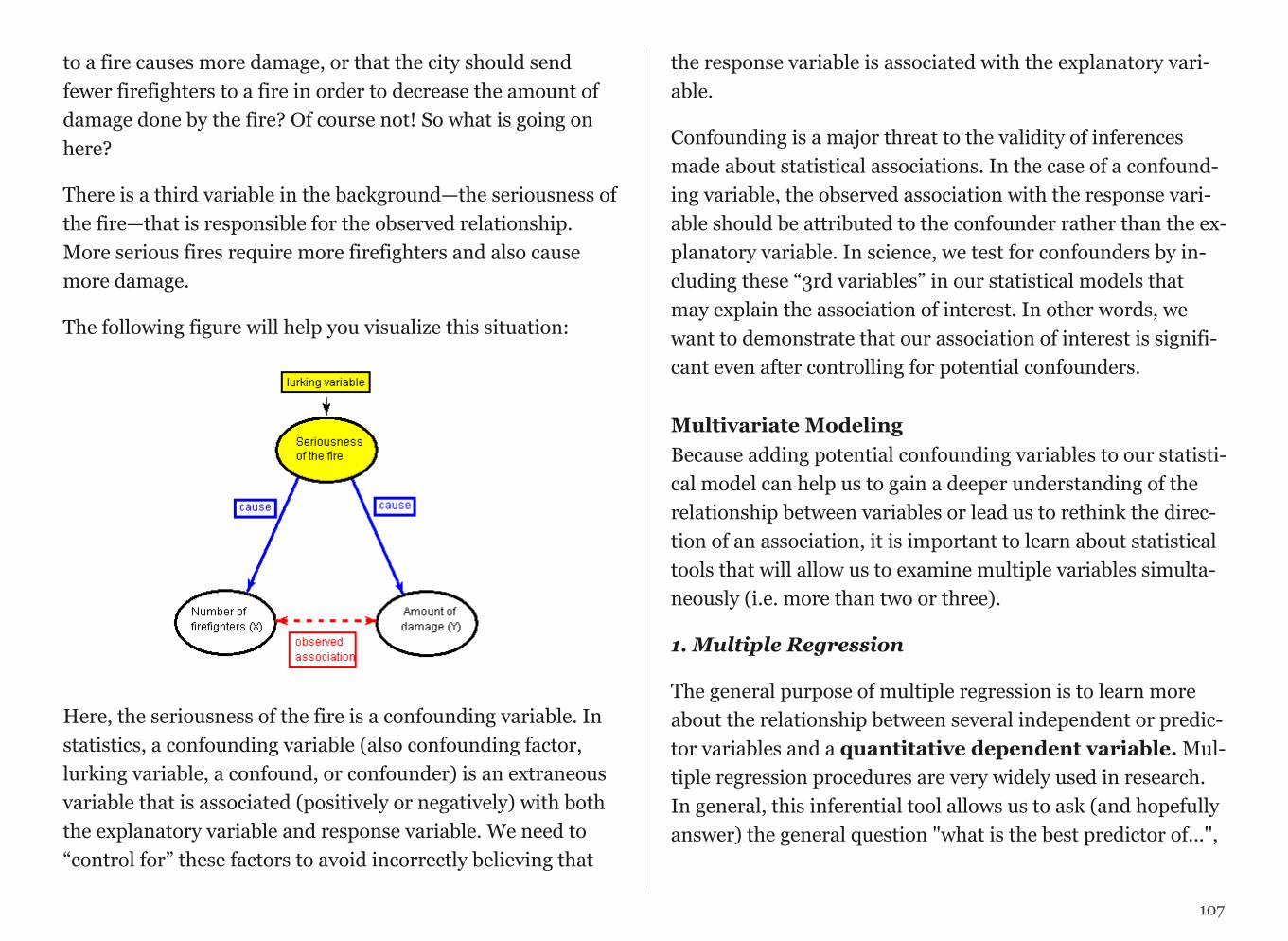
to a fire causes more damage, or that the city should send fewer firefighters to a fire in order to decrease the amount of damage done by the fire? Of course not! So what is going on here?
There is a third variable in the background—the seriousness of the fire—that is responsible for the observed relationship. More serious fires require more firefighters and also cause more damage.
The following figure will help you visualize this situation:
!
Here, the seriousness of the fire is a confounding variable. In statistics, a confounding variable (also confounding factor, lurking variable, a confound, or confounder) is an extraneous variable that is associated (positively or negatively) with both the explanatory variable and response variable. We need to “control for” these factors to avoid incorrectly believing that
the response variable is associated with the explanatory vari-able.
Confounding is a major threat to the validity of inferences made about statistical associations. In the case of a confound-ing variable, the observed association with the response vari-able should be attributed to the confounder rather than the ex-planatory variable. In science, we test for confounders by in-cluding these “3rd variables” in our statistical models that may explain the association of interest. In other words, we want to demonstrate that our association of interest is signifi-cant even after controlling for potential confounders.
Multivariate ModelingBecause adding potential confounding variables to our statisti-cal model can help us to gain a deeper understanding of the relationship between variables or lead us to rethink the direc-tion of an association, it is important to learn about statistical tools that will allow us to examine multiple variables simulta-neously (i.e. more than two or three).
1. Multiple Regression
The general purpose of multiple regression is to learn more about the relationship between several independent or predic-tor variables and a quantitative dependent variable. Mul-tiple regression procedures are very widely used in research. In general, this inferential tool allows us to ask (and hopefully answer) the general question "what is the best predictor of...",
107
and does “third variable a” or “third variable b” confound the relationship between my explanatory and response variable?”
For example, educational researchers might want to learn about the best predictors of success in high-school. Sociolo-gists may want to find out which of the multiple social indica-tors best predict whether or not a new immigrant group will adapt to their new country of residence. Biologists may want to find out which factors (i.e. temperature, barometric pres-sure, humidity, etc.) best predict caterpillar reproduction.
In this clip on regression, we present the basic intuition be-hind regression analysis.
Click here to view Movie 17.1 on Regression (30:03).
2. Logistic Regression
Logistic regression is a multivariate statistical tool used to an-swer the same questions that can be answered with multiple regression. The difference is that logistic regression is used when the response variable (the outcome or Y variable) is binary (categorical with two levels). Note that if the response variable is categorical with more than two levels (ordered or nominal), it must be dichotomized (i.e. made into a binary, two level variable), so that logistic regression can be used.
Both multiple regression and logistic regression allow for ex-planatory variables that are either quantitative, categorical, or both. Click here to view Movie 17.2 on Logistic Regression (1:18:53).
MOVIE 17.1 Regression
108
MOVIE 17.2 Logistic Regression

Putting it all together
In the next video clip, we demonstrate how to test and evalu-ate confounding within a multivariate model.
Since the difficulty arises because of the lurking variable's val-ues being tied in with those of the explanatory variable, one way to attempt to unravel the true nature of the relationship between explanatory and response variables is to separate out the effects of the lurking variable.
Please watch CONFOUNDING AND MULTIVARIATE MODELS video (25.38).
REGRESSION
Multiple regression is used when the response variable is quantitative.
Multiple Regression
SPSS REGRESSION /DEPENDENT QuantitativeResponse /METHOD ENTER ExplanatoryVariable ThirdVariable1 ThirdVariable2.Stata REG QuantitativeResponse ExplanatoryVariable ThirdVariable1 ThirdVariable2SAS Proc glm; class ExplanatoryVariable (ref=”0”) ThirdVariable1 (ref=”2”); /*when these variables are categorical. The number after ref tells SAS what category you want to compare the other categories to. Be sure to use values appropriate to your categorical variables*/ model QuantitativeResponse=ExplanatoryVariable ThirdVariable1 ThirdVariable2 /solution; R >my.lm <-lm(QuantitativeResponse ~ Explanatory + ThirdVariable1 + ThirdVariable2, data=title_of_data_set) >summary(my.lm)
Logistic regression is used when the response variable is binary, categorical.
Logistic Regression
SPSS LOGISTIC REGRESSION BinaryResponse with ExplanatoryVariable ThirdVariable1 ThirdVariable2. Stata logistic BinaryResponse ExplanatoryVariable ThirdVariable1 ThirdVariable2 SAS Proc logistic descending; /*use ‘descending’ when variables is coded 0 (no) and 1 (yes). No need if coded 1 (yes) and 2 (no)*/
109
110
class ExplanatoryVariable ThirdVariable1 ; /*when these variables are categorical*/ model BinaryResponse=ExplanatoryVariable ThirdVariable1 ThirdVariable2;
R >my.logreg<-glm(BinaryResponse ~ ExplanatoryVariable + ThirdVariable1 + ThirdVariable2, data = title_of_data_set, family=”binomial”) >summary(my.logreg) # for p-values >exp(my.logreg$coefficients) # for odds ratios
REGRESSION ASSIGNMENT
Post your regression syntax testing for confounding along with corresponding output. Describe in a few sentences what you found.
Example of how to write results for Multiple Regression:
After adjusting for potential confounding factors (list them), major depression (Beta=1.34, p=.0001) was significantly and positively associated with number of nicotine dependence symptoms.
Example of how to write results for Logistic Regression:
After adjusting for potential confounding factors (list them), major depression (O.R. 4.0, CI 2.94-5.37) was significantly and positively associated with the likelihood of meeting criteria for nicotine dependence.
CHAPTER 18
Poster Presentation
Please watch PREPARING YOUR FINAL PROJECT video.
At the end of the semester, you will have the opportunity to present your research as a final project and presentation. What follows provides useful guidance for preparing each.
These are only general guidelines. For detailed instructions on the poster and presentation, you will need to attend the sched-uled in-class lecture.
PosterThe audience at a poster session is distractible and mobile. Your job in preparing your poster is to grab and keep their attention so that they will stay and take in your message. One study re-vealed that you have 11 seconds to grab a viewer’s attention. Whether they are engaged will depend both on the attractive-ness of your presentation and on how daunting it appears at first glance. The most effective posters are easily digested. Sen-tences and paragraphs should be short, and type should be large. For viewers who want more information, the poster should provide an entry point to further discussion with the author about the project and the results.
Keys to a successful poster
• Know who your audience is! As yours will be diverse (i.e. ex-perts and non-experts), you will need to make a special effort to frame your question and results in an understandable and inter-esting way.
• Be brief! Distill it down…down… down… to the very essence of your project.
• Use figures and graphics where possible. Graphics are good attention-getters. But remember, the golden rule of figures (that they MUST be understandable without reference to accompanying text) applies doubly to posters.
• Layout is important! Because text is limited, layout is used to
convey the logical structure of your argument. Use columns, boxes, arrows, bulleted lists, etc. to draw your viewer forward through your presentation. Be creative and make the viewing experience intellectually and esthetically satisfying.
Reasons why posters fail
• Too much text. Keep each text block to just a few sen-tences. Large font size will be readable from far away and will help to keep you from using too many words.
• Unclear. If you leave out key elements, such as objectives, approach, detailed description of variables or conclusions, peo-ple who are not insiders on your subject will not understand what your goal was or why it is interesting. As one recent guest evaluator wrote: "students should be made aware of the technical language that they have grown accustomed to using and should learn to explain in detail the meaning of words such as proxy, gapminder, and other indicators such as pov-erty headcount ratio, since they are crucial to understanding their study. Not having them explained greatly impaired my understanding of their presentation.”
• Poor figures. Some figures are real puzzles, with incompre-hensible legends, secret codes, small lettering, cryptic cap-tions, etc. Many spreadsheet and data programs do not pro-duce “reader friendly” graphics (see figures on final page), so you will need to budget extra time to customize your figures so that they are self-explanatory.
• Information overload. Most presenters try to do and say too much in one poster. Yes, your research may have yielded many subtle and intertwined results, BUT you will have to set-tle for one, two, or at most three take-home messages to con-vey on your poster.
• Presenter not present. Remember, the poster is just half of the presentation – you are the other half! Be there, so that those viewers who do find your work interesting will be able to engage you in discussion. Remember, poster sessions are interactive - a truly successful poster is an opportunity for the presenter to gain new knowledge and ideas.
• Find your message. Before you begin, try to formulate the essence of what you want to present in a single sentence. This exact sentence probably won’t appear on the poster itself, but it should be your guiding light in deciding what to include and where. Your title and conclusions should be derived directly from this sentence.
• Title. Your poster should include a banner title in a large font (e.g. 90 pt.). Below this, put the author(s) name(s) and in-stitutional affiliation(s) in a slightly smaller font.
• Body text. Your body text should use a font readable at a distance of at least 4 feet (30 pt).
• Introduction. Write a few sentences that identify the prob-lem you address, what is currently known about it (watch out for getting long-winded here!), and your approach to investi-
112
gating it. Consider using a bulleted list rather than a text block.
• Method. Sometimes, the Method section is included in a slightly smaller font so that those who only want the big pic-ture can skip it.
• Results. Select the most pertinent results that support your message. Remove everything that is not absolutely necessary: avoid clutter. Think about the most attractive way to present the data in figures. Avoid tables if at all possible. Each illustra-tion should have a headline title providing a take-home mes-sage with a more detailed caption below.
• Conclusion. Write the conclusion(s) in short, clear state-ments, preferably as a list.
• Attention-getters. An attractive title is important, but it must be supplemented by attractive graphics. There is no rea-son why all of your illustrations need to be the same size. Con-sider enlarging one of these illustrations (or a flow diagram, model, etc. that is the focus of your message) and placing it centrally to attract viewers. You will still need to pay attention to logical flow, directing the viewer’s attention (once you’ve captured it) up to and through this central illustration to your conclusions.
• Background. Do not use colored backgrounds or patterns as both are very distracting. Usually, plain white is best. Do use color in your figures in ways that enhance your message.
• Get feedback! Ask instructors, TA’s, and/or friends to com-ment on a draft version. Give yourself a break and review eve-rything with a critical eye. Listen if someone says it’s too com-plicated – most first-time presenters try to cram far too much into their posters.
PresentationReference : http://www.lifehack.org/articles/communication/18-tips-for-killer-presentations.html
Becoming a competent, rather than just confident, speaker requires a lot of practice. But here are a few things you can consider to start sharpening your presentation skills:
1. Slow Down – Nervous and inexperienced speakers tend to talk way to fast. Consciously slow your speech down and add pauses for emphasis.
2. Eye Contact – Match eye contact with the person to whom you are presenting.
3. 15 Word Summary – Can you summarize your idea in fifteen words? If not, rewrite it and try again. Speaking is of-ten an inefficient medium for communicating statistical infor-mation, so know what the important fifteen words are so they can be repeated.
113

4. Don’t Read – This one is a no brainer, but nervous presenters want to get away with it. If you don’t know your presentation, that doesn’t just make you more distracting, it shows you don’t really understand your message, a huge blow to any confidence the audience has in you. If you need subtle cues or notes to feel comfortable, that’s ok, but don’t’ read.
5. Speeches are About Stories –Great speakers know how to use a story to create an emotional connection between ideas for the audience. Your research is a story, not just informa-tion.
6. Project Your Voice - Nothing is worse than a speaker you can’t hear. Projecting your voice doesn’t mean yelling, rather standing up straight and letting your voice resonate on the air in your lungs rather than in the throat to produce a clearer sound. The poster session will be noisy. You will need to adjust your voice accordingly.
7. Don’t Plan Gestures - Any gestures you use need to be an extension of your message and any emotions that message con-veys. Planned gestures look false because they don’t match your other involuntary body cues. You are better off keeping your hands to your side.
8. “That’s a Good Question” – You can use statements like “that’s a really good question” or “I’m glad you asked me that” to buy yourself a few moments to organize your response. Will the other people in the audience know you are using these filler sentences to reorder your thoughts? Probably not. And even if they do, it still makes the presentation more smooth
than if you answer were littered with fillers like “um” and “ah”.
9. Breathe In Not Out – Feeling the urge to use presenta-tion killers like “um”, “ah”, or “you know”? Replace those with a pause taking a short breath in. The pause may seem a bit awkward, but the audience will barely notice it.
10. Get Practice – Use peers or join Toastmasters (here) to practice your speaking skills regularly in front of an audience. Not only is it a fun time, but it will make you more competent and confident when you need to approach the podium.
11. Don’t Apologize – Apologies are only useful if you’ve done something wrong. Don’t use them to excuse incompe-tence or humble yourself in front of an audience. Don’t apolo-gize for your nervousness or a lack of preparation time. Most audience members can’t detect your anxiety, so don’t draw at-tention to it.
12. Do Apologize if You’re Wrong – One caveat to the above rule is that you should apologize if you are late or shown to be incorrect. You want to seem confident, but don’t be a jerk about it.
13. Put Yourself in the Audience - When writing your pres-entation, see it from the audience’s perspective. What might they not understand? What might seem boring?
14. Be Entertaining – Presentations should be entertaining and informative. I’m not saying you should be silly or imma-
114

ture. But unlike an e-mail or article, people expect some ap-peal to their emotions. Simply reciting dry facts without any passion will make people less likely to pay attention.
15. Have Fun - Sounds impossible? With a little practice you can inject your excitement for your work into your presenta-tions. Enthusiasm is contagious.
POSTER ASSIGNMENT
Submit the title of your poster. Refer to the earlier Writing Chapter for useful tips. (Note: The title that you submit will be used in the formal poster session program).
115

CHAPTER 19
What’s Next
Panel Discussion
In November, we will gather on a Friday for a panel discus-sion on paths and opportunities within the area of quantita-tive careers.
A sampling of panelists from past years include:
Andrea Barthwell, a physician and Executive Officer of ELCGlobal, a health care and policy consulting firm in Washing-ton D.C.
Ben Baumer, Official statistical analyst for the New York Mets.
Andrea Depetris, Alum of the first QAC201 class and former Harvard Catalyst Research Intern at The Cambridge Health Alli-ance.
Michael Heller, Principal at Argus Information & Advisory Services, LLC.
Monica Noether, Executive Vice President and Chief Operat-ing Officer, Charles River Associates
Brian Walker, Pricing Director at W. W. Grainger, Inc.
Steve Wengrovitz: Senior Market Research Manager at Time Warner Cable
Taking Your Project to the Next Level
Beyond the final poster presentation for the course, some stu-dents have found additional outlets for their work in the form of public presentations and student journal publications. Planning for this while you are still in the midst of completing your pro-ject assures that you will have the support that you need.

Wesleyan opportunities have included...
Synthesis is an interdisciplinary magazine aimed at forming a bridge between the science and the arts here at Wesleyan. Se-lected submissions are published on the Synthesis website and a print version is in the making. Synthesis accepts work related to science, medicine, or technology.
Mind Matters is a journal managed and edited by Wesleyan University students from the Psychology Department. The Journal publishes articles, both empirical and theoretical, re-searched and written by Wesleyan students. Topics include, but are not limited to, cognition, social psychology, develop-mental processes, psychopathology, community psychology, intelligence, cultural psychology, neuroscience, and interdisci-plinary work that may extend into other university depart-ments including, but not limited to, sociology, history, or phi-losophy.
Cardinal Direction is Wesleyan's student-run public policy journal. Created in fall of 2009, it publishes work on social, en-vironmental, political, and economic issues on local, national, and global levels. Students are encouraged to submit both pa-pers written specifically for the journal and papers written for their classes.
Undergraduate Journal of Social Studies was a dor-mant student journal that was recently revived (2011). It is now an online publication of student work from the various social sciences with the intention to act as a resource
for students to share their work and hopefully gain a new per-spective on the multifaceted study of the social sciences.
Introduction to Statistical Consulting (QAC380) exposes students to realistic statistical and scientific problems that appear in typical interactions between statisticians and researchers. The goal is for students to apply what they have learned in their basic statistics and data analysis courses to gain greater experience in the areas of research collaboration, data management and analysis, and writing and presenting re-ports on the results of the analyses. An important objective of the course is to help develop communication skills, both writ-ten and verbal, as well as the professional standards and the interpersonal skills necessary for effective statistical consult-ing.
Introduction to Modeling: From Molecules to Mar-kets (QAC221) The development of models to describe physi-cal or social phenomena has a long history in several disci-plines, including physics, chemistry, economics, and sociol-ogy. With the emergence of ubiquitous computing resources, model building is becoming increasingly important across all disciplines. This course will examine how to apply modeling and computational thinking skills to a range of problems. Us-ing examples drawn from physics, biology, economics, and so-cial networks, we will discuss how to create models for com-plex systems that are both descriptive and predictive. The course will include significant computational work. No previ-ous programming experience is required, but a willingness to learn simple programming methods is essential.
117

Introduction to GIS (E&ES322) utilizes geographical infor-mation systems (GIS) to organize, analyze, and display spatial data. GIS has applications in a wide variety of fields including the natural sciences, public policy, business, and the humani-ties, literally any field that uses spatially distributed informa-tion. In this course we will explore the fundamentals of GIS with an emphasis on practical application of GIS to problems from a range of disciplines. The course will cover the basic the-ory of GIS, data collection and input, data management, spa-tial analysis, visualization, and map preparation. Course work will include lecture, discussion, and hands-on activities.
Empirical Methods for Political Science (GOVT366) is an introduction to the concepts, tools, and methods used in the study of political phenomena, with an emphasis on both the practical and theoretical concerns involved in scientific re-search. It is designed to get students to think like social scien-tists and covers topics in research design, hypotheses genera-tion, concept/indicator development, data collection, quantita-tive and qualitative analysis, and interpretation.
Sociological Analysis (SOC202) is an introduction to the major components of sociological analysis: the language of so-ciological inquiry, research techniques and methodology, types of explanation, and the relationship between theory and research.
An Introduction to Probability (MATH231) teaches you the basic theory of probability. Although the notions are sim-ple and the mathematics involved only requires a basic knowl-
edge of the ideas of differential and integral calculus, a certain degree of mathematical maturity is necessary. The fundamen-tal concepts to be studied are probability spaces and random variables, the most important ideas being conditional probabil-ity and independence. Students study the law of large num-bers and the central limit theorem.
Training Institutes and Fellowships
The QAC Summer Apprenticeship Program has three objectives: a) to provide additional experiential learning op-portunities for students by engaging them in active research projects; b) support faculty research by training and support-ing student research assistants; and c) develop and identify students that can serve as tutors during the academic year. Students in the program attend morning classes and work-shops in statistical analysis and statistical software and work on a research project for the rest of the day. Program activities are also available to students not funded by the center (i.e. working on campus as research assistants in faculty labs or sponsored by faculty grants).
SAMSI is a national institute whose vision is to forge a new synthesis of the statistical sciences and the applied mathemati-cal sciences with disciplinary science to confront the very hard-est and most important data- and model-driven scientific chal-lenges. SAMSI achieves profound impact on both research and people by bringing together researchers who would not otherwise interact, and focusing the people, intellectual power, and resources necessary for simultaneous advances in
118

the statistical sciences and applied mathematical sciences that lead to ultimate resolution of the scientific challenges. SAMSI is a partnership of Duke University, North Carolina State Uni-versity, the University of North Carolina at Chapel Hill, and the National Institute of Statistical Sciences, in collaboration with the William R. Kenan, Jr. Institute for Engineering, Tech-nology, and Science. SAMSI is part of the Mathematical Sci ences Institutes program of the Division of Mathematical Sci-ences at the National Science Foundation. For more informa-tion, please visit http://www.samsi.info/.
The University of Connecticut School of Medicine and Dental Medicine College Summer Fellowship Pro-gram is designed to offer undergraduates who are completing their sophomore, or preferably their junior year of college, and plan to pursue a career as a M.D., D.M.D., M.D./Ph.D., or D.M.D./Ph.D., an opportunity to participate in the research activities of a laboratory at the School of Medicine or Dental Medicine under the direction of a faculty member. The pur-pose of the program is to provide a research enrichment expe-rience and some exposure to clinical medicine or dental medi-cine.
The Inter-University Consortium for Political and So-cial Research (ICPSR), the world's largest archive of digital social science data, sponsors an annual summer internship program. Interns spend ten weeks from June 4 - August 10, 2012, at ICPSR (Ann Arbor, Michigan), during which they: work in small groups and with faculty mentors to complete re-search projects resulting in conference-ready posters; gain ex-
perience using statistical programs such as SAS, SPSS, and Stata to check data, working in both UNIX and Windows envi-ronments; attend courses in the ICPSR Summer Program in Quantitative Methods of Social Research; participate in a weekly Lunch and Lecture series that covers topics related to social science research and professional development. Qualifi-cations: undergraduate standing and completion of sopho-more year in a social science major with interests related to one of ICPSR's Thematic Collections; strong academic creden-tials; knowledge of a statistical software package such as SPSS, SAS, or Stata; previous experience with social science research via work or class project.
The Summer Program at Harvard School of Public Health is a relatively intensive 4-week program, during which qualified participants receive an interesting and enjoy-able introduction to biostatistics, epidemiology, and public health research. This program is designed to expose
undergraduates to the use of quantitative methods for biologi-cal, environmental, and medical research. The program also provides useful advice about graduate school and the applica-tion process, meetings with different departments of the Har-vard School of Public Health and other schools at Harvard University, and mock interviews.
The Joint Program in Survey Methodology Junior Fel-lows Program through the University of Maryland is a cooperative venture of the Interagency Council on Statistical Policy and the Joint Program in Survey Methodology aimed at
119

providing graduate educational programs for the next genera-tion of technical staff in the Federal Statistical System. This is a unique internship experience that gives undergraduates a paid research assistantship, plus educational benefits that can expand career horizons. During the day you will work as an in-tern in one of the federal statistical agencies: Bureau of the Census; Bureau of Economic Analysis; Bureau of Labor Statis-tics; Bureau of Justice Statistics; Bureau of Transportation Sta-tistics; Economic Research Service; Energy Information Ad-ministration; Environmental Protection Agency; Internal Revenue Service, Surveys of Income; National Agricultural Sta-tistics Service; National Center for Education Statistics; Na-tional Center for Health Statistics; and National Science Foun-dation, Science Resources Studies. You'll work with staff whose job it is to report to the nation about its health and welfare. You'll watch how they do it, and you'll learn about what's needed to devise modern complex information sys-tems.
The Johns Hopkins School of Medicine Summer In-ternship Program provides experience in research laborato-ries to students of diverse backgrounds, including underrepre-sented minority students and students from economically dis-advantaged and underserved backgrounds that have com-pleted one, two, or more years of college. The purpose of this exposure to biomedical and/or public health research is to en-courage students to consider careers in science, medicine, and public health. Overall, you can expect an experience similar to that of a first-year graduate student who does a three-month
rotation in a laboratory or out in the community to become ac-quainted with the project, techniques, and people working in that area. The program concludes with a poster session by the interns describing their projects.
The Capstone Certificate Program at the Wisconsin School of Business is a professional preparation program for students looking for their first actuarial job (study of the financial impact of risk and uncertainty). One objective of the Capstone program is to teach the actuarial concepts that will prepare students to take and pass the preliminary actuarial ex-ams jointly sponsored by the Society of Actuaries and the Cau-sality Actuarial Society. The Capstone program also teaches students the practical application of these concepts and gives them a deep knowledge of the industry through connections in the field. Participation is open to applicants with at least a bachelor's degree, other than currently registered graduate stu-dents. The program consists of 5 classes (15 credits), and a well-prepared student enrolled full-time can complete it in 9 months.
The Summer Research Opportunities Program (SROP) is a gateway to graduate education at CIC universities. The goal of the program is to increase the num-ber of underrepresented students who pursue graduate study and research careers. SROP helps prepare undergraduates for graduate study through intensive research experiences with faculty mentors and enrichment activities. http://www.cic.net/home/students/srop/home.aspx
120

The MIDAS Summer Undergraduate Research Pro-gram. See www.midas.pitt.edu/srp The University of Pitts-burgh Models of Infectious Disease Agent Study (MIDAS) Na-tional Center of Excellence is pleased to announce a summer research opportunity for undergraduate students in the field of computational modeling and simulation of infectious dis-eases. Through this ten-week Summer Research Program, par-ticipants will gain an appreciation of major research questions being raised at the intersection of public health, biological sci-ence, and computer technology and become acclimated to the rigors of scientific research and graduate education. Women and underrepresented groups are particularly encouraged to apply. For more information about the University of Pitts-burgh MIDAS National Center of Excellence, go to www.midas.pitt.edu.
Fellowship with National Research Center on His-panic Children & Families. The Center is comprised of a strong team of national experts on Hispanic issues, and is a hub of research to improve the lives of Hispanics across three priority areas(1) poverty reduction and self-sufficiency, (2) healthy marriage and responsible fatherhood, and (3) early care and education. The Center was established by a 2013 co-operative agreement from the Office of Planning, Research and Evaluation within the Administration for Children and Families to Child Trends in partnership with Abt Associates and university partners - University of Maryland-College Park, University of North Carolina – Greensboro, and New York University. The Center offers a Summer Research Fellow-
ship Program aimed at attracting, developing and expanding the pool of emerging scholars focused on studying issues con-cerning low-income and vulnerable Hispanic children and families. This 12-week program is open to those currently en-rolled in an advanced graduate program (Master’s, Ph.D., or ABD - “all but dissertation”) and will provide graduate stu-dents with the opportunity to carry out policy-research in an applied setting, and in ways that can impact both policy and programs serving Hispanic children and families. http://www.childtrends.org/our-research/latino-children-and-families/the-national-research-center-on-hispanic-children-and-families/#3
121
APPENDIX
Appendix: Answers to Review Problems
Chapter 8
8.1 - A
8.2 Question 1 - B
8.2 Question 2 - A
8.2 Question 3 - C
8.2 Question 4 - B
8.3 - C
8.4 - C
8.5 - E
8.6 Question 1 - A
8.6 Question 2 - B
Chapter 11
11.1 - B
11.2 - A
Chapter 12
12.1 Question 1 - D
12.1 Question 2 - A

cxxiii
Acknowledgments
The development of this course was supported by grant #0942246 from the National Science Foundation, Trans-forming Undergraduate Education in Science, Technology, Engineering and Mathematics (TUES) and by the Lau-ren B. Dachs Grant in Support of Interdisciplinary Research in the Social Impacts of Science.
Background on statistical content draws heavily on materials from the Open Learning Initiative (http://oli.web.cmu.edu/openlearning/forstudents/freecourses/statistics), which is part of the Creative Com-mons, and as such can be non-commercially copied or remixed with appropriate attribution.

cxxiv
Copyright Information
Passion Driven Statistics by Lisa Dierker under the Creative Commons Attribution-NonCommercial-ShareAlike 3.0 Unported License. For more about Wesleyan’s Quantita-tive Analysis Center, click here.