Embed Size (px)
Citation preview
A STUDY OF THE CHARACTERISTICS OF NATURAL LIGHT
IN SELECTED BUILDINGS DESIGNED BY LE CORBUSIER,
LOUIS I. KAHN AND TADAO ANDO
A Thesis
by
SUKHTEJ SINGH GILL
Submitted to the Office of Graduate Studies of
Texas A&M University in partial fulfillment of the requirements for the degree of
MASTER OF SCIENCE
August 2006
Major Subject: Architecture
A STUDY OF THE CHARACTERISTICS OF NATURAL LIGHT
IN SELECTED BUILDINGS DESIGNED BY LE CORBUSIER,
LOUIS I. KAHN AND TADAO ANDO
A Thesis
by
SUKHTEJ SINGH GILL
Submitted to the Office of Graduate Studies of Texas A&M University
in partial fulfillment of the requirements for the degree of
MASTER OF SCIENCE
Approved by: Chair of Committee, Valerian Miranda Committee Members, Guillermo Vasquez de Velasco
William R. Nash Head of Department, Mardelle Shepley
August 2006
Major Subject: Architecture
iii
ABSTRACT
A Study of the Characteristics of Natural Light in Selected Buildings Designed
by Le Corbusier, Louis I. Kahn and Tadao Ando. (August 2006)
Sukhtej Singh Gill, B.B.S., Chandigarh College of Architecture, India;
B.Arch., Chandigarh College of Architecture, India
Chair of Advisory Committee: Dr. Valerian Miranda
The thesis discusses the characteristics of natural light that are visible inside concrete
buildings designed in the late twentieth century. The study addresses three major
objectives. First is to identify the characteristics of natural light visible inside these
spaces. Second is to understand the use of natural light to illuminate different spaces.
Third is to explore the relation between the characteristics of natural light and the overall
perception of the space. With these objectives in mind, a comprehensive literature
review was done to develop the hypotheses for this thesis.
The first hypothesis states that the overall perception of a space is affected by
certain basic characteristics of natural light. The second hypothesis suggests that the
overall character of a space can be enhanced by emphasizing the source of natural light
as a visual element.
To test these hypotheses, this thesis studies the effect of natural light in three
buildings made out of reinforced concrete in the late twentieth century. The three
buildings are the Chapel of Notre Dame du Haut Ronchamp by Le Corbusier, the
Kimbell Art Museum by Louis I. Kahn and the Church of the Light by Tadao Ando. The
iv
method of analysis is based on the selection of a spatial envelope in each building that
helps to provide an ideal framework for studying the effects of light. The method takes
into consideration the principles of visual perception and the use of images depicting the
varied effects of light inside the spatial envelope.
The results of the analysis show that the three projects employ similar design
principles to achieve some of the common effects of light, and the listed characteristics
of light in relation to the overall perception of the space do not vary to a great extent
when moving from one project to another. The emphasis on the source of natural light is
a common and recurring theme in all three buildings. The thesis concludes that the
results support the hypotheses, and that the quality of a space is dependent upon the way
a designer brings natural light into the space.
v
to my teacher …
vi
ACKNOWLEDGEMENTS
I would like to express my gratitude to my committee chair, Dr. Valerian Miranda, for
being the guiding light in my pursuit of excellence. He has been a source of inspiration
all throughout my research. His strong belief in learning through self exploration has
made my effort into the topic of natural light all the more unique and interesting.
Also, I would like to thank Dr. William R. Nash for the support he has provided
throughout my thesis work. His strong words of encouragement have helped me strive
hard to achieve the quality of work that has been presented in my thesis.
Dr. Guillermo Vasquez de Velasco has been kind enough to help me in all
possible ways despite his busy schedule.
I would like to express my gratitude to M. Salas and M.M.H. Alnuaimi for
allowing me to use selected images from their personal collection that served as a
valuable source of information in my thesis.
Last but not the least, I would like to thank my parents, my family and my
friends who helped me concentrate on my research. Without their moral support there is
little I would have hoped to achieve.
vii
TABLE OF CONTENTS
Page
ABSTRACT .............................................................................................................. iii
DEDICATION .......................................................................................................... v
ACKNOWLEDGEMENTS ...................................................................................... vi
TABLE OF CONTENTS ......................................................................................... vii
LIST OF FIGURES................................................................................................... xii
LIST OF TABLES .................................................................................................... xv
CHAPTER
I INTRODUCTION............................................................................. 1
1.1 Scope ........................................................................................... 3 1.2 Significance ................................................................................. 3 1.3 Objectives.................................................................................... 3 1.4 Research Questions ..................................................................... 4 1.5 Hypotheses .................................................................................. 4 1.6 Layout.......................................................................................... 4 II LITERATURE REVIEW.................................................................. 6 2.1 Historical Perspectives on Natural Light Inside the Buildings ... 6 2.1.1 Pre-Industrial Architecture........................................... 8 2.1.1.1 Egypt ............................................................. 9 2.1.1.2 Greece............................................................ 9 2.1.1.3 Rome ............................................................. 10 2.1.1.4 Early Christian............................................... 10 2.1.1.5 Byzantine....................................................... 11 2.1.1.6 Gothic ............................................................ 11 2.1.1.7 Renaissance ................................................... 12 2.1.1.8 Baroque ......................................................... 12 2.1.2 Industrial Architecture ................................................. 13 2.1.3 Post-Industrial Architecture ......................................... 15
viii
CHAPTER Page 2.2 Light Quality in Concrete Buildings of the Late 20th Century... 16 2.2.1 Le Corbusier................................................................. 17 2.2.2 Louis I. Kahn................................................................ 20 2.2.3 Tadao Ando.................................................................. 22 2.3 Light in Relation to the Character of a Space ............................. 23 2.3.1 The Source ................................................................... 24 2.3.1.1 Intensity......................................................... 25 2.3.1.2 Directional Characteristics ............................ 25 2.3.1.3 Color.............................................................. 27 2.3.2 The Geometry............................................................... 28 2.3.3 Different Surfaces Inside the Space ............................. 28 2.3.4 Movement and Visual Perception of the Observer ...... 29 2.4 Scope of Different Methods of Investigation .............................. 30 III METHOD.......................................................................................... 35 3.1 Research Questions ..................................................................... 35 3.2 Research Model........................................................................... 35 3.3 Hypotheses .................................................................................. 37 3.4 Criteria for Analysis .................................................................... 37 3.4.1 The Spatial Envelope ................................................... 40 3.4.1.1 Boundaries for Spatial Definition ................. 42 3.4.1.2 Visual Perception of the Envelope ................ 44 3.4.1.3 The Character of Space ................................. 45 3.4.1.4 Distortion of the Spatial Envelope ................ 46 3.4.1.5 Clarity of the Spatial Envelope ..................... 47 3.4.1.6 Proportioning of the Spatial Envelope .......... 47 3.4.1.7 The Color of Architectural Space.................. 48 3.4.2 Articulation of the Spatial Envelope ............................ 49 3.4.2.1 Patterning the Dominant Boundaries ............ 50 3.4.2.2 Penetration of the Spatial Envelope .............. 50 3.4.2.3 Articulation with Subspaces.......................... 51 3.4.2.4 Spatial Banding ............................................. 52 3.4.2.5 Curvature and Level Change......................... 52 3.4.3 Role of the Structural System ...................................... 53 3.4.3.1 Prominence of Building Form....................... 53 3.4.3.2 Structure Patterning the Spatial Envelope..... 54 3.4.3.3 The Sources of Light ..................................... 54 3.4.3.4 Structural Synthesis for Architectural Beauty........................................................................ 55 3.4.4 Movement through Space ............................................ 56 3.4.4.1 Stimulus for Movement................................. 57
ix
CHAPTER Page 3.4.4.2 People Move toward Light ............................ 58 3.4.4.3 The Zones of Transition ................................ 59 3.4.4.4 Brightness Changes as a Function of Movement.................................................................. 60 IV ANALYSIS ....................................................................................... 62 4.1 Chapel of Notre Dame Du Haut Ronchamp by Le Corbusier..... 63 4.1.1 The Spatial Envelope ................................................... 64 4.1.1.1 Boundaries for Spatial Definition ................. 65 4.1.1.2 Visual Perception of the Envelope ................ 71 4.1.1.3 The Character of Space ................................. 72 4.1.1.4 Distortion of the Spatial Envelope ................ 73 4.1.1.5 Clarity of the Spatial Envelope ..................... 74 4.1.1.6 Proportioning of the Spatial Envelope .......... 74 4.1.1.7 The Color of Architectural Space.................. 75
4.1.2 Articulation of the Spatial Envelope ............................ 76 4.1.2.1 Patterning the Dominant Boundaries ............ 77 4.1.2.2 Penetration of the Spatial Envelope .............. 78 4.1.2.3 Articulation with Subspaces.......................... 79 4.1.2.4 Spatial Banding ............................................. 81 4.1.2.5 Curvature and Level Change......................... 82 4.1.3 Role of the Structural System ...................................... 82 4.1.3.1 Prominence of Building Form....................... 83 4.1.3.2 Structure Patterning the Spatial Envelope..... 83 4.1.3.3 The Sources of Light ..................................... 84 4.1.3.4 Structural Synthesis for Architectural Beauty........................................................................ 87 4.1.4 Movement through Space. ........................................... 88 4.1.4.1 Stimulus for Movement................................. 88 4.1.4.2 People Move toward Light ............................ 89 4.1.4.3 The Zones of Transition ................................ 90 4.1.4.4 Brightness Changes as a Function of Movement.................................................................. 91 4.2 Kimbell Art Museum by Louis I. Kahn ...................................... 92 4.2.1 The Spatial Envelope ................................................... 93 4.2.1.1 Boundaries for Spatial Definition ................. 94 4.2.1.2 Visual Perception of the Envelope ................ 98 4.2.1.3 The Character of Space ................................. 99 4.2.1.4 Distortion of the Spatial Envelope ................ 101 4.2.1.5 Clarity of the Spatial Envelope ..................... 102 4.2.1.6 Proportioning of the Spatial Envelope .......... 103
x
Page 4.2.1.7 The Color of Architectural Space.................. 103
4.2.2 Articulation of the Spatial Envelope ............................ 105 4.2.2.1 Patterning the Dominant Boundaries ............ 105 4.2.2.2 Penetration of the Spatial Envelope .............. 106 4.2.2.3 Articulation with Subspaces.......................... 108 4.2.2.4 Spatial Banding. ............................................ 110 4.2.2.5 Curvature and Level Change......................... 110 4.2.3 Role of the Structural System ...................................... 111 4.2.3.1 Prominence of Building Form....................... 112 4.2.3.2 Structure Patterning the Spatial Envelope..... 112 4.2.3.3 The Sources of Light ..................................... 113 4.2.3.4 Structural Synthesis for Architectural Beauty........................................................................ 116 4.2.4 Movement through Space ............................................ 118 4.2.4.1 Stimulus for Movement................................. 118 4.2.4.2 People Move toward Light ............................ 119 4.2.4.3 The Zones of Transition ................................ 119 4.2.4.4 Brightness Changes as a Function of Movement.................................................................. 121 4.3 Church of the Light by Tadao Ando ........................................... 122 4.3.1 The Spatial Envelope ................................................... 123 4.3.1.1 Boundaries for Spatial Definition ................. 123 4.3.1.2 Visual Perception of the Envelope ................ 130 4.3.1.3 The Character of Space ................................. 131 4.3.1.4 Distortion of the Spatial Envelope ................ 133 4.3.1.5 Clarity of the Spatial Envelope ..................... 134 4.3.1.6 Proportioning of the Spatial Envelope .......... 135 4.3.1.7 The Color of Architectural Space.................. 135
4.3.2 Articulation of the Spatial Envelope ............................ 136 4.3.2.1 Patterning the Dominant Boundaries ............ 136 4.3.2.2 Penetration of the Spatial Envelope .............. 137 4.3.2.3 Articulation with Subspaces.......................... 137 4.3.2.4 Spatial Banding ............................................. 138 4.3.2.5 Curvature and Level Change......................... 139 4.3.3 Role of the Structural System ...................................... 140 4.3.3.1 Prominence of Building Form....................... 140 4.3.3.2 Structure Patterning the Spatial Envelope..... 140 4.3.3.3 The Sources of Light ..................................... 142 4.3.3.4 Structural Synthesis for Architectural Beauty........................................................................ 143 4.3.4 Movement through Space ............................................ 144 4.3.4.1 Stimulus for Movement................................. 144
xi
CHAPTER Page 4.3.4.2 People Move toward Light ............................ 146 4.3.4.3 The Zones of Transition ................................ 146 4.3.4.4 Brightness Changes as a Function of Movement.................................................................. 147 V RESULTS.......................................................................................... 148 5.1 Chapel of Notre Dame du Haut Ronchamp by Le Corbusier ..... 148 5.1.1 Orientation.................................................................... 148 5.1.2 Intensity........................................................................ 151 5.1.3 Mystery ........................................................................ 152 5.1.4 Shadow......................................................................... 153 5.1.5 Contrast ........................................................................ 153 5.1.6 Color............................................................................. 154 5.1.7 Variation....................................................................... 155 5.2 Kimbell Art Museum by Louis I. Kahn ...................................... 156 5.2.1 Orientation.................................................................... 156 5.2.2 Intensity........................................................................ 157 5.2.3 Mystery ........................................................................ 157 5.2.4 Shadow......................................................................... 158 5.2.5 Contrast ........................................................................ 158 5.2.6 Color............................................................................. 159 5.2.7 Variation....................................................................... 159 5.3 Church of the Light by Tadao Ando ........................................... 160 5.3.1 Orientation.................................................................... 160 5.3.2 Intensity........................................................................ 161 5.3.3 Mystery ........................................................................ 162 5.3.4 Shadow......................................................................... 162 5.3.5 Contrast ........................................................................ 163 5.3.6 Color............................................................................. 163 5.3.7 Variation....................................................................... 164 VI SUMMARY AND CONCLUSIONS................................................ 165 REFERENCES.......................................................................................................... 176 VITA ......................................................................................................................... 179
xii
LIST OF FIGURES
FIGURE Page
1 The study’s conceptual model....................................................................... 36
2 Exterior view from the southwest ................................................................. 63
3 Plan of Notre-Dame-du-Haut Church ........................................................... 64
4 Interior view of the chapel looking towards the south entrance.................... 65
5 View of the south window wall..................................................................... 66
6 View of the east wall facing towards the altar .............................................. 67
7 Close-up view of area behind altar from south ............................................. 68
8 General view of interior looking west ........................................................... 69
9 View towards the east depicting the slope gradient in the floor ................... 70
10 Detail of the openings on the south wall ....................................................... 73
11 View of the window opening on the south wall............................................ 76
12 General view of interior looking east ............................................................ 77
13 View up into main tower from the south....................................................... 79
14 Interior: Northwest side altar......................................................................... 81
15 View towards the south wall ......................................................................... 84
16 Close-up view of area behind altar from the south ....................................... 85
17 Close-up view of the window opening on the south wall ............................. 86
18 Exterior view from the northwest.................................................................. 92
19 Plan of Kimbell Art Museum, upper level .................................................... 93
xiii
FIGURE Page
20 Interior view of the entrance lobby looking towards the south..................... 94
21 View from the entrance lobby looking towards the west porch.................... 95
22 Interior view of the entrance lobby looking towards the north ..................... 95
23 Detail at the gable end of the vault................................................................ 96
24 Detail of the perforated aluminum reflector and the slit at the apex of the vault................................................................ 97
25 Interior view of the ceiling with the daylight fixture .................................... 99
26 Interior view of the artwork on display......................................................... 100
27 Interior view showing the even distribution of light from the daylight fixture................................................................... 101
28 The materials of expression – concrete and travertine .................................. 102
29 Interior view showing the different surface colors visible inside the gallery................................................................................ 104
30 The visible patterns inside the spatial envelope ............................................ 106
31 The penetration of the spatial envelope towards the gable end..................... 107
32 The 7' reinforced concrete channels with the aluminum soffits.................... 108
33 The 3' expansion joint on the south end of the spatial envelope ................... 109
34 View from the staircase looking upwards to the entrance lobby .................. 111
35 The effect of light on the irregularities of two similar surfaces .................... 113
36 The uniform spread of daylight inside the gallery ........................................ 114
37 Exterior view of the west porch .................................................................... 115
38 Effect of light as it enters from the gap between the cycloid shell and gable end of the circle ................................................. 116
xiv
FIGURE Page
39 The combined effect of soft diffused natural light with the spotlight focusing on the displayed artwork.................................... 117
40 Exterior view of the Church of the Light showing the cross cut in the concrete wall .................................................................. 122
41 Plan- Church of the Light.............................................................................. 123
42 South wall with a cross shaped slit opening.................................................. 124
43 East wall on the left side of the image without any opening......................... 125
44 North wall with the full height slit opening .................................................. 126
45 West wall on the left side of the image ......................................................... 127
46 The entry into the chapel from the rectangular opening in the west wall................................................................................ 128
47 The dark brown wooden floor ....................................................................... 129
48 The linear perspective towards the south ...................................................... 130
49 Interior view towards the altar in the south................................................... 132
50 Interior view of the chapel ............................................................................ 134
51 View out of the chapel from the full height glazed opening in the west ............................................................................ 138
52 Cross shaped slit opening in the south wall .................................................. 141
53 Full height glazed opening in the west wall .................................................. 143
54 Interior view of the chapel from the worshipers’ bench ............................... 145
xv
LIST OF TABLES
TABLE Page
1 Orientation..................................................................................................... 167
2 Intensity......................................................................................................... 168
3 Mystery.......................................................................................................... 169
4 Shadow .......................................................................................................... 170
5 Contrast ......................................................................................................... 171
6 Color.............................................................................................................. 172
7 Variation........................................................................................................ 173
1
CHAPTER I
INTRODUCTION
With the rise of modernism in the early twentieth century, the design process in
architecture went through a major transition, one that was to transform the character and
ambiance of the everyday spaces. New materials were introduced and the improving
technology provided innovative ways to use them in the construction of the buildings.
Glass, steel and concrete became the abundantly used materials for construction. The
‘open plan’ and freeing of the outer skin from the inner structure made a strong impact
on the internal layout and the expression of different spaces in each of the building
types. The use of glass, as an external membrane to the building envelope, removed the
need for traditional windows in most of the building facades. Concrete and steel brought
in much needed freedom to the form and design of different spaces. Openings for light
were no longer restricted to a horizontal plane, as the case was with the traditional
windows, but would exist based on the relation between the exterior and the interior
bringing in varied light from all different planes. Openings of different sizes and
orientations were used to transform the natural light as it was brought inside the building
that gave these spaces a unique character.
Reinforced concrete, as a material of construction, offered structural advantages
that brought in a host of possibilities to the design of different spaces. The plasticity of
concrete was used to mold it into different shapes thus bringing new forms to be seen in
_____________________ This thesis follows the style and format of ASHRAE Transactions.
2
modern architecture. In this homogeneous structural envelope, architects found new
ways to carve out openings for light that could transform the quality of spaces inside a
built form. Experimentation continued with architects such as Le Corbusier who came
up with a well defined vocabulary in his ‘Five Points of a New Architecture’ in 1926
(Tzonis 2001). The ribbon windows demonstrated a conscious attempt, on the part of the
architect, to control the quality of light inside the buildings by manipulating the size and
proportions of the opening.
Curtis (1996) points out that the period from 1945 till the death of Le Corbusier
in 1965 produced the kind of work which brought ‘new patterns of form and meaning’ to
architecture. Dealing with the quality of light, he used ‘brises-soleil’ and ‘Light Canons’
to manipulate the effect of natural light once it underwent the transformation from the
outside to the inside. The buildings he designed in this period served as leading
examples to some of the most innovative work done with the use of natural light inside a
space built in concrete.
Louis I. Kahn and later Tadao Ando are two of the master architects who
continued to work primarily with reinforced concrete as a material of construction and
expression, in the late 20th century. Their emphasis was on improving the quality of
spaces inside the buildings through the use of natural light, as evident from most of the
material published on their projects and their individual writings on the subject of
architecture. Though the work of these three architects spans across different continents,
their projects depict new ways of controlling various effects of natural light in a similar
vocabulary of architecture.
3
1.1 SCOPE
An analysis into some of their well known projects can bring out underlying
characteristics of natural light that these three architects share in their approach to the
design of a built space. The present research will be unique in its attempt as the context
of the study is based on the use of reinforced concrete as a common material of
construction and expression which differs from the distinction based on a building type.
The monochromatic surface provides a neutral ground to study the characteristics of
natural light which are highlighted to an even greater degree as there is little deviation in
the reflective properties of a built space while comparing different projects.
1.2 SIGNIFICANCE
Since there has not been much research regarding the quality of natural light by selecting
buildings with similar material of construction and analyzing the space for different
effects, this study provides an opportunity to address different issues related to light and
expression of a space in a collective manner. The outcomes from this study could help
designers in the use of natural light to design and articulate spaces. The methodology
developed and tested in this study could form a basis for analyzing other architects use
of natural light in public spaces. A similar approach could be used for instructing design
students in the configuration and articulation of spaces using natural light.
1.3 OBJECTIVES
In pursuing this investigation, the study addresses three major objectives. First is to
identify the characteristics of natural light visible inside these spaces. Second is to
4
understand the use of natural light to illuminate different spaces. Third is to explore the
relation between the characteristics of natural light to the overall perception of the space.
1.4 RESEARCH QUESTIONS
What are the underlying characteristics of natural light in the buildings made of concrete
in late twentieth century?
How do these relate to the overall perception of a space?
1.5 HYPOTHESES
The first hypothesis states that the overall perception of a space is affected by certain
basic characteristics of natural light. The second hypothesis suggests that the overall
character of a space can be enhanced by emphasizing the source of natural light as a
visual element.
1.6 LAYOUT
The thesis is divided into six chapters including Introduction, Literature Review,
Method, Analysis, Results, Summary and Conclusion.
The Literature Review covers four major topics. First, the historical context of
natural light inside the buildings, and the way it relates to the present time frame of the
thesis topic. Second, the quality of light inside the buildings designed by Corbusier,
Kahn and Ando in the second half of the twentieth century. Third, descriptive
interpretation of the role of natural light in terms of the character of a space in the
present context of the study. Last, studies related to the scope of different methods in
dealing with the role of natural light inside a built space.
5
Chapter III Method, describes the primary criteria for the analysis of different
buildings based on the relation between the light and the space. This thesis draws on
logical argumentation as an underlying research methodology in an attempt to
investigate the basic characteristics of natural light in buildings made of reinforced
concrete, and the way these relate to the overall perception of a space. Michel (1996)
establishes criteria for the analysis of architectural space in relation to overall lighting.
This criteria has been used to analyze the different effects of natural light in the spaces
designed by Le Corbusier, Louis I. Kahn and Tadao Ando.
Chapter IV Analysis, is divided into three major sections. Each section deals with
the analysis of a spatial envelope inside one of the selected buildings by each of the three
master architects. The selected buildings are: Chapel of Notre Dame du Haut Ronchamp
by Le Corbusier; Kimbell Art Museum by Louis I. Kahn and Church of the Light by
Tadao Ando.
Chapter V Results, describes the underlying patterns observed in the analysis of
these three buildings.
Chapter VI Summary and Conclusions, summarizes and discusses the results.
6
CHAPTER II
LITERATURE REVIEW
The literature review will cover four major topics: (a) Historical perspectives on natural
light inside the buildings; (b) Light quality in concrete buildings of late 20th century; (c)
Light in relation to the revealing character of a space; (d) Scope of different methods of
investigation.
2.1 HISTORICAL PERSPECTIVES ON NATURAL LIGHT INSIDE THE
BUILDINGS
The role of natural light inside a built space has seen a sea change starting with sunlight
as the only source of light and slowly moving towards greater dependence on artificial
sources of light. The last century has seen a tremendous shift with the advent of
electrical lighting and its easy availability. The increasing need for control in the
illumination levels inside a space has been emphasized through the use of static artificial
lighting. The variation in the character and ambience of a space, with the movement of
the sun across the sky and the changing seasons, has been sacrificed in the process. This
shift while increasing the energy dependence has also made the interior devoid of a
strong relation with the exterior.
Primitive accounts on the use of natural light can be traced back to the strong
rays of sun penetrating through the extreme darkness of a cave. All through this time,
natural light has been a primary source for illumination used, with varying degrees of
control, in different kinds of shelters built by human beings in pursuit for survival and
7
comfort. The intuitive and artistic sense with which light openings have been carved of
different surfaces has brought in a sense of place that is unique in so many different
ways. Daylight has been associated with strong symbolic meanings in the way it was
made to enter a space and cast shadows on different surfaces.
This part of the literature review will focus on the use of natural light in its
different manifestations inside the built environment in the context of their historical
period. It will deal with the symbolic meanings of natural light as well as the manner in
which it was controlled to create different effects inside a built environment.
Phillips (2004) lays an emphasis on the history of windows and of daylighting,
which he says is synonymous with the history of architecture. The nature of windows
relate to the appearance of buildings. In mediaeval period, the shape and location of
windows was related to the function and role they would perform in the overall
daylighting of the interior spaces. This changed in the Renaissance period as windows
became formal objects seen as part of the elevation thus loosing the connection with the
interior spaces. For military needs, slit windows with splayed sides were used to reduce
the overall contrast as the light would spread along the interior wall surface. Indirect
lighting was used in the baroque churches of southern Germany from windows
concealed of a direct view from the congregation. Vertical windows in the external
façade had been used throughout, but it was the use of roof lights to allow daylight in the
central part of the building that had an influence on the stately homes of the seventeenth
and eighteenth centuries. This gave the architect freedom in the layout of the central
areas in the plan that could receive daylight from different kinds of openings on the roof.
8
The modern movement in England in the 1930s saw the use of full walls of glass and
wrap-around windows at corners. This was one of the earliest attempts aimed at
expressing the freedom in the relation between the exterior and the interior. On the same
note the growth of the workplace in the nineteenth century had seen a need for higher
levels of illumination, thus forcing a greater dependence on a controlled environment
where primary illumination was achieved through artificial lighting. The ever increasing
use of artificial lighting led to windowless built environments by the middle of the
1960s, thus raising questions regarding the association of the interior with the natural
environment and its importance.
Moore (1985) gives a brief summary on the historical response towards natural
light inside the built environment. According to him, daylight has been associated by
symbolic meanings of cleanliness, purity, knowledge and heaven apart from its main
role to illuminate a space. He categorizes the use of natural light into three different
sections – Preindustrial, Industrial and Postindustrial Architecture which have been
discussed below with further subheadings.
2.1.1 PREINDUSTRIAL ARCHITECTURE
The ancient civilizations reveal some of the most interesting transitions in the way light
is brought inside a space. The use of openings both large and small helped in creating
different effects that revealed the intensity with which light was made to enter a
building.
9
2.1.1.1 Egypt
In ancient Egypt, the openings of light were restricted by the limited freedom offered by
the structure as well as the harsh climate. This brought in soft and diffused sunlight
through the thick walls of masonry, as in the process of transformation the rays of sun
would go through multiple side reflections. Clerestory openings with carved grills would
bring in soft light deep inside the large temples thus reinforcing the geometrical
sequence of spaces inside (Moore 1985).
According to Baker and Steemers (2002), the Egyptian temples depict innovative
use of light on a grand scale that shows deep understanding of the effects of sunlight in
the desert landscape. The intensity of the sunlight has been used to reveal the three
dimensional forms by the contrast of light and shadow inside the built space. The
building form and the sequence of spaces were planned in a manner that accentuates the
processional movement from light to dark.
2.1.1.2 Greece
The mild climate of Greece made it possible to bring in strong narrow shafts of light.
The temples oriented towards the east allowed the rays of the rising sun to enter through
the doorway and shine brightly over the statues. Diffuse sky light and reflected ground
light would reveal the decorated and ornamented forms of the structure. The planning
principles revolved around the use of sundial so that winter sun could penetrate deep
inside the spaces (Moore 1985).
Baker and Steemers (2002) point out the use of strong daylight in the Greek
temples to reveal the depth of the façade. The shadows created by the layers of closely
10
spaced columns in the front of the stone walls further accentuate this effect. The sharply
fluted channels on the column shafts are revealed in profile through the change in the
light and shade patterns of the vertical lines.
2.1.1.3 Rome
The structural limitations of the post and beam construction made it impossible to have
large openings so most of the interior spaces were dimly lit. This changed with the
advancements made in Roman Period. Whereas the use of sunlight in the Egyptian and
Greek monuments was to reveal the exterior form and surface modeling through the play
of light and shade, the Roman and Gothic monuments depict the integrity of the structure
and the way light is brought inside a space (Baker and Steemers 2002).
The architectural developments in Rome show a careful understanding of the
principles involved in daylighting and solar passive heating. The structural advantages
gave way to large uncolumned interiors and window openings that could bring in sheets
of light deep inside a space. Skylight and concealed clearstory windows were used to
make the path of light visible inside a space. The Pantheon stands as a strong example
that illustrates this effect (Moore 1985).
2.1.1.4 Early Christian
The basilica building type during the Early Christian architecture was one of the
prominent forms that came to be associated with a particular building type, religious in
this case. It was an attempt at improvisation with the timber trusses replacing the roman
concrete vaulting that resulted in reduced wall area for the clerestory windows. The low
11
levels of light inside the building served to enhance the mystical nature of the spatial
layout by reinforcing the linear perspective towards the altar and religious functions,
which were associated with the apse that received greater visual emphasis due to the
windows surrounding its semi circular plan (Moore 1985).
2.1.1.5 Byzantine
The Byzantine architecture was characteristic of the use of dome supported at only four
points covering a rectangular plan form. This allowed small stained-glass light openings
at the base of the dome making it appear to float above the supporting structure. During
the Romanesque period minor changes took place in the layout of the basilican church
plan. Windows were relatively small thus keeping the mystical quality of the space intact
(Moore 1985).
2.1.1.6 Gothic
Baker and Steemers (2002) provide a detailed account of how the symbolism and
imagery of light and dark were used as ideal vehicles to express religious mysteries and
to inspire devotion. They support this view by a quote from Watkin (2005, p.126), “The
elimination of the massive wall structure and the frontality of Romanesque churches in
favor of a lighter and more diaphanous structure with an emphasis on diagonal lines and
views”. The use of stained glass to create a colored and mysterious quality of space can
be seen as a predominant effect to achieve an association of God with light.
The Gothic period saw a tremendous improvement in the structural sophistication
of stone masonry. The wall was freed of its traditional role of supporting the roof
12
allowing for large expanse of stained glass openings. The east west orientation of the
gothic cathedrals resulted in higher levels of illumination with the light entering through
the windowed façade on the south (Moore 1985).
2.1.1.7 Renaissance
The experimentation with light quality continued through the Renaissance period. The
thick walls and ceilings allowed for deeply recessed light openings thus allowing for
dramatic quality of light that was used to emphasize forms not previously seen. The
dome structure was made of two different shells thus carving out a complex path for
daylight to enter through the upper portion of the dome (Moore 1985).
The association of light was more in terms of a metaphysical link between the
object and soul and as an enhancement of the sense of life. The symbolic association of
light defining the eternal grew obsolete. The emphasis was on the qualities of nature that
formed the basis for linking and evoking emotional response to light. There was a
revival of interest in the visual harmony and proportion that resulted in the effective
manipulation of daylight to emphasize form and dramatize space (Baker and Steemers
2002).
2.1.1.8 Baroque
The series of investigations beginning with the premises of Borromini had light as their
central concern. The extremely refined technique of fusing incident and reflected light in
the same spatial enclosure demonstrated the increasing control of light in relation to the
achieved effect. In the last decades of the eighteenth century, light was brought into the
13
space from the openings that were regulated based on the modular proportioning of the
façade (Portoghesi 1994).
The architecture in Baroque was characterized by a sculptural exuberance and
dynamic spatial qualities. There was a considerable emphasis on the articulation of the
form that provided greater control of light as it entered the space through the overlapping
layers of enclosure. The mysterious quality of light introduced from the perforated vaults
in an indefinite spatial enclosure was used to signify transcendence from the earth to the
heaven. The use of large number of deeply recessed openings to diffusely illuminate the
interior created an atmosphere of illusion and mystery. Most of the sculptural
decorations were illuminated through the use of oblique light rays emphasizing the three
dimensional forms through light and shade (Baker and Steemers 2002).
2.1.2 INDUSTRIAL ARCHITECTURE
The technological advancements of the industrial revolution changed the relation of the
interior from the exterior of a building. The interdependence of the two was minimized
to an extent where it was possible to ignore the environmental conditions. For the first
time, architect had enough freedom from the constraints that had influenced the form of
the building thus marking a definitive shift in the course architecture was to follow in the
future. The use of steel as a structural member removed the need for traditional load
bearing walls with a thin outer skin. This opened the possibility of using large sheets of
glass in the exterior to bring in increased levels of illumination (Moore 1985).
Baker and Steemers (2002) point out the examples of the railway sheds in the
1830s and 1840s that used the strength of iron to provide a structural framework that
14
opened the indoor space by removing the need for load bearing walls. Space and light
could merge with an even greater freedom. This was followed by the more refined
greenhouses and arcades that were further transformed into the astonishing exhibition
structure, the Crystal Palace by Joseph Paxton.
The advent of electrical lighting made it possible to have increased floor area far
removed from the proximity to the exterior thus reducing the overall dependence upon
the natural source of light. Ceiling heights came down and the operable windows
became redundant with most of the building opting for a mechanical ventilation system.
Mass production of the construction materials brought in a change in the overall
vocabulary of the buildings clearly demarcating the start of a modern era that was to see
the building soar to new vertical limits (Moore 1985).
For the first time, the design of a built environment could be done with a
complete isolation from the outside environment – artificially lit, heated and cooled. The
use of glass and steel could help in covering large spaces, both horizontally and
vertically, thus leading to the construction of high rise, deep plan, tower blocks. The use
of large sheets of glass in the perimeter brought in high levels of daylight around the
perimeter at the cost of increased glare, excessive solar gains and heat losses, and a lack
of privacy. The scientific progress in the measurement of light levels helped in achieving
required lux levels on the work plane. But the analysis based on the illuminance levels
was still not able to throw light on the emotional content of the luminous environment
and in providing an explanation to the beauty of a space (Baker and Steemers 2002).
15
The modern movement saw the rise of some prominent architects who employed
the new found freedom in the use of materials and structure to explore new building
forms. Architects, such as Wright, Corbusier and Aalto, were pioneers in using the new
building technology as a means to explore fresh dimensions while retaining the historical
principles of site orientation, natural ventilation and daylight illumination. Others used it
as an end to generate the building form while ignoring the climate. This brought in the
international style that broke free from the use of localized elements that were
characteristic of the traditional architecture. The simple geometric building forms were
seen as a reaction to the over ornamentation of the classic revival architecture of the
previous century (Moore 1985).
2.1.3 POSTINDUSTRIAL ARCHITECTURE
The use of technology for artificial lighting and mechanical ventilation had called for an
ever increasing load on the energy costs of the building. The oil embargo of 1973 saw
steep rise in the prices. The energy costs could no longer be ignored and thus saw an
awakening while dealing with issues of lighting and ventilation. Around the same time
there was another architectural moment that surfaced bringing in a postmodern style. It
was a reaction to restore the visual interest, richness and variety through the use of color,
ornamentation and spatial organization that were characteristic of the new style.
However, some critics still regard all this as purely cosmetic thus not differentiating
from the international style it sought to replace (Moore 1985).
16
2.2 LIGHT QUALITY IN CONCRETE BUILDINGS OF THE LATE 20TH
CENTURY
The architectural research focused on light as the central theme in the period that is
known as Expressionism that spanned before and after the First World War. The thought
of building new cities with glass as the predominant material of expression saw some of
the utopian ideas being put on paper before the actual reconstruction began.
“It is a light which plays on the subjectivity of perception, a light filtered, guided, and
materialized, determining a kind of identification within the observer between light and
space, extension and illumination” (Portoghesi 1994, p. 9).
Plummer (2003), talks about the change in the light quality of different spaces
towards the start of the twentieth century. He associates this with a much broader
understanding of the perceptual, physiological and psychic experience associated with
the way light behaved in a space.
Until this point, light was associated of a dialectic nature, emerging from the
shadows and having metaphysical connotations. This changed with the early works of
Corbuiser and Gropius, as the efforts to build a new society were achieved by means of
production. The theme of transparency and light became predominant in a vocabulary
that followed from the reduction of architecture to a figurative art. “The rational and
Cartesian light of the functionalists is not born from darkness, and has no need for its
opposite in order to exist and assert itself; it lives autonomously, asserts itself as the
natural and necessary condition of an architecture intending to prefigure a pacified
society, free of contradictions and internal conflicts. Gropius’ Bauhaus, Rietveld’s
17
Schröder House, the Villa Savoye by Le Corbusier, three of the most celebrated models
of functionalism, share the same conception of light, understood as ‘universal light’ that
describes the geometric consistency of the architectural object: an ideal midday light,
inclined at 45˚, which penetrates the interior without changing quality, since all divisions
between the interior and exterior are temporary and occasional, and do not ‘separate’
different worlds, but at most distinguish ‘zones,’ separate a ‘microclimate’ within the
same environment” (Portoghesi 1994, p. 9-12).
Although there were a number of architects that made significant contributions, it
is not possible to list each of their work individually. This section of the literature review
attempts to delve deep into the works of Le Corbusier, Louis I. Kahn and Tadao Ando. It
is aimed at providing a better understanding of the existing literature on the way these
three master architects manipulated the effect of natural light inside their buildings.
Also, the focus is on the use of concrete as a common material of expression, and the
way it is manifested in the overall expression of the built form.
2.2.1 LE CORBUSIER
Pauly (1997) lists the work of Le Corbusier in a way that light becomes the language
expressed in his architecture. He quotes Corbusier, ‘As you can imagine, I use light
freely; light for me is the fundamental basis of architecture. I compose with light.’ The
light sources have been used in a restrained manner, but Corbusier lays utmost
importance to their placement that defines the interior volumes.
Transparency retained its symbolic value in the early projects by Corbusier such
as Geneva Apartment building in which clarity of light has been used to provide
18
meanings of form to different objects. “Transparency and light in the functionalist code
are, however, intellectual symbols that aim not at evoking impressions, sensations and
emotions, but merely at confirming an affirmation of a principle that identifies light with
hygiene and habitability, and with the moral call to the necessity that nothing remain
mysterious and hidden in the development of social relationships, in the operation of
great machine of human society” (Portoghesi 1994, p. 12).
The earlier work of Le Corbusier, that found a common expression with other
architects working under the banner of International style, can be associated with the
concept of luminosity and clarity of a space. This was in direct contrast to the dialectic
nature of light that was aimed at expressing a space through contrast of light and shadow
rather than a uniform blanket of white light impoverishing the effects of light. Portghesi
(1994) lists art deco as one of the important movements in the 1920s that aimed at the
improvisation of the traditional models to the current function and taste of modern
society, which finally led to the revival of interest in the varied effects of light and
shadow from the universal, technological and absolute light of the International style.
The period after the Second World War saw some of the great examples that were to
bring back all that was lost in the sole pursuit for achieving the transparent light effects.
The four buildings, Le Corbusier’s chapel at Ronchamp, Alto’s church at Imatra, Eero
Saarinen’s chapel at M.I.T., and the first Unitarian Church in Madison by Frank Llyod
Wright, all religious in character, were attempts at exploring the mystical character of
the space through the light-shadow dialectic.
19
“At Ronchamp, Le Corbusier lets light enter from slits that seem carved out by
the light itself, interpreted as a crystalline pyramidal block, or better, as beams of glass
blades spread apart, which cut the wall, making its inertia and materiality stand out in
contrast … If, with the perforated wall, Le Corbusier seems to have wanted to symbolize
human light descending from on high but reaching us and describing the qualities of our
world, another light, divine light, seems to be symbolic referent of the luminous flux
channeled down from those sorts of hatches rising above the roofing. To the observer
looking from below, the light, filtered through vertical slits, appears pearly and distant,
coming from an unfathomable region: a transcendent, but not triumphant light and
binding light, like that of Baroque ‘glorie’: a light projecting the divine within the
confines of an existence lived in frustration and desire” (Portoghesi 1994, p. 13).
Plummer (2003) lists the chapel at Ronchamp as one of the greatest metaphysical
work of the century which can be seen in light of Le Corbusier’s famous dictum that
‘architecture is the masterly, correct and magnificent play of forms in light.’
Another building that defines the new culture of light in which there exits a
continuous relationship between the two dialectic factors, light and matter and light and
space, is convent at La Tourette built by Corbusier in the year 1952-1960. The formwork
on concrete becomes all the more evident in the presence of light-shadow dialectic. The
surface thus is removed of the oneness of material as the light in its quest for luminosity
reveals a hidden material that finds co-existence in the imprinted texture of wood on
concrete. The building stands as a testimony to the principles of contemplation and a
20
permanence in the way of life that followed a precise ritual for which architecture is just
the medium (Portoghesi 1994).
The Dominican monastery of La Tourette is more severe in its expression with
the use of a single material, and the strength expressed by unfinished concrete coated at
times with plaster. Each basic void is characterized by its own unique light and shadow
that brings in atmospheric richness to a character of total poverty (Plummer 2003).
“Light and shadow are ‘loud speakers’ in the convent at La Tourette as well: they
in fact amplify the character of an uninterrupted chain of different spaces tied to one
another by a sort of complementarity, and underline its extraordinary metric and
proportional qualities, realized through the subtle experience acquired in the theoretical
toil of the Modulor” (Portoghesi 1994, p. 17).
2.2.2 LOUIS I. KAHN For Louis Kahn light is at the base of every architectural effect. It is the very essence
that provides character to a space.
“The ‘meeting between light and silence’ could be the most exact definition of
Kahnian space, a space built from carved out volumes and put into function by the light
which joins and blends the separate unities, drawn near each other as in an ideal
inventory. Kahnian light is synonymous with unity, and with space, if this word is
understood as the visible and traversable interior and exterior extension created by
architecture, which like a boundary delimits and identifies it” (Portoghesi 1994, p. 20-
21).
21
Brownee and Long (1991) provide an understanding into the works of Kahn, and
in the way he treated light to achieve different effects, especially in the last decade of his
life. Most of the buildings depict the way Kahn treated mass and space; two entities that
he considered as fundamental and apparently antithetical elements out of which
architecture was made. For Kahn, mass was related to the structure in ways similar to
space and natural light. The way structure and light were dealt with in a space defined
the basic compositional element of architecture – the room.
“The room is the beginning of architecture. It is the place of mind. You in the
room with its dimensions, its structure, its light respond to its character, its spiritual aura,
recognizing that whatever the human proposes and makes becomes a life. The structure
of the room must be evident in the room itself. Structure, I believe, is the giver of light”
(Kahn 1971, p. 33).
The integration between structure and light is evident from one of his earlier
projects, Trenton Bathhouse, in which the light is washed into the building from the
opening between the wooden pyramidal roofs and the concrete-block walls, though on a
smaller scale. The experiments continued on larger buildings in an even more complex
manner with the use of perforated screens and towering light rooms. The use of ‘silver-
lit barrel vaults in Kimbell Museum, the interfingering light patterns in the Exeter
library, the luminous coffer of the Yale Center for Bristish Art, and the glowing pylons
of the monument for the Jewish martyrs’, are examples of ways in which Kahn brought
the light inside a space (Brownee and Long 1991).
22
2.2.3 TADAO ANDO “As we grow less aware of darkness, we forget spatial reverberations and the subtle
patterns created by light and shade. When this happens, everything is uniformly
illuminated and object and form are limited to simple relations. The remedy to this
situation is a restoration of richness to space” (Ando 1995, p. 458).
The quote above suggests the struggle in the architecture of Tadao Ando, one
which is aimed at restoring the delicate relation between the light and the dark to give
meaning through depth perceived through the formation of shadows. Modern
architecture reached a stage where the freedom of the form from the structural envelope
made way for the use of structural glazing, thus creating a uniform blanket of light in the
interior. Natural light lost its significance as it hardly differed from the artificial light,
both comparable in terms of a uniform luminance pattern inside a spatial enclosure.
Most of the projects done by Tadao Ando can be seen to serve as innovative design
solutions in light of the present discussion. The perception of the tangible (concrete) and
intangible (light) elements of design, as expressed in his works, can be done in a number
of ways. But a more holistic approach is to understand the underlying design issues in
relation to the overall perception of the built form. This is to analyze the play of form,
geometry and the way light is made to interfere with the physical objects. Most of his
projects offer a unique opportunity to study the realm of architectural lighting in a
vocabulary that is pure to the core in terms of the material and the expression (Ando
1995).
23
“Among those architects today who are still in touch with their native skies and
the muted traditions of the past, one comes first to Ando, whose work takes the grayish
light of Japan at its point of departure. Hid buildings mirror the visual qualities of the
national climate, but also express the way reality is transformed by that climate. Thus his
architecture deprives the eye of easy sensory comfort, and pursues instead an art of
vacancy, softening and distancing physical reality” (Plummer 1995, p. 18).
As in the traditional Japanese architecture, the role of light has always been kept
the most sacred especially when it is made to enter the tea house. Paper partitions allow
diffused light to enter the space in a way that reinforces the silence inside. This is the
power of light that can transform an ordinary space into one that invokes strong response
from the user. Tadao Ando’s architecture restates this phenomenon though on a level
where it seems all the more mystical, and the space is freed of its physical dimensions
(Ando 1995).
2.3 LIGHT IN RELATION TO THE CHARACTER OF A SPACE According to Millet (1996), “For all light sources, the luminous effect depends upon four
factors: the source (its intensity, its directional characteristics, its color); the geometry
(its relationship between the source and the receiver or receiving surface); the surfaces
that receive and modify light, becoming secondary light sources in themselves by
reflecting, redirecting, and coloring light; and the person who views the source and
illuminated surfaces as he or she moves around. By observing how light behaves, we can
work with it to reveal architecture.”
24
This section of the literature review explores different meanings of character and
character of a space as associated with the four factors: (1) The Source, (2) The
Geometry, (3) Different Surfaces inside the Space and (4) Movement and Visual
Perception of the Observer. These meanings are both particular and universal.
2.3.1 THE SOURCE
According to Millet (1996), “Each particular place has its light. Light expressing place
encompasses two distinct aspects: the place itself, its physical feature and characteristics
that determine how it differs at any given moment from any other place; and the
particular set of changes that take place within it over time, creating distinctive patterns
of diurnal and seasonal changes.”
These meanings change the way light interacts with the built environment. The
openings in an enclosure define a new source of light which acquires universal meanings
of architectural expression from the distinct meanings associated with light of the place.
“The appearance of buildings of all periods reflects the nature of windows …”
(Phillips 2004, p.4).
“The window is a major component of the ‘spatial record’ between inside and
outside. With its size relative to the solid wall, it determines the sense of separation from
or connection to the outside. With its placement, it determines the direction in which
attention is focused. With its details, it defines the transition between the room and
landscape” (Millet 1996, p. 96).
It is in the transition of the natural light, from the outside to the inside, that a
space is transformed and its character is defined. Millet (1996) lists (a) intensity, (b)
25
Directional Characteristics and (c) Color as three important factors that relate to the
source of natural light, and the way it affects the perception of a space.
2.3.1.1 Intensity
The intensity of the source of light is judged based on the perception of the objects it
tends to highlight. Lam (1977, p. 52) states that “Perceptions of the luminous
environment always include an affective component: an evaluative or emotional
response to the perceived state of affairs.” Judgments in a space, such as light or dark,
bright or gloomy, interesting or dull, sparkle or glare, depend on whether or not the
luminous environment meets our expectations and satisfies our needs for visual
information by emphasizing what we want or need to see rather than the actual
luminance levels in a space.
2.3.1.2 Directional Characteristics
The directional characteristics of natural light are defined out of the movement of the
sun across the sky. The depth of shadows and the contrast between two surfaces are born
out of the directional characteristics of the source of natural light once interrupted by a
physical plane or boundary. These are associated with the character of a space and help
to draw a meaningful relation with the source at all times of a day, month or season of a
year.
Tannizaki (1977) talks about the character generated by shadows in the Japanese
architecture, and the mystery associated with it.
26
“And so it has come to be that the beauty of a Japanese room depends on a
variation of shadows, heavy shadows against light shadows-it has nothing else.
Westerners are amazed at the simplicity of Japanese rooms, perceiving in them no more
than ashen walls bereft of ornament. Their reaction is understandable, but it betrays a
failure to comprehend the mystery of shadows. Out beyond the sitting room, which the
rays of the sun can at best but barely reach, we extend the eaves or build on a verandah,
putting the sunlight at a still greater a remove. The light from the garden steals in but
dimly through paper-paneled doors, and it is precisely this indirect light that makes for
us the charm of a room” (Tanizaki 1977, p.18).
Millet (1996) lists contrast as one of the essential characteristics that introduces
variety in a space. The difference between the bright and the dark helps in understanding
the overall depth of a scene.
“We see by contrast, we live by contrast, and we are aware of qualities only
through their opposites. There is always light to counter darkness and vice versa. Variety
in our environment stimulates us and keeps us aware. As René Dubos warns, ‘We must
shun uniformity of surroundings as much as absolute conformity in behavior and tastes.
We must strive instead to create as many diversified environments as possible.’ Part of
the diversity is accomplished through lighting: the flames of a fire, a candlelight dinner,
the suffused glow of colored light in a cathedral, sunlight filtering through leaves or
reflected from a smooth surface of water, neon signs, and searchlight crossing the night
sky at a grand opening. Light is an indelible part of our experience of life” (Millet 1996,
p. 1).
27
2.3.1.3 Color
According to Solon (1922), “Color possesses an inherent property recognized in its
scientific aspect as its radiant energy. This form of energy is capable of a control which
enables it to attain results of an esthetic character; the phenomena which characterize it
produce direct optical results in their decorative operation; but these results react
indirectly upon certain vital properties in architectural design unless subjected to rigid
regulation. It is necessary, therefore, to discover the nature and location of those
reactions upon elements of architectural design which must not suffer depreciation
through the presence of color, in order that the results proceeding from the use of color
may be uniformly advantageous.”
The use of color can change the perception of a space. Lighter colors reflect more
light, and the room appears to be of a greater size. When painted with dark colors that
tend to absorb most of the light falling on the surface, the same room appears much
smaller in size. The light that filters through a colored glass can change the hue of the
base color of the surface on which it falls. Apart from this, the natural light changes in
color as the case is when comparing the morning, afternoon or evening light from the
sun, but this change is compensated by our expectation in the way we perceive the same
space at different times of a day. According to Phillips (2004), “the experience of natural
colour; for whilst the physical colour of our world as experienced in daylight changes
from morning to night, the changes are part of our experience; we compensate
automatically, a white wall appears a white wall even if in the evening it may be
28
warmer, or is coloured by sunlight, or altered by cloud formations … it is the colour we
regard as natural.”
2.3.2 THE GEOMETRY
The geometry of a space depends on the way structure shapes the overall form. Light is
not perceptible without form and vice versa. The natural light that renders form visible is
always changing, but we perceive the form as stable due to our perceptual processes.
Light can be used to emphasize form depending upon the clarity with which we can
distinguish one form from another. Shadows help in the perception of the form and the
spatial depth. Forms are highlighted to a greater extent on a clear day as compared to a
cloudy one. On the other hand, light can dematerialize a form if the reflecting surface
becomes a secondary source of light obscuring a clear view of the form. Extreme
brightness or darkness can dissolve a form as they tend to blur the details and obscure
the firmness of a material. Silhouetting is one of the ways in which light from the roof
glazing can reveal the structure. At other instances, light can conceal the structure when
the pattern and rhythm of light contradicts to the pattern and rhythm of structure. These
contradictions arise from our expectation of the structure, and the unexpected way light
finds an expression (Millet 1996).
2.3.3 DIFFERENT SURFACES INSIDE THE SPACE
The surface properties of a material are responsible in the way it reflects, refracts and
absorbs the light received from the source. Materials directly affect the quality and
quantity of light present in a space. The finish and color of the material are two
29
important qualities in this regard. Glossy surfaces tend to reflect light as a mirror does,
whereas matte surfaces reflect diffused light equally in all directions. With respect to
color value is one of the three aspects (hue, value and intensity) that determines the
amount of light absorbed or reflected. Light bouncing of a colored surface carries the
hue of the material. Emphasis on materials can be achieved by three different kinds of
interaction, i.e. highlights, revelation and dark shadows, between the light and the
material. Highlights are born out of glazed materials. Revelation of the inner qualities of
materials results from light passing through them and dark shadows arise from light
being deflected from the surface and from the material absorbing light. Surface texture is
defined by the grazing of light. Alternatively, materials can be chosen in a way to mute
the effects of light. The surface properties of two dissimilar materials might make them
look similar in the way they interact with natural light. Also materials can be used to
make the light seem unchanging. A shoji screen in Japanese architecture stands as an
example (Millet 1996).
2.3.4 MOVEMENT AND VISUAL PERCEPTION OF THE OBSERVER
According to Gibson (1986), “One sees the environment not with the eyes but with the
eyes-in-the-head-on-the-body-resting-on-the-ground.”
The experience of a space is through our entire perceptual system. We explore
the space not through a static perspective but by our movement from one point to
another. Our perception of a space is based, in part, on experience and preconceptions.
“As we walk through a room, our visual perceptual system tells us both about the
invariant structure of the environment and also our movement in relationship to it. The
30
light is structured both according to its source and also by the surfaces of the
environment, so that the resulting illumination of the room surfaces informs us about the
room. A change in the lighting conditions means a change in our perception of the room.
We perceive the physical structure of the room as unchanging even as we react to
changes in the patterns of light” (Millet 1996, p. 94-95).
2.4 SCOPE OF DIFFERENT METHODS OF INVESTIGATION Methods dealing with analysis of daylighting can be grouped into two broad categories –
quantitative and qualitative. The quantitative methods are based on the measurement of
light levels in a space that can be further used to analyze the lighting design. On the
other hand, qualitative methods are based on the perceived qualities of a space as related
to the overall lighting scheme. The first method uses mathematical base for arriving at
values that can be used as data to reach further conclusions. On the other hand second
method is more graphic in the sense that it relies on visual information inferred through
human perception.
Robbins (1986) discusses a number of ways to analyze a daylighting design
namely performance characteristics analysis of lighting or lighting energy use; tradeoff
analysis of lighting, heating, and cooling energy use; cost analysis; and human comfort
analysis. He lists different methods for lighting performance and visual comfort analysis
that can be used to determine the amount of light entering a space from one or more
daylighting apertures, and the effect of this light on visual comfort. These are -
• The Lumen Input Method
• The Daylight Factor Method
31
• The Flux Transfer Method
• Physical Scale Modeling of Daylighting Systems
• Glare analysis
These methods are based on the measurement of luminance values in a given
space and then comparing these with the prescribed values in the codes. Ralph
Hopkinson, a psychophysicist, discusses the qualitative issues that these methods might
overlook in their final analysis of a lighting design. He states that “whenever we treat
lighting in purely physical, quantitative terms ... we must constantly sit back and think
where our calculations are leading us. If they lead us to a design that common sense and
experience tell us will be disliked, there is no choice but to examine the design on those
grounds and to reject it if it is clearly at fault” (Hopkinson 1963, p.28).
Lam (1977) lists an alternative approach for the analysis and design of a lighting
scheme based on the process of visual perception. He questions the validity of a lighting
design based on the codes that attempt to define a good luminous environment in pure
quantitative terms. He draws his arguments from the results of psychological
experiments that state that there is no simple correlation between the measured strength
of sensory stimuli and the importance of perceptions which they produce in the brain. He
lists the information content of the incoming stimuli, rather than its absolute intensity, as
the basis to evaluate the quality of an environment. The adaptability of human
perception makes the quality to dominate over quantity when analyzing a lighting
design. He advocates an approach that aims at a lighting design with an emphasis on
character or atmosphere to modify the appearance of a space, one that complements the
32
structure and expresses intended use and not merely providing certain quantity of task
illumination, the conventional objective of contemporary lighting design.
Jay (2002) lists different methods for the analysis of a lighting design, based on
the calculation of luminous intensity like the ‘designed appearance’ by JM Waldram and
‘Multiple Criteria Design Method’ by C Cuttle. The author brings to light the inherent
drawbacks that still exist in most of the methods based on the calculations of luminance
values, thus making a case for a new approach to the subject. The main line of reasoning
adopted by the author is that lighting is essentially a practical subject, and its design can
be effectively guided by rational application of criteria that are expressed as visual
concepts rather than being mathematically defined. The paper lends in a new perspective
to look at the subject of natural light, acknowledging the importance of visual
parameters that cannot be measured. It emphasizes the need to investigate the underlying
characteristics of natural light in relation to the varied characters and expressions of a
space.
“Vision is the primary sense through which we experience architecture, and light
is the medium that reveals space, form, texture and colour to our eyes … light can be
manipulated through design to evoke an emotional response – to heighten sensibilities.
Thus architecture and light are intimately bounded” (Baker and Steemers 2002, p. 4).
Jay (2002) makes a broad distinction between two different kinds of lighting
installation – ‘Functional’ and ‘Subjective’. The former, he defines as one “whose
primary function is to enable people to see accurately, quickly and with minimum
effort.” The latter is defined to be in which “subjective and aesthetic considerations are
33
of equal significance.” The systematic differences in the two calls for a different
approach in their analysis, which are summarized below-
• Functional Installations call for an even distribution of light whereas subjective
installations will emphasize a particular zone of interest by concentrated light.
• Luminaries, for the former, are designed to be plain and simple whereas in the
latter any visible luminaries are designed to attract attention.
• ‘Order’ and ‘coherence’ are important conditions for subjective installations, that
too with a special significance whereas functional installations may or may not
be coherent.
• Functional installations will generally have a low contrast in the foreground and
the background, not greater than 5 so that in all circumstances brightness
constancy will hold. In subjective installations, there is a high contrast often
exceeding 10 so that the brightness constancy starts to break. This can introduce
dramatic effects with certain objects attracting the eye more than others.
Jay (2002) lays emphasis on a different approach towards subjective installations
as their purpose of design is different. He calls for a rational analysis of the lighting
design, one in which the visual process may be exploited.
The present research is aimed at analyzing spaces where aesthetic issues are of
utmost importance. In other words, these spaces could be categorized under ‘subjective
installations’ that cannot be dealt with the conventional methods that are based on
luminance values. These spaces have been designed to create a character by
experimenting with different effects of natural light. To analyze the lighting design in
34
these spaces, one needs to approach the subject based on the visual perception of the
observer. The lighting design cannot be treated in isolation from the architecture of the
space.
35
CHAPTER III
METHOD
This thesis draws on logical argumentation as the underlying research methodology in an
attempt to investigate the basic characteristics of natural light in the buildings made of
reinforced concrete, and the way these relate to the overall perception of a space.
Specifically, the study deals with the buildings made in the late twentieth century - a
time period in which three of the master architects (Le Corbusier, Louis I. Kahn and
Tadao Ando) exhibited their artistic skills in the treatment of natural light inside the built
space, working primarily with concrete. The literature review helped in defining a strong
context to work in, while exploring the role of natural light inside the built environment.
With clear objectives in mind and a comprehensive survey of the relevant literature, it
was possible to develop the hypotheses for this thesis.
3.1 RESEARCH QUESTIONS
What are the underlying characteristics of natural light in the buildings made of concrete
in late twentieth century?
How do these relate to the overall perception of a space?
3.2 RESEARCH MODEL
The review of the existing literature shows that there exists a very close and definite
relationship between the quality of natural light and the revealing character of space.
Each period in the history of architecture has been associated with new and innovative
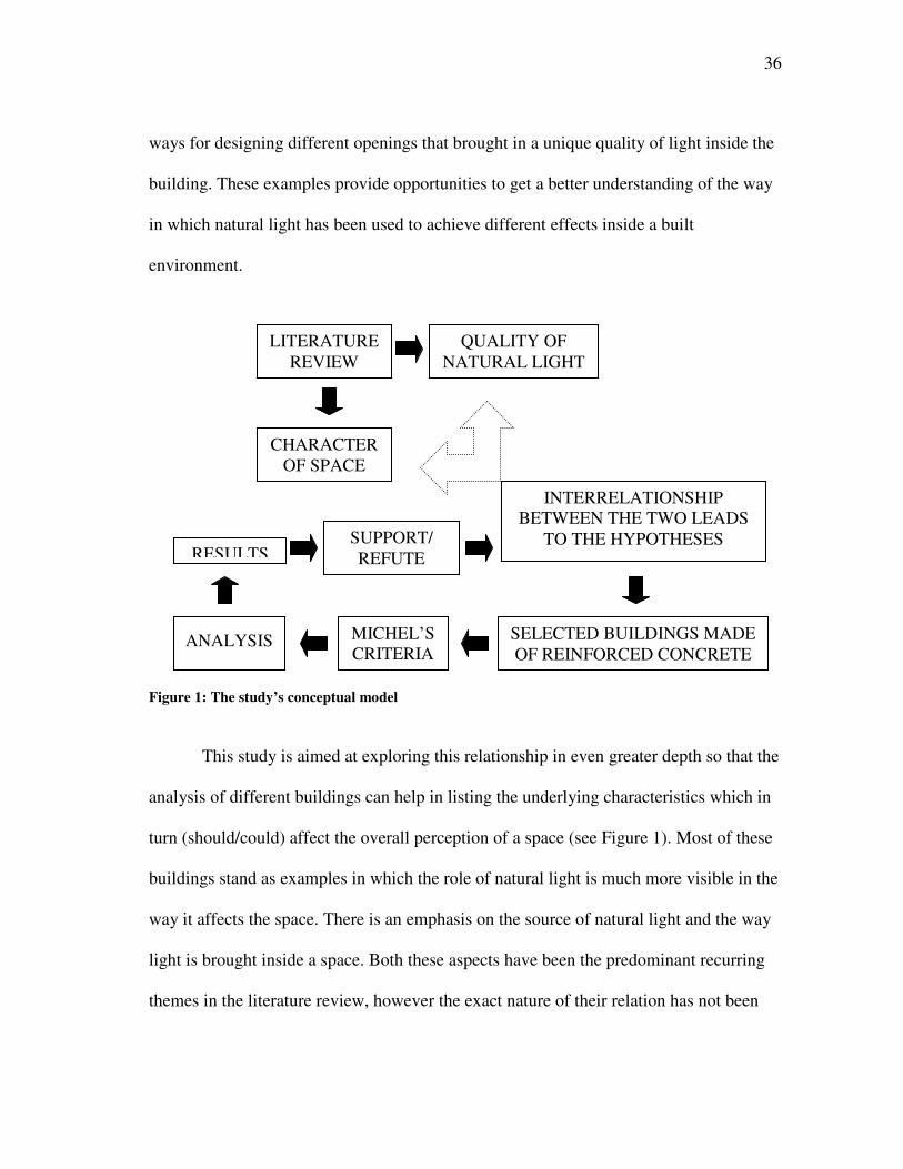
36
ways for designing different openings that brought in a unique quality of light inside the
building. These examples provide opportunities to get a better understanding of the way
in which natural light has been used to achieve different effects inside a built
environment.
Figure 1: The study’s conceptual model
This study is aimed at exploring this relationship in even greater depth so that the
analysis of different buildings can help in listing the underlying characteristics which in
turn (should/could) affect the overall perception of a space (see Figure 1). Most of these
buildings stand as examples in which the role of natural light is much more visible in the
way it affects the space. There is an emphasis on the source of natural light and the way
light is brought inside a space. Both these aspects have been the predominant recurring
themes in the literature review, however the exact nature of their relation has not been
QUALITY OF NATURAL LIGHT
INTERRELATIONSHIP BETWEEN THE TWO LEADS
TO THE HYPOTHESES
LITERATURE REVIEW
CHARACTER OF SPACE
SUPPORT/ REFUTE
SELECTED BUILDINGS MADE OF REINFORCED CONCRETE
MICHEL’S CRITERIA
ANALYSIS
RESULTS
37
explored. This provides the necessary material for developing the hypothesis for this
study that can be tested in the later analysis in some of the selected buildings.
3.3 HYPOTHESES
The first hypothesis states that the overall perception of a space is affected by certain
basic characteristics of natural light. The second hypothesis suggests that the overall
character of a space can be enhanced by emphasizing the source of natural light as a
visual element.
3.4 CRITERIA FOR ANALYSIS
To test the hypotheses, the research relies on the analysis of three of the selected
buildings designed by Le Corbusier, Louis I. Kahn and Tadao Ando. These three master
architects worked with concrete as a common material of building construction and
expression. The plasticity of the material provides the necessary freedom in the
placement and design of the openings for natural light. Thus, it provides greater scope
for experimentation with the building envelope and with the placement of the openings
to achieve different effects of natural light inside a space. The work of these architects
has an underlying emphasis on the experimentation with the light quality inside a built
space and provides the opportunity to get a deeper understanding in the way it has been
achieved.
The selected buildings, Chapel of Notre Dame du Haut Ronchamp by Le
Corbusier, Kimbell Art Museum by Louis I. Kahn and Church of the Light by Tadao
Ando, are projects that have been widely published in recognition for the achieved
38
quality of natural light that can be appreciated with respect to the design of a space. The
emphasis of this study is to explore the different effects of natural light, and the way
these have been achieved.
To understand and analyze the effect of natural light in relation to the overall
perception of a space, it is important that there is an underlying criterion that takes into
consideration all the different parameters that have a major bearing on the design of the
built environment. The analysis of these buildings cannot be done in isolation by
differentiating the lighting design from the overall design of a space. The underlying
criteria should be one that takes into account the principles of visual perception that help
in the analysis of the achieved effect of natural light in relation to the overall design of a
space. The visual nature of the analysis will require images from different projects that
can serve as useful source of data and will provide greater information in a more concise
format.
Michel (1996) lays down the criteria for the analysis of architectural space as
related to its overall lighting. The criterion analyzes the design of a space with respect to
the effect of light rather than the light itself. This has been done with an underlying
emphasis on the way a space is perceived by the human vision. The method of analysis
is based on the principles of visual perception that closely relates to the emotional
response, which is a determining factor in the overall perception of a space in terms of
the revealing character and ambiance. The focus is not in generating mathematical
values of luminance but in understanding the aspects of natural light that help in the
humanization of architecture. This approach is based on the use of a space taking into
39
consideration the movement pattern as it relates to the observed effects of light along a
circulation path. It varies from the conventional methods of analysis based on a
stationary position of the observer which is not the way a space is perceived in reality.
The criterion is based on the concept of spatial envelope as a convenient tool for the
analysis of an architectural space in relation to its lighting design. The criteria has been
summarized below-
1. THE SPATIAL ENVELOPE
a) Boundaries for Spatial Definition
b) Visual Perception of the Envelope
c) The Character of Space
d) Distortion of the Spatial Envelope
e) Clarity of the Spatial Envelope
f) Proportioning of the Spatial Envelope
g) The Color of Architectural Space
2. ARTICULATION OF THE SPATIAL ENVELOPE
a) Patterning the Dominant Boundaries
b) Penetration of the Spatial Envelope
c) Articulation with Subspaces
d) Spatial Banding
e) Curvature and Level Change
3. ROLE OF THE STRUCTURAL SYSTEM
a) Prominence of Building Form
40
b) Structure Patterning the Spatial Envelope
c) The Sources of Light
d) Structural Synthesis for Architectural Beauty
4. MOVEMENT THROUGH SPACE
a) Stimulus for Movement
b) People Move Toward Light
c) The Zones of Transition
d) Brightness Changes as a Function of Movement
The explanation for each of the above steps follows below.
3.4.1 THE SPATIAL ENVELOPE
According to Michel (1996), “A composite set of those [walls, floors, ceilings, and other
major surfaces] boundaries at any one place comprises the spatial envelope, a working
mechanism for the design, analysis, and lighting of architectural space. The envelope is a
conceptualization of a space, stripped of movable or temporary furnishings. This
theoretical segregation of shell and contents facilitates control of the color and
brightness relationships created by all reflected light in the total environment once the
furnishings are added.”
The visualization of the space as an envelope provides a strong conceptual
framework to work with a three dimensional analysis of a built environment. The
boundaries, as defined by the physical planes, help to isolate the spatial envelope from
its surroundings and, in the process, provide a nice setting to analyze the effects of light.
The number of physical parameters affecting the space can be controlled to study the
41
quality of light in a space. A similar approach has been used by Thibaud in the analysis
of the public spaces that have been categorized on the basis of different light levels. This
approach was aimed at exploring the overall relationship between different objects
present in a scene.
“A frame of visibility is a methodological device that helps describe the various
luminous contexts in which interpersonal observation occurs … Each frame of visibility
stands between two extreme cases that prevent any form of vision: complete brightness
and complete darkness. The five frames of visibility that occur most frequently in the
visual experience of the city dwellers are overexposure, enclosure, filtering blurring, and
silhouetting” (Thibaud 2001, p. 43).
The concept of devising a frame of visibility is to understand a space in terms of
the light levels that control the overall visibility of different objects, and the way in
which they relate to one another. Each frame of visibility throws light on the way
different individuals observe space. The idea is to explore deep into the relation between
light and sight.
Whereas the frame of visibility characterizes a setting based on the light levels
and then analyzes the way people observe a space, the spatial envelope defines a space
based on the physical parameters that demarcate its boundary and then analyzes the
effect of light in the way it is made visible in a space. The idea is to start with a limited
number of parameters that might include the major boundaries and surfaces in the
beginning and slowly move towards a complete representation of the space.
42
“Putting freestanding objects or furnishings inside the envelope sets up figure-
ground relationships, brightness ratio, and color relationships. The spatial envelope then
provides a vantage ground for evaluating perceptual simplicity, complexity, Gestalt
Patterns1, character, and, most important, the locations of light sources and their
resulting luminance effects” (Michel 1996, p. 103).
The envelope forms the zone of stimuli for visual perception as defined by the
physical planes. The spatial envelope in terms of its characteristics is categorized into –
• Enclosed Space (Confining and Static)
• Contiguous Space (Partially Confining, Dynamic or Ambiguous) The spatial quality of the envelope has many advantages over the planar
organization of the boundaries. It brings together the isolated elements of design that can
then be used to analyze the character and character of a space under the overall effect of
light. It also acts as a convenient and practical tool for discussion among designers and
users of a space, and a way of evaluating a space in terms of its lighting design.
3.4.1.1 Boundaries for Spatial Definition
According to Michel (1996), “A spatial envelope is best defined by the dominant2
boundaries that shape a clearly defined volume functioning as a full or partial
enclosure.”
The first step in defining a spatial envelope is to recognize the major boundaries and surfaces that demarcate the limits of human vision in a space. A spatial envelope
_____________________ 1 Grouped perceptual stimuli by spontaneous organization. 2 The major surfaces and the edges that build up the volume for a given space act as the dominant boundaries.
43
functions as a full enclosure when the space is completely enclosed and well defined
from it surroundings. But in some cases, the space might seem to flow from one
envelope to another depending upon the way one relates to another and on the use of
materials that define the physical boundaries. This will be an example of a partial
enclosure where most of the edges are loosely defined and the surfaces seem permeable.
The boundaries of the spatial envelope define some of the important
characteristics of the enclosed space like the overall size, human scale, and material of
expression. These further define the predominant visual vocabulary of the built
environment thus providing a background to study the effect of light and then arriving at
the overall perception of a space. This is the starting framework in the overall perception
of the spatial envelope. It can be explored in terms of the underlying concepts such as
unity, clarity and scale that relate to the character and ambience of a built environment.
Thibaud (2001) lists ‘Enclosure’ as one of the five frames of visibility that affect the
overall unity of a space and sets up a background-foreground relation to most of the
spatial parameters.
“Enclosure involves the delimitation and fragmentation of what can be seen in the
built environment. Its function is to structure and direct the visual field of passersby, to
shroud a portion of the place while revealing otherparts and unifying what is visible.
Enclosure both reveals and hides, depending on the spatial position of the observer. This
phenomenon introduces a differentiation between areas that could be considered upstage
and backstage” (Thibaud 2001, p. 43).
44
3.4.1.2 Visual Perception of the Envelope
According to Millet (1996), “The definition of architectural space is the definition of
enclosure, in which light plays a major role. Our sense of space is dependent upon the
way light reveals the enclosure to us.”
This concerns the role of different surfaces on the perceptual stimuli, and the
way these physical boundaries come together to form a spatial envelope. The visual
perception of the boundaries is defined by the visible limits of the envelope. The
dominant edges and surface boundaries provide information for the spatial depth and the
values of a surface’s color, texture, and brightness. The edges and contours act as strong
activators of the photoreceptors in the retina by breaking the flow of surface gradients
and giving a sense of overall depth. The floor, walls, and the ceiling with the overall
pattern, material, and reflectance have a major bearing on the perception of the spatial
envelope. The concern for size and human scale of the space can be dealt in a more
realistic manner while visualizing volumetric proportions of the spatial envelope without
any major articulation of surface details (Michel 1996).
Gärling (1970) studied the role of dominant edges for surfaces in an architectural
setting to understand the way people perceive spatial depth. Subjects responded to two
different set of drawings, one with the surface details and another with just the dominant
edges. The results showed that the drawings with just the edges provided enough
information to make reliable judgments regarding the spatial depth. The need for
organization of major boundaries depicting the edge relationship is important when
dealing with some of the basic characteristics of space.
45
3.4.1.3 The Character of Space
According to Michel (1996), “The spatial envelope is a principal conveyor of the
character of a space. The freestanding contents in a room further describe its
individualism, but the intent here is to continue to isolate the spatial envelope to
facilitate analysis of the space it defines. Furniture can be replaced or rearranged and
litter picked up, but the surface complexion of the boundaries of a room remains more
stable and in prominent view, influencing our feelings.”
The character of a space deals with the underlying character that is conveyed by
the collective imagery of the spatial envelope. This could range from satisfying and
peaceful to the stressful and depressing. Surfaces of walls can convey the variation
(harsh or soft, tattered or trim, upright or leaning, monotone or colorful, bright or
shadowed) in the character of two different spatial envelopes. Age of boundary surfaces
and its familiarity are factors that count in the determination of the character of the
space. Common use of materials, textures, colors and the overall architectural
vocabulary might provide similarity, proximity, and good continuity to the spatial
envelope and, in some cases, prove to be dominant enough to negate the effects of an
incongruous element of design.
The minimalist architecture and postmodernism offers two extreme poles in
the overall variation of the character of an architectural space. The former lays emphasis
on developing a restrained spatial envelope through pure and well proportioned cubic
volumes that conveys a muted and a serene character. The latter banks upon the use of
46
sensuous color, decorative use of materials, and unusual forms and spaces and, at times,
crosses the limits of visual simplicity and spatial clarity.
According to Michel (1996) size, shape and proportions of the spatial
envelope can dominate on the effect of the surface properties of an enclosure. These
parameters can be used to enliven a space where a single monochromatic surface has
been used throughout the building. Such a vocabulary can bring out interesting spaces
through the overall richness and clarity of the spatial envelope as it distinguishes from
another, while still maintaining required interconnectivity.
3.4.1.4 Distortion of the Spatial Envelope
According to Michel (1996), “The spatial envelope can be conceived in any shape,
proportion, or character to produce ergonomic architecture, but it can also be responsible
for the distortion of space, which can be physically upsetting to the human nervous
system when the shapes and organization of the dominant boundaries deprive people of
the basic human need for equilibrium.”
The spatial envelope can be designed in ways that the different surfaces unite to
create a form that has a compositional and psychological imbalance. This breakdown
occurs when an unusually sloped or twisted boundary forms a discordant part in the
spatial envelope. It could also be in a case where the ergonomics have been violated in
designing a space. These distortions can obscure the actual boundaries of the space that
might prove to be disorienting and unsettling. These mostly result from excessive
detailing in the visual field that makes for a poor backdrop for the perception of form-
space relationships.
47
“Unexpected bright elements in the visual field, particularly if they are distorted,
demand the attention of the focus selector, causing distraction. The uneven illumination
of the planar structural surfaces … distorts their apparent form, commanding attention
and forcing viewers to make sure the structure is not in fact the irregular shape which
patterns and gradients of incident illumination seem to suggest it is. This sort of
distracting distortion is annoying and should be avoided whenever possible” (Lam 1977,
p. 38).
3.4.1.5 Clarity of the Spatial Envelope
According to Michel (1996), “Organizing the dominant boundaries of space for
perceptual clarity is an essential step toward achieving visual order and architectural
beauty … To enrich a space, a major surface may deviate from the others as a designated
accent, but the more the individual boundaries are differentiated by dissimilar surface
pattern, color, or appendages, the more the clarity of the overall space is weakened.”
The clarity of the spatial envelope is dependent on a minimal number of
dominant boundaries and similar surface elements used in a space. The more similarities
that different surfaces share, the easier it is to achieve overall visual order. The effect of
reflected light and shadow may then be used to enliven the boundaries of a spatial
envelope if it retains the overall integrity.
3.4.1.6 Proportioning of the Spatial Envelope
According to Michel (1996), “The composition of the dominant boundaries and the
distance between them establish the basic proportions for space.”
48
The manner, in which different boundaries combine together with specified
distances separating one from another, generates the basic proportions of a space. The
controlled volume that is defined in the process becomes a determinant of spatial
perception. The height to width ratio is an important measure of the way a space is
perceived to emphasize a major axial line. The proportions of a spatial layout are less
significant in terms of their overall effect on the perception of the observer who is
moving. The visual relationship with different surfaces is continuously changing and is
dependent on a host of other factors like color, materials, light, exits and entrances. A
linear perspective of the same space will count on the boundary edges of walls, floor,
and ceiling to bring in a perception of depth.
3.4.1.7 The Color of Architectural Space
According to Michel (1996), “The predominant surfacing materials of the spatial
envelope determine the prevailing color of an environment … The color of the spatial
envelope will serve as the greater field against which all other colors will be perceived
after wall appendages and interior furnishings are added … The amount of surface area
of the total envelope is significant for the way various hues influence the quality of
spaciousness.” The shift in the value and saturation of hue, due to the variations of
reflectance and texture, do not affect the overall dominance of the base hue, more so
when there is a single color. Brighter colors will have a positive influence on the size of
a room whereas darker colors will tend to make the room appear smaller. A space with
more than one color will need a further analysis on the amount of color that is present
depending on the surface area on which it is applied.
49
Controlled spatial and chromatic design can add interest and enliven a space
while maintaining the overall stability and clarity of the spatial envelope. Visual order is
thus restored without an overload of stimuli that can take place in the presence of
multiple colors and surfaces. The clarity and character of an environment will depend on
the shape and color of the spatial envelope (Michel 1996).
“Filtering involves the quality and the propagation of light in the built
environment. By passing through a physical milieu (such as glass or foliage), natural
light can be refracted, absorbed or reflected. Filtering produces an ambiguous
relationship between the inside and the outside … the lighting of the place is neither
completely bright nor totally obscure; instead, the light produces a mottled atmosphere.
Such an impressionistic surrounding enhances and transfigures the shapes and the colors
of the place. This frame of visibility creates the sensation of bathlight or a luminous
envelope shared by everybody. Such a diffuse light increases the coherence and the unity
of the place. People located in this kind of surrounding feel physically bonded with the
environment and can also sense the time passing by” (Thibaud 2001, p. 43-46).
3.4.2 ARTICULATION OF THE SPATIAL ENVELOPE
According to Michel (1996), “As buildings are put together by a process of assembling
fabricated parts, the patterns formed on the singular boundaries can activate the surfaces,
but need to be joined together into a good composition for the whole. This is the
articulation of space, and to make the process successful, we need to reiterate this
principle: Clarity of architectural space depends on the distinctness and intelligible
order of the entire spatial envelope.”
50
The articulation of space is the organization of different boundaries with surface
patterns so that they form a cohesive envelope. Clarity is the measure of success for the
articulation of a spatial envelope, which should be visually comprehensible and must be
expressed through the overall design integrity. Over detailing and lack of uniformity can
lead to the break down of the envelope. Perceptual simplicity should be the controlling
condition while attempting to enrich and enliven the space.
3.4.2.1 Patterning the Dominant Boundaries
According to Michel (1996), “As a perceptual phenomenon, pattern belongs to the
‘hierarchy of focal accents’ and attracts the eye scanning the visual world. This is what
makes it an effective means for animating architectural space… As pattern draws
attention to one surface in a visual field, it also draws the eye to another, and becomes
effective for uniting the boundaries of space.”
The spatial articulation can be used to enhance the perceptual response to a
surface boundary through the use of a detailed pattern that forms an interesting part in
the overall composition. The manner in which different patterns draw attention will
determine the hierarchy of focal accents and establish the dominant visual boundary.
“Pattern is an easily perceptible form of order, and triggers expectations of
completeness and consistency” (Lam 1977, p. 41).
3.4.2.2 Penetration of the Spatial Envelope
According to Michel (1996), “Articulating such [self-confining] spaces by animated
detailing of their boundaries begins to break up the static quality, but that technique is
51
not nearly as effective as actual penetration of the greater spatial envelope by windows,
doorways, grilles, or other openings that connect adjacent spaces or subspaces.”
Spatial articulation is aimed at breaking the static quality of the space and is best
achieved by different openings that allow penetration between two or more spatial
envelopes. Penetration of the spatial envelope dramatizes the depth perception as the
space flows through the opening diminishing the power of enclosure. The lighting of the
architectural space will depend on the penetration that can be seen in terms of the
brightness ratio of the reflected light on the surface against the view from the opening.
The relatively bright surface seen against a dark opening enhances the articulation and
animation of the spatial envelope. The proportion of the envelope that is penetrated
compared against that of the opening, will decide the overall dominance of the building
mass in a space.
3.4.2.3 Articulation with Subspaces
According to Michel (1996), “One of the most reliable design devices for generating
visual interest and creating a stimulating quality of architectural space is the controlled
use of subspaces working in harmony with a primary spatial envelope… a subspace is
one of only partial enclosure, identified by its own spatial envelope, but opening freely
to join with the primary space to which it clearly relates. It can be a spatial inset or an
element protruding from the boundaries of its parent space.”
A subspace is a partial enclosure that has its own spatial envelope but can be seen
as an extension to the primary space merging freely at one of the boundary edges. It
affects the overall spatial composition of the parent space depending on the way it has
52
been articulated. The visual framing of the subspaces on the primary envelope should be
controlled in terms of its detailing. The two spaces should not compete with one another
for attention of the visitor. At all times the primary spatial envelope must remain intact
maintaining its own identity and clarity. Color difference can be used to differentiate the
primary spatial envelope from the surroundings, so that the articulation by subspacing is
not weakened. Lighting levels can vary to mark a gradual transition from one space to
another.
3.4.2.4 Spatial Banding
Spatial banding is a design pattern created by the linear strips of structural members.
Fascias of floors, as seen through an atrium, are an example of horizontal banding
whereas piers and columns would depict vertical banding. It is a way of articulating a
space through an integration of the structural and mechanical systems with the overall
spatial composition. Different views to the subspaces might be framed in the process
while keeping with the integrity of the parent space (Michel 1996).
3.4.2.5 Curvature and Level Change
According to Michel (1996), “Curved spaces and those that involve changing from one
level to another provide the opportunity for creating dynamic architectural space due to
the continuously unfolding views for people walking around them. Good articulation of
the spatial envelope is especially important for those environments because design
continuity is required along the path of movement.”
53
Spatial articulation can be achieved by planning circulation patterns along a
major curve or by joining two different levels, while maintaining the overall continuity
in the design. Changes in curvature can bring in interesting views that change
dramatically from one point to another. Stairs or series of steps can been used in
connecting two or more partial spatial envelopes while providing a zone of interaction.
The alternate play of light and shade along a path with well planned start and end points
can help in the articulation of these spaces.
3.4.3 ROLE OF THE STRUCTURAL SYSTEM
Concrete and stone masonry has been used in the construction of the chapel in a manner
that the structure is concealed in the external envelope. The plasticity of the form has
been achieved by using concrete.
The structural system has to be integrated with the overall lighting design if the
space has to be perceived as visually comfortable. The conflict between the two could
lead to overloading of the visual stimuli without any meaningful information being
conveyed in the process. The use of uneven illumination should have a definite purpose
like an emphasis on one of the design elements that creates a point of interest against a
restrained background.
3.4.3.1 Prominence of Building Form
Structure is the generator of form and space. The structural form needs to be conceived
in a manner that it takes into consideration the internal layout and spatial configuration
rather than just dominating the building design. The outer wall, or the structural
54
membrane, needs to be planned from the interior as well as the exterior in terms of
shaping space and bringing in daylight (Michel 1996).
3.4.3.2 Structure Patterning the Spatial Envelope
According to Michel (1996), “A dominant boundary of space can be designed with
structural members organized as aesthetic pattern.”
The structural members can be themselves articulated to create surface patterns
for dominant boundaries in a spatial envelope. Individual units in a structure can be
grouped in a manner that creates an interesting design pattern. The pattern of light and
shadow can further articulate the spatial envelope by animating the surface under
changing effects of daylight. All this should be done while maintaining an overall
integrity with the design of the spatial envelope.
“Strong patterns of visual information can also dominate the visual field,
demanding the attention of the focus selector. The problems of visual noise … can be
eliminated by the use of indirect lighting systems, which deliver light to the room by
reflection from room surfaces, which are intrinsically interesting to look at. These bright
room surfaces satisfy biological needs for structural clarity and for a bright, cheerful
environment” (Lam 1977, p. 39).
3.4.3.3 The Sources of Light
According to Michel (1996), “the design of the structural system determines where, how
much, and what shape of penetrations can be made. When structural design and building
55
design are coordinated, the outcome makes possible engaging dialogue between
architectural space and light.”
The size and type of openings for the entry of daylight are determined by the
design of the structural system and the overall orientation of the building. The
interaction between the spatial envelope and light that fills in the space is best achieved
through close coordination between the structure and the building form. The use of
contrast or even soft illumination should depend on the kind of function and the need for
visual emphasis inside a space.
3.4.3.4 Structural Synthesis for Architectural Beauty
According to Michel (1996), “The appropriateness and correctness of the structural
system fitting the concept and program requirements of a building is a standard for the
achievement of quality architectural design.”
The beauty of an architectural design, as it relates to the structure, is achieved
through the integration of the exterior form with the internal arrangement of the
functional components. The structural synthesis should bring in integrity of different
spaces rather than an isolated dominance of form. This further relates to the idea of
visual harmony inside a space that will depend on the coordination between the structure
and the source of light.
“… the perceptual distortion of structure resulting from sharp brightness
gradients … will be diminished if the designer can locate a color change or a prominent
joint line where a drastic rate change in brightness gradients is unavoidable due to the
geometry of the situation. Flat, uniform surfaces are expected to appear that way; uneven
56
gradients are much more noticeable on a flat ceiling than on an articulated (three-
dimensional) one where the shape of the ceiling itself helps to justify the gradients to the
mind’s eye as long as the relation between shape and gradient is consistent throughout
the visual field. One of the disturbing aspects of the lighting scheme … is the
inconsistency and incompatibility of the relationship between structural form and
luminance gradients” (Lam 1977, p. 50-51).
The luminance gradients should be used in a manner that helps to highlight the
basic geometry used to achieve a particular form. The ambiguity in revealing the
structure might lead to an overall distortion of the way a spatial envelope is perceived.
3.4.4 MOVEMENT THROUGH SPACE
According to Michel (1996), “Spatial organization and the lighting of certain features of
the built environment prompt people’s movement patterns, and those features can be
manipulated to make architectural design more comprehendible and meaningful.”
The movement pattern in a space relates to what people see, and the way they see
different elements of a spatial envelope. There might be some design elements that
attract greater visual attention and thus define a strong path for movement in a space.
The use of contrast through controlled use of light can help to highlight certain objects
more than others.
“If the building is familiar territory, he moves through it in a habitual manner,
scarcely aware of his architectural environment; if it is unfamiliar, he moves in an
exploratory manner, looking in all directions, hesitating, and sometimes retracing his
steps. Exploratory locomotion usually occurs in public buildings such as museums and
57
art galleries. Habitual motion is far more common and generally occurs in homes and
office buildings” (Bechtel 1967, p. 53-54).
The movement of the visitors inside a building depends on their familiarity with
the built environment. Hence what becomes important is the path defining a sequential
arrangement of spaces that creates visual interest and minimizes confusion as people
find their way around a building. Spatial organization and the lighting of certain features
in the built environment do define the movement pattern.
3.4.4.1 Stimulus for Movement
According to Michel (1996), “Focal accents are helpful for creating nodes of special
interest in a building, especially when the intention is to attract people to certain
locations. A center of attention is stronger when it is carefully integrated with the design
of the spatial envelope(s) through which the pedestrian circulation is routed.”
The use of focal accents to create nodes of special interest along a certain path of
movement can be integrated with the overall design of a spatial envelope. This can help
in creating zones that will demand the attention of people while highlighting certain
design features more than others. Perceptual simplicity of the space should not be broken
down with too much of visual stimuli at one point. So a controlled amount of focal
accenting should be done, more so when the nearby space is framed by the opening in
the immediate spatial envelope. The incomplete information that is read through such an
opening prompts the observer to explore the next space. The way this transition takes
place depends on the quality of the focal accent that lies ahead in relation to the design
of the immediate spatial envelope. Pattern detailing can be used as a way of connecting
58
two spaces while keeping with the integrity and clarity of design and maintaining an
overall continuity in the experience. Strong visual patterns as those of light and shadow
can be used as centers of focal attention while integrating different spaces.
“Overexposure involves creating a differentiation between and a hierarchy
among objects in the visual world. It consists increasing the visibility of a specific
object, such as a monument or an individual. This frame of visibility displays passerby,
attracts their visual attention, and points out what can or should be seen by anybody …
Such a phenomenon can be produced in two different ways: either by making use of
contrast between lit space and obscure space …, or by offering a view from above of
what is happening underneath …” (Thibaud 2001, p. 43).
3.4.4.2 People Move toward Light
The relative brightness in certain portions of the spatial envelope acts as focal accents.
The movement of a visitor to a building is directed towards light. The higher the ratio of
the brightness or contrast between two surface the greater attention it demands. This
becomes an important factor in the sequential layout of the spaces inside a building as
the challenge is to combine the functional necessities with the artistic play of light levels
(Michel 1996).
Taylor and Socov (1974) did an experimental study that would answer their
research question: Will light or bright surfaces and objects actually stimulate a person to
move towards them when there are alternate choices to move in directions where light is
not a dominant feature. What they found out was that higher the ratio of brightness
between the two end walls, the higher the percentage of subjects who moved towards the
59
brighter wall. There was clear evidence that people choose the brighter way whenever
they had more than one option to move from a point to another.
“Silhouetting emphasizes the contour of objects or individuals instead of the
details of their surfaces. This frame involves a particularly pronounced figure-ground
relationship; it produces a clear differentiation between several juxtaposed planes or
visual elements … The transition from a dark, artificially lit place to a bright, naturally
lit place, such as the exit from an underground place into the daylight, is the most
common context for experiencing silhouetting … From an architectural point of view;
silhouetting makes it possible to strongly accentuate the transition between two places
and clearly differentiate the foreground from the middleground and background”
(Thibaud 2001, p. 46).
3.4.4.3 The Zone of Transition
According to Michel (1996), “the human retina undergoes light or dark adaptation when
human vision is subjected to changes of brightness levels surrounding the eye.
Movement through the architectural environment strongly influences that adaptation,
particularly between two adjacent spaces of significant brightness-contrast… The retina
needs time to adjust during the move from one extreme of lighted environment to
another, and to promote the humanization of architecture, a spatial zone of transition is
needed.”
The human eye takes time to adjust to significant changes of brightness and
contrast. The movement between zones of high brightness-contrast should provide
suitable buffer for adaptation. A spatial zone of transition is required that provides the
60
necessary time for the adjustment of the photoreceptors in the retina. Shadow patterns
and similar effects of light can be used to bring in the necessary amount of adjustment
between two extreme conditions of brightness and contrast.
“Blurring involves the reducing of visibility of people, making it difficult to
perceive the contours and the shapes of objects and bodies … Blurring emphasizes the
dilution of the visible forms and limits the perception of depth … A feeling of insecurity,
mystery or surprise can result from this luminous context: the pedestrian cannot really
anticipate what will be in his path. Such a frame may also be interpreted as a means to
enhance the secretive character of a place and dramatize the experience of urban space”
(Thibaud 2001, p. 46).
3.4.4.4 Brightness Changes as a Function of Movement
According to Michel (1996), “to the eye, the colors and textures of surfacing materials
change in brightness as seen by a person walking through the architectural environment
... The concept of the spatial envelope is effective for observing and analyzing the
influence of the dominant spatial boundaries surrounding the vision of a person walking
through successive spaces of alternating luminance contrasts … Spaces need to be
connected in such a way as to facilitate a pleasant transition between them, which
depends on the brightness levels of what precedes and what follows.”
Different surfaces appear to change in overall brightness with the movement of
the observer. This is caused by light and dark adaptation of the eye that is continuously
trying to adjust and compensate for the variation of light levels at any given point in
time. The luminance of the dominant surfaces will have a greater affect as compared to
61
the rest, in a way that affects the connection and transition between different spaces.
Thus the shape, dimension and the material of the dominant boundary tend to be
important parameters in the overall play of changing light levels.
“The perception of brightness, as well as color, is influenced by simultaneous
contrast. Objects of the same surface luminance will be perceived as brighter or darker
depending on the relative luminance of their context” (Lam 1977, p. 49).
The visual perception of the space relies on the contextual information to make
judgments on the brightness of a surface. There is a strong relation between the
foreground and the background that helps to decide on the perception of a space in terms
of the existing light levels. The context might change with the movement through a
space, for example, the surface that looked bright against a much darker background
might seem the opposite when seen against a well illuminated light color material. This
might shift the visual interest from the foreground to the background depending on the
information that the two surfaces provide.
62
CHAPTER IV
ANALYSIS
This chapter deals with the analysis of the spatial envelope inside three different
buildings. The selected buildings are (a) Chapel of Notre Dame du Haut Ronchamp by
Le Corbusier, (b) Kimbell Art Museum by Louis I. Kahn, and (c) Church of the Light by
Tadao Ando.
The main space that houses the primary function of the building program has
been selected as the spatial envelope to be analyzed using the criteria as listed in the
previous chapter. The headings and subheadings have been retained to provide an in
depth explanation to each of the parameter that affects the light quality inside a space.
The use of a common criterion based on the principles of visual perception helps
in the study of the effect of natural light in these three buildings that are spread across
different continents. Also, the variation in the shape, size and the organization based on
the functional requirements of the spatial envelope can be dealt in the final analysis as it
provides an opportunity to study the underlying patterns in relation to the quality of light
inside a space with a common material of expression across different projects.
The analysis is aimed at providing a rich content of descriptive explanation in the
way different effects of light have been achieved in a spatial envelope. The approach
takes into consideration the variables that influence the way natural light illuminates a
space. The isolation of a spatial envelope from its surrounding helps to control the
analysis of a space.
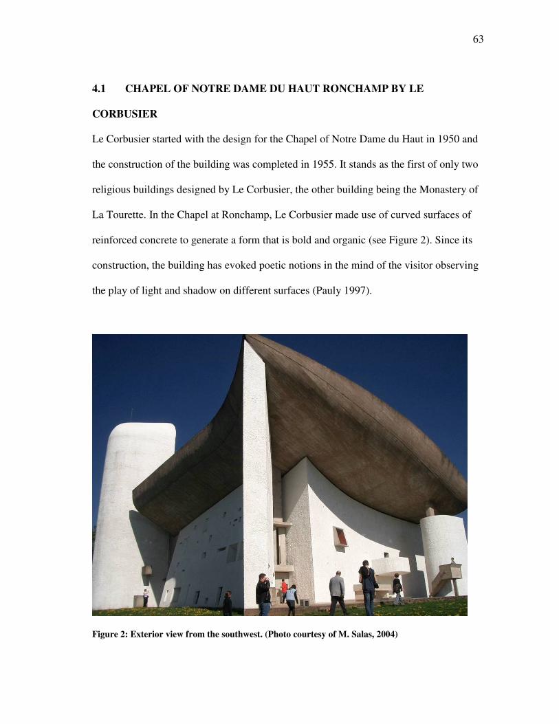
63
4.1 CHAPEL OF NOTRE DAME DU HAUT RONCHAMP BY LE
CORBUSIER
Le Corbusier started with the design for the Chapel of Notre Dame du Haut in 1950 and
the construction of the building was completed in 1955. It stands as the first of only two
religious buildings designed by Le Corbusier, the other building being the Monastery of
La Tourette. In the Chapel at Ronchamp, Le Corbusier made use of curved surfaces of
reinforced concrete to generate a form that is bold and organic (see Figure 2). Since its
construction, the building has evoked poetic notions in the mind of the visitor observing
the play of light and shadow on different surfaces (Pauly 1997).
Figure 2: Exterior view from the southwest. (Photo courtesy of M. Salas, 2004)
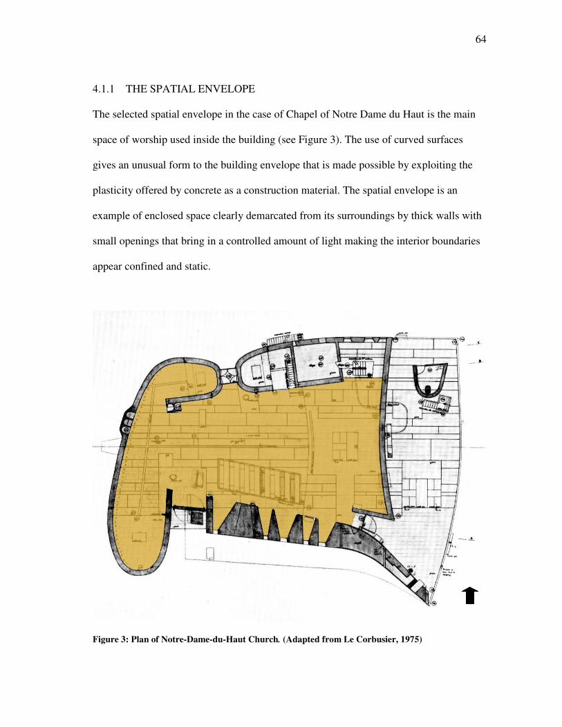
64
4.1.1 THE SPATIAL ENVELOPE
The selected spatial envelope in the case of Chapel of Notre Dame du Haut is the main
space of worship used inside the building (see Figure 3). The use of curved surfaces
gives an unusual form to the building envelope that is made possible by exploiting the
plasticity offered by concrete as a construction material. The spatial envelope is an
example of enclosed space clearly demarcated from its surroundings by thick walls with
small openings that bring in a controlled amount of light making the interior boundaries
appear confined and static.
Figure 3: Plan of Notre-Dame-du-Haut Church. (Adapted from Le Corbusier, 1975)
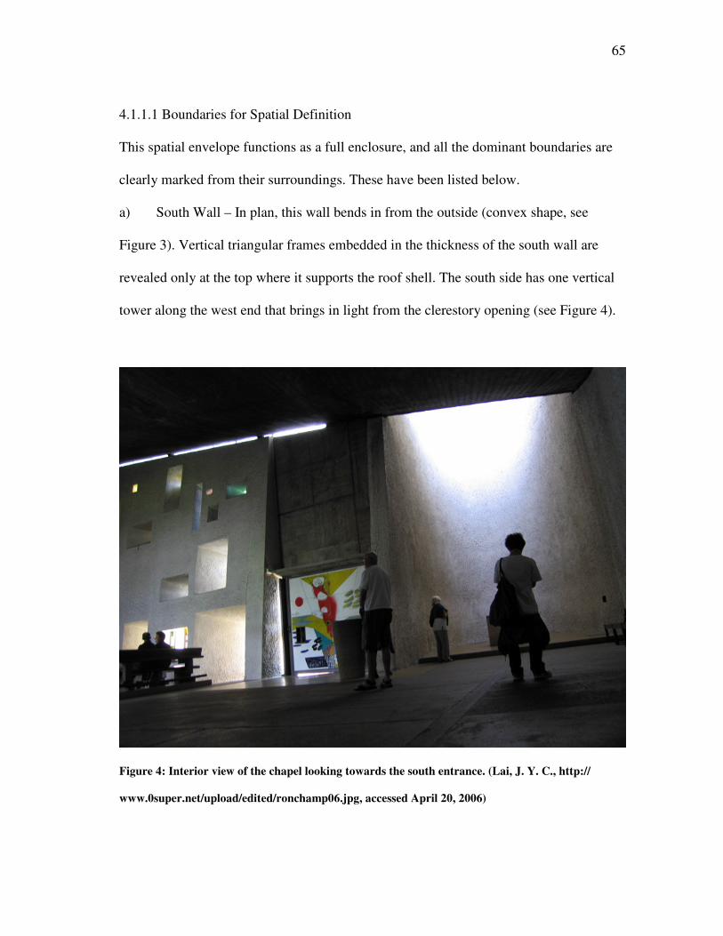
65
4.1.1.1 Boundaries for Spatial Definition
This spatial envelope functions as a full enclosure, and all the dominant boundaries are
clearly marked from their surroundings. These have been listed below.
a) South Wall – In plan, this wall bends in from the outside (convex shape, see
Figure 3). Vertical triangular frames embedded in the thickness of the south wall are
revealed only at the top where it supports the roof shell. The south side has one vertical
tower along the west end that brings in light from the clerestory opening (see Figure 4).
Figure 4: Interior view of the chapel looking towards the south entrance. (Lai, J. Y. C., http://
www.0super.net/upload/edited/ronchamp06.jpg, accessed April 20, 2006)
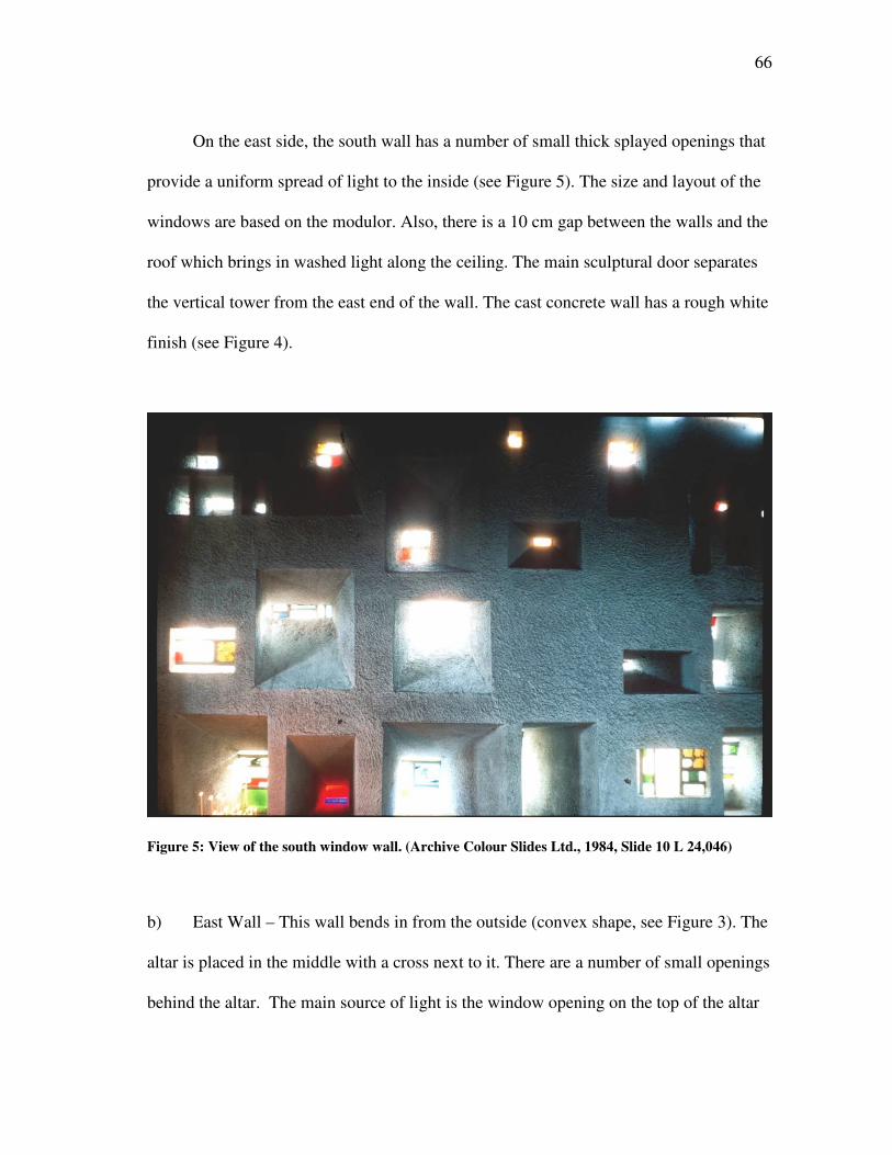
66
On the east side, the south wall has a number of small thick splayed openings that
provide a uniform spread of light to the inside (see Figure 5). The size and layout of the
windows are based on the modulor. Also, there is a 10 cm gap between the walls and the
roof which brings in washed light along the ceiling. The main sculptural door separates
the vertical tower from the east end of the wall. The cast concrete wall has a rough white
finish (see Figure 4).
Figure 5: View of the south window wall. (Archive Colour Slides Ltd., 1984, Slide 10 L 24,046)
b) East Wall – This wall bends in from the outside (convex shape, see Figure 3). The
altar is placed in the middle with a cross next to it. There are a number of small openings
behind the altar. The main source of light is the window opening on the top of the altar
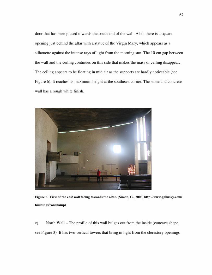
67
door that has been placed towards the south end of the wall. Also, there is a square
opening just behind the altar with a statue of the Virgin Mary, which appears as a
silhouette against the intense rays of light from the morning sun. The 10 cm gap between
the wall and the ceiling continues on this side that makes the mass of ceiling disappear.
The ceiling appears to be floating in mid air as the supports are hardly noticeable (see
Figure 6). It reaches its maximum height at the southeast corner. The stone and concrete
wall has a rough white finish.
Figure 6: View of the east wall facing towards the altar. (Simon, G., 2003, http://www.galinsky.com/
buildings/ronchamp)
c) North Wall – The profile of this wall bulges out from the inside (concave shape,
see Figure 3). It has two vertical towers that bring in light from the clerestory openings
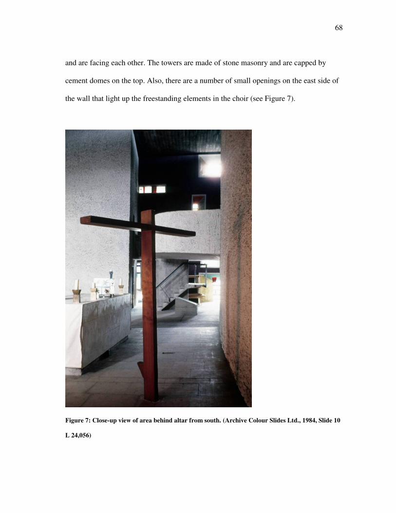
68
and are facing each other. The towers are made of stone masonry and are capped by
cement domes on the top. Also, there are a number of small openings on the east side of
the wall that light up the freestanding elements in the choir (see Figure 7).
Figure 7: Close-up view of area behind altar from south. (Archive Colour Slides Ltd., 1984, Slide 10
L 24,056)
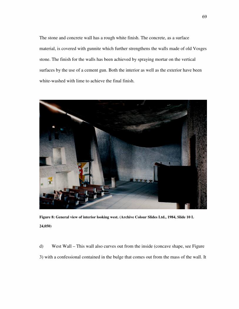
69
The stone and concrete wall has a rough white finish. The concrete, as a surface
material, is covered with gunnite which further strengthens the walls made of old Vosges
stone. The finish for the walls has been achieved by spraying mortar on the vertical
surfaces by the use of a cement gun. Both the interior as well as the exterior have been
white-washed with lime to achieve the final finish.
Figure 8: General view of interior looking west. (Archive Colour Slides Ltd., 1984, Slide 10 L
24,050)
d) West Wall – This wall also curves out from the inside (concave shape, see Figure
3) with a confessional contained in the bulge that comes out from the mass of the wall. It
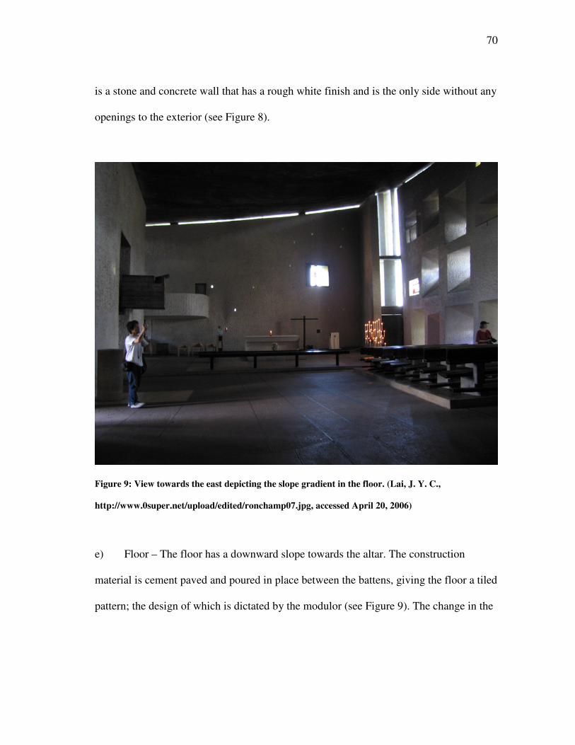
70
is a stone and concrete wall that has a rough white finish and is the only side without any
openings to the exterior (see Figure 8).
Figure 9: View towards the east depicting the slope gradient in the floor. (Lai, J. Y. C.,
http://www.0super.net/upload/edited/ronchamp07.jpg, accessed April 20, 2006)
e) Floor – The floor has a downward slope towards the altar. The construction
material is cement paved and poured in place between the battens, giving the floor a tiled
pattern; the design of which is dictated by the modulor (see Figure 9). The change in the
71
flooring material takes place where the interior and exterior altars rest and is done in
white stone matching with the material used for the altar.
f) Ceiling – The roof consists of two concrete membranes 6 cm thick and separated
by a space of 2.26 m. The idea of this roof represents the shell of a crab that inspired
Corbusier in the design of the final form for the roof. This roof is supported by short
struts, protruding from the vertical surfaces at the south and the east end of the chapel.
The grey ceiling has been left unfinished and rough with the impression of the formwork
visible from the inside (see Figure 8).
4.1.1.2 Visual Perception of the Envelope
The use of curves for all the major surfaces and dominant boundary edges has a strong
impact on the visual perception of the spatial envelope inside the chapel. The sculptural
beauty of the overall form is less predominant inside when compared to the exterior.
This is due to the low light levels inside the space with the emphasis being more on
hiding than revealing the interiors of the chapel. The sources of light become all the
more prominent in the dark interiors because of the strong visual contrast that is
generated by the openings particularly on the south and east walls (see Figure 9).
The rough finish on the vertical surfaces provides greater surface area for the
scattering of natural light inside the chapel thus creating a soft and diffused interior
space. The contrast between the light and shadow is further enhanced by the white
painted surfaces seen against the dark floor and the ceiling. Also, the use of the convex
and concave shapes for the adjacent walls, to support the curved roof, creates a strong
outward thrust from within the building. This effect is further strengthened as the light
72
washes through the small gap between the vertical walls and the ceiling on the south and
east side of the chapel (see Figure 8).
4.1.1.3 The Character of Space
The religious character of the space is defined by the mystery of the shadows, and the
way light reveals the overall form of the chapel. The softness in the light, as it reflects
from the textured surfaces, gives a muted expression to the space. The light, as it is seen
entering from the different openings in the south wall, helps in removing the bulkiness in
the mass of the building and, combined with the curvilinear roof, contributes to a light
and free floating form of the chapel (see Figure 9).
The small size of the chapel, seen enclosed by thick walls as it isolates the spatial
envelope from the exterior, creates a static and silent character that is broken on the
periphery by the placement of major openings of light. The sacred nature of the space is
embedded in the closed quality of the space and the peaceful interaction with the exterior
through the entry of the natural light into the dark interiors (see Figure 9).
The form has been generated out of simple curves that give the spatial envelope a
free flowing geometry and highlights the continuity between different surfaces and
boundary edges. The curvilinear profile generates an organic form that leaves an artistic
impression in the mind of the observer. The space between the wall and the roof helps
to liberate the building of its mass and opens the space to the exterior in a way that
creates a strong relation between the sacred and the profane. The interior space is bathed
in white lime that acts to purify the space and create a contrast with the dark colors on
the floor and the ceiling. The light filtering through the colored glass, in the small
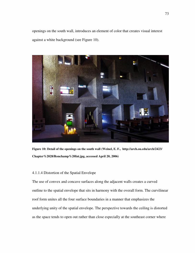
73
openings on the south wall, introduces an element of color that creates visual interest
against a white background (see Figure 10).
Figure 10: Detail of the openings on the south wall (Weinel, E. F., http://arch.ou.edu/arch/2423/
Chapter%2028/Ronchamp%20Int.jpg, accessed April 20, 2006)
4.1.1.4 Distortion of the Spatial Envelope
The use of convex and concave surfaces along the adjacent walls creates a curved
outline to the spatial envelope that sits in harmony with the overall form. The curvilinear
roof form unites all the four surface boundaries in a manner that emphasizes the
underlying unity of the spatial envelope. The perspective towards the ceiling is distorted
as the space tends to open out rather than close especially at the southeast corner where
74
the south wall extends away from the east wall creating a visual tension as the two
boundaries meet (see Figures 2, 3 and 9). But this does not create an imbalance as the
light from the gap between the vertical surface and the ceiling and the window opening
on the top of the altar door highlights this repulsion as a design element. This creates a
vertical thrust and breaks the static nature of the space. The curvilinear roof form further
helps in accentuating the organic nature of the chapel and extends the space out to the
exterior.
4.1.1.5 Clarity of the Spatial Envelope
The different surface boundaries have an underlying uniformity of expression. All the
vertical surfaces are painted white with a rough finish that continues in the ceiling. The
ceiling is in grey concrete and differentiates from the vertical surfaces, and the small gap
for the entry of daylight, placed at the intersection of the two surfaces, further highlights
this change. The floor has a tile pattern that differentiates it from the rest of the surfaces
and, due to its dark color, demands the least visual attention. This contrast, in terms of
the color, helps the building achieve the vertical thrust and combined with the careful
planning, of different openings for daylight, brings clarity to the overall design of the
spatial envelope.
4.1.1.6 Proportioning of the Spatial Envelope
The proportioning of the spatial envelope, and all the openings, is in accordance with the
modulor that is based on the golden section, as is the case with the lowest point of the
roof which is 4.52 m high. This number can be seen as 2 X 2.26 m, which fits in the
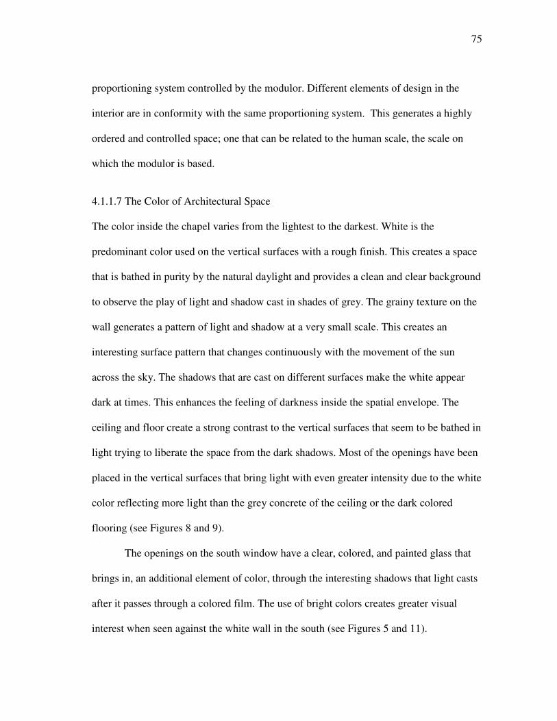
75
proportioning system controlled by the modulor. Different elements of design in the
interior are in conformity with the same proportioning system. This generates a highly
ordered and controlled space; one that can be related to the human scale, the scale on
which the modulor is based.
4.1.1.7 The Color of Architectural Space
The color inside the chapel varies from the lightest to the darkest. White is the
predominant color used on the vertical surfaces with a rough finish. This creates a space
that is bathed in purity by the natural daylight and provides a clean and clear background
to observe the play of light and shadow cast in shades of grey. The grainy texture on the
wall generates a pattern of light and shadow at a very small scale. This creates an
interesting surface pattern that changes continuously with the movement of the sun
across the sky. The shadows that are cast on different surfaces make the white appear
dark at times. This enhances the feeling of darkness inside the spatial envelope. The
ceiling and floor create a strong contrast to the vertical surfaces that seem to be bathed in
light trying to liberate the space from the dark shadows. Most of the openings have been
placed in the vertical surfaces that bring light with even greater intensity due to the white
color reflecting more light than the grey concrete of the ceiling or the dark colored
flooring (see Figures 8 and 9).
The openings on the south window have a clear, colored, and painted glass that
brings in, an additional element of color, through the interesting shadows that light casts
after it passes through a colored film. The use of bright colors creates greater visual
interest when seen against the white wall in the south (see Figures 5 and 11).
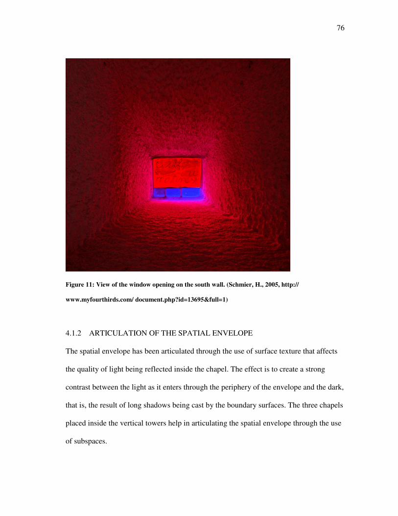
76
Figure 11: View of the window opening on the south wall. (Schmier, H., 2005, http://
www.myfourthirds.com/ document.php?id=13695&full=1)
4.1.2 ARTICULATION OF THE SPATIAL ENVELOPE
The spatial envelope has been articulated through the use of surface texture that affects
the quality of light being reflected inside the chapel. The effect is to create a strong
contrast between the light as it enters through the periphery of the envelope and the dark,
that is, the result of long shadows being cast by the boundary surfaces. The three chapels
placed inside the vertical towers help in articulating the spatial envelope through the use
of subspaces.
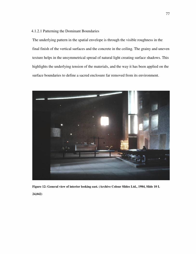
77
4.1.2.1 Patterning the Dominant Boundaries
The underlying pattern in the spatial envelope is through the visible roughness in the
final finish of the vertical surfaces and the concrete in the ceiling. The grainy and uneven
texture helps in the unsymmetrical spread of natural light creating surface shadows. This
highlights the underlying tension of the materials, and the way it has been applied on the
surface boundaries to define a sacred enclosure far removed from its environment.
Figure 12: General view of interior looking east. (Archive Colour Slides Ltd., 1984, Slide 10 L
24,042)
78
4.1.2.2 Penetration of the Spatial Envelope
There is a strong emphasis on achieving a sense of penetration into the closed spatial
envelope through the effect of natural light in different ways as light makes its presence
felt inside the dark interiors of the chapel. The placement of the statue of the Virgin
Mary in one of the recessed openings in the east wall is an attempt at animating a surface
boundary through silhouetting.
The window openings on the south wall are made up of clear, colored, and
painted glass to bring in colored shadows (see Figures 5 and 11). The splayed openings
help in the spread of light creating a sparkle effect as light enters the chapel. Then, there
are hidden openings in the north wall that help to highlight the free standing elements in
the choir. But the most visible attempt of penetration is through the light washing along
the ceiling as it enters from the small gap between the roof and the walls on the south
and east end of the chapel. This heavy mass of the roof is set free and the static nature of
the enclosed space broken through the light penetrating deep into the space (see Figure
12). A similar sense of penetration can be felt when standing near one of three altars
places in the vertical towers. The light from the clerestory floods the small chapel and
illuminates the altar to create a highlight that attracts visual attention in terms of contrast
it generates against the dark interiors (see Figure 13).
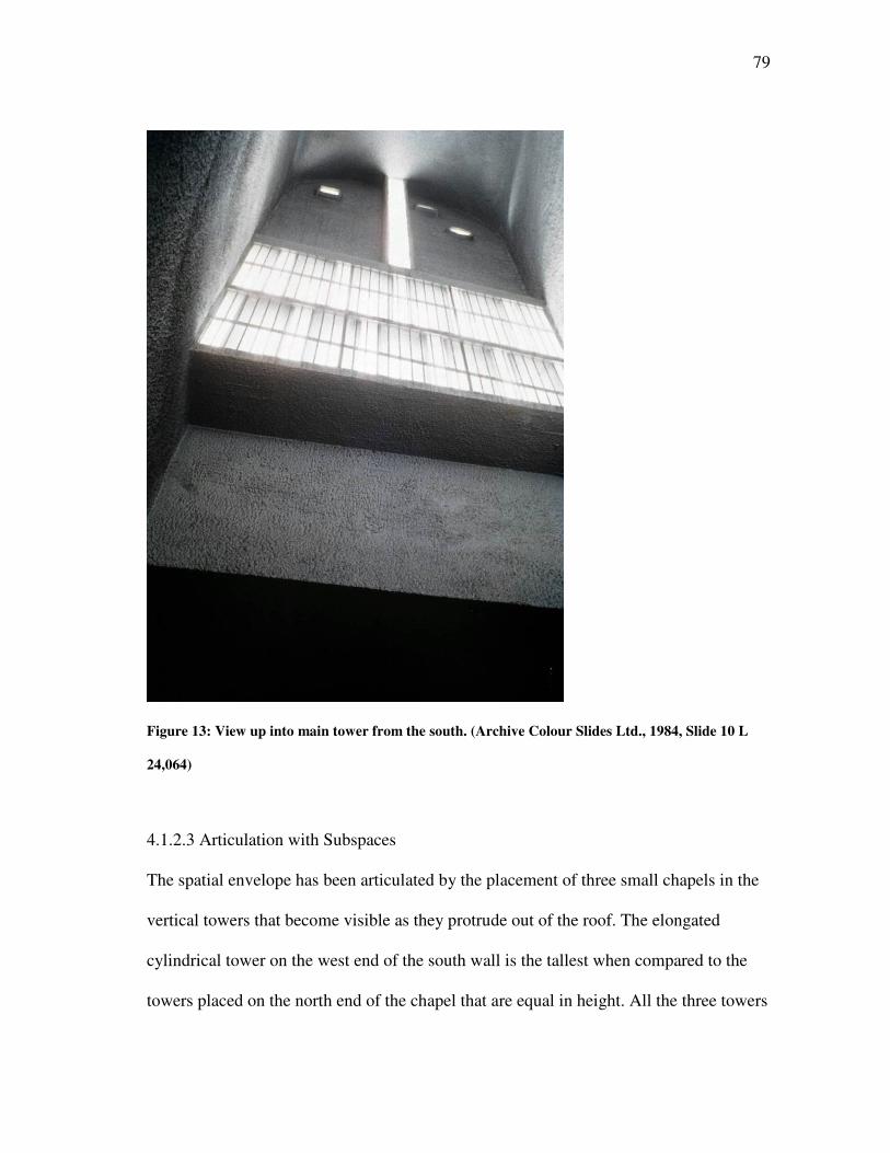
79
Figure 13: View up into main tower from the south. (Archive Colour Slides Ltd., 1984, Slide 10 L
24,064)
4.1.2.3 Articulation with Subspaces
The spatial envelope has been articulated by the placement of three small chapels in the
vertical towers that become visible as they protrude out of the roof. The elongated
cylindrical tower on the west end of the south wall is the tallest when compared to the
towers placed on the north end of the chapel that are equal in height. All the three towers
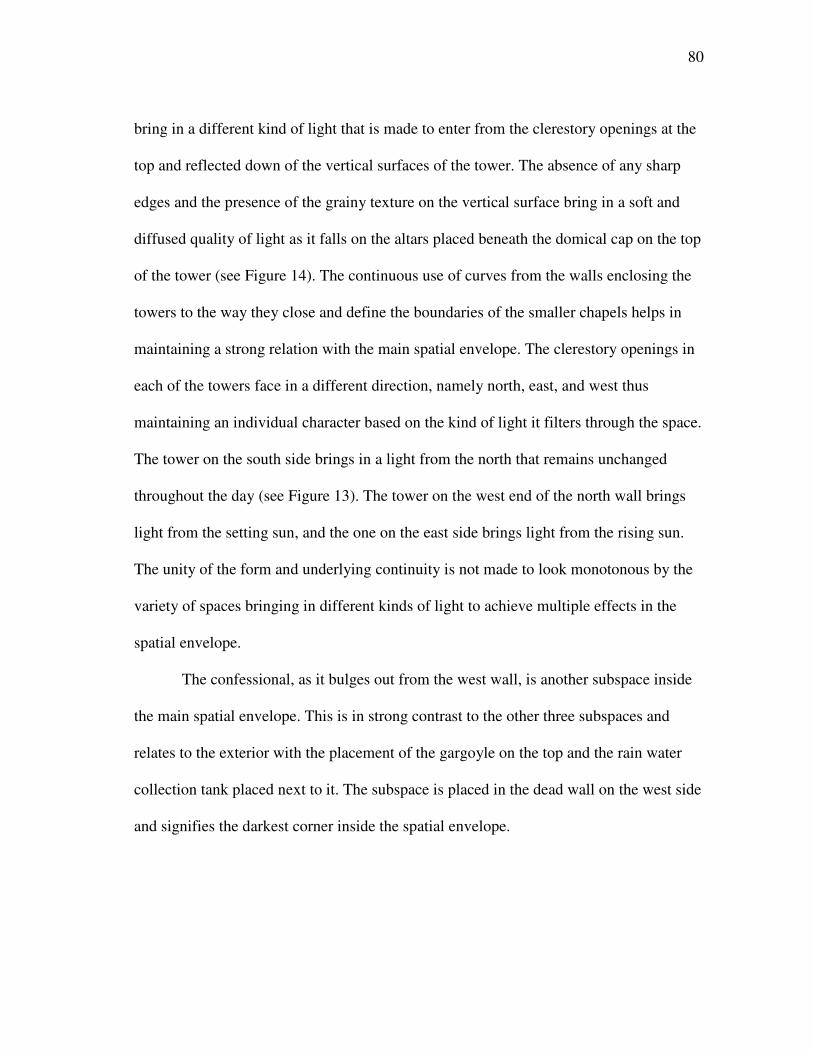
80
bring in a different kind of light that is made to enter from the clerestory openings at the
top and reflected down of the vertical surfaces of the tower. The absence of any sharp
edges and the presence of the grainy texture on the vertical surface bring in a soft and
diffused quality of light as it falls on the altars placed beneath the domical cap on the top
of the tower (see Figure 14). The continuous use of curves from the walls enclosing the
towers to the way they close and define the boundaries of the smaller chapels helps in
maintaining a strong relation with the main spatial envelope. The clerestory openings in
each of the towers face in a different direction, namely north, east, and west thus
maintaining an individual character based on the kind of light it filters through the space.
The tower on the south side brings in a light from the north that remains unchanged
throughout the day (see Figure 13). The tower on the west end of the north wall brings
light from the setting sun, and the one on the east side brings light from the rising sun.
The unity of the form and underlying continuity is not made to look monotonous by the
variety of spaces bringing in different kinds of light to achieve multiple effects in the
spatial envelope.
The confessional, as it bulges out from the west wall, is another subspace inside
the main spatial envelope. This is in strong contrast to the other three subspaces and
relates to the exterior with the placement of the gargoyle on the top and the rain water
collection tank placed next to it. The subspace is placed in the dead wall on the west side
and signifies the darkest corner inside the spatial envelope.
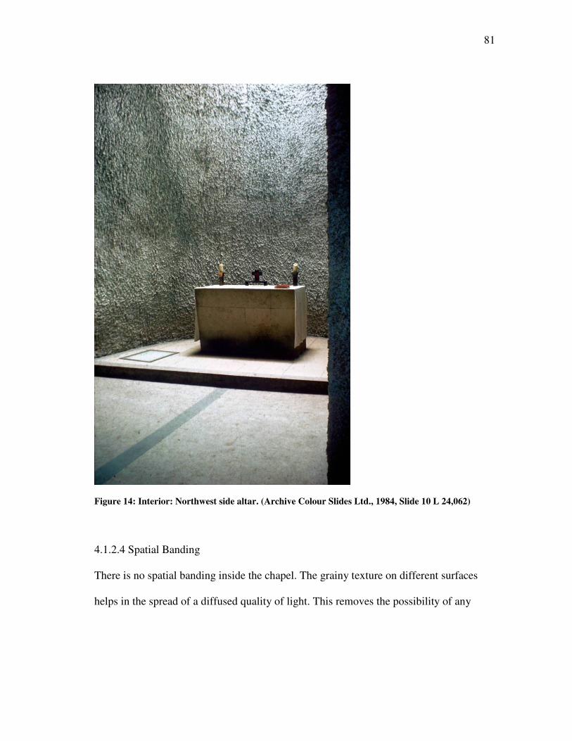
81
Figure 14: Interior: Northwest side altar. (Archive Colour Slides Ltd., 1984, Slide 10 L 24,062)
4.1.2.4 Spatial Banding
There is no spatial banding inside the chapel. The grainy texture on different surfaces
helps in the spread of a diffused quality of light. This removes the possibility of any
82
sharp patterns being created through the path of light as it stands in contrast to the dark
shadows.
4.1.2.5 Curvature and Level Change
The use of curved surfaces inside the chapel varies from the concave to the convex on
the vertical surfaces and gets all the more complicated in the roof. The east and south
walls bend inward and act as receivers of natural light from these two orientations. The
north and west walls bend outward and are more of containers that help in the
distribution of reflected light inside the chapel (see Figures 3, 8 and 9). The generating
curve for the roof sags in the middle and rises towards the periphery of the envelope. It
reaches the pinnacle at the southeast corner of the chapel, and this is highlighted by the
light entering from the gap between the wall and the ceiling. The roof defines the axis of
the space that seems to move from the west end of the chapel, that has no openings, to
the exterior, and the roof is at its lowest point to the southeast corner where the
difference in the height level is made all the more pronounced by light entering from
three different directions (see Figure 12).
The floor inside the spatial envelope slopes downward towards the altar directing
the movement pattern of the visitors. This helps in achieving a gradual and smooth
transition from the point of entry to the center of the worship (see Figure 9).
4.1.3 ROLE OF THE STRUCTURAL SYSTEM
The main structural system in the chapel is composed of reinforced concrete that has
been used to construct the required framework for the building. It has been filled with
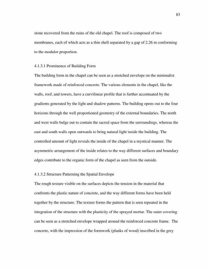
83
stone recovered from the ruins of the old chapel. The roof is composed of two
membranes, each of which acts as a thin shell separated by a gap of 2.26 m conforming
to the modulor proportion.
4.1.3.1 Prominence of Building Form
The building form in the chapel can be seen as a stretched envelope on the minimalist
framework made of reinforced concrete. The various elements in the chapel, like the
walls, roof, and towers, have a curvilinear profile that is further accentuated by the
gradients generated by the light and shadow patterns. The building opens out to the four
horizons through the well proportioned geometry of the external boundaries. The north
and west walls bulge out to contain the sacred space from the surroundings, whereas the
east and south walls open outwards to bring natural light inside the building. The
controlled amount of light reveals the inside of the chapel in a mystical manner. The
asymmetric arrangement of the inside relates to the way different surfaces and boundary
edges contribute to the organic form of the chapel as seen from the outside.
4.1.3.2 Structure Patterning the Spatial Envelope
The rough texture visible on the surfaces depicts the tension in the material that
confronts the plastic nature of concrete, and the way different forms have been held
together by the structure. The texture forms the pattern that is seen repeated in the
integration of the structure with the plasticity of the sprayed mortar. The outer covering
can be seen as a stretched envelope wrapped around the reinforced concrete frame. The
concrete, with the impression of the formwork (planks of wood) inscribed in the grey
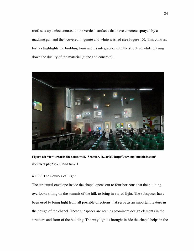
84
roof, sets up a nice contrast to the vertical surfaces that have concrete sprayed by a
machine gun and then covered in gunite and white washed (see Figure 15). This contrast
further highlights the building form and its integration with the structure while playing
down the duality of the material (stone and concrete).
Figure 15: View towards the south wall. (Schmier, H., 2005, http://www.myfourthirds.com/
document.php? id=13552&full=1)
4.1.3.3 The Sources of Light
The structural envelope inside the chapel opens out to four horizons that the building
overlooks sitting on the summit of the hill, to bring in varied light. The subspaces have
been used to bring light from all possible directions that serve as an important feature in
the design of the chapel. These subspaces are seen as prominent design elements in the
structure and form of the building. The way light is brought inside the chapel helps in the
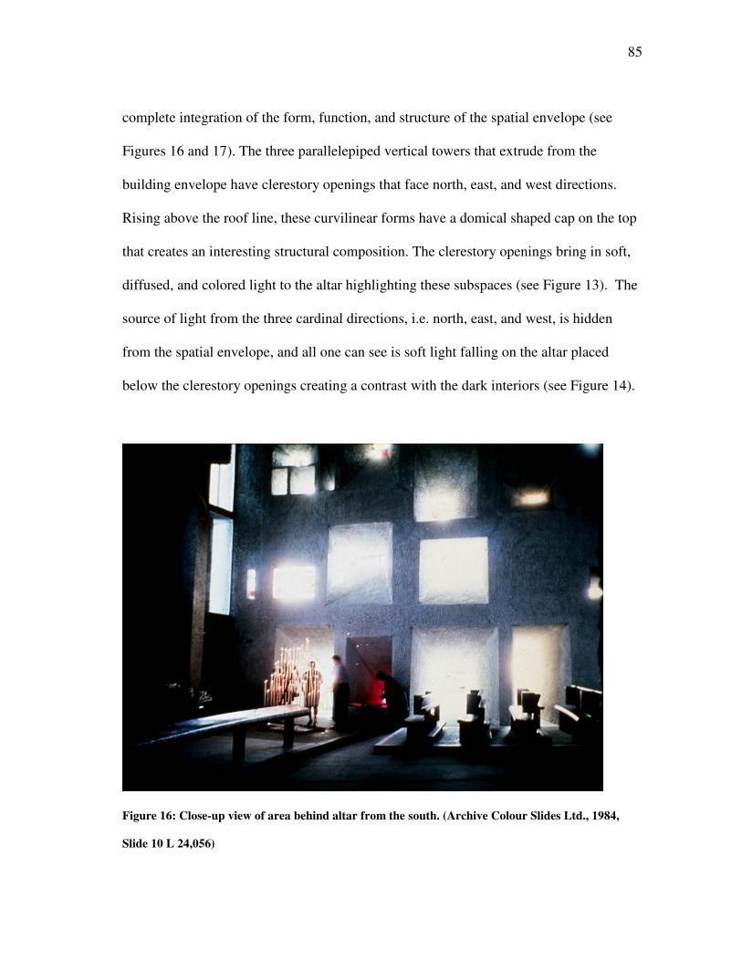
85
complete integration of the form, function, and structure of the spatial envelope (see
Figures 16 and 17). The three parallelepiped vertical towers that extrude from the
building envelope have clerestory openings that face north, east, and west directions.
Rising above the roof line, these curvilinear forms have a domical shaped cap on the top
that creates an interesting structural composition. The clerestory openings bring in soft,
diffused, and colored light to the altar highlighting these subspaces (see Figure 13). The
source of light from the three cardinal directions, i.e. north, east, and west, is hidden
from the spatial envelope, and all one can see is soft light falling on the altar placed
below the clerestory openings creating a contrast with the dark interiors (see Figure 14).
Figure 16: Close-up view of area behind altar from the south. (Archive Colour Slides Ltd., 1984,
Slide 10 L 24,056)
86
Figure 17: Close-up view of the window opening on the south wall. (Schmier, H., 2005, http://
www.myfourthirds.com/document.php?id=13601&full=1)
The fourth cardinal direction, i.e. south, brings in daylight with an emphasis on
the way light enters the chapel rather than the object it illuminates. The splayed window
87
openings bring in direct intense light and help it spread from the narrow opening to the
point where it is about to enter and illuminate the chapel. This creates an effect of
sparkle, which highlights the south wall creating a strong design emphasis based on the
transformation of natural light through the design of a window opening. This effect of
natural light clearly distinguishes the south wall from the surface treatment of the other
three walls (Figures 16 and 17).
4.1.3.4 Structural Synthesis for Architectural Beauty
The building can be seen as a continuous curvilinear skin wrapped around the structure
which forms the basic skeleton. The fluidity in the envelope, as it moves from one
surface boundary to another, gives a sense of visual harmony to the structure both inside
and outside. The south wall is composed of a reinforced concrete frame that is hidden
and partially revealed at the top where it supports the roof. The width of this wall varies
from 3.70 m in the west (where the slant is maximum and the height minimum) to 1.4m
in the east (where the wall gets vertical and reaches its maximum height) and 0.5 m at its
top. This way, the wall achieves its shape in terms of the curve and thickness. This
reinforces the harmony between the strength of the structure and the beauty of the form.
The three vertical towers stand independent from the walls. This is due to the
differential settlement that could result from the pressure exerted by their massing which
would exceed that of the walls. Although the curves from the wall surfaces merge with
those of the towers to achieve the unity of form (see Figure 3), but a small void separates
the two and highlights the difference as they extend out in the vertical direction to
achieve different heights.
88
This structural synthesis is made visible in the way light renders the inside of the
chapel creating a unanimous whole. The light is not allowed to enter from an opening
and merge with the space but is guided along a surface boundary that forms an extension
to the outer edge of the opening. This can be seen in the light that enters from the gap
between the roof and the vertical walls and flows along the curve of the lower most
shell, thus making the mass in the roof disappear as if it was floating on the top of the
chapel.
4.1.4 MOVEMENT THROUGH SPACE
On the exterior of the chapel is a well laid out promenade that guides visitors’
movement. The steep path to the hilltop brings about interesting views that reveal the
structure through the foliage leaving the visitor amazed at the sculptural quality the
chapel has to offer in the exterior. The three entrances on the south, east, and north side
of the chapel invite the visitor to explore the building form by walking all around it.
Once the visitor enters the chapel, the physical movement is replaced by the movement
of the eye that tries to read the space in the way light enters and renders the spatial
envelope. The form becomes less predominant in the dark interior space and what can be
felt are sensations generated by the play of light and shadow (see Figures 8 and 12).
4.1.4.1 Stimulus for Movement
Upon entering the chapel from the north or the south door, one is faced with a dark space
and, once the eye adjusts to the low light levels inside the chapel, the space opens out
towards the south east corner of the chapel. The effect is more pronounced in the way
89
light renders the roof form which achieves its pinnacle at the intersection of the south
and east walls (see Figure 12). Light from the gap between the vertical wall and the
horizontal roof creates an opening for the space to merge with the exterior in a way that
the tension between the inside and outside is relieved to some extent. The light from the
south, east, and north openings highlight the elements in the choir that further demand
greater visual attention of the visitor (see Figure 7). The visitor is forced to follow the
path towards this corner of the chapel and finally exit from the recessed door in the east
wall. In between, there are other focal accents that create visual interest while following
this path. The different openings on the south wall have clear, colored, and painted glass
that brings in natural light with varied effects. The three small chapels placed inside the
vertical towers are bathed in different kinds of light based on the orientation of the
clerestory openings. The hidden source of light creates mystery in the mind of the
observer, and the incomplete information that is read in the process prompts the
movement of the observer away from the path that connects the entrance doors on the
north and south with the exit door on the east (see Figure 14).
4.1.4.2 People Move toward Light
The movement of the visitor is controlled by the strong contrast created by the shadows
seen against a white background bathed in light. The south side of the chapel is
silhouetted with the splayed openings being highlighted defining the path of light into
the chapel. The effect is more of a sparkle rather than a glare due to the splayed edges
and the grainy texture reflecting light in different directions. The seating arrangement is
placed next to the south wall in an asymmetric manner that further reinforces the
90
movement pattern inside the chapel. The light leaking from the gap between the roof and
the vertical surfaces on the south and east walls creates an emphasis on the southeast
corner of the chapel. This is where the exit door has been placed with light, from the
opening on the top of the frame, guiding the movement from the dark interiors of the
chapel to the bright exterior (see Figure 12).
4.1.4.3 The Zone of Transition
The point of entry on the south wall is a revolving door hinged at its centre. The door is
recessed between the south wall and the vertical tower on the southwest corner. The wall
surface is sloped to adjust for the low height of roof at this point. The sloped surface is at
its maximum deviation from the vertical. The buttressing inside allows room for a
transition space from the bright exteriors to the dark interiors (see Figure 4).
The entrance door on the north wall is placed between the two vertical towers
making a deep and recessed point of entry. The zone of transition provides breathing
space for the eyes to adjust to the low levels of light inside the chapel and, in the
process, makes the impact of small sources of light more strong and dramatic. As the
visitor moves out from the east door, the wall on the south side extends outwards to
provide natural shading from the direct sun and creating another smooth transition to the
bright exterior.
The vertical towers containing the altar have a hidden source of light which can
be seen once the person moves into the small chapel and looks towards the top (see
Figure 13). From the initial view of soft light falling on the altar to the final appreciation
91
of the manner in which the light enters the space, there is a gradual change in the
intensity of light being reflected of the surface (see Figure 14).
4.1.4.4 Brightness Changes as a Function of Movement
The brightness changes inside the chapel are perceived against a white background
which creates a significant contrast with the foreground objects. Upon entering the
chapel, light openings on the south and east walls are perceived as the brightest elements
as seen inside the spatial envelope (see Figure 9). Once the eye adjusts to the inside light
levels, the white lime on the vertical surfaces appears to be the brightest surface seen
against the grey concrete on the ceiling and the dark flooring. The light filtering through
the colored glass creates a variety of reflections on the white background that changes
with the movement of the observer (see Figure 17). The light entering through the south,
east and north side of the chapel makes the choir bathe in light and provides a strong
visual emphasis towards the southeast corner (see Figure 12). Looking back towards the
west end of the chapel, the space appears dark, and the absence of any openings makes
the inside of the chapel appear all the more dark and shadowed (see Figure 8).
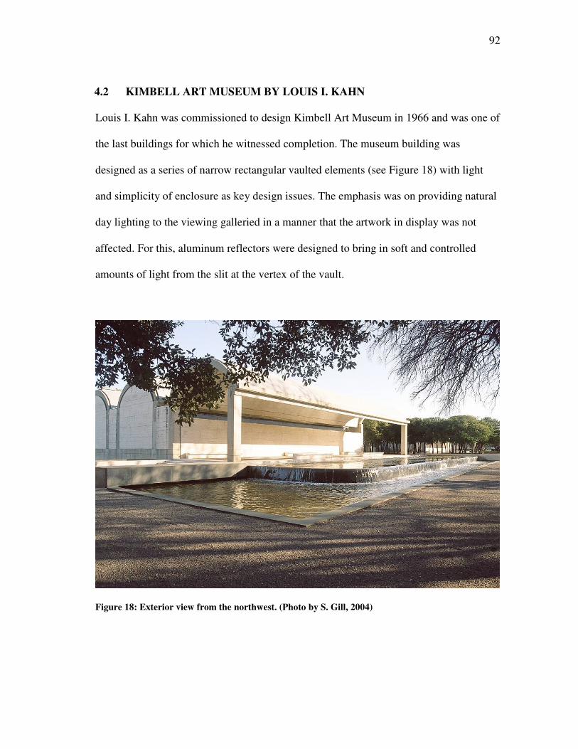
92
4.2 KIMBELL ART MUSEUM BY LOUIS I. KAHN
Louis I. Kahn was commissioned to design Kimbell Art Museum in 1966 and was one of
the last buildings for which he witnessed completion. The museum building was
designed as a series of narrow rectangular vaulted elements (see Figure 18) with light
and simplicity of enclosure as key design issues. The emphasis was on providing natural
day lighting to the viewing galleried in a manner that the artwork in display was not
affected. For this, aluminum reflectors were designed to bring in soft and controlled
amounts of light from the slit at the vertex of the vault.
Figure 18: Exterior view from the northwest. (Photo by S. Gill, 2004)
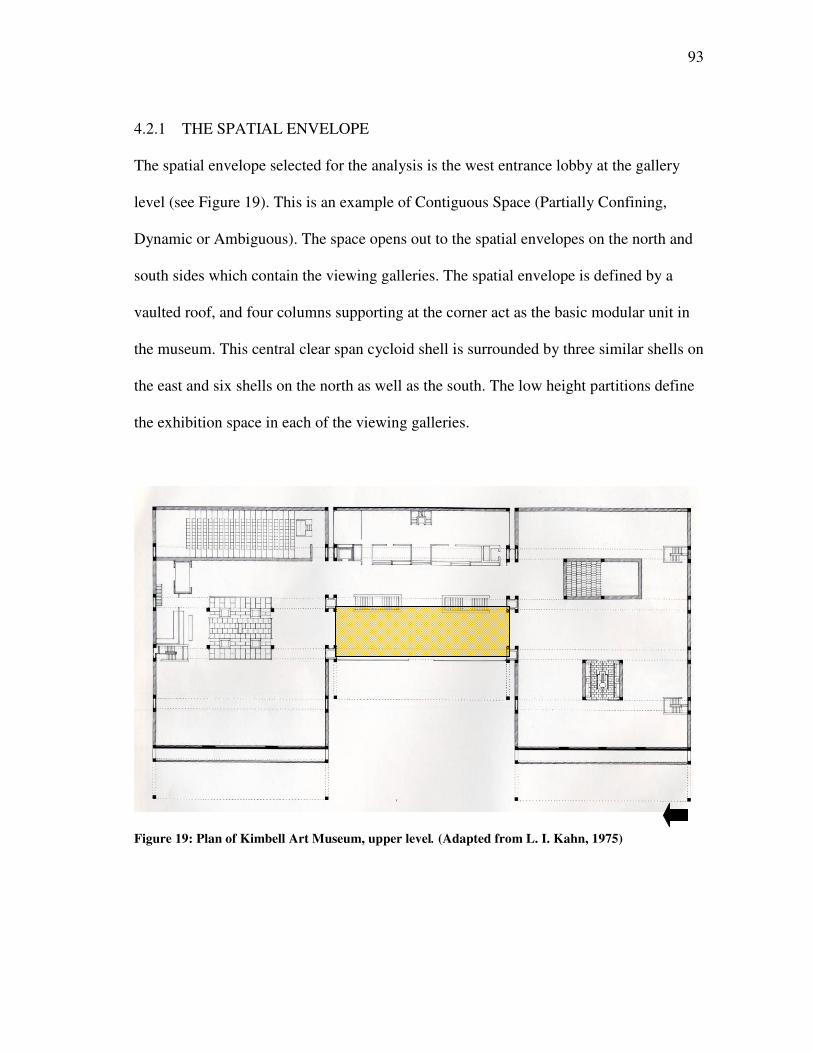
93
4.2.1 THE SPATIAL ENVELOPE
The spatial envelope selected for the analysis is the west entrance lobby at the gallery
level (see Figure 19). This is an example of Contiguous Space (Partially Confining,
Dynamic or Ambiguous). The space opens out to the spatial envelopes on the north and
south sides which contain the viewing galleries. The spatial envelope is defined by a
vaulted roof, and four columns supporting at the corner act as the basic modular unit in
the museum. This central clear span cycloid shell is surrounded by three similar shells on
the east and six shells on the north as well as the south. The low height partitions define
the exhibition space in each of the viewing galleries.
Figure 19: Plan of Kimbell Art Museum, upper level. (Adapted from L. I. Kahn, 1975)
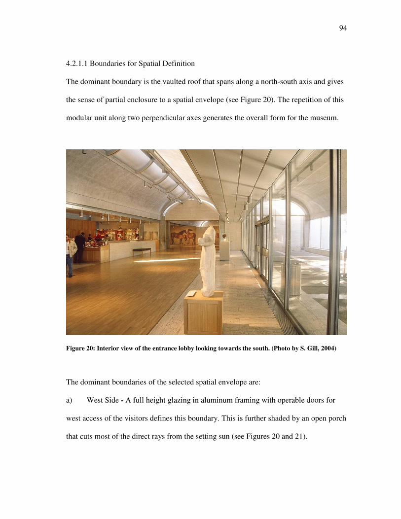
94
4.2.1.1 Boundaries for Spatial Definition
The dominant boundary is the vaulted roof that spans along a north-south axis and gives
the sense of partial enclosure to a spatial envelope (see Figure 20). The repetition of this
modular unit along two perpendicular axes generates the overall form for the museum.
Figure 20: Interior view of the entrance lobby looking towards the south. (Photo by S. Gill, 2004)
The dominant boundaries of the selected spatial envelope are:
a) West Side - A full height glazing in aluminum framing with operable doors for
west access of the visitors defines this boundary. This is further shaded by an open porch
that cuts most of the direct rays from the setting sun (see Figures 20 and 21).
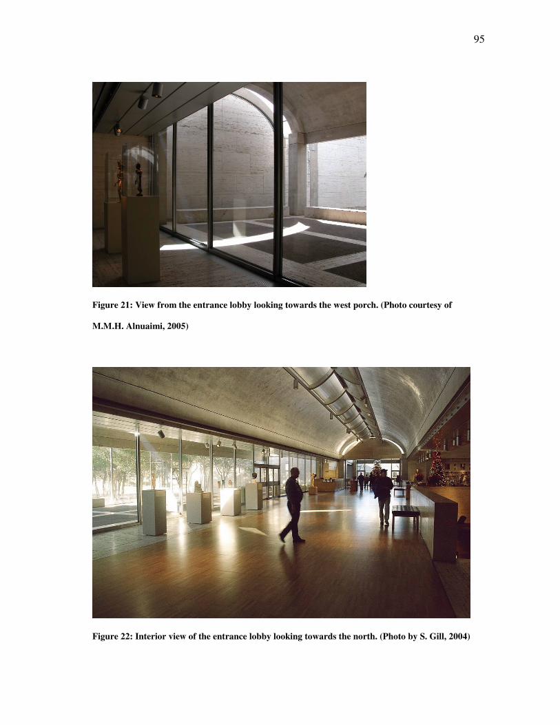
95
Figure 21: View from the entrance lobby looking towards the west porch. (Photo courtesy of
M.M.H. Alnuaimi, 2005)
Figure 22: Interior view of the entrance lobby looking towards the north. (Photo by S. Gill, 2004)
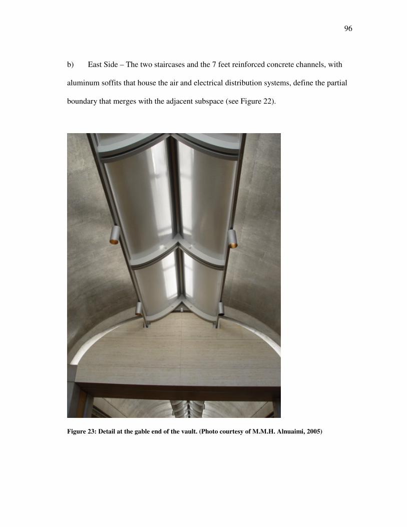
96
b) East Side – The two staircases and the 7 feet reinforced concrete channels, with
aluminum soffits that house the air and electrical distribution systems, define the partial
boundary that merges with the adjacent subspace (see Figure 22).
Figure 23: Detail at the gable end of the vault. (Photo courtesy of M.M.H. Alnuaimi, 2005)
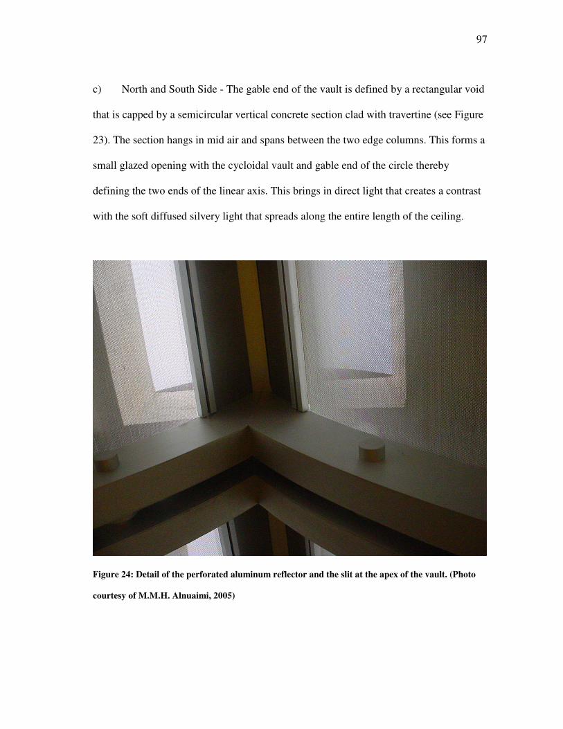
97
c) North and South Side - The gable end of the vault is defined by a rectangular void
that is capped by a semicircular vertical concrete section clad with travertine (see Figure
23). The section hangs in mid air and spans between the two edge columns. This forms a
small glazed opening with the cycloidal vault and gable end of the circle thereby
defining the two ends of the linear axis. This brings in direct light that creates a contrast
with the soft diffused silvery light that spreads along the entire length of the ceiling.
Figure 24: Detail of the perforated aluminum reflector and the slit at the apex of the vault. (Photo
courtesy of M.M.H. Alnuaimi, 2005)
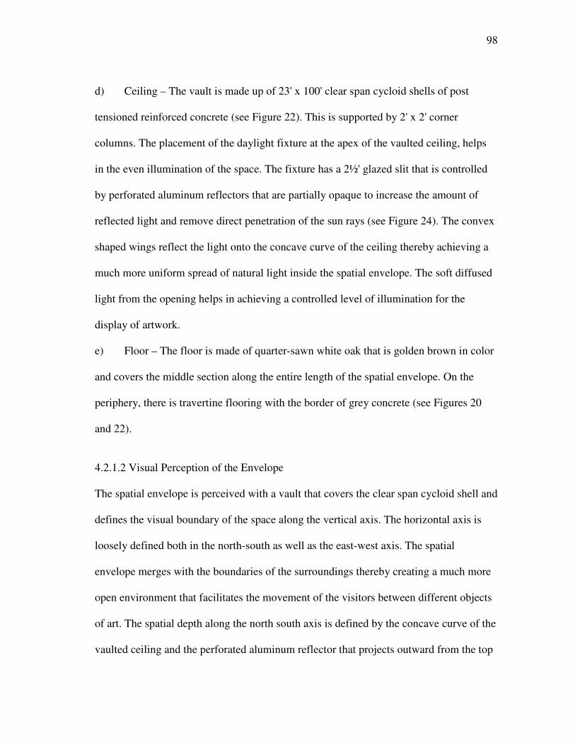
98
d) Ceiling – The vault is made up of 23' x 100' clear span cycloid shells of post
tensioned reinforced concrete (see Figure 22). This is supported by 2' x 2' corner
columns. The placement of the daylight fixture at the apex of the vaulted ceiling, helps
in the even illumination of the space. The fixture has a 2½' glazed slit that is controlled
by perforated aluminum reflectors that are partially opaque to increase the amount of
reflected light and remove direct penetration of the sun rays (see Figure 24). The convex
shaped wings reflect the light onto the concave curve of the ceiling thereby achieving a
much more uniform spread of natural light inside the spatial envelope. The soft diffused
light from the opening helps in achieving a controlled level of illumination for the
display of artwork.
e) Floor – The floor is made of quarter-sawn white oak that is golden brown in color
and covers the middle section along the entire length of the spatial envelope. On the
periphery, there is travertine flooring with the border of grey concrete (see Figures 20
and 22).
4.2.1.2 Visual Perception of the Envelope
The spatial envelope is perceived with a vault that covers the clear span cycloid shell and
defines the visual boundary of the space along the vertical axis. The horizontal axis is
loosely defined both in the north-south as well as the east-west axis. The spatial
envelope merges with the boundaries of the surroundings thereby creating a much more
open environment that facilitates the movement of the visitors between different objects
of art. The spatial depth along the north south axis is defined by the concave curve of the
vaulted ceiling and the perforated aluminum reflector that projects outward from the top
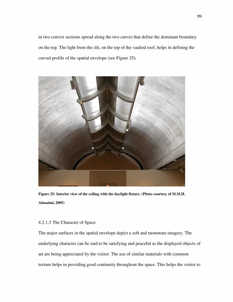
99
in two convex sections spread along the two curves that define the dominant boundary
on the top. The light from the slit, on the top of the vaulted roof, helps in defining the
curved profile of the spatial envelope (see Figure 25).
Figure 25: Interior view of the ceiling with the daylight fixture. (Photo courtesy of M.M.H.
Alnuaimi, 2005)
4.2.1.3 The Character of Space
The major surfaces in the spatial envelope depict a soft and monotone imagery. The
underlying character can be said to be satisfying and peaceful as the displayed objects of
art are being appreciated by the visitor. The use of similar materials with common
texture helps in providing good continuity throughout the space. This helps the visitor to
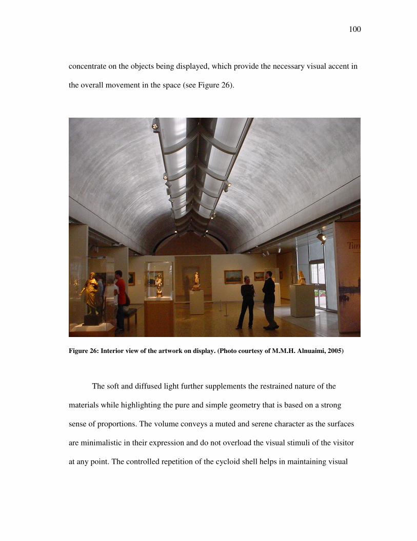
100
concentrate on the objects being displayed, which provide the necessary visual accent in
the overall movement in the space (see Figure 26).
Figure 26: Interior view of the artwork on display. (Photo courtesy of M.M.H. Alnuaimi, 2005)
The soft and diffused light further supplements the restrained nature of the
materials while highlighting the pure and simple geometry that is based on a strong
sense of proportions. The volume conveys a muted and serene character as the surfaces
are minimalistic in their expression and do not overload the visual stimuli of the visitor
at any point. The controlled repetition of the cycloid shell helps in maintaining visual
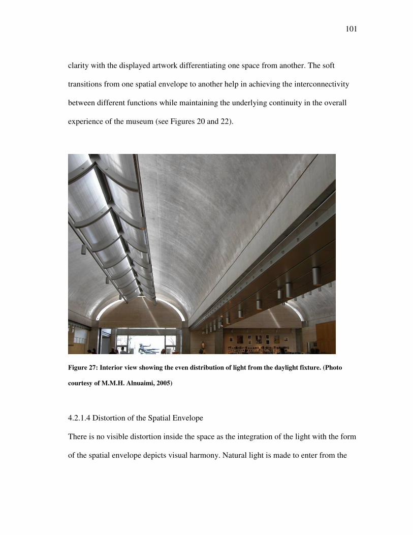
101
clarity with the displayed artwork differentiating one space from another. The soft
transitions from one spatial envelope to another help in achieving the interconnectivity
between different functions while maintaining the underlying continuity in the overall
experience of the museum (see Figures 20 and 22).
Figure 27: Interior view showing the even distribution of light from the daylight fixture. (Photo
courtesy of M.M.H. Alnuaimi, 2005)
4.2.1.4 Distortion of the Spatial Envelope
There is no visible distortion inside the space as the integration of the light with the form
of the spatial envelope depicts visual harmony. Natural light is made to enter from the
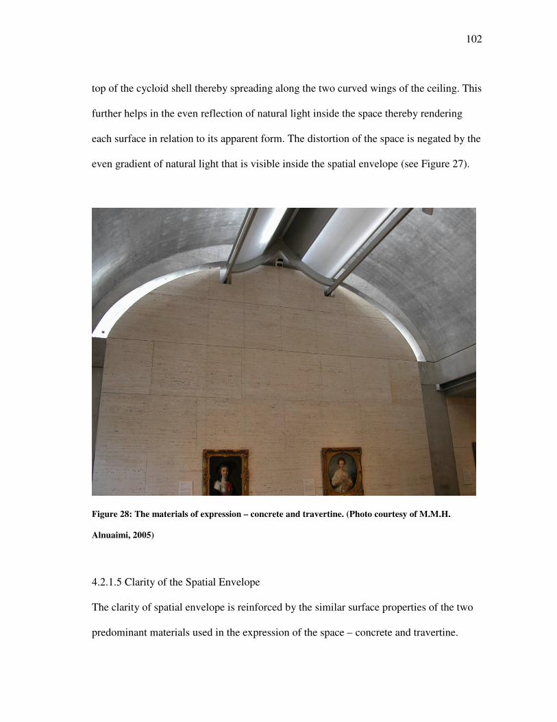
102
top of the cycloid shell thereby spreading along the two curved wings of the ceiling. This
further helps in the even reflection of natural light inside the space thereby rendering
each surface in relation to its apparent form. The distortion of the space is negated by the
even gradient of natural light that is visible inside the spatial envelope (see Figure 27).
Figure 28: The materials of expression – concrete and travertine. (Photo courtesy of M.M.H.
Alnuaimi, 2005)
4.2.1.5 Clarity of the Spatial Envelope
The clarity of spatial envelope is reinforced by the similar surface properties of the two
predominant materials used in the expression of the space – concrete and travertine.
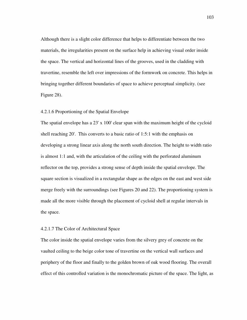
103
Although there is a slight color difference that helps to differentiate between the two
materials, the irregularities present on the surface help in achieving visual order inside
the space. The vertical and horizontal lines of the grooves, used in the cladding with
travertine, resemble the left over impressions of the formwork on concrete. This helps in
bringing together different boundaries of space to achieve perceptual simplicity. (see
Figure 28).
4.2.1.6 Proportioning of the Spatial Envelope
The spatial envelope has a 23' x 100' clear span with the maximum height of the cycloid
shell reaching 20'. This converts to a basic ratio of 1:5:1 with the emphasis on
developing a strong linear axis along the north south direction. The height to width ratio
is almost 1:1 and, with the articulation of the ceiling with the perforated aluminum
reflector on the top, provides a strong sense of depth inside the spatial envelope. The
square section is visualized in a rectangular shape as the edges on the east and west side
merge freely with the surroundings (see Figures 20 and 22). The proportioning system is
made all the more visible through the placement of cycloid shell at regular intervals in
the space.
4.2.1.7 The Color of Architectural Space
The color inside the spatial envelope varies from the silvery grey of concrete on the
vaulted ceiling to the beige color tone of travertine on the vertical wall surfaces and
periphery of the floor and finally to the golden brown of oak wood flooring. The overall
effect of this controlled variation is the monochromatic picture of the space. The light, as
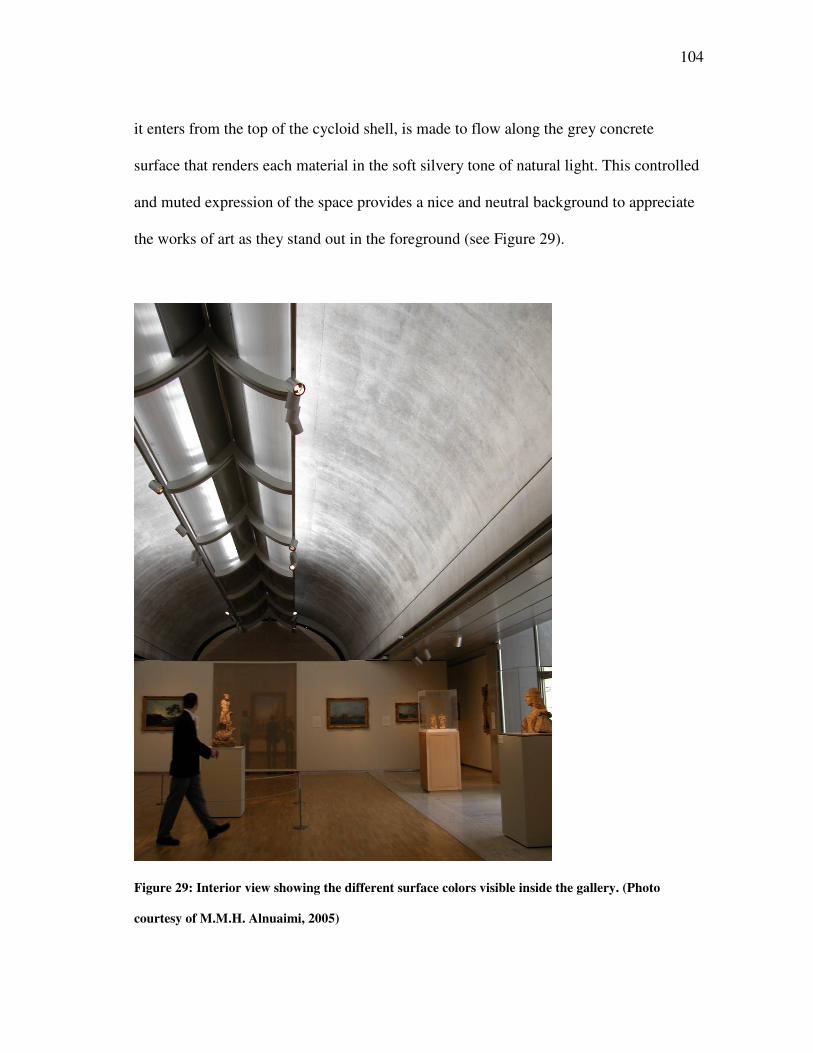
104
it enters from the top of the cycloid shell, is made to flow along the grey concrete
surface that renders each material in the soft silvery tone of natural light. This controlled
and muted expression of the space provides a nice and neutral background to appreciate
the works of art as they stand out in the foreground (see Figure 29).
Figure 29: Interior view showing the different surface colors visible inside the gallery. (Photo
courtesy of M.M.H. Alnuaimi, 2005)
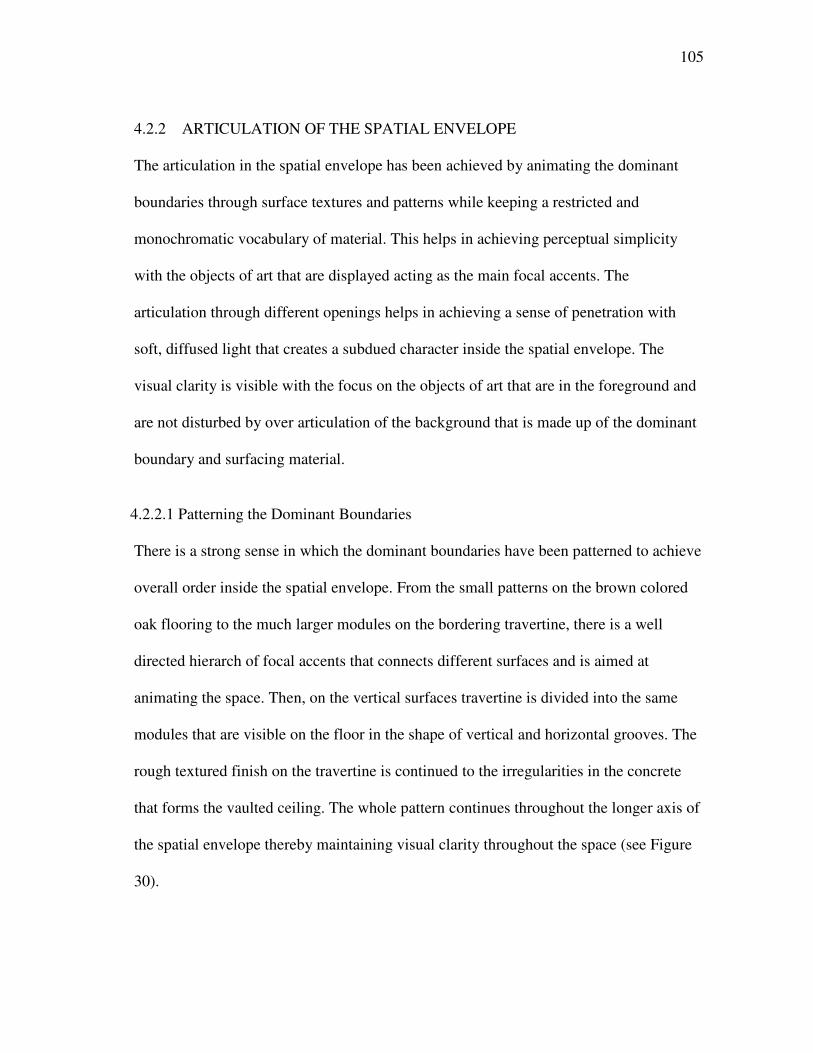
105
4.2.2 ARTICULATION OF THE SPATIAL ENVELOPE
The articulation in the spatial envelope has been achieved by animating the dominant
boundaries through surface textures and patterns while keeping a restricted and
monochromatic vocabulary of material. This helps in achieving perceptual simplicity
with the objects of art that are displayed acting as the main focal accents. The
articulation through different openings helps in achieving a sense of penetration with
soft, diffused light that creates a subdued character inside the spatial envelope. The
visual clarity is visible with the focus on the objects of art that are in the foreground and
are not disturbed by over articulation of the background that is made up of the dominant
boundary and surfacing material.
4.2.2.1 Patterning the Dominant Boundaries
There is a strong sense in which the dominant boundaries have been patterned to achieve
overall order inside the spatial envelope. From the small patterns on the brown colored
oak flooring to the much larger modules on the bordering travertine, there is a well
directed hierarch of focal accents that connects different surfaces and is aimed at
animating the space. Then, on the vertical surfaces travertine is divided into the same
modules that are visible on the floor in the shape of vertical and horizontal grooves. The
rough textured finish on the travertine is continued to the irregularities in the concrete
that forms the vaulted ceiling. The whole pattern continues throughout the longer axis of
the spatial envelope thereby maintaining visual clarity throughout the space (see Figure
30).
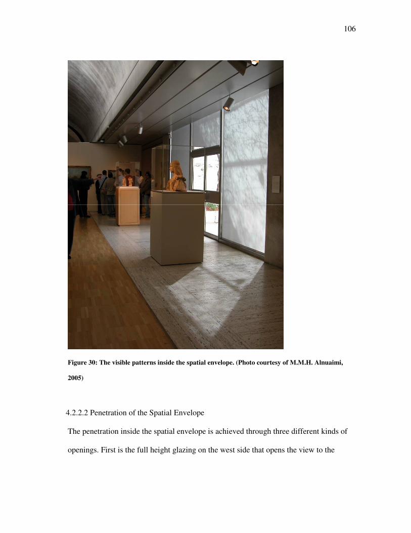
106
Figure 30: The visible patterns inside the spatial envelope. (Photo courtesy of M.M.H. Alnuaimi,
2005)
4.2.2.2 Penetration of the Spatial Envelope
The penetration inside the spatial envelope is achieved through three different kinds of
openings. First is the full height glazing on the west side that opens the view to the
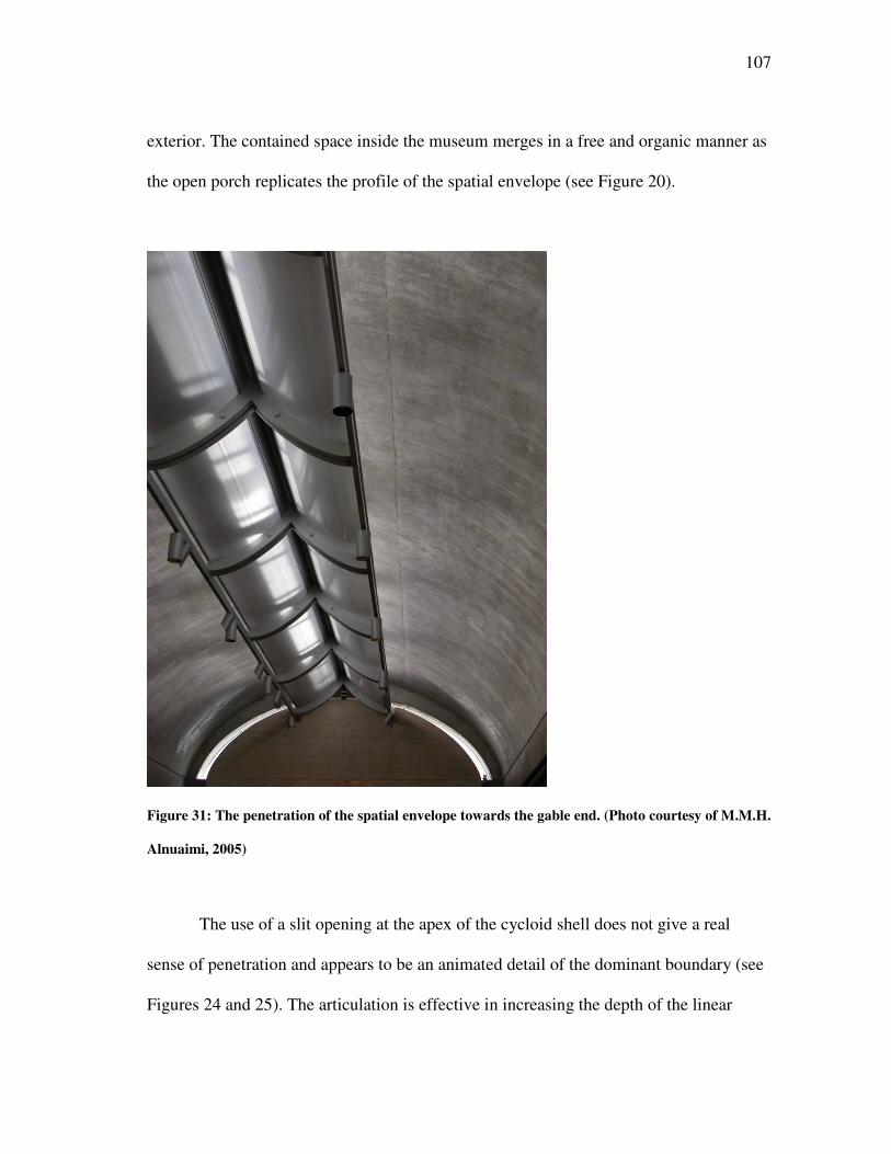
107
exterior. The contained space inside the museum merges in a free and organic manner as
the open porch replicates the profile of the spatial envelope (see Figure 20).
Figure 31: The penetration of the spatial envelope towards the gable end. (Photo courtesy of M.M.H.
Alnuaimi, 2005)
The use of a slit opening at the apex of the cycloid shell does not give a real
sense of penetration and appears to be an animated detail of the dominant boundary (see
Figures 24 and 25). The articulation is effective in increasing the depth of the linear
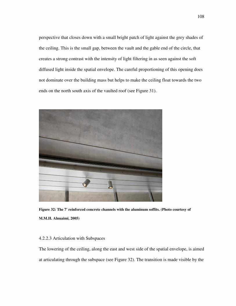
108
perspective that closes down with a small bright patch of light against the grey shades of
the ceiling. This is the small gap, between the vault and the gable end of the circle, that
creates a strong contrast with the intensity of light filtering in as seen against the soft
diffused light inside the spatial envelope. The careful proportioning of this opening does
not dominate over the building mass but helps to make the ceiling float towards the two
ends on the north south axis of the vaulted roof (see Figure 31).
Figure 32: The 7' reinforced concrete channels with the aluminum soffits. (Photo courtesy of
M.M.H. Alnuaimi, 2005)
4.2.2.3 Articulation with Subspaces
The lowering of the ceiling, along the east and west side of the spatial envelope, is aimed
at articulating through the subspace (see Figure 32). The transition is made visible by the
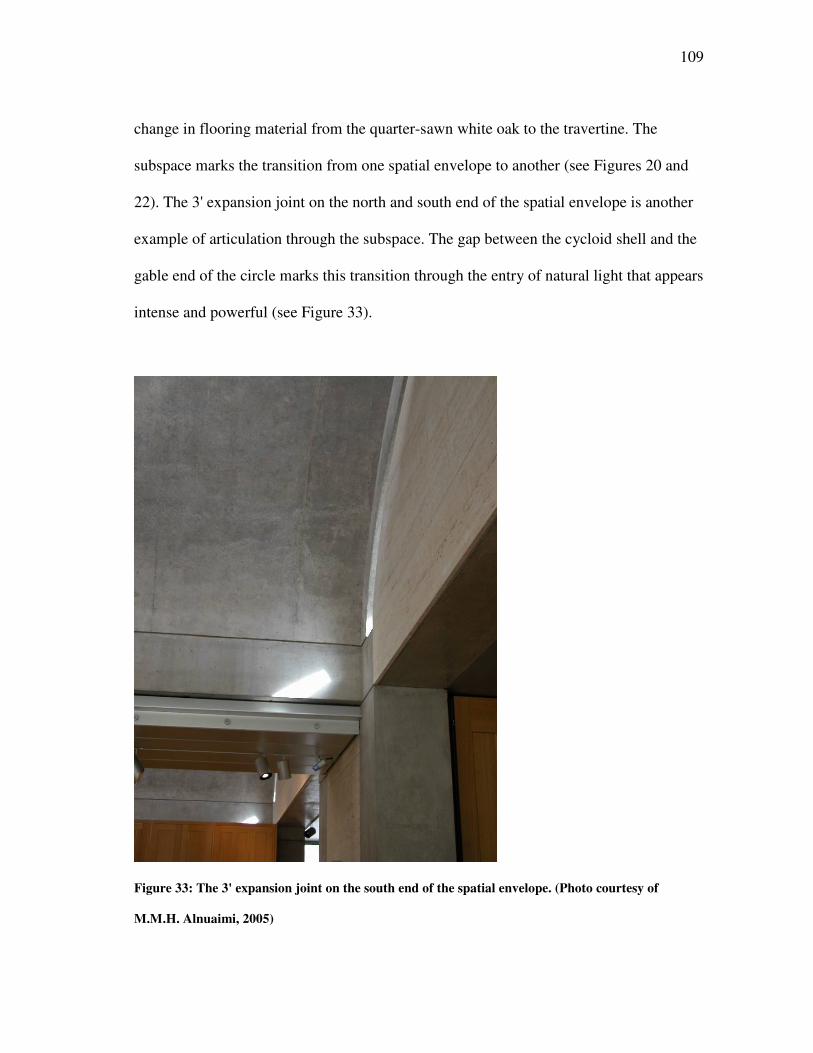
109
change in flooring material from the quarter-sawn white oak to the travertine. The
subspace marks the transition from one spatial envelope to another (see Figures 20 and
22). The 3' expansion joint on the north and south end of the spatial envelope is another
example of articulation through the subspace. The gap between the cycloid shell and the
gable end of the circle marks this transition through the entry of natural light that appears
intense and powerful (see Figure 33).
Figure 33: The 3' expansion joint on the south end of the spatial envelope. (Photo courtesy of
M.M.H. Alnuaimi, 2005)
110
4.2.2.4 Spatial Banding
The spatial banding visible inside the spatial envelope is aimed at emphasizing the north-
south axis. The 7' reinforced concrete channels with the aluminum soffits, which house
the air and electrical distribution systems placed on either side of the vaulted ceiling,
create a strong linear pattern that is further reinforced by the perforated aluminum
reflector running along the entire length of the spatial envelope, although on a much
higher level. This is aimed at the articulation of the space by integrating structural and
mechanical systems with the overall spatial composition (see Figure 32).
4.2.2.5 Curvature and Level Change
The use of curved surfaces is restricted to the ceiling where the vault helps in bouncing
soft diffused light in all different directions thereby creating a uniformly lit space. The
concave profile of the ceiling is balanced by the two convex shaped aluminum reflectors
that create an interest along the entire length of the ceiling while emphasizing on their
function of bringing in the soft and controlled quality of natural light (see Figure 31).
The level change takes place as one makes the transition from the lower level to
the upper level through one of the two staircases placed on the east side of the entrance
lobby. The narrow staircase opens out under the aluminum soffit, which acts as
connector between the two sections of the cycloid shells. The space opens out vertically
with an increase in the ceiling height with the vaults and horizontally connecting the
interiors with the exteriors through the full height glazed wall on the west end of the
spatial envelope. The design continuity is maintained through the smooth transition
along the path of movement connecting two different levels (see Figure 34).
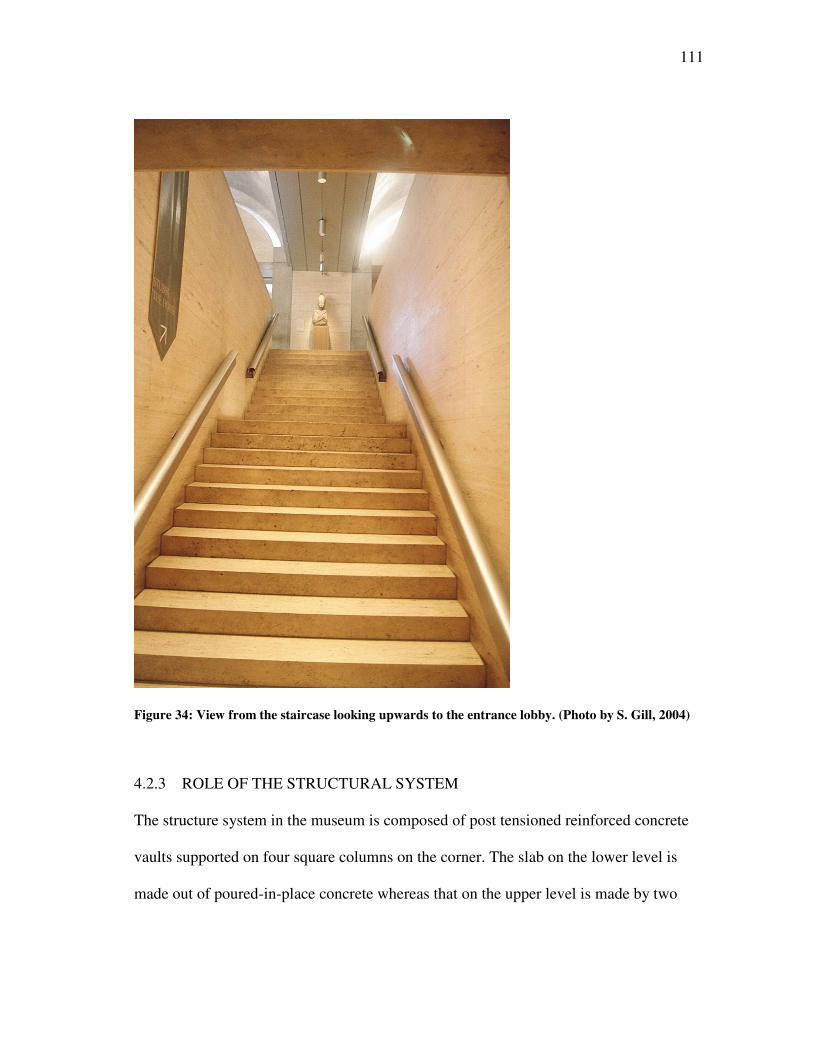
111
Figure 34: View from the staircase looking upwards to the entrance lobby. (Photo by S. Gill, 2004)
4.2.3 ROLE OF THE STRUCTURAL SYSTEM
The structure system in the museum is composed of post tensioned reinforced concrete
vaults supported on four square columns on the corner. The slab on the lower level is
made out of poured-in-place concrete whereas that on the upper level is made by two
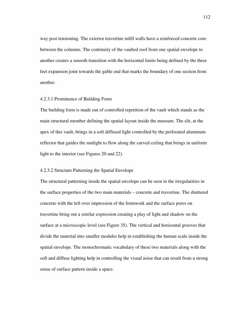
112
way post tensioning. The exterior travertine infill walls have a reinforced concrete core
between the columns. The continuity of the vaulted roof from one spatial envelope to
another creates a smooth transition with the horizontal limits being defined by the three
feet expansion joint towards the gable end that marks the boundary of one section from
another.
4.2.3.1 Prominence of Building Form
The building form is made out of controlled repetition of the vault which stands as the
main structural member defining the spatial layout inside the museum. The slit, at the
apex of this vault, brings in a soft diffused light controlled by the perforated aluminum
reflector that guides the sunlight to flow along the curved ceiling that brings in uniform
light to the interior (see Figures 20 and 22).
4.2.3.2 Structure Patterning the Spatial Envelope
The structural patterning inside the spatial envelope can be seen in the irregularities in
the surface properties of the two main materials – concrete and travertine. The shuttered
concrete with the left over impression of the formwork and the surface pores on
travertine bring out a similar expression creating a play of light and shadow on the
surface at a microscopic level (see Figure 35). The vertical and horizontal grooves that
divide the material into smaller modules help in establishing the human scale inside the
spatial envelope. The monochromatic vocabulary of these two materials along with the
soft and diffuse lighting help in controlling the visual noise that can result from a strong
sense of surface pattern inside a space.
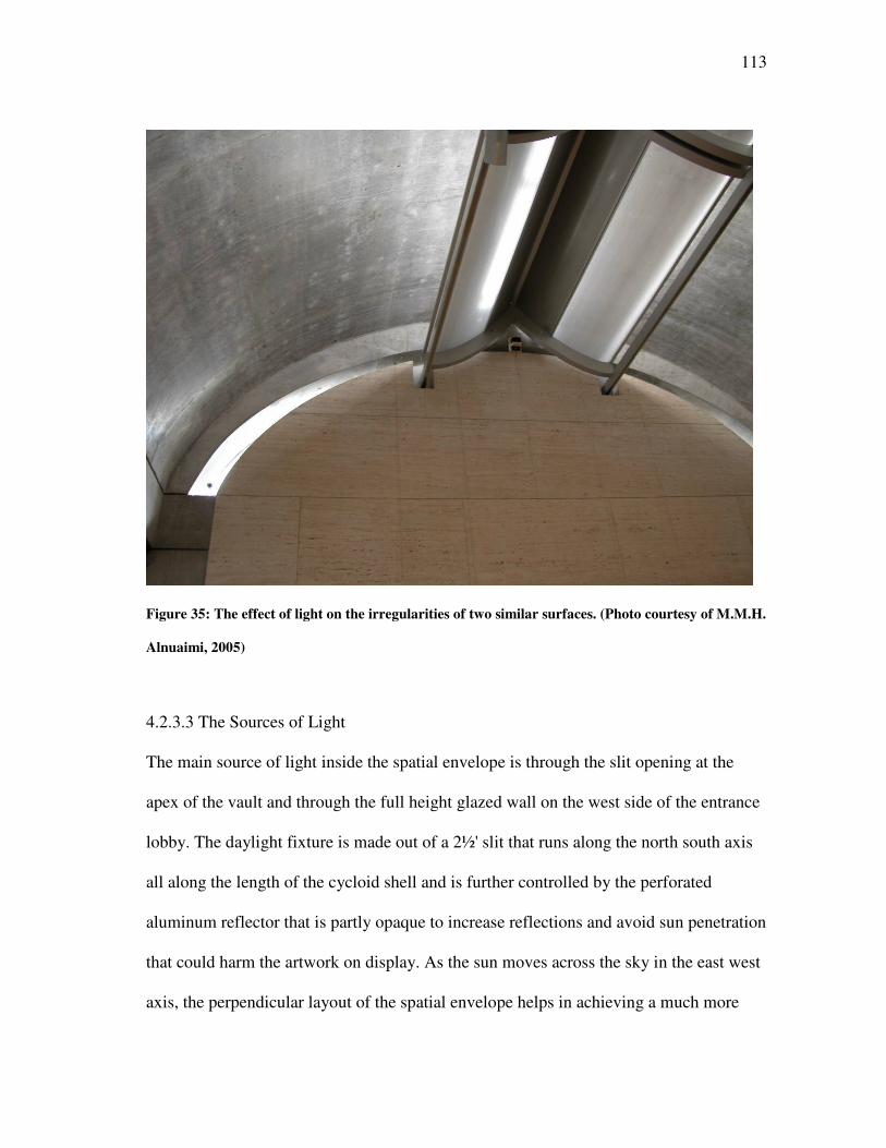
113
Figure 35: The effect of light on the irregularities of two similar surfaces. (Photo courtesy of M.M.H.
Alnuaimi, 2005)
4.2.3.3 The Sources of Light
The main source of light inside the spatial envelope is through the slit opening at the
apex of the vault and through the full height glazed wall on the west side of the entrance
lobby. The daylight fixture is made out of a 2½' slit that runs along the north south axis
all along the length of the cycloid shell and is further controlled by the perforated
aluminum reflector that is partly opaque to increase reflections and avoid sun penetration
that could harm the artwork on display. As the sun moves across the sky in the east west
axis, the perpendicular layout of the spatial envelope helps in achieving a much more
114
uniform quality of light inside the space. Also, the curved profile of the ceiling helps in
reflecting the light in an even manner to all the different corners across the width of the
gallery (see Figure 36).
Figure 36: The uniform spread of daylight inside the gallery. (Photo courtesy of M.M.H. Alnuaimi,
2005)
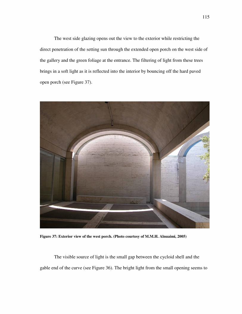
115
The west side glazing opens out the view to the exterior while restricting the
direct penetration of the setting sun through the extended open porch on the west side of
the gallery and the green foliage at the entrance. The filtering of light from these trees
brings in a soft light as it is reflected into the interior by bouncing off the hard paved
open porch (see Figure 37).
Figure 37: Exterior view of the west porch. (Photo courtesy of M.M.H. Alnuaimi, 2005)
The visible source of light is the small gap between the cycloid shell and the
gable end of the curve (see Figure 36). The bright light from the small opening seems to
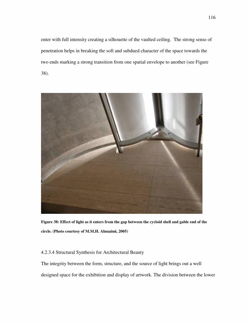
116
enter with full intensity creating a silhouette of the vaulted ceiling. The strong sense of
penetration helps in breaking the soft and subdued character of the space towards the
two ends marking a strong transition from one spatial envelope to another (see Figure
38).
Figure 38: Effect of light as it enters from the gap between the cycloid shell and gable end of the
circle. (Photo courtesy of M.M.H. Alnuaimi, 2005)
4.2.3.4 Structural Synthesis for Architectural Beauty
The integrity between the form, structure, and the source of light brings out a well
designed space for the exhibition and display of artwork. The division between the lower
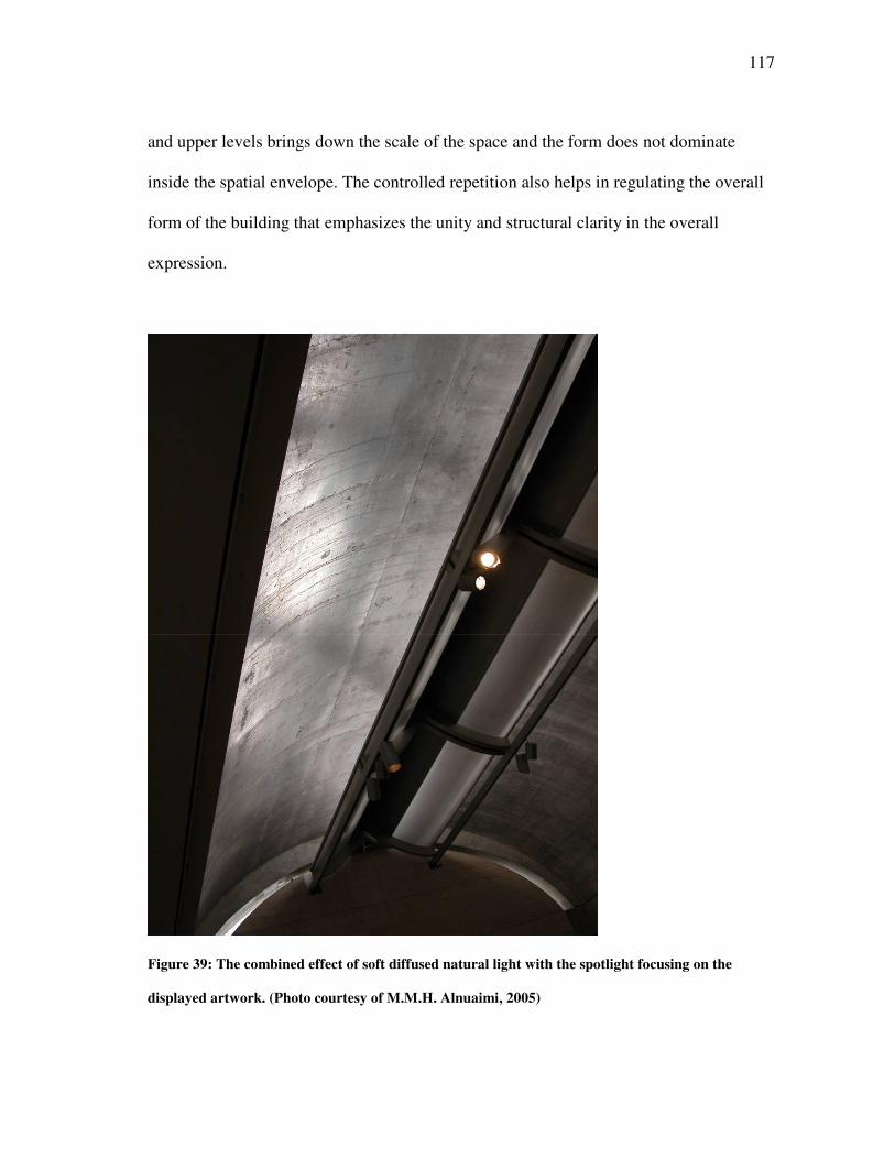
117
and upper levels brings down the scale of the space and the form does not dominate
inside the spatial envelope. The controlled repetition also helps in regulating the overall
form of the building that emphasizes the unity and structural clarity in the overall
expression.
Figure 39: The combined effect of soft diffused natural light with the spotlight focusing on the
displayed artwork. (Photo courtesy of M.M.H. Alnuaimi, 2005)
118
The spatial envelope offers freedom in the layout of the partition used for the
display of artwork as well as the placement of the free standing installation. The
uniform lighting levels, achieved by the natural daylighting, provide the flexibility to
combine the artificial lighting systems for the required emphasis on the displayed objects
(see Figure 39).
The soft lighting and the monochromatic expression of materials help in
achieving visual harmony inside the space. The flow of light is regulated by the
structural form of the vaulted roof depicting the achieved unity that negates the visual
distortion of the spatial envelope.
4.2.4 MOVEMENT THROUGH SPACE
The movement pattern inside the museum is exploratory with the objects of art being
displayed acting as the visual stimuli for movement. The space acts to provide a nice
setting with controlled lighting that highlights these objects against a simple background.
The layout of the spatial envelope with the long vaulted roof reinforces a linear
movement pattern. The lobby connects to the viewing galleries on both ends of this axis,
and the linear perspective focuses on the art being displayed in those subspaces.
4.2.4.1 Stimulus for Movement
The focal accents are the displayed objects that act as the foreground material for
creating the stimuli for movement from one point to another. The background becomes
an important surface that needs a restrained expression so that the contrast highlights the
foreground. The use of materials with a similar texture on the surface, concrete and
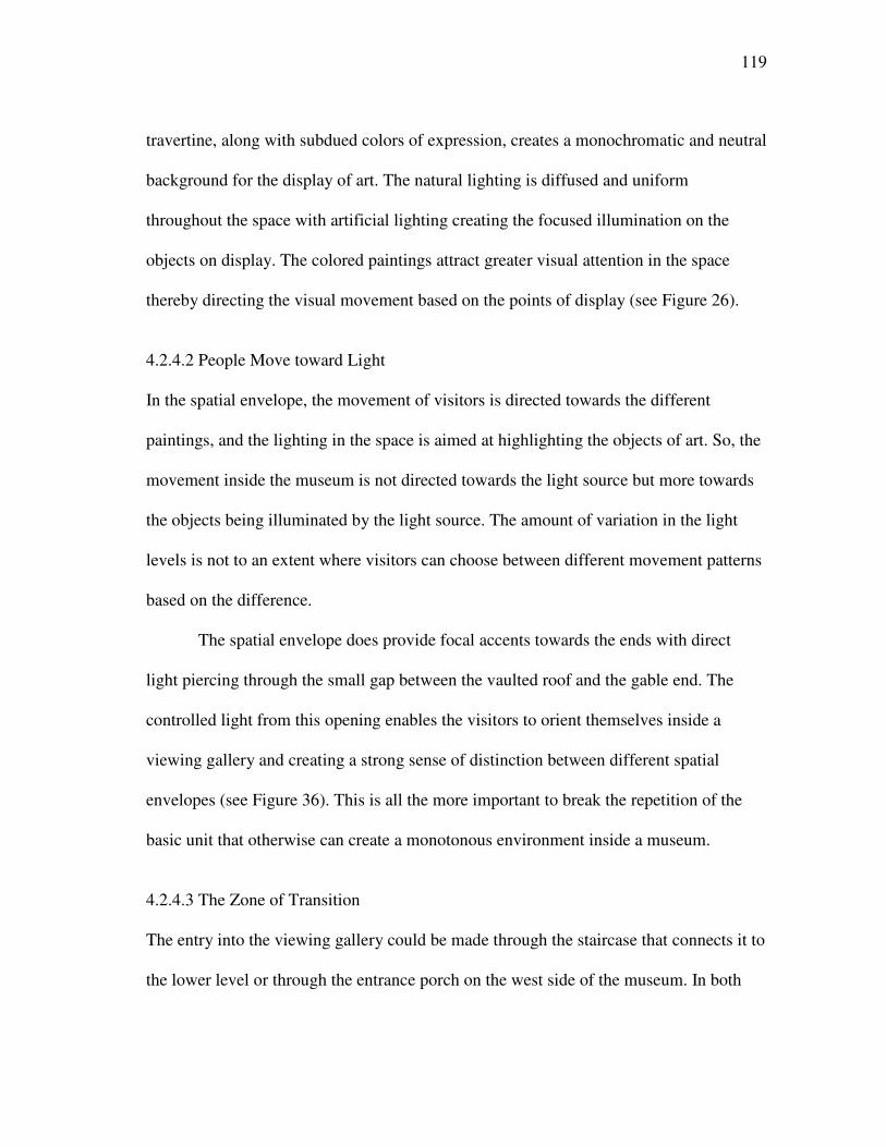
119
travertine, along with subdued colors of expression, creates a monochromatic and neutral
background for the display of art. The natural lighting is diffused and uniform
throughout the space with artificial lighting creating the focused illumination on the
objects on display. The colored paintings attract greater visual attention in the space
thereby directing the visual movement based on the points of display (see Figure 26).
4.2.4.2 People Move toward Light
In the spatial envelope, the movement of visitors is directed towards the different
paintings, and the lighting in the space is aimed at highlighting the objects of art. So, the
movement inside the museum is not directed towards the light source but more towards
the objects being illuminated by the light source. The amount of variation in the light
levels is not to an extent where visitors can choose between different movement patterns
based on the difference.
The spatial envelope does provide focal accents towards the ends with direct
light piercing through the small gap between the vaulted roof and the gable end. The
controlled light from this opening enables the visitors to orient themselves inside a
viewing gallery and creating a strong sense of distinction between different spatial
envelopes (see Figure 36). This is all the more important to break the repetition of the
basic unit that otherwise can create a monotonous environment inside a museum.
4.2.4.3 The Zone of Transition
The entry into the viewing gallery could be made through the staircase that connects it to
the lower level or through the entrance porch on the west side of the museum. In both
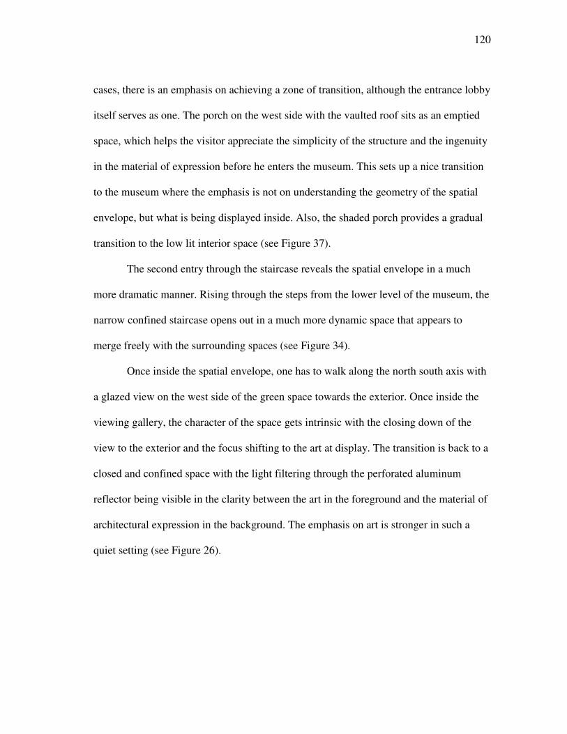
120
cases, there is an emphasis on achieving a zone of transition, although the entrance lobby
itself serves as one. The porch on the west side with the vaulted roof sits as an emptied
space, which helps the visitor appreciate the simplicity of the structure and the ingenuity
in the material of expression before he enters the museum. This sets up a nice transition
to the museum where the emphasis is not on understanding the geometry of the spatial
envelope, but what is being displayed inside. Also, the shaded porch provides a gradual
transition to the low lit interior space (see Figure 37).
The second entry through the staircase reveals the spatial envelope in a much
more dramatic manner. Rising through the steps from the lower level of the museum, the
narrow confined staircase opens out in a much more dynamic space that appears to
merge freely with the surrounding spaces (see Figure 34).
Once inside the spatial envelope, one has to walk along the north south axis with
a glazed view on the west side of the green space towards the exterior. Once inside the
viewing gallery, the character of the space gets intrinsic with the closing down of the
view to the exterior and the focus shifting to the art at display. The transition is back to a
closed and confined space with the light filtering through the perforated aluminum
reflector being visible in the clarity between the art in the foreground and the material of
architectural expression in the background. The emphasis on art is stronger in such a
quiet setting (see Figure 26).
121
4.2.4.4 Brightness Changes as a Function of Movement
The main source of light inside the Kimbell museum is through the slit opening on the
top of the vault that is further controlled by a perforated aluminum reflector, the general
lighting levels do not vary to a significant amount as we move inside the spatial
envelope. The only variation is from the light entering through the gap between the
cycloid vault and the gable end which is part of a circle. The intensity of light from this
narrow opening stands in contrast to the diffused light entering from the daylight fixture
on the top of the ceiling. The brightness of the opening defines the ends of the two axes
by highlighting a curve similar in profile to the vaulted shell (see Figures 31 and 36).
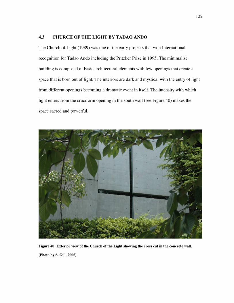
122
4.3 CHURCH OF THE LIGHT BY TADAO ANDO
The Church of Light (1989) was one of the early projects that won International
recognition for Tadao Ando including the Pritzker Prize in 1995. The minimalist
building is composed of basic architectural elements with few openings that create a
space that is born out of light. The interiors are dark and mystical with the entry of light
from different openings becoming a dramatic event in itself. The intensity with which
light enters from the cruciform opening in the south wall (see Figure 40) makes the
space sacred and powerful.
Figure 40: Exterior view of the Church of the Light showing the cross cut in the concrete wall.
(Photo by S. Gill, 2005)
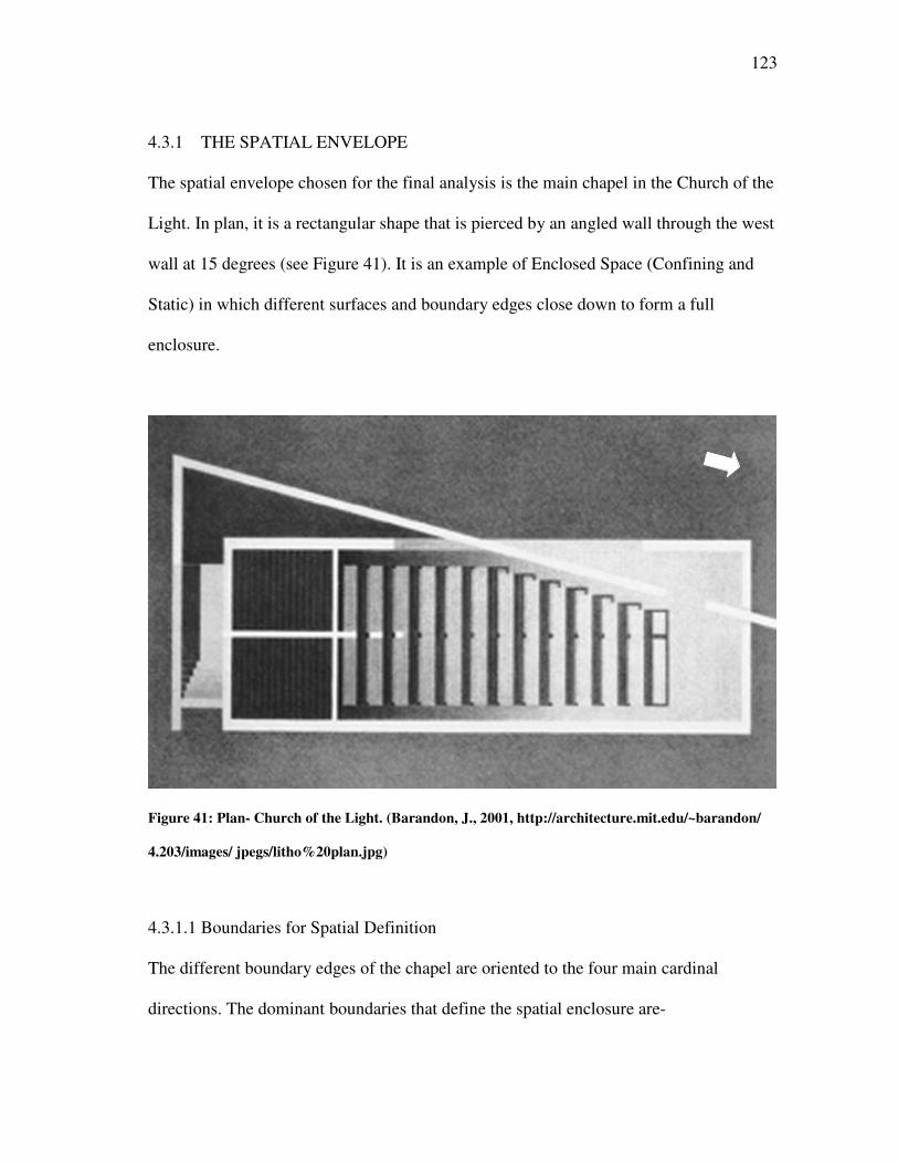
123
4.3.1 THE SPATIAL ENVELOPE
The spatial envelope chosen for the final analysis is the main chapel in the Church of the
Light. In plan, it is a rectangular shape that is pierced by an angled wall through the west
wall at 15 degrees (see Figure 41). It is an example of Enclosed Space (Confining and
Static) in which different surfaces and boundary edges close down to form a full
enclosure.
Figure 41: Plan- Church of the Light. (Barandon, J., 2001, http://architecture.mit.edu/~barandon/
4.203/images/ jpegs/litho%20plan.jpg)
4.3.1.1 Boundaries for Spatial Definition
The different boundary edges of the chapel are oriented to the four main cardinal
directions. The dominant boundaries that define the spatial enclosure are-
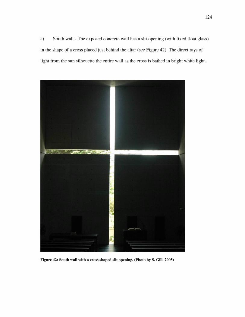
124
a) South wall - The exposed concrete wall has a slit opening (with fixed float glass)
in the shape of a cross placed just behind the altar (see Figure 42). The direct rays of
light from the sun silhouette the entire wall as the cross is bathed in bright white light.
Figure 42: South wall with a cross shaped slit opening. (Photo by S. Gill, 2005)
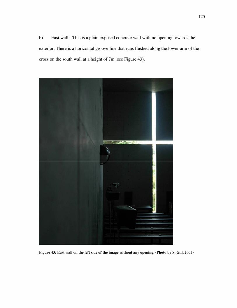
125
b) East wall - This is a plain exposed concrete wall with no opening towards the
exterior. There is a horizontal groove line that runs flushed along the lower arm of the
cross on the south wall at a height of 7m (see Figure 43).
Figure 43: East wall on the left side of the image without any opening. (Photo by S. Gill, 2005)
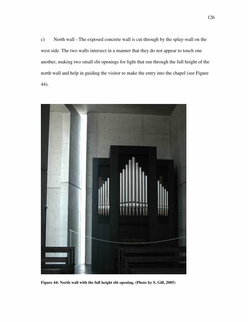
126
c) North wall - The exposed concrete wall is cut through by the splay-wall on the
west side. The two walls intersect in a manner that they do not appear to touch one
another, making two small slit openings for light that run through the full height of the
north wall and help in guiding the visitor to make the entry into the chapel (see Figure
44).
Figure 44: North wall with the full height slit opening. (Photo by S. Gill, 2005)
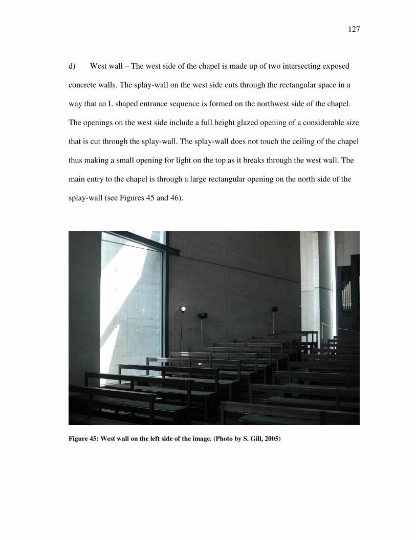
127
d) West wall – The west side of the chapel is made up of two intersecting exposed
concrete walls. The splay-wall on the west side cuts through the rectangular space in a
way that an L shaped entrance sequence is formed on the northwest side of the chapel.
The openings on the west side include a full height glazed opening of a considerable size
that is cut through the splay-wall. The splay-wall does not touch the ceiling of the chapel
thus making a small opening for light on the top as it breaks through the west wall. The
main entry to the chapel is through a large rectangular opening on the north side of the
splay-wall (see Figures 45 and 46).
Figure 45: West wall on the left side of the image. (Photo by S. Gill, 2005)
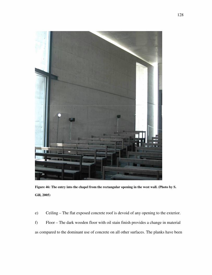
128
Figure 46: The entry into the chapel from the rectangular opening in the west wall. (Photo by S.
Gill, 2005)
e) Ceiling – The flat exposed concrete roof is devoid of any opening to the exterior.
f) Floor – The dark wooden floor with oil stain finish provides a change in material
as compared to the dominant use of concrete on all other surfaces. The planks have been
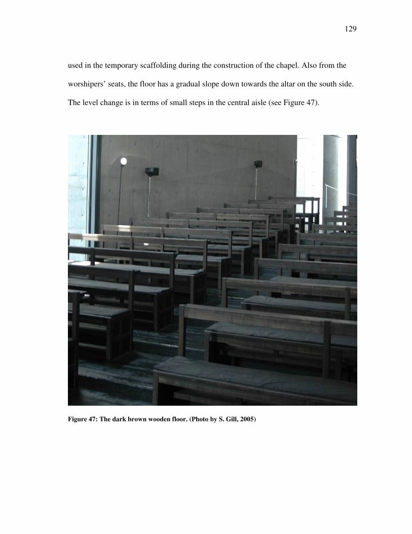
129
used in the temporary scaffolding during the construction of the chapel. Also from the
worshipers’ seats, the floor has a gradual slope down towards the altar on the south side.
The level change is in terms of small steps in the central aisle (see Figure 47).
Figure 47: The dark brown wooden floor. (Photo by S. Gill, 2005)
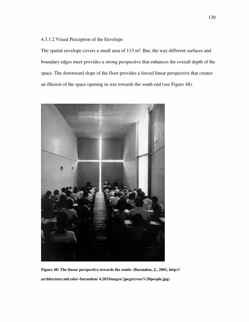
130
4.3.1.2 Visual Perception of the Envelope
The spatial envelope covers a small area of 113 m². But, the way different surfaces and
boundary edges meet provides a strong perspective that enhances the overall depth of the
space. The downward slope of the floor provides a forced linear perspective that creates
an illusion of the space opening in size towards the south end (see Figure 48).
Figure 48: The linear perspective towards the south. (Barandon, J., 2001, http://
architecture.mit.edu/~barandon/ 4.203/images/ jpegs/cross%20people.jpg)
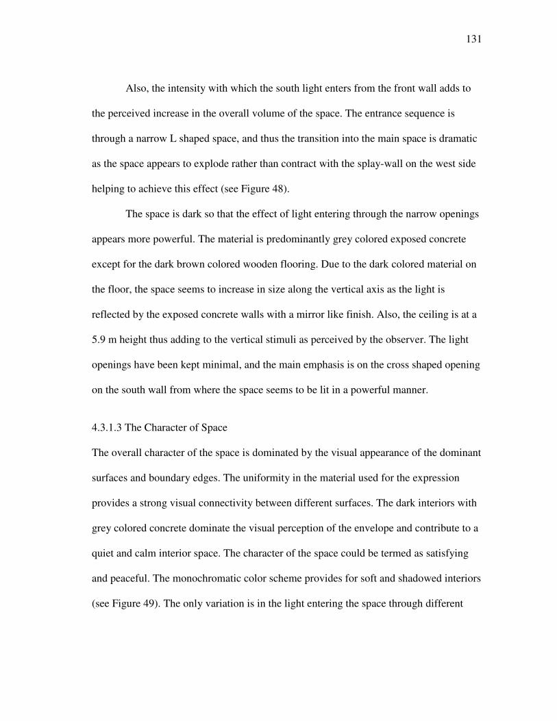
131
Also, the intensity with which the south light enters from the front wall adds to
the perceived increase in the overall volume of the space. The entrance sequence is
through a narrow L shaped space, and thus the transition into the main space is dramatic
as the space appears to explode rather than contract with the splay-wall on the west side
helping to achieve this effect (see Figure 48).
The space is dark so that the effect of light entering through the narrow openings
appears more powerful. The material is predominantly grey colored exposed concrete
except for the dark brown colored wooden flooring. Due to the dark colored material on
the floor, the space seems to increase in size along the vertical axis as the light is
reflected by the exposed concrete walls with a mirror like finish. Also, the ceiling is at a
5.9 m height thus adding to the vertical stimuli as perceived by the observer. The light
openings have been kept minimal, and the main emphasis is on the cross shaped opening
on the south wall from where the space seems to be lit in a powerful manner.
4.3.1.3 The Character of Space
The overall character of the space is dominated by the visual appearance of the dominant
surfaces and boundary edges. The uniformity in the material used for the expression
provides a strong visual connectivity between different surfaces. The dark interiors with
grey colored concrete dominate the visual perception of the envelope and contribute to a
quiet and calm interior space. The character of the space could be termed as satisfying
and peaceful. The monochromatic color scheme provides for soft and shadowed interiors
(see Figure 49). The only variation is in the light entering the space through different
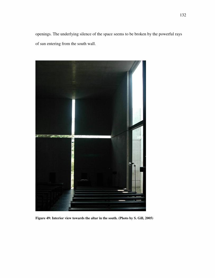
132
openings. The underlying silence of the space seems to be broken by the powerful rays
of sun entering from the south wall.
Figure 49: Interior view towards the altar in the south. (Photo by S. Gill, 2005)
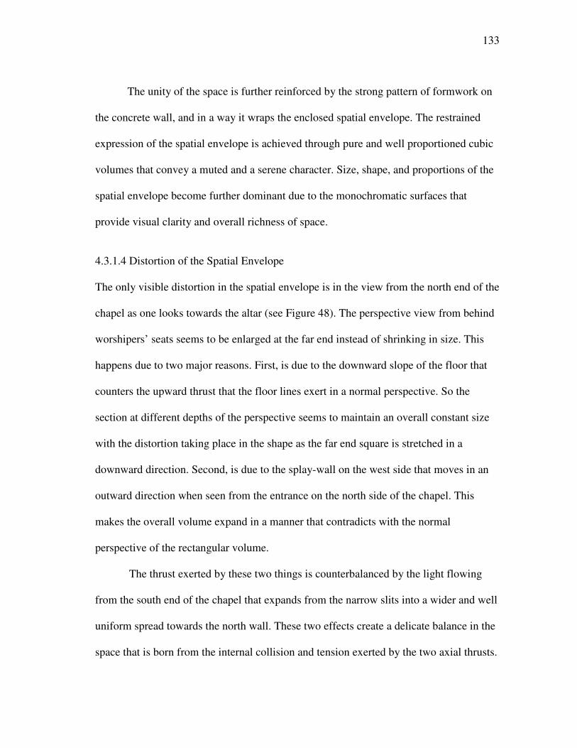
133
The unity of the space is further reinforced by the strong pattern of formwork on
the concrete wall, and in a way it wraps the enclosed spatial envelope. The restrained
expression of the spatial envelope is achieved through pure and well proportioned cubic
volumes that convey a muted and a serene character. Size, shape, and proportions of the
spatial envelope become further dominant due to the monochromatic surfaces that
provide visual clarity and overall richness of space.
4.3.1.4 Distortion of the Spatial Envelope
The only visible distortion in the spatial envelope is in the view from the north end of the
chapel as one looks towards the altar (see Figure 48). The perspective view from behind
worshipers’ seats seems to be enlarged at the far end instead of shrinking in size. This
happens due to two major reasons. First, is due to the downward slope of the floor that
counters the upward thrust that the floor lines exert in a normal perspective. So the
section at different depths of the perspective seems to maintain an overall constant size
with the distortion taking place in the shape as the far end square is stretched in a
downward direction. Second, is due to the splay-wall on the west side that moves in an
outward direction when seen from the entrance on the north side of the chapel. This
makes the overall volume expand in a manner that contradicts with the normal
perspective of the rectangular volume.
The thrust exerted by these two things is counterbalanced by the light flowing
from the south end of the chapel that expands from the narrow slits into a wider and well
uniform spread towards the north wall. These two effects create a delicate balance in the
space that is born from the internal collision and tension exerted by the two axial thrusts.
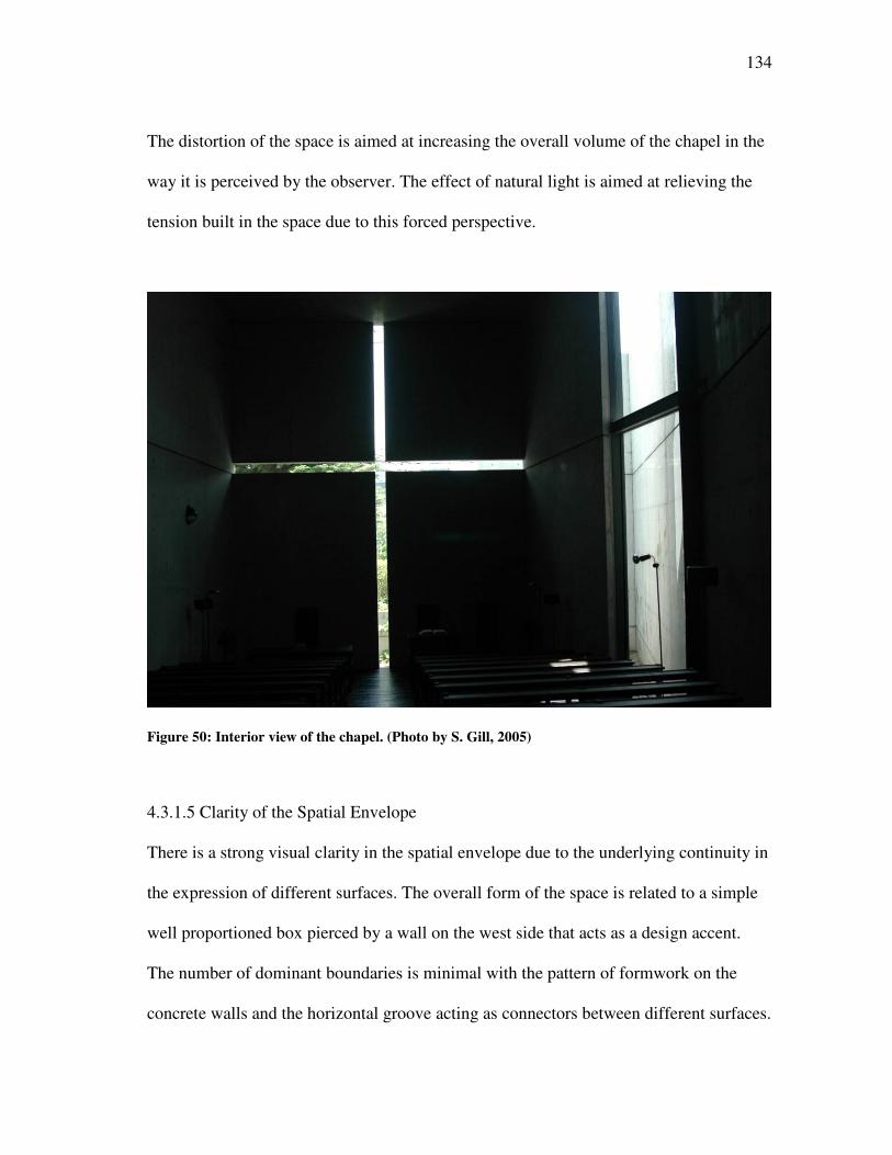
134
The distortion of the space is aimed at increasing the overall volume of the chapel in the
way it is perceived by the observer. The effect of natural light is aimed at relieving the
tension built in the space due to this forced perspective.
Figure 50: Interior view of the chapel. (Photo by S. Gill, 2005)
4.3.1.5 Clarity of the Spatial Envelope
There is a strong visual clarity in the spatial envelope due to the underlying continuity in
the expression of different surfaces. The overall form of the space is related to a simple
well proportioned box pierced by a wall on the west side that acts as a design accent.
The number of dominant boundaries is minimal with the pattern of formwork on the
concrete walls and the horizontal groove acting as connectors between different surfaces.
135
The cross shaped opening on the south wall acts as the principal light source for the
space. Light from this opening washes along four surfaces – east and west walls, floor
and ceiling. The light and shadow patterns are similar on all the four surfaces thus
reinforcing the order and symmetry in the space. The way light spreads into the chapel is
in harmony with the main north-south axis and thus maintaining the integrity of the
spatial envelope (see Figure 50).
4.3.1.6 Proportioning of the Spatial Envelope
The space inside the chapel has been arranged by means of a simple geometric
relationship. The Church of Light measures 5.9m wide x 17.7m long x 5.9 m high. The
proportion of the space can be reduced to a simple ratio i.e. 1:3:1. Thus the spatial
envelope can be said to be made of three identical cubes with each side measuring 5.9m.
The height to width ration is 1:1, meaning that the section is a square one thus
emphasizing on the single long axis that runs from north to south. This further brings a
perceived sense of depth in the space making the overall volume grow rather than shrink.
The basic proportions bring in a controlled order inside the space as each surface or
dominant edge relates to another through simple geometric proportions.
4.3.1.7 The Color of Architectural Space
The predominant color of the spatial envelope is grey out of the exposed concrete that
can be seen on all the major surfaces except for the floor. The variation due to the light
levels creates a shift in the value and saturation of grey color. The dark brown floor is
not affected by the change in light levels and maintains a constant hue throughout the
136
surface. Although the dark interiors might seem to reduce the perceived size of the
envelope, this is not the case inside the chapel. The effect of direct sun rays from the
south wall tends to dominate over the basic color of the architectural space. The light as
it enters from the cross shaped opening breaks free the static quality of space inside the
chapel, making a strong connection with the outside. The space seems to flow and merge
freely with the exterior, and the tension inside the space is relieved.
The controlled use of color helps in maintaining the overall stability and clarity
of the space. There is no overloading on terms of the visual stimuli resulting from the
presence of different colors. Thus, the space retains a simple character where light, as it
enters the space, acts as a strong visual and focal accent.
4.3.2 ARTICULATION OF THE SPATIAL ENVELOPE
The articulation in the Church of Light has been achieved by the use of dominant pattern
on the surface boundaries of the spatial envelope. The monochromatic surfaces are made
more interesting with the pattern that continues on all the different wall surfaces. The
openings are small but bring in the kind of light that is powerful in the way it illuminates
the space. The pattern provides the controlling condition to maintain perceptual
simplicity in the chapel while the varied effects of light have been used to enliven and
create interest in the space.
4.3.2.1 Patterning the Dominant Boundaries
The pattern of formwork on the concrete surfaces is one of the most visible attempts in
articulating the spatial envelope. The concrete walls have a strong pattern of dots that are
137
the left over marks of steel bars used in the scaffolding. The small circular dots have
been recessed into the wall surfaces, thus providing a play of light and shadow that adds
to the overall depth of the space. The ceiling has lines that run in perpendicular
directions depicting the rectangular steel frames used for the formwork. The pattern on
different surfaces breaks them down into small squares with each small square
establishing the overall scale of the space. The repetition in the pattern provides order
and symmetry to the spatial envelope.
4.3.2.2 Penetration of the Spatial Envelope
There is a strong sense of penetration inside the chapel. This is due to the strong contrast
created when the observer is oriented towards the altar. The bright cross shaped opening
seen against the dark grey concrete surfaces is aimed at heightening the depth
perception.
4.3.2.3 Articulation with Subspaces
The chapel avoids any attempt to merge with a subspace. The sense of enclosure is all
the more dominating, and this creates a powerful play of light inside the spatial
envelope. There is a well marked sequence into the chapel that is connected with an L
shaped court. Once inside the chapel, there is not much of visual relief with views to the
adjoining spaces or the exterior. The visual interest of the space is aimed at connecting
with the exterior through the quality of light and not the view available through an
opening. The only view towards the exterior is through the full glazed opening on the
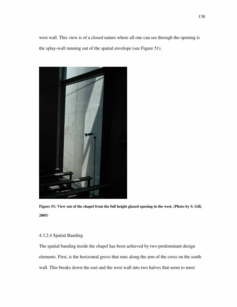
138
west wall. This view is of a closed nature where all one can see through the opening is
the splay-wall running out of the spatial envelope (see Figure 51).
Figure 51: View out of the chapel from the full height glazed opening in the west. (Photo by S. Gill,
2005)
4.3.2.4 Spatial Banding
The spatial banding inside the chapel has been achieved by two predominant design
elements. First, is the horizontal grove that runs along the arm of the cross on the south
wall. This breaks down the east and the west wall into two halves that seem to meet
139
along the south wall with the spread of light blurring this distinction. A band of light
from the south opening is the second design element. The effect of light, in this case,
makes for a dynamic spatial banding of the envelope as this illuminated strip moves
along different surfaces in the darkness of shadow.
4.3.2.5 Curvature and Level Change
The layout of the spatial envelope is based on linear geometry that is devoid of any
curves. The entrance sequence to the chapel can be said to follow an S pattern where one
is made to walk around the entire periphery before making a final U turn that reveals the
inside of this church. The curvatures of the path exist as a metaphysical entity in the
overall composition and circulation pattern of the church. The basic shape is rectangular
with one of the west walls running at a different angle. This provides the necessary
transition from the exterior with an L shaped entrance court that is aimed at dramatizing
the size, shape, and proportions of the chapel.
Once inside the spatial envelope, there is a level change as one walks down
towards the altar. This is aimed at providing another transition that draws the observer
towards the bright rays of the sun entering from the cross shaped opening on the south
wall just behind the altar.
The alternate play of light and shadow is extremely interesting in the way these
transitions have been achieved. From the bright open exterior there is the dark, narrow L
shaped entry court. Then, there is a gradual increase in the intensity with which the light
is made to enter through different openings. The consummation is with the light rays
entering through the south wall appearing to break free the darkness of the space inside.
140
4.3.3 ROLE OF THE STRUCTURAL SYSTEM
The use of concrete as a building material for the chapel removes the need for a separate
structural system. The load bearing walls act as the structure that defines the overall
form. The uniformity in the material provides an overall even gradient to the way natural
light renders the space. The emphasis on the openings is an intended design element,
thus the flat surfaces are perceived in their original shape without any distortion due to
the uneven illumination of the physical planes. Also as a structural material concrete
provides the flexibility of placing the openings at any of the desired locations that might
interfere if there was a separate structural system in place.
4.3.3.1 Prominence of Building Form
The building form has been kept simple to remove any ambiguity of the space and
provide a strong sense of orientation inside the chapel. The exterior is exposed concrete
with the only visible relief to the structure coming from the openings. This is aimed at
providing an inward looking space that is devoid of any visible connections to the
exterior due to a highly sense of neighborhood around the site. The external membrane
seems to be minimalist from the exterior as well as the interior. The transition from the
outside to the inside takes place in terms of the light levels and a controlled effect of
light inside the chapel that provides order to the overall form.
4.3.3.2 Structure Patterning the Spatial Envelope
The structural patterning of the spatial envelope in the Church of the Light has been
achieved by the use of formwork in the construction. The small dots that are recessed
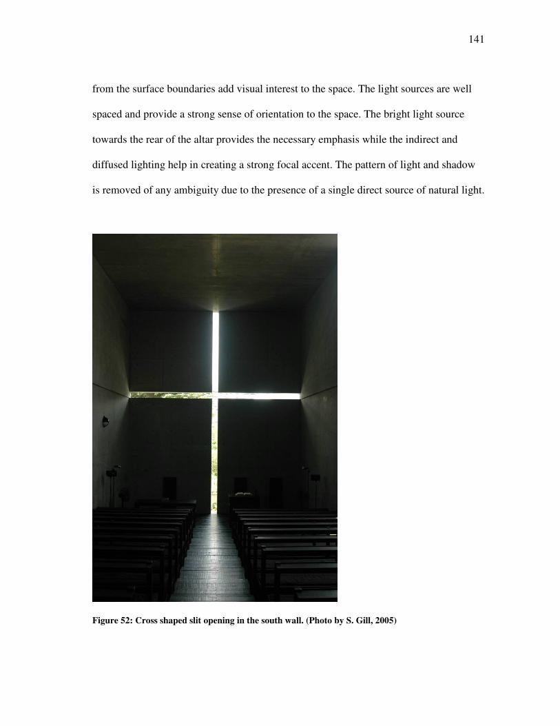
141
from the surface boundaries add visual interest to the space. The light sources are well
spaced and provide a strong sense of orientation to the space. The bright light source
towards the rear of the altar provides the necessary emphasis while the indirect and
diffused lighting help in creating a strong focal accent. The pattern of light and shadow
is removed of any ambiguity due to the presence of a single direct source of natural light.
Figure 52: Cross shaped slit opening in the south wall. (Photo by S. Gill, 2005)
142
4.3.3.3 The Sources of Light
There are four different sources of natural light inside the chapel.
a) Cross shaped slit opening in the south wall – This is the most powerful source
with the direct rays of sun passing through the narrow slit and illuminating four different
planes. The pattern of light and shadow is similar on all four planes, however the effect
is less visible on the dark wooden floor as compared to the other three concrete surfaces.
There is a visible use of contrast when oriented towards the altar. The source of light
makes for a strong visual element when seen against the dark grey concrete wall on the
south side (see Figure 52).
b) Full Height glazed opening in the west wall – This provides more of a diffused
quality of light inside the space; one that washes along the splay-wall to make a quiet
transition from the exterior into the interior. This provides a soft illumination as it is
protected from the direct rays of the setting sun by the natural shade from the extension
of the splay-wall in the exterior (see Figure 53).
c) Slit opening at the top of the splay-wall on the west side – The light washes
along the ceiling and illuminates the space from the top. This provides an even modeling
and a gradual transition from the concrete ceiling to the dark wooden floor (see Figure
46).
d) Full Height slit opening where the splay-wall meets the north wall – The light
that enters from this opening acts as a source that guides the visitor from the dark L
shaped entry court into the chapel. This is the first source of natural light that makes its
presence felt inside the darkness of the chapel (see Figure 44).
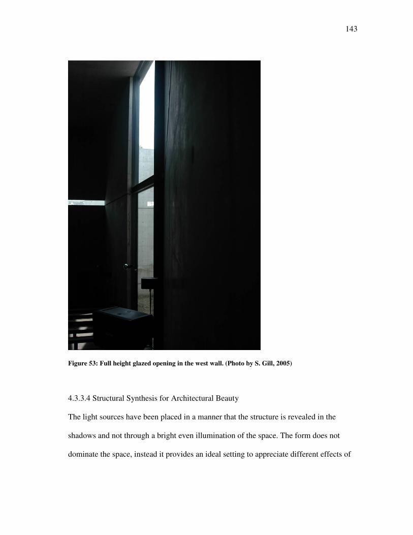
143
Figure 53: Full height glazed opening in the west wall. (Photo by S. Gill, 2005)
4.3.3.4 Structural Synthesis for Architectural Beauty
The light sources have been placed in a manner that the structure is revealed in the
shadows and not through a bright even illumination of the space. The form does not
dominate the space, instead it provides an ideal setting to appreciate different effects of
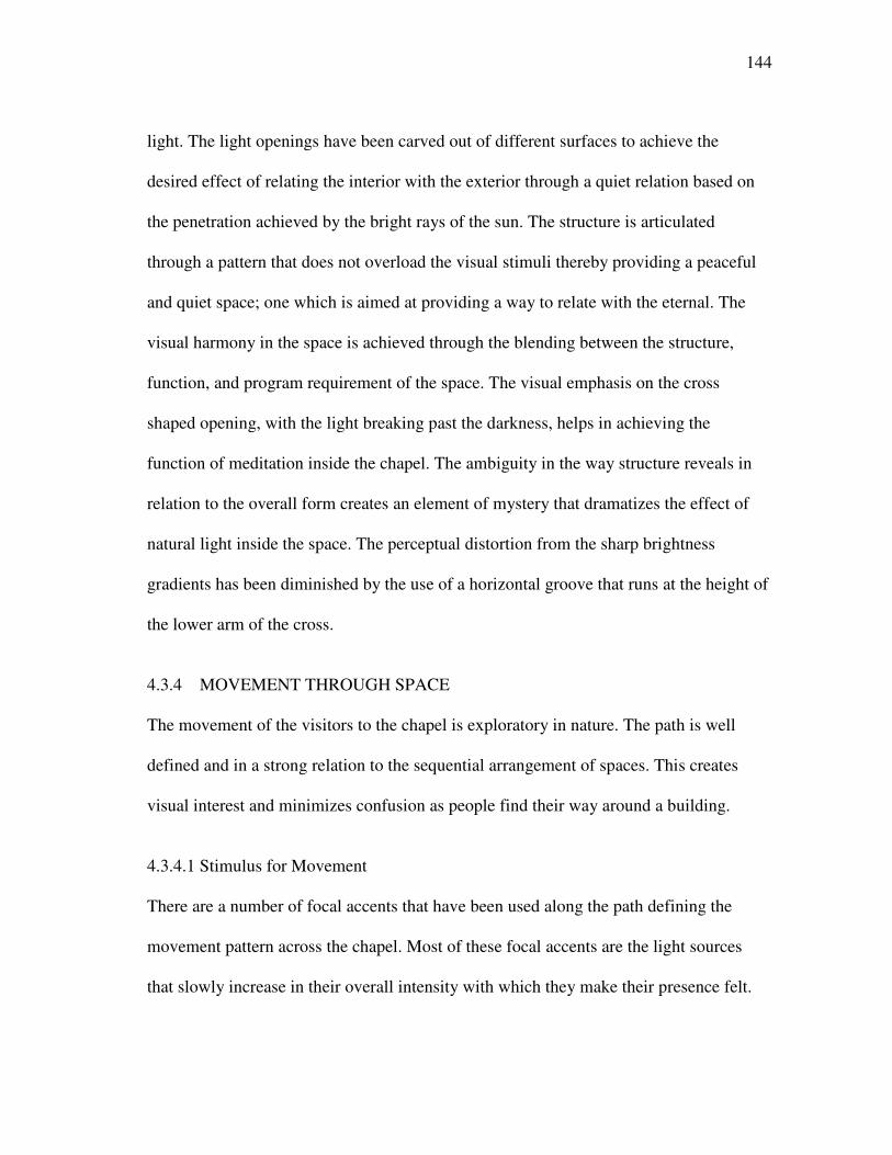
144
light. The light openings have been carved out of different surfaces to achieve the
desired effect of relating the interior with the exterior through a quiet relation based on
the penetration achieved by the bright rays of the sun. The structure is articulated
through a pattern that does not overload the visual stimuli thereby providing a peaceful
and quiet space; one which is aimed at providing a way to relate with the eternal. The
visual harmony in the space is achieved through the blending between the structure,
function, and program requirement of the space. The visual emphasis on the cross
shaped opening, with the light breaking past the darkness, helps in achieving the
function of meditation inside the chapel. The ambiguity in the way structure reveals in
relation to the overall form creates an element of mystery that dramatizes the effect of
natural light inside the space. The perceptual distortion from the sharp brightness
gradients has been diminished by the use of a horizontal groove that runs at the height of
the lower arm of the cross.
4.3.4 MOVEMENT THROUGH SPACE
The movement of the visitors to the chapel is exploratory in nature. The path is well
defined and in a strong relation to the sequential arrangement of spaces. This creates
visual interest and minimizes confusion as people find their way around a building.
4.3.4.1 Stimulus for Movement
There are a number of focal accents that have been used along the path defining the
movement pattern across the chapel. Most of these focal accents are the light sources
that slowly increase in their overall intensity with which they make their presence felt.
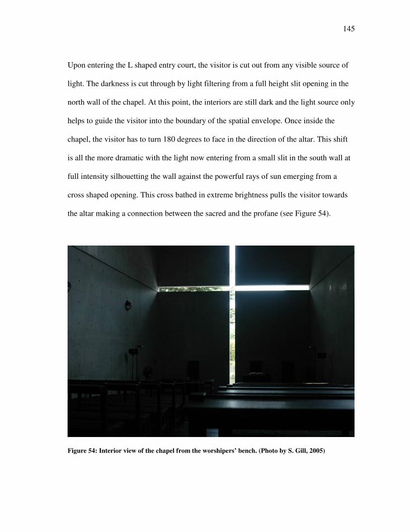
145
Upon entering the L shaped entry court, the visitor is cut out from any visible source of
light. The darkness is cut through by light filtering from a full height slit opening in the
north wall of the chapel. At this point, the interiors are still dark and the light source only
helps to guide the visitor into the boundary of the spatial envelope. Once inside the
chapel, the visitor has to turn 180 degrees to face in the direction of the altar. This shift
is all the more dramatic with the light now entering from a small slit in the south wall at
full intensity silhouetting the wall against the powerful rays of sun emerging from a
cross shaped opening. This cross bathed in extreme brightness pulls the visitor towards
the altar making a connection between the sacred and the profane (see Figure 54).
Figure 54: Interior view of the chapel from the worshipers’ bench. (Photo by S. Gill, 2005)
146
4.3.4.2 People Move toward Light
The use of light to guide the way people move around the chapel has been done in a
manner that closely relates to the circulation path. The spatial layout does not provide for
any number of permutation and combinations while walking inside the church. The
effect of light is aimed at accentuating the transition between different spaces. The light
from the opening on the south wall attracts visual attention and provides a strong
impetus overpowering any source of distraction from this linear perspective focused
towards the altar (see Figure 48).
4.3.4.3 The Zones of Transition
There are three main zones of transition in the spatial layout of the chapel. First, is the L
shaped court with its dark shadows creating a strong contrast with the outside. Second,
is the appearance of the first major opening that is a full height slit on the north wall
bringing in bright diffused light to create a strong contrast with the previous transition.
Once the eye adjusts to this light source, the interiors still appear dark. On a U turn
around the entrance, one is made to go through the third transition in which all that is
seen is a cross illuminated by a natural source of light. The direct rays of light from the
opening on the south wall create a temporary blindness in which everything else fades
away. Slowly the eye adjusts to this extreme bright source and becomes aware of the
matter born through the direct rays of the sun.
147
4.3.4.4 Brightness Changes as a Function of Movement
The movement, from the outside to the inside of the chapel, brings in a mixture of
gradual and abrupt changes in brightness. The L shaped entry court makes for a dark
narrow entrance making the far end seem invisible. Slowly the eye adapts to this
darkness and is hit by the north light entering from the slit opening. The contrast created
in this transition makes the eye adjust and search for all that is revealed through this light
illuminating the space. At this point, the visitor makes a U turn to face in the direction of
the altar. This is where the change in brightness strikes with utmost intensity. The direct
rays of sun piercing the cross shaped opening behind the altar create a strong symbol that
creates visual interest. The emptiness of the space is broken, and all that one is forced to
see is the cross with light spreading from it and illuminating the space. The power of this
image is all the more striking in the relatively dark interiors.
148
CHAPTER V
RESULTS
This chapter describes the results from the analysis of the spatial envelope in three of the
selected buildings- (1) Chapel of Notre Dame du Haut Ronchamp by Le Corbusier, (2)
Kimbell Art Museum by Louis I. Kahn and (3) Church of the Light by Tadao Ando. The
underlying characteristics of natural light - (a) Orientation, (b) Intensity, (c) Mystery, (d)
Shadow, (e) Contrast, (f) Color and (g) Variation have been discussed in this chapter as
visible inside the spatial envelope.
5.1 CHAPEL OF NOTRE DAME DU HAUT RONCHAMP BY LE
CORBUSIER
The characteristics of natural light, as they relate to the overall perception of the spatial
envelope inside the Chapel of Notre Dame du Haut Ronchamp, have been listed and
explained below.
5.1.1 ORIENTATION
The chapel sits on a site that is at the summit of a hill and looks over towards the four
horizons. The chapel in plan is composed of four different curvilinear walls; two on the
east and south side bend inward whereas the other two on the north and west side bend
outward. The south and east walls act as receptors for the majority of sunlight that enters
the chapel through the gap between the roof and the vertical surfaces in an attempt to
break the static nature of the enclosed interior space, whereas the north and west walls
149
act as containers that define the sacred from the profane in a manner that removes any
immediate connection with the outside environment. The concave and convex profiles of
the walls are composed of two opposites that have been joined together with the
curvilinear roof to form a unanimous whole. The functions these two kinds of walls
(convex and concave) serve are in direct contrast and builds a visible tension in the form
of the chapel that can be seen both from the outside as well as the inside.
Inside, the chapel is oriented along an east-west axis that has an asymmetrical
layout of the different openings for the entry of natural light. The main axis connects the
confessional in the west wall to the altar placed in front of the east wall, creating a strong
visual connection between the two important functions housed inside the chapel. This
provides a strong sense of orientation to the visitors as they move inside the spatial
envelope. The worshipers’ desk is placed towards the south wall next to the small
openings bringing in direct light. Most of the space towards the north wall is empty,
thereby highlighting the asymmetry present inside the chapel. There are both direct and
indirect sources of light. Openings for natural light have been oriented towards the four
cardinal directions to receive a characteristic quality of light at different times of the day.
The way different openings have been oriented further highlights the emphasis
on creating a contrast that is visible in the form of the building and is an attempt to draw
visual attention of the observer. The south wall has a number of small openings that
brings in direct sunlight from the splayed windows that are deeply recessed, thereby
creating a transition zone for the bright light to make a quiet but powerful entry into the
interior of the chapel. This is the most visible effect that can be seen all along the path of
150
movement followed by a visitor inside the spatial envelope. On the other hand, the
placement of the vertical tower, in the west corner of the south wall, brings in light from
the clerestory opening that is oriented towards the north. The constant diffused light
from the north is made to flow through the entire height of the tower before it falls on
the altar placed beneath the domical roof. The bright altar does not reveal the source of
light that is far removed from the view of the observer standing at a distance. The visual
interest is generated by the partial hiding of this information that directs the movement
of the observer towards this small chapel before he can fully appreciate the play of light
and shadow from its hidden source of natural light.
A similar effect has been used in the two small chapels placed in the vertical
towers along the north side of the spatial envelope. The vertical towers stand with their
backs turned against each other suggestive of the contrast generated in the inside in
terms of the different kinds of light they receive. The one towards the west end has its
clerestory opening directed towards the setting sun, whereas the tower towards the east
end of the north wall receives its share of light from the morning sun. Thus, the space
inside is rendered in an altogether different kind of light; one that has an added element
of color when compared with the vertical tower on the south side that opens out to the
blue skies of the north.
The openings oriented along the east and south wall are aimed at highlighting the
free standing elements of the choir. Whereas the observer oriented towards the east can
see the visible source of light on the east and south walls, the small openings on the east
end of the north wall are hidden from the direct view. This helps in controlling the
151
amount of focal accents while still achieving a homogenous blend of natural light from
three different directions (north, east and south) in the space next to the altar. The only
variation from this diffused and uniform effect of light is from an opening placed behind
the altar that has the statue of the Virgin Mary made visible through a silhouette against
the bright light of the morning sun. This is aimed at providing a symbolic meaning to the
sacred nature of the space through a controlled effect of natural light.
5.1.2 INTENSITY
The small openings of light inside the chapel help to contain the interior space from any
major views of the exterior. The amount of penetration is to an extent that lights the
periphery of the spatial envelope while maintaining a dark interior space. The intensity
of light source is all the more visible in this setting as the light rays can be seen cutting
through the darkness that envelops the inside of the chapel. The small openings oriented
towards the east and south side help to bring daylight in a manner that does not reveal
the exterior space but highlights the shape of the opening bathed in sunlight.
The different openings for light articulate the surface boundaries that define the
spatial envelope. The light is made to flow along a dominant surface boundary that
creates a strong transition zone between the outside and the inside. The orientation of
major openings towards the south side of the chapel puts further emphasis on
highlighting the source of natural light through the intensity with which it breaks through
the darkness of the chapel.
152
5.1.3 MYSTERY
The mystery of the interior space where everything is not revealed at once helps
maintain the sacred nature of the spatial envelope, by which the inside is far removed
from its immediate environment. The continuous adjustment of the eye, to the bright and
dark surfaces, heightens the awareness for different sources of light as the visitor
attempts to comprehend the spatial geometry through the varied play of light and shadow
inside the chapel. The extreme brightness of the openings towards the south side blinds
the view of the observer, which further controls the amount of information that can be
read through a single window. The removal of anything extraneous that might create a
focal accent brings about a strong focus on the source of light as it makes the transition
from the exterior to the interior of the spatial envelope. The intensity with which the
light is made to enter inside the chapel creates a strong contrast between the highlights
and the lowlights that restrict the complete understanding of the space at any given point
in time. The exploratory nature of the space further helps in achieving the mystery that
characterizes the inside of the chapel.
The extreme brightness of the openings on the south side creates a silhouette in
which the entire wall is seen washed with light. The power of this image creates a strong
impression on the mind of the observer as the space seems to be removed of any material
connection with the outside. The mass of the building is lost in this darkness, and the
emptiness of the space is highlighted by the strong rays of light breaking into the
shadowed interior space. There is an underlying silence associated with the character
that the play of light and shadow creates inside the chapel.
153
5.1.4 SHADOW
There are no sharp shadows inside the chapel. This is due to the rough grainy texture on
the wall surfaces that diffuses and scatters the light with each subsequent reflection. The
only play of light and shadow can be seen at a microscopic scale where the whiteness of
the wall surfaces dilutes into shades of grey due to the shadows cast by the small
projections of the uneven texture. Apart from this, most of the recessed surfaces have
soft shadows that help understand the spatial depth in the overall perception of the
spatial envelope. The softness of the shadows can be appreciated to a greater extent due
to the white finish of the vertical boundaries inside the chapel. The soft and diffused
nature of shadows helps in counterbalancing the effect of rough texture on different
surfaces that could otherwise be discomforting in its appearance.
5.1.5 CONTRAST
There is a good amount of contrast due to the significant difference between the
brightness ratio of the foreground to the background while moving inside the chapel. This
is due to the limited size of the openings that result in a shallow surface penetration
leaving the interiors dark and devoid of a good amount of natural light. The brightness
seen on the white vertical surfaces contrasts to the dark colored flooring and the grey
concrete on the ceiling. There is a significant increase in the perceived brightness on
different surfaces seen from the dark interior space of the chapel. The strong contrast
creates a heightened awareness of the penetration by natural light thereby creating a
hierarchy of spaces from the darkest in the center to the extreme bright on the periphery.
154
5.1.6 COLOR
The interiors of the chapel are painted in white lime that provides a clean, pure, and
neutral background to observe the effects of light as it passes through clear, colored, and
painted glass in the different window openings on the south wall. The predominant color
inside the spatial envelope is white, which is mostly present on the vertical surfaces and
stands out in contrast to the dark colored flooring and grey concrete ceiling. Whiteness
on the wall surfaces acts to purify the mind of the visitor of all the different colors seen in
the exterior of the chapel thereby creating a strong transition from the outside to the
inside, one that signifies the boundaries of the sacred, marked, and distinct from the
profane. The effect of light filtering through the colored glass is all the more strong and
powerful when seen against the predominant white colored background. The use of
primary colors painted on the glass creates interesting patterns of shadows especially on
the splayed openings in the south wall. The sporadic appearance of color in different
openings creates a magical effect where the eye is not able to read as regular pattern in
the way light renders different openings.
The red colored chapel on the east side of the northern wall stands out in terms of
the use of bright color that differentiates it from the other two chapels placed in the
vertical towers. The light renders the entire space in a dramatic fashion that seems to
modify the interior in a way that would be symbolic of a heavenly light. When compared
to the other two towers, the quiet and silent interiors of these chapels colored in white
light seem to be completely transformed into something that dominates over the plain
white. The prevailing character inside this chapel signifies a much more dynamic space
155
with high energy levels. The use of deep carmine red, painted on the wall surfaces,
creates a strong visual emphasis inside the spatial envelope.
Color has been used with a similar eye catching effect by painting the enameled
doors in bright primary colors. This provides for a sculptural point of entry into the
chapel that relies on the power of color to define the character of a space and to bring out
the white color inside the chapel in a stark manner. The effect of highlighting the
entrance doorways stands in direct contrast to the violet wall adjacent to the sacristy. The
dark violet colored walls seem to disappear in the shadows that engulf the space. The
effect, in this case, is to dissolve the mass of a surface through the use of a dark color
seen overlaid with shadows.
5.1.7 VARIATION
The variation in the quality of light inside the chapel can be seen with the movement of
the sun spread across the entire length of the day. The morning light creates a silhouette
of the statue of the Virgin Mary placed in the square opening in the east wall behind the
altar. Also, the altar on the east end of the north wall shines in a bright colored light that
relates its nature to the rays coming from the rising sun. Slowly the sun moves towards
the south, and the openings in the south wall appear predominant in the way they are lit
by the intense bright light. The funnel shaped shafts of light are seen creating subtle
effects like the colored shadows they project onto the splayed openings that change in
brightness as the sun moves across the sky. Finally, the setting sun brings in its own
characteristic light into the chapel placed in the vertical tower that stands towards the
west end of the north wall.
156
5.2 KIMBELL ART MUSEUM BY LOUIS I. KAHN
The characteristics of natural light as they relate to the overall perception of the spatial
envelope inside the Kimbell Art Museum have been listed and explained below.
5.2.1 ORIENTATION
The Museum building is composed of 16 cycloid shells oriented along a north south
axis. The main source of natural light inside the museum is a 2½' slit at the apex of the
vault that runs along the entire length of the spatial envelope. The movement of the sun
is along the east-west axis which is perpendicular to the main axis of the spatial
envelope. This means that the quality of natural light entering from the opening on the
top of the vault remains constant except for the intensity of light that changes with time
as it enters the interior of the museum. Each section across the entire length receives a
similar quality of light, an effect that is a result of the way the building has been
oriented. The directional aspect of sunlight is controlled by perforated aluminum
reflectors and is partially opaque to bring in a diffused and uniform quality of light that
does not affect the artwork on display.
The glazed wall on the west side of the spatial envelope helps maintain a strong
visual connection with the environment. The entrance porch on the west side helps to
shade the interiors from the direct rays of the setting sun. Also, it acts as a transition
space for the eyes to adjust to the relatively low levels of illumination inside the
museum.
157
5.2.2 INTENSITY
The quality of daylight inside the spatial envelope is soft, diffused, and uniform resulting
from the controlled penetration allowed by the daylight fixture at the top of the vaulted
ceiling. Most of the direct rays of the sun are obstructed by the partially opaque
aluminum reflector, thereby cutting down on the intensity with which natural light enters
the spatial envelope. The reflected light is made to flow along the curve of the ceiling,
thereby providing an even spread to the space below.
The intensity of the daylight can be seen at the ends of the long vaulted ceiling
where it creates a small gap with the gable end of the circle. The direct light from the
south as well as the reflected light from the north opening creates a strong visual
emphasis. The shape and size of these openings further relate to the form of the spatial
envelope emphasizing the basic geometry of the major boundary edges. The closed
nature of the opening, that hardly reveals any view to the outside, retains the intrinsic
character of the space, which helps the visitor to appreciate the beauty of the artwork on
display. It further marks the transition from one spatial envelope to another creating a
strong sense of orientation when moving inside a single spatial envelope.
5.2.3 MYSTERY
The element of mystery is induced in the way aluminum reflectors hide the actual light
source and in turn become a secondary source of light along with the silvery light
reflected of the vaulted ceiling in exposed concrete. The light seems to flow from the top
off the cycloid shell rendering all the objects on display in a soft and uniform light. The
controlled quality of natural light creates an illusion of a light source other than the sun.
158
The spatial envelope seems to be bathed in a silvery light that provides a monochromatic
background in combination with concrete and travertine. This helps to appreciate the
artwork on display that is seen in the foreground without realizing that the actual
generator for the underlying character of the space is the sun.
5.2.4 SHADOW
The absence of the directional quality of natural light produces soft diffused shadows.
This results in the absence of strong patterns of light and shadow being projected on
different surfaces and boundary edges. The lack of focal accents helps the visitors to
concentrate on the works of art that further control and guide the movement pattern
inside the spatial envelope. The amount of visual stimuli conveyed by the soft shadows
helps to provide relevant information about the spatial depth but at no point competes for
greater visual attention.
5.2.5 CONTRAST
There is a significant amount of contrast between the objects being displayed as seen
against a restrained monotone background. The use of artificial sources of light directed
towards these objects creates additional emphasis in terms of the higher brightness ratio
when combined with the natural light that renders the entire spatial envelope in a uniform
manner. The contrast between the brown colored oak flooring and the use of travertine
and concrete on the vertical walls’ surfaces helps to distinguish between the freestanding
objects on the floor as well as the paintings displayed on the low height partitions.
159
5.2.6 COLOR
The dominant visual boundary inside the spatial envelope is the vaulted ceiling which
renders the entire space in a silvery light as it is reflected off the grey exposed concrete
to all the different directions. This creates soft and monotone imagery inside the museum
providing for a peaceful and satisfying setting to appreciate the works of art that have
been put on display. The only variation from the silvery grey seen on the vaulted ceiling
is the beige color tone of travertine seen on the vertical wall surfaces and on the
periphery of the floor, then finally moving towards the golden brown color of the oak
wood flooring. The use of materials with similar texture helps to provide good visual
continuity throughout the space. The controlled and muted expression of the space
provides a neutral background to appreciate the works of art as they stand out in the
foreground.
5.2.7 VARIATION
The variation in the light quality inside the museum is due to the difference in the
intensity of the light at different intervals of time. The change in the light levels due to
the movement of the sun across the sky, especially in the presence of a thick cloud cover,
can be seen inside the museum. But with the skylight being the main source of light that
is further controlled by the perforated aluminum reflector, there is not a great variation in
the overall quality of light. It is only during the transition when artificial sources of light
become predominant that the change in the intensity of natural light becomes
significantly visible.
160
5.3 CHURCH OF THE LIGHT BY TADAO ANDO
The characteristics of natural light as they relate to the overall perception of the spatial
envelope inside the Church of the Light have been listed and explained below.
5.3.1 ORIENTATION
The church is a rectangular shaped box that is oriented along a north south axis with the
altar placed in front of the south wall. The amount of penetration inside the spatial
envelope is controlled by the small size of openings thus maintaining a relatively dark
interior space. The openings for light are oriented towards the south, west, and north
direction with the east wall devoid of any opening to the exterior.
The full height slit opening in the north wall that is divided by the splay wall as
the two intersect is the first source on natural light seen by the visitor making an entry
into the chapel through the L shaped entry court. The diffused light entering from this
opening breaks the darkness of the space to guide the movement of the visitor by acting
as one of the focal accents present inside the spatial envelope. On a complete 180 degree
turnaround, the visitor faces towards the altar placed in front of the south wall containing
a cruciform opening. The direct light entering through this opening attempts to break the
dark interior space of the chapel as it spreads light along four dominant surface
boundaries: floor, ceiling and the walls on the east and west side.
Once the eyes get adjusted to the high contrast between the brightness of the
opening and the dark interior space, other sources of light start to take effect. The full
height glazed opening in the west wall brings in diffused light as it is shaded by the
splayed wall that projects outwards and controls the view towards the exterior from this
161
opening. Another source of bright diffused light is along the gap between the splay wall
and the ceiling. The light from this small narrow opening highlights the way the splay
wall breaks the rectangular geometry of the space creating a small L shaped space
serving as the entry court leading into the main chapel.
5.3.2 INTENSITY
The intensity of the different light sources is born out of the dark interiors of the chapel.
The controlled amount of penetration creates a strong emphasis in developing a
connection between the sacred and profane through the power with which light enters
into the chapel. The cross shaped opening is lit up in extreme bright light that connects it
with the symbolic meanings of the projected geometry created by this void in the thick
concrete wall. This is further reinforced by the light and shadow pattern that is seen
moving across the ceiling and the wooden floor.
The darkness that engulfs the interior of the chapel can be seen through the effect
of the north light that enters through a narrow slit. Even this source of light seems so
bright that it serves to act as a focal accent. The light that enters from the gap between
the ceiling and the splayed wall has an altogether different effect on the character of the
space. The intensity of light along this opening attempts to break the static nature of the
enclosed space by making the ceiling float on the top without any visible support
towards the west end of the chapel. The tension inside the space is relieved, and another
connection with the outside is drawn through the intensity of natural light breaking into
the dark interior space of the chapel.
162
5.3.3 MYSTERY
The mystery inside the Church of Light arises from the way the sequential arrangement
of different spaces unfolds one after another. Starting from the bright space in the
exterior the visitor is made to move all along the periphery of the chapel providing a
transition in which the form and geometry of the spatial envelope is demystified. It is
only once the visitor comes across the splayed wall cutting across an L shaped entry
court that the simple geometry of the chapel is made complex. The entrance sequence is
all the more dramatic where a narrow dark passage provides another transition in which
the meanings of form and geometry disappear. The light from the slit opening in the
north wall provides a low level of illumination making the eye adjust to the orientation
of the chapel that demands a complete 180 degrees turnaround at this point. When the
light overpowers the darkness and removes the ambiguity to reveal the spatial envelope,
the sacred from the profane is defined. The cross shaped opening provides a
metaphysical meaning to the space in which there are no other focal accents that try to
compete for greater visual attention. The simplicity of the form revealed at once
highlights the emptiness of the space that builds a visual tension inside the chapel
forcing the visitor to see beyond the narrow opening. The extreme brightness helps hide
the view to the exterior and the actual source of light, thus retaining the element of
mystery that further highlights the sacred nature of the spatial envelope.
5.3.4 SHADOW
The different patterns of shadows resulting from the light entering through the cross
shaped opening in the south wall can be seen on the floor, ceiling, and the east and west
163
walls of the chapel. This provides a much stronger emphasis on the linear axis
connecting the north and south end of the spatial envelope with a sharp sense of the
spatial depth as defined by the dominant boundaries. The long shadows help retain a
relatively dark interior space despite the strong sense of penetration through the different
openings. The overlapping of dark shadows on the grey colored concrete surface creates
an effect in which the building mass appears to dissolve, thereby highlighting the
emptiness of the space.
5.3.5 CONTRAST
The difference in the brightness ratio of the openings and the exposed concrete surfaces
creates a strong visual contrast inside the chapel. The geometry of the openings is
highlighted in the extreme bright light that provides a greater visual emphasis seen
against the grey colored surfaces in the exposed concrete. The emptiness of the space is
seen to be pierced by the strong rays of light entering through these openings creating a
two fold dialectic between the bright and the dark, and light and shadow.
5.3.6 COLOR
The dominant surface boundaries are expressed through the use of exposed concrete. The
grey color of the surfaces appears to be dark when projected with the long shadows. The
low light levels inside the chapel make it hard for the grey color to act in a dominant
manner. Instead, the monochromatic surfaces appear to fade in the dark interior space
dissolving in a fashion that brings out the white bright light to dominate inside the spatial
envelope. The restrained expression of the surfaces helps the different sources of light to
164
act as focal accents depicting the importance of natural light in defining the sacred nature
of the space.
5.3.7 VARIATION
The variation inside the chapel can be seen in terms of the movement of shadows that
help in relating to the source of light inside the spatial envelope. The intensity of the
light varies throughout the entire length of the day and is at its peak once the sun is
overhead. The contrast between the different surfaces and the openings for natural light
is continuously changing as the sun moves across the sky and cutting through the cloud
cover. The hue of the grey color of the exposed concrete appears to fluctuate with the
changing light levels inside the spatial envelope.
165
CHAPTER VI
SUMMARY AND CONCLUSIONS
This thesis discusses the characteristics of natural light that are visible inside the
buildings made of concrete in late twentieth century. Throughout the history of
architecture, natural light has been dealt in different ways to achieve the desired effect
inside a built form. New materials have been used in innovative ways while
experimenting with color, texture, and reflective properties of the surface to create an
interesting play of light and shadow. Reinforced concrete is one such medium that
brought in a new kind of flexibility in dealing with the overall form, design, and
placement of the different openings while exploring the effect of natural light inside a
building. In pursuing this investigation, the study addressed three major objectives. First,
is to identify the characteristics of natural light visible inside these spaces. Second, is to
understand the use of natural light to illuminate different spaces. Third, is to explore the
relation between the characteristics of natural light to the overall perception of the space.
Following these objectives, the study developed two hypotheses on the basis of a
literature review. The first hypothesis examined the link between the design of a built
form in relation to the quality of natural light inside a space by showing that the overall
perception of a space is affected by certain basic characteristics of natural light. The
second hypothesis highlighted the way natural light, both direct and diffused, has been
used inside a spatial envelope to create visual interest by using it as a design element.
166
Thus the second hypothesis suggests that the overall character of a space can be
enhanced by emphasizing the source of natural light as a visual element.
To test these hypotheses, the effect of natural light was studied in three buildings
made out of reinforced concrete in the late twentieth century. These three buildings are
Chapel of Notre Dame du Haut Ronchamp by Le Corbusier, Kimbell Art Museum by
Louis I. Kahn and Church of the Light by Tadao Ando. The criteria for the final analysis
was based on the selection of a spatial envelope in each of the buildings which helped to
provide an ideal framework for studying the effects of light. The method was based on
the principles of visual perception and the use of images depicting the varied effects of
light inside the spatial envelope.
The analysis of the selected spatial envelopes in the three buildings was aimed at
listing the underlying characteristics of natural light that become visible inside these
spaces. The emphasis was on analyzing the effects of natural light in relation to the
overall perception of the space using the process of visual perception that formed the
basis of the criteria used in this study.
The results of the analysis show that the three projects employ similar design
principles to achieve some of the common effects of light, and that the listed
characteristics of light in relation to the overall perception of the space do not vary to a
great extent when moving from one project to another. The characteristics of natural
light were listed as: (a) Orientation, (b) Intensity, (c) Mystery, (d) Shadow, (e) Contrast,
(f) Color and (g) Variation (see Tables 1 through 7).
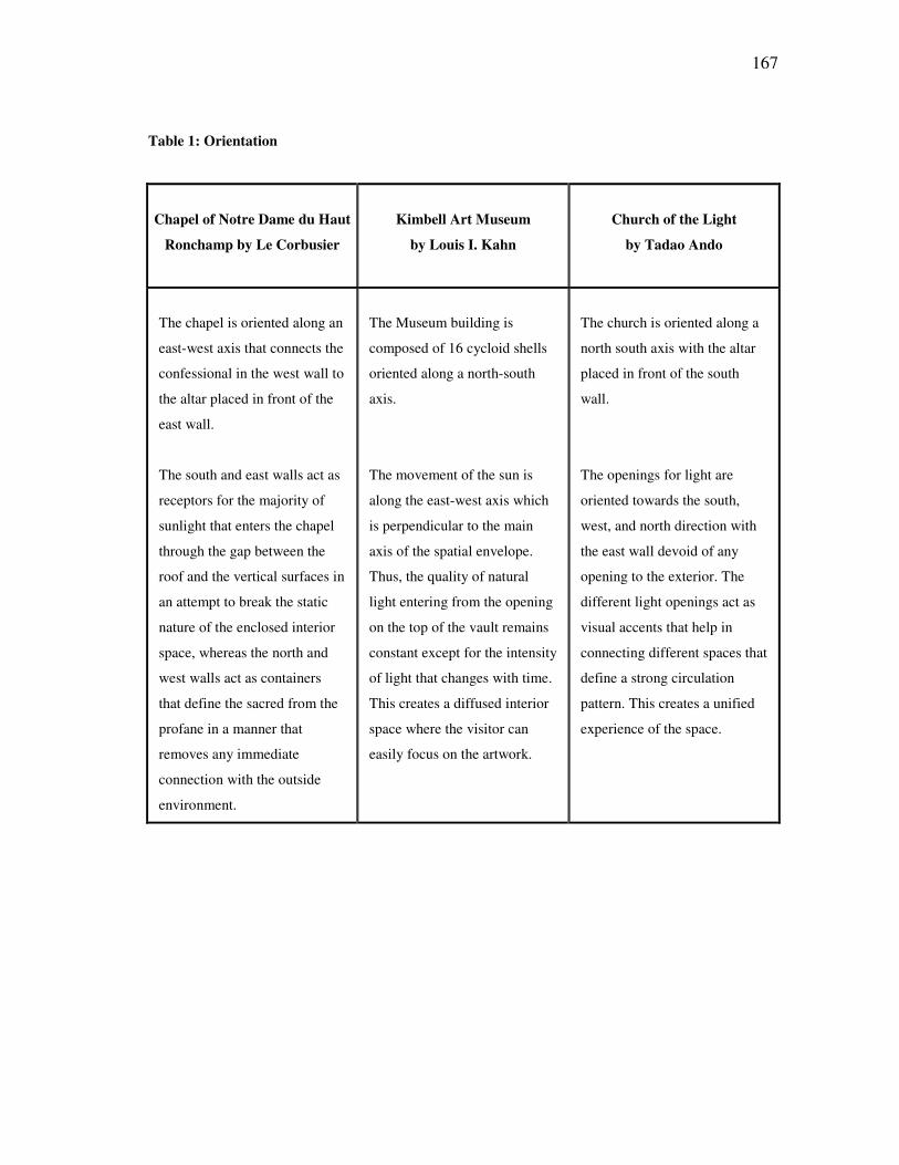
167
Table 1: Orientation
Chapel of Notre Dame du Haut
Ronchamp by Le Corbusier
Kimbell Art Museum
by Louis I. Kahn
Church of the Light
by Tadao Ando
The chapel is oriented along an
east-west axis that connects the
confessional in the west wall to
the altar placed in front of the
east wall.
The south and east walls act as
receptors for the majority of
sunlight that enters the chapel
through the gap between the
roof and the vertical surfaces in
an attempt to break the static
nature of the enclosed interior
space, whereas the north and
west walls act as containers
that define the sacred from the
profane in a manner that
removes any immediate
connection with the outside
environment.
The Museum building is
composed of 16 cycloid shells
oriented along a north-south
axis.
The movement of the sun is
along the east-west axis which
is perpendicular to the main
axis of the spatial envelope.
Thus, the quality of natural
light entering from the opening
on the top of the vault remains
constant except for the intensity
of light that changes with time.
This creates a diffused interior
space where the visitor can
easily focus on the artwork.
The church is oriented along a
north south axis with the altar
placed in front of the south
wall.
The openings for light are
oriented towards the south,
west, and north direction with
the east wall devoid of any
opening to the exterior. The
different light openings act as
visual accents that help in
connecting different spaces that
define a strong circulation
pattern. This creates a unified
experience of the space.
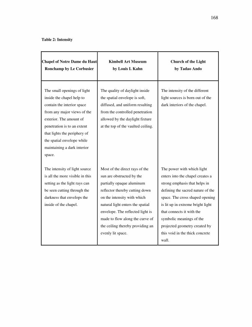
168
Table 2: Intensity
Chapel of Notre Dame du Haut
Ronchamp by Le Corbusier
Kimbell Art Museum
by Louis I. Kahn
Church of the Light
by Tadao Ando
The small openings of light
inside the chapel help to
contain the interior space
from any major views of the
exterior. The amount of
penetration is to an extent
that lights the periphery of
the spatial envelope while
maintaining a dark interior
space.
The intensity of light source
is all the more visible in this
setting as the light rays can
be seen cutting through the
darkness that envelops the
inside of the chapel.
The quality of daylight inside
the spatial envelope is soft,
diffused, and uniform resulting
from the controlled penetration
allowed by the daylight fixture
at the top of the vaulted ceiling.
Most of the direct rays of the
sun are obstructed by the
partially opaque aluminum
reflector thereby cutting down
on the intensity with which
natural light enters the spatial
envelope. The reflected light is
made to flow along the curve of
the ceiling thereby providing an
evenly lit space.
The intensity of the different
light sources is born out of the
dark interiors of the chapel.
The power with which light
enters into the chapel creates a
strong emphasis that helps in
defining the sacred nature of the
space. The cross shaped opening
is lit up in extreme bright light
that connects it with the
symbolic meanings of the
projected geometry created by
this void in the thick concrete
wall.
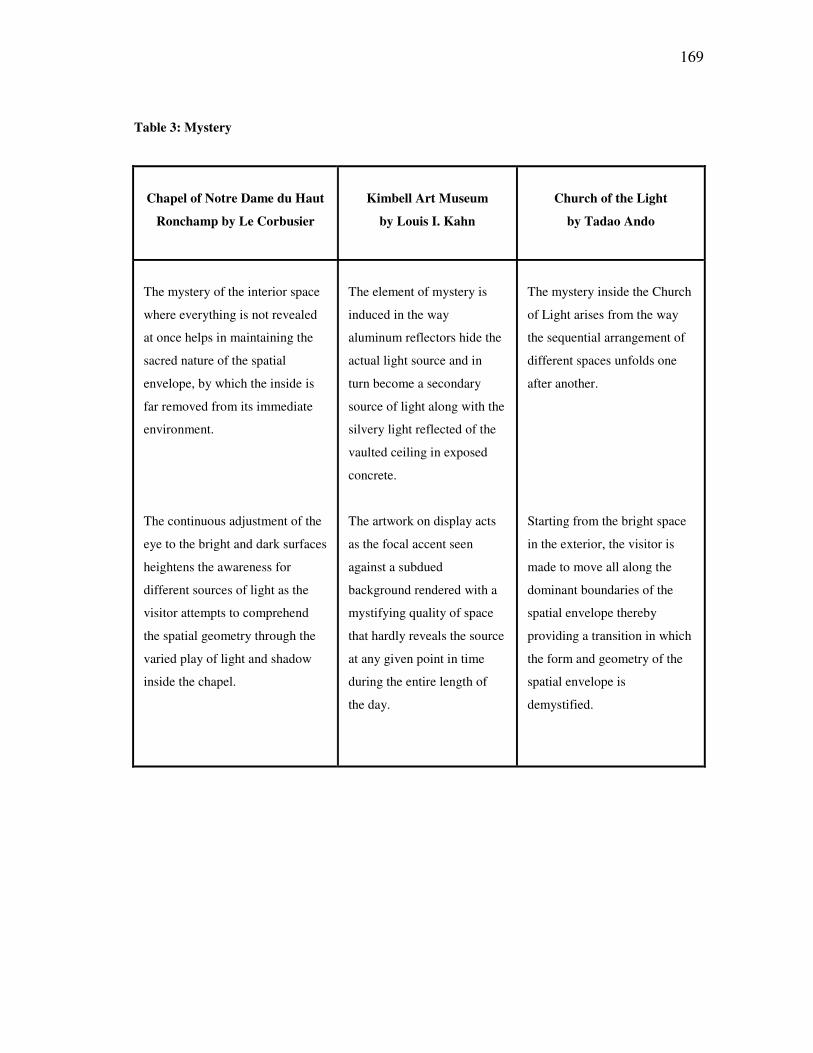
169
Table 3: Mystery
Chapel of Notre Dame du Haut
Ronchamp by Le Corbusier
Kimbell Art Museum
by Louis I. Kahn
Church of the Light
by Tadao Ando
The mystery of the interior space
where everything is not revealed
at once helps in maintaining the
sacred nature of the spatial
envelope, by which the inside is
far removed from its immediate
environment.
The continuous adjustment of the
eye to the bright and dark surfaces
heightens the awareness for
different sources of light as the
visitor attempts to comprehend
the spatial geometry through the
varied play of light and shadow
inside the chapel.
The element of mystery is
induced in the way
aluminum reflectors hide the
actual light source and in
turn become a secondary
source of light along with the
silvery light reflected of the
vaulted ceiling in exposed
concrete.
The artwork on display acts
as the focal accent seen
against a subdued
background rendered with a
mystifying quality of space
that hardly reveals the source
at any given point in time
during the entire length of
the day.
The mystery inside the Church
of Light arises from the way
the sequential arrangement of
different spaces unfolds one
after another.
Starting from the bright space
in the exterior, the visitor is
made to move all along the
dominant boundaries of the
spatial envelope thereby
providing a transition in which
the form and geometry of the
spatial envelope is
demystified.
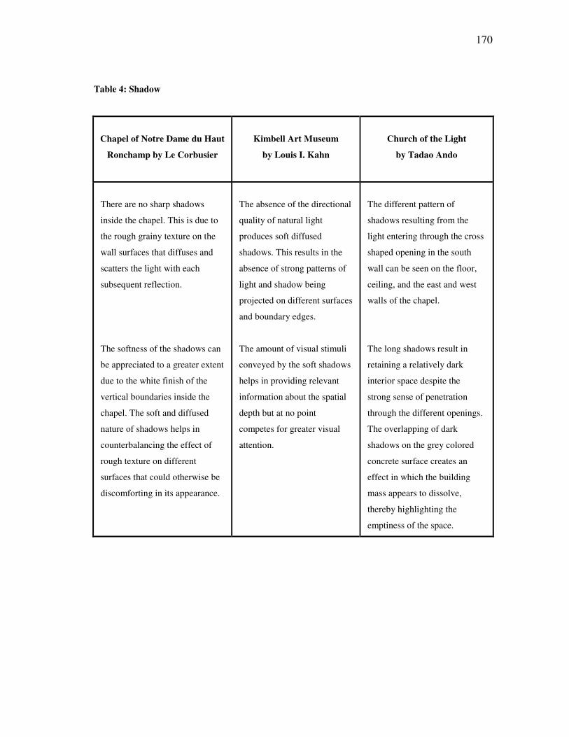
170
Table 4: Shadow
Chapel of Notre Dame du Haut
Ronchamp by Le Corbusier
Kimbell Art Museum
by Louis I. Kahn
Church of the Light
by Tadao Ando
There are no sharp shadows
inside the chapel. This is due to
the rough grainy texture on the
wall surfaces that diffuses and
scatters the light with each
subsequent reflection.
The softness of the shadows can
be appreciated to a greater extent
due to the white finish of the
vertical boundaries inside the
chapel. The soft and diffused
nature of shadows helps in
counterbalancing the effect of
rough texture on different
surfaces that could otherwise be
discomforting in its appearance.
The absence of the directional
quality of natural light
produces soft diffused
shadows. This results in the
absence of strong patterns of
light and shadow being
projected on different surfaces
and boundary edges.
The amount of visual stimuli
conveyed by the soft shadows
helps in providing relevant
information about the spatial
depth but at no point
competes for greater visual
attention.
The different pattern of
shadows resulting from the
light entering through the cross
shaped opening in the south
wall can be seen on the floor,
ceiling, and the east and west
walls of the chapel.
The long shadows result in
retaining a relatively dark
interior space despite the
strong sense of penetration
through the different openings.
The overlapping of dark
shadows on the grey colored
concrete surface creates an
effect in which the building
mass appears to dissolve,
thereby highlighting the
emptiness of the space.
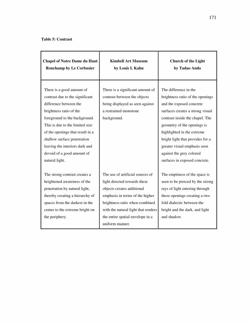
171
Table 5: Contrast
Chapel of Notre Dame du Haut
Ronchamp by Le Corbusier
Kimbell Art Museum
by Louis I. Kahn
Church of the Light
by Tadao Ando
There is a good amount of
contrast due to the significant
difference between the
brightness ratio of the
foreground to the background.
This is due to the limited size
of the openings that result in a
shallow surface penetration
leaving the interiors dark and
devoid of a good amount of
natural light.
The strong contrast creates a
heightened awareness of the
penetration by natural light,
thereby creating a hierarchy of
spaces from the darkest in the
center to the extreme bright on
the periphery.
There is a significant amount of
contrast between the objects
being displayed as seen against
a restrained monotone
background.
The use of artificial sources of
light directed towards these
objects creates additional
emphasis in terms of the higher
brightness ratio when combined
with the natural light that renders
the entire spatial envelope in a
uniform manner.
The difference in the
brightness ratio of the openings
and the exposed concrete
surfaces creates a strong visual
contrast inside the chapel. The
geometry of the openings is
highlighted in the extreme
bright light that provides for a
greater visual emphasis seen
against the grey colored
surfaces in exposed concrete.
The emptiness of the space is
seen to be pierced by the strong
rays of light entering through
these openings creating a two
fold dialectic between the
bright and the dark, and light
and shadow.
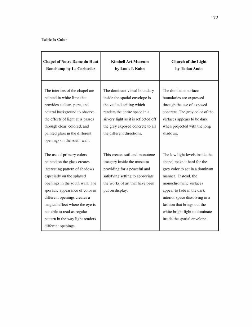
172
Table 6: Color
Chapel of Notre Dame du Haut
Ronchamp by Le Corbusier
Kimbell Art Museum
by Louis I. Kahn
Church of the Light
by Tadao Ando
The interiors of the chapel are
painted in white lime that
provides a clean, pure, and
neutral background to observe
the effects of light at is passes
through clear, colored, and
painted glass in the different
openings on the south wall.
The use of primary colors
painted on the glass creates
interesting pattern of shadows
especially on the splayed
openings in the south wall. The
sporadic appearance of color in
different openings creates a
magical effect where the eye is
not able to read as regular
pattern in the way light renders
different openings.
The dominant visual boundary
inside the spatial envelope is
the vaulted ceiling which
renders the entire space in a
silvery light as it is reflected off
the grey exposed concrete to all
the different directions.
This creates soft and monotone
imagery inside the museum
providing for a peaceful and
satisfying setting to appreciate
the works of art that have been
put on display.
The dominant surface
boundaries are expressed
through the use of exposed
concrete. The grey color of the
surfaces appears to be dark
when projected with the long
shadows.
The low light levels inside the
chapel make it hard for the
grey color to act in a dominant
manner. Instead, the
monochromatic surfaces
appear to fade in the dark
interior space dissolving in a
fashion that brings out the
white bright light to dominate
inside the spatial envelope.
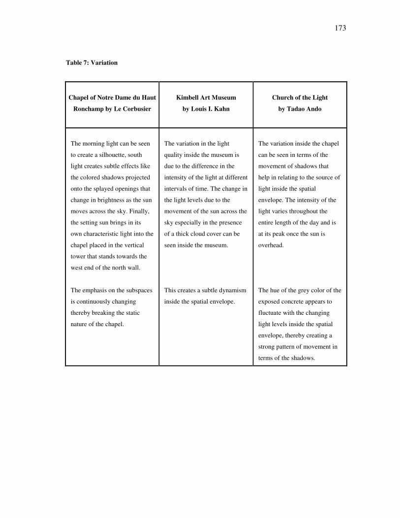
173
Table 7: Variation
Chapel of Notre Dame du Haut
Ronchamp by Le Corbusier
Kimbell Art Museum
by Louis I. Kahn
Church of the Light
by Tadao Ando
The morning light can be seen
to create a silhouette, south
light creates subtle effects like
the colored shadows projected
onto the splayed openings that
change in brightness as the sun
moves across the sky. Finally,
the setting sun brings in its
own characteristic light into the
chapel placed in the vertical
tower that stands towards the
west end of the north wall.
The emphasis on the subspaces
is continuously changing
thereby breaking the static
nature of the chapel.
The variation in the light
quality inside the museum is
due to the difference in the
intensity of the light at different
intervals of time. The change in
the light levels due to the
movement of the sun across the
sky especially in the presence
of a thick cloud cover can be
seen inside the museum.
This creates a subtle dynamism
inside the spatial envelope.
The variation inside the chapel
can be seen in terms of the
movement of shadows that
help in relating to the source of
light inside the spatial
envelope. The intensity of the
light varies throughout the
entire length of the day and is
at its peak once the sun is
overhead.
The hue of the grey color of the
exposed concrete appears to
fluctuate with the changing
light levels inside the spatial
envelope, thereby creating a
strong pattern of movement in
terms of the shadows.
174
The results summarize each of the characteristic that are seen to affect the overall
perception of the spatial envelope in each of the three projects. This validates the first
hypothesis. There was a considerable amount of contrast that helped in distinguishing
between the light and the dark as well as the background and the foreground. The
relatively low light levels in each of the three spatial envelopes created a strong visual
focus on the source of natural light. The source of natural light was used as a visual
accent to maintain strong connectivity in the overall pattern of movement inside the
spatial envelope. This helped in creating a much more unified space thereby validating
the second hypothesis, that the overall character of a space can be enhanced by
emphasizing the source of natural light as a visual element. The results of the analysis
show that the three projects employ similar design principles to achieve some of the
common effects of light, and that the listed characteristics of light affect the overall
perception of the space.
The emphasis on the source of natural light was a common and recurring theme
in all of the three buildings. The results support both hypotheses and also demonstrate
that the character of an interior space is dependent upon the way a designer brings
natural light into the space.
Finally, it should be noted that due to the limited scope of the thesis a relatively
small number of examples were selected that are not representative of all those architects
that have worked in the context of the present study. However, it is suggested that a
further investigation should be undertaken to include more buildings that represent some
of the leading examples by architects who have experimented with the effect of natural
175
light in relation to the quality of a space. The scope of the study can be expanded to
other building types that employ different materials of construction as well as looking at
different time periods that can further test this study’s hypothesis and in validating the
underlying criteria used in the final analysis. A further extension could be made to
include the realm of artificial lighting that could be analyzed based on the principles of
visual perception.
176
REFERENCES
Ando, T. 1995. Tadao Ando: Complete Works, Phaidon Press, London. Archive Colour Slides Ltd., Dublin, Ireland, 1984, Notre Dame du Haut Church. Baker, G. H. 1984. Le Corbusier: An Analysis of Form, Van Nostrand Reinhold, New York. Baker, N. and Steemers, K. 2002. Daylighting Design of Buildings, James & James Ltd, London. Barandon, J. 2001. The Church of Light, Tadao Ando. Available: http:// architecture.mit.edu/~barandon/4.203/images/jpegs/, accessed April 8, 2006. Bechtel, R. B. 1967. Human movement and architecture, Transaction, Washington University, May 1967: 53-56. Brownlee, D. B., and Long, D. G. 1991. Louis I. Kahn : In the Realm of Architecture, Rizzoli International Publications, Inc., New York. Curtis, W. J. R. 1996. Modern Architecture since 1900, Prentice Hall, Upper Saddle River, New Jersey. Dubos, R. 1968. So Human an Animal, Charles Scribner’s Sons, New York. Frampton, K. 2003. Light and Water, The Monacelli Press Inc., New York. Gärling, T. 1970. Studies in visual perception of architectural spaces and rooms IV: the relation of judged size of space under different viewing conditions, Scandinavian Journal of Psychology, 11: 133-145. Gibson, J. J. 1986. The Ecological Approach to Visual Perception, Lawrence Erlbaum Associates, Mahwah, New Jersey. Hopkinson, R. G. 1963. Architectural Physics: Lighting, H.M. Stationery Office, London. Jay, PA. 2002. Subjective criteria of lighting design, Lighting Research & Technology, 34 (2): 87-99.
177
Kahn, L. I. 1971. The room, the street and human agreement, (AIA Gold Medal acceptance speech, Detroit, June 24, 1971), AIA Journal, 56, September 1971: 33. Kahn, L. I. 1975. Light Is the Theme: Louis I. Kahn and the Kimbell Art Museum: Comments on Architecture, Kimbell Art Foundation, Forth Worth, Texas. Lai, J. Y. C. The Chapel of Notre Dame du Haut Ronchamp, Le Corbusier. Available: http://www.0super.net/upload/edited/, accessed April 20, 2006. Lam, W. M. C. 1977. Perception and Lighting as Formgivers for Architecture, McGraw-Hill Book Company, New York. Le Corbusier. 1975. Ronchamp, Oeuvre de Notre-Dame du Haut, Strasbourg, Germany. Lobell, J. 1979. Between Silence and Light: Spirit in the Architecture of Louis I. Kahn, Shambhala Publications Inc., Boulder, Colorado. Michel, L. 1996. Light: The Shape of Space: Designing with Space and Light, Van Nostrand Reinhold, New York. Millet, M. S. 1996. Light Revealing Architecture, Van Nostrand Reinhold, New York. Miyake, R. 1994. Light and Space: Modern Architecture, A.D.A. Edita Tokyo Co., Ltd., Tokyo. Moore, F. 1985. Concepts and Practice of Architectural Daylighting, Van Nostrand Reinhold, New York. Oliva, A., and Torralba, A. 2001. Modeling the shape of the scene: a holistic representation of the spatial envelope, International Journal of Computer Vision, 42 (3): 145-175. Pare, R. 1996. The Colours of Light, Phaidon Press Limited, London. Pauly, D. 1997. Le Corbusier: The Chapel at Ronchamp, Birlhauser (Princeton Architectural Press), Berlin. Phillips, D. 2004. Daylighting: Natural Light in Architecture, Architectural Press, Burlington, Massachusetts. Plummer, H. 1987. Poetics of Light, Architecture and Urbanism, Tokyo. Plummer, H. 1995. Light in Japanese Architecture, Architecture and Urbanism, Tokyo.
178
Plummer, H. 2003. Masters of Light, Architecture and Urbanism, Tokyo. Portoghesi, P. 1994. Light and modern architecture. In Light & Space: Modern Architecture, Futagawa, Y. ed., Ga International Co Ltd, Tokyo. Schmier, H. 2005. The Chapel of Notre Dame du Haut Ronchamp, Le Corbusier. Available: http://www.myfourthirds.com/folder.php?id=906, accessed April 15, 2006. Simon, G. 2003. View of the east wall facing towards the altar. Available: http://www.galinsky.com/buildings/ronchamp/, accessed April 20, 2006. Solon, V. L. 2006. Principles of Architectural Polychromy, http://archrecord. construction.com/inTheCause/onTheState/0402solon-1.asp, accessed April 16, 2006. Tanizaki, J. 1977. In Praise of Shadows, Leete’s Island Books, Stony Creek, NY. Taylor, L. H., and Sucov, E. W. 1974. The movement of people towards lights, Journal of Illuminating Engineering Society, 3: 237-241. Thibaud, J. 2001. Frames of Visibility in Public Spaces, Places, 14 (1): 42-47. Tzonis, A. 2001. Le Corbusier: The Poetics of Machine and Metaphor, Universe Publishing, New York. Weinel, E. F. Detail of the openings on the south wall. Available: http://arch.ou.edu/ arch/2423/Chapter%2028/Ronchamp%20Int.jpg, accessed April 20, 2006.
179
VITA
Name: Sukhtej Singh Gill
Address: c/o Dr. Valerian Miranda, Department of Architecture, Texas A&M University, College Station, TX 77843
Email Address: [email protected]
Education: Master of Science in Architecture (August 2006) Texas A&M University, College Station, Texas Bachelor of Architecture (May, 2004),
Chandigarh College of Architecture, India
Bachelor of Building Science (May, 2002), Chandigarh College of Architecture, India
Work Experience: Practical Training (June 2002 - Nov 2002) Achal Kataria Architects, New Delhi, India
Award: Edward J. Romieniec Graduate Traveling Fellowship (2005-2006)