Embed Size (px)
Citation preview
A Social Semiotic Approach and a Visual
Analysis Approach for Chinese Traditional
Visual Language: A Case of Tea Packaging
Design
Bin Hu School of Arts, University of Jinan, Jinan, China
Oksana Zelenko Queensland University of Technology, Brisbane, Australia
Vaughn Pinxit Queensland University of Technology, Brisbane, Australia
Laurie Buys Queensland University of Technology, Brisbane, Australia
Abstract—the theoretical framework of visual analysis blends approaches to analysing packaging, social
semiotic analysis and Chinese semiotic analysis. A package of Chinese West Lake Dragon Well tea is an
example of a physical object that communicates social meaning related not only to the product itself but also to
Chinese culture. To have a better understanding of social meaning for traditional Chinese visual language on
contemporary tea packages, this study considers visual social semiotic theories and Chinese visual design
semiotic analysis theories that provide insights into the meaning of visual elements of packaging by
understanding the signs used in this packaging. Furthermore, there is diversity in understanding of these
packaging elements due to language, culture and expertise. It is also useful to draw on packaging analysis
theory, which facilitates the identification of traditional and contemporary design elements. This study
identifies the representations of traditional cultural symbols used on the bestselling contemporary tea
packages in China and provides a way for contemporary tea packaging designs to be analysed. It provides one
answer for the question: “How can traditional symbols be interpreted as cultural meaning?”
Index Terms—visual analysis, semiotics, traditional Chinese visual language, visual communication design
I. INTRODUCTION
Cultural practices have been dramatically influenced by globalisation and the preservation of cultural identity has
become a major issue impacted by the rapid growth and development of information technology.
Traditional Chinese symbols and patterns, as the key elements of traditional Chinese visual language developed over
the past 5000 years of Chinese history, are the core components of visual culture in China. Cultural symbols, with their
rich content and diversity, form a unique traditional language that visually conveys cultural significance and
connotations in the way of auspicious Chinese culture (Li, 2015). They form an effective vehicle to shape not only the
Chinese national culture and spirit but also an ideology, culture and reflection (Peng, 2013; J. Zhou, 2006).
Chinese visual communication scholars including Zhang, Liu and Liang (2015) and Chinese design pioneers and leaders in visual communication design, Kan Tai-Keung (2012) and Liran Li (2013), have argued that for designers to
understand traditional symbols which are rich in cultural heritage and unique to their region, they must increase their
self-examination and confidence. This represents a challenge in the face of an ever-expanding context of contemporary
visual communication design (VCD) that is influenced by other visual cultures, for example, Western approaches. In
response to the impact and fusion of those global cultural influences, a shift is emerging in Chinese culture towards the
preservation of unique cultural identities including traditional Chinese visual language from traditional Chinese culture
that is prevalent in daily life.
The book “Traditional Chinese visual design elements” (Ren, 2013) and “Chinese art: a guide to motifs and visual imagery” (Welch, 2013) have addressed the most representative traditional artefacts such as Chinese jade, fans and
paper-cuts, including the traditional Chinese identity within contemporary contexts. However, these researchers have
not utilised a semiotic approach and Chinese visual design semiotic analysis, and this gap has resulted in scholarly
findings that are not easily interpreted and implemented by designers in practice. This points to a gap for scholars and
ISSN 1799-2591Theory and Practice in Language Studies, Vol. 9, No. 2, pp. 168-177, February 2019DOI: http://dx.doi.org/10.17507/tpls.0902.06
© 2019 ACADEMY PUBLICATION
practitioners focusing on analysing and interpreting Chinese symbols into contemporary packaging design. This study
investigates this process in the context of Chinese tea packaging design, which offers a unique blend of cultural values
embedded in the daily practice of tea drinking in China and of its global market position, creating a rich context for the
study of how traditional Chinese visual language manifests in the contemporary global settings. To achieve this, the
study proposes a methodology that brings social semiotic approach and formal visual analysis to assist understanding of
the cultural meaning of traditional symbols from theory to practice. This study contributes to the field of the social
semiotics of Chinese culture and VCD by analysing traditional Chinese symbols from contemporary bestselling tea package.
II. THE THEORETICAL FRAMEWORK OF VISUAL ANALYSIS
TABLE I
THEORETICAL FRAMEWORK OF ANALYSING PACKAGING
Analysing Packaging
Materials Textures Shape Colour Writing & typography Iconography
Wood rigidity front & back dimensions brand & product name objects
glass relief vertical & horizontal brightness callout settings
carton regularity curvature & angularity saturation sell copy persons
paper naturalness opacity purity mandatory copy emblems
plastics viscosity size modulation stylisation
metal liquidity colour range
The theoretical framework for visual analysis blends approaches of analysing packaging, social semiotic analysis and Chinese semiotic analysis. The first approach for analysing packaging is chosen from the book “Doing visual analysis
from theory” to practice by Per Ledin and David Machin (2018). It is a handbook of visual analysis for packaging in
visual communication which includes six aspects: material, textures, shape, colour, iconography, writing and
typography. The authors created Table 1 and listed these six aspects.
TABLE II
THEORETICAL FRAMEWORK OF SOCIAL SEMIOTIC ANALYSIS
Social Semiotic Analysis of Visual Communication
Representational Meaning Interactive Meaning Compositional Meaning
Narrative structures Conceptual structures Contact Information value
Classification structures Distance Framing
Symbolic structure Point of view Salience
Analytical structure Modality
Table 2, also created by the authors, is a social semiotic analysis of a visual communication approach. Social semiotic analysis can be a tool for interpretation of images and other forms of visual communication. It can be used to
create meaning and detailed practices for analysing meaning arising from the integrated use of those resources in
communicative artefacts and events (O’Halloran, 2011). Kress and van Leeuwen (1996) identified social semiotic
analysis including representational meaning, interactive meaning and compositional meaning. Also, there are two kinds
of patterns which can be found in representational meaning: narrative representations and conceptual patterns. Three
kinds of structures – classification structures, analytical structures and symbolic structures – are involved in the
conceptual pattern. Both Table 1 and Table 2 are from a Western visual communication analysis.
TABLE III.
THEORETICAL FRAMEWORK OF CHINESE SEMIOTIC ANALYSIS
Chinese Visual Design Semiotic Analysis
Chinese Visual Language Cultural Meaning
Traditional Contemporary Pun
Motifs Motifs Pronunciation
Chinese characters Chinese characters Homophonic
Water-ink elements Water-ink elements Rebus
Table 3, created by the authors, shows a Chinese visual design semiotic analysis. It is an approach to help readers to
understand the context of Chinese visual language and its cultural meaning.
III. THE TENSIONS OF SEMIOTICS BETWEEN GLOBAL AND CHINESE
Signification is much more meaningful for Chinese people. The traditional Chinese symbols are not only the part of
the decorative visual language but also the form of symbolism with cultural meaning. For practitioners of Chinese
visual communication, it is essential to understand the cultural meaning of traditional symbols to effectively transfer traditional Chinese visual language (TCVL) in visual communication. Semiotics is the study of meaning-making for
signs and symbols. In this section, a review of global semiotics and local Chinese semiotics is conducted.
THEORY AND PRACTICE IN LANGUAGE STUDIES 169
© 2019 ACADEMY PUBLICATION
Semiotic analysis explores the meaning behind visual patterns and symbols. Therefore, people need an approach to
understand the symbolic meaning behind these traditional visual motifs. Semiotics is an essential tool to help people
understand the complexity of relevant cultural signification in the Chinese setting. It is very important to interpret the
global and Chinese perspective of cultural meaning.
A. Global Perspective of Semiotics
Panofsky (1983) claims meaning is a necessary part of a social construct that cannot be separated from visual art.
This argument is supported by Eco (1976) and Hoopes (1991) who state that a sign is anything that stands for
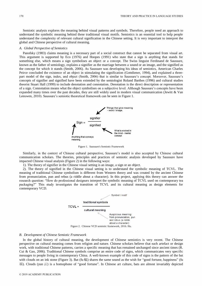
something else, which means a sign symbolises an object or a concept. The Swiss linguist Ferdinand de Saussure,
known as the father of semiology, explains a signifier as the marriage between a sound or an image, and the signified as
the concept for which it stands (Smith, 2006). As Saussure was developing his ideas of semiotics, American Charles
Peirce concluded the existence of an object in stimulating the signification (Gottdiener, 1994), and explained a three-part model of the sign, index, and object (Smith, 2006) that is similar to Saussure’s concept. Moreover, Saussure’s
concepts of signifier and signified have been extended by the semiologist Roland Barthes (1996) and cultural studies
theorist Stuart Hall (1999) to include denotation and connotation. Denotation is the direct description or representation
of a sign. Connotation means what the object symbolises on a subjective level. Although Saussure’s concepts have been
expanded many times over the past decades, they are still widely used in modern visual communication (Jewitt & Van
Leeuwen, 2010). Saussure’s semiotic theoretical framework can be seen in Figure 1.
Figure 1. Saussure's Semiotic Framework
Similarly, in the context of Chinese cultural perspective, Saussure’s model is also accepted by Chinese cultural
communication scholars. The theories, principles and practices of semiotic analysis developed by Saussure have
impacted Chinese visual analysis (Figure 2) in the following ways:
1). The theory of signifier in the Chinese visual setting is an image, a sign or an object.
2). The theory of signified in the Chinese visual setting is to understand the symbolic meaning of TCVL. The meaning of traditional Chinese symbolism is different from Western theory and was created by the ancient Chinese
from pronunciation, pun and rebus (a riddle about a character). In this project, applying this theory can answer the
research question: “How do professional designers interpret the symbolic meaning of TCVL used on contemporary tea
packaging?” This study investigates the transition of TCVL and its cultural meaning as design elements for
contemporary VCD.
Figure 2. Chinese VCD semiotic framework, 2016. Hu.
B. Development of Chinese Semiotic Framework
In the global history of cultural meaning, the development of Chinese semiotics is very recent. The Chinese perspective on cultural meaning comes from religion and nature. Chinese scholars believe that each artefact or design
work, with traditional Chinese patterns, carries a specific meaning that has remained unchanged since ancient times (R.
Cui & Gao, 2006). Traditional Chinese symbols comprise an entire code of signs, which communicates very specific
messages to people living in contemporary China. A well-known example of this code of signs is the pattern of the bat
with clouds on an ink stone (Figure 3). Bat (fu蝠) shares the same sound as the wish for “good fortune, happiness” (fu
福). Clouds (yun云) is a homophone of “good fortune”. In Chinese art culture, bats are almost invariably depicted
170 THEORY AND PRACTICE IN LANGUAGE STUDIES
© 2019 ACADEMY PUBLICATION
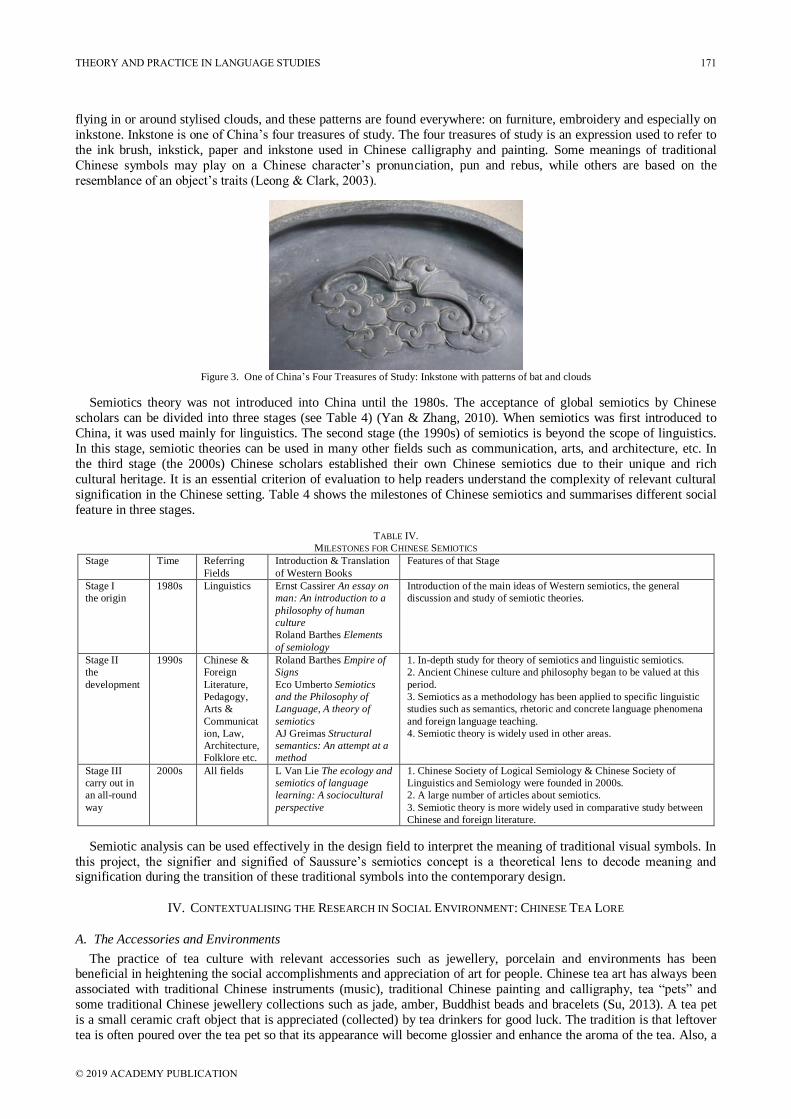
flying in or around stylised clouds, and these patterns are found everywhere: on furniture, embroidery and especially on
inkstone. Inkstone is one of China’s four treasures of study. The four treasures of study is an expression used to refer to
the ink brush, inkstick, paper and inkstone used in Chinese calligraphy and painting. Some meanings of traditional
Chinese symbols may play on a Chinese character’s pronunciation, pun and rebus, while others are based on the
resemblance of an object’s traits (Leong & Clark, 2003).
Figure 3. One of China’s Four Treasures of Study: Inkstone with patterns of bat and clouds
Semiotics theory was not introduced into China until the 1980s. The acceptance of global semiotics by Chinese
scholars can be divided into three stages (see Table 4) (Yan & Zhang, 2010). When semiotics was first introduced to
China, it was used mainly for linguistics. The second stage (the 1990s) of semiotics is beyond the scope of linguistics.
In this stage, semiotic theories can be used in many other fields such as communication, arts, and architecture, etc. In
the third stage (the 2000s) Chinese scholars established their own Chinese semiotics due to their unique and rich
cultural heritage. It is an essential criterion of evaluation to help readers understand the complexity of relevant cultural
signification in the Chinese setting. Table 4 shows the milestones of Chinese semiotics and summarises different social
feature in three stages.
TABLE IV.
MILESTONES FOR CHINESE SEMIOTICS
Stage Time Referring
Fields
Introduction & Translation
of Western Books
Features of that Stage
Stage I
the origin
1980s Linguistics Ernst Cassirer An essay on
man: An introduction to a
philosophy of human
culture
Roland Barthes Elements
of semiology
Introduction of the main ideas of Western semiotics, the general
discussion and study of semiotic theories.
Stage II
the
development
1990s Chinese &
Foreign
Literature,
Pedagogy,
Arts &
Communicat
ion, Law,
Architecture,
Folklore etc.
Roland Barthes Empire of
Signs
Eco Umberto Semiotics
and the Philosophy of
Language, A theory of
semiotics
AJ Greimas Structural
semantics: An attempt at a
method
1. In-depth study for theory of semiotics and linguistic semiotics.
2. Ancient Chinese culture and philosophy began to be valued at this
period.
3. Semiotics as a methodology has been applied to specific linguistic
studies such as semantics, rhetoric and concrete language phenomena
and foreign language teaching.
4. Semiotic theory is widely used in other areas.
Stage III
carry out in
an all-round
way
2000s All fields L Van Lie The ecology and
semiotics of language
learning: A sociocultural
perspective
1. Chinese Society of Logical Semiology & Chinese Society of
Linguistics and Semiology were founded in 2000s.
2. A large number of articles about semiotics.
3. Semiotic theory is more widely used in comparative study between
Chinese and foreign literature.
Semiotic analysis can be used effectively in the design field to interpret the meaning of traditional visual symbols. In
this project, the signifier and signified of Saussure’s semiotics concept is a theoretical lens to decode meaning and signification during the transition of these traditional symbols into the contemporary design.
IV. CONTEXTUALISING THE RESEARCH IN SOCIAL ENVIRONMENT: CHINESE TEA LORE
A. The Accessories and Environments
The practice of tea culture with relevant accessories such as jewellery, porcelain and environments has been beneficial in heightening the social accomplishments and appreciation of art for people. Chinese tea art has always been
associated with traditional Chinese instruments (music), traditional Chinese painting and calligraphy, tea “pets” and
some traditional Chinese jewellery collections such as jade, amber, Buddhist beads and bracelets (Su, 2013). A tea pet
is a small ceramic craft object that is appreciated (collected) by tea drinkers for good luck. The tradition is that leftover
tea is often poured over the tea pet so that its appearance will become glossier and enhance the aroma of the tea. Also, a
THEORY AND PRACTICE IN LANGUAGE STUDIES 171
© 2019 ACADEMY PUBLICATION

Chinese proverb is 茶以养性, 玉以修身 which means “tea can cultivate one’s moral character while jade can mould
one’s temperament”. That is why so much Chinese jewellery and porcelain is often placed on the shelves in a traditional teahouse. As a practice of daily life, Chinese tea tasting has an immensely close relationship with traditional Chinese
culture. It is believed that the art of tea drinking takes the spirit and wisdom of human beings to a higher orbit.
B. Bestselling Chinese Green Tea: West Lake Dragon Well (Xihulongjing)
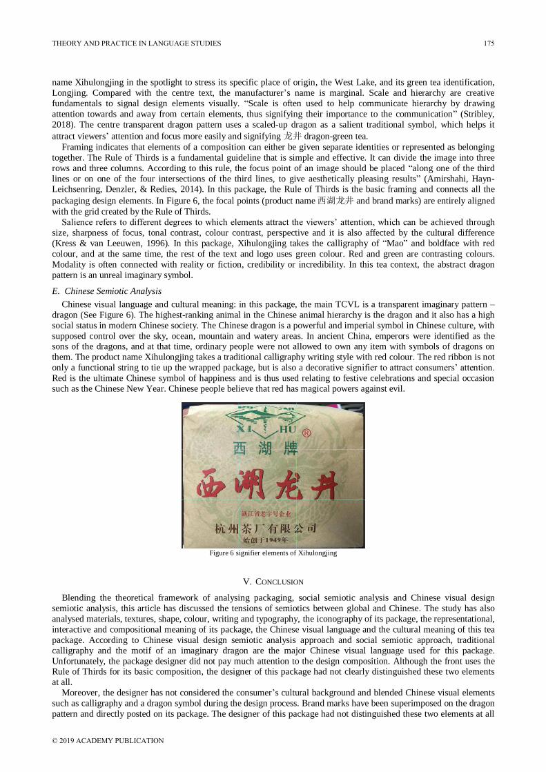
This Chinese tea package shown in Figure 4 is West Lake Dragon Well (Xihulongjing). It is the bestselling green tea from West Lake in Hangzhou, Zhejiang Province, China. The price of this 250-gram authentic Longjing tea is around
AU$40. It has a soft, lush, toasty, nutty aroma, and a full liquor straw colour tending towards amber, with a tea-oil
sheen. In its hand-wrapped craft-paper packaging with a bright ribbon belt, the whole tea package represents a
traditional Chinese gift for tea consumers. This visual artefact will be examined from four sides of its package, and it
will be discussed in three aspects: analysing packaging, social semiotic analysis of visual communication, and Chinese
semiotics based on the theoretical frameworks discussed in section II.
Figure 4. Signifier map of Xihulongjing
172 THEORY AND PRACTICE IN LANGUAGE STUDIES
© 2019 ACADEMY PUBLICATION
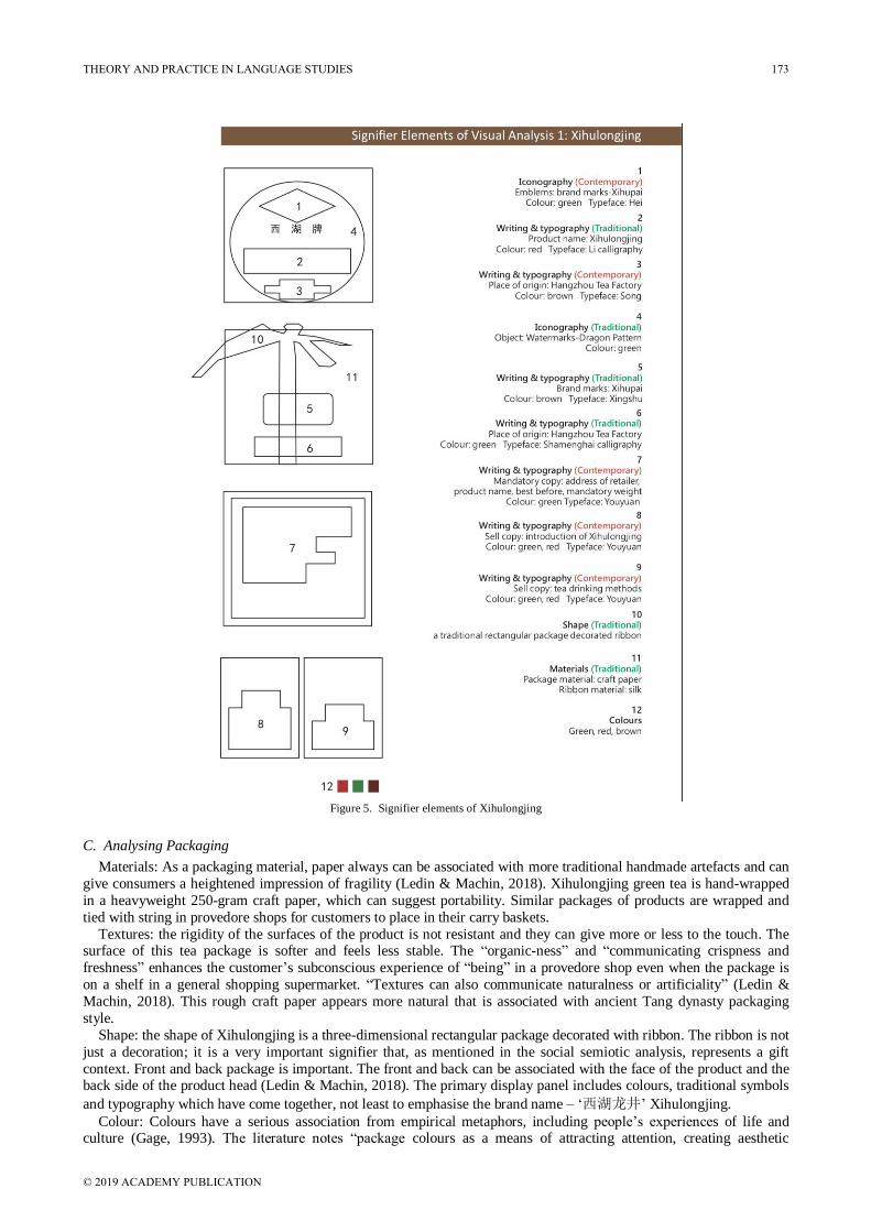
Figure 5. Signifier elements of Xihulongjing
C. Analysing Packaging
Materials: As a packaging material, paper always can be associated with more traditional handmade artefacts and can
give consumers a heightened impression of fragility (Ledin & Machin, 2018). Xihulongjing green tea is hand-wrapped
in a heavyweight 250-gram craft paper, which can suggest portability. Similar packages of products are wrapped and
tied with string in provedore shops for customers to place in their carry baskets.
Textures: the rigidity of the surfaces of the product is not resistant and they can give more or less to the touch. The surface of this tea package is softer and feels less stable. The “organic-ness” and “communicating crispness and
freshness” enhances the customer’s subconscious experience of “being” in a provedore shop even when the package is
on a shelf in a general shopping supermarket. “Textures can also communicate naturalness or artificiality” (Ledin &
Machin, 2018). This rough craft paper appears more natural that is associated with ancient Tang dynasty packaging
style.
Shape: the shape of Xihulongjing is a three-dimensional rectangular package decorated with ribbon. The ribbon is not
just a decoration; it is a very important signifier that, as mentioned in the social semiotic analysis, represents a gift
context. Front and back package is important. The front and back can be associated with the face of the product and the back side of the product head (Ledin & Machin, 2018). The primary display panel includes colours, traditional symbols
and typography which have come together, not least to emphasise the brand name – ‘西湖龙井’ Xihulongjing.
Colour: Colours have a serious association from empirical metaphors, including people’s experiences of life and culture (Gage, 1993). The literature notes “package colours as a means of attracting attention, creating aesthetic
THEORY AND PRACTICE IN LANGUAGE STUDIES 173
© 2019 ACADEMY PUBLICATION
experiences, and delivering communication” (Kauppinen-Räisänen & Luomala, 2010). The packaging colour of
Longjing tea represents light brown with a red ribbon that appeals to consumers’ attention. “For many cultures red is
both death and life – a beautiful and terrible paradox.” (Finlay, 2007). The red colour for this font of product name
Xihulongjing can be used on the front of the package to suggest power and give the product name. “Historically pure
colours have been associated with truth, order and simplicity” (Ledin & Machin, 2018). On this packaging, the brand
name (logo), callout and mandatory copy all use highly pure-green colour to communicate an organic and healthy
impression. Writing & typography: in this package, typography is a crucial part of the product. The product name “Xihulongjing”
uses traditional Chinese calligraphy and a bold font with weight, giving emphasis, given positive qualities in order to
sell. The text “Xihu” (in English “west lake”) brand is placed below the logo with smaller Hei theme font to help
customers be impressed with this brand. The Xihulongjing has two separated callouts with colours, to the left side about
the introduction of green tea – Xihulongjing – and to the right about tea drinking being recommended by tea makers. A
mandatory copy is copy enforced by law, which explains ingredients, producer and the obligatory address of the retailer
in the bottom side.
Iconography: Western packaging design relies on iconography to assist in communicating added meaning along with the product description. Such strategies of iconography include abstract design, icons and photography. In this
packaging design, a transparent imaginary animal – dragon pattern – is placed on the front side of this package as a kind
of object we find on a design. Its semiotic meaning is analysed in the next section.
D. Social Semiotic Analysis
1). Representational Meaning: representational meaning conveys the depiction of abstract or concrete participants
(Jewitt & Van Leeuwen, 2001). It divides the representations into two structures: the narrative structure and the
conceptual structure. The narrative structure involves ongoing actions or kinds of relation, in which vectors, either real
or imaginary, represent actors. Conceptual structures represent actors being something or meaning something, or
belonging to some category, or having certain characteristics. There are three kinds of conceptual structures:
classification structure, symbolic structure and analytical structure (Jewitt & Van Leeuwen, 2001).
According to Van Leeuwen and Jewitt’s definition, the packaging of Xihulongjing is a kind of conceptual structure,
and thus the following discussion focuses on the conceptual process. In the classification structure, the visual participants from the packaging of Xihulongjing are realised in an equal and symmetrical composition. The centre text
Xihulongjing is Chinese calligraphy and shade and positions between the left side and right-side callout are virtually
equal. Therefore, the participants of brand name, product name, logos and iconography are together used to represent
the whole appearance of the tea packaging of Xihulongjing.
In the analytical structure, participants are involved with each other regarding a part-whole structure, namely, the
carrier (the whole) and possessive attributes (the part). In this packaging, the product name Xihulongjing is the carrier,
which is the focus for the reader. The other components of this package are the possessive attributes. The brand name
Xihu with an icon and callout “since 1949” are used to stand for its distinguishing brand identity. Symbolic structures are implied for the identity or symbolic meaning of a participant. It consists of two kinds of
participants: one participant (acting as a carrier) is identified by another participant (symbolic attribute). In this package,
the brand name Xihu 西湖牌 directly uses the pattern of the West Lake Broken Bridge as a sign to provide an emphasis
on its product name Xihu – the West Lake. The imaginary totem-dragon pattern stands for the Chinese character 龙dragon, where it comes from its product name Xihulongjing. Traditional Chinese calligraphy combined with Chinese Pinyin Xihu also shows that this product aims to secure recognition and popularity among the local Chinese people.
2). Interactive Meaning: images or objects can build particular relations between the world inside the picture frame or
objects themselves and the viewers. Three key factors are involved in the realisation of interactive meaning: distance,
contact and point of view. “In everyday interaction, the norms of social relations determine the distance we keep from
each other” (Jewitt & Van Leeuwen, 2001). Images can keep things, places and people close to the viewer at arm’s
length. These require perception and experience from consumers. In this context, when consumers across the store at a
distance see the bright red ribbon tied around the package, this package may bring the consumers closer to it. In other
words, it is also a design strategy used to bring this product to consumers. The analysis of the tea packaging is focused on the ribbon and craft paper. The wrapping with craft paper and tying up with red ribbon can establish a contact with
viewers’ consciousness. Consumers may consider this tea package as a gift while they open it and it establishes a
relationship with viewers closer to nature.
3). Compositional Meaning: compositional meaning refers to “the way in which the representational and interactive
elements are made to relate to each other and the way they are integrated into a meaningful whole” (Kress & Van
Leeuwen, 1996). Compositional meaning includes three sources: informative value; framing; and salience and modality.
Informative value is achieved through the placement of elements of a composition. The left-right arrangement is a
‘given-new’ information structure. The top-bottom structure embodies ‘ideal-real’ information. The centre-margin composition provides ‘important-less’ information (Kress & Van Leeuwen, 1996). In this package, the brand name is
put at the top of the front side while the tea manufacturer’s name is placed at the bottom, indicating that the brand name
Xihu is ideal and salient while the manufacturer’s name is more real and less salient. It is reasonable to place its product
174 THEORY AND PRACTICE IN LANGUAGE STUDIES
© 2019 ACADEMY PUBLICATION
name Xihulongjing in the spotlight to stress its specific place of origin, the West Lake, and its green tea identification,
Longjing. Compared with the centre text, the manufacturer’s name is marginal. Scale and hierarchy are creative
fundamentals to signal design elements visually. “Scale is often used to help communicate hierarchy by drawing
attention towards and away from certain elements, thus signifying their importance to the communication” (Stribley,
2018). The centre transparent dragon pattern uses a scaled-up dragon as a salient traditional symbol, which helps it
attract viewers’ attention and focus more easily and signifying 龙井 dragon-green tea.
Framing indicates that elements of a composition can either be given separate identities or represented as belonging
together. The Rule of Thirds is a fundamental guideline that is simple and effective. It can divide the image into three
rows and three columns. According to this rule, the focus point of an image should be placed “along one of the third
lines or on one of the four intersections of the third lines, to give aesthetically pleasing results” (Amirshahi, Hayn-Leichsenring, Denzler, & Redies, 2014). In this package, the Rule of Thirds is the basic framing and connects all the
packaging design elements. In Figure 6, the focal points (product name西湖龙井 and brand marks) are entirely aligned
with the grid created by the Rule of Thirds.
Salience refers to different degrees to which elements attract the viewers’ attention, which can be achieved through
size, sharpness of focus, tonal contrast, colour contrast, perspective and it is also affected by the cultural difference
(Kress & van Leeuwen, 1996). In this package, Xihulongjing takes the calligraphy of “Mao” and boldface with red
colour, and at the same time, the rest of the text and logo uses green colour. Red and green are contrasting colours.
Modality is often connected with reality or fiction, credibility or incredibility. In this tea context, the abstract dragon
pattern is an unreal imaginary symbol.
E. Chinese Semiotic Analysis
Chinese visual language and cultural meaning: in this package, the main TCVL is a transparent imaginary pattern –
dragon (See Figure 6). The highest-ranking animal in the Chinese animal hierarchy is the dragon and it also has a high
social status in modern Chinese society. The Chinese dragon is a powerful and imperial symbol in Chinese culture, with
supposed control over the sky, ocean, mountain and watery areas. In ancient China, emperors were identified as the sons of the dragons, and at that time, ordinary people were not allowed to own any item with symbols of dragons on
them. The product name Xihulongjing takes a traditional calligraphy writing style with red colour. The red ribbon is not
only a functional string to tie up the wrapped package, but is also a decorative signifier to attract consumers’ attention.
Red is the ultimate Chinese symbol of happiness and is thus used relating to festive celebrations and special occasion
such as the Chinese New Year. Chinese people believe that red has magical powers against evil.
Figure 6 signifier elements of Xihulongjing
V. CONCLUSION
Blending the theoretical framework of analysing packaging, social semiotic analysis and Chinese visual design
semiotic analysis, this article has discussed the tensions of semiotics between global and Chinese. The study has also
analysed materials, textures, shape, colour, writing and typography, the iconography of its package, the representational,
interactive and compositional meaning of its package, the Chinese visual language and the cultural meaning of this tea
package. According to Chinese visual design semiotic analysis approach and social semiotic approach, traditional
calligraphy and the motif of an imaginary dragon are the major Chinese visual language used for this package.
Unfortunately, the package designer did not pay much attention to the design composition. Although the front uses the Rule of Thirds for its basic composition, the designer of this package had not clearly distinguished these two elements
at all.
Moreover, the designer has not considered the consumer’s cultural background and blended Chinese visual elements
such as calligraphy and a dragon symbol during the design process. Brand marks have been superimposed on the dragon
pattern and directly posted on its package. The designer of this package had not distinguished these two elements at all
THEORY AND PRACTICE IN LANGUAGE STUDIES 175
© 2019 ACADEMY PUBLICATION
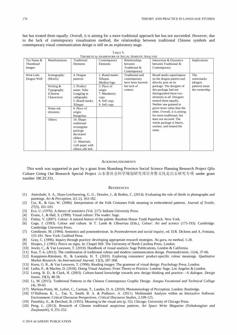
but has treated them equally. Overall, it is aiming for a more traditional approach but has not succeeded. However, due
to the lack of contemporary visualisation method, the relationship between traditional Chinese symbols and
contemporary visual communication design is still on an exploratory stage.
TABLE V.
THEORETICAL FRAMEWORK OF SOCIAL SEMIOTIC ANALYSIS
Tea Name &
Thumbnail
Images
Manifestations Traditional
Elements
Contemporary
Elements
Relationships
between
Traditional &
Contemporary
Interaction & Dynamics
between Traditional &
Contemporary
Implications
West Lake
Dragon Well
Iconography:
(Motifs)
4. Dragon
patterns
1. Brand marks
Xihupai.
Modern logo
Traditional and
contemporary
have been layered,
but lack of
contact.
Brand marks superimpose
on the dragon pattern and
directly post on its
package. The designer of
this package had not
distinguished these two
elements at all. Designer
treated them equally.
Neither one granted or
given more value than the
other. Overall, it is aiming
for more traditional, but
does not succeed. The
whole package is blurry,
unclear, and treated the
same.
The
watermarks
(dragon
pattern) mean
the ownership. Writing &
Typography
(Chinese
Characters)
2. Product
name: Xihu
Longjing in
calligraphy
5. Brand marks:
Xihupai
3. Place of
origin
7. Mandatory
copy
8. Sell copy
9. Sell copy
Water-ink
elements:
6. Place of
origin:
Hangzhou
Others: 10. Shape:
traditional
rectangular
package
decorated
ribbon
11. Materials:
craft paper with
ribbon silk belt
ACKNOWLEDGMENTS
This work was supported in part by a grant from Shandong Province Social Science Planning Research Project Qilu
Culture Going Out Research Special Project 山东省社会科学规划研究项目齐鲁文化走出去研究专项 under grant
number 18CZCJ31.
REFERENCES
[1] Amirshahi, S. A., Hayn-Leichsenring, G. U., Denzler, J., & Redies, C. (2014). Evaluating the rule of thirds in photographs and paintings. Art & Perception, 2(1-2), 163-182.
[2] Cui, R., & Gao, W. (2006). Interpretation of the Folk Costumes Folk meaning in embroidered patterns. Journal of Textile, 27(5), 101-103.
[3] Eco, U. (1976). A theory of semiotics (Vol. 217): Indiana University Press. [4] Evans, J., & Hall, S. (1999). Visual culture: The reader: Sage. [5] Finlay, V. (2007). Colour: A natural history of the palette: Random House Trade Paperback. New York. [6] Gage, J. (1993). Colour and culture. In T. Lamb & J.Bourriau (Eds.), Colour: Art and science (175-193). Cambridge:
Cambridge University Press. [7] Gottdiener, M. (1994). Semiotics and postmodernism. In Postmodernism and social inquiry, ed. D.R. Dickens and A. Fontana,
155-181. New York: Guilford Press. [8] Gray, C. (1996). Inquiry through practice: developing appropriate research strategies. No guru, no method, 1-28. [9] Hoopes, J. (1991). Peirce on signs. In: Chapel Hill: The University of North Carolina Press, London. [10] Jewitt, C., & Van Leeuwen, T. (2010). Handbook of visual analysis: Sage Publications, London & California. [11] Kan, T.-k. (2012). The combination of traditional culture and modern communication design. Postmodernism, 11(4), 37-66. [12] Kauppinen-Räisänen, H., & Luomala, H. T. (2010). Exploring consumers' product-specific colour meanings. Qualitative
Market Research: An International Journal, 13(3), 287-308. [13] Kress, G. R., & Van Leeuwen, T. (1996). Reading images: The grammar of visual design: Psychology Press, London. [14] Ledin, P., & Machin, D. (2018). Doing Visual Analysis: From Theory to Practice: London: Sage, Los Angeles & London.
[15] Leong, B. D., & Clark, H. (2003). Culture-based knowledge towards new design thinking and practice—A dialogue. Design Issues, 19(3), 48-58.
[16] Li, M. (2015). Traditional Patterns in the Chinese Contemporary Graphic Design. Jiangsu Vocational and Technical College (4), 39-43.
[17] Merleau-Ponty, M., Lefort, C., Carman, T., Landes, D. A. (2010). Phenomenology of Perception. London: Routledge. [18] O’Halloran, K. L., Tan, S., Smith, B. A. & Podlasov, A. (2011). Multimodal Analysis within an Interactive Software
Environment: Critical Discourse Perspectives. Critical Discourse Studies, 2,109-125. [19] Panofsky, E., & Drechsel, B. (1955). Meaning in the visual arts (p. 55). Chicago: University of Chicago Press. [20] Peng, L. (2013). Research of Chinese traditional auspicious patterns. Art Space Write Magazine (Yishukongjian and
Zuojiazazhi), 9, 251-252.
176 THEORY AND PRACTICE IN LANGUAGE STUDIES
© 2019 ACADEMY PUBLICATION
[21] Ren, L. (2013). Traditional Chinese Visual Design Elements. Arizona State University. [22] Smith, L. (2006). Uses of heritage: Routledge, London.
[23] Stribley, M. (2018). Ten rules of composition all designers live by. Retrieved from https://www.canva.com/learn/visual-design-composition/ (accessed 23/09/2018).
[24] Su, X. (2013). Tea Culture in China. Learning Theories (24), 219-220. [25] Traditional Chinese Graphic Elements for Modern Graphic Design. Art Research: Harbin Normal University Art College (2),
134-135. [26] Welch, P. (2013). Chinese art: A guide to motifs and visual imagery, Tuttle Publishing. [27] Yan, Z., & Zhang, J. (2010). Western Semiotic Theories in China. Foreign Language Research, 6, 36-43. [28] Zhang, Y., Liu, M., & Liang, S. (2015). Research on the Development Trend of Green Packaging Design. Journal of Quick
Reading (6), 78-83. [29] Zhou, J. (2006). Application of traditional elements for modern packaging design. Journal of Suzhou University (5), 74-75.
Bin Hu was born in Jinan, China in 1984. He received his Master of Digital Design from Griffith University, Queensland College of Arts. He is a PhD candidate at the Creative Industries Faculty, Queensland University of Technology, Brisbane, Australia. He is currently a senior lecturer and director of interactive Design Department, School of Arts, University of Jinan. His research interests mainly focus on visualisation of traditional symbols, Chinese cultural study, semiotics and visual communication design.
Oksana Zelenko presently holds the role of Director, Research Engagement and Impact, with Queensland University of Technology’s Creative Industries Faculty. She is a PhD supervisor and was previously discipline leader heading up several design areas, including Industrial Design, Interaction Design, Visual Communication and Fashion at the QUT School of Design. Dr Zelenko is a design academic and researcher specialising in applications of participatory design for eHealth. Her area of expertise is in interaction and visual design for e-health applications with a specific focus on using participatory and co-design methods for design, development and evaluation of interactive health-promoting technologies promoting youth mental health and wellbeing.
Vaughn Pinxit is a lecturer in interaction design in the School of Design at the Creative Industries Faculty, Queensland University of Technology. Dr Pinxit recently qualified as a fellow of the internationally recognised Higher Education Academy (FHEA, UK), through completion of the Graduate Certificate in Academic Practice (QUT). His approach and philosophy to teaching and academic practice aligns with a connectivist (connected learning) approach, supported with a core leadership philosophy value that aims to be an inspiring leader that is encouraging and innovates future learning opportunities.
Laurie Buys is Theme Leader of Queensland University of Technology’s (QUT) Institute for Future Environment’s (IFE) Infrastructure for Sustainable Communities Theme and Professor in the School of Design in the Creative Industries Faculty. She is also the Director of Senior Living Innovation – an industry research collaboration whose aim is to optimise the lifestyles of future seniors by identifying innovative approaches to designing for future housing, products and services.
THEORY AND PRACTICE IN LANGUAGE STUDIES 177
© 2019 ACADEMY PUBLICATION