Embed Size (px)
Citation preview
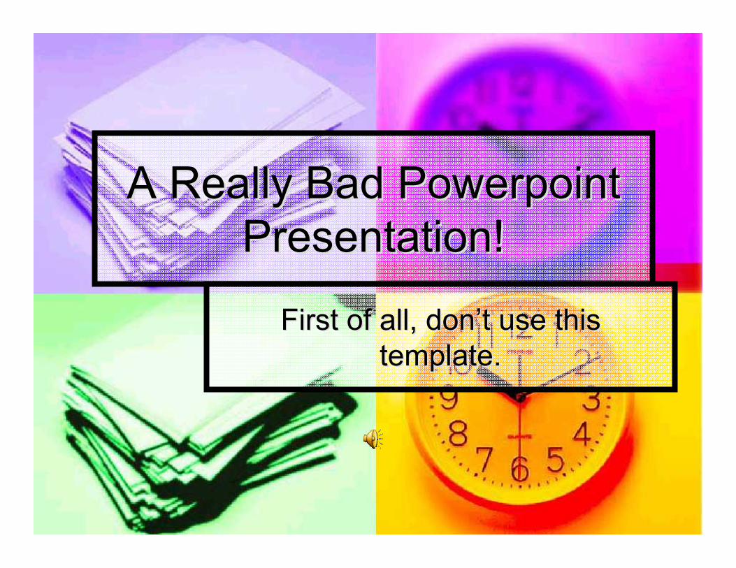
A Really Bad A Really Bad PowerpointPowerpointPresentation!Presentation!
First of all, donFirst of all, don’’t use thist use thistemplate.template.
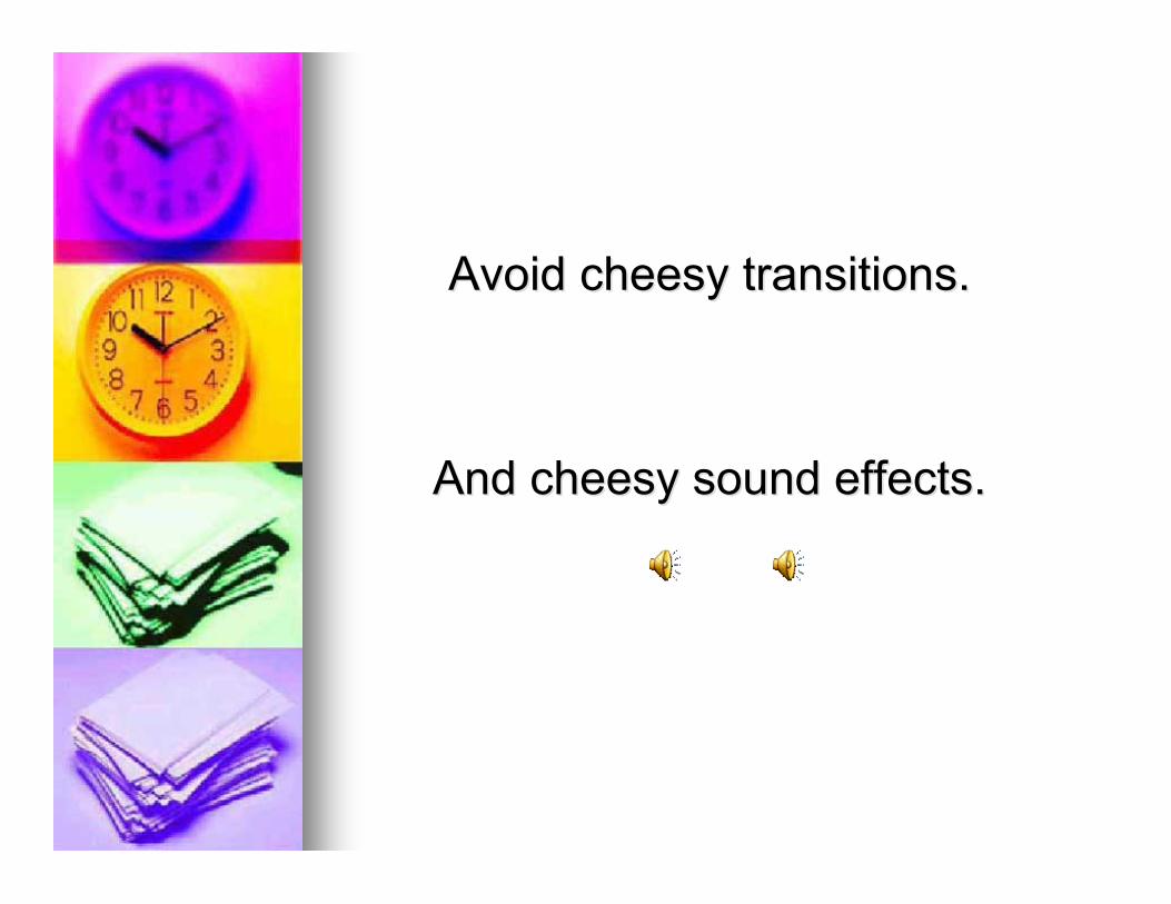
Avoid cheesy transitions.Avoid cheesy transitions.
And cheesy sound effects.And cheesy sound effects.
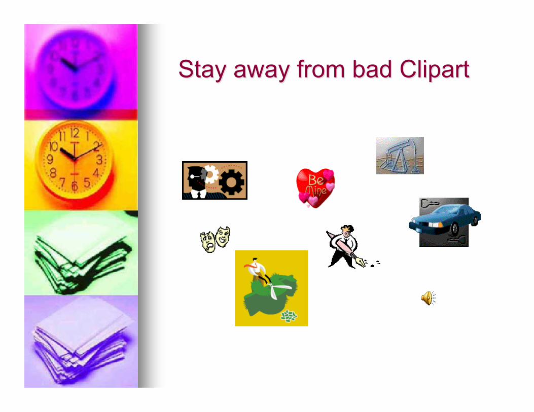
Stay away from bad ClipartStay away from bad Clipart
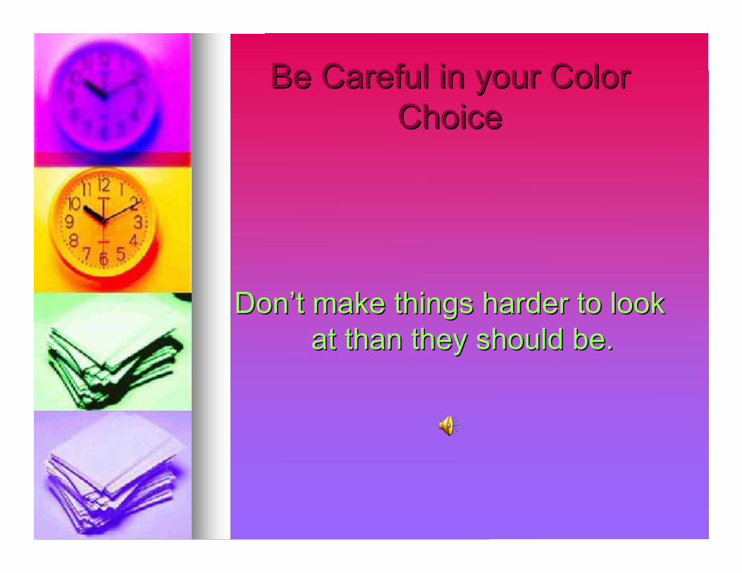
Be Careful in your ColorBe Careful in your ColorChoiceChoice
DonDon’’t make things harder to lookt make things harder to lookat than they should be.at than they should be.
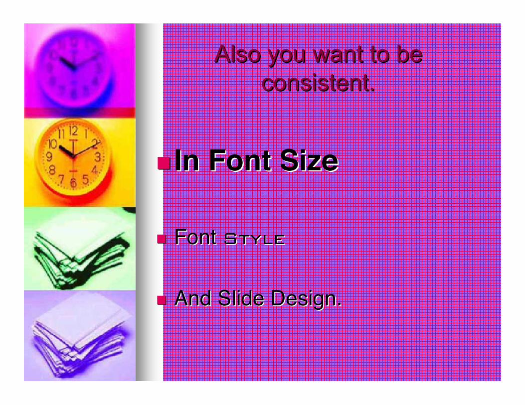
Also you want to beAlso you want to beconsistent.consistent.
In Font SizeIn Font Size
Font Font StyleStyle
And Slide Design.And Slide Design.
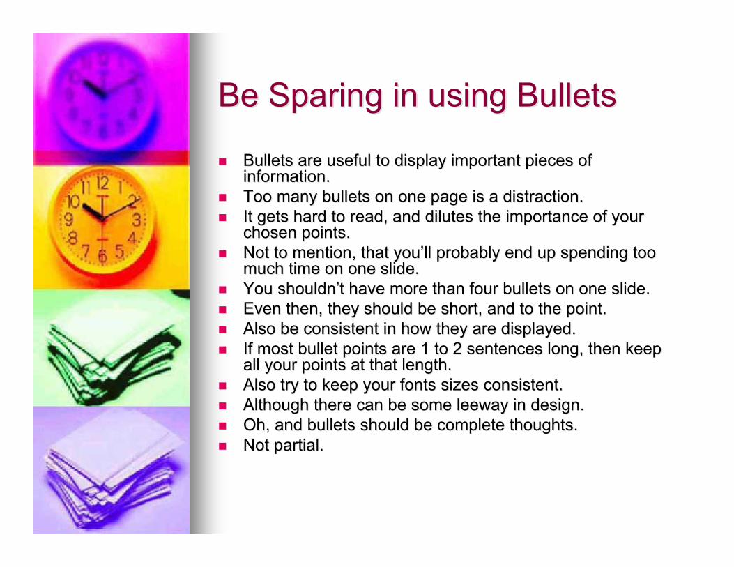
Be Sparing in using BulletsBe Sparing in using Bullets
Bullets are useful to display important pieces ofBullets are useful to display important pieces ofinformation.information.
Too many bullets on one page is a distraction.Too many bullets on one page is a distraction. It gets hard to read, and dilutes the importance of yourIt gets hard to read, and dilutes the importance of your
chosen points.chosen points. Not to mention, that youNot to mention, that you’’ll probably end up spending tooll probably end up spending too
much time on one slide.much time on one slide. You shouldnYou shouldn’’t have more than four bullets on one slide.t have more than four bullets on one slide. Even then, they should be short, and to the point.Even then, they should be short, and to the point. Also be consistent in how they are displayed.Also be consistent in how they are displayed. If most bullet points are 1 to 2 sentences long, then keepIf most bullet points are 1 to 2 sentences long, then keep
all your points at that length.all your points at that length. Also try to keep your fonts sizes consistent.Also try to keep your fonts sizes consistent. Although there can be some leeway in design.Although there can be some leeway in design. Oh, and bullets should be complete thoughts.Oh, and bullets should be complete thoughts. Not partial.Not partial.
Avoid large blocks of textAvoid large blocks of text
The reason you want to avoid large blocks ofThe reason you want to avoid large blocks oftext is because you want to engage yourtext is because you want to engage youraudience, not have them sit back andaudience, not have them sit back andsimply read your presentation. Of course,simply read your presentation. Of course,even simply reading the presentation caneven simply reading the presentation canbe a chore when you have a largebe a chore when you have a largeselection of unbroken text displayed up onselection of unbroken text displayed up onthe screen. You might be able to get awaythe screen. You might be able to get awaywith having a large quote in yourwith having a large quote in yourpresentation, but only if it is VERY relevantpresentation, but only if it is VERY relevantto your material and you display it in a veryto your material and you display it in a veryreadable and aesthetically pleasing way.readable and aesthetically pleasing way.Even then, it probably wonEven then, it probably won’’t work all thatt work all thatwell.well.
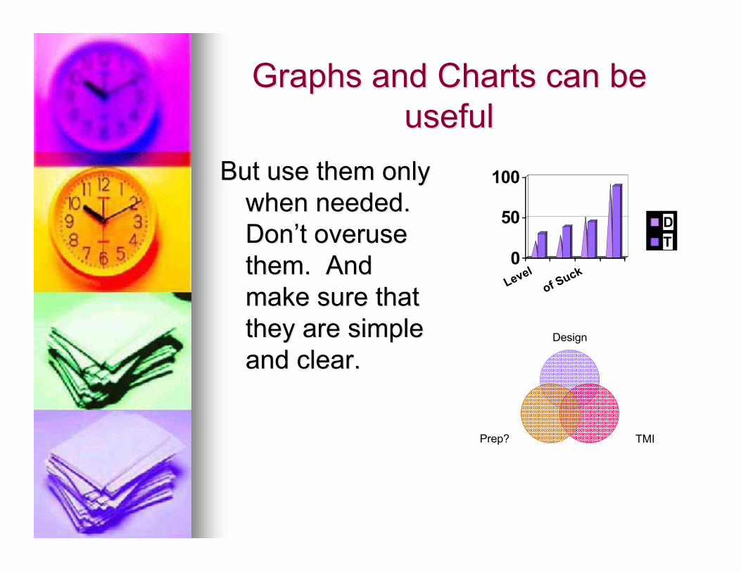
Graphs and Charts can beGraphs and Charts can beusefuluseful
But use them onlyBut use them onlywhen needed.when needed.DonDon’’t overuset overusethem. Andthem. Andmake sure thatmake sure thatthey are simplethey are simpleand clear.and clear.
0
50
100
Levelof Suck
DT
Design
TMIPrep?
Custom Animations can beCustom Animations can beHelpfulHelpful
But make sure they have aBut make sure they have apurpose.purpose.
FinallyFinally……
Be aware that it is the presenterBe aware that it is the presenterthat makes or breaks thethat makes or breaks thepresentation.presentation.
NOT JUST THE SLIDES!!!NOT JUST THE SLIDES!!!