Embed Size (px)
Citation preview
A pixel is nota pixelPeter-Paul Koch
http://quirksmode.orghttp://twitter.com/ppk
MoBeers, 10 April 2012

Example site• http://mobilism.nl/2012/
• A proper responsive site that you can use on any device
• However, for most of the presentation I’m going to pretend it’s not mobile-optimised

What we’ll discuss• Three kinds of pixels
• Two viewports
• Two kinds of zooming
• Five JavaScript property pairs
• Two media queries
• One meta viewport to rule them all

Pixels

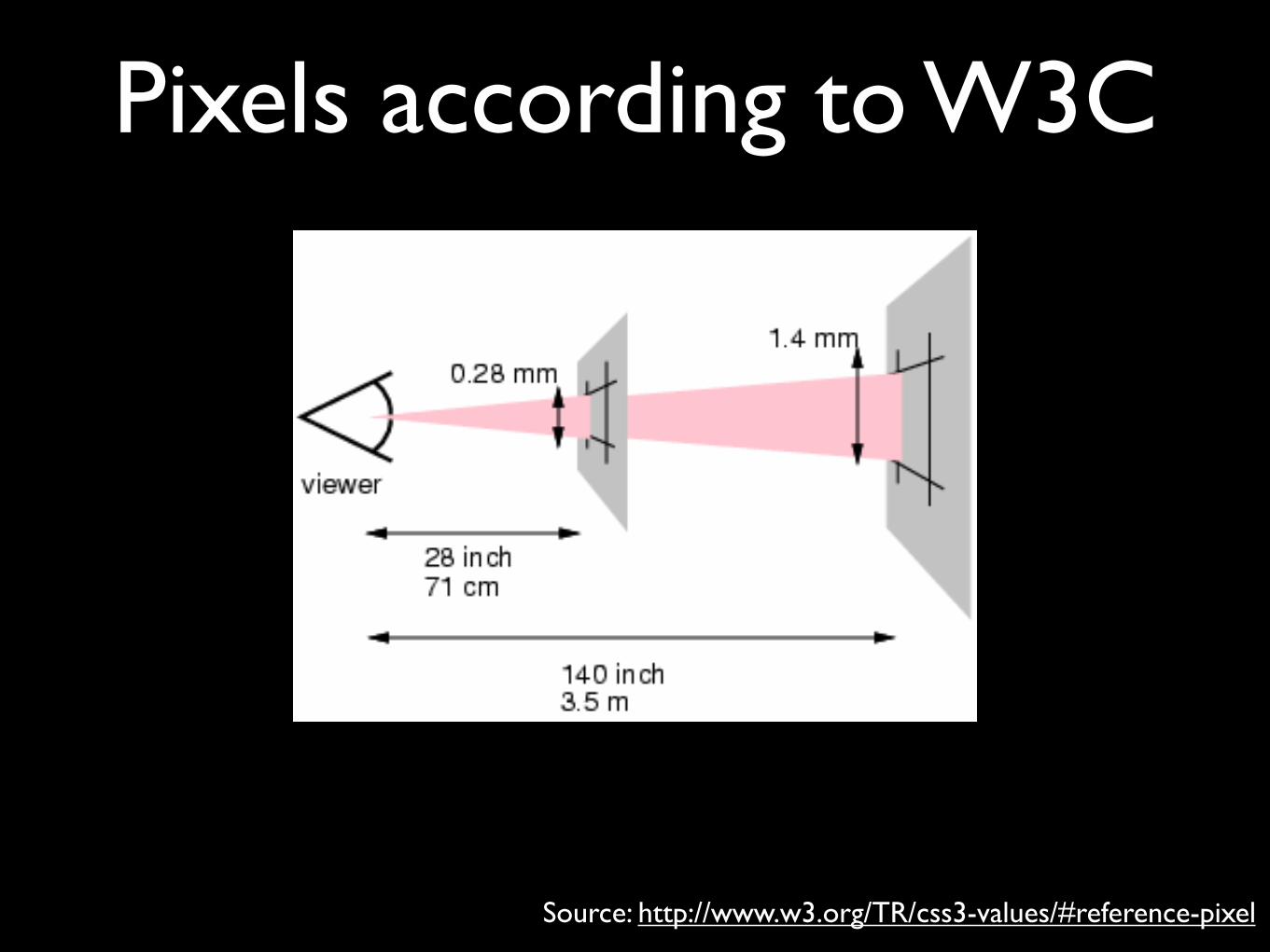
Pixels according to W3C“The reference pixel is the visual angle of one pixel on a device with a pixel density of 96dpi and a distance from the reader of an arm's length. For a nominal arm's length of 28 inches, the visual angle is therefore about 0.0213 degrees. For reading at arm's length, 1px thus corresponds to about 0.26 mm (1/96 inch).”
Source: http://www.w3.org/TR/css3-values/#reference-pixel
Pixels according to W3C
Source: http://www.w3.org/TR/css3-values/#reference-pixel

This is a monkey
Laughing at W3C
Pixels according to W3C

Pixels according to W3C• So the pixel is a certain angle in your view
• which means you cannot zoom it
• An inch is defined as 96 pixels
• and it gets progressively worse from there

Pixels according to W3C• You can’t use min-height: 6mm and be
certain that your element is at least 6 real mm high
• Zooming is not mentioned at all
• W3C’s definition is useless and everybody ignores it
• Especially mobile browsers

A pixel is not a pixel• CSS pixels
• Density-independent pixels
• Device pixels
None of these have anything to do with W3C’s definition.
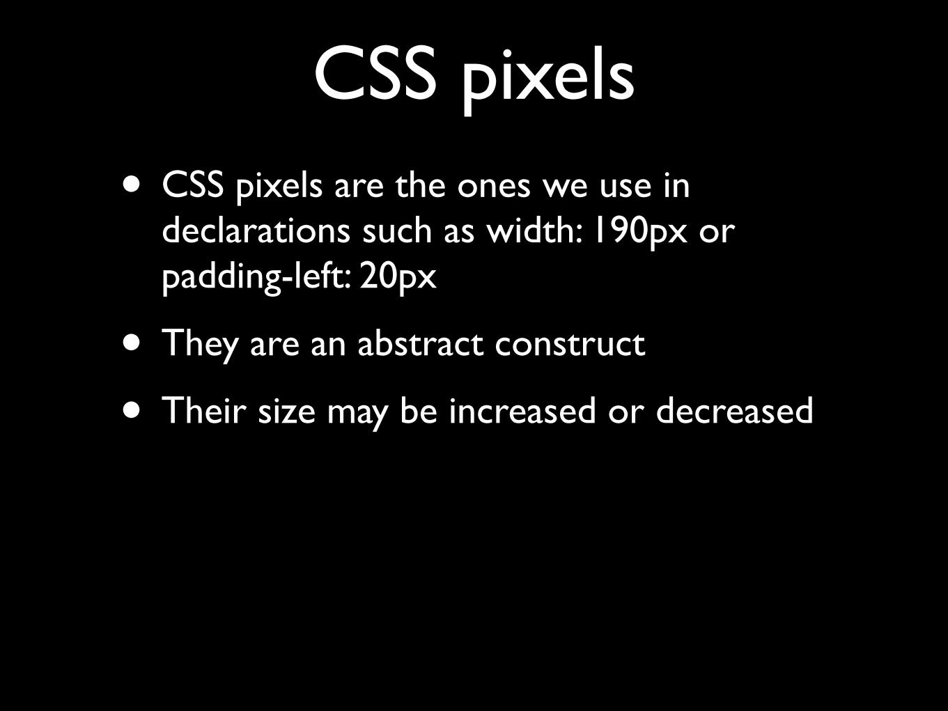
CSS pixels• CSS pixels are the ones we use in
declarations such as width: 190px or padding-left: 20px
• They are an abstract construct
• Their size may be increased or decreased


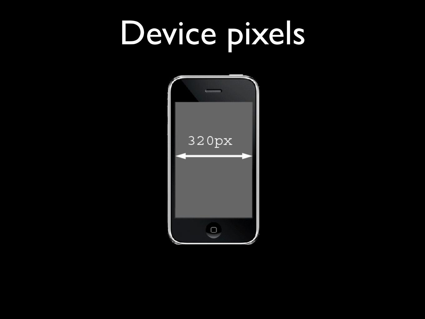
Device pixels• Device pixels are the physical pixels on the
device
• There’s a fixed amount of them that depends on the device
Device pixels
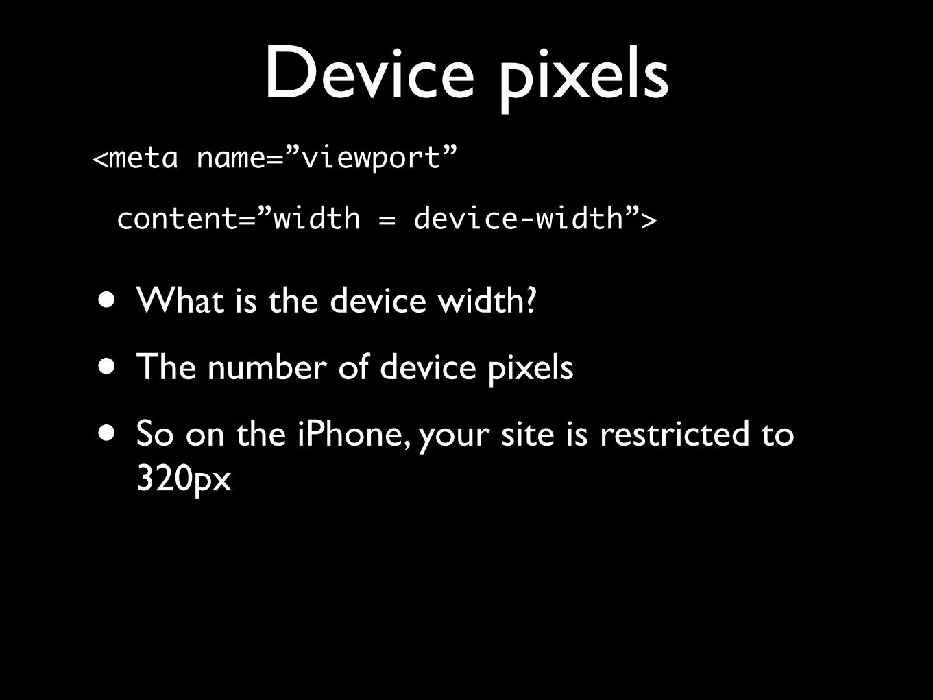
Device pixels<meta name=”viewport”
content=”width = device-width”>
• What is the device width?
• The number of device pixels
• So on the iPhone, your site is restricted to 320px
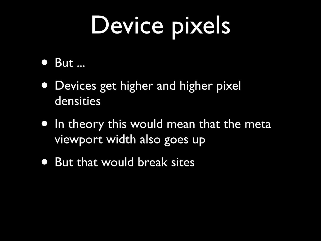
Device pixels• But ...
• Devices get higher and higher pixel densities
• In theory this would mean that the meta viewport width also goes up
• But that would break sites
Device pixels

Density-independent pixels

• Thus device vendors created density-independent pixels (dips)
• They are another abstraction layer
• The number of dips is equal to the number of CSS pixels that is optimal for viewing a website on the device at 100% zoom
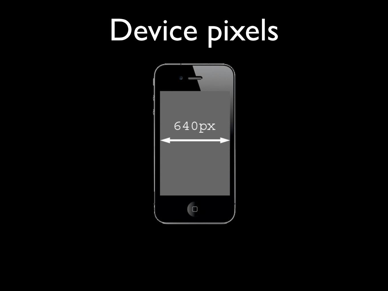
• For the iPhone that’s 320px
Density-independent pixels
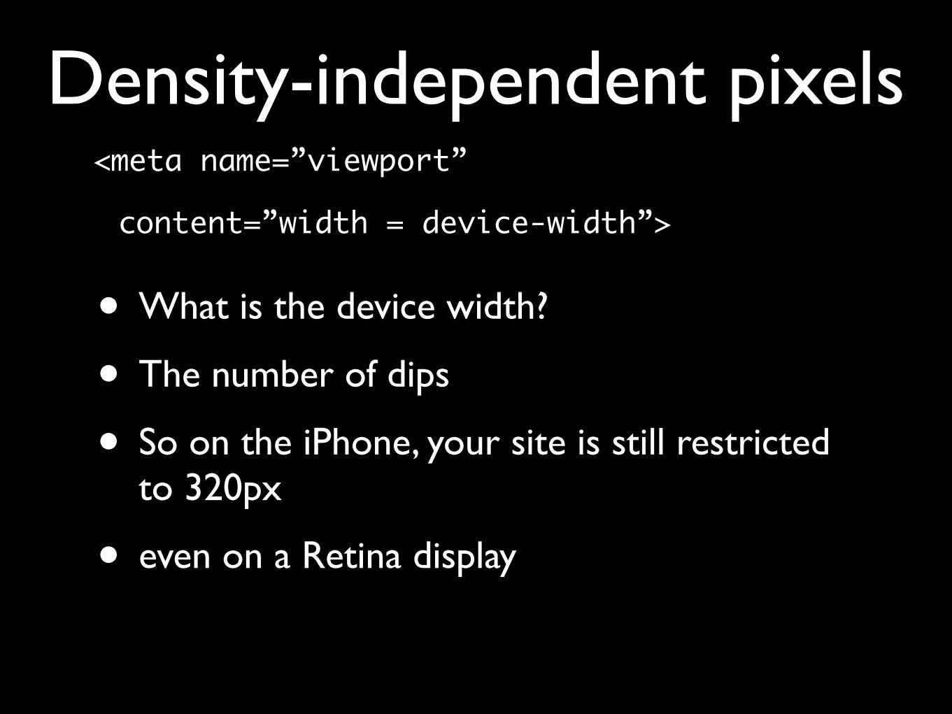
<meta name=”viewport”
content=”width = device-width”>
• What is the device width?
• The number of dips
• So on the iPhone, your site is still restricted to 320px
• even on a Retina display
Density-independent pixels
• CSS pixels
• Density-independent pixels
• Device pixels
What do we need?
What do we need?• CSS pixels
• Density-independent pixels
• Device pixels

Viewports
Viewports• The viewport is the total amount of space
available for CSS layouts
• On the desktop it’s equal to the browser window
• The <html> element has an implicit width: 100% and spans the entire viewport


Viewports• On mobile it’s quite a bit more complicated
• If the (narrow) browser window were to be the viewport, many sites would be squeezed to death
• And mobile browsers must render all sites correctly, even if they haven’t been mobile-optimized

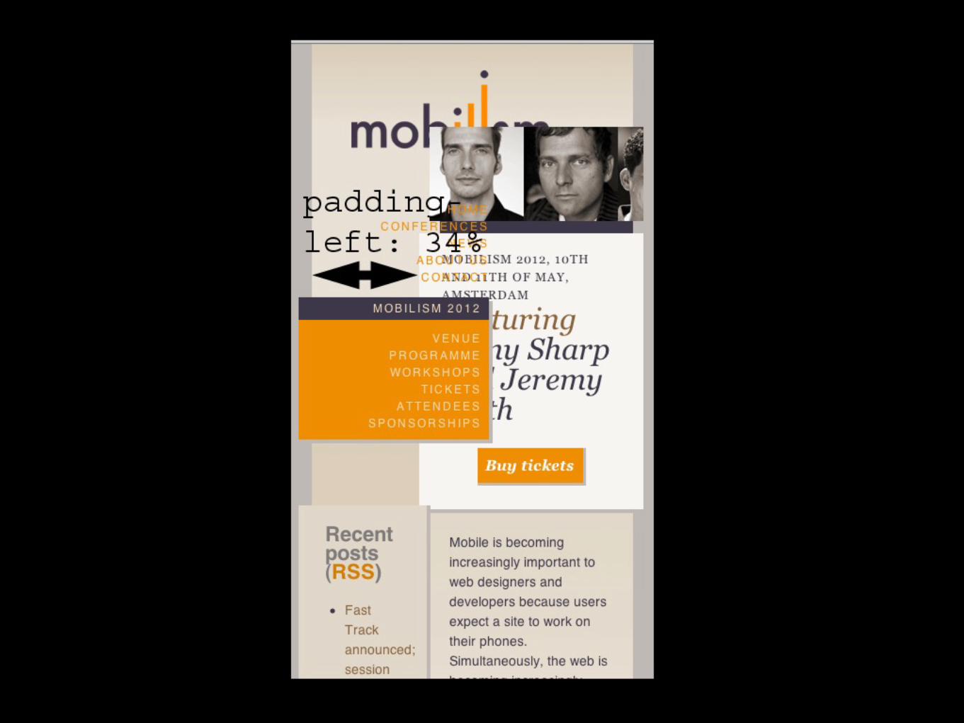
Viewports• That’s why the mobile browser vendors
have split the viewport into two:
• The layout viewport, the viewport that CSS declarations such as padding-left: 34% use,


Viewports• That’s why the mobile browser vendors
have split the viewport into two:
• The layout viewport, the viewport that CSS declarations such as padding-left: 34% use,
• and the visual viewport, which is the part of the page the user is currently seeing
• Both are measured in CSS pixels


Viewports• Initially most browsers make the visual
viewport equal to the layout viewport
• by zooming the page out as much as possible

Viewports• Initially most browsers make the visual
viewport equal to the layout viewport
• by zooming the page out as much as possible
• Although the page is unreadable, the user can at least decide which part he’d like to concentrate on and zoom in on that part

Zooming
Zooming• On the desktop the viewport becomes less
wide and the CSS pixels become larger.
• The same amount of device pixels now contains less CSS pixels, after all.
• So padding-left: 34% is recalculated,
• and width: 190px now covers more device pixels


Zooming• On mobile the visual viewport becomes
less wide, but the layout viewport remains static. Thus CSS declarations are not re-computed.
• The visual viewport now contains less CSS pixels.
• The user sees less of the complete site.


JavaScript properties

screen.width and screen.height
• The width and height of the screen
• In device pixels (or dips)
• Totally useless. Don’t bother reading it out
JavaScript properties
document.documentElement.clientWidth and document.documentElement.clientHeight
• The width and height of the layout viewport
• In CSS pixels
• Useful, though mostly because of media queries
JavaScript properties
window.innerWidth and window.innerHeight
• The width and height of the visual viewport
• In CSS pixels
• Extremely important. It tells you how much the user is currently seeing
JavaScript properties
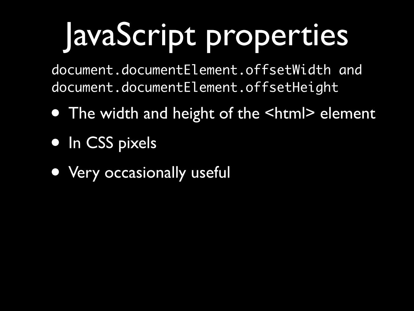
document.documentElement.offsetWidth and document.documentElement.offsetHeight
• The width and height of the <html> element
• In CSS pixels
• Very occasionally useful
JavaScript properties
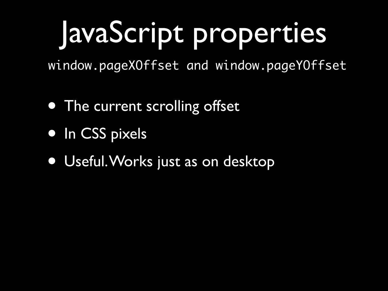
window.pageXOffset and window.pageYOffset
• The current scrolling offset
• In CSS pixels
• Useful. Works just as on desktop
JavaScript properties

• System pioneered by Nokia and BlackBerry
• Picked up by Apple
• Android supports it only from 3 on
• IE9 on Windows Phone does not support it
• But otherwise browser compatibility is quite decent
JavaScript properties
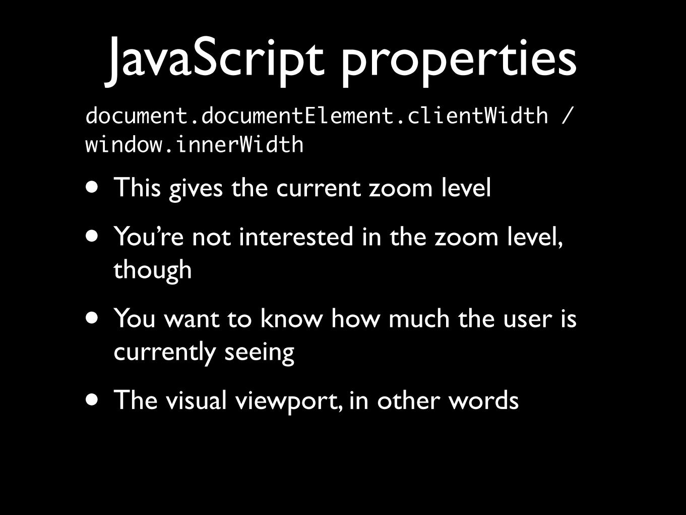
document.documentElement.clientWidth / window.innerWidth
• This gives the current zoom level
• You’re not interested in the zoom level, though
• You want to know how much the user is currently seeing
• The visual viewport, in other words
JavaScript properties

Media queries
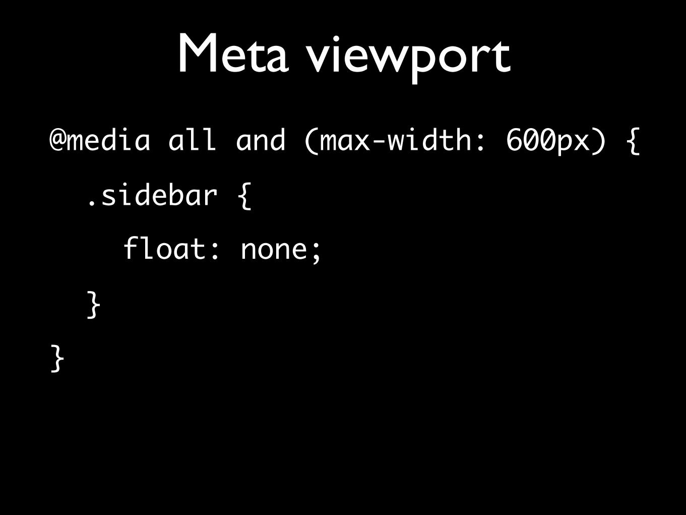
Meta viewport@media all and (max-width: 600px) {
.sidebar {float: none;
}}

Media queries• There are two important media queries:
• width (min-width and max-width)
• device-width (min-device-width and max-device-width)
• width is the one you want
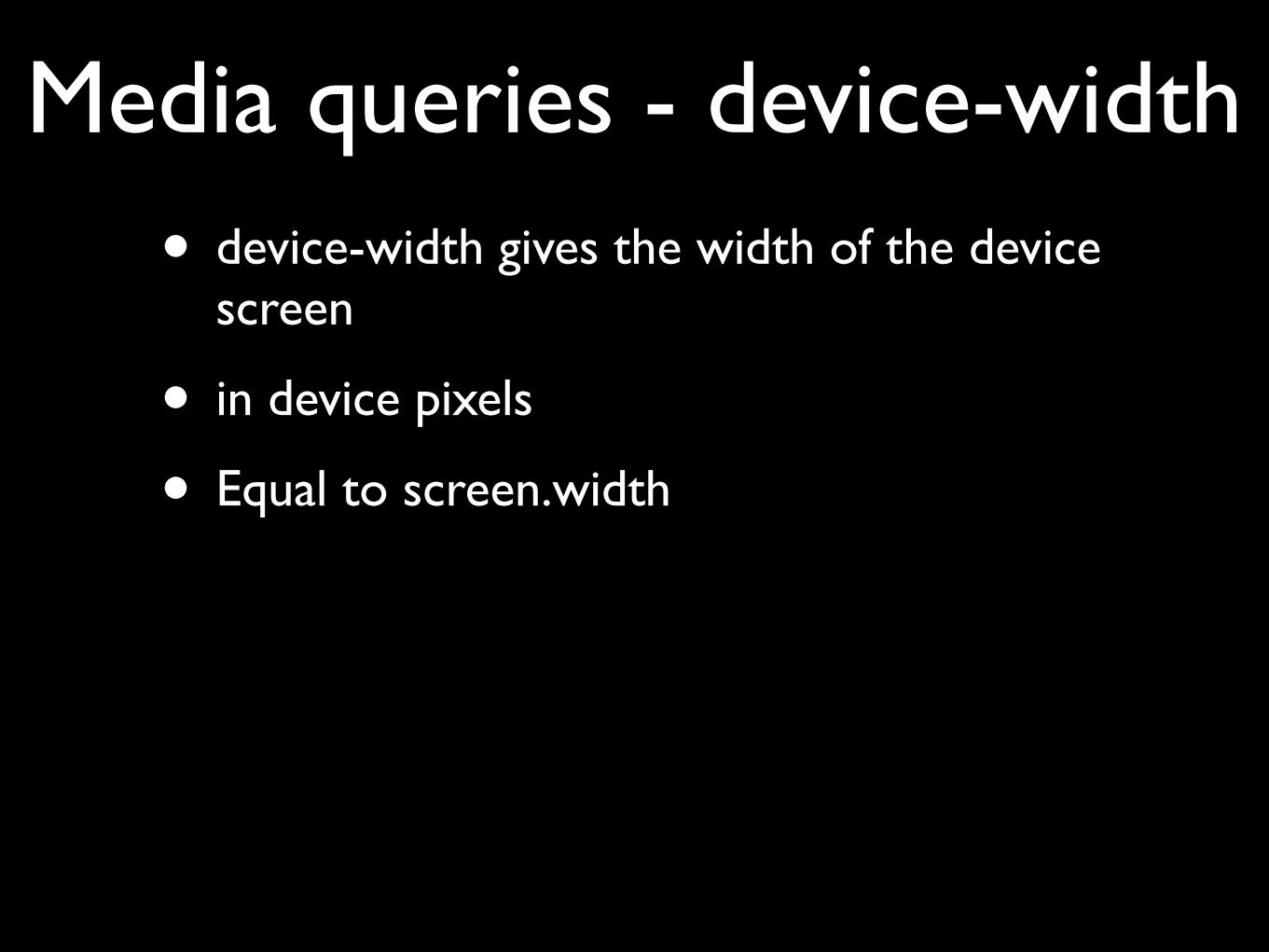
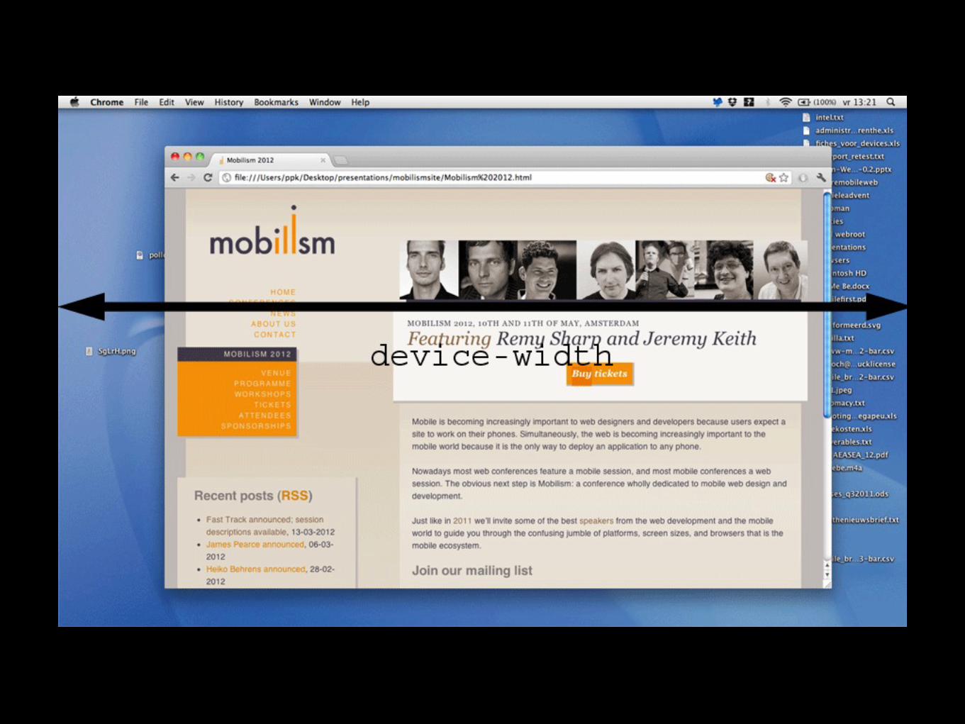
Media queries - device-width• device-width gives the width of the device
screen
• in device pixels
• Equal to screen.width

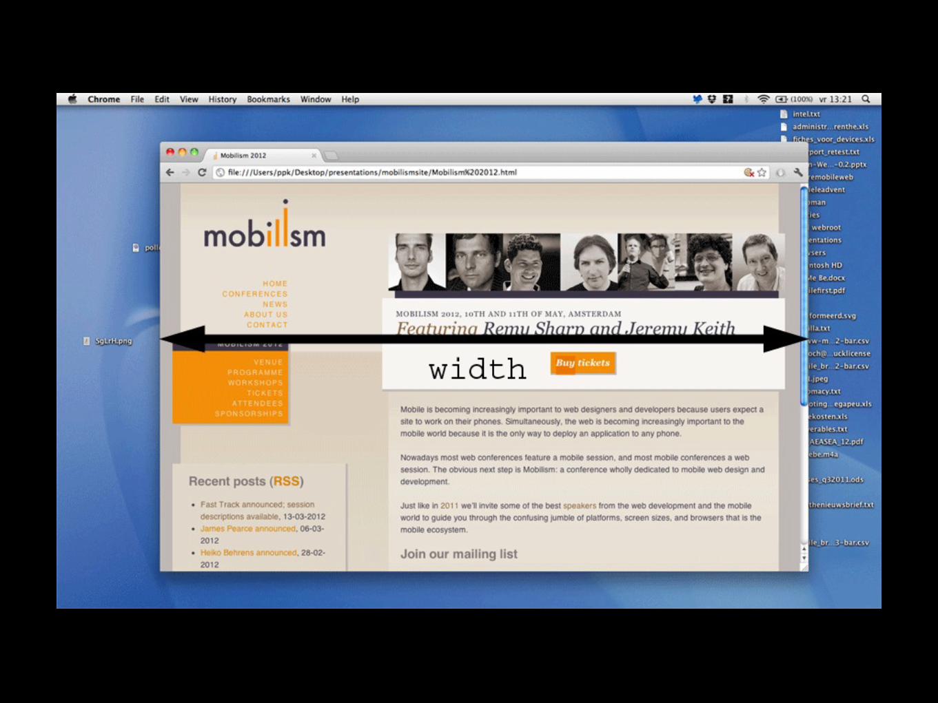
Media queries - width• width gives the width of the viewport
• in CSS pixels
• (There are a few zooming problems on desktop, though)
• Equal to document.documentElement.clientWidth

• device-width gives the width of the device screen
• in device pixels or dips
• Equal to screen.width
• On mobile the screen is far smaller than on desktop, but that doesn’t matter
Media queries - device-width

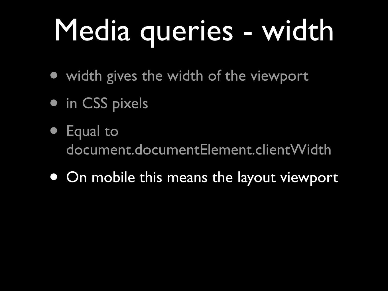
• width gives the width of the viewport
• in CSS pixels
• Equal to document.documentElement.clientWidth
• On mobile this means the layout viewport
Media queries - width


Media queries• width is the media query you want
• but at first sight it seems to be totally useless on mobile
• Usually we don’t care about the width of the layout viewport
• We need to treat one more element, though.

Meta viewport
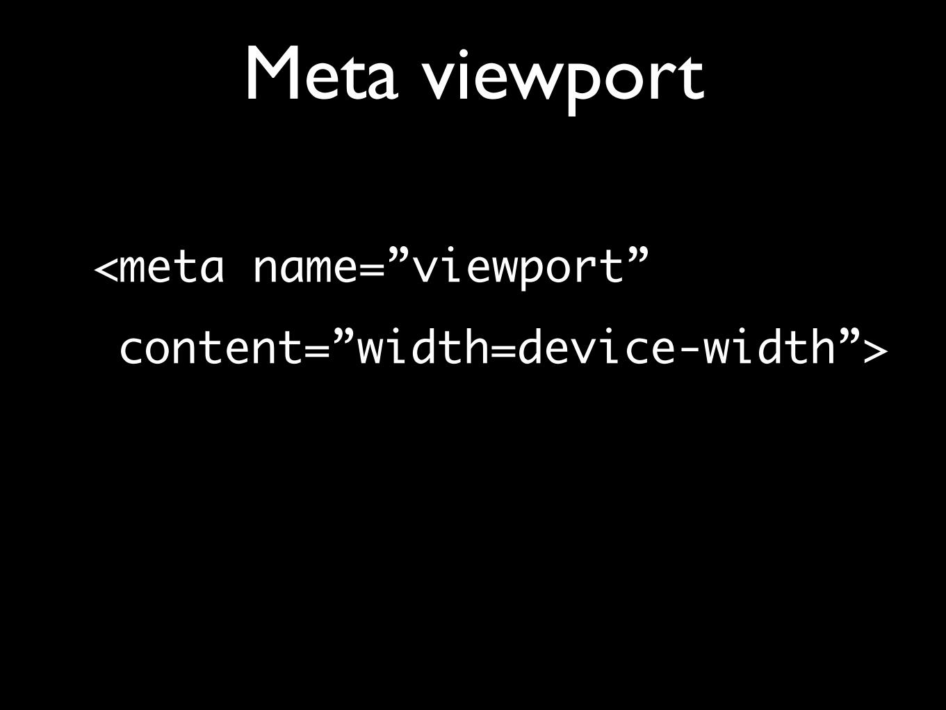
Meta viewport
<meta name=”viewport” content=”width=device-width”>
Meta viewport
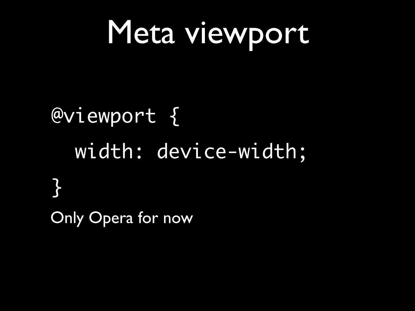
@viewport { width: device-width;}Only Opera for now
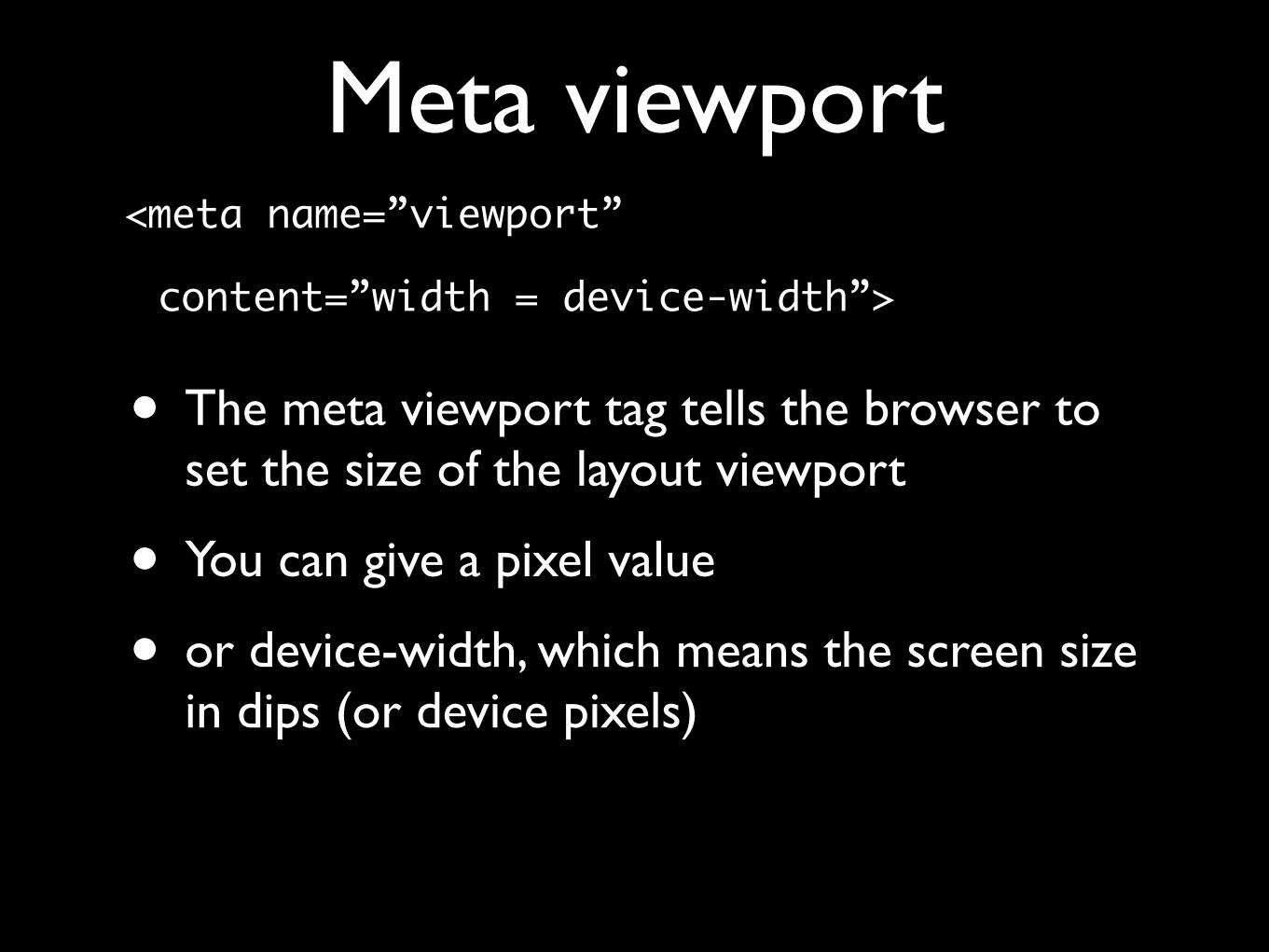
Meta viewport<meta name=”viewport”
content=”width = device-width”>
• The meta viewport tag tells the browser to set the size of the layout viewport
• You can give a pixel value
• or device-width, which means the screen size in dips (or device pixels)


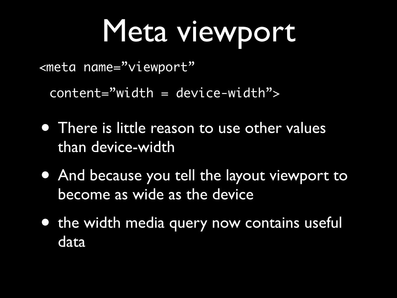
Meta viewport<meta name=”viewport”
content=”width = device-width”>
• There is little reason to use other values than device-width
• And because you tell the layout viewport to become as wide as the device
• the width media query now contains useful data

Media queries• In theory the device-width and width media
queries would now return the same values
• but it uses device pixels or dips, which is not what you want
• This is a frighteningly complicated area
• Don’t go there
• Use width

Responsive design• So the trick for creating a responsive design
• is using <meta name=”viewport” content=”width=device-width” />
• in combination with width media queries
• You probably already knew that
• but now you also understand why

Peter-Paul Kochhttp://quirksmode.orghttp://twitter.com/ppk
MoBeers, 10 April 2012
Thank youI’ll put these slides online
Questions?