Embed Size (px)
Citation preview
www.iggesund.comwww.iggesund.com www.iggesund.com 1
CO11017
E
A MAGAZINE FROM Iggesund paperboard ISSUE 39 2011
inspire1103_Master E.indd 1 2011-09-26 14.39inspire1103_Omsl_kappa_klar.indd 2-3 2011-09-27 14.39omslag 1.indd 1 2011-11-22 15.50
www.iggesund.com2 www.iggesund.com
THAT COUNTS
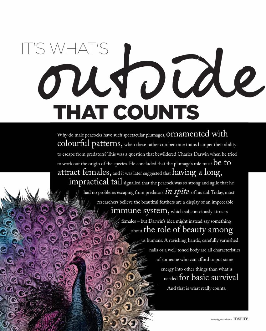
It's what'soutside
12
Why do male peacocks have such spectacular plumages, ornamented with colourful patterns, when these rather cumbersome trains hamper their ability
to escape from predators? This was a question that bewildered Charles Darwin when he tried
to work out the origin of the species. He concluded that the plumage’s role must be to attract females, and it was later suggested that having a long,
impractical tail signalled that the peacock was so strong and agile that he
had no problems escaping from predators in spite of his tail. Today, most
researchers believe the beautiful feathers are a display of an impeccable
immune system, which subconsciously attracts
females – but Darwin’s idea might instead say something
about the role of beauty among
us humans. A ravishing hairdo, carefully varnished
nails or a well-toned body are all characteristics
of someone who can afford to put some
energy into other things than what is
needed for basic survival.
And that is what really counts.
inspire1103_Master E.indd 2 2011-09-26 14.39
www.iggesund.comwww.iggesund.com www.iggesund.com 3
05
06
11
Beauty icon. What’s pink and green and has found a home in millions of women’s makeup bags since 1971?
Beauty & BuSineSS. Beauty is no longer in the eye of the beholder – it’s a multibillion-dollar business. We ask why.
PRoFiLe – eRic GiRouD.Platinum one day, plastic the next – not a problem for watch designer Eric Giroud: ”My life has always been about adap-tation.”
coLuMn By Dan JoneS. Has the everlasting struggle with the concept of beauty come to an end?
PRoFiLe – JaMeS HeeLey. ”Scent is different to fashion. People don’t buy a scent because it’s cool.”
PacKaGeS taLK BacK to conSuMeRS. Packaging is a mirror of social and technologi-cal trends, a part of the fabric of popular culture. Nowadays, packaging is moving beyond the graphical to communicate interactively with consumers in clever new ways.
PRoFiLe – eDWina WHite. Illustrator Edwina White is intrigued by the concept of beauty, and the characters in her work are rarely beautiful in the traditional sense.
a PaRt oF tHe SoLution. Packaging has long been portrayed as an environmental villain in the debate, a waste of resources. But something seems to have changed.
FinaL ten – Q&a WitH RoSS LoVeGRoVe. Meet the man who has pushed the boundaries of design ever since he left the Royal College of Art in 1983.
THE ISSUE ON BEAUTY & VANITY 39outside
#Contents
1617
20
12MODERN LIFE IS UGLY! Spam, pixellated images, shredded documents and junk mail are part of everyday life and we all hate them. But some designers have trans–formed the ills of modern life into something beautiful.
23
24
27
Wow!Paperboard
objects to die for.
18
WHat’S on at iGGeSunD?
Earrings out of paperboard. Is that
really possible?
26
inspire1103_Master E.indd 3 2011-09-26 14.40
www.iggesund.com4 www.iggesund.com
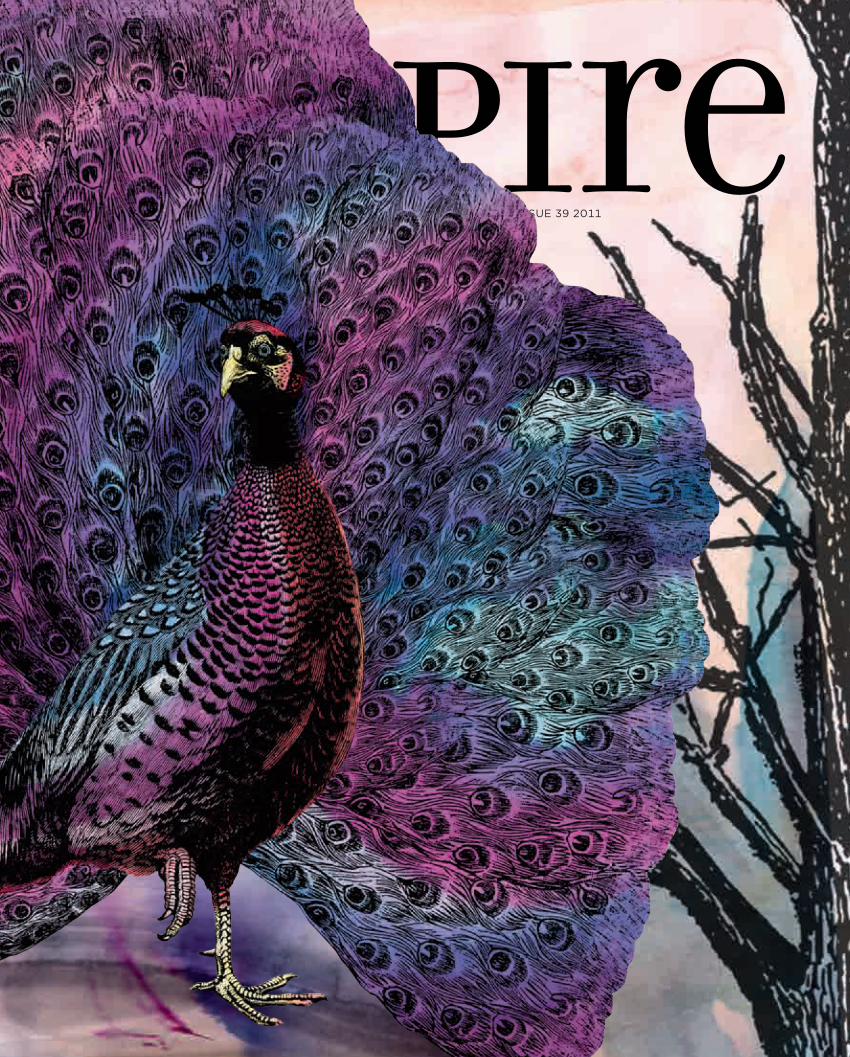
THE COVER of Inspire issue 39 was inspired by the animal kingdom. The pea-cock has often symbolised human beauty and vanity, while also serving as the embodiment of love, divinity and luxury.
“The jacket with the die-cut illustrated peacock has been printed on Invercote Creato 240 g/m2,” explains Art Director Karin Löwencrantz. “For the peacock’s metallic colours we’ve first hot-foil stamped in silver, and then printed four-colour offset on top. We’ve printed white on part of the foil to produce an ‘authentic’ colour. Where there’s no white there’s a metallic impression of the foil. The cover underneath is printed on Invercote Creato 220 g/m2 in four-colour offset. Both covers are water varnished.”
As EdiTOR-in-CHiEf of Inspire, I am constantly faced with a fascinating duality. At Iggesund we produce two types of paperboard: Invercote and Incada. In both cases it is hard to characterise the product as anything other than flat, white and possibly a trifle dull.
At the same time, however, I see all kinds of interesting de-sign projects pass before my eyes. They might involve packaging that contains familiar products from cosmetics to electronics. Packaging that makes the most of the clean white surface of the paperboard but which also, for example, uses state-of-the-art printing techniques to create something that’s guaranteed to catch the consumer’s eye. Technically challenging graphic designers who persist in using 34 printing inks to try to achieve the ultimate effect, the one that no one has ever achieved before.
But also everyday jobs in the graphic design industry, where a material is chosen for peace of mind, working in a familiar area where the end results are predictable, where you can be certain that the next pallet of delivered materials will always behave like the previous one. No need to make adjustments, just use the same settings as last time.
So amid all this printing and conversion-minded pragmatism, I would like to express my gratitude to all of you who give life to the material we produce. All the brilliant graphic design that gives life to the white surfaces we deliver. And not least, everyone who builds three-dimensional creations from the two-dimensional products we put on the market.
Thank you for all the creativeness we’ve been able to write about for more than a decade here at Inspire. And thank you for all the appreciation we receive from our readers after each new issue. Inspire will continue to pass on inspiration to all of you who want to make something exciting from what initially seems flat, white and dull. The best of luck! ■
AddressIggesund Paperboard
SE-825 80 Iggesund, Swedenphone: +46 650 280 [email protected]
www.iggesund.com
PublisherCarlo Einarsson
(responsible under Swedish press law)
Editor in ChiefElisabeth Östlin
Editorial committeeWinnie Halpin, Wout van Hoof, Véronique Lafrance, Ian Harris,
Staffan Sjöberg, Elisabeth Östlin
Publishing AgencyOTW Communication
PO Box 3265, SE-103 65 Stockholm
Editor and project managerRikard Samuelsson
Art directorKarin Löwencrantz
ContributorsTsemaye Opubor Hambraeus, Karin Ström, Anders Modig,
Michael Dee, Dan Jones, Ivan Carvalho,Henrik Emilsson, David Bartal, Anders Thorén, Dag Enander,
Sofia Zetterman
PhotosBruno Ehrs, Dominik von Schulthness,
Eva Hildén Smith, Jann Lipka
illustrationsTeam Hawaii
PrepressDone
PrintingInner cover: Strokirk-Landströms,
Lidköping, Sweden Outer cover: Strand Grafiska, Malmö,
Sweden
issn1404-2436
Inspire is printed in English, Chinese, French, German and Swedish
Inspire, a source of inspiration,provided by Iggesund Paperboard,
home of Invercote and Incada.
Inspire aims to inform and entertain with stories and photos that are not restricted to the scope of Iggesund's own business. As its name suggests, the idea is to be inspirational and not to infringe on a company's or person's image rights or intellectual property.
Products that are made with Invercote, Incada and other paperboard from Iggesund are marked in the text.
Board, not bored
editorialELISABETH ÖSTLIN
Editor in Chief, Iggesund Paperboard
www.iggesund.comwww.iggesund.com www.iggesund.com 1
CO11017
E
A MAGAZINE FROM Iggesund paperboard ISSUE 39 2011
inspire1103_Master E.indd 4 2011-09-26 14.47
www.iggesund.comwww.iggesund.com www.iggesund.com 5
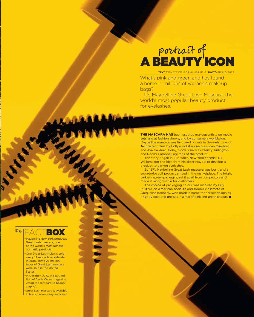
• Maybelline New York produces Great Lash mascara, one of the world’s most famous cosmetic products.
• One Great Lash tube is sold every 1.1 seconds worldwide. In 2010, some 25 million tubes of Great Lash mascara were sold in the United States.
• In October 2010, the U.K. edi-tion of Marie Claire magazine voted the mascara ”a beauty classic”.
• Great Lash mascara is available in black, brown, navy and clear.
The mascara has been used by makeup artists on movie sets and at fashion shows, and by consumers worldwide. Maybelline mascara was first used on sets in the early days of Technicolor films by Hollywood stars such as Joan Crawford and Ava Gardner. Today, models such as Christy Turlington and Naomi Campbell are fans of the product.
The story began in 1915 when New York chemist T. L. Williams got the idea from his sister Maybel to develop a product to darken eyelashes.
By 1971, Maybelline Great Lash mascara was born, and a soon-to-be cult product arrived in the marketplace. The bright pink-and-green packaging set it apart from competitors and made it recognisable for customers.
The choice of packaging colour was inspired by Lilly Pulitzer, an American socialite and former classmate of Jacqueline Kennedy, who made a name for herself designing brightly coloured dresses in a mix of pink and green colours. ■
portrait of
What’s pink and green and has found a home in millions of women’s makeup bags?
It’s Maybelline Great Lash Mascara, the world’s most popular beauty product for eyelashes.
FACTBOX
a Beauty icOn
☞
TexT TseMaye OpubOr HaMbraeus PhOTO bruNO eHrs
inspire1103_Master E.indd 5 2011-09-26 14.48
www.iggesund.com6 www.iggesund.com
B auty
Our ObsessiOn
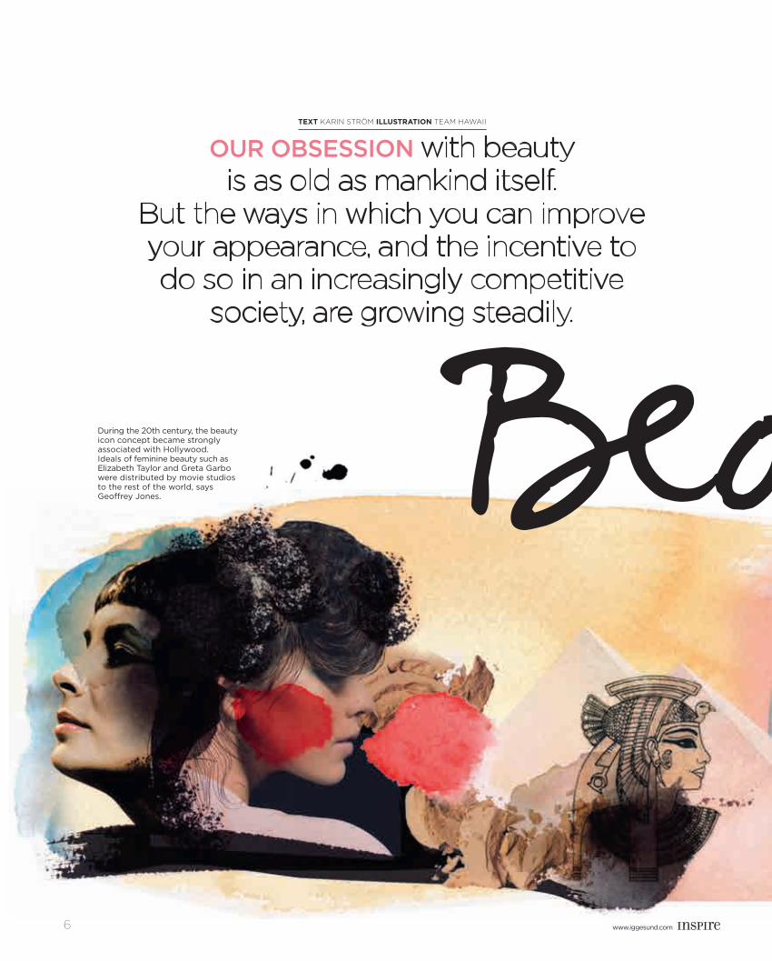
During the 20th century, the beauty icon concept became strongly associated with Hollywood. Ideals of feminine beauty such as Elizabeth Taylor and Greta Garbo were distributed by movie studios to the rest of the world, says Geoffrey Jones.
TexT Karin Ström ILLUSTRATION team hawaii
inspire1103_Master E.indd 6 2011-09-26 14.48
www.iggesund.comwww.iggesund.com www.iggesund.com 7
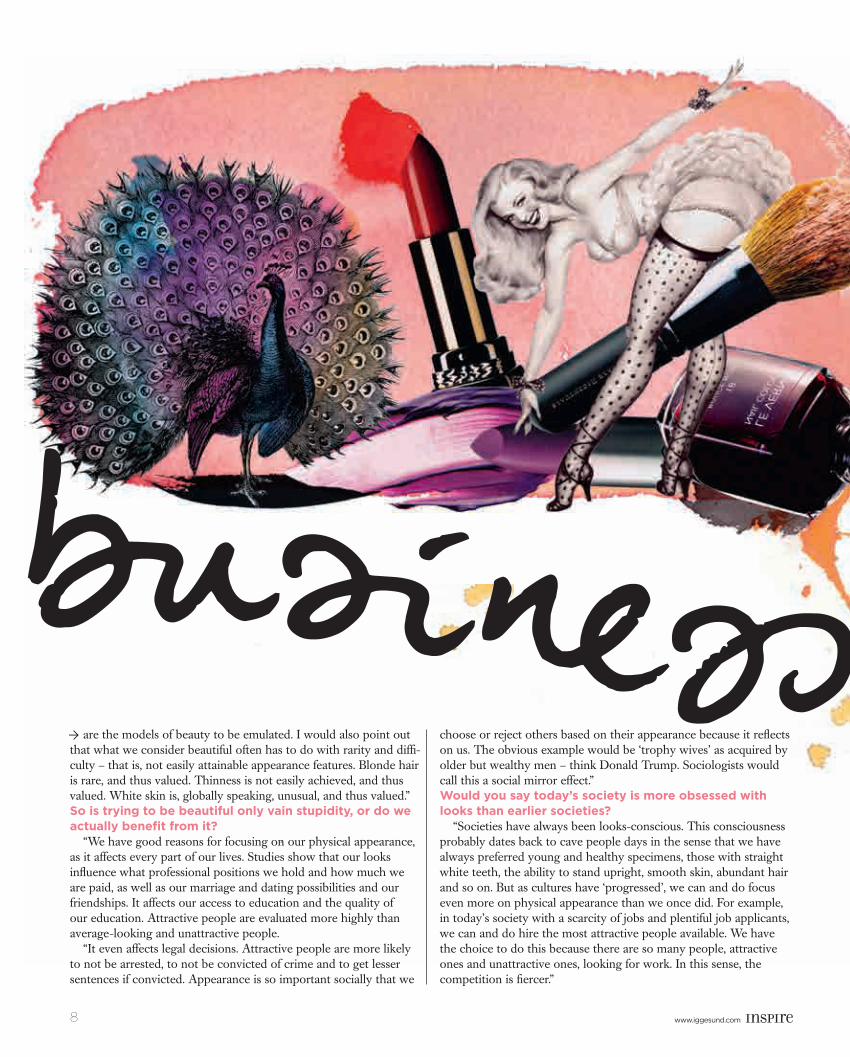
CosmetiCs, anti-ageing Creams, perfume, skincare and hair-care products; treatments at beauty salons and spas: gym member-ships and cosmetic surgery. Beauty is no longer in the eye of the beholder — it’s a multibillion-dollar business. The worldwide turn-over of beauty-related products last year was 382 billion us dollars.
Our fascination with beauty starts early – experiments show that babies as young as two months spend more time looking at photo-graphs of beautiful faces than photos of average-looking faces. Several studies on adult human brains have concluded that making eye contact with a beautiful face of the opposite sex elicits the same reward responses as do good food, sex, an opportunity to make money or a funny joke.
So, what is beauty? If you ask evolutionary biologists, they would say beauty is a marker of valued characteristics, such as good genes or high fertility. A symmetrical face and body are signs of normal development in the foetal stages, a manifestation of a strong im-mune system. In women, smooth hairless skin, high cheekbones
and plump lips have been shown to signify high levels of the female sex hormone oestrogen, which in turn means high fertility.
However, evolutionary explanations cannot account for all aspects of the current beauty ideal. Bonnie Berry, who has a doctorate in sociology, wrote the books The Power of Looks (Ashgate, 2008) and Beauty Bias: Discrimination and Social Power (Praeger, 2007). Inspire recently caught up with her and asked her a few questions.How do you explain the importance of beauty in the modern world?
“The beauty ideal is getting more globalized, largely via movies, magazines, advertisements and other forms of visual media being spread internationally. What we should all look like, regardless of race and nationality, is blonde, blue-eyed, amply busted and thin. These elements of the beauty ideal seem to have less to do with evolutionary causes and more to do with sociological factors.
“Caucasians have so far been in socially and economically power -ful positions relative to the rest of the world, which is why they
andB auty Ò
inspire1103_Master E.indd 7 2011-09-26 14.49
www.iggesund.com8 www.iggesund.com
b s n s are the models of beauty to be emulated. I would also point out that what we consider beautiful often has to do with rarity and diffi-culty – that is, not easily attainable appearance features. Blonde hair is rare, and thus valued. Thinness is not easily achieved, and thus valued. White skin is, globally speaking, unusual, and thus valued.” So is trying to be beautiful only vain stupidity, or do we actually benefit from it?
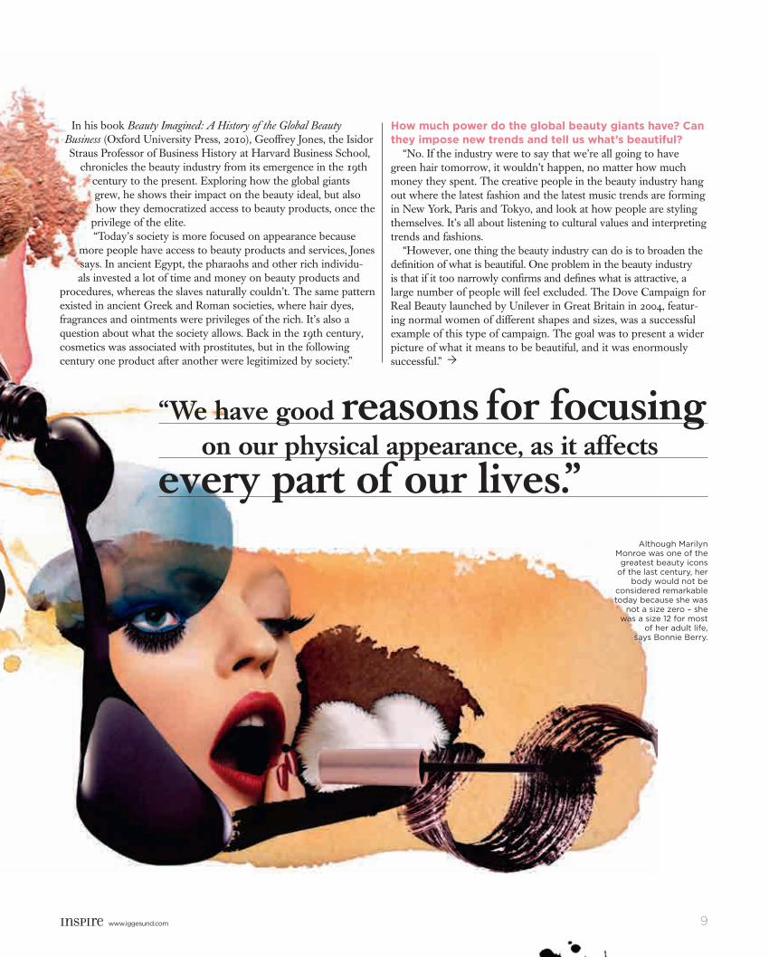
“We have good reasons for focusing on our physical appearance, as it affects every part of our lives. Studies show that our looks influence what professional positions we hold and how much we are paid, as well as our marriage and dating possibilities and our friendships. It affects our access to education and the quality of our education. Attractive people are evaluated more highly than average-looking and unattractive people.
“It even affects legal decisions. Attractive people are more likely to not be arrested, to not be convicted of crime and to get lesser sentences if convicted. Appearance is so important socially that we
choose or reject others based on their appearance because it reflects on us. The obvious example would be ‘trophy wives’ as acquired by older but wealthy men – think Donald Trump. Sociologists would call this a social mirror effect.”Would you say today’s society is more obsessed with looks than earlier societies?
“Societies have always been looks-conscious. This consciousness probably dates back to cave people days in the sense that we have always preferred young and healthy specimens, those with straight white teeth, the ability to stand upright, smooth skin, abundant hair and so on. But as cultures have ‘progressed’, we can and do focus even more on physical appearance than we once did. For example, in today’s society with a scarcity of jobs and plentiful job applicants, we can and do hire the most attractive people available. We have the choice to do this because there are so many people, attractive ones and unattractive ones, looking for work. In this sense, the competition is fiercer.”
Ò
inspire1103_Master E.indd 8 2011-09-26 14.49
www.iggesund.comwww.iggesund.com www.iggesund.com 9
b s n s “We have good reasons for focusing on our physical appearance, as it affects every part of our lives.”
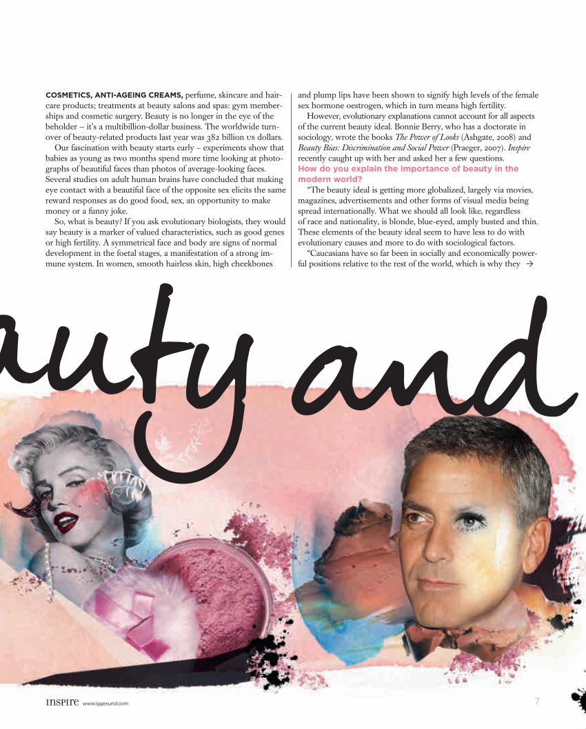
Although Marilyn Monroe was one of the
greatest beauty icons of the last century, her
body would not be considered remarkable today because she was
not a size zero – she was a size 12 for most
of her adult life, says Bonnie Berry.
Ò
In his book Beauty Imagined: A History of the Global Beauty Business (Oxford University Press, 2010), Geoffrey Jones, the Isidor Straus Professor of Business History at Harvard Business School,
chronicles the beauty industry from its emergence in the 19th century to the present. Exploring how the global giants grew, he shows their impact on the beauty ideal, but also how they democratized access to beauty products, once the
privilege of the elite.“Today’s society is more focused on appearance because
more people have access to beauty products and services, Jones says. In ancient Egypt, the pharaohs and other rich individu-als invested a lot of time and money on beauty products and
procedures, whereas the slaves naturally couldn’t. The same pattern existed in ancient Greek and Roman societies, where hair dyes, fragrances and ointments were privileges of the rich. It’s also a question about what the society allows. Back in the 19th century, cosmetics was associated with prostitutes, but in the following century one product after another were legitimized by society.”
How much power do the global beauty giants have? Can they impose new trends and tell us what’s beautiful?
“No. If the industry were to say that we’re all going to have green hair tomorrow, it wouldn’t happen, no matter how much money they spent. The creative people in the beauty industry hang out where the latest fashion and the latest music trends are forming in New York, Paris and Tokyo, and look at how people are styling themselves. It’s all about listening to cultural values and interpreting trends and fashions.
“However, one thing the beauty industry can do is to broaden the definition of what is beautiful. One problem in the beauty industry is that if it too narrowly confirms and defines what is attractive, a large number of people will feel excluded. The Dove Campaign for Real Beauty launched by Unilever in Great Britain in 2004, featur-ing normal women of different shapes and sizes, was a successful example of this type of campaign. The goal was to present a wider picture of what it means to be beautiful, and it was enormously successful.”
inspire1103_Master E.indd 9 2011-09-26 14.49
www.iggesund.com10 www.iggesund.com
With the changing demographics of Western societies, is it necessary for the beauty industry to address a wider range of customers?
“I would say so, but there’s an ongoing discussion about this. Some argue that the beauty industry is all about selling aspiration, an ideal that you want to reach and will try to reach with the help of beauty products. Others argue that the industry needs to adjust to a wider representation of beauty as the Baby Boomers of the 1940s are reaching retirement age and ethnic diversity is growing. In general, I do see a shift towards a new pluralism. An example of this is L’Oreal using models in their 40s and 50s. It doesn’t make any commercial sense to only address the young and white anymore.”What about men? Isn’t that also a potential customer group that the beauty industry would like to reach out to?
“Most definitely. The industry has been crying to sell to men for decades. Already in 1928, Helena Rubenstein predicted that men would start wearing makeup in the near future, which is the beauty industry’s dream. Every decade, we see men using more and more beauty products – moisturizers, hair products, facial cleansers – but the huge breakthrough has yet to come. In Japan, South Korea
and Thailand there is a large group of young men experiment-ing with makeup and hair dye. I think that is indicative of the
future. A scenario where men spend as much on beauty products as women is not impossible at all. On the contrary, that would be a reversion to the norm. In the 18th century, men were as big buyers of fragrances and cosmetics as women.”What’s going to be the next big trend? According to trend analyst Karin Lui from trendwatching.com, the latest cry in the beauty industry is customisation – to sell products that are tailor-made for the customer.
“Recent technological advances have allowed beauty companies to offer made-to-measure skincare products based on the customer’s skin type. One example of this is the French company Codage, which has a diagnostic test on its website to determine your skin’s identity. Based on the test, customised serums and dietary supple-ments are produced and shipped to you. Another example of this is Absolution Cosmetics, a French brand that offers a short range of customisable organic skincare products that you mix together your-self to create the perfect formula, depending on your skin’s changing needs and moods. Many people dream about having a product that is perfect for their skin, and this is as close as it gets.” ■
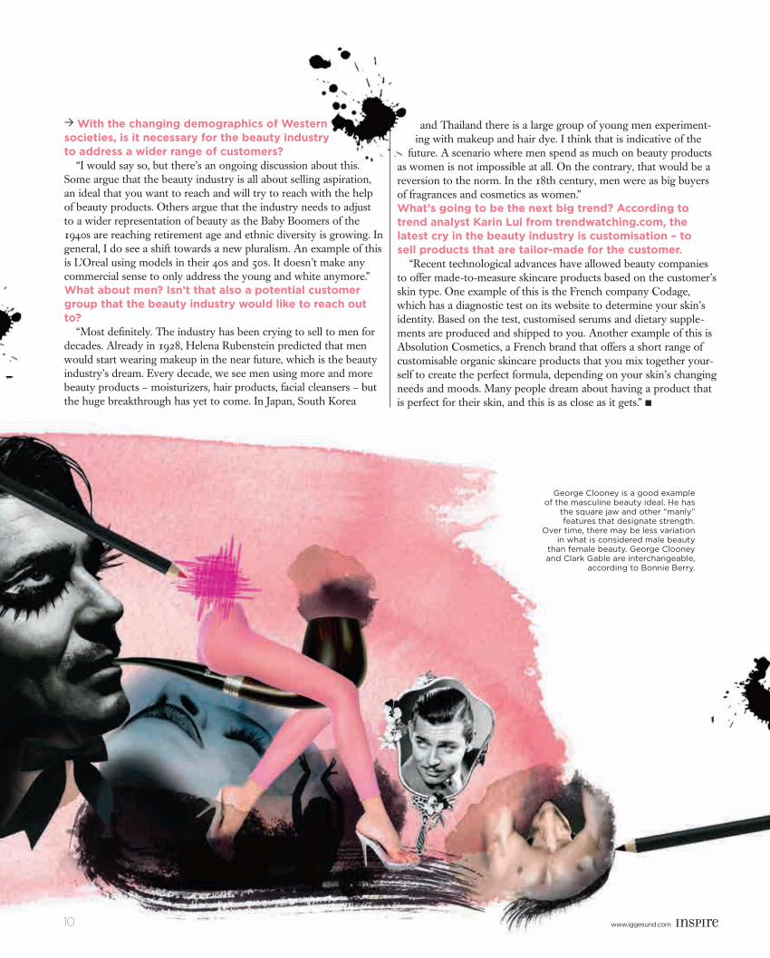
George Clooney is a good example of the masculine beauty ideal. He has
the square jaw and other “manly” features that designate strength.
Over time, there may be less variation in what is considered male beauty
than female beauty. George Clooney and Clark Gable are interchangeable,
according to Bonnie Berry.
Ò
10
inspire1103_Master E.indd 10 2011-09-26 14.50
www.iggesund.comwww.iggesund.com www.iggesund.com 11
“Whether you design a male or a female watch, you must stick to the same rules as in architecture: pay attention to structure, light and transparency, and find a balance between shape, size and comfort. And once you know the rules, you can of course play with them,” says former architect Eric Giroud, one of the world’s most sought-after freelance watch designers.
Engulfed in the micro architectural universe of timepieces since the late 1990s, his career has run parallel with the world’s skyrocketing awareness of male beauty. “You
see this especially in the fashion world,” says Eric, sartorially splendid as usual in a tailored jacket and slacks. “In the fashion world, watches have become a must. Today they are an integral part of a look.
“We now live in a revolution where women are in power, and they simply won’t make do with battery-driven quartz watches or slightly shrunken versions of men’s watches,” Eric says. “Now they want to have mechani-cal watches with original designs that can be combined with other jewellery. This aspect you don’t have to take into consideration
with men, since the watch is the only jewel they wear.”
Before making the first sketch, Eric always makes a reflective analysis about the client’s brand values, needs and future direction. Thanks to this thorough design process, he is able to jump between million-dollar mechanical masterpieces and hundred-dollar battery-driven disposables. Platinum one day, plastic the next is not a problem. “My life has always been about adaptation,” he says. “An important part of my personality is that of a chameleon.” ■
1 Name: Eric Giroud. Age: 47. Profession: Independent watch designer. Based in: Geneva, Switzerland. Brands on CV: Harry Winston, Swarovski, Bertolucci, Tissot, Maximilian Büsser & Friends, MCT Watches, Heritage Watch Manufacture and others. Years in pro-fession: 13. About packaging: “I love designing boxes and packaging. Boxes are very important, and they must be coherent with the product.” Web: www.ericgiroud.com
WhAt is BeAutY for You?
“Simplicity and nice lines, adaptation and
balance. Beauty is about being pure and not arro-gant. The most beautiful philosophical approach is emptiness. Emptiness as in the mountains, the desert, the ocean. Simple and pure beauty like this
is very rare.”
eric Giroud
?
Ó Swarovski D Light, which received the pres-tigious red dot design award in 2010. Eric has also won Grand Prix d’Horlogerie three times (2007, 2009 and 2010) and Watch of the Year in Japan (2008).
Opus 11, designed for Harry Winston in 2011.
text ANDERS MODIG
www.iggesund.com 11
inspire1103_Master E.indd 11 2011-09-26 14.50
www.iggesund.com12 www.iggesund.com
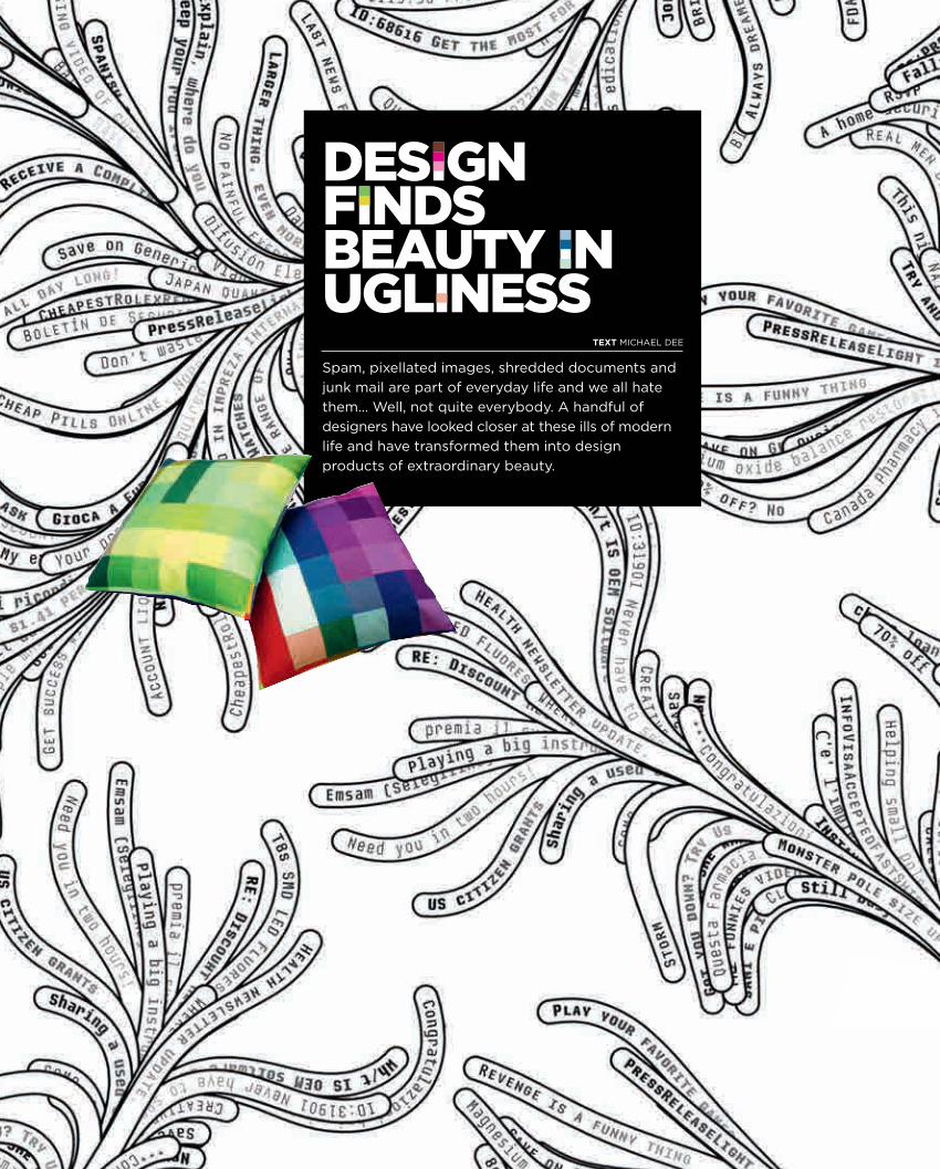
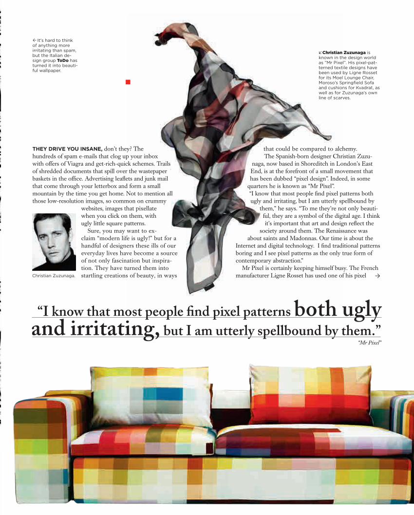
Design finDs beauty in uglinessSpam, pixellated images, shredded documents and junk mail are part of everyday life and we all hate them… Well, not quite everybody. A handful of designers have looked closer at these ills of modern life and have transformed them into design products of extraordinary beauty.
TEXT MichAel Dee
inspire1103_Master E.indd 12 2011-09-26 14.51
www.iggesund.comwww.iggesund.com www.iggesund.com 13
×Christian Zuzunaga is known in the design world as ”Mr Pixel”. His pixel-pat-terned textile designs have been used by Ligne Rosset for its Moel Lounge Chair, Moroso’s Springfield Sofa and cushions for Kvadrat, as well as for Zuzunaga’s own line of scarves.
It's hard to think of anything more irritating than spam, but the Italian de-sign group ToDo has turned it into beauti-ful wallpaper.
“I know that most people find pixel patterns both ugly and irritating, but I am utterly spellbound by them.”
“Mr Pixel ”
Ò
They drive you insane, don’t they? The hundreds of spam e-mails that clog up your inbox with offers of Viagra and get-rich-quick schemes. Trails of shredded documents that spill over the wastepaper baskets in the office. Advertising leaflets and junk mail that come through your letterbox and form a small mountain by the time you get home. Not to mention all those low-resolution images, so common on crummy
websites, images that pixellate when you click on them, with ugly little square patterns.
Sure, you may want to ex-claim “modern life is ugly!” but for a handful of designers these ills of our everyday lives have become a source of not only fascination but inspira-tion. They have turned them into startling creations of beauty, in ways
that could be compared to alchemy. The Spanish-born designer Christian Zuzu-
naga, now based in Shoreditch in London’s East End, is at the forefront of a small movement that has been dubbed “pixel design”. Indeed, in some
quarters he is known as “Mr Pixel”. “I know that most people find pixel patterns both ugly and irritating, but I am utterly spellbound by
them,” he says. “To me they’re not only beauti-ful, they are a symbol of the digital age. I think it’s important that art and design reflect the
society around them. The Renaissance was about saints and Madonnas. Our time is about the
Internet and digital technology. I find traditional patterns boring and I see pixel patterns as the only true form of contemporary abstraction.”
Mr Pixel is certainly keeping himself busy. The French manufacturer Ligne Rosset has used one of his pixel Christian Zuzunaga.
inspire1103_Master E.indd 13 2011-09-26 14.51
www.iggesund.com14 www.iggesund.com
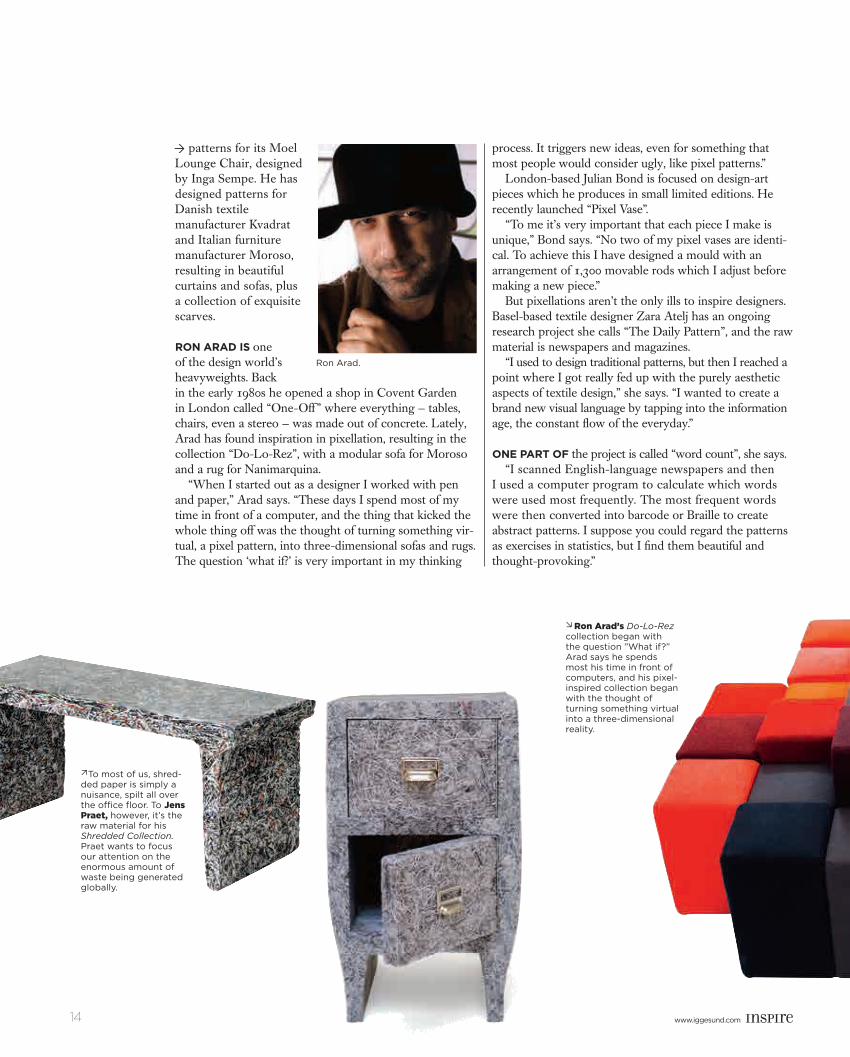
To most of us, shred-ded paper is simply a nuisance, spilt all over the office floor. To Jens Praet, however, it’s the raw material for his Shredded Collection.Praet wants to focus our attention on the enormous amount of waste being generated globally.
ØRon Arad’s Do-Lo-Rez collection began with the question ”What if?” Arad says he spends most his time in front of computers, and his pixel-inspired collection began with the thought of turning something virtual into a three-dimensional reality.
patterns for its Moel Lounge Chair, designed by Inga Sempe. He has designed patterns for Danish textile manufacturer Kvadrat and Italian furniture manufacturer Moroso, resulting in beautiful curtains and sofas, plus a collection of exquisite scarves.
Ron ARAd is one of the design world’s heavyweights. Back in the early 1980s he opened a shop in Covent Garden in London called “One-Off ” where everything — tables, chairs, even a stereo — was made out of concrete. Lately, Arad has found inspiration in pixellation, resulting in the collection “Do-Lo-Rez”, with a modular sofa for Moroso and a rug for Nanimarquina.
“When I started out as a designer I worked with pen and paper,” Arad says. “These days I spend most of my time in front of a computer, and the thing that kicked the whole thing off was the thought of turning something vir-tual, a pixel pattern, into three-dimensional sofas and rugs. The question ‘what if?’ is very important in my thinking
process. It triggers new ideas, even for something that most people would consider ugly, like pixel patterns.”
London-based Julian Bond is focused on design-art pieces which he produces in small limited editions. He recently launched “Pixel Vase”.
“To me it’s very important that each piece I make is unique,” Bond says. “No two of my pixel vases are identi-cal. To achieve this I have designed a mould with an arrangement of 1,300 movable rods which I adjust before making a new piece.”
But pixellations aren’t the only ills to inspire designers. Basel-based textile designer Zara Atelj has an ongoing research project she calls “The Daily Pattern”, and the raw material is newspapers and magazines.
“I used to design traditional patterns, but then I reached a point where I got really fed up with the purely aesthetic aspects of textile design,” she says. “I wanted to create a brand new visual language by tapping into the information age, the constant flow of the everyday.”
one pARt of the project is called “word count”, she says. “I scanned English-language newspapers and then
I used a computer program to calculate which words were used most frequently. The most frequent words were then converted into barcode or Braille to create abstract patterns. I suppose you could regard the patterns as exercises in statistics, but I find them beautiful and thought-provoking.”
Ò
Ron Arad.
inspire1103_Master E.indd 14 2011-09-26 14.52
www.iggesund.comwww.iggesund.com www.iggesund.com 15
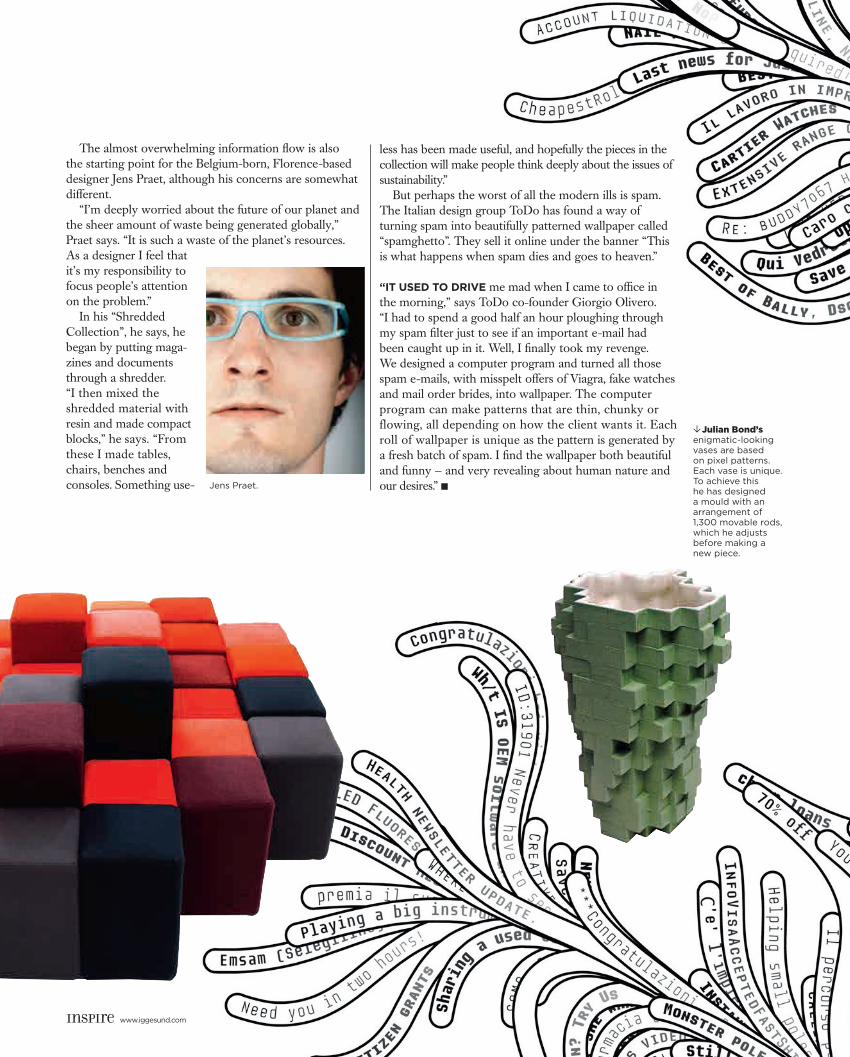
The almost overwhelming information flow is also the starting point for the Belgium-born, Florence-based designer Jens Praet, although his concerns are somewhat different.
“I’m deeply worried about the future of our planet and the sheer amount of waste being generated globally,” Praet says. “It is such a waste of the planet’s resources. As a designer I feel that it’s my responsibility to focus people’s attention on the problem.”
In his “Shredded Collection”, he says, he began by putting maga-zines and documents through a shredder. “I then mixed the shredded material with resin and made compact blocks,” he says. “From these I made tables, chairs, benches and consoles. Something use-
less has been made useful, and hopefully the pieces in the collection will make people think deeply about the issues of sustainability.”
But perhaps the worst of all the modern ills is spam. The Italian design group ToDo has found a way of turning spam into beautifully patterned wallpaper called “spamghetto”. They sell it online under the banner “This is what happens when spam dies and goes to heaven.”
“It used to drIve me mad when I came to office in the morning,” says ToDo co-founder Giorgio Olivero. “I had to spend a good half an hour ploughing through my spam filter just to see if an important e-mail had been caught up in it. Well, I finally took my revenge. We designed a computer program and turned all those spam e-mails, with misspelt offers of Viagra, fake watches and mail order brides, into wallpaper. The computer program can make patterns that are thin, chunky or flowing, all depending on how the client wants it. Each roll of wallpaper is unique as the pattern is generated by a fresh batch of spam. I find the wallpaper both beautiful and funny — and very revealing about human nature and our desires.” ■
Julian Bond’s enigmatic-looking vases are based on pixel patterns. Each vase is unique. To achieve this he has designed a mould with an arrangement of 1,300 movable rods, which he adjusts before making a new piece.
Jens Praet.
inspire1103_Master E.indd 15 2011-09-26 14.52
www.iggesund.com16 www.iggesund.com
ow, I don’t know what Confucius looked like, but you might suspect from the statement below that he was hideously ugly. After all, it tends to be a vigorously repulsive sort of person who cleaves to the idea that there is beauty in everything and everyone.
The rest of us – the irresistibly sexy, symmetrically faced élite, I mean – are clear about things. There is an objective form of beauty in life. And it definitely doesn’t have acne, a wonky nose and a haircut that looks like it’s been chewed into shape by a donkey.
Okay, I’m (half-) joking. But there’s a serious point here. Is it possible that there are certain inherent characteristics to beauty, which transcend cultures and histori-cal ages? Are there things that we humans just find naturally beautiful? Or is it all relative?
Almost every great poet, philosopher, artist and composer has struggled with the concept of beauty. The overwhelming majority have gone in search of a law of beauty. From Aristotle to Ralph Waldo Emerson, men and women have wrestled with equations and theories they hope will lead them to the heart of beauty.
A law of beauty has been sought most often in mathematics. As Leonardo da Vinci’s sketches of Vitruvian man show, perhaps the most brilliant mind in history was convinced there was a law of perfect, symmetrical human form. Perhaps the most famous numerical definition of beauty is the Golden Ratio: approximately 1.61803.
This number, which expresses a beautiful ratio between numbers and lines, has captivated mathe-maticians, architects, biologists and financial traders alike. Botanists have found the Golden Ratio expressed in plant stems and animal nerves. Artists like Salvador Dali have incorporated the Golden Ratio into their work.
These days, in the 21st century liberal West, the idea of innate, objective beauty is going out of fashion. Today all things and all people are supposed to be beautiful, in their own way. Just as we are all equal, so we are all beautiful.
But as so often in these apparently enlightened days, all is not as it seems. Anyone who has worked on a fashion magazine or in an advertising firm will know that for all our hyper-modern political correct-ness, there is still a very shallow, clear, definite idea of what beauty is. Very often it has blonde hair, white teeth and long legs.
Are we wrong to look for objective beauty in mathematics? Is there a science of beauty, or is aesthetics concerned with higher, less definable things? Is it possible to find beauty, as some derma-tologists do, in the shape of a blister or a skin lesion? Can a cancer cell, multiplying by some innate mathematical pattern, be said to be beautiful? What about an atomic explosion? Are these ideas too ugly for us to contemplate?
My instinct is that there are certain values and ratios to which humans are naturally drawn, but that these drift over the course of history, and that man-made beauty springs from the skilful replication of that which is innate but partially concealed in nature. But you may beg to differ. Perhaps beauty does lie in the eye of the beholder. Which would make Confucius right. Again. ■
N☞
Column by Dan Jones
Dan Jones is an award-winning British journalist and author. He has written a cult sports column for the Guardian and is currently features editor at Men’s Health.
“Everything has beauty,” said the Chinese philosopher Confucius. “But not everyone sees it.”
inspire1103_Master E.indd 16 2011-09-26 14.53
www.iggesund.comwww.iggesund.com www.iggesund.com 17
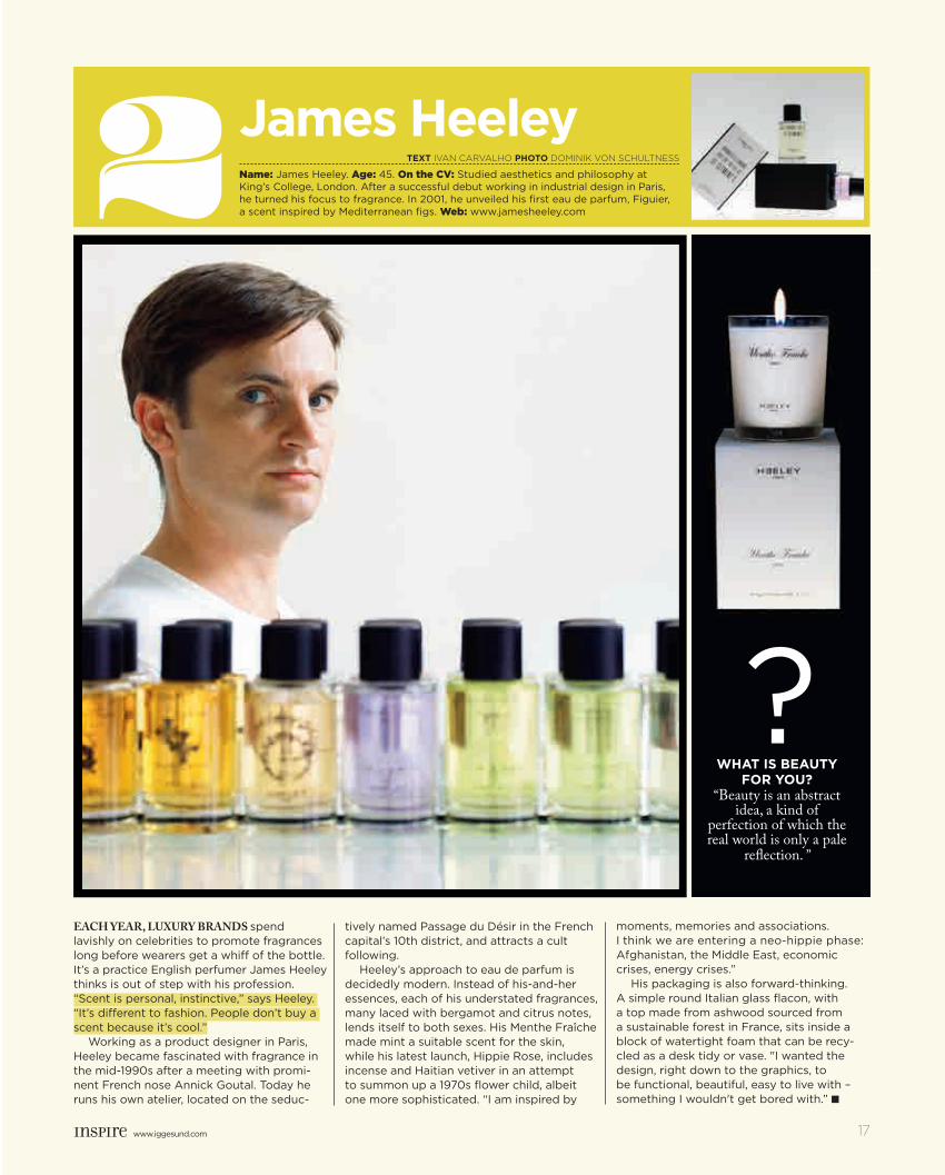
Each yEar, luxury brands spend lavishly on celebrities to promote fragrances long before wearers get a whiff of the bottle. It’s a practice English perfumer James Heeley thinks is out of step with his profession. “Scent is personal, instinctive,” says Heeley. “It’s different to fashion. People don’t buy a scent because it’s cool.”
Working as a product designer in Paris, Heeley became fascinated with fragrance in the mid-1990s after a meeting with promi-nent French nose Annick Goutal. Today he runs his own atelier, located on the seduc-
tively named Passage du Désir in the French capital’s 10th district, and attracts a cult following.
Heeley’s approach to eau de parfum is decidedly modern. Instead of his-and-her essences, each of his understated fragrances, many laced with bergamot and citrus notes, lends itself to both sexes. His Menthe Fraîche made mint a suitable scent for the skin, while his latest launch, Hippie Rose, includes incense and Haitian vetiver in an attempt to summon up a 1970s flower child, albeit one more sophisticated. “I am inspired by
moments, memories and associations. I think we are entering a neo-hippie phase: Afghanistan, the Middle East, economic crises, energy crises.”
His packaging is also forward-thinking. A simple round Italian glass flacon, with a top made from ashwood sourced from a sustainable forest in France, sits inside a block of watertight foam that can be recy-cled as a desk tidy or vase. "I wanted the design, right down to the graphics, to be functional, beautiful, easy to live with – something I wouldn't get bored with.” ■
2 Name: James Heeley. Age: 45. On the CV: Studied aesthetics and philosophy at King’s College, London. After a successful debut working in industrial design in Paris, he turned his focus to fragrance. In 2001, he unveiled his first eau de parfum, Figuier, a scent inspired by Mediterranean figs. Web: www.jamesheeley.com
1
James Heeley CoLuMn by Dan Jones
TexT IVAN CARVALHO PHoTo dOmINIk VON SCHULTNESS
www.iggesund.com 17
?WHaT is beauTy
for you? “Beauty is an abstract
idea, a kind of perfection of which the real world is only a pale
reflection. ”
inspire1103_Master E.indd 17 2011-09-26 14.53
www.iggesund.com18 www.iggesund.com
Have you designed or made exciting packaging or a graphic design product using material from Iggesund Paperboard? Or perhaps you have some tips for these pages? Don’t hesitate to contact us with samples
and information: Inspire, Iggesund Paperboard, SE-825 80, Sweden.
Invercote G 300 g/m2
Wow!
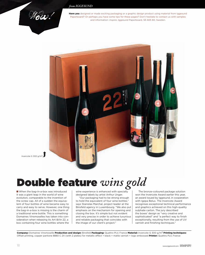
Company: Domaines Vinsmoselle Production and design: Binsfeld Packaging: Quattro PLV, France Material: Invercote G 300 g/m2 Printing techniques: Offset printing, copper pantone 8880 C 2X (with 2 plates) for metallic effect + black + matte varnish + logo embossed Printer: Quattro PLV, France
■ When the bag-in-a-box was introduced it was a giant leap in the world of wine evolution, comparable to the invention of the screw cap. All of a sudden the equiva-lent of four bottles of wine became easy to carry and easy to serve. However, one thing the bag-in-a-box is missing is the charm of a traditional wine bottle. This is something Domaines Vinsmoselles has taken into con-sideration when releasing its Art &Vin 22, a box containing four wine bottles where the
wine experience is enhanced with specially designed labels by artist Arthur Unger.
“Our packaging had to be strong enough to hold the equivalent of four wine bottles,” says Stanislas Marchal, project leader at the Binsfeld agency in Luxembourg. “We also put emphasis on the mechanism for opening and closing the box. It’s simple but not evident and very precise in order to achieve luxurious and reliable packaging that coincides with the image of our client’s project.”
The bronze-coloured package solution won the Invercote Award earlier this year, an award issued by Iggesund, in cooperation with Igepa Belux. The Invercote Award recognises exceptional technical performance and graphics achieved on this high-quality sulphate carton. The jury described the boxes’ design as “very creative and sophisticated” and “a perfect way to finish exceptionally, resulting from the use of UV varnish and finishing techniques.”
from Iggesund TEXT HENRIK EMILSON phoTo EVA HILDÉN SMITH
Double feature wins gold
inspire1103_Master E.indd 18 2011-09-26 14.58
www.iggesund.comwww.iggesund.com www.iggesund.com 19
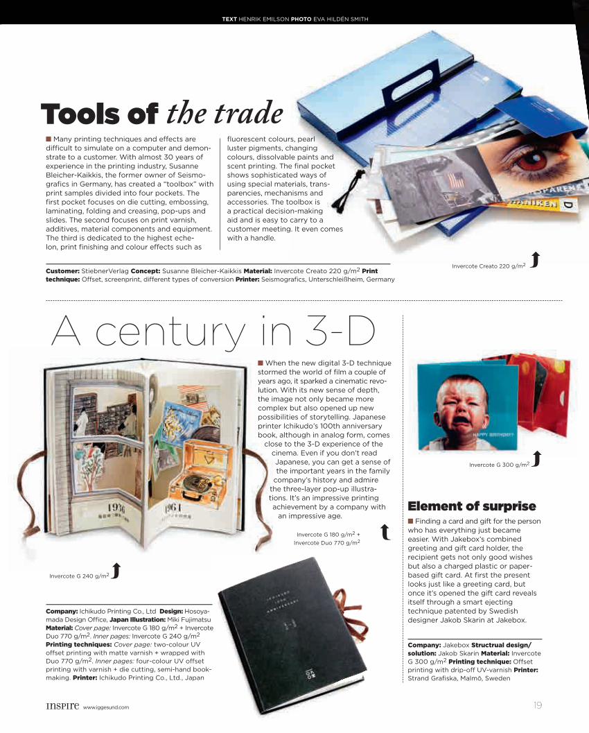
■ Finding a card and gift for the person who has everything just became easier. With Jakebox’s combined greeting and gift card holder, the recipient gets not only good wishes but also a charged plastic or paper-based gift card. At first the present looks just like a greeting card, but once it’s opened the gift card reveals itself through a smart ejecting technique patented by Swedish designer Jakob Skarin at Jakebox.
Invercote Creato 220 g/m2
■ Many printing techniques and effects are difficult to simulate on a computer and demon-strate to a customer. With almost 30 years of experience in the printing industry, Susanne Bleicher-Kaikkis, the former owner of Seismo-grafics in Germany, has created a “toolbox” with print samples divided into four pockets. The first pocket focuses on die cutting, embossing, laminating, folding and creasing, pop-ups and slides. The second focuses on print varnish, additives, material components and equipment. The third is dedicated to the highest eche-lon, print finishing and colour effects such as
fluorescent colours, pearl luster pigments, changing colours, dissolvable paints and scent printing. The final pocket shows sophisticated ways of using special materials, trans-parencies, mechanisms and accessories. The toolbox is a practical decision-making aid and is easy to carry to a customer meeting. It even comes with a handle.
Customer: StiebnerVerlag Concept: Susanne Bleicher-Kaikkis Material: Invercote Creato 220 g/m2 Print technique: Offset, screenprint, different types of conversion Printer: Seismografics, Unterschleißheim, Germany
Tools of the trade
■ When the new digital 3-D technique stormed the world of film a couple of years ago, it sparked a cinematic revo-lution. With its new sense of depth, the image not only became more complex but also opened up new possibilities of storytelling. Japanese printer Ichikudo’s 100th anniversary book, although in analog form, comes
close to the 3-D experience of the cinema. Even if you don’t read Japanese, you can get a sense of the important years in the family
company’s history and admire the three-layer pop-up illustra-tions. It’s an impressive printing achievement by a company with
an impressive age.
Company: Ichikudo Printing Co., Ltd Design: Hosoya-mada Design Office, Japan Illustration: Miki Fujimatsu Material: Cover page: Invercote G 180 g/m2 + Invercote Duo 770 g/m2. Inner pages: Invercote G 240 g/m2 Printing techniques: Cover page: two-colour UV offset printing with matte varnish + wrapped with Duo 770 g/m2. Inner pages: four-colour UV offset printing with varnish + die cutting, semi-hand book-making. Printer: Ichikudo Printing Co., Ltd., Japan
Company: Jakebox Structrual design/solution: Jakob Skarin Material: Invercote G 300 g/m2 Printing technique: Offset printing with drip-off UV-varnish Printer: Strand Grafiska, Malmö, Sweden
Element of surprise
A century in 3-D
Invercote G 180 g/m2 + Invercote Duo 770 g/m2
Invercote G 240 g/m2
TEXT HENRIK EMILSON phoTo EVA HILDÉN SMITH
Invercote G 300 g/m2
inspire1103_Master E.indd 19 2011-09-26 14.59
www.iggesund.com20 www.iggesund.com
PACKAGES
CONSUMERSBACK
TO
TALK
inspire1103_Master E.indd 20 2011-09-26 14.59
www.iggesund.comwww.iggesund.com www.iggesund.com 21
Sophisticated communications technology on product packaging is becoming mainstream.
“The package is not going to just sit quietly on the shelf and wait for someone to perhaps notice it as they pass by — it’s going to play a more active role,” says Richard Shear, creative director of The Shear Partnership, which he founded in 1996. Clients of the firm include such market giants as Coca-Cola, Hasbro, ibm, Johnson & Johnson, Pernod Ricard and Procter & Gamble. He is also a faculty member of the Masters in Branding Program at New York’s School of Visual Arts.
One of the new technologies making an impact on marketing is the bar code, or qr code. This innovative system is becoming a popular tool for interactive market-ing with both manufacturers and retailers. Conventional bar codes, which can be found on almost every packaged product sold in stores, are made up of a series of lines of varying thickness, with numbers across the bottom.
qr code, which looks like a group of random black boxes scattered across a white background, can store
much more data — such as a video — and can be scanned from a mobile phone.
This kind of coding has been used in magazine ads for products like perfumes, taking readers to a video they can watch on their mobiles.
“Technologies such as bar codes offer ever more interesting and robust ideas like information access on the shelf, discount options at the checkout and usage recom-mendations at home,” Shear suggests. The package, in other words, can speak to the consumer in completely new ways.
Several of the biggest retailers in the usa have jumped on the bandwagon. Target, Macy’s, Best Buy and Post Cereals are all using qr barcodes in their marketing.
Best Buy, a multinational retailer of technology and entertainment products with annual sales of over usd 50 billion, recently added rectangular qr code to all of its product-information tags. Shoppers at a Best Buy store can use their phones to scan the qr code on any product, such as a laser printer or a cd-player, which directs them to a product detail page or website.
The codes are also invading the aisles in supermarkets. Post Cereals added qr code to 12 million boxes of Honey Bunches of Oats, one of the breakfast cereal brands mar-keted by the foods giant. The company used the code to promote a Web-based sitcom.
Increased use of interactive technology in packaging is one of the seven trends Richard Shear describes in a New Year 2011 column he wrote for his “Package Unseen” design blog.
In future, he predicts, “The front panel of the package will be the new back panel.”
“Historically one of the biggest challengers manufac-turers face is to tell consumers not just what is in the box but also why it is good for me, the benefits statement, why I should eat or drink or use this product,” Shear says.
“Typically, this was done in many different ways, not a standardized manner,” he says. “We are now beginning to see category leaders in industries such as soft drinks and cereals coming together to present the consumer with certain information in a consistent manner on the front of the package. Theoretically, consumers will benefit be-cause they will have more information presented to them in a more straightforward way.”
Leading soft-drink manufacturers like Coca-Cola Ò
Design prizes are often awarded to packaging that is aesthetically appealing or combines form with function in an innovative manner. But packaging is also a mirror of social and technological trends and forms part of the fabric of popular culture. Nowadays, packaging is moving beyond the graphical sphere to communicate interactively with consumers in clever new ways.
TexT DAVID BARTAL
PACKAGES
CONSUMERS
inspire1103_Master E.indd 21 2011-09-26 15.01
www.iggesund.com22 www.iggesund.com
now use standardized symbols to provide consumers with information about sugar content, calories and other nutritional data, information that used be hidden on the back of the bottle or box. Customers want this informa-tion, and governments are pushing manufacturers to provide it in a clear and transparent way.
Another trend is that manufacturers and retailers all over the planet share a common goal: they want to reduce the cost, size and weight of packages. This is perhaps more a fact of life than a trend.
“In the United States, we have seen how Wal-Mart and Walgreens have been driving package sizes down, insisting that their manufacturers make smaller packages, or use vertical boxes on the shelf because they reduce the need for valuable horizontal space,” he says.
When Shear firSt started doing packaging for compu-ter software a decade ago, the boxes were often 8 or 10 inches high and included large, heavy manuals. “Wal-Mart said to the manufacturers, Your product will be half as large or it won’t be in Wal-Mart.”
Nowadays, if one goes into an Apple store to buy a computer program, the boxes are much smaller than they were a decade ago. Minimalistic packaging allows com-panies to boast about their environmental credentials and also lets retailers display more goods in a smaller space.
Green motives also partly explain the gradual trend to introduce more refillables and reusables.
Refillables and reusables are the “new recyclables”,
Shear says. The design expert observes that the trend began a few years ago “with concern about the amount of plastic being used for bottled water, then spread with the use of reusable shopping bags, and now has extended to detergents, baby wipes, cooking oils and paper products.” Shear also expects that products will be more concentrated, an area in which Procter & Gamble has been innovating.
Luxury products are also getting in the act. “Black Or-chid” perfume by Tom Ford comes in a refillable atomizer. The same goes for Chanel No. 5 and Jean Paul Gaultier’s fragrances.
Yet another change Richard Shear sees in his crystal ball: White will lose its default status on packaging. White became the hot colour for marketers around the time the recession started, but it is now giving way to a more varied palette. He notes that Wal-Mart, the world’s largest retail chain, “is building more colour into the brand’s packaging with the launch in 2011 of some updated packaging.”
Will there be increased consumer pressure for the use of sustainable materials in packaging in the coming year?
“I would like to say that there is a consumer trend to insist on more environmentally friendly sustainable materials, but I don’t think I’ve seen that,” Shear says. “The global recession has worked against that. There was a big push three or five years ago with various initiatives by retailers and manufacturers, but I have not heard much during the past year about a demand for an increase in recyclables.” ■
Ò
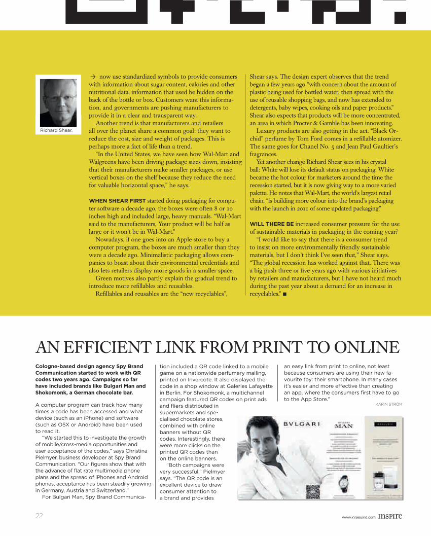
AN eFFICIeNT LINk FROM PRINT TO ONLINeCologne-based design agency Spy brand Communication started to work with Qr codes two years ago. Campaigns so far have included brands like bulgari Man and Shokomonk, a German chocolate bar.
A computer program can track how many times a code has been accessed and what device (such as an iPhone) and software (such as OSX or Android) have been used to read it.
“We started this to investigate the growth of mobile/cross-media opportunities and user acceptance of the codes,” says Christina Pielmyer, business developer at Spy Brand Communication. “Our figures show that with the advance of flat rate multimedia phone plans and the spread of iPhones and Android phones, acceptance has been steadily growing in Germany, Austria and Switzerland.”
For Bulgari Man, Spy Brand Communica-
tion included a QR code linked to a mobile game on a nationwide perfumery mailing, printed on Invercote. It also displayed the code in a shop window at Galeries Lafayette in Berlin. For Shokomonk, a multichannel campaign featured QR codes on print ads and fliers distributed in supermarkets and spe-cialised chocolate stores, combined with online banners without QR codes. Interestingly, there were more clicks on the printed QR codes than on the online banners.
“Both campaigns were very successful,” Pielmyer says. “The QR code is an excellent device to draw consumer attention to a brand and provides
an easy link from print to online, not least because consumers are using their new fa-vourite toy: their smartphone. In many cases it’s easier and more effective than creating an app, where the consumers first have to go to the App Store.”
text SAM EICHBLATT
Richard Shear.
KARIN STRÖM
inspire1103_Master E.indd 22 2011-09-26 15.02
www.iggesund.comwww.iggesund.com www.iggesund.com 23
Opus_Eleven_Design_board
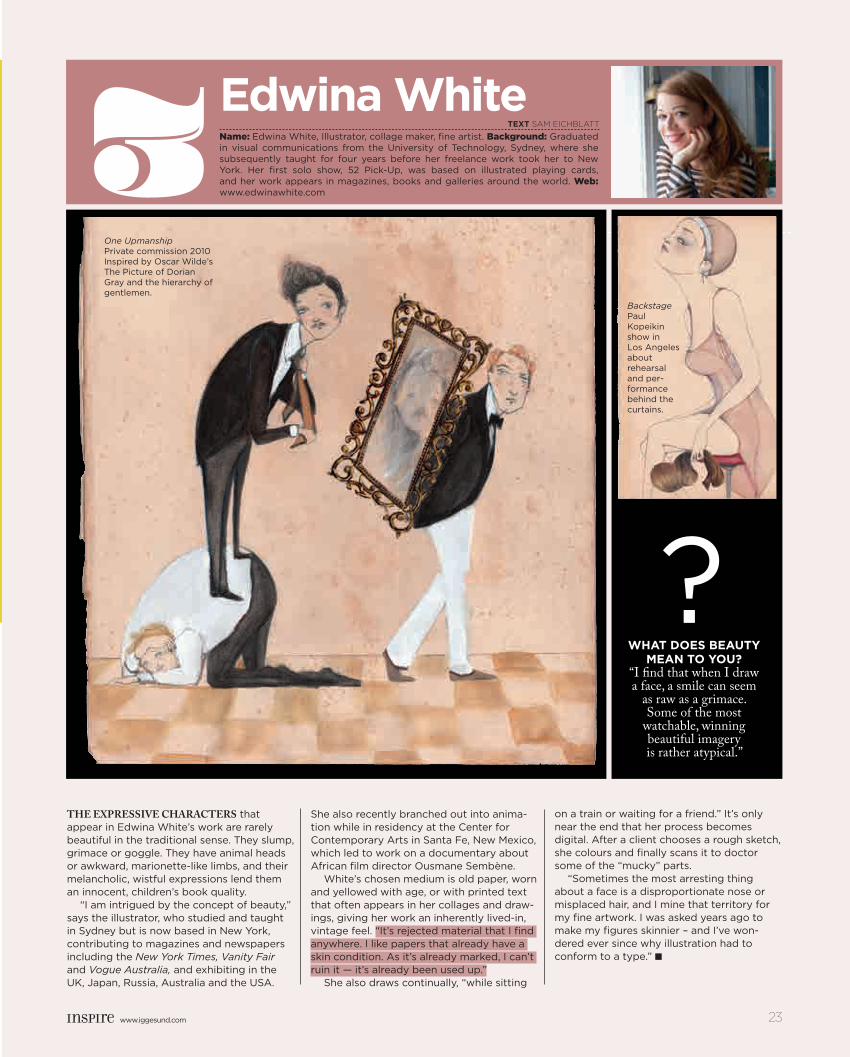
The expressive characTers that appear in Edwina White’s work are rarely beautiful in the traditional sense. They slump, grimace or goggle. They have animal heads or awkward, marionette-like limbs, and their melancholic, wistful expressions lend them an innocent, children’s book quality.
“I am intrigued by the concept of beauty,” says the illustrator, who studied and taught in Sydney but is now based in New York, contributing to magazines and newspapers including the New York Times, Vanity Fair and Vogue Australia, and exhibiting in the UK, Japan, Russia, Australia and the USA.
She also recently branched out into anima-tion while in residency at the Center for Contemporary Arts in Santa Fe, New Mexico, which led to work on a documentary about African film director Ousmane Sembène.
White’s chosen medium is old paper, worn and yellowed with age, or with printed text that often appears in her collages and draw-ings, giving her work an inherently lived-in, vintage feel. “It’s rejected material that I find anywhere. I like papers that already have a skin condition. As it’s already marked, I can’t ruin it — it’s already been used up.”
She also draws continually, “while sitting
on a train or waiting for a friend.” It’s only near the end that her process becomes digital. After a client chooses a rough sketch, she colours and finally scans it to doctor some of the “mucky” parts.
“Sometimes the most arresting thing about a face is a disproportionate nose or misplaced hair, and I mine that territory for my fine artwork. I was asked years ago to make my figures skinnier – and I’ve won-dered ever since why illustration had to conform to a type.” ■
3 Name: Edwina White, Illustrator, collage maker, fine artist. Background: Graduated in visual communications from the University of Technology, Sydney, where she subsequently taught for four years before her freelance work took her to New York. Her first solo show, 52 Pick-Up, was based on illustrated playing cards, and her work appears in magazines, books and galleries around the world. Web: www.edwinawhite.com
Edwina White
BackstagePaul Kopeikin show in Los Angeles about rehearsal and per-formance behind the curtains.
What doEs bEauty mEan to you?
“I find that when I draw a face, a smile can seem
as raw as a grimace. Some of the most
watchable, winning beautiful imagery is rather atypical.”
?
One UpmanshipPrivate commission 2010Inspired by Oscar Wilde’s The Picture of Dorian Gray and the hierarchy of gentlemen.
tExt SAM EICHBLATT
www.iggesund.com 23
inspire1103_Master E.indd 23 2011-09-26 15.02
www.iggesund.com24 www.iggesund.com
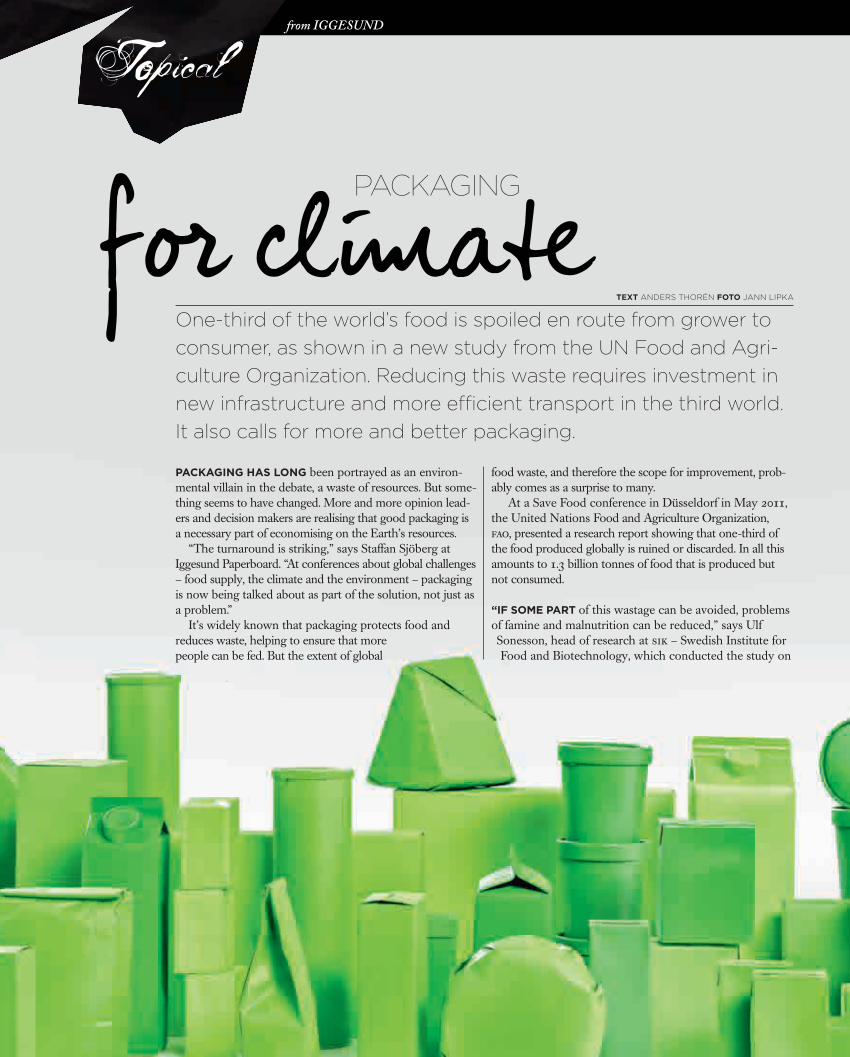
Packaging has long been portrayed as an environmental villain in the debate, a waste of resources. But something seems to have changed. More and more opinion leaders and decision makers are realising that good packaging is a necessary part of economising on the Earth’s resources.
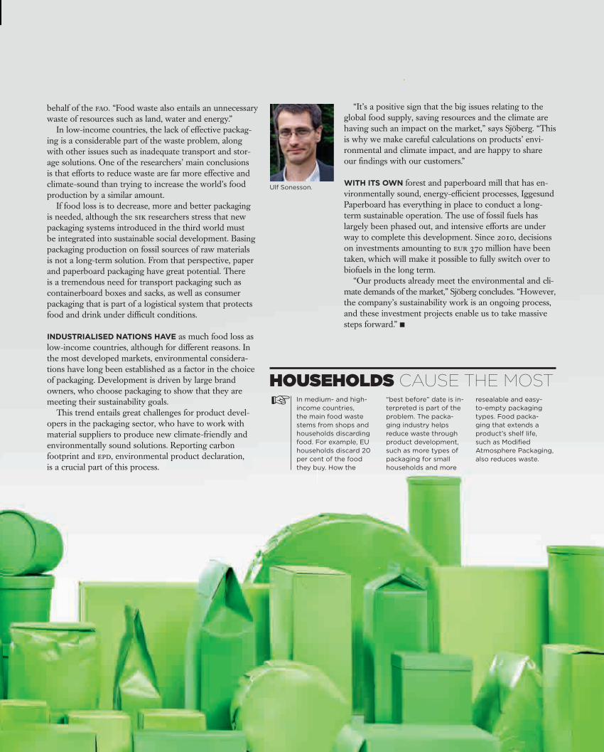
“The turnaround is striking,” says Staffan Sjöberg at Iggesund Paperboard. “At conferences about global challenges – food supply, the climate and the environment – packaging is now being talked about as part of the solution, not just as a problem.”
It’s widely known that packaging protects food and reduces waste, helping to ensure that more people can be fed. But the extent of global
food waste, and therefore the scope for improvement, probably comes as a surprise to many.
At a Save Food conference in Düsseldorf in May 2011, the United Nations Food and Agriculture Organization, fao, presented a research report showing that onethird of the food produced globally is ruined or discarded. In all this amounts to 1.3 billion tonnes of food that is produced but not consumed.
“if some Part of this wastage can be avoided, problems of famine and malnutrition can be reduced,” says UlfSonesson, head of research at sik – Swedish Institute for Food and Biotechnology, which conducted the study on
One-third of the world’s food is spoiled en route from grower to consumer, as shown in a new study from the UN Food and Agri-culture Organization. Reducing this waste requires investment in new in frastructure and more efficient transport in the third world. It also calls for more and better packaging.
Iggesund
packaging
for climateteXt Anders Thorén foto JAnn LIPKA
from Iggesund
Topical
inspire1103_Master E.indd 24 2011-09-26 15.04
www.iggesund.comwww.iggesund.com www.iggesund.com 25
behalf of the fao. “Food waste also entails an unnecessary waste of resources such as land, water and energy.”
In low-income countries, the lack of effective packag-ing is a considerable part of the waste problem, along with other issues such as inadequate transport and stor-age solutions. One of the researchers’ main conclusions is that efforts to reduce waste are far more effective and climate-sound than trying to increase the world’s food production by a similar amount.
If food loss is to decrease, more and better packaging is needed, although the sik researchers stress that new packaging systems introduced in the third world must be integrated into sustainable social development. Basing packaging production on fossil sources of raw materials is not a long-term solution. From that perspective, paper and paperboard packaging have great potential. There is a tremendous need for transport packaging such as containerboard boxes and sacks, as well as consumer packaging that is part of a logistical system that protects food and drink under difficult conditions.
IndustrIalIsed natIons have as much food loss as low-in come countries, although for different reasons. In the most developed markets, environmental considera-tions have long been established as a factor in the choice of packaging. Development is driven by large brand owners, who choose packaging to show that they are meeting their sustainability goals.
This trend entails great challenges for product devel-opers in the packaging sector, who have to work with material suppliers to produce new climate-friendly and environmentally sound solutions. Reporting carbon footprint and epd, environmental product declaration, is a crucial part of this process.
“It’s a positive sign that the big issues relating to the global food supply, saving resources and the climate are having such an impact on the market,” says Sjöberg. “This is why we make careful calculations on products’ envi-ronmental and climate impact, and are happy to share our findings with our customers.”
WIth Its oWn forest and paperboard mill that has en-vironmentally sound, energy-efficient processes, Iggesund Paperboard has everything in place to conduct a long-term sustainable operation. The use of fossil fuels has largely been phased out, and intensive efforts are under way to complete this development. Since 2010, decisions on investments amounting to eur 370 million have been taken, which will make it possible to fully switch over to biofuels in the long term.
“Our products already meet the environmental and cli-mate demands of the market,” Sjöberg concludes. “However, the company’s sustainability work is an ongoing process, and these investment projects enable us to take massive steps forward.” ■
☞HOUSEHOLDS CAUSE THE MOST
In medium- and high-income countries, the main food waste stems from shops and households discarding food. For example, EU households discard 20 per cent of the food they buy. How the
“best before” date is in-terpreted is part of the problem. The packa-ging industry helps reduce waste through product development, such as more types of packaging for small households and more
resealable and easy-to-empty packaging types. Food packa-ging that extends a product’s shelf life, such as Modified Atmosphere Packaging, also reduces waste.
pACkAging
Ulf Sonesson.
inspire1103_Master E.indd 25 2011-09-26 15.04
www.iggesund.com26 www.iggesund.com
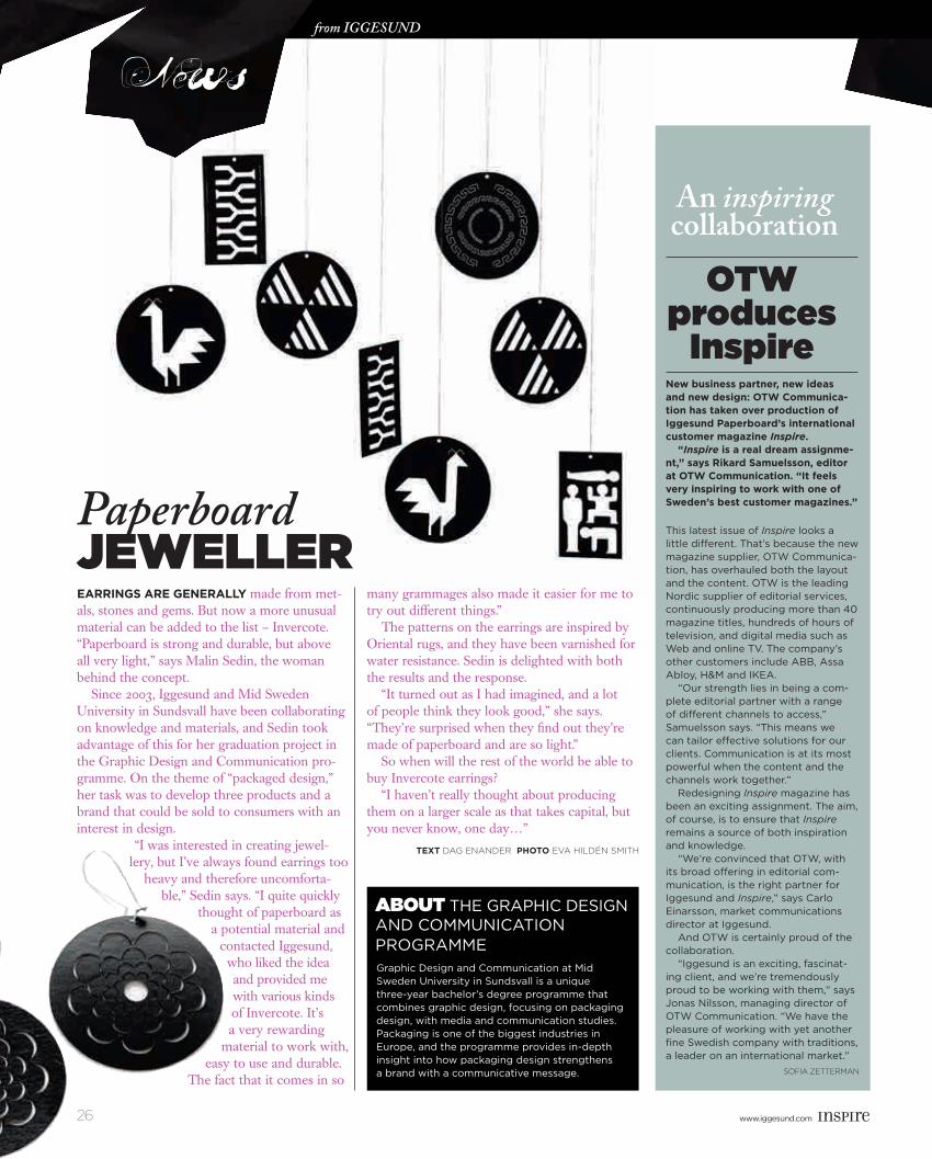
Earrings arE gEnErally made from met-als, stones and gems. But now a more unusual material can be added to the list – Invercote. “Paperboard is strong and durable, but above all very light,” says Malin Sedin, the woman behind the concept.
Since 2003, Iggesund and Mid Sweden University in Sundsvall have been collaborating on knowledge and materials, and Sedin took advantage of this for her graduation project in the Graphic Design and Communication pro-gramme. On the theme of “packaged design,” her task was to develop three products and a brand that could be sold to consumers with an interest in design.
“I was interested in creating jewel-lery, but I’ve always found earrings too
heavy and therefore uncomforta-ble,” Sedin says. “I quite quickly
thought of paperboard as a potential material and
contacted Iggesund, who liked the idea and provided me with various kinds of Invercote. It’s a very rewarding
material to work with, easy to use and durable.
The fact that it comes in so
many grammages also made it easier for me to try out different things.”
The patterns on the earrings are inspired by Oriental rugs, and they have been varnished for water resistance. Sedin is delighted with both the results and the response.
“It turned out as I had imagined, and a lot of people think they look good,” she says. “They’re surprised when they find out they’re made of paperboard and are so light.”
So when will the rest of the world be able to buy Invercote earrings?
“I haven’t really thought about producing them on a larger scale as that takes capital, but you never know, one day…”
TEXT Dag EnanDEr phoTo EVa HILDÉn SMITH
News
new business partner, new ideas and new design: oTW Communica-tion has taken over production of iggesund paperboard’s international customer magazine Inspire. “Inspire is a real dream assignme-nt,” says rikard samuelsson, editor at oTW Communication. “it feels very inspiring to work with one of sweden’s best customer magazines.” This latest issue of Inspire looks a little different. That’s because the new magazine supplier, OTW Communica-tion, has overhauled both the layout and the content. OTW is the leading Nordic supplier of editorial services, continuously producing more than 40 magazine titles, hundreds of hours of television, and digital media such as Web and online TV. The company’s other customers include ABB, Assa Abloy, H&M and IKEA. “Our strength lies in being a com-plete editorial partner with a range of different channels to access,” Samuelsson says. “This means we can tailor effective solutions for our clients. Communication is at its most powerful when the content and the channels work together.” Redesigning Inspire magazine has been an exciting assignment. The aim, of course, is to ensure that Inspire remains a source of both inspiration and knowledge. “We’re convinced that OTW, with its broad offering in editorial com-munication, is the right partner for Iggesund and Inspire,” says Carlo Einarsson, market communications director at Iggesund. And OTW is certainly proud of the collaboration. “Iggesund is an exciting, fascinat-ing client, and we’re tremendously proud to be working with them,” says Jonas Nilsson, managing director of OTW Communication. “We have the pleasure of working with yet another fine Swedish company with traditions, a leader on an international market.”
SofIa ZETTErMan
An inspiring collaboration
OTW produces
Inspire
ABOUT THE GRApHIC DESIGN AND COMMuNICATION pROGRAMMEGraphic Design and Communication at Mid Sweden university in Sundsvall is a unique three-year bachelor’s degree programme that combines graphic design, focusing on packaging design, with media and communication studies. packaging is one of the biggest industries in Europe, and the programme provides in-depth insight into how packaging design strengthens a brand with a communicative message.
News
Paperboard jeWeller
from Iggesund
inspire1103_Master E.indd 26 2011-09-26 15.05
www.iggesund.comwww.iggesund.com www.iggesund.com 27
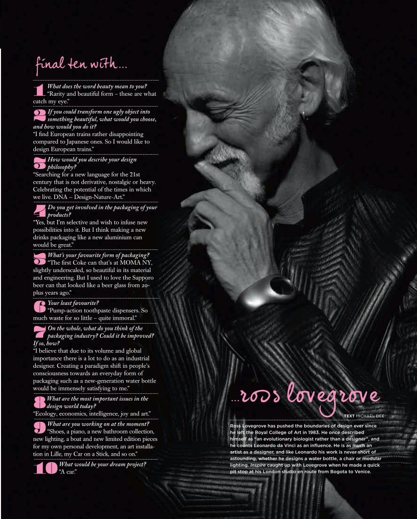
Ross Lovegrove has pushed the boundaries of design ever since he left the Royal College of Art in 1983. He once described himself as “an evolutionary biologist rather than a designer”, and he counts Leonardo da Vinci as an influence. He is as much an artist as a designer, and like Leonardo his work is never short of astounding, whether he designs a water bottle, a chair or modular lighting. Inspire caught up with Lovegrove when he made a quick pit stop at his London studio en route from Bogota to Venice.
final ten with...
...ross lovegrove
1What does the word beauty mean to you?“Rarity and beautiful form – these are what
catch my eye.”
2 If you could transform one ugly object into something beautiful, what would you choose,
and how would you do it?“I find European trains rather disappointing compared to Japanese ones. So I would like to design European trains.”
3 How would you describe your design philosophy?
“Searching for a new language for the 21st century that is not derivative, nostalgic or heavy. Celebrating the potential of the times in which we live. DNA — Design-Nature-Art.”
4 Do you get involved in the packaging of your products?
“Yes, but I'm selective and wish to infuse new possibilities into it. But I think making a new drinks packaging like a new aluminium can would be great.”
5 What’s your favourite form of packaging? “The first Coke can that's at MOMA NY,
slightly underscaled, so beautiful in its material and engineering. But I used to love the Sapporo beer can that looked like a beer glass from 20-plus years ago.”
6 Your least favourite? “Pump-action toothpaste dispensers. So
much waste for so little – quite immoral.”
7 On the whole, what do you think of the packaging industry? Could it be improved?
If so, how?“I believe that due to its volume and global importance there is a lot to do as an industrial designer. Creating a paradigm shift in people’s consciousness towards an everyday form of packaging such as a new-generation water bottle would be immensely satisfying to me.”
8 What are the most important issues in the design world today?
“Ecology, economics, intelligence, joy and art.”
9 What are you working on at the moment? “Shoes, a piano, a new bathroom collection,
new lighting, a boat and new limited edition pieces for my own personal development, an art installa-tion in Lille, my Car on a Stick, and so on.”
10 What would be your dream project? “A car.”
An inspiring collaboration
TEXT MICHAEL DEE
inspire1103_Master E.indd 27 2011-09-26 15.06

www.iggesund.com28 www.iggesund.com
CO11017
E
A MAGAZINE FROM Iggesund paperboard ISSUE 39 2011
inspire1103_Master E.indd 28 2011-09-26 14.39inspire1103_Omsl_kappa_klar.indd 2-3 2011-09-27 14.39omslagbak.indd 1 2011-11-22 15.50