Embed Size (px)
Citation preview
A Guide to More EffectivePowerPoint® Presentations
Dan AganPresident, Panthera Group LLC

This guide to presentations was created by Panthera Group LLC, and by special arrangement is being made available exclu-sively to NSF Science: Becoming the Messenger workshop attendees. It may not be re-transmitted, posted, shared, edited, or otherwise disseminated in any form without the expressed written consent of Panthera Group LLC.
© 2010-2011 Panthera Group LLC. All rights reserved.
www.pantheragroupllc.com
Death By PowerPoint®It’s been estimated that the average business professional may
see as many as 2,500 presentations during his or her career. An MBA student likely will see as many as three hundred presenta-tions during a typical 9-month school year, and may face giving another forty or so on his or her own. As professionals, I can only imagine the number of presentations you’ve endured as a part of your education, at meetings, in symposia, during seminars, and so on, not to mention the number you’ve undoubtedly given.
Clearly, the “talk and slides” has become a fixture of everything from academic to professional and personal life (teachers use it for “Back to School” nights, coaches use it for training, and on occasion even the clergy resort to PowerPoint® as a part of a ser-mon). With all of these presentations floating around, it should be a fairly simple matter to recall dozens that stand out as truly memorable and effective, right? But I’ll wager you’ll have trouble coming up with five...or three...or perhaps even one.
In fact, if you’re like most of us, the number of astonishingly bad presentations you’ve seen dwarfs the number of really good ones. And when I say “bad,” I mean atrocious. They feature acro-nyms and jargon so arcane and obscure that you need an Enigma machine to decode them. They’re delivered by speakers who drone on and on…and on...from a fixed spot in the universe situated squarely behind a podium (or whatever else they can find to help distance themselves from the audience). Their speech wanders about like a squirrel searching for buried nuts in the winter. Worse yet, they’re often backed by slides featuring such a dizzying array of pictures, colors, fonts and information that it seems you’ll need industrial strength Dramamine® to survive. In the most egre-gious cases, the presenters actually read the slides to you, just in case, somewhere along the line, you managed to forget what you learned in grade school.
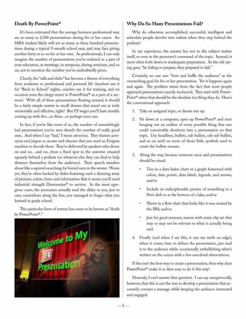
This particular form of torture has come to be known as “death by PowerPoint®.”
Why Do So Many Presentations Fail?Why do otherwise accomplished, successful, intelligent and
articulate people devolve into sadism when they step behind the podium?
In my experience, the answer lies not in the subject matter itself, or even in the presenter’s command of the topic. Instead, it most often boils down to inadequate preparation. As the old say-ing goes, “by failing to prepare, they prepared to fail.”
Certainly, no one sets “bore and baffle the audience” as the overarching goal for his or her presentation. Yet it happens again and again. The problem stems from the fact that most people approach presentations exactly backwards. They start with Power-Point® when that should be the absolute last thing they do. Here’s the conventional approach:
1. Take an assigned topic, or dream one up.
2. Sit down at a computer, open up PowerPoint® and start banging out an outline of every possible thing that one could conceivably shoehorn into a presentation on that topic. Use headlines, bullets, sub bullets, sub sub bullets, and so on until no more of those little symbols used to create the bullets remain.
3. Along the way, because someone once said presentations should be visual:
• Toss in a data-laden chart or a graph festooned with colors, data points, data labels, legends, and arrows; and/or
• Include an indecipherable picture of something in a Petri dish or at the bottom of a lake; and/or
• Throw in a flow chart that looks like it was created by the IRS; and/or
• Just for good measure, season with some clip art that may or may not be relevant to what is actually being said.
4. Finally (and when I see this, it sets my teeth on edge), when it comes time to deliver the presentation, just read it to the audience while occasionally embellishing what’s written on the screen with a few anecdotal observations.
If this isn’t the best way to create a presentation, then why does PowerPoint® make it so darn easy to do it this way?
Honestly, I can’t answer that question. I can say unequivocally, however, that this is not the way to develop a presentation that ac-curately conveys a message while keeping the audience interested and engaged.
—1—
One last note: the phases of this process are straightforward and easy to understand. However, the thinking and the effort re-quired to do them well—to do them in a way that resonates with and engages your audience—demand time, deliberation, a dash of creativity, and an unswerving focus on telling your story clearly, succinctly, effectively and efficiently.
Creating The MessagePhase one involves deciding on the message, including the key
point of your presentation, the major subpoints and the talking points that will buttress and affirm your assertions.
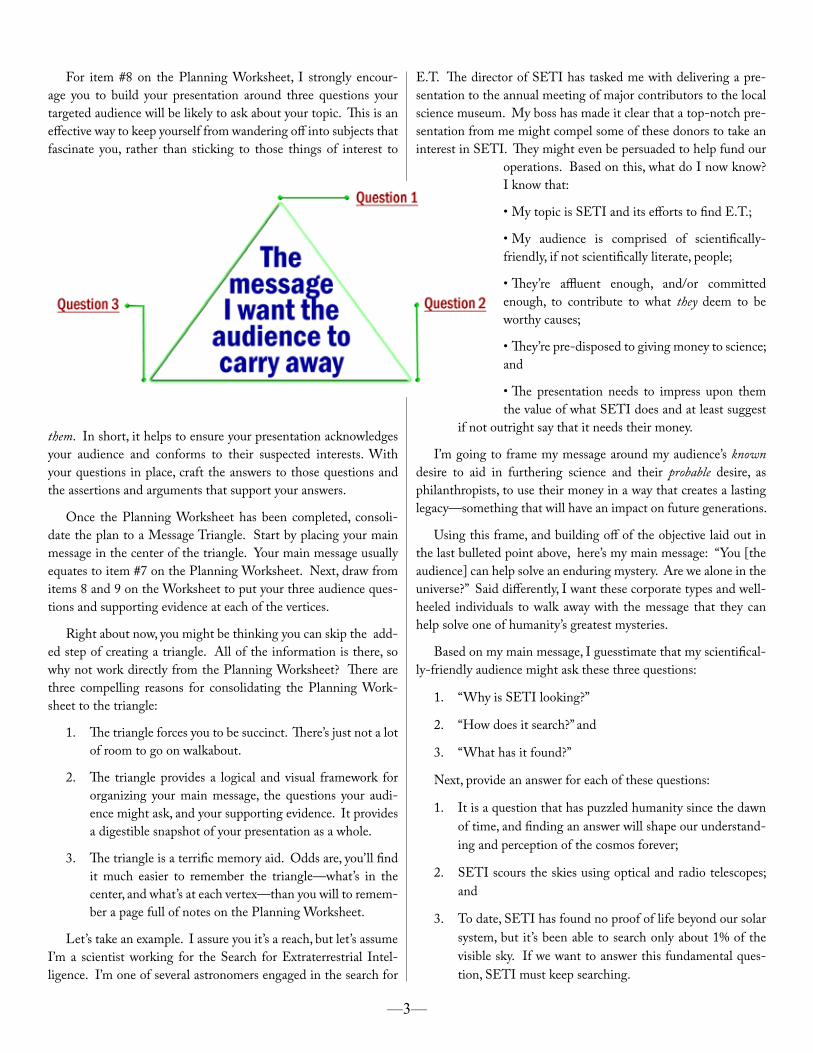
The Communications Workshops conducted by Panthera Group LLC, which this guide was developed to accompany, pres-ent two elegant, and complementary, tools for developing a mes-sage—the Communications Planning Worksheet and the Mes-sage Triangle. These tools are included as appendices at the end of this guide. While an in-depth exploration of how these tools are used exceeds the scope of a guide on creating presentations, here are a few general comments regarding message creation.
Begin developing your plan, and your message, by completing the Communications Planning Worksheet, starting with the topic of your presentation. Succinctly and concisely defining your topic clearly delineates the subject you are to address and serves as a con-stant reminder to stay focused on the matter hand. Happily, defin-ing a topic generally isn’t all that tough. For most presentations, your topic is decided for you. Typically this happens because you’re invited to talk about something of interest to a particular group, or your boss sends you out to address a spe-cific subject with an audience important to your or-ganization.
H a v i n g an audience in the room as you present makes it especially impor-tant that you ac-curately assess the audience as a whole, and then decide whom within that total audi-ence you most want to affect with your prsen-tation—their position on your topic, and the context or frame that will resonate best with them. Now, set an overall objective for your presentation by deciding what it is you want your targeted audi-ence to leave knowing, believing or doing.
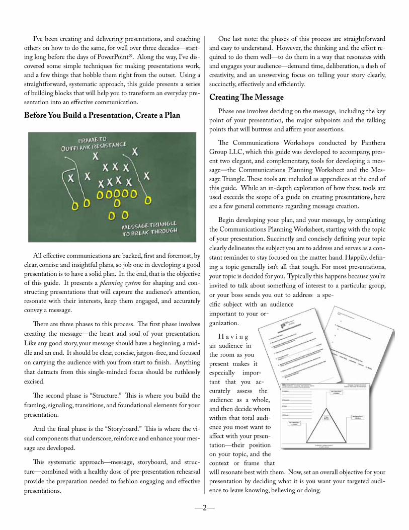
I’ve been creating and delivering presentations, and coaching others on how to do the same, for well over three decades—start-ing long before the days of PowerPoint®. Along the way, I’ve dis-covered some simple techniques for making presentations work, and a few things that hobble them right from the outset. Using a straightforward, systematic approach, this guide presents a series of building blocks that will help you to transform an everyday pre-sentation into an effective communication.
Before You Build a Presentation, Create a Plan
All effective communications are backed, first and foremost, by clear, concise and insightful plans, so job one in developing a good presentation is to have a solid plan. In the end, that is the objective of this guide. It presents a planning system for shaping and con-structing presentations that will capture the audience’s attention, resonate with their interests, keep them engaged, and accurately convey a message.
There are three phases to this process. The first phase involves creating the message—the heart and soul of your presentation. Like any good story, your message should have a beginning, a mid-dle and an end. It should be clear, concise, jargon-free, and focused on carrying the audience with you from start to finish. Anything that detracts from this single-minded focus should be ruthlessly excised.
The second phase is “Structure.” This is where you build the framing, signaling, transitions, and foundational elements for your presentation.
And the final phase is the “Storyboard.” This is where the vi-sual components that underscore, reinforce and enhance your mes-sage are developed.
This systematic approach—message, storyboard, and struc-ture—combined with a healthy dose of pre-presentation rehearsal provide the preparation needed to fashion engaging and effective presentations.
—2—
For item #8 on the Planning Worksheet, I strongly encour-age you to build your presentation around three questions your targeted audience will be likely to ask about your topic. This is an effective way to keep yourself from wandering off into subjects that fascinate you, rather than sticking to those things of interest to
them. In short, it helps to ensure your presentation acknowledges your audience and conforms to their suspected interests. With your questions in place, craft the answers to those questions and the assertions and arguments that support your answers.
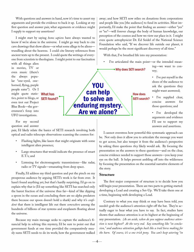
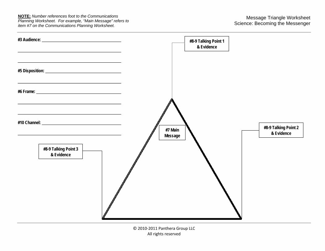
Once the Planning Worksheet has been completed, consoli-date the plan to a Message Triangle. Start by placing your main message in the center of the triangle. Your main message usually equates to item #7 on the Planning Worksheet. Next, draw from items 8 and 9 on the Worksheet to put your three audience ques-tions and supporting evidence at each of the vertices.
Right about now, you might be thinking you can skip the add-ed step of creating a triangle. All of the information is there, so why not work directly from the Planning Worksheet? There are three compelling reasons for consolidating the Planning Work-sheet to the triangle:
1. The triangle forces you to be succinct. There’s just not a lot of room to go on walkabout.
2. The triangle provides a logical and visual framework for organizing your main message, the questions your audi-ence might ask, and your supporting evidence. It provides a digestible snapshot of your presentation as a whole.
3. The triangle is a terrific memory aid. Odds are, you’ll find it much easier to remember the triangle—what’s in the center, and what’s at each vertex—than you will to remem-ber a page full of notes on the Planning Worksheet.
Let’s take an example. I assure you it’s a reach, but let’s assume I’m a scientist working for the Search for Extraterrestrial Intel-ligence. I’m one of several astronomers engaged in the search for
E.T. The director of SETI has tasked me with delivering a pre-sentation to the annual meeting of major contributors to the local science museum. My boss has made it clear that a top-notch pre-sentation from me might compel some of these donors to take an interest in SETI. They might even be persuaded to help fund our
operations. Based on this, what do I now know? I know that:
• My topic is SETI and its efforts to find E.T.;
• My audience is comprised of scientifically-friendly, if not scientifically literate, people;
• They’re affluent enough, and/or committed enough, to contribute to what they deem to be worthy causes;
• They’re pre-disposed to giving money to science; and
• The presentation needs to impress upon them the value of what SETI does and at least suggest
if not outright say that it needs their money.
I’m going to frame my message around my audience’s known desire to aid in furthering science and their probable desire, as philanthropists, to use their money in a way that creates a lasting legacy—something that will have an impact on future generations.
Using this frame, and building off of the objective laid out in the last bulleted point above, here’s my main message: “You [the audience] can help solve an enduring mystery. Are we alone in the universe?” Said differently, I want these corporate types and well-heeled individuals to walk away with the message that they can help solve one of humanity’s greatest mysteries.
Based on my main message, I guesstimate that my scientifical-ly-friendly audience might ask these three questions:
1. “Why is SETI looking?”
2. “How does it search?” and
3. “What has it found?”
Next, provide an answer for each of these questions:
1. It is a question that has puzzled humanity since the dawn of time, and finding an answer will shape our understand-ing and perception of the cosmos forever;
2. SETI scours the skies using optical and radio telescopes; and
3. To date, SETI has found no proof of life beyond our solar system, but it’s been able to search only about 1% of the visible sky. If we want to answer this fundamental ques-tion, SETI must keep searching.
—3—
With questions and answers in hand, now it’s time to assert my arguments and provide the evidence to back it up. Looking at my first question and answer pair, what arguments or evidence might I supply to support my assertions?
I might start by saying homo sapiens have always wanted to know if we’re alone in the universe. I might go way back to cite cave drawings that show aliens—or what some allege to be aliens—trundling about the heavens. I could cite literary references from ancient texts up to the present. I could quote the writings of every-one from scientists to theologians. I might point to our fascination with all things alien in movies, TV or even music (there’s the always popu-lar “one-eyed, one-horned, flying, purple people eater”). Or I might quote statis-tics, point to blogs, or even trot out Project Blue Book—the gov-ernment’s foray into UFO investigations.
For my second question and answer pair, I’d likely relate the basics of SETI research involving both optical and radio telescope observations scanning the cosmos for:
• Flashing lights, like lasers that might originate with some intelligent alien presence;
• Large structures that would indicate the presence of smart E.T.’s; and
• Listening for electromagnetic transmissions—like radar, radio or TV signals—emanating from deep space.
Finally, I’d address my third question and put the pinch on my prosperous audience by arguing SETI’s work is far from over. It hasn’t found anything yet, but that’s hardly surprising. I’d go on to explain why that is (I’d say something like SETI has searched only the barest fraction of the universe thus far—kind of like dipping a spoon in the ocean and concluding there are no alpha predators there because our spoon doesn’t hold a shark) and why it’s confi-dent that there is intelligent life out there somewhere among the hundreds of billions of star systems and exoplanets floating about the universe.
Because my main message seeks to capture the audience’s fi-nancial help in solving this mystery, I’d be sure to point out that government funds at one time provided the comparatively mea-sly sums SETI needs to do its work; how the government walked
away; and how SETI now relies on donations from corporations and people like you [the audience] to fund its activities. Most im-portantly, I’d make the point that finding an answer—either “yes” or “no”—will forever change the body of human knowledge, our perception of the cosmos and how we view our place in it. I might even quote astrophysicist Dr. Ed Seidel of the National Science Foundation who said, “If we discover life outside our planet, it would perhaps be the most significant discovery of all time.”
With that, I’ve breathed life into my presentation:
• I’ve articulated the main point—or the intended mean-ing—we want to con-vey;
• I’ve put myself in the shoes of the audience to ask the questions they might want answered;
• I’ve supplied clear, concise answers for those questions; and
• I’ve developed the arguments and evidence I’ll use to support my answers and assertions.
I cannot overstress how powerful this systematic approach can be. Not only does it allow you to articulate the message you want to get across, but also temper it from the audience’s perspective by asking three questions they likely would ask. By focusing the presentation on the answers to these questions—and on the clear, concise evidence needed to support those answers—you keep your eye on the ball. It helps prevent ambling off into the wilderness by focusing the presentation on the essential narrative elements of the story.
Structure
The first major component of structure is to decide how you will begin your presentation. There are two parts to getting started: developing a Lead and creating a Set-Up. We’ll take them one at a time, beginning with developing a Lead.
Contrary to what you may think or may have been told, you needn’t grab the audience’s attention right off the bat. They’re ac-tually eager to hear what you have to say. In fact, studies have shown that audience attention is at its highest at the beginning of any presentation. (As an aside, when do you suppose audience atten-tion is next highest? At the very end. Say something like “in conclu-sion,” and audience attention gallops back like a trail horse making for the barn. Of course, it’s a one trick pony. You can’t keep uttering “in
—4—
conclusion” every few minutes to salvage a presentation bereft of inter-esting material. Audiences are smarter than that.)
The goal of the Lead is to convince your audience that they should continue to pay attention because you’re going to have many more interesting things to say during your presentation.
Many communications coaches suggest that you Lead with a joke–something to warm up the audience–and that’s fine if you’re confident in your skills as a humorist or a joke teller. However, humor is a risky thing. What you think is hysterical may not be so funny to someone else, so why risk starting off your presentation under the threatening skies of a joke that falls flat?
Instead, I recommend that you lead with an interesting story or an amazing statistic. Most assuredly, not everyone
may find your story interesting or your statis-tics amazing, but unlike the joke
no one laughs at, there’s usually no outward evidence of the
audience’s indifference.
Going back to the SETI example, I might lead my presentation
with something like this:
“I want you to look around. Odds are someone sitting very near to you believes we are being visited by intelligent beings from beyond Earth. According to recent research, three out of every five of you in this room believe that. An entire cottage industry has grown up around this pervasive belief based largely on anecdotal evidence. But is there scientific evidence to believe we’re not alone? And if so, what is it?”
The second part to getting started is to segue from the Lead to your first question and answer pair. Now, one might argue that I could dive right into my Message Triangle after the Lead, but that, in my view, would overlook or diminish some important chapters in my story, or it would disrupt the flow of my presentation were I forced to come back later and tack on these additional chapters.
What am I talking about here? Well, like any good story, I need an elegant, but concise, way of giving my audience some es-sential background information. We do this through the Set-Up.
The Set-Up is an expository device that helps carry your narra-tive from the Lead into your Main Message. It’s fundamental pur-pose is to provide background information on the main character (meaning you); the “plot,” and by that I mean the topic at hand; its “setting,” meaning a context for why the audience should care; and the “dramatic action,” meaning a hint as to what you expect the audience to come away knowing, believing, or doing.
During the Set-Up, you need to address four things, not neces-sarily in this order:
• What you are going to talk about;
• Why the audience should care;
• Why you are qualified or interested in talking about this; and finally
• What you want the audience to do, act, or believe.
Here’s how I might use the Set-Up to segue from the Lead for my SETI talk into my Message Triangle. The first paragraph below repeats my Lead so you can follow the flow from Lead to Set-Up to Message Triangle:
[LEAD] “I want you to look around. Odds are someone sitting very near to you believes we are being visited by intelligent beings from beyond Earth. According to recent research, three out of every five of you in this room believe that. An entire cottage industry has grown up around this pervasive belief based largely on anecdotal evidence. But is there scientific evidence to believe we’re not alone? And if so, what is it?.
[SET-UP] “Over the next few minutes, I’m going to tell you about the scientific quest to find intelligent aliens—a search that’s been go-ing on for half a century and one I’ve personally been involved in for 25 years. Then, at the end, I’m going to ask you to become personally involved in the effort to answer one of the most enduring questions of all time—’Are we alone in the universe?’ Yes or no, it’s an answer that will forever change humankind’s view of the cosmos and our place in it.
[MESSAGE TRIANGLE] “Perhaps some of you didn’t realize we’re actively looking for E.T. You might even wonder why. The truth is, SETI is not the first to wonder. We’re just the first to address the question scientifically. You can discover human fascination with all things alien everywhere from ancient cave drawings to cable TV, the internet and the corner cineplex. Our distant ancestors painted pictures of what many speculate are alien life forms on the walls of caves. In India, it was, and still is, believed that man descended from gods who flew in fiery craft. Whether these ancient references truly reflect our predecessors’ musings on the possibility of alien intelligence, or as some maintain provide proof that we have been and are being visited by E.T., has been, is, and will be the subject of considerable debate. What is clear, however, is that the question of life among the stars has puzzled us for a very long time indeed. And it still does. Need I say more than ‘Roswell ’ or ‘Area 51’?”
With that, you’re already off and running. on your first question and answer pair.
—5—
Telegraphing and Recapping
Now that you’ve structured your opening, there are two inter-related structural components you’ll want to deploy over the course of your presentation: telegraphing and recapping.
Telegraphing is a foreshadowing of key information about spe-cific points headed the audience’s way. Use it to give the audience a heads up about what’s coming next. It’s kind of a scorecard to help the audience keep track of the players. Here’s one way you might telegraph: “There are three important reasons for this. First...”
The flip side of this is recapping. If telegraphing is akin to that tried and true maxim “tell them what you’re going to tell them,” then recapping is the bit where you “tell them what you told them.” It’s a way of saying, “I’m done with these points and I’m getting ready to move on.” Recapping goes something like this: “These three points—1,2,3—demonstrate that...” Without the visual paragraph markers and subheads we’re accustomed to in written text, telegraphing and recapping are es-sential verbal cues to your audience about the important points you’ll be making or have just made.
Planting Flags
Good presenters also plant flags. With flags you signal what’s more impor-tant and what’s less important, what the audience should absolutely remember, what they needn’t focus on, and what you expect of them. Flags take the form of phrases like:
• “Here’s what I want you to do...”;
• “Remember this...”; and
• “The bottom line is this...”.
Think of a GPS
Like you do with telegraphing and recapping of individual points in your presentation, you’ll also want to keep your audi-ence up-to-date on the big picture of where you’ve been, where you are, and where you’re going in the presentation as a whole. This ensures the audience follows you each step of the way from the beginning, through the middle and to the end of your narrative. For example, you might say things like:
“During this presentation, I’ll cover four major trends that suggest humankind is having an impact on climate. The first major trend is...”
“Well, if that’s major trend number one, then what about major trend number two? In a moment, I’ll talk about the second major trend, but before I do, let me touch on…”
Remember to think like a GPS in providing your audience not only with a macro view of your presentation’s route, but also an update on the individual turns your presentation is making in pro-gressing towards your final destination.
Storyboarding
With the messaging and structural foundations in place, now it’s time to focus on the visual components of the presentation—what I call the “Storyboard.”
Imagine for a moment that you’re tasked with conveying your message using only visuals and a minimal dose of words – say three or four words per slide, kind of like a series of billboards along the highway. This is the goal of the storyboard, to create a compelling visual story that will reinforce and enhance the things you’re going to say, not replicate them in text on a slide.
Good visuals fall mainly into three camps. One, they can serve to reinforce what you say. Two, they can enhance the oral message by making a point more memorable. And three, good visuals can present important information in a more easily digestible form, such as in a chart or graph, instead of a litany of spoken numbers.
Earlier, I referred to the way many presenters approach slide shows with my tongue planted firmly in my cheek, but like all dark humor there’s a substantial element of truth here. Undoubtedly you, like I, have suffered through presentations where the speak-er slaps up complicated slide after complicated slide full of text, charts, graphs, fonts, colors and images, and then proceeds to point at things while reading the slide aloud to the audience. (When you witness this, think to yourself, these slides are for the speaker, not for the audience. The presenter is using his or her slides as a set of crib notes for the presentation!)
That’s not the point of having visuals and in fact doing so is detrimental to effective communication.
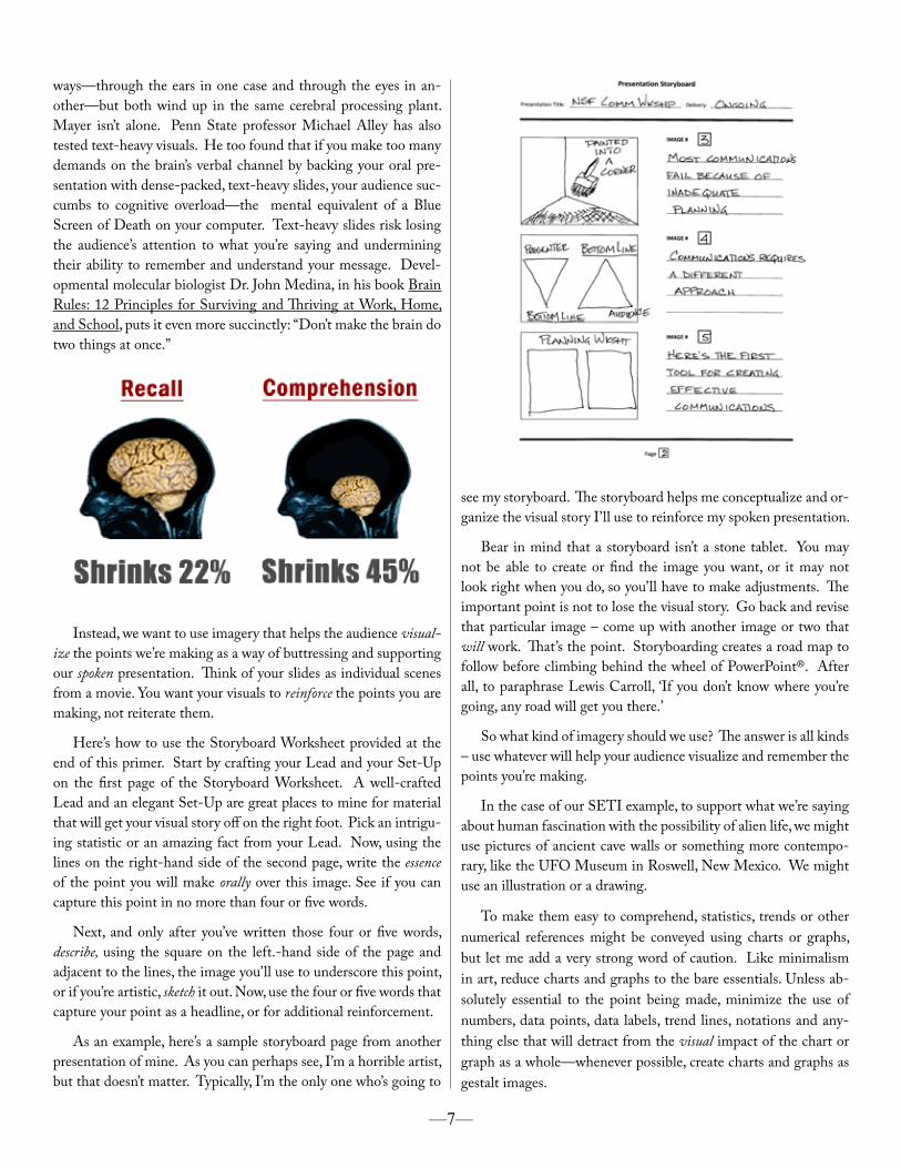
Educational psychologist and researcher Richard Mayer has studied the effects of multimedia presentations on audiences. Mayer found that when you force an audience to read compli-cated, text-heavy slides while you’re also talking, both recall and comprehension suffer.
• In the case of recall, audience memory of what was said slips by 22%.
• The story for comprehension is even worse. When forced both to read a slide and listen to a speaker, audience under-standing of the material falls a whopping 45%.
The likely reason for this, according to Mayer, is that non-tex-tual material is processed by the brain’s visual channel, whereas both spoken language and written text are processed by the brain’s verbal channel. Granted, the information arrives in different
—6—
ways—through the ears in one case and through the eyes in an-other—but both wind up in the same cerebral processing plant. Mayer isn’t alone. Penn State professor Michael Alley has also tested text-heavy visuals. He too found that if you make too many demands on the brain’s verbal channel by backing your oral pre-sentation with dense-packed, text-heavy slides, your audience suc-cumbs to cognitive overload—the mental equivalent of a Blue Screen of Death on your computer. Text-heavy slides risk losing the audience’s attention to what you’re saying and undermining their ability to remember and understand your message. Devel-opmental molecular biologist Dr. John Medina, in his book Brain Rules: 12 Principles for Surviving and Thriving at Work, Home, and School, puts it even more succinctly: “Don’t make the brain do two things at once.”
Instead, we want to use imagery that helps the audience visual-ize the points we’re making as a way of buttressing and supporting our spoken presentation. Think of your slides as individual scenes from a movie. You want your visuals to reinforce the points you are making, not reiterate them.
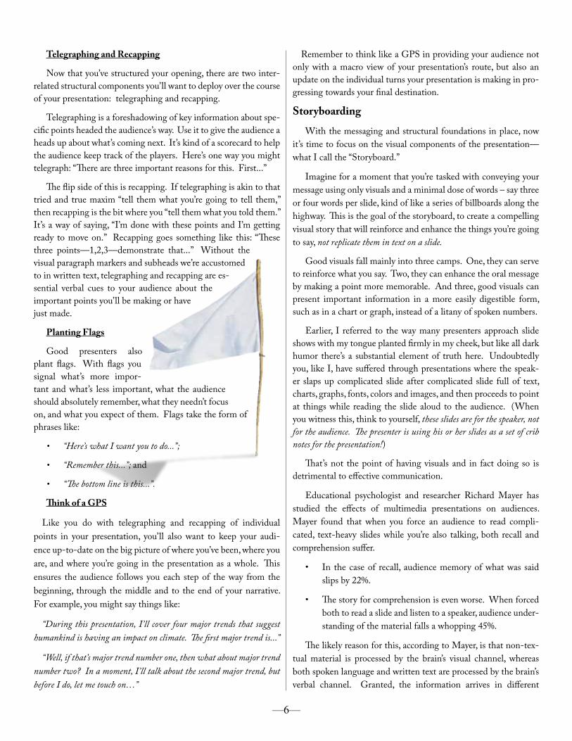
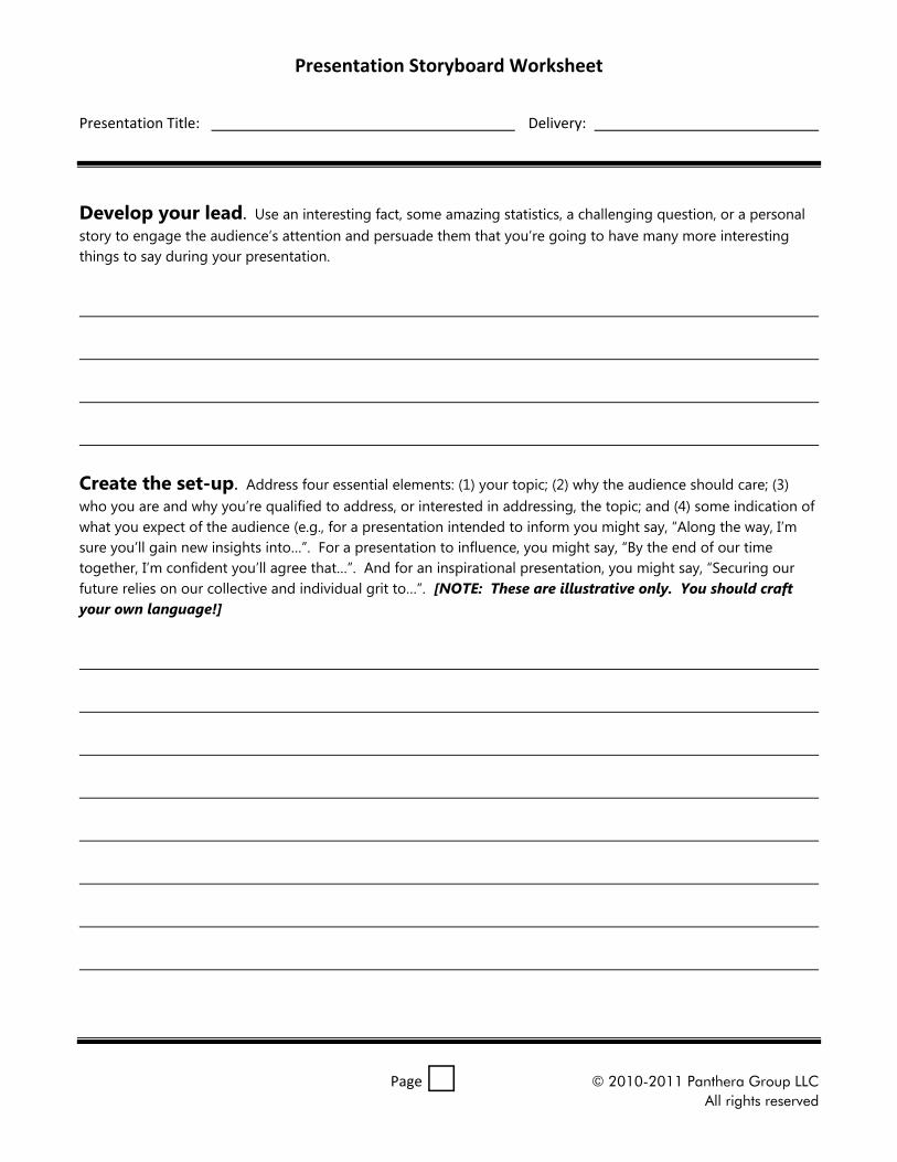
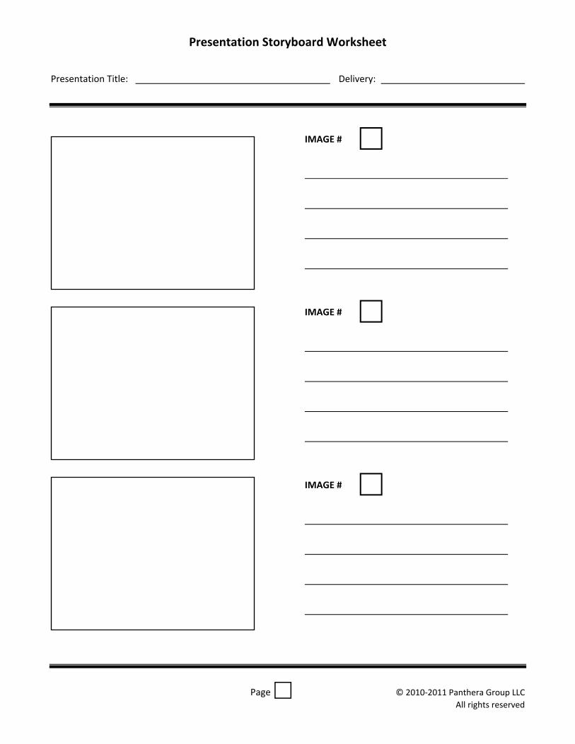
Here’s how to use the Storyboard Worksheet provided at the end of this primer. Start by crafting your Lead and your Set-Up on the first page of the Storyboard Worksheet. A well-crafted Lead and an elegant Set-Up are great places to mine for material that will get your visual story off on the right foot. Pick an intrigu-ing statistic or an amazing fact from your Lead. Now, using the lines on the right-hand side of the second page, write the essence of the point you will make orally over this image. See if you can capture this point in no more than four or five words.
Next, and only after you’ve written those four or five words, describe, using the square on the left.-hand side of the page and adjacent to the lines, the image you’ll use to underscore this point, or if you’re artistic, sketch it out. Now, use the four or five words that capture your point as a headline, or for additional reinforcement.
As an example, here’s a sample storyboard page from another presentation of mine. As you can perhaps see, I’m a horrible artist, but that doesn’t matter. Typically, I’m the only one who’s going to
see my storyboard. The storyboard helps me conceptualize and or-ganize the visual story I’ll use to reinforce my spoken presentation.
Bear in mind that a storyboard isn’t a stone tablet. You may not be able to create or find the image you want, or it may not look right when you do, so you’ll have to make adjustments. The important point is not to lose the visual story. Go back and revise that particular image – come up with another image or two that will work. That’s the point. Storyboarding creates a road map to follow before climbing behind the wheel of PowerPoint®. After all, to paraphrase Lewis Carroll, ‘If you don’t know where you’re going, any road will get you there.’
So what kind of imagery should we use? The answer is all kinds – use whatever will help your audience visualize and remember the points you’re making.
In the case of our SETI example, to support what we’re saying about human fascination with the possibility of alien life, we might use pictures of ancient cave walls or something more contempo-rary, like the UFO Museum in Roswell, New Mexico. We might use an illustration or a drawing.
To make them easy to comprehend, statistics, trends or other numerical references might be conveyed using charts or graphs, but let me add a very strong word of caution. Like minimalism in art, reduce charts and graphs to the bare essentials. Unless ab-solutely essential to the point being made, minimize the use of numbers, data points, data labels, trend lines, notations and any-thing else that will detract from the visual impact of the chart or graph as a whole—whenever possible, create charts and graphs as gestalt images.
—7—
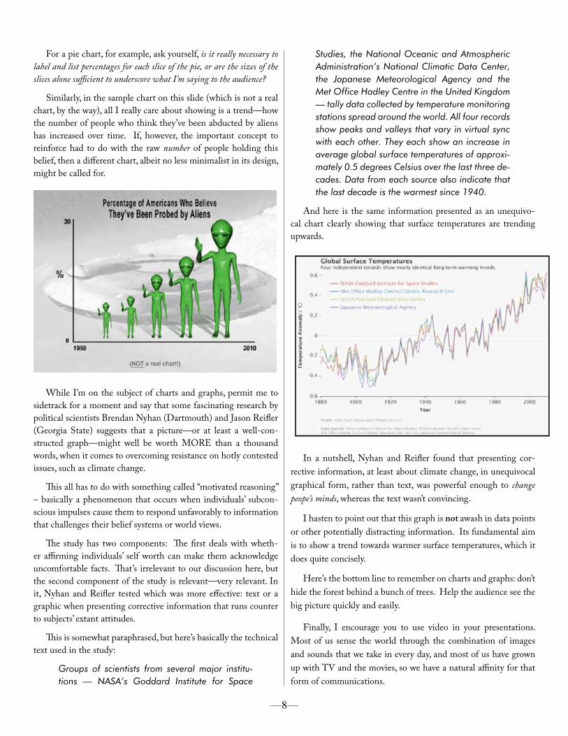
For a pie chart, for example, ask yourself, is it really necessary to label and list percentages for each slice of the pie, or are the sizes of the slices alone sufficient to underscore what I’m saying to the audience?
Similarly, in the sample chart on this slide (which is not a real chart, by the way), all I really care about showing is a trend—how the number of people who think they’ve been abducted by aliens has increased over time. If, however, the important concept to reinforce had to do with the raw number of people holding this belief, then a different chart, albeit no less minimalist in its design, might be called for.
While I’m on the subject of charts and graphs, permit me to sidetrack for a moment and say that some fascinating research by political scientists Brendan Nyhan (Dartmouth) and Jason Reifler (Georgia State) suggests that a picture—or at least a well-con-structed graph—might well be worth MORE than a thousand words, when it comes to overcoming resistance on hotly contested issues, such as climate change.
This all has to do with something called “motivated reasoning” – basically a phenomenon that occurs when individuals’ subcon-scious impulses cause them to respond unfavorably to information that challenges their belief systems or world views.
The study has two components: The first deals with wheth-er affirming individuals’ self worth can make them acknowledge uncomfortable facts. That’s irrelevant to our discussion here, but the second component of the study is relevant—very relevant. In it, Nyhan and Reifler tested which was more effective: text or a graphic when presenting corrective information that runs counter to subjects’ extant attitudes.
This is somewhat paraphrased, but here’s basically the technical text used in the study:
Groups of scientists from several major institu-tions — NASA’s Goddard Institute for Space
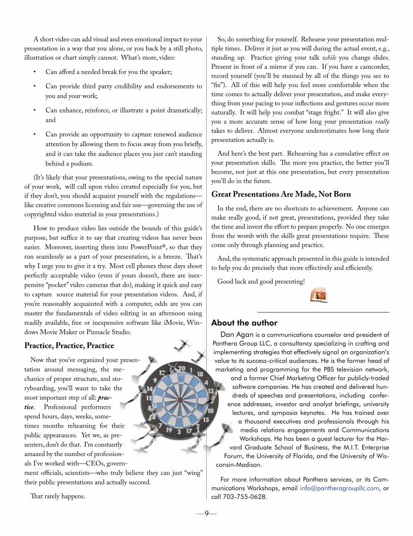
Studies, the National Oceanic and Atmospheric Administration’s National Climatic Data Center, the Japanese Meteorological Agency and the Met Office Hadley Centre in the United Kingdom — tally data collected by temperature monitoring stations spread around the world. All four records show peaks and valleys that vary in virtual sync with each other. They each show an increase in average global surface temperatures of approxi-mately 0.5 degrees Celsius over the last three de-cades. Data from each source also indicate that the last decade is the warmest since 1940.
And here is the same information presented as an unequivo-cal chart clearly showing that surface temperatures are trending upwards.
In a nutshell, Nyhan and Reifler found that presenting cor-rective information, at least about climate change, in unequivocal graphical form, rather than text, was powerful enough to change peope’s minds, whereas the text wasn’t convincing.
I hasten to point out that this graph is not awash in data points or other potentially distracting information. Its fundamental aim is to show a trend towards warmer surface temperatures, which it does quite concisely.
Here’s the bottom line to remember on charts and graphs: don’t hide the forest behind a bunch of trees. Help the audience see the big picture quickly and easily.
Finally, I encourage you to use video in your presentations. Most of us sense the world through the combination of images and sounds that we take in every day, and most of us have grown up with TV and the movies, so we have a natural affinity for that form of communications.
—8—
A short video can add visual and even emotional impact to your presentation in a way that you alone, or you back by a still photo, illustration or chart simply cannot. What’s more, video:
• Can afford a needed break for you the speaker;
• Can provide third party credibility and endorsements to you and your work;
• Can enhance, reinforce, or illustrate a point dramatically; and
• Can provide an opportunity to capture renewed audience attention by allowing them to focus away from you briefly, and it can take the audience places you just can’t standing behind a podium.
(It’s likely that your presentations, owing to the special nature of your work, will call upon video created especially for you, but if they don’t, you should acquaint yourself with the regulations—like creative commons licensing and fair use—governing the use of copyrighted video material in your presentations.)
How to produce video lies outside the bounds of this guide’s purpose, but suffice it to say that creating videos has never been easier. Moreover, inserting them into PowerPoint®, so that they run seamlessly as a part of your presentation, is a breeze. That’s why I urge you to give it a try. Most cell phones these days shoot perfectly acceptable video (even if yours doesn’t, there are inex-pensive “pocket” video cameras that do), making it quick and easy to capture source material for your presentation videos. And, if you’re reasonably acquainted with a computer, odds are you can master the fundamentals of video editing in an afternoon using readily available, free or inexpensive software like iMovie, Win-dows Movie Maker or Pinnacle Studio.
Practice, Practice, PracticeNow that you’ve organized your presen-
tation around messaging, the me-chanics of proper structure, and sto-ryboarding, you’ll want to take the most important step of all: prac-tice. Professional performers spend hours, days, weeks, some-times months rehearsing for their public appearances. Yet we, as pre-senters, don’t do that. I’m constantly amazed by the number of profession-als I’ve worked with—CEOs, govern-ment officials, scientists—who truly believe they can just “wing” their public presentations and actually succeed.
That rarely happens.
So, do something for yourself. Rehearse your presentation mul-tiple times. Deliver it just as you will during the actual event, e.g., standing up. Practice giving your talk while you change slides. Present in front of a mirror if you can. If you have a camcorder, record yourself (you’ll be stunned by all of the things you see to “fix”). All of this will help you feel more comfortable when the time comes to actually deliver your presentation, and make every-thing from your pacing to your inflections and gestures occur more naturally. It will help you combat “stage fright.” It will also give you a more accurate sense of how long your presentation really takes to deliver. Almost everyone underestimates how long their presentation actually is.
And here’s the best part. Rehearsing has a cumulative effect on your presentation skills. The more you practice, the better you’ll become, not just at this one presentation, but every presentation you’ll do in the future.
Great Presentations Are Made, Not BornIn the end, there are no shortcuts to achievement. Anyone can
make really good, if not great, presentations, provided they take the time and invest the effort to prepare properly. No one emerges from the womb with the skills great presentations require. These come only through planning and practice.
And, the systematic approach presented in this guide is intended to help you do precisely that more effectively and efficiently.
Good luck and good presenting!
—9—
About the authorDan Agan is a communications counselor and president of
Panthera Group LLC, a consultancy specializing in crafting and implementing strategies that effectively signal an organization’s value to its success-critical audiences. He is the former head of marketing and programming for the PBS television network,
and a former Chief Marketing Officer for publicly-traded software companies. He has created and delivered hun-dreds of speeches and presentations, including confer-
ence addresses, investor and analyst briefings, university lectures, and symposia keynotes. He has trained over
a thousand executives and professionals through his media relations engagements and Communications Workshops. He has been a guest lecturer for the Har-
vard Graduate School of Business, the M.I.T. Enterprise Forum, the University of Florida, and the University of Wis-
consin-Madison.
For more information about Panthera services, or its Com-munications Workshops, email [email protected], or call 703-755-0628.
© 2010‐2011 Panthera Group LLC All rights reserved
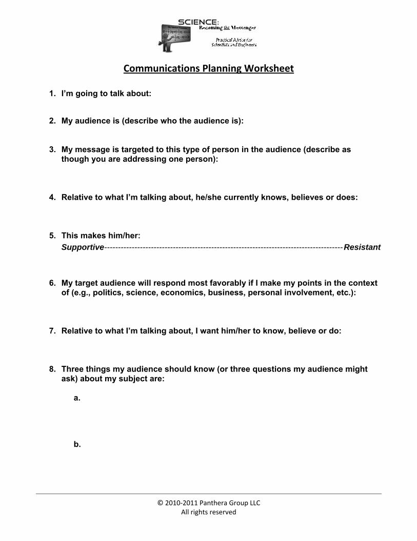
Communications Planning Worksheet
1. I’m going to talk about:
2. My audience is (describe who the audience is):
3. My message is targeted to this type of person in the audience (describe as though you are addressing one person):
4. Relative to what I’m talking about, he/she currently knows, believes or does:
5. This makes him/her:
Supportive --------------------------------------------------------------------------------------- Resistant
� � � � �
6. My target audience will respond most favorably if I make my points in the context of (e.g., politics, science, economics, business, personal involvement, etc.):
7. Relative to what I’m talking about, I want him/her to know, believe or do:
8. Three things my audience should know (or three questions my audience might ask) about my subject are:
a.
b.
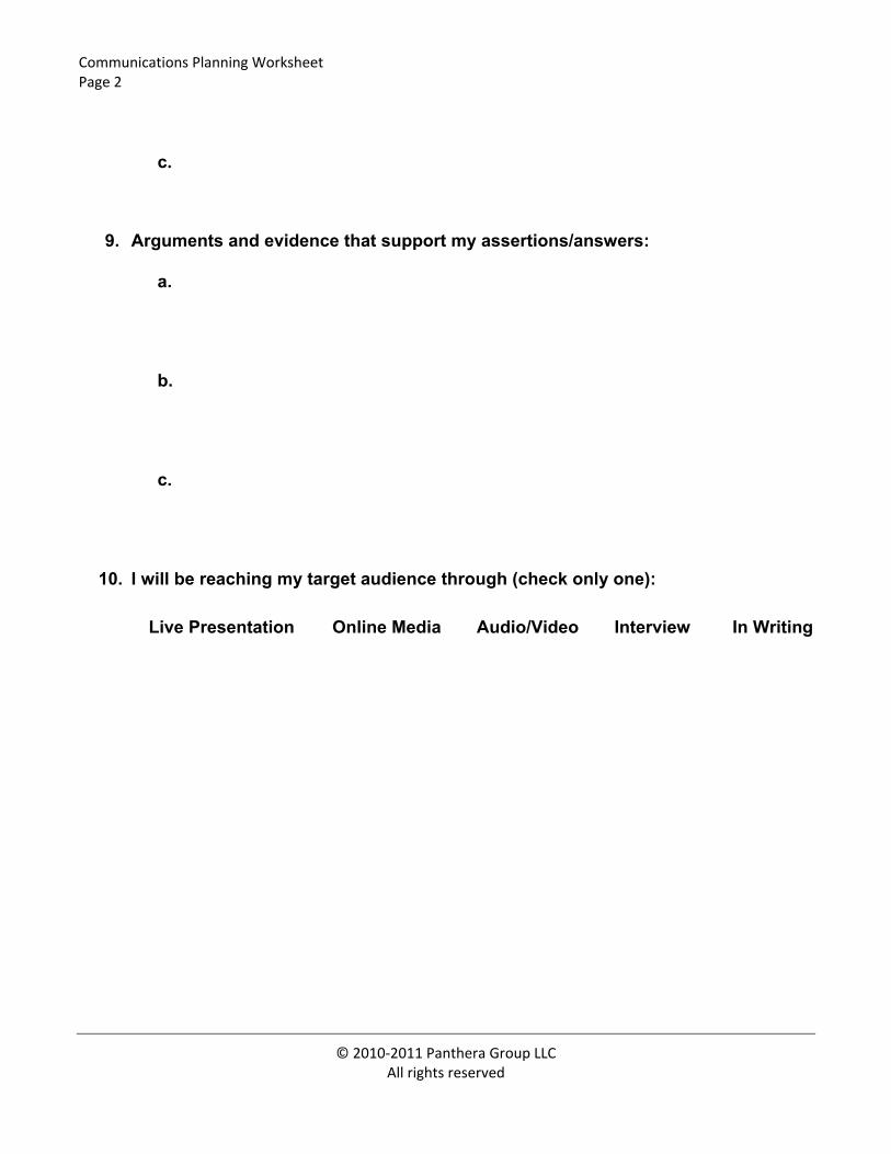
Communications Planning Worksheet Page 2
© 2010‐2011 Panthera Group LLC All rights reserved
c.
9. Arguments and evidence that support my assertions/answers:
a.
b.
c.
10. I will be reaching my target audience through (check only one):
�Live Presentation �Online Media �Audio/Video �Interview �In Writing
Message Triangle Worksheet Science: Becoming the Messenger
© 2010‐2011 Panthera Group LLC All rights reserved
#3 Audience:
#5 Disposition:
#6 Frame:
#10 Channel:
#8-9 Talking Point 3 & Evidence
#7 Main Message
#8-9 Talking Point 1 & Evidence
#8-9 Talking Point 2 & Evidence
NOTE: Number references foot to the Communications Planning Worksheet. For example, “Main Message” refers to item #7 on the Communications Planning Worksheet.
Presentation Storyboard Worksheet
Presentation Title: Delivery:
Page © 2010-2011 Panthera Group LLC All rights reserved
Develop your lead. Use an interesting fact, some amazing statistics, a challenging question, or a personal story to engage the audience’s attention and persuade them that you’re going to have many more interesting things to say during your presentation.
Create the set-up. Address four essential elements: (1) your topic; (2) why the audience should care; (3) who you are and why you’re qualified to address, or interested in addressing, the topic; and (4) some indication of what you expect of the audience (e.g., for a presentation intended to inform you might say, “Along the way, I’m sure you’ll gain new insights into…”. For a presentation to influence, you might say, “By the end of our time together, I’m confident you’ll agree that…”. And for an inspirational presentation, you might say, “Securing our future relies on our collective and individual grit to…”. [NOTE: These are illustrative only. You should craft your own language!]
Presentation Storyboard Worksheet
Presentation Title: Delivery:
Page © 2010‐2011 Panthera Group LLC
All rights reserved
IMAGE #
IMAGE #
IMAGE #