Embed Size (px)
Citation preview
Graduate Theses, Dissertations, and Problem Reports
2006
A cross-cultural design pattern: Chinese modern design A cross-cultural design pattern: Chinese modern design
Feifei Fan West Virginia University
Follow this and additional works at: https://researchrepository.wvu.edu/etd
Recommended Citation Recommended Citation Fan, Feifei, "A cross-cultural design pattern: Chinese modern design" (2006). Graduate Theses, Dissertations, and Problem Reports. 748. https://researchrepository.wvu.edu/etd/748
This Thesis is protected by copyright and/or related rights. It has been brought to you by the The Research Repository @ WVU with permission from the rights-holder(s). You are free to use this Thesis in any way that is permitted by the copyright and related rights legislation that applies to your use. For other uses you must obtain permission from the rights-holder(s) directly, unless additional rights are indicated by a Creative Commons license in the record and/ or on the work itself. This Thesis has been accepted for inclusion in WVU Graduate Theses, Dissertations, and Problem Reports collection by an authorized administrator of The Research Repository @ WVU. For more information, please contact [email protected].
A Cross-cultural Design Pattern: Chinese Modern Design
Feifei Fan
Thesis submitted to the College of Creative Arts
at West Virginia University in partial fulfillment of the requirements
for the degree of
Master of Arts in
Visual Art
Eve Faulkes, M.F.A., Chair Heidi Specht, M.F.A Juan Giraldo, M.F.A Paul Krainak, M.F.A
Department of Graphic Design
Morgantown, West Virginia 2006
Keywords: Graphic Design, Cross-cultural Design, Modern Chinese Design
Copyright 2006 Feifei Fan
Abstract
A Cross-cultural Design Pattern: Modern Chinese Design
Feifei Fan Chinese graphic designers are gaining more visibility
and earn awards in various international poster
competitions, shaping a new visual frontier in Chinese
graphic design. These successes are based on their
special cross-cultural design principle, which combines
Chinese traditional culture with the imported Western
modern design theory. In this paper, Modern Chinese
design history, development and characteristics are
reviewed. Meanwhile, some existing principles are
demonstrated and something new is experimented
through the series posters design.
iii
To my talented wife, Dr. Jianxia Cui, whose love and supports
encourage me to chase my dream;
To my beautiful daughter, Margaret Heyi Fan, who has inspired me to finish this
project.
iv
I wish to give my thanks to Professor Cliff Harvey, who took me to this amazing field,
and always understands and supports me like a father.
v
Table of Contents
Introduction…………………………………………………………………………...1
Shanghai Style: Origin of Modern Chinese Design………………………………..…2
Hong Kong Period: Three Swordsmen……………………………………………..…4
1978: The Waken Lion………………………………………………………..……….8
Thematic Poster: Garden of Mind….............................................................................10
ABC Issue: The Confusion as Marginal Men ….….……………………………..…..13
My Solution: Simplicity, Harmony, and Wit…………………………………………16
Conclusion…................................................................................................................27
Notes…………………………………………………………………………….……29
Bibliography……………………………………………………………………….....31
1
Introduction
Modern Chinese design is made up of distinct periods. It
started in Shanghai in the 1920s and the 1930s. It
developed from the 1950s to the 1970s in Hong Kong.
And it made strides and flourished in Mainland China
since the start of the Open Door Policy in 1979. Modern
Chinese design is a cross-cultural design, which is
characterized by combining Chinese cultural elements
with Western design concepts and art styles.
I was educated both in China and America. My
intercultural experiences and knowledge base make me
think and design in a cross-cultural way. Especially
when I selected an intercultural topic “ABC” (American-
born Chinese) as the point of my thesis, the cross-
cultural creative pattern has become more attractive, and
suitable for me to express myself personally. Moreover,
my target audiences are American-born Chinese and
their families, as well as some Americans with
prejudices and racial discrimination. Thus, it is
meaningful for me to solve a cross-cultural problem for
audiences with cross-cultural backgrounds using a cross-
cultural design method.
2
Fig. 1
Fig. 2
Shanghai Style: Origin of Modern Chinese Design
Modern Chinese design is a combination of traditional
arts and crafts with Western influences. The 1920s and
1930s saw prominent examples of Modern Chinese
design in Shanghai. During this period, a lot of design
works produced in Shanghai reflected foreign influence.
On one hand, the numerous foreign concession zones in
the metropolitan city brought Western art style to the
local life; on the other hand, the artists who were trained
in Japan and Europe absorbed the inspiration of Western
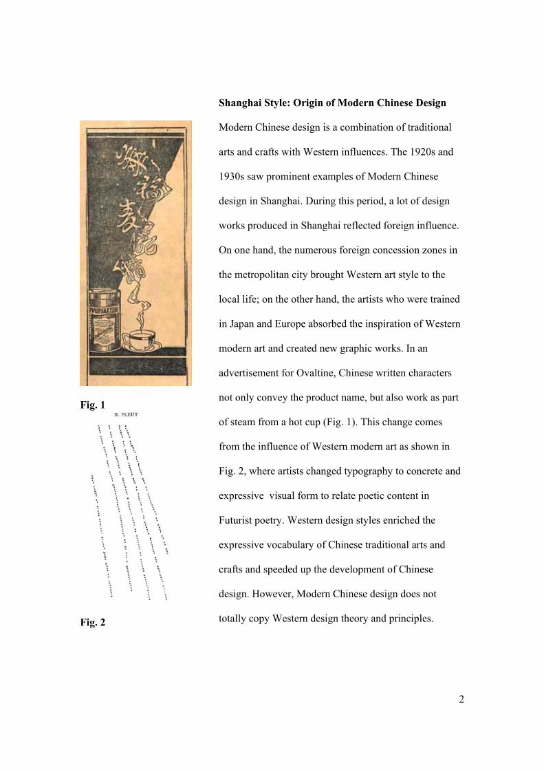
modern art and created new graphic works. In an
advertisement for Ovaltine, Chinese written characters
not only convey the product name, but also work as part
of steam from a hot cup (Fig. 1). This change comes
from the influence of Western modern art as shown in
Fig. 2, where artists changed typography to concrete and
expressive visual form to relate poetic content in
Futurist poetry. Western design styles enriched the
expressive vocabulary of Chinese traditional arts and
crafts and speeded up the development of Chinese
design. However, Modern Chinese design does not
totally copy Western design theory and principles.
3
Rather, it mixes West and East together, producing a
new combination. As Minick and Jiao note, “coming to a
culture with such a strong decorative heritage, the
geometric and patterned compositions of art deco only
succeeded in fueling further the renewed interests in
China’s own past [1].” They refer to the “masterful
synthesis” characterizing Chinese design works at this
time.
Shanghai style was the beginning of Modern Chinese
design, which was stopped by the Second World War.
After 1949, commercial graphic design was not allowed
in China. Shanghai would not get the chance to continue
its commercial design. However, the Shanghai spirit of
commercial design had already rooted in Hong Kong
after the war.
4
Hong Kong Period: Three Swordsmen
The political policy and economic market provided a
steady environment for Modern Chinese Design to
develop in Hong Kong after the Second World War.
American companies preferred their own graphic
designers from overseas, challenging local Chinese
designers to change their design styles to match
American companies’ requirements. “This transition was
significant to the history of Hong Kong design, because
it brought Western design theory and principles directly
into contact with Chinese culture [2].” In this period,
there were three important graphic designers who acted
as “exponents of an ‘East/West’ aesthetic that
characterized Hong Kong design for the rest of the
century [3].” They were Henry Steiner, Kan Tai-Keung,
and Alan Chan.
Modern Chinese design benefited from the influx of
American designers, and Henry Steiner was the most
influential. As a student of Paul Rand’s at Yale, he
learned the two important design principles, “the
primacy of concept” and the use of contrast to “give life”
to a design [4]. Henry Steiner applied these two
5
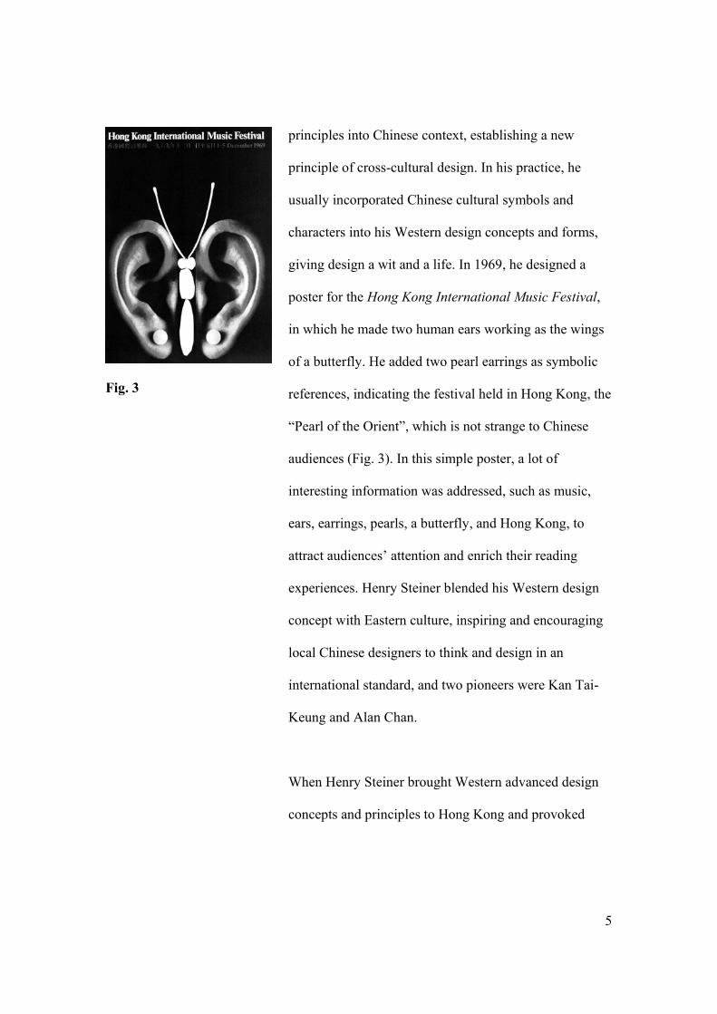
Fig. 3
principles into Chinese context, establishing a new
principle of cross-cultural design. In his practice, he
usually incorporated Chinese cultural symbols and
characters into his Western design concepts and forms,
giving design a wit and a life. In 1969, he designed a
poster for the Hong Kong International Music Festival,
in which he made two human ears working as the wings
of a butterfly. He added two pearl earrings as symbolic
references, indicating the festival held in Hong Kong, the
“Pearl of the Orient”, which is not strange to Chinese
audiences (Fig. 3). In this simple poster, a lot of
interesting information was addressed, such as music,
ears, earrings, pearls, a butterfly, and Hong Kong, to
attract audiences’ attention and enrich their reading
experiences. Henry Steiner blended his Western design
concept with Eastern culture, inspiring and encouraging
local Chinese designers to think and design in an
international standard, and two pioneers were Kan Tai-
Keung and Alan Chan.
When Henry Steiner brought Western advanced design
concepts and principles to Hong Kong and provoked
6
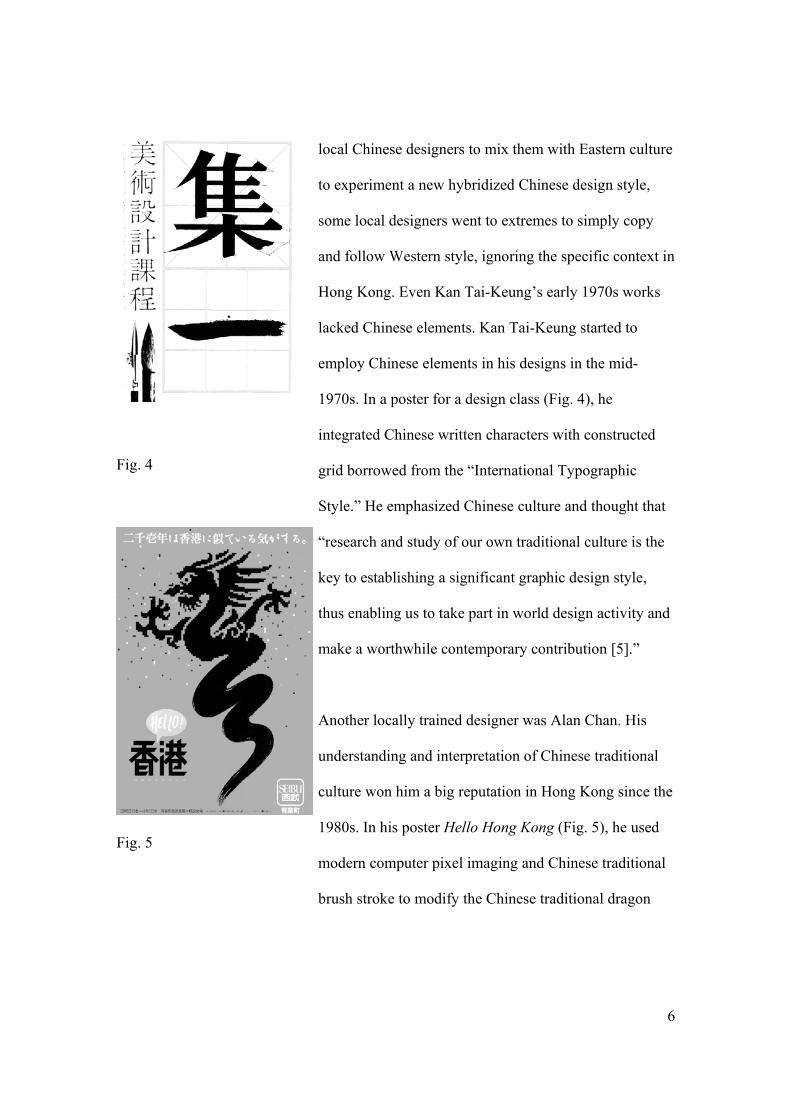
Fig. 4
Fig. 5
local Chinese designers to mix them with Eastern culture
to experiment a new hybridized Chinese design style,
some local designers went to extremes to simply copy
and follow Western style, ignoring the specific context in
Hong Kong. Even Kan Tai-Keung’s early 1970s works
lacked Chinese elements. Kan Tai-Keung started to
employ Chinese elements in his designs in the mid-
1970s. In a poster for a design class (Fig. 4), he
integrated Chinese written characters with constructed
grid borrowed from the “International Typographic
Style.” He emphasized Chinese culture and thought that
“research and study of our own traditional culture is the
key to establishing a significant graphic design style,
thus enabling us to take part in world design activity and
make a worthwhile contemporary contribution [5].”
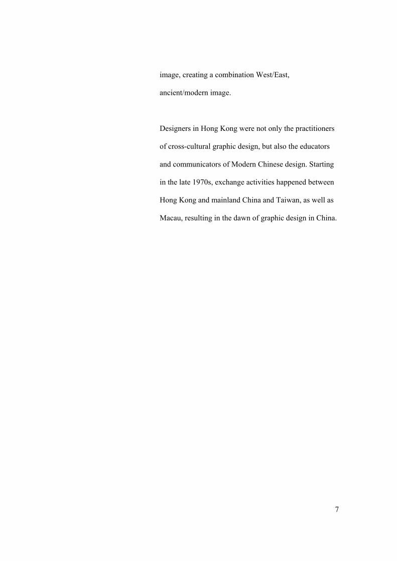
Another locally trained designer was Alan Chan. His
understanding and interpretation of Chinese traditional
culture won him a big reputation in Hong Kong since the
1980s. In his poster Hello Hong Kong (Fig. 5), he used
modern computer pixel imaging and Chinese traditional
brush stroke to modify the Chinese traditional dragon
7
image, creating a combination West/East,
ancient/modern image.
Designers in Hong Kong were not only the practitioners
of cross-cultural graphic design, but also the educators
and communicators of Modern Chinese design. Starting
in the late 1970s, exchange activities happened between
Hong Kong and mainland China and Taiwan, as well as
Macau, resulting in the dawn of graphic design in China.
8
1978: The Waken Lion
When China’s government announced its Open Door
Policy in 1978, mainland China had been cut off from
the outside world for almost three decades. The Great
Cultural Revolution (1966-1976) made China immerse
isolation and self-analysis. Political event played the
main role in people’s daily life, and science as well as art
became a desert. “This was a dark period for intellectuals
and the creative community, as it meant subordinating
self-expression in all of the arts to the needs of the class
struggle [6].” Graphic design could not find itself in
commercial art activities except in the service of
communist party propaganda. In such circumstances,
Shanghai style was not maintained, rather than being
developed. Modern Chinese Design style was gone with
the wind.
It was the Open Door Policy that provided an
opportunity for international exchange activities to take
place between mainland China and outside world. Hong
Kong designers introduced the latest international design
trends into Mainland China through lectures,
9
organizations’ visits, and exhibitions in the late 1970s
and early 1980s. Those activities brought creative and
conceptual thinking into the old Chinese design
education system, which was “based on a skill-training
curriculum exported from the 1960s Russian model [7].”
Young Chinese designers were inspired and influenced
by the designers from Hong Kong. Some of them, such
as Wang Xu and Wang Yue-fei, later became graphic
design pioneers in mainland China.
10
Thematic Poster: Garden of Mind
In the mid-1980s, due to the increasingly relaxed
political situation, thematic poster exhibitions were
initiated in Taiwan. Such non-commercial events
provided designers a free space to express individual
emotions and creative potential. When the trend spread
to mainland China, designers finally found an outlet to
demonstrate their graphic design talents. They didn’t
need to worry about a lack of commercial markets, and
they also didn’t need to see clients’ long faces. Freedom
allowed them to create diversification. Till the mid-
1990s, thematic poster design improved quickly,
preparing for Chinese designers to enter the international
design community successfully.
Contemporary designer Wang Xu was educated in
China. His works were deeply marked with Chinese
cultural heritage. He believes in Taoist philosophies that
“propose that man return to a simple, unsophisticated life
and place himself in an amicable environment [8].” He
stresses the use of negative space to create simple and
clean styles that have won him much fame throughout
the design world. In 1995, Wang Xu was invited to the
11
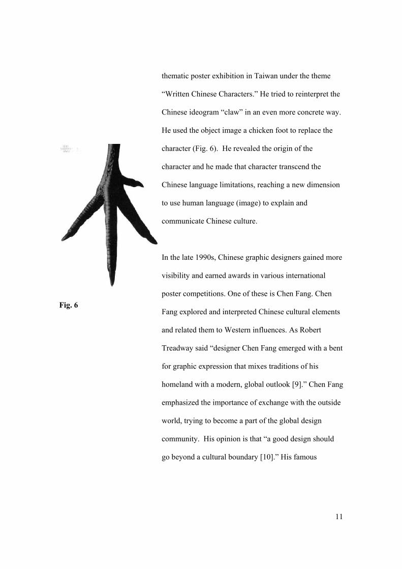
Fig. 6
thematic poster exhibition in Taiwan under the theme
“Written Chinese Characters.” He tried to reinterpret the
Chinese ideogram “claw” in an even more concrete way.
He used the object image a chicken foot to replace the
character (Fig. 6). He revealed the origin of the
character and he made that character transcend the
Chinese language limitations, reaching a new dimension
to use human language (image) to explain and
communicate Chinese culture.
In the late 1990s, Chinese graphic designers gained more
visibility and earned awards in various international
poster competitions. One of these is Chen Fang. Chen
Fang explored and interpreted Chinese cultural elements
and related them to Western influences. As Robert
Treadway said “designer Chen Fang emerged with a bent
for graphic expression that mixes traditions of his
homeland with a modern, global outlook [9].” Chen Fang
emphasized the importance of exchange with the outside
world, trying to become a part of the global design
community. His opinion is that “a good design should
go beyond a cultural boundary [10].” His famous
12
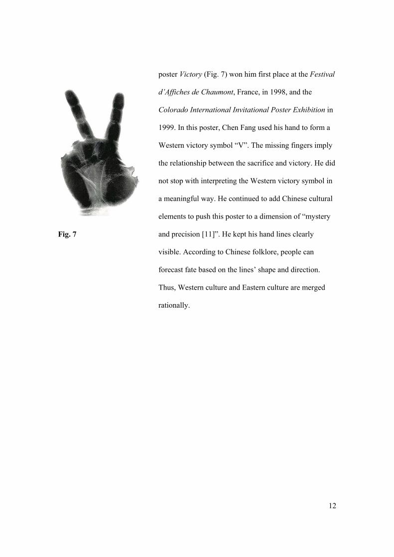
Fig. 7
poster Victory (Fig. 7) won him first place at the Festival
d’Affiches de Chaumont, France, in 1998, and the
Colorado International Invitational Poster Exhibition in
1999. In this poster, Chen Fang used his hand to form a
Western victory symbol “V”. The missing fingers imply
the relationship between the sacrifice and victory. He did
not stop with interpreting the Western victory symbol in
a meaningful way. He continued to add Chinese cultural
elements to push this poster to a dimension of “mystery
and precision [11]”. He kept his hand lines clearly
visible. According to Chinese folklore, people can
forecast fate based on the lines’ shape and direction.
Thus, Western culture and Eastern culture are merged
rationally.
13
ABC Issue: The Confusion as Marginal Men
My daughter was born last June. Since then, American-
born Chinese (ABC) has become an interesting topic in
my family. ABC is a special group. Their parents come
from China. They are born and growing up in America.
As the first generation Americans, they are educated
both in Chinese (at home) and American (in society)
contexts. The different cultures between East and West
bring them a lot of confusion. As May Tung said,
“Confusion is inevitable when one lives in the cross
section of East and West. Chinese Americans must sort
out the contributing factors from sides in the self-
identification process [12].”
Basically, ABC issues come from the physical
distinctions upon which racial definitions are based.
ABC’s yellow color is a major barrier to stop them from
entering American mainstream. However, the white skin
of immigrants from Europe “gave them the potential
eventually to become invisible, to meld into the
mainstream [13].” ABC’s parents suffer a lot due to their
color and language. They are afraid of being
14
discriminated against. They don’t want this to happen to
their children. When they couldn’t change racial stigma,
they are strict with their children about study. They want
them to be straight-A students, since they think that
education can make their lives easier in part. However,
education can not save them from their color. Even after
they entered the mainstream, discrimination still haunts
them. That is the reason why ABC is called Honorary
White as a banana by their white companions. That is the
reason why when Michelle Kwan lost her medal to her
European American friend in the Winter Olympic Games
in 1998, the MSNBC titled the news as “American Beats
Out Kwan.” When ABC does not benefit from straight-
As, some of them have to hate their skin color. They
think they are white, or they want to change their skin
tone from yellow to white. On the other hand, some ABC
long for freedom and equality, rejecting discrimination
and assimilation. They are “never ashamed of being
Chinese” and they are “proud to be linked to a great
civilization” [14]. They want to integrate into the
mainstream without losing their Chinese identity.
15
ABC is a very complicated issue, it is associated with
ABC, their parents, and their surroundings. When I
did research about ABC, I found their situations are very
complicated. In reality, they have to face discrimination,
assimilation, isolation, prejudice, insularity, and
internalized inferiority. In their dreams, they thirst for
integration, adaptation, equality, and keeping their own
identities. They are confused by their treatment in a
country bragging about freedom and equality. There are
a lot of ways to solve this problem. And mine is to
educate my audiences with graphic communication.
16
My Solution: Simplicity, Harmony, and Wit
What is the design philosophy of Chinese designers?
Minick and Jiao point out “Chinese design traditionally
emphasizes the absence of form in an attempt to stress
the spirit” and “the concept and harmony” and the “yin
and yang principle” [15]. Chinese designers follow these
heritages and develop specific simple and clear design
styles. Chinese designers don’t stop with their own
obvious traditional and contemporary elements. Their
open minds lead them to an even broader outside world.
Serge Serov says, “Chinese design succeeds also thanks
to its sensitivity to different kinds of breezes and winds,
to its openness and readiness for different cultural
inflows [16].” Reviewing the examples mentioned
above, it is not hard to find these characteristics in
Chinese designers’ works.
As a Chinese designer educated both in Eastern and
Western cultures, it is even more impossible for me to
think and design without multicultural influences. First
of all, I pursue simple, airy, harmonious style, which
comes from Taoist philosophy and Yin Yang principle.
17
Fig. 8
Fig. 9
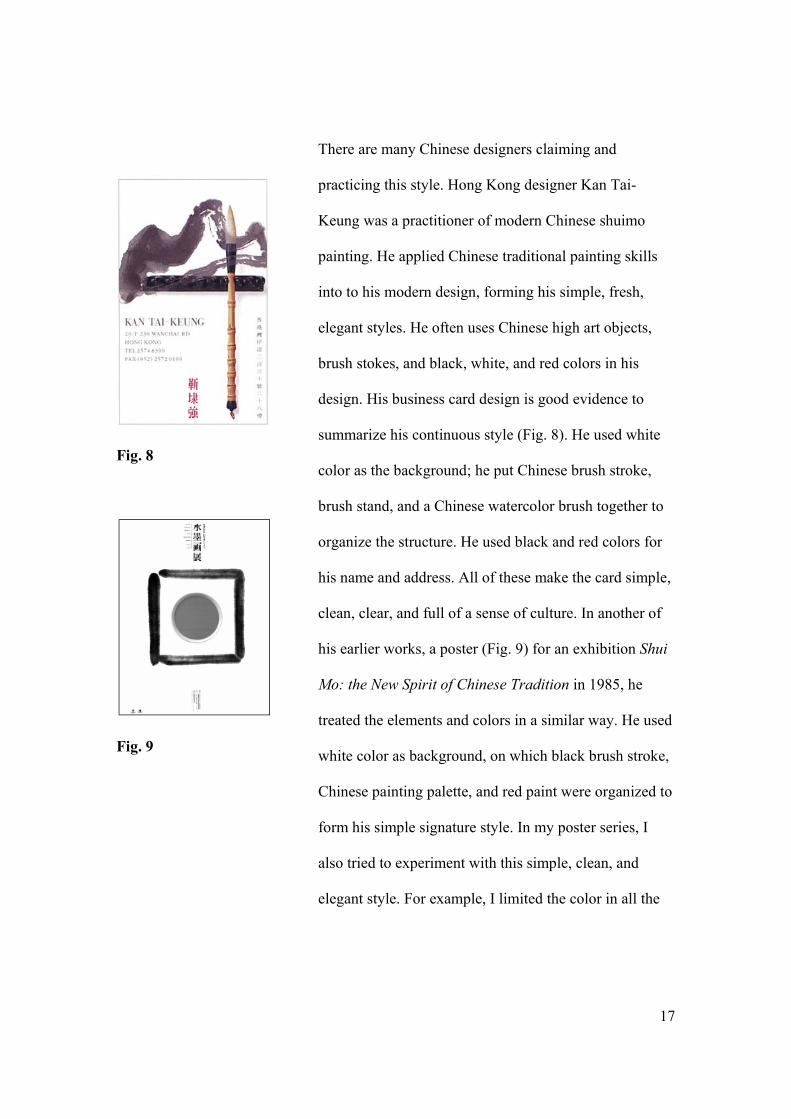
There are many Chinese designers claiming and
practicing this style. Hong Kong designer Kan Tai-
Keung was a practitioner of modern Chinese shuimo
painting. He applied Chinese traditional painting skills
into to his modern design, forming his simple, fresh,
elegant styles. He often uses Chinese high art objects,
brush stokes, and black, white, and red colors in his
design. His business card design is good evidence to
summarize his continuous style (Fig. 8). He used white
color as the background; he put Chinese brush stroke,
brush stand, and a Chinese watercolor brush together to
organize the structure. He used black and red colors for
his name and address. All of these make the card simple,
clean, clear, and full of a sense of culture. In another of
his earlier works, a poster (Fig. 9) for an exhibition Shui
Mo: the New Spirit of Chinese Tradition in 1985, he
treated the elements and colors in a similar way. He used
white color as background, on which black brush stroke,
Chinese painting palette, and red paint were organized to
form his simple signature style. In my poster series, I
also tried to experiment with this simple, clean, and
elegant style. For example, I limited the color in all the
18
Fig. 10 Fig. 11 Fig. 12
Fig. 13
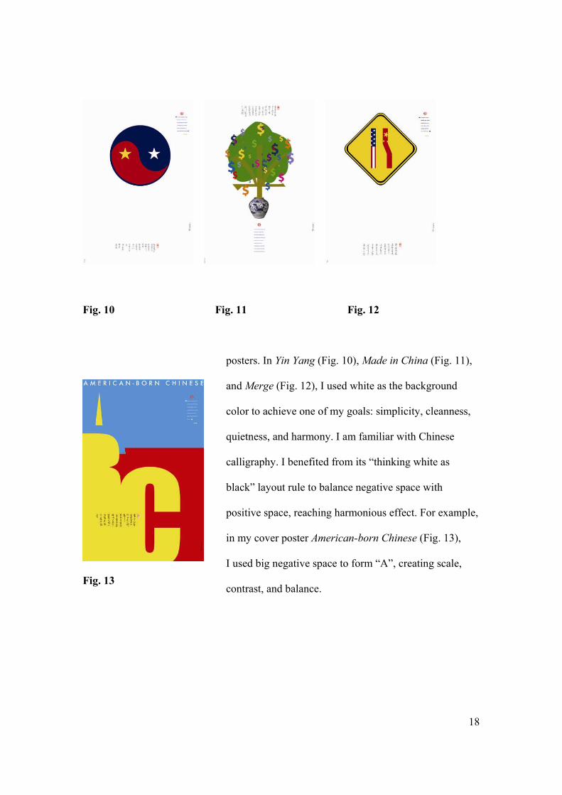
posters. In Yin Yang (Fig. 10), Made in China (Fig. 11),
and Merge (Fig. 12), I used white as the background
color to achieve one of my goals: simplicity, cleanness,
quietness, and harmony. I am familiar with Chinese
calligraphy. I benefited from its “thinking white as
black” layout rule to balance negative space with
positive space, reaching harmonious effect. For example,
in my cover poster American-born Chinese (Fig. 13),
I used big negative space to form “A”, creating scale,
contrast, and balance.
19
Fig. 14
Fig. 15
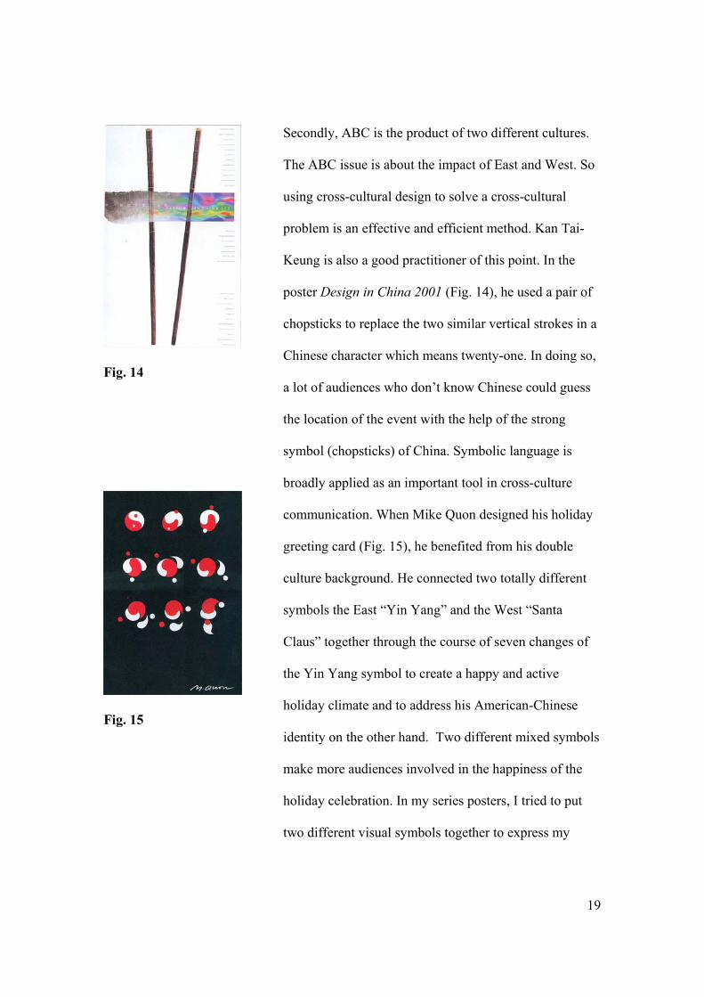
Secondly, ABC is the product of two different cultures.
The ABC issue is about the impact of East and West. So
using cross-cultural design to solve a cross-cultural
problem is an effective and efficient method. Kan Tai-
Keung is also a good practitioner of this point. In the
poster Design in China 2001 (Fig. 14), he used a pair of
chopsticks to replace the two similar vertical strokes in a
Chinese character which means twenty-one. In doing so,
a lot of audiences who don’t know Chinese could guess
the location of the event with the help of the strong
symbol (chopsticks) of China. Symbolic language is
broadly applied as an important tool in cross-culture
communication. When Mike Quon designed his holiday
greeting card (Fig. 15), he benefited from his double
culture background. He connected two totally different
symbols the East “Yin Yang” and the West “Santa
Claus” together through the course of seven changes of
the Yin Yang symbol to create a happy and active
holiday climate and to address his American-Chinese
identity on the other hand. Two different mixed symbols
make more audiences involved in the happiness of the
holiday celebration. In my series posters, I tried to put
two different visual symbols together to express my
20
Fig. 16
Fig. 17
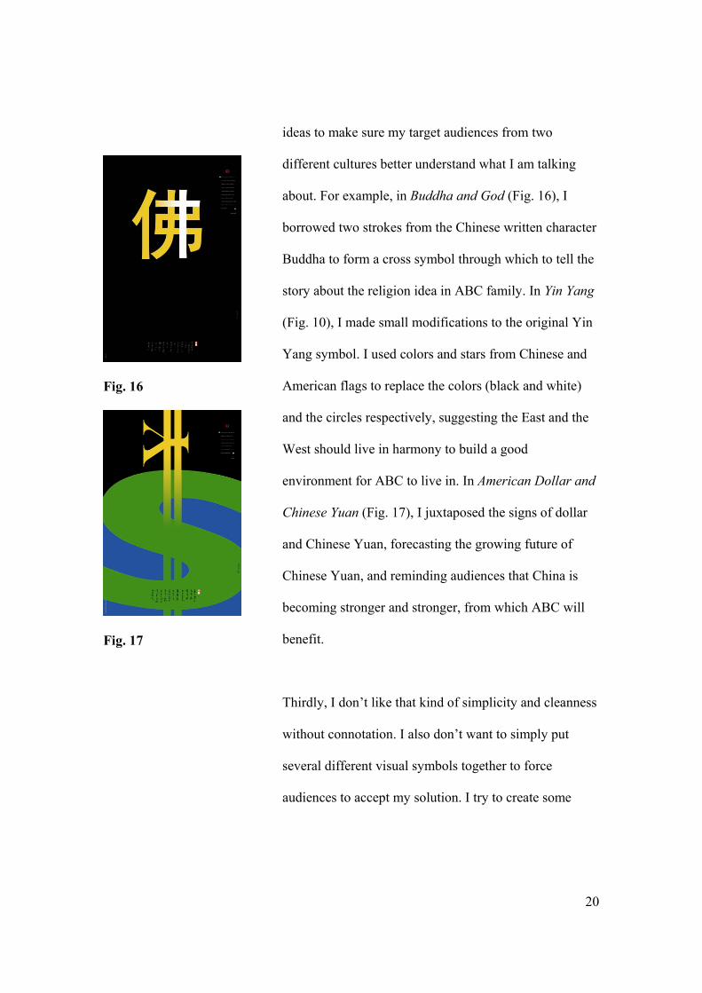
ideas to make sure my target audiences from two
different cultures better understand what I am talking
about. For example, in Buddha and God (Fig. 16), I
borrowed two strokes from the Chinese written character
Buddha to form a cross symbol through which to tell the
story about the religion idea in ABC family. In Yin Yang
(Fig. 10), I made small modifications to the original Yin
Yang symbol. I used colors and stars from Chinese and
American flags to replace the colors (black and white)
and the circles respectively, suggesting the East and the
West should live in harmony to build a good
environment for ABC to live in. In American Dollar and
Chinese Yuan (Fig. 17), I juxtaposed the signs of dollar
and Chinese Yuan, forecasting the growing future of
Chinese Yuan, and reminding audiences that China is
becoming stronger and stronger, from which ABC will
benefit.
Thirdly, I don’t like that kind of simplicity and cleanness
without connotation. I also don’t want to simply put
several different visual symbols together to force
audiences to accept my solution. I try to create some
21
witty ideas to attract their attention and interests. What is
a witty idea?
The two elements – ‘the familiar’ and ‘the play’–
are responsible for the two main emotions
experienced by someone ‘getting’ a witty idea –
recognition and surprise. These two main
characteristics of wit provide a kind of matrix of
success. If a witty solution involves a great deal
of recognition but little surprise, the solution will
be obvious and weak, if, on the other hand, the
solution involves a great deal of surprise but little
recognition, it will be baffling, enigmatic and
impenetrable to most people, prompting anxiety
and a feeling of failure. If the solution is low on
both recognition and surprise – total failure. If it
is high on both – if it combines great familiarity
with a big surprise – the solution will be a
success, a hit [17].
I love witty ideas. I like to encode and decode witty
ideas. Witty ideas are light in the dark. They grab
audiences’ eyes, they attract them to approach and
22
Fig. 18
Fig. 19
decode. They help them to recall their deep memories
and remind them to take action.
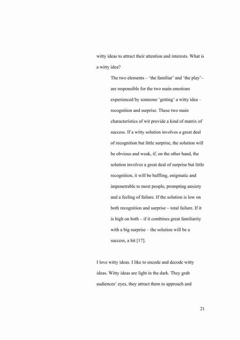
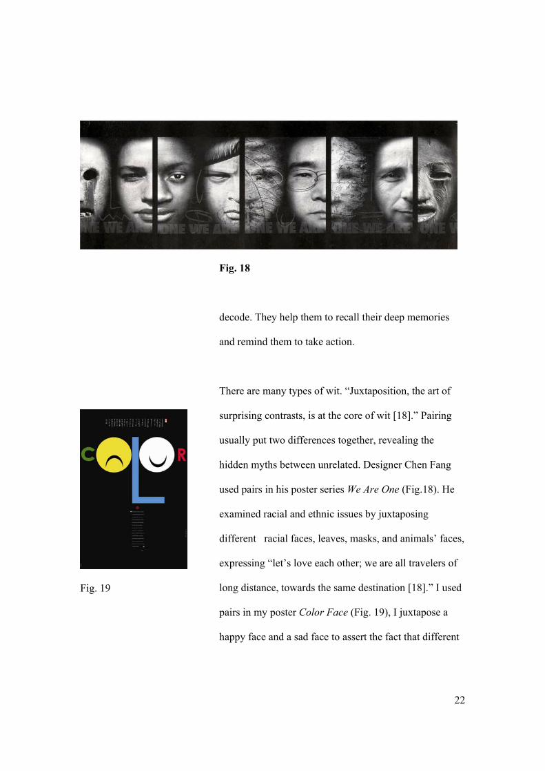
There are many types of wit. “Juxtaposition, the art of
surprising contrasts, is at the core of wit [18].” Pairing
usually put two differences together, revealing the
hidden myths between unrelated. Designer Chen Fang
used pairs in his poster series We Are One (Fig.18). He
examined racial and ethnic issues by juxtaposing
different racial faces, leaves, masks, and animals’ faces,
expressing “let’s love each other; we are all travelers of
long distance, towards the same destination [18].” I used
pairs in my poster Color Face (Fig. 19), I juxtapose a
happy face and a sad face to assert the fact that different
23
Fig. 20
skins matter in America. Pairing creates contrast and
comparison, resulting in surprise and comprehension.
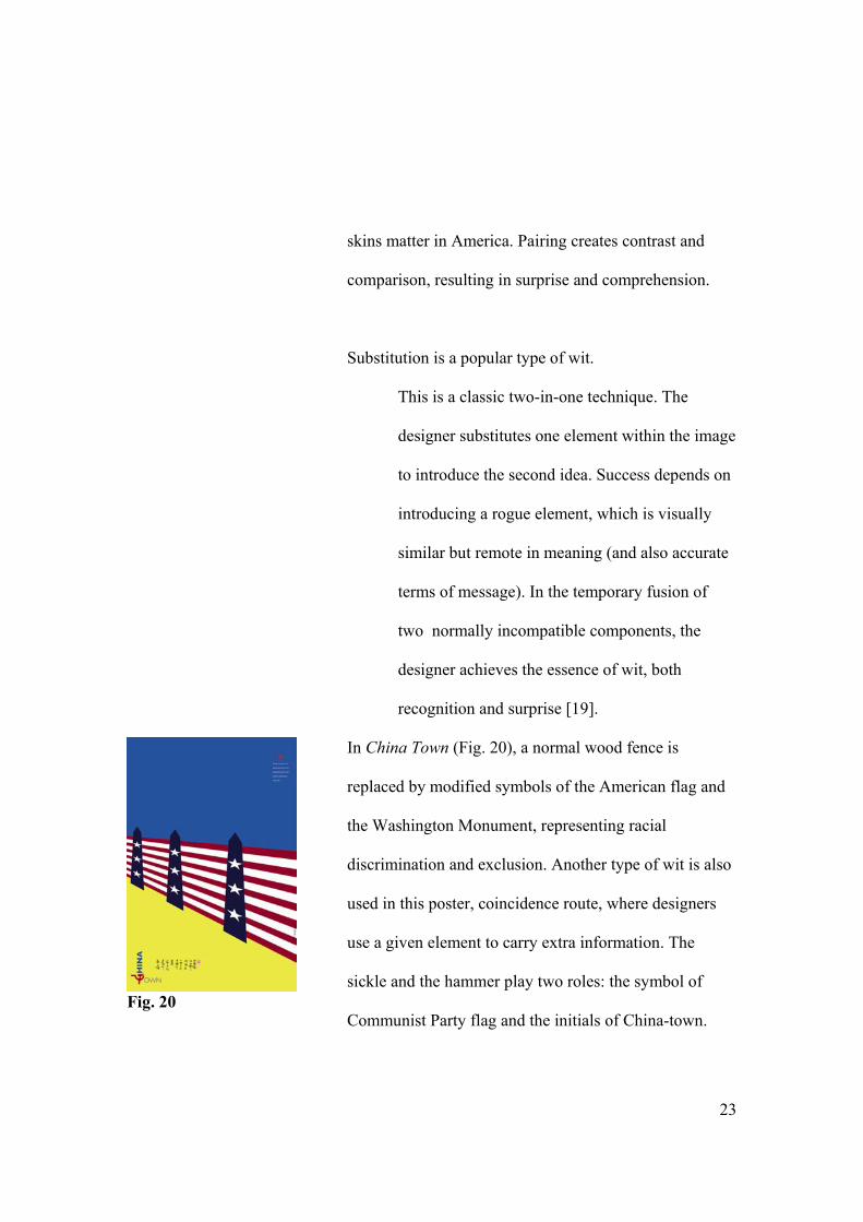
Substitution is a popular type of wit.
This is a classic two-in-one technique. The
designer substitutes one element within the image
to introduce the second idea. Success depends on
introducing a rogue element, which is visually
similar but remote in meaning (and also accurate
terms of message). In the temporary fusion of
two normally incompatible components, the
designer achieves the essence of wit, both
recognition and surprise [19].
In China Town (Fig. 20), a normal wood fence is
replaced by modified symbols of the American flag and
the Washington Monument, representing racial
discrimination and exclusion. Another type of wit is also
used in this poster, coincidence route, where designers
use a given element to carry extra information. The
sickle and the hammer play two roles: the symbol of
Communist Party flag and the initials of China-town.
24
Fig. 21
I used coincidence to create surprise out of the
recognition. The juxtaposition of symbols of capitalist
and communist in one poster enforces the meaning of
impact, isolation, and conflict. In Buddha and God (Fig.
16), I also applied coincidence route. In the Chinese
character of “Fe” (Buddha), two strokes are coincidently
the same as the cross. I modified the strokes by changing
the color and adding the gradient effect, building a
connection between Buddha and God.
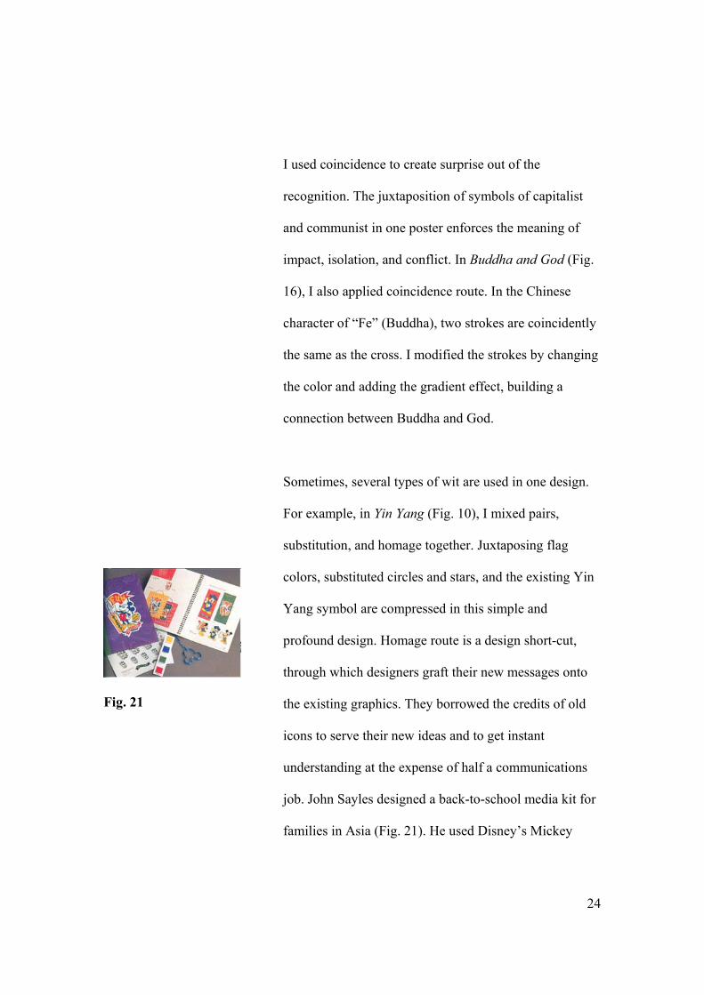
Sometimes, several types of wit are used in one design.
For example, in Yin Yang (Fig. 10), I mixed pairs,
substitution, and homage together. Juxtaposing flag
colors, substituted circles and stars, and the existing Yin
Yang symbol are compressed in this simple and
profound design. Homage route is a design short-cut,
through which designers graft their new messages onto
the existing graphics. They borrowed the credits of old
icons to serve their new ideas and to get instant
understanding at the expense of half a communications
job. John Sayles designed a back-to-school media kit for
families in Asia (Fig. 21). He used Disney’s Mickey
25
Fig. 22
Mouse, one of the most familiar cultural icons in the
world, to convey his message, receiving an effective
communication result. My poster Merge (Fig. 12) works
in the same way. Based on the familiar traffic sign, I
substitute the solid black lines for symbols of the
American and Chinese flags, adding the new meaning to
the old sign.
Some other types of wit I used in my series are metaphor
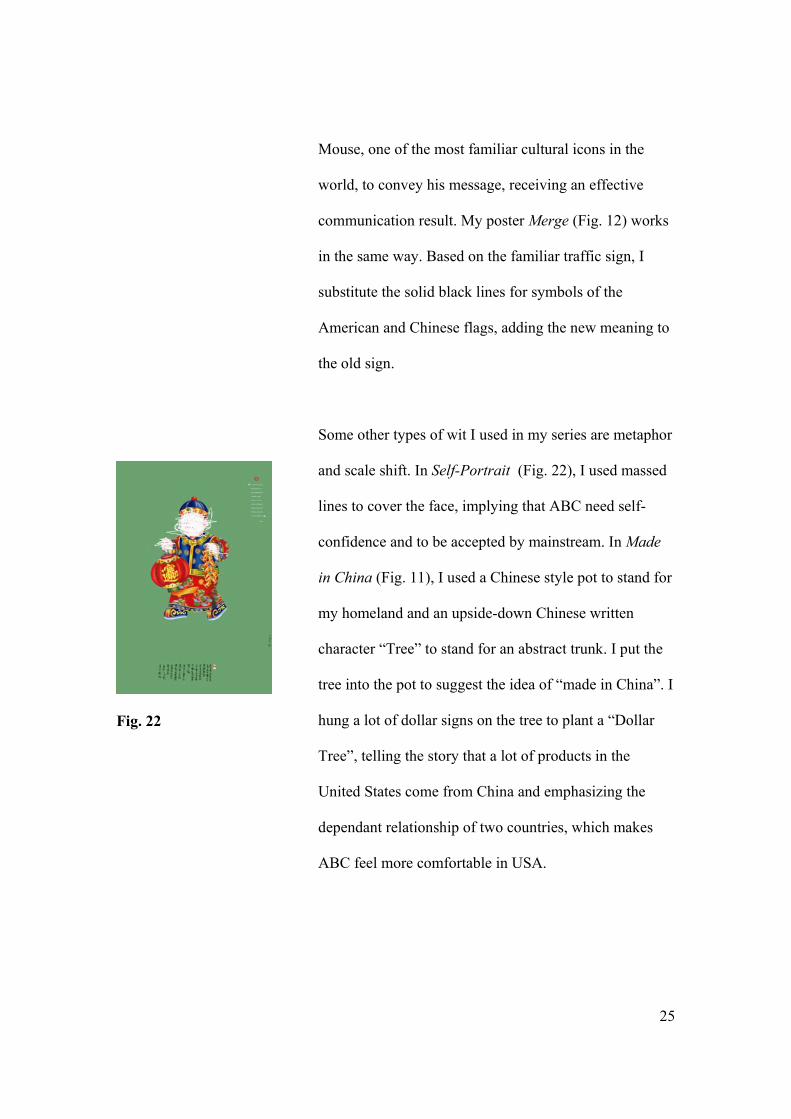
and scale shift. In Self-Portrait (Fig. 22), I used massed
lines to cover the face, implying that ABC need self-
confidence and to be accepted by mainstream. In Made
in China (Fig. 11), I used a Chinese style pot to stand for
my homeland and an upside-down Chinese written
character “Tree” to stand for an abstract trunk. I put the
tree into the pot to suggest the idea of “made in China”. I
hung a lot of dollar signs on the tree to plant a “Dollar
Tree”, telling the story that a lot of products in the
United States come from China and emphasizing the
dependant relationship of two countries, which makes
ABC feel more comfortable in USA.
26
Fig. 23
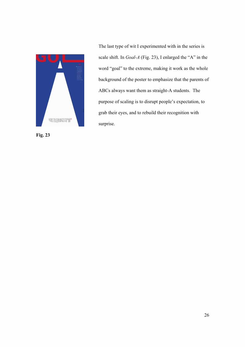
The last type of wit I experimented with in the series is
scale shift. In Goal-A (Fig. 23), I enlarged the “A” in the
word “goal” to the extreme, making it work as the whole
background of the poster to emphasize that the parents of
ABCs always want them as straight-A students. The
purpose of scaling is to disrupt people’s expectation, to
grab their eyes, and to rebuild their recognition with
surprise.
27
Conclusion
Modern Chinese design is characterized with Taoist
simplicity, cross-culture communication, and witty idea
application. In my poster series, I experimented with all
of these principles and methods. They help me to use
communication graphics to solve my ABC problems in
part. However, any rules are produced for solving
specific problems. When something new happens, new
methods are needed. ABC issues are new cases. To solve
the problems, I need to face three different target
audiences: ABC, their parents, and Americans with
prejudices. Based on their different backgrounds and
experiences, I have to develop some new effective
methods to achieve great understanding and
communication. What is the most important
characteristic of my audience? It is bilingual. To make
sure my messages are conveyed and understood
correctly, I need to find a way to direct them to read and
think along the right direction. My method is that
bilingual expressions serve bilingual audiences. Taoist
style emphasizes simplicity and encourages artists to
leave enough space for readers to imagine, develop, and
invent. This is a good method for personal expression.
28
However, when you get your audiences and try to help
your audiences to solve their problems, you must limit
and frame your topic in a correct way. There are one
hundred different Hamlets in one hundred readers’
minds. That is a fine art rule, but it is not working here.
If you design something that can be read in many ways,
then how will the audiences follow you, and what are
your suggestions and directions? In my case, I used
bilingual quotations from the books about ABC issues to
help audiences follow what I am thinking and calling for.
Bilingual quotation plus bilingual red signature seals and
my Chinese calligraphy enrich the cross-culture
communication and modern Chinese design.
29
Notes
1. Minick, S., Jiao P. Chinese Graphic Design in the Twentiethh Century. London,
Thames and Hudson (1990).
2. Wendy Siuyi Wong, Detachment and Unification: A Chinese Graphic Design
History in Greater China Since 1979. Design Issues: Volume 17, Number 4
Autumn 2001, 53.
3. Wendy Siuyi Wong, In Search of a New Graphic Design Frontier in China:
Establishing the “Chinese-ness” of International Style.
4. Wendy Siuyi Wong, Detachment and Unification: A Chinese Graphic Design
History in Greater China Since 1979. Design Issues: Volume 17, Number 4
Autumn 2001, 53.
5. Robert L. Peters, No Sleeping Dragon: The Dawn of Graphic Design in China.
Communication Arts, March/April 2004.
6. Robert L. Peters, No Sleeping Dragon: The Dawn of Graphic Design in China.
Communication Arts, March/April 2004.
7. Lin Jianyang, On Design Education, Art and Design, Beijing: Art and Design
Publishing House, June 2000, 29-34.
8. Robert L. Peters, No Sleeping Dragon: The Dawn of Graphic Design in China.
Communication Arts, March/April 2004.
9. Robert Treadway, After the Revolution. Print, July/August 2003, 103.
10. Robert Treadway, After the Revolution. Print, July/August 2003, 107.
11. Robert Treadway, After the Revolution. Print, July/August 2003, 107.
30
12. May Tung, Chinese American and Their Immigrant Parents, Binghamton, NY:
The Haworth Clinical Practice Press, Inc. 25.
13. Nazli Kibria, Becoming Asian American. Baltimore and London, The Johns
Hopkins University Press, 2002, 6.
14. Eric Liu, The Accidental Asian. New York, Random House, 1998.
15. Minick, S., Jiao P. Chinese Graphic Design in the Twentiethh Century. London,
Thames and Hudson (1990).
16. Serge Serov, Area, Phaidon Press Inc, 2005, 392.
17. Beryl McAlhone, David Stuart, A Smile in the Mind, Phaidon Press Inc, 1998, 16.
18. Beryl McAlhone, David Stuart, A Smile in the Mind, Phaidon Press Inc, 1998, 38.
19. Robert Treadway, After the Revolution. Print, July/August 2003, 108.
20. Beryl McAlhone, David Stuart, A Smile in the Mind, Phaidon Press Inc, 1998, 42.
31
Bibliography
Lin, Jianyang (2000, June). On Design Education, Art and Design (Beijing: Art and
Design), Publishing House, Beijing.
Liu, Eric (1998). The Accidental Asian. New York, Random House.
McAlhone, Beryl and Stuart, David (1998). A Smile in the Mind, New York: Phaidon
Press Inc.
Peters, Robert L. (2004, March/April). No Sleeping Dragon: The Dawn of Graphic
Design in China. Communication Arts.
Minick, S. and Jiao P. (1990). Chinese Graphic Design in the Twentieth Century,
London: Thames and Hudson.
Serov, Serge (2005). Area, Phaidon Press Inc. p. 392.
Treadway, Robert (2003, July/August). After the Revolution. Print pp. 102-109.
Tung, May (2000). Chinese American and Their Immigrant Parents, Binghamton, NY:
The Haworth Clinical Practice Press, Inc.
Wong, Siuyi Wendy (2001, Autumn), Detachment and Unification: A Chinese Graphic
Design History in Greater China Since 1979, Design Issues: pp 51-71.
Wong, Siuyi, Wendy, In Search of a New Graphic Design Frontier in China:
Establishing the “Chinese-ness” of International Style.