Embed Size (px)
Citation preview
A comparative study of the development of the Gurmukhi script: from the handwritten manuscript to the digital typeface.
Submitted in partial fulfilment for the requirements for the Master of Arts in Typeface Design, Department of Typography and Graphic Communication, at the University of Reading, United Kingdom
Typeset in Minion Pro and Linotype Gurmukhi
Emma Williams, September 2008
A comparative study of the development of the Gurmukhi script: from the handwritten manuscript to the digital typeface.
Introduction Origins of the Gurmukhi script
Handwritten Gurmukhi
Part one:

* The author, as a non-native to the Punjabi language and Gurmukhi script, can only evaluate and form assumptions from a designer’s point of view.
This dissertation explores the development of Gurmukhi text typeface designs from the metal types of the nineteenth century to the contemporary digital format. This study is an attempt to understand the transition from one format to the other, taking into consideration the implications of technology developments where and when necessary.
Following an introduction to the origin(s) of the script, a concise summary of the writing system* is provided as reference. The chronological analysis begins with the script’s handwritten appearance in late eighteenth and early nineteenth century manuscripts, and with further comparisons to examples of the contemporary handwritten style.
The traditional appearance is used as reference when regarding the evolution of individual characters and overall style which is clearly visible in the designs to follow. Examples are considered from the various developments in typesetting technologies: metal type, both hand and machine composed, through to the early and current digital format, with the addition of Unicode and OpenType.
Concluding with a contemporary design which demonstrates a development in design: a style of refined characteristics, which achieves consistency regarding the script’s proportions and colour, losing cursive qualities, an influence of the handwritten form, which had been evident in the design of early metal types.
Abstract

A comparative study of the development of the Gurmukhi script
02 – 03
Introduction Origins of the Gurmukhi script
The writing system Handwritten Gurmukhi
ManuscriptsThe tool
Development of the printed characterPrinting types
IndiaSerampore Missionary Press, SeramporeLudhiana Missionary Press, PunjabSudarshan Printing Press, AmritsarGujarati Type Foundry, Bombay
EnglandStephen Austin & Sons, HertfordGilbert & Rivington and William Clowes & Sons, LondonOxford University Press, OxfordV & J Figgins and R. H. Stevens & Co, Ltd. London
EuropeK. K. Hof-und Staats-Druckerei, ViennaDer Reichsdruckerei, Berlin
Hot metal to early digital typeMonotype GurmukhiLinotype Gurmukhi
Digital type: Unicode and OpenTypeAscender Corporation: Raavi Dr K. S. Thind: GurbaniLipi and AnmolLipiPunjabi Computing Resource Centre: Saab
Conclusion Bibliography
Sources citedBooks consultedType specimensOnline sourcesManuscriptsDigital fontsMiscellaneous
Appendix
05
0915
232331
39
3939434549515155576165656767697377798181
85
87 87879193959595
97
Contents

A comparative study of the development of the Gurmukhi script
04 – 05
1 Williams, Emma Considerations for the development of a Gurmukhi font in OpenType 20082 The author met Mushtaq by coincidence at the British Library, 13th August 2008 3 Sewadar is a Punjabi word for a volunteer who offers his/her services to the community.
This dissertation should be regraded only as an overview, in the attempt to illustrate the development of the Gurmukhi script. With considerations for its traditional form, handwritten manuscripts from as early as the eighteenth century will be consulted, through to its present, contemporary representation in the digital format. Reflecting on their similarities and differences, with particular interest in the transition from the handwritten form to the printed character, and how it may or may not have had an effect upon the reoccurring considerations of typeface design, such as consistency of repeated forms, general proportions, overall colour etc.
By defining a set of limits, the overview can be considered with more integrity. Typefaces studied will be those with the original intention to have been used as a text typeface, between the sizes eight and sixteen points. The time restriction meant that research has only been done so in the United Kingdom, where resourceful collections are held at the British Library, and St Bride’s Printing Library, both in London. The UK Punjab Heritage Association (UKPHA) have a strong online presence with their well-documented and illustrated catalogue of late eighteenth and nineteenth century Gurmukhi manuscripts.
There does not seem to be any previous or existing publications that consider the development of the Gurmukhi script, with the exception of an essay written by the author in January 2008.1 Devanagari and Bengali are examples of Indian scripts which have been considered greatly, resulting in various lengthy publications. However, no comparison can be made with regards to the vast amount of such publications that are widely available for the Latin script.
The author, as a non-native to the Punjabi language and Gurmukhi script, can only evaluate and form assumptions from a designer’s point of view. Discussions via email with one of the three founders of the UKPHA a fellow reader at the British Library2 and with a Sewadar3 at the Sikh Missionary Society (SMS) in Southall, London, meant that questions regarding the origins and use of the script could be answered by those whom were native to the language and familiar with the script. More specific questions regarding typeface designs were answered by designers in the United States and India. Further research in India, and an improved familiarity with the language would provide a stronger basis for this study.
Introduction
A comparative study of the development of the Gurmukhi script
06 – 07
Introduction
This dissertation begins with an introduction to the origins of and original intention for the Gurmukhi script. The writing system is broken down into its structural elements and basic forms; to be used as reference when considering the comparison of particular characters further on in the dissertation. A loose chronological order runs through the fourth chapter, Development of the printed character, providing a backbone to the main developments in typesetting technologies throughout the nineteenth and twentieth centuries: metal printing types, organised according to their production locations, machine-set type through to early and current digital typeface designs, with an introduction to the Unicode standard and the OpenType font format.
Note: illustrations are provide at full size where possible; scale will be stated otherwise. Ownership of illustrations and photography is that of the author’s, unless stated otherwise.

A comparative study of the development of the Gurmukhi script
08 – 09
4 This chapter originally appeared in the author’s essay, Considerations for the development of a Gurmukhi font in OpenType January 2008; page 5. It has since been elaborated for the use in this dissertation.5 For further reading see: Deol, Harnik. Religion and nationalism in India 20006 Ray, Niharranjan. The Sikh Gurus and the Sikh Society 1970; page 1–307 The Sewadar at the SMS mentioned that children are taught the Punjabi script at school. 8 ‘The Panjabi script has often been referred to as Gurmukhi because of the popular (but mistaken) belief that it had been invented by the second Sikh Guru, Guru Angad, which is wrong. In fact this script was the one introduced to Guru Nanak when he first went to school at the age of five or six.’ Sacha, Gurinder Singh. The Sikhs and their way of life 2003; chapter 89 Cole, W. Owen and Sambhi, Piara S. A popular dictionary of Sikhism 1990; page 75
Figure 1. Map of India (left) and detail of the Punjab (above) [not to scale].
Figure 2. Example of Punjabi written in the Gurmukhi (top) and Perso-Arabic (bottom, right) scripts: differing in terms of their design and structure. Downie, R. A. The Monotype Recorder 1963; page 47
The region of the Punjab sits across the borders of Pakistan and India [figure 1]; because of this location it has suffered the impact of numerous invasions by people of various religions and ethnic groups from as early as the 4th century. Many stayed and became permanent inhabitants. The effect of this meant that the Punjab became a mixed culture of various beliefs and ethnicities; a country without a strong sense of identity. Below, in the regions of India the social-religious organisation of Brahmanism had spread and become what are the foundations of Hinduism today.5
Many political and religious changes occurred over the next few centuries causing much change and turmoil. It was not until the beginning of the 16th century that the first Guru, Guru Nanak, told of his belief that only one God existed who should be devoted and accepted; a message that attracted thousands of followers. Guru Nanak’s teachings, prayers and disciplined routines are still the basis of a Sikh’s lifestyle to this present day.6
The official language of the Punjab is Punjabi (often spelt as Panjabi). It is written using the Gurmukhi script, yet can be done so with others, the choice depends very much on religion: Hindus may prefer Devanagari, whereas Muslims, Perso-Arabic [figure 2]. The Gurmukhi script is now regarded both as an identity for the Sikh faith and that of the Punjab (it is often called the Punjabi script rather than Gurmukhi,7 causing the words to become synonyms of each other); an identity that it certainly lacked in the 4th century.
It is believed by many (only one source was found to disagree8), that it was Guru Angad, Guru Nanak’s successor, whom invented the Gurmukhi script. ‘The literal meaning of the word, from the mouth of the Guru:’9 its purpose of origin was to render the precise sounds of the spoken language, making it possible to record the religious teachings of Guru Nanak.
Origins of the Gurmukhi script4

A comparative study of the development of the Gurmukhi script
10 – 11
10 Lo Bianco, Joseph. Invented languages and new worlds 2004; page 1611 Shackle, Christopher. ‘Panjabi’ The Indo-Aryan languages 2003; page 59512 http://www.monotypefonts.com/Library/Non-Latin-Library.asp?show=info&lan=gurmukhi
Origins of the gurmukhi script
Figure 3. Six examples of the various strands in which the Gurmukhi script may have derived from. Details in square brackets denote the route taken, rather than a specific script. Ordered according to the date of publication of their respective source, [see Appendix; pages 98 to 103].
Figure 4. The earliest example of the Brahmi script, 3rd century BC. Fragment of a polished sandstone pillar inscribed with part of the Sixth Pillar Edict of Asoka. British Museum; G33/Ind/case4
© Trustees of the British Museum
‘Script alone invokes national allegiances, religious affiliations and different histories. Such extra-linguistic contexts powerfully differentiate the combination of linguistic elements used, even in what linguists might describe as similar or identical languages.’10
It is inaccurate to believe that Guru Angad had invented an entirely new script; its similarities with other north Indian scripts are great when considering both its forms and phonological system. This makes it extremely difficult to conclude the actual whereabouts of Gurmukhi. Many books explore the evolution of the north Indian scripts in multiple ways, including Gurmukhi [figure 3]. Initially, all derive from the Brahmi script, which dates back to as early as the 3rd century BC [figure 4]. From this, Gurmukhi seems to either derive directly from, or take various routes, whether through Devanagari or the Landa script, before it is achieved. There is no evidence to suggest that any scripts have evolved from Gurmukhi.
As a non-native to the language and script, one can be somewhat ignorant in assuming that all Indian scripts are very much alike. A little further investigation highlights their differences in both form and sound. Contributing to the unfamiliarity is the possibility that any one script can often support more than one language: previously mentioned with regards to Punjabi [figure 2; page 8].
It would be easy to assume that the original source for Gurmukhi to be that of the Devanagari script, as there are existing forms which bear a close resemblance, if not identical, to those which appear in Gurmukhi [figure 5]. Despite this, Devanagari ‘is rather different in several aspects of fundamental organization.’11 This theory is of frequent occurrence in books and online sources: a description by Monotype, which sits alongside their Gurmukhi digital fonts, explains that ‘the shapes of its characters are heavily influenced by Devanagari; the resemblance even extends to the horizontal joining bar which typifies Devanagari,’12 [see Monotype Gurmukhi; page 69]
In a letter dated April 1845, found in the catalogue for the India Office Records at the British Library [figure 6], was addressed to Francis Egerton, the first Earl of Ellesmore, from Horace Hayman, librarian of the East India Company and India Office Library, here Horace explains that
Brahmi ▶ [Northern] ▶ Gupta ▶ Sarada ▶ Landa ▶ GurmukhiHosking, R F, and Meredith-Owens, G M eds. A handbook of Asian scripts 1966; page –
Brahmi ▶ Gupta ▶ Western Gupta ▶ Sharda ▶ Landa ▶ GurmukhiNaik, Bapurao S. Typography of Devanagari 1971; page (facing) 12
Brahmi ▶ Gupta ▶ [North Indian branch] ▶ [Western type] ▶ Landa ▶ GurmukhiDiringer, David. A history of the alphabet 1977; inside cover
Brahmi ▶ [Main branch/development] ▶ GurmukhiKesavan, B S. A history of printing and publishing in India 1985; page 43 (volume 3)
Brahmi ▶ [Northern scripts] ▶ PunjabiBright, William and Daniels, Peter eds. The world’s writing systems 1996; page 380
Brahmi ▶ [Northern Indian] ▶ Gupta ▶ Nagari ▶ Devanagari ▶ GurmukhiFischer, Steven R. A history of writing 2001; page 107
Figure 5. Example of the similar forms which appear in the Devanagari (above) and Gurmukhi (below) scripts. The joining headline is another of their similarities.
Figure 6. Detail from a letter dated 18th April 1845, discussing the Gurmukhi script, [see Appendix; page 105]. British library; Mss eur c790

A comparative study of the development of the Gurmukhi script
12 – 13
13 Bright, William, and Daniels, Peter eds. The world’s writing systems 1996; page 381
Origins of the gurmukhi script
‘Gooroo-mookhi is a modification of the Nagari and Sanskrit alphabets’, both of which are early forms of the Devanagari script.
With further reading and discussions — in person with Marina Chellini, the curator of north-Indian Languages at the British Library, and via email with Bhupinder Singh and Sukhjinder Sidhu, the typeface designers of the digital Gurmukhi typeface Saab [see Punjabi Computing Resource Centre: Saab; page 81] — the idea that the conception of the Gurmukhi script via the Landa script appears to be of greater preference. Chellini was certain that the relationship between Brahmi to Gurmukhi was closer than that of Devanagari, with some possible influence from Landa. Both Singh and Sidhu separately stated the influence of Sarada through to Landa and then to Gurmukhi [figure 7].
It seems plausible that Landa could have been the model for Gurmukhi, as it had been previously used to write the Punjabi language before Gurmukhi was introduced; improving the system to provide a better representation of the Punjabi language. Both scripts can still be compared and a similarity is evident between their individual characters [figure 8], and by the structure of their syllabaries [see The writing system; page 15]: each script has seven sets of five characters, the first three are the vowels [figure 9].
The invisible connections between the Gurmukhi script and its predecessors provide another level of difficultly when attempting an assumption regarding the whereabouts of the Gurmukhi script. This is demonstrated in The world’s writing system, in which Peter Daniels illustrates the ‘palaeographic development’ of the na character [figure 10]. Daniels explains how ...
‘The changes illustrates the various process of graphic alteration, such as cursivization, stroke reduction, and development of a character ductus, which account for the gradual differentiation of the derivative script. Despite their very different superficial appearance, however, which often disguises their genetic relationships, nearly all the Brahmi-derived scripts retain the basic systematic principles of the aksara system.’13
This highlights the immense difficulties of pin-pointing a definite source for any of the Indian scripts directly after Brahmi, and the likely cause of the varying theories found in the sources consulted [figure 3]. Questioning
Figure 7. ‘The four main local scripts of north-western India’; Gurmukhi, Landa, Takri and Sarada. Diringer, David The Alphabet volume 2; page 275 [scale 65%].
Figure 10. ‘Development of na in Brahmi and its modern descendants.’ Bright, William and Daniels, Peter eds. The world’s writing systems 1996; page 380 [scale 50%].
Figure 8. Example characters which are of similar forms between Gurmukhi and Landa: a relationship between the two is evident.
Figure 9.The Landa syllabary includes three vowels which appear as the first three characters on the top line, a feature visible in Gurmukhi syllabary [see The writing system; page 14].
Note: the numerous spelling variations: – Sikh: Shikh– Punjabi: Panjabi; Punjabee – Gurmukhi: Gurumukhi; Gurmakhi– Sarada: Sharda– Landa: Lande; Lahnda

A comparative study of the development of the Gurmukhi script
14 – 15
Figure 12. The original 35 consonants of the Gurmukhi syllabary are shown above the solid line, and those organised according to their place of articulation [see figure 11] are denoted by the dotted bounding-box. The six dotted consonants were added at a later date, [see The 19th century additions; page 19].
Note: Sound values under each character are represented with compliance to the IAST (International Alphabet of Sanskrit Transliteration) transliteration system.
Figure 11. Diagram of the various locations of articulation in which the Indian scripts are organised by, [see Appendix for an extended key; page 109], [scale 30%].
14 Taken from email between author and Sukhjinder Sidhu; received 15th August 200815 Shackle, Christopher. ‘Panjabi’ The Indo-Aryan languages 2003; page 59516 This chapter originally appeared in the author’s essay, Considerations for the development of a Gurmukhi font in OpenType January 2008; pages 5–9. It has since been elaborated for the use in this dissertation.17 Shackle, Christopher. ‘Repacking the ineffable, changing styles of Sikh scriptural commentary.’ Bulletin of School of Oriental and African Studies June 2008; page 25718 For further reading see: Shackle, Christopher. ‘Panjabi’ The Indo-Aryan languages 2003; pages 581–622]19 Fischer, Steven R. A history of writing 2001; page 108
Origins of the gurmukhi script
Sidhu with regards to the indefinite whereabouts of Gurmukhi, and the many contradicting theories, Sidhu mentioned that ‘most research is currently available in Punjabi only and has not been translated into English’,14 and Christopher Shackle in The Indo-Aryan languages states that ‘Gurmukhi’s earlier history and it’s relationship to Lande have yet to be fully determined.’15 Both statements are of great encouragement for further research outside the United Kingdom, which could reveal a more significant and/or pertinent aspects related to a conclusive origin.
The writing system16
‘The Gurmukhi script is actually more similar in organisation to the original Brahmi from which all modern scripts ultimately derive.’17
Gurmukhi reads from left to right and each character commonly hangs from a horizontal headline. Gurmukhi is a syllabic script organised in a logical system: each character represents individual sound values according to their place of articulation18 [figure 11]. ‘This system has been maintained as it best conveyed the full repertoire of Indic sounds.’19
The syllabaryIn the Gurmukhi syllabary [figure 12] there were originally 35 consonants, which are the basis of the script. These are organised into seven groups of five consonants, six of which are according to their articulation methods [figure 11]. An additional six characters have been added [see The 19th century additions; page 19]. Three consonants, out of the new total of 41, act as vowel bearers [see Vowel signs; page 17]. The consonant sounds are represented by phonemes and all have an inherent a, (and are therefore syllables), vowel signs can be used to alter this inherent a.

A comparative study of the development of the Gurmukhi script
16 – 17
Origins of the gurmukhi script
Figure 18. Two superscript diacritics.
Figure 20. The top three characters are consonants with their corresponding consonant conjuncts.
Figure 21. The consonant y with it’s half-form, which is not of common occurrence.
Figure 14. The three vowel consonants which act as vowel bearers have no sound value of their own.
Figure 15. The ten vowel signs are each assigned to their own vowel bearer, creating ten independent or initial vowels.
Figure 13. The ten dependent vowel signs, which can be organised into pairs, (denoted by the dotted bounding-boxes): each consisting of one short sound and one long.
Figure 16. Example of each of the ten dependent vowel signs and how they appear when accompanied by a consonant, creating consonant syllables
Vowel signsThere are ten vowel sounds that are represented by nine signs, the tenth represents the inherent a and has no visual element, (the reader simply learns to recognise its occurrence) [figure 13]. The vowel signs are each assigned to their own vowel bearer (which have no sound value of their own) [figure 14]. These are classed as independent or initial vowels [figure 15]. When the vowels appear as part of a consonant syllable they are classed as dependant vowels and represented by vowel signs [figure 16].
The vowel signs can be organised in five sets of pairs according to their sound values: each pair comprises of one short and one long sound [figure 13]. The vowel signs also run in a sequential order and can be organised like the Latin alphabet, the method being that words are initially arranged in order of consonant and then in order of vowel sign [figure 17]. This is evident in dictionaries.
Diacritics: superscriptThere are two additional diacritics which are placed above the horizontal headline [figure 18]. The tippi and bindi represent nasalised sounds and have the following values:
– when placed at the end of a word, they indicate a nasalized vowel. – when placing either a tippi or bindi in the middle of a word they indicate a nasal consonant before a consonant of the same articulation.
Some vowel signs are assigned to the tippi and others the bindi depending on whether the signs are used with vowel bearers or not [figure 19; page 18]. These characters have no affect upon the sequential order of consonants, as previously mentioned regarding the vowel signs.
Diacritics: conjunctsFour conjuncts are used: three consonant conjuncts [figure 20], which sit beneath the base characters and one half-form [figure 21]. Each have derived from an existing consonant. There are very few conjuncts in Gurmukhi compared to other Indian scripts, Devanagari for example has potentially hundreds.
Figure 17. An example of a sequence of consonants, taking into consideration the specific order of the consonants and then of the vowel signs.

A comparative study of the development of the Gurmukhi script
18 – 19
Origins of the gurmukhi script
Figure 22. The halant removes the inherent vowel from which it follows.
Figure 25. Two special characters which appear in the Gurmukhi script. [These characters have been taken from the digital font Saab].
Figure 19. Showing which ‘consonants and vowel bearers’ with vowels take either the tippi or bindi diacritic: those which take tippi are underlined.
Figure 24. The Gurmukhi numerals, with the often preferred Arabic numerals underneath.
Diacritics: subscriptThe halant (or virama) is another character placed beneath the baseline [figure 22]. It is used after a consonant to remove its inherent vowel, indicating a vowel-less ending.
ToneThe Punjabi language has three distinctive tones: level, high and low. The meaning of words can vary depending on which of these tones are used.
at the beginning of a word is pronounced, where as in all other cases it affects the tone of the adjacent vowels: – a final indicates high tone on the vowel that appears before it. – between two long vowels indicates high tone on the vowel that appears before it. – after a short vowel and before a long vowel indicates low tone on the following vowel or a diphthong with low tone.
In addition the tones can also be represented by five existing consonants and another five with the subscript of [figure 23].
NumeralsThe Gurmukhi script has its own set of numerals [figure 24]. The use of Arabic numerals is increasingly the preferred format.
PunctuationThe punctuation marks used in Latin are predominantly used in Gurmukhi literature: this is accepted as standard practice. Few traditional marks are still in use: the Latin full-point may be replaced by the dandi , a single upright stroke; a double dandi can be used to indicate a longer pause between sentences or paragraphs, and is often seen in poetry; abbreviations are marked by °.
Special charactersReligious texts use the Ek Onkar character meaning ‘One God’ or ‘God is one’, and is often used in Sikh literature. The Khanda is the symbol of the Sikhs. It reflects the fundamental concepts of Sikhism [figure 25].
The 19th century additionsBy the 19th century came there came the addition of five repeated consonants with an added dot beneath each, and more recently a sixth [figure 26; page 20]. These six additional sounds enable the Gurmukhi script to accommodate loan words from other languages, mostly Persian.
Figure 23. The top line are the consonants which can represent tone as well as the five below, with the added subscript of .

A comparative study of the development of the Gurmukhi script
20 – 21
Origins of the gurmukhi script
Figure 27. Nomenclature for the Gurmukhi script.
The addak [figure 26], another superscript diacritic was introduced to indicate the frequent occurrence of double consonants.
Nomenclature
Figure 26. The first five dotted consonants were introduced in the 19th century along with the addak. A sixth dotted consonant was introduced in the 20th century.
Figure 28. Example of Gurmukhi text taken from J. S. Nagra’s primer Panjabi Made Easy 2002; page 25 [scale 50%].
A comparative study of the development of the Gurmukhi script
22 – 23
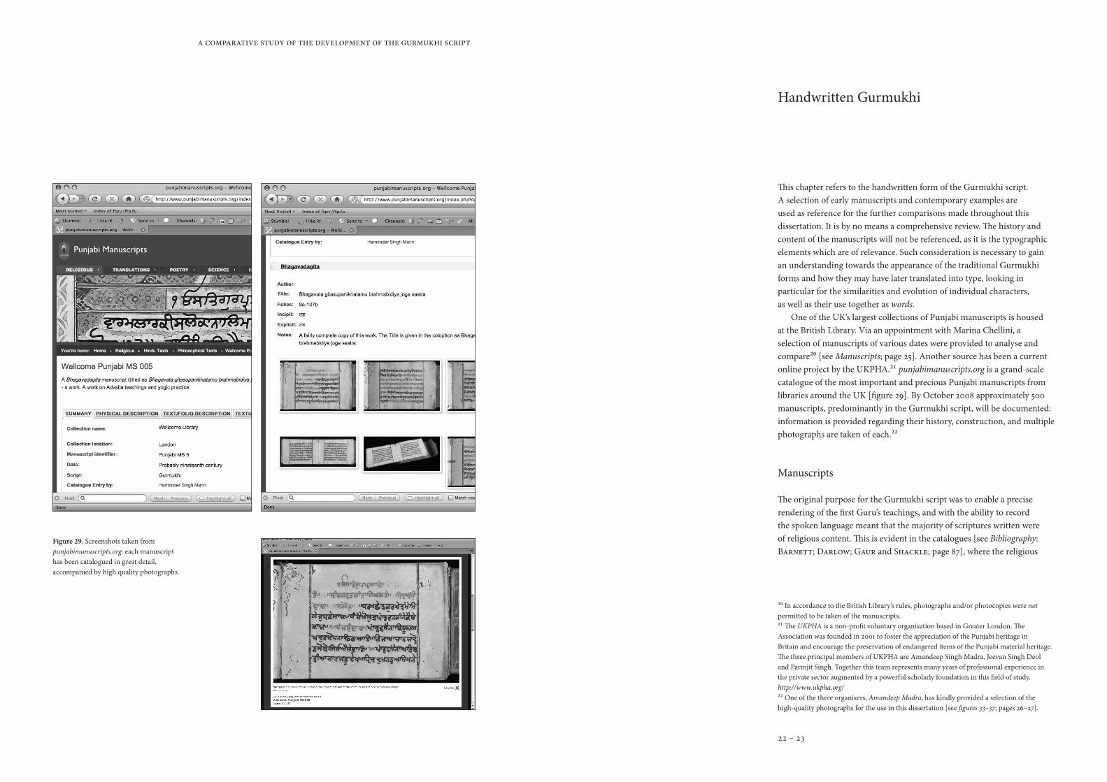
20 In accordance to the British Library’s rules, photographs and/or photocopies were not permitted to be taken of the manuscripts.21 The UKPHA is a non-profit voluntary organisation based in Greater London. The Association was founded in 2001 to foster the appreciation of the Punjabi heritage in Britain and encourage the preservation of endangered items of the Punjabi material heritage. The three principal members of UKPHA are Amandeep Singh Madra, Jeevan Singh Deol and Parmjit Singh. Together this team represents many years of professional experience in the private sector augmented by a powerful scholarly foundation in this field of study. http://www.ukpha.org/22 One of the three organisers, Amandeep Madra, has kindly provided a selection of the high-quality photographs for the use in this dissertation [see figures 33–37; pages 26–27].
Figure 29. Screenshots taken from punjabimanuscripts.org: each manuscript has been catalogued in great detail, accompanied by high quality photographs.
Handwritten Gurmukhi
This chapter refers to the handwritten form of the Gurmukhi script. A selection of early manuscripts and contemporary examples are used as reference for the further comparisons made throughout this dissertation. It is by no means a comprehensive review. The history and content of the manuscripts will not be referenced, as it is the typographic elements which are of relevance. Such consideration is necessary to gain an understanding towards the appearance of the traditional Gurmukhi forms and how they may have later translated into type, looking in particular for the similarities and evolution of individual characters, as well as their use together as words.
One of the UK’s largest collections of Punjabi manuscripts is housed at the British Library. Via an appointment with Marina Chellini, a selection of manuscripts of various dates were provided to analyse and compare20 [see Manuscripts; page 25]. Another source has been a current online project by the UKPHA.21 punjabimanuscripts.org is a grand-scale catalogue of the most important and precious Punjabi manuscripts from libraries around the UK [figure 29]. By October 2008 approximately 500 manuscripts, predominantly in the Gurmukhi script, will be documented: information is provided regarding their history, construction, and multiple photographs are taken of each.22
Manuscripts
The original purpose for the Gurmukhi script was to enable a precise rendering of the first Guru’s teachings, and with the ability to record the spoken language meant that the majority of scriptures written were of religious content. This is evident in the catalogues [see Bibliography: Barnett; Darlow; Gaur and Shackle; page 87], where the religious
A comparative study of the development of the Gurmukhi script
24 – 25
23 An influence from the sacred scripts of Islam, like the Qu’ran The Ramayana British Library24 McLeod, W. H. ed. The B–40 Janamsakhi 1980; page –25 Familiarity with the Punjabi language would be of great use.26 Figure 33. Panjabi MS–––: punjabimanuscripts.org27 Figure 34. Panjabi MS–––: punjabimanuscripts.org28 Figure 35. Panjabi MS005; Wellcome Library; c.19th century: punjabimanuscripts.org29 Figure 36. Panjabi MS–––: punjabimanuscripts.org30 Figure 37. Panjabi MS–––: punjabimanuscripts.org
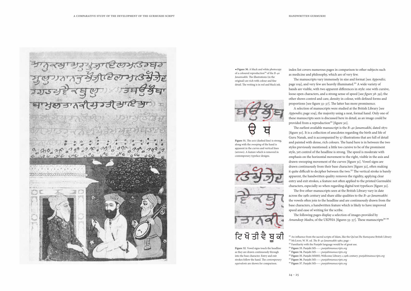
◀ Figure 30. A black and white photocopy of a coloured reproduction24 of the B–40 Janamsakhi. The illustrations (in the original) are rich with colour and fine detail. The writing is in red and black ink.
Figure 31. The axis (dashed line) is strong, along with the swooping of the hand is apparent in the curves and vertical lines (arrows). A feature which is removed in contemporary typeface designs.
index list covers numerous pages in comparison to other subjects such as medicine and philosophy, which are of very few.
The manuscripts vary immensely in size and format [see Appendix; page 109], and very few are heavily illuminated.23 A wide variety of hands are visible, with two apparent differences in style: one with cursive, loose open characters, and a strong sense of speed [see figure 38–39]; the other shows control and care, density in colour, with defined forms and proportions [see figure 33–37]. The latter has more prominence.
A selection of manuscripts were studied at the British Library [see Appendix; page 109], the majority using a neat, formal hand. Only one of these manuscripts seen is discussed here in detail, as an image could be provided from a reproduction24 [figure 30].
The earliest available manuscript is the B–40 Janamsakhi, dated 1870 [figure 30]. It is a collection of anecdotes regarding the birth and life of Guru Nanak, and is accompanied by 57 illustrations that are full of detail and painted with dense, rich colours. The hand here is in between the two styles previously mentioned: a little too cursive to be of the prominent style, yet control of the headline is strong. The speed is moderate with emphasis on the horizontal movement to the right, visible in the axis and drawn-swooping movement of the curves [figure 31]. Vowel signs are drawn continuously from their base characters [figure 32], often making it quite difficult to decipher between the two.25 The vertical stroke is barely apparent, the handwritten quality removes the rigidity, applying clear entry and exit strokes, a feature not often applied to the printed Gurmukhi characters, especially so when regarding digital text typefaces [figure 32].
The five other manuscripts seen at the British Library vary in date across the 19th century and share alike qualities to the B–40 Janamsakhi: the vowels often join to the headline and are continuously drawn from the base characters, a handwritten feature which is likely to have improved speed and ease of writing for the scribe.
The following pages display a selection of images provided by Amandeep Madra, of the UKPHA [figures 33–37]. These manuscripts26-30
Handwritten Gurmukhi
Figure 32. Vowel signs touch the headline as they are drawn continuously through into the base character. Entry and exit strokes follow the hand. The contemporary equivalents are shown for comparison.

A comparative study of the development of the Gurmukhi script
26 – 27
Handwritten Gurmukhi
Figure 33
Figure 34
Figure 35 vowels join the headline
red and black ink is a common occurrence
speed is controlled & forms are similar in proportions to contemporary typefaces
the thick monolinear line is a common feature in Gurmukhi manuscripts
this is one of few Gurmukhi manuscripts which deviates from the monolinear line and instead
stresses some visible stroke-contrast
line spacing31 is tight, & with the addition of vowel signs can increase the density of colour
Figure 36
Figure 37
Note: Figures 33–37 are not shown to scale. Details regarding each manuscripts are given on page 25.26-30 These images are to be used as reference, in which important characteristics are highlighted to the right of the page, [scale 200% of their corresponding image].

A comparative study of the development of the Gurmukhi script
28 – 29
31 Line spacing refers to the white space between each line.32 McLeod, W. H. ‘Reviews; Gurinder Singh Mann …’ Indo-Iranian Journal 1997; page 40633 Mann, Gurinder Singh. The Goindval Pothis 199634 Mann, Gurinder Singh. The Goindval Pothis 1996; page 18
Handwritten Gurmukhi
Figure 38. The Gurmukhi characters, as recorded in the Goindval Pothis, compared with their contemporary equivalents; the majority of which have altered drastically. Mann, Gurinder Singh. The Goindval Pothis 1996; page 17.
Figure 39. Folio two from the Goindval Pothis: an example of the less frequent style of Gurmukhi hand-writing, but one closer to its origins. The shaded circles denote specific oddities which are not common in contemporary printed types [see figure 38; page 29]. Mann, Gurinder Singh. The Goindval Pothis 1996; page 195.
are of a similar style to those seen at the British Library. The most common relationship between all is the controlled hand and density of colour, due to the heavy monolinear line and minimal line spacing.31 Further details are highlighted on the images [see figures 33–37; pages 26–27].
Another example is the Goindval Pothis. There are only two in extant and are privately owned,32 but a reproduction in English was done by Gurinder Singh Mann in 1996,33 in which Mann has analysed and reproduced a selection of their folios. A precise date for the Goindval Pothis is unknown, but ‘the letters in the two extant copies confirm that they were prepared at an early stage of the evolution of Gurmukhi writings,’34 falling somewhere in the second-half of the sixteenth century.
It is obvious that there are many characters which have evolved from the handwritten form at this early stage, compared with the manuscripts
vertical strokes are now rigid & forms defined
the headline does not exist
anymore
proportions have been generalised
vertical strokes lose their
curvature but remain open
vowel signs are drawn continuously
with the base characters
loss of cursive qualities
vowel signs are now inverted or simplified
vowel signs are now inverted
& refined
this vowel signs once appeared
as a dot
some forms have evolved drastically
characters now appear more alike
A comparative study of the development of the Gurmukhi script
30 – 31
35 Taken from email between author and Bhupinder Singh; received 15th August 200836 Alternate characters regarding the Gurmukhi script were originally mentioned in the author’s essay, Considerations for the development of a Gurmukhi font in OpenType January 2008; pages 10. It has since been elaborated for the use in this dissertation.37 Johnston, Edward. Writing and Illuminating and Lettering 1932; page xiii 38 A process in which the author is familiar with.
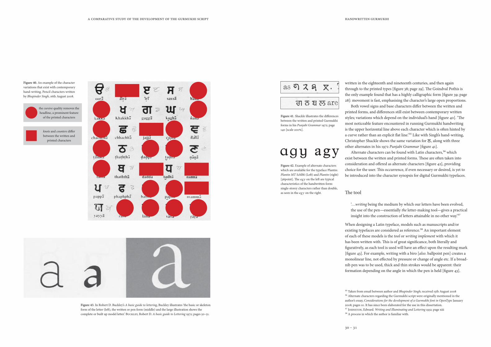
Figure 40. An example of the character variations that exist with contemporary hand-writing. Pencil characters written by Bhupinder Singh, 16th August 2008.
Figure 43. In Robert D. Buckley’s A basic guide to lettering, Buckley illustrates ‘the basic or skeleton form of the letter (left), the written or pen form (middle) and the large illustration shows the complete or built up model letter.’ Buckley, Robert D. A basic guide to Lettering 1972; pages 50–51.
Figure 42. Example of alternate characters which are available for the typeface Plantin: Plantin MT Schlbk (Left) and Plantin (right) [36point]. The ag y on the left are typical characteristics of the handwritten form: single-storey characters rather than double, as seen in the ag y on the right.
Figure 41. Shackle illustrates the differences between the written and printed Gurmukhi forms in his Punjabi Grammar 1972; page 140 [scale 200%].
Handwritten Gurmukhi
written in the eighteenth and nineteenth centuries, and then again through to the printed types [figure 38; page 29]. The Goindval Pothis is the only example found that has a highly calligraphic form [figure 39; page 28]: movement is fast, emphasising the character’s large open proportions.
Both vowel signs and base characters differ between the written and printed forms, and differences still exist between contemporary written styles; variations which depend on the individual’s hand [figure 40]. ‘The most noticeable feature encountered in running Gurmukhi handwriting is the upper horizontal line above each character which is often hinted by a curve rather than an explicit flat line.’35 Like with Singh’s hand-writing, Christopher Shackle shows the same variation for , along with three other alternates in his 1972 Punjabi Grammar [figure 41].
Alternate characters can be found with Latin characters,36 which exist between the written and printed forms. These are often taken into consideration and offered as alternate characters [figure 42], providing choice for the user. This occurrence, if even necessary or desired, is yet to be introduced into the character synopsis for digital Gurmukhi typefaces.
The tool
‘…writing being the medium by which our letters have been evolved, the use of the pen—essentially the letter-making tool—gives a practical insight into the construction of letters attainable in no other way.’37
When designing a Latin typeface, models such as manuscripts and/or existing typefaces are considered as reference.38 An important element of each of these models is the tool or writing implement with which it has been written with. This is of great significance, both literally and figuratively, as each tool is used will have an effect upon the resulting mark [figure 43]. For example, writing with a biro [also. ballpoint pen] creates a monolinear line, not effected by pressure or change of angle etc. If a broad-nib pen was to be used, thick and thin strokes would be apparent: their formation depending on the angle in which the pen is held [figure 43].
the cursive quality removes the headline, a prominent feature
of the printed characters
knots and counters differ between the written and
printed characters
A comparative study of the development of the Gurmukhi script
32 – 33
39 Noordzij, Gerrit. The Stroke: theory of writing 2005; page back-cover40 One would like to stress that this approach would provide definitive results, but should act as a starting point, especially with reference to those unfamiliar to any particular script. The design of a typeface would benefit from a range of influences both historical contemporary.41 Ghosh, Pijush K. An approach to type design and … Indian scripts 1983; page 1542 Ghosh, Pijush K. An approach to type design and … Indian scripts 1983; page 1443 Ghosh, Pijush K. An approach to type design and… Indian scripts 1983; page 1244 A reminder that the Gurmukhi script is one of small presence compared to others such as Devanagari and Bengali, where one can assume plenty more typefaces existed for each.
Handwritten Gurmukhi
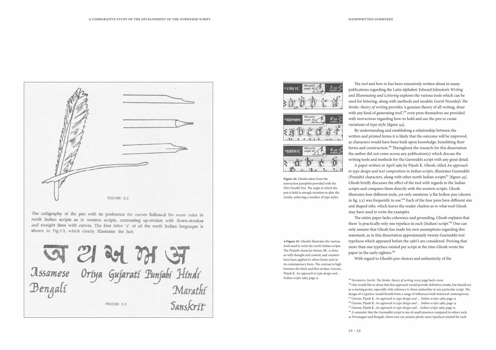
The tool and how-to has been extensively written about in many publications regarding the Latin alphabet: Edward Johnston’s Writing and Illuminating and Lettering explores the various tools which can be used for lettering, along with methods and models; Gerrit Noordzj’s The Stroke: theory of writing provides ‘a genuine theory of all writing, done with any kind of generating tool’;39 even pens themselves are provided with instructions regarding how-to hold and use the pen to create variations of type style [figure 44].
By understanding and establishing a relationship between the written and printed forms it is likely that the outcome will be improved, as characters would have been built upon knowledge, benefitting their forms and construction.40 Throughout the research for this dissertation the author did not come across any publication(s) which discuss the writing tools and methods for the Gurmukhi script with any great detail.
A paper written in April 1983 by Pijush K. Ghosh, titled An approach to type design and text composition in Indian scripts, illustrates Gurmukhi (Punjabi) characters, along with other north Indian scripts41 [figure 45]. Ghosh briefly discusses the effect of the tool with regards to the Indian scripts and compares them directly with the western scripts. Ghosh illustrates four different tools, yet only mentions ‘a flat hollow pen (shown in fig. 3.2) was frequently in use.’42 Each of the four pens have different size and shaped nibs, which leaves the reader clueless as to what tool Ghosh may have used to write the examples.
The entire paper lacks coherence and grounding. Ghosh explains that there ‘is practically only one typeface in each (Indian) script.’43 One can only assume that Ghosh has made his own assumptions regarding this statement, as in this dissertation approximately twenty Gurmukhi text typefaces which appeared before the 1980’s are considered. Proving that more than one typeface existed per script at the time Ghosh wrote his paper in the early eighties.44
With regard to Ghosh’s pen choices and authenticity of the
Figure 44. Details taken from the instruction pamphlet provided with the Pilot Parallel Pen. The angle at which the pen is held is enough variation to alter the results, achieving a number of type styles.
◀ Figure 45. Ghosh’s illustrates the various tools used to write the north Indian scripts. The Punjabi character drawn, , is done so with thought and control, and counters have been applied to where knots exist in its contemporary form. The contrast is high between the thick and thin strokes. Ghosh, Pijush K. An approach to type design and… Indian scripts 1983; page 15

A comparative study of the development of the Gurmukhi script
34 – 35
45 An analysis of the Gurmukhi script was compiled in the author’s essay, Considerations for the development of a Gurmukhi font in OpenType, written in January 2008. 46 Taken from email between author and the editor of sikhchic.com; received 27th August 2008
Figure 46. Illustration showing how to sharpen and shape the reed, creating a pen. K. C. Aryan’s Encyclopedia of Indian Art; page 15,
Figure 48. [top = front; bottom = reverse] Pens: (from the top) Kullum; hollow flat-nib reed pen; three solid, flat-nibbed reed pens.
Figure 49. A mural found in the Gurudwara Baba Atal in Amritsar, depicts a school scene in which pupils are writing and sitting beside ink wells (dotted circles), [Freed sikhsangat.com].
Figure 47. The suggested stroke sequence for each Gurmukhi consonant. Ganathe N. S. R. Learn Punjabi in 30 days 2005; page i (one of two pages).
Handwritten Gurmukhi
illustrations, all express a visibly high-contrasting stroke, a feature that is seen in Devanagari, however not so much in Gurmukhi. Referring to the previously discussed manuscripts [figures 30; 33–37; 38–39], one can see that a high-contrast stroke is not a common feature and the majority tend to be of a monolinear line [figures 33–37]. Those that stress some contrast may be the result of a variation between speed and movement of the hand, rather than the mark of a specific tool.
One should mention that out of the six manuscripts seen at the British Library, the nineteenth century Add. 26,525 [see Appendix; page 109], is an example of Gurmukhi characters which are of high-contrast, along with being refined and well-proportioned. Unable to provide an example, the characters can be compared to those of the 1876 Gurmukhi typeface cast by the Oxford University Press, which expresses similar characteristics, [see Development of the printed character; page 39–83].
Tools have been specified for other Indian scripts. The reed pen for Devanagari is mentioned numerous times, including how it should be prepared and used: K. C. Aryan’s Encyclopedia of Indian Art [figure 46] and a thorough study regarding the Analysis and calligraphy of Devanagari was compiled by Dr Bhagwat and published in Naik’s Typography of Devanagari. A primer, Learn Punjabi in 30 days by N .S. R. Ganathe, illustrates the stroke sequence in which to write the Gurmukhi characters [figure 47], but no such publications appear to exist that considered the Gurmukhi script beyond how-to write the characters. An alike analysis to Dr Bhagwat’s was done so by the author regarding the components and construction of the Gurmukhi characters.45
There does not seem to be a conclusive answer regarding a specific tool for traditional Gurmukhi writing, and is often left at the assumption that it too was written with a reed pen: this is a possibility, yet the nib may have been cut striaght-across, a flat-nib, rather than at an angle [figure 46], as there is a significant difference in stroke-contrast between the handwritten Devanagari and Gurmukhi characters. The flat-nib reed pen is a theory shared with Bhupinder Singh, and Mushtaq, who also provided examples of this specific flat-nibbed tool [figure 48]. The term kullum, mentioned by the editor of sikhchic.com,46 refers to the tool consisting of a wooden stem and a slip-on metal nib, a tool which is similar to a fountain pen [figure 48].

A comparative study of the development of the Gurmukhi script
36 – 37
A mural found in the Gurudwara Baba Atal,47 in Amritsar, illustrates a classroom scene, with children writing on slate, and ink-wells at their side, in which they dip their pens [figure 49; page 34].
Today, Gurmukhi is written with any tool at hand,48 and there seems no evidence of any withstanding traditional tool. Photographs of contemporary scribes were found on sikhsangat.com [figure 50–51], dates are unknown and no response was received regarding them. The two examples use different tools: one looks as though it may be a reed pen [figure 50]: notice that the board is at an angle, with the scribe’s hand holding himself steady as he writes at a large size, holding the pen far from the nib, yet with control. The second, looks very much like a western fountain pen or dip-pen [figure 51]: held with its nib facing to the side and very close to, working on a flat surface, at a smaller size compared to the first example but with the same control and attentiveness.
It is evident that there is a particular style to the Gurmukhi character, and with further investigation one would hope to find a conclusive answer, whether regarding the tool itself, or of the practiced method.
47 The Gurudwara Baba Atal, Amritsar, is believed to be the cremation ground of Baba Atal.48 Discussed with the Sewadar, at the SMS, Southall: 22nd August 2008
Handwritten Gurmukhi
Figure 51. The Keertani Master Nirarijan Singh, writing a saroop of Guru Sahib. Using a dip-pen to write the compact, yet controlled Gurmukhi characters. [Date, location and photographer are unknown. Freed sikhsangat.com].
Figure 50. Gurmeet Singh, a scribe who uses what seems like a reed pen. The Gurmukhi characters are well-controlled and evenly proportioned. [Date, location and photographer are unknown. Freed sikhsangat.com].