Embed Size (px)
Citation preview

A Brief Examination of Previous House Price Declines
June 2009
2
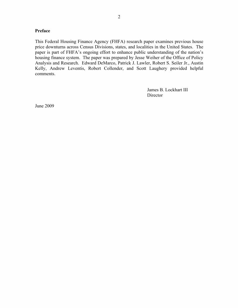
Preface
This Federal Housing Finance Agency (FHFA) research paper examines previous house price downturns across Census Divisions, states, and localities in the United States. The paper is part of FHFA’s ongoing effort to enhance public understanding of the nation’s housing finance system. The paper was prepared by Jesse Weiher of the Office of Policy Analysis and Research. Edward DeMarco, Patrick J. Lawler, Robert S. Seiler Jr., Austin Kelly, Andrew Leventis, Robert Collender, and Scott Laughery provided helpful comments.
James B. Lockhart III Director
June 2009
3
Introduction
Homeowners, business leaders, and government officials are keenly interested in knowing how long the current decline in house prices will last. The length and depth of house price declines and the strength of subsequent recoveries play important roles in business cycles. Although the Federal Housing Finance Agency (FHFA) does not forecast price movements, the agency’s house price index (HPI) provides a great deal of information concerning historical price declines. This paper provides a brief examination of house price declines in the United States and focuses on select areas that have experienced sharp price declines. The depth and duration of declines have varied significantly across areas, and inflation-adjusted prices have generally taken several years to rebound to previous levels.
There are a number of issues associated with studying house price declines, not the least of which is choosing a definition for downturns and subsequent recoveries. One question, for example, is: how large must price declines be before they are labeled “downturns”? Also, it is not obvious whether downturns should be identified in nominal terms or in inflation-adjusted terms. Finally, should a “recovery” be defined as the period in which prices return to their prior peak, or should it be classified as the period required to return to some long-term “fundamentals-based” price? The fundamentals-based approach is appealing because it does not presume prior price peaks are attainable.1 It is problematic because identifying the appropriate fundamentals and determining the true long-term values are not trivial tasks. Those issues have been the subject of considerable ongoing research and are beyond the scope of this paper.2
In the initial sections of the paper, house price declines and recoveries are analyzed using inflation-adjusted prices; home prices are gauged relative to the price trends for all other goods and services in the economy, which is measured using the Bureau of Labor Statistics' Consumer Price Index (CPI) for “all items less shelter.”3 Each geographic area is assigned at most one trough and one peak (prior to the trough).4 Troughs are flagged as the points at which the percentage distance between the real HPI and the previous high is most negative.5 Once the trough has been identified, the peak is defined as the
1 While it reasonable to assume that nominal prices can always return to prior peaks, the same may not be true for inflation-adjusted prices. Indeed, real home prices for many areas within the U.S. have not yet returned to values they approached in the 1980s.2 For a recent discussion, see Vladimir Klyuev, “What Goes Up Must Come Down? House Price Dynamics in the United States,” International Monetary Fund Working Paper 08-187 (July 2008). 3 The Bureau of Labor Statistics’ price index series ID# CUUR0000SA0L2—U.S. city average CPI for all items less shelter—can be obtained at http://data.bls.gov/cgi-bin/srgate. 4 For the United States and California—both areas of which are currently experiencing their worst downturns—a subsequent analysis was done on the second worst downturn, which occurred in the mid- 1990s for both areas. 5 FHFA’s purchase-only index, which is estimated using sales price data but not appraisal values in refinance transactions, is used where available. The index is available beginning in the first quarter of 1991 for the United States, all Census Divisions, and all states. For periods prior to the first quarter of 1991, the all-transactions index, which includes data from sales and refinance transactions, is used. FHFA’s purchase-only index is not used for Metropolitan Statistical Areas or Divisions (MSAs) due to data
4
previous high in the real HPI. The point of recovery is defined to be the date at which the real HPI has returned to the previous peak value. The last section of the paper provides a supplementary analysis of house price declines and recoveries using nominal dollars.
In reviewing the data, it should be recognized that the applicability of historical trends to the current U.S. house price downturn may be limited. The economic drivers of price increases during the boom period in the early 2000s differed from the drivers of prior market booms, and the magnitude of recent price increases has generally been larger. Also, the catalyst of the recent downturn is much different. As will be discussed briefly, most of the larger historical downturns were caused by sharp increases in unemployment rates and shocks to personal income. Although the U.S. economy has experienced such conditions in the last year, those factors were not among the precipitants of the latest downturn, which began in 2006, well before the financial crisis erupted in the third quarter of 2007 and the recession began in the fourth quarter of 2007.
Typical Characteristics of House Price Downturns
Table 1 presents summary information recounting the features of previous house price downturns for Census Divisions, states, and metropolitan statistical areas (MSAs). The duration of the decline period and the ensuing recovery period are reported, as are the relative rates of price change during the respective periods. Because real prices have not returned to prior highs in some areas, the table also reports the relative frequency in which no full recovery was evident.
Several observations can be made from Table 1. First, house price downturns have tended to be long. The median time required to return to prior peak prices was 10½ to 20 years. Second, it tends to take longer for prices to rise from the trough to their former peak than it takes prices to decline from peak to trough. While the difference is small for Census Divisions and states, FHFA’s Metropolitan Statistical Area and Division (MSA) indexes suggest that the time from peak to trough tends to be about 3¾ years, whereas the median recovery period (from trough to prior peak) was 6⅔ years.
Worst House Price Downturns Since 1975
The previous section described some typical characteristics of house price downturns. This section seeks to examine the characteristics of the worst house price downturns.
Table 2 describes the worst house price downturns among all MSAs, among all states, and among all Census Divisions. A geographic area’s downturn is ranked as being the worst among all areas if it is either:
1. the area with the most depreciation from peak to trough (deepest drop);
limitations. The all-transactions index for MSAs extends back as far as available data will allow for index estimation, but is available no earlier than the first quarter of 1975.
5
2. the area with the most negative annualized depreciation rate from peak to trough (steepest drop); or
3. the area that took the longest time to go from peak to trough and then to fully recover (longest duration).
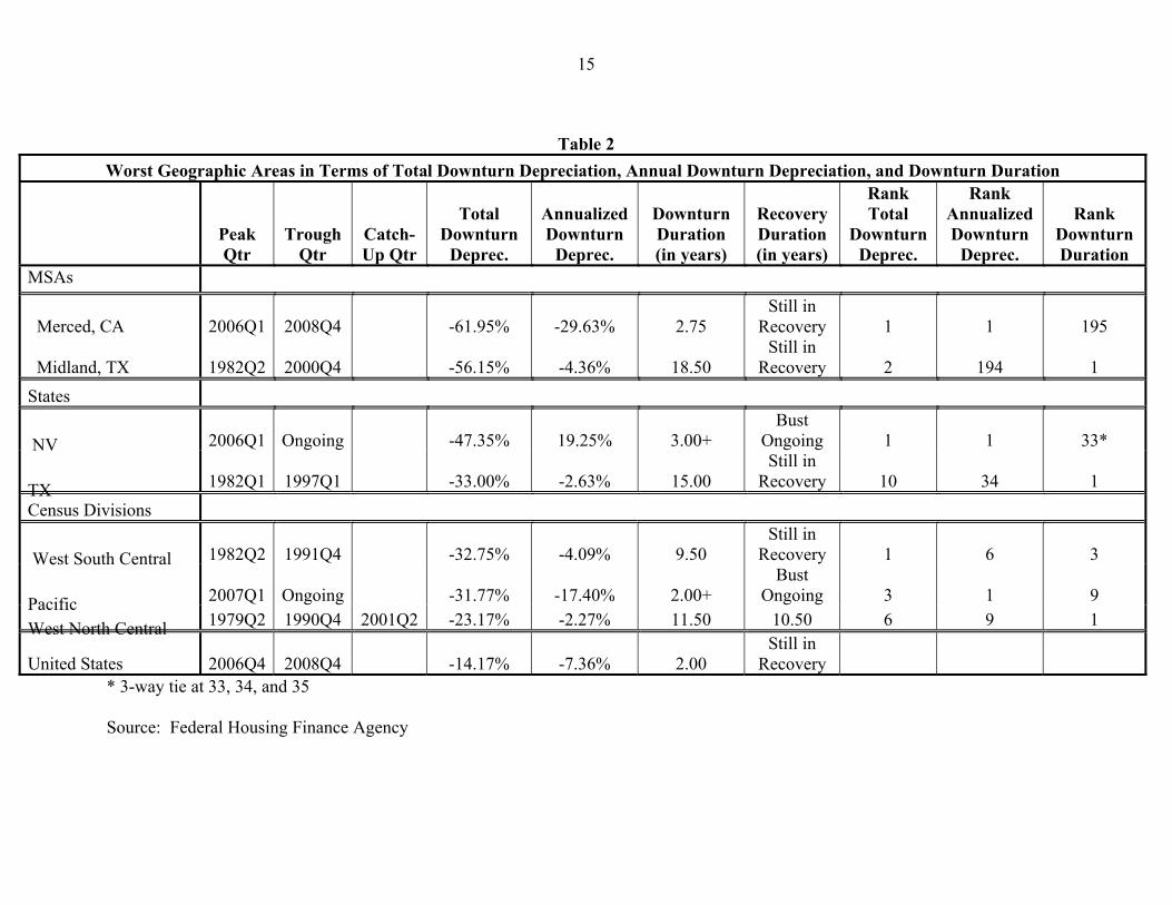
Data for the United States as a whole are included for comparison. Notice that the Pacific Census Division is currently the worst Census Division in terms of annualized downturn depreciation. House prices have lost almost 17½ percent of their value per year for 2 years and are still on a downward trajectory.
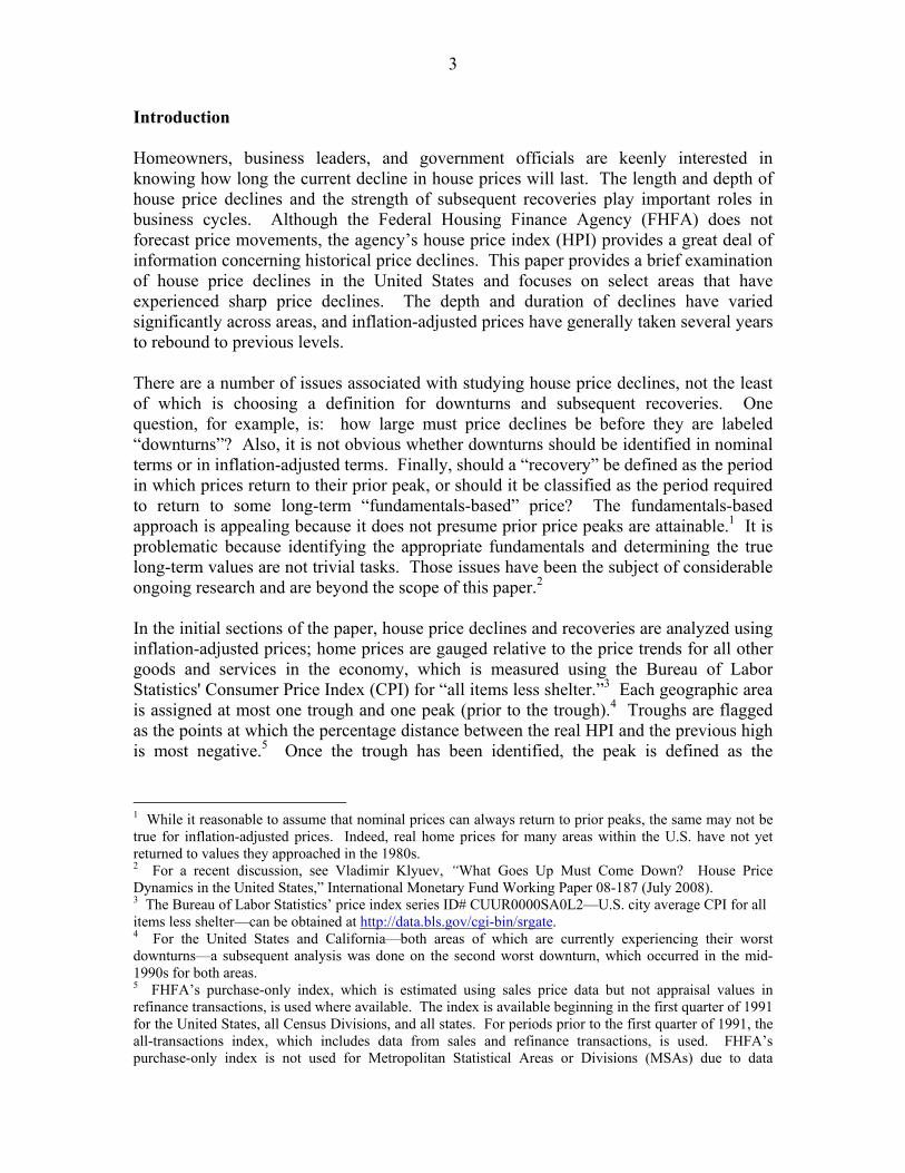
Home prices in Midland, TX—the worst MSA by duration of house price decline—lost over 56 percent of their value from the second quarter of 1982 to the fourth quarter of 2000 and have yet to recover 8¼ years later. The real HPI for Midland, TX is displayed in Figure 1.
Figure 1
Midland, TX: Worst MSA by Downturn Duration (1995Q1 = 100)
1981
Q3
1982
Q3
1983
Q3
1984
Q3
1985
Q3
1986
Q3
1987
Q3
1988
Q3
1989
Q3
1990
Q3
1991
Q3
1992
Q3
1993
Q3
1994
Q3
1995
Q3
1996
Q3
1997
Q3
1998
Q3
1999
Q3
2000
Q3
2001
Q3
2002
Q3
2003
Q3
2004
Q3
2005
Q3
2006
Q3
2007
Q3
2008
Q3 80
100
120
140
160
180
200
220
240
Rea
l HPI
Date
Real HPI Pre-Peak Trend Peak-to-Trough Trend Catch-Up Trend
Source: Federal Housing Finance Agency
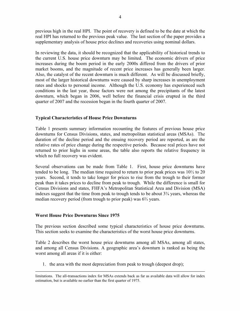
Figure 2 displays the real HPI for Merced, CA. Prices in Merced—the worst MSA in terms of both total and annualized downturn depreciation—lost almost 30 percent of their value per year for 2¾ years before rising in the first quarter of 2009.
6
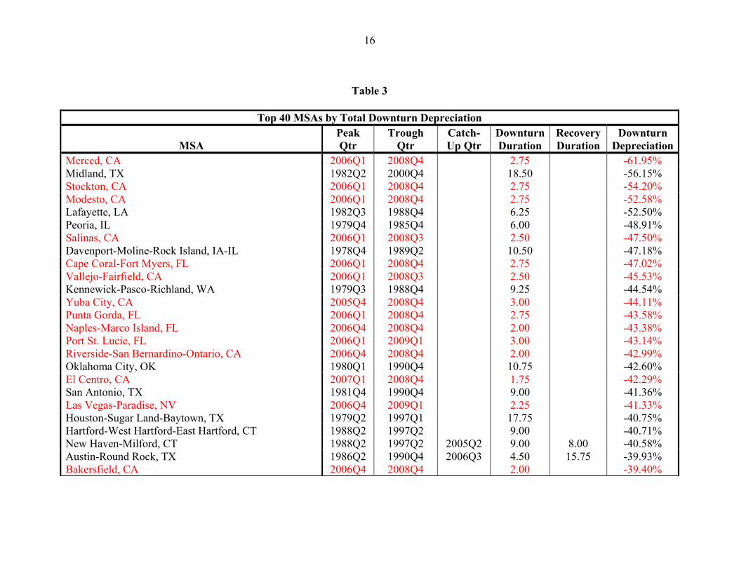
Table 3 lists the worst 40 MSAs in terms of total downturn depreciation. Note that 17 of the MSAs with the worst house price downturns; located in California, Florida, and Nevada; are currently just beginning to recover from—or are still experiencing—those downturns.
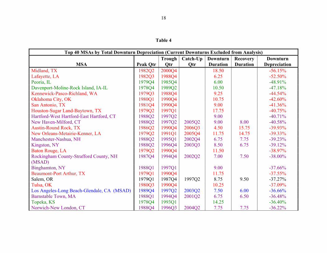
In order to get a picture of which areas have historically had the worst downturns, Table 4 lists the 40 MSAs with the worst downturns occurring prior to 2006. All but one of those MSAs can be placed in four groups:
Figure 2
Merced, CA: Worst MSA by Total and Annualized Downturn Depreciation (1995Q1 = 100)
1979
Q2
1980
Q2
1981
Q2
1982
Q4
1983
Q4
1984
Q4
1985
Q4
1986
Q4
1987
Q4
1988
Q4
1989
Q4
1990
Q4
1991
Q4
1992
Q4
1993
Q4
1994
Q4
1995
Q4
1996
Q4
1997
Q4
1998
Q4
1999
Q4
2000
Q4
2001
Q4
2002
Q4
2003
Q4
2004
Q4
2005
Q4
2006
Q4
2007
Q4
2008
Q4 80
100
120
140
160
180
200
220
240
260
Rea
l HPI
Date
Pre-Peak Trend Peak-to-Trough Trend Catch-Up Trend Real HPI
Source: Federal Housing Finance Agency
1. Cities in the Southwest and other energy-producing areas affected by the collapse of energy prices in the early to mid- 1980s,
2. Northeastern cities affected by that area’s real estate collapse of the late 1980s, 3. Midwestern cities affected by the energy crisis of the late 1970s and the ensuing
manufacturing downturn, and 4. California cities affected by that state’s recession of the early 1990s.
House Price Downturns in Specific Areas
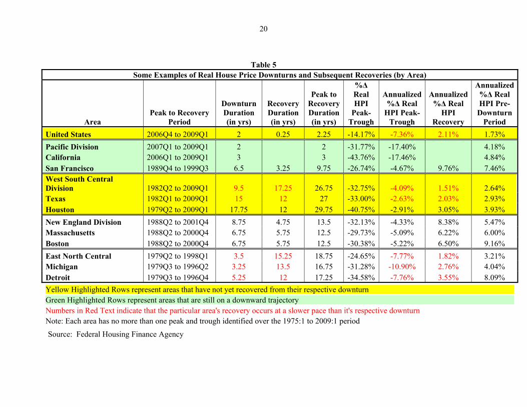
Table 5 presents evidence concerning the magnitude and duration of the largest historical house price decline for the U.S. as a whole and some of the most severe localized market
7
declines mentioned in the previous section. In addition to the national level, data are provided for selected Census Divisions and states and for a few large cities.
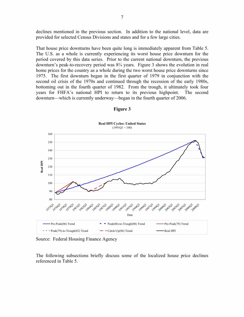
That house price downturns have been quite long is immediately apparent from Table 5. The U.S. as a whole is currently experiencing its worst house price downturn for the period covered by this data series. Prior to the current national downturn, the previous downturn’s peak-to-recovery period was 8¾ years. Figure 3 shows the evolution in real home prices for the country as a whole during the two worst house price downturns since 1975. The first downturn began in the first quarter of 1979 in conjunction with the second oil crisis of the 1970s and continued through the recession of the early 1980s, bottoming out in the fourth quarter of 1982. From the trough, it ultimately took four years for FHFA’s national HPI to return to its previous highpoint. The second downturn—which is currently underway—began in the fourth quarter of 2006.
Figure 3
Real HPI Cycles: United States (1991Q1 = 100)
1975
Q1
1976
Q3
1978
Q1
1979
Q3
1981
Q1
1982
Q3
1984
Q1
1985
Q3
1987
Q1
1988
Q3
1990
Q1
1991
Q3
1993
Q1
1994
Q3
1996
Q1
1997
Q3
1999
Q1
2000
Q3
2002
Q1
2003
Q3
2005
Q1
2006
Q3
2008
Q1 80
90
100
110
120
130
140
150
160
Rea
l HPI
Date
Pre-Peak(06) Trend Peak(06)-to-Trough(08) Trend Pre-Peak(79) Trend
Peak(79)-to-Trough(82) Trend Catch-Up(86) Trend Real HPI
Source: Federal Housing Finance Agency
The following subsections briefly discuss some of the localized house price declines referenced in Table 5.
8
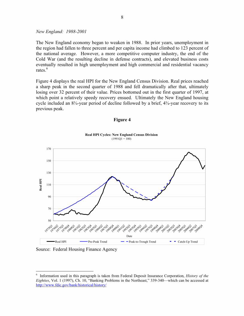
New England: 1988-2001
The New England economy began to weaken in 1988. In prior years, unemployment in the region had fallen to three percent and per capita income had climbed to 123 percent of the national average. However, a more competitive computer industry, the end of the Cold War (and the resulting decline in defense contracts), and elevated business costs eventually resulted in high unemployment and high commercial and residential vacancy rates.6
Information used in this paragraph is taken from Federal Deposit Insurance Corporation, History of the Eighties, Vol. 1 (1997), Ch. 10, “Banking Problems in the Northeast,” 339-340—which can be accessed at http://www.fdic.gov/bank/historical/history/
Figure 4 displays the real HPI for the New England Census Division. Real prices reached a sharp peak in the second quarter of 1988 and fell dramatically after that, ultimately losing over 32 percent of their value. Prices bottomed out in the first quarter of 1997, at which point a relatively speedy recovery ensued. Ultimately the New England housing cycle included an 8¾-year period of decline followed by a brief, 4¾-year recovery to its previous peak.
Figure 4
Real HPI Cycles: New England Census Division (1991Q1 = 100)
1975
Q1
1976
Q2
1977
Q3
1978
Q4
1980
Q1
1981
Q2
1982
Q3
1983
Q4
1985
Q1
1986
Q2
1987
Q3
1988
Q4
1990
Q1
1991
Q2
1992
Q3
1993
Q4
1995
Q1
1996
Q2
1997
Q3
1998
Q4
2000
Q1
2001
Q2
2002
Q3
2003
Q4
2005
Q1
2006
Q2
2007
Q3
2008
Q4 50
70
90
110
130
150
170
Rea
l HPI
Date
Real HPI Pre-Peak Trend Peak-to-Trough Trend Catch-Up Trend
Source: Federal Housing Finance Agency
6
9
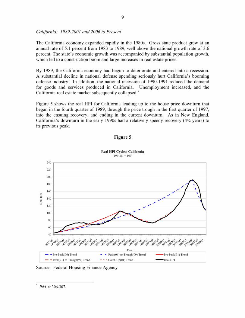
California: 1989-2001 and 2006 to Present
The California economy expanded rapidly in the 1980s. Gross state product grew at an annual rate of 5.1 percent from 1983 to 1989, well above the national growth rate of 3.6 percent. The state’s economic growth was accompanied by substantial population growth, which led to a construction boom and large increases in real estate prices.
By 1989, the California economy had begun to deteriorate and entered into a recession. A substantial decline in national defense spending seriously hurt California’s booming defense industry. In addition, the national recession of 1990-1991 reduced the demand for goods and services produced in California. Unemployment increased, and the California real estate market subsequently collapsed.7
7 Ibid, at 306-307.
Figure 5 shows the real HPI for California leading up to the house price downturn that began in the fourth quarter of 1989, through the price trough in the first quarter of 1997, into the ensuing recovery, and ending in the current downturn. As in New England, California’s downturn in the early 1990s had a relatively speedy recovery (4¾ years) to its previous peak.
Figure 5
Real HPI Cycles: California (1991Q1 = 100)
1975
Q1
1976
Q2
1977
Q3
1978
Q4
1980
Q1
1981
Q2
1982
Q3
1983
Q4
1985
Q1
1986
Q2
1987
Q3
1988
Q4
1990
Q1
1991
Q2
1992
Q3
1993
Q4
1995
Q1
1996
Q2
1997
Q3
1998
Q4
2000
Q1
2001
Q2
2002
Q3
2003
Q4
2005
Q1
2006
Q2
2007
Q3
2008
Q4 40
60
80
100
120
140
160
180
200
220
240
Rea
l HPI
Date Pre-Peak(06) Trend Peak(06)-to-Trough(09) Trend Pre-Peak(91) Trend
Peak(91)-to-Trough(97) Trend Catch-Up(01) Trend Real HPI
Source: Federal Housing Finance Agency
10
In the early 2000s California experienced a particularly large house price boom fueled by a marked increase in the availability of mortgage credit. Real house prices in California peaked in the first quarter of 2006. The ensuing subprime mortgage crisis hit California particularly hard. As of the first quarter of 2009, real house prices have fallen almost 44 percent—far more than the 32 percent drop from 1989 to 1997.
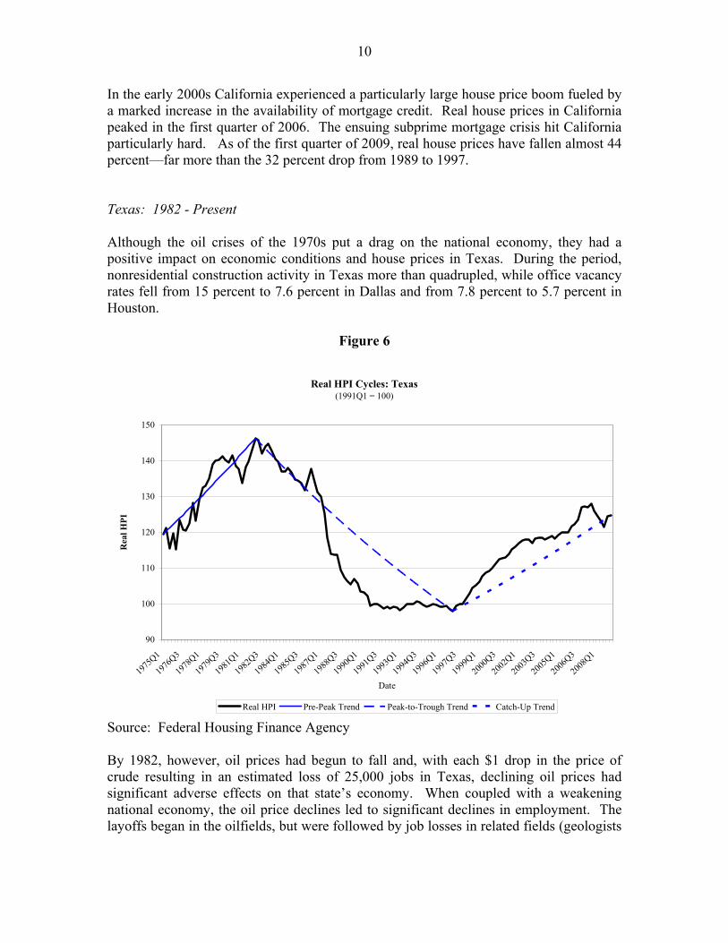
Texas: 1982 - Present
Although the oil crises of the 1970s put a drag on the national economy, they had a positive impact on economic conditions and house prices in Texas. During the period, nonresidential construction activity in Texas more than quadrupled, while office vacancy rates fell from 15 percent to 7.6 percent in Dallas and from 7.8 percent to 5.7 percent in Houston.
Figure 6
Real HPI Cycles: Texas (1991Q1 = 100)
1975
Q1
1976
Q3
1978
Q1
1979
Q3
1981
Q1
1982
Q3
1984
Q1
1985
Q3
1987
Q1
1988
Q3
1990
Q1
1991
Q3
1993
Q1
1994
Q3
1996
Q1
1997
Q3
1999
Q1
2000
Q3
2002
Q1
2003
Q3
2005
Q1
2006
Q3
2008
Q1 90
100
110
120
130
140
150
Rea
l HPI
Date
Real HPI Pre-Peak Trend Peak-to-Trough Trend Catch-Up Trend
Source: Federal Housing Finance Agency
By 1982, however, oil prices had begun to fall and, with each $1 drop in the price of crude resulting in an estimated loss of 25,000 jobs in Texas, declining oil prices had significant adverse effects on that state’s economy. When coupled with a weakening national economy, the oil price declines led to significant declines in employment. The layoffs began in the oilfields, but were followed by job losses in related fields (geologists
11
and engineers) and next in service companies (motels, restaurants, and retail stores). By September 1986, 743,000 Texans were unemployed.8
Figure 6 shows the real value of FHFA’s HPI for Texas since 1975. Prices peaked in the first quarter of 1982 and then declined steadily. Prices bottomed out in the first quarter of 1997 after losing 33 percent of their value. Texas’ real estate prices have yet to fully recover and now are roughly 15 percent below their prior peak.
Michigan and Detroit: 1979 - 1996
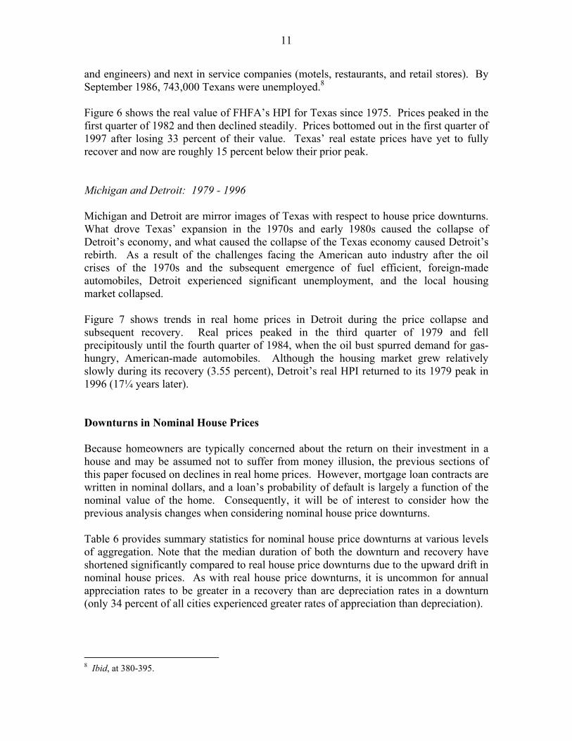
Michigan and Detroit are mirror images of Texas with respect to house price downturns. What drove Texas’ expansion in the 1970s and early 1980s caused the collapse of Detroit’s economy, and what caused the collapse of the Texas economy caused Detroit’s rebirth. As a result of the challenges facing the American auto industry after the oil crises of the 1970s and the subsequent emergence of fuel efficient, foreign-made automobiles, Detroit experienced significant unemployment, and the local housing market collapsed.
Figure 7 shows trends in real home prices in Detroit during the price collapse and subsequent recovery. Real prices peaked in the third quarter of 1979 and fell precipitously until the fourth quarter of 1984, when the oil bust spurred demand for gas-hungry, American-made automobiles. Although the housing market grew relatively slowly during its recovery (3.55 percent), Detroit’s real HPI returned to its 1979 peak in 1996 (17¼ years later).
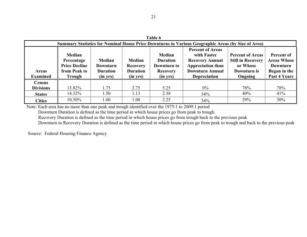
Downturns in Nominal House Prices
Because homeowners are typically concerned about the return on their investment in a house and may be assumed not to suffer from money illusion, the previous sections of this paper focused on declines in real home prices. However, mortgage loan contracts are written in nominal dollars, and a loan’s probability of default is largely a function of the nominal value of the home. Consequently, it will be of interest to consider how the previous analysis changes when considering nominal house price downturns.
Table 6 provides summary statistics for nominal house price downturns at various levels of aggregation. Note that the median duration of both the downturn and recovery have shortened significantly compared to real house price downturns due to the upward drift in nominal house prices. As with real house price downturns, it is uncommon for annual appreciation rates to be greater in a recovery than are depreciation rates in a downturn (only 34 percent of all cities experienced greater rates of appreciation than depreciation).
8 Ibid, at 380-395.
12
Figure 7
Real HPI Cycles: Detroit (1995Q1 = 100)
1976
Q3
1977
Q4
1979
Q1
1980
Q2
1981
Q3
1982
Q4
1984
Q1
1985
Q2
1986
Q3
1987
Q4
1989
Q1
1990
Q2
1991
Q3
1992
Q4
1994
Q1
1995
Q2
1996
Q3
1997
Q4
1999
Q1
2000
Q2
2001
Q3
2002
Q4
2004
Q1
2005
Q2
2006
Q3
2007
Q4
2009
Q1 60
70
80
90
100
110
120
130
140
150
160
Date
Rea
l HPI
Real HPI Pre-Peak Trend Peak-to-Trough Trend Catch-Up Trend
Source: Federal Housing Finance Agency
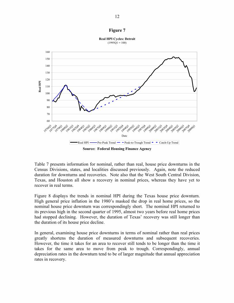
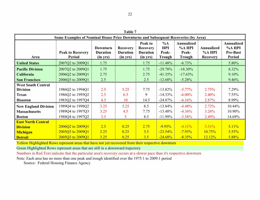
Table 7 presents information for nominal, rather than real, house price downturns in the Census Divisions, states, and localities discussed previously. Again, note the reduced duration for downturns and recoveries. Note also that the West South Central Division, Texas, and Houston all show a recovery in nominal prices, whereas they have yet to recover in real terms.
Figure 8 displays the trends in nominal HPI during the Texas house price downturn. High general price inflation in the 1980’s masked the drop in real home prices, so the nominal house price downturn was correspondingly short. The nominal HPI returned to its previous high in the second quarter of 1995, almost two years before real home prices had stopped declining. However, the duration of Texas’ recovery was still longer than the duration of its house price decline.
In general, examining house price downturns in terms of nominal rather than real prices greatly shortens the duration of measured downturns and subsequent recoveries. However, the time it takes for an area to recover still tends to be longer than the time it takes for the same area to move from peak to trough. Correspondingly, annual depreciation rates in the downturn tend to be of larger magnitude that annual appreciation rates in recovery.
1975
Q1
1976
Q3
1978
Q1
1979
Q3
1981
Q1
1982
Q3
1984
Q1
1985
Q3
1987
Q1
1988
Q3
1990
Q1
1991
Q3
1993
Q1
1994
Q3
1996
Q1
1997
Q3
1999
Q1
2000
Q3
2002
Q1
2003
Q3
2005
Q1
2006
Q3
2008
Q1 40
60
80
100
120
140
160
180
200
Date
Nom
inal
HPI
HPI Pre-Peak Trend Peak-to-Trough Trend Catch-Up Trend
13
Figure 8
Nominal HPI Cycles: Texas (1995Q1=100)
Source: Federal Housing Finance Agency
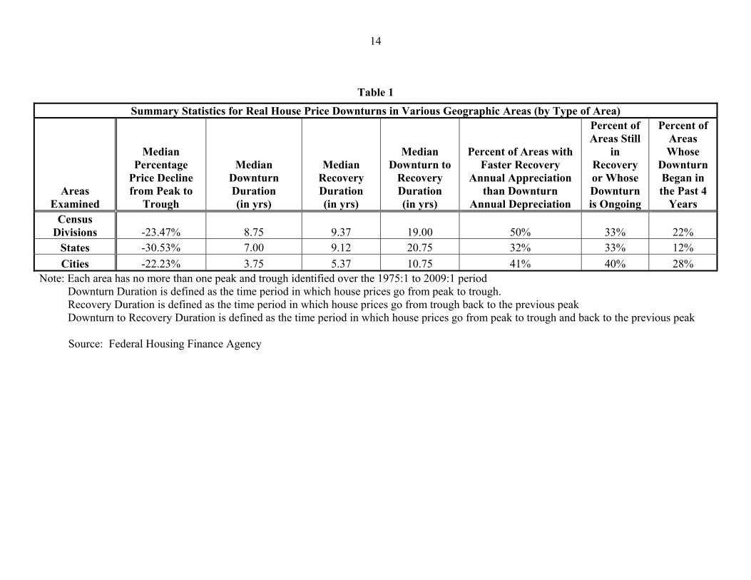
14
Table 1 Summary Statistics for Real House Price Downturns in Various Geographic Areas (by Type of Area)
Areas Examined
Median Percentage
Price Decline from Peak to
Trough
Median Downturn Duration (in yrs)
Median Recovery Duration (in yrs)
Median Downturn to
Recovery Duration (in yrs)
Percent of Areas with Faster Recovery
Annual Appreciation than Downturn
Annual Depreciation
Percent of Areas Still
in Recovery or Whose Downturn is Ongoing
Percent of Areas Whose
Downturn Began in the Past 4
Years Census
Divisions -23.47% 8.75 9.37 19.00 50% 33% 22% States -30.53% 7.00 9.12 20.75 32% 33% 12% Cities -22.23% 3.75 5.37 10.75 41% 40% 28%
Note: Each area has no more than one peak and trough identified over the 1975:1 to 2009:1 period Downturn Duration is defined as the time period in which house prices go from peak to trough. Recovery Duration is defined as the time period in which house prices go from trough back to the previous peak Downturn to Recovery Duration is defined as the time period in which house prices go from peak to trough and back to the previous peak
Source: Federal Housing Finance Agency
15
Table 2 Worst Geographic Areas in Terms of Total Downturn Depreciation, Annual Downturn Depreciation, and Downturn Duration
Peak Qtr
Trough Qtr
Catch-Up Qtr
Total Downturn
Deprec.
Annualized Downturn
Deprec.
Downturn Duration (in years)
Recovery Duration (in years)
Rank Total
Downturn Deprec.
Rank Annualized Downturn
Deprec.
Rank Downturn Duration
MSAs
Merced, CA
Midland, TX
2006Q1
1982Q2
2008Q4
2000Q4
-61.95%
-56.15%
-29.63%
-4.36%
2.75
18.50
Still in Recovery
Still in Recovery
1
2
1
194
195
1 States
NV
TX
2006Q1
1982Q1
Ongoing
1997Q1
-47.35%
-33.00%
19.25%
-2.63%
3.00+
15.00
Bust Ongoing Still in
Recovery
1
10
1
34
33*
1 Census Divisions
West South Central
Pacific West North Central
1982Q2
2007Q1 1979Q2
1991Q4
Ongoing 1990Q4 2001Q2
-32.75%
-31.77% -23.17%
-4.09%
-17.40% -2.27%
9.50
2.00+ 11.50
Still in Recovery
Bust Ongoing
10.50
1
3 6
6
1 9
3
9 1
United States 2006Q4 2008Q4 -14.17% -7.36% 2.00 Still in
Recovery * 3-way tie at 33, 34, and 35
Source: Federal Housing Finance Agency
16
Table 3
Top 40 MSAs by Total Downturn Depreciation
MSA Peak Qtr
Trough Qtr
Catch-Up Qtr
Downturn Duration
Recovery Duration
Downturn Depreciation
Merced, CA 2006Q1 2008Q4 2.75 -61.95% Midland, TX 1982Q2 2000Q4 18.50 -56.15% Stockton, CA 2006Q1 2008Q4 2.75 -54.20% Modesto, CA 2006Q1 2008Q4 2.75 -52.58% Lafayette, LA 1982Q3 1988Q4 6.25 -52.50% Peoria, IL 1979Q4 1985Q4 6.00 -48.91% Salinas, CA 2006Q1 2008Q3 2.50 -47.50% Davenport-Moline-Rock Island, IA-IL 1978Q4 1989Q2 10.50 -47.18% Cape Coral-Fort Myers, FL 2006Q1 2008Q4 2.75 -47.02% Vallejo-Fairfield, CA 2006Q1 2008Q3 2.50 -45.53% Kennewick-Pasco-Richland, WA 1979Q3 1988Q4 9.25 -44.54% Yuba City, CA 2005Q4 2008Q4 3.00 -44.11% Punta Gorda, FL 2006Q1 2008Q4 2.75 -43.58% Naples-Marco Island, FL 2006Q4 2008Q4 2.00 -43.38% Port St. Lucie, FL 2006Q1 2009Q1 3.00 -43.14% Riverside-San Bernardino-Ontario, CA 2006Q4 2008Q4 2.00 -42.99% Oklahoma City, OK 1980Q1 1990Q4 10.75 -42.60% El Centro, CA 2007Q1 2008Q4 1.75 -42.29% San Antonio, TX 1981Q4 1990Q4 9.00 -41.36% Las Vegas-Paradise, NV 2006Q4 2009Q1 2.25 -41.33% Houston-Sugar Land-Baytown, TX 1979Q2 1997Q1 17.75 -40.75% Hartford-West Hartford-East Hartford, CT 1988Q2 1997Q2 9.00 -40.71% New Haven-Milford, CT 1988Q2 1997Q2 2005Q2 9.00 8.00 -40.58% Austin-Round Rock, TX 1986Q2 1990Q4 2006Q3 4.50 15.75 -39.93% Bakersfield, CA 2006Q4 2008Q4 2.00 -39.40%
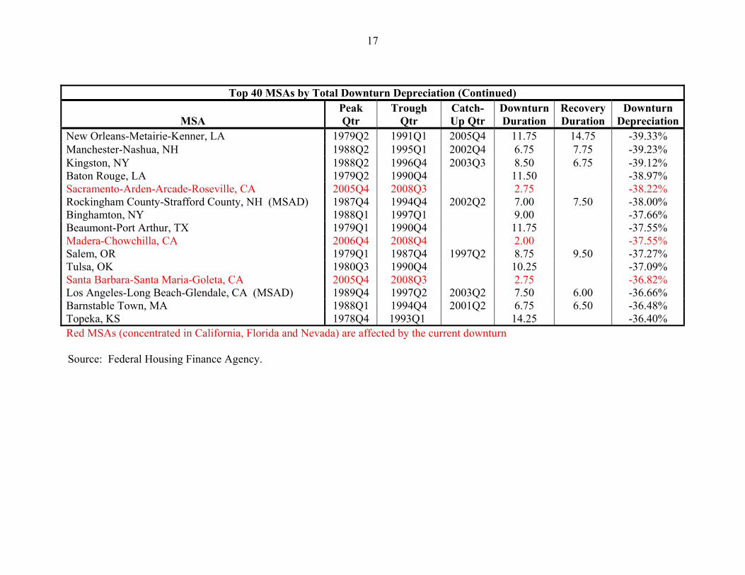
Top 40 MSAs by Total Downturn Depreciation (Continued)
MSA Peak Qtr
Trough Qtr
Catch-Up Qtr
Downturn Duration
Recovery Duration
Downturn Depreciation
17
New Orleans-Metairie-Kenner, LA 1979Q2 1991Q1 2005Q4 11.75 14.75 -39.33% Manchester-Nashua, NH 1988Q2 1995Q1 2002Q4 6.75 7.75 -39.23% Kingston, NY 1988Q2 1996Q4 2003Q3 8.50 6.75 -39.12% Baton Rouge, LA 1979Q2 1990Q4 11.50 -38.97% Sacramento-Arden-Arcade-Roseville, CA 2005Q4 2008Q3 2.75 -38.22% Rockingham County-Strafford County, NH (MSAD) 1987Q4 1994Q4 2002Q2 7.00 7.50 -38.00% Binghamton, NY 1988Q1 1997Q1 9.00 -37.66% Beaumont-Port Arthur, TX 1979Q1 1990Q4 11.75 -37.55% Madera-Chowchilla, CA 2006Q4 2008Q4 2.00 -37.55% Salem, OR 1979Q1 1987Q4 1997Q2 8.75 9.50 -37.27% Tulsa, OK 1980Q3 1990Q4 10.25 -37.09% Santa Barbara-Santa Maria-Goleta, CA 2005Q4 2008Q3 2.75 -36.82% Los Angeles-Long Beach-Glendale, CA (MSAD) 1989Q4 1997Q2 2003Q2 7.50 6.00 -36.66% Barnstable Town, MA 1988Q1 1994Q4 2001Q2 6.75 6.50 -36.48% Topeka, KS 1978Q4 1993Q1 14.25 -36.40% Red MSAs (concentrated in California, Florida and Nevada) are affected by the current downturn
Source: Federal Housing Finance Agency.
18
Table 4
Top 40 MSAs by Total Downturn Depreciation (Current Downturns Excluded from Analysis)
MSA Peak Qtr Trough
Qtr Catch-Up
Qtr Downturn Duration
Recovery Duration
Downturn Depreciation
Midland, TX 1982Q2 2000Q4 18.50 -56.15% Lafayette, LA 1982Q3 1988Q4 6.25 -52.50% Peoria, IL 1979Q4 1985Q4 6.00 -48.91% Davenport-Moline-Rock Island, IA-IL 1978Q4 1989Q2 10.50 -47.18% Kennewick-Pasco-Richland, WA 1979Q3 1988Q4 9.25 -44.54% Oklahoma City, OK 1980Q1 1990Q4 10.75 -42.60% San Antonio, TX 1981Q4 1990Q4 9.00 -41.36% Houston-Sugar Land-Baytown, TX 1979Q2 1997Q1 17.75 -40.75% Hartford-West Hartford-East Hartford, CT 1988Q2 1997Q2 9.00 -40.71% New Haven-Milford, CT 1988Q2 1997Q2 2005Q2 9.00 8.00 -40.58% Austin-Round Rock, TX 1986Q2 1990Q4 2006Q3 4.50 15.75 -39.93% New Orleans-Metairie-Kenner, LA 1979Q2 1991Q1 2005Q4 11.75 14.75 -39.33% Manchester-Nashua, NH 1988Q2 1995Q1 2002Q4 6.75 7.75 -39.23% Kingston, NY 1988Q2 1996Q4 2003Q3 8.50 6.75 -39.12% Baton Rouge, LA 1979Q2 1990Q4 11.50 -38.97% Rockingham County-Strafford County, NH 1987Q4 1994Q4 2002Q2 7.00 7.50 -38.00% (MSAD) Binghamton, NY 1988Q1 1997Q1 9.00 -37.66% Beaumont-Port Arthur, TX 1979Q1 1990Q4 11.75 -37.55% Salem, OR 1979Q1 1987Q4 1997Q2 8.75 9.50 -37.27% Tulsa, OK 1980Q3 1990Q4 10.25 -37.09% Los Angeles-Long Beach-Glendale, CA (MSAD) 1989Q4 1997Q2 2003Q2 7.50 6.00 -36.66% Barnstable Town, MA 1988Q1 1994Q4 2001Q2 6.75 6.50 -36.48% Topeka, KS 1978Q4 1993Q1 14.25 -36.40% Norwich-New London, CT 1988Q4 1996Q3 2004Q2 7.75 7.75 -36.22%
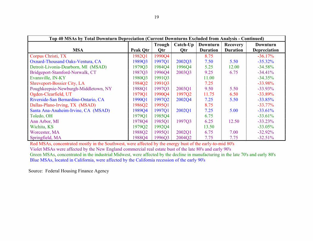
Top 40 MSAs by Total Downturn Depreciation (Current Downturns Excluded from Analysis - Continued)
MSA Peak Qtr Trough
Qtr Catch-Up
Qtr Downturn Duration
Recovery Duration
Downturn Depreciation
19
Corpus Christi, TX 1982Q1 1990Q4 8.75 -36.17% Oxnard-Thousand Oaks-Ventura, CA 1989Q3 1997Q1 2002Q3 7.50 5.50 -35.32% Detroit-Livonia-Dearborn, MI (MSAD) 1979Q3 1984Q4 1996Q4 5.25 12.00 -34.58% Bridgeport-Stamford-Norwalk, CT 1987Q3 1996Q4 2003Q3 9.25 6.75 -34.41% Evansville, IN-KY 1980Q3 1991Q3 11.00 -34.35% Shreveport-Bossier City, LA 1984Q2 1991Q3 7.25 -33.98% Poughkeepsie-Newburgh-Middletown, NY 1988Q1 1997Q3 2003Q1 9.50 5.50 -33.93% Ogden-Clearfield, UT 1979Q1 1990Q4 1997Q2 11.75 6.50 -33.89% Riverside-San Bernardino-Ontario, CA 1990Q1 1997Q2 2002Q4 7.25 5.50 -33.85% Dallas-Plano-Irving, TX (MSAD) 1986Q2 1995Q1 8.75 -33.77% Santa Ana-Anaheim-Irvine, CA (MSAD) 1989Q4 1997Q1 2002Q1 7.25 5.00 -33.61% Toledo, OH 1979Q1 1985Q4 6.75 -33.61% Ann Arbor, MI 1978Q4 1985Q1 1997Q3 6.25 12.50 -33.23% Wichita, KS 1979Q2 1992Q4 13.50 -33.05% Worcester, MA 1988Q2 1995Q1 2002Q1 6.75 7.00 -32.92% Springfield, MA 1988Q4 1996Q3 2004Q2 7.75 7.75 -32.51% Red MSAs, concentrated mostly in the Southwest, were affected by the energy bust of the early-to-mid 80's Violet MSAs were affected by the New England commercial real estate bust of the late 80's and early 90's Green MSAs, concentrated in the industrial Midwest, were affected by the decline in manufacturing in the late 70's and early 80's Blue MSAs, located in California, were affected by the California recession of the early 90's
Source: Federal Housing Finance Agency
20
Table 5 Some Examples of Real House Price Downturns and Subsequent Recoveries (by Area)
Area Peak to Recovery
Period
Downturn Duration (in yrs)
Recovery Duration (in yrs)
Peak to Recovery Duration (in yrs)
%Δ Real HPI
Peak-Trough
Annualized %Δ Real
HPI Peak-Trough
Annualized %Δ Real
HPI Recovery
Annualized %Δ Real HPI Pre-
Downturn Period
United States 2006Q4 to 2009Q1 2 0.25 2.25 -14.17% -7.36% 2.11% 1.73% Pacific Division California San Francisco
2007Q1 to 2009Q1 2006Q1 to 2009Q1 1989Q4 to 1999Q3
2 3
6.5 3.25
2 3
9.75
-31.77% -43.76% -26.74%
-17.40% -17.46% -4.67% 9.76%
4.18% 4.84% 7.46%
West South Central Division Texas Houston
1982Q2 to 2009Q1 1982Q1 to 2009Q1 1979Q2 to 2009Q1
9.5 15
17.75
17.25 12 12
26.75 27
29.75
-32.75% -33.00% -40.75%
-4.09% -2.63% -2.91%
1.51% 2.03% 3.05%
2.64% 2.93% 3.93%
New England Division Massachusetts Boston
1988Q2 to 2001Q4 1988Q2 to 2000Q4 1988Q2 to 2000Q4
8.75 6.75 6.75
4.75 5.75 5.75
13.5 12.5 12.5
-32.13% -29.73% -30.38%
-4.33% -5.09% -5.22%
8.38% 6.22% 6.50%
5.47% 6.00% 9.16%
East North Central Michigan Detroit
1979Q2 to 1998Q1 1979Q3 to 1996Q2 1979Q3 to 1996Q4
3.5 3.25 5.25
15.25 13.5 12
18.75 16.75 17.25
-24.65% -31.28% -34.58%
-7.77% -10.90% -7.76%
1.82% 2.76% 3.55%
3.21% 4.04% 8.09%
Yellow Highlighted Rows represent areas that have not yet recovered from their respective downturn Green Highlighted Rows represent areas that are still on a downward trajectory Numbers in Red Text indicate that the particular area's recovery occurs at a slower pace than it's respective downturn Note: Each area has no more than one peak and trough identified over the 1975:1 to 2009:1 period Source: Federal Housing Finance Agency
21
Table 6 Summary Statistics for Nominal House Price Downturns in Various Geographic Areas (by Size of Area)
Areas Examined
Median Percentage
Price Decline from Peak to
Trough
Median Downturn Duration (in yrs)
Median Recovery Duration (in yrs)
Median Duration
Downturn to Recovery (in yrs)
Percent of Areas with Faster
Recovery Annual Appreciation than Downturn Annual
Depreciation
Percent of Areas Still in Recovery
or Whose Downturn is
Ongoing
Percent of Areas Whose
Downturn Began in the Past 4 Years
Census Divisions 13.82% 1.75 2.75 5.25 0% 78% 78%
States 14.32% 1.50 1.13 2.38 34% 40% 41% Cities 10.50% 1.00 1.00 2.25 34% 29% 30%
Note: Each area has no more than one peak and trough identified over the 1975:1 to 2009:1 period Downturn Duration is defined as the time period in which house prices go from peak to trough. Recovery Duration is defined as the time period in which house prices go from trough back to the previous peak Downturn to Recovery Duration is defined as the time period in which house prices go from peak to trough and back to the previous peak
Source: Federal Housing Finance Agency
22
Table 7 Some Examples of Nominal House Price Downturns and Subsequent Recoveries (by Area)
Area Peak to Recovery
Period
Downturn Duration (in yrs)
Recovery Duration (in yrs)
Peak to Recovery Duration (in yrs)
%Δ HPI
Peak-Trough
Annualized %Δ HPI
Peak-Trough
Annualized %Δ HPI Recovery
Annualized %Δ HPI Pre-Bust Period
United States 2007Q2 to 2009Q1 1.75 1.75 -11.48% -6.73% 5.80% Pacific Division California San Francisco
2007Q2 to 2009Q1 2006Q2 to 2009Q1 2006Q3 to 2009Q1
1.75 2.75 2.5
1.75 2.75 2.5
-29.78% -41.35% -12.68%
-18.30% -17.63% -5.28%
8.32% 9.10% 9.46%
West South Central Division Texas Houston
1986Q2 to 1994Q1 1986Q2 to 1995Q2 1983Q2 to 1997Q4
2.5 2.5 4.5
5.25 6.5 10
7.75 9
14.5
-13.82% -14.33% -24.87%
-5.77% -6.00% -6.16%
2.75% 2.40% 2.87%
7.29% 7.55% 8.99%
1989Q4 to 1998Q2 1989Q4 to 1997Q3 1988Q4 to 1997Q2
3.25 3.253.5
5.25 4.5 5
8.5 7.75 8.5
-13.84% -13.48% -11.99%
-4.48% -4.36% -3.58%
2.72% 3.26% 2.49%
10.44% 10.90% 14.69%
New England Division Massachusetts Boston East North Central Division Michigan Detroit
2006Q2 to 2009Q1 2005Q3 to 2009Q1 2005Q3 to 2009Q1
2.5 3.25 3.25
0.25 0.25 0.25
2.75 3.5 3.5
-9.95% -23.54% -24.68%
-4.11% -7.93% -8.35%
3.31% 10.75% 12.12%
5.11% 5.55% 5.88%
Yellow Highlighted Rows represent areas that have not yet recovered from their respective downturn Green Highlighted Rows represent areas that are still in a downward trajectory Numbers in Red Text indicate that the particular area's recovery occurs at a slower pace than it's respective downturn Note: Each area has no more than one peak and trough identified over the 1975:1 to 2009:1 period
Source: Federal Housing Finance Agency