Embed Size (px)
Citation preview

8/13/2019 9 Maps to Change How You See World
http://slidepdf.com/reader/full/9-maps-to-change-how-you-see-world 1/7
Tweet 56
9 Maps to Change How You See the WorldOct 18, 2013
Tags: Maps, Education, List, World, Lists, Global
Image by Flickr user “Caveman Chuck” Coker
Maps give us a graphic understanding of the world around us – whether it be global geography or the
tricky intersection just around the corner. They help us to grasp concepts of size and distance… but
what about IQ scores and vegetation? Or flags? This creative and varied collection of world maps will
open your mind, no matter where you live or how much coffee you've had today.
1. NATIONAL IQ SCORES
This first map shows average national IQ scores – a score derived from standardized tests to assess
intelligence. The jury's still out as to why IQ scores vary so much around the world, with theories
ranging from environmental factors to genetic influence.
DID YOU KNOW? Singapore boasts the highest national IQ score, with an average of 108.
Image: Target Map
2. FLAGS OF THE WORLD
This creative map needs little explanation – just check it out and enjoy!
DID YOU KNOW? Switzerland and the Vatican are the only two countries with square-shaped flags.
165LikeLike ShareShare
Página1 de59 Maps to Change How You See the World - Goodnet
05-11-2013http://www.goodnet.org/articles/9-maps-to-change-how-you-see-world

8/13/2019 9 Maps to Change How You See World
http://slidepdf.com/reader/full/9-maps-to-change-how-you-see-world 2/7
Image: Imgur
3. PAID MATERNITY LEAVE
Parental leave is a hot topic these days, in terms of both length and alternation between mothers and
fathers. This map gives a broad sense of global positions.
DID YOU KNOW? The US is one of eight countries (out of 188 with known policies) without paid
maternity leave.
Image: The New York Times
4. VISUALIZING GLOBAL POPULATION DENSITY
While we all vaguely know that Asia is densely populated, this simple map and illustration makes that
understanding starkly clear.
DID YOU KNOW? Macau is the world's most densely populated country, closely followed by Monaco.
Image: Imgur
Página2 de59 Maps to Change How You See the World - Goodnet
05-11-2013http://www.goodnet.org/articles/9-maps-to-change-how-you-see-world

8/13/2019 9 Maps to Change How You See World
http://slidepdf.com/reader/full/9-maps-to-change-how-you-see-world 3/7
5. NATIONAL ATTITUDES TO FOREIGNERS
This surprising and interesting map uses data from the World Economic Forum, to rate how welcoming
countries are to foreign visitors. The information was gathered using a survey in which people were
simply asked, "How welcome are foreign visitors in your country?"
DID YOU KNOW? According to the data, the three countries in which foreigners are most welcome are
Iceland, New Zealand and Morocco.
Image: The Washington Post
6. FREEDOM OF THE PRESS
Scandinavia and northern Europe stand out as the frontrunners in this 2013 map, which shows respect
for media freedom. We'd certainly like to see some more white on this one in years to come!
DID YOU KNOW? Finland – also known for its awesome baby boxes – has stood out as the country that
most respects free press for three years running.
Image: Reporters Without Borders
7. VEGETATION ON EARTH
The dark green on this map indicates areas lushest in vegetation, while the pale colors point to areas
which are sparse in vegetation cover - due to snow, drought, rock, or urbanization.
DID YOU KNOW? This incredible map was built using data from the Visible-Infrared Imager/Radiometer
Suite instrument on board the NASA/NOAA Suomi NPP satellite.
Página3 de59 Maps to Change How You See the World - Goodnet
05-11-2013http://www.goodnet.org/articles/9-maps-to-change-how-you-see-world

8/13/2019 9 Maps to Change How You See World
http://slidepdf.com/reader/full/9-maps-to-change-how-you-see-world 4/7
Image: NASA/NOAA
8. ANNUAL COFFEE CONSUMPTION PER CAPITA
This highly caffeinated map shows the amount of coffee consumed annually (in kilograms) by each
person in a given country or region. The global trend has been rising upward since the economic
downturn of 2007.
DID YOU KNOW? The current world total coffee consumption stands at 1.3kg per person per
year. Coffee anyone?
Image: Charts Bin
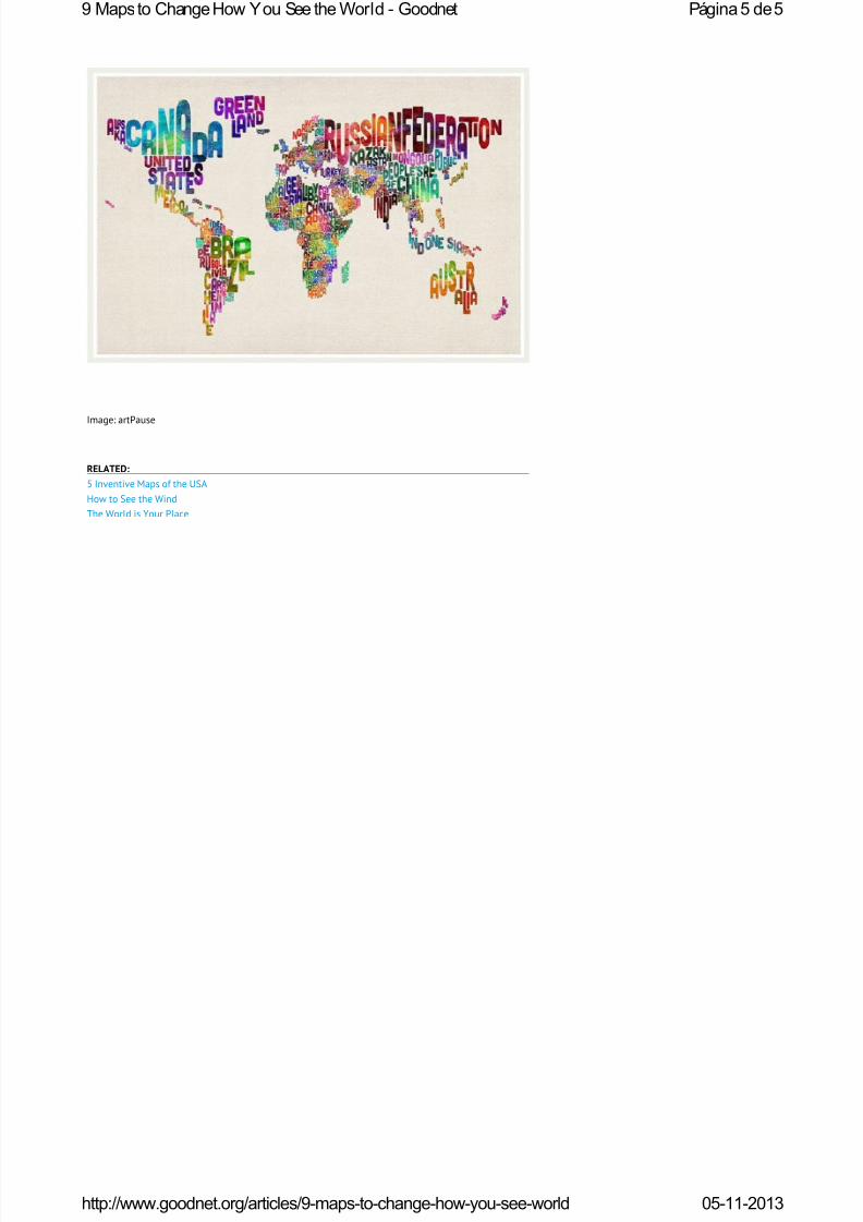
9. TYPOGRAPHIC TEXT
Last but certainly not least, this artistic creation depicts each of the world's countries using its name,
shaped to be geographically correct. Smart AND pretty!
DID YOU KNOW? Like this map the most? You can buy it on our favorite handmade marketplace, Etsy.
Página4 de59 Maps to Change How You See the World - Goodnet
05-11-2013http://www.goodnet.org/articles/9-maps-to-change-how-you-see-world
8/13/2019 9 Maps to Change How You See World
http://slidepdf.com/reader/full/9-maps-to-change-how-you-see-world 5/7
Image: artPause
RELATED:
5 Inventive Maps of the USA
How to See the Wind
The World is Your Place
Página5 de59 Maps to Change How You See the World - Goodnet
05-11-2013http://www.goodnet.org/articles/9-maps-to-change-how-you-see-world

8/13/2019 9 Maps to Change How You See World
http://slidepdf.com/reader/full/9-maps-to-change-how-you-see-world 6/7
Tweet 6
5 Inventive Maps of the USA Jul 4, 2012
Tags: Maps, USA, July 4, Fourth Of July, Navigation, Direction, Coordinates
Image: watercolor map of the USA by Stamen
1.
SOURCEMAP
WHAT Trail-tracking of consumer products: from production to point of sale through to environmental
impact.
IN DETAIL Sourcemap is a crowdsourced directory of maps that provide comprehensive info about
products, production and carbon footprint.
CREATED BY Leonardo Bonani
2.
WIND MAP
WHAT A stunning visualization of wind flow currents in the US.
IN DETAIL Updated hourly with data from the National Digital Forecast Database, Wind Map provides
info about current wind speed in major American cities. Snapshots of Winds Past is a gallery of
spellbinding shots worth browsing.
CREATED BY Fernanda Viégas and Martin Wattenberg, who now head Google's "Big Picture"
visualization research group in Massachusetts.
3.
TRESHR
WHAT Easily find free giveaways.
IN DETAIL Treshr gleans giveaway postings from classifieds giants Craigslist and Freecycle, and
displays the goodies on a map.
CREATED BY S7 Labs
4.
WATERCOLOR MAP
WHAT Watercolor map of the US.
Like 16 Send
Página1 de25 Inventive Maps of the USA - Goodnet
05-11-2013http://www.goodnet.org/articles/369?utm_source=goodnet-site&utm_medium=footer...

8/13/2019 9 Maps to Change How You See World
http://slidepdf.com/reader/full/9-maps-to-change-how-you-see-world 7/7
IN DETAIL Enter location and see the watercolor rendition. Beutiful to look at and could come in handy
as a graphics tool for presentations and even school projects.
CREATED BY Stamen
5.
MAPNIFICENT
WHAT An interactive map that visualizes public transportation travel time.
IN DETAIL Using data collected from the GTFS Data Exchange, Mapnificent allows users to specify
location and timeframe for reaching a certain point with public transportation. It should be the go-to
app for apartment searching or a day full of errands.
CREATED BY Stefan Wehrmeye
RELATED:
Top 10 Games for Social Good
7 Free Education Websites You Don't Want to Miss
13 Crowdfunding Websites for Good Doers
Página2 de25 Inventive Maps of the USA - Goodnet