Embed Size (px)
Citation preview

www.statmodeller.com
Free Webinar on
7 QC ToolsSystematic approach to Problem Solving
Delivered by
Mehul Gandhi | Business Associate
Stat Modeller, Vadodara
www.statmodeller.com

www.statmodeller.com
WELCOME TO
STAT MODELLER
ROBUST KIT OF SOLUTION

www.statmodeller.com
HISTORY
Stat Modeller is formed in 2019 providing servicesrelated to training and consultancy for OperationalExcellence, Application of Statistical Tools andData Science Tools to solve the problems of
various segments.

www.statmodeller.com
TRAINING AND CONSULTANCY
Data Science
▪ Machine Learning
▪ R & R Studio▪ Python▪ SPSS▪ SAS▪ Minitab▪ Power BI▪ Tableau▪ Excel &
Advanced Excel
Operational Excellence
Blended Approach
▪ Six Sigma▪ Lean▪ 5-S▪ TPM▪ Kaizen▪ Kanban▪ QMS▪ SPC and SQC
Research Project
▪ Research Projects
▪ Survey Analysis
▪ Marketing Research etc.
Universities & college
• Workshops• Trainings• Certification
Course for Students etc.

www.statmodeller.com
OUR EXPERTISE ON DATA ANALYSIS SOFTWARE
www.statmodeller.com
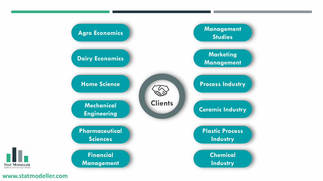
Clients
Agro Economics
Dairy Economics
Home Science
Mechanical
Engineering
Pharmaceutical
Sciences
Financial
Management
Management
Studies
Marketing
Management
Process Industry
Ceramic Industry
Plastic Process
Industry
Chemical
Industry

www.statmodeller.com
PROGRAMS WE CONDUCTED
Workshop on Basics of SPSS at
BVM College of Engineering, Vallabh Vidyanagar
Agro Economics
www.statmodeller.com
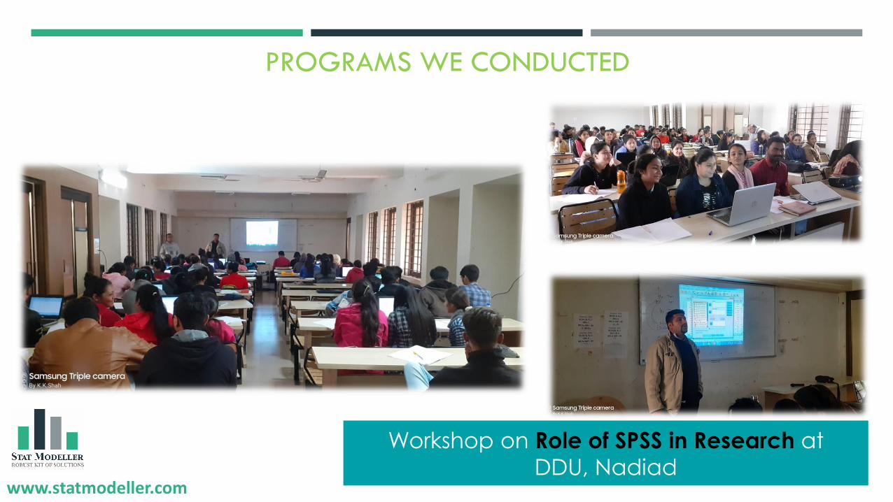
PROGRAMS WE CONDUCTED
Workshop on Role of SPSS in Research at
DDU, Nadiad

www.statmodeller.com
Training on R at
Mumbai UniversityTraining on R at
AERC, Vallabh VidyanagarTraining on R at
FDP, SPU
Training on R at
Charusat University, Changa
Training on SPSS at
Charusat University, Changa
Training on R at
HRDC, Gujarat University

www.statmodeller.com
01
HIREN KAKKAD
CEO & CO-FOUNDER
Expert in Data Science, Business
Transformation and Research Project
Analysis
02
MEHUL GANDHI
BUSINESS ASSOCIATE
Expert in Business Transformation
and Advanced Excel
03
SAURABH CHAUDHARI
BUSINESS ASSOCIATE
Expert in Data Scienceand Research Project
Analysis
KAPILVALAND
BUSINESS ASSOCIATE
Expert in Data Science, Business Transformation
and Research Project Analysis
London, UK
04

www.statmodeller.com
D-503, Sharnam Happy Homes,Sayaji Township Road, Sayajipura, Vadodara - 390019
+91 90330 84742
www.statmodeller.com
Lets get connected
Join us on

www.statmodeller.com
❑ What is quality?
❑ Why Quality Improvement is much needed?
❑ Approach of Quality Improvement
❑ Various tools & techniques for Quality control & improvement.
❑ 7 QC Tools & its application
❑ Q&A Session.
www.statmodeller.com 12
Content

www.statmodeller.comwww.statmodeller.com 13
Question
What is Quality?

www.statmodeller.comwww.statmodeller.com 14
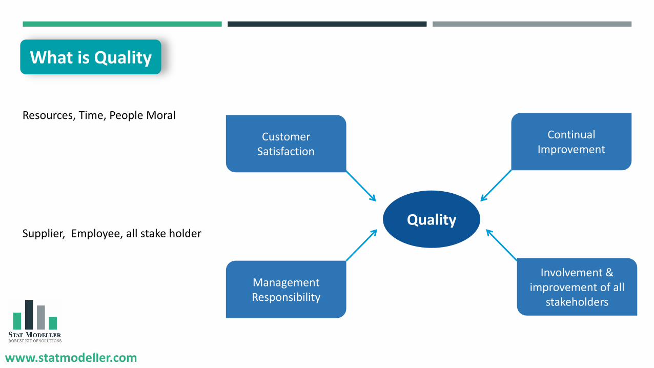
What is Quality
Quality
Customer Satisfaction
Continual Improvement
Involvement & improvement of all stakeholders
Management Responsibility
Conformance to stated requirements
Fit for Use
Customer Experience
New Customer
Existing Customer
www.statmodeller.comwww.statmodeller.com 15
Quality
Customer Satisfaction
Continual Improvement
Involvement & improvement of all
stakeholders
Management Responsibility
Resources, Time, People Moral
Supplier, Employee, all stake holder
What is Quality

www.statmodeller.comwww.statmodeller.com 16
Question
What is the ultimate goal of any business or organization?

www.statmodeller.comwww.statmodeller.com 17
Goal
Traditional approach
Cost + Profit = Price
Cost
Profit
Cost
Profit

www.statmodeller.comwww.statmodeller.com 18
Goal
Traditional approach
Cost + Profit = Price
Cost
Profit
Cost
Profit
Modern approach
Price - Cost = Profit
Cost
Profit
Cost
Profit

www.statmodeller.comwww.statmodeller.com 19
Goal
Cost
Profit
Cost
Profit
Modern approach
Price - Cost = ProfitCost
Cost of Product
Cost of Waste
Cost of Poor Quality

www.statmodeller.comwww.statmodeller.com 20
Approach

www.statmodeller.com
Tools & Techniques

www.statmodeller.com
❑ Problem Solving & Process Improvement tools
❑ 1st proposed by Dr. Kaoru Ishikawa – 1968
❑ Basic Quality Tools
❑ Collecting, organizing, manipulating &
presenting data graphically.
❑ 95% problems can be solved
AnalysisIdentification
Check-sheet
Pareto Chart
Flow Chart
Histogram
Scatter Plot
Control Charts
C&E Diagram
Introduction to 7 QC Tools

www.statmodeller.com
❑ A fixed set of graphical tools to solve problems
❑ The basic fundamental tools to achieve quality improvement
❑ These tools help organization to tackle every day problems
❑ These tools are easy to understand and implement
❑ Do not required any complex analytical or statistical competency
❑ Rely on data
Why 7 QC Tools?
www.statmodeller.com
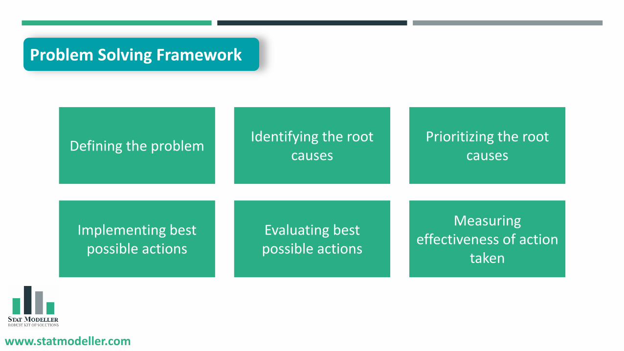
Defining the problemIdentifying the root
causesPrioritizing the root
causes
Evaluating best possible actions
Implementing best possible actions
Measuring effectiveness of action
taken
Problem Solving Framework

www.statmodeller.com
Sales of ABC company has decrease by 15% in the year of 2019-2020 comparing to sales of year 2018-2019.
The sales in year 2018-2019 was 10,00,000 INR.
Company targeted to achieve sales or Rs. 15,00,000 by the year ending 2021.
Problem Statement

www.statmodeller.com
Root Causes?

www.statmodeller.com
Criteria Rank
Extremely Unhappy 1
Unhappy 2
Cannot Say 3
Happy 4
Extremely Happy 5
❑ Conducted sample survey of 2000 existing customers
❑ Samples were collected using statistical sampling method
❑ Survey was conducted to analyze customer’s satisfaction.
Data Collection

www.statmodeller.com
Customer ID
Customer Name
City of CustomerContact
No. Overall Rating by Customer
CSS - 001 - Vadodara - 2
CSS - 002 - Surat - 1
CSS - 003 - Ahmedabad - 3
CSS - 004 - Ahmedabad - 5
CSS - 005 - Vadodara - 4
CSS - 006 - Vadodara - 1
CSS - 007 - Anand - 3
CSS - 008 - Vadodara - 5
CSS - 009 - Ahmedabad - 5
CSS - 010 - Surat - 4
Category Tally Sheet Frequency
Extremely Unhappy 668
Unhappy 560
Can not Say 127
Happy 422
Extremely Happy 223
2000TOTAL
Data Collection

www.statmodeller.com
❑ Check sheet is a systematic method to collect,record & present the relevant data.
❑ Check sheet can be used for various purposes.
❑ Both Qualitative data & Quantitative data can be collected using check sheet.
❑ Check sheet is useful to collect attribute data
❑ Data collected using check sheet can be used as input data for other quality tools.
Category Tally Sheet Frequency
Extremely Unhappy 668
Unhappy 560
Can not Say 127
Happy 422
Extremely Happy 223
2000TOTAL
Check Sheet
www.statmodeller.com
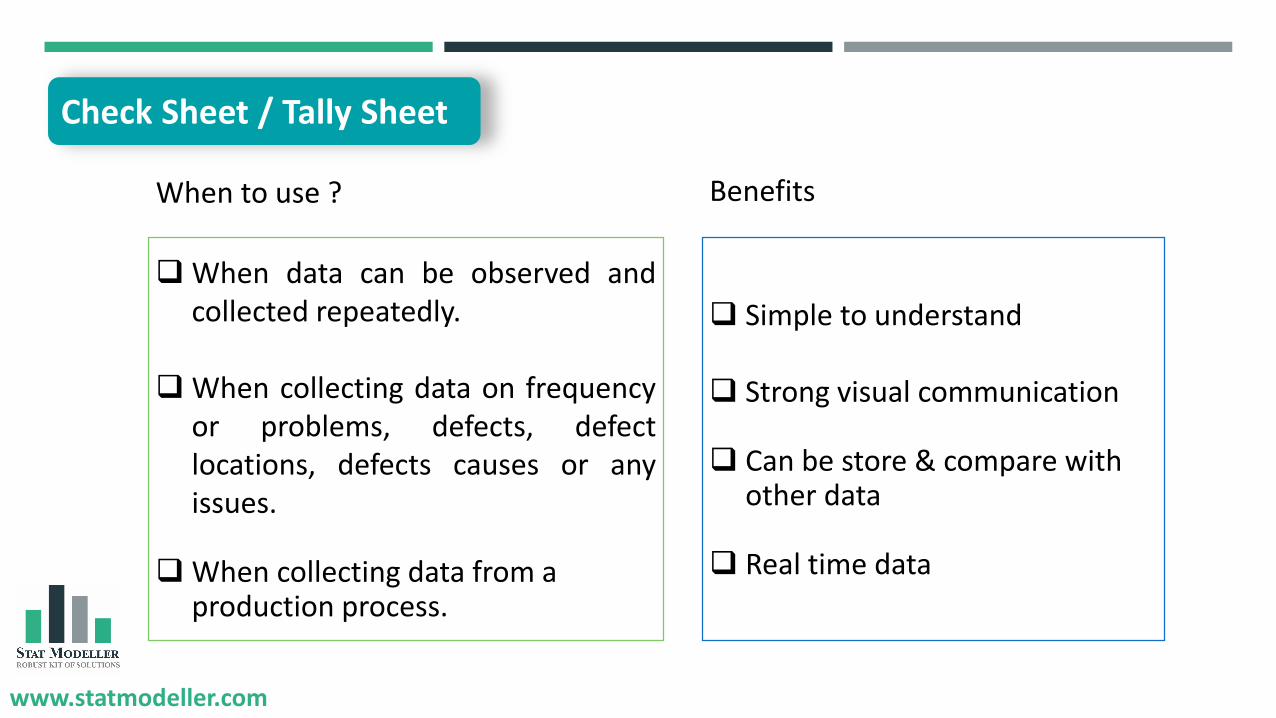
Check Sheet / Tally Sheet
❑ When data can be observed andcollected repeatedly.
❑ When collecting data on frequencyor problems, defects, defectlocations, defects causes or anyissues.
❑ When collecting data from a production process.
❑ Simple to understand
❑ Strong visual communication
❑ Can be store & compare with other data
❑ Real time data
When to use ? Benefits
www.statmodeller.com
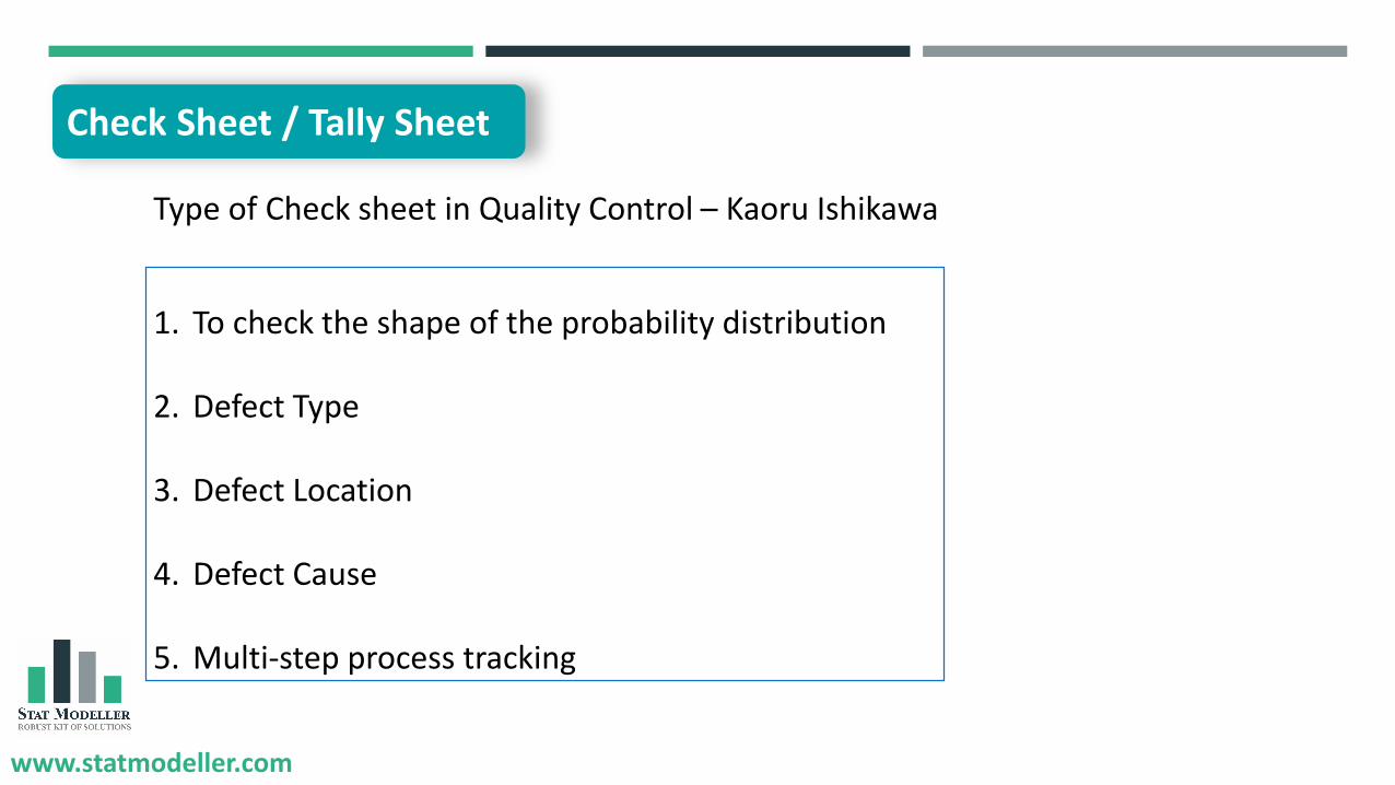
Type of Check sheet in Quality Control – Kaoru Ishikawa
1. To check the shape of the probability distribution
2. Defect Type
3. Defect Location
4. Defect Cause
5. Multi-step process tracking
Check Sheet / Tally Sheet
www.statmodeller.com
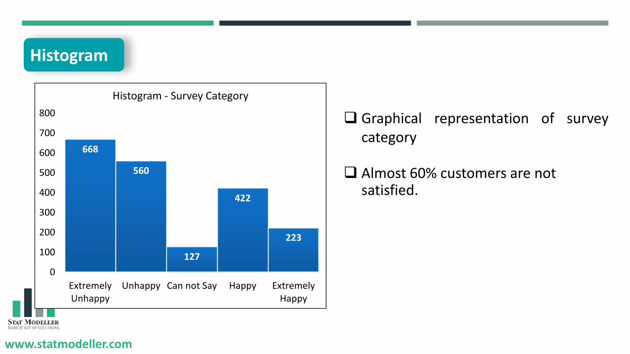
Histogram
668
560
127
422
223
0
100
200
300
400
500
600
700
800
ExtremelyUnhappy
Unhappy Can not Say Happy ExtremelyHappy
Histogram - Survey Category
❑ Graphical representation of surveycategory
❑ Almost 60% customers are not satisfied.

www.statmodeller.com
Histogram
❑ Histogram is a graph which representfrequency of observation or range ofobservation.
❑ Graphical summary of large data
❑ Karl Perason - 1891.
❑ Classification of data.
668
560
127
422
223
0100200300400500600700800
ExtremelyUnhappy
Unhappy Can notSay
Happy ExtremelyHappy
Histogram - Survey Category

www.statmodeller.com
❑ Numerical Data
❑ Distribution of data
❑ To compare data of different time
period
❑ To represent & communicate data
easily and effectively to others
When to use ? Benefits
❑ Easy to construct.
❑ Easy to understand different data, it’sfrequency of occurrence and categorieswhich are difficult to interpret in tabularform.
❑ Helps to visualize distribution of data.
❑ Helps to understand skewness of the data.
Histogram

www.statmodeller.com
668
560
127
422
223
0
100
200
300
400
500
600
700
800
ExtremelyUnhappy
Unhappy Can not Say Happy ExtremelyHappy
Histogram - Survey Category
Title
Horizontal Axis
Vertical Axis
Bins / Bar
Data Lables
Elements of Histogram
www.statmodeller.com
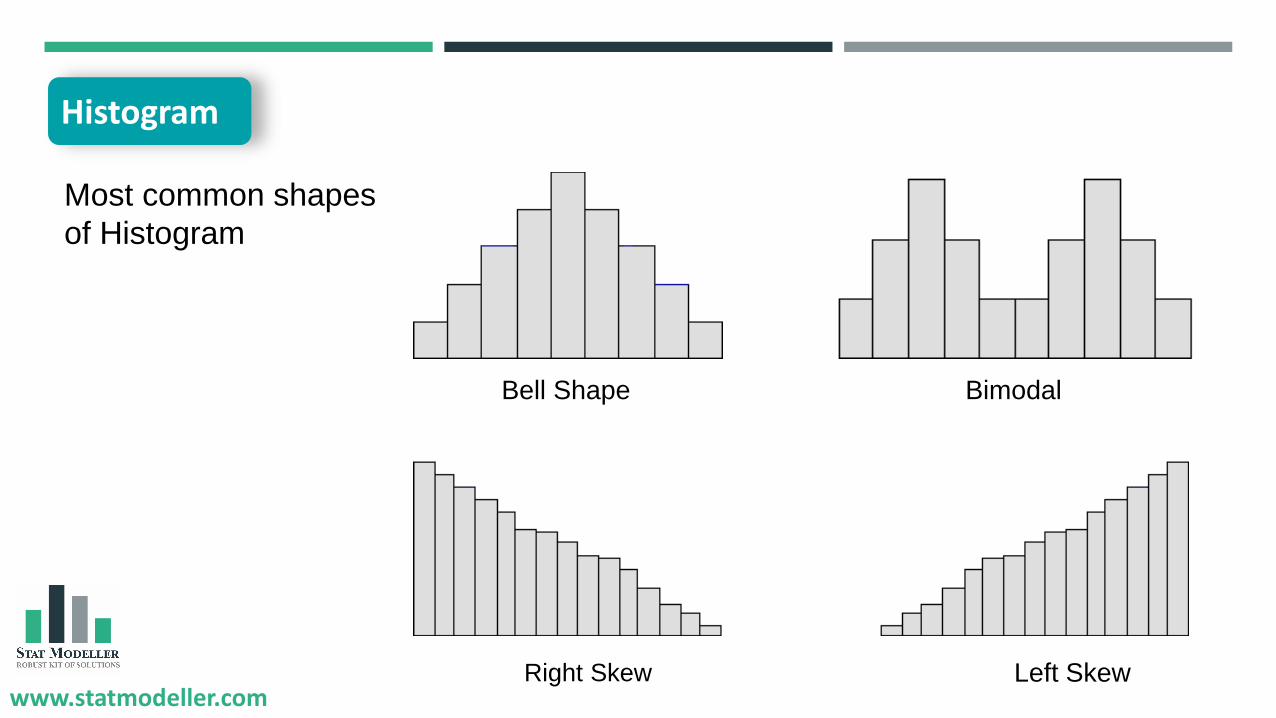
Most common shapes
of Histogram
Bell Shape Bimodal
Right Skew Left Skew
Histogram

www.statmodeller.com
- How much time required to address all reasons?
- Which reason to be address?
- Which are the most potential reasons?
1. On Time Delivery
2. User Experience
3. Variety of Product
4. High value
5. Quality of Product
6. Payment Issue
7. Product Guide
Re-survey – Not satisfied customer

www.statmodeller.com
Sr.
No.Complaint Reason
No. of
ComplaintCum. %
1 On Time Delivery 537 44%
2 User Experience 463 81%
3 Variety of Products 96 89%
4 High Value 73 95%
5 Quality of Products 30 98%
6 Payment Issue 18 99%
7 Product Guide 11 100%
1228
Reasons - Customer Unhappiness
TOTAL
Pareto Chart / Pareto Analysis

www.statmodeller.com
Pareto Chart / Pareto Analysis
❑ It is a combination of Bar Graph & Line Graph.
❑ Represents frequency of occurrence innumbers & cumulative impact in %
❑ Data is arranged in Descending Order.
❑ Based on 80/20 Principle.
❑ Developed Vilfredo Pareto

www.statmodeller.com
Pareto Chart / Pareto Analysis
❑ To analyze cumulative impact ofreasons or causes of problem.
❑ To prioritize reasons or causes.
❑ Decision making based on factbase data.
When to use ? Benefits
❑ Easy to construct.
❑ Easy to identify vital few causesfrom trivial many.
❑ Simple but effective tool fordecision making.
❑ Helps to identify root causes

www.statmodeller.com
Title
Horizontal Axis
Primary Vertical
Axis Secondary Vertical
Axis
Elements of Pareto Chart

www.statmodeller.com
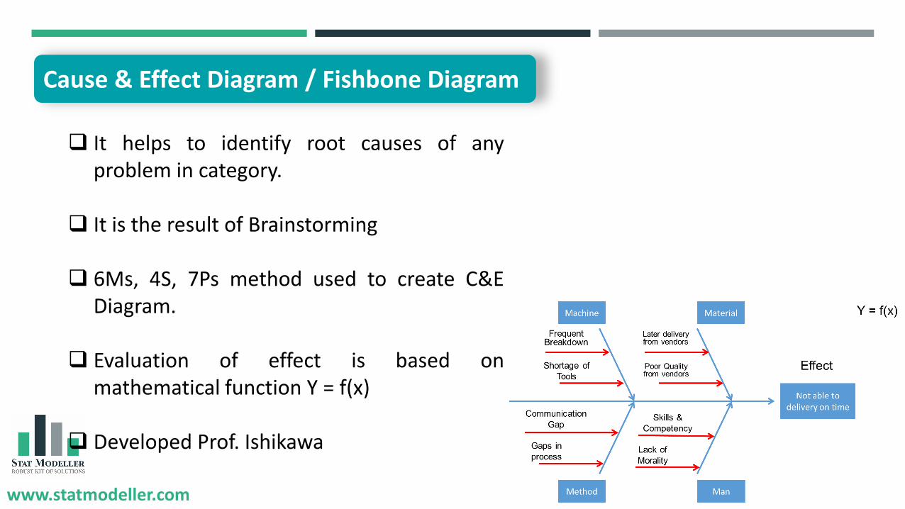
Cause & Effect Diagram / Fishbone Diagram
Machine Material
Method Man
Not able to delivery on time
Effect
Later delivery from vendors
Poor Quality from vendors
Frequent Breakdown
Shortage of
Tools
Communication
Gap
Gaps in
process
Skills &
Competency
Lack of
Morality
Y = f(x)
www.statmodeller.com
❑ It helps to identify root causes of anyproblem in category.
❑ It is the result of Brainstorming
❑ 6Ms, 4S, 7Ps method used to create C&EDiagram.
❑ Evaluation of effect is based onmathematical function Y = f(x)
❑ Developed Prof. Ishikawa
Cause & Effect Diagram / Fishbone Diagram

www.statmodeller.com
❑ When the problem is clearly defined.
❑ To identify root causes
❑ Organized possible causes in category
❑ Decision making based on fact basedata.
When to use ? Benefits
❑ Single screen view of all possiblecauses
❑ Helps to concentration on causes bycategory.
❑ Effective decision making tool.
❑ Involvement of People
Cause & Effect Diagram / Fishbone Diagram

www.statmodeller.com
Machine Material
Method Man
Not able to delivery on time
Effect
Later delivery from vendors
Poor Quality from vendors
Frequent Breakdown
Shortage of
Tools
Communication
Gap
Gaps in
process
Skills &
Competency
Lack of
Morality
Element of C&E Causes
Sub Causes
Problem Statement

www.statmodeller.com
Late delivery from vendors(No of hours)
No
t ab
le t
o d
eliv
ery
on
tim
e
(No
. of
ho
urs
)
Late delivery from Vendors
Late delivery to customer
1 Day 5 Hours
1.5 Days 10 Hours
2 Days 15 Hours
2.5 Days 20 Hours
3 Days 25 Hours
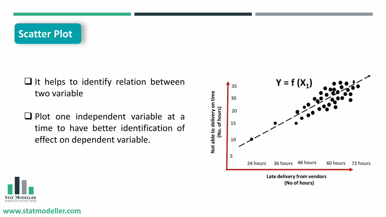
Scatter Plot
www.statmodeller.com
❑ It helps to identify relation betweentwo variable
❑ Plot one independent variable at atime to have better identification ofeffect on dependent variable.
Scatter Plot

www.statmodeller.com
❑ Two numerical paired data.
❑ Dependent variable may havemultiple value for each value ofindependent variable
❑ To determine whether the twovariables are related or not.
❑ To identify potential root causes ofproblem.
When to use ? Benefits
❑ It helps to identify relationshipbetween two variables.
❑ It helps to determine range of data.i.e. maximum and minimum valuecan be determine.
❑ Easy to construct & interpret.
Scatter Plot
www.statmodeller.com
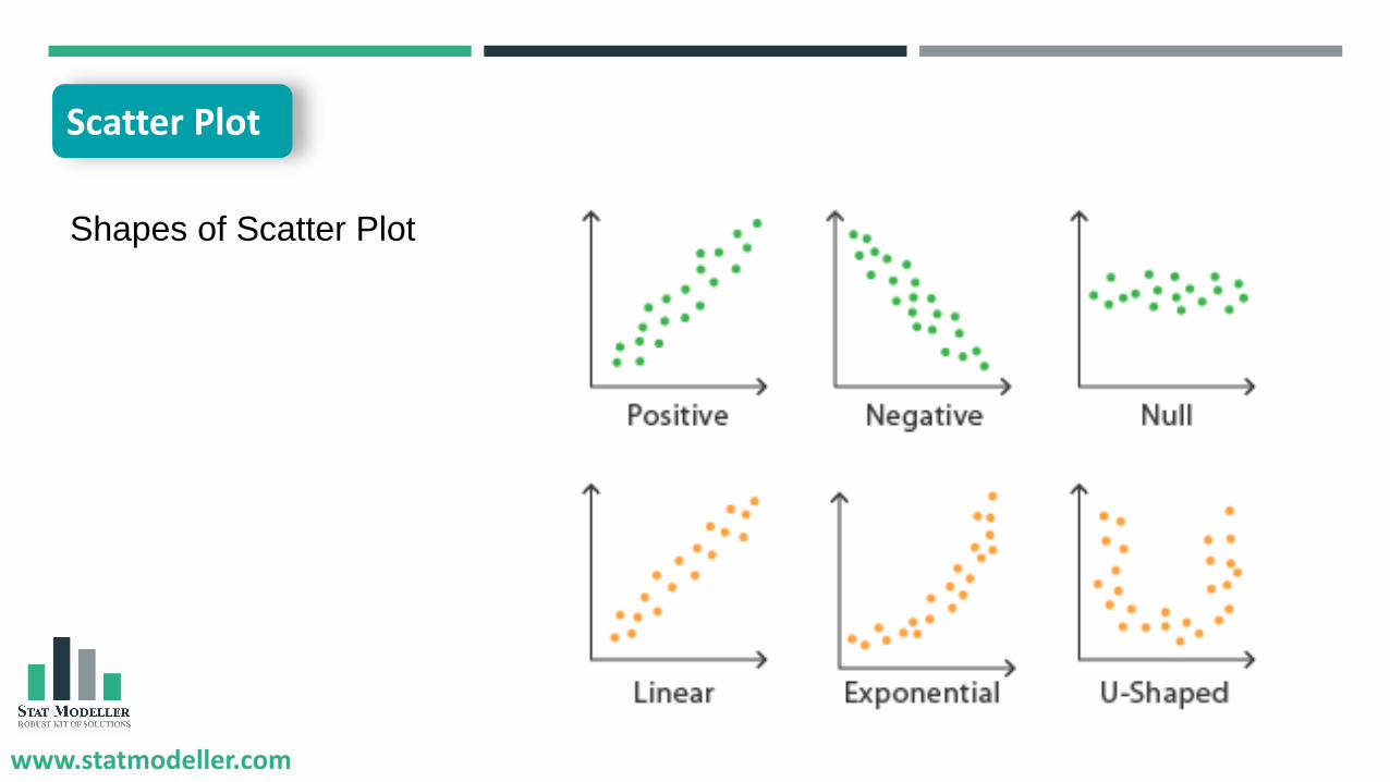
Shapes of Scatter Plot
Scatter Plot

www.statmodeller.com
Flow Chart / Process Map
Requirements
Inspection
Process
Inspection
P
Inspection
Requirements
SupplierS CustomerCInput
I
Output
O

www.statmodeller.com
Supplier
Store
Process 1 Process 2 Process 3 Process 4 Output
Customer
Flow Chart / Process Map

www.statmodeller.com
❑ It is a simple representation ofprocess steps in sequence.
❑ It has a various shapes of boxeswhich is symbol of action.
❑ It is widely use in Manufacturing,computer programming & complexprocesses.
Flow Chart / Process Map

www.statmodeller.com
❑ To explain process in sequence
❑ To identify and communicate check-points.
❑ It helps in process time study onearly stage.
❑ To communicate start & end pointof process.
❑ It helps to clarify complex processes.
❑ It helps to identify delay, unwantedstorage & transportations.
❑ It helps to minimize communicationgap & provide better clarity to work.
When to use ? Benefits
Flow Chart / Process Map

www.statmodeller.com
Symbols
Start & End Point
Input / Output
Process
Decision / Inspection
Decision / Inspection
Document / Record
Flow Chart / Process Map

www.statmodeller.com
Control Chart

www.statmodeller.com
❑ Also known as Shewhart chart or processbehavior chart.
❑ It is used to determine process is in controlor not.
❑ It can be stated that control chart aregraphical tool to represent processmonitoring.
❑ Control chart can be used for variable andattribute data.
Control Chart

www.statmodeller.com
❑ To monitor & control ongoingprocess.
❑ To predict expected range ofoutcome from a process.
❑ To analyze variation in process.
❑ To determine process is in controlor not.
❑ Can easily identify special causesand common causes of variation.
❑ It helps to determine processcapability.
❑ It gives early warning signals incase of process shifting to out oflimit.
When to use ? Benefits
Control Chart

www.statmodeller.com
Control Charts
Variable Control Chart
Attribute Control Chart
X chart R Chart P Chart C Chart
Continuous /
Numerical Data
Categorical / Discrete
Numerical Data
Types of Control Chart

www.statmodeller.com
Defining the problemIdentifying the root
causesPrioritizing the root
causes
Evaluating best possible actions
Implementing best possible actions
Measuring effectiveness of
action taken
7 QC Tools for problem solving

www.statmodeller.com
Po
ssib
ly C
on
tro
lO
ut
of
Co
ntr
ol
High Medium Low
Solutions Solutions Solutions
Solutions Solutions Solutions
Action Plan Matrix

www.statmodeller.com
Root Cause Action Plan Responsibility Time to ReviewExpected
completion date
Action Plan

www.statmodeller.com
Register Now…
https://bit.ly/33YJjw7

www.statmodeller.com
To download Material
Visit
www.statmodeller.com/download
www.statmodeller.com
Q&A Session
Join us on

![7 qc tools training material[1]](https://img.pdfslide.us/doc/110x75/54cd70374a7959ca738b469c/7-qc-tools-training-material1.jpg)


![7 qc tools[1]](https://img.pdfslide.us/doc/110x75/546c37cab4af9fae2c8b47e1/7-qc-tools1.jpg)