Embed Size (px)
Citation preview
Chapter 7: Country case study – UK
7–1
7. Country case study – UK
Robert Joyce and Luke Sibieta
The UK recently experienced its deepest recession since the Second World War, during
which GDP fell by over 6 per cent between the first quarter of 2008 and the third quarter of
2009. We would naturally expect these falls in national income to have consequences for UK
households’ living standards. In this chapter, we examine how earnings, employment and
household incomes evolved immediately before, during and after the Great Recession in the
UK. In section 7.1, we show that employment fell by less than GDP during the Great
Recession, and that the largest falls in employment were experienced by young people, men
and individuals with little education. In section 7.2, we show that average incomes
surprisingly grew during the recession, but seem likely to have fallen substantially in the
financial year immediately afterwards (2010–11): the pain was delayed, but not avoided. We
also show that income changes during the Great Recession were relatively progressive, with
the bottom slightly catching up with the top and middle. As might thus be expected, relative
poverty fell. In section 7.3, we discuss the likely effects of the upcoming fiscal consolidation
– which comprises tax rises and cuts to welfare spending and public services totalling 6 per
cent of national income – on UK households as the Government attempts to redress the fiscal
position that deteriorated so rapidly during the Great Recession. This shows that poorer
households and families with children will be most affected by tax and benefit reforms; more
uncertain are the distributional impact of public service cuts and trends in the macroeconomy.
7.1. Employment and earnings in the UK during the Great Recession
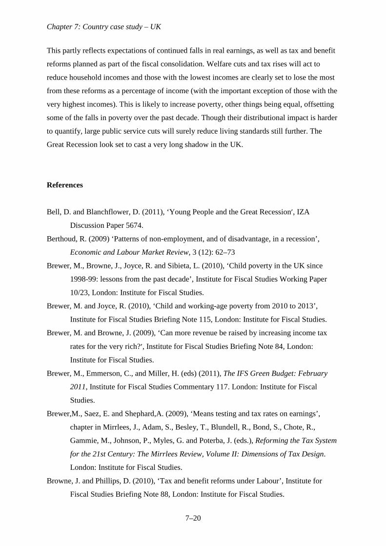
In the UK, GDP reached its pre-recession peak at the start of 2008, before falling in each
quarter up to the third quarter of 2009. From peak to trough, GDP fell by 6.5 per cent. As we
saw in Chapter 2, this was the deepest UK recession since the Second World War, and is thus
henceforth referred to as the Great Recession (GR). As Figure 7.1 shows, the economy began
to expand again from the end of 2009, but at the end of 2010 was still nearly 5 per cent below
its pre-GR peak.
<Figure 7.1 near here>
Chapter 7: Country case study – UK
7–2
Figure 7.1 also shows employment rates and hours worked amongst employees
relative to their level at the start of the GR. This makes clear that although employment fell
during the GR, it did not fall by nearly as much as GDP. Employment fell by around 2.6 per
cent during the GR, much less than the 6.5 per cent fall in GDP. This was observed by Gregg
and Wadsworth (2010), who show that this was not the case in previous UK recessions.
However, as Figure 7.1 makes clear, during 2010 the UK economy expanded whilst
employment remained largely constant. Hence, by the end of 2010 the gap between the two
series had narrowed slightly, with employment 2.5 per cent below its pre-GR peak and GDP
4.5 per cent lower. Whilst the economy recovered slightly, employment levels did not.
We also observe those who kept their jobs working shorter hours, on average. Hours
worked amongst employees fell by around 1 per cent, on average, over the course of the GR,
and then continued to fall as the economy expanded and employment stagnated during 2010.
This left hours worked amongst employees 2 per cent lower at the end of 2010 than at the
start of the recession. Combining this with the fall in employment, we see that total hours
worked was 4.2 per cent lower at the end of 2010 than at the start of the GR, similar to the 4.5
per cent drop in GDP. This means that that GDP per hour worked (a measure of productivity)
was almost unchanged between the start of the GR at the beginning of 2008 and the end of
2010.
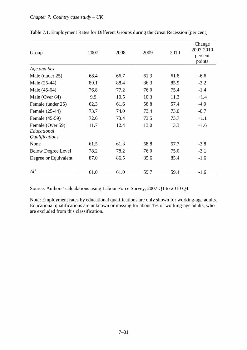
Which groups the saw the largest drops in employment? Table 7.1 shows the average
employment levels amongst men and women of different ages from 2007 through to 2010.
The age groups are defined as under 25s, 25–44, 45 to State Pension Age (SPA), and over
SPA. This shows a very stark gradient in employment trends by age. Employment fell by
more for young people, with a fall of 6.6 percentage points for men under 25 and 4.9
percentage points for women under 25. Individuals over SPA actually saw an increase in
employment over this period, albeit from a relatively low base. Amongst each age group,
employment fell by more for men than women.
<Table 7.1 near here>
Table 7.1 also shows employment amongst individuals with different levels of
educational qualifications (none, below degree level, degree or equivalent). This breakdown
is only available for working-age individuals. This shows very clearly that, although
employment fell across all education groups, it fell most for lower education groups. We can
conclude that employment fell by more for young people, men and those with less education.
Berthoud (2009) has shown that in past UK recessions individuals from ethnic minorities and
those with low levels of education were disproportionately likely to see their employment
Chapter 7: Country case study – UK
7–3
prospects suffer, but there were not disproportionate effects by gender, ages and disability.
However, Bell and Blanchflower (2011) have shown that young people in other countries
also suffered disproportionately from the GR.
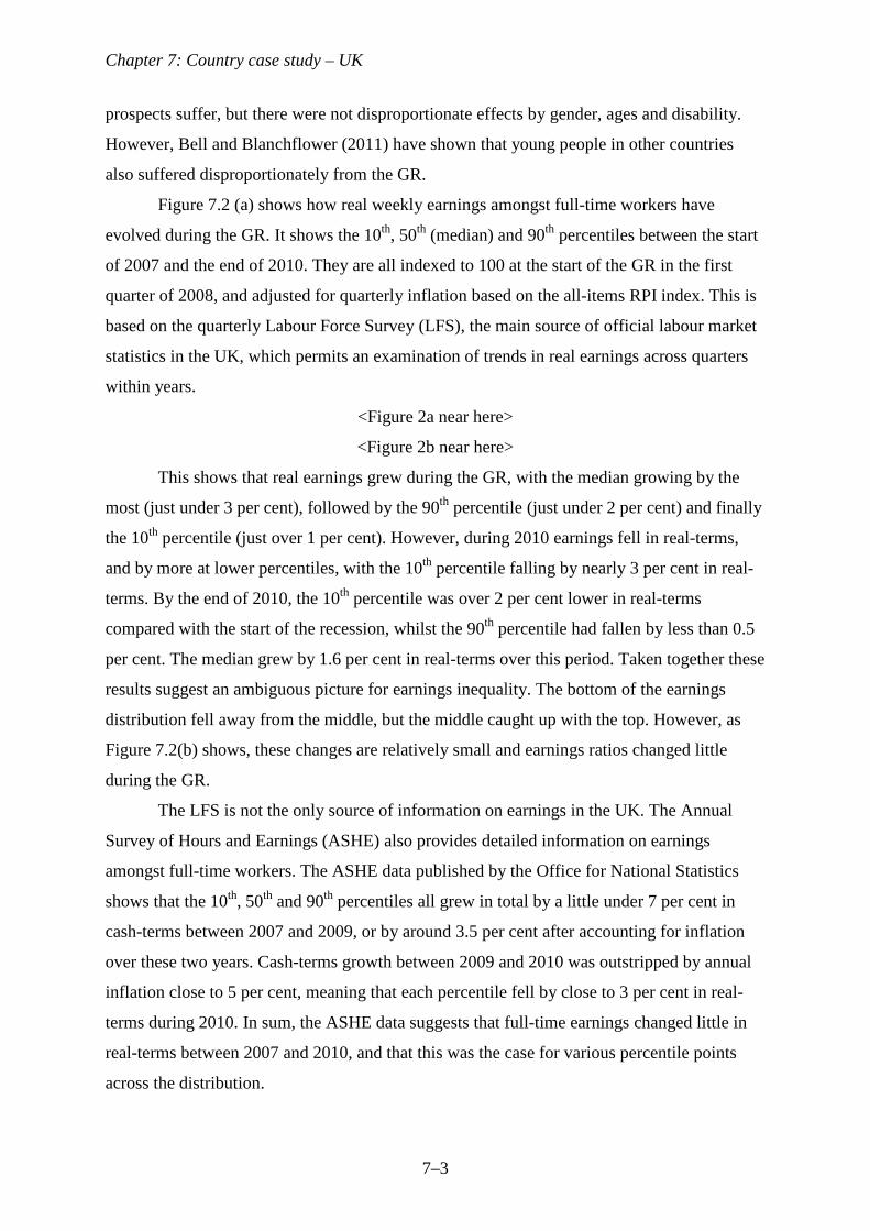
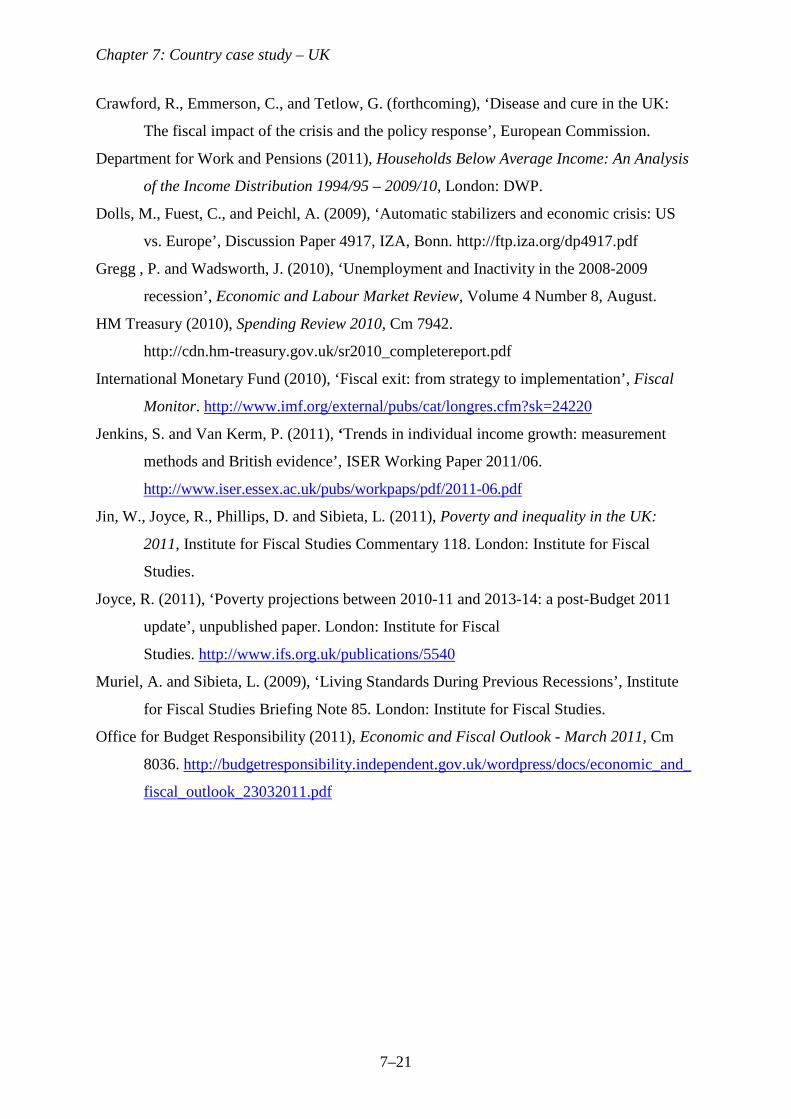
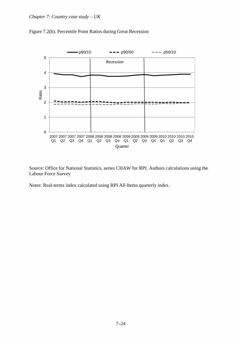
Figure 7.2 (a) shows how real weekly earnings amongst full-time workers have
evolved during the GR. It shows the 10th, 50th (median) and 90th percentiles between the start
of 2007 and the end of 2010. They are all indexed to 100 at the start of the GR in the first
quarter of 2008, and adjusted for quarterly inflation based on the all-items RPI index. This is
based on the quarterly Labour Force Survey (LFS), the main source of official labour market
statistics in the UK, which permits an examination of trends in real earnings across quarters
within years.
<Figure 2a near here>
<Figure 2b near here>
This shows that real earnings grew during the GR, with the median growing by the
most (just under 3 per cent), followed by the 90th percentile (just under 2 per cent) and finally
the 10th percentile (just over 1 per cent). However, during 2010 earnings fell in real-terms,
and by more at lower percentiles, with the 10th percentile falling by nearly 3 per cent in real-
terms. By the end of 2010, the 10th percentile was over 2 per cent lower in real-terms
compared with the start of the recession, whilst the 90th percentile had fallen by less than 0.5
per cent. The median grew by 1.6 per cent in real-terms over this period. Taken together these
results suggest an ambiguous picture for earnings inequality. The bottom of the earnings
distribution fell away from the middle, but the middle caught up with the top. However, as
Figure 7.2(b) shows, these changes are relatively small and earnings ratios changed little
during the GR.
The LFS is not the only source of information on earnings in the UK. The Annual
Survey of Hours and Earnings (ASHE) also provides detailed information on earnings
amongst full-time workers. The ASHE data published by the Office for National Statistics
shows that the 10th, 50th and 90th percentiles all grew in total by a little under 7 per cent in
cash-terms between 2007 and 2009, or by around 3.5 per cent after accounting for inflation
over these two years. Cash-terms growth between 2009 and 2010 was outstripped by annual
inflation close to 5 per cent, meaning that each percentile fell by close to 3 per cent in real-
terms during 2010. In sum, the ASHE data suggests that full-time earnings changed little in
real-terms between 2007 and 2010, and that this was the case for various percentile points
across the distribution.
Chapter 7: Country case study – UK
7–4
Although there is some disagreement between the two data sources on the precise
changes in real earnings during the GR, both suggest that the fall in real-earnings was
concentrated in 2010 when inflation accelerated and that there was little change in earnings
inequality over the period
.
7.2. Household incomes in the UK during the recession
We now consider the evolution of living standards during the GR explicitly by looking at the
distribution of household incomes. The measure of household income used is net of taxes,
inclusive of benefits and tax credits, before any housing costs have been deducted, and
equivalised using the square root of household size. This is comparable with the measures
used in other chapters, but different to UK official statistics, which use the modified OECD
equivalence scale (Department for Work and Pensions 2011). Existing analysis of official UK
statistics during the recession suggests that using a different equivalence scale does not
qualitatively change any conclusions here (Jin et al. 2011). Equivalised income amounts are
expressed in terms of the equivalent income for a 2-person household. Incomes are measured
at the household level, but the unit of analysis remains the individual: for example, median
income refers to the household income of the individual in the middle of the household
income distribution. All monetary amounts have been converted to 2010–11 prices using the
all items Retail Prices Index (RPI), and all discussion of changes in incomes thus relates to
changes in real incomes.
Data and simulation techniques
The primary source for the analysis presented in this section is the Family Resources Survey
(FRS), which includes around 25,000 households each financial year (beginning in April) and
underlies the official statistical series used by the UK Government to measure trends in the
income distribution (Department for Work and Pensions 2011).
Data from the FRS for the 2010-11 financial year are not yet available. To gain a
fuller picture of what happened to the income distribution during the GR, we therefore
simulate household incomes for 2010–11. The basic methodology behind this simulation
follows that used (and described in detail) in recent work simulating future poverty rates in
the UK (Brewer and Joyce 2010). We begin with the 2008–09 FRS data and then adjust these
data in various ways to account for changes that we expect to see by 2010–11 on the basis of
Chapter 7: Country case study – UK
7–5
other data sources. These adjustments are described below. At the time of writing, it was not
possible to use the 2009–10 FRS in these simulations, but the 2009-10 data will be used in
the final version of this chapter. However, in previous work we have been able to produce
summary statistics based on the 2009-10 FRS data (Jin et al. 2011), which we also include
here.
We reweight the data to account for the reduction in employment – reducing the
sampling weights, on average, applied to employed individuals – using the Labour Force
Survey as the source of employment data. We account for these employment changes within
subgroups defined by age and gender (jointly) and by family type (couple or single), part-
time/full-time status and gender (jointly). Accounting for differences in employment trends
across different population groups in this way (rather than simply accounting for the
aggregate employment change and assuming that the average characteristics of unemployed
workers remain the same) is potentially important for capturing changes in the distribution of
income, as shown in previous empirical work (Dolls, Fuest, and Peichl 2009) and discussed
in Chapter 1. Other expected demographic changes (for example, changes in the number of
single-person households) are also incorporated through the reweighting process, using
projections from the Office for National Statistics (ONS).
Average nominal gross earnings in the 2008–09 data are increased by the rate of
average annual earnings growth to 2010–11 measured by the ONS Average Weekly Earnings
(AWE) index; but we allow for differential earnings growth in each quintile of the
distribution of jobs by gender and full-time/part-time status (a total of 5 x 2 x 2 = 20 cells),
based on official statistics produced by the ASHE data described in Section 7.1.
The impacts of reforms to the tax and benefit system between 2008–09 and 2010–11
are incorporated using TAXBEN, the static tax and benefit micro-simulation model of the
Institute for Fiscal Studies (IFS). No behavioural responses to such reforms are assumed as
reforms over this period had mostly marginal impacts on behavioural incentives. One
important exception is at the very top of the earnings distribution where the marginal rate of
income tax for those with gross earnings above £150,000 was increased from 40 per cent to
50 per cent in April 2010. This is likely to reduce taxable incomes from 2010-11 as a result of
changes to labour supply and increased avoidance behaviour (Brewer, Saez, and Shephard
2009, Brewer and Browne 2010). TAXBEN simulates tax liabilities and benefit and tax credit
entitlements. Hence, to account for incomplete take-up of means-tested benefits and tax
credits, we subtract simulated benefit or tax credit income from people if they did not report
Chapter 7: Country case study – UK
7–6
receiving that benefit or tax credit in the 2008–09 FRS but they were (according to our
simulation) eligible for it in that year.
Note that the evolution of incomes at the very top of the distribution is highly
uncertain. In the UK Government’s official statistical series based on the FRS, the measured
personal incomes of the very richest individuals are replaced with values from the Survey of
Personal Incomes (SPI) – a survey of tax returns – because of the lack of sufficient sampling
of very rich individuals. However, the SPI data only becomes available with a long lag.
Moreover, the significant changes to top rates of tax in the UK in April 2010 mean that past
changes to top incomes are highly unlikely to be a good guide to future changes. We
therefore have no credible way of simulating trends at the very top of the household income
distribution (which we define as the top 5 percentile groups) in 2010–11. Key summary
statistics which depend on these trends are mean incomes and the Gini coefficient. For these
statistics, we present two different simulations designed to capture the possible range of
values for income growth at the very top in 2010–11: real income growth of 0 per cent and -
10 per cent in the top 5 percentile groups of the distribution. As we shall see, these scenarios
correspond to income growth in the top 5 percentile groups being approximately 5 percentage
points above or below that at the 90th percentile. Such differences relative to the 90th
percentile would be unusual by recent historical standards (the main exception being 2009–10
when there was a change in the way official UK statistics treat top incomes) but changes to
top rates of tax in April 2010 would leave one to expect income growth at the very top to be
below that seen at the 90th percentile, other things being equal. Due to the uncertainty
regarding the evolution of top incomes, these scenarios should be viewed as purely
illustrative.
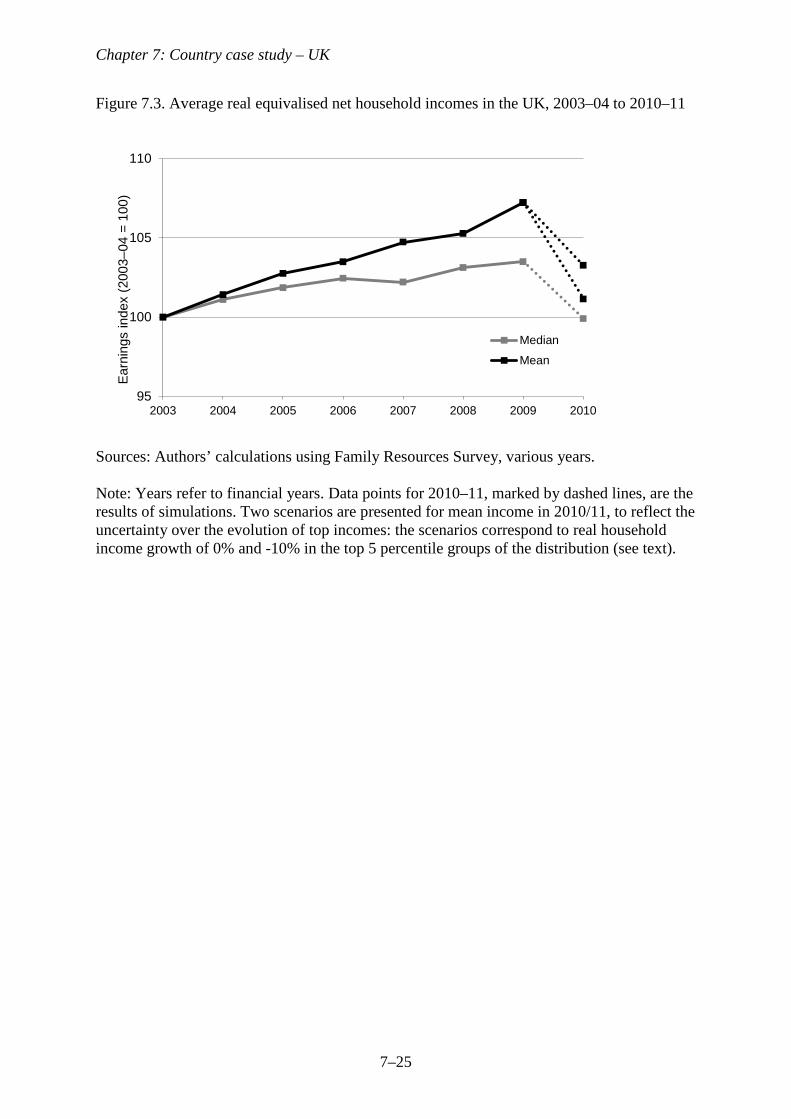
Average incomes before and during the recession
Figure 7.3 shows how average net household incomes in the UK have evolved in recent
years. The graph shows that average income growth was very sluggish in the years before the
UK entered recession. In the four years between 2003–04 and 2007–08, net income growth
averaged about 0.5 per cent per year at the median and about 1.2 per cent per year at the
mean.
Despite the falls in GDP per head and the increases in unemployment during the GR,
average incomes actually seemed to increase. Indeed, the average annual growth rate of net
household income between 2007–08 and 2009–10 was virtually identical at both the mean
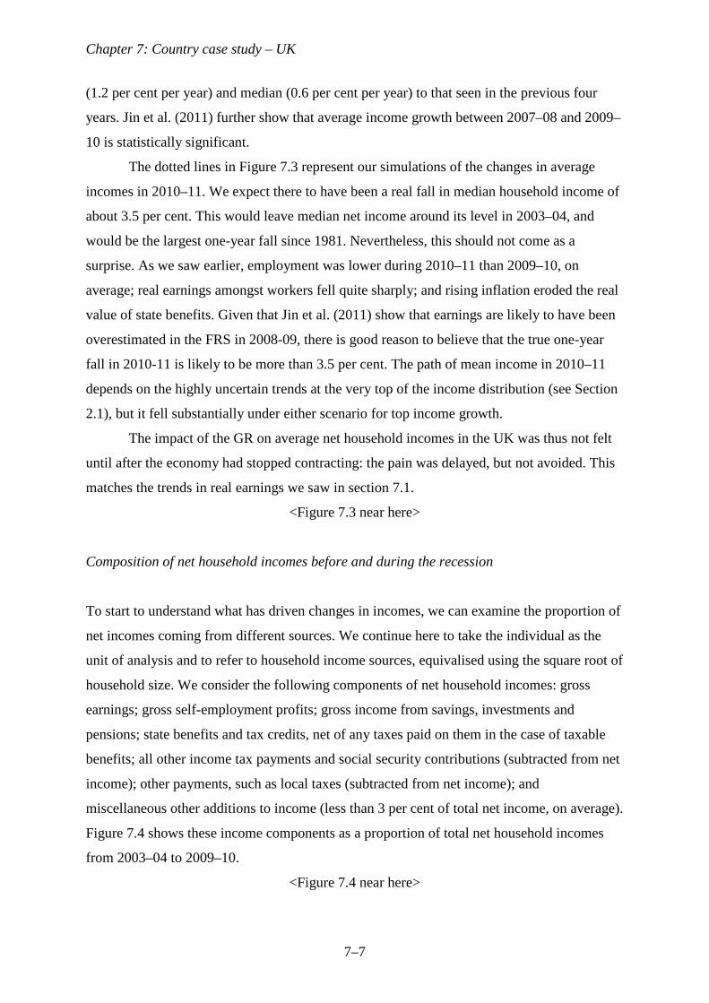
Chapter 7: Country case study – UK
7–7
(1.2 per cent per year) and median (0.6 per cent per year) to that seen in the previous four
years. Jin et al. (2011) further show that average income growth between 2007–08 and 2009–
10 is statistically significant.
The dotted lines in Figure 7.3 represent our simulations of the changes in average
incomes in 2010–11. We expect there to have been a real fall in median household income of
about 3.5 per cent. This would leave median net income around its level in 2003–04, and
would be the largest one-year fall since 1981. Nevertheless, this should not come as a
surprise. As we saw earlier, employment was lower during 2010–11 than 2009–10, on
average; real earnings amongst workers fell quite sharply; and rising inflation eroded the real
value of state benefits. Given that Jin et al. (2011) show that earnings are likely to have been
overestimated in the FRS in 2008-09, there is good reason to believe that the true one-year
fall in 2010-11 is likely to be more than 3.5 per cent. The path of mean income in 2010–11
depends on the highly uncertain trends at the very top of the income distribution (see Section
2.1), but it fell substantially under either scenario for top income growth.
The impact of the GR on average net household incomes in the UK was thus not felt
until after the economy had stopped contracting: the pain was delayed, but not avoided. This
matches the trends in real earnings we saw in section 7.1.
<Figure 7.3 near here>
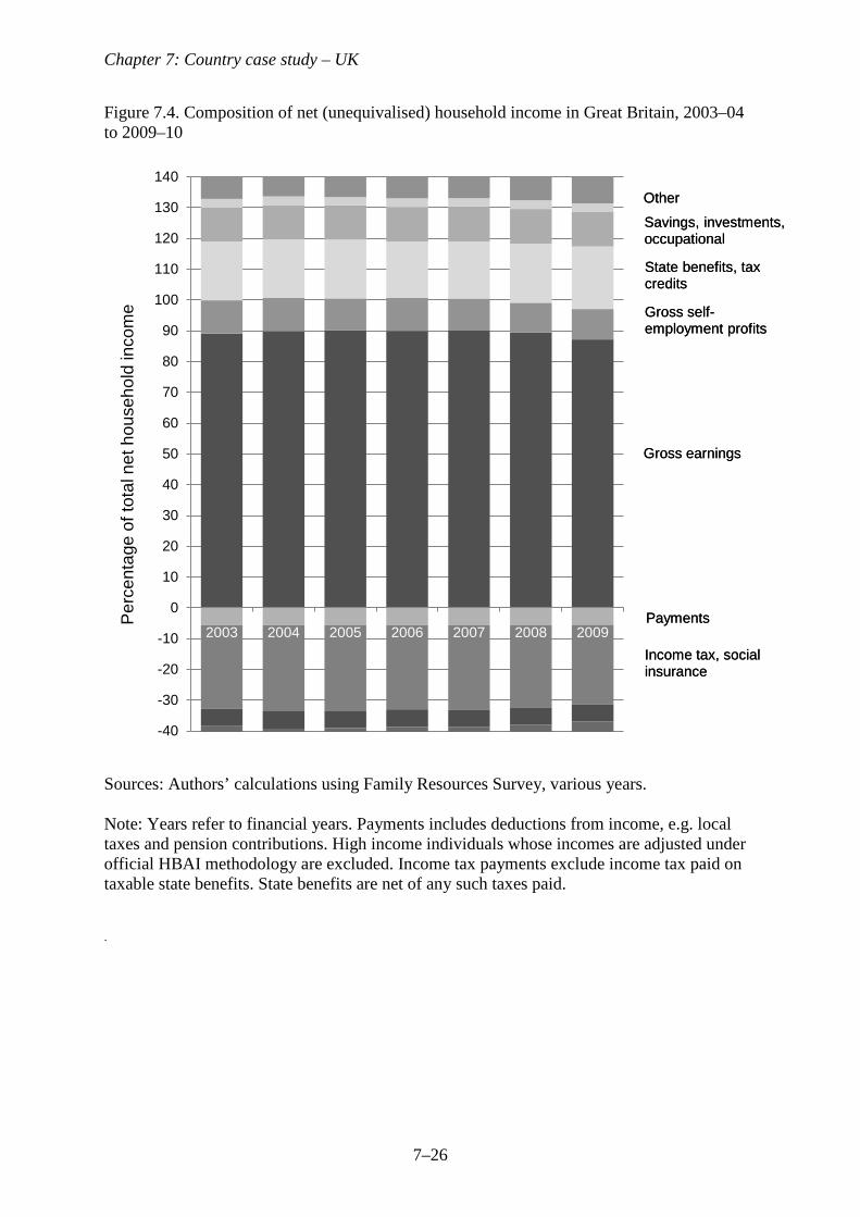
Composition of net household incomes before and during the recession
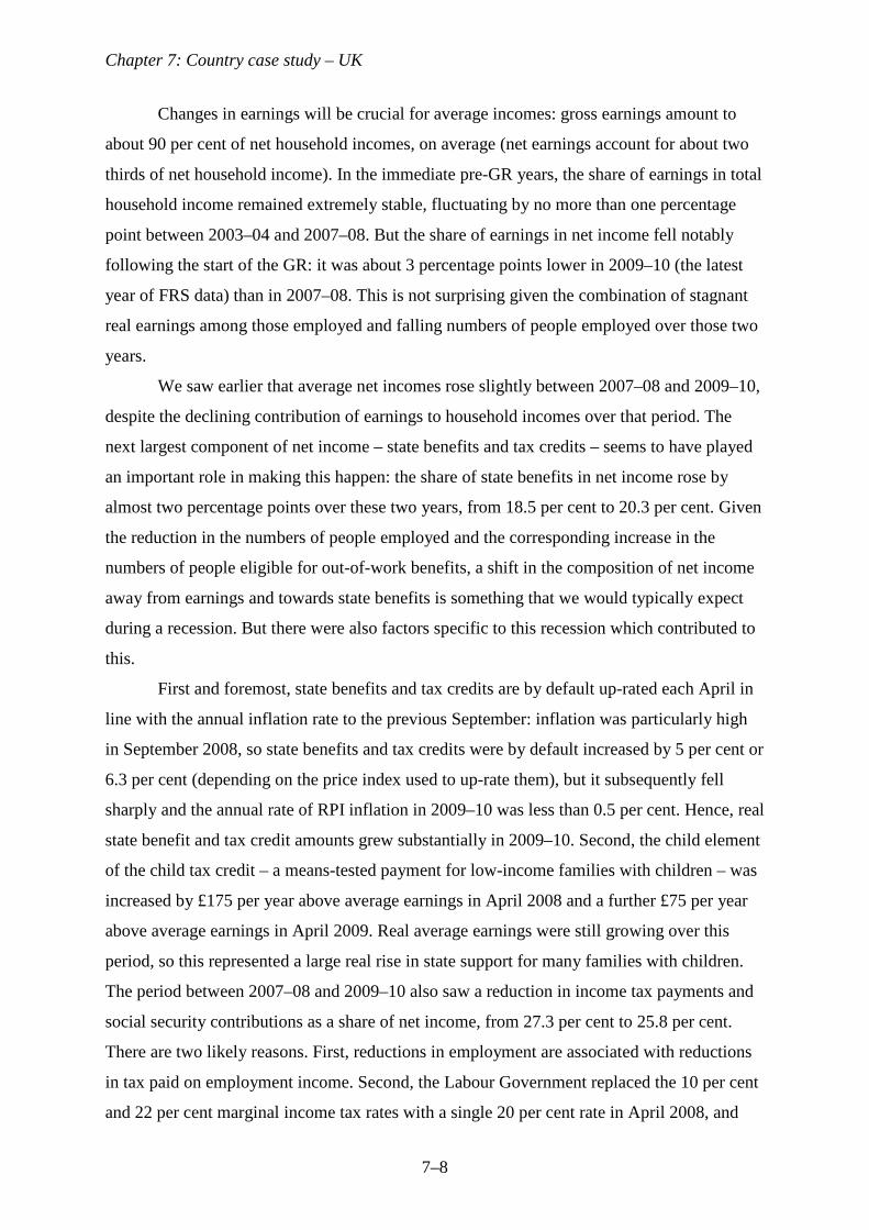
To start to understand what has driven changes in incomes, we can examine the proportion of
net incomes coming from different sources. We continue here to take the individual as the
unit of analysis and to refer to household income sources, equivalised using the square root of
household size. We consider the following components of net household incomes: gross
earnings; gross self-employment profits; gross income from savings, investments and
pensions; state benefits and tax credits, net of any taxes paid on them in the case of taxable
benefits; all other income tax payments and social security contributions (subtracted from net
income); other payments, such as local taxes (subtracted from net income); and
miscellaneous other additions to income (less than 3 per cent of total net income, on average).
Figure 7.4 shows these income components as a proportion of total net household incomes
from 2003–04 to 2009–10.
<Figure 7.4 near here>
Chapter 7: Country case study – UK
7–8
Changes in earnings will be crucial for average incomes: gross earnings amount to
about 90 per cent of net household incomes, on average (net earnings account for about two
thirds of net household income). In the immediate pre-GR years, the share of earnings in total
household income remained extremely stable, fluctuating by no more than one percentage
point between 2003–04 and 2007–08. But the share of earnings in net income fell notably
following the start of the GR: it was about 3 percentage points lower in 2009–10 (the latest
year of FRS data) than in 2007–08. This is not surprising given the combination of stagnant
real earnings among those employed and falling numbers of people employed over those two
years.
We saw earlier that average net incomes rose slightly between 2007–08 and 2009–10,
despite the declining contribution of earnings to household incomes over that period. The
next largest component of net income – state benefits and tax credits – seems to have played
an important role in making this happen: the share of state benefits in net income rose by
almost two percentage points over these two years, from 18.5 per cent to 20.3 per cent. Given
the reduction in the numbers of people employed and the corresponding increase in the
numbers of people eligible for out-of-work benefits, a shift in the composition of net income
away from earnings and towards state benefits is something that we would typically expect
during a recession. But there were also factors specific to this recession which contributed to
this.
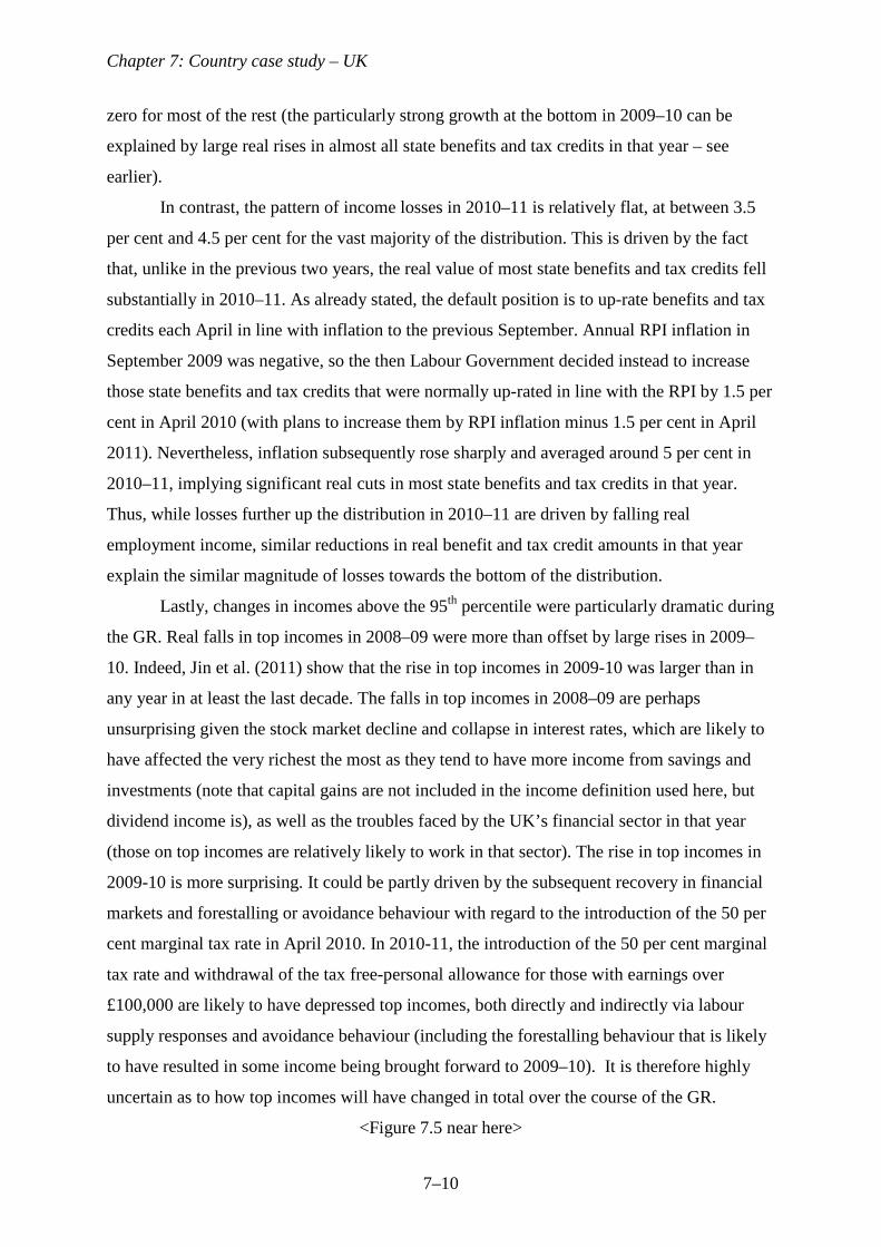
First and foremost, state benefits and tax credits are by default up-rated each April in
line with the annual inflation rate to the previous September: inflation was particularly high
in September 2008, so state benefits and tax credits were by default increased by 5 per cent or
6.3 per cent (depending on the price index used to up-rate them), but it subsequently fell
sharply and the annual rate of RPI inflation in 2009–10 was less than 0.5 per cent. Hence, real
state benefit and tax credit amounts grew substantially in 2009–10. Second, the child element
of the child tax credit – a means-tested payment for low-income families with children – was
increased by £175 per year above average earnings in April 2008 and a further £75 per year
above average earnings in April 2009. Real average earnings were still growing over this
period, so this represented a large real rise in state support for many families with children.
The period between 2007–08 and 2009–10 also saw a reduction in income tax payments and
social security contributions as a share of net income, from 27.3 per cent to 25.8 per cent.
There are two likely reasons. First, reductions in employment are associated with reductions
in tax paid on employment income. Second, the Labour Government replaced the 10 per cent
and 22 per cent marginal income tax rates with a single 20 per cent rate in April 2008, and
Chapter 7: Country case study – UK
7–9
subsequently compensated the majority of the losers from this reform by substantially
increasing the tax-free personal allowance, meaning that the package of reforms as a whole
represented a net tax ‘giveaway’.
The share of net income accounted for by the other income components - gross self-
employment profits, gross income from savings, investments and pensions, payments such as
local taxes (subtracted from net income), and miscellaneous other additions to income –
remained very stable between 2007–08 and 2009–10.
The shift in the composition of net income away from earnings and towards state
benefits clearly has potentially important implications for the pattern of changes in income
across the income distribution. We turn to this below.
The distribution of net household incomes during the recession
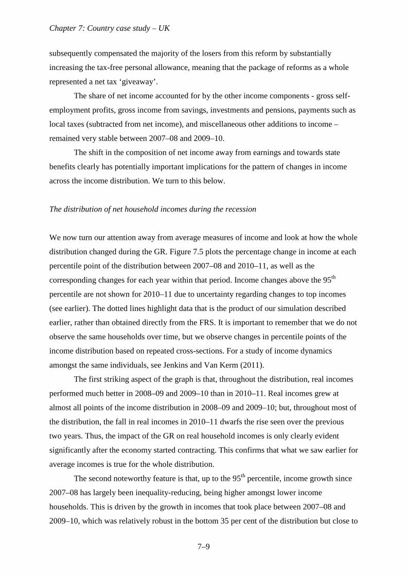
We now turn our attention away from average measures of income and look at how the whole
distribution changed during the GR. Figure 7.5 plots the percentage change in income at each
percentile point of the distribution between 2007–08 and 2010–11, as well as the
corresponding changes for each year within that period. Income changes above the 95th
percentile are not shown for 2010–11 due to uncertainty regarding changes to top incomes
(see earlier). The dotted lines highlight data that is the product of our simulation described
earlier, rather than obtained directly from the FRS. It is important to remember that we do not
observe the same households over time, but we observe changes in percentile points of the
income distribution based on repeated cross-sections. For a study of income dynamics
amongst the same individuals, see Jenkins and Van Kerm (2011).
The first striking aspect of the graph is that, throughout the distribution, real incomes
performed much better in 2008–09 and 2009–10 than in 2010–11. Real incomes grew at
almost all points of the income distribution in 2008–09 and 2009–10; but, throughout most of
the distribution, the fall in real incomes in 2010–11 dwarfs the rise seen over the previous
two years. Thus, the impact of the GR on real household incomes is only clearly evident
significantly after the economy started contracting. This confirms that what we saw earlier for
average incomes is true for the whole distribution.
The second noteworthy feature is that, up to the 95th percentile, income growth since
2007–08 has largely been inequality-reducing, being higher amongst lower income
households. This is driven by the growth in incomes that took place between 2007–08 and
2009–10, which was relatively robust in the bottom 35 per cent of the distribution but close to
Chapter 7: Country case study – UK
7–10
zero for most of the rest (the particularly strong growth at the bottom in 2009–10 can be
explained by large real rises in almost all state benefits and tax credits in that year – see
earlier).
In contrast, the pattern of income losses in 2010–11 is relatively flat, at between 3.5
per cent and 4.5 per cent for the vast majority of the distribution. This is driven by the fact
that, unlike in the previous two years, the real value of most state benefits and tax credits fell
substantially in 2010–11. As already stated, the default position is to up-rate benefits and tax
credits each April in line with inflation to the previous September. Annual RPI inflation in
September 2009 was negative, so the then Labour Government decided instead to increase
those state benefits and tax credits that were normally up-rated in line with the RPI by 1.5 per
cent in April 2010 (with plans to increase them by RPI inflation minus 1.5 per cent in April
2011). Nevertheless, inflation subsequently rose sharply and averaged around 5 per cent in
2010–11, implying significant real cuts in most state benefits and tax credits in that year.
Thus, while losses further up the distribution in 2010–11 are driven by falling real
employment income, similar reductions in real benefit and tax credit amounts in that year
explain the similar magnitude of losses towards the bottom of the distribution.
Lastly, changes in incomes above the 95th percentile were particularly dramatic during
the GR. Real falls in top incomes in 2008–09 were more than offset by large rises in 2009–
10. Indeed, Jin et al. (2011) show that the rise in top incomes in 2009-10 was larger than in
any year in at least the last decade. The falls in top incomes in 2008–09 are perhaps
unsurprising given the stock market decline and collapse in interest rates, which are likely to
have affected the very richest the most as they tend to have more income from savings and
investments (note that capital gains are not included in the income definition used here, but
dividend income is), as well as the troubles faced by the UK’s financial sector in that year
(those on top incomes are relatively likely to work in that sector). The rise in top incomes in
2009-10 is more surprising. It could be partly driven by the subsequent recovery in financial
markets and forestalling or avoidance behaviour with regard to the introduction of the 50 per
cent marginal tax rate in April 2010. In 2010-11, the introduction of the 50 per cent marginal
tax rate and withdrawal of the tax free-personal allowance for those with earnings over
£100,000 are likely to have depressed top incomes, both directly and indirectly via labour
supply responses and avoidance behaviour (including the forestalling behaviour that is likely
to have resulted in some income being brought forward to 2009–10). It is therefore highly
uncertain as to how top incomes will have changed in total over the course of the GR.
<Figure 7.5 near here>
Chapter 7: Country case study – UK
7–11
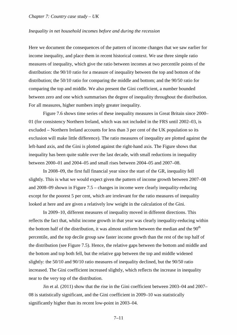
Inequality in net household incomes before and during the recession
Here we document the consequences of the pattern of income changes that we saw earlier for
income inequality, and place them in recent historical context. We use three simple ratio
measures of inequality, which give the ratio between incomes at two percentile points of the
distribution: the 90/10 ratio for a measure of inequality between the top and bottom of the
distribution; the 50/10 ratio for comparing the middle and bottom; and the 90/50 ratio for
comparing the top and middle. We also present the Gini coefficient, a number bounded
between zero and one which summarises the degree of inequality throughout the distribution.
For all measures, higher numbers imply greater inequality.
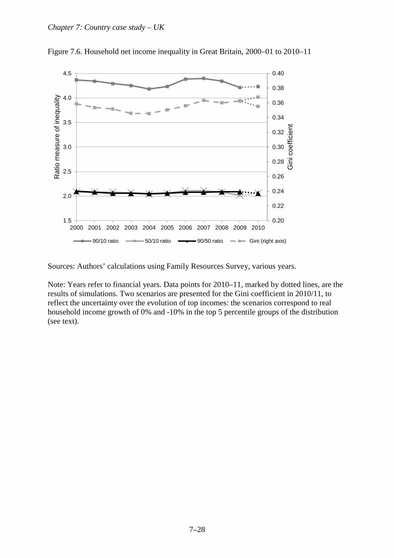
Figure 7.6 shows time series of these inequality measures in Great Britain since 2000–
01 (for consistency Northern Ireland, which was not included in the FRS until 2002–03, is
excluded – Northern Ireland accounts for less than 3 per cent of the UK population so its
exclusion will make little difference). The ratio measures of inequality are plotted against the
left-hand axis, and the Gini is plotted against the right-hand axis. The Figure shows that
inequality has been quite stable over the last decade, with small reductions in inequality
between 2000–01 and 2004–05 and small rises between 2004–05 and 2007–08.
In 2008–09, the first full financial year since the start of the GR, inequality fell
slightly. This is what we would expect given the pattern of income growth between 2007–08
and 2008–09 shown in Figure 7.5 – changes in income were clearly inequality-reducing
except for the poorest 5 per cent, which are irrelevant for the ratio measures of inequality
looked at here and are given a relatively low weight in the calculation of the Gini.
In 2009–10, different measures of inequality moved in different directions. This
reflects the fact that, whilst income growth in that year was clearly inequality-reducing within
the bottom half of the distribution, it was almost uniform between the median and the 90th
percentile, and the top decile group saw faster income growth than the rest of the top half of
the distribution (see Figure 7.5). Hence, the relative gaps between the bottom and middle and
the bottom and top both fell, but the relative gap between the top and middle widened
slightly: the 50/10 and 90/10 ratio measures of inequality declined, but the 90/50 ratio
increased. The Gini coefficient increased slightly, which reflects the increase in inequality
near to the very top of the distribution.
Jin et al. (2011) show that the rise in the Gini coefficient between 2003–04 and 2007–
08 is statistically significant, and the Gini coefficient in 2009–10 was statistically
significantly higher than its recent low-point in 2003–04.
Chapter 7: Country case study – UK
7–12
According to our simulation for 2010–11, there was little change in the ratio measures
of inequality in that year because the percentage income losses were close to uniform across
much of the distribution (see Figure 7.5). Nevertheless, taking the three years between 2007–
08 and 2010–11 as a whole, inequality narrowed slightly: this is true both for inequality
between the bottom and middle, and between the middle and top, as reflected by falling
50/10, 90/10 and 90/50 ratios. The narrowing of inequality in the bottom half of the
distribution is very much driven by the pattern of real income growth in 2009–10, which was
very robust at the bottom of the distribution as most state benefit and tax credit amounts grew
strongly in real terms. It is worth noting that, despite these small reductions during the GR,
the ratio measures of inequality in 2010–11 are still at or above their mid-2000 levels.
Figure 7.6 also highlights that the uncertainty over the evolution of top incomes in 2010–11
(see earlier) prevents us from coming to firm conclusions about what happened to the Gini
coefficient. Under the two scenarios of real income growth of 0 per cent and -10 per cent in
the top 5 percentile groups of the income distribution in 2010–11, the Gini would have risen
and fallen respectively (this is true both for the single year between 2009–10 and 2010–11,
and for the three years between 2007–08 and 2010–11 taken together). It is however worth
noting that, under either scenario, inequality in 2010–11 as measured by the Gini would still
lie above its 2006–07 level.
<Figure 7.6 near here>
The fact that inequality in the bottom half of the income distribution declined so
clearly during the GR strongly suggests that relative poverty is likely to have fallen. In the
next subsection, we confirm that this is the case in the aggregate, but show that this was
driven by particular demographic groups.
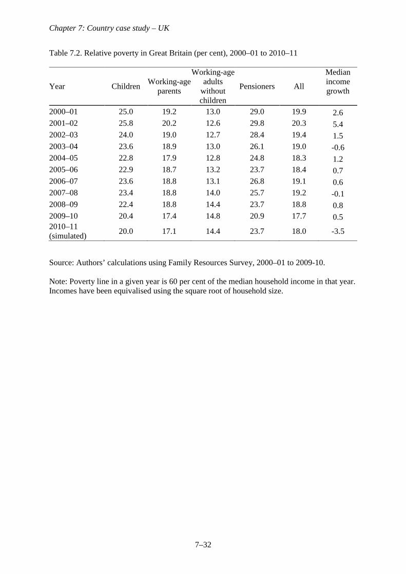
Poverty before and during the recession
Table 7.2 shows relative poverty rates in Great Britain since 2000–01 among major
demographic groups (as in the previous section, we exclude Northern Ireland for
consistency), where the poverty line is the commonly used 60 per cent of contemporary
median income. These poverty rates are different to those used in official UK statistics, which
use the same definition of household income but use the modified OECD equivalence scale
and are calculated for the UK as whole. This affects the level of poverty observed in any
year, but is less likely to affect trends over time. Indeed, existing analysis using the official
Chapter 7: Country case study – UK
7–13
UK statistics has reached the same qualitative conclusions as we do here regarding changes in
poverty among various groups in recent years (Jin et al. 2011).
The table highlights that, despite small rises in the middle of the previous decade,
there were overall reductions in poverty among children and pensioners in the years
preceding the GR. Interestingly, the reduction in poverty among working-age parents was
much less notable than that among children because it is families with larger numbers of
children who have seen falls in their poverty rate, as highlighted in Brewer et al. (2010). This
contrasts with the trend among working-age adults without children, whose poverty rate rose
slightly (and has been rising steadily for most of the past three decades). Tax and benefit
policy is an important reason for these trends: overall, the Labour Government’s tax and
benefit reforms heavily favoured low-income families with children and pensioners (Browne
and Phillips 2010) and they were a very dominant driver of both the overall reduction in child
poverty and the partial reversal of this reduction in the middle of the decade (Brewer et al.
2010).
In both 2008–09 and 2009–10, families with children and pensioners again
experienced substantial falls in poverty of similar magnitude to those seen in the early 2000s,
more than reversing the small rises in poverty among those groups in the previous few years.
Child poverty fell by 3 percentage points and pensioner poverty fell by almost 5 percentage
points over the two years. Tax and benefit reforms are again key to the explanation. Low-
income families with children and pensioners are the major demographic groups most likely
to be entitled to state support, and so both benefitted disproportionately from the large real
increases in most state benefits and tax credits that occurred over these years – see earlier.
However, poverty among working-age adults without children continued its gradual rise after
the GR hit. This group are less likely to be in receipt of state benefits and tax credits, so
would not have benefitted to the same extent from the large real increases in most state
benefits and tax credits in April 2009; and they were not major beneficiaries of any
discretionary state benefit or tax credit changes during the GR.
According to our simulation for 2010–11, overall poverty in that year remained stable,
as we would expect given the relatively flat profile of income changes in 2010–11 that we
saw in Figure 7.5. Pensioners are the only group whose poverty rate is expected to have
changed notably in 2010–11, but the rise in pensioner poverty that we simulate would only
return it to its 2008–09 level and would thus still be 2 percentage points lower than just
before the GR in 2007–08.
<Table 7.2 near here>
Chapter 7: Country case study – UK
7–14
Given the substantial fall in median income and hence the relative poverty line in 2010–
11, trends in relative poverty are of course not a good guide to the evolution of absolute
living standards amongst those on low incomes in that year. In fact, absolute poverty (using
the 2010–11 poverty line fixed in real terms) actually rose by about 2 percentage points under
our simulations between 2009–10 and 2010–11; and it rose for pensioners, children and those
of working age without children. Taking the three years since the recession began as a whole
(2007–08 to 2010–11), absolute poverty stayed relatively stable overall, as it did for
pensioners. It fell by about one percentage point for children and rose for those of working-
age without children by about one percentage point. Hence, the overall trends in absolute
poverty over time are unsurprising given what we have seen happened to real incomes across
the distribution during the recession; but as with relative poverty, there have been clear
differences between the fortunes of major demographic groups.
7.3. The aftermath of the Great Recession: fiscal consolidation
We finally consider the prospects for living standards in the immediate post-recession years.
This is a highly uncertain exercise because of the substantial uncertainty about how the
macro-economy, and in particular the labour market, will evolve. But the Conservative-
Liberal Democrat coalition Government has already set out its public spending plans for the
next few years as part of a total fiscal tightening of £102 billion in 2011–12 terms, or 6.6 per
cent of national income, by 2015–16 in an effort to redress the fiscal position which
deteriorated so rapidly during the course of the GR (Crawford, Emmerson, and Tetlow,
forthcoming). About three quarters will come from public spending cuts and about a quarter
from tax rises. According to the IMF, the planned reduction in public spending as a share of
national income between 2010 and 2015 is the third largest out of 29 leading industrial
countries, behind only Iceland and Ireland (International Monetary Fund 2010). Assuming
that these plans are adhered to, the impacts of policy reforms due to be implemented over the
next few years on household incomes can already be estimated. In this section we draw on
analysis of these reforms conducted by the Treasury and IFS. Note that this analysis uses the
modified OECD equivalence scale, as is used for official UK statistics, rather than the square
root of household size used in the rest of this chapter. As already discussed, this is very
unlikely to qualitatively affect any conclusions. Equivalisation is irrelevant when calculating
the loss or gain from a reform as a percentage of income. Its only impact on the distributional
analysis in this section is to affect the grouping of households by income.
Chapter 7: Country case study – UK
7–15
The impacts of reforms have been estimated using data on the current population.
Hence, to the extent that the impacts of reforms depend upon macroeconomic developments
(for example, the impact of cuts to income-related benefits depends upon how people’s gross
incomes evolve), this is an approximation only. We are abstracting from changes to the
macroeconomy which will clearly also be crucial in determining how the distribution of
incomes evolves in the years ahead but which are extremely uncertain.
Reforms to the tax and benefit system
Planned tax and benefit reforms in the post-recession period constitute a large net takeaway
from households, amounting to about 5 per cent of total net household income by 2014–15.
Examples include a rise in the basic rate of Value Added Tax (VAT) from 17.5 per cent to 20
per cent in January 2011 (raising £13.5 billion per year in 2014–15); a switching of the price
index used to up-rate benefit and tax credit amounts annually which will in general result in
less generous increases in those amounts (an estimated welfare cut of £6 billion per year by
2014–15); and a series of aggregate cuts to tax credits and Housing Benefit. The cuts to
welfare spending are in total expected to save the Government £18 billion per year by 2014–
15 (HM Treasury 2010).
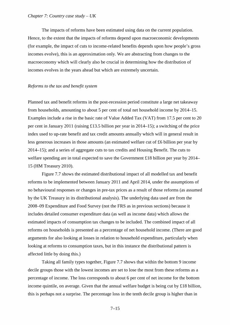
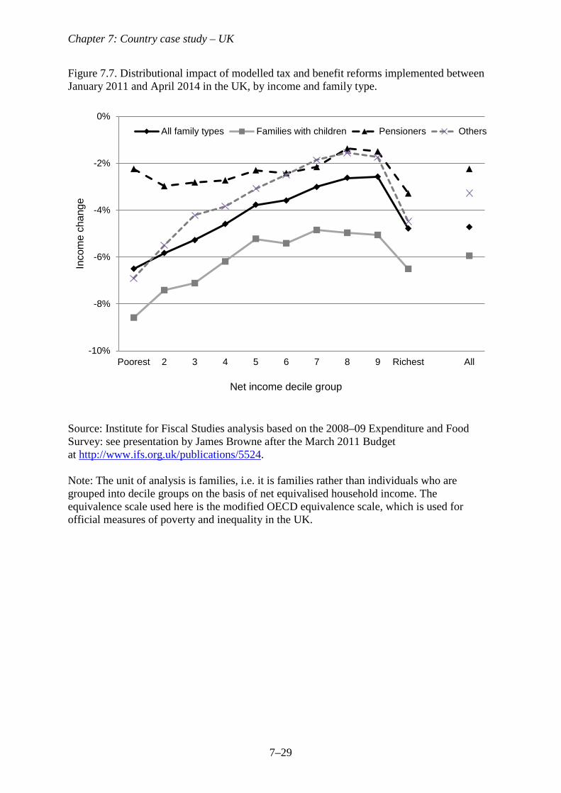
Figure 7.7 shows the estimated distributional impact of all modelled tax and benefit
reforms to be implemented between January 2011 and April 2014, under the assumptions of
no behavioural responses or changes in pre-tax prices as a result of those reforms (as assumed
by the UK Treasury in its distributional analysis). The underlying data used are from the
2008–09 Expenditure and Food Survey (not the FRS as in previous sections) because it
includes detailed consumer expenditure data (as well as income data) which allows the
estimated impacts of consumption tax changes to be included. The combined impact of all
reforms on households is presented as a percentage of net household income. (There are good
arguments for also looking at losses in relation to household expenditure, particularly when
looking at reforms to consumption taxes, but in this instance the distributional pattern is
affected little by doing this.)
Taking all family types together, Figure 7.7 shows that within the bottom 9 income
decile groups those with the lowest incomes are set to lose the most from these reforms as a
percentage of income. The loss corresponds to about 6 per cent of net income for the bottom
income quintile, on average. Given that the annual welfare budget is being cut by £18 billion,
this is perhaps not a surprise. The percentage loss in the tenth decile group is higher than in
Chapter 7: Country case study – UK
7–16
all but the bottom 3 decile groups, but in fact this is largely driven by tax rises for the very
richest (approximately the top 1 per cent): those households with an individual earning above
£100,000 per year had tax relief on pension contributions restricted from April 2011 (the very
rich had in fact already been hit by two tax rises under the previous Labour Government in
April 2010: a rise in the marginal income tax rate from 40 per cent to 50 per cent for those
with gross earnings above £150,000 per year, and a gradual withdrawal of the personal
income tax allowance for those with gross earnings above £100,000 per year).
Therefore, tax and benefit reforms seem likely to squeeze the livings standards of the
less well off by more than those on higher incomes (except for those on the very highest
incomes). Using the numbers in Figure 7.7 we can approximate the implied proportionate
changes to ratio measures of inequality as a result of these reforms by assuming that
households’ rankings in the distribution remain the same and that the percentage loss at the
midpoint of each quintile is equal to the average loss in that quintile group (for the top
quintile group, we exclude families containing someone with gross earnings above £100,000
from this calculation, since we know that their average losses far exceed those in the rest of
the quintile). Under these assumptions, all the ratio measures of inequality shown in Figure 6
would increase as a result of the reforms: the 90/10 ratio by about 3.5 per cent, the 50/10 ratio
by about 2.6 per cent, and the 90/50 ratio by about 0.8 per cent. To put this in context, they
compare to the respective falls in these measures of inequality of 3.8 per cent, 2.8 per cent,
and 1.1 per cent that we expect to have taken place between 2007–08 and 2010–11 (see
Figure 7.6). Hence, the impact of upcoming tax and benefit reforms seems likely to be to
reverse a substantial part (if not all) of the reductions in ratio measures of inequality seen
during the GR.
Figure 7.7 also explores the impact of these tax and benefit reforms across family
types. It shows that families with children are to be hit harder by these reforms than other
family types, on average. This is not simply because losses are decreasing in income and
having children is negatively correlated with income: within given income decile groups,
families with children will on average lose more. There are various cuts to child-contingent
state support which help to explain this. Child Benefit amounts are to be frozen in cash terms
(a real cut) for three years; aggregate Child Tax Credit spending is to be cut (one element of it
is to be increased and other elements are to be cut or abolished); the percentage of childcare
costs that can be claimed by those receiving the Working Tax Credit was cut from 80 per cent
to 70 per cent in April 2011; the minimum weekly working hours requirement for a couple
with children to claim Working Tax Credit is to rise from 16 to 24 in April 2012; and Child

Chapter 7: Country case study – UK
7–17
Benefit is to be removed from families containing a higher rate income tax-payer from
January 2013. Hence, in contrast to recent trends in the UK (see Section 7.1), families with
children are not to be favoured by tax and benefit reforms in the near future.
Recent IFS modelling predicted that child poverty will rise in each of the 3 years
between 2010–11 and 2013–14, and that it will be about 2 percentage points higher in 2013–
14 as a result of the tax and benefit reforms planned by the current Government. Poverty
among those of working-age without children is also expected to continue rising, but the
estimated impact of the package of tax and benefit reforms on the poverty rate among that
group in 2013–14 is lower, at about 1 percentage point (Joyce, 2011). Across almost the
whole income distribution, pensioners are the least affected by the reforms as a percentage of
net income. A contributing factor is that annual increases in the Basic State Pension are in
fact to become more generous. Hence, unlike for families with children, tax and benefit
reforms look set to continue to favour pensioners just as they did under the Labour
Government in the years before the GR.
<Figure 7.7 near here>
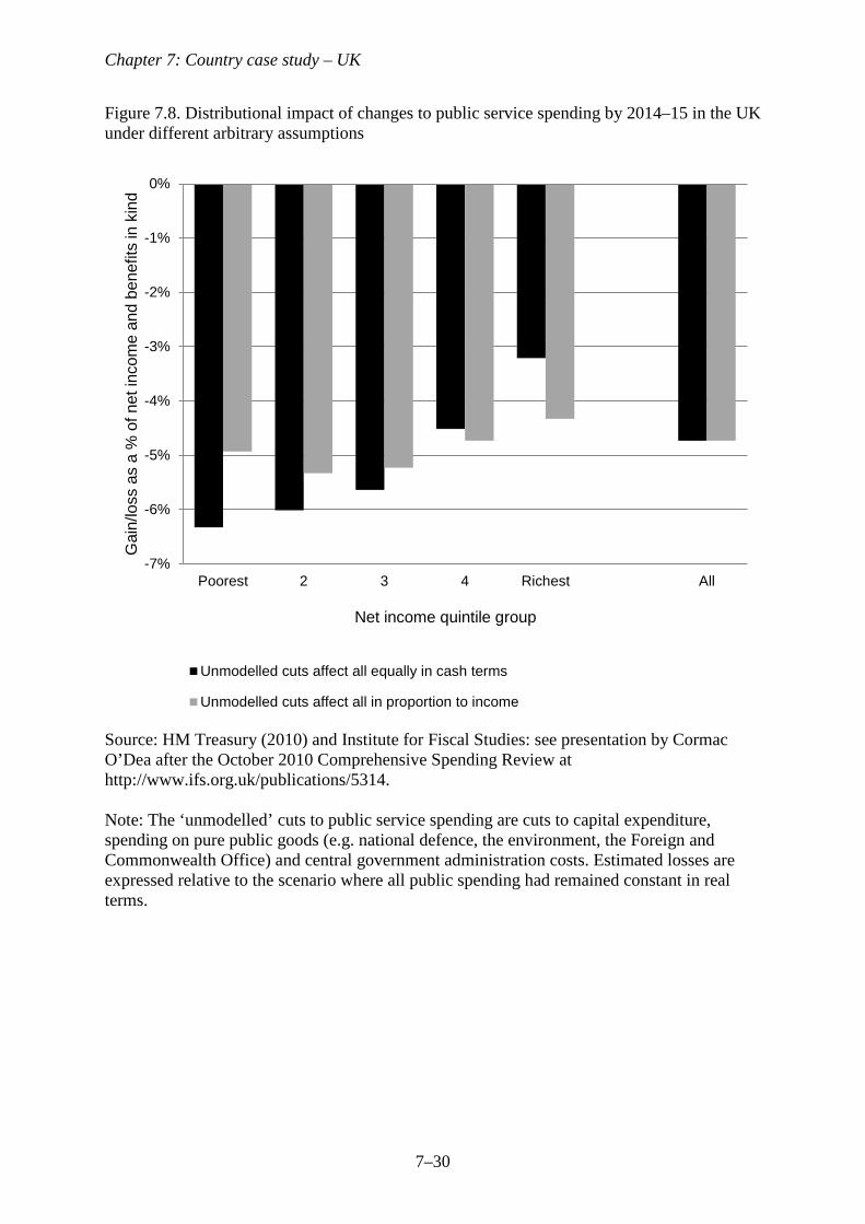
Cuts to expenditure on public services
The fiscal consolidation is by no means confined to tax and benefit reforms. Very large real
cuts to public service spending are also planned. The average real cut across all departments
is currently expected to be around 12 per cent. However, this will not be equally distributed
across all areas (Crawford, Emmerson and Tetlow, forthcoming). Some small areas of
spending will be increased (International Development, and Energy and Climate Change),
whilst others have been offered some relative protection (health spending will be
approximately frozen in real-terms, and defence and schools will receive smaller cuts than
most). The largest cuts will be most strongly felt by other areas such as universities, transport,
housing, local government, justice and the home affairs. Further details can be found in
chapter 6 of Brewer, Emmerson, and Miller (2011).
Since public services are largely received as benefits-in-kind, allocating losses and
gains from public service spending changes to particular households is notoriously difficult
and requires strong assumptions. The UK Treasury has attempted this by assuming that the
value people get from a public service is equal to the cost of providing it to them (which
depends on the per-unit cost of provision and the amount that different people actually use
the services provided), and by excluding from its analysis cuts to areas of expenditure where
Chapter 7: Country case study – UK
7–18
it was unable to measure and value usage, e.g. capital expenditure, central government
administration and spending on pure public goods such as national defence, the environment
and the Foreign and Commonwealth Office. IFS researchers have explored the sensitivity of
the overall estimated distributional impact of the public service spending cuts to different
(arbitrary) assumptions about the value of these unmodelled cuts to different households
(Brewer, Emmerson, and Miller 2011). Under one assumption, the cash value of unmodelled
public services is the same for everyone; under another assumption, that value is proportional
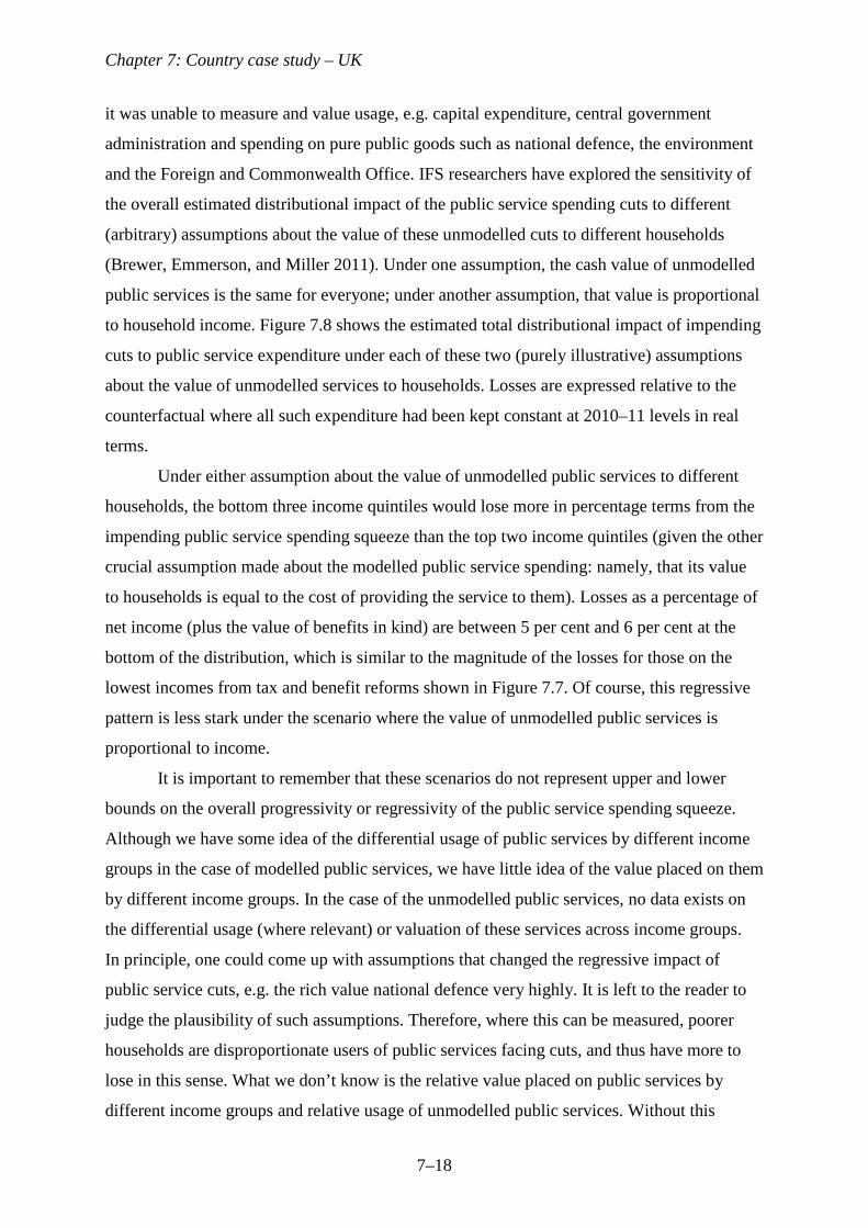
to household income. Figure 7.8 shows the estimated total distributional impact of impending
cuts to public service expenditure under each of these two (purely illustrative) assumptions
about the value of unmodelled services to households. Losses are expressed relative to the
counterfactual where all such expenditure had been kept constant at 2010–11 levels in real
terms.
Under either assumption about the value of unmodelled public services to different
households, the bottom three income quintiles would lose more in percentage terms from the
impending public service spending squeeze than the top two income quintiles (given the other
crucial assumption made about the modelled public service spending: namely, that its value
to households is equal to the cost of providing the service to them). Losses as a percentage of
net income (plus the value of benefits in kind) are between 5 per cent and 6 per cent at the
bottom of the distribution, which is similar to the magnitude of the losses for those on the
lowest incomes from tax and benefit reforms shown in Figure 7.7. Of course, this regressive
pattern is less stark under the scenario where the value of unmodelled public services is
proportional to income.
It is important to remember that these scenarios do not represent upper and lower
bounds on the overall progressivity or regressivity of the public service spending squeeze.
Although we have some idea of the differential usage of public services by different income
groups in the case of modelled public services, we have little idea of the value placed on them
by different income groups. In the case of the unmodelled public services, no data exists on
the differential usage (where relevant) or valuation of these services across income groups.
In principle, one could come up with assumptions that changed the regressive impact of
public service cuts, e.g. the rich value national defence very highly. It is left to the reader to
judge the plausibility of such assumptions. Therefore, where this can be measured, poorer
households are disproportionate users of public services facing cuts, and thus have more to
lose in this sense. What we don’t know is the relative value placed on public services by
different income groups and relative usage of unmodelled public services. Without this
Chapter 7: Country case study – UK
7–19
knowledge, it is impossible to be definitive about the distributional impact of the overall
fiscal consolidation.
<Figure 7.8 near here>
As mentioned above, the evolution of living standards in the near future will also depend
heavily on things less directly under the Government’s immediate control, most notably the
labour market recovery (or lack thereof). The UK Government’s independent fiscal watchdog
expects average real earnings among those employed to continue falling until 2013–14; and it
expects the unemployment rate in both 2011–12 and 2012–13 to be higher than in 2010–11
(before falling slowly), with cuts in general government employment to amount to about
400,000 jobs between 2010–11 and 2015–16 (Office for Budget Responsibility 2011). Such
macroeconomic forecasts are of course highly uncertain. But the signs are that the post-
recession years will continue to see much larger strains on people’s living standards than was
the case during the Great Recession itself.
7.4. Conclusions
During the Great Recession, UK GDP fell by over 6 per cent. Employment fell, and it fell by
more for the young, male and less educated. Hours worked amongst employees fell,
suggesting a rise in part-time working. It may thus be surprising to learn that average incomes
increased in the UK whilst the economy was contracting. However, in 2010-11 earnings, state
benefits and tax credits fell in real-terms. This is likely to have led to the largest drop in
average net household incomes in any single year since 1981, and would leave them at their
2003–04 level. It seems that the impact of the GR on net household incomes in the UK was
not felt until after the economy had stopped contracting. The pain was delayed, not avoided.
Between 2007–08 to 2010–11, the bottom half of the distribution caught up with the middle,
which led to declines in relative poverty, particularly amongst pensioners and families with
children. At the very top of the distribution, top incomes increased up to 2009–10, but seem
sure to have been hit by the introduction of the 50 pence tax rate in April 2010: by how much
is highly uncertain and will depend on how individuals’ behaviour responds. Trends in top
incomes will determine the path of overall measures of inequality, but it seems likely to be
higher than that seen in the mid-2000s.
Declines in living standards look set to continue until at least 2013–14. If realised, this
would mean that average living standards had not grown in well over ten years, making it one
of the worst decades for changes in living standards since at least the Second World War.
Chapter 7: Country case study – UK
7–20
This partly reflects expectations of continued falls in real earnings, as well as tax and benefit
reforms planned as part of the fiscal consolidation. Welfare cuts and tax rises will act to
reduce household incomes and those with the lowest incomes are clearly set to lose the most
from these reforms as a percentage of income (with the important exception of those with the
very highest incomes). This is likely to increase poverty, other things being equal, offsetting
some of the falls in poverty over the past decade. Though their distributional impact is harder
to quantify, large public service cuts will surely reduce living standards still further. The
Great Recession look set to cast a very long shadow in the UK.
References
Bell, D. and Blanchflower, D. (2011), ‘Young People and the Great Recession’, IZA
Discussion Paper 5674.
Berthoud, R. (2009) ‘Patterns of non-employment, and of disadvantage, in a recession’,
Economic and Labour Market Review, 3 (12): 62–73
Brewer, M., Browne, J., Joyce, R. and Sibieta, L. (2010), ‘Child poverty in the UK since
1998-99: lessons from the past decade’, Institute for Fiscal Studies Working Paper
10/23, London: Institute for Fiscal Studies.
Brewer, M. and Joyce, R. (2010), ‘Child and working-age poverty from 2010 to 2013’,
Institute for Fiscal Studies Briefing Note 115, London: Institute for Fiscal Studies.
Brewer, M. and Browne, J. (2009), ‘Can more revenue be raised by increasing income tax
rates for the very rich?’, Institute for Fiscal Studies Briefing Note 84, London:
Institute for Fiscal Studies.
Brewer, M., Emmerson, C., and Miller, H. (eds) (2011), The IFS Green Budget: February
2011, Institute for Fiscal Studies Commentary 117. London: Institute for Fiscal
Studies.
Brewer,M., Saez, E. and Shephard,A. (2009), ‘Means testing and tax rates on earnings’,
chapter in Mirrlees, J., Adam, S., Besley, T., Blundell, R., Bond, S., Chote, R.,
Gammie, M., Johnson, P., Myles, G. and Poterba, J. (eds.), Reforming the Tax System
for the 21st Century: The Mirrlees Review, Volume II: Dimensions of Tax Design.
London: Institute for Fiscal Studies.
Browne, J. and Phillips, D. (2010), ‘Tax and benefit reforms under Labour’, Institute for
Fiscal Studies Briefing Note 88, London: Institute for Fiscal Studies.
Chapter 7: Country case study – UK
7–21
Crawford, R., Emmerson, C., and Tetlow, G. (forthcoming), ‘Disease and cure in the UK:
The fiscal impact of the crisis and the policy response’, European Commission.
Department for Work and Pensions (2011), Households Below Average Income: An Analysis
of the Income Distribution 1994/95 – 2009/10, London: DWP.
Dolls, M., Fuest, C., and Peichl, A. (2009), ‘Automatic stabilizers and economic crisis: US
vs. Europe’, Discussion Paper 4917, IZA, Bonn. http://ftp.iza.org/dp4917.pdf
Gregg , P. and Wadsworth, J. (2010), ‘Unemployment and Inactivity in the 2008-2009
recession’, Economic and Labour Market Review, Volume 4 Number 8, August.
HM Treasury (2010), Spending Review 2010, Cm 7942.
http://cdn.hm-treasury.gov.uk/sr2010_completereport.pdf
International Monetary Fund (2010), ‘Fiscal exit: from strategy to implementation’, Fiscal
Monitor. http://www.imf.org/external/pubs/cat/longres.cfm?sk=24220
Jenkins, S. and Van Kerm, P. (2011), ‘Trends in individual income growth: measurement
methods and British evidence’, ISER Working Paper 2011/06.
http://www.iser.essex.ac.uk/pubs/workpaps/pdf/2011-06.pdf
Jin, W., Joyce, R., Phillips, D. and Sibieta, L. (2011), Poverty and inequality in the UK:
2011, Institute for Fiscal Studies Commentary 118. London: Institute for Fiscal
Studies.
Joyce, R. (2011), ‘Poverty projections between 2010-11 and 2013-14: a post-Budget 2011
update’, unpublished paper. London: Institute for Fiscal
Studies. http://www.ifs.org.uk/publications/5540
Muriel, A. and Sibieta, L. (2009), ‘Living Standards During Previous Recessions’, Institute
for Fiscal Studies Briefing Note 85. London: Institute for Fiscal Studies.
Office for Budget Responsibility (2011), Economic and Fiscal Outlook - March 2011, Cm
8036. http://budgetresponsibility.independent.gov.uk/wordpress/docs/economic_and_
fiscal_outlook_23032011.pdf
Chapter 7: Country case study – UK
7–22
Figure 7.1. UK GDP, Employment and Hours Worked During Great Recession
Source: Office for National Statistics, series ABMI. Authors calculations using the Labour Force Survey
92
94
96
98
100
102
104
2007Q1
2007Q2
2007Q3
2007Q4
2008Q1
2008Q2
2008Q3
2008Q4
2009Q1
2009Q2
2009Q3
2009Q4
2010Q1
2010Q2
2010Q3
2010Q4
2008
Q1=
100
Quarter
GDP Employment Hours per Worker
Recession
Chapter 7: Country case study – UK
7–23
Figure 7.2(a). Percentile Points of Full-Time Weekly Earnings during Great Recession
Source: Office for National Statistics, series CHAW for RPI. Authors’ calculations using the Labour Force Survey Notes: Real-terms index calculated using RPI All-Items quarterly index.
92
94
96
98
100
102
104
106
2007Q1
2007Q2
2007Q3
2007Q4
2008Q1
2008Q2
2008Q3
2008Q4
2009Q1
2009Q2
2009Q3
2009Q4
2010Q1
2010Q2
2010Q3
2010Q4
2008
Q1=
100
Quarter
P10 P50 P90
Recession
Chapter 7: Country case study – UK
7–24
Figure 7.2(b). Percentile Point Ratios during Great Recession
Source: Office for National Statistics, series CHAW for RPI. Authors calculations using the Labour Force Survey Notes: Real-terms index calculated using RPI All-Items quarterly index.
0
1
2
3
4
5
2007Q1
2007Q2
2007Q3
2007Q4
2008Q1
2008Q2
2008Q3
2008Q4
2009Q1
2009Q2
2009Q3
2009Q4
2010Q1
2010Q2
2010Q3
2010Q4
Rat
io
Quarter
p90/10 p90/50 p50/10
Recession
Chapter 7: Country case study – UK
7–25
Figure 7.3. Average real equivalised net household incomes in the UK, 2003–04 to 2010–11
Sources: Authors’ calculations using Family Resources Survey, various years. Note: Years refer to financial years. Data points for 2010–11, marked by dashed lines, are the results of simulations. Two scenarios are presented for mean income in 2010/11, to reflect the uncertainty over the evolution of top incomes: the scenarios correspond to real household income growth of 0% and -10% in the top 5 percentile groups of the distribution (see text).
95
100
105
110
2003 2004 2005 2006 2007 2008 2009 2010
Earn
ings
inde
x (2
003–
04 =
100
)
Median
Mean
Chapter 7: Country case study – UK
7–26
Figure 7.4. Composition of net (unequivalised) household income in Great Britain, 2003–04 to 2009–10
Sources: Authors’ calculations using Family Resources Survey, various years. Note: Years refer to financial years. Payments includes deductions from income, e.g. local taxes and pension contributions. High income individuals whose incomes are adjusted under official HBAI methodology are excluded. Income tax payments exclude income tax paid on taxable state benefits. State benefits are net of any such taxes paid.
.
-40
-30
-20
-10
0
10
20
30
40
50
60
70
80
90
100
110
120
130
140
2003 2004 2005 2006 2007 2008 2009
Per
cent
age
of to
tal n
et h
ouse
hold
inco
me
Income tax, social insurance
Payments
Gross earnings
Savings, investments, occupational
State benefits, tax credits
Gross self-employment profits
Other
Income tax, social insurance
Payments
Gross earnings
Savings, investments, occupational
State benefits, tax credits
Gross self-employment profits
Other
Chapter 7: Country case study – UK
7–27
Figure 7.5. Real income growth by percentile point, 2007–08 to 2010-11
Source: Authors’ calculations using Family Resources Survey, 2007–08, 2008–09 and 2009–10. Note: Simulated income growth at points above the 95th percentile is not shown due to uncertainty over the evolution of top incomes.
-8%
-4%
0%
4%
8%
10 20 30 40 50 60 70 80 90
Inco
me
chan
ge (%
)
2007-08 to 2008-09 2008-09 to 2009-10
2009-10 to 2010-11 (simulated) 2007-08 to 2010-11 (simulated)
Percentile point
Chapter 7: Country case study – UK
7–28
Figure 7.6. Household net income inequality in Great Britain, 2000–01 to 2010–11
Sources: Authors’ calculations using Family Resources Survey, various years. Note: Years refer to financial years. Data points for 2010–11, marked by dotted lines, are the results of simulations. Two scenarios are presented for the Gini coefficient in 2010/11, to reflect the uncertainty over the evolution of top incomes: the scenarios correspond to real household income growth of 0% and -10% in the top 5 percentile groups of the distribution (see text).
0.20
0.22
0.24
0.26
0.28
0.30
0.32
0.34
0.36
0.38
0.40
1.5
2.0
2.5
3.0
3.5
4.0
4.5
2000 2001 2002 2003 2004 2005 2006 2007 2008 2009 2010
Gin
i coe
ffici
ent
Rat
io m
easu
re o
f ine
qual
ity
90/10 ratio 50/10 ratio 90/50 ratio Gini (right axis)
Chapter 7: Country case study – UK
7–29
Figure 7.7. Distributional impact of modelled tax and benefit reforms implemented between January 2011 and April 2014 in the UK, by income and family type.
Source: Institute for Fiscal Studies analysis based on the 2008–09 Expenditure and Food Survey: see presentation by James Browne after the March 2011 Budget at http://www.ifs.org.uk/publications/5524. Note: The unit of analysis is families, i.e. it is families rather than individuals who are grouped into decile groups on the basis of net equivalised household income. The equivalence scale used here is the modified OECD equivalence scale, which is used for official measures of poverty and inequality in the UK.
-10%
-8%
-6%
-4%
-2%
0%
Poorest 2 3 4 5 6 7 8 9 Richest All
Inco
me
chan
ge
Net income decile group
All family types Families with children Pensioners Others
Chapter 7: Country case study – UK
7–30
Figure 7.8. Distributional impact of changes to public service spending by 2014–15 in the UK under different arbitrary assumptions
Source: HM Treasury (2010) and Institute for Fiscal Studies: see presentation by Cormac O’Dea after the October 2010 Comprehensive Spending Review at http://www.ifs.org.uk/publications/5314. Note: The ‘unmodelled’ cuts to public service spending are cuts to capital expenditure, spending on pure public goods (e.g. national defence, the environment, the Foreign and Commonwealth Office) and central government administration costs. Estimated losses are expressed relative to the scenario where all public spending had remained constant in real terms.
-7%
-6%
-5%
-4%
-3%
-2%
-1%
0%
Poorest 2 3 4 Richest All
Gai
n/lo
ss a
s a
% o
f net
inco
me
and
bene
fits
in k
ind
Net income quintile group
Unmodelled cuts affect all equally in cash terms
Unmodelled cuts affect all in proportion to income
Chapter 7: Country case study – UK
7–31
Table 7.1. Employment Rates for Different Groups during the Great Recession (per cent)
Group 2007 2008 2009 2010
Change 2007-2010
percent points
Age and Sex Male (under 25) 68.4 66.7 61.3 61.8 -6.6 Male (25-44) 89.1 88.4 86.3 85.9 -3.2 Male (45-64) 76.8 77.2 76.0 75.4 -1.4 Male (Over 64) 9.9 10.5 10.3 11.3 +1.4 Female (under 25) 62.3 61.6 58.8 57.4 -4.9 Female (25-44) 73.7 74.0 73.4 73.0 -0.7 Female (45-59) 72.6 73.4 73.5 73.7 +1.1 Female (Over 59) 11.7 12.4 13.0 13.3 +1.6 Educational Qualifications
None 61.5 61.3 58.8 57.7 -3.8 Below Degree Level 78.2 78.2 76.0 75.0 -3.1 Degree or Equivalent 87.0 86.5 85.6 85.4 -1.6 All 61.0 61.0 59.7 59.4 -1.6
Source: Authors’ calculations using Labour Force Survey, 2007 Q1 to 2010 Q4. Note: Employment rates by educational qualifications are only shown for working-age adults. Educational qualifications are unknown or missing for about 1% of working-age adults, who are excluded from this classification.
Chapter 7: Country case study – UK
7–32
Table 7.2. Relative poverty in Great Britain (per cent), 2000–01 to 2010–11
Year Children Working-age parents
Working-age adults
without children
Pensioners All
Median income growth
2000–01 25.0 19.2 13.0 29.0 19.9 2.6 2001–02 25.8 20.2 12.6 29.8 20.3 5.4 2002–03 24.0 19.0 12.7 28.4 19.4 1.5 2003–04 23.6 18.9 13.0 26.1 19.0 -0.6 2004–05 22.8 17.9 12.8 24.8 18.3 1.2 2005–06 22.9 18.7 13.2 23.7 18.4 0.7 2006–07 23.6 18.8 13.1 26.8 19.1 0.6 2007–08 23.4 18.8 14.0 25.7 19.2 -0.1 2008–09 22.4 18.8 14.4 23.7 18.8 0.8 2009–10 20.4 17.4 14.8 20.9 17.7 0.5 2010–11 (simulated) 20.0 17.1 14.4 23.7 18.0 -3.5
Source: Authors’ calculations using Family Resources Survey, 2000–01 to 2009-10. Note: Poverty line in a given year is 60 per cent of the median household income in that year. Incomes have been equivalised using the square root of household size.