Embed Size (px)
Citation preview
7Building Float-Based Layouts
Chapter 12
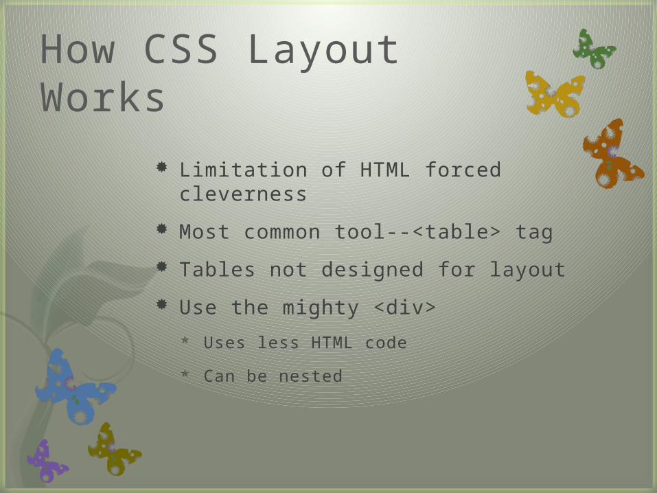
How CSS Layout Works
Limitation of HTML forced cleverness
Most common tool--<table> tag
Tables not designed for layout
Use the mighty <div>
Uses less HTML code
Can be nested
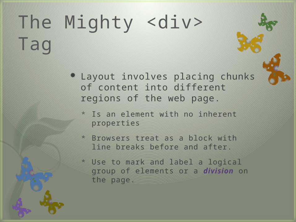
The Mighty <div> Tag
Layout involves placing chunks of content into different regions of the web page.
Is an element with no inherent properties
Browsers treat as a block with line breaks before and after.
Use to mark and label a logical group of elements or a division on the page.
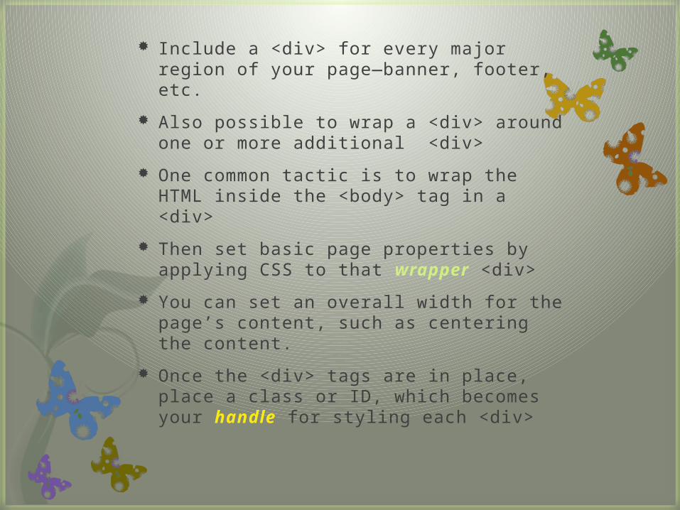
Include a <div> for every major region of your page—banner, footer, etc.
Also possible to wrap a <div> around one or more additional <div>
One common tactic is to wrap the HTML inside the <body> tag in a <div>
Then set basic page properties by applying CSS to that wrapper <div>
You can set an overall width for the page’s content, such as centering the content.
Once the <div> tags are in place, place a class or ID, which becomes your handle for styling each <div>
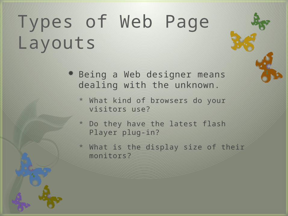
Types of Web Page Layouts
Being a Web designer means dealing with the unknown.
What kind of browsers do your visitors use?
Do they have the latest flash Player plug-in?
What is the display size of their monitors?
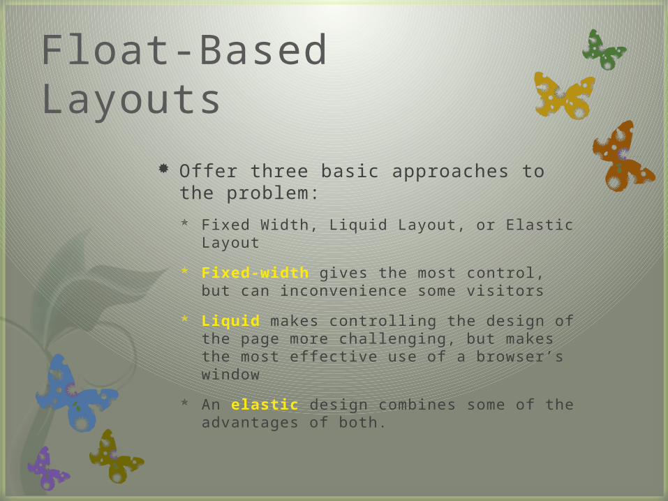
Float-Based Layouts
Offer three basic approaches to the problem:
Fixed Width, Liquid Layout, or Elastic Layout
Fixed-width gives the most control, but can inconvenience some visitors
Liquid makes controlling the design of the page more challenging, but makes the most effective use of a browser’s window
An elastic design combines some of the advantages of both.
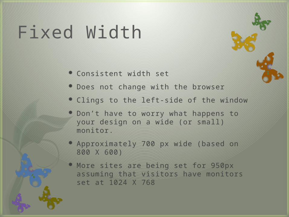
Fixed Width
Consistent width set
Does not change with the browser
Clings to the left-side of the window
Don’t have to worry what happens to your design on a wide (or small) monitor.
Approximately 700 px wide (based on 800 X 600)
More sites are being set for 950px assuming that visitors have monitors set at 1024 X 768
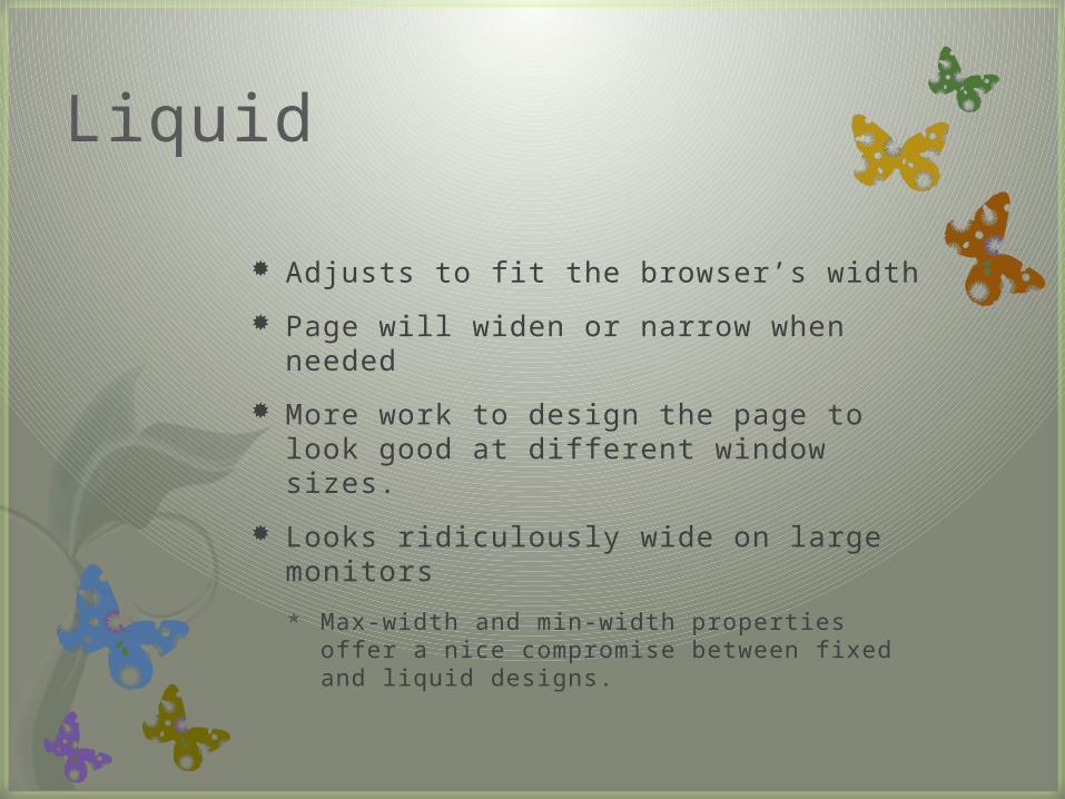
Liquid
Adjusts to fit the browser’s width
Page will widen or narrow when needed
More work to design the page to look good at different window sizes.
Looks ridiculously wide on large monitors
Max-width and min-width properties offer a nice compromise between fixed and liquid designs.
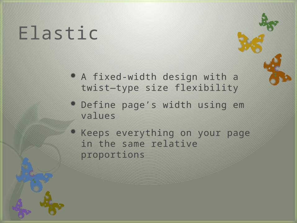
Elastic
A fixed-width design with a twist—type size flexibility
Define page’s width using em values
Keeps everything on your page in the same relative proportions
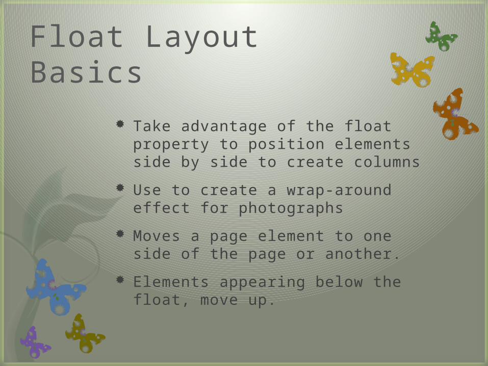
Float Layout Basics
Take advantage of the float property to position elements side by side to create columns
Use to create a wrap-around effect for photographs
Moves a page element to one side of the page or another.
Elements appearing below the float, move up.
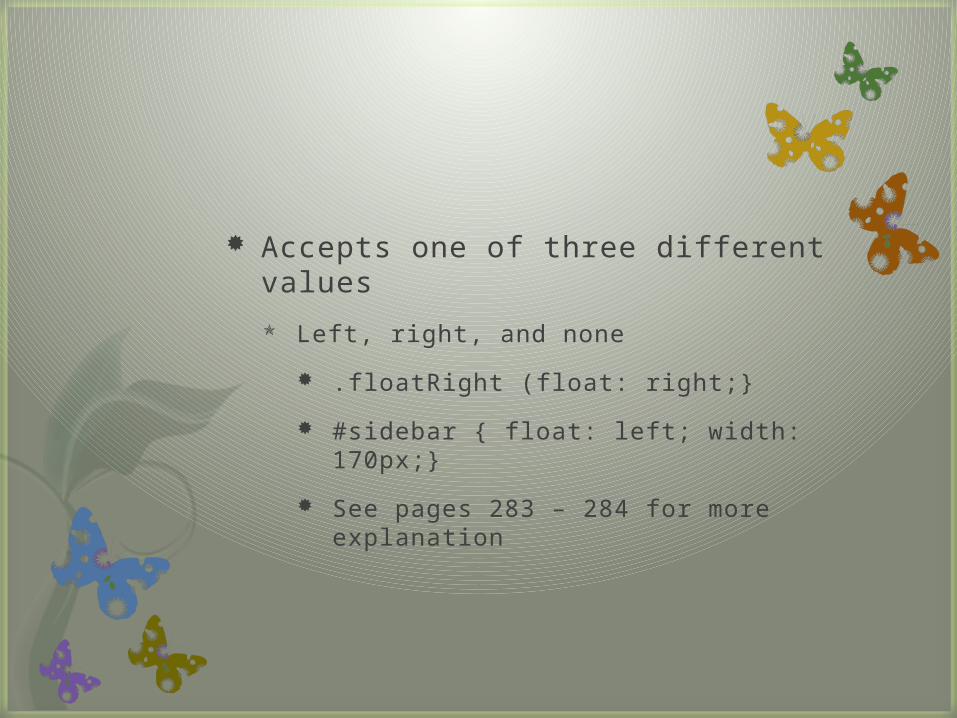
Accepts one of three different values
Left, right, and none
.floatRight (float: right;}
#sidebar { float: left; width: 170px;}
See pages 283 – 284 for more explanation
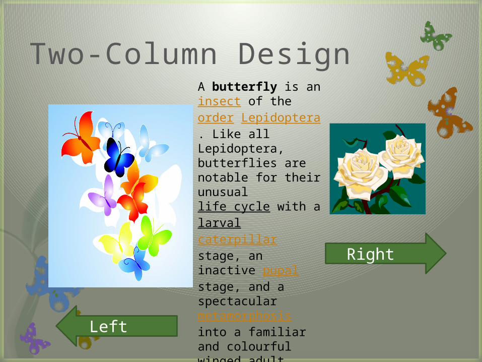
Two-Column Design
Left
Right
A butterfly is an insect of the order Lepidoptera. Like all Lepidoptera, butterflies are notable for their unusual life cycle with a larval caterpillar stage, an inactive pupal stage, and a spectacular metamorphosis into a familiar and colourful winged adult form. Most species are day-flying so they regularly attract attention.
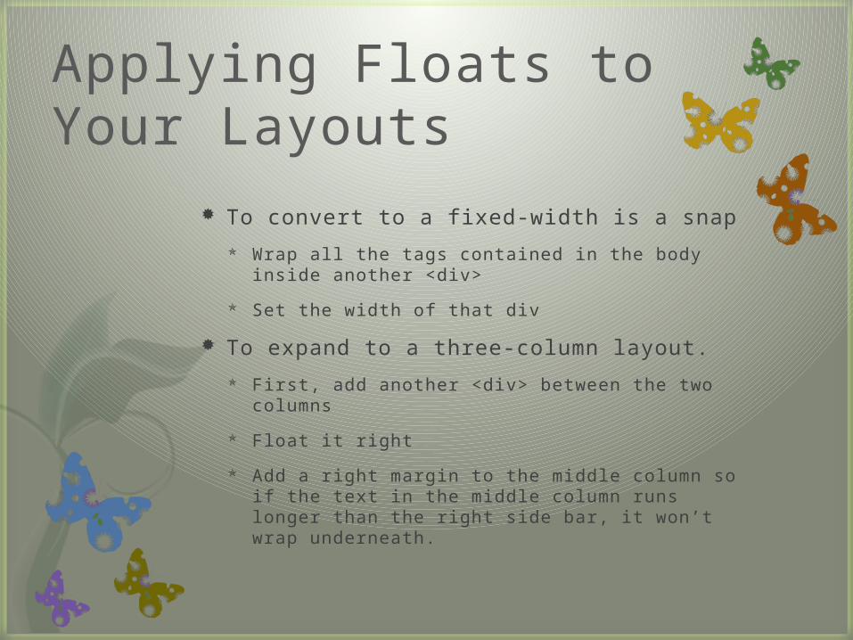
Applying Floats to Your Layouts
To convert to a fixed-width is a snap
Wrap all the tags contained in the body inside another <div>
Set the width of that div
To expand to a three-column layout.
First, add another <div> between the two columns
Float it right
Add a right margin to the middle column so if the text in the middle column runs longer than the right side bar, it won’t wrap underneath.
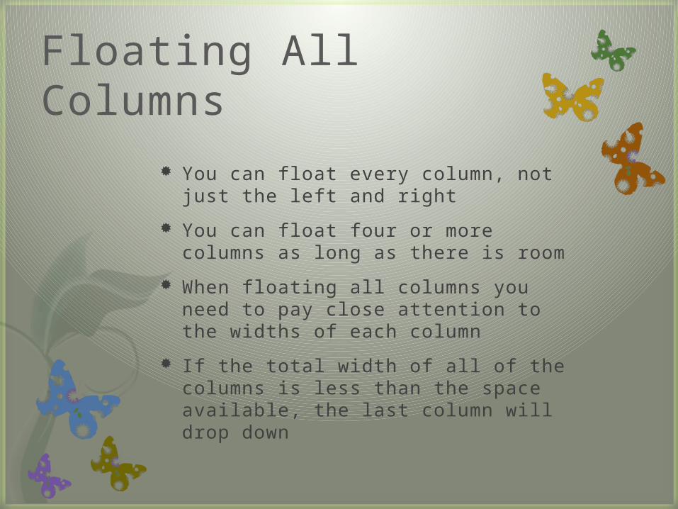
Floating All Columns
You can float every column, not just the left and right
You can float four or more columns as long as there is room
When floating all columns you need to pay close attention to the widths of each column
If the total width of all of the columns is less than the space available, the last column will drop down
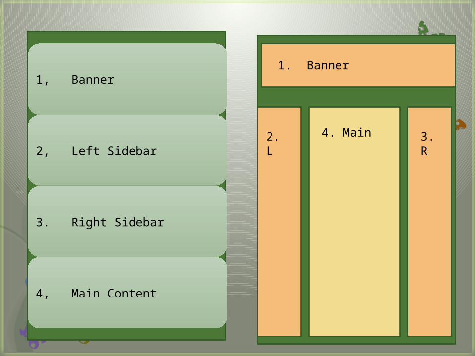
1, Banner
2, Left Sidebar
3. Right Sidebar
4, Main Content
1. Banner
2. L 3. R
4. Main
Because of the way floated elements work, they must appear before any content that wraps around them.
Screen readers must read all of the advertisements, etc. before the main content. Using CSS skips this issue
Search engines read a limited amount of data on a page. They also give more value to data at the top of a page
If you are concerned about getting good placement within a search engine’s results, place your main content close to the top of the page.
Floats Within Floats
Although a bit confusing, it is helpful in a number of instances
1. Lets you add columns within a column
2. Can create very complex designs
3. Makes calculating the widths of a page element easier
4. Good way to control float drops
Using Negative Margins to Position Elements
Allows you to place your <div> tags in any order you wish in the HTML
Then position them in a different order onscreen
This keeps your pages accessible to screen readers, text browsers, and search engins.
Since you don’t have to worry about source order, you can always change the design of a page without having to change the HTML
See pages 289 - 292
Overcoming Float Problems
Clearing and Containing Floats
Because some columns will be shorter than others, you may not want elements to float up under them. Using the clear property usually helps to prevent this.
Make an element drop below a left-float using {clear: left;}
For footers and elements that need to appear at the bottom of the page, you should use {clear: both}
Containing Floats
There are three ways to tackle the problem of renegade floating elements—elements that pop out of the container
Add a clearing element at the bottom of the containing div
Float the containing element
Use the “easy clearing method”
Adding a clearing element
Add a tag such as a line break or horizontal rule to the last item in the <div> containing the floated element.
Then use the clear property to force the extra tag below the float.
br.clear {clear: both;}
Float the containing Element
A floated container <div> expands to fully contain any floated elements inside it.
Placing your floated elements inside a floating <div> is a simple solution
Use the “Easy Clearing Method”
Add a few styles and a class name to the <div> tag containing the floated element
You must add three different styles to your style sheet:
One applies to Firefox, Safari, Opera and other modern browsers; another style applies to IE7; and the lasts style makes IE6 and IE5 behave
See page 295
Creating Full-Height Columns
HTML tables aren’t great for Web page layout for several reasons:
They add lots of code
They are diffi cult to update
They do not work well on alternative-browsers like those used by cellphones
They DO have one thing going for them—equal-height columns
CSS floats fall short in this regard
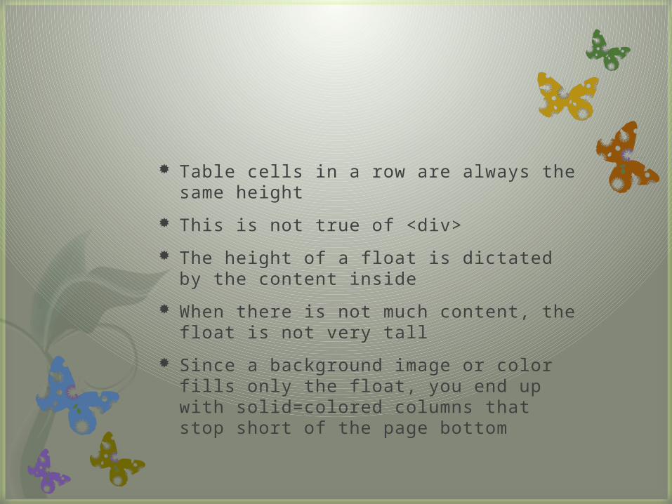
Table cells in a row are always the same height
This is not true of <div>
The height of a float is dictated by the content inside
When there is not much content, the float is not very tall
Since a background image or color fills only the float, you end up with solid=colored columns that stop short of the page bottom
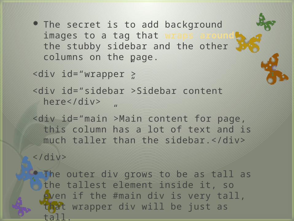
The secret is to add background images to a tag that wraps around the stubby sidebar and the other columns on the page.
<div id=“wrapper”>
<div id=“sidebar”>Sidebar content here</div>
<div id=“main”>Main content for page, this column has a lot of text and is much taller than the sidebar.</div>
</div>
The outer div grows to be as tall as the tallest element inside it, so even if the #main div is very tall, that wrapper div will be just as tall.
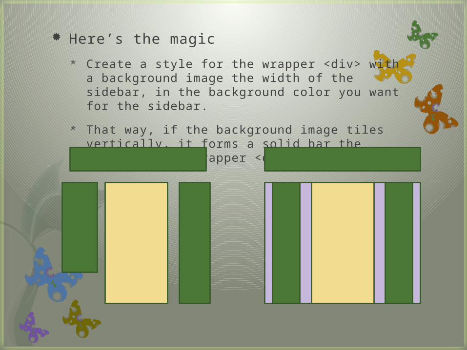
Here’s the magic
Create a style for the wrapper <div> with a background image the width of the sidebar, in the background color you want for the sidebar.
That way, if the background image tiles vertically, it forms a solid bar the height of the wrapper <div>
Preventing Float Drops
Suddenly, one of your columns simply drops down below the others
It looks like there is plenty of room, but they don’t
You have the dreaded FLOAT DROP
A floated column drops down because there is not enough room for it to fit.
Be careful if you set widths for each column
If the available space in the browser window (or containing block is in a fixed width design) is less than the total widths of the columns, you are asking for a float drop.
Keep the CSS box model in mind: the width of an element displayed in the browser window is not the same as its width property.
The displayed width of any element is a combination of its width, left and right border sizes, left and right padding, and left and right margins.
For the columns to fit, the browser window (or containing block) must accommodate the combined total of all of those widths.
Here are a few other culprits
Rounding errors in percentage widths
Browsers sometimes make mistakes when calculating the actual number of pixels needed to display the page—they round numbers up
IE’s double-margin bug—It doubles the margins applied to floated elements
IE’s 3-pixel gap—Will add 3 pixels to the side of a float.
Italic text—IE strikes again. If a float contains italicized text, then IE 6 sometimes makes the float wider.
Handling IE Bugs
Double-Margin Bug
Problem only occurs when the margin’s in the same direction as the float—left margin on a left float and it doubles the margins width.
Solution: add display: inline; to the style of the floated element.
3-Pixel Gaps
IE6 and earlier insert an additional 3 pixels of space between a floated column and a non-floated column
Solution—Live with it. If that does not suit you, add layout to the non-floated element.
What if the non-floated column has a set width or height
The 3-pixel gap will appear between the two columns, this can cause the second column to drop
Solution: float all of the columns.
The Guillotine Bug:
If the bottom part of a floated element just disappears. Visit www.positioniseverything.net/explorer/guillotine.html
Content inside a floated element doesn’t appear:
The peak-a-boo bug. Learn more at
www.positioniseverything.net/explorer/peekaboo.html