Embed Size (px)
Citation preview
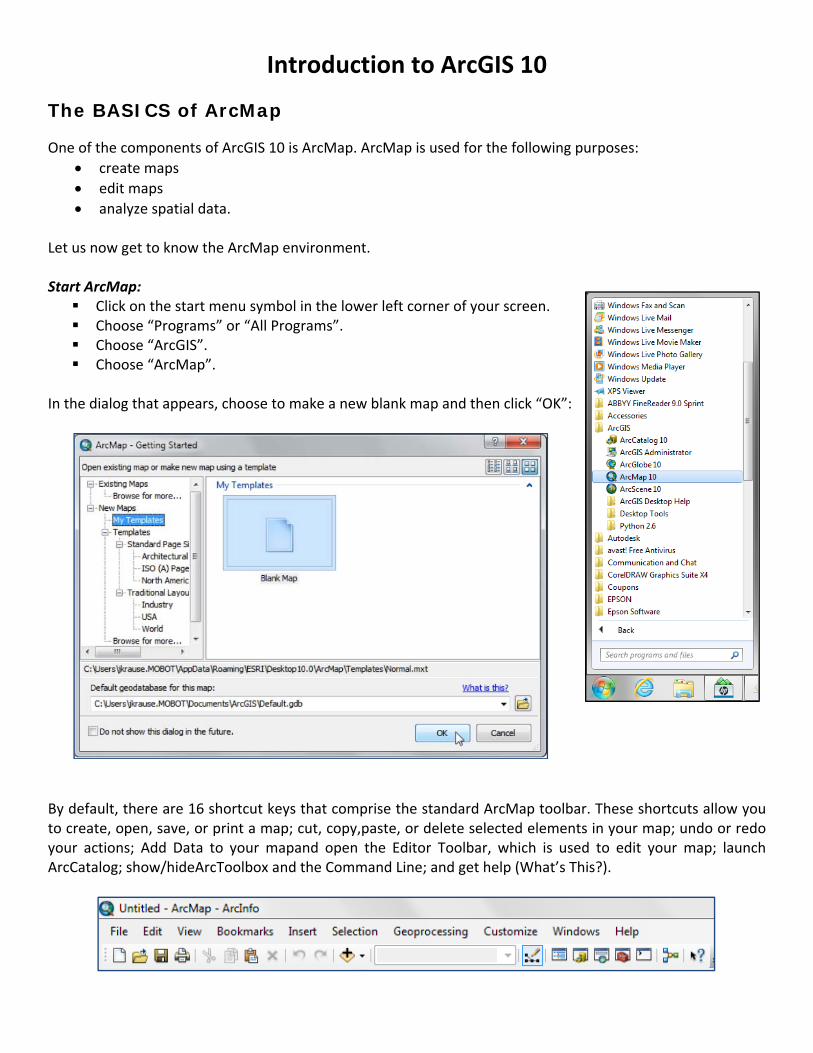
Introduction to ArcGIS 10
The BASICS of ArcMap
One of the components of ArcGIS 10 is ArcMap. ArcMap is used for the following purposes: • create maps • edit maps • analyze spatial data.
Let us now get to know the ArcMap environment. Start ArcMap:
Click on the start menu symbol in the lower left corner of your screen. Choose “Programs” or “All Programs”. Choose “ArcGIS”. Choose “ArcMap”.
In the dialog that appears, choose to make a new blank map and then click “OK”:
By default, there are 16 shortcut keys that comprise the standard ArcMap toolbar. These shortcuts allow you to create, open, save, or print a map; cut, copy,paste, or delete selected elements in your map; undo or redo your actions; Add Data to your mapand open the Editor Toolbar, which is used to edit your map; launch ArcCatalog; show/hideArcToolbox and the Command Line; and get help (What’s This?).
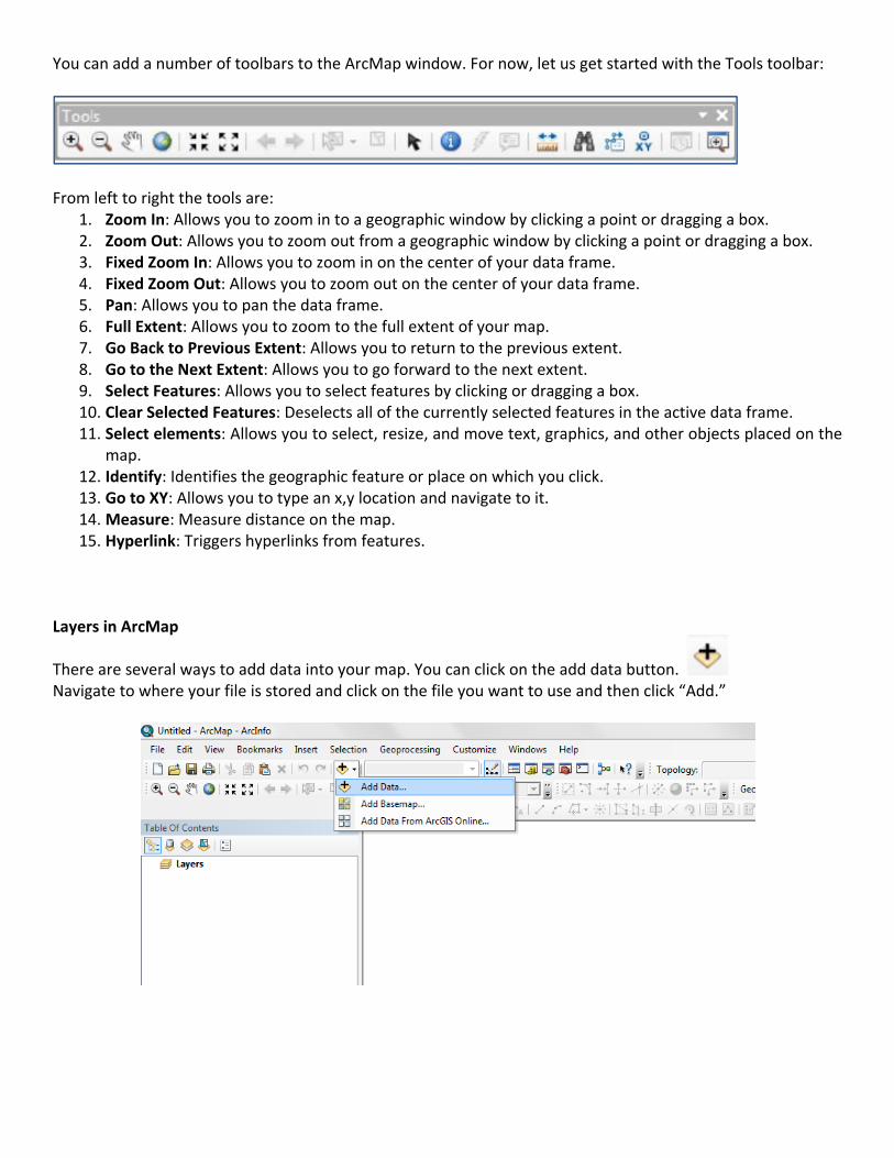
You can add a number of toolbars to the ArcMap window. For now, let us get started with the Tools toolbar:
From left to right the tools are:
1. Zoom In: Allows you to zoom in to a geographic window by clicking a point or dragging a box. 2. Zoom Out: Allows you to zoom out from a geographic window by clicking a point or dragging a box. 3. Fixed Zoom In: Allows you to zoom in on the center of your data frame. 4. Fixed Zoom Out: Allows you to zoom out on the center of your data frame. 5. Pan: Allows you to pan the data frame. 6. Full Extent: Allows you to zoom to the full extent of your map. 7. Go Back to Previous Extent: Allows you to return to the previous extent. 8. Go to the Next Extent: Allows you to go forward to the next extent. 9. Select Features: Allows you to select features by clicking or dragging a box. 10. Clear Selected Features: Deselects all of the currently selected features in the active data frame. 11. Select elements: Allows you to select, resize, and move text, graphics, and other objects placed on the
map. 12. Identify: Identifies the geographic feature or place on which you click. 13. Go to XY: Allows you to type an x,y location and navigate to it. 14. Measure: Measure distance on the map. 15. Hyperlink: Triggers hyperlinks from features.
Layers in ArcMap There are several ways to add data into your map. You can click on the add data button. Navigate to where your file is stored and click on the file you want to use and then click “Add.”
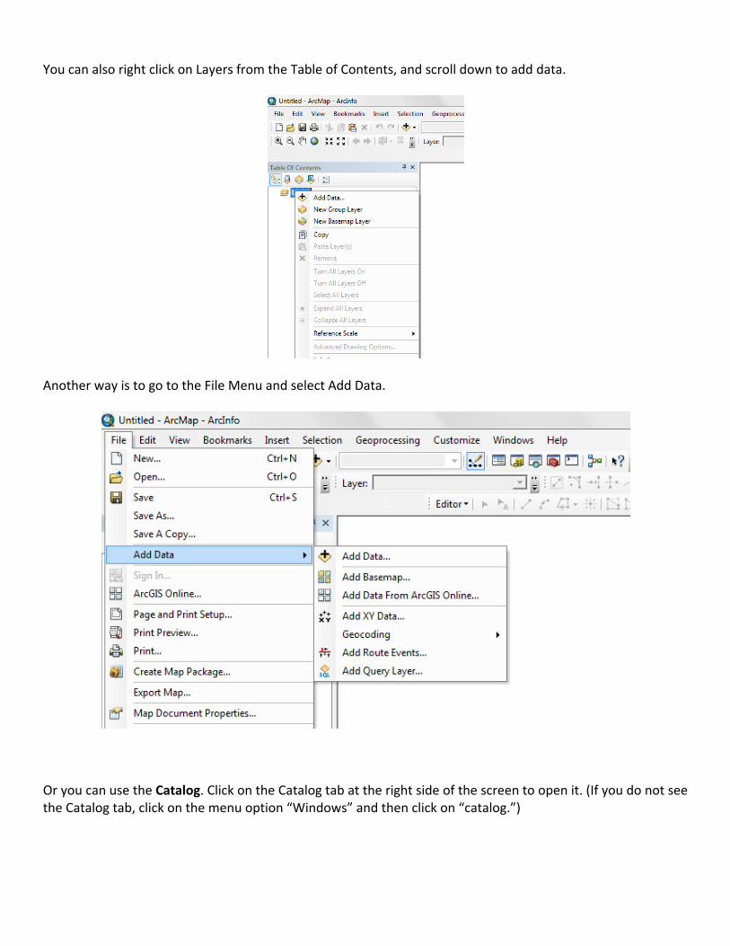
You can also right click on Layers from the Table of Contents, and scroll down to add data.
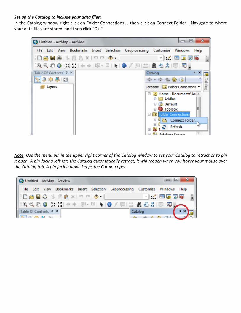
Another way is to go to the File Menu and select Add Data.
Or you can use the Catalog. Click on the Catalog tab at the right side of the screen to open it. (If you do not see the Catalog tab, click on the menu option “Windows” and then click on “catalog.”)
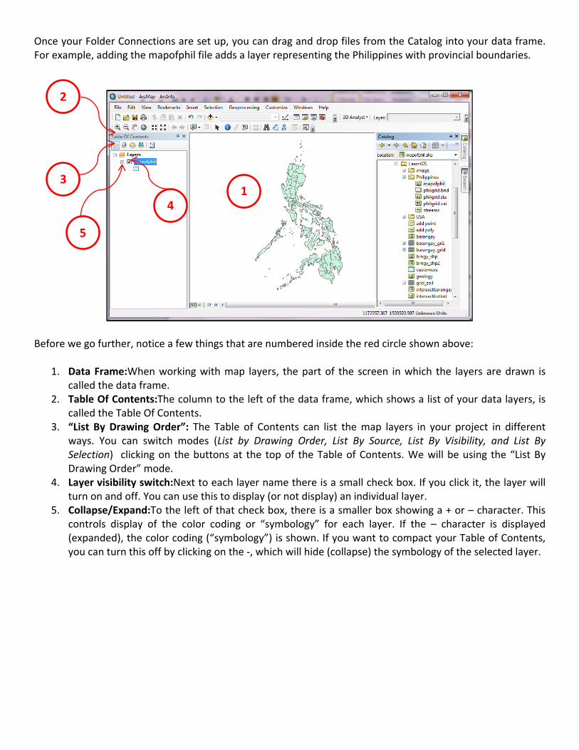
Set up the Catalog to include your data files: In the Catalog window right‐click on Folder Connections…, then click on Connect Folder… Navigate to where your data files are stored, and then click “Ok.”
Note: Use the menu pin in the upper right corner of the Catalog window to set your Catalog to retract or to pin it open. A pin facing left lets the Catalog automatically retract; it will reopen when you hover your mouse over the Catalog tab. A pin facing down keeps the Catalog open.
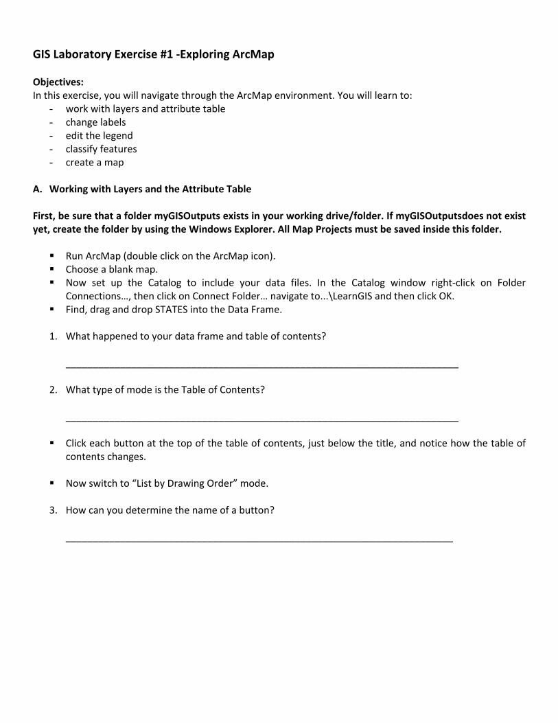
Once your Folder Connections are set up, you can drag and drop files from the Catalog into your data frame. For example, adding the mapofphil file adds a layer representing the Philippines with provincial boundaries.
2
3
4
5
1
Before we go further, notice a few things that are numbered inside the red circle shown above:
1. Data Frame:When working with map layers, the part of the screen in which the layers are drawn is called the data frame.
2. Table Of Contents:The column to the left of the data frame, which shows a list of your data layers, is called the Table Of Contents.
3. “List By Drawing Order”: The Table of Contents can list the map layers in your project in different ways. You can switch modes (List by Drawing Order, List By Source, List By Visibility, and List By Selection) clicking on the buttons at the top of the Table of Contents. We will be using the “List By Drawing Order” mode.
4. Layer visibility switch:Next to each layer name there is a small check box. If you click it, the layer will turn on and off. You can use this to display (or not display) an individual layer.
5. Collapse/Expand:To the left of that check box, there is a smaller box showing a + or – character. This controls display of the color coding or “symbology” for each layer. If the – character is displayed (expanded), the color coding (“symbology”) is shown. If you want to compact your Table of Contents, you can turn this off by clicking on the ‐, which will hide (collapse) the symbology of the selected layer.
GIS Laboratory Exercise #1 ‐Exploring ArcMap Objectives: In this exercise, you will navigate through the ArcMap environment. You will learn to:
- work with layers and attribute table - change labels - edit the legend - classify features - create a map
A. Working with Layers and the Attribute Table
First, be sure that a folder myGISOutputs exists in your working drive/folder. If myGISOutputsdoes not exist yet, create the folder by using the Windows Explorer. All Map Projects must be saved inside this folder.
Run ArcMap (double click on the ArcMap icon). Choose a blank map. Now set up the Catalog to include your data files. In the Catalog window right‐click on Folder
Connections…, then click on Connect Folder… navigate to...\LearnGIS and then click OK. Find, drag and drop STATES into the Data Frame.
1. What happened to your data frame and table of contents?
________________________________________________________________________
2. What type of mode is the Table of Contents? ________________________________________________________________________
Click each button at the top of the table of contents, just below the title, and notice how the table of contents changes.
Now switch to “List by Drawing Order” mode.
3. How can you determine the name of a button? _______________________________________________________________________
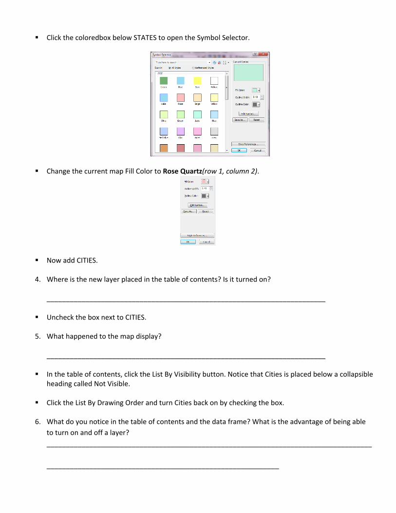
Click the coloredbox below STATES to open the Symbol Selector.
Change the current map Fill Color to Rose Quartz(row 1, column 2).
Now add CITIES.
4. Where is the new layer placed in the table of contents? Is it turned on? ________________________________________________________________________
Uncheck the box next to CITIES.
5. What happened to the map display? ________________________________________________________________________
In the table of contents, click the List By Visibility button. Notice that Cities is placed below a collapsible
heading called Not Visible.
Click the List By Drawing Order and turn Cities back on by checking the box.
6. What do you notice in the table of contents and the data frame? What is the advantage of being able to turn on and off a layer? ____________________________________________________________________________________ ____________________________________________________________
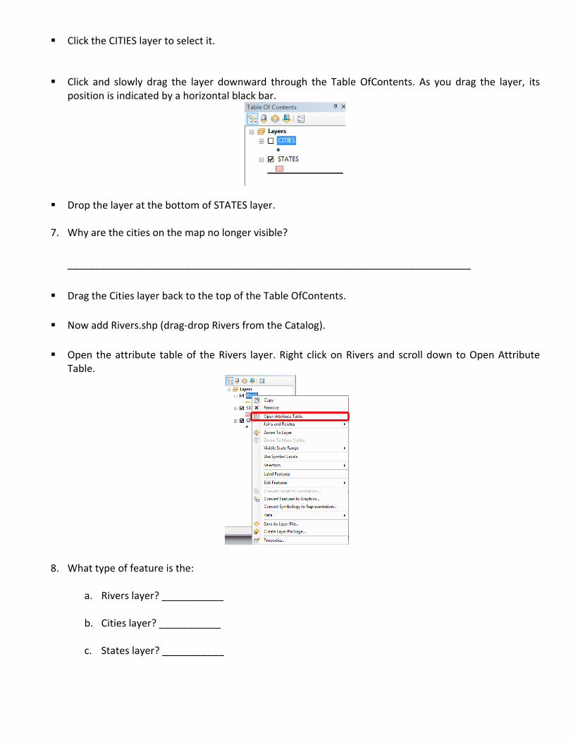
Click the CITIES layer to select it.
Click and slowly drag the layer downward through the Table OfContents. As you drag the layer, its position is indicated by a horizontal black bar.
Drop the layer at the bottom of STATES layer.
7. Why are the cities on the map no longer visible? ________________________________________________________________________
Drag the Cities layer back to the top of the Table OfContents.
Now add Rivers.shp (drag‐drop Rivers from the Catalog).
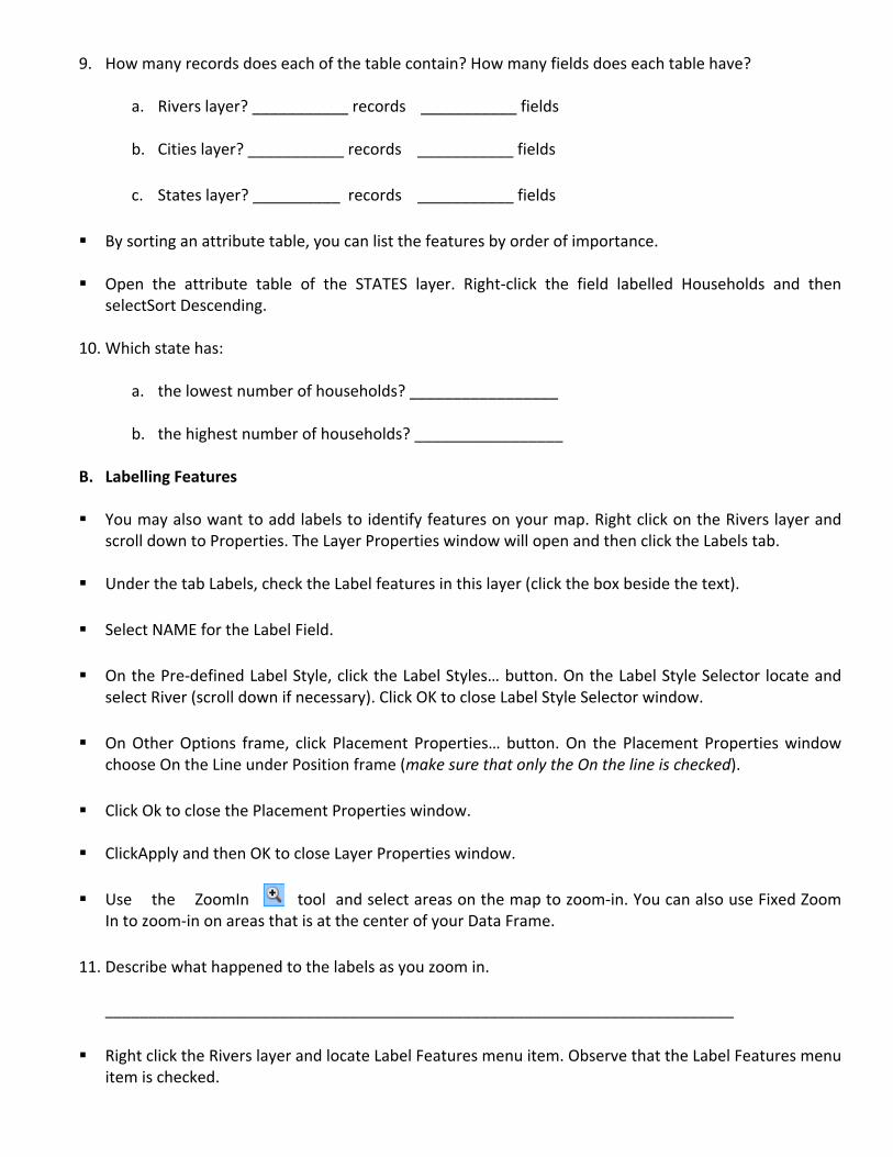
Open the attribute table of the Rivers layer. Right click on Rivers and scroll down to Open Attribute Table.
8. What type of feature is the:
a. Rivers layer? ___________
b. Cities layer? ___________
c. States layer? ___________
9. How many records does each of the table contain? How many fields does each table have?
a. Rivers layer? ___________ records ___________ fields
b. Cities layer? ___________ records ___________ fields
c. States layer? __________ records ___________ fields
By sorting an attribute table, you can list the features by order of importance.
Open the attribute table of the STATES layer. Right‐click the field labelled Households and then selectSort Descending.
10. Which state has:
a. the lowest number of households? _________________
b. the highest number of households? _________________
B. Labelling Features
You may also want to add labels to identify features on your map. Right click on the Rivers layer and scroll down to Properties. The Layer Properties window will open and then click the Labels tab.
Under the tab Labels, check the Label features in this layer (click the box beside the text).
Select NAME for the Label Field.
On the Pre‐defined Label Style, click the Label Styles… button. On the Label Style Selector locate and select River (scroll down if necessary). Click OK to close Label Style Selector window.
On Other Options frame, click Placement Properties… button. On the Placement Properties window choose On the Line under Position frame (make sure that only the On the line is checked).
Click Ok to close the Placement Properties window.
ClickApply and then OK to close Layer Properties window.
Use the ZoomIn tool and select areas on the map to zoom‐in. You can also use Fixed Zoom In to zoom‐in on areas that is at the center of your Data Frame.
11. Describe what happened to the labels as you zoom in. ________________________________________________________________________
Right click the Rivers layer and locate Label Features menu item. Observe that the Label Features menu item is checked.
Uncheck Label Features to remove the labels on the map.
Click the Full Extent tool to view the full extent of the map.
C. Editing the Legend
You may want to create color‐coded visualizations of some of your variables. For example, you want to represent the different states by having each its own color. To perform this, you need to modify the layer’s Symbology. Symbology is based on the layer’s attributes. So if you want to give each state its own color, you need an attribute that has unique values for each feature. This is commonly a name or ID attribute.
In the Table OfContents, double‐click the STATES layer to open the Layer Properties dialog box.
Click the Symbology tab, if necessary.
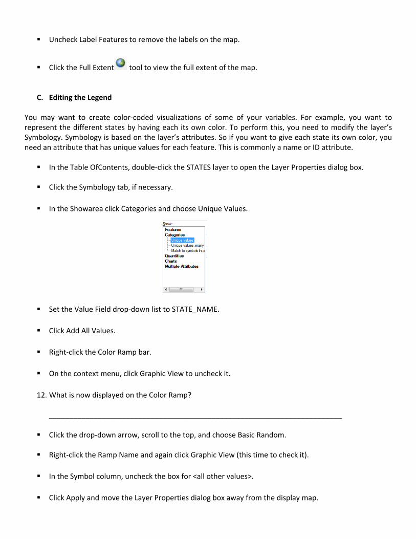
In the Showarea click Categories and choose Unique Values.
Set the Value Field drop‐down list to STATE_NAME.
Click Add All Values.
Right‐click the Color Ramp bar.
On the context menu, click Graphic View to uncheck it.
12. What is now displayed on the Color Ramp?
________________________________________________________________________
Click the drop‐down arrow, scroll to the top, and choose Basic Random.
Right‐click the Ramp Name and again click Graphic View (this time to check it).
In the Symbol column, uncheck the box for <all other values>.
Click Apply and move the Layer Properties dialog box away from the display map.
13. What appeared in the Table of Contents? ________________________________________________________________________
Rename the heading under the Label column from STATE_NAME to US States.
Click outside the heading edited text or press ENTER. Now the heading has been renamed.
14. Describe another way of renaming the heading. _______________________________________________________________________
Save your map.
Click the save button or go to File‐>Save menu.
Name the file US States with River.
Remember to save in ..\myGISOutputs folder.
D. Classifying Features
Features can also be symbolized using quantitative attributes. When symbolizing quantities, you want to see how attributes relate to one another in a continuous scale. To do this, your data need to be grouped into classes.ArcMap has 6 pre‐defined classification schemes:
1. Natural Breaks (Jenks): Classifies data based on natural groups inherent to the data. Boundaries are set
where there are big jumps between the data values. This is the default method inArcGIS. 2. Quantiles: Each class contains an equal number of features. It contains unequal‐sized intervals. This
classification scheme is most suited to linearly distributed data. 3. Equal Interval: Bases classification on equal‐sized intervals, with the number of classes defined by the
user. 4. Defined Interval: This classification scheme is similar to equal interval, except the number of intervals
determines the classes. 5. Standard Deviation: This classification scheme shows how much of the attribute’s values varies from the
mean. ArcMap calculates the statistical mean. The number of intervals determines the classes 6. Manual: You determine your own break.
Add COUNTIESshape file to the Table OfContents.
Right‐click on the COUNTIES layer and click on Properties.
Click on the Symbology tab.
Next, click on Quantities ‐ Graduated Colors.
Under Value from the Fields group, select POP1997.
15. What is the default classification displayed? Do you think this is appropriate? ________________________________________________________________________
Change the color scheme to Orange Light to Dark.(Note: You can view the text mode of the color scheme by right clicking on the Color Ramp and uncheck Graphic View from the pop‐up menu.)
Click Apply.
Click the Classify button.
16. List down the Classification Statistics shown:
a. Count: _________
b. Minimum: _________
c. Maximum: __________
d. Sum: _________
e. Mean: _________
f. Median: _________
g. Standard Deviation: _________
Close the Classification and Layer Properties windows.
Be sure that only the COUNTIES layer is visible. Use the Select by Rectangle buttonlocate and click on the darkest portion of the map (Hint: south‐western part of the USA).Right‐click on the selected
feature and click Zoom to Selected Features .Using the Identity Tool click on the selected feature.
17. What is the name of the county identified as the most populated?
_______________________________________________________________________
Deselect selected features by clicking Clear Selected Features button. Save your map and name it as US Counties in ..\myGISOutputs.
Close ArcMap.
E. Creating a Printable Map
Now that you have familiarized the ArcMap environment, you have to make your own map layout suitable for printout.
Start ArcMap (choose a blank map if necessary).
Open the Catalog window.
Click on Folder Connections. Navigate to ..\LearnGIS folder.
Navigate and expand the folder Philippines and drag‐drop mapofphil on the Data Frame.
Change the Symbology to Unique Values.Select REGION under the Value Field.Choose Basic Random for the color scheme.
Click on the Add All Values and uncheck the <all other values>. Click OK to close the Layer Properties dialog box.
Savethe map document in your ..\myGISOutputs folder as MyPhilippinesMapLayout.
At present, your ArcMap view is the Data View. In order to change the view to the Layout View, click View menu and select Layout View or simply click the icon located at the bottom‐left of the Map Viewer.
Change the map orientation from portrait to landscape (Hint: click the menu File‐>Page and Print Setupand then change the orientation from Portrait to Landscape).
Accept the other default settings and click OK.
From the Customize menu, choose ArcMap Options.
On the ArcMap Options dialog box, click the Layout View tab and change the units from inches to centimeters.
In the Snap elements to area, check the box for Guides.
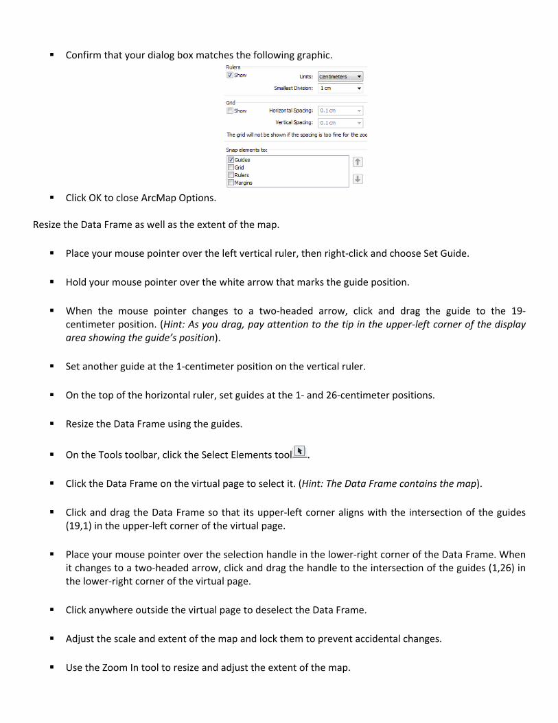
Confirm that your dialog box matches the following graphic.
Click OK to close ArcMap Options.
Resize the Data Frame as well as the extent of the map.
Place your mouse pointer over the left vertical ruler, then right‐click and choose Set Guide.
Hold your mouse pointer over the white arrow that marks the guide position.
When the mouse pointer changes to a two‐headed arrow, click and drag the guide to the 19‐
centimeter position. (Hint: As you drag, pay attention to the tip in the upper‐left corner of the display area showing the guide’s position).
Set another guide at the 1‐centimeter position on the vertical ruler.
On the top of the horizontal ruler, set guides at the 1‐ and 26‐centimeter positions.
Resize the Data Frame using the guides.
On the Tools toolbar, click the Select Elements tool .
Click the Data Frame on the virtual page to select it. (Hint: The Data Frame contains the map).
Click and drag the Data Frame so that its upper‐left corner aligns with the intersection of the guides (19,1) in the upper‐left corner of the virtual page.
Place your mouse pointer over the selection handle in the lower‐right corner of the Data Frame. When it changes to a two‐headed arrow, click and drag the handle to the intersection of the guides (1,26) in the lower‐right corner of the virtual page.
Click anywhere outside the virtual page to deselect the Data Frame.
Adjust the scale and extent of the map and lock them to prevent accidental changes.
Use the Zoom In tool to resize and adjust the extent of the map.
Confirm that all of Philippines is still included in the map extent.
Click outside the Data Frame to deselect it.
Open the Data Frame properties (Hint: Right‐click on the Data Frame and click Properties.) and click the Data Frame tab.
In the Extent area, click the drop‐down list and choose the Fixed Scale Option.
Click OK.
On the Layout toolbar, click the Zoom to 100% button. This displays the map’s actual output size.
On the Layout toolbar, click the Zoom Whole Page button. The map is shown at a reduced size.
Add elements to your map.
Add Title to the Map Layout
From the Insert menu, choose Title (type Regions in the Philippines).
Double‐click on the added Title and type on the Text with Regions in the Philippines.
Click Change Symbol.
On the Symbol Selector, choose a color, font, size, and style that you like. (Make sure that the title will be large enough to be recognizable.)
Click OK on the Symbol Selector and on the Properties dialog box.
Drag the title to an appropriate position, such as top‐left portion of the layout.
Right‐click the title, point to Align, and choose Align to Margins.
Right‐click the title again, point to Align, and choose Align Center.
Deselect the title.
Save your map.
Add a legend to your map.
From the Insert menu, choose Legend.
In the Legend Items, click mapofphil to select it.
Click Next to advance to the next panel.
In the Legend Title area, select and delete the default legend title, Legend.
Click Next.
Click Next to skip past the legend frame panel.
Click Next again to skip past the legend symbol patch panel.
On the final panel, click Finish to add the legend to the map.
Drag the selected legend to the lower‐left of the map.
Modify the legend.
Right‐click the legend to select it and choose Properties.
On the Legend Properties dialog box, if necessary, click the Legend tab.
In the Patch area, change the width to 15 pt and the height to 10 pt.
Click OK.
Select the legend.
Right‐click the legend and open its properties.
Click the Frame tab.
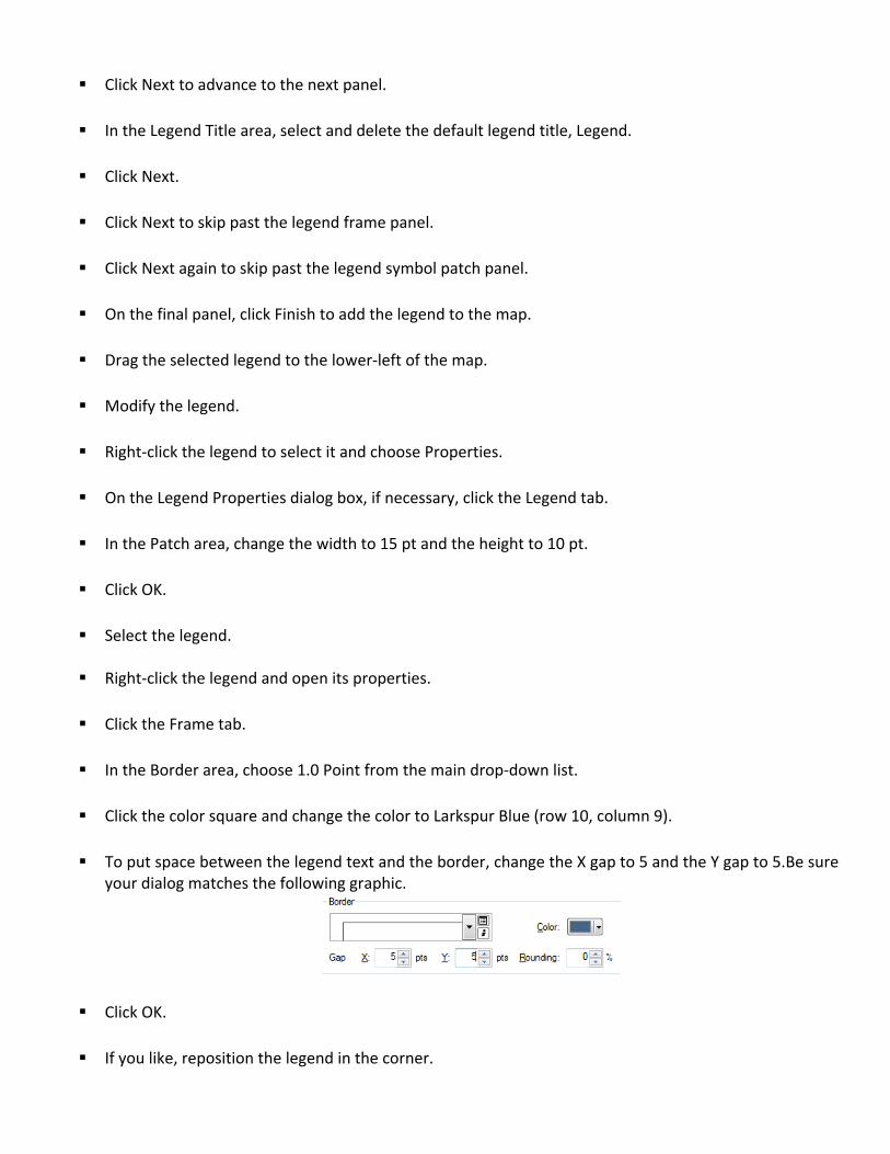
In the Border area, choose 1.0 Point from the main drop‐down list.
Click the color square and change the color to Larkspur Blue (row 10, column 9).
To put space between the legend text and the border, change the X gap to 5 and the Y gap to 5.Be sure
your dialog matches the following graphic.
Click OK.
If you like, reposition the legend in the corner.
Click outside the virtual page to deselect the legend.
Save the map.
You may add more map information like the North Arrow. Now try adding the Scale Bar and the Scale Text.
18. Describe what happened. Explain why the Scale Bar can’t be added into the map layout. _____________________________________________________________________________
Prepared by: Engr. Janice B. Jamora, MEng and Engr. Noel Navasca, CompE November 2012 References:
1. ArcGIS desktop II: Tools and Functionality by GEODATA, ESRI 2. Getting Started with GIS by Social Science and Data Software, Leland Standford Junior University 3. Mapping your Community with GIS