Embed Size (px)
Citation preview
51 . 3 + 52 . 1
december 2017april 2018
Visible Language the journal of visual communication research
ISSN 0022-2224
Published continuously since 1967.
Visible Language
the journal of visual communication research
special issue:
P r a c t i c e - l e d I c o n i c R e s e a r c h
December 2 0 1 7 – April 2 0 1 8
51 . 3 – 52 . 1
2 3
Special Issue: Practice-led
Icon
ic Research
Visible Language 51
.3 –
52
.1
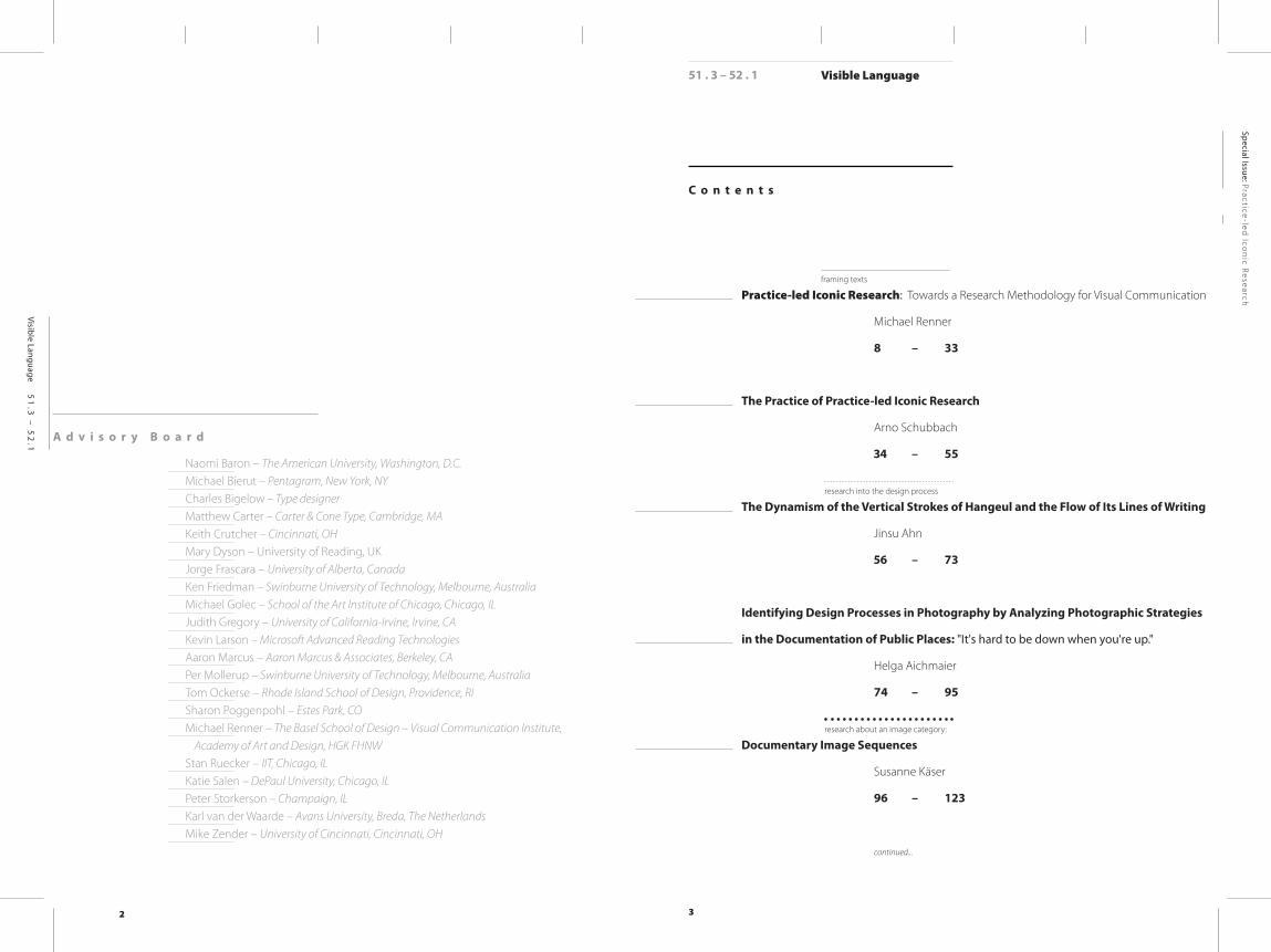
A d v i s o r y B o a r d
Naomi Baron – The American University, Washington, D.C.Michael Bierut – Pentagram, New York, NYCharles Bigelow – Type designerMatthew Carter – Carter & Cone Type, Cambridge, MAKeith Crutcher – Cincinnati, OHMary Dyson – University of Reading, UKJorge Frascara – University of Alberta, Canada Ken Friedman – Swinburne University of Technology, Melbourne, AustraliaMichael Golec – School of the Art Institute of Chicago, Chicago, ILJudith Gregory – University of California-Irvine, Irvine, CAKevin Larson – Microsoft Advanced Reading TechnologiesAaron Marcus – Aaron Marcus & Associates, Berkeley, CAPer Mollerup – Swinburne University of Technology, Melbourne, AustraliaTom Ockerse – Rhode Island School of Design, Providence, RISharon Poggenpohl – Estes Park, COMichael Renner – The Basel School of Design – Visual Communication Institute, Academy of Art and Design, HGK FHNWStan Ruecker – IIT, Chicago, ILKatie Salen – DePaul University, Chicago, ILPeter Storkerson – Champaign, ILKarl van der Waarde – Avans University, Breda, The NetherlandsMike Zender – University of Cincinnati, Cincinnati, OH
Practice-led Iconic Research: Towards a Research Methodology for Visual Communication
Michael Renner
8 – 33
The Practice of Practice-led Iconic Research
Arno Schubbach
34 – 55
The Dynamism of the Vertical Strokes of Hangeul and the Flow of Its Lines of Writing
Jinsu Ahn
56 – 73
Identifying Design Processes in Photography by Analyzing Photographic Strategies
in the Documentation of Public Places: "It's hard to be down when you're up."
Helga Aichmaier
74 – 95
Documentary Image Sequences Susanne Käser
96 – 123
continued...
Visible Language
C o n t e n t s
framing texts
research into the design process
research about an image category:
51 . 3 – 52 . 1
4 5
Special Issue: Practice-led
Icon
ic Research
Visible Language 51
.3 –
52
.1
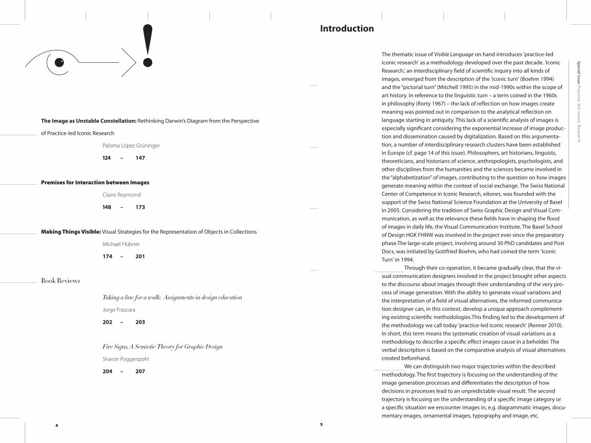
The Image as Unstable Constellation: Rethinking Darwin’s Diagram from the Perspective
of Practice-led Iconic Research
Paloma López Grüninger
124 – 147
Premises for Interaction between Images
Claire Reymond
148 – 173
Making Things Visible: Visual Strategies for the Representation of Objects in Collections
Michael Hübner
174 – 201
Book Reviews
Taking a line for a walk: Assignments in design education
Jorge Frascara
202 – 203
Fire Signs, A Semiotic Theory for Graphic Design
Sharon Poggenpohl
204 – 207
Introduction
The thematic issue of Visible Language on hand introduces 'practice-led iconic research' as a methodology developed over the past decade. 'Iconic Research,' an interdisciplinary field of scientific inquiry into all kinds of images, emerged from the description of the 'iconic turn' (Boehm 1994) and the “pictorial turn” (Mitchell 1995) in the mid-1990s within the scope of art history. In reference to the linguistic turn – a term coined in the 1960s in philosophy (Rorty 1967) – the lack of reflection on how images create meaning was pointed out in comparison to the analytical reflection on language starting in antiquity. This lack of a scientific analysis of images is especially significant considering the exponential increase of image produc-tion and dissemination caused by digitalization. Based on this argumenta-tion, a number of interdisciplinary research clusters have been established in Europe (cf. page 14 of this issue). Philosophers, art historians, linguists, theoreticians, and historians of science, anthropologists, psychologists, and other disciplines from the humanities and the sciences became involved in the “alphabetization” of images, contributing to the question on how images generate meaning within the context of social exchange. The Swiss National Center of Competence in Iconic Research, eikones, was founded with the support of the Swiss National Science Foundation at the University of Basel in 2005. Considering the tradition of Swiss Graphic Design and Visual Com-munication, as well as the relevance these fields have in shaping the flood of images in daily life, the Visual Communication Institute, The Basel School of Design HGK FHNW was involved in the project ever since the preparatory phase.The large-scale project, involving around 30 PhD candidates and Post Docs, was initiated by Gottfried Boehm, who had coined the term 'Iconic Turn' in 1994.
Through their co-operation, it became gradually clear, that the vi-sual communication designers involved in the project brought other aspects to the discourse about images through their understanding of the very pro-cess of image generation. With the ability to generate visual variations and the interpretation of a field of visual alternatives, the informed communica-tion designer can, in this context, develop a unique approach complement-ing existing scientific methodologies.This finding led to the development of the methodology we call today 'practice-led iconic research' (Renner 2010). In short, this term means the systematic creation of visual variations as a methodology to describe a specific effect images cause in a beholder. The verbal description is based on the comparative analysis of visual alternatives created beforehand.
We can distinguish two major trajectories within the described methodology. The first trajectory is focusing on the understanding of the image generation processes and differentiates the description of how decisions in processes lead to an unpredictable visual result. The second trajectory is focusing on the understanding of a specific image category or a specific situation we encounter images in, e.g. diagrammatic images, docu-mentary images, ornamental images, typography and image, etc.
6 7
Special Issue: Practice-led
Icon
ic Research
Visible Language 51
.3 –
52
.1
scope of the sequence, temporal distances between the images, gradations between the difference and similarity of the image material, light situa-tion, color palette, and image section are investigated and discussed with the help of practical examples. Paloma López’s paper, is based on her PhD thesis, and starts with the observation that the visual process is formed by a broad variety of choices. The knowledge about and the practical experience of these options are at the very core of a particular manner of looking at images. A famous diagram that Charles Darwin drew, is used to show how a different understanding of images can allow us to uncover new insights on the intrinsic meaning of the diagram itself. Claire Reymond’s article presents an explorative study using the method of practice-led iconic research to detect the premises that allow connection processes between two images. The analysis documents the relevance of different image features such as, for example, the analogy of the main vectors within the images or the width of the stroke in line drawings. A pilot study using eye-tracking, that was conducted as a subsequent step, strengthens the findings of the practical re-search. Michael Hübner’s contribution presents a practice-led investigation on a diversity of visual strategies to represent objects, and their effects on the perception of the latter. How and what kind of knowledge can be gained from the representation of objects? Series of photographs as well as hand and digital drawings alternate with analytical observations, thus formulating diverse findings and opening up further perspectives not only applicable to the practice of object archives.
We hope that the articles in this issue demonstrate an approach of inquiry and research closely related to the practice of visual communica-tion and representing a relevant contribution to the interdisciplinary field of iconic research. It is our understanding that the basic nature of the research approach presented in this issue is different to applied research, which is oriented towards its direct applicability. Besides, the basic nature of the practice-led methodology presented here is not comparable to a purely theoretical or historical approach. Therefore, we should like to describe the methodology of practice-led iconic research as basic practice-led research in the hope that the outcome of these research activities will help establish a community of communication designers and improve the recognition of design in the research community and in society in the long run.
We should like to thank all the authors contributing to this is-sue, and all the reviewers of the articles, who have contributed with their constructive criticism to the actual form of this issue. In particular however, we should like to thank the editor of Visible Language, Mike Zender, for his outstanding efforts as to the realization of this issue.
The team of guest editors,Michael Renner, Claire Reymond, Arno Schubbach
Boehm G. (1994). Die Wiederkehr der Bilder, in: Boehm, G. (1994) (ed.). Was ist ein Bild?, München: Wilhelm Fink Verlag, pp. 11 – 38.
Mitchell, W.J.T. (1995). The Pictorial Turn, in: Mitchell, W.J.T. (1995) (ed.). Picture Theory, Chicago: The University of Chicago Press, pp. 11 – 34.
Renner, M. (2010). Practice-led Iconic Research, in: diid, disegno industriale industrial design, 41: pp. 76 – 82.
Rorty, R. ((1967) 1992). The Linguistic Turn; Essays on Linguistic Method. Chicago US: University of Chicago Press.
The articles published in this issue describe and demonstrate what distinguishes the design of images for communication in a design office from the design of images to contribute to a scientific question related to iconic research. The articles present projects which were developed in the context provided through the co-operation of the Visual Communication Institute, The Basel School of Design HGK FHNW with eikones from 2005 till 2013 as well as research projects which were developed independently at the Visual Communication Institute since the turn of the Millennium until today.
The publication is structured into three parts.Part 1 consists of two texts framing the methodology of practice-
led iconic research applied to the concrete projects described in Parts 2 and 3. Michael Renner’s article introduces the concept of practice led-iconic research. It provides a brief background on the relation between ‘text and image.’ The article introduces practice-led iconic research as an approach starting from the making of images and distinguishes the two trajectories described above. Both trajectories of iconic research aim to provide evi-dence perceived by the visual sense that augments the evidence provided by language. Arno Schubbach’s contribution argues that the opposition of theory and practice is outdated and not adequate to conceive practice led-iconic research. That rather, it should be understood as a specific research practice based on the production of images. In order to characterize this kind of practice-led research, Schubbach compares it to a theory-driven approach to images and its use of visual examples as well as to the ways in which the natural sciences and artistic research deal with pictures.
Part 2 presents two inquiries into an image-generation process describing the process of taking a photographic picture and writing the Korean alphabet Hangeul. Jinsu Ahn’s contribution investigates the design properties of Hangeul that appear in the process of practical writing. They are in contrast to the first publication of the script in 1446 by King Sejong the Great, which introduced letters based on basic geometric shapes. Basic writing experiments and the analysis of their outcome were performed to find answers to the questions of what formal properties Hangeul strokes have, and what role they play in connecting letters to form a fluid vertical line of text. Helga Aichmaier’s article explores, based on her dissertation, how taking pictures within a research context enables the analysis and ver-balization of strategies that are employed in photographic design processes. Despite a growing body of knowledge on image creation, little research has been conducted into photographic design processes. Viable contact sheets, sketches, proofs, or notes have not been available yet for proper research. Thus practice-led iconic research is adapted as a method for photography – possibilities of photographic practice and its strategies are explored as an instrument of research.
Part 3 presents four articles addressing the image category of the documentary image, the diagrammatic image, the interaction between two pictures, as well as the representation of objects for accessing those objects in an archive. Susanne Käser approaches the question of how a documen-tary image sequence has to be designed to convey a temporal develop-ment. Using the method of practice-led iconic research, aspects such as the
1 2 4 125
Ló
pe
z G
rü
nin
ge
rThe Im
age as Unstable Constellation
Special Issue: Practice-led
Icon
ic Research
Visible Language 51
.3 –
52
.1
research about an image category:
the scientific image
The Image as Unstable Constellation:
Rethinking Darwin’s Diagram
from the Perspective
of Practice-led Iconic Research
Paloma López Grüninger
The visual process is formed by a broad variety of choices that reach from material aspects, such as the selection of the tool or the support material, to a multiplicity of formal, organizational, and aesthetic decisions. The variance of possibilities is sheerly infinite. The knowledge about and the practical experience of these options are at the very core of a particular manner of looking at images, which can be described as a way of understanding them in respect to their potentiality. Under this perspective, images can no longer be seen as one indivisible and homogeneous entity, but as a flexible con-stellation resulting from individual choices. Through this approach, paired with the methodology of practice-led iconic research, questions about the process and the decisions that drove the image towards its final appearance are allowed to arise.
This article will show, using as an example the famous diagram that Charles Darwin drew in 1837 into his sketchbook, how a different under-standing of images, can allow us to uncover new insights on the intrinsic meaning of the diagram itself.
keywords
practice-led iconic researchscientific Imagediagrams
1 2 6 127
Ló
pe
z G
rü
nin
ge
rThe Im
age as Unstable Constellation
Special Issue: Practice-led
Icon
ic Research
Visible Language 51
.3 –
52
.1
caminante, no hay camino, se hace el camino al andar.1 Antonio Machado, 1912
Michael Renner describes practice-led iconic research as a methodology to gain knowledge about the power and meaning of images through image production itself (Renner 2011, p. 93). The articles presented in this volume show a variety of interesting approaches that involve this method. It implies the previous existence of a more or less specific research question and leads towards the generation of a multiplicity of visual examples. The careful de-scription, analysis, comparison, and evaluation of these images allows us to approach the question posed through practice. Answers are found in a close and reiterative dialogue between the question formulated and the design process itself.
This method, as described in detail by Claire Reymond in this issue (Reymond 2017), proves particularly useful when the goal is to approach ba-sic research questions regarding the power and meaning of images. Broad, general questions are addressed through a rich and varied process of image production and, subsequently, narrowed-down and specified by an iterative dialogue between reflection and design.
However, the benefits of the practice-led iconic research meth-odology can be queried, when applied to more particular and determined questions, as in the case of studying the power and meaning of historic im-agery. In this case, the initial question is strongly related to a specific image or series of images, to the content they represent, and the context in which they originated. This will limit the generation of visual variants in a signifi-cant way, as it notably narrows down the range of possibilities.
This essay will show how this limitation can be overcome through the use of a mixed methodological approach. The methodology of practice-led iconic research is complemented by a close reading of the historical im-agery based on a perspective derived directly from the practical experience of operating in the realm of the visual. Perceiving the image, not as a stable set of fixed relations, but understanding it as the result of a sheer infinite amount of possible variations, will allow approaching the images differently by drawing insights that from other perspectives would be more difficult, as a comparison with broadly accepted academic interpretations will show.
When images of whatever nature, from logical diagrams to artistic interpretations, are produced, they all share a common aspect: their visual process is formed by choices. The first decision is usually the selection of the physical material and leads towards a multiplicity of options that are at the designer’s or artist’s disposal. Should the image be impressed on a wall, on paper, on clay, or even be stored digitally in a computer? What is the format
1 “wanderer, there is no road, the road is made by walking.” Fragment of a poem from the Spanish poet Antonio Machado, 1912.
Translation by Stanley Appelbaum (Machado 1998).
that will hold the traces, what is its orientation? Where is the background to be positioned, and how should the body relate to it, nearby or far away from the support? What should the movements that will produce the image be like: small and precise, or engaging the whole body’s energy to complete them? What tools should be used in order to create the images: subtle or bold, permanent or alterable? Is the process to be slow and careful or fast and furious? Are the shapes soft or hard, precise or fuzzy, dynamic or static? Are the colors contrasting or harmonic, vivid or calm? Is there a texture that adds dimension to the image? What feeling does the overall composition transmit? The variety of possibilities is simply infinite.
The reason for the decisions taken during the design process are varied as well: the designer’s personal preferences, experience or previous knowledge, or technical and economic considerations, or collective, conventional, or traditional ways to do and see things. The final result is an image that may as well have looked different if at a certain point another decision had been taken. The process can be imagined as a walk, with every choice of direction and path contributing to the final result of the overall experience.
The practical experience of image generation leads towards the awareness that each position, each material, each color, and each shape may have been chosen differently, paired with the knowledge that each and every single one of those decisions contributes in a fundamental way to the overall meaning of the image. The final image may be perceived as stable, but only at first sight. It dissolves into one specific constellation that embraces all other possible appearances that may have originated through the decisions rejected during its formation process.
Understanding the potentiality of images, perceiving not only their actual state but also all other possibilities they might encompass, allows the researcher to ask questions about the image that could not have surfaced otherwise. This perspective – which emphasizes the processual character of all images – is at the very core of the practice-led iconic research method-ology itself. It is based on this understanding of images that it becomes meaningful to use the generation of visual variants as a means of knowl-edge acquisition.
The following pages will take a careful and precise look at one single historic image and the comments and interpretations that have been associated with it. Comprehending the image in its potentiality will allow re-drawing, re-thinking, and re-structuring it; by doing so, alternative interpre-tations that so far have gone unperceived will be revealed.
1 2 8 129
Ló
pe
z G
rü
nin
ge
rThe Im
age as Unstable Constellation
Special Issue: Practice-led
Icon
ic Research
Visible Language 51
.3 –
52
.1
O p e n i n g t h e B r a c k e t :
D a r w i n ’ s D i a g r a m f r o m N o t e b o o k B , P a g e 3 6
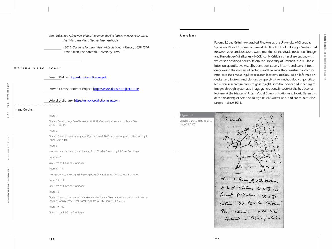
During the summer of 1837, Charles Darwin drew a small diagram into his Notebook B, introduced by the words “I think” (Figure 1).2 For decades, little attention had been paid to this specific page of his notes.3 However, in the last 15 years, and particularly since the bicentennial of Darwin’s birth and the 150th anniversary of the publication of his central work in 2009, it has be-come an element that is seldom passed over, either in any publication that addresses Darwin’s theories in general, or in those dedicated to the history of the metaphorical concept of the “tree.” Today it is generally considered the starting point of Darwin’s evolutionary ideas (Voss 2007, p. 95).
Scholars such as Julia Voss and Horst Bredekamp have devoted their attention specifically to Darwin’s images, as their goal is to learn more about the role that images play in the development of scientific thought (Voss 2007; Bredekamp 2005; Gruber 1974). However, most publications lack a precise examination of the meaning of the drawing itself. It is most often treated as a mere illustration of the origin of the concept of the “tree of life,” while the meaning it may transmit is not dealt with specifically.
Recently, it has even become one of the main motifs of the souve-nir market surrounding Darwin, decorating everything from T-shirts to cups, mouse pads and – ironically – notebooks themselves.4 The attention to this little sketch has finally managed to jump from the academic world to the universe of mass consumption.
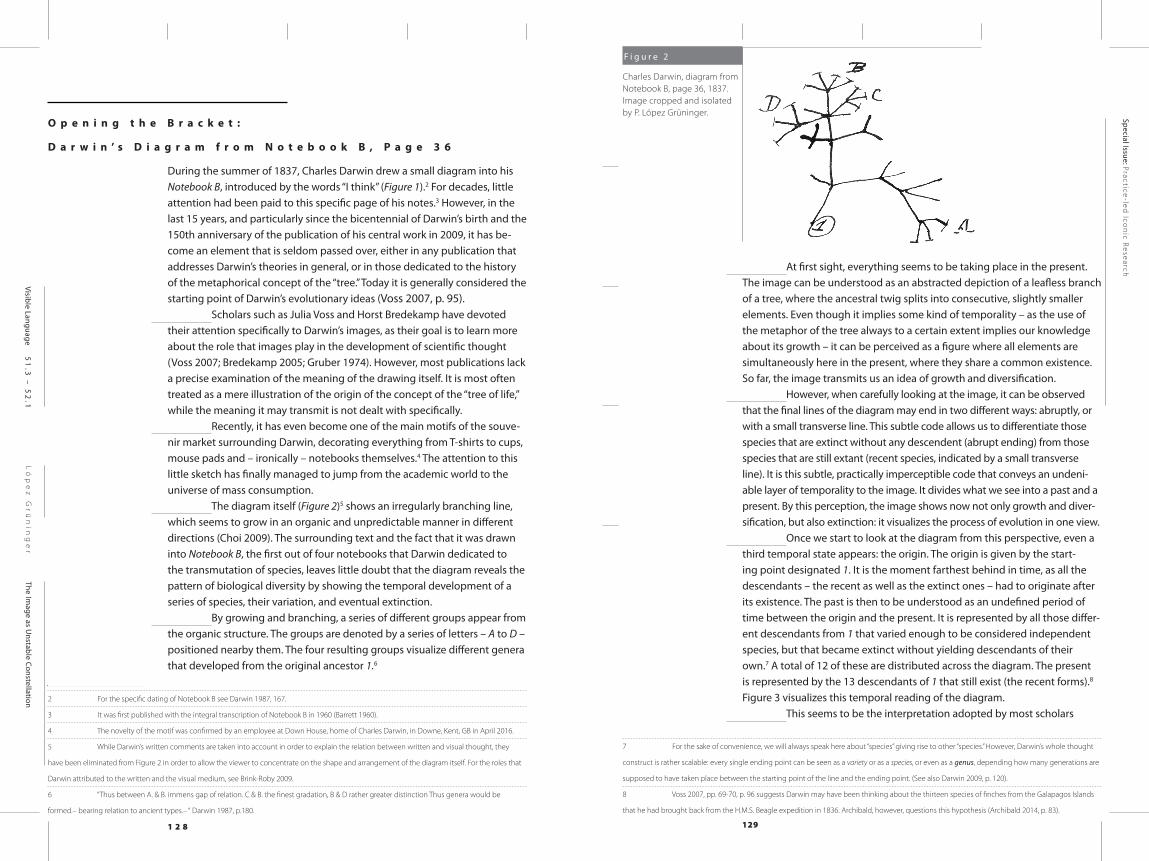
The diagram itself (Figure 2)5 shows an irregularly branching line, which seems to grow in an organic and unpredictable manner in different directions (Choi 2009). The surrounding text and the fact that it was drawn into Notebook B, the first out of four notebooks that Darwin dedicated to the transmutation of species, leaves little doubt that the diagram reveals the pattern of biological diversity by showing the temporal development of a series of species, their variation, and eventual extinction.
By growing and branching, a series of different groups appear from the organic structure. The groups are denoted by a series of letters – A to D – positioned nearby them. The four resulting groups visualize different genera that developed from the original ancestor 1.6
2 For the specific dating of Notebook B see Darwin 1987, 167.
3 It was first published with the integral transcription of Notebook B in 1960 (Barrett 1960).
4 The novelty of the motif was confirmed by an employee at Down House, home of Charles Darwin, in Downe, Kent, GB in April 2016.
5 While Darwin’s written comments are taken into account in order to explain the relation between written and visual thought, they
have been eliminated from Figure 2 in order to allow the viewer to concentrate on the shape and arrangement of the diagram itself. For the roles that
Darwin attributed to the written and the visual medium, see Brink-Roby 2009.
6 “Thus between A. & B. immens gap of relation. C & B. the finest gradation, B & D rather greater distinction Thus genera would be
formed.– bearing relation to ancient types.– “ Darwin 1987, p.180.
F i g u r e 2
Charles Darwin, diagram from Notebook B, page 36, 1837. Image cropped and isolated by P. López Grüninger.
At first sight, everything seems to be taking place in the present. The image can be understood as an abstracted depiction of a leafless branch of a tree, where the ancestral twig splits into consecutive, slightly smaller elements. Even though it implies some kind of temporality – as the use of the metaphor of the tree always to a certain extent implies our knowledge about its growth – it can be perceived as a figure where all elements are simultaneously here in the present, where they share a common existence. So far, the image transmits us an idea of growth and diversification.
However, when carefully looking at the image, it can be observed that the final lines of the diagram may end in two different ways: abruptly, or with a small transverse line. This subtle code allows us to differentiate those species that are extinct without any descendent (abrupt ending) from those species that are still extant (recent species, indicated by a small transverse line). It is this subtle, practically imperceptible code that conveys an undeni-able layer of temporality to the image. It divides what we see into a past and a present. By this perception, the image shows now not only growth and diver-sification, but also extinction: it visualizes the process of evolution in one view.
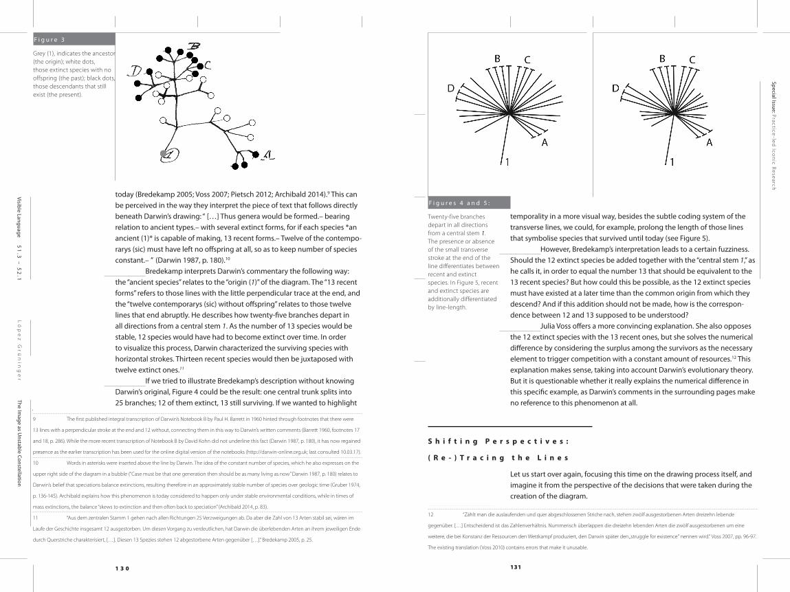
Once we start to look at the diagram from this perspective, even a third temporal state appears: the origin. The origin is given by the start-ing point designated 1. It is the moment farthest behind in time, as all the descendants – the recent as well as the extinct ones – had to originate after its existence. The past is then to be understood as an undefined period of time between the origin and the present. It is represented by all those differ-ent descendants from 1 that varied enough to be considered independent species, but that became extinct without yielding descendants of their own.7 A total of 12 of these are distributed across the diagram. The present is represented by the 13 descendants of 1 that still exist (the recent forms).8 Figure 3 visualizes this temporal reading of the diagram.
This seems to be the interpretation adopted by most scholars
7 For the sake of convenience, we will always speak here about “species” giving rise to other “species.” However, Darwin’s whole thought
construct is rather scalable: every single ending point can be seen as a variety or as a species, or even as a genus, depending how many generations are
supposed to have taken place between the starting point of the line and the ending point. (See also Darwin 2009, p. 120).
8 Voss 2007, pp. 69-70, p. 96 suggests Darwin may have been thinking about the thirteen species of finches from the Galapagos Islands
that he had brought back from the H.M.S. Beagle expedition in 1836. Archibald, however, questions this hypothesis (Archibald 2014, p. 83).
1 3 0 131
Ló
pe
z G
rü
nin
ge
rThe Im
age as Unstable Constellation
Special Issue: Practice-led
Icon
ic Research
Visible Language 51
.3 –
52
.1
today (Bredekamp 2005; Voss 2007; Pietsch 2012; Archibald 2014).9 This can be perceived in the way they interpret the piece of text that follows directly beneath Darwin’s drawing: “ […] Thus genera would be formed.– bearing relation to ancient types.– with several extinct forms, for if each species *an ancient (1)* is capable of making, 13 recent forms.– Twelve of the contempo-rarys (sic) must have left no offspring at all, so as to keep number of species constant.– ” (Darwin 1987, p. 180).10
Bredekamp interprets Darwin’s commentary the following way: the “ancient species” relates to the “origin (1)” of the diagram. The “13 recent forms” refers to those lines with the little perpendicular trace at the end, and the “twelve contemporarys (sic) without offspring” relates to those twelve lines that end abruptly. He describes how twenty-five branches depart in all directions from a central stem 1. As the number of 13 species would be stable, 12 species would have had to become extinct over time. In order to visualize this process, Darwin characterized the surviving species with horizontal strokes. Thirteen recent species would then be juxtaposed with twelve extinct ones.11
If we tried to illustrate Bredekamp’s description without knowing Darwin’s original, Figure 4 could be the result: one central trunk splits into 25 branches; 12 of them extinct, 13 still surviving. If we wanted to highlight
9 The first published integral transcription of Darwin’s Notebook B by Paul H. Barrett in 1960 hinted through footnotes that there were
13 lines with a perpendicular stroke at the end and 12 without, connecting them in this way to Darwin’s written comments (Barrett 1960, footnotes 17
and 18, p. 286). While the more recent transcription of Notebook B by David Kohn did not underline this fact (Darwin 1987, p. 180), it has now regained
presence as the earlier transcription has been used for the online digital version of the notebooks (http://darwin-online.org.uk; last consulted 10.03.17).
10 Words in asterisks were inserted above the line by Darwin. The idea of the constant number of species, which he also expresses on the
upper right side of the diagram in a bubble (“Case must be that one generation then should be as many living as now” Darwin 1987, p. 180) relates to
Darwin’s belief that speciations balance extinctions, resulting therefore in an approximately stable number of species over geologic time (Gruber 1974,
p. 136-145). Archibald explains how this phenomenon is today considered to happen only under stable environmental conditions, while in times of
mass extinctions, the balance “skews to extinction and then often back to speciation” (Archibald 2014, p. 83).
11 “Aus dem zentralen Stamm 1 gehen nach allen Richtungen 25 Verzweigungen ab. Da aber die Zahl von 13 Arten stabil sei, wären im
Laufe der Geschichte insgesamt 12 ausgestorben. Um diesen Vorgang zu verdeutlichen, hat Darwin die überlebenden Arten an ihrem jeweiligen Ende
durch Querstriche charakterisiert, […]. Diesen 13 Spezies stehen 12 abgestorbene Arten gegenüber […].” Bredekamp 2005, p. 25.
temporality in a more visual way, besides the subtle coding system of the transverse lines, we could, for example, prolong the length of those lines that symbolise species that survived until today (see Figure 5).
However, Bredekamp’s interpretation leads to a certain fuzziness. Should the 12 extinct species be added together with the “central stem 1,” as he calls it, in order to equal the number 13 that should be equivalent to the 13 recent species? But how could this be possible, as the 12 extinct species must have existed at a later time than the common origin from which they descend? And if this addition should not be made, how is the correspon-dence between 12 and 13 supposed to be understood?
Julia Voss offers a more convincing explanation. She also opposes the 12 extinct species with the 13 recent ones, but she solves the numerical difference by considering the surplus among the survivors as the necessary element to trigger competition with a constant amount of resources.12 This explanation makes sense, taking into account Darwin’s evolutionary theory. But it is questionable whether it really explains the numerical difference in this specific example, as Darwin’s comments in the surrounding pages make no reference to this phenomenon at all.
S h i f t i n g P e r s p e c t i v e s :
( R e - ) T r a c i n g t h e L i n e s
Let us start over again, focusing this time on the drawing process itself, and imagine it from the perspective of the decisions that were taken during the creation of the diagram.
12 “Zählt man die auslaufenden und quer abgeschlossenen Striche nach, stehen zwölf ausgestorbenen Arten dreizehn lebende
gegenüber. […] Entscheidend ist das Zahlenverhältnis. Nummerisch überlappen die dreizehn lebenden Arten die zwölf ausgestorbenen um eine
weitere, die bei Konstanz der Ressourcen den Wettkampf produziert, den Darwin später den „struggle for existence“ nennen wird.“ Voss 2007, pp. 96-97.
The existing translation (Voss 2010) contains errors that make it unusable.
F i g u r e 3
Grey (1), indicates the ancestor (the origin); white dots, those extinct species with no offspring (the past); black dots, those descendants that still exist (the present).
F i g u r e s 4 a n d 5 :
Twenty-five branches depart in all directions from a central stem 1. The presence or absence of the small transverse stroke at the end of the line differentiates between recent and extinct species. In Figure 5, recent and extinct species are additionally differentiated by line-length.
1 3 2 133
Ló
pe
z G
rü
nin
ge
rThe Im
age as Unstable Constellation
Special Issue: Practice-led
Icon
ic Research
Visible Language 51
.3 –
52
.1
Some of the basic graphic choices seem to result from the specific context in which the diagram was created. The format, the quality of the paper and even the orientation were given, as Darwin drew the diagram into the same place where his verbalized thoughts on the transmutation of spe-cies also found expression: a little (170 x 97 mm) leather-bound notebook. As well, the medium with which he draws does not deviate from the one he used for his written ideas: both are translated into brown ink, apparently performed by the same pen.13 The fact that Darwin embedded the image into this space seems to suggest that, for him, it was a tool to express and clarify his thoughts, similar to the way in which he used the written word.
When it came to giving graphic expression to his thoughts, however, he found freedom of choice: in determining the shape of the lines that constitute the diagram and the way they were organised on the two-dimensional space of the page. Darwin decided to use continuous, (mainly) straight lines, in a variety of lengths, and to organise them in an irregular manner on the drawing surface.
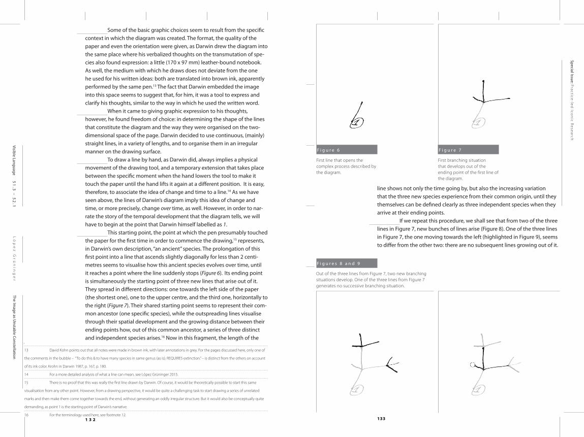
To draw a line by hand, as Darwin did, always implies a physical movement of the drawing tool, and a temporary extension that takes place between the specific moment when the hand lowers the tool to make it touch the paper until the hand lifts it again at a different position. It is easy, therefore, to associate the idea of change and time to a line.14 As we have seen above, the lines of Darwin’s diagram imply this idea of change and time, or more precisely, change over time, as well. However, in order to nar-rate the story of the temporal development that the diagram tells, we will have to begin at the point that Darwin himself labelled as 1.
This starting point, the point at which the pen presumably touched the paper for the first time in order to commence the drawing,15 represents, in Darwin’s own description, “an ancient” species. The prolongation of this first point into a line that ascends slightly diagonally for less than 2 centi-metres seems to visualise how this ancient species evolves over time, until it reaches a point where the line suddenly stops (Figure 6). Its ending point is simultaneously the starting point of three new lines that arise out of it. They spread in different directions: one towards the left side of the paper (the shortest one), one to the upper centre, and the third one, horizontally to the right (Figure 7). Their shared starting point seems to represent their com-mon ancestor (one specific species), while the outspreading lines visualise through their spatial development and the growing distance between their ending points how, out of this common ancestor, a series of three distinct and independent species arises.16 Now in this fragment, the length of the
13 David Kohn points out that all notes were made in brown ink, with later annotations in grey. For the pages discussed here, only one of
the comments in the bubble – “To do this & to have many species in same genus (as is). REQUIRES extinction.” – is distinct from the others on account
of its ink color. Krohn in Darwin 1987, p. 167, p. 180.
14 For a more detailed analysis of what a line can mean, see López Grüninger 2015.
15 There is no proof that this was really the first line drawn by Darwin. Of course, it would be theoretically possible to start this same
visualisation from any other point. However, from a drawing perspective, it would be quite a challenging task to start drawing a series of unrelated
marks and then make them come together towards the end, without generating an oddly irregular structure. But it would also be conceptually quite
demanding, as point 1 is the starting point of Darwin’s narrative.
16 For the terminology used here, see footnote 12.
line shows not only the time going by, but also the increasing variation that the three new species experience from their common origin, until they themselves can be defined clearly as three independent species when they arrive at their ending points.
If we repeat this procedure, we shall see that from two of the three lines in Figure 7, new bunches of lines arise (Figure 8). One of the three lines in Figure 7, the one moving towards the left (highlighted in Figure 9), seems to differ from the other two: there are no subsequent lines growing out of it.
F i g u r e 6
First line that opens the complex process described by the diagram.
F i g u r e 7
First branching situation that develops out of the ending point of the first line of the diagram.
F i g u r e s 8 a n d 9
Out of the three lines from Figure 7, two new branching situations develop. One of the three lines from Figure 7 generates no successive branching situation.
1 3 4 135
Ló
pe
z G
rü
nin
ge
rThe Im
age as Unstable Constellation
Special Issue: Practice-led
Icon
ic Research
Visible Language 51
.3 –
52
.1
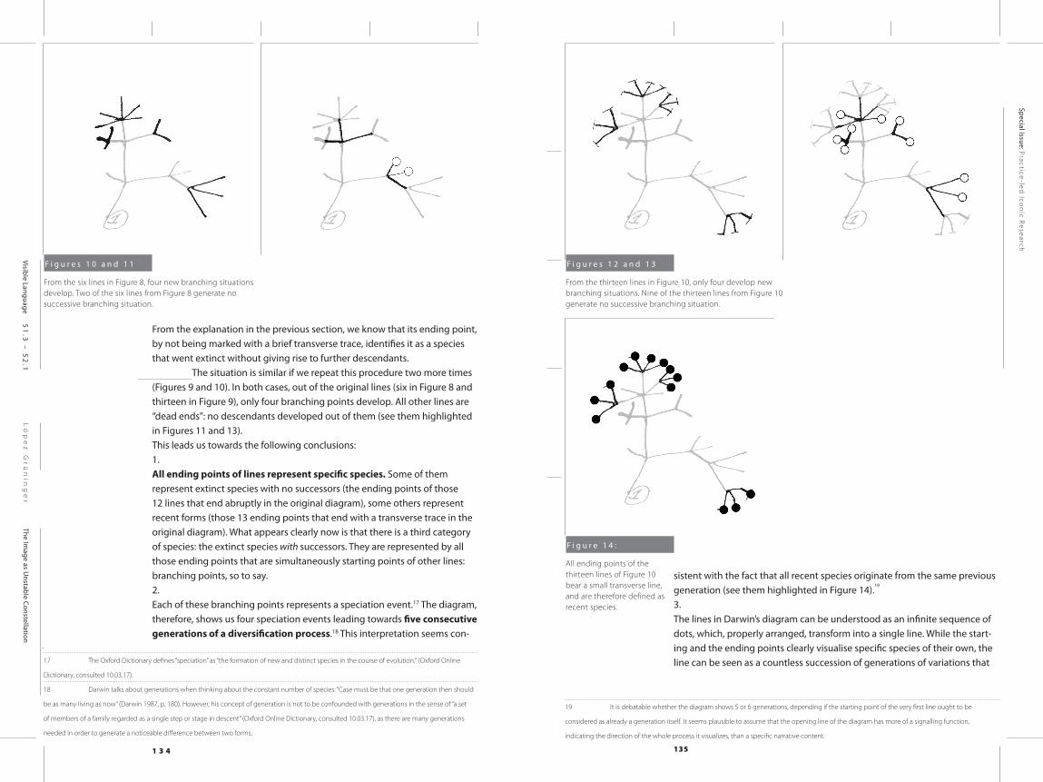
From the explanation in the previous section, we know that its ending point, by not being marked with a brief transverse trace, identifies it as a species that went extinct without giving rise to further descendants.
The situation is similar if we repeat this procedure two more times (Figures 9 and 10). In both cases, out of the original lines (six in Figure 8 and thirteen in Figure 9), only four branching points develop. All other lines are “dead ends”: no descendants developed out of them (see them highlighted in Figures 11 and 13). This leads us towards the following conclusions: 1. All ending points of lines represent specific species. Some of them represent extinct species with no successors (the ending points of those 12 lines that end abruptly in the original diagram), some others represent recent forms (those 13 ending points that end with a transverse trace in the original diagram). What appears clearly now is that there is a third category of species: the extinct species with successors. They are represented by all those ending points that are simultaneously starting points of other lines: branching points, so to say.2.Each of these branching points represents a speciation event.17 The diagram, therefore, shows us four speciation events leading towards five consecutive generations of a diversification process.18 This interpretation seems con-
17 The Oxford Dictionary defines “speciation” as “the formation of new and distinct species in the course of evolution.“ (Oxford Online
Dictionary, consulted 10.03.17).
18 Darwin talks about generations when thinking about the constant number of species: “Case must be that one generation then should
be as many living as now” (Darwin 1987, p. 180). However, his concept of generation is not to be confounded with generations in the sense of “a set
of members of a family regarded as a single step or stage in descent” (Oxford Online Dictionary, consulted 10.03.17), as there are many generations
needed in order to generate a noticeable difference between two forms.
sistent with the fact that all recent species originate from the same previous generation (see them highlighted in Figure 14).
19
3.The lines in Darwin’s diagram can be understood as an infinite sequence of dots, which, properly arranged, transform into a single line. While the start-ing and the ending points clearly visualise specific species of their own, the line can be seen as a countless succession of generations of variations that
19 It is debatable whether the diagram shows 5 or 6 generations, depending if the starting point of the very first line ought to be
considered as already a generation itself. It seems plausible to assume that the opening line of the diagram has more of a signalling function,
indicating the direction of the whole process it visualizes, than a specific narrative content.
F i g u r e s 1 0 a n d 1 1
From the six lines in Figure 8, four new branching situations develop. Two of the six lines from Figure 8 generate no successive branching situation.
F i g u r e s 1 2 a n d 1 3
From the thirteen lines in Figure 10, only four develop new branching situations. Nine of the thirteen lines from Figure 10 generate no successive branching situation.
F i g u r e 1 4 :
All ending points of the thirteen lines of Figure 10 bear a small transverse line, and are therefore defined as recent species.
1 3 6 137
Ló
pe
z G
rü
nin
ge
rThe Im
age as Unstable Constellation
Special Issue: Practice-led
Icon
ic Research
Visible Language 51
.3 –
52
.1
unfold between those two points.20
However, to visualise speciation as a series of clearly defined lines that grow out of one specific point in time implies a high level of abstraction.21 It is a similar phenomenon to what happens on a verbal level with the term “species” itself, as this concept does not delimit a certain magnitude, but has to be understood as an immense collective existence, which implies a significant variability among the individuals that compose it.22 Darwin’s abstraction even surpassed the level that this naming may imply, as he was not just reducing the multiplicity of the living population into one clear, homogeneous form when drawing a straight line, but was simultaneously assuming the transformation of the depicted species over time. 4.The development of the branching points into independent lines visualizes, on the one hand, how the variation from this common ancestor increases until several clearly independent and different species evolve. But it also codes resemblance (closer or more remote relatedness that exists among the species of the new generation) through distance.
23 This allows Darwin
to highlight a series of different groups (A, B, C, D), which he describes as genera,24 whose existence is explained by the fact that all species belonging to one group share one common ancestor, which is not shared by those spe-cies belonging to another genus.
This also explains why, in the lower right corner, he abandons the use of con-sistently straight lines, and breaks them slightly, in order to ensure that the final points are still close enough to be identified as one single group (A).
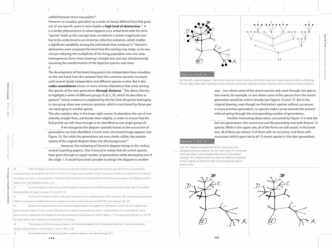
If we reorganise the diagram spatially based on the succession of generations we have identified, a much more structured image appears (see Figure 15). But while the generations are now clearly visible, the random nature of the original diagram fades into the background.25
However, the reshaping of Darwin’s diagram brings to the surface several surprising aspects. One is bound to realize that all current species have gone through an equal number of generations while developing out of the origin 1. It would have been possible to design the diagram in another
20 In fact, the diagram that will accompany the publication of Darwin’s thoughts about twenty years later will have substituted the
continuous line by the dotted line (see Figure 14). Voss convincingly relates this graphic choice to a drawing convention proceeding from the domain
of Geology (Voss 2007, p. 126). Bredekamp, on the other hand, locates the source of inspiration for Darwin’s visual language in Jean-Baptiste Lamarck’s
diagram from 1809 (Bredekamp 2005, p. 16).
21 It is worth analysing in detail the visual and conceptual consequences of simplifying graphically highly complex ideas. This has been
done elsewhere, see López Grüninger, 2011, pp. 204-210.
22 The concept of “species” has been vividly discussed over time. For a detailed analysis of the concept in 19th century Biology see McOuat
1996. For a discussion of categorisation and its implications for the concept of species see Lakoff 1987, particularly pp. 185-195.
23 Darwin’s own reading directions for his published diagram (Figure 18) suggests this interpretation as well: “Let A to L represent the
species of a genus large in its own country; these species are supposed to resemble each other in unequal degrees, as is so generally the case in
nature, and as is represented in the diagram by the letters standing at unequal distances.” (Darwin 2009, p. 111). See López Grüninger 2011, p. 182-198
for further detail on the codification and interpretation of distance.
24 “Thus between A. & B. immens gap of relation. C & B. the finest gradation, B & D rather greater distinction Thus genera would be
formed.– bearing relation to ancient types.– “ Darwin 1987, p. 180.
25 For a detailed analysis of coding principles in qualitative diagrams, see López Grüninger 2011.
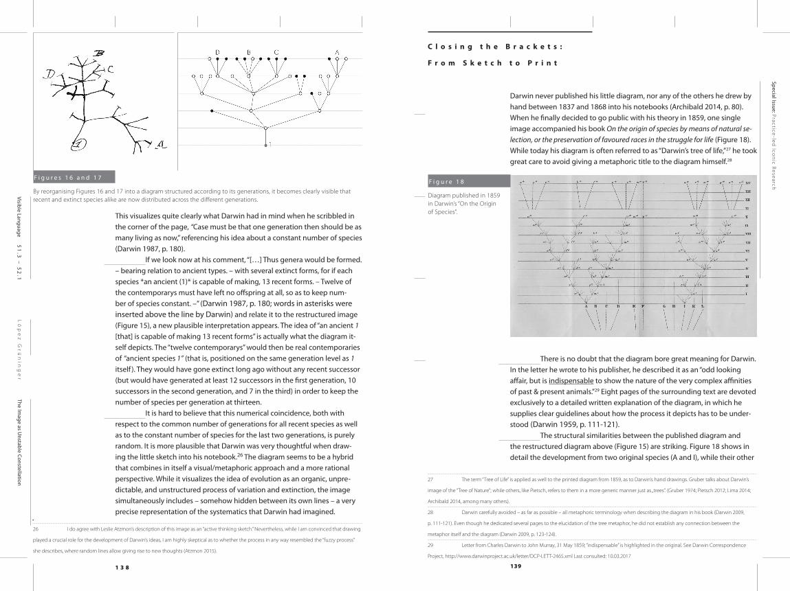
way – one where some of the recent species only went through two specia-tion events, for example, or one where some of the species from the recent generation would be extinct already (see Figures 16 and 17). But in the original drawing, even though we find extinct species without successors in every previous generation, no species make a jump towards the present without going through the corresponding number of generations.
Another interesting observation uncovered by Figure 15 is that the last two generations (the recent one and the preceding one) both feature 13 species. While in the upper one, all of the forms are still extant, in the lower one, all of them are extinct: 9 of them with no successor, 4 of them with successors (which gave rise to all 13 recent species in the later generation).
F i g u r e s 3 a n d 1 5
On the left, original diagram: black dots represent recent species, white dots represent extinct species with no offspring. On the right, black dots represent recent species, white dots represent extinct species, with or without living successors.
F i g u r e s 2 a n d 1 6
Left, the original arrangement of the transverse lines designating recent species. On the right side, the transverse lines have been interchanged with some of the abrupt endings. This diagram seems to show an identical situation to the original, as there are still 13 recent species and 12 extinct ones.
1 3 8 139
Ló
pe
z G
rü
nin
ge
rThe Im
age as Unstable Constellation
Special Issue: Practice-led
Icon
ic Research
Visible Language 51
.3 –
52
.1
This visualizes quite clearly what Darwin had in mind when he scribbled in the corner of the page, “Case must be that one generation then should be as many living as now,” referencing his idea about a constant number of species (Darwin 1987, p. 180).
If we look now at his comment, “[…] Thus genera would be formed. – bearing relation to ancient types. – with several extinct forms, for if each species *an ancient (1)* is capable of making, 13 recent forms. – Twelve of the contemporarys must have left no offspring at all, so as to keep num-ber of species constant. –” (Darwin 1987, p. 180; words in asterisks were inserted above the line by Darwin) and relate it to the restructured image (Figure 15), a new plausible interpretation appears. The idea of “an ancient 1 [that] is capable of making 13 recent forms” is actually what the diagram it-self depicts. The “twelve contemporarys” would then be real contemporaries of “ancient species 1” (that is, positioned on the same generation level as 1 itself ). They would have gone extinct long ago without any recent successor (but would have generated at least 12 successors in the first generation, 10 successors in the second generation, and 7 in the third) in order to keep the number of species per generation at thirteen.
It is hard to believe that this numerical coincidence, both with respect to the common number of generations for all recent species as well as to the constant number of species for the last two generations, is purely random. It is more plausible that Darwin was very thoughtful when draw-ing the little sketch into his notebook.26 The diagram seems to be a hybrid that combines in itself a visual/metaphoric approach and a more rational perspective. While it visualizes the idea of evolution as an organic, unpre-dictable, and unstructured process of variation and extinction, the image simultaneously includes – somehow hidden between its own lines – a very precise representation of the systematics that Darwin had imagined.
26 I do agree with Leslie Atzmon’s description of this image as an “active thinking sketch.” Nevertheless, while I am convinced that drawing
played a crucial role for the development of Darwin’s ideas, I am highly skeptical as to whether the process in any way resembled the “fuzzy process”
she describes, where random lines allow giving rise to new thoughts (Atzmon 2015).
C l o s i n g t h e B r a c k e t s :
F r o m S k e t c h t o P r i n t
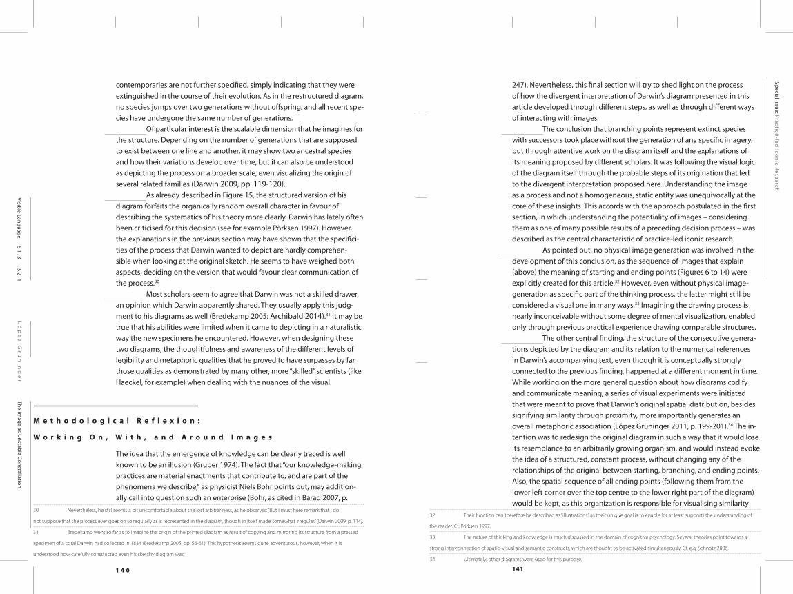
Darwin never published his little diagram, nor any of the others he drew by hand between 1837 and 1868 into his notebooks (Archibald 2014, p. 80). When he finally decided to go public with his theory in 1859, one single image accompanied his book On the origin of species by means of natural se-lection, or the preservation of favoured races in the struggle for life (Figure 18). While today his diagram is often referred to as “Darwin’s tree of life,”27 he took great care to avoid giving a metaphoric title to the diagram himself.28
There is no doubt that the diagram bore great meaning for Darwin. In the letter he wrote to his publisher, he described it as an “odd looking affair, but is indispensable to show the nature of the very complex affinities of past & present animals.”29 Eight pages of the surrounding text are devoted exclusively to a detailed written explanation of the diagram, in which he supplies clear guidelines about how the process it depicts has to be under-stood (Darwin 1959, p. 111-121).
The structural similarities between the published diagram and the restructured diagram above (Figure 15) are striking. Figure 18 shows in detail the development from two original species (A and I), while their other
27 The term “Tree of Life” is applied as well to the printed diagram from 1859, as to Darwin’s hand drawings. Gruber talks about Darwin’s
image of the “Tree of Nature”; while others, like Pietsch, refers to them in a more generic manner just as „trees”. (Gruber 1974; Pietsch 2012; Lima 2014;
Archibald 2014, among many others).
28 Darwin carefully avoided – as far as possible – all metaphoric terminology when describing the diagram in his book (Darwin 2009,
p. 111-121). Even though he dedicated several pages to the elucidation of the tree metaphor, he did not establish any connection between the
metaphor itself and the diagram (Darwin 2009, p. 123-124).
29 Letter from Charles Darwin to John Murray, 31 May 1859; “indispensable” is highlighted in the original. See Darwin Correspondence
Project, http://www.darwinproject.ac.uk/letter/DCP-LETT-2465.xml Last consulted: 10.03.2017
F i g u r e s 1 6 a n d 1 7
By reorganising Figures 16 and 17 into a diagram structured according to its generations, it becomes clearly visible that recent and extinct species alike are now distributed across the different generations.
F i g u r e 1 8
Diagram published in 1859 in Darwin’s “On the Origin of Species”.
1 4 0 141
Ló
pe
z G
rü
nin
ge
rThe Im
age as Unstable Constellation
Special Issue: Practice-led
Icon
ic Research
Visible Language 51
.3 –
52
.1
contemporaries are not further specified, simply indicating that they were extinguished in the course of their evolution. As in the restructured diagram, no species jumps over two generations without offspring, and all recent spe-cies have undergone the same number of generations.
Of particular interest is the scalable dimension that he imagines for the structure. Depending on the number of generations that are supposed to exist between one line and another, it may show two ancestral species and how their variations develop over time, but it can also be understood as depicting the process on a broader scale, even visualizing the origin of several related families (Darwin 2009, pp. 119-120).
As already described in Figure 15, the structured version of his diagram forfeits the organically random overall character in favour of describing the systematics of his theory more clearly. Darwin has lately often been criticised for this decision (see for example Pörksen 1997). However, the explanations in the previous section may have shown that the specifici-ties of the process that Darwin wanted to depict are hardly comprehen-sible when looking at the original sketch. He seems to have weighed both aspects, deciding on the version that would favour clear communication of the process.30
Most scholars seem to agree that Darwin was not a skilled drawer, an opinion which Darwin apparently shared. They usually apply this judg-ment to his diagrams as well (Bredekamp 2005; Archibald 2014).31 It may be true that his abilities were limited when it came to depicting in a naturalistic way the new specimens he encountered. However, when designing these two diagrams, the thoughtfulness and awareness of the different levels of legibility and metaphoric qualities that he proved to have surpasses by far those qualities as demonstrated by many other, more “skilled” scientists (like Haeckel, for example) when dealing with the nuances of the visual.
M e t h o d o l o g i c a l R e f l e x i o n :
W o r k i n g O n , W i t h , a n d A r o u n d I m a g e s
The idea that the emergence of knowledge can be clearly traced is well known to be an illusion (Gruber 1974). The fact that “our knowledge-making practices are material enactments that contribute to, and are part of the phenomena we describe,” as physicist Niels Bohr points out, may addition-ally call into question such an enterprise (Bohr, as cited in Barad 2007, p.
30 Nevertheless, he still seems a bit uncomfortable about the lost arbitrariness, as he observes: “But I must here remark that I do
not suppose that the process ever goes on so regularly as is represented in the diagram, though in itself made somewhat irregular.” (Darwin 2009, p. 114).
31 Bredekamp went so far as to imagine the origin of the printed diagram as result of copying and mirroring its structure from a pressed
specimen of a coral Darwin had collected in 1834 (Bredekamp 2005, pp. 56-61). This hypothesis seems quite adventurous, however, when it is
understood how carefully constructed even his sketchy diagram was.
247). Nevertheless, this final section will try to shed light on the process of how the divergent interpretation of Darwin’s diagram presented in this article developed through different steps, as well as through different ways of interacting with images.
The conclusion that branching points represent extinct species with successors took place without the generation of any specific imagery, but through attentive work on the diagram itself and the explanations of its meaning proposed by different scholars. It was following the visual logic of the diagram itself through the probable steps of its origination that led to the divergent interpretation proposed here. Understanding the image as a process and not a homogeneous, static entity was unequivocally at the core of these insights. This accords with the approach postulated in the first section, in which understanding the potentiality of images – considering them as one of many possible results of a preceding decision process – was described as the central characteristic of practice-led iconic research.
As pointed out, no physical image generation was involved in the development of this conclusion, as the sequence of images that explain (above) the meaning of starting and ending points (Figures 6 to 14) were explicitly created for this article.32 However, even without physical image-generation as specific part of the thinking process, the latter might still be considered a visual one in many ways.33 Imagining the drawing process is nearly inconceivable without some degree of mental visualization, enabled only through previous practical experience drawing comparable structures.
The other central finding, the structure of the consecutive genera-tions depicted by the diagram and its relation to the numerical references in Darwin’s accompanying text, even though it is conceptually strongly connected to the previous finding, happened at a different moment in time. While working on the more general question about how diagrams codify and communicate meaning, a series of visual experiments were initiated that were meant to prove that Darwin’s original spatial distribution, besides signifying similarity through proximity, more importantly generates an overall metaphoric association (López Grüninger 2011, p. 199-201).34 The in-tention was to redesign the original diagram in such a way that it would lose its resemblance to an arbitrarily growing organism, and would instead evoke the idea of a structured, constant process, without changing any of the relationships of the original between starting, branching, and ending points. Also, the spatial sequence of all ending points (following them from the lower left corner over the top centre to the lower right part of the diagram) would be kept, as this organization is responsible for visualising similarity
32 Their function can therefore be described as “illustrations,” as their unique goal is to enable (or at least support) the understanding of
the reader. Cf. Pörksen 1997.
33 The nature of thinking and knowledge is much discussed in the domain of cognitive psychology. Several theories point towards a
strong interconnection of spatio-visual and semantic constructs, which are thought to be activated simultaneously. Cf. e.g. Schnotz 2006.
34 Ultimately, other diagrams were used for this purpose.
1 4 2 143
Ló
pe
z G
rü
nin
ge
rThe Im
age as Unstable Constellation
Special Issue: Practice-led
Icon
ic Research
Visible Language 51
.3 –
52
.1
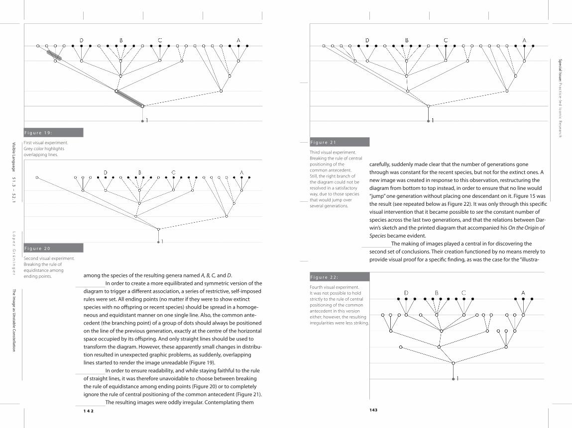
among the species of the resulting genera named A, B, C, and D. In order to create a more equilibrated and symmetric version of the
diagram to trigger a different association, a series of restrictive, self-imposed rules were set. All ending points (no matter if they were to show extinct species with no offspring or recent species) should be spread in a homoge-neous and equidistant manner on one single line. Also, the common ante-cedent (the branching point) of a group of dots should always be positioned on the line of the previous generation, exactly at the centre of the horizontal space occupied by its offspring. And only straight lines should be used to transform the diagram. However, these apparently small changes in distribu-tion resulted in unexpected graphic problems, as suddenly, overlapping lines started to render the image unreadable (Figure 19).
In order to ensure readability, and while staying faithful to the rule of straight lines, it was therefore unavoidable to choose between breaking the rule of equidistance among ending points (Figure 20) or to completely ignore the rule of central positioning of the common antecedent (Figure 21).
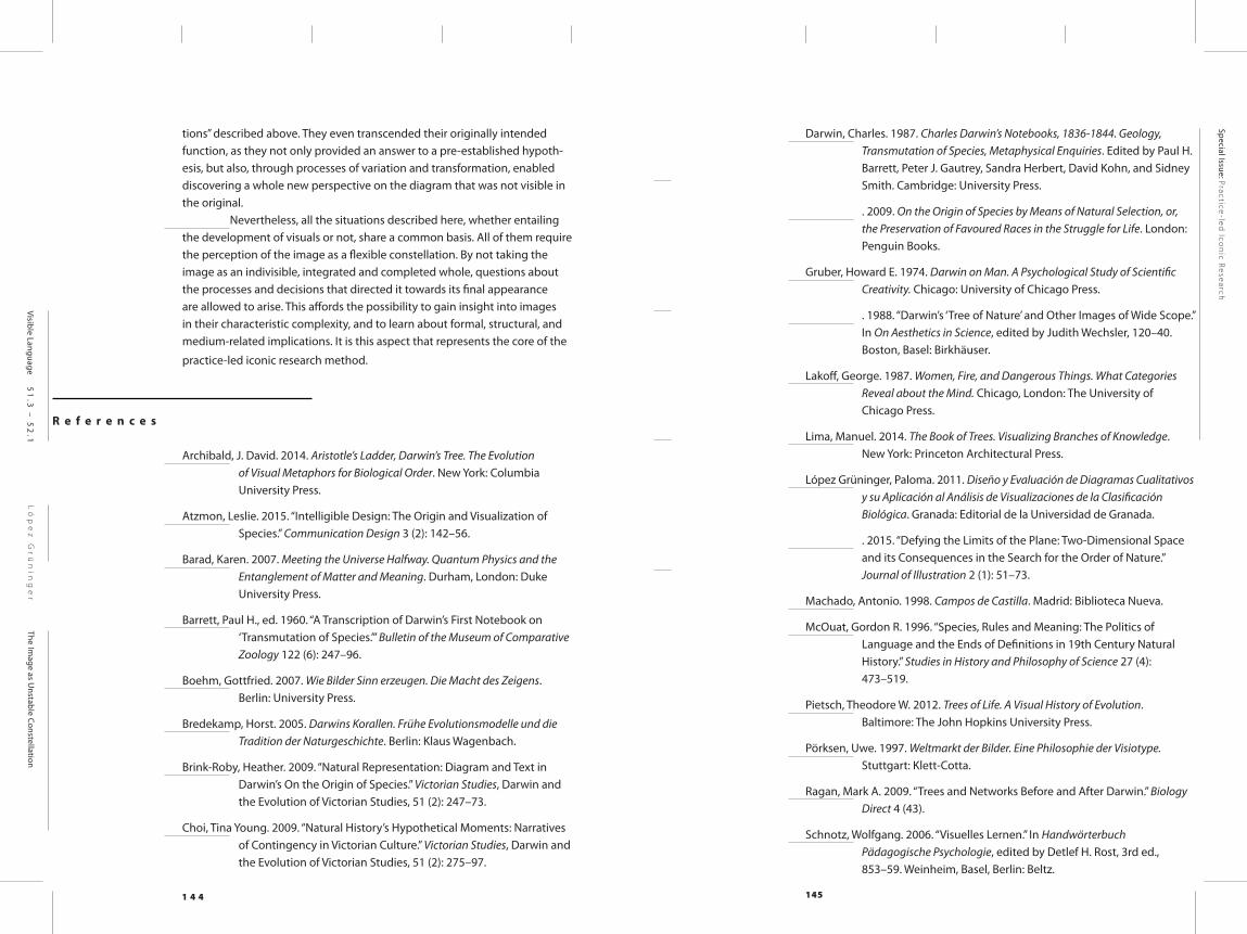
The resulting images were oddly irregular. Contemplating them
carefully, suddenly made clear that the number of generations gone through was constant for the recent species, but not for the extinct ones. A new image was created in response to this observation, restructuring the diagram from bottom to top instead, in order to ensure that no line would “jump” one generation without placing one descendant on it. Figure 15 was the result (see repeated below as Figure 22). It was only through this specific visual intervention that it became possible to see the constant number of species across the last two generations, and that the relations between Dar-win’s sketch and the printed diagram that accompanied his On the Origin of Species became evident.
The making of images played a central in for discovering the second set of conclusions. Their creation functioned by no means merely to provide visual proof for a specific finding, as was the case for the “illustra-
F i g u r e 2 1
Third visual experiment. Breaking the rule of central positioning of the common antecedent. Still, the right branch of the diagram could not be resolved in a satisfactory way, due to those species that would jump over several generations.
F i g u r e 2 2 :
Fourth visual experiment. It was not possible to hold strictly to the rule of central positioning of the common antecedent in this version either; however, the resulting irregularities were less striking.
F i g u r e 1 9 :
First visual experiment. Grey color highlights overlapping lines.
F i g u r e 2 0
Second visual experiment. Breaking the rule of equidistance among ending points.
1 4 4 145
Ló
pe
z G
rü
nin
ge
rThe Im
age as Unstable Constellation
Special Issue: Practice-led
Icon
ic Research
Visible Language 51
.3 –
52
.1
tions” described above. They even transcended their originally intended function, as they not only provided an answer to a pre-established hypoth-esis, but also, through processes of variation and transformation, enabled discovering a whole new perspective on the diagram that was not visible in the original.
Nevertheless, all the situations described here, whether entailing the development of visuals or not, share a common basis. All of them require the perception of the image as a flexible constellation. By not taking the image as an indivisible, integrated and completed whole, questions about the processes and decisions that directed it towards its final appearance are allowed to arise. This affords the possibility to gain insight into images in their characteristic complexity, and to learn about formal, structural, and medium-related implications. It is this aspect that represents the core of the
practice-led iconic research method.
R e f e r e n c e s
Archibald, J. David. 2014. Aristotle’s Ladder, Darwin’s Tree. The Evolution of Visual Metaphors for Biological Order. New York: Columbia University Press.
Atzmon, Leslie. 2015. “Intelligible Design: The Origin and Visualization of Species.” Communication Design 3 (2): 142–56.
Barad, Karen. 2007. Meeting the Universe Halfway. Quantum Physics and the Entanglement of Matter and Meaning. Durham, London: Duke University Press.
Barrett, Paul H., ed. 1960. “A Transcription of Darwin’s First Notebook on ‘Transmutation of Species.’” Bulletin of the Museum of Comparative Zoology 122 (6): 247–96.
Boehm, Gottfried. 2007. Wie Bilder Sinn erzeugen. Die Macht des Zeigens. Berlin: University Press.
Bredekamp, Horst. 2005. Darwins Korallen. Frühe Evolutionsmodelle und die Tradition der Naturgeschichte. Berlin: Klaus Wagenbach.
Brink-Roby, Heather. 2009. “Natural Representation: Diagram and Text in Darwin’s On the Origin of Species.” Victorian Studies, Darwin and the Evolution of Victorian Studies, 51 (2): 247–73.
Choi, Tina Young. 2009. “Natural History’s Hypothetical Moments: Narratives of Contingency in Victorian Culture.” Victorian Studies, Darwin and the Evolution of Victorian Studies, 51 (2): 275–97.
Darwin, Charles. 1987. Charles Darwin’s Notebooks, 1836-1844. Geology, Transmutation of Species, Metaphysical Enquiries. Edited by Paul H. Barrett, Peter J. Gautrey, Sandra Herbert, David Kohn, and Sidney Smith. Cambridge: University Press.
. 2009. On the Origin of Species by Means of Natural Selection, or, the Preservation of Favoured Races in the Struggle for Life. London: Penguin Books.
Gruber, Howard E. 1974. Darwin on Man. A Psychological Study of Scientific Creativity. Chicago: University of Chicago Press.
. 1988. “Darwin’s ‘Tree of Nature’ and Other Images of Wide Scope.” In On Aesthetics in Science, edited by Judith Wechsler, 120–40. Boston, Basel: Birkhäuser.
Lakoff, George. 1987. Women, Fire, and Dangerous Things. What Categories Reveal about the Mind. Chicago, London: The University of Chicago Press.
Lima, Manuel. 2014. The Book of Trees. Visualizing Branches of Knowledge. New York: Princeton Architectural Press.
López Grüninger, Paloma. 2011. Diseño y Evaluación de Diagramas Cualitativos y su Aplicación al Análisis de Visualizaciones de la Clasificación Biológica. Granada: Editorial de la Universidad de Granada.
. 2015. “Defying the Limits of the Plane: Two-Dimensional Space and its Consequences in the Search for the Order of Nature.” Journal of Illustration 2 (1): 51–73.
Machado, Antonio. 1998. Campos de Castilla. Madrid: Biblioteca Nueva.
McOuat, Gordon R. 1996. “Species, Rules and Meaning: The Politics of Language and the Ends of Definitions in 19th Century Natural History.” Studies in History and Philosophy of Science 27 (4): 473–519.
Pietsch, Theodore W. 2012. Trees of Life. A Visual History of Evolution. Baltimore: The John Hopkins University Press.
Pörksen, Uwe. 1997. Weltmarkt der Bilder. Eine Philosophie der Visiotype. Stuttgart: Klett-Cotta.
Ragan, Mark A. 2009. “Trees and Networks Before and After Darwin.” Biology Direct 4 (43).
Schnotz, Wolfgang. 2006. “Visuelles Lernen.” In Handwörterbuch Pädagogische Psychologie, edited by Detlef H. Rost, 3rd ed., 853–59. Weinheim, Basel, Berlin: Beltz.
1 4 6 147
Ló
pe
z G
rü
nin
ge
rThe Im
age as Unstable Constellation
Special Issue: Practice-led
Icon
ic Research
Visible Language 51
.3 –
52
.1
Voss, Julia. 2007. Darwins Bilder. Ansichten der Evolutionstheorie 1837-1874. Frankfurt am Main: Fischer Taschenbuch.
. 2010. Darwin’s Pictures. Views of Evolutionary Theory, 1837-1874. New Haven, London: Yale University Press.
O n l i n e R e s o u r c e s :
Darwin Online: http://darwin-online.org.uk
Darwin Correspondence Project: https://www.darwinproject.ac.uk/
Oxford Dictionary: https://en.oxforddictionaries.com
Image Credits
Figure 1
Charles Darwin, page 36 of Notebook B, 1937. Cambridge University Library, Dar. Ms. 121, Fol. 36.
Figure 2
Charles Darwin, drawing on page 36, Notebook B, 1937. Image cropped and isolated by P. López Grüninger.
Figure 3
Interventions on the original drawing from Charles Darwin by P. López Grüninger.
Figure 4 – 5
Diagrams by P. López Grüninger.
Figure 6 – 14
Interventions to the original drawing from Charles Darwin by P. López Grüninger.
Figure 15 – 17
Diagrams by P. López Grüninger.
Figure 18
Charles Darwin, diagram published in On the Origin of Species by Means of Natural Selection. London: John Murray, 1859. Cambridge University Library, CCA.24.19
Figure 19 – 22
Diagrams by P. López Grüninger.
A u t h o r
Paloma López Grüninger studied Fine Arts at the University of Granada, Spain, and Visual Communication at the Basel School of Design, Switzerland. Between 2005 and 2008, she was a member of the Graduate School “Image and Knowledge” of eikones – NCCR Iconic Criticism. Her dissertation, with which she obtained her PhD from the University of Granada in 2011, looks into non-quantitative visualizations, particularly historic and current tree-diagrams in the domain of biology, and the ways they construct and com-municate their meaning. Her research interests are focused on information design and instructional design, by applying the methodology of practice-led iconic research in order to gain insights into the power and meaning of images through systematic image generation. Since 2012 she has been a lecturer at the Master of Arts in Visual Communication and Iconic Research at the Academy of Arts and Design Basel, Switzerland, and coordinates the program since 2013.
F i g u r e 1
Charles Darwin, Notebook B, page 36, 1837.