Embed Size (px)
Citation preview
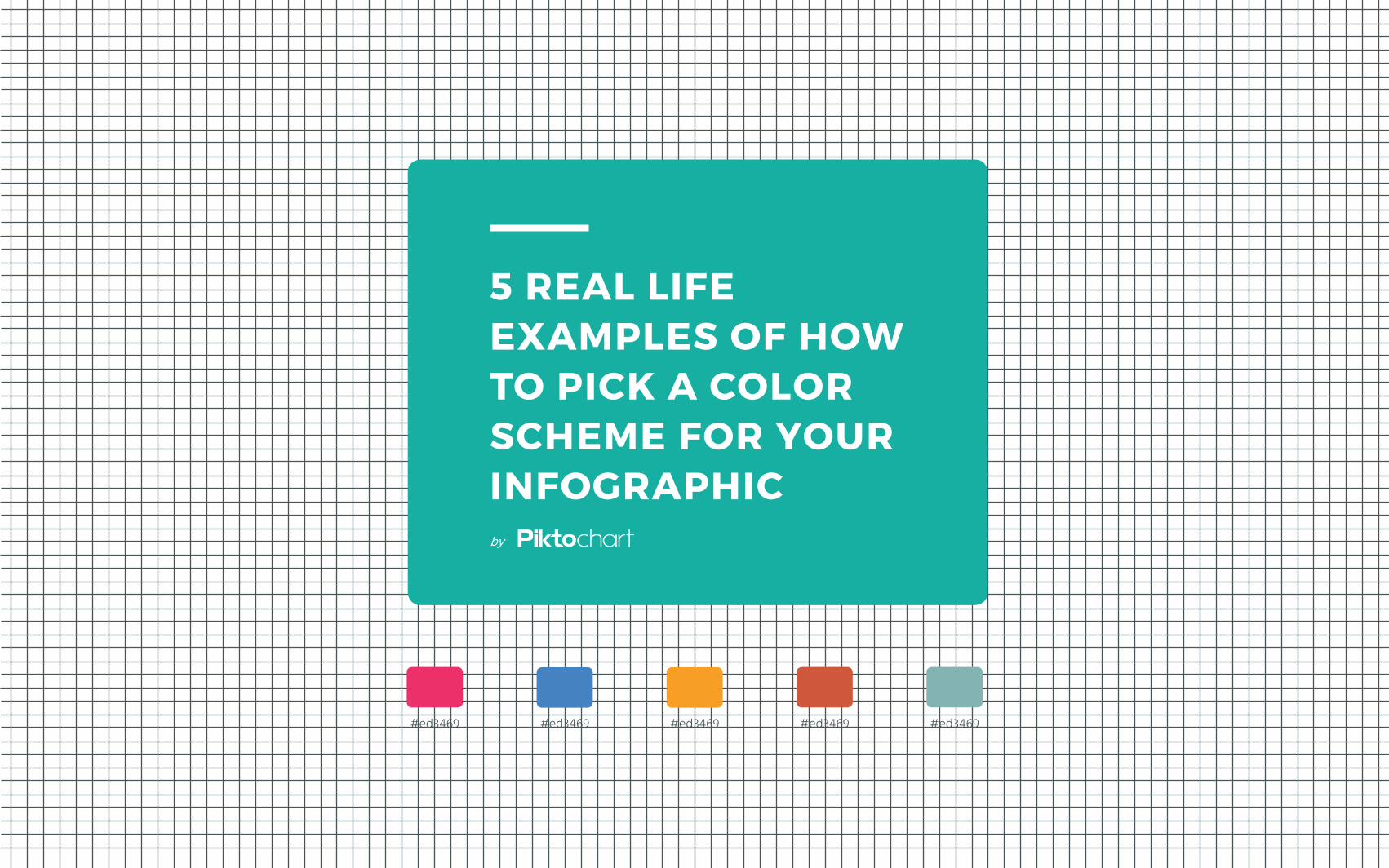
5 REAL LIFE EXAMPLES OF HOW TO PICK A COLOR SCHEME FOR YOUR INFOGRAPHIC
#ed3469 #ed3469 #ed3469 #ed3469 #ed3469
by
01 #00427C#00B6F1#B39759
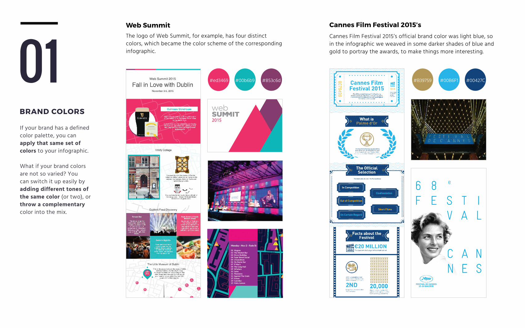
BRAND COLORS
If your brand has a defined color palette, you can apply that same set of colors to your infographic.
What if your brand colors are not so varied? You can switch it up easily by adding different tones of the same color (or two), or throw a complementary color into the mix.
Web SummitThe logo of Web Summit, for example, has four distinct colors, which became the color scheme of the corresponding infographic.
#ed3469 #00b6b9 #853c6d
Cannes Film Festival 2015’s
Cannes Film Festival 2015’s official brand color was light blue, so in the infographic we weaved in some darker shades of blue and gold to portray the awards, to make things more interesting.
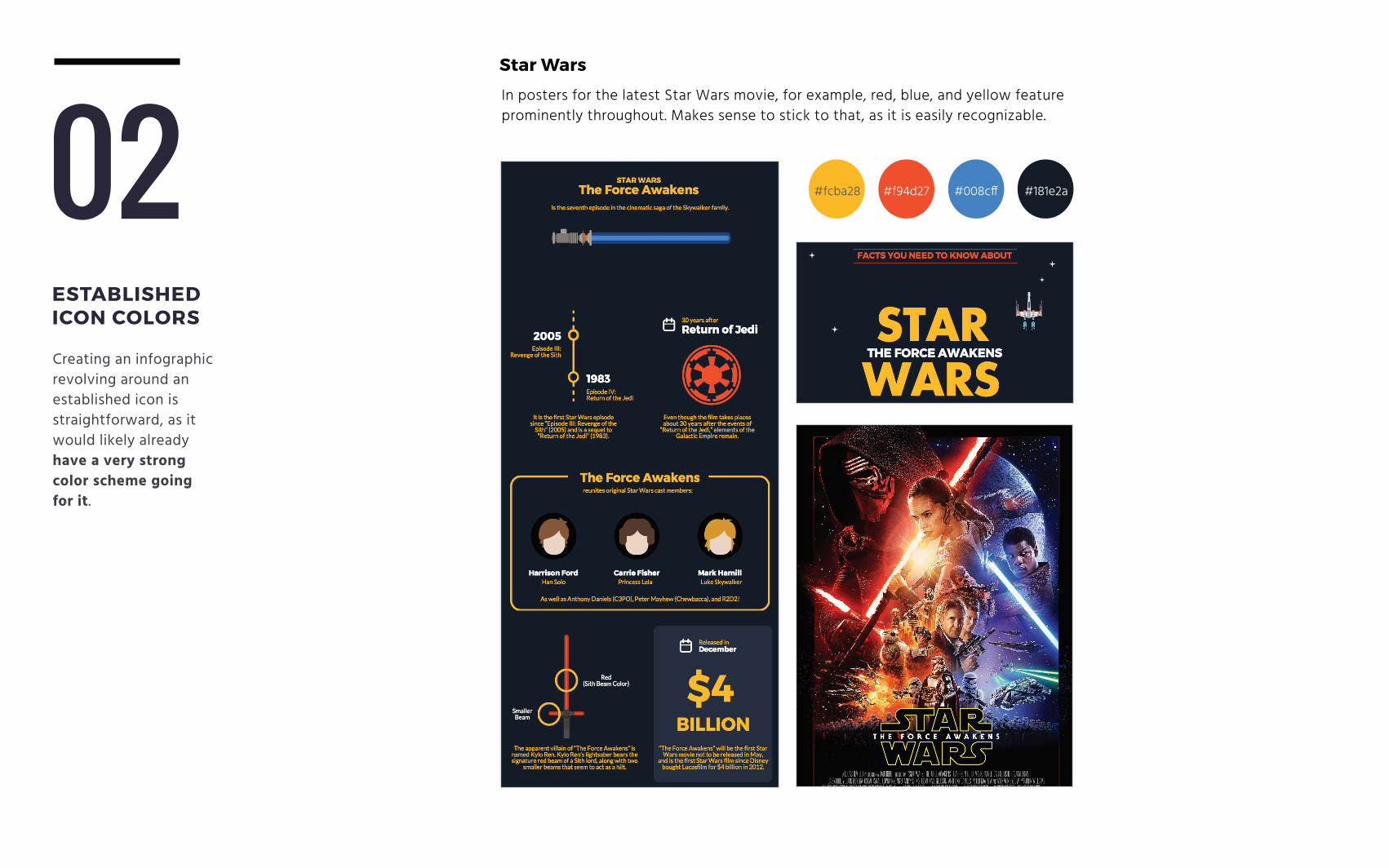
02ESTABLISHED ICON COLORS
Creating an infographic revolving around an established icon is straightforward, as it would likely already have a very strong color scheme going for it.
Star Wars
In posters for the latest Star Wars movie, for example, red, blue, and yellow feature prominently throughout. Makes sense to stick to that, as it is easily recognizable.
#181e2a#fcba28 #f94d27 #008cff
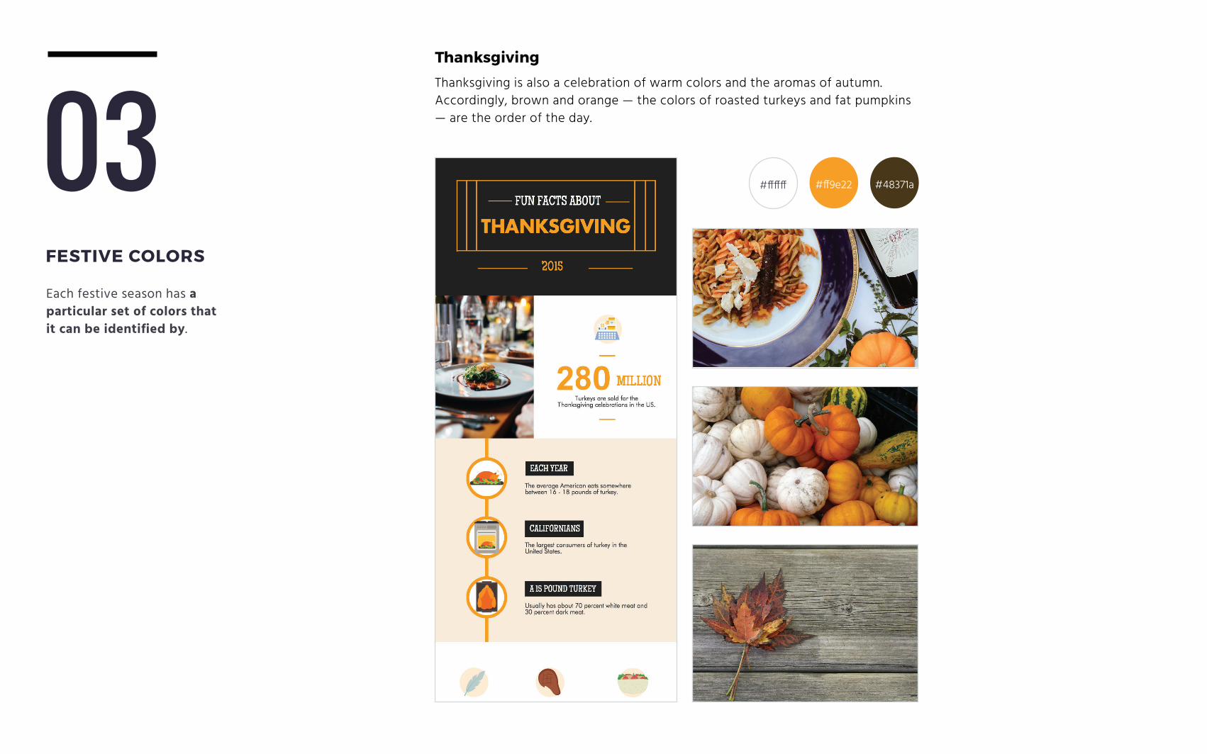
03FESTIVE COLORS
Each festive season has a particular set of colors that it can be identified by.
Thanksgiving
Thanksgiving is also a celebration of warm colors and the aromas of autumn. Accordingly, brown and orange — the colors of roasted turkeys and fat pumpkins — are the order of the day.
#ff9e22 #48371a#ffffff
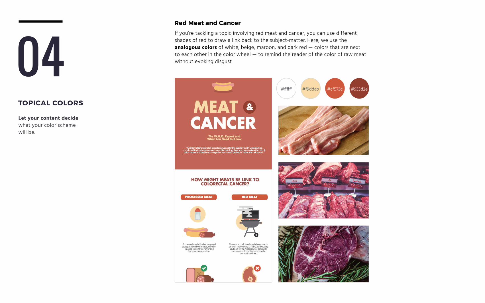
04TOPICAL COLORS
Let your content decide what your color scheme will be.
Red Meat and Cancer
If you’re tackling a topic involving red meat and cancer, you can use different shades of red to draw a link back to the subject-matter. Here, we use the analogous colors of white, beige, maroon, and dark red — colors that are next to each other in the color wheel — to remind the reader of the color of raw meat without evoking disgust.
#cf573c#f9ddab#ffffff #933d2e
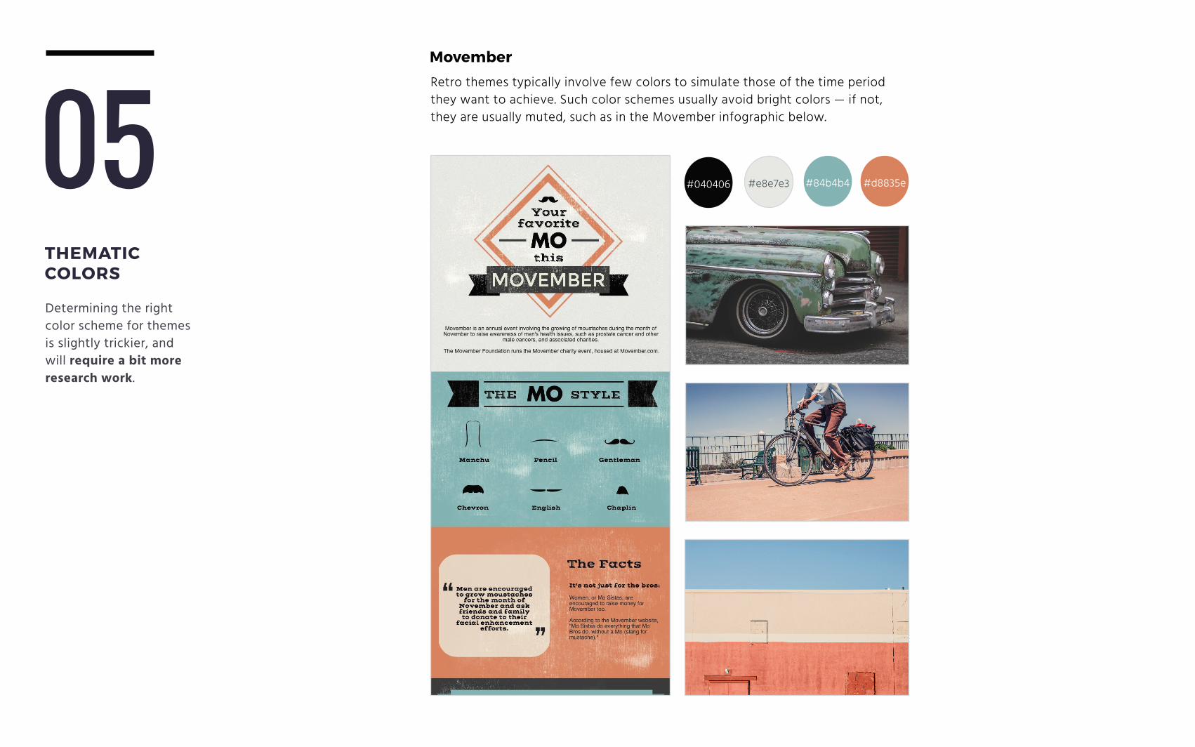
Movember
Retro themes typically involve few colors to simulate those of the time period they want to achieve. Such color schemes usually avoid bright colors — if not, they are usually muted, such as in the Movember infographic below.
#84b4b4#e8e7e3 #d8835e#040406
THEMATIC COLORS
05Determining the right color scheme for themes is slightly trickier, and will require a bit more research work.
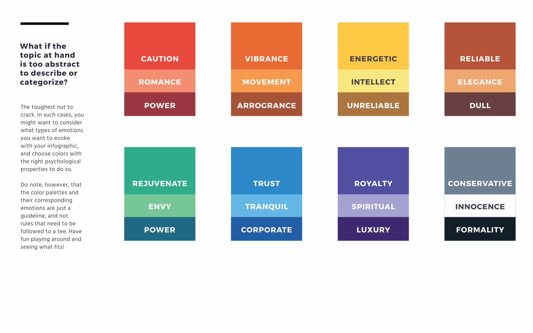
What if the topic at hand is too abstract to describe or categorize?
The toughest nut to crack. In such cases, you might want to consider what types of emotions you want to evoke with your infographic, and choose colors with the right psychological properties to do so.
Do note, however, that the color palettes and their corresponding emotions are just a guideline, and not rules that need to be followed to a tee. Have fun playing around and seeing what fits!
CAUTION VIBRANCE ENERGETIC RELIABLE
REJUVENATE TRUST ROYALTY CONSERVATIVE
ROMANCE MOVEMENT INTELLECT ELEGANCE
ENVY TRANQUIL SPIRITUAL INNOCENCE
POWER ARROGRANCE UNRELIABLE DULL
POWER CORPORATE LUXURY FORMALITY
Enjoy what you’ve read? Get more of our in-depth and actionable design, education, and marketing content by:
Following us on Twitter
Following us on Facebook
Joining our weekly blog newsletter

ATTRIBUTION
https://blog.websummit.net/
http://www.festival-cannes.fr
http://www.starwars.com/
www.magic.piktochart.com
www.unsplash.com
www.gratisography.com
www.morguefile.com